Angular PrimeNG Chip Basic
Last Updated :
23 Aug, 2022
Angular PrimeNG is an open-source framework with a rich set of native Angular UI components that are used for great styling and this framework is used to make responsive websites with very much ease. This article will show us how to use the Chips Basic in Angular PrimeNG.
The Chips component sets multiple values to enter for an input field. It is generally used for implementing the filter input on most e-commerce websites.
Syntax:
<p-chip
    label="...."
    [removable]="true">
</p-chip>
Angular PrimeNG Chip Basic properties:
- label: It is used to display the text inside the chip.
- removable: It is used to specify whether a removable icon should be shown or not. It is of boolean type. The default value is false.
Creating Angular Application & module installation:
Step 1: Create an Angular application using the following command.
ng new appname
Step 2: After creating your project folder i.e. appname, move to it using the following command.
cd appname
Step 3: Install PrimeNG in your given directory.
npm install primeng --save
npm install primeicons --save
Project Structure: It will look like the following:

- Run the below command to see the output:
ng serve --open
Example 1: Below is the example code that illustrates the use of Angular PrimeNG Chip Basic.
app.component.html
<h2 style="color: green">GeeksforGeeks</h2>
<h5>Angular PrimeNG Chips Basic</h5>
<div class="d-flex ai-center">
    <p-chip
            label="HTML"
            styleClass="mr-3">
    </p-chip>
    <p-chip
            label="CSS"
            styleClass="mr-3">
    </p-chip>
    <p-chip
            label="JavaScript"
            styleClass="mr-3">
    </p-chip>
    <p-chip
            label="ReactJS"
            styleClass="mr-3">
    </p-chip>
    <p-chip
            label="AngularJS"
            styleClass="mr-3">
    </p-chip>
    <p-chip
            label="PrimeNG"
            styleClass="mr-3">
    </p-chip>
</div>
import { Component } from "@angular/core";

@Component({
    selector: "app-root",
    templateUrl: "./app.component.html",
    styleUrls: ["./app.component.css"]
})
export class AppComponent { }
import { NgModule } from "@angular/core";
import { BrowserModule }
    from "@angular/platform-browser";
import { BrowserAnimationsModule }
    from "@angular/platform-browser/animations";
import { AppComponent } from "./app.component";
import { ButtonModule } from "primeng/button";
import { BadgeModule } from "primeng/badge";
import { ChipModule } from "primeng/chip";

@NgModule({
    imports: [
        BrowserModule,
        BrowserAnimationsModule,
        ChipModule,
        ButtonModule,
        BadgeModule
    ],
    declarations: [AppComponent],
    bootstrap: [AppComponent]
})
export class AppModule { }
Output:

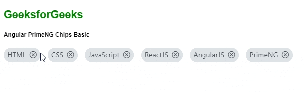
Example 2: Below is another example code that illustrates Angular PrimeNG Chip Basic using the [removable]="true" property.
app.component.html
<h2 style="color: green">GeeksforGeeks</h2>
<h5>Angular PrimeNG Chips Basic</h5>
<div class="d-flex ai-center">
    <p-chip
            label="HTML"
            styleClass="mr-3"
            [removable]="true">
    </p-chip>
    <p-chip
            label="CSS"
            styleClass="mr-3"
            [removable]="true">
    </p-chip>
    <p-chip
            label="JavaScript"
            styleClass="mr-3"
            [removable]="true">
    </p-chip>
    <p-chip
            label="ReactJS"
            styleClass="mr-3"
            [removable]="true">
    </p-chip>
    <p-chip
            label="AngularJS"
            styleClass="mr-3"
            [removable]="true">
    </p-chip>
    <p-chip
            label="PrimeNG"
            [removable]="true">
    </p-chip>
</div>
import { Component } from "@angular/core";

@Component({
    selector: "app-root",
    templateUrl: "./app.component.html",
    styleUrls: ["./app.component.css"]
})
export class AppComponent { }
import { NgModule } from "@angular/core";
import { BrowserModule }
    from "@angular/platform-browser";
import { BrowserAnimationsModule }
    from "@angular/platform-browser/animations";
import { AppComponent } from "./app.component";
import { ButtonModule } from "primeng/button";
import { BadgeModule } from "primeng/badge";
import { ChipModule } from "primeng/chip";

@NgModule({
    imports: [
        BrowserModule,
        BrowserAnimationsModule,
        ChipModule,
        ButtonModule,
        BadgeModule
    ],
    declarations: [AppComponent],
    bootstrap: [AppComponent]
})
export class AppModule { }
Output:
Reference: https://primefaces.org/primeng/chip
Similar Reads
Angular PrimeNG Image Basic Angular PrimeNG is an open-source UI component library for Angular Applications. Using the components provided by Angular PrimeNG, one can create stunning and responsive angular applications. In this post, we will see Angular PrimeNG Image Basic. The Image component is used to show a single image to
3 min read
Angular PrimeNG Menu Basic Angular PrimeNG is an open-source framework with a rich set of native Angular UI components that are used for great styling and this framework is used to make responsive websites with very much ease. This article will show us how to use the Menu Basic in Angular PrimeNG. Angular PrimeNG Menu Basic i
3 min read
Angular PrimeNG Chip Icon Angular PrimeNG is an open-source framework with a rich set of native Angular UI components that are used for great styling and this framework is used to make responsive websites with very much ease. In this article, we will see how to use the Chips Icon in Angular PrimeNG. The Chips component sets
3 min read
Angular PrimeNG Chip Image Angular PrimeNG is an open-source framework with a rich set of native Angular UI components that are used for great styling and this framework is used to make responsive websites with very much ease. This article will show us how to use the Chips Image in Angular PrimeNG. The Chips component sets mu
3 min read
Angular PrimeNG Chip Events Angular PrimeNG is a UI component library for Angular Applications. It offers many pre-built themes and UI components for various tasks like inputs, menus, charts, Buttons, etc. In this article, we will see Angular PrimeNG Chip Events. The Chip component represents entities using text, icons, and im
3 min read