Change Axis Labels, Set Title and Figure Size to Plots with Seaborn
Last Updated :
26 Nov, 2020
Seaborn is Python's visualization library built as an extension to Matplotlib. Seaborn has Axes-level functions (scatterplot, regplot, boxplot, kdeplot, etc.) as well as Figure-level functions (lmplot, factorplot, jointplot, relplot etc.). Axes-level functions return Matplotlib axes objects with the plot drawn on them while figure-level functions include axes that are always organized in a meaningful way. The basic customization that a graph needs to make it understandable is setting the title, setting the axis labels, and adjusting the figure size. Any customization made is on the axes object for axes-level functions and the figure object for figure-level functions.
Note: Axes in the above explanation refers to a part of the figure or the top layer of a figure and is not the mathematical term for more than one axis. Consider a plot on a figure. This plot axes. Now, consider multiple subplots on a figure. Each of these subplots is one axes.
Let us see some examples to better understand customization with Seaborn.
Python
# Import required libraries
import matplotlib.pyplot as plt
import seaborn as sns

# Load data set
tips = sns.load_dataset( "tips" )
tips.head()
Output:

Example 1: Customizing plot with axes object
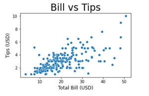
For axes-level functions, pass the figsize argument to the plt.subplots() function to set the figure size. The function plt.subplots() returns Figure and Axes objects. These objects are created ahead of time and later the plots are drawn on it. We make use of the set_title(), set_xlabel(), and set_ylabel() functions to change axis labels and set the title for a plot. We can set the size of the text with size attribute. Make sure to assign the axes-level object while creating the plot. This object is then used for setting the title and labels as shown below.
Python
# Set figure size (width, height) in inches
fig, ax = plt.subplots(figsize = ( 5 , 3 ))

# Plot the scatterplot
sns.scatterplot( ax = ax , x = "total_bill" , y = "tip" , data = tips )

# Set label for x-axis
ax.set_xlabel( "Total Bill (USD)" , size = 12 )

# Set label for y-axis
ax.set_ylabel( "Tips (USD)" , size = 12 )

# Set title for plot
ax.set_title( "Bill vs Tips" , size = 24 )

# Display figure
plt.show()
Output:
Example 2: Customizing scatter plot with pyplot object
We can also change the axis labels and set the plot title with the matplotlib.pyplot object using xlabel(), ylabel() and title() functions. Similar to the above example, we can set the size of the text with the size attribute. The function plt.figure() creates a Figure instance and the figsize argument allows to set the figure size.
Python
# Set figure size (width, height) in inches
plt.figure(figsize = ( 5 , 3 ))

# Plot scatterplot
sns.scatterplot( x = "total_bill" , y = "tip" , data = tips )

# Set label for x-axis
plt.xlabel( "Total Bill (USD)" , size = 12 )

# Set label for y-axis
plt.ylabel( "Tips (USD)" , size = 12 )

# Set title for figure
plt.title( "Bill vs Tips" , size = 24 )

# Display figure
plt.show()
Output:
Example 3: Customizing multiple plots in the same figure
Seaborn's relplot function returns a FacetGrid object which is a figure-level object. This object allows the convenient management of subplots. To give a title to the complete figure containing multiple subplots, we use the suptitle() method. The subplots_adjust() method is used to avoid overlapping of subplot titles and the figure title by specifying the top, bottom, left, and right edge positions of the subplots. To set the figure size, pass a dictionary with the key 'figure.figsize' in the set() method. The set() method allows to set multiple theme parameters in a single step.
Python
# Set figure size
sns.set( rc = {'figure.figsize' : ( 20, 20 ),
               'axes.labelsize' : 12 })

# Plot scatter plot
g = sns.relplot(data = tips , x = "total_bill" ,
                y = "tip" , col = "time" ,
                hue = "day" , style = "day" ,
                kind = "scatter" )

# Title for the complete figure
g.fig.suptitle("Tips by time of day" ,
               fontsize = 'x-large' ,
               fontweight = 'bold' )

# Adjust subplots so that titles don't overlap
g.fig.subplots_adjust( top = 0.85 )

# Set x-axis and y-axis labels
g.set_axis_labels( "Tip" , "Total Bill (USD)" )

# Display the figure
plt.show()
Output:

Similar Reads
How to set a Seaborn chart figure size?
Seaborn is a Python data visualization library based on Matplotlib. It is used to draw attractive and informative statistical graphics. To adjust the figure size of the seaborn plot we will use the subplots function of matplotlib.pyplot. Examples to change the figure size of a seaborn axes matplotli
2 min read
How to change the size of axis labels in Matplotlib?
Matplotlib is a Python library that helps in visualizing and customizing various plots. One of the customization you can do is to change the size of the axis labels to make reading easier. In this guide, we’ll look how to adjust font size of axis labels using Matplotlib.Let’s start with a basic plot
2 min read
How to set axes labels & limits in a Seaborn plot?
In this article, we will learn How to set axes labels & limits in a Seaborn plot. Let's discuss some concepts first. Axis is the region in the plot that contains the data space. The Axes contain two or three-axis(in case of 3D) objects which take care of the data limits.Axes Labels are the label
4 min read
How to set the title and fonts of your Seaborn Chart?
In this article, we are going to see how to set the title and fonts in seaborn chart. Data Visualization is the presentation of data in pictorial format. It is extremely important for Data Analysis, primarily because of the fantastic ecosystem of data-centric Python packages and seaborn is an amazin
4 min read
A Step-by-Step Guide to Changing Plot Colors in Seaborn
Seaborn is a powerful Python library for data visualization built on top of Matplotlib. It provides a high-level interface for drawing attractive and informative statistical graphics. One of the key features of Seaborn is its ability to handle color palettes effectively, which can significantly enha
5 min read
How To Align Kde Plot With Strip Plot In Seaborn?
A high-level interface for creating attractive and informative statistical graphics is offered by a powerful python library Seaborn. One of the most common tasks in data visualization is aligning different types of plots in one graph to gain insights into the data. In this article, we will understan
4 min read
How to Add a Title to Seaborn Plots?
In this article, we will discuss how to add a title to Seaborn Plots in Python. Method 1: Adding title using set methodset method takes 1 argument "title" as a parameter which stores Title of a plot. Syntax set(title="Title of a plot") Example: Here, we are going to create a dataframe with months an
2 min read
Adding Titles to Seaborn Boxplots
Seaborn is a powerful Python library for data visualization that makes it easy to create aesthetically pleasing and informative plots. Boxplots are a popular type of plot for visualizing the distribution of a dataset. Adding a title to a Seaborn boxplot can help provide context and enhance the inter
4 min read
How to change the font size of the Title in a Matplotlib figure ?
In this article, we are going to discuss how to change the font size of the title in a figure using matplotlib module in Python. As we use matplotlib.pyplot.title() method to assign a title to a plot, so in order to change the font size, we are going to use the font size argument of the pyplot.title
2 min read
How to Set Tick Labels Font Size in Matplotlib?
Prerequisite: MatplotlibMatplotlib is one of the most widely used data visualization libraries in Python. It provides a variety of ways to create high-quality 2D plots. One important aspect of making plots readable and aesthetically pleasing is formatting tick labels, including adjusting their font
3 min read