The Grid Container is the container element where the property display with a value grid or the inline-grid is used for defining their direct children into a grid layout. The Grid Container offers various properties these are grid-template-columns Property, grid-template-rows Property, justify-content Property, and align-content property.
We will explore the above topics with the help of suitable examples.
Grid Container with display "grid" property
The "display: grid" property in CSS is used to create a grid container, allowing efficient organization of elements in rows and columns for responsive and structured web layouts.
Syntax
.gridbox {
    display: grid;
}
The grid-template-columns Property
The grid-template-columns property is used to define the number of columns in the grid.
Example 1: The example illustrates defining a grid with grid-template-columns property for making columns.
HTML
<!DOCTYPE html>
<html lang="en">

<head>
    <meta charset="UTF-8">
    <meta name="viewport" content="width=device-width,
                                   initial-scale=1.0">
    <link rel="stylesheet" href="style.css">
</head>

<body>
    <div class="gridbox">
        <div class="divclass" id="div1">box1</div>
        <div class="divclass" id="div2">box2</div>
        <div class="divclass" id="div3">box3</div>
        <div class="divclass" id="div4">box4</div>
        <div class="divclass" id="div5">box5</div>
        <div class="divclass" id="div6">box6</div>
        <div class="divclass" id="div7">box7</div>
        <div class="divclass" id="div8">box8</div>
        <div class="divclass" id="div9">box9</div>
        <div class="divclass" id="div10">box10</div>
    </div>

</body>

</html>
.gridbox{
    display: grid;
    row-gap: 10px;
    column-gap: 10px;
    grid-template-columns: 1fr 2fr 1fr 1fr;
    background-color:  rgb(186, 226, 186);
    padding: 5px;
    border: 2px solid rgb(177, 206, 177);
}
.divclass{
    border: 2px solid green;
    text-align: center;
}
Output:
 grid-template-columns
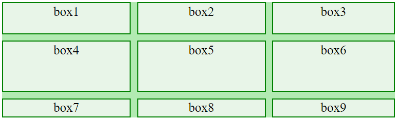
Example 2: The example illustrates how to define a grid with grid-template-columns property for making columns.
HTML
<!DOCTYPE html>
<html lang="en">

<head>
    <meta charset="UTF-8">
    <meta name="viewport" content="width=device-width,
                                   initial-scale=1.0">
    <link rel="stylesheet" href="style.css">
</head>

<body>
    <div class="gridbox">
        <div class="divclass" id="div1">box1</div>
        <div class="divclass" id="div2">box2</div>
        <div class="divclass" id="div3">box3</div>
        <div class="divclass" id="div4">box4</div>
        <div class="divclass" id="div5">box5</div>
        <div class="divclass" id="div6">box6</div>
        <div class="divclass" id="div7">box7</div>
        <div class="divclass" id="div8">box8</div>
        <div class="divclass" id="div9">box9</div>
    </div>

</body>

</html>
.gridbox{
    display: grid;
    row-gap: 10px;
    column-gap: 10px;
    grid-template-columns: 100px 200px auto;
    background-color:  rgb(186, 226, 186);
    padding: 5px;
    border: 2px solid rgb(177, 206, 177);
}
.divclass{
    border: 2px solid green;
    text-align: center;
}
Output:
 grid-template-columns
The grid-template-rows Property
The grid-template-rows property is used to define the height of the rows in the grid.
Syntax
.grid-box{
  display: grid;
  grid-template-rows: 50px, 150px;
}
Example 1: The example illustrates how to define a grid with grid-template-rows property for giving rows height.
HTML
<!DOCTYPE html>
<html lang="en">

<head>
    <meta charset="UTF-8">
    <meta name="viewport" content="width=device-width,
                                   initial-scale=1.0">
    <link rel="stylesheet" href="style.css">
</head>

<body>
    <div class="gridbox">
        <div class="divclass" id="div1">box1</div>
        <div class="divclass" id="div2">box2</div>
        <div class="divclass" id="div3">box3</div>
        <div class="divclass" id="div4">box4</div>
        <div class="divclass" id="div5">box5</div>
        <div class="divclass" id="div6">box6</div>
        <div class="divclass" id="div7">box7</div>
        <div class="divclass" id="div8">box8</div>
        <div class="divclass" id="div9">box9</div>
    </div>

</body>

</html>
.gridbox{
    display: grid;
    row-gap: 10px;
    column-gap: 10px;
    grid-template-columns: 200px 200px auto;
    grid-template-rows: 50px 80px;
    background-color: rgb(178, 234, 178);

}
.divclass{
    border: 2px solid green;
    background-color: rgb(232, 245, 232);
    text-align: center;
    padding: 2px;
    font-size: 20px;
}
Output:
 grid-template-rows
The justify-content Property
The justify-content property is used to horizontally align the complete grid inside the container.
Syntax
.grid-box {
    display: grid;
    justify-content: space-between;
}
Property with Syntax
| Descriptions
|
|---|
| justify-content: center; | The property aligns the complete grid to the center |
| justify-content: space-between; | The property distributes the complete space equally, leaving no space at the beginning or end. |
| justify-content: space-evenly; | The property distributes the equal space at the beginning, between, and at the end. |
| justify-content: space-around; | The property creates equal space at the beginning, between, and at the end. |
| justify-content: end; | The property aligns the complete grid to the end. |
| justify-content: start; | The property aligns the complete grid to the start. |
Example 1: The example illustrates property justify-content and value as space-between.
HTML
<!DOCTYPE html>
<html lang="en">

<head>
    <meta charset="UTF-8">
    <meta name="viewport" content="width=device-width,
                                   initial-scale=1.0">
    <link rel="stylesheet" href="style.css">
</head>

<body>
    <div class="grid-box">
        <div class="divclass" id="div1">box1</div>
        <div class="divclass" id="div2">box2</div>
        <div class="divclass" id="div3">box3</div>
        <div class="divclass" id="div4">box4</div>
        <div class="divclass" id="div5">box5</div>
        <div class="divclass" id="div6">box6</div>
        <div class="divclass" id="div7">box7</div>
        <div class="divclass" id="div8">box8</div>
        <div class="divclass" id="div9">box9</div>
    </div>

</body>

</html>
.grid-box{
    display: grid;
    gap: 5px;
    grid-template-columns: 200px 200px auto;
    grid-template-rows: 50px 150px;
    justify-content: space-between;
    border: 2px solid green;
    background-color: rgb(188, 233, 188);
    padding: 10px;
}
.divclass{
    border: 3px solid green;
    padding: 5px;
    text-align: center;
}
Output:
 justify-content: space-between
Example 2: The example illustrates property justify-content and value as an end.
HTML
<!DOCTYPE html>
<html lang="en">

<head>
    <meta charset="UTF-8">
    <meta name="viewport" content="width=device-width,
                                   initial-scale=1.0">
    <link rel="stylesheet" href="style.css">
</head>

<body>

    <div class="grid-box">
        <div class="divclass" id="div1">box1</div>
        <div class="divclass" id="div2">box2</div>
        <div class="divclass" id="div3">box3</div>
        <div class="divclass" id="div4">box4</div>
        <div class="divclass" id="div5">box5</div>
        <div class="divclass" id="div6">box6</div>
        <div class="divclass" id="div7">box7</div>
        <div class="divclass" id="div8">box8</div>
        <div class="divclass" id="div9">box9</div>
    </div>

</body>

</html>
.grid-box{
    display: grid;
    gap: 5px;
    grid-template-columns: 200px 200px auto;
    grid-template-rows: 50px 150px;
    justify-content: end;
    border: 2px solid green;
    background-color: rgb(188, 233, 188);
    padding: 10px;
}
.divclass{
    border: 3px solid green;
    padding: 5px;
    text-align: center;
}
Output:
 justify-content: end
The align-content Property
The align-content property is used for vertically aligning the complete grid inside the container.
Syntax
.grid-box{
    display: grid;
    align-content: center;
}
Property with Syntax
| Descriptions
|
|---|
| align-content: center; | The property vertically aligns the complete grid to the center. |
| align-content: space-between; | The property distributes the complete space equally, leaving no space at the beginning or end. |
| align-content: space-evenly; | The property distributes the equal space at the beginning, between, and at the end. |
| align-content: space-around; | The property creates equal space at the beginning, between, and at the end. |
| align-content: end; | The property vertically aligns the complete grid to the end. |
| align-content: start; | The property vertically aligns the complete grid to the start. |
Example 1: The example illustrates property align-content with the value center.
HTML
<!DOCTYPE html>
<html lang="en">

<head>
    <meta charset="UTF-8">
    <meta name="viewport" content="width=device-width,
                                   initial-scale=1.0">
    <link rel="stylesheet" href="style.css">
</head>

<body>

    <div class="grid-box">
        <div class="divclass" id="div1">box1</div>
        <div class="divclass" id="div2">box2</div>
        <div class="divclass" id="div3">box3</div>
        <div class="divclass" id="div4">box4</div>
        <div class="divclass" id="div5">box5</div>
        <div class="divclass" id="div6">box6</div>
        <div class="divclass" id="div7">box7</div>
        <div class="divclass" id="div8">box8</div>
        <div class="divclass" id="div9">box9</div>
    </div>

</body>

</html>
.grid-box{
    display: grid;
    gap: 5px;
    grid-template-columns: 200px 200px auto;
    align-content: center;
    border: 2px solid green;
    background-color: rgb(188, 233, 188);
    padding: 10px;
    height: 240px;
}
.divclass{
    border: 3px solid green;
    padding: 5px;
    text-align: center;
}
Output:
 align-content: center
Example 2: The example illustrates to property align-content with value end.
HTML
<!DOCTYPE html>
<html lang="en">

<head>
    <meta charset="UTF-8">
    <meta name="viewport"
          content="width=device-width,
                   initial-scale=1.0">
    <link rel="stylesheet" href="style.css">
</head>

<body>
    <div class="grid-box">
        <div class="divclass" id="div1">box1</div>
        <div class="divclass" id="div2">box2</div>
        <div class="divclass" id="div3">box3</div>
        <div class="divclass" id="div4">box4</div>
        <div class="divclass" id="div5">box5</div>
        <div class="divclass" id="div6">box6</div>
        <div class="divclass" id="div7">box7</div>
        <div class="divclass" id="div8">box8</div>
        <div class="divclass" id="div9">box9</div>
    </div>
</body>

</html>
.grid-box{
    display: grid;
    gap: 5px;
    grid-template-columns: 200px 200px auto;
    align-content: end;
    border: 2px solid green;
    background-color: rgb(188, 233, 188);
    padding: 10px;
    height: 240px;
}
.divclass{
    border: 3px solid green;
    padding: 5px;
    text-align: center;
}
Output:
 align-content: end
Similar Reads
Blaze UI Containers Basic Grid In this article, we'll see about Container basic grid in Blaze UI. Blaze UI is a free, open-source UI toolkit to build a great website. It provides you with various features like responsiveness, custom components, etc. A grid is a very popular way to create a responsive layout and is very easy to us
2 min read
Foundation CSS XY Grid Container Foundation CSS is an open-source and responsive front-end framework built by ZURB foundation in September 2011, that makes it easy to layout stunning responsive websites, apps, and emails that appear amazing and can be accessible to any device. In this article, we will discuss the XY Grid Container
2 min read
Foundation CSS XY Grid Foundation CSS is an open-source and responsive front-end framework built by the ZURB foundation in September 2011, that makes it easy to layout stunning responsive websites, apps, and emails that appear amazing and can be accessible to any device. In this article, we will know about XY Grid in Foun
4 min read
Foundation CSS XY Grid Frame Foundation CSS is an open-source & responsive front-end framework built by ZURB foundation in September 2011, that makes it easy to layout stunning responsive websites, apps, and emails that appear amazing & can be accessible to any device. In this article, we will discuss the XY Grid Frame
6 min read
Flutter - GridView Flutter's GridView is a widget similar to a 2-D array found in many programming languages. As its name indicates, the GridView widget is used to display content in a grid format. This allows us to showcase images, text, icons, and more within the GridView. There are several ways to implement GridVie
6 min read