How to Align Items and Space with Flex in Tailwind CSS?
Last Updated :
14 Aug, 2024
Flex allows you to structure the elements in a container with precise control over alignment and spacing. Tailwind CSS provides utility classes to use Flexbox for aligning items and distributing space between them. By using classes like justify-between and justify-around, you can easily create layouts that balance spacing and align content effectively, resulting in clean and responsive designs.
These are the following approaches to align items and space with Flex in Tailwind CSS:
Center Items with Space Between
In this approach, we use Flexbox with items-center to vertically align items within the container and justify-between to distribute space evenly between the items. The items are centered horizontally and spaced apart, with the first item aligned to the start and the last item aligned to the end of the container, creating equal spacing between them.
Example: The below example performs Center Items with Space Between with Flex in Tailwind CSS.
HTML
<!DOCTYPE html>
<html>

<head>
    <title> Center Items with Space Between </title>
    <link href=
"https://cdn.jsdelivr.net/npm/[email protected]/dist/tailwind.min.css" rel="stylesheet">
</head>

<body class="flex flex-col
			 items-center justify-center
             min-h-screen bg-gray-100">
    <h1 class="text-green-500
               text-4xl font-bold mb-4">
        GeeksforGeeks
    </h1>
    <h3 class="text-gray-700
               text-2xl mb-6">
        Approach 1: Center Items with Space Between
    </h3>

    <div class="flex items-center
                justify-between
                w-full max-w-md
                p-4 bg-white shadow-md">
        <div class="text-lg
                    text-gray-700">JavaScript</div>
        <div class="text-lg
                    text-gray-700">Python</div>
        <div class="text-lg
                    text-gray-700">Java</div>
    </div>
</body>

</html>
Output:
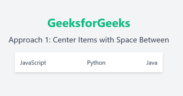 Center Items with Space Between
Align Items to Start with Equal Space Around
In this approach, we use Flexbox with items-center to vertically align the items along the container's cross axis and justify-around to distribute equal space around each item. This layout aligns items to the start of the container while ensuring there is an equal amount of space around each item, creating a balanced and visually appealing arrangement.
Example: The below example performs Align Items to Start with Equal Space Around with Flex in Tailwind CSS.
HTML
<!DOCTYPE html>
<html>

<head>
    <title>Align Items to Start with Equal Space Around</title>
    <link href=
"https://cdn.jsdelivr.net/npm/[email protected]/dist/tailwind.min.css"
          rel="stylesheet">
</head>

<body class="flex flex-col
			items-center justify-center
			min-h-screen bg-gray-100">
    <h1 class="text-green-500
    		   text-4xl font-bold mb-4">
      GeeksforGeeks
    </h1>
    <h3 class="text-gray-700
               text-2xl mb-8">
        Approach 2: Align Items to Start with Equal Space Around
    </h3>

    <div class="flex items-center
       			justify-around w-full max-w-3xl
       			p-6 bg-white shadow-lg rounded-lg
        		border border-gray-300">
        <div class="flex flex-col items-center p-4">
            <div class="text-blue-500
                        text-2xl font-bold mb-2">
                JavaScript
            </div>
            <p class="text-gray-600">
                The versatile language of the web.
            </p>
        </div>
        <div class="flex flex-col
        			items-center p-4">
            <div class="text-green-500
            			text-2xl font-bold mb-2">
              Python
             </div>
            <p class="text-gray-600">
                The language for data science and more.</p>
        </div>
        <div class="flex flex-col items-center p-4">
            <div class="text-red-500
            			text-2xl font-bold mb-2">Java</div>
            <p class="text-gray-600">
                The robust language for enterprise solutions.
            </p>
        </div>
    </div>
</body>

</html>
Output:
 Align Items to Start with Equal Space Around