Box Office Revenue Prediction Using Linear Regression in ML
Last Updated :
02 Jun, 2025
The objective of this project is to develop a machine learning model using Linear Regression to accurately predict the box office revenue of movies based on various available features. The model will be trained on a dataset containing historical movie data and will aim to identify key factors that impact revenue. By implementing data preprocessing, feature engineering, visualization and model evaluation techniques, this project seeks to:
- Build a predictive model that can estimate the expected revenue of a movie prior to its release.
- Provide insights into which features most influence box office success.
- Compare linear regression performance with more advanced models (e.g., XGBoost) to assess predictive accuracy.
1. Importing Libraries and Dataset
Core Libraries
- Pandas: For loading and exploring the dataset.
- NumPy:For working with numerical arrays and math operations.
Visualization
- Matplotlib and Seaborn: Used to plot data distributions, trends and model performance.
Preprocessing and Modeling
- train_test_split: Splits the data into training and validation sets.
- LabelEncoder: Converts categories like genres into numeric format.
- StandardScaler: Scales features for better model performance.
- CountVectorizer: Converts text data (e.g., genres) into numeric vectors.
- metrics: Offers tools for evaluating model accuracy.
Advanced Modeling
- XGBoost: A high-performance gradient boosting algorithm used for better predictions.
Utility
- warnings.filterwarnings('ignore'): Hides unnecessary warning messages for cleaner output.
Python
import numpy as np
import pandas as pd
import matplotlib.pyplot as plt
import seaborn as sb
from sklearn.model_selection import train_test_split
from sklearn.preprocessing import LabelEncoder, StandardScaler
from sklearn.feature_extraction.text import CountVectorizer
from sklearn import metrics
from xgboost import XGBRegressor

import warnings
warnings.filterwarnings('ignore')
2. Loading the dataset into a pandas DataFrame
We now load the dataset into a pandas DataFrame to begin analysis. You can download the dataset from here.
Python
df = pd.read_csv('boxoffice.csv',
                 encoding='latin-1')
df.head()
Output:
 df.head()
2.1 Checking Dataset Size
Let's see how many rows and columns we have.
Python
Output:
(2694, 10)
2.2 Checking Data Types
We check the data types of each column and look for issues.
Python
Output:
 Checking Data Types
Here we can observe an unusual discrepancy in the dtype column the columns which should be in the number format are also in the object type. This means we need to clean the data before moving any further.
3. Exploring the Dataset
We take a quick look at statistical metrics (like mean, min, max) for each numeric column to understand the data distribution.
- df.describe() gives a summary of the numeric columns (count, mean, standard deviation, min, max, etc.).
- .T transposes the output for better readability ( rows become columns and vice versa ).
Python
Output:
 Statistical Summary
Since we are predicting only domestic revenue in this project, we are dropping world_revenue and opening_revenue columns from the dataframe.
Python
to_remove = ['world_revenue', 'opening_revenue']
df.drop(to_remove, axis=1, inplace=True)
3.1 Checking Missing Values
We calculate what percentage of values is missing in each column. isnull().sum() functions helps us identify columns with many missing entries.
Python
df.isnull().sum() * 100 / df.shape[0]
Output:
 percentage of entries in each column that is null
4. Handling Missing Values
We clean the data by removing or filling missing values appropriately.
- We drop the budget column entirely, likely due to too many missing values.
- Fill missing values in MPAA and genres columns using their most frequent values (mode).
- Remove any remaining rows with missing values.
- Finally, check if any null values remain; the result should be 0.
Python
df.drop('budget', axis=1, inplace=True)

for col in ['MPAA', 'genres']:
    df[col] = df[col].fillna(df[col].mode()[0])

df.dropna(inplace=True)

df.isnull().sum().sum()
Output:
0
4.1 Cleaning Numeric Columns Stored as Strings
Some numeric columns might be stored as strings with special characters (like $ or ,). We need to remove these characters and convert the columns back to numeric format.
- Remove the first character from 'domestic_revenue' (likely a $ sign).
- Remove commas from numeric values (e.g., 1,000 to 1000).
- Ensure the columns are properly converted to float types.
- Use pd.to_numeric to handle any remaining non-numeric values gracefully to turn them into NaNs.
Python
df['domestic_revenue'] = df['domestic_revenue'].astype(str).str[1:]

for col in ['domestic_revenue', 'opening_theaters', 'release_days']:
    df[col] = df[col].astype(str).str.replace(',', '')

    temp = (~df[col].isnull())
    df[temp][col] = df[temp][col].convert_dtypes(float)

    df[col] = pd.to_numeric(df[col], errors='coerce')
5. Visualizing MPAA Rating Distribution
We want to see how many movies fall under each MPAA rating category like PG, R, PG-13, etc. We will create a horizontal bar chart showing the count of movies in each MPAA rating.
- plt.figure(figsize=(10, 5)) sets the size of the plot.
- sb.countplot() from Seaborn automatically counts and plots the frequency of each category in the 'MPAA' column.
- plt.show() displays the plot.
Python
plt.figure(figsize=(10, 5))
sb.countplot(df['MPAA'])
plt.show()
Output:
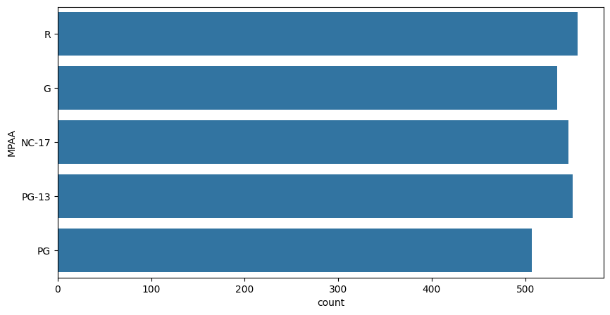 countplot
5.1 Average Domestic Revenue by MPAA Rating
We group the dataset by the 'MPAA' rating category and calculate the mean (average) of the 'domestic_revenue' for each rating group.
Python
df.groupby('MPAA')['domestic_revenue'].mean()
Output:
 Average Domestic Revenue by MPAA Rating
Here we can observe that the movies with PG or R ratings generally have their revenue higher than the other rating class.
6. Visualizing Distributions of Key Numeric Features
We plot the distribution (shape) of three important numeric columns to see how their values spread out.
- We create three side-by-side plots in one row.
- For each feature (domestic_revenue, opening_theaters, release_days) we show the distribution using Seaborn’s distplot.
- This helps check if the data is normally distributed, skewed or has any unusual patterns.
Python
plt.subplots(figsize=(15, 5))

features = ['domestic_revenue', 'opening_theaters', 'release_days']
for i, col in enumerate(features):
    plt.subplot(1, 3, i+1)
    sb.distplot(df[col])
plt.tight_layout()
plt.show()
Output:
 distplot
Understanding these distributions is important before modeling, as it affects how the model interprets the data.
7. Detecting Outliers Using Boxplots
We use boxplots to visually check for outliers in key numeric features. Boxplots show the spread of data and highlight any outliers (points outside the whiskers).
- We create three boxplots side by side, one for each feature (domestic_revenue, opening_theaters, release_days).
- This helps us identify unusual values that might affect the model.
Python
plt.subplots(figsize=(15, 5))
for i, col in enumerate(features):
    plt.subplot(1, 3, i+1)
    sb.boxplot(df[col])
plt.tight_layout()
plt.show()
Output:
 Outliers
We can observe that there are no outliers in the above features.
We apply a log transformation to reduce skewness in our numeric data because log transformation often improves model performance and stability.
- We take the base-10 logarithm of each value in the specified columns (domestic_revenue, opening_theaters, release_days).
- This helps make skewed data more normally distributed and reduces the effect of extreme values.
Python
for col in features:
  df[col] = df[col].apply(lambda x: np.log10(x))
Now the data in the columns we have visualized above should be close to normal distribution.
We visualize the distributions of the numeric features again to see the effect of the log transformation.
Python
plt.subplots(figsize=(15, 5))
for i, col in enumerate(features):
    plt.subplot(1, 3, i+1)
    sb.distplot(df[col])
plt.tight_layout()
plt.show()
Output:
 Normal Distribution
9. Converting Movie Genres into Numeric Features
We transform the text data in the genres column into separate numeric features using one-hot encoding.
- We use CountVectorizer to convert each genre like “Action”, “Comedy” into a binary feature i.e 1 if the movie belongs to that genre, else 0.
- Then drop the original genres text column since it’s now represented numerically.
Python
vectorizer = CountVectorizer()
vectorizer.fit(df['genres'])
features = vectorizer.transform(df['genres']).toarray()

genres = vectorizer.get_feature_names_out()
for i, name in enumerate(genres):
	df[name] = features[:, i]

df.drop('genres', axis=1, inplace=True)
But there will be certain genres that are not that frequent which will lead to increases in the complexity of the model unnecessarily. So we will remove those genres which are very rare.
9.1 Removing Rare Genre Columns with Mostly Zero Values
We will check for columns between 'action' and 'western' in the DataFrame and drop columns where over 95% of values are zero meaning that genre is rare.
Python
removed = 0

if 'action' in df.columns and 'western' in df.columns:
    for col in df.loc[:, 'action':'western'].columns:

        if (df[col] == 0).mean() > 0.95:
            removed += 1
            df.drop(col, axis=1, inplace=True)

print(removed)
print(df.shape)
Output:
0
(2694, 12)
This helps simplify the model by focusing on genres that actually appear frequently.
10. Encoding Categorical Columns into Numbers
We use LabelEncoder to replace each unique category with a number like “PG” to 0, “R” to 1. This is necessary because machine learning models work better with numbers than text labels.
Python
for col in ['distributor', 'MPAA']:
    le = LabelEncoder()
    df[col] = le.fit_transform(df[col])
11. Visualizing Strong Correlations Between Numeric Features
As all the categorical features have been labeled encoded let's check if there are highly correlated features in the dataset.
- We will calculate the correlation matrix for all numeric columns.
- The plot a heatmap, highlighting pairs of features with correlation greater than 0.8 (very strong correlation).
This helps us identify redundant features that may need to be removed or handled before modeling.
Python
plt.figure(figsize=(8, 8))
sb.heatmap(df.select_dtypes(include=np.number).corr() > 0.8,
            annot=True,
            cbar=False)
plt.show()
Output:
 heatmap
12. Preparing Data for Model Training and Validation
Now we will separate the features and target variables and split them into training and the testing data by using which we will select the model which is performing best on the validation data.
- We will remove the title and target column domestic_revenue from the features and set domestic_revenue as the target variable.
- We split the data into 90% training and 10% validation sets to evaluate model performance.
Python
features = df.drop(['title', 'domestic_revenue'], axis=1)
target = df['domestic_revenue'].values

X_train, X_val, Y_train, Y_val = train_test_split(features, target,
									test_size=0.1,
									random_state=22)
X_train.shape, X_val.shape
Output:
((2424, 10), (270, 10))
12.1 Normalizing Features for Better Model Training
We scale the features to have a mean of 0 and a standard deviation of 1, which helps models learn more effectively.
- fit_transform learns scaling parameters from training data and applies scaling.
- transform applies the same scaling to validation data without changing the scaler.
This standardization helps the model converge faster and improves stability during training.
Python
scaler = StandardScaler()
X_train = scaler.fit_transform(X_train)
X_val = scaler.transform(X_val)
13. Training the XGBoost Regression Model
XGBoost library models help to achieve state-of-the-art results most of the time so, we will also train this model to get better results.
- We initialize an XGBoost regressor a gradient boosting model.
- Then train the model on the normalized training data (X_train) and target values (Y_train).
Python
from sklearn.metrics import mean_absolute_error as mae
model = XGBRegressor()
model.fit(X_train, Y_train)
We use Mean Absolute Error (MAE) to check how well the model predicts revenue on both training and validation data.
- We predict revenue for the training data and calculate MAE to measure training error.
- Also we predict revenue for the validation data and calculate MAE to measure how well the model generalizes.
Note: Lower MAE means better predictions, it helps identify if the model is overfitting or underfitting.
Python
train_preds = model.predict(X_train)
print('Training Error : ', mae(Y_train, train_preds))

val_preds = model.predict(X_val)
print('Validation Error : ', mae(Y_val, val_preds))
print()
Output:
Training Error: 0.2104541861999253
Validation Error: 0.6358190127903746
We can observe that :
- Training Error (0.21) is low: The model fits the training data quite well.
- Validation Error (0.63) is significantly higher than training: This gap suggests the model might be overfitting, meaning it performs well on training data but not as well on unseen (validation) data.
Get the Complete notebook:
Notebook: click here.
Similar Reads
100+ Machine Learning Projects with Source Code [2025] This article provides over 100 Machine Learning projects and ideas to provide hands-on experience for both beginners and professionals. Whether you're a student enhancing your resume or a professional advancing your career these projects offer practical insights into the world of Machine Learning an
5 min read
Classification Projects
Wine Quality Prediction - Machine LearningHere we will predict the quality of wine on the basis of given features. We use the wine quality dataset available on Internet for free. This dataset has the fundamental features which are responsible for affecting the quality of the wine. By the use of several Machine learning models, we will predi
5 min read
Credit Card Fraud Detection - MLThe goal of this project is to develop a machine learning model that can accurately detect fraudulent credit card transactions using historical data. By analyzing transaction patterns, the model should be able to distinguish between normal and fraudulent activity, helping financial institutions flag
6 min read
Disease Prediction Using Machine LearningDisease prediction using machine learning is used in healthcare to provide accurate and early diagnosis based on patient symptoms. We can build predictive models that identify diseases efficiently. In this article, we will explore the end-to-end implementation of such a system. Step 1: Import Librar
5 min read
Recommendation System in PythonIndustry leaders like Netflix, Amazon and Uber Eats have transformed how individuals access products and services. They do this by using recommendation algorithms that improve the user experience. These systems offer personalized recommendations based on users interests and preferences. In this arti
6 min read
Detecting Spam Emails Using Tensorflow in PythonSpam messages are unsolicited or unwanted emails/messages sent in bulk to users. Detecting spam emails automatically helps prevent unnecessary clutter in users' inboxes. In this article, we will build a spam email detection model that classifies emails as Spam or Ham (Not Spam) using TensorFlow, one
5 min read
SMS Spam Detection using TensorFlow in PythonIn today's society, practically everyone has a mobile phone, and they all get communications (SMS/ email) on their phone regularly. But the essential point is that majority of the messages received will be spam, with only a few being ham or necessary communications. Scammers create fraudulent text m
7 min read
Python | Classify Handwritten Digits with TensorflowClassifying handwritten digits is the basic problem of the machine learning and can be solved in many ways here we will implement them by using TensorFlowUsing a Linear Classifier Algorithm with tf.contrib.learn linear classifier achieves the classification of handwritten digits by making a choice b
4 min read
Recognizing HandWritten Digits in Scikit LearnScikit learn is one of the most widely used machine learning libraries in the machine learning community the reason behind that is the ease of code and availability of approximately all functionalities which a machine learning developer will need to build a machine learning model. In this article, w
10 min read
Identifying handwritten digits using Logistic Regression in PyTorchLogistic Regression is a very commonly used statistical method that allows us to predict a binary output from a set of independent variables. The various properties of logistic regression and its Python implementation have been covered in this article previously. Now, we shall find out how to implem
7 min read
Customer Churn Analysis Prediction - PythonCustomer churn occurs when a customer stops using a company’s service lead to revenue loss. Analyzing churn helps businesses understand why customers leave and how to improve retention. High churn rates can affect revenue and business growth. By analyzing churn patterns businesses can take proactive
4 min read
Online Payment Fraud Detection using Machine Learning in PythonAs we are approaching modernity, the trend of paying online is increasing tremendously. It is very beneficial for the buyer to pay online as it saves time, and solves the problem of free money. Also, we do not need to carry cash with us. But we all know that Good thing are accompanied by bad things.
5 min read
Flipkart Reviews Sentiment Analysis using PythonSentiment analysis is a NLP task used to determine the sentiment behind textual data. In context of product reviews it helps in understanding whether the feedback given by customers is positive, negative or neutral. It helps businesses gain valuable insights about customer experiences, product quali
3 min read
Loan Approval Prediction using Machine LearningLoans are a major requirement of the modern world. By this alone, banks receive a major portion of the total profit. It is beneficial for students to manage their education and living expenses, and for individuals to purchase various luxuries, such as houses and cars. But when it comes to deciding w
4 min read
Loan Eligibility Prediction using Machine Learning Models in PythonHave you ever thought about the apps that can predict whether you will get your loan approved or not? In this article, we are going to develop one such model that can predict whether a person will get his/her loan approved or not by using some of the background information of the applicant like the
5 min read
Stock Price Prediction using Machine Learning in PythonMachine learning proves immensely helpful in many industries in automating tasks that earlier required human labor one such application of ML is predicting whether a particular trade will be profitable or not.In this article, we will learn how to predict a signal that indicates whether buying a part
8 min read
Bitcoin Price Prediction using Machine Learning in PythonMachine learning proves immensely helpful in many industries in automating tasks that earlier required human labor one such application of ML is predicting whether a particular trade will be profitable or not.In this article, we will learn how to predict a signal that indicates whether buying a part
7 min read
Handwritten Digit Recognition using Neural NetworkHandwritten digit recognition is a classic problem in machine learning and computer vision. It involves recognizing handwritten digits (0-9) from images or scanned documents. This task is widely used as a benchmark for evaluating machine learning models especially neural networks due to its simplici
5 min read
Parkinson Disease Prediction using Machine Learning - PythonParkinson's disease is a progressive neurological disorder that affects movement. Stiffening, tremors and slowing down of movements may be signs of Parkinson's disease. While there is no certain diagnostic test, but we can use machine learning in predicting whether a person has Parkinson's disease b
8 min read
Spaceship Titanic Project using Machine Learning - PythonIf you are a machine learning enthusiast you must have done the Titanic project in which you would have predicted whether a person will survive or not. Spaceship Titanic Project using Machine Learning in PythonIn this article, we will try to solve one such problem which is a slightly modified versio
9 min read
Rainfall Prediction using Machine Learning - PythonToday there are no certain methods by using which we can predict whether there will be rainfall today or not. Even the meteorological department's prediction fails sometimes. In this article, we will learn how to build a machine-learning model which can predict whether there will be rainfall today o
6 min read
Autism Prediction using Machine LearningAutism is a neurological disorder that affects a person's ability to interact with others, make eye contact with others, learn and have other behavioral issue. However there is no certain way to tell whether a person has Autism or not because there are no such diagnostics methods available to diagno
8 min read
Predicting Stock Price Direction using Support Vector MachinesWe are going to implement an End-to-End project using Support Vector Machines to live Trade For us. You Probably must have Heard of the term stock market which is known to have made the lives of thousands and to have destroyed the lives of millions. If you are not familiar with the stock market you
5 min read
Fake News Detection Model using TensorFlow in PythonFake news is a type of misinformation that can mislead readers, influence public opinion, and even damage reputations. Detecting fake news prevents its spread and protects individuals and organizations. Media outlets often use these models to help filter and verify content, ensuring that the news sh
5 min read
CIFAR-10 Image Classification in TensorFlowPrerequisites:Image ClassificationConvolution Neural Networks including basic pooling, convolution layers with normalization in neural networks, and dropout.Data Augmentation.Neural Networks.Numpy arrays.In this article, we are going to discuss how to classify images using TensorFlow. Image Classifi
8 min read
Black and white image colorization with OpenCV and Deep LearningIn this article, we'll create a program to convert a black & white image i.e grayscale image to a colour image. We're going to use the Caffe colourization model for this program. And you should be familiar with basic OpenCV functions and uses like reading an image or how to load a pre-trained mo
3 min read
ML | Breast Cancer Wisconsin Diagnosis using Logistic RegressionBreast Cancer Wisconsin Diagnosis dataset is commonly used in machine learning to classify breast tumors as malignant (cancerous) or benign (non-cancerous) based on features extracted from breast mass images. In this article we will apply Logistic Regression algorithm for binary classification to pr
5 min read
ML | Cancer cell classification using Scikit-learnMachine learning is used in solving real-world problems including medical diagnostics. One such application is classifying cancer cells based on their features and determining whether they are 'malignant' or 'benign'. In this article, we will use Scikit-learn to build a classifier for cancer cell de
3 min read
ML | Kaggle Breast Cancer Wisconsin Diagnosis using KNN and Cross ValidationDataset : It is given by Kaggle from UCI Machine Learning Repository, in one of its challenges. It is a dataset of Breast Cancer patients with Malignant and Benign tumor. K-nearest neighbour algorithm is used to predict whether is patient is having cancer (Malignant tumour) or not (Benign tumour). I
3 min read
Human Scream Detection and Analysis for Controlling Crime Rate - Project IdeaProject Title: Human Scream Detection and Analysis for Controlling Crime Rate using Machine Learning and Deep Learning Crime is the biggest social problem of our society which is spreading day by day. Thousands of crimes are committed every day, and still many are occurring right now also all over t
6 min read
Multiclass image classification using Transfer learningImage classification is one of the supervised machine learning problems which aims to categorize the images of a dataset into their respective categories or labels. Classification of images of various dog breeds is a classic image classification problem. So, we have to classify more than one class t
8 min read
Intrusion Detection System Using Machine Learning AlgorithmsProblem Statement: The task is to build a network intrusion detector, a predictive model capable of distinguishing between bad connections, called intrusions or attacks, and good normal connections. Introduction:Intrusion Detection System is a software application to detect network intrusion using v
11 min read
Heart Disease Prediction using ANNDeep Learning is a technology of which mimics a human brain in the sense that it consists of multiple neurons with multiple layers like a human brain. The network so formed consists of an input layer, an output layer, and one or more hidden layers. The network tries to learn from the data that is fe
3 min read
Regression Projects
IPL Score Prediction using Deep LearningIn today’s world of cricket every run and decision can turn the game around. Using Deep Learning to predict IPL scores during live matches is becoming a game changer. This article shows how advanced algorithms help us to forecast scores with impressive accuracy, giving fans and analysts valuable ins
7 min read
Dogecoin Price Prediction with Machine LearningDogecoin is a cryptocurrency, like Ethereum or Bitcoin — despite the fact that it's totally different than both of these famous coins. Dogecoin was initially made to some extent as a joke for crypto devotees and took its name from a previously well-known meme.In this article, we will be implementing
4 min read
Zillow Home Value (Zestimate) Prediction in MLIn this article, we will try to implement a house price index calculator which revolutionized the whole real estate industry in the US. This will be a regression task in which we have been provided with logarithm differences between the actual and the predicted prices of those homes by using a bench
6 min read
Calories Burnt Prediction using Machine LearningIn this article, we will learn how to develop a machine learning model using Python which can predict the number of calories a person has burnt during a workout based on some biological measures.Importing Libraries and DatasetPython libraries make it easy for us to handle the data and perform typica
5 min read
Vehicle Count Prediction From Sensor DataSensors at road junctions collect vehicle count data at different times which helps transport managers make informed decisions. In this article we will predict vehicle count based on this sensor data using machine learning techniques.Implementation of Vehicle Count PredictionDataset which we will be
3 min read
Analyzing Selling Price of used Cars using PythonAnalyzing the selling price of used cars is essential for making informed decisions in the automotive market. Using Python, we can efficiently process and visualize data to uncover key factors influencing car prices. This analysis not only aids buyers and sellers but also enables predictive modeling
4 min read
Box Office Revenue Prediction Using Linear Regression in MLThe objective of this project is to develop a machine learning model using Linear Regression to accurately predict the box office revenue of movies based on various available features. The model will be trained on a dataset containing historical movie data and will aim to identify key factors that i
9 min read
House Price Prediction using Machine Learning in PythonHouse price prediction is a problem in the real estate industry to make informed decisions. By using machine learning algorithms we can predict the price of a house based on various features such as location, size, number of bedrooms and other relevant factors. In this article we will explore how to
6 min read
Linear Regression using Boston Housing Dataset - MLBoston Housing Data: This dataset was taken from the StatLib library and is maintained by Carnegie Mellon University. This dataset concerns the housing prices in the housing city of Boston. The dataset provided has 506 instances with 13 features.The Description of the dataset is taken from the below
3 min read
Stock Price Prediction Project using TensorFlowStock price prediction is a challenging task in the field of finance with applications ranging from personal investment strategies to algorithmic trading. In this article we will explore how to build a stock price prediction model using TensorFlow and Long Short-Term Memory (LSTM) networks a type of
5 min read
Medical Insurance Price Prediction using Machine Learning - PythonYou must have heard some advertisements regarding medical insurance that promises to help financially in case of any medical emergency. One who purchases this type of insurance has to pay premiums monthly and this premium amount varies vastly depending upon various factors. Medical Insurance Price P
7 min read
Inventory Demand Forecasting using Machine Learning - PythonVendors selling everyday items need to keep their stock updated so that customers don’t leave empty-handed. Maintaining the right stock levels helps avoid shortages that disappoint customers and prevents overstocking which can increase costs. In this article we’ll learn how to use Machine Learning (
6 min read
Ola Bike Ride Request Forecast using MLFrom telling rickshaw-wala where to go, to tell him where to come we have grown up. Yes, we are talking about online cab and bike facility providers like OLA and Uber. If you had used this app some times then you must have paid some day less and someday more for the same journey. But have you ever t
8 min read
Waiter's Tip Prediction using Machine LearningIf you have recently visited a restaurant for a family dinner or lunch and you have tipped the waiter for his generous behavior then this project might excite you. As in this article, we will try to predict what amount of tip a person will give based on his/her visit to the restaurant using some fea
7 min read
Predict Fuel Efficiency Using Tensorflow in PythonPredicting fuel efficiency is a important task in automotive design and environmental sustainability. In this article we will build a fuel efficiency prediction model using TensorFlow one of the most popular deep learning libraries. We will use the Auto MPG dataset which contains features like engin
5 min read
Microsoft Stock Price Prediction with Machine LearningIn this article, we will implement Microsoft Stock Price Prediction with a Machine Learning technique. We will use TensorFlow, an Open-Source Python Machine Learning Framework developed by Google. TensorFlow makes it easy to implement Time Series forecasting data. Since Stock Price Prediction is one
5 min read
Share Price Forecasting Using Facebook ProphetTime series forecast can be used in a wide variety of applications such as Budget Forecasting, Stock Market Analysis, etc. But as useful it is also challenging to forecast the correct projections, Thus can't be easily automated because of the underlying assumptions and factors. The analysts who prod
6 min read
Implementation of Movie Recommender System - PythonRecommender Systems provide personalized suggestions for items that are most relevant to each user by predicting preferences according to user's past choices. They are used in various areas like movies, music, news, search queries, etc. These recommendations are made in two ways: Collaborative filte
4 min read
How can Tensorflow be used with abalone dataset to build a sequential model?In this article, we will learn how to build a sequential model using TensorFlow in Python to predict the age of an abalone. We may wonder what is an abalone. Answer to this question is that it is a kind of snail. Generally, the age of an Abalone is determined by the physical examination of the abalo
7 min read
Computer Vision Projects
OCR of Handwritten digits | OpenCVOCR which stands for Optical Character Recognition is a computer vision technique used to identify the different types of handwritten digits that are used in common mathematics. To perform OCR in OpenCV we will use the KNN algorithm which detects the nearest k neighbors of a particular data point an
2 min read
Cartooning an Image using OpenCV - PythonInstead of sketching images by hand we can use OpenCV to convert a image into cartoon image. In this tutorial you'll learn how to turn any image into a cartoon. We will apply a series of steps like:Smoothing the image (like a painting)Detecting edges (like a sketch)Combining both to get a cartoon ef
2 min read
Count number of Object using Python-OpenCVIn this article, we will use image processing to count the number of Objects using OpenCV in Python.Google Colab link: https://colab.research.google.com/drive/10lVjcFhdy5LVJxtSoz18WywM92FQAOSV?usp=sharingModule neededOpenCv: OpenCv is an open-source library that is useful for computer vision applica
2 min read
Count number of Faces using Python - OpenCVPrerequisites: Face detection using dlib and openCV In this article, we will use image processing to detect and count the number of faces. We are not supposed to get all the features of the face. Instead, the objective is to obtain the bounding box through some methods i.e. coordinates of the face i
3 min read
Text Detection and Extraction using OpenCV and OCROptical Character Recognition (OCR) is a technology used to extract text from images which is used in applications like document digitization, license plate recognition and automated data entry. In this article, we explore how to detect and extract text from images using OpenCV for image processing
2 min read
FaceMask Detection using TensorFlow in PythonIn this article, we’ll discuss our two-phase COVID-19 face mask detector, detailing how our computer vision/deep learning pipeline will be implemented. We’ll use this Python script to train a face mask detector and review the results. Given the trained COVID-19 face mask detector, we’ll proceed to i
9 min read
Dog Breed Classification using Transfer LearningIn this tutorial, we will demonstrate how to build a dog breed classifier using transfer learning. This method allows us to use a pre-trained deep learning model and fine-tune it to classify images of different dog breeds. Why to use Transfer Learning for Dog Breed ClassificationTransfer learning is
9 min read
Flower Recognition Using Convolutional Neural NetworkConvolutional Neural Network (CNN) are a type of deep learning model specifically designed for processing structured grid data such as images. In this article we will build a CNN model to classify different types of flowers from a dataset containing images of various flowers like roses, daisies, dan
6 min read
Emojify using Face Recognition with Machine LearningIn this article, we will learn how to implement a modification app that will show an emoji of expression which resembles the expression on your face. This is a fun project based on computer vision in which we use an image classification model in reality to classify different expressions of a person.
7 min read
Cat & Dog Classification using Convolutional Neural Network in PythonConvolutional Neural Networks (CNNs) are a type of deep learning model specifically designed for processing images. Unlike traditional neural networks CNNs uses convolutional layers to automatically and efficiently extract features such as edges, textures and patterns from images. This makes them hi
5 min read
Traffic Signs Recognition using CNN and Keras in PythonWe always come across incidents of accidents where drivers' Overspeed or lack of vision leads to major accidents. In winter, the risk of road accidents has a 40-50% increase because of the traffic signs' lack of visibility. So here in this article, we will be implementing Traffic Sign recognition us
5 min read
Lung Cancer Detection using Convolutional Neural Network (CNN)Computer Vision is one of the applications of deep neural networks and one such use case is in predicting the presence of cancerous cells. In this article, we will learn how to build a classifier using Convolution Neural Network which can classify normal lung tissues from cancerous tissues.The follo
7 min read
Lung Cancer Detection Using Transfer LearningComputer Vision is one of the applications of deep neural networks that enables us to automate tasks that earlier required years of expertise and one such use in predicting the presence of cancerous cells.In this article, we will learn how to build a classifier using the Transfer Learning technique
8 min read
Pneumonia Detection using Deep LearningIn this article, we will discuss solving a medical problem i.e. Pneumonia which is a dangerous disease that may occur in one or both lungs usually caused by viruses, fungi or bacteria. We will detect this lung disease based on the x-rays we have. Chest X-rays dataset is taken from Kaggle which conta
7 min read
Detecting Covid-19 with Chest X-rayCOVID-19 pandemic is one of the biggest challenges for the healthcare system right now. It is a respiratory disease that affects our lungs and can cause lasting damage to the lungs that led to symptoms such as difficulty in breathing and in some cases pneumonia and respiratory failure. In this artic
9 min read
Skin Cancer Detection using TensorFlowIn this article, we will learn how to implement a Skin Cancer Detection model using Tensorflow. We will use a dataset that contains images for the two categories that are malignant or benign. We will use the transfer learning technique to achieve better results in less amount of training. We will us
5 min read
Age Detection using Deep Learning in OpenCVThe task of age prediction might sound simple at first but it's quite challenging in real-world applications. While predicting age is typically seen as a regression problem this approach faces many uncertainties like camera quality, brightness, climate condition, background, etc. In this article we'
5 min read
Face and Hand Landmarks Detection using Python - Mediapipe, OpenCVIn this article, we will use mediapipe python library to detect face and hand landmarks. We will be using a Holistic model from mediapipe solutions to detect all the face and hand landmarks. We will be also seeing how we can access different landmarks of the face and hands which can be used for diff
4 min read
Detecting COVID-19 From Chest X-Ray Images using CNNA Django Based Web Application built for the purpose of detecting the presence of COVID-19 from Chest X-Ray images with multiple machine learning models trained on pre-built architectures. Three different machine learning models were used to build this project namely Xception, ResNet50, and VGG16. T
5 min read
Image Segmentation Using TensorFlowImage segmentation refers to the task of annotating a single class to different groups of pixels. While the input is an image, the output is a mask that draws the region of the shape in that image. Image segmentation has wide applications in domains such as medical image analysis, self-driving cars,
7 min read
License Plate Recognition with OpenCV and Tesseract OCRLicense Plate Recognition is widely used for automated identification of vehicle registration plates for security purpose and law enforcement. By combining computer vision techniques with Optical Character Recognition (OCR) we can extract license plate numbers from images enabling applications in ar
5 min read
Detect and Recognize Car License Plate from a video in real timeRecognizing a Car License Plate is a very important task for a camera surveillance-based security system. We can extract the license plate from an image using some computer vision techniques and then we can use Optical Character Recognition to recognize the license number. Here I will guide you thro
11 min read
Residual Networks (ResNet) - Deep LearningAfter the first CNN-based architecture (AlexNet) that win the ImageNet 2012 competition, Every subsequent winning architecture uses more layers in a deep neural network to reduce the error rate. This works for less number of layers, but when we increase the number of layers, there is a common proble
9 min read
Natural Language Processing Projects
Twitter Sentiment Analysis using PythonThis article covers the sentiment analysis of any topic by parsing the tweets fetched from Twitter using Python. What is sentiment analysis? Sentiment Analysis is the process of 'computationally' determining whether a piece of writing is positive, negative or neutral. It’s also known as opinion mini
10 min read
Facebook Sentiment Analysis using pythonThis article is a Facebook sentiment analysis using Vader, nowadays many government institutions and companies need to know their customers' feedback and comment on social media such as Facebook. What is sentiment analysis? Sentiment analysis is one of the best modern branches of machine learning, w
6 min read
Next Sentence Prediction using BERTNext Sentence Prediction is a pre-training task used in BERT to help the model understand the relationship between different sentences. It is widely used for tasks like question answering, summarization and dialogue systems. The goal is to determine whether a given second sentence logically follows
4 min read
Hate Speech Detection using Deep LearningThere must be times when you have come across some social media post whose main aim is to spread hate and controversies or use abusive language on social media platforms. As the post consists of textual information to filter out such Hate Speeches NLP comes in handy. This is one of the main applicat
5 min read
Image Caption Generator using Deep Learning on Flickr8K datasetGenerating a caption for a given image is a challenging problem in the deep learning domain. In this article we will use different computer vision and NLP techniques to recognize the context of an image and describe them in a natural language like English. We will build a working model of the image
12 min read
Movie recommendation based on emotion in PythonMovies that effectively portray and explore emotions resonate deeply with audiences because they tap into our own emotional experiences and vulnerabilities. A well-crafted emotional movie can evoke empathy, understanding, and self-reflection, allowing viewers to connect with the characters and their
4 min read
Speech Recognition in Python using Google Speech APISpeech recognition means converting spoken words into text. It used in various artificial intelligence applications such as home automation, speech to text, etc. In this article, you’ll learn how to do basic speech recognition in Python using the Google Speech Recognition API.Step 1: Install Require
2 min read
Voice Assistant using pythonSpeech recognition is the process of turning spoken words into text. It is a key part of any voice assistant. In Python the SpeechRecognition module helps us do this by capturing audio and converting it to text. In this guide we’ll create a basic voice assistant using Python.Step 1: Install Required
3 min read
Human Activity Recognition - Using Deep Learning ModelHuman activity recognition using smartphone sensors like accelerometer is one of the hectic topics of research. HAR is one of the time series classification problem. In this project various machine learning and deep learning models have been worked out to get the best final result. In the same seque
6 min read
Fine-tuning BERT model for Sentiment AnalysisGoogle created a transformer-based machine learning approach for natural language processing pre-training called Bidirectional Encoder Representations from Transformers. It has a huge number of parameters, hence training it on a small dataset would lead to overfitting. This is why we use a pre-train
6 min read
Sentiment Classification Using BERTBERT stands for Bidirectional Representation for Transformers and was proposed by researchers at Google AI language in 2018. Although the main aim of that was to improve the understanding of the meaning of queries related to Google Search, BERT becomes one of the most important and complete architec
12 min read
Sentiment Analysis with an Recurrent Neural Networks (RNN)Recurrent Neural Networks (RNNs) are used in sequence tasks such as sentiment analysis due to their ability to capture context from sequential data. In this article we will be apply RNNs to analyze the sentiment of customer reviews from Swiggy food delivery platform. The goal is to classify reviews
5 min read
Building an Autocorrector Using NLP in PythonAutocorrect feature predicts and correct misspelled words, it helps to save time invested in the editing of articles, emails and reports. This feature is added many websites and social media platforms to ensure easy typing. In this tutorial we will build a Python-based autocorrection feature using N
4 min read
Python | NLP analysis of Restaurant reviewsNatural language processing (NLP) is an area of computer science and artificial intelligence concerned with the interactions between computers and human (natural) languages, in particular how to program computers to process and analyze large amounts of natural language data. It is the branch of mach
7 min read
Restaurant Review Analysis Using NLP and SQLiteNormally, a lot of businesses are remained as failures due to lack of profit, lack of proper improvement measures. Mostly, restaurant owners face a lot of difficulties to improve their productivity. This project really helps those who want to increase their productivity, which in turn increases thei
9 min read
Twitter Sentiment Analysis using PythonThis article covers the sentiment analysis of any topic by parsing the tweets fetched from Twitter using Python. What is sentiment analysis? Sentiment Analysis is the process of 'computationally' determining whether a piece of writing is positive, negative or neutral. It’s also known as opinion mini
10 min read
Clustering Projects
Recommender System Project