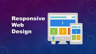


Responsive_Web_Design
- 2. Agenda: What is RWD? Why RWD? Advantages & Disadvantages How RWD works? Frameworks Try out
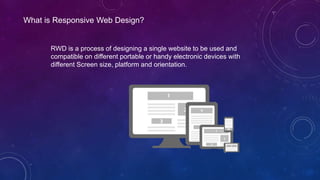
- 3. What is Responsive Web Design? RWD is a process of designing a single website to be used and compatible on different portable or handy electronic devices with different Screen size, platform and orientation.
- 4. Why RWD? Supporting the Multi-Device User One Site to Rule Them All Improved Search Engine Rankings Future Scalability
- 5. Advantages: Flexible User Experience Cost Effective It is Recommended By Google Very Easy to manage
- 6. How RWD works? View Port The viewport is the user's visible area of a web page. <meta name="viewport" content="width=device-width, initial-scale=1.0"> It sets the browser's layout viewport, relative to which CSS declarations such as width: 20% are calculated, to the device width. Media Queries The @media rule is used to define different style rules for different media types/devices. <link rel="stylesheet" href="this.css" media="(min-width: 960px)"> @media only screen and (max-width: 500px) { .gridmenu { width:100%; } }
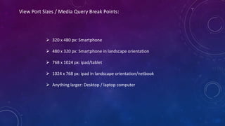
- 7. View Port Sizes / Media Query Break Points: 320 x 480 px: Smartphone 480 x 320 px: Smartphone in landscape orientation 768 x 1024 px: ipad/tablet 1024 x 768 px: ipad in landscape orientation/netbook Anything larger: Desktop / laptop computer
- 8. Frameworks: Bootstrap Foundation 960 grid Semantic UI Pure by Yahoo! W3.CSS
- 9. We can verify whether the site is designed in responsive or not with below links. http://responsivetest.net/ http://www.responsinator.com/ Try out:
- 10. Thank You - Bala