SlideShare a Scribd company logo
iOS Human Interface
Guidelines
Contents


Introduction 8
At a Glance 8
     Great iOS Apps Embrace the Platform and HI Design Principles 9
     Great App Design Begins with Some Clear Definitions 9
     A Great User Experience Is Rooted in Your Attention to Detail 9
     People Expect to Find iOS Technologies in the Apps They Use 9
     All Apps Need at Least Some Custom Artwork 10

Platform Characteristics 11
The Display Is Paramount, Regardless of Its Size 11
Device Orientation Can Change 11
Apps Respond to Gestures, Not Clicks 12
People Interact with One App at a Time 13
Preferences Are Available in Settings 15
Onscreen User Help Is Minimal 15
Most iOS Apps Have a Single Window 15
Two Types of Software Run in iOS 16
Safari on iOS Provides the Web Interface 17

Human Interface Principles 19
Aesthetic Integrity 19
Consistency 19
Direct Manipulation 20
Feedback 20
Metaphors 21
User Control 21

App Design Strategies 22
Create an App Definition Statement 22
    1. List All the Features You Think Users Might Like 22
    2. Determine Who Your Users Are 23
    3. Filter the Feature List Through the Audience Definition 23
    4. Don’t Stop There 24
Design the App for the Device 24


                                   2012-09-19 | © 2012 Apple Inc. All Rights Reserved.

                                                           2
Contents


     Embrace iOS UI Paradigms 24
     Ensure that Universal Apps Run Well on Both iPhone and iPad 25
     Reconsider Web-Based Designs 25
Tailor Customization to the Task 26
Prototype and Iterate 29

Transition Case Studies 30
Transitioning Between the Desktop and an iOS-Based Device 30
    From Mail on the Desktop to Mail on iPhone 31
    From Keynote on the Desktop to Keynote on iPad 33
    From a Desktop Browser to Safari on iOS 35
Transitioning Between iOS-Based Devices 40
    From Mail on iPhone to Mail on iPad 41
    Running on iPhone 5 44

User Experience Guidelines 52
Focus on the Primary Task 52
Elevate the Content that People Care About 53
Think Top Down 54
Give People a Logical Path to Follow 54
Make Usage Easy and Obvious 54
Use User-Centric Terminology 55
Minimize the Effort Required for User Input 56
Downplay File-Handling Operations 56
Enable Collaboration and Connectedness 57
De-emphasize Settings 58
Brand Appropriately 59
Make Search Quick and Rewarding 60
Entice and Inform with a Well-Written Description 61
Be Succinct 61
Use UI Elements Consistently 61
Consider Adding Physicality and Realism 63
Delight People with Stunning Graphics 64
Handle Orientation Changes 66
Make Targets Fingertip-Size 68
Use Subtle Animation to Communicate 69
Support Gestures Appropriately 69
Ask People to Save Only When Necessary 70
Make Modal Tasks Occasional and Simple 71
Start Instantly 72


                                  2012-09-19 | © 2012 Apple Inc. All Rights Reserved.

                                                          3
Contents


Always Be Prepared to Stop 73
Don’t Quit Programmatically 73
If Necessary, Display a License Agreement or Disclaimer 74
For iPad: Enhance Interactivity (Don’t Just Add Features) 74
For iPad: Reduce Full-Screen Transitions 75
For iPad: Restrain Your Information Hierarchy 75
For iPad: Consider Using Popovers for Some Modal Tasks 78
For iPad: Migrate Toolbar Content to the Top 79

iOS Technology Usage Guidelines 81
Passbook 81
Social Media 83
iCloud 84
Multitasking 86
Notification Center 88
Printing 93
iAd Rich Media Ads 94
Location Services and Data Privacy 100
Quick Look Document Preview 102
Sound 103
     Understand User Expectations 103
     Define the Audio Behavior of Your App 104
     Manage Audio Interruptions 109
     Handle Media Remote Control Events, if Appropriate 111
VoiceOver and Accessibility 112
Edit Menu 113
Undo and Redo 115
Keyboards and Input Views 116

iOS UI Element Usage Guidelines 118
Bars 118
    The Status Bar 118
    Navigation Bar 120
    Toolbar 123
    Tab Bar 124
Content Views 126
    Activity 127
    Activity View Controller 129
    Collection View 130
    Container View Controller 132


                                    2012-09-19 | © 2012 Apple Inc. All Rights Reserved.

                                                            4
Contents


    Popover (iPad Only) 133
    Split View (iPad Only) 136
    Table View 138
    Text View 147
    Web View 148
Alerts, Action Sheets, and Modal Views 149
    Alert 149
    Action Sheet 154
    Modal View 157
Controls 160
    Activity Indicator 160
    Date and Time Picker 161
    Detail Disclosure Button 162
    Info Button 162
    Label 163
    Network Activity Indicator 163
    Page Indicator 164
    Picker 165
    Progress View 166
    Refresh Control 167
    Rounded Rectangle Button 168
    Scope Bar 168
    Search Bar 169
    Segmented Control 170
    Slider 171
    Stepper 172
    Switch 173
    Text Field 174
System-Provided Buttons and Icons 175
    Standard Buttons for Use in Toolbars and Navigation Bars 175
    Standard Icons for Use in Tab Bars 178
    Standard Buttons for Use in Table Rows and Other UI Elements 179

Custom Icon and Image Creation Guidelines 181
Tips for Designing Great Icons and Images 183
Tips for Creating Great Artwork for the Retina Display 184
Tips for Creating Resizable Images 186
App Icons 186
Launch Images 189


                                   2012-09-19 | © 2012 Apple Inc. All Rights Reserved.

                                                           5
Contents


Small Icons 192
Document Icons 193
Web Clip Icons 194
Icons for Navigation Bars, Toolbars, and Tab Bars 195
Newsstand Icons 197

Document Revision History 201


                                   2012-09-19 | © 2012 Apple Inc. All Rights Reserved.

                                                           6
Tables


Platform Characteristics 11
Table 1-1   Gestures users make to interact with iOS-based devices 12

iOS Technology Usage Guidelines 81
Table 6-1   Standard banner view dimensions 95
Table 6-2   Medium rectangle banner view dimensions 95
Table 6-3   Full screen banner view dimensions 96
Table 6-4   Audio session categories and their associated behaviors 106

iOS UI Element Usage Guidelines 118
Table 7-1   Table-view elements 140
Table 7-2   Standard buttons available for toolbars and navigation bars (plain style) 176
Table 7-3   Bordered action buttons for use in navigation bars and toolbars 177
Table 7-4   Standard icons for use in the tabs of a tab bar 178
Table 7-5   Standard buttons for use in table rows and other UI elements 179

Custom Icon and Image Creation Guidelines 181
Table 8-1   Size (in pixels) of custom icons and images 181
Table 8-2   Maximum scaled sizes for the long edges of per-issue icons 198


                                 2012-09-19 | © 2012 Apple Inc. All Rights Reserved.

                                                         7
Introduction


iOS Human Interface Guidelines describes the guidelines and principles that help you design a superlative user
interface and user experience for your iOS app.


iOS Human Interface Guidelines does not describe how to implement your designs in code. When you’re ready
to code, start by reading iOS App Programming Guide .


At a Glance
By working with the platform conventions, you’ll be much better positioned to create outstanding iOS apps.


                                   2012-09-19 | © 2012 Apple Inc. All Rights Reserved.

                                                           8
Introduction
At a Glance


Great iOS Apps Embrace the Platform and HI Design Principles
People appreciate iOS apps that feel as though they were designed expressly for the device. For example,
when an app fits well on the device screen and responds to the gestures that people know, it provides much
of the experience people are looking for. And, although people might not be aware of human interface design
principles, such as direct manipulation or consistency, they can tell when apps follow them and when they
don’t. As you begin designing an iOS app, be sure to understand what makes iOS-based devices unique, and
learn how to incorporate HI design principles so that you can deliver a user experience people will appreciate.


    Relevant Chapters: “Platform Characteristics” (page 11) and “Human Interface Principles” (page
    19)


Great App Design Begins with Some Clear Definitions
When you’re starting with an idea for an app, it’s crucial to decide precisely which features you intend to deliver,
and to whom. After you’ve determined this, you need to make sure you tailor the look and feel of your app to
the device it runs on and to the task it enables.

If you’re bringing existing software to iOS, you face many of the same challenges. As you redesign your existing
software, it can help to learn about some of the design decisions that informed other successful interdevice
transitions, such as those for Mail and Keynote.


    Relevant Chapters: “App Design Strategies” (page 22) and “Transition Case Studies” (page 30)


A Great User Experience Is Rooted in Your Attention to Detail
It’s essential to keep the user experience uppermost in your mind as you design every aspect of your app, from
the way you enable a task, to the way your app starts and stops, to the way you use a button. Discover the
guidelines that influence the look and behavior of your app, in matters both general and specific.


    Relevant Chapters: “User Experience Guidelines” (page 52) and “iOS UI Element Usage
    Guidelines” (page 118)


People Expect to Find iOS Technologies in the Apps They Use
iOS provides many great technologies that add value to apps, such as iCloud, multitasking, Passbook, and
VoiceOver. Although users might view these technologies as automatically available whenever they use their
iOS-based devices, it can require work on your part to incorporate them in your app. If an iOS technology is
appropriate in your app, be sure to follow the guidelines that govern its usage.


                                     2012-09-19 | © 2012 Apple Inc. All Rights Reserved.

                                                             9
Introduction
At a Glance


    Relevant Chapter: “iOS Technology Usage Guidelines” (page 81)


All Apps Need at Least Some Custom Artwork
Even if your app enables a serious, productive task and uses only standard user interface elements, you still
need to provide a beautiful, custom app icon that people will enjoy seeing in the App Store and on their Home
screens. Whether your app includes significant amounts of custom artwork, or only a little, you need to know
which icons and images are required and how to create them appropriately. In addition, when you’re designing
artwork for the Retina display, you should take advantage of some techniques that can make this process
easier.


    Relevant Chapter: “Custom Icon and Image Creation Guidelines” (page 181)


                                   2012-09-19 | © 2012 Apple Inc. All Rights Reserved.

                                                           10
Platform Characteristics


iOS-based devices share several unique characteristics that influence the user experience of all apps that run
on them. The most successful apps embrace these characteristics and provide a user experience that integrates
with the device they’re running on.


The Display Is Paramount, Regardless of Its Size
The display of an iOS-based device is at the heart of the user’s experience. Not only do people view beautiful
text, graphics, and media on the display, they also physically interact with the Multi-Touch screen to drive their
experience (even when they can’t see the screen).

Different iOS-based devices can have displays of different dimensions and resolutions, but in all devices the
display affects the user experience in the same ways:
 ●   44 x 44 points is the comfortable minimum size of a tappable UI element.
 ●   People are very aware of the quality of app artwork.
 ●   The display encourages people to forget about the device and to focus on their content or task.


     Note: Pixel is the appropriate unit of measurement to use when discussing the size of a device
     screen or the size of an icon you create in an image-editing app. Point is the appropriate unit of
     measurement to use when discussing the size of an area that is drawn onscreen.
     On a standard-resolution device screen, one point equals one pixel, but other resolutions might
     dictate a different relationship. On a Retina display, for example, one point equals two pixels.
     See “Points Versus Pixels” in View Programming Guide for iOS for a complete discussion of this concept.


Device Orientation Can Change
People can rotate iOS-based devices at any time and for a variety of reasons. For example, sometimes the task
people are performing feels more natural in portrait, and sometimes people feel that they can see more in
landscape. Whatever their reason for rotating the device, people expect the app to maintain its focus on the
primary functionality.


                                     2012-09-19 | © 2012 Apple Inc. All Rights Reserved.

                                                             11
Platform Characteristics
Apps Respond to Gestures, Not Clicks


People often launch apps from the Home screen, so they tend to expect all apps to start in the same orientation.
Because of the different ways iPhone and iPad display the Home screen, this expectation affects apps in different
ways:
 ●   On iPhone and iPod touch, the Home screen is displayed in portrait orientation only, with the Home button
     at the bottom. This leads users to expect iPhone apps to launch in this orientation by default.
 ●   On iPad, the Home screen is displayed in all orientations, so users tend to expect iPad apps to launch in
     the device orientation they’re currently using.


Apps Respond to Gestures, Not Clicks
People make specific finger movements, called gestures, to operate the unique Multi-Touch interface of
iOS-based devices. For example, people tap a button to activate it, flick or drag to scroll a long list, or pinch
open to zoom in on an image.

The Multi-Touch interface gives people a sense of immediate connection with their devices and enhances their
sense of direct manipulation of onscreen objects.

People are comfortable with the standard gestures because the built-in apps use them consistently. Their
experience using the built-in apps gives people a familiar set of gestures that they expect to be able to use
successfully in most other apps.


Table 1-1      Gestures users make to interact with iOS-based devices

 Gesture                  Action

 Tap                      To press or select a control or item (analogous to a single mouse click).

 Drag                     To scroll or pan (that is, move side to side).
                          To drag an element.

 Flick                    To scroll or pan quickly.

 Swipe                    With one finger, to reveal the Delete button in a table-view row, the hidden view
                          in a split view (iPad only), or the Notification Center (from the top edge of the
                          screen).
                          With four fingers, to switch between apps on iPad.

 Double tap               To zoom in and center a block of content or an image.
                          To zoom out (if already zoomed in).


                                       2012-09-19 | © 2012 Apple Inc. All Rights Reserved.

                                                               12
Platform Characteristics
People Interact with One App at a Time


 Gesture                  Action

 Pinch                    Pinch open to zoom in.
                          Pinch close to zoom out.

 Touch and hold           In editable or selectable text, to display a magnified view for cursor positioning.

 Shake                    To initiate an undo or redo action.


In addition to these gestures, people can move the device itself to perform certain tasks. Examples of these
tasks are to activate Siri (on iPhone 4S) or to calibrate the compass. People expect all these gestures to work
the same, regardless of the app they’re currently running.


People Interact with One App at a Time
Only one app is visible in the foreground at a time. When people switch from one app to another, the previous
app transitions to the background and its user interface goes away. This feature, called multitasking, allows
apps to remain in the background until users relaunch them or until they are terminated.


                                         2012-09-19 | © 2012 Apple Inc. All Rights Reserved.

                                                                 13
Platform Characteristics
People Interact with One App at a Time


Most apps enter a suspended state when they transition to the background. Suspended apps are displayed in
the multitasking UI, which provides a convenient way for people to switch to recently used apps. The multitasking
UI appears at the bottom of the screen, below the UI of the currently running app or the Home screen (shown
here below the iPhone Settings app).


When people return to a suspended app, it can instantly resume running from the point where it went to the
background, without having to reload its UI.

Some apps might need to continue running in the background while users run another app in the foreground.
For example, users might want to continue hearing the song that’s playing in one app while they’re using a
different app to check their to-do list or handle email.

To learn how to handle multitasking correctly and gracefully, see “Multitasking” (page 86).


                                         2012-09-19 | © 2012 Apple Inc. All Rights Reserved.

                                                                 14
Platform Characteristics
Preferences Are Available in Settings


     Note: Apps running in iOS 3.2 and earlier don’t enter the background and some older devices don’t
     support multitasking or background execution at all, even when running iOS 4 or later. In these
     cases, apps are terminated when they leave the foreground.


Preferences Are Available in Settings
People set certain preferences for an iOS app in the built-in Settings app. They must switch away from the
current app when they want to access those preferences in Settings.

Preferences in the Settings app are of the “set once and rarely change” type. Although some of the built-in
apps provide preferences of this type, most apps do not need them, so they don’t have preferences in the
Settings app.


Onscreen User Help Is Minimal
Mobile users have neither the time nor the desire to read through a lot of help content before they can benefit
from an app. What’s more, help content takes up valuable space to store and display.

iOS-based devices and the built-in apps are intuitive and easy to use, so people don’t need onscreen help
content to tell them how to use the device or the apps. This experience leads people to expect all iOS apps to
be similarly easy to use.


Most iOS Apps Have a Single Window
An iOS app has a single window, unless it supports an external display. An app’s window fills the device’s main
screen and provides an empty surface that hosts one or more views in which you present your content. It’s
important to realize that a window in an iOS app is very different from a window in a computer app. For
example, an iOS window has no visible components (such as a title bar or a close button) and it can’t be moved
to a new location on the device display.

It’s also important to realize that most users are unaware of the windows and views in the iOS apps that they
use. For the most part, users experience an iOS app as a collection of screens through which they navigate.
From this perspective, a screen generally corresponds to a distinct visual state or mode in an app. In the
Contacts app on iPhone, for example, users think of their contact list—regardless of its length—as one screen
and an individual contact’s details as a different screen.


                                        2012-09-19 | © 2012 Apple Inc. All Rights Reserved.

                                                                15
Platform Characteristics
Two Types of Software Run in iOS


     Note: Because this document focuses on the UI and user experience of iOS apps, it frequently uses
     “screen” as it’s understood by most users. Unless otherwise stated, this document does not use
     “screen” to mean a UIScreen object (which is an object you can use to access an external display
     screen).


Two Types of Software Run in iOS
There are two types of software that you can develop for iOS-based devices:
 ●   iOS apps
 ●   Web content


An iOS app is an app you develop using the iOS SDK to run natively on iOS-based devices. iOS apps resemble
the built-in apps on iOS-based devices in that they reside on the device itself and take advantage of features
of the iOS environment. People install iOS apps on their devices and use them just as they use built-in apps,
such as Photos, Calendar, and Mail.

Web content is hosted by a website that people visit using their iOS-based devices. There are three types of
web content:

Web apps. Webpages that provide a focused solution to a task and conform to certain display guidelines are
known as web apps because they behave similarly to iOS apps. A web app often hides the UI of Safari on iOS
so that it looks more like a native app. Using the web clip feature, a web app can also supply an icon for people
to put on the Home screen. This allows people to open web apps in the same way that they open iOS apps.

Optimized webpages. Webpages that are optimized for Safari on iOS display and operate as designed (with
the exception of any elements that rely on unsupported technologies, such as plug-ins, Flash, and Java). In
addition, an optimized webpage correctly scales content for the device screen and is often designed to detect
when it is being viewed on iOS-based devices, so that it can adjust the content it provides accordingly.

Compatible webpages. Webpages that are compatible with Safari on iOS display and operate as designed
(with the exception of any elements that rely on unsupported technologies, such as plug-ins, Flash, and Java).
A compatible webpage does not tend to take extra steps to optimize the viewing experience on iOS-based
devices, but the device usually displays the page successfully.

An iOS app might combine native UI elements with access to web content within a web content–viewing area
(typically by using a UIWebView). Such an app can look and behave like a native iOS app, without drawing
attention to the fact that it depends on web sources.


                                    2012-09-19 | © 2012 Apple Inc. All Rights Reserved.

                                                            16
Platform Characteristics
Safari on iOS Provides the Web Interface


Safari on iOS Provides the Web Interface
Safari on iOS provides the interface for browsing web content on iOS-based devices. Although Safari on iOS
is similar in many ways to Safari on the computer desktop, it is not the same.

For the most part, users can’t change the size of the viewport (the area that displays content). On the desktop,
users resize the viewport when they resize the browser window. On iOS-based devices, the viewport doesn’t
resize unless the device orientation changes. iOS users can change the scale of the viewport by zooming in
and out, and they can pan the webpage. On iPad, users are much less likely to zoom web content than they
are on iPhone (shown below).


Safari on iOS supports cookies. Use of cookies can streamline user interaction with web content by saving
the user’s context, preferences, and previously entered data.

Safari on iOS does not support Flash, Java (including Java applets), or third-party plug-ins within web
content. Instead, Safari on iOS supports the HTML5 <audio> and <video> tags to provide audio and video
streaming, and JavaScript and CSS3 transforms, transitions, and animations to display animated content.

Safari on iOS interprets most gestures as targeting the way the device displays content, not the content
itself. The tap—which is analogous to a single mouse click—can cause Safari on iOS to send the onclick
event to a webpage. There are no analogs for other mouse-based gestures, such as hover.


                                           2012-09-19 | © 2012 Apple Inc. All Rights Reserved.

                                                                   17
Platform Characteristics
Safari on iOS Provides the Web Interface


Safari on iOS allows web apps to run in full-screen mode. Web apps that launch from a web clip icon on the
user’s Home screen can hide the UI for Safari on iOS, so that they look more like native apps.


                                           2012-09-19 | © 2012 Apple Inc. All Rights Reserved.

                                                                   18
Human Interface Principles


A great user interface follows human interface design principles that are based on the way people—users—think
and work, not on the capabilities of the device. A UI that is unattractive, convoluted, or illogical can make even
a great app seem like a chore to use. But a beautiful, intuitive, compelling UI enhances an app’s functionality
and inspires a positive emotional attachment in users.


Aesthetic Integrity
Aesthetic integrity is not a measure of how beautiful an app is. It’s a measure of how well the appearance of
the app integrates with its function. For example, an app that enables a productive task generally keeps
decorative elements subtle and in the background, while giving prominence to the task by providing standard
controls and behaviors. Such an app gives users a clear, unified message about its purpose and its identity. If,
on the other hand, the app enables the productive task within a UI that seems whimsical or frivolous, people
might not know how to interpret these contradictory signals.

Similarly, in an app that encourages an immersive task, such as a game, users expect a beautiful appearance
that promises fun and encourages discovery. Although people don’t expect to accomplish a serious or productive
task in a game, they still expect the game’s appearance to integrate with the experience.


Consistency
Consistency in the interface allows people to transfer their knowledge and skills from one app to another. A
consistent app is not a slavish copy of other apps. Rather, it is an app that takes advantage of the standards
and paradigms people are comfortable with.

To determine whether an app follows the principle of consistency, think about these questions:
 ●   Is the app consistent with iOS standards? Does it use system-provided controls, views, and icons correctly?
     Does it incorporate device features in a reliable way?
 ●   Is the app consistent within itself? Does text use uniform terminology and style? Do the same icons always
     mean the same thing? Can people predict what will happen when they perform the same action in different
     places? Do custom UI elements look and behave the same throughout the app?


                                     2012-09-19 | © 2012 Apple Inc. All Rights Reserved.

                                                             19
Human Interface Principles
Direct Manipulation


 ●   Within reason, is the app consistent with its earlier versions? Have the terms and meanings remained the
     same? Are the fundamental concepts essentially unchanged?


Direct Manipulation
When people directly manipulate onscreen objects instead of using separate controls to manipulate them,
they're more engaged with the task and they more readily understand the results of their actions. iOS users
enjoy a heightened sense of direct manipulation because of the Multi-Touch interface. Using gestures gives
people a greater affinity for, and sense of control over, the objects they see onscreen, because they're able to
touch them without using an intermediary, such as a mouse.

For example, instead of tapping zoom controls, people can use the pinch gestures to directly expand or contract
an area of content. And in a game, players move and interact directly with onscreen objects. For example, a
game might display a combination lock that users can spin to open.

In an iOS app, people can experience direct manipulation when they:
 ●   Rotate or otherwise move the device to affect onscreen objects
 ●   Use gestures to manipulate onscreen objects
 ●   Can see that their actions have immediate, visible results


Feedback
Feedback acknowledges people’s actions and assures them that processing is occurring. People expect
immediate feedback when they operate a control, and they appreciate status updates during lengthy operations.

The built-in iOS apps respond to every user action with some perceptible change. For example, list items
highlight briefly when people tap them. During operations that last more than a few seconds, a control shows
elapsing progress, and if appropriate, the app displays an explanatory message.

Subtle animation can give people meaningful feedback that helps clarify the results of their actions. For example,
lists can animate the addition of a new row to help people track the change visually.

Sound can also give people useful feedback. But sound shouldn’t be the primary or sole feedback mechanism
because people may use their devices in places where they can’t hear or where they must turn off the sound.


                                     2012-09-19 | © 2012 Apple Inc. All Rights Reserved.

                                                            20
Human Interface Principles
Metaphors


Metaphors
When virtual objects and actions in an app are metaphors for objects and actions in the real world, users quickly
grasp how to use the app. The classic example of a software metaphor is the folder: People put things in folders
in the real world, so they immediately understand the idea of putting files into folders on a computer.

The most appropriate metaphors suggest a usage or experience without enforcing the limitations of the
real-world object or action on which they’re based. For example, people can fill software folders with much
more content than would fit in a physical folder.

iOS provides great scope for metaphors because it supports rich graphical images and gestures. People physically
interact with realistic onscreen objects, in many cases operating them as if they were real-world objects.
Metaphors in iOS include:
 ●   Tapping Music playback controls
 ●   Dragging, flicking, or swiping objects in a game
 ●   Sliding On/Off switches
 ●   Flicking through pages of photos
 ●   Spinning picker wheels to make choices


In general, metaphors work best when they’re not stretched too far. For example, the usability of software
folders would decrease if they had to be organized into a virtual filing cabinet.


User Control
People, not apps, should initiate and control actions. Although an app can suggest a course of action or warn
about dangerous consequences, it’s usually a mistake for the app to take decision-making away from the user.
The best apps find the correct balance between giving people the capabilities they need while helping them
avoid dangerous outcomes.

Users feel more in control of an app when behaviors and controls are familiar and predictable. And, when
actions are simple and straightforward, users can easily understand and remember them.

People expect to have ample opportunity to cancel an operation before it begins, and they expect to get a
chance to confirm their intention to perform a potentially destructive action. Finally, people expect to be able
to gracefully stop an operation that’s underway.


                                    2012-09-19 | © 2012 Apple Inc. All Rights Reserved.

                                                           21
App Design Strategies


All great apps begin with a great idea, but that doesn’t mean that the path from idea to successful iOS app is
an easy one. This chapter describes some strategies you can use to refine your idea, review your design options,
and converge on an app that people will appreciate.


Create an App Definition Statement
An app definition statement is a concise, concrete declaration of an app’s main purpose and its intended
audience.

Create an app definition statement early in your development effort to help you turn an idea and a list of
features into a coherent product that people want to own. Throughout development, use the definition
statement to decide if potential features and behaviors make sense. Take the following steps to create a solid
app definition statement.


1. List All the Features You Think Users Might Like
Go ahead and brainstorm here. At this point, you’re trying to capture all the tasks related to your main product
idea. Don’t worry if your list is long; you’ll narrow it down later.

For example, imagine that your initial idea is to develop an app that helps people shop for groceries. As you
think about this activity, you come up with a list of related tasks (potential features) that users might be
interested in, such as:
●   Creating lists
●   Getting recipes
●   Comparing prices
●   Locating stores
●   Annotating recipes
●   Getting and using coupons
●   Viewing cooking demos
●   Exploring different cuisines


                                    2012-09-19 | © 2012 Apple Inc. All Rights Reserved.

                                                           22
App Design Strategies
Create an App Definition Statement


 ●   Finding ingredient substitutions


2. Determine Who Your Users Are
Apart from the likelihood that your users are mobile and that they expect beautiful graphics, simple interactions,
and high performance, what distinguishes them? In the context of the app you’re planning, what is most
important to your users? Using the grocery-shopping example, you might ask whether your users:
 ●   Usually cook at home or prefer ready-made meals
 ●   Are committed coupon-users or think that coupons aren’t worth the effort
 ●   Enjoy hunting for speciality ingredients or seldom venture beyond the basics
 ●   Follow recipes strictly or use recipes as inspiration
 ●   Buy small amounts frequently or buy in bulk infrequently
 ●   Want to keep several in-progress lists for different purposes or just want to remember a few things to buy
     on the way home
 ●   Insist on specific brands or make do with the most convenient alternatives
 ●   Tend to buy a similar set of items on each shopping trip or buy items listed in a recipe


After musing on these questions, imagine that you decide on three characteristics that best describe your
target audience: Love to experiment with recipes, are often in a hurry, and are thrifty (if it doesn’t take too
much effort).


3. Filter the Feature List Through the Audience Definition
If, after deciding on a few audience characteristics, you end up with just a few features, you’re on the right
track: Great iOS apps have a laser focus on the task users want to accomplish.

For example, consider the large number of possible features for the grocery-shopping app you listed in Step
1. Even though these are all useful features, it’s not likely that every feature would be equally useful to every
user. More importantly, it’s not likely that every feature would be equally appreciated by the audience you
defined in Step 2.

When you examine your feature list in the context of your target audience, you conclude that your app should
focus on three main features: Creating lists, getting and using coupons, and getting recipes.

Now you can craft your app definition statement, concretely summarizing what the app does and for whom.
A good app definition statement for this grocery-shopping app might be:

“A shopping list creation tool for thrifty people who love to cook.“


                                     2012-09-19 | © 2012 Apple Inc. All Rights Reserved.

                                                            23
App Design Strategies
Design the App for the Device


4. Don’t Stop There
Use your app definition statement throughout the development process to determine the suitability of features,
controls, and terminology. For example:

As you consider whether to add a new feature, ask yourself whether it is essential to the main purpose of your
app and to your target audience. If it isn’t, set it aside; it might form the basis of a different app. For example,
you’ve decided that your users are interested in adventurous cooking, so emphasizing boxed cake mixes and
ready-made meals would probably not be appreciated.

As you consider the look and behavior of the UI, ask yourself whether your users appreciate a simple, streamlined
style or a more overtly thematic style. Be guided by what people might expect to accomplish with your app,
such as the ability to accomplish a serious task, to get a quick answer, to delve into comprehensive content,
or to be entertained. For example, although your grocery list app needs to be easy to understand and quick
to use, your audience is likely to appreciate a themed UI that includes beautiful pictures of ingredients and
meals.

As you consider the terminology to use, strive to match your audience’s expertise with the subject. For example,
even though your audience might not be made up of expert chefs, you’re fairly confident that they appreciate
seeing the proper terms for ingredients and techniques.


Design the App for the Device
You know what your app does and who its audience is; now you need to make sure that your app looks and
feels like it was designed expressly for an iOS-based device. This is crucial because people have high expectations
for the apps they choose to install on their devices. If your app feels like it was designed for a different device,
or for the web, people are less likely to value it.


Embrace iOS UI Paradigms
iOS users are accustomed to the appearance and behavior of the built-in apps, so they tend to expect similar
experiences in the apps they download. You don’t want to mimic every detail of the built-in apps but it’s helpful
to understand the design patterns they follow. Start by understanding the characteristics that distinguish
iOS-based devices and the apps that run on them (you can read about these in “Platform Characteristics” (page
11)). Then, keep the following things in mind:

Controls should look tappable. iOS controls, such as buttons, pickers, and sliders, have contours and gradients
that invite touches.

App structure should be clean and easy to navigate. iOS provides the navigation bar for drilling down
through hierarchical content, and the tab bar for displaying different peer groups of content or functionality.


                                     2012-09-19 | © 2012 Apple Inc. All Rights Reserved.

                                                            24
App Design Strategies
Design the App for the Device


User feedback should be subtle, but clear. iOS apps often use precise, fluid animations to show the results
of user actions. iOS apps can also use the activity indicator and the progress view to show status, and the alert
to give users warnings or other critical information.

You can learn about the usage guidelines that govern these elements in “iOS UI Element Usage Guidelines” (page
118). As you begin designing the overall user experience of your app, be sure you understand the guidelines
described in “User Experience Guidelines” (page 52).


Ensure that Universal Apps Run Well on Both iPhone and iPad
If you’re planning to develop an app that runs on iPhone and iPad, you need to adapt your design to each
device. Here is some guidance to help you do this:

Mold the UI of each app version to the device it runs on. Most individual UI elements are available on both
devices, but overall the layout differs dramatically.

Adapt art to the screen size. Users tend to expect more high-fidelity artwork in iPad apps than they do in
iPhone apps. Merely scaling up an iPhone app to fill the iPad screen is not recommended.

Preserve the primary functionality of your app, regardless of the device it runs on. Even though one version
might offer a more in-depth or interactive presentation of the task than the other, it’s important to avoid
making users feel that they’re choosing between two entirely different apps.

Go beyond the default. Unmodified iPhone apps run in a compatibility mode on iPad by default. Although
this mode allows people to use an iPhone app on iPad, it does not give them the device-specific experience
they want.


Reconsider Web-Based Designs
If you're coming from the web, you need to make sure that you give people an iOS app experience, not a web
experience. Remember, people can visit your website on their iOS-based devices using Safari on iOS.

Here are some strategies that can help web developers create an iOS app:

Focus your app. Websites often greet visitors with a large number of tasks and options from which they can
choose, but this type of experience does not translate well to iOS apps. iOS users expect an app to do what it
advertises, and they want to see useful content immediately.

Make sure your app lets people do something. People might enjoy viewing marketing content in the websites
they visit, but they expect to accomplish something in an app.

Design for touch. Don’t try to replicate web UI design paradigms in your iOS app. Instead, get familiar with
the UI elements and patterns of iOS and use them to showcase your content. Web elements you’ll need to
re-examine include menus, interactions initiated by hovering, and links.


                                    2012-09-19 | © 2012 Apple Inc. All Rights Reserved.

                                                           25
App Design Strategies
Tailor Customization to the Task


Let people scroll. Most websites take care to display the most important information in the top half of the
page where it is seen first (“above the fold”), because people sometimes leave a page when they don’t find
what they’re looking for near the top. But on iOS-based devices, scrolling is an easy, expected part of the
experience. If you reduce font size or squeeze controls to fit your content into the space of a single device
screen, you’re likely to end up with unreadable content and an unusable layout.

Relocate the homepage icon. Websites often display an icon that links to the homepage at the top of every
webpage. iOS apps don’t include homepages, so this behavior is unnecessary. In addition, iOS apps allow
people to tap the status bar to quickly scroll back to the top of a long list. If you center a tappable home icon
at the top of the screen, it’s very difficult for users to tap the status bar instead.


Tailor Customization to the Task
The best iOS apps balance UI customization with clarity of purpose and ease of use. To achieve this balance
in your app, be sure to consider customization early in the design process. Because concerns about branding,
originality, and marketability often influence customization decisions, it can be challenging to stay focused on
how customization impacts the user experience.

Using the iOS SDK, you can customize the UI of your app as much or as little as you choose. Because there are
no practical limits to the amount of customization that you can do, you need to determine how customization
might affect the task your app enables. As you consider the tasks in your app, think about how often users
perform them and under what circumstances.

For example, imagine an app that enables phone calls. Now imagine that instead of a keypad, the app displays
a beautiful, realistic rotary dial. The dial is meticulously rendered, so users both appreciate its quality and
instantly know how to use it. The dial behaves realistically, so users delight in making the dialing gesture and
hearing the distinctive sounds. But for users who often need to call numbers that are not in Contacts, initial


                                    2012-09-19 | © 2012 Apple Inc. All Rights Reserved.

                                                           26
App Design Strategies
Tailor Customization to the Task


appreciation of the experience soon gives way to frustration, because using a rotary dial is much less efficient
than using a keypad. In an app that is designed to help people make phone calls, this beautiful custom UI is
a hindrance.


On the other hand, consider the BubbleLevel sample app, which displays a realistic rendition of a carpenter’s
level. People know how to use the physical tool so they instantly know how to use the app. The app could
have displayed its information without the rendition of the bubble vial, but this would have made the app less
intuitive and harder to use. In this case, the custom UI not only shows people how to use the app, it also makes
the task easier to accomplish.


                                    2012-09-19 | © 2012 Apple Inc. All Rights Reserved.

                                                           27
App Design Strategies
Tailor Customization to the Task


As you consider how customization might enhance or detract from the task your app enables, keep these
guidelines in mind.

Always have a reason for customization. Ideally, UI customization facilitates the task people want to perform
and enhances their experience. As much as possible, you need to let your app’s task drive your customization
decisions. For example:
 ●   If your app enables a productive task that involves the manipulation of a lot of detailed data, people are
     likely to appreciate an understated, mostly standard UI and streamlined navigation.
 ●   If your app helps people view content, they generally don’t appreciate a UI that competes with it.
 ●   If your app is a game or provides an immersive, story-driven experience, people expect to enter a unique
     world filled with rich, beautiful graphics and innovative interactions.


As much as possible, avoid increasing the user’s cognitive burden. Users are familiar with the appearance
and behavior of the standard UI elements, so they don’t have to stop and think about how to use them. When
faced with elements that do not look or behave at all like standard ones, users lose the advantage of their prior
experience. Unless your unique elements make performing the task easier, users might dislike being forced to
learn new procedures that don’t transfer to any other apps.

Be internally consistent. The more custom your UI is, the more important it is for the appearance and behavior
of your custom elements to be consistent within your app. If users take the time to learn how to use the
unfamiliar controls you create, they expect to be able to rely on that knowledge throughout your app.

Always defer to the content. Because the standard elements are so familiar, they don’t compete with the
content for people’s attention. As you customize your UI, take care to ensure that it does not overshadow the
content people care about. For example, if your app allows people to watch videos, you might choose to design
custom playback controls. But whether you use custom or standard playback controls is less important than
whether the controls fade out after the user begins watching the video and reappear with a tap.

Think twice before you redesign a standard control. If you plan on doing more than customizing a standard
control, make sure your redesigned control provides as much information as the standard one. For example,
if you create a button that doesn’t have the rounded, dimensional appearance people associate with buttons,
people might not realize that it’s tappable. Or, if you create a switch control that does not indicate the presence
of the opposite value, people might not realize that it’s a two-state control.

Be sure to thoroughly user-test custom UI elements. During testing, closely observe users to see if they can
predict what your elements do and if they can interact with them easily. If, for example, you create a control
that has a hit target smaller than 44 x 44 points, people will have trouble activating it. Or, if you create a view
that responds differently to a tap than it does to a swipe, be sure the functionality the view provides is worth
the extra care people have to take when interacting with it.


                                     2012-09-19 | © 2012 Apple Inc. All Rights Reserved.

                                                            28
App Design Strategies
Prototype and Iterate


Prototype and Iterate
Before you invest significant engineering resources into the implementation of your design, it’s a really good
idea to create prototypes for user testing. Even if you can get only a few colleagues to test the prototypes,
you’ll benefit from their fresh perspectives on your app’s functionality and user experience.

In the very early stages of your design you can use paper prototypes or wireframes to lay out the main views
and controls, and to map the flow among screens. Although you can get some useful feedback from testing
wireframes, their sparseness can mislead testers. This is because it’s difficult for people to imagine how the
experience of an app will change when wireframes are filled in with real content.

You’ll get more valuable feedback if you can put together a fleshed-out prototype that runs on a device. When
people can interact with your prototype on a device, they’re more likely to uncover places where your app
doesn’t function as they expect, or where the user experience is too complex.

The easiest way to create a credible prototype is to use a storyboard-based Xcode template to build a basic
app, and populate it with some appropriate placeholder content. (A storyboard file captures the entire UI of
your app, including the transitions among different screens.) Then, install the prototype on a device so that
your testers can have as realistic an experience as possible.

You don’t need to supply a large amount of content or enable every control in your prototype app, but you
do need to provide enough context to suggest a realistic experience. Aim for a balance between the typical
user experience and the more unusual edge cases. For example, if it’s likely that your app will handle long lists
of items, you should avoid creating a prototype that displays only one or two list items. And for testing user
interactions, as long as testers can tap an area of the screen to advance to the next logical view or to perform
the main task, they’ll be able to provide constructive feedback.

When you base your prototype on an Xcode app template, you get lots of functionality for free and it’s relatively
easy to make design adjustments in response to feedback. With a short turnaround time, you should be able
to test several iterations of your prototype before you solidify your design and commit resources to its
implementation. To get started learning about Xcode, see Xcode 4 User Guide .


                                    2012-09-19 | © 2012 Apple Inc. All Rights Reserved.

                                                           29
Transition Case Studies


In addition to creating new apps, you might also want to bring an existing app or piece of software to a new
platform or device. In some cases, redesigning an app or website for a new platform or device can be more
challenging than starting from scratch. In other cases, you only need to take a few steps to take advantage of
the new environment. Whether your transition project is large or small, a good way to prepare for it is to study
examples of other products that have made the same transition.


Transitioning Between the Desktop and an iOS-Based Device
As you embark on bringing your software from the desktop to the iOS platform, stay focused on the ways in
which people use iOS-based devices:
●   People often use iOS-based devices while they’re on the go, and in environments filled with distractions.
    Part of your job is to create a responsive, compelling experience that pulls people in, gets them quickly
    to the content they care about, and maintains focus on that content.
●   Following what’s known as the 80-20 rule, the largest percentage of users—typically, at least 80
    percent—use a limited number of features in an app, while only a small percentage—seldom more than
    20 percent—use all the features. Most iOS apps don’t need to provide all the features that only power
    users need.


                                    2012-09-19 | © 2012 Apple Inc. All Rights Reserved.

                                                           30
Transition Case Studies
Transitioning Between the Desktop and an iOS-Based Device


From Mail on the Desktop to Mail on iPhone
Mail is one of the most highly visible, well-used, and appreciated apps in OS X. It is also a very powerful program
that allows users to create, receive, prioritize, and store email, track action items and events, and create notes
and invitations. Mail on the desktop offers this powerful functionality in a couple of windows.


Mail on iPhone focuses on the core functionality of Mail on the desktop, helping people to receive, create,
send, and organize their messages. Mail on iPhone delivers this condensed functionality in a UI tailored for the
mobile experience that includes:
 ●   A streamlined appearance that puts people’s content front and center
 ●   Different views designed to facilitate different tasks
 ●   An intuitive information structure that scales effortlessly
 ●   Powerful editing and organizing tools that are available when they’re needed
 ●   Subtle but expressive animation that communicates actions and provides feedback


It’s important to realize that Mail on iPhone isn’t a better app than Mail on the desktop; rather, it’s Mail,
redesigned for mobile users. By concentrating on a subset of desktop features and presenting them in an
attractively lean UI, Mail on iPhone gives people the core of the Mail experience while they’re mobile.

To adapt the Mail experience to the mobile context, Mail on iPhone innovates the UI in several key ways.


                                        2012-09-19 | © 2012 Apple Inc. All Rights Reserved.

                                                                31
Transition Case Studies
Transitioning Between the Desktop and an iOS-Based Device


Distinct, highly focused screens. Each screen displays one aspect of the Mail experience: account list, mailbox
list, message list, message view, and composition view. Within a screen, people scroll to see the entire contents.


Easy, predictable navigation. Making one tap per screen, people drill down from the general (the list of
accounts) to the specific (a message). Each screen displays a title that shows people where they are, and a back
button that makes it easy for them to retrace their steps.

Simple, tappable controls, available when needed. Because composing a message and checking for new
email are primary actions people might want to take in any context, Mail on iPhone makes them accessible in
multiple screens. When people are viewing a message, functions such as reply, move, and trash are available
because they act upon a message.


Different types of feedback for different tasks. When people delete a message, it animates into the trash
icon. When people send a message, they can see its progress; when the send finishes, they can hear a distinctive
sound. By looking at the subtle text in the message list toolbar, people can see at a glance when their mailbox
was last updated.


                                        2012-09-19 | © 2012 Apple Inc. All Rights Reserved.

                                                               32
Transition Case Studies
Transitioning Between the Desktop and an iOS-Based Device


From Keynote on the Desktop to Keynote on iPad
Keynote on the desktop is a powerful, flexible app for creating world-class slide presentations. People love
how Keynote combines ease of use with fine-grained control over myriad precise details, such as animations
and text attributes.


Keynote on iPad captures the essence of Keynote on the desktop, and makes it feel at home on iPad by creating
a user experience that:
 ●   Focuses on the user’s content
 ●   Reduces complexity without diluting capability
 ●   Provides shortcuts that empower and delight
 ●   Adapts familiar hallmarks of the desktop experience
 ●   Provides feedback and communication via eloquent animation


Keynote users instantly understand how to use the app on iPad because it delivers expected functionality
using native iPad paradigms. New users easily learn how to use Keynote on iPad because they can directly
manipulate their content in simple, natural ways.


                                        2012-09-19 | © 2012 Apple Inc. All Rights Reserved.

                                                               33
Transition Case Studies
Transitioning Between the Desktop and an iOS-Based Device


The transformation of Keynote from the desktop to iPad is based on myriad modifications and redesigns that
range from subtle to profound. These are some of the most visible adaptations:

A streamlined toolbar. Only seven items are in the toolbar, but they give users consistent access to all the
functions and tools they need to create their content.


A simplified, prioritized inspector that responds to the user’s focus. The Keynote on iPad inspector
automatically contains the tools and attributes people need to modify the selected object. Often, people can
make all the modifications they need in the first inspector view. If they need to modify less frequently changed
attributes, they can drill down to other inspector views.


                                        2012-09-19 | © 2012 Apple Inc. All Rights Reserved.

                                                               34
Transition Case Studies
Transitioning Between the Desktop and an iOS-Based Device


Lots of prebuilt style collections. People can easily change the look and feel of objects such as charts and
tables by taking advantage of the prebuilt styles. In addition to color scheme, each collection includes prestyled
attributes, such as table headings and axis-division marks, that are designed to coordinate with the overall
theme.


Direct manipulation of content, enriched with meaningful animation. In Keynote on iPad, a user drags a
slide to a new position, twists an object to rotate it, and taps an image to select it. The impression of direct
manipulation is enhanced by the responsive animations Keynote on iPad performs. For example, a slide pulses
gently as users move it and, when they place it in a new location, the surrounding slides ripple outward to
make room for it.


From a Desktop Browser to Safari on iOS
Safari on iOS provides a preeminent mobile web-viewing experience on iOS-based devices. People appreciate
the crisp text and sharp images and the ability to adjust their view by rotating the device or pinching and
tapping the screen.

Standards-based websites display well on iOS-based devices. In particular, websites that detect the device and
do not use plug-ins look great on both iPhone and iPad with little, if any, modification.

In addition, the most successful websites typically:
 ●   Set the viewport appropriately for the device, if the page width needs to match the device width


                                        2012-09-19 | © 2012 Apple Inc. All Rights Reserved.

                                                               35
Transition Case Studies
Transitioning Between the Desktop and an iOS-Based Device


 ●   Avoid CSS fixed positioning, so that content does not move offscreen when users zoom or pan the page
 ●   Enable a touch-based UI that does not rely on pointer-based interactions


Sometimes, other modifications can be appropriate. For example, web apps always set the viewport width
appropriately and often hide the UI of Safari on iOS. To learn more about how to make these modifications,
see “Configuring the Viewport” and “Configuring Web Applications” in Safari Web Content Guide .

Websites adapt the desktop web experience to Safari on iOS in other ways, too:

Using custom CSS to provide adaptable UI. Different UI elements can be suitable for different environments.
For example, the Apple website includes a page that displays movie trailers users can watch. When viewed in
Safari on the desktop, users can click the numbers or the previous and next controls to see additional trailers:


When viewed on iPhone, the next, previous, and number controls are replaced by prominent, easy-to-use
buttons with symbols that echo the style of built-in controls (such as the detail disclosure indicator and the
page indicator):


Accommodating the keyboard in Safari on iOS. When a keyboard and the form assistant are visible, Safari
on iPhone displays your webpage in the area below the URL text field and above the keyboard and form
assistant.


                                        2012-09-19 | © 2012 Apple Inc. All Rights Reserved.

                                                               36
Transition Case Studies
Transitioning Between the Desktop and an iOS-Based Device


     Note: For the metrics on a high-resolution iPhone or iPod touch, double the values shown below.


                                                                            Status bar: 20 pixels

                                                                            URL text field: 60 pixels


                                                                            Remaining space: 140 pixels


                                                                            Form assistant: 44 pixels


                                                                            Keyboard: 216 pixels


When a keyboard and the form assistant are not displayed, there is an additional 216 pixels of vertical space
available (in portrait orientation) for the display of your webpage. In landscape orientation, two of the values
differ: The keyboard height is 162 pixels, and the form assistant height is 32 pixels.


                                        2012-09-19 | © 2012 Apple Inc. All Rights Reserved.

                                                               37
Transition Case Studies
Transitioning Between the Desktop and an iOS-Based Device


Accommodating the pop-up menu control in Safari on iOS. In Safari on the desktop, a pop-up menu that
contains a large number of items displays as it does in an OS X app; that is, the menu opens to display all items,
extending past the window boundaries, if necessary. In Safari on iOS, a pop-up menu is displayed using native
elements, which provides a much better user experience. For example, on iPhone, the pop-up menu appears
in a picker, a list of choices from which the user can pick, as shown below.


                                        2012-09-19 | © 2012 Apple Inc. All Rights Reserved.

                                                               38
Transition Case Studies
Transitioning Between the Desktop and an iOS-Based Device


On iPad, the pop-up menu displays in a popover, as shown below.


                                        2012-09-19 | © 2012 Apple Inc. All Rights Reserved.

                                                               39
Transition Case Studies
Transitioning Between iOS-Based Devices


Using lists to display data in iPhone web apps. iOS users are accustomed to lists in native apps, so when they
see lists in web apps, they’re more likely to think that the web content is an app. On iPhone, lists appear edge
to edge or inside rounded rectangles. Each style is defined by its own metrics.

                   Edge-to-edge list                                            Rounded rectangle list


                                                       356 pixels                                        356 pixels


                      320 pixels                                                       320 pixels


Transitioning Between iOS-Based Devices
People appreciate having their apps run on all their iOS-based devices. As much as possible, ensure that each
version of your app takes advantage of the characteristics of each device.


                                          2012-09-19 | © 2012 Apple Inc. All Rights Reserved.

                                                                 40
Transition Case Studies
Transitioning Between iOS-Based Devices


From Mail on iPhone to Mail on iPad
Mail is one of the premier built-in apps on iPhone. People appreciate the clear, streamlined way it organizes
large amounts of information in a series of easy-to-use screens.


Mail on iPad delivers the same core functionality. At the same time it provides more onscreen space for people’s
messages, meaningful touches of realism, and powerful organizing and editing tools that are always accessible
but not obtrusive. The visual stability of a single, uncluttered screen provides what users need in one place,
with minimal context changes.

The differences between Mail on iPhone and Mail on iPad reflect the different user experiences of each device.
 ●   Mail on iPhone is designed to help mobile users handle their email while they’re standing in line or walking
     to a meeting.
 ●   Mail on iPad is efficient enough for people to use on the go, but its rich experience also encourages more
     in-depth use.


Even though Mail on iPad tailors the user experience to the device, it does not alter the core functionality
people are used to, or gratuitously change the location or effect of individual functions. iPhone Mail users
easily recognize the toolbar items and mailbox structure in iPad Mail, and immediately know how to use them
because they’re virtually identical.

To enhance the mobile email experience, Mail on iPad evolves the iPhone Mail UI in a number of important
ways:


                                          2012-09-19 | © 2012 Apple Inc. All Rights Reserved.

                                                                 41
Transition Case Studies
Transitioning Between iOS-Based Devices


Expanded support for device orientations. People can use Mail on iPad in any of the four orientations
(landscape shown here). Although the landscape layout differs somewhat from the portrait layout, the focus
remains on the content and functionality people care about.


                                          2012-09-19 | © 2012 Apple Inc. All Rights Reserved.

                                                                 42
Transition Case Studies
Transitioning Between iOS-Based Devices


Increased focus on message content. Mail on iPad reserves most of the screen for the current message in all
orientations (portrait shown in the following figure). This includes moving the toolbar to the top of the message
view to increase the vertical space available for the message content. With the extra space, people can read
longer messages with less scrolling. And when people want to view the message list in portrait, they can still
see a large portion of the current message.


A flatter hierarchy. Mail on iPad effectively flattens the Mail hierarchy (that is, account > mailbox > message
list > message) by confining all levels above the message itself to a separate UI element. In landscape, these
levels are persistently visible in the left pane of a split view; in portrait, users can view these levels by revealing
an element that hovers over part of the main screen.

Drastically reduced full-screen transitions. Because most of the hierarchy is available in a separate onscreen
element, people can access most of what they need in a single screen. When people drill down through the
hierarchy, it’s the account > mailbox > message list view that transitions, not the entire screen.


                                          2012-09-19 | © 2012 Apple Inc. All Rights Reserved.

                                                                 43
Transition Case Studies
Transitioning Between iOS-Based Devices


Realistic messages. When people mark a message for deletion, it slides onto the message view like a physical
sheet of paper. As they choose additional messages to delete, the messages form a realistic stack of papers,
complete with slightly untidy edges.


Running on iPhone 5
You don’t have to redesign your app for it to look good on iPhone 5. Many apps look good simply by displaying
more of their existing UI; others might need to stretch content or background regions. Only some apps—such
as games or apps that display lots of custom artwork—are likely to need some additional work to look their
best.


                                          2012-09-19 | © 2012 Apple Inc. All Rights Reserved.

                                                                 44
Transition Case Studies
Transitioning Between iOS-Based Devices


     Note: All apps that run on iPhone 5 must include a launch image of the correct size. To learn how
     to create launch images for iOS-based devices, see “Launch Images” (page 189).


The iPhone 5 display is 176 pixels taller than the display of other iPhone and iPod touch devices. In portrait
orientation, the extra height is about the same as the height of two additional rows in a standard table view.
For example, Messages running on iPhone 5 (shown below on the right) displays a taller conversation area
than does Messages running on iPhone 4S (shown below on the left).


                                          2012-09-19 | © 2012 Apple Inc. All Rights Reserved.

                                                                 45
Transition Case Studies
Transitioning Between iOS-Based Devices


Of course, the additional 176 pixels in height translates into additional lateral space when the device is in
landscape orientation. For example, in Messages on iPhone 5 (shown here below Messages on iPhone 4S), the
UI stretches to fill the additional width.


The Messages screens shown above illustrate a crucial point: The minor UI adjustments that were made to
accommodate the iPhone 5 display do not change the app’s functionality in any way. The consistency of the
user experience—which is evident in all of the apps described in this section—follows a key design principle
of iPhone 5: The larger device display enables users to see more of the content they care about; it does not
provide an opportunity to squeeze in more app functionality.

Because you won’t be changing the functionality of your app, there’s typically very little you have to do to
make your app look great on iPhone 5. If you use Auto Layout to design your app’s UI, you might have even
less work to do. The following guidelines can help you decide which UI changes are best suited to your app.


                                          2012-09-19 | © 2012 Apple Inc. All Rights Reserved.

                                                                 46
Transition Case Studies
Transitioning Between iOS-Based Devices


     Note: If you don’t make any changes to your app, it runs in a compatibility mode on iPhone 5. When
     an app runs in compatibility mode, iOS automatically centers the app’s UI by adding slim black bars
     above and below it. For some developers, it might be reasonable to simply create a new launch
     image of the correct size and allow the unchanged app UI to be centered on the iPhone 5 display.


Allow more content to be revealed automatically. If some of your UI is currently hidden below the bottom
edge of the screen—requiring users to scroll—you don’t have to make any changes to allow the increased
display height of iPhone 5 to reveal more of your UI. In Settings, for example, users see additional table rows
on iPhone 5 (shown below, on the right) than they do on iPhone 4S (shown below, on the left).


                                          2012-09-19 | © 2012 Apple Inc. All Rights Reserved.

                                                                 47
Transition Case Studies
Transitioning Between iOS-Based Devices


Stretch content regions. If you display content in a view, consider vertically expanding the view to show some
additional content or to insert more space within the view. For example, users have a larger message body
region in Mail on iPhone 5 (shown below, on the right) than they do in Mail on iPhone 4S (shown below, on
the left).


                                          2012-09-19 | © 2012 Apple Inc. All Rights Reserved.

                                                                 48
Transition Case Studies
Transitioning Between iOS-Based Devices


Stretch background areas between content regions. You can make your layout look a bit more relaxed by
expanding the vertical space between content views. For example, Game Center on iPhone 5 (shown below,
on the right) shows more of the background between the main content regions than does Game Center on
iPhone 4S (shown below, on the left).


                                          2012-09-19 | © 2012 Apple Inc. All Rights Reserved.

                                                                 49
Transition Case Studies
Transitioning Between iOS-Based Devices


If necessary, recenter dominant visual elements. After adjusting backgrounds or views to accommodate the
additional space, you might want to make sure that principal elements of your UI are still centered appropriately.
One way to do this is to first stretch a region near the top of the screen and then adjust the centering of the
elements. For example, Compass on iPhone 5 (shown below, on the right) maintains the user’s focus on the
compass and heading by keeping these elements centered on the extended background.


                                          2012-09-19 | © 2012 Apple Inc. All Rights Reserved.

                                                                 50
Transition Case Studies
Transitioning Between iOS-Based Devices


Expand custom artwork, but don’t put essential details in the new areas. If your app contains mostly custom
UI—such as in a game—you should use the extra space to give users more artwork to enjoy. It’s not appropriate
to put app-critical functionality or details in these additional areas, because not all users will see them. For
example, users see more of the microphone stand in Voice Memos on iPhone 5 (shown below, on the right)
than they do in Voice Memos on iPhone 4S (shown below, on the left).


In general, avoid increasing control sizes. If you use the minimum tappable size for controls in your app—that
is, no smaller than 44 x 44 points—you should not need to adjust them for iPhone 5. However, you might
choose to add a little more space between existing controls.

Don’t use the extra space to display an additional bar or banner. People expect to see more content on
iPhone 5. To avoid disappointing your users, resist the temptation to use the extra vertical space for a custom
button bar or banner.


                                          2012-09-19 | © 2012 Apple Inc. All Rights Reserved.

                                                                  51
User Experience Guidelines


The user experience of iOS-based devices revolves around streamlined interaction with content that people
care about. The guidelines in this chapter apply to apps that run on all iOS-based devices.


Focus on the Primary Task
When an iOS app establishes and maintains focus on its primary task, it is satisfying and enjoyable to use. Your
app definition statement will help you focus your app on its primary task (to learn more about this statement,
see “Create an App Definition Statement” (page 22)). To maintain that focus, you need to determine what’s
most important in each context or screen.

Analyze what’s needed in each screen. As you decide what to display in each screen always ask yourself, Is
this critical information or functionality users need right now ? If your answer is no, decide whether the
information or functionality might be critical in a different context, or if it’s not that important after all.


                                    2012-09-19 | © 2012 Apple Inc. All Rights Reserved.

                                                           52
User Experience Guidelines
Elevate the Content that People Care About


For example, the iPhone Calendar app is focused on days and the events that occur on them. Users can use
the clearly labeled buttons to highlight the current day, select a viewing option, and add events.


Elevate the Content that People Care About
In a game, people care about the experience; they don’t expect to manage, consume, or create content. If
you’re developing a game, you elevate content by enhancing the experience with a satisfying story, beautiful
graphics, and responsive gameplay.

If you’re not developing a game, you can help people focus on the content by designing your UI as a subtle
frame for the information they’re interested in. Here are some ways you can do this:

Minimize the number and prominence of controls to decrease their weight in the UI. Photos does this by
placing a few unobtrusive controls on translucent bars.

Consider subtly customizing controls so that they integrate with your app’s graphical style. In this way,
controls are discoverable and comprehensible, without being conspicuous.

Consider fading controls after people have stopped interacting with them for a little while, and redisplaying
them when people tap the screen. Sometimes you may want to fade the rest of your app UI, too. This is
especially appropriate in apps that enable an immersive experience, because it gives even more of the screen


                                         2012-09-19 | © 2012 Apple Inc. All Rights Reserved.

                                                                53
User Experience Guidelines
Think Top Down


space to the content people want to see. For example, Photos fades the controls and bars after a few moments
of noninteraction, which encourages people to immerse themselves in the content. When people want to
perform a task with their photos, a single tap anywhere on the screen redisplays the controls.


Think Top Down
The top of the screen is most visible to people, because they tend to interact with the device by holding the
device in the following ways:
 ●   In their nondominant hand (or laying it on a surface), and gesturing with a finger of the dominant hand
 ●   In one hand, and gesturing with the thumb of the same hand
 ●   Between their hands, and gesturing with both thumbs


Put the most frequently used (usually higher level) information near the top, where it is most visible and
easy to reach. As the user scans the screen from top to bottom, the information displayed should progress
from general to specific and from high level to low level.

For example, in a game, the most important action can take place in the top half of the screen. This leaves the
bottom half of the screen for supplementary information and for controls users can tap without obscuring
their view.


Give People a Logical Path to Follow
Make the path through the information you present logical and easy for users to predict. In addition, be
sure to provide markers, such as back buttons, that users can use to find out where they are and how to retrace
their steps.

In most cases, give users only one path to a screen. If a screen needs to be accessible in different circumstances,
consider using a modal view that can appear in different contexts.


Make Usage Easy and Obvious
Strive to make your app instantly understandable to people, because you can’t assume that they have the time
(or can spare the attention) to figure out how it works.

Make the main function of your app immediately apparent. You can make it so by:


                                     2012-09-19 | © 2012 Apple Inc. All Rights Reserved.

                                                            54
User Experience Guidelines
Use User-Centric Terminology


 ●   Minimizing the number of controls from which people have to choose
 ●   Using standard controls and gestures appropriately and consistently so that they behave the way people
     expect
 ●   Labeling controls clearly so that people understand exactly what they do


Be consistent with the usage paradigms of the built-in apps. Users understand how to navigate a hierarchy
of screens, edit list contents, and switch among app modes using the tab bar. Make it easy for people to use
your app by reinforcing their experience. For example, people understand that the blue button in a toolbar
represents the action they’re most likely to take in the current context. If your app displays more than one blue
button in a single context, users will have to figure out which one to tap.

In the built-in Stopwatch function (part of the iPhone Clock app) users can see at a glance which button stops
and starts the stopwatch and which button captures lap times.


Use User-Centric Terminology
In all your text-based communication with users, use terminology you’re sure that your users understand.
In particular, avoid technical jargon in the user interface. Use what you know about your users to determine
whether the words and phrases you plan to use are appropriate.


                                    2012-09-19 | © 2012 Apple Inc. All Rights Reserved.

                                                           55
User Experience Guidelines
Minimize the Effort Required for User Input


The Wi-Fi Networks Settings screen uses plain language to explain how iOS responds to the user’s preference.


Take care to be accurate when describing dates. It’s often appropriate to use friendly terms such as “today”
and “tomorrow” when you display date information in your UI, but it can be confusing if you don’t account
for the user’s current locale. For example, consider an event that starts just before midnight. To users in the
same time zone, the event starts today, but to users in an earlier time zone, the same event may have started
yesterday.


Minimize the Effort Required for User Input
Inputting information takes time and attention, whether people tap controls or use the keyboard. If your app
requires a lot of user input before anything useful happens, that input slows people down and can discourage
them from using your app.

Balance any request for input by users with what you offer users in return. In other words, strive to provide
as much information or functionality as possible for each piece of information people give you. That way,
people feel they are making progress and are not being delayed as they move through your app.

Make it easy for users to input their choices. For example, you can use a table view or a picker instead of a
text field, because it’s usually easier for people to select an item from a list than to type words. (To learn more
about these UI elements, see “Table View” (page 138) and “Picker” (page 165).)

Get information from iOS, when appropriate. People store lots of information on their devices. When it makes
sense, don’t force people to give you information you can easily find for yourself, such as their contacts or
calendar information.


Downplay File-Handling Operations
Although iOS apps can allow people to create and manipulate files, this does not mean that people should
have an awareness of a file system on an iOS-based device.


                                              2012-09-19 | © 2012 Apple Inc. All Rights Reserved.

                                                                     56
User Experience Guidelines
Enable Collaboration and Connectedness


There is no iOS app analogous to the OS X Finder, and people should not be asked to interact with files as they
do on a computer. In particular, people should not be faced with anything that encourages them to think
about file metadata or locations, such as:
 ●   An open or save dialog that exposes a file hierarchy
 ●   Information about the permissions status of files


As much as possible, allow people to manage documents without opening iTunes on their computer.
Consider using iCloud to help users access their content on all of their devices. For some tips on how to provide
a great iCloud experience in your app, see “iCloud” (page 84).

If your app allows people to create and edit documents, it’s appropriate to provide some sort of document
picker that allows them to open an existing document or create a new one. Ideally, such a document picker:
 ●   Is highly graphical. People should be able to easily identify the document they want by looking at visual
     representations of the documents onscreen.
 ●   Allows people to make the fewest possible gestures to do what they want. For example, people might
     scroll horizontally through a carousel of existing documents and open the desired one with a tap.
 ●   Includes a new document function. Instead of making people go somewhere else to create a new
     document, a document picker can allow them to tap a placeholder image to create a new document.


You can also use the Quick Look Preview feature to allow people to preview documents within your app, even
if your app can’t open them. To learn how to provide this feature in your app, see “Quick Look Document
Preview” (page 102).


Enable Collaboration and Connectedness
iOS devices are personal devices, but they also encourage collaboration and sharing with others. Enhance your
app by helping people collaborate and connect with others.

When appropriate, make it easy for people to interact with others and share things like their location,
opinions, and high scores. People generally expect to be able to share information that’s important to them.

Most apps can add value by allowing people to go beyond the app and share data with other tools they use.
For example, an iOS app can act as a mobile complement to a computer app. Or, an iPad app might allow its
users to communicate with the users of the iPhone version of the app.

If your app allows people to access their social media accounts, be sure to take advantage of the Social framework
APIs so that you can avoid asking users to sign in multiple times on the same device.


                                         2012-09-19 | © 2012 Apple Inc. All Rights Reserved.

                                                                57
User Experience Guidelines
De-emphasize Settings


For iPad, think of ways to allow more than one person to use your app on the same device. For example,
two people might be able to play a game on opposing sides of an onscreen board. Or a band app might allow
different people to play different instruments together on a single device.


De-emphasize Settings
Avoid including settings in your app if you can. Settings include preferred app behaviors and information
that people rarely want to change. Users can’t open the Settings app without first switching away from your
app, and you don’t want to encourage this action.

When you design your app to function the way most of your users expect, you decrease the need for settings.
If you need information about the user, query the system for it instead of asking users to provide it. If you
decide you must provide settings in your iOS app, see “The Settings Bundle” in iOS App Programming Guide to
learn how to support them in your code.

Let users set the behavior they want by using configuration options in your app. Configuration options let
your app react dynamically to changes, because people do not have to leave your app to set them.

Offer configuration options in the main user interface or (in iPhone apps) on the back of a view. To decide
which location makes sense, determine whether the options represent a primary task and how often people
might want to set them.
 ●   In the main UI, put options that provide primary functionality or that people want to change frequently.
     For example, iPad Calendar allows people to view their schedules by day, week, or month. These
     configuration options are offered in the main UI because viewing different perspectives of a calendar is a
     primary functionality of the app and people are likely to change their focus frequently.
     Apps that provide an immersive experience, such as games, are most likely to provide configuration options
     within the app, because users tend to change aspects of the experience frequently.
 ●   In iPhone apps, you can put options that people are unlikely to change frequently on the back of a view.
     For example, the primary function of Weather is to display a city’s current conditions and 6-day forecast.
     Although it’s important to be able to choose whether temperatures are displayed in Celsius or Fahrenheit,
     people are not likely to change this option very often. Therefore it makes sense to put the temperature-scale
     option on the back of the Weather view, where it is conveniently available, but not obtrusive.


                                     2012-09-19 | © 2012 Apple Inc. All Rights Reserved.

                                                            58
User Experience Guidelines
Brand Appropriately


Brand Appropriately
Incorporate a brand’s colors or images in a refined, unobtrusive way. Branding is most effective when it is
subtle and understated. People use your app to get things done or to be entertained; they don’t want to feel
as if they’re being forced to watch an advertisement. For the best user experience, you want to quietly remind
users of your identity.

Avoid taking space away from the content people care about. For example, displaying a second, persistent
bar at the top of the screen that does nothing but display branding assets means that there’s less room for
content. Consider other, less intrusive ways to display pervasive branding, such as subtly customizing the
background of a screen.

The exception to these guidelines is your app icon, which should be completely focused on your brand. Because
users see your app icon frequently, it’s important to spend some time balancing eye-appeal with brand
recognition.


                                   2012-09-19 | © 2012 Apple Inc. All Rights Reserved.

                                                          59
User Experience Guidelines
Make Search Quick and Rewarding


Make Search Quick and Rewarding
In apps that handle or display a lot of data, search can be a primary function. If you need to provide search in
your app, follow these guidelines to ensure that it performs well.

Build indexes of your data so that you are always prepared for search. Don't wait until the user initiates a
search to do this, because you can't afford to create a negative first impression of the search experience in
your app.

Live-filter local data so that you can display results more quickly. It’s best when you can begin filtering as
soon as users begin typing, and narrow the results as they continue typing. Although live-filtering data usually
produces a superior user experience, it’s not always practical. When live filtering is impractical, you can begin
the search process after the user taps the Search button in the keyboard. If you do this, be sure to provide
feedback on the search’s progress so users know that the process has not stalled.

When possible, also filter remote data while users type. Although filtering users' typing can result in a better
search experience, be sure to inform them and give them an opportunity to opt out if the response time is
likely to delay the results by more than a second or two.

Display a search bar above a list or the index in a list. Users expect to find a search bar in this position,
because they're accustomed to the search bar in Contacts and other apps. Putting the search bar in this location
means that it stays out of users' way when they're scrolling through the list or using the index, but is conveniently
available when it's needed.

Use a tab for search only in special circumstances. If search is a primary function in your app you might want
to feature it as a distinct mode. In iTunes, for example, finding and getting music and podcasts is the focus of
the app. Users want to search for their favorite songs, artists, or podcasts regardless of the mode they're
currently in, so it makes sense to offer a dedicated search tab that's always available.

If necessary, display placeholder content right away and partial results as they become available. In this
way, you give users useful information promptly. In iTunes, for example, users initiate a search for content by
tapping the Search button. If the network connection is slow, iTunes first displays the Loading... message along
with a spinning activity indicator so users know that search is proceeding. iTunes then displays a results view
in which each section is populated with textual results—such as title and genre—and a custom outline of a
box. As users scan the items in each section, thumbnail images appear in the box outlines.

Consider providing a scope bar if the data sorts naturally into different categories. A scope bar allows users
to specify locations or rules in a search or to filter objects by specific criteria. It contains up to four scope
buttons, each representing a category. For example, Mail provides a scope bar that allows users to focus their
search on the From, To, or Subject fields of messages, or broaden the search to include all fields. Providing a
scope bar helps users focus their search and can significantly reduce the number of results. To learn more
about using a scope bar, see “Scope Bar” (page 168).


                                     2012-09-19 | © 2012 Apple Inc. All Rights Reserved.

                                                            60
User Experience Guidelines
Entice and Inform with a Well-Written Description


Entice and Inform with a Well-Written Description
Your App Store description is a great opportunity to communicate with potential users. In addition to describing
your app accurately and highlighting the qualities you think people might appreciate the most, follow these
guidelines:

Be sure to correct all spelling, grammatical, and punctuation errors. Although such errors don’t bother
everyone, in some people they can create a negative impression of your app’s quality.

Keep all-capital words to a minimum. The occasional all-capital word can draw people’s attention, but
capitalizing every letter of every word in a description can make it very difficult to read.

Consider describing specific bug fixes. If a new version of your app contains bug fixes that customers have
been waiting for, it can be a good idea to mention this in your description.


Be Succinct
Think like a newspaper editor, and strive to convey information in a condensed, headline style. When your
UI text is short and direct, users can absorb it quickly and easily. Identify the most important information,
express it concisely, and display it prominently so that people don’t have to read too many words to find what
they’re looking for or to figure out what to do next.

Give controls short labels, or use well-understood symbols, so that people can tell what they do at a glance.
When appropriate, use the built-in buttons and icons described in “System-Provided Buttons and Icons” (page
175); for guidelines on designing your own icons, see “Icons for Navigation Bars, Toolbars, and Tab Bars” (page
195).


Use UI Elements Consistently
People expect standard views and controls to look and behave consistently across apps.

Follow the recommended usages for standard user interface elements. In this way, users can depend on
their prior experience to help them as they learn to use your app. You also make it easy for your app to look
up-to-date and work correctly if iOS changes the look or behavior of these standard views or controls.

For an app that enables an immersive task, such as a game, it’s reasonable to create completely custom
controls. This is because you’re creating a unique environment, and discovering how to control that environment
is an experience users expect in such apps.


                                          2012-09-19 | © 2012 Apple Inc. All Rights Reserved.

                                                                  61
User Experience Guidelines
Use UI Elements Consistently


Avoid radically changing the appearance of a control that performs a standard action. If you use unfamiliar
controls to perform standard actions, users will spend time discovering how to use them and will wonder what,
if anything, your controls do that the standard ones do not.

iOS makes available to you many of the standard buttons and icons used throughout the built-in apps. For
example, you can use the same Refresh, Organize, Trash, Reply, and Compose icons that Mail uses on both
iPhone and iPad.


To avoid confusing people, never use the standard buttons and icons to mean something else. Be sure
you understand the documented meaning of a standard button or icon; don’t rely on your interpretation of
its appearance. To learn more about using system-provided items, see “System-Provided Buttons and
Icons” (page 175).

In addition to the benefit of leveraging users’ prior experience, using system-provided buttons and icons
imparts two other substantial advantages:
 ●   Decreased development time, because you don’t have to create custom art to represent standard functions.
 ●   Increased stability of your user interface, even if future iOS updates change the appearances of standard
     icons. In other words, you can rely on the semantic meaning of a standard icon remaining the same, even
     if its appearance changes.


The Interface Builder editor in Xcode makes it easy to use the system-provided buttons and apply
system-provided icons to your controls. For guidance, see the appearance-related information in “Designing
User Interfaces in Xcode” in Interface Builder User Guide .

If you can’t find a system-provided button or icon that has the appropriate meaning for a specific function in
your app, you should design a custom button or icon. For some guidelines to help you do this, see “Icons for
Navigation Bars, Toolbars, and Tab Bars” (page 195).


                                    2012-09-19 | © 2012 Apple Inc. All Rights Reserved.

                                                           62
User Experience Guidelines
Consider Adding Physicality and Realism


Consider Adding Physicality and Realism
When appropriate, add a realistic, physical dimension to your app. Often, the more true to life your app looks
and behaves, the easier it is for people to understand how it works and the more they enjoy using it. For
example, people instantly know how to use the realistic address book that Contacts on iPad portrays.


On iPhone, people instantly know what the Voice Memos app does, and how to use it, because it presents a
beautifully rendered focal image (the microphone) and realistic controls.


                                          2012-09-19 | © 2012 Apple Inc. All Rights Reserved.

                                                                 63
User Experience Guidelines
Delight People with Stunning Graphics


Think of the objects and scenes you design as opportunities to communicate with users and to express
the essence of your app. Don’t feel that you must strive for scrupulous accuracy. Often, an amplified or
enhanced portrayal of something can seem more real, and convey more meaning, than a faithful likeness.

Use appropriate animation to further enhance realism in your app. In general, it’s more important to strive
for accuracy in movement than in appearance. This is because people accept artistic license in appearance,
but they can feel disoriented when they see movement that appears to defy physical laws. As much as possible,
make sure your virtual views and controls mimic the behavior of the physical objects and controls they resemble.
Convincing animation heightens people’s impression of your app as a tangible, physical realm in which they
want to spend time.


Delight People with Stunning Graphics
Rich, beautiful, engaging graphics draw people into an app and make the simplest task rewarding. Beautiful
artwork also helps to build your app’s brand in people’s eyes. iOS-based devices showcase your app’s artwork,
so you should consider hiring a professional artist to create first-rate graphics that people will admire.


                                        2012-09-19 | © 2012 Apple Inc. All Rights Reserved.

                                                               64
User Experience Guidelines
Delight People with Stunning Graphics


Consider replicating the look of high-quality or precious materials. If the effect of wood, leather, or metal
is appropriate in your app, take the time to make sure the material looks realistic and valuable. For example,
Notes reproduces the look of fine leather and meticulous stitching.


Create high-resolution artwork. In most cases, scaling up your artwork is not recommended as a long-term
solution. Instead, try creating your artwork in a dimension that is larger than you need, so you can add depth
and details before scaling it down. This works especially well when the dimension of the original art file is a
multiple of the dimension you need. Then, if you also use an appropriate grid size in your image-editing app,
you’ll be able to keep the scaled-down art file crisp and reduce the amount of retouching and sharpening you
need to do.

Spend the time to design a beautiful, memorable app icon. It’s not unusual for users to base the decision
to download an app on the quality of its app icon. For guidelines on how to create an app icon, see “App
Icons” (page 186).

Remove hard-coded values that identify screen dimensions. This is particularly important if you want your
app to run on different iOS-based devices or external displays.


                                        2012-09-19 | © 2012 Apple Inc. All Rights Reserved.

                                                               65
User Experience Guidelines
Handle Orientation Changes


Handle Orientation Changes
People often expect to use their iOS-based devices in any orientation. You need to determine how to respond
to this expectation, within the context of your app and the task it enables.

In all orientations, maintain focus on the primary content. This is your highest priority. People use your app
to view and interact with the content they care about. Altering the focus on that content in different orientations
can make people feel that they’ve lost control over the app.

Think twice before preventing your app from running in all orientations. People expect to use your app in
different orientations, and it’s best when you can fulfill that expectation. iPad users, in particular, expect to use
your app in whichever orientation they’re currently holding their device. But in certain cases an app needs to
run in portrait only or in landscape only. If it’s essential that your app run in only one orientation, you should:
 ●   Launch your app in your supported orientation, regardless of the current device orientation. For
     example, if your game or media-viewing app runs in landscape only, it’s appropriate to launch your app
     in landscape, even if the device is currently in portrait. This way, if people start your app in portrait, they
     know to rotate the device to landscape to view the content.
 ●   Avoid displaying a UI element that tells people to rotate the device. Launching in your supported
     orientation clearly tells people to rotate the device, if required, without adding unnecessary clutter to your
     UI.
 ●   Support both variants of an orientation. For example, if your app runs only in landscape, people should
     be able to use it whether they’re holding the device with the Home button on the right or on the left.
     And, if people rotate the device 180 degrees while using your app, it’s best if you can respond by rotating
     your content 180 degrees.


If your app interprets changes in device orientation as user input, you can handle rotation in app-specific
ways. For example, if your app is a game that allows people to move game pieces by rotating the device, you
can’t respond to device rotation by rotating the screen. In a case like this, you should launch in either variant
of your required orientation and allow people to switch between the variants until they start the main task of
the app. Then, as soon as people begin the main task, you can begin responding to device movement in
app-specific ways.

Take advantage of the one-step change in orientation to perform smoother, often faster rotations. However,
if your screen layout is very complicated, you might choose instead to perform a cross-fade transition when
users change the orientation of the device. “Handling View Rotations” in UIViewController Class Reference explains
how to use the one-step process in your code.

Pay attention to accelerometer values. To learn more about these values and how to receive them, see Core
Motion Framework Reference . If appropriate, your app should respond to all changes in device orientation.


                                      2012-09-19 | © 2012 Apple Inc. All Rights Reserved.

                                                             66
User Experience Guidelines
Handle Orientation Changes


On iPhone, anticipate users’ needs when you respond to a change in device orientation. Users often rotate
their devices to landscape orientation because they want to “see more.” If you respond by merely scaling up
your content, you fail to meet users’ expectations. Instead, you should respond by rewrapping lines of text
and, if necessary, rearranging the layout of the user interface so that more content fits on the screen.

On iPad, strive to satisfy users’ expectations by being able to run in all orientations. The large iPad screen
mitigates people’s desire to rotate the device to landscape to “see more.” And, because people don’t pay much
attention to the minimal frame of the device or the location of the Home button, they don’t view the device
as having a default orientation. This lack of awareness of an app’s default orientation leads people to expect
apps to run well in the device orientation they’re currently using. As much as possible, your app should
encourage people to interact with iPad from any side by providing a great experience in all orientations.

Follow these guidelines as you design how your iPad app should handle rotation:
 ●   Consider changing how you display auxiliary information or functionality. Although you should make
     sure that the most important content is always in focus, you can respond to rotation by changing how
     you provide secondary content.
     In Mail on iPad, for example, the lists of accounts and mailboxes are secondary content (the main content
     is the selected message). In landscape, secondary content is displayed in the left pane of a split view; in
     portrait, it’s displayed in a popover.
     Or, consider an iPad game that displays a rectangular game board in landscape. In portrait, the game
     needs to redraw the board to fit well on the screen, which might result in additional space above or below
     the board. Instead of vertically stretching the game board to fit the space or leaving the space empty, the
     game could display supplemental information or objects in the additional space.
 ●   Avoid gratuitous changes in layout. As much as possible, provide a consistent experience in all orientations.
     A comparable experience in all orientations allows people to maintain their usage patterns when they
     rotate the device. For example, if your iPad app displays images in a grid while in landscape, it’s not
     necessary to display the same information in a list while in portrait (although you might adjust the
     dimensions of the grid).
 ●   When possible, avoid reformatting information and rewrapping text on rotation. Strive to maintain a
     similar format in all orientations. Especially if people are reading text, it’s important to avoid causing them
     to lose their place when they rotate the device.
     If some reformatting is unavoidable, use animation to help people track the changes. For example, if you
     must add or remove a column of text in different orientations, you might choose to hide the movement
     of columns and simply fade in the new arrangement. To help you design appropriate rotation behavior,
     think about how you’d expect your content to behave if you were physically interacting with it in the real
     world.


                                     2012-09-19 | © 2012 Apple Inc. All Rights Reserved.

                                                            67
User Experience Guidelines
Make Targets Fingertip-Size


 ●   Provide a unique launch image for each orientation. When each orientation has a unique launch image,
     people experience a smooth app start regardless of the current device orientation. In contrast with the
     Home screen on iPhone, the iPad Home screen supports all orientations, so people are likely to start your
     app in the same orientation in which they quit the previous app.


Make Targets Fingertip-Size
The screen size of iOS-based devices might vary, but the average size of a fingertip does not. Regardless of the
device your app runs on, following these guidelines ensures that people can comfortably use your app.

Give tappable elements in your app a target area of about 44 x 44 points. The iPhone Calculator app is a
good example of fingertip-size controls.


If you create smaller controls, or if you place them too close together, people must aim carefully before they
tap and they’re more likely to tap the wrong element. As a consequence, the app becomes much less enjoyable,
or even impossible, to use. For example, a game that has small controls that are too close together forces
people to concentrate on the interface, instead of on playing the game.


                                    2012-09-19 | © 2012 Apple Inc. All Rights Reserved.

                                                           68
User Experience Guidelines
Use Subtle Animation to Communicate


Use Subtle Animation to Communicate
Animation is a great way to communicate effectively, as long as it doesn’t get in the way of users’ tasks or slow
them down. Subtle and appropriate animation can:
 ●   Communicate status
 ●   Provide useful feedback
 ●   Enhance the sense of direct manipulation
 ●   Help people visualize the results of their actions


Add animation cautiously, especially in apps that do not provide an immersive experience. In apps that
are focused on serious or productive tasks, animation that seems excessive or gratuitous can obstruct app
flow, decrease performance, and distract users from the task.

Make animation consistent with built-in apps when appropriate. People are accustomed to the subtle
animation used in the built-in iOS apps. In fact, most people regard the smooth transitions between views,
the fluid response to changes in device orientation, and the realistic flipping and scrolling as an expected part
of the iOS experience. Unless you’re creating an app that enables an immersive experience, such as a game,
custom animation should be comparable to the built-in animations.

Use animation consistently throughout your app. As with other types of customization, it’s important to use
custom animation consistently so that users can rely on the experience they gain with your app.


Support Gestures Appropriately
People use gestures to interact with their iOS-based devices and they quickly learn to associate certain behaviors
with specific gestures. Unless they’re playing a game, people expect apps to respond to their gestures in
predictable ways.

Avoid associating different actions with the standard gestures users know. For example, take care to avoid
redefining the meaning of the “swipe down from the top” gesture that reveals Notification Center.

Just as important, avoid creating custom gestures to invoke the actions users already associate with the standard
gestures.

Use complex gestures as shortcuts to expedite a task, not as the only way to perform a task. Although
most users know the more complex standard gestures, such as swipe, or pinch open, these complex gestures
are not as common.


                                      2012-09-19 | © 2012 Apple Inc. All Rights Reserved.

                                                             69
User Experience Guidelines
Ask People to Save Only When Necessary


For example, when viewing a list of messages in Mail, users delete a message by revealing and then tapping
the Delete button in the preview row for the message. Users can reveal the Delete button in two different
ways:
 ●   Tap the Edit button in the navigation bar, which reveals a delete control in each preview row. Then, tap
     the delete control in a specific preview row to reveal the Delete button for that message.
     This method takes an extra step, but is easily discoverable because it requires only the tap and begins
     with the clearly labeled Edit button.
 ●   Make the swipe gesture across a preview row to reveal the Delete button for that message.
     This method is faster, but it requires the user to learn and remember the more specialized swipe gesture.


Try to ensure that there is always a simple, straightforward way to perform an action, even if it means an extra
tap or two. Simple gestures allow users to focus on the experience and the content, not the interaction.

In general, avoid defining new gestures. When you introduce new gestures, users must make an effort to
discover and remember them. The primary exception to this recommendation is an app that enables an
immersive experience, in which custom gestures can be appropriate. For example, a document-creation app
that requires users to make a circular gesture to reveal the Delete button in a table row would be confusing
and difficult to use. But a game might reasonably require users to make a circular gesture to spin a game piece.

Be sure the gestures you use make sense in the context of your app’s functionality and the expectations of
your users. If, for example, your app enables an important task that users perform frequently and want to
complete quickly, you should probably use only standard gestures. But if your app contains realistic controls
that dictate a specific usage, or provides an environment that users expect to explore, custom gestures can
be appropriate. (For more information about the standard gestures, see “Apps Respond to Gestures, Not
Clicks” (page 12).)

For iPad, consider using multifinger gestures. The large iPad screen provides great scope for custom multifinger
gestures, including gestures made by more than one person. Although complex gestures are not appropriate
for every app, they can enrich the experience in apps that people spend a lot of time in, such as games or
content-creation environments. Always bear in mind that nonstandard gestures aren’t discoverable and should
rarely, if ever, be the only way to perform an action.


Ask People to Save Only When Necessary
People should have confidence that their work is always preserved unless they explicitly cancel or delete
it. If your app helps people create and edit documents, make sure that they do not have to take an explicit
save action. iOS apps should take responsibility for saving people’s input, both periodically and when they
open a different document or quit the app.


                                         2012-09-19 | © 2012 Apple Inc. All Rights Reserved.

                                                                70
User Experience Guidelines
Make Modal Tasks Occasional and Simple


If the main function of your app is not content creation, but you allow people to switch between viewing
information and editing it, it can make sense to ask them to save their changes. In this scenario, it often works
well to provide an Edit button in the view that displays the information. When people tap the Edit button, you
can replace it with a Save button and add a Cancel button. The transformation of the Edit button helps remind
people that they’re in an editing mode and might need to save changes, and the Cancel button gives them
the opportunity to exit without saving their changes.

For iPad, save information that people enter in a popover (unless they cancel their work), because they
might dismiss the popover without meaning to. For more guidelines specific to using popovers, see “Popover
(iPad Only)” (page 133).


Make Modal Tasks Occasional and Simple
When possible, minimize the number of times people must be in a modal environment to perform a task or
supply a response. iOS apps should allow people to interact with them in nonlinear ways. Modality prevents
this freedom by interrupting people’s workflow and forcing them to choose a particular path.

Modality is most appropriate when:
 ●   It’s critical to get the user’s attention.
 ●   A task must be completed (or explicitly abandoned) to avoid leaving the user’s data in an ambiguous state.


People appreciate being able to accomplish a self-contained subtask in a modal view, because the context
shift is clear and temporary. But if the subtask is too complex, people can lose sight of the main task they
suspended when they entered the modal view. This risk increases when the modal view is full screen and when
it includes multiple subordinate views or states.

Keep modal tasks fairly short and narrowly focused. You don’t want your users to experience a modal view
as a mini app within your app. Be especially wary of creating a modal task that involves a hierarchy of views,
because people can get lost and forget how to retrace their steps. If a modal task must contain subtasks in
separate views, be sure to give users a single, clear path through the hierarchy, and avoid circularities.

Always provide an obvious and safe way to exit a modal task. People should always be able to predict the
fate of their work when they dismiss a modal view.

If the task requires a hierarchy of modal views, make sure your users understand what happens if they tap
a Done button in a view that’s below the top level. Examine the task to decide whether a Done button in a
lower-level view should finish only that view’s part of the task or the entire task. When possible, avoid adding
Done buttons to subordinate views, because of this potential for confusion.


                                         2012-09-19 | © 2012 Apple Inc. All Rights Reserved.

                                                                71
User Experience Guidelines
Start Instantly


Start Instantly
It’s often said that people spend no more than a minute or two evaluating a new app. When you make the
most of this brief period by presenting useful content immediately, you pique the interest of new users and
give all users a superior experience.

Display a launch image that closely resembles the first screen of the app. This practice decreases the perceived
launch time of your app.

Avoid displaying an About window or a splash screen. In general, try to avoid providing any type of startup
experience that prevents people from using your app immediately.

On iPhone, specify the appropriate status bar style. In general, you want the status bar to coordinate with
the rest of your app’s UI.

Launch in the appropriate default orientation. On iPhone, the default orientation is portrait; on iPad, the
default orientation is the current device orientation. If, however, you intend your app to be used only in
landscape orientation, launch in landscape regardless of the current device orientation and allow users to
rotate the device to landscape orientation if necessary.

A landscape-only app should support both landscape orientations—that is, with the Home button on the right
or on the left. If the device is already physically in a landscape orientation, a landscape-only app should launch
in that orientation, unless there’s a very good reason not to. Otherwise, a landscape-only app should launch
in the orientation with the Home button on the right by default.

Avoid asking people to supply setup information. Instead, follow these guidelines:
 ●   Focus your solution on the needs of 80 percent of your users. When you do this, the majority of users
     do not need to supply settings because your app is already set up to behave the way they expect. If there
     is functionality that only a handful of people might want, or that most people might want only once, leave
     it out.
 ●   Get as much information as possible from other sources. If you can use any of the information people
     supply in built-in app or device settings, query the system for these values; don’t ask people to enter them
     again.
 ●   If you must ask for setup information, prompt people to enter it within your app. Then, as soon as
     possible, store this information (possibly, in your app’s settings). This way, people aren’t forced to quit
     your app and open Settings before they get the chance to enjoy your app. If people need to make changes
     to this information later, they can go to your app’s settings at any time.


Delay a login requirement for as long as possible. Ideally, users should be able to navigate through much
of your app and use some of its functionality without logging in. When you ask users to log in before they can
start using your app, it can make the start-up process seem longer.


                                     2012-09-19 | © 2012 Apple Inc. All Rights Reserved.

                                                            72
User Experience Guidelines
Always Be Prepared to Stop


When your app restarts, restore its state so that users can continue what they were doing. People should
not have to remember the steps they took to reach their previous location in your app. To learn more about
efficient ways to preserve and restore your app’s state, see “State Preservation and Restoration”.

 Important: Don’t tell people to reboot or restart their devices after installing your app because restarting
 takes extra time and can make the app seem less easy to use. If your app has memory-usage or other issues
 that make it difficult to run unless the system has just booted, you need to address those issues. For some
 guidance on developing a well-tuned app, see “Using Memory Efficiently” in iOS App Programming Guide .


Always Be Prepared to Stop
iOS apps stop when people press the Home button to open a different app or use a device feature, such as
the phone. In particular, people don’t tap an app close button or select Quit from a menu. To provide a good
stopping experience, an iOS app should:
 ●   Save user data as soon as possible and as often as reasonable because an exit or terminate notification
     can arrive at any time.
 ●   Save the current state when stopping, at the finest level of detail possible so that people don’t lose their
     context when they start the app again. For example, if your app displays scrolling data, save the current
     scroll position. To learn more about efficient ways to preserve and restore your app’s state, see “State
     Preservation and Restoration”.


Don’t Quit Programmatically
Never quit an iOS app programmatically because people tend to interpret this as a crash. However, if external
circumstances prevent your app from functioning as intended, you need to tell your users about the situation
and explain what they can do about it. Depending on how severe the app malfunction is, you have two choices.

Display an attractive screen that describes the problem and suggests a correction. A screen provides
feedback that reassures users that there’s nothing wrong with your app. It puts users in control, letting them
decide whether they want to take corrective action and continue using your app or press the Home button
and open a different app

If only some of your app's features are unavailable, display either a screen or an alert when people use
the feature. Display the alert only when people try to access the feature that isn’t functioning.


                                    2012-09-19 | © 2012 Apple Inc. All Rights Reserved.

                                                           73
User Experience Guidelines
If Necessary, Display a License Agreement or Disclaimer


If Necessary, Display a License Agreement or Disclaimer
If you provide an end-user license agreement (or EULA) with your iOS app, the App Store displays it so that
people can read it before they get your app.

If possible, avoid requiring users to indicate their agreement to your EULA when they first start your app.
Without an agreement displayed, users can enjoy your app without delay. However, even though this is the
preferred user experience, it might not be feasible in all cases. If you must display a license agreement within
your app, do so in a way that harmonizes with your user interface and causes the least inconvenience to users.

If possible, provide a disclaimer within your app description or EULA. Users can then view the disclaimer
in the App Store, and you can balance business requirements with user experience needs.


For iPad: Enhance Interactivity (Don’t Just Add Features)
The best iPad apps give people innovative ways to interact with content while they perform a clearly defined,
finite task.

Resist the temptation to add features that are not directly related to the main task. Instead, explore ways
to allow people to see more and interact more. In particular, you should not view the large iPad screen as an
invitation to bring back all the functionality you might have pruned from your iPhone app.

To make your iPad app stand out, concentrate on ways to amplify the user experience, without diluting the
main task with extraneous features. For example:
 ●   A book-reader app that allows people to read books and keep track of reading lists can provide a very
     enjoyable reading experience on the large screen. Instead of making people transition to another screen
     to manage their reading lists, the app can put the list in a popover and allow people to copy favorite
     passages into it. The app can also let people add bookmarks and annotations to the text, and help them
     trade their lists with others or compare their progress against a central repository of lists.
 ●   A fighter pilot game might enable a translucent heads-up display over the main view. Players can tap
     realistic cockpit controls to engage the enemy or locate themselves on a map overlay.
 ●   A soccer playing game can display a larger, more realistic playing field and more detailed characters, and
     allow people to manage their teams and customize the characters. It can also allow people to see
     information about characters without leaving the field view. Finally, it can enable a multiplayer mode in
     which two people can pit their teams against each other.
 ●   A screenwriting app might provide ways to switch between a plot view and a character view without
     leaving the main context. Writers can switch between these views to check details as they write in the
     main view.


                                          2012-09-19 | © 2012 Apple Inc. All Rights Reserved.

                                                                 74
User Experience Guidelines
For iPad: Reduce Full-Screen Transitions


For iPad: Reduce Full-Screen Transitions
Closely associate visual transitions with the content that’s changing. Instead of swapping in a whole new
screen when some embedded information changes, try to update only the areas of the UI that need it. As a
general rule, transition individual views and objects, not the screen. In most cases, flipping the entire screen
is not recommended.

When you perform fewer full-screen transitions, your iPad app has greater visual stability, which helps people
keep track of where they are in their task. You can use UI elements such as split view and popover to lessen
the need for full-screen transitions.


For iPad: Restrain Your Information Hierarchy
Use the large iPad screen and iPad-specific UI elements to give people access to more information in one place.
Although you don’t want to pack too much information into one screen, you also want to prevent people from
feeling that they must visit many different screens to find what they want.

In general, focus the main screen on the primary content and provide additional information or tools in an
auxiliary view, such as a popover. This gives people easy access to the functionality they need, without requiring
them to leave the context of the main task.

With the large iPad screen, and UI elements such as a split view and popovers, you have alternatives to the
one-level-per-screen structure of many iPhone apps. (For specific guidelines on how to use these elements,
see “Split View (iPad Only)” (page 136) and “Popover (iPad Only)” (page 133).)


                                           2012-09-19 | © 2012 Apple Inc. All Rights Reserved.

                                                                  75
User Experience Guidelines
For iPad: Restrain Your Information Hierarchy


Use a navigation bar in the right pane of a split view to allow people to drill down into a top-level category
that is persistently displayed in the left pane. A split view flattens your information hierarchy by at least one
level, because two levels are always onscreen at the same time. For example, Settings displays device and app
settings using a navigation bar in the right pane of a split view.


Use a navigation bar in the left pane of a split view to allow people to drill down through a fairly shallow
hierarchy. Then, display the most specific information (that is, the leaf nodes in the hierarchy) in the right pane.
This, too, flattens your hierarchy by displaying two levels onscreen at one time. For example, Mail in landscape
uses this design to display the hierarchy of accounts, mailboxes, and message lists in the left pane, and individual
messages in the right pane.


                                           2012-09-19 | © 2012 Apple Inc. All Rights Reserved.

                                                                  76
User Experience Guidelines
For iPad: Restrain Your Information Hierarchy


Use a popover to enable actions or provide tools that affect onscreen objects. A popover can display these
actions and tools temporarily on top of the current screen, which means people don’t have to transition to
another screen to get them. For example, Reminders uses a popover to give users an easy way to add details
to a reminder item they created.


Use a segmented control in a toolbar to display different perspectives on the content or different information
categories. In this way, you can provide access to these perspectives or categories from a single bar at the top
(or the bottom) of the screen. (For usage guidelines, see “Toolbar” (page 123) and “Segmented Control” (page
123).) For example, iTunes uses a segmented control in a top-edge toolbar to provide different perspectives
on the content in a category.


Use a tab bar to display different information categories or, less often, different app modes. In iPad apps, a
tab bar is more likely to be used as a filter or category switcher than as a mode switcher. For example, iTunes
uses a tab bar to give people access to different categories of media.


When possible, avoid using a tab bar to swap in completely different screens, because it’s best to reduce
full-screen transitions on iPad.


                                           2012-09-19 | © 2012 Apple Inc. All Rights Reserved.

                                                                  77
User Experience Guidelines
For iPad: Consider Using Popovers for Some Modal Tasks


For iPad: Consider Using Popovers for Some Modal Tasks
Popovers and modal views are similar, in the sense that people typically can’t interact with the main view while
a popover or modal view is open. But a modal view is always modal, whereas a popover can be used in two
different ways:
 ●   Modal, in which case the popover dims the screen area around it and requires an explicit dismissal. This
     behavior is very similar to that of a modal view, but a popover’s appearance tends to give the experience
     a lighter weight.
 ●   Nonmodal, in which case the popover does not dim the screen area around it and people can tap anywhere
     outside its bounds (including the control that reveals the popover) to dismiss it. This behavior makes a
     nonmodal popover seem like another view in the app.


In addition, a popover always has an arrow that points to the control or area the user tapped to reveal it. This
visual tie-in helps people remember their previous context. It also makes a modal popover seem like a more
transient state than a modal view, which takes over the screen without indicating where it came from.

If you use modal views to enable self-contained tasks in your iPhone app, you might be able to use popovers
instead. To help you decide when this might be appropriate, consider these questions:
 ●   Does the task require more than one type of input? If so, use a popover.
     Although a keyboard can accompany either a popover or a modal view, a popover is better for displaying
     a picker or a list of options.
 ●   Does the task require people to drill down through a hierarchy of views? If so, use a popover.
     The frame of a popover is better suited to displaying multiple pages, because there is less chance people
     will confuse it with the main view.
 ●   Might people want to do something in the main view before they finish the task? If so, use a nonmodal
     popover.
     Because people can see the main view around a nonmodal popover and they can dismiss it by tapping
     in the main view, you should allow them to suspend the popover’s task and come right back to it.
 ●   Is the task fairly in-depth and does it represent one of the app’s main functions? If so, you might want
     to use a modal view.
     The greater context shift of a modal view helps people stay focused on the task until they finish it. The
     greater screen space of most modal view styles makes it easier for people to provide a lot of input.
     If, on the other hand, the task represents an important part of app functionality, but it is not in-depth, a
     modal popover can be a better choice. This is because the lighter visual weight of a popover can be more
     pleasant for frequently performed tasks.


                                         2012-09-19 | © 2012 Apple Inc. All Rights Reserved.

                                                                78
User Experience Guidelines
For iPad: Migrate Toolbar Content to the Top


 ●   Is the task performed only once or very infrequently, as with a setup task? If so, consider using a modal
     view.
     People aren’t as concerned about staying in the current context when they perform a task only once or
     very infrequently.


There are a number of other uses for popovers, such as to provide auxiliary tools (for complete usage guidelines,
see “Popover (iPad Only)” (page 133)). Also, iPad apps display action sheets inside popovers (for more information,
see “Action Sheet” (page 154)).

If you decide to use a modal view, be sure to read about the different presentation styles you can use (they’re
described in “Modal View” (page 157)). In your iPad app, you can choose the presentation style that’s best suited
to the modal task you need to enable.


For iPad: Migrate Toolbar Content to the Top
If your iPhone app has a toolbar, consider moving it to the top of the screen instead of leaving it at the bottom.
With the additional width of the iPad screen, you should be able to provide all of your toolbar functionality in
a single toolbar at the top. This gives you more vertical space for your focused content.

For example, Mail on iPhone uses a toolbar at the bottom to give people access to the refresh, organize, trash,
reply, and compose actions while they view messages.


                                          2012-09-19 | © 2012 Apple Inc. All Rights Reserved.

                                                                 79
User Experience Guidelines
For iPad: Migrate Toolbar Content to the Top


Mail on iPad migrates all but one of these actions to a toolbar located above the message. The Refresh control
remains at the bottom of the mailbox list.


                                          2012-09-19 | © 2012 Apple Inc. All Rights Reserved.

                                                                 80
iOS Technology Usage Guidelines


iOS provides many great technologies that users appreciate, such as Passbook, multitasking, iCloud, Notification
Center, and VoiceOver.

From the user’s perspective, these technologies are part of the iOS landscape, but developers know that it
takes care and attention to make sure these features blend well with the user experience of their apps.


Passbook
The Passbook app helps people view and manage passes, which are digital representations of physical items
such as boarding passes, coupons, membership cards, and tickets. In your app, you can create a pass, distribute
it to users, and update it when things change.


The Pass Kit framework makes it easy to use your custom content to assemble a pass and to access a pass
when it’s in the user’s pass library. (To learn about the key concepts of Passbook technology and how to use
the Pass Kit APIs in your app, see Passbook Programming Guide .) The following guidelines can help you create
a pass that people appreciate having in their pass library and enjoy using.


                                    2012-09-19 | © 2012 Apple Inc. All Rights Reserved.

                                                           81
iOS Technology Usage Guidelines
Passbook


As much as possible, avoid simply reproducing an existing physical pass. Passbook has an established
design aesthetic and passes that coordinate with this aesthetic tend to look best. Instead of replicating the
appearance of a physical item, take this opportunity to design a clean, simple pass that follows the form and
function of Passbook.

Be selective about the information you put on the front of a pass. People expect to be able to glance at a
pass and quickly get the information they need, so the front of a pass should be uncluttered and easy to read.
If there’s additional information that you think people might need, it’s better to put it on the back of the pass
than to squeeze it onto the front.

In general, avoid using a plain white background. A pass tends to look best when its background is a vivid,
solid color or displays an image that uses strong, vibrant colors. As you design the background, always make
sure that it doesn’t interfere with the readability of the content.

Use the logo text field for your company name. Text in the logo text field is rendered in a consistent font on
all passes. To avoid clashing with other passes in the user’s pass library, it’s recommended that you enter text
into the logo text field instead of using a custom font.


    Note: It’s best to use the appropriate pass fields for all of the text in your pass and avoid embedding
    text in images or using custom fonts. Using the fields benefits you in two important ways: It allows
    VoiceOver users to get all the information in your pass and it gives your pass a consistent appearance.


Use a white company logo. The logo image is placed in the upper-left corner of the pass, next to your company
name. For best results, supply a white, monochrome version of your logo that doesn’t include text. If you want
to engrave the logo so that it matches the rendered logo text, add a black drop shadow with a 1 pixel y offset,
a 1 pixel blur, and 35% opacity.


                                    2012-09-19 | © 2012 Apple Inc. All Rights Reserved.

                                                           82
iOS Technology Usage Guidelines
Social Media


Use a rectangular barcode when possible. Because of the layout of a pass, a rectangular barcode—such as
PDF417—tends to look better than a square barcode. As shown below on the right, a square barcode creates
empty gutters on both sides and can vertically crowd the fields above and below it.


                                                                                                square barcode
                                         rectangular barcode


Optimize images for performance. Because users often receive passes via email or Safari, it’s important to
make downloads as fast as possible. To improve the user experience, use the smallest image files that achieve
the desired visual appearance.

Enhance the utility of a pass by updating it when appropriate. Even though a pass represents a physical
item that doesn’t typically change, your digital pass can provide a better experience by reflecting real-world
events. For example, you can update an airline boarding pass when a flight is delayed so that people always
get current information when they check the pass.


Social Media
People expect to have access to their favorite social media accounts regardless of their current context. The
following guidelines help you integrate social media interactions into your app in ways that people appreciate.

Give users a convenient way to compose a post without leaving your app. As much as possible, you want
to integrate social media support into your app so users can post content to their account without switching
to another app to do so. The Social framework provides a compose view controller that allows you to present
users with a view in which they can edit a post. Optionally, you can prepopulate the compose view with custom
content before you present it to users for editing (after you present the view to users, only they can edit the
content). To learn about the programming interfaces of the Social framework—including the
SLComposeViewController class—see Social Framework Reference .


                                    2012-09-19 | © 2012 Apple Inc. All Rights Reserved.

                                                           83
iOS Technology Usage Guidelines
iCloud


When possible, avoid asking users to sign into a social media account. The Social framework works with
the Accounts framework to support a single sign-on model, so you can get authorization to access the user’s
account without asking them to reauthenticate. If the user hasn’t already signed into an account, you can
present UI that allows them to do so.

Consider using an activity view controller to help users choose one of their social media accounts. By
default, an activity view controller—that is, a UIActivityViewController object—lists several
system-provided services that act upon the currently selected content, including sending the content via Mail
or Messages and posting the content to social media accounts. When you use an activity view controller, you
don’t have to provide a custom service that interacts with a social media account and you benefit from the
user’s familiarity with the Share button that reveals the list of services. For guidelines on how to use an activity
view controller in your app, see “Activity View Controller” (page 129).


iCloud
iCloud lets people access the content they care about regardless of which device they’re currently using. When
you integrate iCloud into your app, users can use different instances of your app on different devices to view
and edit their personal content without performing explicit synchronization. To provide this user experience,
it’s likely that you’ll need to reexamine the ways in which you store, access, and present information—especially
user-created content—in your app. To learn how to enable iCloud in your app, see iCloud Design Guide .

A fundamental aspect of the iCloud user experience is transparency: Ideally, users don’t need to know where
their content is located and they should seldom have to think about which version of the content they’re
currently viewing. The following guidelines can help you give users the iCloud experience they’re expecting.

If appropriate, make it easy for users to enable iCloud for your app. On their iOS-based devices, users log
into their iCloud account in iCloud Settings, and for the most part, they expect their apps to work with iCloud
automatically. But if you think users might want to choose whether to use iCloud with your app, you can
provide a simple option that they can set when they open your app for the first time. In most cases, this option
should provide a choice between using iCloud with all the content that users access in your app or not at all.

Respect the user’s iCloud space. It’s important to remember that iCloud is a finite resource for which users
pay. You should use iCloud for storing information that users create and understand, and avoid using it to
store app resources or content that you can regenerate. Also, note that when the user’s iCloud account is
active, iCloud automatically backs up the contents of your app’s Documents folder. To avoid using up too
much of the user’s space, it’s best to be picky about the content you place in the Documents folder.


                                     2012-09-19 | © 2012 Apple Inc. All Rights Reserved.

                                                            84
iOS Technology Usage Guidelines
iCloud


Avoid asking users to choose which documents to store in iCloud. Typically, users expect all the content
they care about to be available via iCloud. Most users don’t need to manage the storage of individual documents,
so you shouldn’t assume that your app needs to support this experience. To provide a good user experience,
you might want to rearchitect the way your app handles and exposes content so that you can perform more
file-management tasks for the user.

Determine which types of information to store in iCloud. In addition to storing user-created documents and
other content, you can also store small amounts of data such as the user’s current state in your app or their
preferences. To store this type of information you use iCloud key-value storage. For example, if people use
your app to read a magazine, you might use iCloud key-value storage to store the last page they viewed so
that when they reopen the issue on a different device, they can continue reading from where they left off.

If you use iCloud key-value storage to store preferences, be sure that the preferences are ones that users are
likely to want to have applied to all their devices. For example, some preferences are more useful in a work
environment than they are in a home environment. In some cases, it can make sense to store preferences on
your app’s server, instead of in the user’s iCloud account, so that the preferences are available regardless of
whether iCloud is enabled.

Make sure that your app behaves reasonably when iCloud is unavailable. For example, if users log out of
their iCloud account, turn off iCloud usage for your app, or enter Airplane mode, iCloud becomes unavailable.
In these cases, users performed an action that turned off access to iCloud, so your app does not need to tell
them about it. However, it can be appropriate to show users that the changes they make will not be visible on
their other devices until they restore access to iCloud.

Avoid giving users the option to create a "local” document. Regardless of whether you support iCloud in
your app, you should not encourage users to think in terms of a device-specific file system. Instead, you want
users to focus on the pervasive availability of their content through iCloud.

When appropriate, update content automatically. It’s best when users don’t have to take any action to ensure
that they’re accessing the most up-to-date content in your app. However, you need to balance this experience
with respect for the user’s device space and bandwidth constraints. If your users work with very large documents,
it can be appropriate to give them control over whether to download an update from iCloud. If you need to
do this, design a way to indicate that a more recent version of the document is available in iCloud. When the
user chooses to update the document, be sure to provide subtle feedback if the download takes more than a
few seconds.

Warn users about the consequences of deleting a document. When a user deletes a document in an
iCloud-enabled app, the document is removed from the user’s iCloud account and all other devices. It’s
appropriate to display an alert that describes this result and to get confirmation before you perform the deletion.

Tell users about conflicts as soon as possible, but only when necessary. Using the iCloud programming
interfaces, you should be able to resolve most conflicts between different versions of a document without
involving the user. In cases where this is not possible, make sure that you detect conflicts as soon as possible


                                     2012-09-19 | © 2012 Apple Inc. All Rights Reserved.

                                                            85
iOS Technology Usage Guidelines
Multitasking


so that you can help users avoid wasting time on the wrong version of their content. You need to design an
unobtrusive way to show users that a conflict exists; then, make it easy for users to differentiate between
versions and make a decision.

Be sure to include the user’s iCloud content in searches. Users with iCloud accounts tend to think of their
content as being universally available, and they expect search results to reflect this perspective. If your app
allows people to search their content, make sure you use the appropriate APIs to extend search to their iCloud
accounts. (To learn how to search content in iCloud, see “Incorporating Search into Your Infrastructure” in iOS App
Programming Guide .)


Multitasking
Multitasking allows people to switch quickly among recently used apps. To support this experience, multitasking
allows an app to enter a suspended state in the background when users switch away from it. When users switch
back to the app, the app can resume quickly because it doesn’t have to reload its UI. People use the multitasking
bar (shown here below the iPhone Calendar app) to choose a recently used app.


Thriving in a multitasking environment hinges on achieving a harmonious coexistence with other apps on the
device. At a high level, this means that all apps should:


                                     2012-09-19 | © 2012 Apple Inc. All Rights Reserved.

                                                            86
iOS Technology Usage Guidelines
Multitasking


 ●   Handle interruptions or audio from other apps gracefully
 ●   Stop and restart—that is, transition to and from the background—quickly and smoothly
 ●   Behave responsibly when not in the foreground


The following specific guidelines help your app succeed in the multitasking environment.

Be prepared for interruptions, and be ready to resume. Multitasking increases the probability that a
background app will interrupt your app. Other features, such as the presence of ads and faster app-switching,
can also cause more frequent interruptions. The more quickly and precisely you can save the current state of
your app, the faster people can relaunch it and continue from where they left off. To give users a seamless
restart experience, take advantage of UIKit’s state preservation and restoration functionality (for more
information, see “State Preservation and Restoration”).

Make sure your UI can handle the double-high status bar. The double-high status bar appears during events
such as in-progress phone calls, audio recording, and tethering. In unprepared apps the extra height of this
bar can cause layout problems. For example, the UI can become pushed down or covered. In a multitasking
environment, it’s especially important to be able to handle the double-high status bar properly because there
are likely to be more apps that can cause it to appear. You can trigger the double-high status bar during testing
to help you find and correct any views that don’t handle it well. (To learn how to do this using iOS Simulator,
see “Manipulating the Hardware” in Tools Workflow Guide for iOS .)


                                    2012-09-19 | © 2012 Apple Inc. All Rights Reserved.

                                                           87
iOS Technology Usage Guidelines
Notification Center


Be ready to pause activities that require people’s attention or active participation. For example, if your app
is a game or a media-viewing app, make sure your users don’t miss any content or events when they switch
away from your app. When people switch back to a game or media viewer, they want to continue the experience
as if they’d never left it.

Ensure that your audio behaves appropriately. Multitasking makes it more likely that other media activity is
occurring while your app is running. It also makes it more likely that your audio will have to pause and resume
to handle interruptions. For specific guidelines that help you make sure your audio meets people’s expectations
and coexists properly with other audio on the device, see “Sound” (page 103).

Use local notifications sparingly. An app can arrange for local notifications to be sent at specific times, whether
the app is suspended, running in the background, or not running at all. For the best user experience, avoid
pestering people with too many notifications, and follow the guidelines for creating notification content
described in “Notification Center” (page 88).

When appropriate, finish user-initiated tasks in the background. When people initiate a task, they usually
expect it to finish even if they switch away from your app. If your app is in the middle of performing a
user-initiated task that does not require additional user interaction, you should complete it in the background
before suspending.


Notification Center
Notification Center gives users a single, convenient place in which to view notifications from their apps. Users
appreciate the unobtrusive interface of Notification Center and they value the ability to customize the way
each app can present its notifications.


                                     2012-09-19 | © 2012 Apple Inc. All Rights Reserved.

                                                            88
iOS Technology Usage Guidelines
Notification Center


Notification Center uses a sectioned list to display recent notification items from the apps that users are
interested in. In addition to notifications, users can also choose to see weather and stock market information
in Notification Center.


iOS apps can use local or push notifications to let people know when interesting things happen, such as:
 ●   A message has arrived
 ●   An event is about to occur
 ●   New data is available for download
 ●   The status of something has changed


A local notification is scheduled by an app and delivered by iOS on the same device, regardless of whether
the app is currently running in the foreground. For example, a calendar or to-do app can schedule a local
notification to alert people of an upcoming meeting or due date.

A push notification is sent by an app’s remote server to the Apple Push Notification service, which pushes the
notification to all devices that have the app installed. For example, a game that a user can play against remote
opponents can update all players with the latest move.

You can still receive local and push notifications when your app is running in the foreground, but you pass the
information to your users in an app-specific way.


                                    2012-09-19 | © 2012 Apple Inc. All Rights Reserved.

                                                           89
iOS Technology Usage Guidelines
Notification Center


iOS apps that support local or push notifications can participate in Notification Center in various ways, depending
on the user’s preferences. To ensure that users can customize their notification experience, you should support
as many as possible of the following notification styles:
 ●   Banner
 ●   Alert
 ●   Badge
 ●   Sound


A banner is a small translucent view that appears onscreen and then disappears after a few seconds. In addition
to your notification message, iOS displays the small version of your app icon in a banner, so that people can
see at a glance which app is notifying them (to learn more about the small app icon, see “Small Icons” (page
192)).


An alert is a standard alert view that appears onscreen and requires user interaction to dismiss. You supply
the notification message and, optionally, a title for the action button in the alert. You have no control over the
background appearance of the alert or the buttons.


                                     2012-09-19 | © 2012 Apple Inc. All Rights Reserved.

                                                            90
iOS Technology Usage Guidelines
Notification Center


A badge is a small red oval that displays the number of pending notification items (a badge appears over the
upper-right corner of an app’s icon). You have no control over the size or color of the badge.


A custom or system-provided sound can accompany any of the other three notification delivery styles.


     Note: Apps that use local notifications can provide banners, alerts, badges, and sounds. But an app
     that uses push notifications instead of local notifications can provide only the notification types that
     correspond to the push categories for which the app is registered. For example, if a push-notification
     app registers for alerts only, users aren’t given the choice to receive badges or sounds when a
     notification arrives.


As you design the content that your notifications can deliver, be sure to observe the following guidelines.

Keep badge contents up to date. It’s especially important to update the badge as soon as users have attended
to the new information, so that they don’t think additional notifications have arrived. Note that setting the
badge contents to zero also removes the related notification items from Notification Center.

 Important: Don’t use a badge for purposes other than notifications. Remember that users can turn off
 badging for your app, so you can’t be sure that they will see the content in a badge.

Don’t send multiple notifications for the same event. Users can attend to notification items when they
choose; the items don’t disappear until users handle them in some way. If you send multiple notifications for
the same event, you fill up the Notification Center list and users are likely to turn off notifications from your
app.

Provide a custom message that does not include your app name. Your custom message is displayed in alerts
and banners, and in Notification Center list items. You should not include your app’s name in your custom
message because iOS automatically displays the name with your message.

To be useful, a local or push notification message should:
 ●   Focus on the information, not user actions. Avoid telling people which alert button to tap or how to open
     your app.


                                     2012-09-19 | © 2012 Apple Inc. All Rights Reserved.

                                                            91
iOS Technology Usage Guidelines
Notification Center


 ●   Be short enough to display on one or two lines. Long messages are difficult for users to read quickly, and
     they can force alerts to scroll.
 ●   Use sentence-style capitalization and appropriate ending punctuation. When possible, use a complete
     sentence.


     Note: In general, a Notification Center item can display more of a notification message than a banner
     can. If necessary, iOS truncates your message so that it fits well in each notification delivery style;
     for best results, you should not truncate your message.


Optionally, provide a custom title for the action button in an alert. An alert can contain one or two buttons.
In a two-button alert, the Close button is on the left and the action button (titled View by default) is on the
right. If you specify one button, the alert displays an OK button.

Tapping the action button dismisses the alert and launches your app simultaneously. Tapping either the Close
button or the OK button dismisses the alert without opening your app.

If you want to use a custom title for the action button, be sure to create a title that clearly describes the action
that occurs when your app launches. For example, a game might use the title Play to indicate that tapping the
button opens the app to a place where the user can take their turn. Make sure the title:
 ●   Uses title-style capitalization
 ●   Is short enough to fit in the button without truncation (be sure to test the length of localized titles, too)


     Note: Your custom button title can also be displayed in the “slide to view” message people see
     when a notification arrives while the device is locked. When this happens, your custom title is
     automatically converted to lowercase and replaces the word “view” in the message.


Provide a sound that users can choose to hear when a notification arrives. A sound can get people’s attention
when they’re not looking at the device screen. Users might want to enable sounds when they’re expecting a
notification that they consider important. For example, a calendar app might play a sound with an alert that
reminds people about an imminent event. Or, a collaborative task management app might play a sound with
a badge update to signal that a remote colleague has completed an assignment.

You can supply a custom sound, or you can use a built-in alert sound. If you create a custom sound, be sure it
is short, distinctive, and professionally produced. (To learn about the technical requirements for this sound,
see “Preparing Custom Alert Sounds” in Local and Push Notification Programming Guide .) Note that you cannot
programmatically cause the device to vibrate when a notification is delivered, because the user has control
over whether alerts are accompanied by vibration.


                                       2012-09-19 | © 2012 Apple Inc. All Rights Reserved.

                                                              92
iOS Technology Usage Guidelines
Printing


Optionally, provide a launch image. In addition to displaying your existing launch images, you can supply a
different launch image to display when people start your app in response to a notification. For example, a
game might specify a launch image that’s similar to a screen within the game, instead of an image that’s similar
to the opening menu screen. If you don’t supply this launch image, iOS displays either the previous snapshot
or one of your other launch images. (To learn how to create a launch image, see “Launch Images” (page 189).)


Printing
In iOS 4.2 and later, and on devices that support multitasking, users can wirelessly print content from your
app. You can take advantage of built-in support for printing images and PDF content, or you can use
printing-specific programming interfaces to do custom formatting and rendering. iOS handles printer discovery
and the scheduling and execution of print jobs on the selected printer.

Typically, users tap the standard Share button in your app when they want to print something. When they
choose the Print item in the view that appears, they can then select a printer, set available printing options,
and tap the Print button to start the job. On iPhone, this view appears in an action sheet that slides up from
the bottom of the screen; on iPad, the view appears in a popover that emerges from the button.


Users can check on the print job they requested in the Print Center app, which is a background system app
that is available only while a print job is in progress. In Print Center, users can view the current print queue,
get details about a specific print job, and even cancel the job.

You can support basic printing in your app with comparatively little additional code (to learn about adding
print support to your code, see Drawing and Printing Guide for iOS ). To ensure that users appreciate the printing
experience in your app, follow these guidelines:

Use the system-provided Share button. Users are familiar with the meaning and behavior of this button, so
it’s a good idea to use it when possible. The main exception to this is if your app does not contain a toolbar
or navigation bar. When this is the case, you need to design a custom print button that can appear in the main
UI of your app, because the Share button can only be used in a toolbar or navigation bar.


                                     2012-09-19 | © 2012 Apple Inc. All Rights Reserved.

                                                            93
iOS Technology Usage Guidelines
iAd Rich Media Ads


Display the Print item when printing is a primary function in the current context. If printing is inappropriate
in the current context, or if users are not likely to want to print, don’t include the Print item in the view revealed
by the Share button.

If appropriate, provide additional printing options to users. For example, you might allow users to choose
a page range or to request multiple copies.


Don’t display print-specific UI if users can’t print. Be sure to check whether the user’s device supports printing
before you display UI that offers printing as an option. To learn how to do this in your code, see
UIPrintInteractionController Class Reference .


iAd Rich Media Ads
In iOS 4.0 and later, you can allow advertisements to display within your app and you can receive revenue
when users see or interact with them. It’s essential that you plan when and how to integrate ads with your UI
so that people are motivated to view them without being distracted from your app.

You host an ad served by the iAd Network in a specific view in your UI. Initially, this view contains the ad’s
banner, which functions as the entrance into the full iAd experience. When people tap the banner, the ad
performs a preprogrammed action, such as playing a movie, displaying interactive content, or launching Safari
to open a webpage. The action can display content that covers your UI or it might cause your app to transition
to the background.

There are three types of banners that you can display in your app: standard, medium rectangle, and full screen.
All types of banners serve the same purpose—that is, to usher users into the ad—but they differ in their
appearance and functionality.


                                      2012-09-19 | © 2012 Apple Inc. All Rights Reserved.

                                                             94
iOS Technology Usage Guidelines
iAd Rich Media Ads


A standard banner takes up a small area of the screen and is often visible for as long as the screen is visible.
You choose the app screens that should display a standard banner and make room for the banner view in the
layout.

All iOS apps running in iOS 4.0 and later can display standard banners. You use a view provided by the
ADBannerView class to contain a standard banner in your app.

A medium rectangle banner is similar in behavior to a standard banner and—as with standard banners—you
choose where a medium rectangle banner should be displayed. Medium rectangle banners are available only
in iPad apps running in iOS 6.0 and later. You use a view provided by the ADBannerView class to contain a
medium rectangle banner in your app.

A full screen banner occupies most or all of the screen and is usually visible at specific times during the app
flow or in specific locations. You choose whether to display the banner modally or as a separate page within
scrollable content.

Full screen banners are available only in iPad apps running in iOS 4.3 and later. You use a view provided by
the ADInterstitialAd class to contain a full screen banner in your app.

All banner types appear inside the iAd frame, which displays the iAd mark in the lower-right corner. The iAd
frame has been designed to look best when it is anchored to the bottom edge of your app screens.

The dimensions of the standard banner view you place in the app UI vary, according to the device and the
orientation.


Table 6-1     Standard banner view dimensions

 Device       Portrait                 Landscape

 iPad         768 x 66 points          1024 x 66 points

 iPhone       320 x 50 points          480 x 32 points


The dimensions of a medium rectangle banner view do not vary with changes in device orientation.


Table 6-2     Medium rectangle banner view dimensions

 iPad orientation                 Width                Height

 Portrait and landscape           300 points           250 points


The overall dimensions of a full screen banner view can vary with changes in device orientation, but the height
can vary further with the presence or absence of iOS bars (such as toolbars and tab bars) in your app’s UI. The
width of a full screen banner is always the full width of the iPad screen.


                                          2012-09-19 | © 2012 Apple Inc. All Rights Reserved.

                                                                 95
iOS Technology Usage Guidelines
iAd Rich Media Ads


Table 6-3     Full screen banner view dimensions

 iPad orientation       Width               Height range

 Portrait               768 points          911 points to 1024 points

 Landscape              1024 points         655 points to 768 points


To ensure seamless integration with banner ads and to provide the best user experience, follow these guidelines:

Place a standard banner view at or near the bottom of the screen. This placement differs slightly, depending
on whether there is a bar on the bottom of the screen and if so, the kind of bar.

If there are no bars at the bottom of the screen, put the standard banner view at the bottom edge of the screen
(iPod touch shown).


If there are no bars at all, again put the standard banner view at the bottom edge of the screen (iPod touch
shown).


                                      2012-09-19 | © 2012 Apple Inc. All Rights Reserved.

                                                             96
iOS Technology Usage Guidelines
iAd Rich Media Ads


If there is a toolbar or tab bar, put the standard banner view directly above the toolbar or tab bar (iPod touch
shown).


Place a medium rectangle banner view where it does not interfere with the user’s content. As with the
standard banner view, the medium banner view looks best at or near the bottom of the screen. Putting the
banner near the bottom of the screen also increases the likelihood that it won’t get in people’s way.


                                    2012-09-19 | © 2012 Apple Inc. All Rights Reserved.

                                                           97
iOS Technology Usage Guidelines
iAd Rich Media Ads


Present a full screen banner modally when there are interludes in the user experience. If there are natural
breaks or context changes in the flow of your iPad app, the modal presentation style can be appropriate. When
you present a full screen banner modally (by using presentFromViewController:), the user must either
enter the ad or dismiss it. For this reason, it’s a good idea to use the modal presentation style when users are
expecting a change in experience, such as after they complete a task.

Be sure to reveal and close a modal full screen banner view in a way that makes sense in your app. For example,
a game might use fade-in and fade-out animations to reveal and close the banner.

As you can see below, a modally presented full screen banner completely covers the app UI and includes the
iAd close button in the upper-left corner.


Present a full screen banner nonmodally when there are transitions between app views. If users experience
your app by making frequent screen transitions, such as paging through a magazine or flicking through a
gallery, the nonmodal presentation style can be appropriate. When you present a full screen banner nonmodally
(by using presentInView:), you can preserve the bars in your UI so that users can use app controls to move
past or return to the ad. As with all banners, a full screen banner launches the iAd experience when a user taps
it, but your app can respond to other gestures within the banner area (such as drag or swipe) if appropriate.


                                    2012-09-19 | © 2012 Apple Inc. All Rights Reserved.

                                                           98
iOS Technology Usage Guidelines
iAd Rich Media Ads


Be sure to use appropriate animations to reveal and hide a nonmodal full screen banner view. For example, a
magazine reader app would probably present a banner using the same page-turn animation it uses to reveal
other content pages.

The nonmodally presented full screen banner shown below is displayed between a navigation bar and a toolbar.
However, it’s up to you to choose which bars should be present.


Ensure that all banners appear when and where it makes sense in your app. People are more likely to enter
the iAd experience when they don’t feel like they’re interrupting their workflow to do so. This is especially
important for immersive apps such as games: You don’t want to place banner views where they will conflict
with playing a game.

Avoid displaying banners on screens that users are likely to see only briefly. If your app includes screens
that users move through quickly as they drill down or navigate to the content they care about, it’s best to
avoid displaying banners on these screens. Users are more likely to tap a banner when it stays onscreen for
more than a second or two.


                                   2012-09-19 | © 2012 Apple Inc. All Rights Reserved.

                                                          99
iOS Technology Usage Guidelines
Location Services and Data Privacy


As much as possible, display banner ads in both orientations. It’s best when users don’t have to change the
orientation of the device to switch between using your app and viewing an ad. Also, supporting both orientations
allows you to accept a wider range of advertisements. To learn how to make sure a banner view responds to
orientation changes, see iAd Programming Guide .

Don’t allow standard or medium rectangle banners to scroll off the screen. If your app displays scrolling
content in the screen, make sure the banner view remains anchored in its position.

While people view or interact with ads, pause activities that require their attention or interaction. When
people choose to view an ad, they don’t want to feel that they’re missing events in your app, and they don’t
want your app to interrupt the ad experience. A good rule of thumb is to pause the same activities you would
pause when your app transitions to the background.

Don’t stop an ad, except in rare circumstances. In general, your app continues running and receiving events
while users view and interact with ads, so it’s possible that an event will occur that urgently requires their
immediate attention. However, there are very few scenarios that warrant the dismissal of an in-progress ad.
One possibility is with an app that provides Voice over Internet Protocol (VoIP) service. In such an app, it
probably makes sense to cancel a running ad when an incoming call arrives.


     Note: Canceling an ad might adversely impact the kinds of advertisements your app can receive
     and the revenue you can collect.


Location Services and Data Privacy
Location Services allows apps to determine people’s approximate location geographically, the direction they’re
pointing their device, and the direction in which they’re moving. In iOS 6.0 and later, other system services—such
as Contacts, Calendar, Reminders, and Photo Library—also allow apps to access the data people store in them.

Although people appreciate the convenience of using an app that already knows a lot about them, they also
expect to have the option of keeping their data private. For example, people like being able to automatically
tag content with their physical location or find friends that are currently nearby, but they also want to be able
to disable such features when they don’t choose to share their location with others. (To learn more about how
to make your app location-aware, see Location Awareness Programming Guide .)


                                     2012-09-19 | © 2012 Apple Inc. All Rights Reserved.

                                                            100
iOS Technology Usage Guidelines
Location Services and Data Privacy


In iOS 6.0 and later, the system displays an alert that asks users if they want to permit an app to access their
personal data. For example, when Location Services is on and a user opens Compass for the first time, the
following alert appears:


The following guidelines can help you ask for user data in ways that help people feel comfortable.

Make sure users understand why they’re being asked to share their personal data. It’s natural for people
to be suspicious of a request for their personal information if they don’t see an obvious need for it. To avoid
making users uncomfortable, make sure the alert appears only when they attempt to use a feature that clearly
needs to know their information. For example, people can use Maps when Location Services is off, but they
see an alert when they access the feature that finds and tracks their current location.

Describe why your app needs the information, if it’s not obvious. You can provide text that appears in the
alert, below a system-provided title such as ““App Name” Would Like to Access Your Contacts” You want this
                                                                                                .
text to be specific and polite so that people understand why you’re asking for access to their information and
don’t feel pressured. Your reason text should:
 ●   Not include your app name. The system-provided alert title already includes your app name.
 ●   Clearly describe why your app needs the data. If appropriate, you might also explain ways in which your
     app will not use the data.
 ●   Use user-centric terminology and be localizable.
 ●   Be as short as possible, while still being easy to understand. As much as possible, avoid supplying more
     than one sentence.
 ●   Use sentence-style capitalization. (Sentence-style capitalization means that the first word is capitalized,
     and the rest of the words are lowercase unless they are proper nouns or proper adjectives.)


Ask permission at app startup only if your app can’t perform its primary function without the user’s data.
People will not be bothered by this if it’s obvious that the main function of your app depends on knowing
their personal information.


                                     2012-09-19 | © 2012 Apple Inc. All Rights Reserved.

                                                            101
iOS Technology Usage Guidelines
Quick Look Document Preview


Avoid making programmatic calls that trigger the alert before the user actually selects the feature that
needs the data. This way, you avoid causing people to wonder why your app wants their personal information
when they’re doing something that doesn’t appear to need it. (Note that getting the user’s Location Services
preference does not trigger the alert.)

For location data, check the Location Services preference to avoid triggering the alert unnecessarily. You
can use Core Location programming interfaces to get this setting (to learn how to do this, see Core Location
Framework Reference ). With this knowledge, you can trigger the alert as closely as possible to the feature that
requires location information, or perhaps avoid an alert altogether.


Quick Look Document Preview
In iOS 4 and later, users can preview a document within your app, even if your app cannot open the document.
For example, you might allow users to preview documents that they download from the web or receive from
other sources. To learn more about how to support Quick Look document preview in your app, see Document
Interaction Programming Topics for iOS .

Before users preview a document in your app, they can see information about the document in a custom view
that you create. For example, after users download a document attached to an email message, Mail on iPad
displays the document’s icon, title, and size in a custom view within the message. Users can tap this view to
preview the document.


You can present a document preview in a new view in your app, or in a full-screen, modal view. The presentation
method you choose depends on which device your app runs on.

On iPad, display a document preview modally. The large iPad screen is appropriate for displaying a document
preview in an immersive environment that users can easily leave. The zoom transition is especially well-suited
to reveal the preview.

On iPhone, display a document preview in a dedicated view, preferably a navigation view. Doing this allows
users to navigate to and from the document preview without losing context in your app. Although it’s possible
to display a document preview modally in an iPhone app, it’s not recommended. (Note that the zoom transition
is not available on iPhone.)


                                    2012-09-19 | © 2012 Apple Inc. All Rights Reserved.

                                                           102
iOS Technology Usage Guidelines
Sound


Also, note that displaying a document preview in a navigation view allows Quick Look to place preview-specific
navigation controls in the navigation bar. (If your view already contains a toolbar, Quick Look places the preview
navigation controls in the toolbar, instead.)


Sound
iOS-based devices produce great sound that users appreciate. In your app, sound might be an essential part
of the user experience or provide only incidental enhancement. Regardless of the role that sound plays in your
app, you need to know how users expect sound to behave and how to meet those expectations.


Understand User Expectations
People can use device controls to affect sound, and they might use wired or wireless headsets and headphones.
People also have various expectations for how their actions impact the sound they hear. Although you might
find some of these expectations surprising, they all follow the principle of user control in that the user, not the
device, decides when it’s appropriate to hear sound.

Users switch their devices to silent when they want to:
 ●   Avoid being interrupted by unexpected sounds, such as phone ringtones and incoming message sounds
 ●   Avoid hearing sounds that are the byproducts of user actions, such as keyboard or other feedback sounds,
     incidental sounds, or app startup sounds
 ●   Avoid hearing game sounds that are not essential to using the game, such as incidental sounds and
     soundtracks


     Note: People switch their devices to silent using either the Ring/Silent switch (on iPhone) or the
     Silent switch (on iPad).


For example, in a theater users switch their devices to silent to avoid bothering other people in the theater. In
this situation, users still want to be able to use apps on their devices, but they don’t want to be surprised by
sounds they don’t expect or explicitly request, such as ringtones or new message sounds.

The Ring/Silent (or Silent) switch does not silence sounds that result from user actions that are solely and
explicitly intended to produce sound. For example:
 ●   Media playback in a media-only app is not silenced because the media playback was explicitly requested
     by the user.
 ●   A Clock alarm is not silenced because the alarm was explicitly set by the user.
 ●   A sound clip in a language-learning app is not silenced because the user took explicit action to hear it.


                                     2012-09-19 | © 2012 Apple Inc. All Rights Reserved.

                                                            103
iOS Technology Usage Guidelines
Sound


 ●   Conversation in an audio chat app is not silenced because the user started the app for the sole purpose
     of having an audio chat.


Users use the device’s volume buttons to adjust the volume of all sounds their devices can play, including
songs, app sounds, and device sounds. Users can use the volume buttons to quiet any sound, regardless of
the position of the Ring/Silent (or Silent) switch. Using the volume buttons to adjust an app’s currently playing
audio also adjusts the overall system volume, with the exception of the ringer volume.


     iPhone: Using the volume buttons when no audio is currently playing adjusts the ringer volume.


Users use headsets and headphones to hear sounds privately and to free their hands. Regardless of whether
these accessories are wired or wireless, users have specific expectations for the user experience.

When users plug in a headset or headphones, or connect to a wireless audio device, they intend to continue
listening to the current audio, but privately. For this reason, they expect an app that is currently playing audio
to continue playing without pause.

When users unplug a headset or headphones, or disconnect from a wireless device (or the device goes out of
range or turns off ), they don’t want to automatically share what they’ve been listening to with others. For this
reason, they expect an app that is currently playing audio to pause, allowing them to explicitly restart playback
when they’re ready.


Define the Audio Behavior of Your App
If necessary, you can adjust relative, independent volume levels to produce the best mix in your app’s
audio output. But the volume of the final audio output should always be governed by the system volume,
whether it’s adjusted by the volume buttons or a volume slider. This means that control over an app’s audio
output remains in users’ hands, where it belongs.

Ensure that your app can display the audio route picker, if appropriate. (An audio route is an electronic
pathway for audio signals, such as from a device to headphone or from a device to speakers.) Even though
people don’t physically plug in or unplug a wireless audio device, they still expect to be able to choose a
different audio route. To handle this, iOS automatically displays a control that allows users to pick an output
audio route (use the MPVolumeView class to allow the control to display in your app). Because choosing a
different audio route is a user-initiated action, users expect currently playing audio to continue without pause.

If you need to display a volume slider, be sure to use the system-provided volume slider available when you
use the MPVolumeView class. Note that when the currently active audio output device does not support
volume control, the volume slider is replaced by the appropriate device name.


                                     2012-09-19 | © 2012 Apple Inc. All Rights Reserved.

                                                            104
iOS Technology Usage Guidelines
Sound


If your app produces only UI sound effects that are incidental to its functionality, use System Sound
Services. System Sound Services is the iOS technology that produces alerts and UI sounds and invokes vibration;
it is unsuitable for any other purpose. When you use System Sound Services to produce sound, you cannot
influence how your audio interacts with audio on the device, or how it should respond to interruptions and
changes in device configuration. For a sample project that demonstrates how to use this technology, see Audio
UI Sounds (SysSound) .

If sound plays an important role in your app, use Audio Session Services or the AVAudioSession class.
These programming interfaces do not produce sound; instead, they help you express how your audio should
interact with audio on the device and respond to interruptions and changes in device configuration.


     iPhone: No matter what technology you use to produce audio or how you define its behavior, the
     phone can always interrupt the currently running app. This is because no app should prevent people
     from receiving an incoming call.


In Audio Session Services, the audio session functions as an intermediary for audio between your app and the
system. One of the most important facets of the audio session is the category, which defines the audio behavior
of your app.

To realize the benefits of Audio Session Services and provide the audio experience users expect, you need to
select the category that best describes the audio behavior of your app. This is the case whether your app plays
only audio in the foreground or can also play audio in the background. Follow these guidelines as you make
this selection:
 ●   Select an audio session category based on its semantic meaning, not its precise set of behaviors. By
     selecting a category whose purpose is clear, you ensure that your app behaves according to users’
     expectations. In addition, it gives your app the best chance of working properly if the exact set of behaviors
     is refined in the future.
 ●   In rare cases, add a property to the audio session to modify a category’s standard behavior. A category’s
     standard behavior represents what most users expect, so you should consider carefully before you change
     that behavior. For example, you might add the ducking property to make sure your audio is louder than
     all other audio (except phone audio), if that’s what users expect from your app. (To learn more about audio
     session properties, see “Fine-Tuning the Category” in Audio Session Programming Guide .)
 ●   Consider basing your category selection on the current audio environment of the device. This might
     make sense if, for example, users can use your app while listening to other audio instead of to your
     soundtrack. If you do this, be sure to avoid forcing users to stop listening to their music or make an explicit
     soundtrack choice when your app starts.


                                     2012-09-19 | © 2012 Apple Inc. All Rights Reserved.

                                                            105
iOS Technology Usage Guidelines
Sound


 ●   In general, avoid changing categories while your app is running. The primary reason for changing the
     category is if your app needs to support recording and playback at different times. In this case, it can be
     better to switch between the Record category and the Playback category as needed, than to select the
     Play and Record category. This is because selecting the Record category ensures that no alerts (such as
     an incoming text message alert) will sound while the recording is in progress.


Table 6-4 lists the audio session categories you can use. Different categories allow sounds to be silenced by
the Ring/Silent or Silent switch (or device locking), to mix with other audio, or to play while the app is in the
background. (For the actual category and property names as they appear in the programming interfaces, see
Audio Session Programming Guide .)


Table 6-4     Audio session categories and their associated behaviors

 Category          Meaning                                      Silenced           Mixes             In
                                                                                                     Background

 Solo              Sounds enhance app                           Yes                No                No
 Ambient           functionality, and should silence
                   other audio.

 Ambient           Sounds enhance app                           Yes                Yes               No
                   functionality but should not
                   silence other audio.

 Playback          Sounds are essential to app                  No                 No (default)      Yes
                   functionality and might mix with                                Yes (when the
                   other audio.                                                    Mix With Others
                                                                                   property is
                                                                                   added)

 Record            Audio is user-recorded.                      No                 No                Yes

 Play and          Sounds represent audio input                 No                 No (default)      Yes
 Record            and output, sequentially or                                     Yes (when the
                   simultaneously.                                                 Mix With Others
                                                                                   property is
                                                                                   added)

 Audio             App performs hardware-assisted               N/A                No                Yes *
 Processing        audio encoding (it does not play
                   or record).


                                     2012-09-19 | © 2012 Apple Inc. All Rights Reserved.

                                                            106
iOS Technology Usage Guidelines
Sound


* If you select the Audio Processing category and you want to perform audio processing in the background,
you need to prevent your app from suspending before you’re finished with the audio processing. To learn how
to do this, see “iCloud Storage” in iOS App Programming Guide .

Here are some scenarios that illustrate how to choose the audio session category that provides an audio
experience users appreciate.

Scenario 1: An educational app that helps people learn a new language. You provide:
 ●   Feedback sounds that play when users tap specific controls
 ●   Recordings of words and phrases that play when users want to hear examples of correct pronunciation


In this app, sound is essential to the primary functionality. People use this app to hear words and phrases in
the language they’re learning, so the sound should play even when the device locks or is switched to silent.
Because users need to hear the sounds clearly, they expect other audio they might be playing to be silenced.

To produce the audio experience users expect for this app, you would use the Playback category. Although
this category can be refined to allow mixing with other audio, this app should use the default behavior to
ensure that other audio does not compete with the educational content the user has explicitly chosen to hear.

Scenario 2: A Voice over Internet Protocol (VoIP) app. You provide:
 ●   The ability to accept audio input
 ●   The ability to play audio


In this app, sound is essential to the primary functionality. People use this app to communicate with others,
often while they’re currently using a different app. Users expect to be able to receive calls when they’ve switched
their device to silent or the device is locked, and they expect other audio to be silent for the duration of a call.
They also expect to be able to receive and continue calls when the app is in the background.

To produce the expected user experience for this app, you would use the Play and Record category. In addition,
you would be sure to activate your audio session only when you need it so that users can use other audio
between calls.

Scenario 3: A game that allows users to guide a character through different tasks. You provide:
 ●   Various gameplay sound effects
 ●   A musical soundtrack


In this app, sound greatly enhances the user experience, but is not essential to the main task. Also, users are
likely to appreciate being able to play the game silently or while listening to songs in their music library instead
of to the game soundtrack.


                                     2012-09-19 | © 2012 Apple Inc. All Rights Reserved.

                                                            107
iOS Technology Usage Guidelines
Sound


The best strategy is to find out if users are listening to other audio when your app starts. Don’t ask users to
choose whether they want to listen to other audio or listen to your soundtrack. Instead, use the Audio Session
Services function AudioSessionGetProperty to query the state of the
kAudioSessionProperty_OtherAudioIsPlaying property. Based on the answer to this query, you can
choose either the Ambient or Solo Ambient categories (both categories allow users to play the game silently):
 ●   If users are listening to other audio, you should assume that they’d like to continue listening and would
     not appreciate being forced to listen to the game soundtrack instead. In this situation, have your app
     choose the Ambient category.
 ●   If users are not listening to any other audio when your app starts, have your app choose the Solo Ambient
     category.


Scenario 4: An app that provides precise, real-time navigation instructions to the user’s destination. You
provide:
 ●   Spoken directions for every step of the journey
 ●   A few feedback sounds
 ●   The ability for users to continue to listen to their own audio


In this app, the spoken navigation instructions represent the primary task, regardless of whether the app is in
the background. For this reason, you would use the Playback category, which allows your audio to play when
the device is locked or switched to silent, and while the app is in the background.

To allow people to listen to other audio while they use your app, you can add the
kAudioSessionProperty_OverrideCategoryMixWithOthers property. However, you also want to make
sure that users can hear the spoken instructions above the audio they’re currently playing. To do this, you can
apply the kAudioSessionProperty_OtherMixableAudioShouldDuck property to the audio session. This
ensures that your audio is louder than all currently playing audio (except phone audio on iPhone).

Scenario 5: A blogging app that allows users to upload their text and graphics to a website. You provide:
 ●   A short startup sound file
 ●   Various short sound effects that accompany user actions (such as a sound that plays when a post has been
     uploaded)
 ●   An alert sound that plays when a posting fails


                                     2012-09-19 | © 2012 Apple Inc. All Rights Reserved.

                                                            108
iOS Technology Usage Guidelines
Sound


In this app, sound enhances the user experience, but it is incidental. The main task has nothing to do with
audio and users do not need to hear any sounds to successfully use the app. In this scenario, you would use
System Sound Services to produce sound. This is because the audio context of all sound in the app conforms
to the intended purpose of this technology, which is to produce UI sound effects and alert sounds that obey
device locking and the Ring/Silent (or Silent) switch in the way users expect.


Manage Audio Interruptions
Sometimes, currently playing audio is interrupted by audio from a different app. For example, an incoming
phone call interrupts the current iPhone app’s audio for the duration of the call. In a multitasking environment,
the frequency of such audio interruptions can be great.

To provide an audio experience users appreciate, iOS relies on you to:
 ●   Identify the type of audio interruption your app can cause
 ●   Respond appropriately when your app continues after an audio interruption ends


Every app needs to identify the type of audio interruption it can cause, but not every app needs to determine
how to respond to the end of an audio interruption. This is because, for most types of apps, the appropriate
response to the end of an audio interruption is to resume playing audio. Only apps that are primarily or partly
media playback apps, and that provide media playback controls, have to take an extra step to determine the
appropriate response.

Conceptually, there are two types of audio interruptions, based on the type of audio that is doing the interrupting
and the way users expect the particular app to respond when the interruption ends:
 ●   Resumable interruption. A resumable interruption is caused by audio that users view as a temporary
     interlude in their primary listening experience.
     After a resumable interruption ends, an app that displays controls for media playback should resume what
     it was doing when the interruption occurred, whether this is playing audio or remaining paused. An app
     that doesn’t have media playback controls should resume playing audio.
     For example, consider a user listening to an app for music playback on iPhone when a VoIP call arrives in
     the middle of a song. The user answers the call, expecting the playback app to be silent while they talk.
     After the call ends, the user expects the playback app to automatically resume playing the song, because
     the music—not the call—constitutes their primary listening experience and they had not paused the
     music before the call arrived. If, on the other hand, the user had paused music playback before the call
     arrived, they would expect the music to remain paused after the call ends.
     Other examples of apps that can cause resumable interruptions are apps that play alarms, audio prompts
     (such as spoken driving directions), or other intermittent audio.


                                     2012-09-19 | © 2012 Apple Inc. All Rights Reserved.

                                                            109
iOS Technology Usage Guidelines
Sound


 ●   Nonresumable interruption. A nonresumable interruption is caused by audio that users view as a primary
     listening experience, such as audio from a media playback app.
     After a nonresumable interruption ends, an app that displays media playback controls should not resume
     playing audio. An app that doesn’t have media playback controls should resume playing audio.
     For example, consider a user listening to a music playback app (music app 1) when a different music
     playback app (music app 2) interrupts. In response, the user decides to listen to music app 2 for some
     period of time. After quitting music app 2, the user would not expect music app 1 to automatically resume
     playing because they’d deliberately made music app 2 their primary listening experience.


The following guidelines help you decide what information to supply and how to continue after an audio
interruption ends.

Identify the type of audio interruption your app caused. You do this by deactivating your audio session in
one of the following two ways when your audio is finished:
 ●   If your app caused a resumable interruption, deactivate your audio session with the
     AVAudioSessionSetActiveFlags_NotifyOthersOnDeactivation flag.
 ●   If your app caused a nonresumable interruption, deactivate your audio session without any flags.


Providing, or not providing, the flags allows iOS to give interrupted apps the ability to resume playing their
audio automatically, if appropriate.

Determine whether you should resume audio when an audio interruption ends. You base this decision on
the audio user experience you provide in your app.
 ●   If your app displays media playback controls that people use to play or pause audio, you need to check
     the AVAudioSessionInterruptionFlags_ShouldResume flag when an audio interruption ends.
     If your app receives the Should Resume flag, you should have your app:
     ●   Resume playing audio if your app was actively playing audio when it was interrupted
     ●   Not resume playing audio if your app was not actively playing audio when it was interrupted
 ●   If your app does not display any media playback controls that people can use to play or pause audio, you
     should have your app always resume previously playing audio when an audio interruption ends. You do
     not have to check for the presence of the Should Resume flag.
     For example, a game that plays a soundtrack should automatically resume playing the soundtrack after
     an interruption.


                                    2012-09-19 | © 2012 Apple Inc. All Rights Reserved.

                                                           110
iOS Technology Usage Guidelines
Sound


Handle Media Remote Control Events, if Appropriate
Beginning in iOS 4.0, apps can receive remote control events when people use iOS media controls or accessory
controls (such as headset controls). This allows your app to accept user input that does not come through your
UI, whether your app is currently playing audio in the foreground or in the background.

In iOS 4.3 and later, apps can send video to AirPlay-enabled hardware, such as Apple TV, and transition to the
background while playback continues. Such an app can also accept user input via remote control events, so
that users can control video playback while the app is in the background.

A media playback app, in particular, needs to respond appropriately to media remote control events, especially
if it plays audio or video while it’s in the background.

To meet the responsibilities associated with the privilege of playing media while your app is in the background,
be sure to follow these guidelines:

Limit your app’s eligibility to receive remote control events to times when it makes sense. For example, if
your app allows users to read content, search for information, and listen to audio, it should accept remote
control events only while the user is in the audio context. When the user leaves the audio context, you should
relinquish the ability to receive the events. If your app allows users to play audio or video on an AirPlay-enabled
device, it should accept remote control events for the duration of media playback. Following these guidelines
allows users to consume a different app’s media (and control it with headset controls) when they’re in the
nonmedia contexts of your app.

As much as possible, use system-provided controls to offer AirPlay support. When you use the
MPMoviePlayerController class to enable AirPlay playback, you can take advantage of a standard control
that allows users to choose an AirPlay-enabled device that is currently in range. Or, you can use the
MPVolumeView class to display AirPlay-enabled audio or video devices from which users can choose. Users
are accustomed to the appearance and behavior of these standard controls, so they’ll know how to use them
in your app.

Don’t repurpose an event, even if the event has no meaning in your app. Users expect the iOS media controls
and accessory controls to function consistently in all apps. You do not have to handle the events that your app
doesn’t need, but the events that you do handle must result in the experience users expect. If you redefine
the meaning of an event, you confuse users and risk leading them into an unknown state from which they
can’t escape without quitting your app.


                                     2012-09-19 | © 2012 Apple Inc. All Rights Reserved.

                                                            111
iOS Technology Usage Guidelines
VoiceOver and Accessibility


VoiceOver and Accessibility
VoiceOver is designed to increase accessibility for blind and low-vision users, and for users with certain learning
challenges.


To make sure VoiceOver users can use your app, you might need to supply some descriptive information about
the views and controls in your user interface. Supporting VoiceOver does not require you to change the visual
design of your UI in any way.

When you use standard UI elements in a completely standard way, you have little (if any) additional work to
do. The more custom your UI is, the more custom information you need to provide so that VoiceOver can
accurately describe your app.

Making your iOS app accessible to VoiceOver users can increase your user base and help you enter new markets.
Supporting VoiceOver can also help you address accessibility guidelines created by various governing bodies.


                                     2012-09-19 | © 2012 Apple Inc. All Rights Reserved.

                                                            112
iOS Technology Usage Guidelines
Edit Menu


Edit Menu
Users can reveal an edit menu to perform operations such as Cut, Paste, and Select in a text view, web view,
or image view.


You can adjust some of the behaviors of the menu to give users more control over the content in your app.
For example, you can:
 ●   Specify which of the standard menu commands are appropriate for the current context
 ●   Determine the position of the menu before it appears so that you can prevent important parts of your
     app’s UI from being obscured
 ●   Define the object that is selected by default when users double-tap to reveal the menu


You cannot change the color or shape of the menu itself.

For information on how to implement these behaviors in code, see “Copy and Paste Operations” in iOS App
Programming Guide .

To ensure that the edit menu behaves as users expect in your app, you should:

Display commands that make sense in the current context. For example, if nothing is selected, the menu
should not contain Copy or Cut because these commands act on a selection. Similarly, if something is selected,
the menu should not contain Select. If you support an edit menu in a custom view, you’re responsible for
making sure that the commands the menu displays are appropriate for the current context.

Accommodate the menu display in your layout. iOS displays the edit menu above or below the insertion
point or selection, depending on available space, and places the menu pointer so that users can see how the
menu commands relate to the content. You can programmatically determine the position of the menu before
it appears so that you can prevent important parts of your UI from being obscured, if necessary.

Support both gestures that people can use to invoke the menu. Although the touch and hold gesture is the
primary way users reveal the edit menu, they can also double-tap a word in a text view to select the word and
reveal the menu at the same time. If you support the menu in a custom view, be sure to respond to both
gestures. In addition, you can define the object that is selected by default when the user double taps.


                                   2012-09-19 | © 2012 Apple Inc. All Rights Reserved.

                                                          113
iOS Technology Usage Guidelines
Edit Menu


Avoid creating a button in your UI that performs a command that’s available in the edit menu. For example,
it’s better to allow users to perform a copy operation using the edit menu than to provide a Copy button,
because users will wonder why there are two ways to do the same thing in your app.

Consider enabling the selection of static text if it’s useful to the user. For example, a user might want to
copy the caption of an image, but they’re not likely to want to copy the label of a tab item or a screen title,
such as Accounts. In a text view, selection by word should be the default.

Don’t make button titles selectable. A selectable button title makes it difficult for users to reveal the edit
menu without activating the button. In general, elements that behave as buttons don’t need to be selectable.

Combine support for undo and redo with your support of copy and paste . People often expect to be able
to undo recent operations if they change their minds. Because the edit menu does not require confirmation
before its actions are performed, you should give users the opportunity to undo or redo these actions (to learn
how to do this, see “Undo and Redo” (page 115)).

In iOS 4 and later, you can provide custom, app-specific commands to display in the edit menu. The following
example shows a menu that allows users to copy a style rather simply copy text.


    Note: If you need to enable actions that use the selected text or object in a way that’s external to
    the current context, it’s better to use an action sheet. For example, if you want to allow people to
    share their selection with others, you might display an action sheet that lists social networking sites
    to allow the actions of selecting and sending to a particular site. To learn about the usage guidelines
    for action sheets, see “Action Sheet” (page 154).


Follow these guidelines if you need to create custom edit menu items.

Create edit menu items that edit, alter, or otherwise act directly upon the user’s selection. People expect
the standard edit menu items to act upon text or objects within the current context, and it’s best when your
custom menu items behave similarly.


                                    2012-09-19 | © 2012 Apple Inc. All Rights Reserved.

                                                           114
iOS Technology Usage Guidelines
Undo and Redo


List custom items together after all system-provided items. Don’t intersperse your custom items with the
system-provided ones.

Keep the number of custom menu items reasonable. You don’t want to overwhelm your users with too many
choices.

Use succinct names for your custom menu items and make sure the names precisely describe what the
commands do. In general, item names should be verbs that describe the action to be performed. Although
you should generally use a single capitalized word for an item name, use title-style capitalization if you must
use a short phrase. (Briefly, title-style capitalization means to capitalize every word except articles, coordinating
conjunctions, and prepositions of four or fewer letters.)


Undo and Redo
Users initiate an Undo operation by shaking the device, which displays an alert that allows them to:
 ●   Undo what they just typed
 ●   Redo previously undone typing
 ●   Cancel the undo operation


You can support the Undo operation in a more general way in your app by specifying:
 ●   The actions users can undo or redo
 ●   The circumstances under which your app should interpret a shake event as the shake-to-undo gesture
 ●   How many levels of undo to support


To learn how to implement this behavior in code, see Undo Architecture . If you support undo and redo in your
app, follow these guidelines to provide a good user experience.

Supply brief descriptive phrases that tell users precisely what they’re undoing or redoing. iOS automatically
supplies the strings “Undo “ and “Redo “ (including a space after the word) for the undo alert button titles, but
you need to provide a word or two that describes the action users can undo or redo. For example, you might
supply the text Delete Name or Address Change, to create button titles such as “Undo Delete Name” or “Redo
Address Change.” (Note that the Cancel button in the alert cannot be changed or removed.)

Avoid supplying text that is too long. A button title that is too long is truncated and is difficult for users to
decipher. And because this text is in a button title, use title-style capitalization and do not add punctuation.


                                     2012-09-19 | © 2012 Apple Inc. All Rights Reserved.

                                                            115
iOS Technology Usage Guidelines
Keyboards and Input Views


Avoid overloading the shake gesture. Even though you can programmatically set when your app interprets
a shake event as shake to undo, you run the risk of confusing users if they also use shake to perform a different
action. Analyze user interaction in your app and avoid creating situations in which users can’t reliably predict
the result of the shake gesture.

Use the system-provided Undo and Redo buttons only if undo and redo are fundamental tasks in your
app. Remember that the shake gesture is the primary way users initiate undo and redo, and that it can be
confusing to offer two different ways to perform the same task. If you decide it’s important to provide explicit,
dedicated controls for undo and redo, you can place the system-provided buttons in the navigation bar. (To
learn more about these buttons, see “Standard Buttons for Use in Toolbars and Navigation Bars” (page 175).)

Clearly relate undo and redo capability to the user’s immediate context, and not to an earlier context.
Consider the context of the actions you allow to be undone or redone. In general, users expect their changes
and actions to take effect immediately.


Keyboards and Input Views
A custom input view can replace the system-provided onscreen keyboard in apps running in iOS 3.2 and later.
For example, Numbers on iPad provides an input view that’s designed to make entering dates and times easy
and efficient.


If you provide a custom input view, be sure its function is obvious to people. Also, be sure to make the controls
in your input view look tappable.


                                    2012-09-19 | © 2012 Apple Inc. All Rights Reserved.

                                                           116
iOS Technology Usage Guidelines
Keyboards and Input Views


You can also provide a custom input accessory view, which is a separate view that appears above the keyboard
(or your custom input view). For example, in some contexts, Numbers displays an input accessory view that
allows users to perform standard or custom calculations on spreadsheet values.


In iOS 4.2 and later, you can use the standard keyboard click sound to provide audible feedback when people
tap the custom controls in your input view. To learn how to enable this sound in your code, see the
documentation for playInputClick in UIDevice Class Reference .


    Note: The standard click sound is available only for custom input views that are currently onscreen.
    People can turn off all keyboard clicks (including ones that come from your custom input view) in
    Settings > Sounds.


                                   2012-09-19 | © 2012 Apple Inc. All Rights Reserved.

                                                          117
iOS UI Element Usage Guidelines


In iOS, the UIKit framework provides a wide range of UI elements that you can use in your app. As you design
the user interface of your app, always remember that users expect the standard views and controls to behave
as they do in the built-in apps. This is to your advantage, as long as you use these elements appropriately in
your app.

Another advantage of using standard UI elements is that they automatically receive updates if iOS introduces
a redesigned appearance (completely custom elements do not receive updates). If you create custom UI
elements to replicate standard UI elements in all but appearance, you should instead consider using the
appearance customization programming interfaces available in iOS 5 and later. When you use these APIs, you
can customize the appearance of most UI elements and still receive automatic appearance updates.


Bars
The status bar, navigation bar, tab bar, and toolbar are UI elements that have specifically defined appearances
and behaviors in iOS apps. These bars are not required to be present in every app (apps that provide an
immersive experience often don’t display any of them), but if they are present, it’s important to use them
correctly. The bars provide familiar anchors to users of iOS-based devices, who are accustomed to the information
they display and the types of functions they perform.


The Status Bar
The status bar displays important information about the device and the current environment.


The UIStatusBarStyle constant, described in UIApplication Class Reference , controls the status bar style.
To specify the status bar style, you set a value in your Info.plist file. (For more information about the
contents of this file, see “UIKit Keys”; to learn how to set values, see Property List Editor Help .)


                                    2012-09-19 | © 2012 Apple Inc. All Rights Reserved.

                                                           118
iOS UI Element Usage Guidelines
Bars


Appearance and Behavior
The status bar always appears at the upper edge of the device screen (in all orientations) and contains
information people need, such as the network connection, the time of day, and the battery charge.

On iPhone, the status bar can have different colors; on iPad, the status bar is always black.


Guidelines
Although you don’t use the status bar in the same way that you use other UI elements, it’s important to
understand its function in your app.

Think twice before hiding the status bar if your app is not a game or full-screen media-viewing app.
Although these apps might permanently hide the status bar, you should understand the ramifications of this
design decision. Permanently hiding the status bar means that users must quit your app to find out, for example,
whether they need to recharge their device.

Note that most iPad apps do not need to hide the status bar to gain extra space, because the status bar occupies
such a small fraction of the screen. On iPad, the subtle appearance of the status bar does not compete with
your app for the user’s attention. The small size of the status bar, combined with the slightly rounded corners
of the app’s upper bar, make the status bar seem like part of the device background.

Consider hiding the status bar (and all other app UI) while people are actively viewing full-screen media.
If you do this, be sure to allow people to retrieve the status bar (and appropriate app UI) with a single tap.
Unless you have a very compelling reason to do so, it’s best to avoid defining a custom gesture to redisplay
the status bar because users are unlikely to discover such a gesture or remember it.

Don’t create a custom status bar. Users depend on the consistency of the system-provided status bar. Although
you might hide the status bar in your app, it’s not appropriate to create custom UI that takes its place.

When appropriate, display the network activity indicator. The network activity indicator can appear in the
status bar to show users that lengthy network access is occurring. To learn how to implement this indicator in
your code, see “Network Activity Indicator” (page 163).

On iPhone, specify the color of the status bar. You can choose gray (the default color), opaque black, or
translucent black (that is, black with an alpha value of 0.5).


Be sure to choose a status bar appearance that coordinates with the rest of your iPhone app. For example,
avoid using a translucent status bar if the navigation bar is opaque.


                                    2012-09-19 | © 2012 Apple Inc. All Rights Reserved.

                                                           119
iOS UI Element Usage Guidelines
Bars


On iPhone, set whether the change in status bar color should be animated. Note that the animation causes
the old status bar to slide up until it disappears off the screen while the new status bar slides into place.


Navigation Bar
A navigation bar enables navigation through an information hierarchy and, optionally, management of screen
contents.


A navigation bar is contained in a navigation controller, which is an object that manages the display of your
hierarchy of custom views. To learn more about defining a navigation bar in your code, see “Navigation Controllers”
and UINavigationBar Class Reference .


Appearance and Behavior
A navigation bar appears at the upper edge of an app screen, just below the status bar. A navigation bar usually
displays the title of the current screen or view, centered along its length. When navigating through a hierarchy
of information, users tap the back button to the left of the title to return to the previous screen. Otherwise,
users can tap content-specific controls in the navigation bar to manage the contents of the screen.

All controls in a navigation bar include a bezel around them, which, in iOS, is the bordered style. If you place
a plain (borderless) control in a navigation bar, it automatically converts to the bordered style.

A navigation bar can be translucent or opaque. If the bar is translucent, the top edge of the main content view
meets the bottom edge of the status bar, so that users can see the content behind the navigation bar. If the
bar is opaque, the top edge of the main content view meets the bottom edge of the navigation bar.

On iPhone, changing the device orientation from portrait to landscape can change the height of the navigation
bar automatically. On iPad, the height and translucency of a navigation bar does not change with rotation.

On iPhone, a navigation bar always displays across the full width of the screen. On iPad, a navigation bar can
display within a view, such as one pane of a split view, that does not extend across the screen.


Guidelines
You can use a navigation bar to enable navigation among different views, or provide controls that manage
the items in a view.


                                     2012-09-19 | © 2012 Apple Inc. All Rights Reserved.

                                                            120
iOS UI Element Usage Guidelines
Bars


Use the title of the current view as the title of the navigation bar. When the user navigates to a new level,
two things should happen:
 ●   The bar title should change to the new level’s title.
 ●   A back button should appear to the left of the title, and it should be labeled with the previous level’s title.


Make sure it’s easy to read the text in the navigation bar. The system font provides maximum readability,
but you can specify a different font, if appropriate.

Use a toolbar instead of a navigation bar if you need to offer a larger set of controls, or you do not need to
enable navigation.

Consider putting a segmented control in a navigation bar at the top level of an app. This is especially useful
if doing so helps to flatten your information hierarchy and makes it easier for people to find what they’re
looking for. If you use a segmented control in a navigation bar, be sure to choose accurate back-button titles.
(For usage guidelines, see “Segmented Control” (page 170).)

Avoid crowding a navigation bar with additional controls, even if there appears to be enough space. The
navigation bar should contain no more than a view’s current title, the back button, and one control that
manages the view’s contents. If, instead, you use a segmented control in the navigation bar, the bar should
not display a title and it should not contain any controls other than the segmented control.

Use system-provided buttons according to their documented meaning. For more information, see “Standard
Buttons for Use in Toolbars and Navigation Bars” (page 175). If you decide to create your own navigation bar
controls, see “Icons for Navigation Bars, Toolbars, and Tab Bars” (page 195) for advice on how to design them.

If appropriate, customize the appearance of a navigation bar. If you want the navigation bar to coordinate
with the overall look of your app, you can specify a custom appearance. For example, you can supply a custom
background image or tint for the bar and you can specify translucency. In some cases, it can be a good idea
to supply a resizable background image; to learn more about creating a resizable image, see “Tips for Creating
Resizable Images” (page 186).

Make sure that the look of your customized navigation bar is consistent with the look of the rest of your app.
If you use a translucent navigation bar, for example, don’t combine it with an opaque toolbar. Also, it’s best
to avoid changing the image, color, or translucency of the navigation bar in different screens in the same
orientation.


                                     2012-09-19 | © 2012 Apple Inc. All Rights Reserved.

                                                            121
iOS UI Element Usage Guidelines
Bars


     Note: If you want to design a navigation bar that slightly overlaps the content at the bottom edge,
     you can supply a custom background image that is taller than the standard bar height. In an iPhone
     app, you can supply different background images for the different bar heights (in an iPad app, the
     same custom image is used in both orientations).
     If you provide a taller background image, it’s best to create a translucent image (and to specify that
     the navigation bar itself is translucent) so that users can see the content behind the bar.


If appropriate, customize the appearance of navigation-bar controls. In particular, if you supply a custom
background appearance for the navigation bar, you should consider supplying a coordinating appearance for
the bar controls.

Make sure that a customized back button still looks like a back button. Users know that the standard back
button allows them to retrace their steps through a hierarchy of information. If, for example, you create a
custom back button that doesn’t have a pointed side, users won’t instantly know what it does.

Don’t create a multisegment back button.


Creating a multisegment back button (as in the example above) causes several problems:
 ●   The extended width of a multisegment back button does not leave room for the title of the current screen.
 ●   There is no way to program such a multisegment button to indicate the selected state of an individual
     segment.
 ●   The more segments there are, the smaller the hit region for each one, which makes it difficult for users to
     tap a specific one.
 ●   Choosing which levels to display as users navigate deeper in the hierarchy is problematic.


If you think users might get lost without a multisegment back button that displays a type of breadcrumb path,
it probably means that users must go too deeply into the information hierarchy to find what they need. To
address this, you should flatten your information hierarchy.

On iPhone, take into account the automatic change in navigation bar height that occurs on device rotation.
In particular, make sure that your custom navigation bar icons fit well in the thinner bar that appears in landscape
orientation. Don’t specify the height of a navigation bar programmatically; instead, you can take advantage
of the UIBarMetrics constants to ensure that your content fits well.


                                     2012-09-19 | © 2012 Apple Inc. All Rights Reserved.

                                                            122
iOS UI Element Usage Guidelines
Bars


Toolbar
A toolbar contains controls that perform actions related to objects in the screen or view.


A toolbar is typically contained in a navigation controller, which is an object that manages the display of a
hierarchy of custom views. To learn more about defining a toolbar in your code, see “Displaying a Navigation
Toolbar” in View Controller Programming Guide for iOS and UIToolbar Class Reference .


Appearance and Behavior
On iPhone, a toolbar always appears at the bottom edge of a screen or view, but on iPad it can instead appear
at the top edge.

Toolbar items are displayed equally spaced across the width of the toolbar. The precise set of toolbar items
can change from view to view, because the items are always specific to the context of the current view.

On iPhone, changing the device orientation from portrait to landscape can change the height of the toolbar
automatically. On iPad, the height and translucency of a toolbar does not change with rotation.


Guidelines
Use a toolbar to provide a set of actions users can take in the current context.

Use a toolbar to give people a selection of frequently used commands that make sense in the current
context. An alternative is to put a segmented control in a toolbar to give people access to different perspectives
on your app’s data or to different app modes (for usage guidelines, see “Segmented Control” (page 170)).

If appropriate, customize the appearance of a toolbar. If you want the toolbar to coordinate with the overall
look of your app, you can specify a custom background image or tint and you can specify translucency. In
some cases, it can be a good idea to supply a resizable background image; to learn more about creating a
resizable image, see “Tips for Creating Resizable Images” (page 186).

Make sure that your toolbar customization is consistent with the look of the rest of your app. If you use a
translucent toolbar, for example, don’t combine it with an opaque navigation bar. Also, it’s usually best to
avoid changing the appearance of the toolbar in different screens in the same orientation.


                                     2012-09-19 | © 2012 Apple Inc. All Rights Reserved.

                                                            123
iOS UI Element Usage Guidelines
Bars


    Note: If you want to design a toolbar that slightly overlaps the main content view, you can supply
    a custom background image that is taller than the standard bar height. In an iPhone app, you can
    supply different background images for the different bar heights (in an iPad app, the same custom
    image is used in both orientations).
    If you provide a taller background image, it’s best to create a translucent image (and to specify that
    the toolbar itself is translucent) so that users can see the content behind the bar.


Maintain a hit target area of at least 44 x 44 points for each toolbar item. If you crowd toolbar items too
closely together, people have difficulty tapping the one they want.

Use system-provided toolbar items according to their documented meaning. See “Standard Buttons for
Use in Toolbars and Navigation Bars” (page 175) for more information. If you decide to create your own toolbar
items, see “Icons for Navigation Bars, Toolbars, and Tab Bars” (page 195) for advice on how to design them.

If appropriate, customize the appearance of toolbar items. If you customize the appearance of the toolbar,
you might want to consider creating a coordinating appearance for the toolbar items. You might also want to
adjust the selected appearance of the items so that they look good on your customized toolbar background.

Try to avoid mixing plain style (borderless) and bordered toolbar items in the same toolbar. You can use
either style in a toolbar, but mixing them does not usually look good.

On iPhone, take into account the automatic change in toolbar height that occurs on device rotation. In
particular, make sure your custom toolbar icons fit well in the thinner bar that appears in landscape orientation.
Don’t specify the height of a toolbar programmatically; instead, you can take advantage of the UIBarMetrics
constants to ensure that your content fits well..


Tab Bar
A tab bar gives people the ability to switch between different subtasks, views, or modes.


A tab bar is contained in a tab bar controller, which is an object that manages the display of your set of custom
views. To learn more about defining a tab bar in your code, see “Tab Bar Controllers” and UITabBar Class Reference .


                                     2012-09-19 | © 2012 Apple Inc. All Rights Reserved.

                                                            124
iOS UI Element Usage Guidelines
Bars


Appearance and Behavior
A tab bar appears at the bottom edge of the screen and should be accessible from every location in the app.
A tab bar displays icons and text in tabs, all of which are equal in width and display a black background by
default. When users select a tab, the tab displays a lighter background (which is known as the selection indicator
image) and its icon receives a blue glow.


On iPhone, a tab bar can display no more than five tabs at one time; if the app has more tabs, the tab bar
displays four of them and adds the More tab, which reveals the additional tabs in a list. On iPad, a tab bar can
display more than five tabs.

A tab can display a badge (a red oval that contains white text, either a number or exclamation point) that
communicates app-specific information.

A tab bar does not change its opacity or height, regardless of device orientation.


Guidelines
Use a tab bar to give users access to different perspectives on the same set of data or different subtasks related
to the overall function of your app. When you use a tab bar, follow these guidelines:

Don’t use a tab bar to give users controls that act on elements in the current mode or screen. If you need
to provide controls for your users, use a toolbar instead (for usage guidelines, see “Toolbar” (page 123)).

In general, use a tab bar to organize information at the app level. A tab bar is well-suited for use in the main
app view because it’s a good way to flatten your information hierarchy and provide access to several peer
information categories or modes at one time.

Don’t remove a tab when its function is unavailable. If a tab represents a part of your app that is unavailable
in the current context, it’s better to display a disabled tab than to remove the tab altogether. If you remove a
tab in some cases but not in others, you make your app’s UI unstable and unpredictable. The best solution is
to ensure that your tabs are always enabled, but to explain why a tab’s content is unavailable. For example, if
the user does not have any songs on an iOS-based device, the Music app does not disable the Songs tab;
instead, the Songs tab displays a screen that explains how to download songs.

On iPad, you might use a tab bar in a split view pane or a popover if the tabs switch or filter the content
within that view. However, it often works better to use a segmented control at the bottom edge of a popover
or split view pane, because the appearance of a segmented control coordinates better with the popover or
split view appearance. (For more information on using a segmented control, see “Segmented Control” (page
123).)


                                     2012-09-19 | © 2012 Apple Inc. All Rights Reserved.

                                                            125
iOS UI Element Usage Guidelines
Content Views


Consider badging a tab bar icon to communicate unobtrusively. You can display a badge on a tab bar icon
to indicate that there is new information associated with that view or mode.

Use system-provided tab bar icons according to their documented meaning. For more information, see
“Standard Icons for Use in Tab Bars” (page 178). If you decide to create your own tab bar icons, see “Icons for
Navigation Bars, Toolbars, and Tab Bars” (page 195) for advice on how to design them.

If appropriate, customize the appearance of a tab bar. For example, you can supply a custom tint for the
tab bar and its icons, as long as the icons are either system-provided or custom template images (to learn how
to create a template image, see “Icons for Navigation Bars, Toolbars, and Tab Bars” (page 195)). You can also
supply a background image for the tab bar (note that it’s often a good idea to supply a resizable background
image; to learn more about creating a resizable image, see “Tips for Creating Resizable Images” (page 186)).
Finally, you can also supply a different tint for the selected appearance of a tab icon (note that this appearance
is separate from the selection indicator image). If you do not supply a custom selected-appearance tint, iOS
applies the standard blue glow to a selected tab bar icon; if you supply a custom selected-appearance tint, iOS
applies only the glow.

If necessary, provide a custom selection indicator image. In particular, if you provide a custom tint for a tab
bar, you might want to define a selection indicator image that coordinates with it. You can supply one fixed-size
or resizable image to apply to the currently selected tab (you can’t supply multiple selection indicator images
for different tabs). In addition, your image should be translucent because iOS draws the selection indicator
image behind the tab icon.

On iPad, avoid crowding the tab bar with too many tabs. Putting too many tabs in a tab bar can make it
physically difficult for people to tap the one they want. Also, with each additional tab you display, you increase
the complexity of your app. In general, try to limit the number of tabs in the main view or in the right pane of
a split view to about seven. In a popover or in the left pane of a split view, up to about five tabs fit well.

On iPad, avoid creating a More tab. In an iPad app, a screen devoted solely to a list of additional tabs is a
poor use of space.

On iPad, display the same tabs in each orientation to increase the visual stability of your app. In portrait,
the recommended seven tabs fit well across the width of the screen. In landscape orientation, you should
center the same tabs along the width of the screen. This guidance also applies to the usage of a tab bar within
a split view pane or a popover. For example, if you use a tab bar in a popover in portrait, it works well to display
the same tabs in the left pane of a split view in landscape.


Content Views
iOS provides several views and view controllers that can display custom app content. Each view has certain
properties and behaviors that make it especially well-suited to display certain types of information.


                                     2012-09-19 | © 2012 Apple Inc. All Rights Reserved.

                                                            126
iOS UI Element Usage Guidelines
Content Views


Activity
An activity represents a system-provided or custom service—accessible via an activity view controller—that
can act on some specified content.


To learn more about defining an activity in your code, see UIActivity Class Reference .


Appearance and Behavior
An activity is a customizable object that represents a service that your app can perform. When users tap the
Share button, a set of activities is presented by an activity view controller (to learn how incorporate an activity
view controller into your app, see “Activity View Controller” (page 129)).

Each activity is represented by an icon and a title that appears below the icon. System-provided activities can
use either of two icon styles: a style that looks like an app icon or a style that evokes the Settings icon. A
third-party activity is always represented by an icon that uses the second style. You can see both icon styles
in the activity view controller shown below.


                                     2012-09-19 | © 2012 Apple Inc. All Rights Reserved.

                                                            127
iOS UI Element Usage Guidelines
Content Views


Users initiate a service by tapping its activity icon in the activity view controller. In response, the activity either
performs the service immediately or—if the service is complicated—it can request more information before
performing the service.


Guidelines
Use an activity to give users access to a custom service that your app can perform. Note that iOS provides
several built-in services, such as Print, Twitter, Message, and Copy. You do not need to create a custom activity
that performs a built-in service.

The following guidelines can help you design an activity icon and title that accurately describes your service
and looks good onscreen.

Create a streamlined image that represents your service. A service’s image is displayed in an icon in an
activity view controller. Design a simple template image that clearly identifies your service to users. (A template
image is an image that iOS uses as a mask to create the final image that users see.) To create a template image
that looks good in the final icon, follow these guidelines:
 ●   Use black or white with appropriate alpha transparency.
 ●   Do not include a drop shadow.
 ●   Use anti-aliasing.


Create the image in the following sizes:

For iPhone and iPod touch:
 ●   About 43 x 43 pixels
 ●   About 86 x 86 pixels (high resolution)


For iPad:
 ●   About 55 x 55 pixels
 ●   About 110 x 110 pixels (high resolution)


Center the image within the square area.

Create an activity title that succinctly describes your service. The title is displayed below the activity’s icon
in the activity view controller. A short title is best, because it looks better onscreen and it’s easier to localize.
If your title is too long, iOS first shrinks the text and then—if the title is still too long—truncates it. In general,
it’s a good idea to avoid including your company or product name in the activity title.


                                      2012-09-19 | © 2012 Apple Inc. All Rights Reserved.

                                                             128
iOS UI Element Usage Guidelines
Content Views


Activity View Controller
An activity view controller presents a transient view that lists system-provided and custom services that can
act on some specified content.


To learn more about defining an activity view controller in your code, see UIActivityViewController Class
Reference .


Appearance and Behavior
An activity view controller displays a configurable list of services that the user can perform on the specified
content. Users tap the Share button to reveal the contents of an activity view controller.

An activity view controller works with a set of activities, each of which represents a specific service. To learn
how to design an activity to provide a custom service, see “Activity” (page 127).

On iPhone and iPod touch, an activity view controller appears in an action sheet; on iPad, it appears in a
popover.


Guidelines
Use an activity view controller to give people a list of services they can perform on content that is specified in
some way. The services can be system-provided—such as Copy, Twitter, and Print—or custom. A common
way to use an activity view controller is to allow users to post content they’ve selected to a social media account.


                                     2012-09-19 | © 2012 Apple Inc. All Rights Reserved.

                                                            129
iOS UI Element Usage Guidelines
Content Views


Don’t create a custom button that reveals an activity view controller. People are accustomed to accessing
system-provided services when they tap the Share button. You want to take advantage of this learned behavior
and avoid confusing users by providing an alternate way to do the same thing.

Ensure that the listed services are appropriate in the current context. You can change the services listed in
an activity view controller by specifying system-provided services to exclude and by identifying custom services
to include. For example, if you wanted to prevent users from printing an image, you would exclude the Print
activity from the activity view controller.


    Note: You can’t change the order in which the system-provided services are listed in an activity
    view controller. Also, all system-provided services appear before any custom services.


Collection View
A collection view manages an ordered collection of items and presents them in a customizable layout.


To learn more about defining a collection view in your code, see Collection View Programming Guide for iOS .


Appearance and Behavior
A collection view is a customizable scrolling view that displays a set of items your app provides. People use
gestures to interact with the items in a collection view and they can modify the collection by inserting, moving,
and deleting items.


                                    2012-09-19 | © 2012 Apple Inc. All Rights Reserved.

                                                           130
iOS UI Element Usage Guidelines
Content Views


A collection view works with several other objects in your code to define the overall layout and appearance
of items. Chief among these objects is the layout object—that is, a standard or custom subclass of
UICollectionViewLayout—which specifies the placement and visual attributes of the individual items in
the collection. For convenience, UIKit provides the UICollectionViewFlowLayout object, which defines
an adjustable linear ordering that can display a grid of items.

Within a collection view, optional supplementary views can visually distinguish subsets of items. A collection
view also supports optional decoration views that can provide custom background and other appearances.

When users insert, move, or delete items, a collection view animates the action by default. Collection views
also support the addition of gesture recognizers to perform custom actions; by default, a collection view
recognizes the tap and touch-and-hold gestures to handle item selection and editing, respectively.


Guidelines
Use a collection view to give users a way to view and manipulate a set of items that don’t need to be displayed
in a list. Because a collection view doesn’t enforce a strictly linear layout, it’s particularly well suited to display
items that differ in size.

A collection view supports extensive customization, so it’s essential to avoid getting distracted by the ability
to create radical new designs. You want a collection view to enhance the user’s task; you don’t want a collection
view to become the focus of the user experience. The following guidelines can help you create collection views
that people appreciate.

Don’t use a collection view when a table view is a better choice. In some cases, it’s easier for people to view
and understand information when it’s presented in a list. For example, it can be simpler and more efficient for
people to view and interact with textual information when it’s in a scrolling list. Also, it’s a good idea to continue
using a table view to present a hierarchy of information.

Make it easy for people to select an item. If it’s hard for users to tap an item in your collection view, they’re
less likely to enjoy using your app. As with all UI objects that users might want to tap, ensure that the minimum
target area for each item in a collection view is 44 x 44 points. If you’re using a collection view in an iPhone
app, it’s especially important to make items easy to tap.

Use caution if you make dynamic layout changes. A collection view allows you to change the layout of items
while users are viewing and interacting with them. If you decide to dynamically adjust a collection view’s
layout, be sure that the change makes sense and is easy for users to track. You want to avoid giving people
the impression that your app is unpredictable and hard to use by changing a collection view’s layout without
an obvious motivation. And, if the current focus or context is lost during a dynamic layout change, users are
likely to feel that they’re no longer in control of your app.


                                      2012-09-19 | © 2012 Apple Inc. All Rights Reserved.

                                                             131
iOS UI Element Usage Guidelines
Content Views


Container View Controller
A container view controller manages and presents its set of child views (or view controllers) in a custom way.
Examples of system-defined container view controllers are tab bar view controller, navigation view controller,
and split view controller (you can learn more about these components in “Tab Bar” (page 124), “Navigation
Bar” (page 120), and “Split View (iPad Only)” (page 136)).

To learn more about defining a custom container view controller in your code, see UIViewController Class
Reference .


Appearance and Behavior
As you might expect, a custom container view controller does not have any predefined appearance or behavior.
When you subclass UIViewController to create a custom container view controller object, you decide how
many child view controllers it contains and how they should be presented.


Guidelines
You can use a container view controller to present content through which users navigate in a custom way.

Ask yourself whether a custom container view controller is really necessary. Users are comfortable with the
appearance and behavior of standard container view controllers, such as split view and tab bar view. You need
to be sure that the potential advantages of your custom container view outweigh the fact that users won’t
recognize it or instantly know how it works.

Make sure that your custom container view controller works in both orientations. You need to design a
container view controller that gives users a consistent experience in both portrait and landscape.

In general, avoid flashy view transitions. When you use storyboards to design a custom view controller, it’s
easy to define custom animations for the transitions between content views. But in most cases, flamboyant
view transitions distract people from their purpose and often decrease the aesthetic appeal of your app.


                                   2012-09-19 | © 2012 Apple Inc. All Rights Reserved.

                                                          132
iOS UI Element Usage Guidelines
Content Views


Popover (iPad Only)
A popover is a transient view that can be revealed when people tap a control or an onscreen area.


To learn more about defining a popover in your code, see “Popovers” in View Controller Programming Guide for
iOS and UIPopoverController Class Reference .

 Important: Popovers are available in iPad apps only.


Appearance and Behavior
A popover is a self-contained view that hovers above the contents of a screen. It always displays an arrow that
indicates the point from which it emerged. A popover can contain a wide variety of objects and views, such
as:
 ●   Table, image, map, text, web, or custom views
 ●   Navigation bars, toolbars, or tab bars


                                    2012-09-19 | © 2012 Apple Inc. All Rights Reserved.

                                                           133
iOS UI Element Usage Guidelines
Content Views


 ●   Controls or objects that act upon objects in the current app view


In iPad apps, an action sheet always appears inside a popover.


Guidelines
You can use a popover to:
 ●   Display additional information or a list of items related to the focused (or selected) object.
 ●   Display an action sheet that contains a short list of options that are closely related to something on the
     screen.
 ●   Display the contents of the left pane when a split view–based app is in portrait. If you do this, you either
     provide an appropriately titled button that displays the popover—preferably in a navigation bar or toolbar
     at the top of the screen—or allow people to make the swipe gesture to hide and reveal it.


Avoid providing a “dismiss popover” button. A popover should close automatically when its presence is no
longer necessary. To determine when a popover’s presence is no longer necessary, consider the following
scenarios:
 ●   When a popover’s only function is to provide a set of options or items that have an effect on the main
     view, it should close as soon as people make a choice. This behavior is very similar to that of a menu in a
     computer application. Note that this behavior also applies to a popover that contains only an action sheet:
     As soon as people tap a button in the action sheet, the popover should close.
     Occasionally, it can make sense to provide a popover that contains items that affect the main view, but
     that does not close when people make a choice. You might want to do this if you implement an inspector
     in a popover, because people might want to make an additional choice or change the attributes of the
     current choice.
     A popover that provides menu or inspector functionality should close when people tap anywhere outside
     its bounds, including the control that reveals the popover. In a popover that provides a menu of choices,
     this gesture means that the user has decided not to make a choice (so the main view remains unaffected).
     In a popover that contains an action sheet, this gesture takes the place of tapping a Cancel button.
 ●   If a popover enables a task, it can be appropriate to display buttons that complete or cancel the task and
     simultaneously dismiss the popover. In general, popovers that enable an editing task do not close when
     people tap outside of them; instead, they display a Done button and a Cancel button. These buttons help
     remind people that they’re in an editing environment and allow them to explicitly keep or discard their
     input. When people tap either button, the popover should close.


                                     2012-09-19 | © 2012 Apple Inc. All Rights Reserved.

                                                            134
iOS UI Element Usage Guidelines
Content Views


    In general, you should prevent people from closing a task-enabling popover when they tap outside its
    borders, especially when it’s important that people finish—or explicitly abandon—the task. Otherwise,
    you should save people’s input when they tap outside a popover’s borders, just as you would if they
    tapped Done.


In general, save users’ work when they tap outside a popover’s borders. Not every popover requires an
explicit dismissal, so people might dismiss them mistakenly. You should discard the work people do in a
popover only if they tap a Cancel button.

Ensure that the popover arrow points as directly as possible to the element that revealed it. Doing this
helps people remember where the popover came from and what task or object it’s associated with.

Make sure people can use a popover without seeing the app content behind it. A popover obscures the
content behind it, and people cannot drag a popover to another location.

Ensure that only one popover is visible onscreen at a time. You should not display more than one popover
(or custom view designed to look and behave like a popover) at the same time. In particular, you should avoid
displaying a cascade or hierarchy of popovers simultaneously, in which one popover emerges from another.

Don’t display a modal view on top of a popover. Except for an alert, nothing should display on top of a
popover.

When possible, allow people to close one popover and open a new one with one tap. This behavior is
especially desirable when several different bar buttons each open a popover, because it prevents people from
having to make extra taps.

Avoid making a popover too big. A popover should not appear to take over the entire screen. Instead, it
should be just big enough to display its contents and still point to the place it came from.

Ideally, the width of a popover should be at least 320 points, but no greater than 600 points. The height of a
popover is not constrained, so you can use it to display a long list of items. In general, though, you should try
to avoid scrolling in a popover that enables a task or that presents an action sheet. Note that the system might
adjust both the height and the width of a popover to ensure that it fits well on the screen.

Generally, use standard UI controls and views within a popover. In general, popovers look best, and are
easier for users to understand, when they contain standard controls and views.

If appropriate, customize the appearance of a popover. Although it’s easy to customize many of the visual
aspects of a popover by using the UIPopoverBackgroundView APIs, it’s important to avoid creating a design
that people might not recognize as a popover. If you change the appearance of a popover too much, users
can’t rely on their prior experience to help them understand how to use it in your app. (If you decide to supply
a resizable background image, see “Tips for Creating Resizable Images” (page 186) for more information on
how to do this.)


                                    2012-09-19 | © 2012 Apple Inc. All Rights Reserved.

                                                           135
iOS UI Element Usage Guidelines
Content Views


Take care if you combine a customized background color or texture with standard controls and views. Be
sure the standard UI elements look good and are easy to read when they’re seen on top of your custom
background appearance.

If appropriate, change a popover’s size while it remains visible. You might want to change a popover’s size
if you use it to display both a minimal and an expanded view of the same information. If you adjust the size
of a popover while it’s visible, you can choose to animate the change. Animating the change is usually a good
idea because it avoids making people think that a new popover has replaced the old one.


Split View (iPad Only)
A split view is a full-screen view that consists of two side-by-side panes.


A split view is contained in a split view controller, which is an object that manages the display of the split view’s
panes. To learn more about defining a split view in your code, see UISplitViewController Class Reference .


                                     2012-09-19 | © 2012 Apple Inc. All Rights Reserved.

                                                            136
iOS UI Element Usage Guidelines
Content Views


 Important: Split views are available in iPad apps only.


Appearance and Behavior
A split view consists of two panes. The width of the left pane is fixed at 320 points in all orientations. Users
cannot resize either pane of a split view.


     Note: Even though the left pane is often called the master pane and the right pane is often called
     the detail pane , this relationship is not enforced in code.


Both panes can contain a wide variety of objects and views, such as:
 ●   Table, image, map, text, web, or custom views.
 ●   Navigation bars, toolbars, or tab bars.


Guidelines
You can use a split view to display persistent information in the left pane and related details or subordinate
information in the right pane. In this design pattern, when people select an item in the left pane, the right
pane should display the information related to that item. (You’re responsible for making this happen in code.)

Sometimes, when an app uses a split view in landscape, it displays the contents of the left pane in a popover
when the device rotates to portrait. However, you are not required to follow this pattern. If it makes sense in
your app, you can design your UI to display side-by-side views in all orientations.

Avoid creating a right pane that is narrower than the left pane. Although the width of the right pane is up
to you, it does not look good to use a width of less than 320 points (which is the width of the left pane).

Avoid displaying a navigation bar in both panes at the same time. Doing this would make it very difficult
for users to discern the relationship between the two panes.

In general, indicate the current selection in the left pane in a persistent way. This behavior helps people
understand the relationship between the item in the left pane and the contents of the right pane. This is
important because the content of the right pane can change, but it should always remain related to the item
selected in the left pane.

Allow people to use the swipe gesture to access the left pane, if appropriate. By default, only the right pane
is displayed in portrait orientation and you provide users with a button—typically located in a navigation
bar—to reveal and hide the left pane. In iOS 5.1 and later, the split view controller also supports the swipe
gesture to perform the reveal/hide action. Unless your app uses the swipe gesture to perform other functions,
you should allow people to use it for accessing the left pane.


                                     2012-09-19 | © 2012 Apple Inc. All Rights Reserved.

                                                            137
iOS UI Element Usage Guidelines
Content Views


Table View
A table view presents data in a single-column list of multiple rows.


To learn more about defining a table view in your code, see Table View Programming Guide for iOS and
UITableView Class Reference .


Appearance and Behavior
A table view displays data in rows that can be divided by section or separated into groups. Users flick or drag
to scroll through rows or groups of rows. Users tap a table row to select it and use table view controls to add
or remove rows, select multiple rows, see more information about a row item, or reveal another table view. A
table row highlights briefly when the user taps a selectable item.

If a row selection results in navigation to a new screen, the selected row highlights briefly as the new screen
slides into place. When the user navigates back to the previous screen, the originally selected row again
highlights briefly to remind the user of their earlier selection (it does not remain highlighted).

iOS defines two styles of table views, which are distinguished mainly by appearance.


                                    2012-09-19 | © 2012 Apple Inc. All Rights Reserved.

                                                           138
iOS UI Element Usage Guidelines
Content Views


Plain tables display rows that extend from side edge to side edge of the screen. Rows can be separated into
labeled sections and an optional index can appear vertically along the right edge of the view. A header can
appear before the first item in a section and a footer can appear after the last item. By default, the row
background is a creamy white.


Grouped tables display groups of rows that are inset from the side edges of the screen. A grouped table view
always contains at least one group of list items (one list item per row), and each group always contains at least
one item. A group can be preceded by a header and followed by a footer. By default, groups are displayed on
a distinctive blue-striped background; inside a group, row background is a creamy white. A grouped table view
does not include an index.


                                    2012-09-19 | © 2012 Apple Inc. All Rights Reserved.

                                                           139
iOS UI Element Usage Guidelines
Content Views


iOS includes some table-view elements that can extend the functionality of table views. Unless noted otherwise,
these elements are suitable for use with table views only.


Table 7-1     Table-view elements

 Element          Name                             Description

                  Checkmark                        Indicates that the row is selected

                  Disclosure indicator             Displays another table associated with the row

                  Detail disclosure button         Displays additional details about the row in a new view (for
                                                   information on how to use this element outside of a table,
                                                   see “Detail Disclosure Button” (page 162))

                  Row reorder                      Indicates that the row can be dragged to another location
                                                   in the table

                  Row insert                       Adds a new row to the table

                  Delete button control            In an editing context, reveals and hides the Delete button
                                                   for a row

                  Delete button                    Deletes the row


In addition to the table-specific elements listed in Table 7-1, iOS defines the refresh control, which gives users
the ability to refresh a table’s contents. To learn more about using a refresh control with a table in your app,
see “Refresh Control” (page 167).

iOS defines four table-cell styles that implement the most common layouts for table rows in both plain and
grouped tables. Each cell style is best suited to display a different type of information.


                                     2012-09-19 | © 2012 Apple Inc. All Rights Reserved.

                                                            140
iOS UI Element Usage Guidelines
Content Views


    Note: Programmatically, these styles are applied to a table view’s cell, which is an object that tells
    the table how to draw its rows.


Default (UITableViewCellStyleDefault). The default cell style includes an optional image in the left end
of the row, followed by a left-aligned title in black.


In the default cell style, the text label’s appearance implies that it represents an item name or title and its
left-alignment makes the list easy to scan. This makes the default style good for displaying a list of items that
do not need to be differentiated by supplementary information.

Subtitle (UITableViewCellStyleSubtitle). The subtitle style includes an optional image in the left end
of the row, followed by a left-aligned title on one line and a left-aligned subtitle on the line below. The title is
in black and the subtitle is in a smaller, gray font.


In the subtitle cell style, the prominent appearance of the text label implies that it represents an item name
or title, whereas the subtle appearance of the detail text label implies that it contains subsidiary information
related to the item. The left-alignment of the text labels makes the list easy to scan. This table-cell style works
well when list items look similar, because users can use the additional information in the detail text labels to
help distinguish items named in the text labels.


                                     2012-09-19 | © 2012 Apple Inc. All Rights Reserved.

                                                            141
iOS UI Element Usage Guidelines
Content Views


Value 1 (UITableViewCellStyleValue1). The value 1 style displays a left-aligned title in black on the same
line with a right-aligned subtitle in a smaller, blue font. Images do not fit well in this style.


In the value 1 cell style, the appearance of the text label implies that it represents an item name or title, whereas
the appearance of the detail text label implies that it provides important information that is closely associated
with the item.

The left-alignment and font of the text label help users scan the list for the item they want, and the
right-alignment of the detail text label draws their attention to the related information it provides. This table-cell
style works well to display an item’s current value, possibly selected from a sublist.

Value 2 (UITableViewCellStyleValue2). The value 2 style displays a right-aligned title in a small, blue
font, followed on the same line by a left-aligned subtitle in a larger, black font. Images do not fit well in this
style.


In the value 2 cell style, the right-alignment, constrained width, and font of the text label imply that it functions
as a heading or caption for the important information in the more prominent, left-aligned detail text label.

In this layout, the labels are aligned towards each other at the same location in every row. This creates a crisp,
vertical margin between the text labels and the detail text labels in the list, which helps users focus on the first
words of the detail text label.


                                      2012-09-19 | © 2012 Apple Inc. All Rights Reserved.

                                                             142
iOS UI Element Usage Guidelines
Content Views


    Note: All four standard table-cell styles also allow the addition of a table-view element, such as the
    checkmark or the disclosure indicator. Adding these elements decreases the width of the cell available
    for the title and subtitle.


Guidelines
You can use a table view to display large or small amounts of information cleanly and efficiently. For example,
you can use a table view to:

Provide a list of options from which users can select. You can use the checkmark to show users the currently
selected option (or options) in the list.

To display a list of choices users see when they tap an item in a table row, you can use either a plain or a
grouped table view. To display a list of choices users see when they tap a button or other UI element that is
not in a table row, use the plain style.

Display hierarchical information. The plain table style is well-suited to display a hierarchy of information.
Each list item can lead to a different subset of information displayed in another list. Users follow a path through
the hierarchy by selecting one item in each successive list. The disclosure indicator tells users that tapping
anywhere in the row reveals the subset of information in a new list.

Display conceptually grouped information. Both table view styles allow you to provide context by supplying
header and footer views between sections of information. The rounded corners of the grouped style make
separate groups of information easy to see, even when users are scrolling quickly.

In iOS 6.0 and later, you can use a header-footer view—that is, an instance of
UITableViewHeaderFooterView—to display text or a custom view in a header or footer. To learn how to
use a header-footer view in your code, see UITableViewHeaderFooterView Class Reference .

Display information that is indexed to facilitate lookup. The plain style supports an index view that helps
users quickly find what they need. The index consists of a column of entries (usually letters in an alphabet)
that floats on the right edge of the screen. Users tap (or drag to) an index entry to reveal the corresponding
area in the list.

If you include an index, avoid using table-view elements that display on the right edge of the table (such as
the disclosure indicator), because these elements interfere with the index.

Always provide feedback when users select a list item. Users expect a table row to highlight briefly when
they tap a selectable item in it. After tapping, users expect an immediate action to occur: Either a new view
appears or the row displays a checkmark to indicate that the item has been selected or enabled.


                                     2012-09-19 | © 2012 Apple Inc. All Rights Reserved.

                                                            143
iOS UI Element Usage Guidelines
Content Views


In rare cases, a row might remain highlighted when secondary details or controls related to the row item are
displayed in the same screen. However, this is not encouraged because it is difficult to display simultaneously
a list of choices, a selected item, and related details or controls without creating an uncomfortably crowded
layout.

Follow these guidelines when you use table views:

Consider animating the changes users make to list items to provide feedback and strengthen the user’s
sense of direct manipulation. In Settings, for example, when users turn off the automatic date and time setting
(by selecting Off in General > Date & Time > Set Automatically), the list group expands smoothly to display
two new items, Time Zone and Set Date & Time.

If table content is extensive or complex, avoid waiting until all the data is available before displaying
anything. Instead, fill the onscreen rows with textual data immediately and display more complex data (such
as images) as they become available. This technique gives users useful information right away and increases
the perceived responsiveness of your app.

Consider displaying “stale” data while waiting for new data to arrive. If your app displays data that changes
infrequently, you might consider this technique so that users can see something useful right away. This
technique is not recommended for apps that handle data that changes frequently. Before you decide to do
this, gauge how often the data changes and how much users depend on seeing fresh data quickly.

If the data is slow-loading or complex, provide users with a signal that processing is continuing. If a table
contains only complex data, it might be difficult to display anything useful right away. In these rare cases, it's
important to avoid displaying empty rows, because this can imply that the app has stalled. Instead, the table
should display a spinning activity indicator along with an informative label, such as “Loading...” centered in
                                                                                                 ,
the screen. This provides feedback to users, letting them know that processing is continuing.

Avoid variable row heights in a plain table. Variable row heights are acceptable in grouped tables, but they
can make a plain table look cluttered and uneven.

Don’t use white in areas of an image that you want to look transparent. The background of a table row is
not pure white, so white areas in an image will appear white; they will not blend in with the background and
appear transparent. If you want some areas in an image to look transparent, be sure to make them transparent.

If appropriate, use a custom title for the Delete button. If it helps users to better understand the way your
app works, you can create a title to replace the system-provided Delete title.


                                     2012-09-19 | © 2012 Apple Inc. All Rights Reserved.

                                                            144
iOS UI Element Usage Guidelines
Content Views


Generally, use grouped tables for the value 1 and value 2 cell styles. Although you can use any cell style
with either type of table, the value 1 and value 2 cell styles look best in grouped tables. For example, Settings
uses the value 1 cell style:


                                    2012-09-19 | © 2012 Apple Inc. All Rights Reserved.

                                                           145
iOS UI Element Usage Guidelines
Content Views


iPhone Contacts uses the value 2 cell style:


As much as possible, ensure that your text labels are succinct to avoid truncation. Truncated words and
phrases can be difficult for users to scan and understand. Text truncation is automatic in all table-cell styles,
but it can present more or less of a problem, depending on which cell style you use and on where truncation
occurs.
 ●   In the default cell style, short text labels are best. If truncation is unavoidable, try to ensure that the most
     important information is contained in the first few words.
 ●   In the subtitle cell style, too, short text labels are best. If truncation is unavoidable, focus on putting the
     most important information in the first few words. If the detail text label is truncated, users are not likely
     to mind too much because they view it as information that enhances or supplements the item named by
     the text label.
 ●   In the value 1 cell style, text truncation can be difficult to avoid (because both labels are on the same line),
     but it’s worth the effort. Otherwise, you lose the active space between the labels that helps users understand
     the relationship between the two pieces of information.
 ●   In the value 2 cell style, truncated text labels blunt the sharpness of the vertical strip of white space between
     them and the detail text. When the white-space width is inconsistent from row to row, it’s harder for users
     to scan the information in the detail text.


                                      2012-09-19 | © 2012 Apple Inc. All Rights Reserved.

                                                             146
iOS UI Element Usage Guidelines
Content Views


You might be able to avoid text truncation by increasing the height of a table row to accommodate text
wrapping, but this can be problematic for these reasons:
 ●   You have to programmatically check the text length and decide if wrapping might occur. You must make
     this determination for both portrait and landscape orientation, because the table width affects text
     wrapping.
 ●   Text might wrap in one orientation, but not the other, which is something you should avoid.
 ●   Variable row heights can negatively impact the overall table view performance in your app, regardless of
     table-view style.


If you want to lay out your table rows in a nonstandard way, it’s better to create a custom table-cell style
than to significantly alter a standard one. To learn how to create your own cells, see “Customizing Cells” in Table
View Programming Guide for iOS .


Text View
A text view accepts and displays multiple lines of text.


To learn more about defining a text view in your code, see UITextView Class Reference .


Appearance and Behavior
A text view is a rounded rectangle of any height. A text view supports scrolling when the content is too large
to fit inside its bounds.

If the text view supports user editing, a keyboard appears when the user taps inside the text view. The keyboard’s
input method and layout are determined by the user’s language settings. When users tap the button labeled
“.?123,” the keyboard changes to display numbers, punctuation marks, and a few common symbols.


                                     2012-09-19 | © 2012 Apple Inc. All Rights Reserved.

                                                            147
iOS UI Element Usage Guidelines
Content Views


Guidelines
You have control over the font, color, and alignment of the text in a text view, but only as they apply to the
entirety of the text. In other words, you can’t change any of these properties for only part of the text. The
default font is the system font and the default color is black, because these tend to be the most readable. The
default for the alignment property is left (you can change it to center or right).

If you must enable variable fonts, colors, or alignments within a view that displays text, you can use a web
view instead of a text view, and style the text using HTML.

You can also specify different keyboard styles, depending on the type of content you expect users to enter.
For a description of the styles you can use, see “Text Field” (page 174).


Web View
A web view is a region that can display rich HTML content (shown here between the navigation bar and toolbar
in Mail on iPhone).


To learn more about defining a web view in your code, see UIWebView Class Reference .


                                    2012-09-19 | © 2012 Apple Inc. All Rights Reserved.

                                                           148
iOS UI Element Usage Guidelines
Alerts, Action Sheets, and Modal Views


Appearance and Behavior
In addition to displaying web content, a web view performs some automatic processing on web content, such
as converting a phone number to a phone link.


Guidelines
If you have a webpage or web app, you might decide to use a web view to implement a simple iOS app that
provides a wrapper for your webpage or web app. If you plan to use a web view to access web content that
you control, be sure to read Safari Web Content Guide .

Avoid using a web view to create an app that looks and behaves like a mini web browser. People expect
to use Safari on iOS to browse web content, so replicating this broad functionality within your app is not
recommended.


Alerts, Action Sheets, and Modal Views
Alerts, action sheets, and modal views are temporary views that appear when something requires the user’s
attention or when additional choices or functionality need to be offered. People cannot interact with an app
while one of these views is on the screen.

To learn about working with these types of views in your code, see “Presenting View Controllers from Other View
Controllers” in View Programming Guide for iOS .


Alert
An alert gives people important information that affects their use of the app (or the device).


To learn about using an alert in your code, see UIAlertView Class Reference .


                                         2012-09-19 | © 2012 Apple Inc. All Rights Reserved.

                                                                149
iOS UI Element Usage Guidelines
Alerts, Action Sheets, and Modal Views


Appearance and Behavior
An alert pops up in the middle of the app screen and floats above its views. The unattached appearance of an
alert emphasizes the fact that its arrival is due to some change in the app or the device, not necessarily as the
result of the user’s most recent action. Users must dismiss the alert before they can continue using the currently
running app.

An alert always contains at least one button, which users tap to dismiss the alert. By default, an alert displays
a title and might also display a message that provides additional information. An alert can contain one or two
text fields, one of which can be a secure text-input field. The background appearance of an alert is system-defined
and cannot be changed.


     Note: A local or push notification might use an alert to communicate with users, although this is
     rare. To learn more about local and push notifications, see “Notification Center” (page 88).


Guidelines
The infrequency with which alerts appear helps users take them seriously. Be sure to minimize the number of
alerts your app displays and ensure that each one offers critical information and useful choices.

Avoid creating unnecessary alerts.

In general, alerts are unnecessary if they:
 ●   Merely increase the visibility of some information, especially information that is related to the standard
     functioning of your app.
     Instead, you should design an eye-catching way to display the information that harmonizes with your
     app’s style.
 ●   Update users on tasks that are progressing normally.
     Instead, consider using a progress view or an activity indicator to provide progress-related feedback to
     users (these methods of feedback are described in “Progress View” (page 166) and “Activity Indicator” (page
     160)).
 ●   Ask for confirmation of user-initiated actions.
     To get confirmation for an action the user initiated, even a potentially risky action such as deleting a
     contact, you should use an action sheet.
 ●   Inform users of errors or problems about which they can do nothing.
     Although it might be necessary to use an alert to tell users about a critical problem they can’t fix, it’s better
     to integrate such information into the UI, if possible. For example, instead of telling users every time a
     server connection fails, display the time of the last successful connection.


                                         2012-09-19 | © 2012 Apple Inc. All Rights Reserved.

                                                                150
iOS UI Element Usage Guidelines
Alerts, Action Sheets, and Modal Views


You can specify the text of the required title and optional message, the number of buttons, and the button
contents in an alert. You can’t customize the width or the background appearance of the alert view itself, or
the alignment of the text (it’s center-aligned).

As you read the alert-text design guidelines, it’s useful to know the following definitions:
 ●   Title-style capitalization means that every word is capitalized, except articles, coordinating conjunctions,
     and prepositions of four or fewer letters when they aren’t the first word.
 ●   Sentence-style capitalization means that the first word is capitalized, and the rest of the words are
     lowercase unless they are proper nouns or proper adjectives.


Write alert text that succinctly describes the situation and explains what people can do about it. Ideally,
the text you write gives people enough context to understand why the alert has appeared and to decide which
button to tap.

Keep the title short enough to display on a single line, if possible. A long alert title is difficult for people to
read quickly, and it might get truncated or force the alert message to scroll.


Avoid single-word titles that don’t provide any useful information, such as “Error” or “Warning.”

When possible, use a sentence fragment. A short, informative statement is often easier to understand than
a complete sentence.

Don’t hesitate to be negative. People understand that most alerts tell them about problems or warn them
about dangerous situations. It’s better to be negative and direct than it is to be positive but oblique.

Avoid using “you,” “your,” “me,” and “my” as much as possible. Sometimes, text that identifies people
directly can be ambiguous and can even be interpreted as an insult.

Use capitalization and punctuation appropriately.

Use title-style capitalization and no ending punctuation when the title is a sentence fragment or it consists of
a single sentence that is not a question.

If the title consists of a single sentence that is a question, use sentence-style capitalization and an ending
question mark. In general, consider using a question for an alert title if it allows you to avoid adding a message.


                                         2012-09-19 | © 2012 Apple Inc. All Rights Reserved.

                                                                151
iOS UI Element Usage Guidelines
Alerts, Action Sheets, and Modal Views


If the title consists of two or more sentences, use sentence-style capitalization and appropriate ending
punctuation for each sentence. A two-sentence alert title should seldom be necessary, although you might
consider it if it allows you to avoid adding a message.

If you provide an optional alert message, create a short, complete sentence. Use sentence-style capitalization
and appropriate ending punctuation.


Avoid creating an alert message that is too long. If possible, keep the message short enough to display on
one or two lines. If the message is too long it will scroll, which is not a good user experience.


Avoid lengthening your alert text with descriptions of which button to tap, such as “Tap View to see the
information.” Ideally, the combination of unambiguous alert text and logical button labels gives people enough
information to understand the situation and their choices. However, if you must provide detailed guidance,
follow these guidelines:
 ●   Be sure to use the word “tap” (not “touch” or “click” or “choose”) to describe the selection action.
 ●   Don’t enclose a button title in quotation marks, but do preserve its capitalization.


                                         2012-09-19 | © 2012 Apple Inc. All Rights Reserved.

                                                                152
iOS UI Element Usage Guidelines
Alerts, Action Sheets, and Modal Views


Be sure to test the appearance of your alert in both orientations. Because the height of an alert is constrained
in landscape, it might look different from the way it looks in portrait. It’s recommended that you optimize the
length of the alert text so that it looks good (and avoids scrolling) in both orientations.

Generally, use a two-button alert. A two-button alert is often the most useful, because it is easiest for people
to choose between two alternatives. It is rarely a good idea to display an alert with a single button because
such an alert is merely informative; it does not give people any control over the situation. An alert that contains
three or more buttons is significantly more complex than a two-button alert and should be avoided if possible.
In fact, if you find that you need to offer people more than two choices, you should consider using an action
sheet instead (to learn how to use an action sheet, see “Action Sheet” (page 154)).

Use alert button colors appropriately. Alert buttons are colored either dark or light. In an alert with two
buttons, the button on the left is always dark-colored and the button on the right is always light-colored. In a
one-button alert, the button is always light-colored.
 ●   In a two-button alert that proposes a potentially risky action, the button that cancels the action should
     be on the right (and light-colored).
 ●   In a two-button alert that proposes a benign action that people are likely to want, the button that cancels
     the action should be on the left (and dark-colored).


     Note: A Cancel button may be either light-colored or dark-colored and it may be on the right or
     the left, depending on whether the alternate choice is destructive. Be sure to properly identify which
     button is the Cancel button in your code (for more information, see UIAlertView Class Reference ).
     Pressing the Home button while an alert is visible should quit the app, as expected. It should also
     be identical to tapping the Cancel button—that is, the alert is dismissed and the action is not
     performed.


Give alert buttons short, logical titles. The best titles consist of one or two words that make sense in the
context of the alert text. Follow these guidelines as you create titles for alert buttons:
 ●   As with all button titles, use title-style capitalization and no ending punctuation.
 ●   Use verbs and verb phrases, such as “Cancel,” “Allow,” “Reply,” or “Ignore” that relate directly to the alert
     text.
 ●   Use “OK” for a simple acceptance option if there is no better alternative. Avoid using “Yes” or “No.”
 ●   Avoid “you,” “your,” “me,” and “my” as much as possible. Button titles that use these words are often both
     ambiguous and patronizing.


                                         2012-09-19 | © 2012 Apple Inc. All Rights Reserved.

                                                                153
iOS UI Element Usage Guidelines
Alerts, Action Sheets, and Modal Views


Action Sheet
An action sheet (shown below on iPhone) displays a set of choices related to a task the user initiates.


To learn how to define an action sheet in your code, see UIActionSheet Class Reference .


Appearance and Behavior
An action sheet has two different appearances. On iPhone, an action sheet always emerges from the bottom
of the screen and hovers over the app’s views (an action sheet for Safari on iPhone is shown above). The side
edges of an action sheet are anchored to the sides of the screen, which reinforces its connection to the app
and to the user’s most recent action.


                                         2012-09-19 | © 2012 Apple Inc. All Rights Reserved.

                                                                154
iOS UI Element Usage Guidelines
Alerts, Action Sheets, and Modal Views


On iPad, an action sheet is always displayed within a popover; it never has full-screen width (to learn more
about popovers, see “Popover (iPad Only)” (page 133)). An action sheet can cause a popover to appear, or it
can appear within a popover that is already open. In both cases, there is a strong visual connection between
the action sheet and the user’s action. For example, the action sheet shown here is displayed when the user
taps the Mail Reply button on iPad.


An action sheet always contains at least two buttons that allow users to choose how to complete their task.
When users tap a button, the action sheet disappears. An action sheet does not include a title or explanatory
text, because it appears in immediate response to a user action.


Guidelines
Use an action sheet to:
 ●   Provide alternate ways a task can be completed. An action sheet allows you to provide a range of choices
     that make sense in the context of the current task, without giving these choices a permanent place in the
     user interface.
 ●   Get confirmation before completing a potentially dangerous task. An action sheet prompts users to think
     about the potentially dangerous effects of the step they’re about to take and gives them some alternatives.
     This type of communication is particularly important on iOS-based devices because sometimes users tap
     controls without meaning to.


On iPhone, coordinate the action sheet background appearance with the navigation bars and toolbars.
Use the translucent black background if your app uses black navigation bars and toolbars. Use the default blue
background if your navigation bars and toolbars are the default blue color.

All action sheets in your iPhone app should have the same background color.


                                         2012-09-19 | © 2012 Apple Inc. All Rights Reserved.

                                                                155
iOS UI Element Usage Guidelines
Alerts, Action Sheets, and Modal Views


On iPhone, include a Cancel button so that users can easily and safely abandon the task. Place the Cancel
button at the bottom of the action sheet to encourage users to read through all the alternatives before making
a choice. By default, the appearance of the Cancel button coordinates with the background of the action sheet.

On iPad, choose whether to display an action sheet with animation or without animation.
 ●   Display an action sheet without animation to provide alternatives related to a task that the user initiates
     from outside a popover. Without animation, an action sheet and its popover appear simultaneously. When
     you display an action sheet this way, the popover’s arrow points to the control or area the user tapped to
     initiate the task.
     Do not include a Cancel button when the action sheet is displayed without animation, because people
     can tap outside the popover to dismiss the action sheet without selecting one of the other alternatives.
 ●   Display an action sheet with animation to provide alternatives related to a task that the user initiates from
     within an open popover. With animation, an action sheet slides up over an open popover’s content.
     An animated action sheet should include a Cancel button, because people need to be able to dismiss the
     action sheet without closing the popover.


On both devices, use the red button color if you need to provide a button that performs a potentially
destructive action. Display a red button at the top of the action sheet, because the closer to the top of the
action sheet a button is, the more eye-catching it is. And, on iPhone, the farther a destructive button is from
the bottom of an action sheet, the less likely users are to tap it when they’re aiming for the Home button.


Avoid making users scroll through an action sheet. If you include too many buttons in an action sheet, users
must scroll to see all actions. This is a disconcerting experience for users, because they must spend extra time
considering each choice. Also, it can be very difficult for users to scroll without inadvertently tapping a button.


                                         2012-09-19 | © 2012 Apple Inc. All Rights Reserved.

                                                                156
iOS UI Element Usage Guidelines
Alerts, Action Sheets, and Modal Views


Modal View
A modal view (that is, a view presented modally) provides self-contained functionality in the context of the
current task or workflow.


To learn more about defining a modal view in your code, see UIViewController Class Reference .


Appearance and Behavior
A modal view occupies the entire app screen, which strengthens the user’s perception of entering a separate,
transient mode in which they can accomplish something. On iPad, a modal view might also occupy the entire
area of a parent view, such as a popover.

A modal view can display text if appropriate, and contains the controls necessary to perform the task. A modal
view generally displays a button that completes the task and dismisses the view, and a Cancel button users
can tap to abandon the task.


Guidelines
Use a modal view when you need to offer the ability to accomplish a self-contained task related to your app’s
primary function. A modal view is especially appropriate for a multistep subtask that requires UI elements that
don’t belong in the main app user interface all the time.


                                         2012-09-19 | © 2012 Apple Inc. All Rights Reserved.

                                                                157
iOS UI Element Usage Guidelines
Alerts, Action Sheets, and Modal Views


On iPad, choose a modal view style that suits the current task and the visual style of your app. You can
use any of these styles, defined here:
 ●   Full screen. Covers the entire screen. This style is good for presenting a potentially complex task that
     people can complete within the context of the modal view. For example, the Music app uses this style for
     its Genius playlist creation task.
 ●   Page sheet. Has a fixed width of 768 points; the sheet height is the current height of the screen. In portrait,
     the modal view covers the entire screen; in landscape, the screen that is visible on both sides of the modal
     view is dimmed to prevent user interaction. For example, Mail uses this style for its message composition
     task.
 ●   Form sheet. Has fixed dimensions of 540 x 620 points and is centered in the screen. The area of the screen
     that is visible outside the modal view is dimmed to prevent user interaction. When the keyboard is visible
     in landscape, a form sheet view moves up to just below the status bar. This style is good for gathering
     structured information from the user.
 ●   Current context. Uses the same size as its parent view. This style is good for displaying a modal view
     within a split view pane, popover, or other non–full–screen view.


On iPad, don’t display a modal view on top of a popover. With the possible exception of an alert, nothing
should display on top of a popover. In rare cases when you might need to display a modal view as a result of
an action the user takes in a popover, close the popover before you open the modal view.

On iPhone, coordinate the overall look of a modal view with the appearance of your app. For example, a
modal view often includes a navigation bar that contains a title and buttons that cancel or complete the modal
view’s task. When this is the case, the navigation bar should have the same background appearance as the
navigation bar in the app.


                                         2012-09-19 | © 2012 Apple Inc. All Rights Reserved.

                                                                158
iOS UI Element Usage Guidelines
Alerts, Action Sheets, and Modal Views


On both devices, display a title that identifies the task, if appropriate. You might also display text in other
areas of the view that more fully describes the task or provides some guidance. For example, the Messages
app on iPhone presents a modal view when users want to compose a text message. This modal view displays
a navigation bar with the same background as the app navigation bar and with the title New Message.


On both devices, choose an appropriate transition style for revealing the modal view. Use a style that
coordinates with your app and enhances the user’s awareness of the temporary context shift that the modal
view represents. To do this, you can specify one of the following transition styles:
 ●   Vertical. The modal view slides up from the bottom edge of the screen and slides back down when
     dismissed. (This is the default transition style.)
 ●   Flip. The current view flips horizontally from right to left to reveal the modal view. Visually, the modal
     view looks as if it is the back of the current view. When the modal view is dismissed, it flips horizontally
     from left to right, revealing the previous view.
 ●   Partial curl. The partial-curl transition style is similar to the page-curl behavior of Maps on iPhone. Visually,
     one corner of the current view curls up to reveal the modal view underneath. When the user leaves the
     modal view, the current view uncurls to its original position. You might want to use this style when the
     modal view you reveal is not large and does not require much user interaction, such as a view that holds
     configuration options.
     Note that a modal view revealed by a partial-curl transition cannot itself reveal another modal view.


                                         2012-09-19 | © 2012 Apple Inc. All Rights Reserved.

                                                                159
iOS UI Element Usage Guidelines
Controls


If you decide to vary the transition styles of the modal views in your app, avoid doing so merely for the sake
of variety. Users are quick to notice such differences and will assume that they mean something. For this reason,
it’s best to establish a logical, consistent pattern that users can easily detect and remember, and avoid changing
transition styles without a good reason.


Controls
Controls are UI elements that users view to get information, or interact with to perform an action. iOS provides
a large number of controls that you can use in your app.


Activity Indicator
An activity indicator shows that a task or process is progressing (shown here with a label).


To learn how to define an activity indicator in your code, see UIActivityIndicatorView Class Reference .


Appearance and Behavior
An activity indicator spins while a task is progressing and disappears when the task completes. Users do not
interact with an activity indicator. By default, an activity indicator is white.


Guidelines
Use an activity indicator in a toolbar or a main view to show that processing is occurring, without suggesting
when it will finish.

Don’t display a stationary activity indicator, because users associate this with a stalled process.

Use an activity indicator when it’s more important to reassure users that their task or process has not
stalled than it is to suggest when processing will finish.

If appropriate, customize the size and color of an activity indicator to coordinate with the background of
the view in which it appears.


                                     2012-09-19 | © 2012 Apple Inc. All Rights Reserved.

                                                            160
iOS UI Element Usage Guidelines
Controls


Date and Time Picker
A date and time picker displays components of date and time, such as hours, minutes, days, and years.


To learn how to define a date and time picker in your code, see UIDatePicker Class Reference .


Appearance and Behavior
A date and time picker can have up to four independent wheels, each of which displays values in a single
category, such as month or hour. Users flick or drag to spin each wheel until it displays the desired value
beneath the clear selection bar that stretches across the middle of the picker. The final value comprises the
values displayed in each wheel.

The overall size of a date and time picker is fixed at the same size as the iPhone keyboard.

A date and time picker has four modes, each of which displays a different number of wheels that contain a set
of different values.
 ●   Date and time. The date and time mode displays wheels for the calendar date, hour, and minute values,
     with the optional addition of a wheel for the AM/PM designation. This is the default mode.
 ●   Time. The time mode displays wheels for the hour and minute values, with the optional addition of a
     wheel for the AM/PM designation.
 ●   Date. The date mode displays wheels for the month, day, and year values.
 ●   Countdown timer. The countdown timer mode displays wheels for the hour and minute. You can specify
     the total duration of a countdown, up to a maximum of 23 hours and 59 minutes.


Guidelines
Use a date and time picker to let users pick (instead of type) a date or time value that consists of multiple parts,
such as the day, month, and year. A date and time picker is easy to use because the values in each part have
a relatively small range and users already know what the values are.


                                     2012-09-19 | © 2012 Apple Inc. All Rights Reserved.

                                                            161
iOS UI Element Usage Guidelines
Controls


If it makes sense in your app, change the interval in the minutes wheel. By default, a minutes wheel displays
60 values (0 to 59). If you need to display a coarser granularity of choices, you can set a minutes wheel to
display a larger minute interval, as long as the interval divides evenly into 60. For example, you might want to
display the quarter-hour intervals 0, 15, 30, and 45.

On iPad, present a date and time picker only within a popover. A date and time picker is not suitable for
the main screen.


Detail Disclosure Button
A detail disclosure button reveals additional details or functionality related to an item (shown here inside a
map annotation view).


To learn how to define a detail disclosure button (UITableViewCellAccessoryDetailDisclosureButton)
in your code, see UITableViewCell Class Reference and UIButton Class Reference .


Appearance and Behavior
Users tap a detail disclosure button to reveal additional information or functionality related to a specific item.
The additional details or functionality are revealed in a separate view.

When a detail disclosure button appears in a table row, tapping elsewhere in the row does not activate the
detail disclosure button; instead, it selects the row item or results in app-defined behavior.


Guidelines
Typically, you use a detail disclosure button in a table view to give users a way to see more details or functionality
related to a list item. However, you can also use this element in other types of views to provide a way to reveal
more information or functionality related to an item in that view.


Info Button
An Info button reveals configuration details about an app, often on the back of the current view.


To learn more about defining an Info button in your code, see UIButton Class Reference .


                                      2012-09-19 | © 2012 Apple Inc. All Rights Reserved.

                                                             162
iOS UI Element Usage Guidelines
Controls


Appearance and Behavior
iOS includes two styles of Info button: a dark-colored “i” on a light background and a light-colored “i” on a
dark background. An Info button automatically glows briefly when the user taps it. When tapped, an Info
button results in an immediate action, such as flipping a view in an app to reveal the back.


Guidelines
Use an Info button to reveal configuration details or options about an app. You can use the style of Info button
that coordinates best with the UI of your app.

On iPhone, use an Info button to flip the screen and reveal more information. Typically, the back of a screen
displays configuration options that don’t need to be in the main UI.

On iPad, avoid using an Info button to flip the entire screen. Instead, you might use an Info button to show
people that they can access an expanded view that contains related information or additional details.


Label
A label displays static text.


To learn more about defining labels in your code, see UILabel Class Reference .


Appearance and Behavior
A label displays any amount of static text. Users do not interact with labels except, potentially, to copy the
text.


Guidelines
You can use a label to name or describe parts of your UI or to provide short messages to the user. A label is
best suited to display a relatively small amount of text.

Take care to make your labels legible. Don’t sacrifice clarity for fancy fonts or showy colors.


Network Activity Indicator
A network activity indicator appears in the status bar and shows that network activity is occurring (shown
here to the left of the time).


                                    2012-09-19 | © 2012 Apple Inc. All Rights Reserved.

                                                           163
iOS UI Element Usage Guidelines
Controls


In your code, you use the UIApplication method networkActivityIndicatorVisible to control the
indicator’s visibility.


Appearance and Behavior
The network activity indicator spins in the status bar while network activity proceeds. It disappears when
network activity stops. Users do not interact with the network activity indicator.


Guidelines
Display the network activity indicator to provide feedback when your app accesses the network for more than
a couple of seconds. If the operation finishes sooner than that, you don’t have to show the network activity
indicator, because the indicator would be likely to disappear before users notice its presence.


Page Indicator
A page indicator indicates how many views are open and which one is currently visible.


To learn more about defining a page indicator in your code, see UIPageControl Class Reference .


Appearance and Behavior
A page indicator displays a dot for each currently open peer view in an app. From left to right, the dots represent
the order in which the views were opened (the leftmost dot represents the first view). The currently visible
view is indicated by a glow on the dot that represents it. Users tap to the left or the right of the glowing dot
to see the previous or next open view.

The dots of a page indicator do not shrink or squeeze together as more appear. A screen in portrait orientation
can accommodate approximately 20 dots; if you try to display more dots than will fit in the screen, they will
be clipped.


Guidelines
Use a page indicator when each view in your app is a peer of every other view. Do not use a page indicator if
your app displays information in a hierarchy of views, because a page indicator does not help users retrace
their steps through a specific path.


                                     2012-09-19 | © 2012 Apple Inc. All Rights Reserved.

                                                            164
iOS UI Element Usage Guidelines
Controls


Vertically center a page indicator between the bottom edge of an open view and the bottom edge of the
screen, where it is always visible without getting in users’ way. Be sure to avoid trying to display too many
dots for the current screen orientation.

On iPad, investigate ways to display your content on a single screen. On the large iPad screen multiple
parallel screens don’t work as well, so the need for the page indicator control is decreased.


Picker
A picker displays a set of values from which a user picks one.


To learn more about defining a picker in your code, see UIPickerView Class Reference .


Appearance and Behavior
A picker is a generic version of the date and time picker. As with a date and time picker, users spin the wheel
(or wheels) of a picker until the value they want appears. The overall size of a picker, including its background,
is fixed at the same size as the keyboard on iPhone. (For more information about the date and time picker, see
“Date and Time Picker” (page 161).)


Guidelines
Use a picker to make it easy for people to choose from a set of values. It’s often best to use a picker when
people are familiar with the entire set of values. This is because many, if not most, of the values are hidden
when the wheel is stationary. If you need to provide a large set of choices that aren’t well known to your users,
a picker might not be the appropriate control.

Consider using a table view, instead of a picker, if you need to display a very large number of values. This
is because the greater height of a table view makes scrolling faster.

Use the translucent selection bar to display contextual information, such as a unit of measurement. Do not
display such labels above the picker or on the wheel itself.


                                     2012-09-19 | © 2012 Apple Inc. All Rights Reserved.

                                                            165
iOS UI Element Usage Guidelines
Controls


On iPad, present a picker only within a popover. A picker is not suitable for the main screen.


Progress View
A progress view shows the progress of a task or process that has a known duration (shown here with a label).


To learn more about defining a progress view in your code, see UIProgressView Class Reference .


Appearance and Behavior
iOS provides two styles of progress view. The appearance of each style is very similar, except for height.
 ●   The default style is white and has a weight that makes it suitable for use in an app’s main content area.
 ●   The bar style is thinner than the default style, which makes it well-suited for use in a toolbar. The bar style
     is also white by default.


As the task or process proceeds, the track of the progress view is filled from left to right. At any given time,
the proportion of filled to unfilled area in the progress view gives people an indication of how soon the task
or process will finish. Users do not interact with a progress view.


Guidelines
Use a progress view to provide feedback to people on a task that has a well-defined duration, especially when
it’s important to show them approximately how long the task will take. When you display a progress view, you
tell the user that their task is being performed and you give them enough information to decide if they want
to wait until the task is complete or cancel it.

If appropriate, customize the appearance of a progress view to coordinate with the style of your app. You
can specify a custom tint or image for both the track and the fill of a progress view.


                                     2012-09-19 | © 2012 Apple Inc. All Rights Reserved.

                                                            166
iOS UI Element Usage Guidelines
Controls


Refresh Control
A refresh control performs a user-initiated content refresh—typically in a table (shown here above the mailbox
list).


To learn more about defining a refresh control in your code, see UIRefreshControl Class Reference .


Appearance and Behavior
By default, a refresh control is hidden until the user initiates a refresh action by dragging down from the top
edge of a table. The refresh control smoothly changes its appearance while the user drags it, lengthening
during the drag and snapping back to its original circular shape when the refresh begins. During a refresh
operation, the refresh control looks similar to an activity indicator.

A refresh control can also display a title and use a custom tint.


Guidelines
Use a refresh control to give users a consistent way to tell a table or other view to update its contents
immediately, without waiting for the next automatic update. The following guidelines can help you ensure
that your refresh control enhances the user’s experience.

Don’t stop performing automatic content updates just because you provide a refresh control. Even though
users appreciate being able to request that an update be performed now , they still appreciate content that
refreshes itself automatically. And if you rely on users to initiate all refreshes, users who are unaware of the
refresh control are likely to wonder why your app displays stale data. In general, you want to give users the
option to refresh contents immediately; you don’t want to make users responsible for every update.

Supply a short title only if it adds value. In particular, don’t use the title to describe how to use the refresh
control.


                                     2012-09-19 | © 2012 Apple Inc. All Rights Reserved.

                                                            167
iOS UI Element Usage Guidelines
Controls


Rounded Rectangle Button
A rounded rectangle button performs an app-specific action.


To learn more about defining a rounded rectangle button in your code, see UIButton Class Reference .


Appearance and Behavior
A rounded rectangle button has a corner radius that is the same as the corner radius of a grouped table view.
By default, the button’s background is white.


Guidelines
Use a rounded rectangle button to initiate an action. When you supply a title for a rounded rectangle button,
follow this approach:
 ●   Use title-style capitalization (that is, capitalize every word except articles, coordinating conjunctions, and
     prepositions of four or fewer letters)
 ●   Avoid creating a title that is too long. Overly long text gets truncated, which can make it difficult for users
     to understand it.


You can specify the title or image to display in a rounded rectangle button (for some guidelines on providing
a resizable background image, see “Tips for Creating Resizable Images” (page 186)). You can also specify that
the button should highlight when it’s tapped and how the title should look when the button highlights.


Scope Bar
A scope bar—which is available only in conjunction with a search bar—allows users to define the scope of a
search (shown here below a search bar).


To learn more about defining a search bar and scope bar in your code, see UISearchBar Class Reference .


                                     2012-09-19 | © 2012 Apple Inc. All Rights Reserved.

                                                            168
iOS UI Element Usage Guidelines
Controls


Appearance and Behavior
When a search bar is present, a scope bar can appear near it. The scope bar displays below the search bar,
regardless of orientation, unless you use a search display controller in your code (for more information on the
way this works, see UISearchDisplayController Class Reference ). When you use a search display controller, the
scope bar is displayed within the search bar to the right of the search field when the device is in landscape
orientation (in portrait orientation, it’s below the search bar).

The scope bar contains buttons users can tap to select a scope for the search, and it adopts the same appearance
you specify for the search bar.


Guidelines
It can be useful to display a scope bar when there are clearly defined or typical categories in which users might
want to search. For example, users often want to narrow their search to one field in an email message.

You can customize a scope bar by supplying a background image. In addition, you can define different
appearances for the enabled and disabled states of the scope bar buttons and the dividers between them.


Search Bar
A search bar accepts text from users, which can be used as input for a search (shown here with placeholder
text).


To learn how to define a search bar in your code, see UISearchBar Class Reference .


Appearance and Behavior
A search bar looks like a text field with rounded ends. By default, a search bar displays the search icon on the
left side. When the user taps a search bar, a keyboard appears; when the user is finished typing search terms,
the input is handled in an app-specific way.

In addition, a search bar can display a few optional elements:
 ●   Placeholder text. This text might state the function of the control (for example, “Search”) or remind users
     in what context they are searching (for example, “Google”).
 ●   The Bookmarks button. This button can provide a shortcut to information users want to easily find again.
     For example, the Bookmarks button in the Maps search mode gives access to bookmarked locations, recent
     searches, and contacts.


                                    2012-09-19 | © 2012 Apple Inc. All Rights Reserved.

                                                           169
iOS UI Element Usage Guidelines
Controls


     The Bookmarks button is visible only when there is no user-supplied or nonplaceholder text in the search
     bar, because the Clear button is visible when there is text in the search bar that users might want to erase.
 ●   The Clear button. Most search bars include a Clear button that allows users to erase the contents of the
     search bar with one tap. (The Clear button is a gray circle with a white “x” in it.)
     When the search bar contains any nonplaceholder text, the Clear button is visible so users can erase the
     text. If there is no user-supplied or nonplaceholder text in the search bar, the Clear button is hidden
     because there is no need to erase the contents of the search bar.
 ●   The results list icon. This icon indicates the presence of search results. When users tap the results list icon,
     your app can display the results of their most recent search.
 ●   A descriptive title, called a prompt, that appears above the search bar. For example, a prompt can be a
     short phrase that provides introductory or app-specific context for the search bar.


Guidelines
Use a search bar to enable search in your app. Do not use a text field to enable search because it doesn’t have
the standard search-bar appearance that users expect.

You can customize a search bar by specifying a custom background appearance and providing custom accessory
images. For the background, you can supply a tint or an image, or you can choose one of the following standard
background colors:
 ●   Blue (this is the default gradient that coordinates with the default appearance of toolbars and navigation
     bars)
 ●   Black
 ●   Black transparent


If you decide to supply a background image, it can be a good idea to supply a resizable image; to learn more
about creating one, see “Tips for Creating Resizable Images” (page 186).


Segmented Control
A segmented control is a linear set of segments, each of which functions as a button that can display a different
view.


To learn more about defining a segmented control in your code, see UISegmentedControl Class Reference .


                                      2012-09-19 | © 2012 Apple Inc. All Rights Reserved.

                                                             170
iOS UI Element Usage Guidelines
Controls


Appearance and Behavior
The length of a segmented control is determined by the number of its segments; the height of a segmented
control is fixed. The width of each segment is proportional, based on the total number of segments. When
users tap a segment, the segment displays a selected appearance.


Guidelines
Use a segmented control to offer closely related, but mutually exclusive choices.

Make sure that each segment is easy to tap. To maintain a comfortable hit region of 44 x 44 points for each
segment, you need to limit the number of segments. On iPhone, a segmented control should have five or
fewer segments.

As much as possible, maintain consistency in the size of each segment’s contents. Because all segments in
a segmented control have equal width, it does not look good if the content fills some segments, but not others.

Avoid mixing text and images in a single segmented control. A segmented control can contain text or
images. An individual segment can contain either text or an image, but not both. In general, it’s best to avoid
putting text in some segments and images in other segments of a single segmented control.

If appropriate, customize the appearance of a segmented control. For example, you can supply a custom
background tint or image. If you supply a background image, you can also specify a different background
image to use for a segment’s selected appearance and a custom appearance for the dividers between segments.
(In some cases, it can be a good idea to supply a resizable background image; to learn more about creating
one, see “Tips for Creating Resizable Images” (page 186).)

If you customize the background appearance of a segmented control, you should make sure that the automatic
centering of the control’s text or image content still looks good. If necessary, you can use the bar metrics APIs
to adjust the positioning of the content inside the segmented control (to learn more about specifying bar
metrics, see the appearance-customization APIs described in UISegmentedControl Class Reference).


Slider
A slider allows users to make adjustments to a value or process throughout a range of allowed values (shown
here with custom images on the left and the right).


To learn more about defining a slider in your code, see UISlider Class Reference .


                                    2012-09-19 | © 2012 Apple Inc. All Rights Reserved.

                                                           171
iOS UI Element Usage Guidelines
Controls


Appearance and Behavior
A slider consists of a track and a thumb (a circular control that the user can slide) and optional images that
convey the meaning of the right and left values. When people drag the thumb along the slider, the value or
process is updated continuously and is displayed in the track.


Guidelines
Use a slider to give users fine-grained control over values they can choose or the operation of the current
process.

If appropriate, customize the appearance of a slider. For example, you can do any of the following:
 ●   Display a slider either horizontally or vertically.
 ●   Set the width of a slider to fit in with the UI of your app.
 ●   Define the appearance of the thumb, so that users can see at a glance whether the slider is active.
 ●   Supply images to appear at both ends of the slider to help users understand what the slider does.
     Typically, these custom images correspond to the minimum and maximum values of the value range that
     the slider controls. A slider that controls font size, for example, could display a very small character at the
     minimum end and a very large character at the maximum end.
 ●   Define a different appearance for the track, depending on which side of the thumb it is on and which state
     the control is in.


Stepper
A stepper increases or decreases a value by a constant amount.


To learn more about defining a stepper in your code, see UIStepper Class Reference .


Appearance and Behavior
A stepper is a two-segment control in which one segment displays a plus symbol and the other segment
displays a minus symbol. Users tap a segment to increase or decrease a value. A stepper does not display the
value that the user changes.


                                      2012-09-19 | © 2012 Apple Inc. All Rights Reserved.

                                                             172
iOS UI Element Usage Guidelines
Controls


Guidelines
In general, use a stepper when users might need to make small adjustments to a value. For example, it makes
sense to use a stepper to set the number of copies in the Printer Options action sheet, because users rarely
change this value by very much. On the other hand, it would not make sense to use a stepper to help users
choose a page range, because those values can vary a lot.

Make it obvious which value the stepper affects. A stepper does not display any values, so you need to make
sure that users know which value they’re changing when they use a stepper.


Switch
A switch presents two mutually exclusive choices or states (used in table views only).


To learn more about defining a switch in your code, see UISwitch Class Reference .


Appearance and Behavior
A switch displays the value that is currently in effect; users slide the control to select (and reveal) the other
value. Users can also tap the control to switch between choices.


Guidelines
Use a switch in a table row to give users two simple, diametrically opposed choices that determine the state
of something, such as yes/no or on/off. Use a predictable pair of values so that users don’t have to slide the
control to discover what the other value is.

You can use a switch control to change the state of other UI elements in the view. Depending on the choice
users make, new list items might appear or disappear, or list items might become active or inactive.

If appropriate, customize the appearance of a switch. You can supply a tint for the on-state appearance that
coordinates with the look of your app.


                                     2012-09-19 | © 2012 Apple Inc. All Rights Reserved.

                                                            173
iOS UI Element Usage Guidelines
Controls


    Note: If you created a custom switch so that you could display a custom appearance, it will not
    receive the iOS 5 switch appearance.


Text Field
A text field accepts a single line of user input (shown here with a purpose description and placeholder text).


To learn more about defining a text field and customizing it to display images and buttons, see UITextField
Class Reference .


Appearance and Behavior
A text field is a fixed-height field with rounded corners. When users tap a text field a keyboard appears; when
users tap Return in the keyboard, the text field handles the input in an app-specific way.


Guidelines
Use a text field to get a small amount of information from the user. Before you decide to use a text field,
consider whether there are other controls that might make inputting the information easier, such as a picker
or a list.

Customize a text field if it helps users understand how they should use it. For example, you can display
custom images in the left or right sides of the text field, or add a system-provided button, such as the Bookmarks
button. In general, you should use the left end of a text field to indicate its purpose and the right end to indicate
the presence of additional features, such as bookmarks.

Display the Clear button in the right end of a text field when appropriate. When this element is present,
tapping it clears the contents of the text field, regardless of any other image you might display over it.

Display a hint in the text field if it helps users understand its purpose, such as “Name” or “Address.” A text
field can display such placeholder text when there is no other text in the field.

Specify different keyboard types to accommodate different types of content you expect users to enter.
For example, you might want to make it easy for users to enter a URL, a PIN, or a phone number. Note, however,
that you have no control over the keyboard’s input method and layout, which are determined by the user’s
language settings. iOS provides several different keyboard types, each designed to facilitate a different type


                                     2012-09-19 | © 2012 Apple Inc. All Rights Reserved.

                                                            174
iOS UI Element Usage Guidelines
System-Provided Buttons and Icons


of input. To learn about the keyboard types that are available, see the documentation for UIKeyboardType.
To learn more about managing the keyboard in your app, read “Managing the Keyboard” in iOS App Programming
Guide .


System-Provided Buttons and Icons
To promote a consistent user experience (and to make your job easier) iOS provides numerous standard buttons
for use in navigation bars and toolbars, and icons for use in tab bars.

You should familiarize yourself with the guidelines that govern the use of the system-provided buttons and
icons regardless of the type of app you’re developing, so that you can:
 ●   Use the system-provided items correctly
 ●   Avoid designing a custom icon that looks too similar to a system-provided icon


     Note: The system-provided buttons and icons are not provided as separate files. Instead, you use
     symbols defined in the UIBarButtonItem class to specify the standard UIKit buttons. For example,
     the symbol that identifies the Search button (listed in Table 7-2 (page 176)) is
     UIBarButtonSystemItemSearch.

     You can also specify these symbol names in the Xcode Interface Builder editor: In the Attributes
     inspector for your bar button item, choose an icon from the Identifier pop-up menu. To learn more
     about using the Interface Builder editor, see “Edit User Interfaces”.


If you can’t find a system-provided toolbar or navigation bar button or tab bar icon that has the appropriate
meaning for a specific function in your app, you should design a custom button or icon. For guidelines to help
you do this, see “Icons for Navigation Bars, Toolbars, and Tab Bars” (page 195).


Standard Buttons for Use in Toolbars and Navigation Bars
iOS makes available many of the standard buttons users see in toolbars and navigation bars. These buttons,
shown in Table 7-2 (page 176), are available in two styles, each of which is appropriate for the specific usages
described here:
 ●   Bordered style—For example, the Add button in the navigation bar of the Contacts app on iPhone uses
     bordered style. This style is suitable for both navigation bars and toolbars.
 ●   Plain style—For example, the Compose button in the Mail toolbar uses plain style. This style is suitable
     for toolbars only. In fact, if you specify the plain style for a button in the navigation bar, it is converted to
     the bordered style.


                                      2012-09-19 | © 2012 Apple Inc. All Rights Reserved.

                                                             175
iOS UI Element Usage Guidelines
System-Provided Buttons and Icons


As with all system-provided buttons, you should avoid using the buttons described in Table 7-2 to represent
actions other than those for which they are designed. In particular, avoid choosing a button based on its
appearance, without regard for its documented meaning. For a discussion of the reasons why it’s important
to use these icons correctly, see “Use UI Elements Consistently” (page 61).

To find out which symbol names to use to specify these buttons, see the documentation for
UIBarButtonSystemItem in UIBarButtonItem Class Reference .


Table 7-2      Standard buttons available for toolbars and navigation bars (plain style)

 Button        Name                 Meaning

               Share                Open an action sheet that lists system-provided and app-specific services
                                    that act on the specified content

               Camera               Open an action sheet that displays a photo picker in camera mode

               Compose              Open a new message view in edit mode

               Bookmarks            Show app-specific bookmarks

               Search               Display a search field

               Add                  Create a new item

               Trash                Delete current item

               Organize             Move or route an item to a destination within the app, such as a folder

               Reply                Send or route an item to another location

               Stop                 Stop current process or task

               Refresh              Refresh contents (use only when necessary; otherwise, refresh
                                    automatically)

               Play                 Begin media playback or slides

               FastForward          Fast forward through media playback or slides

               Pause                Pause media playback or slides (note that this implies context preservation)


                                       2012-09-19 | © 2012 Apple Inc. All Rights Reserved.

                                                              176
iOS UI Element Usage Guidelines
System-Provided Buttons and Icons


 Button        Name                   Meaning

               Rewind                 Move backwards through media playback or slides


In addition to the buttons shown in Table 7-2, you can also use the system-provided Edit, Cancel, Save, Done,
Redo, and Undo buttons shown in Table 7-3 to support editing or other types of content manipulation in your
app.

To find out which symbol names to use to specify these buttons, see the documentation for
UIBarButtonSystemItem in UIBarButtonItem Class Reference .


Table 7-3      Bordered action buttons for use in navigation bars and toolbars

 Button            Name             Meaning

                   Edit             Enter an editing or content-manipulation mode


                   Cancel           Exit the editing or content-manipulation mode without saving changes


                   Save             Save changes and, if appropriate, exit the editing or content-manipulation
                                    mode

                   Done             Exit the current mode and save changes, if any


                   Undo             Undo the most recent action


                   Redo             Redo the most recent undone action


     Note: In general, there is never more than one blue button in a bar. The blue button represents the
     action that the user is most likely to take in the current context.


The buttons listed in Table 7-3 are suitable for both navigation bars and toolbars, and are available in the
bordered style only. If you specify the plain style for one of these buttons, it is converted to the bordered style.


                                          2012-09-19 | © 2012 Apple Inc. All Rights Reserved.

                                                                 177
iOS UI Element Usage Guidelines
System-Provided Buttons and Icons


In addition, you can use the system-provided page curl button in a toolbar (for more information, see the
documentation for UIBarButtonSystemItemPageCurl in UIBarButtonItem Class Reference ). The page curl
button is not available for use in a navigation bar.


The page curl button allows you to give users a way to curl up the bottom corner of a screen to see information
underneath. For example, Maps allows people to lift the lower-right corner of a map view to access buttons
that manipulate the map.

Don’t use the page curl button to flip the screen. If you need to flip the screen, use the Info button instead
(for more information about the Info button, see “Info Button” (page 162)). Also, make sure that some of the
curled-up page is still visible onscreen to emphasize the temporary nature of the action of flipping the screen.
If the upper page disappears, the page curl becomes too much like a full-screen transition, and users lose their
context.


Standard Icons for Use in Tab Bars
iOS provides the standard icons described in Table 7-4 for use in tab bars.


Table 7-4      Standard icons for use in the tabs of a tab bar

 Icon         Name                  Meaning

              Bookmarks             Show app-specific bookmarks


              Contacts              Show contacts


              Downloads             Show downloads


              Favorites             Show user-determined favorites


              Featured              Show content featured by the app


              History               Show history of user actions


              More                  Show additional tab bar items


              MostRecent            Show the most recent item


                                        2012-09-19 | © 2012 Apple Inc. All Rights Reserved.

                                                               178
iOS UI Element Usage Guidelines
System-Provided Buttons and Icons


 Icon         Name                  Meaning

              MostViewed            Show items most popular with all users


              Recents               Show the items accessed by the user within an app-defined period


              Search                Enter a search mode


              TopRated              Show the highest-rated items, as determined by the user


As with all standard buttons and icons, it’s essential to use the tab bar icons in accordance with their documented
meanings. In particular, take care to base your usage of an icon on its semantic meaning, not its appearance.
This will help your app’s user interface make sense even if the icon associated with a specific meaning changes
its appearance. For further reasons why it’s important to use these icons correctly, see “Use UI Elements
Consistently” (page 61).

To find out which symbol names to use to specify these icons, see the documentation for UITabBarSystemItem
in UITabBarItem Class Reference .


Standard Buttons for Use in Table Rows and Other UI Elements
iOS provides the buttons described in Table 7-5 for use in table rows and other elements.


Table 7-5      Standard buttons for use in table rows and other UI elements

 Button        Name                     Meaning

               ContactAdd               Display a people picker to add a contact to an item.


               DetailDisclosure         Display a new view that contains details about the current item.


               Info                     Flip to the back of the view to display configuration options or more
                                        information.
                                        Note that the Info button is also available as a light-colored “i” in a
                                        dark circle.


                                        2012-09-19 | © 2012 Apple Inc. All Rights Reserved.

                                                               179
iOS UI Element Usage Guidelines
System-Provided Buttons and Icons


These buttons should be used according to their defined meaning, as with all standard buttons and icons. In
other words, avoid choosing a button based on its appearance, without regard for its documented meaning.
For a discussion of the reasons why it’s important to use these buttons correctly, see “Use UI Elements
Consistently” (page 61).

Although the detail disclosure button is usually used in table rows, it can be used elsewhere. For more
information about this button, see “Detail Disclosure Button” (page 162). iOS also provides a set of controls for
use in table rows only; for more information about these, see “Table View” (page 138).

For more information on using the ContactAdd and Info buttons in your app, see the documentation for
UIButtonType in UIButton Class Reference . For information on using the DetailDisclosure button in your app,
see UITableViewCellAccessoryDetailDisclosureButton in UITableViewCell Class Reference .)


                                    2012-09-19 | © 2012 Apple Inc. All Rights Reserved.

                                                           180
Custom Icon and Image Creation Guidelines


Every app needs an app icon and a launch image. It’s recommended that apps also provide an icon for iOS to
display in Spotlight search results and—if necessary—in Settings. In addition, some apps need custom icons
to represent app-specific content, functions, or modes in navigation bars, toolbars, and tab bars.

Unlike other custom artwork in your app, these icons and images must meet specific criteria so that iOS can
display them properly. In addition, some icon and image files have naming requirements. Table 8-1 contains
information about these icons and images and provides links to specific guidelines for creating them. To learn
how to name these files and specify them in your code, see “App Icons” in iOS App Programming Guide and
“App Launch (Default) Images” in iOS App Programming Guide .

You can customize many UI elements by supplying a resizable image for the element’s background. To learn
how to create a resizable image that looks good and performs well, see “Tips for Creating Resizable Images” (page
186).


    Note: To support resolution independence, you should provide high-resolution versions of your
    icons and images in addition to the resources you already supply. For guidelines on how to make
    the most of your high-resolution artwork, see “Tips for Creating Great Artwork for the Retina
    Display” (page 184).


Table 8-1      Size (in pixels) of custom icons and images

 Description             Size for iPhone 5         Size for                     Size for iPhone   Size for          Size for iPad
                         and iPod touch            high-resolution              and iPod touch    high-resolution
                         (5th generation)          iPhone and iPod                                iPad
                                                   touch

 App icon                114 x 114                 114 x 114                    57 x 57           144 x 144         72 x 72
 (required for all
 apps)

 App icon for the        1024 x 1024               1024 x 1024                  512 x 512         1024 x 1024       512 x 512
 App Store               (recommended)             (recommended)                                  (recommended)
 (required for all
 apps)


                                       2012-09-19 | © 2012 Apple Inc. All Rights Reserved.

                                                              181
Custom Icon and Image Creation Guidelines


 Description             Size for iPhone 5        Size for                     Size for iPhone   Size for          Size for iPad
                         and iPod touch           high-resolution              and iPod touch    high-resolution
                         (5th generation)         iPhone and iPod                                iPad
                                                  touch

 Launch image            640 x 1136               640 x 960                    320 x 480         1536 x 2008       768 x 1004
 (required for all                                                                               (portrait)        (portrait)
 apps)                                                                                           2048 x 1496       1024 x 748
                                                                                                 (landscape)       (landscape)

 Small icon for          58 x 58                  58 x 58                      29 x 29           100 x 100         50 x 50
 Spotlight search                                                                                (Spotlight        (Spotlight
 results and                                                                                     search results)   search results
 Settings                                                                                        58 x 58           29 x 29
 (recommended)                                                                                   (Settings)        (Settings)

 Web clip icon           114 x 114                114 x 114                    57 x 57           144 x 144         72 x 72
 (recommended
 for web apps
 and websites)

 Toolbar and             Approximately            Approximately                Approximately     Approximately     Approximatel
 navigation bar          40 x 40                  40 x 40                      20 x 20           40 x 40           20 x 20
 icon (optional)


 Tab bar icon            Approximately            Approximately                Approximately     Approximately     Approximatel
 (optional)              60 x 60                  60 x 60                      30 x 30           60 x 60           30 x 30


 Default                 At least 1024            At least 1024                At least 512      At least 1024     At least 512
 Newsstand               pixels on the            pixels on the                pixels on the     pixels on the     pixels on the
 cover icon for          longest edge             longest edge                 longest edge      longest edge      longest edge
 the App Store
 (required for
 Newsstand
 apps)


                                      2012-09-19 | © 2012 Apple Inc. All Rights Reserved.

                                                             182
Custom Icon and Image Creation Guidelines
Tips for Designing Great Icons and Images


    Note: For all images and icons, the PNG format is recommended (avoid using interlaced PNGs).
    The standard bit depth for icons and images is 24 bits (8 bits each for red, green, and blue), plus an
    8-bit alpha channel.
    You do not need to constrain your palette to web-safe colors. Although you can use alpha
    transparency in the icons you create for navigation bars, toolbars, and tab bars, do not use it in app
    icons.


Tips for Designing Great Icons and Images
Beautiful, compelling icons and images are a fundamental part of the iOS user experience. Far from being
merely decorative, the icons and images in your app play an essential role in communicating with users.

For the best results, enlist the help of a professional graphic designer. An experienced graphic designer
can help you develop an overall visual style for your app and apply that style to all the icons and images in it.

Use universal imagery that people will easily recognize. Avoid focusing on a secondary or obscure aspect
of an element.

Embrace simplicity. In particular, avoid cramming lots of different images into your icon. Try to use a single
object that expresses the essence of your app. Start with a basic shape and add details cautiously. If an icon’s
content or shape is overly complex, the details can become confusing and may appear muddy at smaller sizes.

Use color and shadow judiciously to help the icon tell its story. Don’t add color just to make the icon more
colorful. Also, smooth gradients typically work better than sharp delineations of color.

In general, avoid using “greek” text or wavy lines to suggest text. If you want to show text in your icon, but
you don’t want to draw attention to the words themselves, start with actual text and make it hard to read by
shrinking it or doubling the layers.

In general, create an idealized version of the subject rather than using a photo. Although it can be appropriate
to use a photo (or a screenshot) in an app icon, it’s often better to augment reality in an artistic way. Creating
an enhanced version can help you emphasize the aspects of the subject that you want users to notice.

If your app has a very recognizable UI, consider creating a refined representation of it, instead of using an
actual screenshot of your software in the app icon. Creating an enhanced version of the UI is particularly
important when users could confuse a large version of the icon with the actual interface of the app.

Avoid using iOS interface elements in your artwork. You don’t want users to confuse your icons or images
with the iOS UI.


                                      2012-09-19 | © 2012 Apple Inc. All Rights Reserved.

                                                             183
Custom Icon and Image Creation Guidelines
Tips for Creating Great Artwork for the Retina Display


Don’t use replicas of Apple hardware products in your artwork. The symbols that represent Apple products
are copyrighted and cannot be reproduced in your icons or images. In general, it’s a good idea to avoid replicas
of any specific devices in your artwork, because these designs change frequently and icons or images that are
based on them can look dated.

Don’t reuse iOS app icons in your interface. It can be confusing to users to see the same icon used to mean
slightly different things in multiple locations throughout the system.

Portray real substances accurately. Icons that represent real objects should also look as though they are made
of real materials and have real mass. Realistic icons accurately replicate the characteristics of substances such
as fabric, glass, paper, and metal, and convey an object’s weight and feel.

Use transparency when it makes sense. Transparency in an image can help depict glass or plastic, but it can
be tricky to use convincingly. You should not use transparency in your app icon.


Tips for Creating Great Artwork for the Retina Display
The Retina display allows you to display high-resolution versions of your art and icons. If you merely scale up
your existing artwork, you miss out on the opportunity to provide the beautiful, captivating images users
expect. Instead, you should rework your existing image resources to create large, higher quality versions that
are:
 ●   Richer in texture. For example, in the high-resolution versions of the Settings and Contacts icons, the
     metal and paper textures are clearly visible.


 ●   More detailed. For example, in the high-resolution versions of the Safari and Notes icons, you can see
     details such as the accurate contours of the continents behind the compass and the torn paper left by the
     previous note.


 ●   More realistic. For example, the high-resolution versions of the Compass and Photos icons combine rich
     texture and fine details to create realistic portrayals of a compass and a photograph.


                                           2012-09-19 | © 2012 Apple Inc. All Rights Reserved.

                                                                  184
Custom Icon and Image Creation Guidelines
Tips for Creating Great Artwork for the Retina Display


Even though bar icons are simpler than app or document icons, you should consider adding details as you
create high-resolution versions of them. For example, the artists tab bar icon in the Music app is a streamlined
silhouette of a singer. The high-resolution version of this icon is recognizably the same icon, but includes
greater detail.


The following techniques can help you get great results as you create a high-resolution version of your artwork.

Start by scaling up your original artwork and then redraw it. Beginning this way lets you to preserve the
original layout of your design. In most cases, you can use the “nearest neighbor” scaling algorithm to scale
your artwork to 200%. This works well if the original artwork was not created with vector shapes and does not
include layer effects. The result is a large, pixelated image on top of which you can draw matching high-resolution
art.


     Note: If the original artwork was created with vector shapes, or it includes layer effects, you can use
     the default scaling algorithm instead of the nearest neighbor algorithm.


Add detail and depth. Don’t hesitate to draw very small elements, because the high-resolution version of your
artwork allows much more room for fine details. For example, a 1-pixel dot in your original image becomes a
4-pixel dot (that is, 2 x 2 pixels) in the larger version.

Consider softening scaled-up elements. If, for example, you have a sharp, 1-pixel dividing line in your original
artwork, it might have the boldness you want when you leave it scaled up to a 2-pixel line. But for some lines
and elements, you might want to soften the scaled results by feathering or even leaving the element at the
smaller size.

Consider adding blur for better results in effects such as engravings and drop shadows. For example, text
engraving is typically done by shifting a duplicate image of the text by 1 pixel. Scaled up, this shift would result
in an engraving width of 2 pixels, which is likely to look very sharp and unrealistic at a higher resolution. To
improve this, you can leave the shift as-is (that is, at 1 pixel), but add a 1-pixel blur to soften the engraving.
This still results in a 2-pixel wide engraving effect, but the outer pixel now looks more like it is only half a pixel
wide, which results in a better sense of dimensionality.


                                           2012-09-19 | © 2012 Apple Inc. All Rights Reserved.

                                                                  185
Custom Icon and Image Creation Guidelines
Tips for Creating Resizable Images


Tips for Creating Resizable Images
You can create a resizable image to customize the background of several standard UI elements, such as
popovers, buttons, navigation bars, tab bars, and toolbars (including the items on these bars). Providing
resizable images for these elements can result in better app performance.

For many UI elements, you can also specify end caps in addition to a background appearance. An end cap
defines an area of the image that should not be resized. For example, you might create a resizable image that
includes four end caps that define the four corners of a button. When the image is resized to fill the button’s
background area, the portions defined by the end caps are drawn unchanged.

Depending on the dimensions of the resizable image you supply, iOS either stretches or tiles it as appropriate
to fill a UI element’s background area. To stretch an image means to scale up the image, without regard for
its original aspect ratio. Stretching is performant, but it isn’t usually desirable for a multipixel image that can
distort. To tile an image is to repeat the original image as many times as necessary to fill the target area. Tiling
is less performant than stretching, but it's the only way to achieve a textured or patterned effect.

As a general rule, you should supply the smallest image (excluding end caps) that will result in the look you
want. For example:
 ●   If you want a solid color with no gradient, create a 1 x 1 pixel image.
 ●   If you want a vertical gradient, create an image that has a width of 1 pixel and a height that matches the
     height of the UI element’s background.
 ●   If you want to provide a repeating textured appearance, you need to create an image with dimensions
     that match the dimensions of the repeating portion of the texture.
 ●   If you want to provide a nonrepeating textured appearance, you need to create a static image with
     dimensions that match the dimensions of the UI element’s background area.


     Note: If you’re creating resizable images to draw on a Retina display, you also need to supply
     high-resolution versions of your images. For example, you would also supply a solid-color 2 x 2 pixel
     image, or a gradient image that has a width of 2 pixels.


App Icons
An app icon is an icon users put on their Home screens and tap to start an app. This is a place where branding
and strong visual design should come together into a compact, instantly recognizable, attractive package.
Every app needs an app icon.


                                      2012-09-19 | © 2012 Apple Inc. All Rights Reserved.

                                                             186
Custom Icon and Image Creation Guidelines
App Icons


     Note: iOS uses the app icon to create document icons, so you don’t need to supply custom artwork
     for this purpose. To see some examples of document icons that use app icons, see “Document
     Icons” (page 193).
     If your app is a game, its app icon is also used in Game Center.


With the exception of the App Store icon—which must be named iTunesArtwork—you can name your app
icon anything you want. As long as you use the CFBundleIcons key to declare the names and you add the
@2x suffix to the names of all high-resolution icons, iOS chooses an icon based on whether its size is appropriate
for the intended usage. To learn more about icon naming, see “App Icons” in iOS App Programming Guide .

Try to balance eye appeal and clarity of meaning in your icon so that it’s rich and beautiful and clearly conveys
the essence of your app’s purpose. Also, it’s a good idea to investigate how your choice of image and color
might be interpreted by people from different cultures.

Create different sizes of your app icon for different devices. If you’re creating a universal app, you need to
supply app icons in all four sizes.

For iPhone and iPod touch both of these sizes are required:
 ●   57 x 57 pixels
 ●   114 x 114 pixels (high resolution)


For iPad, both of these sizes are required:
 ●   72 x 72 pixels
 ●   144 x 144 (high resolution)


When iOS displays your app icon on the Home screen of a device, it automatically adds the following visual
effects:
 ●   Rounded corners
 ●   Drop shadow
 ●   Reflective shine (unless you prevent the shine effect)


For example, a simple 57 x 57 pixel iPhone app icon might look like this:


                                      2012-09-19 | © 2012 Apple Inc. All Rights Reserved.

                                                             187
Custom Icon and Image Creation Guidelines
App Icons


When it’s displayed on an iPhone Home screen, iOS adds rounded corners, a drop shadow, and a reflected
shine. So the same app icon would look like this:


     Note: You can prevent iOS from adding the shine to your app icon. To do this, you need to add the
     UIPrerenderedIcon key to your app’s Info.plist file (to learn about this file, see “The Information
     Property List” in iOS App Programming Guide ).

     The presence (or absence) of the added shine does not change the dimensions of your app icon.


Ensure that your icon is eligible for the visual enhancements iOS provides. You should provide an image
that:
 ●   Has 90° corners (it’s important to avoid cropping the corners of your icon—iOS does that for you when it
     applies the corner-rounding mask)
 ●   Does not include a drop shadow
 ●   Does not have any shine or gloss (unless you’ve chosen to prevent the addition of the reflective shine)
 ●   Does not use alpha transparency


Give your app icon a discernible background. Icons with visible backgrounds look best on the Home screen
primarily because of the rounded corners iOS adds. This is because uniformly rounded corners ensure that all
the icons on a user's Home screen have a consistent appearance that invites tapping. If you create an icon with
a background that disappears when it's viewed on the Home screen, users don't see the rounded corners. Such
icons often don't look tappable and tend to interfere with the orderly symmetry of the Home screen that users
appreciate.

Be sure your image completely fills the required area. If your image boundaries are smaller than the
recommended sizes, or you use transparency to create “see-through” areas within them, your icon can appear
to float on a black background with rounded corners.

For example, an app might supply an icon on a transparent background, like the blue star on the far left. When
iOS displays this icon on a Home screen, it looks like the image in the middle (if no shine is added) or it looks
like the image on the right (if shine is added).


                                      2012-09-19 | © 2012 Apple Inc. All Rights Reserved.

                                                             188
Custom Icon and Image Creation Guidelines
Launch Images


An icon that appears to float on a visible black background looks especially unattractive on a Home screen
that displays a custom picture.

Create a large version of your app icon for display in the App Store. Although it’s important that this version
be instantly recognizable as your app icon, it can be subtly richer and more detailed. There are no visual effects
added to this version of your app icon.

For the App Store, create a large version of your app icon in two sizes so that it looks good on all devices:
 ●   512 x 512 pixels
 ●   1024 x 1024 pixels (high resolution); recommended


Be sure to name these versions of your app icon iTunesArtwork and iTunesArtwork@2x, respectively.

If you’re developing an app for ad-hoc distribution (that is, to be distributed in-house only, not through the
App Store), you must also provide the large versions of your app icon. This icon identifies your app in iTunes.

iOS might also use the large image in other ways. In an iPad app, for example, iOS uses the large image to
generate the large document icon.


Launch Images
To enhance the user’s experience at app launch, you must provide at least one launch image. A launch image
looks very similar to the first screen your app displays. iOS displays this image instantly when the user starts
your app and until the app is fully ready to use. As soon as your app is ready for use, your app displays its first
screen, replacing the launch placeholder image.


     Note: In general, an iPhone app should include a launch image in portrait orientation; an iPad app
     should include one launch image in portrait orientation and one launch image in landscape
     orientation.


Because iOS lets you supply different launch images for different usages, you give each image a name that
specifies how it should be used. The format of the launch image filename includes modifiers you use to specify
the device, resolution, and orientation of the image. To learn how to name launch images appropriately, see
“App Launch (Default) Images” in iOS App Programming Guide .

Supply a launch image to improve user experience.

Avoid using your launch image as an opportunity to provide:
 ●   An “app entry experience,” such as a splash screen


                                      2012-09-19 | © 2012 Apple Inc. All Rights Reserved.

                                                             189
Custom Icon and Image Creation Guidelines
Launch Images


 ●   An About window
 ●   Branding elements, unless they are a static part of your app’s first screen


Because users are likely to switch among apps frequently, you should make every effort to cut launch time to
a minimum, and you should design a launch image that downplays the experience rather than drawing attention
to it.

Generally, design a launch image that is identical to the first screen of the app.

Exceptions:

Text. The launch image is static, so any text you display in it will not be localized.

UI elements that might change. Avoid including elements that might look different when the app finishes
launching, so that users don’t experience a flash between the launch image and the first app screen.

For iPhone and iPod touch launch images, include the status bar region. Create launch images of the
following sizes.

For standard iPhone and iPod touch devices:
 ●   320 x 480 pixels
 ●   640 x 960 pixels (high resolution)


For apps that run on iPhone 5 and iPod touch (5th generation), create a launch image that measures 640 x
1136 pixels.

For iPad launch images, do not include the status bar region. Create launch images of these sizes (most iPad
apps should supply a launch image for each orientation):
 ●   For portrait:
      ●   768 x 1004 pixels
      ●   1536 x 2008 pixels (high resolution)
 ●   For landscape:
      ●   1024 x 748 pixels
      ●   2048 x 1496 pixels (high resolution)


                                      2012-09-19 | © 2012 Apple Inc. All Rights Reserved.

                                                             190
Custom Icon and Image Creation Guidelines
Launch Images


    Note: Be sure to supply both standard and high-resolution iPad launch images so that your app
    looks good on all iPad devices.


If you think that following these guidelines will result in a plain, boring launch image, you’re right. Remember,
the launch image is not meant to provide an opportunity for artistic expression; it is solely intended to enhance
the user’s perception of your app as quick to launch and immediately ready for use. The following examples
show you how plain a launch image can be.

The Settings launch image—shown below, to the left of the first app screen—displays only the background
of the app, because no other content in the app is guaranteed to be static.


                                      2012-09-19 | © 2012 Apple Inc. All Rights Reserved.

                                                             191
Custom Icon and Image Creation Guidelines
Small Icons


In the launch image for iPhone Stocks—shown below, to the left of the first app screen—only static images
are included because these images are always visible in the first app view of the Stocks app.


Small Icons
Every app should supply a small icon that iOS can display when the app name matches a term in a Spotlight
search. Apps that supply settings should also supply this icon to identify them in the built-in Settings app.

This icon should clearly identify your app so that people can recognize it in a list of search results or in Settings.

You can name your icon anything you want as long as you use the CFBundleIcons key to declare the names
and you add the @2x suffix to the names of all high-resolution icons. You can use custom names because iOS
chooses an icon based on whether its size is appropriate for the intended usage. To learn more about icon
naming, see “App Icons” in iOS App Programming Guide .

For iPhone and iPod touch, iOS uses the same icon for both Spotlight search results and Settings. If you do not
provide this icon, iOS might shrink your app icon for display in search results and in Settings. For your iPhone
app, create two small icons that measure:
 ●   29 x 29 pixels
 ●   58 x 58 pixels (high resolution)


                                        2012-09-19 | © 2012 Apple Inc. All Rights Reserved.

                                                               192
Custom Icon and Image Creation Guidelines
Document Icons


For iPad, you supply separate icons for Settings and Spotlight search results. For Settings on iPad, create two
icons that measure:
 ●   29 x 29 pixels
 ●   58 x 58 pixels (high resolution)


For Spotlight search results on iPad, create two icons that measure:
 ●   50 x 50 pixels
 ●   100 x 100 pixels (high resolution)


Note that the final visual size of a Spotlight search results icon on iPad is 48 x 48 pixels (96 x 96 pixels in high
resolution). iOS trims 1 pixel (or 2 pixels, for high resolution) from each side of your artwork and adds a drop
shadow. Be sure to take this into account as you design your icon for Spotlight search results.


Document Icons
If your iOS app creates documents of a custom type, you want users to be able to recognize these documents
at a glance. You don't need to design a custom icon for this purpose because iOS uses your app icon to create
document icons for you.

For example, a default document icon that uses the 57 x 57 pixel white star iPhone app icon would look like
this:


A high-resolution default document icon that uses the 114 x 114 pixel white star iPhone app icon would look
like this:


On iPad, a default document icon that uses the 72 x 72 pixel white star app icon would look like this:


                                        2012-09-19 | © 2012 Apple Inc. All Rights Reserved.

                                                               193
Custom Icon and Image Creation Guidelines
Web Clip Icons


Web Clip Icons
If you have a web app or a website, you can provide a custom icon that users can display on their Home screens
using the web clip feature. Users tap the icon to reach your web content in one easy step. You can create an
icon that represents your website as a whole or an icon that represents a single webpage.

If your web content is distinguished by a familiar image or recognizable color scheme, it makes sense to
incorporate it in your icon. However, to ensure that your icon looks great on the device, you should also follow
the guidelines in this section. (To learn how to add code to your web content to provide a custom icon, see
Safari Web Content Guide .)

For iPhone and iPod touch, create icons that measure:
 ●   57 x 57 pixels
 ●   114 x 114 pixels (high resolution)


For iPad, create icons that measure:
 ●   72 x 72 pixels
 ●   144 x 144 (high resolution)


As it does with app icons, iOS automatically adds some visual effects to your icon so that it coordinates with
the built-in icons on the Home screen. Specifically, iOS adds:
 ●   Rounded corners
 ●   Drop shadow
 ●   Reflective shine


For example, a simple 57 x 57 pixel webpage icon might look like this:


When your 57 x 57 pixel icon is displayed on an iPhone Home screen, iOS makes the icon look like this:


                                       2012-09-19 | © 2012 Apple Inc. All Rights Reserved.

                                                              194
Custom Icon and Image Creation Guidelines
Icons for Navigation Bars, Toolbars, and Tab Bars


     Note: You can prevent the addition of all effects by naming your icon
     apple-touch-icon-precomposed.png (this is available in iOS 2 and later).


Ensure your icon is eligible for the visual enhancements iOS adds (if you want them). You should produce
an image in PNG format that:
 ●   Has 90° corners
 ●   Does not have any shine or gloss


Icons for Navigation Bars, Toolbars, and Tab Bars
As much as possible, you should use the system-provided buttons and icons to represent standard tasks in
your app. For a complete list of standard buttons and icons, and guidelines on how to use them, see
“System-Provided Buttons and Icons” (page 175).

Of course, not every task your app performs is a standard one. If your app supports custom tasks users need
to perform frequently, you need to create custom icons that represent these tasks in your toolbar or navigation
bar. Similarly, if your app displays a tab bar that allows users to switch among custom app modes or custom
subsets of data, you need to design tab bar icons that represent these modes or subsets.

Before you create the art for your icon, you need to spend some time thinking about what it should convey.
As you consider designs, aim for an icon that is:
 ●   Simple and streamlined. Too many details can make an icon appear sloppy or indecipherable.
 ●   Not easily mistaken for one of the system-provided icons. Users should be able to distinguish your
     custom icon from the standard icons at a glance.
 ●   Readily understood and widely acceptable. Strive to create a symbol that most users will interpret
     correctly and that no users will find offensive.


  Important: Be sure to avoid using images that replicate Apple products in your designs. These symbols
  are copyrighted and product designs can change frequently.

A custom icon that you provide for a toolbar, navigation bar, or tab bar is also known as a template image,
because iOS uses it as a mask to create the icon you see in your app. It is not necessary to create a full-color
template image.

After you’ve decided on the appearance of your icon, follow these guidelines as you create it:
 ●   Use pure white with appropriate alpha transparency.


                                            2012-09-19 | © 2012 Apple Inc. All Rights Reserved.

                                                                   195
Custom Icon and Image Creation Guidelines
Icons for Navigation Bars, Toolbars, and Tab Bars


 ●   Do not include a drop shadow.
 ●   Use anti-aliasing.
 ●   If you decide to add a bevel, be sure that it is 90° (to help you do this, imagine a light source positioned
     at the top of the icon).


For toolbar and navigation bar icons on iPhone, iPod touch, and iPad, create an icon in the following sizes:
 ●   About 20 x 20 pixels
 ●   About 40 x 40 pixels (high resolution)


For tab bar icons on iPhone, iPod touch, and iPad, create an icon in the following sizes:
 ●   About 30 x 30 pixels
 ●   About 60 x 60 pixels (high resolution)


Don’t include text in a custom tab bar icon. Instead, use the tab bar item APIs to set the title for each tab (for
example, initWithTitle:image:tag:). If you need to adjust the automatic layout of the title, you can use
the title adjustment APIs (such as setTitlePositionAdjustment:).


     Note: For a tab bar icon, you can also provide a set of two fixed images, one for the unselected
     appearance and one for the selected appearance. If you provide fixed images, iOS does not treat
     them as template images and so it does not apply any standard or custom tab bar tint to them.
     However, iOS still draws the selection indicator image when the user taps a tab that contains a
     fixed-image icon. (To learn more about the selection indicator image, see “Tab Bar” (page 124).)


If necessary, include custom pressed or selected appearances for your icons. iOS automatically provides
these appearances for items in navigation bars, toolbars, and tab bars, even when you specify a tint for the
bar. However, you can supply custom appearances if the default treatment does not look good with your
custom icons or bar background.

Give all icons in a bar a similar visual weight. Aim to balance the overall size, level of detail, and use of solid
regions across all icons that can appear in a specific bar. In general, it does not look good to combine in the
same bar icons that are large and blocky, and completely filled, with icons that are small, detailed, and unfilled.


                                            2012-09-19 | © 2012 Apple Inc. All Rights Reserved.

                                                                   196
Custom Icon and Image Creation Guidelines
Newsstand Icons


Newsstand Icons
If your app uses Newsstand Kit to publish subscription-based periodical content, you need to provide icons
for display in the App Store and on people’s devices. Follow the guidelines in this section to ensure that your
icons look good on all iOS-based devices and in all contexts.

 Important: The aspect ratio of all Newsstand icons should be between 1:2 and 2:1. In addition, all Newsstand
 icons must be flat and have 90° corners.
 Do not add perspective to any of your Newsstand icons.

All Newsstand apps need to supply a Newsstand cover icon that represents the default cover art in the App
Store. The long edge of this icon should measure at least 512 pixels (1024 pixels for high-resolution devices).
Note that this icon is separate from the app icon that all iOS apps must provide.

Your default Newsstand cover icon should be a generalized facsimile of the cover of a typical issue, which
focuses on the parts of the cover that are fairly consistent from issue to issue. For example:
 ●   Avoid adding to your default cover icon elements that users would never see on an actual cover, such as
     a message to “tap here for the latest issue”
                                                .
 ●   Avoid using artwork or headlines that are seasonal or topical, such as images related to holidays or headlines
     that refer to current events.


In particular, do not reuse the cover of a previous issue for your default Newsstand cover icon, because users
might confuse your app with a specific issue.

In addition to the default Newsstand cover icon, you also need to supply a separate icon that accurately
represents each new issue so that it can appear on the Newsstand shelf and in the multitasking bar on an
iOS-based device. Unlike the default cover icon, each per-issue icon should display details about the contents
of a specific issue.

It’s recommended that you create a single large icon for each issue, and allow iOS to scale it for display in both
places (the icon displayed on the Newsstand shelf is larger than the icon displayed in the multitasking bar).
Depending on the precise location of an issue on a Newsstand shelf, iOS might also add perspective to the
icon so that it matches the realistic look of the shelf.

Specifically, you should create a per-issue icon whose long edge measures at least 512 pixels (1024 pixels for
high-resolution devices). To display the current issue’s icon on the Newsstand shelf and in the multitasking
bar, iOS scales your large icon to the following sizes:


                                      2012-09-19 | © 2012 Apple Inc. All Rights Reserved.

                                                             197
Custom Icon and Image Creation Guidelines
Newsstand Icons


Table 8-2     Maximum scaled sizes for the long edges of per-issue icons

 Device                   Scaled long-edge size (Newsstand                      Scaled long-edge size (multitasking
                          shelf )                                               bar)

 iPhone and iPod          90 pixels (180 pixels for high                        57 pixels (114 pixels for high
 touch                    resolution)                                           resolution)

 iPad                     126 pixels (252 pixels for high                       72 pixels (144 pixels for high
                          resolution)                                           resolution)


In addition to providing icons, you use keys in your app’s Info.plist file to define how the icons should
appear on iOS-based devices. First, you use the binding type key to indicate whether your content is a magazine
or a newspaper. Then, you use the binding edge key to specify the visual enhancements that iOS should add
to the icon, such as the fold at the bottom edge of a standard newspaper. For more information about these
keys and their values, see “Contents of the UINewsstandIcon Dictionary” in Information Property List Key Reference .

When you specify the magazine binding type, iOS adds the appearance of multiple pages and a shadow that
suggests thickness. You must also specify a left or right binding edge for a magazine icon, to indicate the edge
that should receive the stapled binding appearance.

For example, suppose that you supply a per-issue icon similar to this:


                                      2012-09-19 | © 2012 Apple Inc. All Rights Reserved.

                                                             198
Custom Icon and Image Creation Guidelines
Newsstand Icons


If you specify the left binding edge, iOS adds the stapled binding appearance to the left edge and the
multiple-page appearance to the right edge.


When you specify the newspaper binding type, iOS adds the appearance of additional copies of the paper that
are stacked beneath the current issue.

If your newspaper is standard size, you can specify a bottom binding edge to give your icon the appearance
of a fold at its bottom edge. If your newspaper is tabloid-size (that is, approximately half the size of a broadsheet),
you can specify left, right, or no binding edge to avoid the addition of the fold appearance.

For example, suppose that your per-issue newspaper icon looks similar to this:


                                      2012-09-19 | © 2012 Apple Inc. All Rights Reserved.

                                                             199
Custom Icon and Image Creation Guidelines
Newsstand Icons


If you specify the bottom binding edge, iOS adds the appearance of a fold to the bottom edge. (iOS adds the
stacked-paper appearance regardless of the value you supply for the binding edge key.)


For additional information about setting up a Newsstand app, see iTunes Connect Developer Guide .


                                      2012-09-19 | © 2012 Apple Inc. All Rights Reserved.

                                                             200
Document Revision History


This table describes the changes to iOS Human Interface Guidelines .


 Date                        Notes

 2012-09-19                  Updated for iOS 6.0.

                             Described how to make sure your app looks great on iPhone 5 (see
                             “Running on iPhone 5” (page 44)).

                             Added information about technologies that are new and changed in iOS
                             6.0, and how to integrate them into your app. See “Passbook” (page 81),
                             “Social Media” (page 83), and “Location Services and Data Privacy” (page
                             100).

                             Provided guidelines for “Activity” (page 127), “Activity View
                             Controller” (page 129), “Collection View” (page 130), and “Refresh
                             Control” (page 167).

 2012-03-07                  Described additional icon sizes.

 2011-10-12                  Updated for iOS 5. Described iCloud user experience guidelines and
                             appearance customization capabilities for UI elements.

 2011-03-23                  Made minor corrections.

 2011-02-24                  Described how to display full screen banner ads in an iPad app.

 2011-01-03                  Made minor corrections.

 2010-12-10                  Edited for content and clarity.

 2010-11-15                  Changed the title from iPhone Human Interface Guidelines. Updated to
                             include iPad and iPhone guidelines, including guidelines for iPhone web
                             applications.


                                   2012-09-19 | © 2012 Apple Inc. All Rights Reserved.

                                                          201
Document Revision History


 Date                       Notes

 2010-06-03                 Described how to accommodate multitasking, design local notifications,
                            and host ads.

 2010-05-12                 Described how to accommodate multitasking, design local notifications,
                            and host ads.

 2010-03-24                 Enhanced guidelines for designing an alert.

 2010-02-19                 Added guidance on using table-cell styles.

 2009-11-20                 Fixed minor errors and rearranged table view content.

 2009-09-09                 Updated guidelines for using sound; made additional minor corrections.

 2009-06-04                 Added guidelines for using the user's location and making an application
                            accessible; updated guidelines for settings, search, and bar appearances.

 2009-03-27                 Made minor corrections.

 2009-03-12                 Added guidelines for handling editing and undo functionality, searching,
                            push notifications, and modal view transitions.

 2009-02-04                 Enhanced guidelines for tabs in a tab bar.

 2008-11-21                 Expanded guidelines for using sound in iPhone applications and made
                            minor corrections.

 2008-09-09                 Transferred web-specific guidelines to iPhone Human Interface Guidelines
                            for Web Applications.

 2008-06-27                 New document that describes how to design the user interface of an
                            iPhone application and provides guidelines for creating web content for
                            iOS-based devices.


                                 2012-09-19 | © 2012 Apple Inc. All Rights Reserved.

                                                        202
Apple Inc.
© 2012 Apple Inc.
All rights reserved.

No part of this publication may be reproduced,
stored in a retrieval system, or transmitted, in any
form or by any means, mechanical, electronic,
photocopying, recording, or otherwise, without
prior written permission of Apple Inc., with the
following exceptions: Any person is hereby
authorized to store documentation on a single
computer for personal use only and to print
copies of documentation for personal use
provided that the documentation contains
Apple’s copyright notice.
No licenses, express or implied, are granted with
respect to any of the technology described in this
document. Apple retains all intellectual property
rights associated with the technology described
in this document. This document is intended to
assist application developers to develop
applications only for Apple-labeled computers.
Apple Inc.
1 Infinite Loop
Cupertino, CA 95014
408-996-1010

Apple, the Apple logo, AirPlay, Apple TV, Finder,
iPad, iPhone, iPod, iPod touch, iTunes, Keynote,
Logic, Numbers, OS X, Passbook, Safari, Shake,
Siri, Spotlight, and Xcode are trademarks of Apple
Inc., registered in the U.S. and other countries.
Multi-Touch and Retina are trademarks of Apple
Inc.
Genius, iAd, and iCloud are service marks of Apple
Inc., registered in the U.S. and other countries.
App Store is a service mark of Apple Inc.
Java is a registered trademark of Oracle and/or
its affiliates.
iOS is a trademark or registered trademark of
Cisco in the U.S. and other countries and is used
under license.
Even though Apple has reviewed this document,
APPLE MAKES NO WARRANTY OR REPRESENTATION,
EITHER EXPRESS OR IMPLIED, WITH RESPECT TO THIS
DOCUMENT, ITS QUALITY, ACCURACY,
MERCHANTABILITY, OR FITNESS FOR A PARTICULAR
PURPOSE. AS A RESULT, THIS DOCUMENT IS PROVIDED
“AS IS,” AND YOU, THE READER, ARE ASSUMING THE
ENTIRE RISK AS TO ITS QUALITY AND ACCURACY.
IN NO EVENT WILL APPLE BE LIABLE FOR DIRECT,
INDIRECT, SPECIAL, INCIDENTAL, OR CONSEQUENTIAL
DAMAGES RESULTING FROM ANY DEFECT OR
INACCURACY IN THIS DOCUMENT, even if advised of
the possibility of such damages.
THE WARRANTY AND REMEDIES SET FORTH ABOVE
ARE EXCLUSIVE AND IN LIEU OF ALL OTHERS, ORAL
OR WRITTEN, EXPRESS OR IMPLIED. No Apple dealer,
agent, or employee is authorized to make any
modification, extension, or addition to this warranty.
Some states do not allow the exclusion or limitation
of implied warranties or liability for incidental or
consequential damages, so the above limitation or
exclusion may not apply to you. This warranty gives
you specific legal rights, and you may also have other
rights which vary from state to state.

More Related Content

What's hot (20)

UIKit User Interface Catalog (iOS 7)
UIKit User Interface Catalog (iOS 7)UIKit User Interface Catalog (iOS 7)
UIKit User Interface Catalog (iOS 7)
Evgeny Belyaev
 
iOS 7 Transition guide
iOS 7 Transition guideiOS 7 Transition guide
iOS 7 Transition guide
Jigar Maheshwari
 
iOS HIG
iOS HIGiOS HIG
iOS HIG
Jigar Maheshwari
 
iOS Human Interface Guidelines (HCI)
iOS Human Interface Guidelines (HCI)iOS Human Interface Guidelines (HCI)
iOS Human Interface Guidelines (HCI)
Mohammad Khalil
 
iOS Human Interface Guideline
iOS Human Interface GuidelineiOS Human Interface Guideline
iOS Human Interface Guideline
Design My Template LLP
 
iPhone - Human Interface Guidelines
iPhone - Human Interface GuidelinesiPhone - Human Interface Guidelines
iPhone - Human Interface Guidelines
Martin Ebner
 
ComparingTwo major mobile operating system
ComparingTwo major mobile operating systemComparingTwo major mobile operating system
ComparingTwo major mobile operating system
phexcom1
 
Day: 1 Introduction to Mobile Application Development (in Android)
Day: 1 Introduction to Mobile Application Development (in Android)Day: 1 Introduction to Mobile Application Development (in Android)
Day: 1 Introduction to Mobile Application Development (in Android)
Ahsanul Karim
 
iOS App Development and Marketing
iOS App Development and MarketingiOS App Development and Marketing
iOS App Development and Marketing
Changwon National University
 
Android introduction
Android introductionAndroid introduction
Android introduction
perpetrotech
 
iOS Human Interface Guidlines for iOS-Platforms
iOS Human Interface Guidlines for iOS-PlatformsiOS Human Interface Guidlines for iOS-Platforms
iOS Human Interface Guidlines for iOS-Platforms
Martin Ebner
 
iPhone / iPad - Human Interface Guidelines
iPhone / iPad - Human Interface GuidelinesiPhone / iPad - Human Interface Guidelines
iPhone / iPad - Human Interface Guidelines
Martin Ebner
 
Secured Mobile Application Development in Android, Blackberry & iOS
Secured Mobile Application Development in Android, Blackberry & iOSSecured Mobile Application Development in Android, Blackberry & iOS
Secured Mobile Application Development in Android, Blackberry & iOS
Appin Delhi
 
Development of Mobile Application -PPT
Development of Mobile Application -PPTDevelopment of Mobile Application -PPT
Development of Mobile Application -PPT
Dhivya T
 
App design guide
App design guideApp design guide
App design guide
Jintin Lin
 
Human Computer Interface Guidelines
Human Computer Interface GuidelinesHuman Computer Interface Guidelines
Human Computer Interface Guidelines
Martin Ebner
 
Don't Miss from WWDC June 2018
Don't Miss from WWDC June 2018Don't Miss from WWDC June 2018
Don't Miss from WWDC June 2018
Wavemaker Taiwan
 
Introduction to Mobile Development
Introduction to Mobile DevelopmentIntroduction to Mobile Development
Introduction to Mobile Development
Pragnesh Vaghela
 
Android
AndroidAndroid
Android
mmJRiest
 
Android Design Guidelines 1.1
Android Design Guidelines 1.1Android Design Guidelines 1.1
Android Design Guidelines 1.1
Mutual Mobile
 
UIKit User Interface Catalog (iOS 7)
UIKit User Interface Catalog (iOS 7)UIKit User Interface Catalog (iOS 7)
UIKit User Interface Catalog (iOS 7)
Evgeny Belyaev
 
iOS Human Interface Guidelines (HCI)
iOS Human Interface Guidelines (HCI)iOS Human Interface Guidelines (HCI)
iOS Human Interface Guidelines (HCI)
Mohammad Khalil
 
iPhone - Human Interface Guidelines
iPhone - Human Interface GuidelinesiPhone - Human Interface Guidelines
iPhone - Human Interface Guidelines
Martin Ebner
 
ComparingTwo major mobile operating system
ComparingTwo major mobile operating systemComparingTwo major mobile operating system
ComparingTwo major mobile operating system
phexcom1
 
Day: 1 Introduction to Mobile Application Development (in Android)
Day: 1 Introduction to Mobile Application Development (in Android)Day: 1 Introduction to Mobile Application Development (in Android)
Day: 1 Introduction to Mobile Application Development (in Android)
Ahsanul Karim
 
Android introduction
Android introductionAndroid introduction
Android introduction
perpetrotech
 
iOS Human Interface Guidlines for iOS-Platforms
iOS Human Interface Guidlines for iOS-PlatformsiOS Human Interface Guidlines for iOS-Platforms
iOS Human Interface Guidlines for iOS-Platforms
Martin Ebner
 
iPhone / iPad - Human Interface Guidelines
iPhone / iPad - Human Interface GuidelinesiPhone / iPad - Human Interface Guidelines
iPhone / iPad - Human Interface Guidelines
Martin Ebner
 
Secured Mobile Application Development in Android, Blackberry & iOS
Secured Mobile Application Development in Android, Blackberry & iOSSecured Mobile Application Development in Android, Blackberry & iOS
Secured Mobile Application Development in Android, Blackberry & iOS
Appin Delhi
 
Development of Mobile Application -PPT
Development of Mobile Application -PPTDevelopment of Mobile Application -PPT
Development of Mobile Application -PPT
Dhivya T
 
App design guide
App design guideApp design guide
App design guide
Jintin Lin
 
Human Computer Interface Guidelines
Human Computer Interface GuidelinesHuman Computer Interface Guidelines
Human Computer Interface Guidelines
Martin Ebner
 
Don't Miss from WWDC June 2018
Don't Miss from WWDC June 2018Don't Miss from WWDC June 2018
Don't Miss from WWDC June 2018
Wavemaker Taiwan
 
Introduction to Mobile Development
Introduction to Mobile DevelopmentIntroduction to Mobile Development
Introduction to Mobile Development
Pragnesh Vaghela
 
Android Design Guidelines 1.1
Android Design Guidelines 1.1Android Design Guidelines 1.1
Android Design Guidelines 1.1
Mutual Mobile
 

Similar to iOS humaninterfaceguidelines (20)

Mobile hig
Mobile higMobile hig
Mobile hig
antonsdavis33
 
HCI Guidelines for iOS Platforms
HCI Guidelines for iOS PlatformsHCI Guidelines for iOS Platforms
HCI Guidelines for iOS Platforms
Martin Ebner
 
Beginning iOS UI
Beginning iOS UIBeginning iOS UI
Beginning iOS UI
ritksm
 
I phone human interface guidlines
I phone human interface guidlinesI phone human interface guidlines
I phone human interface guidlines
zhuxiongjie
 
UI design for mobile apps
UI design for mobile appsUI design for mobile apps
UI design for mobile apps
Ivano Malavolta
 
UI design for mobile apps
UI design for mobile appsUI design for mobile apps
UI design for mobile apps
Ivano Malavolta
 
Mobile Project Management
Mobile Project ManagementMobile Project Management
Mobile Project Management
Lee Schlenker
 
UI Design
UI DesignUI Design
UI Design
Ivano Malavolta
 
iOS Human Interface Design Guideline Part 1
iOS Human Interface Design Guideline Part 1iOS Human Interface Design Guideline Part 1
iOS Human Interface Design Guideline Part 1
Sansern Wuthirat
 
Designing apps for iOS based on its human interface guidelines
Designing apps for iOS based on its human interface guidelinesDesigning apps for iOS based on its human interface guidelines
Designing apps for iOS based on its human interface guidelines
UTFPR
 
iPhone Lunch And Learn
iPhone Lunch And LearniPhone Lunch And Learn
iPhone Lunch And Learn
Timothy McGuckin
 
I os11
I os11I os11
I os11
Ananda Krishnan
 
iOS 7 UI Guidelines
iOS 7 UI GuidelinesiOS 7 UI Guidelines
iOS 7 UI Guidelines
Aneeq Anwar
 
Human Interface Guidelines: For Dummies
Human Interface Guidelines: For DummiesHuman Interface Guidelines: For Dummies
Human Interface Guidelines: For Dummies
Jeremy Curcio
 
Apples’ iPhone, iPod touch and iPad Application Programming - CLASS 1
Apples’ iPhone, iPod touch and iPad Application Programming - CLASS 1Apples’ iPhone, iPod touch and iPad Application Programming - CLASS 1
Apples’ iPhone, iPod touch and iPad Application Programming - CLASS 1
Violeta Salas
 
Mobile UX Design
Mobile UX DesignMobile UX Design
Mobile UX Design
Effective
 
Mobile UX Design
Mobile UX DesignMobile UX Design
Mobile UX Design
Juan Sanchez
 
Mobile UX Design
Mobile UX DesignMobile UX Design
Mobile UX Design
EffectiveUI
 
Designing for Multiple Devices - Sarit Arora
 Designing for Multiple Devices - Sarit Arora Designing for Multiple Devices - Sarit Arora
Designing for Multiple Devices - Sarit Arora
STC India UX SIG
 
Apple Watch Human Interface Guidelines
Apple Watch Human Interface GuidelinesApple Watch Human Interface Guidelines
Apple Watch Human Interface Guidelines
ShengWen Chiou
 
HCI Guidelines for iOS Platforms
HCI Guidelines for iOS PlatformsHCI Guidelines for iOS Platforms
HCI Guidelines for iOS Platforms
Martin Ebner
 
Beginning iOS UI
Beginning iOS UIBeginning iOS UI
Beginning iOS UI
ritksm
 
I phone human interface guidlines
I phone human interface guidlinesI phone human interface guidlines
I phone human interface guidlines
zhuxiongjie
 
UI design for mobile apps
UI design for mobile appsUI design for mobile apps
UI design for mobile apps
Ivano Malavolta
 
UI design for mobile apps
UI design for mobile appsUI design for mobile apps
UI design for mobile apps
Ivano Malavolta
 
Mobile Project Management
Mobile Project ManagementMobile Project Management
Mobile Project Management
Lee Schlenker
 
iOS Human Interface Design Guideline Part 1
iOS Human Interface Design Guideline Part 1iOS Human Interface Design Guideline Part 1
iOS Human Interface Design Guideline Part 1
Sansern Wuthirat
 
Designing apps for iOS based on its human interface guidelines
Designing apps for iOS based on its human interface guidelinesDesigning apps for iOS based on its human interface guidelines
Designing apps for iOS based on its human interface guidelines
UTFPR
 
iOS 7 UI Guidelines
iOS 7 UI GuidelinesiOS 7 UI Guidelines
iOS 7 UI Guidelines
Aneeq Anwar
 
Human Interface Guidelines: For Dummies
Human Interface Guidelines: For DummiesHuman Interface Guidelines: For Dummies
Human Interface Guidelines: For Dummies
Jeremy Curcio
 
Apples’ iPhone, iPod touch and iPad Application Programming - CLASS 1
Apples’ iPhone, iPod touch and iPad Application Programming - CLASS 1Apples’ iPhone, iPod touch and iPad Application Programming - CLASS 1
Apples’ iPhone, iPod touch and iPad Application Programming - CLASS 1
Violeta Salas
 
Mobile UX Design
Mobile UX DesignMobile UX Design
Mobile UX Design
Effective
 
Mobile UX Design
Mobile UX DesignMobile UX Design
Mobile UX Design
EffectiveUI
 
Designing for Multiple Devices - Sarit Arora
 Designing for Multiple Devices - Sarit Arora Designing for Multiple Devices - Sarit Arora
Designing for Multiple Devices - Sarit Arora
STC India UX SIG
 
Apple Watch Human Interface Guidelines
Apple Watch Human Interface GuidelinesApple Watch Human Interface Guidelines
Apple Watch Human Interface Guidelines
ShengWen Chiou
 

iOS humaninterfaceguidelines

  • 2. Contents Introduction 8 At a Glance 8 Great iOS Apps Embrace the Platform and HI Design Principles 9 Great App Design Begins with Some Clear Definitions 9 A Great User Experience Is Rooted in Your Attention to Detail 9 People Expect to Find iOS Technologies in the Apps They Use 9 All Apps Need at Least Some Custom Artwork 10 Platform Characteristics 11 The Display Is Paramount, Regardless of Its Size 11 Device Orientation Can Change 11 Apps Respond to Gestures, Not Clicks 12 People Interact with One App at a Time 13 Preferences Are Available in Settings 15 Onscreen User Help Is Minimal 15 Most iOS Apps Have a Single Window 15 Two Types of Software Run in iOS 16 Safari on iOS Provides the Web Interface 17 Human Interface Principles 19 Aesthetic Integrity 19 Consistency 19 Direct Manipulation 20 Feedback 20 Metaphors 21 User Control 21 App Design Strategies 22 Create an App Definition Statement 22 1. List All the Features You Think Users Might Like 22 2. Determine Who Your Users Are 23 3. Filter the Feature List Through the Audience Definition 23 4. Don’t Stop There 24 Design the App for the Device 24 2012-09-19 | © 2012 Apple Inc. All Rights Reserved. 2
  • 3. Contents Embrace iOS UI Paradigms 24 Ensure that Universal Apps Run Well on Both iPhone and iPad 25 Reconsider Web-Based Designs 25 Tailor Customization to the Task 26 Prototype and Iterate 29 Transition Case Studies 30 Transitioning Between the Desktop and an iOS-Based Device 30 From Mail on the Desktop to Mail on iPhone 31 From Keynote on the Desktop to Keynote on iPad 33 From a Desktop Browser to Safari on iOS 35 Transitioning Between iOS-Based Devices 40 From Mail on iPhone to Mail on iPad 41 Running on iPhone 5 44 User Experience Guidelines 52 Focus on the Primary Task 52 Elevate the Content that People Care About 53 Think Top Down 54 Give People a Logical Path to Follow 54 Make Usage Easy and Obvious 54 Use User-Centric Terminology 55 Minimize the Effort Required for User Input 56 Downplay File-Handling Operations 56 Enable Collaboration and Connectedness 57 De-emphasize Settings 58 Brand Appropriately 59 Make Search Quick and Rewarding 60 Entice and Inform with a Well-Written Description 61 Be Succinct 61 Use UI Elements Consistently 61 Consider Adding Physicality and Realism 63 Delight People with Stunning Graphics 64 Handle Orientation Changes 66 Make Targets Fingertip-Size 68 Use Subtle Animation to Communicate 69 Support Gestures Appropriately 69 Ask People to Save Only When Necessary 70 Make Modal Tasks Occasional and Simple 71 Start Instantly 72 2012-09-19 | © 2012 Apple Inc. All Rights Reserved. 3
  • 4. Contents Always Be Prepared to Stop 73 Don’t Quit Programmatically 73 If Necessary, Display a License Agreement or Disclaimer 74 For iPad: Enhance Interactivity (Don’t Just Add Features) 74 For iPad: Reduce Full-Screen Transitions 75 For iPad: Restrain Your Information Hierarchy 75 For iPad: Consider Using Popovers for Some Modal Tasks 78 For iPad: Migrate Toolbar Content to the Top 79 iOS Technology Usage Guidelines 81 Passbook 81 Social Media 83 iCloud 84 Multitasking 86 Notification Center 88 Printing 93 iAd Rich Media Ads 94 Location Services and Data Privacy 100 Quick Look Document Preview 102 Sound 103 Understand User Expectations 103 Define the Audio Behavior of Your App 104 Manage Audio Interruptions 109 Handle Media Remote Control Events, if Appropriate 111 VoiceOver and Accessibility 112 Edit Menu 113 Undo and Redo 115 Keyboards and Input Views 116 iOS UI Element Usage Guidelines 118 Bars 118 The Status Bar 118 Navigation Bar 120 Toolbar 123 Tab Bar 124 Content Views 126 Activity 127 Activity View Controller 129 Collection View 130 Container View Controller 132 2012-09-19 | © 2012 Apple Inc. All Rights Reserved. 4
  • 5. Contents Popover (iPad Only) 133 Split View (iPad Only) 136 Table View 138 Text View 147 Web View 148 Alerts, Action Sheets, and Modal Views 149 Alert 149 Action Sheet 154 Modal View 157 Controls 160 Activity Indicator 160 Date and Time Picker 161 Detail Disclosure Button 162 Info Button 162 Label 163 Network Activity Indicator 163 Page Indicator 164 Picker 165 Progress View 166 Refresh Control 167 Rounded Rectangle Button 168 Scope Bar 168 Search Bar 169 Segmented Control 170 Slider 171 Stepper 172 Switch 173 Text Field 174 System-Provided Buttons and Icons 175 Standard Buttons for Use in Toolbars and Navigation Bars 175 Standard Icons for Use in Tab Bars 178 Standard Buttons for Use in Table Rows and Other UI Elements 179 Custom Icon and Image Creation Guidelines 181 Tips for Designing Great Icons and Images 183 Tips for Creating Great Artwork for the Retina Display 184 Tips for Creating Resizable Images 186 App Icons 186 Launch Images 189 2012-09-19 | © 2012 Apple Inc. All Rights Reserved. 5
  • 6. Contents Small Icons 192 Document Icons 193 Web Clip Icons 194 Icons for Navigation Bars, Toolbars, and Tab Bars 195 Newsstand Icons 197 Document Revision History 201 2012-09-19 | © 2012 Apple Inc. All Rights Reserved. 6
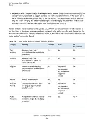
  • 7. Tables Platform Characteristics 11 Table 1-1 Gestures users make to interact with iOS-based devices 12 iOS Technology Usage Guidelines 81 Table 6-1 Standard banner view dimensions 95 Table 6-2 Medium rectangle banner view dimensions 95 Table 6-3 Full screen banner view dimensions 96 Table 6-4 Audio session categories and their associated behaviors 106 iOS UI Element Usage Guidelines 118 Table 7-1 Table-view elements 140 Table 7-2 Standard buttons available for toolbars and navigation bars (plain style) 176 Table 7-3 Bordered action buttons for use in navigation bars and toolbars 177 Table 7-4 Standard icons for use in the tabs of a tab bar 178 Table 7-5 Standard buttons for use in table rows and other UI elements 179 Custom Icon and Image Creation Guidelines 181 Table 8-1 Size (in pixels) of custom icons and images 181 Table 8-2 Maximum scaled sizes for the long edges of per-issue icons 198 2012-09-19 | © 2012 Apple Inc. All Rights Reserved. 7
  • 8. Introduction iOS Human Interface Guidelines describes the guidelines and principles that help you design a superlative user interface and user experience for your iOS app. iOS Human Interface Guidelines does not describe how to implement your designs in code. When you’re ready to code, start by reading iOS App Programming Guide . At a Glance By working with the platform conventions, you’ll be much better positioned to create outstanding iOS apps. 2012-09-19 | © 2012 Apple Inc. All Rights Reserved. 8
  • 9. Introduction At a Glance Great iOS Apps Embrace the Platform and HI Design Principles People appreciate iOS apps that feel as though they were designed expressly for the device. For example, when an app fits well on the device screen and responds to the gestures that people know, it provides much of the experience people are looking for. And, although people might not be aware of human interface design principles, such as direct manipulation or consistency, they can tell when apps follow them and when they don’t. As you begin designing an iOS app, be sure to understand what makes iOS-based devices unique, and learn how to incorporate HI design principles so that you can deliver a user experience people will appreciate. Relevant Chapters: “Platform Characteristics” (page 11) and “Human Interface Principles” (page 19) Great App Design Begins with Some Clear Definitions When you’re starting with an idea for an app, it’s crucial to decide precisely which features you intend to deliver, and to whom. After you’ve determined this, you need to make sure you tailor the look and feel of your app to the device it runs on and to the task it enables. If you’re bringing existing software to iOS, you face many of the same challenges. As you redesign your existing software, it can help to learn about some of the design decisions that informed other successful interdevice transitions, such as those for Mail and Keynote. Relevant Chapters: “App Design Strategies” (page 22) and “Transition Case Studies” (page 30) A Great User Experience Is Rooted in Your Attention to Detail It’s essential to keep the user experience uppermost in your mind as you design every aspect of your app, from the way you enable a task, to the way your app starts and stops, to the way you use a button. Discover the guidelines that influence the look and behavior of your app, in matters both general and specific. Relevant Chapters: “User Experience Guidelines” (page 52) and “iOS UI Element Usage Guidelines” (page 118) People Expect to Find iOS Technologies in the Apps They Use iOS provides many great technologies that add value to apps, such as iCloud, multitasking, Passbook, and VoiceOver. Although users might view these technologies as automatically available whenever they use their iOS-based devices, it can require work on your part to incorporate them in your app. If an iOS technology is appropriate in your app, be sure to follow the guidelines that govern its usage. 2012-09-19 | © 2012 Apple Inc. All Rights Reserved. 9
  • 10. Introduction At a Glance Relevant Chapter: “iOS Technology Usage Guidelines” (page 81) All Apps Need at Least Some Custom Artwork Even if your app enables a serious, productive task and uses only standard user interface elements, you still need to provide a beautiful, custom app icon that people will enjoy seeing in the App Store and on their Home screens. Whether your app includes significant amounts of custom artwork, or only a little, you need to know which icons and images are required and how to create them appropriately. In addition, when you’re designing artwork for the Retina display, you should take advantage of some techniques that can make this process easier. Relevant Chapter: “Custom Icon and Image Creation Guidelines” (page 181) 2012-09-19 | © 2012 Apple Inc. All Rights Reserved. 10
  • 11. Platform Characteristics iOS-based devices share several unique characteristics that influence the user experience of all apps that run on them. The most successful apps embrace these characteristics and provide a user experience that integrates with the device they’re running on. The Display Is Paramount, Regardless of Its Size The display of an iOS-based device is at the heart of the user’s experience. Not only do people view beautiful text, graphics, and media on the display, they also physically interact with the Multi-Touch screen to drive their experience (even when they can’t see the screen). Different iOS-based devices can have displays of different dimensions and resolutions, but in all devices the display affects the user experience in the same ways: ● 44 x 44 points is the comfortable minimum size of a tappable UI element. ● People are very aware of the quality of app artwork. ● The display encourages people to forget about the device and to focus on their content or task. Note: Pixel is the appropriate unit of measurement to use when discussing the size of a device screen or the size of an icon you create in an image-editing app. Point is the appropriate unit of measurement to use when discussing the size of an area that is drawn onscreen. On a standard-resolution device screen, one point equals one pixel, but other resolutions might dictate a different relationship. On a Retina display, for example, one point equals two pixels. See “Points Versus Pixels” in View Programming Guide for iOS for a complete discussion of this concept. Device Orientation Can Change People can rotate iOS-based devices at any time and for a variety of reasons. For example, sometimes the task people are performing feels more natural in portrait, and sometimes people feel that they can see more in landscape. Whatever their reason for rotating the device, people expect the app to maintain its focus on the primary functionality. 2012-09-19 | © 2012 Apple Inc. All Rights Reserved. 11
  • 12. Platform Characteristics Apps Respond to Gestures, Not Clicks People often launch apps from the Home screen, so they tend to expect all apps to start in the same orientation. Because of the different ways iPhone and iPad display the Home screen, this expectation affects apps in different ways: ● On iPhone and iPod touch, the Home screen is displayed in portrait orientation only, with the Home button at the bottom. This leads users to expect iPhone apps to launch in this orientation by default. ● On iPad, the Home screen is displayed in all orientations, so users tend to expect iPad apps to launch in the device orientation they’re currently using. Apps Respond to Gestures, Not Clicks People make specific finger movements, called gestures, to operate the unique Multi-Touch interface of iOS-based devices. For example, people tap a button to activate it, flick or drag to scroll a long list, or pinch open to zoom in on an image. The Multi-Touch interface gives people a sense of immediate connection with their devices and enhances their sense of direct manipulation of onscreen objects. People are comfortable with the standard gestures because the built-in apps use them consistently. Their experience using the built-in apps gives people a familiar set of gestures that they expect to be able to use successfully in most other apps. Table 1-1 Gestures users make to interact with iOS-based devices Gesture Action Tap To press or select a control or item (analogous to a single mouse click). Drag To scroll or pan (that is, move side to side). To drag an element. Flick To scroll or pan quickly. Swipe With one finger, to reveal the Delete button in a table-view row, the hidden view in a split view (iPad only), or the Notification Center (from the top edge of the screen). With four fingers, to switch between apps on iPad. Double tap To zoom in and center a block of content or an image. To zoom out (if already zoomed in). 2012-09-19 | © 2012 Apple Inc. All Rights Reserved. 12
  • 13. Platform Characteristics People Interact with One App at a Time Gesture Action Pinch Pinch open to zoom in. Pinch close to zoom out. Touch and hold In editable or selectable text, to display a magnified view for cursor positioning. Shake To initiate an undo or redo action. In addition to these gestures, people can move the device itself to perform certain tasks. Examples of these tasks are to activate Siri (on iPhone 4S) or to calibrate the compass. People expect all these gestures to work the same, regardless of the app they’re currently running. People Interact with One App at a Time Only one app is visible in the foreground at a time. When people switch from one app to another, the previous app transitions to the background and its user interface goes away. This feature, called multitasking, allows apps to remain in the background until users relaunch them or until they are terminated. 2012-09-19 | © 2012 Apple Inc. All Rights Reserved. 13
  • 14. Platform Characteristics People Interact with One App at a Time Most apps enter a suspended state when they transition to the background. Suspended apps are displayed in the multitasking UI, which provides a convenient way for people to switch to recently used apps. The multitasking UI appears at the bottom of the screen, below the UI of the currently running app or the Home screen (shown here below the iPhone Settings app). When people return to a suspended app, it can instantly resume running from the point where it went to the background, without having to reload its UI. Some apps might need to continue running in the background while users run another app in the foreground. For example, users might want to continue hearing the song that’s playing in one app while they’re using a different app to check their to-do list or handle email. To learn how to handle multitasking correctly and gracefully, see “Multitasking” (page 86). 2012-09-19 | © 2012 Apple Inc. All Rights Reserved. 14
  • 15. Platform Characteristics Preferences Are Available in Settings Note: Apps running in iOS 3.2 and earlier don’t enter the background and some older devices don’t support multitasking or background execution at all, even when running iOS 4 or later. In these cases, apps are terminated when they leave the foreground. Preferences Are Available in Settings People set certain preferences for an iOS app in the built-in Settings app. They must switch away from the current app when they want to access those preferences in Settings. Preferences in the Settings app are of the “set once and rarely change” type. Although some of the built-in apps provide preferences of this type, most apps do not need them, so they don’t have preferences in the Settings app. Onscreen User Help Is Minimal Mobile users have neither the time nor the desire to read through a lot of help content before they can benefit from an app. What’s more, help content takes up valuable space to store and display. iOS-based devices and the built-in apps are intuitive and easy to use, so people don’t need onscreen help content to tell them how to use the device or the apps. This experience leads people to expect all iOS apps to be similarly easy to use. Most iOS Apps Have a Single Window An iOS app has a single window, unless it supports an external display. An app’s window fills the device’s main screen and provides an empty surface that hosts one or more views in which you present your content. It’s important to realize that a window in an iOS app is very different from a window in a computer app. For example, an iOS window has no visible components (such as a title bar or a close button) and it can’t be moved to a new location on the device display. It’s also important to realize that most users are unaware of the windows and views in the iOS apps that they use. For the most part, users experience an iOS app as a collection of screens through which they navigate. From this perspective, a screen generally corresponds to a distinct visual state or mode in an app. In the Contacts app on iPhone, for example, users think of their contact list—regardless of its length—as one screen and an individual contact’s details as a different screen. 2012-09-19 | © 2012 Apple Inc. All Rights Reserved. 15
  • 16. Platform Characteristics Two Types of Software Run in iOS Note: Because this document focuses on the UI and user experience of iOS apps, it frequently uses “screen” as it’s understood by most users. Unless otherwise stated, this document does not use “screen” to mean a UIScreen object (which is an object you can use to access an external display screen). Two Types of Software Run in iOS There are two types of software that you can develop for iOS-based devices: ● iOS apps ● Web content An iOS app is an app you develop using the iOS SDK to run natively on iOS-based devices. iOS apps resemble the built-in apps on iOS-based devices in that they reside on the device itself and take advantage of features of the iOS environment. People install iOS apps on their devices and use them just as they use built-in apps, such as Photos, Calendar, and Mail. Web content is hosted by a website that people visit using their iOS-based devices. There are three types of web content: Web apps. Webpages that provide a focused solution to a task and conform to certain display guidelines are known as web apps because they behave similarly to iOS apps. A web app often hides the UI of Safari on iOS so that it looks more like a native app. Using the web clip feature, a web app can also supply an icon for people to put on the Home screen. This allows people to open web apps in the same way that they open iOS apps. Optimized webpages. Webpages that are optimized for Safari on iOS display and operate as designed (with the exception of any elements that rely on unsupported technologies, such as plug-ins, Flash, and Java). In addition, an optimized webpage correctly scales content for the device screen and is often designed to detect when it is being viewed on iOS-based devices, so that it can adjust the content it provides accordingly. Compatible webpages. Webpages that are compatible with Safari on iOS display and operate as designed (with the exception of any elements that rely on unsupported technologies, such as plug-ins, Flash, and Java). A compatible webpage does not tend to take extra steps to optimize the viewing experience on iOS-based devices, but the device usually displays the page successfully. An iOS app might combine native UI elements with access to web content within a web content–viewing area (typically by using a UIWebView). Such an app can look and behave like a native iOS app, without drawing attention to the fact that it depends on web sources. 2012-09-19 | © 2012 Apple Inc. All Rights Reserved. 16
  • 17. Platform Characteristics Safari on iOS Provides the Web Interface Safari on iOS Provides the Web Interface Safari on iOS provides the interface for browsing web content on iOS-based devices. Although Safari on iOS is similar in many ways to Safari on the computer desktop, it is not the same. For the most part, users can’t change the size of the viewport (the area that displays content). On the desktop, users resize the viewport when they resize the browser window. On iOS-based devices, the viewport doesn’t resize unless the device orientation changes. iOS users can change the scale of the viewport by zooming in and out, and they can pan the webpage. On iPad, users are much less likely to zoom web content than they are on iPhone (shown below). Safari on iOS supports cookies. Use of cookies can streamline user interaction with web content by saving the user’s context, preferences, and previously entered data. Safari on iOS does not support Flash, Java (including Java applets), or third-party plug-ins within web content. Instead, Safari on iOS supports the HTML5 <audio> and <video> tags to provide audio and video streaming, and JavaScript and CSS3 transforms, transitions, and animations to display animated content. Safari on iOS interprets most gestures as targeting the way the device displays content, not the content itself. The tap—which is analogous to a single mouse click—can cause Safari on iOS to send the onclick event to a webpage. There are no analogs for other mouse-based gestures, such as hover. 2012-09-19 | © 2012 Apple Inc. All Rights Reserved. 17
  • 18. Platform Characteristics Safari on iOS Provides the Web Interface Safari on iOS allows web apps to run in full-screen mode. Web apps that launch from a web clip icon on the user’s Home screen can hide the UI for Safari on iOS, so that they look more like native apps. 2012-09-19 | © 2012 Apple Inc. All Rights Reserved. 18
  • 19. Human Interface Principles A great user interface follows human interface design principles that are based on the way people—users—think and work, not on the capabilities of the device. A UI that is unattractive, convoluted, or illogical can make even a great app seem like a chore to use. But a beautiful, intuitive, compelling UI enhances an app’s functionality and inspires a positive emotional attachment in users. Aesthetic Integrity Aesthetic integrity is not a measure of how beautiful an app is. It’s a measure of how well the appearance of the app integrates with its function. For example, an app that enables a productive task generally keeps decorative elements subtle and in the background, while giving prominence to the task by providing standard controls and behaviors. Such an app gives users a clear, unified message about its purpose and its identity. If, on the other hand, the app enables the productive task within a UI that seems whimsical or frivolous, people might not know how to interpret these contradictory signals. Similarly, in an app that encourages an immersive task, such as a game, users expect a beautiful appearance that promises fun and encourages discovery. Although people don’t expect to accomplish a serious or productive task in a game, they still expect the game’s appearance to integrate with the experience. Consistency Consistency in the interface allows people to transfer their knowledge and skills from one app to another. A consistent app is not a slavish copy of other apps. Rather, it is an app that takes advantage of the standards and paradigms people are comfortable with. To determine whether an app follows the principle of consistency, think about these questions: ● Is the app consistent with iOS standards? Does it use system-provided controls, views, and icons correctly? Does it incorporate device features in a reliable way? ● Is the app consistent within itself? Does text use uniform terminology and style? Do the same icons always mean the same thing? Can people predict what will happen when they perform the same action in different places? Do custom UI elements look and behave the same throughout the app? 2012-09-19 | © 2012 Apple Inc. All Rights Reserved. 19
  • 20. Human Interface Principles Direct Manipulation ● Within reason, is the app consistent with its earlier versions? Have the terms and meanings remained the same? Are the fundamental concepts essentially unchanged? Direct Manipulation When people directly manipulate onscreen objects instead of using separate controls to manipulate them, they're more engaged with the task and they more readily understand the results of their actions. iOS users enjoy a heightened sense of direct manipulation because of the Multi-Touch interface. Using gestures gives people a greater affinity for, and sense of control over, the objects they see onscreen, because they're able to touch them without using an intermediary, such as a mouse. For example, instead of tapping zoom controls, people can use the pinch gestures to directly expand or contract an area of content. And in a game, players move and interact directly with onscreen objects. For example, a game might display a combination lock that users can spin to open. In an iOS app, people can experience direct manipulation when they: ● Rotate or otherwise move the device to affect onscreen objects ● Use gestures to manipulate onscreen objects ● Can see that their actions have immediate, visible results Feedback Feedback acknowledges people’s actions and assures them that processing is occurring. People expect immediate feedback when they operate a control, and they appreciate status updates during lengthy operations. The built-in iOS apps respond to every user action with some perceptible change. For example, list items highlight briefly when people tap them. During operations that last more than a few seconds, a control shows elapsing progress, and if appropriate, the app displays an explanatory message. Subtle animation can give people meaningful feedback that helps clarify the results of their actions. For example, lists can animate the addition of a new row to help people track the change visually. Sound can also give people useful feedback. But sound shouldn’t be the primary or sole feedback mechanism because people may use their devices in places where they can’t hear or where they must turn off the sound. 2012-09-19 | © 2012 Apple Inc. All Rights Reserved. 20
  • 21. Human Interface Principles Metaphors Metaphors When virtual objects and actions in an app are metaphors for objects and actions in the real world, users quickly grasp how to use the app. The classic example of a software metaphor is the folder: People put things in folders in the real world, so they immediately understand the idea of putting files into folders on a computer. The most appropriate metaphors suggest a usage or experience without enforcing the limitations of the real-world object or action on which they’re based. For example, people can fill software folders with much more content than would fit in a physical folder. iOS provides great scope for metaphors because it supports rich graphical images and gestures. People physically interact with realistic onscreen objects, in many cases operating them as if they were real-world objects. Metaphors in iOS include: ● Tapping Music playback controls ● Dragging, flicking, or swiping objects in a game ● Sliding On/Off switches ● Flicking through pages of photos ● Spinning picker wheels to make choices In general, metaphors work best when they’re not stretched too far. For example, the usability of software folders would decrease if they had to be organized into a virtual filing cabinet. User Control People, not apps, should initiate and control actions. Although an app can suggest a course of action or warn about dangerous consequences, it’s usually a mistake for the app to take decision-making away from the user. The best apps find the correct balance between giving people the capabilities they need while helping them avoid dangerous outcomes. Users feel more in control of an app when behaviors and controls are familiar and predictable. And, when actions are simple and straightforward, users can easily understand and remember them. People expect to have ample opportunity to cancel an operation before it begins, and they expect to get a chance to confirm their intention to perform a potentially destructive action. Finally, people expect to be able to gracefully stop an operation that’s underway. 2012-09-19 | © 2012 Apple Inc. All Rights Reserved. 21
  • 22. App Design Strategies All great apps begin with a great idea, but that doesn’t mean that the path from idea to successful iOS app is an easy one. This chapter describes some strategies you can use to refine your idea, review your design options, and converge on an app that people will appreciate. Create an App Definition Statement An app definition statement is a concise, concrete declaration of an app’s main purpose and its intended audience. Create an app definition statement early in your development effort to help you turn an idea and a list of features into a coherent product that people want to own. Throughout development, use the definition statement to decide if potential features and behaviors make sense. Take the following steps to create a solid app definition statement. 1. List All the Features You Think Users Might Like Go ahead and brainstorm here. At this point, you’re trying to capture all the tasks related to your main product idea. Don’t worry if your list is long; you’ll narrow it down later. For example, imagine that your initial idea is to develop an app that helps people shop for groceries. As you think about this activity, you come up with a list of related tasks (potential features) that users might be interested in, such as: ● Creating lists ● Getting recipes ● Comparing prices ● Locating stores ● Annotating recipes ● Getting and using coupons ● Viewing cooking demos ● Exploring different cuisines 2012-09-19 | © 2012 Apple Inc. All Rights Reserved. 22
  • 23. App Design Strategies Create an App Definition Statement ● Finding ingredient substitutions 2. Determine Who Your Users Are Apart from the likelihood that your users are mobile and that they expect beautiful graphics, simple interactions, and high performance, what distinguishes them? In the context of the app you’re planning, what is most important to your users? Using the grocery-shopping example, you might ask whether your users: ● Usually cook at home or prefer ready-made meals ● Are committed coupon-users or think that coupons aren’t worth the effort ● Enjoy hunting for speciality ingredients or seldom venture beyond the basics ● Follow recipes strictly or use recipes as inspiration ● Buy small amounts frequently or buy in bulk infrequently ● Want to keep several in-progress lists for different purposes or just want to remember a few things to buy on the way home ● Insist on specific brands or make do with the most convenient alternatives ● Tend to buy a similar set of items on each shopping trip or buy items listed in a recipe After musing on these questions, imagine that you decide on three characteristics that best describe your target audience: Love to experiment with recipes, are often in a hurry, and are thrifty (if it doesn’t take too much effort). 3. Filter the Feature List Through the Audience Definition If, after deciding on a few audience characteristics, you end up with just a few features, you’re on the right track: Great iOS apps have a laser focus on the task users want to accomplish. For example, consider the large number of possible features for the grocery-shopping app you listed in Step 1. Even though these are all useful features, it’s not likely that every feature would be equally useful to every user. More importantly, it’s not likely that every feature would be equally appreciated by the audience you defined in Step 2. When you examine your feature list in the context of your target audience, you conclude that your app should focus on three main features: Creating lists, getting and using coupons, and getting recipes. Now you can craft your app definition statement, concretely summarizing what the app does and for whom. A good app definition statement for this grocery-shopping app might be: “A shopping list creation tool for thrifty people who love to cook.“ 2012-09-19 | © 2012 Apple Inc. All Rights Reserved. 23
  • 24. App Design Strategies Design the App for the Device 4. Don’t Stop There Use your app definition statement throughout the development process to determine the suitability of features, controls, and terminology. For example: As you consider whether to add a new feature, ask yourself whether it is essential to the main purpose of your app and to your target audience. If it isn’t, set it aside; it might form the basis of a different app. For example, you’ve decided that your users are interested in adventurous cooking, so emphasizing boxed cake mixes and ready-made meals would probably not be appreciated. As you consider the look and behavior of the UI, ask yourself whether your users appreciate a simple, streamlined style or a more overtly thematic style. Be guided by what people might expect to accomplish with your app, such as the ability to accomplish a serious task, to get a quick answer, to delve into comprehensive content, or to be entertained. For example, although your grocery list app needs to be easy to understand and quick to use, your audience is likely to appreciate a themed UI that includes beautiful pictures of ingredients and meals. As you consider the terminology to use, strive to match your audience’s expertise with the subject. For example, even though your audience might not be made up of expert chefs, you’re fairly confident that they appreciate seeing the proper terms for ingredients and techniques. Design the App for the Device You know what your app does and who its audience is; now you need to make sure that your app looks and feels like it was designed expressly for an iOS-based device. This is crucial because people have high expectations for the apps they choose to install on their devices. If your app feels like it was designed for a different device, or for the web, people are less likely to value it. Embrace iOS UI Paradigms iOS users are accustomed to the appearance and behavior of the built-in apps, so they tend to expect similar experiences in the apps they download. You don’t want to mimic every detail of the built-in apps but it’s helpful to understand the design patterns they follow. Start by understanding the characteristics that distinguish iOS-based devices and the apps that run on them (you can read about these in “Platform Characteristics” (page 11)). Then, keep the following things in mind: Controls should look tappable. iOS controls, such as buttons, pickers, and sliders, have contours and gradients that invite touches. App structure should be clean and easy to navigate. iOS provides the navigation bar for drilling down through hierarchical content, and the tab bar for displaying different peer groups of content or functionality. 2012-09-19 | © 2012 Apple Inc. All Rights Reserved. 24
  • 25. App Design Strategies Design the App for the Device User feedback should be subtle, but clear. iOS apps often use precise, fluid animations to show the results of user actions. iOS apps can also use the activity indicator and the progress view to show status, and the alert to give users warnings or other critical information. You can learn about the usage guidelines that govern these elements in “iOS UI Element Usage Guidelines” (page 118). As you begin designing the overall user experience of your app, be sure you understand the guidelines described in “User Experience Guidelines” (page 52). Ensure that Universal Apps Run Well on Both iPhone and iPad If you’re planning to develop an app that runs on iPhone and iPad, you need to adapt your design to each device. Here is some guidance to help you do this: Mold the UI of each app version to the device it runs on. Most individual UI elements are available on both devices, but overall the layout differs dramatically. Adapt art to the screen size. Users tend to expect more high-fidelity artwork in iPad apps than they do in iPhone apps. Merely scaling up an iPhone app to fill the iPad screen is not recommended. Preserve the primary functionality of your app, regardless of the device it runs on. Even though one version might offer a more in-depth or interactive presentation of the task than the other, it’s important to avoid making users feel that they’re choosing between two entirely different apps. Go beyond the default. Unmodified iPhone apps run in a compatibility mode on iPad by default. Although this mode allows people to use an iPhone app on iPad, it does not give them the device-specific experience they want. Reconsider Web-Based Designs If you're coming from the web, you need to make sure that you give people an iOS app experience, not a web experience. Remember, people can visit your website on their iOS-based devices using Safari on iOS. Here are some strategies that can help web developers create an iOS app: Focus your app. Websites often greet visitors with a large number of tasks and options from which they can choose, but this type of experience does not translate well to iOS apps. iOS users expect an app to do what it advertises, and they want to see useful content immediately. Make sure your app lets people do something. People might enjoy viewing marketing content in the websites they visit, but they expect to accomplish something in an app. Design for touch. Don’t try to replicate web UI design paradigms in your iOS app. Instead, get familiar with the UI elements and patterns of iOS and use them to showcase your content. Web elements you’ll need to re-examine include menus, interactions initiated by hovering, and links. 2012-09-19 | © 2012 Apple Inc. All Rights Reserved. 25
  • 26. App Design Strategies Tailor Customization to the Task Let people scroll. Most websites take care to display the most important information in the top half of the page where it is seen first (“above the fold”), because people sometimes leave a page when they don’t find what they’re looking for near the top. But on iOS-based devices, scrolling is an easy, expected part of the experience. If you reduce font size or squeeze controls to fit your content into the space of a single device screen, you’re likely to end up with unreadable content and an unusable layout. Relocate the homepage icon. Websites often display an icon that links to the homepage at the top of every webpage. iOS apps don’t include homepages, so this behavior is unnecessary. In addition, iOS apps allow people to tap the status bar to quickly scroll back to the top of a long list. If you center a tappable home icon at the top of the screen, it’s very difficult for users to tap the status bar instead. Tailor Customization to the Task The best iOS apps balance UI customization with clarity of purpose and ease of use. To achieve this balance in your app, be sure to consider customization early in the design process. Because concerns about branding, originality, and marketability often influence customization decisions, it can be challenging to stay focused on how customization impacts the user experience. Using the iOS SDK, you can customize the UI of your app as much or as little as you choose. Because there are no practical limits to the amount of customization that you can do, you need to determine how customization might affect the task your app enables. As you consider the tasks in your app, think about how often users perform them and under what circumstances. For example, imagine an app that enables phone calls. Now imagine that instead of a keypad, the app displays a beautiful, realistic rotary dial. The dial is meticulously rendered, so users both appreciate its quality and instantly know how to use it. The dial behaves realistically, so users delight in making the dialing gesture and hearing the distinctive sounds. But for users who often need to call numbers that are not in Contacts, initial 2012-09-19 | © 2012 Apple Inc. All Rights Reserved. 26
  • 27. App Design Strategies Tailor Customization to the Task appreciation of the experience soon gives way to frustration, because using a rotary dial is much less efficient than using a keypad. In an app that is designed to help people make phone calls, this beautiful custom UI is a hindrance. On the other hand, consider the BubbleLevel sample app, which displays a realistic rendition of a carpenter’s level. People know how to use the physical tool so they instantly know how to use the app. The app could have displayed its information without the rendition of the bubble vial, but this would have made the app less intuitive and harder to use. In this case, the custom UI not only shows people how to use the app, it also makes the task easier to accomplish. 2012-09-19 | © 2012 Apple Inc. All Rights Reserved. 27
  • 28. App Design Strategies Tailor Customization to the Task As you consider how customization might enhance or detract from the task your app enables, keep these guidelines in mind. Always have a reason for customization. Ideally, UI customization facilitates the task people want to perform and enhances their experience. As much as possible, you need to let your app’s task drive your customization decisions. For example: ● If your app enables a productive task that involves the manipulation of a lot of detailed data, people are likely to appreciate an understated, mostly standard UI and streamlined navigation. ● If your app helps people view content, they generally don’t appreciate a UI that competes with it. ● If your app is a game or provides an immersive, story-driven experience, people expect to enter a unique world filled with rich, beautiful graphics and innovative interactions. As much as possible, avoid increasing the user’s cognitive burden. Users are familiar with the appearance and behavior of the standard UI elements, so they don’t have to stop and think about how to use them. When faced with elements that do not look or behave at all like standard ones, users lose the advantage of their prior experience. Unless your unique elements make performing the task easier, users might dislike being forced to learn new procedures that don’t transfer to any other apps. Be internally consistent. The more custom your UI is, the more important it is for the appearance and behavior of your custom elements to be consistent within your app. If users take the time to learn how to use the unfamiliar controls you create, they expect to be able to rely on that knowledge throughout your app. Always defer to the content. Because the standard elements are so familiar, they don’t compete with the content for people’s attention. As you customize your UI, take care to ensure that it does not overshadow the content people care about. For example, if your app allows people to watch videos, you might choose to design custom playback controls. But whether you use custom or standard playback controls is less important than whether the controls fade out after the user begins watching the video and reappear with a tap. Think twice before you redesign a standard control. If you plan on doing more than customizing a standard control, make sure your redesigned control provides as much information as the standard one. For example, if you create a button that doesn’t have the rounded, dimensional appearance people associate with buttons, people might not realize that it’s tappable. Or, if you create a switch control that does not indicate the presence of the opposite value, people might not realize that it’s a two-state control. Be sure to thoroughly user-test custom UI elements. During testing, closely observe users to see if they can predict what your elements do and if they can interact with them easily. If, for example, you create a control that has a hit target smaller than 44 x 44 points, people will have trouble activating it. Or, if you create a view that responds differently to a tap than it does to a swipe, be sure the functionality the view provides is worth the extra care people have to take when interacting with it. 2012-09-19 | © 2012 Apple Inc. All Rights Reserved. 28
  • 29. App Design Strategies Prototype and Iterate Prototype and Iterate Before you invest significant engineering resources into the implementation of your design, it’s a really good idea to create prototypes for user testing. Even if you can get only a few colleagues to test the prototypes, you’ll benefit from their fresh perspectives on your app’s functionality and user experience. In the very early stages of your design you can use paper prototypes or wireframes to lay out the main views and controls, and to map the flow among screens. Although you can get some useful feedback from testing wireframes, their sparseness can mislead testers. This is because it’s difficult for people to imagine how the experience of an app will change when wireframes are filled in with real content. You’ll get more valuable feedback if you can put together a fleshed-out prototype that runs on a device. When people can interact with your prototype on a device, they’re more likely to uncover places where your app doesn’t function as they expect, or where the user experience is too complex. The easiest way to create a credible prototype is to use a storyboard-based Xcode template to build a basic app, and populate it with some appropriate placeholder content. (A storyboard file captures the entire UI of your app, including the transitions among different screens.) Then, install the prototype on a device so that your testers can have as realistic an experience as possible. You don’t need to supply a large amount of content or enable every control in your prototype app, but you do need to provide enough context to suggest a realistic experience. Aim for a balance between the typical user experience and the more unusual edge cases. For example, if it’s likely that your app will handle long lists of items, you should avoid creating a prototype that displays only one or two list items. And for testing user interactions, as long as testers can tap an area of the screen to advance to the next logical view or to perform the main task, they’ll be able to provide constructive feedback. When you base your prototype on an Xcode app template, you get lots of functionality for free and it’s relatively easy to make design adjustments in response to feedback. With a short turnaround time, you should be able to test several iterations of your prototype before you solidify your design and commit resources to its implementation. To get started learning about Xcode, see Xcode 4 User Guide . 2012-09-19 | © 2012 Apple Inc. All Rights Reserved. 29
  • 30. Transition Case Studies In addition to creating new apps, you might also want to bring an existing app or piece of software to a new platform or device. In some cases, redesigning an app or website for a new platform or device can be more challenging than starting from scratch. In other cases, you only need to take a few steps to take advantage of the new environment. Whether your transition project is large or small, a good way to prepare for it is to study examples of other products that have made the same transition. Transitioning Between the Desktop and an iOS-Based Device As you embark on bringing your software from the desktop to the iOS platform, stay focused on the ways in which people use iOS-based devices: ● People often use iOS-based devices while they’re on the go, and in environments filled with distractions. Part of your job is to create a responsive, compelling experience that pulls people in, gets them quickly to the content they care about, and maintains focus on that content. ● Following what’s known as the 80-20 rule, the largest percentage of users—typically, at least 80 percent—use a limited number of features in an app, while only a small percentage—seldom more than 20 percent—use all the features. Most iOS apps don’t need to provide all the features that only power users need. 2012-09-19 | © 2012 Apple Inc. All Rights Reserved. 30
  • 31. Transition Case Studies Transitioning Between the Desktop and an iOS-Based Device From Mail on the Desktop to Mail on iPhone Mail is one of the most highly visible, well-used, and appreciated apps in OS X. It is also a very powerful program that allows users to create, receive, prioritize, and store email, track action items and events, and create notes and invitations. Mail on the desktop offers this powerful functionality in a couple of windows. Mail on iPhone focuses on the core functionality of Mail on the desktop, helping people to receive, create, send, and organize their messages. Mail on iPhone delivers this condensed functionality in a UI tailored for the mobile experience that includes: ● A streamlined appearance that puts people’s content front and center ● Different views designed to facilitate different tasks ● An intuitive information structure that scales effortlessly ● Powerful editing and organizing tools that are available when they’re needed ● Subtle but expressive animation that communicates actions and provides feedback It’s important to realize that Mail on iPhone isn’t a better app than Mail on the desktop; rather, it’s Mail, redesigned for mobile users. By concentrating on a subset of desktop features and presenting them in an attractively lean UI, Mail on iPhone gives people the core of the Mail experience while they’re mobile. To adapt the Mail experience to the mobile context, Mail on iPhone innovates the UI in several key ways. 2012-09-19 | © 2012 Apple Inc. All Rights Reserved. 31
  • 32. Transition Case Studies Transitioning Between the Desktop and an iOS-Based Device Distinct, highly focused screens. Each screen displays one aspect of the Mail experience: account list, mailbox list, message list, message view, and composition view. Within a screen, people scroll to see the entire contents. Easy, predictable navigation. Making one tap per screen, people drill down from the general (the list of accounts) to the specific (a message). Each screen displays a title that shows people where they are, and a back button that makes it easy for them to retrace their steps. Simple, tappable controls, available when needed. Because composing a message and checking for new email are primary actions people might want to take in any context, Mail on iPhone makes them accessible in multiple screens. When people are viewing a message, functions such as reply, move, and trash are available because they act upon a message. Different types of feedback for different tasks. When people delete a message, it animates into the trash icon. When people send a message, they can see its progress; when the send finishes, they can hear a distinctive sound. By looking at the subtle text in the message list toolbar, people can see at a glance when their mailbox was last updated. 2012-09-19 | © 2012 Apple Inc. All Rights Reserved. 32
  • 33. Transition Case Studies Transitioning Between the Desktop and an iOS-Based Device From Keynote on the Desktop to Keynote on iPad Keynote on the desktop is a powerful, flexible app for creating world-class slide presentations. People love how Keynote combines ease of use with fine-grained control over myriad precise details, such as animations and text attributes. Keynote on iPad captures the essence of Keynote on the desktop, and makes it feel at home on iPad by creating a user experience that: ● Focuses on the user’s content ● Reduces complexity without diluting capability ● Provides shortcuts that empower and delight ● Adapts familiar hallmarks of the desktop experience ● Provides feedback and communication via eloquent animation Keynote users instantly understand how to use the app on iPad because it delivers expected functionality using native iPad paradigms. New users easily learn how to use Keynote on iPad because they can directly manipulate their content in simple, natural ways. 2012-09-19 | © 2012 Apple Inc. All Rights Reserved. 33
  • 34. Transition Case Studies Transitioning Between the Desktop and an iOS-Based Device The transformation of Keynote from the desktop to iPad is based on myriad modifications and redesigns that range from subtle to profound. These are some of the most visible adaptations: A streamlined toolbar. Only seven items are in the toolbar, but they give users consistent access to all the functions and tools they need to create their content. A simplified, prioritized inspector that responds to the user’s focus. The Keynote on iPad inspector automatically contains the tools and attributes people need to modify the selected object. Often, people can make all the modifications they need in the first inspector view. If they need to modify less frequently changed attributes, they can drill down to other inspector views. 2012-09-19 | © 2012 Apple Inc. All Rights Reserved. 34
  • 35. Transition Case Studies Transitioning Between the Desktop and an iOS-Based Device Lots of prebuilt style collections. People can easily change the look and feel of objects such as charts and tables by taking advantage of the prebuilt styles. In addition to color scheme, each collection includes prestyled attributes, such as table headings and axis-division marks, that are designed to coordinate with the overall theme. Direct manipulation of content, enriched with meaningful animation. In Keynote on iPad, a user drags a slide to a new position, twists an object to rotate it, and taps an image to select it. The impression of direct manipulation is enhanced by the responsive animations Keynote on iPad performs. For example, a slide pulses gently as users move it and, when they place it in a new location, the surrounding slides ripple outward to make room for it. From a Desktop Browser to Safari on iOS Safari on iOS provides a preeminent mobile web-viewing experience on iOS-based devices. People appreciate the crisp text and sharp images and the ability to adjust their view by rotating the device or pinching and tapping the screen. Standards-based websites display well on iOS-based devices. In particular, websites that detect the device and do not use plug-ins look great on both iPhone and iPad with little, if any, modification. In addition, the most successful websites typically: ● Set the viewport appropriately for the device, if the page width needs to match the device width 2012-09-19 | © 2012 Apple Inc. All Rights Reserved. 35
  • 36. Transition Case Studies Transitioning Between the Desktop and an iOS-Based Device ● Avoid CSS fixed positioning, so that content does not move offscreen when users zoom or pan the page ● Enable a touch-based UI that does not rely on pointer-based interactions Sometimes, other modifications can be appropriate. For example, web apps always set the viewport width appropriately and often hide the UI of Safari on iOS. To learn more about how to make these modifications, see “Configuring the Viewport” and “Configuring Web Applications” in Safari Web Content Guide . Websites adapt the desktop web experience to Safari on iOS in other ways, too: Using custom CSS to provide adaptable UI. Different UI elements can be suitable for different environments. For example, the Apple website includes a page that displays movie trailers users can watch. When viewed in Safari on the desktop, users can click the numbers or the previous and next controls to see additional trailers: When viewed on iPhone, the next, previous, and number controls are replaced by prominent, easy-to-use buttons with symbols that echo the style of built-in controls (such as the detail disclosure indicator and the page indicator): Accommodating the keyboard in Safari on iOS. When a keyboard and the form assistant are visible, Safari on iPhone displays your webpage in the area below the URL text field and above the keyboard and form assistant. 2012-09-19 | © 2012 Apple Inc. All Rights Reserved. 36
  • 37. Transition Case Studies Transitioning Between the Desktop and an iOS-Based Device Note: For the metrics on a high-resolution iPhone or iPod touch, double the values shown below. Status bar: 20 pixels URL text field: 60 pixels Remaining space: 140 pixels Form assistant: 44 pixels Keyboard: 216 pixels When a keyboard and the form assistant are not displayed, there is an additional 216 pixels of vertical space available (in portrait orientation) for the display of your webpage. In landscape orientation, two of the values differ: The keyboard height is 162 pixels, and the form assistant height is 32 pixels. 2012-09-19 | © 2012 Apple Inc. All Rights Reserved. 37
  • 38. Transition Case Studies Transitioning Between the Desktop and an iOS-Based Device Accommodating the pop-up menu control in Safari on iOS. In Safari on the desktop, a pop-up menu that contains a large number of items displays as it does in an OS X app; that is, the menu opens to display all items, extending past the window boundaries, if necessary. In Safari on iOS, a pop-up menu is displayed using native elements, which provides a much better user experience. For example, on iPhone, the pop-up menu appears in a picker, a list of choices from which the user can pick, as shown below. 2012-09-19 | © 2012 Apple Inc. All Rights Reserved. 38
  • 39. Transition Case Studies Transitioning Between the Desktop and an iOS-Based Device On iPad, the pop-up menu displays in a popover, as shown below. 2012-09-19 | © 2012 Apple Inc. All Rights Reserved. 39
  • 40. Transition Case Studies Transitioning Between iOS-Based Devices Using lists to display data in iPhone web apps. iOS users are accustomed to lists in native apps, so when they see lists in web apps, they’re more likely to think that the web content is an app. On iPhone, lists appear edge to edge or inside rounded rectangles. Each style is defined by its own metrics. Edge-to-edge list Rounded rectangle list 356 pixels 356 pixels 320 pixels 320 pixels Transitioning Between iOS-Based Devices People appreciate having their apps run on all their iOS-based devices. As much as possible, ensure that each version of your app takes advantage of the characteristics of each device. 2012-09-19 | © 2012 Apple Inc. All Rights Reserved. 40
  • 41. Transition Case Studies Transitioning Between iOS-Based Devices From Mail on iPhone to Mail on iPad Mail is one of the premier built-in apps on iPhone. People appreciate the clear, streamlined way it organizes large amounts of information in a series of easy-to-use screens. Mail on iPad delivers the same core functionality. At the same time it provides more onscreen space for people’s messages, meaningful touches of realism, and powerful organizing and editing tools that are always accessible but not obtrusive. The visual stability of a single, uncluttered screen provides what users need in one place, with minimal context changes. The differences between Mail on iPhone and Mail on iPad reflect the different user experiences of each device. ● Mail on iPhone is designed to help mobile users handle their email while they’re standing in line or walking to a meeting. ● Mail on iPad is efficient enough for people to use on the go, but its rich experience also encourages more in-depth use. Even though Mail on iPad tailors the user experience to the device, it does not alter the core functionality people are used to, or gratuitously change the location or effect of individual functions. iPhone Mail users easily recognize the toolbar items and mailbox structure in iPad Mail, and immediately know how to use them because they’re virtually identical. To enhance the mobile email experience, Mail on iPad evolves the iPhone Mail UI in a number of important ways: 2012-09-19 | © 2012 Apple Inc. All Rights Reserved. 41
  • 42. Transition Case Studies Transitioning Between iOS-Based Devices Expanded support for device orientations. People can use Mail on iPad in any of the four orientations (landscape shown here). Although the landscape layout differs somewhat from the portrait layout, the focus remains on the content and functionality people care about. 2012-09-19 | © 2012 Apple Inc. All Rights Reserved. 42
  • 43. Transition Case Studies Transitioning Between iOS-Based Devices Increased focus on message content. Mail on iPad reserves most of the screen for the current message in all orientations (portrait shown in the following figure). This includes moving the toolbar to the top of the message view to increase the vertical space available for the message content. With the extra space, people can read longer messages with less scrolling. And when people want to view the message list in portrait, they can still see a large portion of the current message. A flatter hierarchy. Mail on iPad effectively flattens the Mail hierarchy (that is, account > mailbox > message list > message) by confining all levels above the message itself to a separate UI element. In landscape, these levels are persistently visible in the left pane of a split view; in portrait, users can view these levels by revealing an element that hovers over part of the main screen. Drastically reduced full-screen transitions. Because most of the hierarchy is available in a separate onscreen element, people can access most of what they need in a single screen. When people drill down through the hierarchy, it’s the account > mailbox > message list view that transitions, not the entire screen. 2012-09-19 | © 2012 Apple Inc. All Rights Reserved. 43
  • 44. Transition Case Studies Transitioning Between iOS-Based Devices Realistic messages. When people mark a message for deletion, it slides onto the message view like a physical sheet of paper. As they choose additional messages to delete, the messages form a realistic stack of papers, complete with slightly untidy edges. Running on iPhone 5 You don’t have to redesign your app for it to look good on iPhone 5. Many apps look good simply by displaying more of their existing UI; others might need to stretch content or background regions. Only some apps—such as games or apps that display lots of custom artwork—are likely to need some additional work to look their best. 2012-09-19 | © 2012 Apple Inc. All Rights Reserved. 44
  • 45. Transition Case Studies Transitioning Between iOS-Based Devices Note: All apps that run on iPhone 5 must include a launch image of the correct size. To learn how to create launch images for iOS-based devices, see “Launch Images” (page 189). The iPhone 5 display is 176 pixels taller than the display of other iPhone and iPod touch devices. In portrait orientation, the extra height is about the same as the height of two additional rows in a standard table view. For example, Messages running on iPhone 5 (shown below on the right) displays a taller conversation area than does Messages running on iPhone 4S (shown below on the left). 2012-09-19 | © 2012 Apple Inc. All Rights Reserved. 45
  • 46. Transition Case Studies Transitioning Between iOS-Based Devices Of course, the additional 176 pixels in height translates into additional lateral space when the device is in landscape orientation. For example, in Messages on iPhone 5 (shown here below Messages on iPhone 4S), the UI stretches to fill the additional width. The Messages screens shown above illustrate a crucial point: The minor UI adjustments that were made to accommodate the iPhone 5 display do not change the app’s functionality in any way. The consistency of the user experience—which is evident in all of the apps described in this section—follows a key design principle of iPhone 5: The larger device display enables users to see more of the content they care about; it does not provide an opportunity to squeeze in more app functionality. Because you won’t be changing the functionality of your app, there’s typically very little you have to do to make your app look great on iPhone 5. If you use Auto Layout to design your app’s UI, you might have even less work to do. The following guidelines can help you decide which UI changes are best suited to your app. 2012-09-19 | © 2012 Apple Inc. All Rights Reserved. 46
  • 47. Transition Case Studies Transitioning Between iOS-Based Devices Note: If you don’t make any changes to your app, it runs in a compatibility mode on iPhone 5. When an app runs in compatibility mode, iOS automatically centers the app’s UI by adding slim black bars above and below it. For some developers, it might be reasonable to simply create a new launch image of the correct size and allow the unchanged app UI to be centered on the iPhone 5 display. Allow more content to be revealed automatically. If some of your UI is currently hidden below the bottom edge of the screen—requiring users to scroll—you don’t have to make any changes to allow the increased display height of iPhone 5 to reveal more of your UI. In Settings, for example, users see additional table rows on iPhone 5 (shown below, on the right) than they do on iPhone 4S (shown below, on the left). 2012-09-19 | © 2012 Apple Inc. All Rights Reserved. 47
  • 48. Transition Case Studies Transitioning Between iOS-Based Devices Stretch content regions. If you display content in a view, consider vertically expanding the view to show some additional content or to insert more space within the view. For example, users have a larger message body region in Mail on iPhone 5 (shown below, on the right) than they do in Mail on iPhone 4S (shown below, on the left). 2012-09-19 | © 2012 Apple Inc. All Rights Reserved. 48
  • 49. Transition Case Studies Transitioning Between iOS-Based Devices Stretch background areas between content regions. You can make your layout look a bit more relaxed by expanding the vertical space between content views. For example, Game Center on iPhone 5 (shown below, on the right) shows more of the background between the main content regions than does Game Center on iPhone 4S (shown below, on the left). 2012-09-19 | © 2012 Apple Inc. All Rights Reserved. 49
  • 50. Transition Case Studies Transitioning Between iOS-Based Devices If necessary, recenter dominant visual elements. After adjusting backgrounds or views to accommodate the additional space, you might want to make sure that principal elements of your UI are still centered appropriately. One way to do this is to first stretch a region near the top of the screen and then adjust the centering of the elements. For example, Compass on iPhone 5 (shown below, on the right) maintains the user’s focus on the compass and heading by keeping these elements centered on the extended background. 2012-09-19 | © 2012 Apple Inc. All Rights Reserved. 50
  • 51. Transition Case Studies Transitioning Between iOS-Based Devices Expand custom artwork, but don’t put essential details in the new areas. If your app contains mostly custom UI—such as in a game—you should use the extra space to give users more artwork to enjoy. It’s not appropriate to put app-critical functionality or details in these additional areas, because not all users will see them. For example, users see more of the microphone stand in Voice Memos on iPhone 5 (shown below, on the right) than they do in Voice Memos on iPhone 4S (shown below, on the left). In general, avoid increasing control sizes. If you use the minimum tappable size for controls in your app—that is, no smaller than 44 x 44 points—you should not need to adjust them for iPhone 5. However, you might choose to add a little more space between existing controls. Don’t use the extra space to display an additional bar or banner. People expect to see more content on iPhone 5. To avoid disappointing your users, resist the temptation to use the extra vertical space for a custom button bar or banner. 2012-09-19 | © 2012 Apple Inc. All Rights Reserved. 51
  • 52. User Experience Guidelines The user experience of iOS-based devices revolves around streamlined interaction with content that people care about. The guidelines in this chapter apply to apps that run on all iOS-based devices. Focus on the Primary Task When an iOS app establishes and maintains focus on its primary task, it is satisfying and enjoyable to use. Your app definition statement will help you focus your app on its primary task (to learn more about this statement, see “Create an App Definition Statement” (page 22)). To maintain that focus, you need to determine what’s most important in each context or screen. Analyze what’s needed in each screen. As you decide what to display in each screen always ask yourself, Is this critical information or functionality users need right now ? If your answer is no, decide whether the information or functionality might be critical in a different context, or if it’s not that important after all. 2012-09-19 | © 2012 Apple Inc. All Rights Reserved. 52
  • 53. User Experience Guidelines Elevate the Content that People Care About For example, the iPhone Calendar app is focused on days and the events that occur on them. Users can use the clearly labeled buttons to highlight the current day, select a viewing option, and add events. Elevate the Content that People Care About In a game, people care about the experience; they don’t expect to manage, consume, or create content. If you’re developing a game, you elevate content by enhancing the experience with a satisfying story, beautiful graphics, and responsive gameplay. If you’re not developing a game, you can help people focus on the content by designing your UI as a subtle frame for the information they’re interested in. Here are some ways you can do this: Minimize the number and prominence of controls to decrease their weight in the UI. Photos does this by placing a few unobtrusive controls on translucent bars. Consider subtly customizing controls so that they integrate with your app’s graphical style. In this way, controls are discoverable and comprehensible, without being conspicuous. Consider fading controls after people have stopped interacting with them for a little while, and redisplaying them when people tap the screen. Sometimes you may want to fade the rest of your app UI, too. This is especially appropriate in apps that enable an immersive experience, because it gives even more of the screen 2012-09-19 | © 2012 Apple Inc. All Rights Reserved. 53
  • 54. User Experience Guidelines Think Top Down space to the content people want to see. For example, Photos fades the controls and bars after a few moments of noninteraction, which encourages people to immerse themselves in the content. When people want to perform a task with their photos, a single tap anywhere on the screen redisplays the controls. Think Top Down The top of the screen is most visible to people, because they tend to interact with the device by holding the device in the following ways: ● In their nondominant hand (or laying it on a surface), and gesturing with a finger of the dominant hand ● In one hand, and gesturing with the thumb of the same hand ● Between their hands, and gesturing with both thumbs Put the most frequently used (usually higher level) information near the top, where it is most visible and easy to reach. As the user scans the screen from top to bottom, the information displayed should progress from general to specific and from high level to low level. For example, in a game, the most important action can take place in the top half of the screen. This leaves the bottom half of the screen for supplementary information and for controls users can tap without obscuring their view. Give People a Logical Path to Follow Make the path through the information you present logical and easy for users to predict. In addition, be sure to provide markers, such as back buttons, that users can use to find out where they are and how to retrace their steps. In most cases, give users only one path to a screen. If a screen needs to be accessible in different circumstances, consider using a modal view that can appear in different contexts. Make Usage Easy and Obvious Strive to make your app instantly understandable to people, because you can’t assume that they have the time (or can spare the attention) to figure out how it works. Make the main function of your app immediately apparent. You can make it so by: 2012-09-19 | © 2012 Apple Inc. All Rights Reserved. 54
  • 55. User Experience Guidelines Use User-Centric Terminology ● Minimizing the number of controls from which people have to choose ● Using standard controls and gestures appropriately and consistently so that they behave the way people expect ● Labeling controls clearly so that people understand exactly what they do Be consistent with the usage paradigms of the built-in apps. Users understand how to navigate a hierarchy of screens, edit list contents, and switch among app modes using the tab bar. Make it easy for people to use your app by reinforcing their experience. For example, people understand that the blue button in a toolbar represents the action they’re most likely to take in the current context. If your app displays more than one blue button in a single context, users will have to figure out which one to tap. In the built-in Stopwatch function (part of the iPhone Clock app) users can see at a glance which button stops and starts the stopwatch and which button captures lap times. Use User-Centric Terminology In all your text-based communication with users, use terminology you’re sure that your users understand. In particular, avoid technical jargon in the user interface. Use what you know about your users to determine whether the words and phrases you plan to use are appropriate. 2012-09-19 | © 2012 Apple Inc. All Rights Reserved. 55
  • 56. User Experience Guidelines Minimize the Effort Required for User Input The Wi-Fi Networks Settings screen uses plain language to explain how iOS responds to the user’s preference. Take care to be accurate when describing dates. It’s often appropriate to use friendly terms such as “today” and “tomorrow” when you display date information in your UI, but it can be confusing if you don’t account for the user’s current locale. For example, consider an event that starts just before midnight. To users in the same time zone, the event starts today, but to users in an earlier time zone, the same event may have started yesterday. Minimize the Effort Required for User Input Inputting information takes time and attention, whether people tap controls or use the keyboard. If your app requires a lot of user input before anything useful happens, that input slows people down and can discourage them from using your app. Balance any request for input by users with what you offer users in return. In other words, strive to provide as much information or functionality as possible for each piece of information people give you. That way, people feel they are making progress and are not being delayed as they move through your app. Make it easy for users to input their choices. For example, you can use a table view or a picker instead of a text field, because it’s usually easier for people to select an item from a list than to type words. (To learn more about these UI elements, see “Table View” (page 138) and “Picker” (page 165).) Get information from iOS, when appropriate. People store lots of information on their devices. When it makes sense, don’t force people to give you information you can easily find for yourself, such as their contacts or calendar information. Downplay File-Handling Operations Although iOS apps can allow people to create and manipulate files, this does not mean that people should have an awareness of a file system on an iOS-based device. 2012-09-19 | © 2012 Apple Inc. All Rights Reserved. 56
  • 57. User Experience Guidelines Enable Collaboration and Connectedness There is no iOS app analogous to the OS X Finder, and people should not be asked to interact with files as they do on a computer. In particular, people should not be faced with anything that encourages them to think about file metadata or locations, such as: ● An open or save dialog that exposes a file hierarchy ● Information about the permissions status of files As much as possible, allow people to manage documents without opening iTunes on their computer. Consider using iCloud to help users access their content on all of their devices. For some tips on how to provide a great iCloud experience in your app, see “iCloud” (page 84). If your app allows people to create and edit documents, it’s appropriate to provide some sort of document picker that allows them to open an existing document or create a new one. Ideally, such a document picker: ● Is highly graphical. People should be able to easily identify the document they want by looking at visual representations of the documents onscreen. ● Allows people to make the fewest possible gestures to do what they want. For example, people might scroll horizontally through a carousel of existing documents and open the desired one with a tap. ● Includes a new document function. Instead of making people go somewhere else to create a new document, a document picker can allow them to tap a placeholder image to create a new document. You can also use the Quick Look Preview feature to allow people to preview documents within your app, even if your app can’t open them. To learn how to provide this feature in your app, see “Quick Look Document Preview” (page 102). Enable Collaboration and Connectedness iOS devices are personal devices, but they also encourage collaboration and sharing with others. Enhance your app by helping people collaborate and connect with others. When appropriate, make it easy for people to interact with others and share things like their location, opinions, and high scores. People generally expect to be able to share information that’s important to them. Most apps can add value by allowing people to go beyond the app and share data with other tools they use. For example, an iOS app can act as a mobile complement to a computer app. Or, an iPad app might allow its users to communicate with the users of the iPhone version of the app. If your app allows people to access their social media accounts, be sure to take advantage of the Social framework APIs so that you can avoid asking users to sign in multiple times on the same device. 2012-09-19 | © 2012 Apple Inc. All Rights Reserved. 57
  • 58. User Experience Guidelines De-emphasize Settings For iPad, think of ways to allow more than one person to use your app on the same device. For example, two people might be able to play a game on opposing sides of an onscreen board. Or a band app might allow different people to play different instruments together on a single device. De-emphasize Settings Avoid including settings in your app if you can. Settings include preferred app behaviors and information that people rarely want to change. Users can’t open the Settings app without first switching away from your app, and you don’t want to encourage this action. When you design your app to function the way most of your users expect, you decrease the need for settings. If you need information about the user, query the system for it instead of asking users to provide it. If you decide you must provide settings in your iOS app, see “The Settings Bundle” in iOS App Programming Guide to learn how to support them in your code. Let users set the behavior they want by using configuration options in your app. Configuration options let your app react dynamically to changes, because people do not have to leave your app to set them. Offer configuration options in the main user interface or (in iPhone apps) on the back of a view. To decide which location makes sense, determine whether the options represent a primary task and how often people might want to set them. ● In the main UI, put options that provide primary functionality or that people want to change frequently. For example, iPad Calendar allows people to view their schedules by day, week, or month. These configuration options are offered in the main UI because viewing different perspectives of a calendar is a primary functionality of the app and people are likely to change their focus frequently. Apps that provide an immersive experience, such as games, are most likely to provide configuration options within the app, because users tend to change aspects of the experience frequently. ● In iPhone apps, you can put options that people are unlikely to change frequently on the back of a view. For example, the primary function of Weather is to display a city’s current conditions and 6-day forecast. Although it’s important to be able to choose whether temperatures are displayed in Celsius or Fahrenheit, people are not likely to change this option very often. Therefore it makes sense to put the temperature-scale option on the back of the Weather view, where it is conveniently available, but not obtrusive. 2012-09-19 | © 2012 Apple Inc. All Rights Reserved. 58
  • 59. User Experience Guidelines Brand Appropriately Brand Appropriately Incorporate a brand’s colors or images in a refined, unobtrusive way. Branding is most effective when it is subtle and understated. People use your app to get things done or to be entertained; they don’t want to feel as if they’re being forced to watch an advertisement. For the best user experience, you want to quietly remind users of your identity. Avoid taking space away from the content people care about. For example, displaying a second, persistent bar at the top of the screen that does nothing but display branding assets means that there’s less room for content. Consider other, less intrusive ways to display pervasive branding, such as subtly customizing the background of a screen. The exception to these guidelines is your app icon, which should be completely focused on your brand. Because users see your app icon frequently, it’s important to spend some time balancing eye-appeal with brand recognition. 2012-09-19 | © 2012 Apple Inc. All Rights Reserved. 59
  • 60. User Experience Guidelines Make Search Quick and Rewarding Make Search Quick and Rewarding In apps that handle or display a lot of data, search can be a primary function. If you need to provide search in your app, follow these guidelines to ensure that it performs well. Build indexes of your data so that you are always prepared for search. Don't wait until the user initiates a search to do this, because you can't afford to create a negative first impression of the search experience in your app. Live-filter local data so that you can display results more quickly. It’s best when you can begin filtering as soon as users begin typing, and narrow the results as they continue typing. Although live-filtering data usually produces a superior user experience, it’s not always practical. When live filtering is impractical, you can begin the search process after the user taps the Search button in the keyboard. If you do this, be sure to provide feedback on the search’s progress so users know that the process has not stalled. When possible, also filter remote data while users type. Although filtering users' typing can result in a better search experience, be sure to inform them and give them an opportunity to opt out if the response time is likely to delay the results by more than a second or two. Display a search bar above a list or the index in a list. Users expect to find a search bar in this position, because they're accustomed to the search bar in Contacts and other apps. Putting the search bar in this location means that it stays out of users' way when they're scrolling through the list or using the index, but is conveniently available when it's needed. Use a tab for search only in special circumstances. If search is a primary function in your app you might want to feature it as a distinct mode. In iTunes, for example, finding and getting music and podcasts is the focus of the app. Users want to search for their favorite songs, artists, or podcasts regardless of the mode they're currently in, so it makes sense to offer a dedicated search tab that's always available. If necessary, display placeholder content right away and partial results as they become available. In this way, you give users useful information promptly. In iTunes, for example, users initiate a search for content by tapping the Search button. If the network connection is slow, iTunes first displays the Loading... message along with a spinning activity indicator so users know that search is proceeding. iTunes then displays a results view in which each section is populated with textual results—such as title and genre—and a custom outline of a box. As users scan the items in each section, thumbnail images appear in the box outlines. Consider providing a scope bar if the data sorts naturally into different categories. A scope bar allows users to specify locations or rules in a search or to filter objects by specific criteria. It contains up to four scope buttons, each representing a category. For example, Mail provides a scope bar that allows users to focus their search on the From, To, or Subject fields of messages, or broaden the search to include all fields. Providing a scope bar helps users focus their search and can significantly reduce the number of results. To learn more about using a scope bar, see “Scope Bar” (page 168). 2012-09-19 | © 2012 Apple Inc. All Rights Reserved. 60
  • 61. User Experience Guidelines Entice and Inform with a Well-Written Description Entice and Inform with a Well-Written Description Your App Store description is a great opportunity to communicate with potential users. In addition to describing your app accurately and highlighting the qualities you think people might appreciate the most, follow these guidelines: Be sure to correct all spelling, grammatical, and punctuation errors. Although such errors don’t bother everyone, in some people they can create a negative impression of your app’s quality. Keep all-capital words to a minimum. The occasional all-capital word can draw people’s attention, but capitalizing every letter of every word in a description can make it very difficult to read. Consider describing specific bug fixes. If a new version of your app contains bug fixes that customers have been waiting for, it can be a good idea to mention this in your description. Be Succinct Think like a newspaper editor, and strive to convey information in a condensed, headline style. When your UI text is short and direct, users can absorb it quickly and easily. Identify the most important information, express it concisely, and display it prominently so that people don’t have to read too many words to find what they’re looking for or to figure out what to do next. Give controls short labels, or use well-understood symbols, so that people can tell what they do at a glance. When appropriate, use the built-in buttons and icons described in “System-Provided Buttons and Icons” (page 175); for guidelines on designing your own icons, see “Icons for Navigation Bars, Toolbars, and Tab Bars” (page 195). Use UI Elements Consistently People expect standard views and controls to look and behave consistently across apps. Follow the recommended usages for standard user interface elements. In this way, users can depend on their prior experience to help them as they learn to use your app. You also make it easy for your app to look up-to-date and work correctly if iOS changes the look or behavior of these standard views or controls. For an app that enables an immersive task, such as a game, it’s reasonable to create completely custom controls. This is because you’re creating a unique environment, and discovering how to control that environment is an experience users expect in such apps. 2012-09-19 | © 2012 Apple Inc. All Rights Reserved. 61
  • 62. User Experience Guidelines Use UI Elements Consistently Avoid radically changing the appearance of a control that performs a standard action. If you use unfamiliar controls to perform standard actions, users will spend time discovering how to use them and will wonder what, if anything, your controls do that the standard ones do not. iOS makes available to you many of the standard buttons and icons used throughout the built-in apps. For example, you can use the same Refresh, Organize, Trash, Reply, and Compose icons that Mail uses on both iPhone and iPad. To avoid confusing people, never use the standard buttons and icons to mean something else. Be sure you understand the documented meaning of a standard button or icon; don’t rely on your interpretation of its appearance. To learn more about using system-provided items, see “System-Provided Buttons and Icons” (page 175). In addition to the benefit of leveraging users’ prior experience, using system-provided buttons and icons imparts two other substantial advantages: ● Decreased development time, because you don’t have to create custom art to represent standard functions. ● Increased stability of your user interface, even if future iOS updates change the appearances of standard icons. In other words, you can rely on the semantic meaning of a standard icon remaining the same, even if its appearance changes. The Interface Builder editor in Xcode makes it easy to use the system-provided buttons and apply system-provided icons to your controls. For guidance, see the appearance-related information in “Designing User Interfaces in Xcode” in Interface Builder User Guide . If you can’t find a system-provided button or icon that has the appropriate meaning for a specific function in your app, you should design a custom button or icon. For some guidelines to help you do this, see “Icons for Navigation Bars, Toolbars, and Tab Bars” (page 195). 2012-09-19 | © 2012 Apple Inc. All Rights Reserved. 62
  • 63. User Experience Guidelines Consider Adding Physicality and Realism Consider Adding Physicality and Realism When appropriate, add a realistic, physical dimension to your app. Often, the more true to life your app looks and behaves, the easier it is for people to understand how it works and the more they enjoy using it. For example, people instantly know how to use the realistic address book that Contacts on iPad portrays. On iPhone, people instantly know what the Voice Memos app does, and how to use it, because it presents a beautifully rendered focal image (the microphone) and realistic controls. 2012-09-19 | © 2012 Apple Inc. All Rights Reserved. 63
  • 64. User Experience Guidelines Delight People with Stunning Graphics Think of the objects and scenes you design as opportunities to communicate with users and to express the essence of your app. Don’t feel that you must strive for scrupulous accuracy. Often, an amplified or enhanced portrayal of something can seem more real, and convey more meaning, than a faithful likeness. Use appropriate animation to further enhance realism in your app. In general, it’s more important to strive for accuracy in movement than in appearance. This is because people accept artistic license in appearance, but they can feel disoriented when they see movement that appears to defy physical laws. As much as possible, make sure your virtual views and controls mimic the behavior of the physical objects and controls they resemble. Convincing animation heightens people’s impression of your app as a tangible, physical realm in which they want to spend time. Delight People with Stunning Graphics Rich, beautiful, engaging graphics draw people into an app and make the simplest task rewarding. Beautiful artwork also helps to build your app’s brand in people’s eyes. iOS-based devices showcase your app’s artwork, so you should consider hiring a professional artist to create first-rate graphics that people will admire. 2012-09-19 | © 2012 Apple Inc. All Rights Reserved. 64
  • 65. User Experience Guidelines Delight People with Stunning Graphics Consider replicating the look of high-quality or precious materials. If the effect of wood, leather, or metal is appropriate in your app, take the time to make sure the material looks realistic and valuable. For example, Notes reproduces the look of fine leather and meticulous stitching. Create high-resolution artwork. In most cases, scaling up your artwork is not recommended as a long-term solution. Instead, try creating your artwork in a dimension that is larger than you need, so you can add depth and details before scaling it down. This works especially well when the dimension of the original art file is a multiple of the dimension you need. Then, if you also use an appropriate grid size in your image-editing app, you’ll be able to keep the scaled-down art file crisp and reduce the amount of retouching and sharpening you need to do. Spend the time to design a beautiful, memorable app icon. It’s not unusual for users to base the decision to download an app on the quality of its app icon. For guidelines on how to create an app icon, see “App Icons” (page 186). Remove hard-coded values that identify screen dimensions. This is particularly important if you want your app to run on different iOS-based devices or external displays. 2012-09-19 | © 2012 Apple Inc. All Rights Reserved. 65
  • 66. User Experience Guidelines Handle Orientation Changes Handle Orientation Changes People often expect to use their iOS-based devices in any orientation. You need to determine how to respond to this expectation, within the context of your app and the task it enables. In all orientations, maintain focus on the primary content. This is your highest priority. People use your app to view and interact with the content they care about. Altering the focus on that content in different orientations can make people feel that they’ve lost control over the app. Think twice before preventing your app from running in all orientations. People expect to use your app in different orientations, and it’s best when you can fulfill that expectation. iPad users, in particular, expect to use your app in whichever orientation they’re currently holding their device. But in certain cases an app needs to run in portrait only or in landscape only. If it’s essential that your app run in only one orientation, you should: ● Launch your app in your supported orientation, regardless of the current device orientation. For example, if your game or media-viewing app runs in landscape only, it’s appropriate to launch your app in landscape, even if the device is currently in portrait. This way, if people start your app in portrait, they know to rotate the device to landscape to view the content. ● Avoid displaying a UI element that tells people to rotate the device. Launching in your supported orientation clearly tells people to rotate the device, if required, without adding unnecessary clutter to your UI. ● Support both variants of an orientation. For example, if your app runs only in landscape, people should be able to use it whether they’re holding the device with the Home button on the right or on the left. And, if people rotate the device 180 degrees while using your app, it’s best if you can respond by rotating your content 180 degrees. If your app interprets changes in device orientation as user input, you can handle rotation in app-specific ways. For example, if your app is a game that allows people to move game pieces by rotating the device, you can’t respond to device rotation by rotating the screen. In a case like this, you should launch in either variant of your required orientation and allow people to switch between the variants until they start the main task of the app. Then, as soon as people begin the main task, you can begin responding to device movement in app-specific ways. Take advantage of the one-step change in orientation to perform smoother, often faster rotations. However, if your screen layout is very complicated, you might choose instead to perform a cross-fade transition when users change the orientation of the device. “Handling View Rotations” in UIViewController Class Reference explains how to use the one-step process in your code. Pay attention to accelerometer values. To learn more about these values and how to receive them, see Core Motion Framework Reference . If appropriate, your app should respond to all changes in device orientation. 2012-09-19 | © 2012 Apple Inc. All Rights Reserved. 66
  • 67. User Experience Guidelines Handle Orientation Changes On iPhone, anticipate users’ needs when you respond to a change in device orientation. Users often rotate their devices to landscape orientation because they want to “see more.” If you respond by merely scaling up your content, you fail to meet users’ expectations. Instead, you should respond by rewrapping lines of text and, if necessary, rearranging the layout of the user interface so that more content fits on the screen. On iPad, strive to satisfy users’ expectations by being able to run in all orientations. The large iPad screen mitigates people’s desire to rotate the device to landscape to “see more.” And, because people don’t pay much attention to the minimal frame of the device or the location of the Home button, they don’t view the device as having a default orientation. This lack of awareness of an app’s default orientation leads people to expect apps to run well in the device orientation they’re currently using. As much as possible, your app should encourage people to interact with iPad from any side by providing a great experience in all orientations. Follow these guidelines as you design how your iPad app should handle rotation: ● Consider changing how you display auxiliary information or functionality. Although you should make sure that the most important content is always in focus, you can respond to rotation by changing how you provide secondary content. In Mail on iPad, for example, the lists of accounts and mailboxes are secondary content (the main content is the selected message). In landscape, secondary content is displayed in the left pane of a split view; in portrait, it’s displayed in a popover. Or, consider an iPad game that displays a rectangular game board in landscape. In portrait, the game needs to redraw the board to fit well on the screen, which might result in additional space above or below the board. Instead of vertically stretching the game board to fit the space or leaving the space empty, the game could display supplemental information or objects in the additional space. ● Avoid gratuitous changes in layout. As much as possible, provide a consistent experience in all orientations. A comparable experience in all orientations allows people to maintain their usage patterns when they rotate the device. For example, if your iPad app displays images in a grid while in landscape, it’s not necessary to display the same information in a list while in portrait (although you might adjust the dimensions of the grid). ● When possible, avoid reformatting information and rewrapping text on rotation. Strive to maintain a similar format in all orientations. Especially if people are reading text, it’s important to avoid causing them to lose their place when they rotate the device. If some reformatting is unavoidable, use animation to help people track the changes. For example, if you must add or remove a column of text in different orientations, you might choose to hide the movement of columns and simply fade in the new arrangement. To help you design appropriate rotation behavior, think about how you’d expect your content to behave if you were physically interacting with it in the real world. 2012-09-19 | © 2012 Apple Inc. All Rights Reserved. 67
  • 68. User Experience Guidelines Make Targets Fingertip-Size ● Provide a unique launch image for each orientation. When each orientation has a unique launch image, people experience a smooth app start regardless of the current device orientation. In contrast with the Home screen on iPhone, the iPad Home screen supports all orientations, so people are likely to start your app in the same orientation in which they quit the previous app. Make Targets Fingertip-Size The screen size of iOS-based devices might vary, but the average size of a fingertip does not. Regardless of the device your app runs on, following these guidelines ensures that people can comfortably use your app. Give tappable elements in your app a target area of about 44 x 44 points. The iPhone Calculator app is a good example of fingertip-size controls. If you create smaller controls, or if you place them too close together, people must aim carefully before they tap and they’re more likely to tap the wrong element. As a consequence, the app becomes much less enjoyable, or even impossible, to use. For example, a game that has small controls that are too close together forces people to concentrate on the interface, instead of on playing the game. 2012-09-19 | © 2012 Apple Inc. All Rights Reserved. 68
  • 69. User Experience Guidelines Use Subtle Animation to Communicate Use Subtle Animation to Communicate Animation is a great way to communicate effectively, as long as it doesn’t get in the way of users’ tasks or slow them down. Subtle and appropriate animation can: ● Communicate status ● Provide useful feedback ● Enhance the sense of direct manipulation ● Help people visualize the results of their actions Add animation cautiously, especially in apps that do not provide an immersive experience. In apps that are focused on serious or productive tasks, animation that seems excessive or gratuitous can obstruct app flow, decrease performance, and distract users from the task. Make animation consistent with built-in apps when appropriate. People are accustomed to the subtle animation used in the built-in iOS apps. In fact, most people regard the smooth transitions between views, the fluid response to changes in device orientation, and the realistic flipping and scrolling as an expected part of the iOS experience. Unless you’re creating an app that enables an immersive experience, such as a game, custom animation should be comparable to the built-in animations. Use animation consistently throughout your app. As with other types of customization, it’s important to use custom animation consistently so that users can rely on the experience they gain with your app. Support Gestures Appropriately People use gestures to interact with their iOS-based devices and they quickly learn to associate certain behaviors with specific gestures. Unless they’re playing a game, people expect apps to respond to their gestures in predictable ways. Avoid associating different actions with the standard gestures users know. For example, take care to avoid redefining the meaning of the “swipe down from the top” gesture that reveals Notification Center. Just as important, avoid creating custom gestures to invoke the actions users already associate with the standard gestures. Use complex gestures as shortcuts to expedite a task, not as the only way to perform a task. Although most users know the more complex standard gestures, such as swipe, or pinch open, these complex gestures are not as common. 2012-09-19 | © 2012 Apple Inc. All Rights Reserved. 69
  • 70. User Experience Guidelines Ask People to Save Only When Necessary For example, when viewing a list of messages in Mail, users delete a message by revealing and then tapping the Delete button in the preview row for the message. Users can reveal the Delete button in two different ways: ● Tap the Edit button in the navigation bar, which reveals a delete control in each preview row. Then, tap the delete control in a specific preview row to reveal the Delete button for that message. This method takes an extra step, but is easily discoverable because it requires only the tap and begins with the clearly labeled Edit button. ● Make the swipe gesture across a preview row to reveal the Delete button for that message. This method is faster, but it requires the user to learn and remember the more specialized swipe gesture. Try to ensure that there is always a simple, straightforward way to perform an action, even if it means an extra tap or two. Simple gestures allow users to focus on the experience and the content, not the interaction. In general, avoid defining new gestures. When you introduce new gestures, users must make an effort to discover and remember them. The primary exception to this recommendation is an app that enables an immersive experience, in which custom gestures can be appropriate. For example, a document-creation app that requires users to make a circular gesture to reveal the Delete button in a table row would be confusing and difficult to use. But a game might reasonably require users to make a circular gesture to spin a game piece. Be sure the gestures you use make sense in the context of your app’s functionality and the expectations of your users. If, for example, your app enables an important task that users perform frequently and want to complete quickly, you should probably use only standard gestures. But if your app contains realistic controls that dictate a specific usage, or provides an environment that users expect to explore, custom gestures can be appropriate. (For more information about the standard gestures, see “Apps Respond to Gestures, Not Clicks” (page 12).) For iPad, consider using multifinger gestures. The large iPad screen provides great scope for custom multifinger gestures, including gestures made by more than one person. Although complex gestures are not appropriate for every app, they can enrich the experience in apps that people spend a lot of time in, such as games or content-creation environments. Always bear in mind that nonstandard gestures aren’t discoverable and should rarely, if ever, be the only way to perform an action. Ask People to Save Only When Necessary People should have confidence that their work is always preserved unless they explicitly cancel or delete it. If your app helps people create and edit documents, make sure that they do not have to take an explicit save action. iOS apps should take responsibility for saving people’s input, both periodically and when they open a different document or quit the app. 2012-09-19 | © 2012 Apple Inc. All Rights Reserved. 70
  • 71. User Experience Guidelines Make Modal Tasks Occasional and Simple If the main function of your app is not content creation, but you allow people to switch between viewing information and editing it, it can make sense to ask them to save their changes. In this scenario, it often works well to provide an Edit button in the view that displays the information. When people tap the Edit button, you can replace it with a Save button and add a Cancel button. The transformation of the Edit button helps remind people that they’re in an editing mode and might need to save changes, and the Cancel button gives them the opportunity to exit without saving their changes. For iPad, save information that people enter in a popover (unless they cancel their work), because they might dismiss the popover without meaning to. For more guidelines specific to using popovers, see “Popover (iPad Only)” (page 133). Make Modal Tasks Occasional and Simple When possible, minimize the number of times people must be in a modal environment to perform a task or supply a response. iOS apps should allow people to interact with them in nonlinear ways. Modality prevents this freedom by interrupting people’s workflow and forcing them to choose a particular path. Modality is most appropriate when: ● It’s critical to get the user’s attention. ● A task must be completed (or explicitly abandoned) to avoid leaving the user’s data in an ambiguous state. People appreciate being able to accomplish a self-contained subtask in a modal view, because the context shift is clear and temporary. But if the subtask is too complex, people can lose sight of the main task they suspended when they entered the modal view. This risk increases when the modal view is full screen and when it includes multiple subordinate views or states. Keep modal tasks fairly short and narrowly focused. You don’t want your users to experience a modal view as a mini app within your app. Be especially wary of creating a modal task that involves a hierarchy of views, because people can get lost and forget how to retrace their steps. If a modal task must contain subtasks in separate views, be sure to give users a single, clear path through the hierarchy, and avoid circularities. Always provide an obvious and safe way to exit a modal task. People should always be able to predict the fate of their work when they dismiss a modal view. If the task requires a hierarchy of modal views, make sure your users understand what happens if they tap a Done button in a view that’s below the top level. Examine the task to decide whether a Done button in a lower-level view should finish only that view’s part of the task or the entire task. When possible, avoid adding Done buttons to subordinate views, because of this potential for confusion. 2012-09-19 | © 2012 Apple Inc. All Rights Reserved. 71
  • 72. User Experience Guidelines Start Instantly Start Instantly It’s often said that people spend no more than a minute or two evaluating a new app. When you make the most of this brief period by presenting useful content immediately, you pique the interest of new users and give all users a superior experience. Display a launch image that closely resembles the first screen of the app. This practice decreases the perceived launch time of your app. Avoid displaying an About window or a splash screen. In general, try to avoid providing any type of startup experience that prevents people from using your app immediately. On iPhone, specify the appropriate status bar style. In general, you want the status bar to coordinate with the rest of your app’s UI. Launch in the appropriate default orientation. On iPhone, the default orientation is portrait; on iPad, the default orientation is the current device orientation. If, however, you intend your app to be used only in landscape orientation, launch in landscape regardless of the current device orientation and allow users to rotate the device to landscape orientation if necessary. A landscape-only app should support both landscape orientations—that is, with the Home button on the right or on the left. If the device is already physically in a landscape orientation, a landscape-only app should launch in that orientation, unless there’s a very good reason not to. Otherwise, a landscape-only app should launch in the orientation with the Home button on the right by default. Avoid asking people to supply setup information. Instead, follow these guidelines: ● Focus your solution on the needs of 80 percent of your users. When you do this, the majority of users do not need to supply settings because your app is already set up to behave the way they expect. If there is functionality that only a handful of people might want, or that most people might want only once, leave it out. ● Get as much information as possible from other sources. If you can use any of the information people supply in built-in app or device settings, query the system for these values; don’t ask people to enter them again. ● If you must ask for setup information, prompt people to enter it within your app. Then, as soon as possible, store this information (possibly, in your app’s settings). This way, people aren’t forced to quit your app and open Settings before they get the chance to enjoy your app. If people need to make changes to this information later, they can go to your app’s settings at any time. Delay a login requirement for as long as possible. Ideally, users should be able to navigate through much of your app and use some of its functionality without logging in. When you ask users to log in before they can start using your app, it can make the start-up process seem longer. 2012-09-19 | © 2012 Apple Inc. All Rights Reserved. 72
  • 73. User Experience Guidelines Always Be Prepared to Stop When your app restarts, restore its state so that users can continue what they were doing. People should not have to remember the steps they took to reach their previous location in your app. To learn more about efficient ways to preserve and restore your app’s state, see “State Preservation and Restoration”. Important: Don’t tell people to reboot or restart their devices after installing your app because restarting takes extra time and can make the app seem less easy to use. If your app has memory-usage or other issues that make it difficult to run unless the system has just booted, you need to address those issues. For some guidance on developing a well-tuned app, see “Using Memory Efficiently” in iOS App Programming Guide . Always Be Prepared to Stop iOS apps stop when people press the Home button to open a different app or use a device feature, such as the phone. In particular, people don’t tap an app close button or select Quit from a menu. To provide a good stopping experience, an iOS app should: ● Save user data as soon as possible and as often as reasonable because an exit or terminate notification can arrive at any time. ● Save the current state when stopping, at the finest level of detail possible so that people don’t lose their context when they start the app again. For example, if your app displays scrolling data, save the current scroll position. To learn more about efficient ways to preserve and restore your app’s state, see “State Preservation and Restoration”. Don’t Quit Programmatically Never quit an iOS app programmatically because people tend to interpret this as a crash. However, if external circumstances prevent your app from functioning as intended, you need to tell your users about the situation and explain what they can do about it. Depending on how severe the app malfunction is, you have two choices. Display an attractive screen that describes the problem and suggests a correction. A screen provides feedback that reassures users that there’s nothing wrong with your app. It puts users in control, letting them decide whether they want to take corrective action and continue using your app or press the Home button and open a different app If only some of your app's features are unavailable, display either a screen or an alert when people use the feature. Display the alert only when people try to access the feature that isn’t functioning. 2012-09-19 | © 2012 Apple Inc. All Rights Reserved. 73
  • 74. User Experience Guidelines If Necessary, Display a License Agreement or Disclaimer If Necessary, Display a License Agreement or Disclaimer If you provide an end-user license agreement (or EULA) with your iOS app, the App Store displays it so that people can read it before they get your app. If possible, avoid requiring users to indicate their agreement to your EULA when they first start your app. Without an agreement displayed, users can enjoy your app without delay. However, even though this is the preferred user experience, it might not be feasible in all cases. If you must display a license agreement within your app, do so in a way that harmonizes with your user interface and causes the least inconvenience to users. If possible, provide a disclaimer within your app description or EULA. Users can then view the disclaimer in the App Store, and you can balance business requirements with user experience needs. For iPad: Enhance Interactivity (Don’t Just Add Features) The best iPad apps give people innovative ways to interact with content while they perform a clearly defined, finite task. Resist the temptation to add features that are not directly related to the main task. Instead, explore ways to allow people to see more and interact more. In particular, you should not view the large iPad screen as an invitation to bring back all the functionality you might have pruned from your iPhone app. To make your iPad app stand out, concentrate on ways to amplify the user experience, without diluting the main task with extraneous features. For example: ● A book-reader app that allows people to read books and keep track of reading lists can provide a very enjoyable reading experience on the large screen. Instead of making people transition to another screen to manage their reading lists, the app can put the list in a popover and allow people to copy favorite passages into it. The app can also let people add bookmarks and annotations to the text, and help them trade their lists with others or compare their progress against a central repository of lists. ● A fighter pilot game might enable a translucent heads-up display over the main view. Players can tap realistic cockpit controls to engage the enemy or locate themselves on a map overlay. ● A soccer playing game can display a larger, more realistic playing field and more detailed characters, and allow people to manage their teams and customize the characters. It can also allow people to see information about characters without leaving the field view. Finally, it can enable a multiplayer mode in which two people can pit their teams against each other. ● A screenwriting app might provide ways to switch between a plot view and a character view without leaving the main context. Writers can switch between these views to check details as they write in the main view. 2012-09-19 | © 2012 Apple Inc. All Rights Reserved. 74
  • 75. User Experience Guidelines For iPad: Reduce Full-Screen Transitions For iPad: Reduce Full-Screen Transitions Closely associate visual transitions with the content that’s changing. Instead of swapping in a whole new screen when some embedded information changes, try to update only the areas of the UI that need it. As a general rule, transition individual views and objects, not the screen. In most cases, flipping the entire screen is not recommended. When you perform fewer full-screen transitions, your iPad app has greater visual stability, which helps people keep track of where they are in their task. You can use UI elements such as split view and popover to lessen the need for full-screen transitions. For iPad: Restrain Your Information Hierarchy Use the large iPad screen and iPad-specific UI elements to give people access to more information in one place. Although you don’t want to pack too much information into one screen, you also want to prevent people from feeling that they must visit many different screens to find what they want. In general, focus the main screen on the primary content and provide additional information or tools in an auxiliary view, such as a popover. This gives people easy access to the functionality they need, without requiring them to leave the context of the main task. With the large iPad screen, and UI elements such as a split view and popovers, you have alternatives to the one-level-per-screen structure of many iPhone apps. (For specific guidelines on how to use these elements, see “Split View (iPad Only)” (page 136) and “Popover (iPad Only)” (page 133).) 2012-09-19 | © 2012 Apple Inc. All Rights Reserved. 75
  • 76. User Experience Guidelines For iPad: Restrain Your Information Hierarchy Use a navigation bar in the right pane of a split view to allow people to drill down into a top-level category that is persistently displayed in the left pane. A split view flattens your information hierarchy by at least one level, because two levels are always onscreen at the same time. For example, Settings displays device and app settings using a navigation bar in the right pane of a split view. Use a navigation bar in the left pane of a split view to allow people to drill down through a fairly shallow hierarchy. Then, display the most specific information (that is, the leaf nodes in the hierarchy) in the right pane. This, too, flattens your hierarchy by displaying two levels onscreen at one time. For example, Mail in landscape uses this design to display the hierarchy of accounts, mailboxes, and message lists in the left pane, and individual messages in the right pane. 2012-09-19 | © 2012 Apple Inc. All Rights Reserved. 76
  • 77. User Experience Guidelines For iPad: Restrain Your Information Hierarchy Use a popover to enable actions or provide tools that affect onscreen objects. A popover can display these actions and tools temporarily on top of the current screen, which means people don’t have to transition to another screen to get them. For example, Reminders uses a popover to give users an easy way to add details to a reminder item they created. Use a segmented control in a toolbar to display different perspectives on the content or different information categories. In this way, you can provide access to these perspectives or categories from a single bar at the top (or the bottom) of the screen. (For usage guidelines, see “Toolbar” (page 123) and “Segmented Control” (page 123).) For example, iTunes uses a segmented control in a top-edge toolbar to provide different perspectives on the content in a category. Use a tab bar to display different information categories or, less often, different app modes. In iPad apps, a tab bar is more likely to be used as a filter or category switcher than as a mode switcher. For example, iTunes uses a tab bar to give people access to different categories of media. When possible, avoid using a tab bar to swap in completely different screens, because it’s best to reduce full-screen transitions on iPad. 2012-09-19 | © 2012 Apple Inc. All Rights Reserved. 77
  • 78. User Experience Guidelines For iPad: Consider Using Popovers for Some Modal Tasks For iPad: Consider Using Popovers for Some Modal Tasks Popovers and modal views are similar, in the sense that people typically can’t interact with the main view while a popover or modal view is open. But a modal view is always modal, whereas a popover can be used in two different ways: ● Modal, in which case the popover dims the screen area around it and requires an explicit dismissal. This behavior is very similar to that of a modal view, but a popover’s appearance tends to give the experience a lighter weight. ● Nonmodal, in which case the popover does not dim the screen area around it and people can tap anywhere outside its bounds (including the control that reveals the popover) to dismiss it. This behavior makes a nonmodal popover seem like another view in the app. In addition, a popover always has an arrow that points to the control or area the user tapped to reveal it. This visual tie-in helps people remember their previous context. It also makes a modal popover seem like a more transient state than a modal view, which takes over the screen without indicating where it came from. If you use modal views to enable self-contained tasks in your iPhone app, you might be able to use popovers instead. To help you decide when this might be appropriate, consider these questions: ● Does the task require more than one type of input? If so, use a popover. Although a keyboard can accompany either a popover or a modal view, a popover is better for displaying a picker or a list of options. ● Does the task require people to drill down through a hierarchy of views? If so, use a popover. The frame of a popover is better suited to displaying multiple pages, because there is less chance people will confuse it with the main view. ● Might people want to do something in the main view before they finish the task? If so, use a nonmodal popover. Because people can see the main view around a nonmodal popover and they can dismiss it by tapping in the main view, you should allow them to suspend the popover’s task and come right back to it. ● Is the task fairly in-depth and does it represent one of the app’s main functions? If so, you might want to use a modal view. The greater context shift of a modal view helps people stay focused on the task until they finish it. The greater screen space of most modal view styles makes it easier for people to provide a lot of input. If, on the other hand, the task represents an important part of app functionality, but it is not in-depth, a modal popover can be a better choice. This is because the lighter visual weight of a popover can be more pleasant for frequently performed tasks. 2012-09-19 | © 2012 Apple Inc. All Rights Reserved. 78
  • 79. User Experience Guidelines For iPad: Migrate Toolbar Content to the Top ● Is the task performed only once or very infrequently, as with a setup task? If so, consider using a modal view. People aren’t as concerned about staying in the current context when they perform a task only once or very infrequently. There are a number of other uses for popovers, such as to provide auxiliary tools (for complete usage guidelines, see “Popover (iPad Only)” (page 133)). Also, iPad apps display action sheets inside popovers (for more information, see “Action Sheet” (page 154)). If you decide to use a modal view, be sure to read about the different presentation styles you can use (they’re described in “Modal View” (page 157)). In your iPad app, you can choose the presentation style that’s best suited to the modal task you need to enable. For iPad: Migrate Toolbar Content to the Top If your iPhone app has a toolbar, consider moving it to the top of the screen instead of leaving it at the bottom. With the additional width of the iPad screen, you should be able to provide all of your toolbar functionality in a single toolbar at the top. This gives you more vertical space for your focused content. For example, Mail on iPhone uses a toolbar at the bottom to give people access to the refresh, organize, trash, reply, and compose actions while they view messages. 2012-09-19 | © 2012 Apple Inc. All Rights Reserved. 79
  • 80. User Experience Guidelines For iPad: Migrate Toolbar Content to the Top Mail on iPad migrates all but one of these actions to a toolbar located above the message. The Refresh control remains at the bottom of the mailbox list. 2012-09-19 | © 2012 Apple Inc. All Rights Reserved. 80
  • 81. iOS Technology Usage Guidelines iOS provides many great technologies that users appreciate, such as Passbook, multitasking, iCloud, Notification Center, and VoiceOver. From the user’s perspective, these technologies are part of the iOS landscape, but developers know that it takes care and attention to make sure these features blend well with the user experience of their apps. Passbook The Passbook app helps people view and manage passes, which are digital representations of physical items such as boarding passes, coupons, membership cards, and tickets. In your app, you can create a pass, distribute it to users, and update it when things change. The Pass Kit framework makes it easy to use your custom content to assemble a pass and to access a pass when it’s in the user’s pass library. (To learn about the key concepts of Passbook technology and how to use the Pass Kit APIs in your app, see Passbook Programming Guide .) The following guidelines can help you create a pass that people appreciate having in their pass library and enjoy using. 2012-09-19 | © 2012 Apple Inc. All Rights Reserved. 81
  • 82. iOS Technology Usage Guidelines Passbook As much as possible, avoid simply reproducing an existing physical pass. Passbook has an established design aesthetic and passes that coordinate with this aesthetic tend to look best. Instead of replicating the appearance of a physical item, take this opportunity to design a clean, simple pass that follows the form and function of Passbook. Be selective about the information you put on the front of a pass. People expect to be able to glance at a pass and quickly get the information they need, so the front of a pass should be uncluttered and easy to read. If there’s additional information that you think people might need, it’s better to put it on the back of the pass than to squeeze it onto the front. In general, avoid using a plain white background. A pass tends to look best when its background is a vivid, solid color or displays an image that uses strong, vibrant colors. As you design the background, always make sure that it doesn’t interfere with the readability of the content. Use the logo text field for your company name. Text in the logo text field is rendered in a consistent font on all passes. To avoid clashing with other passes in the user’s pass library, it’s recommended that you enter text into the logo text field instead of using a custom font. Note: It’s best to use the appropriate pass fields for all of the text in your pass and avoid embedding text in images or using custom fonts. Using the fields benefits you in two important ways: It allows VoiceOver users to get all the information in your pass and it gives your pass a consistent appearance. Use a white company logo. The logo image is placed in the upper-left corner of the pass, next to your company name. For best results, supply a white, monochrome version of your logo that doesn’t include text. If you want to engrave the logo so that it matches the rendered logo text, add a black drop shadow with a 1 pixel y offset, a 1 pixel blur, and 35% opacity. 2012-09-19 | © 2012 Apple Inc. All Rights Reserved. 82
  • 83. iOS Technology Usage Guidelines Social Media Use a rectangular barcode when possible. Because of the layout of a pass, a rectangular barcode—such as PDF417—tends to look better than a square barcode. As shown below on the right, a square barcode creates empty gutters on both sides and can vertically crowd the fields above and below it. square barcode rectangular barcode Optimize images for performance. Because users often receive passes via email or Safari, it’s important to make downloads as fast as possible. To improve the user experience, use the smallest image files that achieve the desired visual appearance. Enhance the utility of a pass by updating it when appropriate. Even though a pass represents a physical item that doesn’t typically change, your digital pass can provide a better experience by reflecting real-world events. For example, you can update an airline boarding pass when a flight is delayed so that people always get current information when they check the pass. Social Media People expect to have access to their favorite social media accounts regardless of their current context. The following guidelines help you integrate social media interactions into your app in ways that people appreciate. Give users a convenient way to compose a post without leaving your app. As much as possible, you want to integrate social media support into your app so users can post content to their account without switching to another app to do so. The Social framework provides a compose view controller that allows you to present users with a view in which they can edit a post. Optionally, you can prepopulate the compose view with custom content before you present it to users for editing (after you present the view to users, only they can edit the content). To learn about the programming interfaces of the Social framework—including the SLComposeViewController class—see Social Framework Reference . 2012-09-19 | © 2012 Apple Inc. All Rights Reserved. 83
  • 84. iOS Technology Usage Guidelines iCloud When possible, avoid asking users to sign into a social media account. The Social framework works with the Accounts framework to support a single sign-on model, so you can get authorization to access the user’s account without asking them to reauthenticate. If the user hasn’t already signed into an account, you can present UI that allows them to do so. Consider using an activity view controller to help users choose one of their social media accounts. By default, an activity view controller—that is, a UIActivityViewController object—lists several system-provided services that act upon the currently selected content, including sending the content via Mail or Messages and posting the content to social media accounts. When you use an activity view controller, you don’t have to provide a custom service that interacts with a social media account and you benefit from the user’s familiarity with the Share button that reveals the list of services. For guidelines on how to use an activity view controller in your app, see “Activity View Controller” (page 129). iCloud iCloud lets people access the content they care about regardless of which device they’re currently using. When you integrate iCloud into your app, users can use different instances of your app on different devices to view and edit their personal content without performing explicit synchronization. To provide this user experience, it’s likely that you’ll need to reexamine the ways in which you store, access, and present information—especially user-created content—in your app. To learn how to enable iCloud in your app, see iCloud Design Guide . A fundamental aspect of the iCloud user experience is transparency: Ideally, users don’t need to know where their content is located and they should seldom have to think about which version of the content they’re currently viewing. The following guidelines can help you give users the iCloud experience they’re expecting. If appropriate, make it easy for users to enable iCloud for your app. On their iOS-based devices, users log into their iCloud account in iCloud Settings, and for the most part, they expect their apps to work with iCloud automatically. But if you think users might want to choose whether to use iCloud with your app, you can provide a simple option that they can set when they open your app for the first time. In most cases, this option should provide a choice between using iCloud with all the content that users access in your app or not at all. Respect the user’s iCloud space. It’s important to remember that iCloud is a finite resource for which users pay. You should use iCloud for storing information that users create and understand, and avoid using it to store app resources or content that you can regenerate. Also, note that when the user’s iCloud account is active, iCloud automatically backs up the contents of your app’s Documents folder. To avoid using up too much of the user’s space, it’s best to be picky about the content you place in the Documents folder. 2012-09-19 | © 2012 Apple Inc. All Rights Reserved. 84
  • 85. iOS Technology Usage Guidelines iCloud Avoid asking users to choose which documents to store in iCloud. Typically, users expect all the content they care about to be available via iCloud. Most users don’t need to manage the storage of individual documents, so you shouldn’t assume that your app needs to support this experience. To provide a good user experience, you might want to rearchitect the way your app handles and exposes content so that you can perform more file-management tasks for the user. Determine which types of information to store in iCloud. In addition to storing user-created documents and other content, you can also store small amounts of data such as the user’s current state in your app or their preferences. To store this type of information you use iCloud key-value storage. For example, if people use your app to read a magazine, you might use iCloud key-value storage to store the last page they viewed so that when they reopen the issue on a different device, they can continue reading from where they left off. If you use iCloud key-value storage to store preferences, be sure that the preferences are ones that users are likely to want to have applied to all their devices. For example, some preferences are more useful in a work environment than they are in a home environment. In some cases, it can make sense to store preferences on your app’s server, instead of in the user’s iCloud account, so that the preferences are available regardless of whether iCloud is enabled. Make sure that your app behaves reasonably when iCloud is unavailable. For example, if users log out of their iCloud account, turn off iCloud usage for your app, or enter Airplane mode, iCloud becomes unavailable. In these cases, users performed an action that turned off access to iCloud, so your app does not need to tell them about it. However, it can be appropriate to show users that the changes they make will not be visible on their other devices until they restore access to iCloud. Avoid giving users the option to create a "local” document. Regardless of whether you support iCloud in your app, you should not encourage users to think in terms of a device-specific file system. Instead, you want users to focus on the pervasive availability of their content through iCloud. When appropriate, update content automatically. It’s best when users don’t have to take any action to ensure that they’re accessing the most up-to-date content in your app. However, you need to balance this experience with respect for the user’s device space and bandwidth constraints. If your users work with very large documents, it can be appropriate to give them control over whether to download an update from iCloud. If you need to do this, design a way to indicate that a more recent version of the document is available in iCloud. When the user chooses to update the document, be sure to provide subtle feedback if the download takes more than a few seconds. Warn users about the consequences of deleting a document. When a user deletes a document in an iCloud-enabled app, the document is removed from the user’s iCloud account and all other devices. It’s appropriate to display an alert that describes this result and to get confirmation before you perform the deletion. Tell users about conflicts as soon as possible, but only when necessary. Using the iCloud programming interfaces, you should be able to resolve most conflicts between different versions of a document without involving the user. In cases where this is not possible, make sure that you detect conflicts as soon as possible 2012-09-19 | © 2012 Apple Inc. All Rights Reserved. 85
  • 86. iOS Technology Usage Guidelines Multitasking so that you can help users avoid wasting time on the wrong version of their content. You need to design an unobtrusive way to show users that a conflict exists; then, make it easy for users to differentiate between versions and make a decision. Be sure to include the user’s iCloud content in searches. Users with iCloud accounts tend to think of their content as being universally available, and they expect search results to reflect this perspective. If your app allows people to search their content, make sure you use the appropriate APIs to extend search to their iCloud accounts. (To learn how to search content in iCloud, see “Incorporating Search into Your Infrastructure” in iOS App Programming Guide .) Multitasking Multitasking allows people to switch quickly among recently used apps. To support this experience, multitasking allows an app to enter a suspended state in the background when users switch away from it. When users switch back to the app, the app can resume quickly because it doesn’t have to reload its UI. People use the multitasking bar (shown here below the iPhone Calendar app) to choose a recently used app. Thriving in a multitasking environment hinges on achieving a harmonious coexistence with other apps on the device. At a high level, this means that all apps should: 2012-09-19 | © 2012 Apple Inc. All Rights Reserved. 86
  • 87. iOS Technology Usage Guidelines Multitasking ● Handle interruptions or audio from other apps gracefully ● Stop and restart—that is, transition to and from the background—quickly and smoothly ● Behave responsibly when not in the foreground The following specific guidelines help your app succeed in the multitasking environment. Be prepared for interruptions, and be ready to resume. Multitasking increases the probability that a background app will interrupt your app. Other features, such as the presence of ads and faster app-switching, can also cause more frequent interruptions. The more quickly and precisely you can save the current state of your app, the faster people can relaunch it and continue from where they left off. To give users a seamless restart experience, take advantage of UIKit’s state preservation and restoration functionality (for more information, see “State Preservation and Restoration”). Make sure your UI can handle the double-high status bar. The double-high status bar appears during events such as in-progress phone calls, audio recording, and tethering. In unprepared apps the extra height of this bar can cause layout problems. For example, the UI can become pushed down or covered. In a multitasking environment, it’s especially important to be able to handle the double-high status bar properly because there are likely to be more apps that can cause it to appear. You can trigger the double-high status bar during testing to help you find and correct any views that don’t handle it well. (To learn how to do this using iOS Simulator, see “Manipulating the Hardware” in Tools Workflow Guide for iOS .) 2012-09-19 | © 2012 Apple Inc. All Rights Reserved. 87
  • 88. iOS Technology Usage Guidelines Notification Center Be ready to pause activities that require people’s attention or active participation. For example, if your app is a game or a media-viewing app, make sure your users don’t miss any content or events when they switch away from your app. When people switch back to a game or media viewer, they want to continue the experience as if they’d never left it. Ensure that your audio behaves appropriately. Multitasking makes it more likely that other media activity is occurring while your app is running. It also makes it more likely that your audio will have to pause and resume to handle interruptions. For specific guidelines that help you make sure your audio meets people’s expectations and coexists properly with other audio on the device, see “Sound” (page 103). Use local notifications sparingly. An app can arrange for local notifications to be sent at specific times, whether the app is suspended, running in the background, or not running at all. For the best user experience, avoid pestering people with too many notifications, and follow the guidelines for creating notification content described in “Notification Center” (page 88). When appropriate, finish user-initiated tasks in the background. When people initiate a task, they usually expect it to finish even if they switch away from your app. If your app is in the middle of performing a user-initiated task that does not require additional user interaction, you should complete it in the background before suspending. Notification Center Notification Center gives users a single, convenient place in which to view notifications from their apps. Users appreciate the unobtrusive interface of Notification Center and they value the ability to customize the way each app can present its notifications. 2012-09-19 | © 2012 Apple Inc. All Rights Reserved. 88
  • 89. iOS Technology Usage Guidelines Notification Center Notification Center uses a sectioned list to display recent notification items from the apps that users are interested in. In addition to notifications, users can also choose to see weather and stock market information in Notification Center. iOS apps can use local or push notifications to let people know when interesting things happen, such as: ● A message has arrived ● An event is about to occur ● New data is available for download ● The status of something has changed A local notification is scheduled by an app and delivered by iOS on the same device, regardless of whether the app is currently running in the foreground. For example, a calendar or to-do app can schedule a local notification to alert people of an upcoming meeting or due date. A push notification is sent by an app’s remote server to the Apple Push Notification service, which pushes the notification to all devices that have the app installed. For example, a game that a user can play against remote opponents can update all players with the latest move. You can still receive local and push notifications when your app is running in the foreground, but you pass the information to your users in an app-specific way. 2012-09-19 | © 2012 Apple Inc. All Rights Reserved. 89
  • 90. iOS Technology Usage Guidelines Notification Center iOS apps that support local or push notifications can participate in Notification Center in various ways, depending on the user’s preferences. To ensure that users can customize their notification experience, you should support as many as possible of the following notification styles: ● Banner ● Alert ● Badge ● Sound A banner is a small translucent view that appears onscreen and then disappears after a few seconds. In addition to your notification message, iOS displays the small version of your app icon in a banner, so that people can see at a glance which app is notifying them (to learn more about the small app icon, see “Small Icons” (page 192)). An alert is a standard alert view that appears onscreen and requires user interaction to dismiss. You supply the notification message and, optionally, a title for the action button in the alert. You have no control over the background appearance of the alert or the buttons. 2012-09-19 | © 2012 Apple Inc. All Rights Reserved. 90
  • 91. iOS Technology Usage Guidelines Notification Center A badge is a small red oval that displays the number of pending notification items (a badge appears over the upper-right corner of an app’s icon). You have no control over the size or color of the badge. A custom or system-provided sound can accompany any of the other three notification delivery styles. Note: Apps that use local notifications can provide banners, alerts, badges, and sounds. But an app that uses push notifications instead of local notifications can provide only the notification types that correspond to the push categories for which the app is registered. For example, if a push-notification app registers for alerts only, users aren’t given the choice to receive badges or sounds when a notification arrives. As you design the content that your notifications can deliver, be sure to observe the following guidelines. Keep badge contents up to date. It’s especially important to update the badge as soon as users have attended to the new information, so that they don’t think additional notifications have arrived. Note that setting the badge contents to zero also removes the related notification items from Notification Center. Important: Don’t use a badge for purposes other than notifications. Remember that users can turn off badging for your app, so you can’t be sure that they will see the content in a badge. Don’t send multiple notifications for the same event. Users can attend to notification items when they choose; the items don’t disappear until users handle them in some way. If you send multiple notifications for the same event, you fill up the Notification Center list and users are likely to turn off notifications from your app. Provide a custom message that does not include your app name. Your custom message is displayed in alerts and banners, and in Notification Center list items. You should not include your app’s name in your custom message because iOS automatically displays the name with your message. To be useful, a local or push notification message should: ● Focus on the information, not user actions. Avoid telling people which alert button to tap or how to open your app. 2012-09-19 | © 2012 Apple Inc. All Rights Reserved. 91
  • 92. iOS Technology Usage Guidelines Notification Center ● Be short enough to display on one or two lines. Long messages are difficult for users to read quickly, and they can force alerts to scroll. ● Use sentence-style capitalization and appropriate ending punctuation. When possible, use a complete sentence. Note: In general, a Notification Center item can display more of a notification message than a banner can. If necessary, iOS truncates your message so that it fits well in each notification delivery style; for best results, you should not truncate your message. Optionally, provide a custom title for the action button in an alert. An alert can contain one or two buttons. In a two-button alert, the Close button is on the left and the action button (titled View by default) is on the right. If you specify one button, the alert displays an OK button. Tapping the action button dismisses the alert and launches your app simultaneously. Tapping either the Close button or the OK button dismisses the alert without opening your app. If you want to use a custom title for the action button, be sure to create a title that clearly describes the action that occurs when your app launches. For example, a game might use the title Play to indicate that tapping the button opens the app to a place where the user can take their turn. Make sure the title: ● Uses title-style capitalization ● Is short enough to fit in the button without truncation (be sure to test the length of localized titles, too) Note: Your custom button title can also be displayed in the “slide to view” message people see when a notification arrives while the device is locked. When this happens, your custom title is automatically converted to lowercase and replaces the word “view” in the message. Provide a sound that users can choose to hear when a notification arrives. A sound can get people’s attention when they’re not looking at the device screen. Users might want to enable sounds when they’re expecting a notification that they consider important. For example, a calendar app might play a sound with an alert that reminds people about an imminent event. Or, a collaborative task management app might play a sound with a badge update to signal that a remote colleague has completed an assignment. You can supply a custom sound, or you can use a built-in alert sound. If you create a custom sound, be sure it is short, distinctive, and professionally produced. (To learn about the technical requirements for this sound, see “Preparing Custom Alert Sounds” in Local and Push Notification Programming Guide .) Note that you cannot programmatically cause the device to vibrate when a notification is delivered, because the user has control over whether alerts are accompanied by vibration. 2012-09-19 | © 2012 Apple Inc. All Rights Reserved. 92
  • 93. iOS Technology Usage Guidelines Printing Optionally, provide a launch image. In addition to displaying your existing launch images, you can supply a different launch image to display when people start your app in response to a notification. For example, a game might specify a launch image that’s similar to a screen within the game, instead of an image that’s similar to the opening menu screen. If you don’t supply this launch image, iOS displays either the previous snapshot or one of your other launch images. (To learn how to create a launch image, see “Launch Images” (page 189).) Printing In iOS 4.2 and later, and on devices that support multitasking, users can wirelessly print content from your app. You can take advantage of built-in support for printing images and PDF content, or you can use printing-specific programming interfaces to do custom formatting and rendering. iOS handles printer discovery and the scheduling and execution of print jobs on the selected printer. Typically, users tap the standard Share button in your app when they want to print something. When they choose the Print item in the view that appears, they can then select a printer, set available printing options, and tap the Print button to start the job. On iPhone, this view appears in an action sheet that slides up from the bottom of the screen; on iPad, the view appears in a popover that emerges from the button. Users can check on the print job they requested in the Print Center app, which is a background system app that is available only while a print job is in progress. In Print Center, users can view the current print queue, get details about a specific print job, and even cancel the job. You can support basic printing in your app with comparatively little additional code (to learn about adding print support to your code, see Drawing and Printing Guide for iOS ). To ensure that users appreciate the printing experience in your app, follow these guidelines: Use the system-provided Share button. Users are familiar with the meaning and behavior of this button, so it’s a good idea to use it when possible. The main exception to this is if your app does not contain a toolbar or navigation bar. When this is the case, you need to design a custom print button that can appear in the main UI of your app, because the Share button can only be used in a toolbar or navigation bar. 2012-09-19 | © 2012 Apple Inc. All Rights Reserved. 93
  • 94. iOS Technology Usage Guidelines iAd Rich Media Ads Display the Print item when printing is a primary function in the current context. If printing is inappropriate in the current context, or if users are not likely to want to print, don’t include the Print item in the view revealed by the Share button. If appropriate, provide additional printing options to users. For example, you might allow users to choose a page range or to request multiple copies. Don’t display print-specific UI if users can’t print. Be sure to check whether the user’s device supports printing before you display UI that offers printing as an option. To learn how to do this in your code, see UIPrintInteractionController Class Reference . iAd Rich Media Ads In iOS 4.0 and later, you can allow advertisements to display within your app and you can receive revenue when users see or interact with them. It’s essential that you plan when and how to integrate ads with your UI so that people are motivated to view them without being distracted from your app. You host an ad served by the iAd Network in a specific view in your UI. Initially, this view contains the ad’s banner, which functions as the entrance into the full iAd experience. When people tap the banner, the ad performs a preprogrammed action, such as playing a movie, displaying interactive content, or launching Safari to open a webpage. The action can display content that covers your UI or it might cause your app to transition to the background. There are three types of banners that you can display in your app: standard, medium rectangle, and full screen. All types of banners serve the same purpose—that is, to usher users into the ad—but they differ in their appearance and functionality. 2012-09-19 | © 2012 Apple Inc. All Rights Reserved. 94
  • 95. iOS Technology Usage Guidelines iAd Rich Media Ads A standard banner takes up a small area of the screen and is often visible for as long as the screen is visible. You choose the app screens that should display a standard banner and make room for the banner view in the layout. All iOS apps running in iOS 4.0 and later can display standard banners. You use a view provided by the ADBannerView class to contain a standard banner in your app. A medium rectangle banner is similar in behavior to a standard banner and—as with standard banners—you choose where a medium rectangle banner should be displayed. Medium rectangle banners are available only in iPad apps running in iOS 6.0 and later. You use a view provided by the ADBannerView class to contain a medium rectangle banner in your app. A full screen banner occupies most or all of the screen and is usually visible at specific times during the app flow or in specific locations. You choose whether to display the banner modally or as a separate page within scrollable content. Full screen banners are available only in iPad apps running in iOS 4.3 and later. You use a view provided by the ADInterstitialAd class to contain a full screen banner in your app. All banner types appear inside the iAd frame, which displays the iAd mark in the lower-right corner. The iAd frame has been designed to look best when it is anchored to the bottom edge of your app screens. The dimensions of the standard banner view you place in the app UI vary, according to the device and the orientation. Table 6-1 Standard banner view dimensions Device Portrait Landscape iPad 768 x 66 points 1024 x 66 points iPhone 320 x 50 points 480 x 32 points The dimensions of a medium rectangle banner view do not vary with changes in device orientation. Table 6-2 Medium rectangle banner view dimensions iPad orientation Width Height Portrait and landscape 300 points 250 points The overall dimensions of a full screen banner view can vary with changes in device orientation, but the height can vary further with the presence or absence of iOS bars (such as toolbars and tab bars) in your app’s UI. The width of a full screen banner is always the full width of the iPad screen. 2012-09-19 | © 2012 Apple Inc. All Rights Reserved. 95
  • 96. iOS Technology Usage Guidelines iAd Rich Media Ads Table 6-3 Full screen banner view dimensions iPad orientation Width Height range Portrait 768 points 911 points to 1024 points Landscape 1024 points 655 points to 768 points To ensure seamless integration with banner ads and to provide the best user experience, follow these guidelines: Place a standard banner view at or near the bottom of the screen. This placement differs slightly, depending on whether there is a bar on the bottom of the screen and if so, the kind of bar. If there are no bars at the bottom of the screen, put the standard banner view at the bottom edge of the screen (iPod touch shown). If there are no bars at all, again put the standard banner view at the bottom edge of the screen (iPod touch shown). 2012-09-19 | © 2012 Apple Inc. All Rights Reserved. 96
  • 97. iOS Technology Usage Guidelines iAd Rich Media Ads If there is a toolbar or tab bar, put the standard banner view directly above the toolbar or tab bar (iPod touch shown). Place a medium rectangle banner view where it does not interfere with the user’s content. As with the standard banner view, the medium banner view looks best at or near the bottom of the screen. Putting the banner near the bottom of the screen also increases the likelihood that it won’t get in people’s way. 2012-09-19 | © 2012 Apple Inc. All Rights Reserved. 97
  • 98. iOS Technology Usage Guidelines iAd Rich Media Ads Present a full screen banner modally when there are interludes in the user experience. If there are natural breaks or context changes in the flow of your iPad app, the modal presentation style can be appropriate. When you present a full screen banner modally (by using presentFromViewController:), the user must either enter the ad or dismiss it. For this reason, it’s a good idea to use the modal presentation style when users are expecting a change in experience, such as after they complete a task. Be sure to reveal and close a modal full screen banner view in a way that makes sense in your app. For example, a game might use fade-in and fade-out animations to reveal and close the banner. As you can see below, a modally presented full screen banner completely covers the app UI and includes the iAd close button in the upper-left corner. Present a full screen banner nonmodally when there are transitions between app views. If users experience your app by making frequent screen transitions, such as paging through a magazine or flicking through a gallery, the nonmodal presentation style can be appropriate. When you present a full screen banner nonmodally (by using presentInView:), you can preserve the bars in your UI so that users can use app controls to move past or return to the ad. As with all banners, a full screen banner launches the iAd experience when a user taps it, but your app can respond to other gestures within the banner area (such as drag or swipe) if appropriate. 2012-09-19 | © 2012 Apple Inc. All Rights Reserved. 98
  • 99. iOS Technology Usage Guidelines iAd Rich Media Ads Be sure to use appropriate animations to reveal and hide a nonmodal full screen banner view. For example, a magazine reader app would probably present a banner using the same page-turn animation it uses to reveal other content pages. The nonmodally presented full screen banner shown below is displayed between a navigation bar and a toolbar. However, it’s up to you to choose which bars should be present. Ensure that all banners appear when and where it makes sense in your app. People are more likely to enter the iAd experience when they don’t feel like they’re interrupting their workflow to do so. This is especially important for immersive apps such as games: You don’t want to place banner views where they will conflict with playing a game. Avoid displaying banners on screens that users are likely to see only briefly. If your app includes screens that users move through quickly as they drill down or navigate to the content they care about, it’s best to avoid displaying banners on these screens. Users are more likely to tap a banner when it stays onscreen for more than a second or two. 2012-09-19 | © 2012 Apple Inc. All Rights Reserved. 99
  • 100. iOS Technology Usage Guidelines Location Services and Data Privacy As much as possible, display banner ads in both orientations. It’s best when users don’t have to change the orientation of the device to switch between using your app and viewing an ad. Also, supporting both orientations allows you to accept a wider range of advertisements. To learn how to make sure a banner view responds to orientation changes, see iAd Programming Guide . Don’t allow standard or medium rectangle banners to scroll off the screen. If your app displays scrolling content in the screen, make sure the banner view remains anchored in its position. While people view or interact with ads, pause activities that require their attention or interaction. When people choose to view an ad, they don’t want to feel that they’re missing events in your app, and they don’t want your app to interrupt the ad experience. A good rule of thumb is to pause the same activities you would pause when your app transitions to the background. Don’t stop an ad, except in rare circumstances. In general, your app continues running and receiving events while users view and interact with ads, so it’s possible that an event will occur that urgently requires their immediate attention. However, there are very few scenarios that warrant the dismissal of an in-progress ad. One possibility is with an app that provides Voice over Internet Protocol (VoIP) service. In such an app, it probably makes sense to cancel a running ad when an incoming call arrives. Note: Canceling an ad might adversely impact the kinds of advertisements your app can receive and the revenue you can collect. Location Services and Data Privacy Location Services allows apps to determine people’s approximate location geographically, the direction they’re pointing their device, and the direction in which they’re moving. In iOS 6.0 and later, other system services—such as Contacts, Calendar, Reminders, and Photo Library—also allow apps to access the data people store in them. Although people appreciate the convenience of using an app that already knows a lot about them, they also expect to have the option of keeping their data private. For example, people like being able to automatically tag content with their physical location or find friends that are currently nearby, but they also want to be able to disable such features when they don’t choose to share their location with others. (To learn more about how to make your app location-aware, see Location Awareness Programming Guide .) 2012-09-19 | © 2012 Apple Inc. All Rights Reserved. 100
  • 101. iOS Technology Usage Guidelines Location Services and Data Privacy In iOS 6.0 and later, the system displays an alert that asks users if they want to permit an app to access their personal data. For example, when Location Services is on and a user opens Compass for the first time, the following alert appears: The following guidelines can help you ask for user data in ways that help people feel comfortable. Make sure users understand why they’re being asked to share their personal data. It’s natural for people to be suspicious of a request for their personal information if they don’t see an obvious need for it. To avoid making users uncomfortable, make sure the alert appears only when they attempt to use a feature that clearly needs to know their information. For example, people can use Maps when Location Services is off, but they see an alert when they access the feature that finds and tracks their current location. Describe why your app needs the information, if it’s not obvious. You can provide text that appears in the alert, below a system-provided title such as ““App Name” Would Like to Access Your Contacts” You want this . text to be specific and polite so that people understand why you’re asking for access to their information and don’t feel pressured. Your reason text should: ● Not include your app name. The system-provided alert title already includes your app name. ● Clearly describe why your app needs the data. If appropriate, you might also explain ways in which your app will not use the data. ● Use user-centric terminology and be localizable. ● Be as short as possible, while still being easy to understand. As much as possible, avoid supplying more than one sentence. ● Use sentence-style capitalization. (Sentence-style capitalization means that the first word is capitalized, and the rest of the words are lowercase unless they are proper nouns or proper adjectives.) Ask permission at app startup only if your app can’t perform its primary function without the user’s data. People will not be bothered by this if it’s obvious that the main function of your app depends on knowing their personal information. 2012-09-19 | © 2012 Apple Inc. All Rights Reserved. 101
  • 102. iOS Technology Usage Guidelines Quick Look Document Preview Avoid making programmatic calls that trigger the alert before the user actually selects the feature that needs the data. This way, you avoid causing people to wonder why your app wants their personal information when they’re doing something that doesn’t appear to need it. (Note that getting the user’s Location Services preference does not trigger the alert.) For location data, check the Location Services preference to avoid triggering the alert unnecessarily. You can use Core Location programming interfaces to get this setting (to learn how to do this, see Core Location Framework Reference ). With this knowledge, you can trigger the alert as closely as possible to the feature that requires location information, or perhaps avoid an alert altogether. Quick Look Document Preview In iOS 4 and later, users can preview a document within your app, even if your app cannot open the document. For example, you might allow users to preview documents that they download from the web or receive from other sources. To learn more about how to support Quick Look document preview in your app, see Document Interaction Programming Topics for iOS . Before users preview a document in your app, they can see information about the document in a custom view that you create. For example, after users download a document attached to an email message, Mail on iPad displays the document’s icon, title, and size in a custom view within the message. Users can tap this view to preview the document. You can present a document preview in a new view in your app, or in a full-screen, modal view. The presentation method you choose depends on which device your app runs on. On iPad, display a document preview modally. The large iPad screen is appropriate for displaying a document preview in an immersive environment that users can easily leave. The zoom transition is especially well-suited to reveal the preview. On iPhone, display a document preview in a dedicated view, preferably a navigation view. Doing this allows users to navigate to and from the document preview without losing context in your app. Although it’s possible to display a document preview modally in an iPhone app, it’s not recommended. (Note that the zoom transition is not available on iPhone.) 2012-09-19 | © 2012 Apple Inc. All Rights Reserved. 102
  • 103. iOS Technology Usage Guidelines Sound Also, note that displaying a document preview in a navigation view allows Quick Look to place preview-specific navigation controls in the navigation bar. (If your view already contains a toolbar, Quick Look places the preview navigation controls in the toolbar, instead.) Sound iOS-based devices produce great sound that users appreciate. In your app, sound might be an essential part of the user experience or provide only incidental enhancement. Regardless of the role that sound plays in your app, you need to know how users expect sound to behave and how to meet those expectations. Understand User Expectations People can use device controls to affect sound, and they might use wired or wireless headsets and headphones. People also have various expectations for how their actions impact the sound they hear. Although you might find some of these expectations surprising, they all follow the principle of user control in that the user, not the device, decides when it’s appropriate to hear sound. Users switch their devices to silent when they want to: ● Avoid being interrupted by unexpected sounds, such as phone ringtones and incoming message sounds ● Avoid hearing sounds that are the byproducts of user actions, such as keyboard or other feedback sounds, incidental sounds, or app startup sounds ● Avoid hearing game sounds that are not essential to using the game, such as incidental sounds and soundtracks Note: People switch their devices to silent using either the Ring/Silent switch (on iPhone) or the Silent switch (on iPad). For example, in a theater users switch their devices to silent to avoid bothering other people in the theater. In this situation, users still want to be able to use apps on their devices, but they don’t want to be surprised by sounds they don’t expect or explicitly request, such as ringtones or new message sounds. The Ring/Silent (or Silent) switch does not silence sounds that result from user actions that are solely and explicitly intended to produce sound. For example: ● Media playback in a media-only app is not silenced because the media playback was explicitly requested by the user. ● A Clock alarm is not silenced because the alarm was explicitly set by the user. ● A sound clip in a language-learning app is not silenced because the user took explicit action to hear it. 2012-09-19 | © 2012 Apple Inc. All Rights Reserved. 103
  • 104. iOS Technology Usage Guidelines Sound ● Conversation in an audio chat app is not silenced because the user started the app for the sole purpose of having an audio chat. Users use the device’s volume buttons to adjust the volume of all sounds their devices can play, including songs, app sounds, and device sounds. Users can use the volume buttons to quiet any sound, regardless of the position of the Ring/Silent (or Silent) switch. Using the volume buttons to adjust an app’s currently playing audio also adjusts the overall system volume, with the exception of the ringer volume. iPhone: Using the volume buttons when no audio is currently playing adjusts the ringer volume. Users use headsets and headphones to hear sounds privately and to free their hands. Regardless of whether these accessories are wired or wireless, users have specific expectations for the user experience. When users plug in a headset or headphones, or connect to a wireless audio device, they intend to continue listening to the current audio, but privately. For this reason, they expect an app that is currently playing audio to continue playing without pause. When users unplug a headset or headphones, or disconnect from a wireless device (or the device goes out of range or turns off ), they don’t want to automatically share what they’ve been listening to with others. For this reason, they expect an app that is currently playing audio to pause, allowing them to explicitly restart playback when they’re ready. Define the Audio Behavior of Your App If necessary, you can adjust relative, independent volume levels to produce the best mix in your app’s audio output. But the volume of the final audio output should always be governed by the system volume, whether it’s adjusted by the volume buttons or a volume slider. This means that control over an app’s audio output remains in users’ hands, where it belongs. Ensure that your app can display the audio route picker, if appropriate. (An audio route is an electronic pathway for audio signals, such as from a device to headphone or from a device to speakers.) Even though people don’t physically plug in or unplug a wireless audio device, they still expect to be able to choose a different audio route. To handle this, iOS automatically displays a control that allows users to pick an output audio route (use the MPVolumeView class to allow the control to display in your app). Because choosing a different audio route is a user-initiated action, users expect currently playing audio to continue without pause. If you need to display a volume slider, be sure to use the system-provided volume slider available when you use the MPVolumeView class. Note that when the currently active audio output device does not support volume control, the volume slider is replaced by the appropriate device name. 2012-09-19 | © 2012 Apple Inc. All Rights Reserved. 104
  • 105. iOS Technology Usage Guidelines Sound If your app produces only UI sound effects that are incidental to its functionality, use System Sound Services. System Sound Services is the iOS technology that produces alerts and UI sounds and invokes vibration; it is unsuitable for any other purpose. When you use System Sound Services to produce sound, you cannot influence how your audio interacts with audio on the device, or how it should respond to interruptions and changes in device configuration. For a sample project that demonstrates how to use this technology, see Audio UI Sounds (SysSound) . If sound plays an important role in your app, use Audio Session Services or the AVAudioSession class. These programming interfaces do not produce sound; instead, they help you express how your audio should interact with audio on the device and respond to interruptions and changes in device configuration. iPhone: No matter what technology you use to produce audio or how you define its behavior, the phone can always interrupt the currently running app. This is because no app should prevent people from receiving an incoming call. In Audio Session Services, the audio session functions as an intermediary for audio between your app and the system. One of the most important facets of the audio session is the category, which defines the audio behavior of your app. To realize the benefits of Audio Session Services and provide the audio experience users expect, you need to select the category that best describes the audio behavior of your app. This is the case whether your app plays only audio in the foreground or can also play audio in the background. Follow these guidelines as you make this selection: ● Select an audio session category based on its semantic meaning, not its precise set of behaviors. By selecting a category whose purpose is clear, you ensure that your app behaves according to users’ expectations. In addition, it gives your app the best chance of working properly if the exact set of behaviors is refined in the future. ● In rare cases, add a property to the audio session to modify a category’s standard behavior. A category’s standard behavior represents what most users expect, so you should consider carefully before you change that behavior. For example, you might add the ducking property to make sure your audio is louder than all other audio (except phone audio), if that’s what users expect from your app. (To learn more about audio session properties, see “Fine-Tuning the Category” in Audio Session Programming Guide .) ● Consider basing your category selection on the current audio environment of the device. This might make sense if, for example, users can use your app while listening to other audio instead of to your soundtrack. If you do this, be sure to avoid forcing users to stop listening to their music or make an explicit soundtrack choice when your app starts. 2012-09-19 | © 2012 Apple Inc. All Rights Reserved. 105
  • 106. iOS Technology Usage Guidelines Sound ● In general, avoid changing categories while your app is running. The primary reason for changing the category is if your app needs to support recording and playback at different times. In this case, it can be better to switch between the Record category and the Playback category as needed, than to select the Play and Record category. This is because selecting the Record category ensures that no alerts (such as an incoming text message alert) will sound while the recording is in progress. Table 6-4 lists the audio session categories you can use. Different categories allow sounds to be silenced by the Ring/Silent or Silent switch (or device locking), to mix with other audio, or to play while the app is in the background. (For the actual category and property names as they appear in the programming interfaces, see Audio Session Programming Guide .) Table 6-4 Audio session categories and their associated behaviors Category Meaning Silenced Mixes In Background Solo Sounds enhance app Yes No No Ambient functionality, and should silence other audio. Ambient Sounds enhance app Yes Yes No functionality but should not silence other audio. Playback Sounds are essential to app No No (default) Yes functionality and might mix with Yes (when the other audio. Mix With Others property is added) Record Audio is user-recorded. No No Yes Play and Sounds represent audio input No No (default) Yes Record and output, sequentially or Yes (when the simultaneously. Mix With Others property is added) Audio App performs hardware-assisted N/A No Yes * Processing audio encoding (it does not play or record). 2012-09-19 | © 2012 Apple Inc. All Rights Reserved. 106
  • 107. iOS Technology Usage Guidelines Sound * If you select the Audio Processing category and you want to perform audio processing in the background, you need to prevent your app from suspending before you’re finished with the audio processing. To learn how to do this, see “iCloud Storage” in iOS App Programming Guide . Here are some scenarios that illustrate how to choose the audio session category that provides an audio experience users appreciate. Scenario 1: An educational app that helps people learn a new language. You provide: ● Feedback sounds that play when users tap specific controls ● Recordings of words and phrases that play when users want to hear examples of correct pronunciation In this app, sound is essential to the primary functionality. People use this app to hear words and phrases in the language they’re learning, so the sound should play even when the device locks or is switched to silent. Because users need to hear the sounds clearly, they expect other audio they might be playing to be silenced. To produce the audio experience users expect for this app, you would use the Playback category. Although this category can be refined to allow mixing with other audio, this app should use the default behavior to ensure that other audio does not compete with the educational content the user has explicitly chosen to hear. Scenario 2: A Voice over Internet Protocol (VoIP) app. You provide: ● The ability to accept audio input ● The ability to play audio In this app, sound is essential to the primary functionality. People use this app to communicate with others, often while they’re currently using a different app. Users expect to be able to receive calls when they’ve switched their device to silent or the device is locked, and they expect other audio to be silent for the duration of a call. They also expect to be able to receive and continue calls when the app is in the background. To produce the expected user experience for this app, you would use the Play and Record category. In addition, you would be sure to activate your audio session only when you need it so that users can use other audio between calls. Scenario 3: A game that allows users to guide a character through different tasks. You provide: ● Various gameplay sound effects ● A musical soundtrack In this app, sound greatly enhances the user experience, but is not essential to the main task. Also, users are likely to appreciate being able to play the game silently or while listening to songs in their music library instead of to the game soundtrack. 2012-09-19 | © 2012 Apple Inc. All Rights Reserved. 107
  • 108. iOS Technology Usage Guidelines Sound The best strategy is to find out if users are listening to other audio when your app starts. Don’t ask users to choose whether they want to listen to other audio or listen to your soundtrack. Instead, use the Audio Session Services function AudioSessionGetProperty to query the state of the kAudioSessionProperty_OtherAudioIsPlaying property. Based on the answer to this query, you can choose either the Ambient or Solo Ambient categories (both categories allow users to play the game silently): ● If users are listening to other audio, you should assume that they’d like to continue listening and would not appreciate being forced to listen to the game soundtrack instead. In this situation, have your app choose the Ambient category. ● If users are not listening to any other audio when your app starts, have your app choose the Solo Ambient category. Scenario 4: An app that provides precise, real-time navigation instructions to the user’s destination. You provide: ● Spoken directions for every step of the journey ● A few feedback sounds ● The ability for users to continue to listen to their own audio In this app, the spoken navigation instructions represent the primary task, regardless of whether the app is in the background. For this reason, you would use the Playback category, which allows your audio to play when the device is locked or switched to silent, and while the app is in the background. To allow people to listen to other audio while they use your app, you can add the kAudioSessionProperty_OverrideCategoryMixWithOthers property. However, you also want to make sure that users can hear the spoken instructions above the audio they’re currently playing. To do this, you can apply the kAudioSessionProperty_OtherMixableAudioShouldDuck property to the audio session. This ensures that your audio is louder than all currently playing audio (except phone audio on iPhone). Scenario 5: A blogging app that allows users to upload their text and graphics to a website. You provide: ● A short startup sound file ● Various short sound effects that accompany user actions (such as a sound that plays when a post has been uploaded) ● An alert sound that plays when a posting fails 2012-09-19 | © 2012 Apple Inc. All Rights Reserved. 108
  • 109. iOS Technology Usage Guidelines Sound In this app, sound enhances the user experience, but it is incidental. The main task has nothing to do with audio and users do not need to hear any sounds to successfully use the app. In this scenario, you would use System Sound Services to produce sound. This is because the audio context of all sound in the app conforms to the intended purpose of this technology, which is to produce UI sound effects and alert sounds that obey device locking and the Ring/Silent (or Silent) switch in the way users expect. Manage Audio Interruptions Sometimes, currently playing audio is interrupted by audio from a different app. For example, an incoming phone call interrupts the current iPhone app’s audio for the duration of the call. In a multitasking environment, the frequency of such audio interruptions can be great. To provide an audio experience users appreciate, iOS relies on you to: ● Identify the type of audio interruption your app can cause ● Respond appropriately when your app continues after an audio interruption ends Every app needs to identify the type of audio interruption it can cause, but not every app needs to determine how to respond to the end of an audio interruption. This is because, for most types of apps, the appropriate response to the end of an audio interruption is to resume playing audio. Only apps that are primarily or partly media playback apps, and that provide media playback controls, have to take an extra step to determine the appropriate response. Conceptually, there are two types of audio interruptions, based on the type of audio that is doing the interrupting and the way users expect the particular app to respond when the interruption ends: ● Resumable interruption. A resumable interruption is caused by audio that users view as a temporary interlude in their primary listening experience. After a resumable interruption ends, an app that displays controls for media playback should resume what it was doing when the interruption occurred, whether this is playing audio or remaining paused. An app that doesn’t have media playback controls should resume playing audio. For example, consider a user listening to an app for music playback on iPhone when a VoIP call arrives in the middle of a song. The user answers the call, expecting the playback app to be silent while they talk. After the call ends, the user expects the playback app to automatically resume playing the song, because the music—not the call—constitutes their primary listening experience and they had not paused the music before the call arrived. If, on the other hand, the user had paused music playback before the call arrived, they would expect the music to remain paused after the call ends. Other examples of apps that can cause resumable interruptions are apps that play alarms, audio prompts (such as spoken driving directions), or other intermittent audio. 2012-09-19 | © 2012 Apple Inc. All Rights Reserved. 109
  • 110. iOS Technology Usage Guidelines Sound ● Nonresumable interruption. A nonresumable interruption is caused by audio that users view as a primary listening experience, such as audio from a media playback app. After a nonresumable interruption ends, an app that displays media playback controls should not resume playing audio. An app that doesn’t have media playback controls should resume playing audio. For example, consider a user listening to a music playback app (music app 1) when a different music playback app (music app 2) interrupts. In response, the user decides to listen to music app 2 for some period of time. After quitting music app 2, the user would not expect music app 1 to automatically resume playing because they’d deliberately made music app 2 their primary listening experience. The following guidelines help you decide what information to supply and how to continue after an audio interruption ends. Identify the type of audio interruption your app caused. You do this by deactivating your audio session in one of the following two ways when your audio is finished: ● If your app caused a resumable interruption, deactivate your audio session with the AVAudioSessionSetActiveFlags_NotifyOthersOnDeactivation flag. ● If your app caused a nonresumable interruption, deactivate your audio session without any flags. Providing, or not providing, the flags allows iOS to give interrupted apps the ability to resume playing their audio automatically, if appropriate. Determine whether you should resume audio when an audio interruption ends. You base this decision on the audio user experience you provide in your app. ● If your app displays media playback controls that people use to play or pause audio, you need to check the AVAudioSessionInterruptionFlags_ShouldResume flag when an audio interruption ends. If your app receives the Should Resume flag, you should have your app: ● Resume playing audio if your app was actively playing audio when it was interrupted ● Not resume playing audio if your app was not actively playing audio when it was interrupted ● If your app does not display any media playback controls that people can use to play or pause audio, you should have your app always resume previously playing audio when an audio interruption ends. You do not have to check for the presence of the Should Resume flag. For example, a game that plays a soundtrack should automatically resume playing the soundtrack after an interruption. 2012-09-19 | © 2012 Apple Inc. All Rights Reserved. 110
  • 111. iOS Technology Usage Guidelines Sound Handle Media Remote Control Events, if Appropriate Beginning in iOS 4.0, apps can receive remote control events when people use iOS media controls or accessory controls (such as headset controls). This allows your app to accept user input that does not come through your UI, whether your app is currently playing audio in the foreground or in the background. In iOS 4.3 and later, apps can send video to AirPlay-enabled hardware, such as Apple TV, and transition to the background while playback continues. Such an app can also accept user input via remote control events, so that users can control video playback while the app is in the background. A media playback app, in particular, needs to respond appropriately to media remote control events, especially if it plays audio or video while it’s in the background. To meet the responsibilities associated with the privilege of playing media while your app is in the background, be sure to follow these guidelines: Limit your app’s eligibility to receive remote control events to times when it makes sense. For example, if your app allows users to read content, search for information, and listen to audio, it should accept remote control events only while the user is in the audio context. When the user leaves the audio context, you should relinquish the ability to receive the events. If your app allows users to play audio or video on an AirPlay-enabled device, it should accept remote control events for the duration of media playback. Following these guidelines allows users to consume a different app’s media (and control it with headset controls) when they’re in the nonmedia contexts of your app. As much as possible, use system-provided controls to offer AirPlay support. When you use the MPMoviePlayerController class to enable AirPlay playback, you can take advantage of a standard control that allows users to choose an AirPlay-enabled device that is currently in range. Or, you can use the MPVolumeView class to display AirPlay-enabled audio or video devices from which users can choose. Users are accustomed to the appearance and behavior of these standard controls, so they’ll know how to use them in your app. Don’t repurpose an event, even if the event has no meaning in your app. Users expect the iOS media controls and accessory controls to function consistently in all apps. You do not have to handle the events that your app doesn’t need, but the events that you do handle must result in the experience users expect. If you redefine the meaning of an event, you confuse users and risk leading them into an unknown state from which they can’t escape without quitting your app. 2012-09-19 | © 2012 Apple Inc. All Rights Reserved. 111
  • 112. iOS Technology Usage Guidelines VoiceOver and Accessibility VoiceOver and Accessibility VoiceOver is designed to increase accessibility for blind and low-vision users, and for users with certain learning challenges. To make sure VoiceOver users can use your app, you might need to supply some descriptive information about the views and controls in your user interface. Supporting VoiceOver does not require you to change the visual design of your UI in any way. When you use standard UI elements in a completely standard way, you have little (if any) additional work to do. The more custom your UI is, the more custom information you need to provide so that VoiceOver can accurately describe your app. Making your iOS app accessible to VoiceOver users can increase your user base and help you enter new markets. Supporting VoiceOver can also help you address accessibility guidelines created by various governing bodies. 2012-09-19 | © 2012 Apple Inc. All Rights Reserved. 112
  • 113. iOS Technology Usage Guidelines Edit Menu Edit Menu Users can reveal an edit menu to perform operations such as Cut, Paste, and Select in a text view, web view, or image view. You can adjust some of the behaviors of the menu to give users more control over the content in your app. For example, you can: ● Specify which of the standard menu commands are appropriate for the current context ● Determine the position of the menu before it appears so that you can prevent important parts of your app’s UI from being obscured ● Define the object that is selected by default when users double-tap to reveal the menu You cannot change the color or shape of the menu itself. For information on how to implement these behaviors in code, see “Copy and Paste Operations” in iOS App Programming Guide . To ensure that the edit menu behaves as users expect in your app, you should: Display commands that make sense in the current context. For example, if nothing is selected, the menu should not contain Copy or Cut because these commands act on a selection. Similarly, if something is selected, the menu should not contain Select. If you support an edit menu in a custom view, you’re responsible for making sure that the commands the menu displays are appropriate for the current context. Accommodate the menu display in your layout. iOS displays the edit menu above or below the insertion point or selection, depending on available space, and places the menu pointer so that users can see how the menu commands relate to the content. You can programmatically determine the position of the menu before it appears so that you can prevent important parts of your UI from being obscured, if necessary. Support both gestures that people can use to invoke the menu. Although the touch and hold gesture is the primary way users reveal the edit menu, they can also double-tap a word in a text view to select the word and reveal the menu at the same time. If you support the menu in a custom view, be sure to respond to both gestures. In addition, you can define the object that is selected by default when the user double taps. 2012-09-19 | © 2012 Apple Inc. All Rights Reserved. 113
  • 114. iOS Technology Usage Guidelines Edit Menu Avoid creating a button in your UI that performs a command that’s available in the edit menu. For example, it’s better to allow users to perform a copy operation using the edit menu than to provide a Copy button, because users will wonder why there are two ways to do the same thing in your app. Consider enabling the selection of static text if it’s useful to the user. For example, a user might want to copy the caption of an image, but they’re not likely to want to copy the label of a tab item or a screen title, such as Accounts. In a text view, selection by word should be the default. Don’t make button titles selectable. A selectable button title makes it difficult for users to reveal the edit menu without activating the button. In general, elements that behave as buttons don’t need to be selectable. Combine support for undo and redo with your support of copy and paste . People often expect to be able to undo recent operations if they change their minds. Because the edit menu does not require confirmation before its actions are performed, you should give users the opportunity to undo or redo these actions (to learn how to do this, see “Undo and Redo” (page 115)). In iOS 4 and later, you can provide custom, app-specific commands to display in the edit menu. The following example shows a menu that allows users to copy a style rather simply copy text. Note: If you need to enable actions that use the selected text or object in a way that’s external to the current context, it’s better to use an action sheet. For example, if you want to allow people to share their selection with others, you might display an action sheet that lists social networking sites to allow the actions of selecting and sending to a particular site. To learn about the usage guidelines for action sheets, see “Action Sheet” (page 154). Follow these guidelines if you need to create custom edit menu items. Create edit menu items that edit, alter, or otherwise act directly upon the user’s selection. People expect the standard edit menu items to act upon text or objects within the current context, and it’s best when your custom menu items behave similarly. 2012-09-19 | © 2012 Apple Inc. All Rights Reserved. 114
  • 115. iOS Technology Usage Guidelines Undo and Redo List custom items together after all system-provided items. Don’t intersperse your custom items with the system-provided ones. Keep the number of custom menu items reasonable. You don’t want to overwhelm your users with too many choices. Use succinct names for your custom menu items and make sure the names precisely describe what the commands do. In general, item names should be verbs that describe the action to be performed. Although you should generally use a single capitalized word for an item name, use title-style capitalization if you must use a short phrase. (Briefly, title-style capitalization means to capitalize every word except articles, coordinating conjunctions, and prepositions of four or fewer letters.) Undo and Redo Users initiate an Undo operation by shaking the device, which displays an alert that allows them to: ● Undo what they just typed ● Redo previously undone typing ● Cancel the undo operation You can support the Undo operation in a more general way in your app by specifying: ● The actions users can undo or redo ● The circumstances under which your app should interpret a shake event as the shake-to-undo gesture ● How many levels of undo to support To learn how to implement this behavior in code, see Undo Architecture . If you support undo and redo in your app, follow these guidelines to provide a good user experience. Supply brief descriptive phrases that tell users precisely what they’re undoing or redoing. iOS automatically supplies the strings “Undo “ and “Redo “ (including a space after the word) for the undo alert button titles, but you need to provide a word or two that describes the action users can undo or redo. For example, you might supply the text Delete Name or Address Change, to create button titles such as “Undo Delete Name” or “Redo Address Change.” (Note that the Cancel button in the alert cannot be changed or removed.) Avoid supplying text that is too long. A button title that is too long is truncated and is difficult for users to decipher. And because this text is in a button title, use title-style capitalization and do not add punctuation. 2012-09-19 | © 2012 Apple Inc. All Rights Reserved. 115
  • 116. iOS Technology Usage Guidelines Keyboards and Input Views Avoid overloading the shake gesture. Even though you can programmatically set when your app interprets a shake event as shake to undo, you run the risk of confusing users if they also use shake to perform a different action. Analyze user interaction in your app and avoid creating situations in which users can’t reliably predict the result of the shake gesture. Use the system-provided Undo and Redo buttons only if undo and redo are fundamental tasks in your app. Remember that the shake gesture is the primary way users initiate undo and redo, and that it can be confusing to offer two different ways to perform the same task. If you decide it’s important to provide explicit, dedicated controls for undo and redo, you can place the system-provided buttons in the navigation bar. (To learn more about these buttons, see “Standard Buttons for Use in Toolbars and Navigation Bars” (page 175).) Clearly relate undo and redo capability to the user’s immediate context, and not to an earlier context. Consider the context of the actions you allow to be undone or redone. In general, users expect their changes and actions to take effect immediately. Keyboards and Input Views A custom input view can replace the system-provided onscreen keyboard in apps running in iOS 3.2 and later. For example, Numbers on iPad provides an input view that’s designed to make entering dates and times easy and efficient. If you provide a custom input view, be sure its function is obvious to people. Also, be sure to make the controls in your input view look tappable. 2012-09-19 | © 2012 Apple Inc. All Rights Reserved. 116
  • 117. iOS Technology Usage Guidelines Keyboards and Input Views You can also provide a custom input accessory view, which is a separate view that appears above the keyboard (or your custom input view). For example, in some contexts, Numbers displays an input accessory view that allows users to perform standard or custom calculations on spreadsheet values. In iOS 4.2 and later, you can use the standard keyboard click sound to provide audible feedback when people tap the custom controls in your input view. To learn how to enable this sound in your code, see the documentation for playInputClick in UIDevice Class Reference . Note: The standard click sound is available only for custom input views that are currently onscreen. People can turn off all keyboard clicks (including ones that come from your custom input view) in Settings > Sounds. 2012-09-19 | © 2012 Apple Inc. All Rights Reserved. 117
  • 118. iOS UI Element Usage Guidelines In iOS, the UIKit framework provides a wide range of UI elements that you can use in your app. As you design the user interface of your app, always remember that users expect the standard views and controls to behave as they do in the built-in apps. This is to your advantage, as long as you use these elements appropriately in your app. Another advantage of using standard UI elements is that they automatically receive updates if iOS introduces a redesigned appearance (completely custom elements do not receive updates). If you create custom UI elements to replicate standard UI elements in all but appearance, you should instead consider using the appearance customization programming interfaces available in iOS 5 and later. When you use these APIs, you can customize the appearance of most UI elements and still receive automatic appearance updates. Bars The status bar, navigation bar, tab bar, and toolbar are UI elements that have specifically defined appearances and behaviors in iOS apps. These bars are not required to be present in every app (apps that provide an immersive experience often don’t display any of them), but if they are present, it’s important to use them correctly. The bars provide familiar anchors to users of iOS-based devices, who are accustomed to the information they display and the types of functions they perform. The Status Bar The status bar displays important information about the device and the current environment. The UIStatusBarStyle constant, described in UIApplication Class Reference , controls the status bar style. To specify the status bar style, you set a value in your Info.plist file. (For more information about the contents of this file, see “UIKit Keys”; to learn how to set values, see Property List Editor Help .) 2012-09-19 | © 2012 Apple Inc. All Rights Reserved. 118
  • 119. iOS UI Element Usage Guidelines Bars Appearance and Behavior The status bar always appears at the upper edge of the device screen (in all orientations) and contains information people need, such as the network connection, the time of day, and the battery charge. On iPhone, the status bar can have different colors; on iPad, the status bar is always black. Guidelines Although you don’t use the status bar in the same way that you use other UI elements, it’s important to understand its function in your app. Think twice before hiding the status bar if your app is not a game or full-screen media-viewing app. Although these apps might permanently hide the status bar, you should understand the ramifications of this design decision. Permanently hiding the status bar means that users must quit your app to find out, for example, whether they need to recharge their device. Note that most iPad apps do not need to hide the status bar to gain extra space, because the status bar occupies such a small fraction of the screen. On iPad, the subtle appearance of the status bar does not compete with your app for the user’s attention. The small size of the status bar, combined with the slightly rounded corners of the app’s upper bar, make the status bar seem like part of the device background. Consider hiding the status bar (and all other app UI) while people are actively viewing full-screen media. If you do this, be sure to allow people to retrieve the status bar (and appropriate app UI) with a single tap. Unless you have a very compelling reason to do so, it’s best to avoid defining a custom gesture to redisplay the status bar because users are unlikely to discover such a gesture or remember it. Don’t create a custom status bar. Users depend on the consistency of the system-provided status bar. Although you might hide the status bar in your app, it’s not appropriate to create custom UI that takes its place. When appropriate, display the network activity indicator. The network activity indicator can appear in the status bar to show users that lengthy network access is occurring. To learn how to implement this indicator in your code, see “Network Activity Indicator” (page 163). On iPhone, specify the color of the status bar. You can choose gray (the default color), opaque black, or translucent black (that is, black with an alpha value of 0.5). Be sure to choose a status bar appearance that coordinates with the rest of your iPhone app. For example, avoid using a translucent status bar if the navigation bar is opaque. 2012-09-19 | © 2012 Apple Inc. All Rights Reserved. 119
  • 120. iOS UI Element Usage Guidelines Bars On iPhone, set whether the change in status bar color should be animated. Note that the animation causes the old status bar to slide up until it disappears off the screen while the new status bar slides into place. Navigation Bar A navigation bar enables navigation through an information hierarchy and, optionally, management of screen contents. A navigation bar is contained in a navigation controller, which is an object that manages the display of your hierarchy of custom views. To learn more about defining a navigation bar in your code, see “Navigation Controllers” and UINavigationBar Class Reference . Appearance and Behavior A navigation bar appears at the upper edge of an app screen, just below the status bar. A navigation bar usually displays the title of the current screen or view, centered along its length. When navigating through a hierarchy of information, users tap the back button to the left of the title to return to the previous screen. Otherwise, users can tap content-specific controls in the navigation bar to manage the contents of the screen. All controls in a navigation bar include a bezel around them, which, in iOS, is the bordered style. If you place a plain (borderless) control in a navigation bar, it automatically converts to the bordered style. A navigation bar can be translucent or opaque. If the bar is translucent, the top edge of the main content view meets the bottom edge of the status bar, so that users can see the content behind the navigation bar. If the bar is opaque, the top edge of the main content view meets the bottom edge of the navigation bar. On iPhone, changing the device orientation from portrait to landscape can change the height of the navigation bar automatically. On iPad, the height and translucency of a navigation bar does not change with rotation. On iPhone, a navigation bar always displays across the full width of the screen. On iPad, a navigation bar can display within a view, such as one pane of a split view, that does not extend across the screen. Guidelines You can use a navigation bar to enable navigation among different views, or provide controls that manage the items in a view. 2012-09-19 | © 2012 Apple Inc. All Rights Reserved. 120
  • 121. iOS UI Element Usage Guidelines Bars Use the title of the current view as the title of the navigation bar. When the user navigates to a new level, two things should happen: ● The bar title should change to the new level’s title. ● A back button should appear to the left of the title, and it should be labeled with the previous level’s title. Make sure it’s easy to read the text in the navigation bar. The system font provides maximum readability, but you can specify a different font, if appropriate. Use a toolbar instead of a navigation bar if you need to offer a larger set of controls, or you do not need to enable navigation. Consider putting a segmented control in a navigation bar at the top level of an app. This is especially useful if doing so helps to flatten your information hierarchy and makes it easier for people to find what they’re looking for. If you use a segmented control in a navigation bar, be sure to choose accurate back-button titles. (For usage guidelines, see “Segmented Control” (page 170).) Avoid crowding a navigation bar with additional controls, even if there appears to be enough space. The navigation bar should contain no more than a view’s current title, the back button, and one control that manages the view’s contents. If, instead, you use a segmented control in the navigation bar, the bar should not display a title and it should not contain any controls other than the segmented control. Use system-provided buttons according to their documented meaning. For more information, see “Standard Buttons for Use in Toolbars and Navigation Bars” (page 175). If you decide to create your own navigation bar controls, see “Icons for Navigation Bars, Toolbars, and Tab Bars” (page 195) for advice on how to design them. If appropriate, customize the appearance of a navigation bar. If you want the navigation bar to coordinate with the overall look of your app, you can specify a custom appearance. For example, you can supply a custom background image or tint for the bar and you can specify translucency. In some cases, it can be a good idea to supply a resizable background image; to learn more about creating a resizable image, see “Tips for Creating Resizable Images” (page 186). Make sure that the look of your customized navigation bar is consistent with the look of the rest of your app. If you use a translucent navigation bar, for example, don’t combine it with an opaque toolbar. Also, it’s best to avoid changing the image, color, or translucency of the navigation bar in different screens in the same orientation. 2012-09-19 | © 2012 Apple Inc. All Rights Reserved. 121
  • 122. iOS UI Element Usage Guidelines Bars Note: If you want to design a navigation bar that slightly overlaps the content at the bottom edge, you can supply a custom background image that is taller than the standard bar height. In an iPhone app, you can supply different background images for the different bar heights (in an iPad app, the same custom image is used in both orientations). If you provide a taller background image, it’s best to create a translucent image (and to specify that the navigation bar itself is translucent) so that users can see the content behind the bar. If appropriate, customize the appearance of navigation-bar controls. In particular, if you supply a custom background appearance for the navigation bar, you should consider supplying a coordinating appearance for the bar controls. Make sure that a customized back button still looks like a back button. Users know that the standard back button allows them to retrace their steps through a hierarchy of information. If, for example, you create a custom back button that doesn’t have a pointed side, users won’t instantly know what it does. Don’t create a multisegment back button. Creating a multisegment back button (as in the example above) causes several problems: ● The extended width of a multisegment back button does not leave room for the title of the current screen. ● There is no way to program such a multisegment button to indicate the selected state of an individual segment. ● The more segments there are, the smaller the hit region for each one, which makes it difficult for users to tap a specific one. ● Choosing which levels to display as users navigate deeper in the hierarchy is problematic. If you think users might get lost without a multisegment back button that displays a type of breadcrumb path, it probably means that users must go too deeply into the information hierarchy to find what they need. To address this, you should flatten your information hierarchy. On iPhone, take into account the automatic change in navigation bar height that occurs on device rotation. In particular, make sure that your custom navigation bar icons fit well in the thinner bar that appears in landscape orientation. Don’t specify the height of a navigation bar programmatically; instead, you can take advantage of the UIBarMetrics constants to ensure that your content fits well. 2012-09-19 | © 2012 Apple Inc. All Rights Reserved. 122
  • 123. iOS UI Element Usage Guidelines Bars Toolbar A toolbar contains controls that perform actions related to objects in the screen or view. A toolbar is typically contained in a navigation controller, which is an object that manages the display of a hierarchy of custom views. To learn more about defining a toolbar in your code, see “Displaying a Navigation Toolbar” in View Controller Programming Guide for iOS and UIToolbar Class Reference . Appearance and Behavior On iPhone, a toolbar always appears at the bottom edge of a screen or view, but on iPad it can instead appear at the top edge. Toolbar items are displayed equally spaced across the width of the toolbar. The precise set of toolbar items can change from view to view, because the items are always specific to the context of the current view. On iPhone, changing the device orientation from portrait to landscape can change the height of the toolbar automatically. On iPad, the height and translucency of a toolbar does not change with rotation. Guidelines Use a toolbar to provide a set of actions users can take in the current context. Use a toolbar to give people a selection of frequently used commands that make sense in the current context. An alternative is to put a segmented control in a toolbar to give people access to different perspectives on your app’s data or to different app modes (for usage guidelines, see “Segmented Control” (page 170)). If appropriate, customize the appearance of a toolbar. If you want the toolbar to coordinate with the overall look of your app, you can specify a custom background image or tint and you can specify translucency. In some cases, it can be a good idea to supply a resizable background image; to learn more about creating a resizable image, see “Tips for Creating Resizable Images” (page 186). Make sure that your toolbar customization is consistent with the look of the rest of your app. If you use a translucent toolbar, for example, don’t combine it with an opaque navigation bar. Also, it’s usually best to avoid changing the appearance of the toolbar in different screens in the same orientation. 2012-09-19 | © 2012 Apple Inc. All Rights Reserved. 123
  • 124. iOS UI Element Usage Guidelines Bars Note: If you want to design a toolbar that slightly overlaps the main content view, you can supply a custom background image that is taller than the standard bar height. In an iPhone app, you can supply different background images for the different bar heights (in an iPad app, the same custom image is used in both orientations). If you provide a taller background image, it’s best to create a translucent image (and to specify that the toolbar itself is translucent) so that users can see the content behind the bar. Maintain a hit target area of at least 44 x 44 points for each toolbar item. If you crowd toolbar items too closely together, people have difficulty tapping the one they want. Use system-provided toolbar items according to their documented meaning. See “Standard Buttons for Use in Toolbars and Navigation Bars” (page 175) for more information. If you decide to create your own toolbar items, see “Icons for Navigation Bars, Toolbars, and Tab Bars” (page 195) for advice on how to design them. If appropriate, customize the appearance of toolbar items. If you customize the appearance of the toolbar, you might want to consider creating a coordinating appearance for the toolbar items. You might also want to adjust the selected appearance of the items so that they look good on your customized toolbar background. Try to avoid mixing plain style (borderless) and bordered toolbar items in the same toolbar. You can use either style in a toolbar, but mixing them does not usually look good. On iPhone, take into account the automatic change in toolbar height that occurs on device rotation. In particular, make sure your custom toolbar icons fit well in the thinner bar that appears in landscape orientation. Don’t specify the height of a toolbar programmatically; instead, you can take advantage of the UIBarMetrics constants to ensure that your content fits well.. Tab Bar A tab bar gives people the ability to switch between different subtasks, views, or modes. A tab bar is contained in a tab bar controller, which is an object that manages the display of your set of custom views. To learn more about defining a tab bar in your code, see “Tab Bar Controllers” and UITabBar Class Reference . 2012-09-19 | © 2012 Apple Inc. All Rights Reserved. 124
  • 125. iOS UI Element Usage Guidelines Bars Appearance and Behavior A tab bar appears at the bottom edge of the screen and should be accessible from every location in the app. A tab bar displays icons and text in tabs, all of which are equal in width and display a black background by default. When users select a tab, the tab displays a lighter background (which is known as the selection indicator image) and its icon receives a blue glow. On iPhone, a tab bar can display no more than five tabs at one time; if the app has more tabs, the tab bar displays four of them and adds the More tab, which reveals the additional tabs in a list. On iPad, a tab bar can display more than five tabs. A tab can display a badge (a red oval that contains white text, either a number or exclamation point) that communicates app-specific information. A tab bar does not change its opacity or height, regardless of device orientation. Guidelines Use a tab bar to give users access to different perspectives on the same set of data or different subtasks related to the overall function of your app. When you use a tab bar, follow these guidelines: Don’t use a tab bar to give users controls that act on elements in the current mode or screen. If you need to provide controls for your users, use a toolbar instead (for usage guidelines, see “Toolbar” (page 123)). In general, use a tab bar to organize information at the app level. A tab bar is well-suited for use in the main app view because it’s a good way to flatten your information hierarchy and provide access to several peer information categories or modes at one time. Don’t remove a tab when its function is unavailable. If a tab represents a part of your app that is unavailable in the current context, it’s better to display a disabled tab than to remove the tab altogether. If you remove a tab in some cases but not in others, you make your app’s UI unstable and unpredictable. The best solution is to ensure that your tabs are always enabled, but to explain why a tab’s content is unavailable. For example, if the user does not have any songs on an iOS-based device, the Music app does not disable the Songs tab; instead, the Songs tab displays a screen that explains how to download songs. On iPad, you might use a tab bar in a split view pane or a popover if the tabs switch or filter the content within that view. However, it often works better to use a segmented control at the bottom edge of a popover or split view pane, because the appearance of a segmented control coordinates better with the popover or split view appearance. (For more information on using a segmented control, see “Segmented Control” (page 123).) 2012-09-19 | © 2012 Apple Inc. All Rights Reserved. 125
  • 126. iOS UI Element Usage Guidelines Content Views Consider badging a tab bar icon to communicate unobtrusively. You can display a badge on a tab bar icon to indicate that there is new information associated with that view or mode. Use system-provided tab bar icons according to their documented meaning. For more information, see “Standard Icons for Use in Tab Bars” (page 178). If you decide to create your own tab bar icons, see “Icons for Navigation Bars, Toolbars, and Tab Bars” (page 195) for advice on how to design them. If appropriate, customize the appearance of a tab bar. For example, you can supply a custom tint for the tab bar and its icons, as long as the icons are either system-provided or custom template images (to learn how to create a template image, see “Icons for Navigation Bars, Toolbars, and Tab Bars” (page 195)). You can also supply a background image for the tab bar (note that it’s often a good idea to supply a resizable background image; to learn more about creating a resizable image, see “Tips for Creating Resizable Images” (page 186)). Finally, you can also supply a different tint for the selected appearance of a tab icon (note that this appearance is separate from the selection indicator image). If you do not supply a custom selected-appearance tint, iOS applies the standard blue glow to a selected tab bar icon; if you supply a custom selected-appearance tint, iOS applies only the glow. If necessary, provide a custom selection indicator image. In particular, if you provide a custom tint for a tab bar, you might want to define a selection indicator image that coordinates with it. You can supply one fixed-size or resizable image to apply to the currently selected tab (you can’t supply multiple selection indicator images for different tabs). In addition, your image should be translucent because iOS draws the selection indicator image behind the tab icon. On iPad, avoid crowding the tab bar with too many tabs. Putting too many tabs in a tab bar can make it physically difficult for people to tap the one they want. Also, with each additional tab you display, you increase the complexity of your app. In general, try to limit the number of tabs in the main view or in the right pane of a split view to about seven. In a popover or in the left pane of a split view, up to about five tabs fit well. On iPad, avoid creating a More tab. In an iPad app, a screen devoted solely to a list of additional tabs is a poor use of space. On iPad, display the same tabs in each orientation to increase the visual stability of your app. In portrait, the recommended seven tabs fit well across the width of the screen. In landscape orientation, you should center the same tabs along the width of the screen. This guidance also applies to the usage of a tab bar within a split view pane or a popover. For example, if you use a tab bar in a popover in portrait, it works well to display the same tabs in the left pane of a split view in landscape. Content Views iOS provides several views and view controllers that can display custom app content. Each view has certain properties and behaviors that make it especially well-suited to display certain types of information. 2012-09-19 | © 2012 Apple Inc. All Rights Reserved. 126
  • 127. iOS UI Element Usage Guidelines Content Views Activity An activity represents a system-provided or custom service—accessible via an activity view controller—that can act on some specified content. To learn more about defining an activity in your code, see UIActivity Class Reference . Appearance and Behavior An activity is a customizable object that represents a service that your app can perform. When users tap the Share button, a set of activities is presented by an activity view controller (to learn how incorporate an activity view controller into your app, see “Activity View Controller” (page 129)). Each activity is represented by an icon and a title that appears below the icon. System-provided activities can use either of two icon styles: a style that looks like an app icon or a style that evokes the Settings icon. A third-party activity is always represented by an icon that uses the second style. You can see both icon styles in the activity view controller shown below. 2012-09-19 | © 2012 Apple Inc. All Rights Reserved. 127
  • 128. iOS UI Element Usage Guidelines Content Views Users initiate a service by tapping its activity icon in the activity view controller. In response, the activity either performs the service immediately or—if the service is complicated—it can request more information before performing the service. Guidelines Use an activity to give users access to a custom service that your app can perform. Note that iOS provides several built-in services, such as Print, Twitter, Message, and Copy. You do not need to create a custom activity that performs a built-in service. The following guidelines can help you design an activity icon and title that accurately describes your service and looks good onscreen. Create a streamlined image that represents your service. A service’s image is displayed in an icon in an activity view controller. Design a simple template image that clearly identifies your service to users. (A template image is an image that iOS uses as a mask to create the final image that users see.) To create a template image that looks good in the final icon, follow these guidelines: ● Use black or white with appropriate alpha transparency. ● Do not include a drop shadow. ● Use anti-aliasing. Create the image in the following sizes: For iPhone and iPod touch: ● About 43 x 43 pixels ● About 86 x 86 pixels (high resolution) For iPad: ● About 55 x 55 pixels ● About 110 x 110 pixels (high resolution) Center the image within the square area. Create an activity title that succinctly describes your service. The title is displayed below the activity’s icon in the activity view controller. A short title is best, because it looks better onscreen and it’s easier to localize. If your title is too long, iOS first shrinks the text and then—if the title is still too long—truncates it. In general, it’s a good idea to avoid including your company or product name in the activity title. 2012-09-19 | © 2012 Apple Inc. All Rights Reserved. 128
  • 129. iOS UI Element Usage Guidelines Content Views Activity View Controller An activity view controller presents a transient view that lists system-provided and custom services that can act on some specified content. To learn more about defining an activity view controller in your code, see UIActivityViewController Class Reference . Appearance and Behavior An activity view controller displays a configurable list of services that the user can perform on the specified content. Users tap the Share button to reveal the contents of an activity view controller. An activity view controller works with a set of activities, each of which represents a specific service. To learn how to design an activity to provide a custom service, see “Activity” (page 127). On iPhone and iPod touch, an activity view controller appears in an action sheet; on iPad, it appears in a popover. Guidelines Use an activity view controller to give people a list of services they can perform on content that is specified in some way. The services can be system-provided—such as Copy, Twitter, and Print—or custom. A common way to use an activity view controller is to allow users to post content they’ve selected to a social media account. 2012-09-19 | © 2012 Apple Inc. All Rights Reserved. 129
  • 130. iOS UI Element Usage Guidelines Content Views Don’t create a custom button that reveals an activity view controller. People are accustomed to accessing system-provided services when they tap the Share button. You want to take advantage of this learned behavior and avoid confusing users by providing an alternate way to do the same thing. Ensure that the listed services are appropriate in the current context. You can change the services listed in an activity view controller by specifying system-provided services to exclude and by identifying custom services to include. For example, if you wanted to prevent users from printing an image, you would exclude the Print activity from the activity view controller. Note: You can’t change the order in which the system-provided services are listed in an activity view controller. Also, all system-provided services appear before any custom services. Collection View A collection view manages an ordered collection of items and presents them in a customizable layout. To learn more about defining a collection view in your code, see Collection View Programming Guide for iOS . Appearance and Behavior A collection view is a customizable scrolling view that displays a set of items your app provides. People use gestures to interact with the items in a collection view and they can modify the collection by inserting, moving, and deleting items. 2012-09-19 | © 2012 Apple Inc. All Rights Reserved. 130
  • 131. iOS UI Element Usage Guidelines Content Views A collection view works with several other objects in your code to define the overall layout and appearance of items. Chief among these objects is the layout object—that is, a standard or custom subclass of UICollectionViewLayout—which specifies the placement and visual attributes of the individual items in the collection. For convenience, UIKit provides the UICollectionViewFlowLayout object, which defines an adjustable linear ordering that can display a grid of items. Within a collection view, optional supplementary views can visually distinguish subsets of items. A collection view also supports optional decoration views that can provide custom background and other appearances. When users insert, move, or delete items, a collection view animates the action by default. Collection views also support the addition of gesture recognizers to perform custom actions; by default, a collection view recognizes the tap and touch-and-hold gestures to handle item selection and editing, respectively. Guidelines Use a collection view to give users a way to view and manipulate a set of items that don’t need to be displayed in a list. Because a collection view doesn’t enforce a strictly linear layout, it’s particularly well suited to display items that differ in size. A collection view supports extensive customization, so it’s essential to avoid getting distracted by the ability to create radical new designs. You want a collection view to enhance the user’s task; you don’t want a collection view to become the focus of the user experience. The following guidelines can help you create collection views that people appreciate. Don’t use a collection view when a table view is a better choice. In some cases, it’s easier for people to view and understand information when it’s presented in a list. For example, it can be simpler and more efficient for people to view and interact with textual information when it’s in a scrolling list. Also, it’s a good idea to continue using a table view to present a hierarchy of information. Make it easy for people to select an item. If it’s hard for users to tap an item in your collection view, they’re less likely to enjoy using your app. As with all UI objects that users might want to tap, ensure that the minimum target area for each item in a collection view is 44 x 44 points. If you’re using a collection view in an iPhone app, it’s especially important to make items easy to tap. Use caution if you make dynamic layout changes. A collection view allows you to change the layout of items while users are viewing and interacting with them. If you decide to dynamically adjust a collection view’s layout, be sure that the change makes sense and is easy for users to track. You want to avoid giving people the impression that your app is unpredictable and hard to use by changing a collection view’s layout without an obvious motivation. And, if the current focus or context is lost during a dynamic layout change, users are likely to feel that they’re no longer in control of your app. 2012-09-19 | © 2012 Apple Inc. All Rights Reserved. 131
  • 132. iOS UI Element Usage Guidelines Content Views Container View Controller A container view controller manages and presents its set of child views (or view controllers) in a custom way. Examples of system-defined container view controllers are tab bar view controller, navigation view controller, and split view controller (you can learn more about these components in “Tab Bar” (page 124), “Navigation Bar” (page 120), and “Split View (iPad Only)” (page 136)). To learn more about defining a custom container view controller in your code, see UIViewController Class Reference . Appearance and Behavior As you might expect, a custom container view controller does not have any predefined appearance or behavior. When you subclass UIViewController to create a custom container view controller object, you decide how many child view controllers it contains and how they should be presented. Guidelines You can use a container view controller to present content through which users navigate in a custom way. Ask yourself whether a custom container view controller is really necessary. Users are comfortable with the appearance and behavior of standard container view controllers, such as split view and tab bar view. You need to be sure that the potential advantages of your custom container view outweigh the fact that users won’t recognize it or instantly know how it works. Make sure that your custom container view controller works in both orientations. You need to design a container view controller that gives users a consistent experience in both portrait and landscape. In general, avoid flashy view transitions. When you use storyboards to design a custom view controller, it’s easy to define custom animations for the transitions between content views. But in most cases, flamboyant view transitions distract people from their purpose and often decrease the aesthetic appeal of your app. 2012-09-19 | © 2012 Apple Inc. All Rights Reserved. 132
  • 133. iOS UI Element Usage Guidelines Content Views Popover (iPad Only) A popover is a transient view that can be revealed when people tap a control or an onscreen area. To learn more about defining a popover in your code, see “Popovers” in View Controller Programming Guide for iOS and UIPopoverController Class Reference . Important: Popovers are available in iPad apps only. Appearance and Behavior A popover is a self-contained view that hovers above the contents of a screen. It always displays an arrow that indicates the point from which it emerged. A popover can contain a wide variety of objects and views, such as: ● Table, image, map, text, web, or custom views ● Navigation bars, toolbars, or tab bars 2012-09-19 | © 2012 Apple Inc. All Rights Reserved. 133
  • 134. iOS UI Element Usage Guidelines Content Views ● Controls or objects that act upon objects in the current app view In iPad apps, an action sheet always appears inside a popover. Guidelines You can use a popover to: ● Display additional information or a list of items related to the focused (or selected) object. ● Display an action sheet that contains a short list of options that are closely related to something on the screen. ● Display the contents of the left pane when a split view–based app is in portrait. If you do this, you either provide an appropriately titled button that displays the popover—preferably in a navigation bar or toolbar at the top of the screen—or allow people to make the swipe gesture to hide and reveal it. Avoid providing a “dismiss popover” button. A popover should close automatically when its presence is no longer necessary. To determine when a popover’s presence is no longer necessary, consider the following scenarios: ● When a popover’s only function is to provide a set of options or items that have an effect on the main view, it should close as soon as people make a choice. This behavior is very similar to that of a menu in a computer application. Note that this behavior also applies to a popover that contains only an action sheet: As soon as people tap a button in the action sheet, the popover should close. Occasionally, it can make sense to provide a popover that contains items that affect the main view, but that does not close when people make a choice. You might want to do this if you implement an inspector in a popover, because people might want to make an additional choice or change the attributes of the current choice. A popover that provides menu or inspector functionality should close when people tap anywhere outside its bounds, including the control that reveals the popover. In a popover that provides a menu of choices, this gesture means that the user has decided not to make a choice (so the main view remains unaffected). In a popover that contains an action sheet, this gesture takes the place of tapping a Cancel button. ● If a popover enables a task, it can be appropriate to display buttons that complete or cancel the task and simultaneously dismiss the popover. In general, popovers that enable an editing task do not close when people tap outside of them; instead, they display a Done button and a Cancel button. These buttons help remind people that they’re in an editing environment and allow them to explicitly keep or discard their input. When people tap either button, the popover should close. 2012-09-19 | © 2012 Apple Inc. All Rights Reserved. 134
  • 135. iOS UI Element Usage Guidelines Content Views In general, you should prevent people from closing a task-enabling popover when they tap outside its borders, especially when it’s important that people finish—or explicitly abandon—the task. Otherwise, you should save people’s input when they tap outside a popover’s borders, just as you would if they tapped Done. In general, save users’ work when they tap outside a popover’s borders. Not every popover requires an explicit dismissal, so people might dismiss them mistakenly. You should discard the work people do in a popover only if they tap a Cancel button. Ensure that the popover arrow points as directly as possible to the element that revealed it. Doing this helps people remember where the popover came from and what task or object it’s associated with. Make sure people can use a popover without seeing the app content behind it. A popover obscures the content behind it, and people cannot drag a popover to another location. Ensure that only one popover is visible onscreen at a time. You should not display more than one popover (or custom view designed to look and behave like a popover) at the same time. In particular, you should avoid displaying a cascade or hierarchy of popovers simultaneously, in which one popover emerges from another. Don’t display a modal view on top of a popover. Except for an alert, nothing should display on top of a popover. When possible, allow people to close one popover and open a new one with one tap. This behavior is especially desirable when several different bar buttons each open a popover, because it prevents people from having to make extra taps. Avoid making a popover too big. A popover should not appear to take over the entire screen. Instead, it should be just big enough to display its contents and still point to the place it came from. Ideally, the width of a popover should be at least 320 points, but no greater than 600 points. The height of a popover is not constrained, so you can use it to display a long list of items. In general, though, you should try to avoid scrolling in a popover that enables a task or that presents an action sheet. Note that the system might adjust both the height and the width of a popover to ensure that it fits well on the screen. Generally, use standard UI controls and views within a popover. In general, popovers look best, and are easier for users to understand, when they contain standard controls and views. If appropriate, customize the appearance of a popover. Although it’s easy to customize many of the visual aspects of a popover by using the UIPopoverBackgroundView APIs, it’s important to avoid creating a design that people might not recognize as a popover. If you change the appearance of a popover too much, users can’t rely on their prior experience to help them understand how to use it in your app. (If you decide to supply a resizable background image, see “Tips for Creating Resizable Images” (page 186) for more information on how to do this.) 2012-09-19 | © 2012 Apple Inc. All Rights Reserved. 135
  • 136. iOS UI Element Usage Guidelines Content Views Take care if you combine a customized background color or texture with standard controls and views. Be sure the standard UI elements look good and are easy to read when they’re seen on top of your custom background appearance. If appropriate, change a popover’s size while it remains visible. You might want to change a popover’s size if you use it to display both a minimal and an expanded view of the same information. If you adjust the size of a popover while it’s visible, you can choose to animate the change. Animating the change is usually a good idea because it avoids making people think that a new popover has replaced the old one. Split View (iPad Only) A split view is a full-screen view that consists of two side-by-side panes. A split view is contained in a split view controller, which is an object that manages the display of the split view’s panes. To learn more about defining a split view in your code, see UISplitViewController Class Reference . 2012-09-19 | © 2012 Apple Inc. All Rights Reserved. 136
  • 137. iOS UI Element Usage Guidelines Content Views Important: Split views are available in iPad apps only. Appearance and Behavior A split view consists of two panes. The width of the left pane is fixed at 320 points in all orientations. Users cannot resize either pane of a split view. Note: Even though the left pane is often called the master pane and the right pane is often called the detail pane , this relationship is not enforced in code. Both panes can contain a wide variety of objects and views, such as: ● Table, image, map, text, web, or custom views. ● Navigation bars, toolbars, or tab bars. Guidelines You can use a split view to display persistent information in the left pane and related details or subordinate information in the right pane. In this design pattern, when people select an item in the left pane, the right pane should display the information related to that item. (You’re responsible for making this happen in code.) Sometimes, when an app uses a split view in landscape, it displays the contents of the left pane in a popover when the device rotates to portrait. However, you are not required to follow this pattern. If it makes sense in your app, you can design your UI to display side-by-side views in all orientations. Avoid creating a right pane that is narrower than the left pane. Although the width of the right pane is up to you, it does not look good to use a width of less than 320 points (which is the width of the left pane). Avoid displaying a navigation bar in both panes at the same time. Doing this would make it very difficult for users to discern the relationship between the two panes. In general, indicate the current selection in the left pane in a persistent way. This behavior helps people understand the relationship between the item in the left pane and the contents of the right pane. This is important because the content of the right pane can change, but it should always remain related to the item selected in the left pane. Allow people to use the swipe gesture to access the left pane, if appropriate. By default, only the right pane is displayed in portrait orientation and you provide users with a button—typically located in a navigation bar—to reveal and hide the left pane. In iOS 5.1 and later, the split view controller also supports the swipe gesture to perform the reveal/hide action. Unless your app uses the swipe gesture to perform other functions, you should allow people to use it for accessing the left pane. 2012-09-19 | © 2012 Apple Inc. All Rights Reserved. 137
  • 138. iOS UI Element Usage Guidelines Content Views Table View A table view presents data in a single-column list of multiple rows. To learn more about defining a table view in your code, see Table View Programming Guide for iOS and UITableView Class Reference . Appearance and Behavior A table view displays data in rows that can be divided by section or separated into groups. Users flick or drag to scroll through rows or groups of rows. Users tap a table row to select it and use table view controls to add or remove rows, select multiple rows, see more information about a row item, or reveal another table view. A table row highlights briefly when the user taps a selectable item. If a row selection results in navigation to a new screen, the selected row highlights briefly as the new screen slides into place. When the user navigates back to the previous screen, the originally selected row again highlights briefly to remind the user of their earlier selection (it does not remain highlighted). iOS defines two styles of table views, which are distinguished mainly by appearance. 2012-09-19 | © 2012 Apple Inc. All Rights Reserved. 138
  • 139. iOS UI Element Usage Guidelines Content Views Plain tables display rows that extend from side edge to side edge of the screen. Rows can be separated into labeled sections and an optional index can appear vertically along the right edge of the view. A header can appear before the first item in a section and a footer can appear after the last item. By default, the row background is a creamy white. Grouped tables display groups of rows that are inset from the side edges of the screen. A grouped table view always contains at least one group of list items (one list item per row), and each group always contains at least one item. A group can be preceded by a header and followed by a footer. By default, groups are displayed on a distinctive blue-striped background; inside a group, row background is a creamy white. A grouped table view does not include an index. 2012-09-19 | © 2012 Apple Inc. All Rights Reserved. 139
  • 140. iOS UI Element Usage Guidelines Content Views iOS includes some table-view elements that can extend the functionality of table views. Unless noted otherwise, these elements are suitable for use with table views only. Table 7-1 Table-view elements Element Name Description Checkmark Indicates that the row is selected Disclosure indicator Displays another table associated with the row Detail disclosure button Displays additional details about the row in a new view (for information on how to use this element outside of a table, see “Detail Disclosure Button” (page 162)) Row reorder Indicates that the row can be dragged to another location in the table Row insert Adds a new row to the table Delete button control In an editing context, reveals and hides the Delete button for a row Delete button Deletes the row In addition to the table-specific elements listed in Table 7-1, iOS defines the refresh control, which gives users the ability to refresh a table’s contents. To learn more about using a refresh control with a table in your app, see “Refresh Control” (page 167). iOS defines four table-cell styles that implement the most common layouts for table rows in both plain and grouped tables. Each cell style is best suited to display a different type of information. 2012-09-19 | © 2012 Apple Inc. All Rights Reserved. 140
  • 141. iOS UI Element Usage Guidelines Content Views Note: Programmatically, these styles are applied to a table view’s cell, which is an object that tells the table how to draw its rows. Default (UITableViewCellStyleDefault). The default cell style includes an optional image in the left end of the row, followed by a left-aligned title in black. In the default cell style, the text label’s appearance implies that it represents an item name or title and its left-alignment makes the list easy to scan. This makes the default style good for displaying a list of items that do not need to be differentiated by supplementary information. Subtitle (UITableViewCellStyleSubtitle). The subtitle style includes an optional image in the left end of the row, followed by a left-aligned title on one line and a left-aligned subtitle on the line below. The title is in black and the subtitle is in a smaller, gray font. In the subtitle cell style, the prominent appearance of the text label implies that it represents an item name or title, whereas the subtle appearance of the detail text label implies that it contains subsidiary information related to the item. The left-alignment of the text labels makes the list easy to scan. This table-cell style works well when list items look similar, because users can use the additional information in the detail text labels to help distinguish items named in the text labels. 2012-09-19 | © 2012 Apple Inc. All Rights Reserved. 141
  • 142. iOS UI Element Usage Guidelines Content Views Value 1 (UITableViewCellStyleValue1). The value 1 style displays a left-aligned title in black on the same line with a right-aligned subtitle in a smaller, blue font. Images do not fit well in this style. In the value 1 cell style, the appearance of the text label implies that it represents an item name or title, whereas the appearance of the detail text label implies that it provides important information that is closely associated with the item. The left-alignment and font of the text label help users scan the list for the item they want, and the right-alignment of the detail text label draws their attention to the related information it provides. This table-cell style works well to display an item’s current value, possibly selected from a sublist. Value 2 (UITableViewCellStyleValue2). The value 2 style displays a right-aligned title in a small, blue font, followed on the same line by a left-aligned subtitle in a larger, black font. Images do not fit well in this style. In the value 2 cell style, the right-alignment, constrained width, and font of the text label imply that it functions as a heading or caption for the important information in the more prominent, left-aligned detail text label. In this layout, the labels are aligned towards each other at the same location in every row. This creates a crisp, vertical margin between the text labels and the detail text labels in the list, which helps users focus on the first words of the detail text label. 2012-09-19 | © 2012 Apple Inc. All Rights Reserved. 142
  • 143. iOS UI Element Usage Guidelines Content Views Note: All four standard table-cell styles also allow the addition of a table-view element, such as the checkmark or the disclosure indicator. Adding these elements decreases the width of the cell available for the title and subtitle. Guidelines You can use a table view to display large or small amounts of information cleanly and efficiently. For example, you can use a table view to: Provide a list of options from which users can select. You can use the checkmark to show users the currently selected option (or options) in the list. To display a list of choices users see when they tap an item in a table row, you can use either a plain or a grouped table view. To display a list of choices users see when they tap a button or other UI element that is not in a table row, use the plain style. Display hierarchical information. The plain table style is well-suited to display a hierarchy of information. Each list item can lead to a different subset of information displayed in another list. Users follow a path through the hierarchy by selecting one item in each successive list. The disclosure indicator tells users that tapping anywhere in the row reveals the subset of information in a new list. Display conceptually grouped information. Both table view styles allow you to provide context by supplying header and footer views between sections of information. The rounded corners of the grouped style make separate groups of information easy to see, even when users are scrolling quickly. In iOS 6.0 and later, you can use a header-footer view—that is, an instance of UITableViewHeaderFooterView—to display text or a custom view in a header or footer. To learn how to use a header-footer view in your code, see UITableViewHeaderFooterView Class Reference . Display information that is indexed to facilitate lookup. The plain style supports an index view that helps users quickly find what they need. The index consists of a column of entries (usually letters in an alphabet) that floats on the right edge of the screen. Users tap (or drag to) an index entry to reveal the corresponding area in the list. If you include an index, avoid using table-view elements that display on the right edge of the table (such as the disclosure indicator), because these elements interfere with the index. Always provide feedback when users select a list item. Users expect a table row to highlight briefly when they tap a selectable item in it. After tapping, users expect an immediate action to occur: Either a new view appears or the row displays a checkmark to indicate that the item has been selected or enabled. 2012-09-19 | © 2012 Apple Inc. All Rights Reserved. 143
  • 144. iOS UI Element Usage Guidelines Content Views In rare cases, a row might remain highlighted when secondary details or controls related to the row item are displayed in the same screen. However, this is not encouraged because it is difficult to display simultaneously a list of choices, a selected item, and related details or controls without creating an uncomfortably crowded layout. Follow these guidelines when you use table views: Consider animating the changes users make to list items to provide feedback and strengthen the user’s sense of direct manipulation. In Settings, for example, when users turn off the automatic date and time setting (by selecting Off in General > Date & Time > Set Automatically), the list group expands smoothly to display two new items, Time Zone and Set Date & Time. If table content is extensive or complex, avoid waiting until all the data is available before displaying anything. Instead, fill the onscreen rows with textual data immediately and display more complex data (such as images) as they become available. This technique gives users useful information right away and increases the perceived responsiveness of your app. Consider displaying “stale” data while waiting for new data to arrive. If your app displays data that changes infrequently, you might consider this technique so that users can see something useful right away. This technique is not recommended for apps that handle data that changes frequently. Before you decide to do this, gauge how often the data changes and how much users depend on seeing fresh data quickly. If the data is slow-loading or complex, provide users with a signal that processing is continuing. If a table contains only complex data, it might be difficult to display anything useful right away. In these rare cases, it's important to avoid displaying empty rows, because this can imply that the app has stalled. Instead, the table should display a spinning activity indicator along with an informative label, such as “Loading...” centered in , the screen. This provides feedback to users, letting them know that processing is continuing. Avoid variable row heights in a plain table. Variable row heights are acceptable in grouped tables, but they can make a plain table look cluttered and uneven. Don’t use white in areas of an image that you want to look transparent. The background of a table row is not pure white, so white areas in an image will appear white; they will not blend in with the background and appear transparent. If you want some areas in an image to look transparent, be sure to make them transparent. If appropriate, use a custom title for the Delete button. If it helps users to better understand the way your app works, you can create a title to replace the system-provided Delete title. 2012-09-19 | © 2012 Apple Inc. All Rights Reserved. 144
  • 145. iOS UI Element Usage Guidelines Content Views Generally, use grouped tables for the value 1 and value 2 cell styles. Although you can use any cell style with either type of table, the value 1 and value 2 cell styles look best in grouped tables. For example, Settings uses the value 1 cell style: 2012-09-19 | © 2012 Apple Inc. All Rights Reserved. 145
  • 146. iOS UI Element Usage Guidelines Content Views iPhone Contacts uses the value 2 cell style: As much as possible, ensure that your text labels are succinct to avoid truncation. Truncated words and phrases can be difficult for users to scan and understand. Text truncation is automatic in all table-cell styles, but it can present more or less of a problem, depending on which cell style you use and on where truncation occurs. ● In the default cell style, short text labels are best. If truncation is unavoidable, try to ensure that the most important information is contained in the first few words. ● In the subtitle cell style, too, short text labels are best. If truncation is unavoidable, focus on putting the most important information in the first few words. If the detail text label is truncated, users are not likely to mind too much because they view it as information that enhances or supplements the item named by the text label. ● In the value 1 cell style, text truncation can be difficult to avoid (because both labels are on the same line), but it’s worth the effort. Otherwise, you lose the active space between the labels that helps users understand the relationship between the two pieces of information. ● In the value 2 cell style, truncated text labels blunt the sharpness of the vertical strip of white space between them and the detail text. When the white-space width is inconsistent from row to row, it’s harder for users to scan the information in the detail text. 2012-09-19 | © 2012 Apple Inc. All Rights Reserved. 146
  • 147. iOS UI Element Usage Guidelines Content Views You might be able to avoid text truncation by increasing the height of a table row to accommodate text wrapping, but this can be problematic for these reasons: ● You have to programmatically check the text length and decide if wrapping might occur. You must make this determination for both portrait and landscape orientation, because the table width affects text wrapping. ● Text might wrap in one orientation, but not the other, which is something you should avoid. ● Variable row heights can negatively impact the overall table view performance in your app, regardless of table-view style. If you want to lay out your table rows in a nonstandard way, it’s better to create a custom table-cell style than to significantly alter a standard one. To learn how to create your own cells, see “Customizing Cells” in Table View Programming Guide for iOS . Text View A text view accepts and displays multiple lines of text. To learn more about defining a text view in your code, see UITextView Class Reference . Appearance and Behavior A text view is a rounded rectangle of any height. A text view supports scrolling when the content is too large to fit inside its bounds. If the text view supports user editing, a keyboard appears when the user taps inside the text view. The keyboard’s input method and layout are determined by the user’s language settings. When users tap the button labeled “.?123,” the keyboard changes to display numbers, punctuation marks, and a few common symbols. 2012-09-19 | © 2012 Apple Inc. All Rights Reserved. 147
  • 148. iOS UI Element Usage Guidelines Content Views Guidelines You have control over the font, color, and alignment of the text in a text view, but only as they apply to the entirety of the text. In other words, you can’t change any of these properties for only part of the text. The default font is the system font and the default color is black, because these tend to be the most readable. The default for the alignment property is left (you can change it to center or right). If you must enable variable fonts, colors, or alignments within a view that displays text, you can use a web view instead of a text view, and style the text using HTML. You can also specify different keyboard styles, depending on the type of content you expect users to enter. For a description of the styles you can use, see “Text Field” (page 174). Web View A web view is a region that can display rich HTML content (shown here between the navigation bar and toolbar in Mail on iPhone). To learn more about defining a web view in your code, see UIWebView Class Reference . 2012-09-19 | © 2012 Apple Inc. All Rights Reserved. 148
  • 149. iOS UI Element Usage Guidelines Alerts, Action Sheets, and Modal Views Appearance and Behavior In addition to displaying web content, a web view performs some automatic processing on web content, such as converting a phone number to a phone link. Guidelines If you have a webpage or web app, you might decide to use a web view to implement a simple iOS app that provides a wrapper for your webpage or web app. If you plan to use a web view to access web content that you control, be sure to read Safari Web Content Guide . Avoid using a web view to create an app that looks and behaves like a mini web browser. People expect to use Safari on iOS to browse web content, so replicating this broad functionality within your app is not recommended. Alerts, Action Sheets, and Modal Views Alerts, action sheets, and modal views are temporary views that appear when something requires the user’s attention or when additional choices or functionality need to be offered. People cannot interact with an app while one of these views is on the screen. To learn about working with these types of views in your code, see “Presenting View Controllers from Other View Controllers” in View Programming Guide for iOS . Alert An alert gives people important information that affects their use of the app (or the device). To learn about using an alert in your code, see UIAlertView Class Reference . 2012-09-19 | © 2012 Apple Inc. All Rights Reserved. 149
  • 150. iOS UI Element Usage Guidelines Alerts, Action Sheets, and Modal Views Appearance and Behavior An alert pops up in the middle of the app screen and floats above its views. The unattached appearance of an alert emphasizes the fact that its arrival is due to some change in the app or the device, not necessarily as the result of the user’s most recent action. Users must dismiss the alert before they can continue using the currently running app. An alert always contains at least one button, which users tap to dismiss the alert. By default, an alert displays a title and might also display a message that provides additional information. An alert can contain one or two text fields, one of which can be a secure text-input field. The background appearance of an alert is system-defined and cannot be changed. Note: A local or push notification might use an alert to communicate with users, although this is rare. To learn more about local and push notifications, see “Notification Center” (page 88). Guidelines The infrequency with which alerts appear helps users take them seriously. Be sure to minimize the number of alerts your app displays and ensure that each one offers critical information and useful choices. Avoid creating unnecessary alerts. In general, alerts are unnecessary if they: ● Merely increase the visibility of some information, especially information that is related to the standard functioning of your app. Instead, you should design an eye-catching way to display the information that harmonizes with your app’s style. ● Update users on tasks that are progressing normally. Instead, consider using a progress view or an activity indicator to provide progress-related feedback to users (these methods of feedback are described in “Progress View” (page 166) and “Activity Indicator” (page 160)). ● Ask for confirmation of user-initiated actions. To get confirmation for an action the user initiated, even a potentially risky action such as deleting a contact, you should use an action sheet. ● Inform users of errors or problems about which they can do nothing. Although it might be necessary to use an alert to tell users about a critical problem they can’t fix, it’s better to integrate such information into the UI, if possible. For example, instead of telling users every time a server connection fails, display the time of the last successful connection. 2012-09-19 | © 2012 Apple Inc. All Rights Reserved. 150
  • 151. iOS UI Element Usage Guidelines Alerts, Action Sheets, and Modal Views You can specify the text of the required title and optional message, the number of buttons, and the button contents in an alert. You can’t customize the width or the background appearance of the alert view itself, or the alignment of the text (it’s center-aligned). As you read the alert-text design guidelines, it’s useful to know the following definitions: ● Title-style capitalization means that every word is capitalized, except articles, coordinating conjunctions, and prepositions of four or fewer letters when they aren’t the first word. ● Sentence-style capitalization means that the first word is capitalized, and the rest of the words are lowercase unless they are proper nouns or proper adjectives. Write alert text that succinctly describes the situation and explains what people can do about it. Ideally, the text you write gives people enough context to understand why the alert has appeared and to decide which button to tap. Keep the title short enough to display on a single line, if possible. A long alert title is difficult for people to read quickly, and it might get truncated or force the alert message to scroll. Avoid single-word titles that don’t provide any useful information, such as “Error” or “Warning.” When possible, use a sentence fragment. A short, informative statement is often easier to understand than a complete sentence. Don’t hesitate to be negative. People understand that most alerts tell them about problems or warn them about dangerous situations. It’s better to be negative and direct than it is to be positive but oblique. Avoid using “you,” “your,” “me,” and “my” as much as possible. Sometimes, text that identifies people directly can be ambiguous and can even be interpreted as an insult. Use capitalization and punctuation appropriately. Use title-style capitalization and no ending punctuation when the title is a sentence fragment or it consists of a single sentence that is not a question. If the title consists of a single sentence that is a question, use sentence-style capitalization and an ending question mark. In general, consider using a question for an alert title if it allows you to avoid adding a message. 2012-09-19 | © 2012 Apple Inc. All Rights Reserved. 151
  • 152. iOS UI Element Usage Guidelines Alerts, Action Sheets, and Modal Views If the title consists of two or more sentences, use sentence-style capitalization and appropriate ending punctuation for each sentence. A two-sentence alert title should seldom be necessary, although you might consider it if it allows you to avoid adding a message. If you provide an optional alert message, create a short, complete sentence. Use sentence-style capitalization and appropriate ending punctuation. Avoid creating an alert message that is too long. If possible, keep the message short enough to display on one or two lines. If the message is too long it will scroll, which is not a good user experience. Avoid lengthening your alert text with descriptions of which button to tap, such as “Tap View to see the information.” Ideally, the combination of unambiguous alert text and logical button labels gives people enough information to understand the situation and their choices. However, if you must provide detailed guidance, follow these guidelines: ● Be sure to use the word “tap” (not “touch” or “click” or “choose”) to describe the selection action. ● Don’t enclose a button title in quotation marks, but do preserve its capitalization. 2012-09-19 | © 2012 Apple Inc. All Rights Reserved. 152
  • 153. iOS UI Element Usage Guidelines Alerts, Action Sheets, and Modal Views Be sure to test the appearance of your alert in both orientations. Because the height of an alert is constrained in landscape, it might look different from the way it looks in portrait. It’s recommended that you optimize the length of the alert text so that it looks good (and avoids scrolling) in both orientations. Generally, use a two-button alert. A two-button alert is often the most useful, because it is easiest for people to choose between two alternatives. It is rarely a good idea to display an alert with a single button because such an alert is merely informative; it does not give people any control over the situation. An alert that contains three or more buttons is significantly more complex than a two-button alert and should be avoided if possible. In fact, if you find that you need to offer people more than two choices, you should consider using an action sheet instead (to learn how to use an action sheet, see “Action Sheet” (page 154)). Use alert button colors appropriately. Alert buttons are colored either dark or light. In an alert with two buttons, the button on the left is always dark-colored and the button on the right is always light-colored. In a one-button alert, the button is always light-colored. ● In a two-button alert that proposes a potentially risky action, the button that cancels the action should be on the right (and light-colored). ● In a two-button alert that proposes a benign action that people are likely to want, the button that cancels the action should be on the left (and dark-colored). Note: A Cancel button may be either light-colored or dark-colored and it may be on the right or the left, depending on whether the alternate choice is destructive. Be sure to properly identify which button is the Cancel button in your code (for more information, see UIAlertView Class Reference ). Pressing the Home button while an alert is visible should quit the app, as expected. It should also be identical to tapping the Cancel button—that is, the alert is dismissed and the action is not performed. Give alert buttons short, logical titles. The best titles consist of one or two words that make sense in the context of the alert text. Follow these guidelines as you create titles for alert buttons: ● As with all button titles, use title-style capitalization and no ending punctuation. ● Use verbs and verb phrases, such as “Cancel,” “Allow,” “Reply,” or “Ignore” that relate directly to the alert text. ● Use “OK” for a simple acceptance option if there is no better alternative. Avoid using “Yes” or “No.” ● Avoid “you,” “your,” “me,” and “my” as much as possible. Button titles that use these words are often both ambiguous and patronizing. 2012-09-19 | © 2012 Apple Inc. All Rights Reserved. 153
  • 154. iOS UI Element Usage Guidelines Alerts, Action Sheets, and Modal Views Action Sheet An action sheet (shown below on iPhone) displays a set of choices related to a task the user initiates. To learn how to define an action sheet in your code, see UIActionSheet Class Reference . Appearance and Behavior An action sheet has two different appearances. On iPhone, an action sheet always emerges from the bottom of the screen and hovers over the app’s views (an action sheet for Safari on iPhone is shown above). The side edges of an action sheet are anchored to the sides of the screen, which reinforces its connection to the app and to the user’s most recent action. 2012-09-19 | © 2012 Apple Inc. All Rights Reserved. 154
  • 155. iOS UI Element Usage Guidelines Alerts, Action Sheets, and Modal Views On iPad, an action sheet is always displayed within a popover; it never has full-screen width (to learn more about popovers, see “Popover (iPad Only)” (page 133)). An action sheet can cause a popover to appear, or it can appear within a popover that is already open. In both cases, there is a strong visual connection between the action sheet and the user’s action. For example, the action sheet shown here is displayed when the user taps the Mail Reply button on iPad. An action sheet always contains at least two buttons that allow users to choose how to complete their task. When users tap a button, the action sheet disappears. An action sheet does not include a title or explanatory text, because it appears in immediate response to a user action. Guidelines Use an action sheet to: ● Provide alternate ways a task can be completed. An action sheet allows you to provide a range of choices that make sense in the context of the current task, without giving these choices a permanent place in the user interface. ● Get confirmation before completing a potentially dangerous task. An action sheet prompts users to think about the potentially dangerous effects of the step they’re about to take and gives them some alternatives. This type of communication is particularly important on iOS-based devices because sometimes users tap controls without meaning to. On iPhone, coordinate the action sheet background appearance with the navigation bars and toolbars. Use the translucent black background if your app uses black navigation bars and toolbars. Use the default blue background if your navigation bars and toolbars are the default blue color. All action sheets in your iPhone app should have the same background color. 2012-09-19 | © 2012 Apple Inc. All Rights Reserved. 155
  • 156. iOS UI Element Usage Guidelines Alerts, Action Sheets, and Modal Views On iPhone, include a Cancel button so that users can easily and safely abandon the task. Place the Cancel button at the bottom of the action sheet to encourage users to read through all the alternatives before making a choice. By default, the appearance of the Cancel button coordinates with the background of the action sheet. On iPad, choose whether to display an action sheet with animation or without animation. ● Display an action sheet without animation to provide alternatives related to a task that the user initiates from outside a popover. Without animation, an action sheet and its popover appear simultaneously. When you display an action sheet this way, the popover’s arrow points to the control or area the user tapped to initiate the task. Do not include a Cancel button when the action sheet is displayed without animation, because people can tap outside the popover to dismiss the action sheet without selecting one of the other alternatives. ● Display an action sheet with animation to provide alternatives related to a task that the user initiates from within an open popover. With animation, an action sheet slides up over an open popover’s content. An animated action sheet should include a Cancel button, because people need to be able to dismiss the action sheet without closing the popover. On both devices, use the red button color if you need to provide a button that performs a potentially destructive action. Display a red button at the top of the action sheet, because the closer to the top of the action sheet a button is, the more eye-catching it is. And, on iPhone, the farther a destructive button is from the bottom of an action sheet, the less likely users are to tap it when they’re aiming for the Home button. Avoid making users scroll through an action sheet. If you include too many buttons in an action sheet, users must scroll to see all actions. This is a disconcerting experience for users, because they must spend extra time considering each choice. Also, it can be very difficult for users to scroll without inadvertently tapping a button. 2012-09-19 | © 2012 Apple Inc. All Rights Reserved. 156
  • 157. iOS UI Element Usage Guidelines Alerts, Action Sheets, and Modal Views Modal View A modal view (that is, a view presented modally) provides self-contained functionality in the context of the current task or workflow. To learn more about defining a modal view in your code, see UIViewController Class Reference . Appearance and Behavior A modal view occupies the entire app screen, which strengthens the user’s perception of entering a separate, transient mode in which they can accomplish something. On iPad, a modal view might also occupy the entire area of a parent view, such as a popover. A modal view can display text if appropriate, and contains the controls necessary to perform the task. A modal view generally displays a button that completes the task and dismisses the view, and a Cancel button users can tap to abandon the task. Guidelines Use a modal view when you need to offer the ability to accomplish a self-contained task related to your app’s primary function. A modal view is especially appropriate for a multistep subtask that requires UI elements that don’t belong in the main app user interface all the time. 2012-09-19 | © 2012 Apple Inc. All Rights Reserved. 157
  • 158. iOS UI Element Usage Guidelines Alerts, Action Sheets, and Modal Views On iPad, choose a modal view style that suits the current task and the visual style of your app. You can use any of these styles, defined here: ● Full screen. Covers the entire screen. This style is good for presenting a potentially complex task that people can complete within the context of the modal view. For example, the Music app uses this style for its Genius playlist creation task. ● Page sheet. Has a fixed width of 768 points; the sheet height is the current height of the screen. In portrait, the modal view covers the entire screen; in landscape, the screen that is visible on both sides of the modal view is dimmed to prevent user interaction. For example, Mail uses this style for its message composition task. ● Form sheet. Has fixed dimensions of 540 x 620 points and is centered in the screen. The area of the screen that is visible outside the modal view is dimmed to prevent user interaction. When the keyboard is visible in landscape, a form sheet view moves up to just below the status bar. This style is good for gathering structured information from the user. ● Current context. Uses the same size as its parent view. This style is good for displaying a modal view within a split view pane, popover, or other non–full–screen view. On iPad, don’t display a modal view on top of a popover. With the possible exception of an alert, nothing should display on top of a popover. In rare cases when you might need to display a modal view as a result of an action the user takes in a popover, close the popover before you open the modal view. On iPhone, coordinate the overall look of a modal view with the appearance of your app. For example, a modal view often includes a navigation bar that contains a title and buttons that cancel or complete the modal view’s task. When this is the case, the navigation bar should have the same background appearance as the navigation bar in the app. 2012-09-19 | © 2012 Apple Inc. All Rights Reserved. 158
  • 159. iOS UI Element Usage Guidelines Alerts, Action Sheets, and Modal Views On both devices, display a title that identifies the task, if appropriate. You might also display text in other areas of the view that more fully describes the task or provides some guidance. For example, the Messages app on iPhone presents a modal view when users want to compose a text message. This modal view displays a navigation bar with the same background as the app navigation bar and with the title New Message. On both devices, choose an appropriate transition style for revealing the modal view. Use a style that coordinates with your app and enhances the user’s awareness of the temporary context shift that the modal view represents. To do this, you can specify one of the following transition styles: ● Vertical. The modal view slides up from the bottom edge of the screen and slides back down when dismissed. (This is the default transition style.) ● Flip. The current view flips horizontally from right to left to reveal the modal view. Visually, the modal view looks as if it is the back of the current view. When the modal view is dismissed, it flips horizontally from left to right, revealing the previous view. ● Partial curl. The partial-curl transition style is similar to the page-curl behavior of Maps on iPhone. Visually, one corner of the current view curls up to reveal the modal view underneath. When the user leaves the modal view, the current view uncurls to its original position. You might want to use this style when the modal view you reveal is not large and does not require much user interaction, such as a view that holds configuration options. Note that a modal view revealed by a partial-curl transition cannot itself reveal another modal view. 2012-09-19 | © 2012 Apple Inc. All Rights Reserved. 159
  • 160. iOS UI Element Usage Guidelines Controls If you decide to vary the transition styles of the modal views in your app, avoid doing so merely for the sake of variety. Users are quick to notice such differences and will assume that they mean something. For this reason, it’s best to establish a logical, consistent pattern that users can easily detect and remember, and avoid changing transition styles without a good reason. Controls Controls are UI elements that users view to get information, or interact with to perform an action. iOS provides a large number of controls that you can use in your app. Activity Indicator An activity indicator shows that a task or process is progressing (shown here with a label). To learn how to define an activity indicator in your code, see UIActivityIndicatorView Class Reference . Appearance and Behavior An activity indicator spins while a task is progressing and disappears when the task completes. Users do not interact with an activity indicator. By default, an activity indicator is white. Guidelines Use an activity indicator in a toolbar or a main view to show that processing is occurring, without suggesting when it will finish. Don’t display a stationary activity indicator, because users associate this with a stalled process. Use an activity indicator when it’s more important to reassure users that their task or process has not stalled than it is to suggest when processing will finish. If appropriate, customize the size and color of an activity indicator to coordinate with the background of the view in which it appears. 2012-09-19 | © 2012 Apple Inc. All Rights Reserved. 160
  • 161. iOS UI Element Usage Guidelines Controls Date and Time Picker A date and time picker displays components of date and time, such as hours, minutes, days, and years. To learn how to define a date and time picker in your code, see UIDatePicker Class Reference . Appearance and Behavior A date and time picker can have up to four independent wheels, each of which displays values in a single category, such as month or hour. Users flick or drag to spin each wheel until it displays the desired value beneath the clear selection bar that stretches across the middle of the picker. The final value comprises the values displayed in each wheel. The overall size of a date and time picker is fixed at the same size as the iPhone keyboard. A date and time picker has four modes, each of which displays a different number of wheels that contain a set of different values. ● Date and time. The date and time mode displays wheels for the calendar date, hour, and minute values, with the optional addition of a wheel for the AM/PM designation. This is the default mode. ● Time. The time mode displays wheels for the hour and minute values, with the optional addition of a wheel for the AM/PM designation. ● Date. The date mode displays wheels for the month, day, and year values. ● Countdown timer. The countdown timer mode displays wheels for the hour and minute. You can specify the total duration of a countdown, up to a maximum of 23 hours and 59 minutes. Guidelines Use a date and time picker to let users pick (instead of type) a date or time value that consists of multiple parts, such as the day, month, and year. A date and time picker is easy to use because the values in each part have a relatively small range and users already know what the values are. 2012-09-19 | © 2012 Apple Inc. All Rights Reserved. 161
  • 162. iOS UI Element Usage Guidelines Controls If it makes sense in your app, change the interval in the minutes wheel. By default, a minutes wheel displays 60 values (0 to 59). If you need to display a coarser granularity of choices, you can set a minutes wheel to display a larger minute interval, as long as the interval divides evenly into 60. For example, you might want to display the quarter-hour intervals 0, 15, 30, and 45. On iPad, present a date and time picker only within a popover. A date and time picker is not suitable for the main screen. Detail Disclosure Button A detail disclosure button reveals additional details or functionality related to an item (shown here inside a map annotation view). To learn how to define a detail disclosure button (UITableViewCellAccessoryDetailDisclosureButton) in your code, see UITableViewCell Class Reference and UIButton Class Reference . Appearance and Behavior Users tap a detail disclosure button to reveal additional information or functionality related to a specific item. The additional details or functionality are revealed in a separate view. When a detail disclosure button appears in a table row, tapping elsewhere in the row does not activate the detail disclosure button; instead, it selects the row item or results in app-defined behavior. Guidelines Typically, you use a detail disclosure button in a table view to give users a way to see more details or functionality related to a list item. However, you can also use this element in other types of views to provide a way to reveal more information or functionality related to an item in that view. Info Button An Info button reveals configuration details about an app, often on the back of the current view. To learn more about defining an Info button in your code, see UIButton Class Reference . 2012-09-19 | © 2012 Apple Inc. All Rights Reserved. 162
  • 163. iOS UI Element Usage Guidelines Controls Appearance and Behavior iOS includes two styles of Info button: a dark-colored “i” on a light background and a light-colored “i” on a dark background. An Info button automatically glows briefly when the user taps it. When tapped, an Info button results in an immediate action, such as flipping a view in an app to reveal the back. Guidelines Use an Info button to reveal configuration details or options about an app. You can use the style of Info button that coordinates best with the UI of your app. On iPhone, use an Info button to flip the screen and reveal more information. Typically, the back of a screen displays configuration options that don’t need to be in the main UI. On iPad, avoid using an Info button to flip the entire screen. Instead, you might use an Info button to show people that they can access an expanded view that contains related information or additional details. Label A label displays static text. To learn more about defining labels in your code, see UILabel Class Reference . Appearance and Behavior A label displays any amount of static text. Users do not interact with labels except, potentially, to copy the text. Guidelines You can use a label to name or describe parts of your UI or to provide short messages to the user. A label is best suited to display a relatively small amount of text. Take care to make your labels legible. Don’t sacrifice clarity for fancy fonts or showy colors. Network Activity Indicator A network activity indicator appears in the status bar and shows that network activity is occurring (shown here to the left of the time). 2012-09-19 | © 2012 Apple Inc. All Rights Reserved. 163
  • 164. iOS UI Element Usage Guidelines Controls In your code, you use the UIApplication method networkActivityIndicatorVisible to control the indicator’s visibility. Appearance and Behavior The network activity indicator spins in the status bar while network activity proceeds. It disappears when network activity stops. Users do not interact with the network activity indicator. Guidelines Display the network activity indicator to provide feedback when your app accesses the network for more than a couple of seconds. If the operation finishes sooner than that, you don’t have to show the network activity indicator, because the indicator would be likely to disappear before users notice its presence. Page Indicator A page indicator indicates how many views are open and which one is currently visible. To learn more about defining a page indicator in your code, see UIPageControl Class Reference . Appearance and Behavior A page indicator displays a dot for each currently open peer view in an app. From left to right, the dots represent the order in which the views were opened (the leftmost dot represents the first view). The currently visible view is indicated by a glow on the dot that represents it. Users tap to the left or the right of the glowing dot to see the previous or next open view. The dots of a page indicator do not shrink or squeeze together as more appear. A screen in portrait orientation can accommodate approximately 20 dots; if you try to display more dots than will fit in the screen, they will be clipped. Guidelines Use a page indicator when each view in your app is a peer of every other view. Do not use a page indicator if your app displays information in a hierarchy of views, because a page indicator does not help users retrace their steps through a specific path. 2012-09-19 | © 2012 Apple Inc. All Rights Reserved. 164
  • 165. iOS UI Element Usage Guidelines Controls Vertically center a page indicator between the bottom edge of an open view and the bottom edge of the screen, where it is always visible without getting in users’ way. Be sure to avoid trying to display too many dots for the current screen orientation. On iPad, investigate ways to display your content on a single screen. On the large iPad screen multiple parallel screens don’t work as well, so the need for the page indicator control is decreased. Picker A picker displays a set of values from which a user picks one. To learn more about defining a picker in your code, see UIPickerView Class Reference . Appearance and Behavior A picker is a generic version of the date and time picker. As with a date and time picker, users spin the wheel (or wheels) of a picker until the value they want appears. The overall size of a picker, including its background, is fixed at the same size as the keyboard on iPhone. (For more information about the date and time picker, see “Date and Time Picker” (page 161).) Guidelines Use a picker to make it easy for people to choose from a set of values. It’s often best to use a picker when people are familiar with the entire set of values. This is because many, if not most, of the values are hidden when the wheel is stationary. If you need to provide a large set of choices that aren’t well known to your users, a picker might not be the appropriate control. Consider using a table view, instead of a picker, if you need to display a very large number of values. This is because the greater height of a table view makes scrolling faster. Use the translucent selection bar to display contextual information, such as a unit of measurement. Do not display such labels above the picker or on the wheel itself. 2012-09-19 | © 2012 Apple Inc. All Rights Reserved. 165
  • 166. iOS UI Element Usage Guidelines Controls On iPad, present a picker only within a popover. A picker is not suitable for the main screen. Progress View A progress view shows the progress of a task or process that has a known duration (shown here with a label). To learn more about defining a progress view in your code, see UIProgressView Class Reference . Appearance and Behavior iOS provides two styles of progress view. The appearance of each style is very similar, except for height. ● The default style is white and has a weight that makes it suitable for use in an app’s main content area. ● The bar style is thinner than the default style, which makes it well-suited for use in a toolbar. The bar style is also white by default. As the task or process proceeds, the track of the progress view is filled from left to right. At any given time, the proportion of filled to unfilled area in the progress view gives people an indication of how soon the task or process will finish. Users do not interact with a progress view. Guidelines Use a progress view to provide feedback to people on a task that has a well-defined duration, especially when it’s important to show them approximately how long the task will take. When you display a progress view, you tell the user that their task is being performed and you give them enough information to decide if they want to wait until the task is complete or cancel it. If appropriate, customize the appearance of a progress view to coordinate with the style of your app. You can specify a custom tint or image for both the track and the fill of a progress view. 2012-09-19 | © 2012 Apple Inc. All Rights Reserved. 166
  • 167. iOS UI Element Usage Guidelines Controls Refresh Control A refresh control performs a user-initiated content refresh—typically in a table (shown here above the mailbox list). To learn more about defining a refresh control in your code, see UIRefreshControl Class Reference . Appearance and Behavior By default, a refresh control is hidden until the user initiates a refresh action by dragging down from the top edge of a table. The refresh control smoothly changes its appearance while the user drags it, lengthening during the drag and snapping back to its original circular shape when the refresh begins. During a refresh operation, the refresh control looks similar to an activity indicator. A refresh control can also display a title and use a custom tint. Guidelines Use a refresh control to give users a consistent way to tell a table or other view to update its contents immediately, without waiting for the next automatic update. The following guidelines can help you ensure that your refresh control enhances the user’s experience. Don’t stop performing automatic content updates just because you provide a refresh control. Even though users appreciate being able to request that an update be performed now , they still appreciate content that refreshes itself automatically. And if you rely on users to initiate all refreshes, users who are unaware of the refresh control are likely to wonder why your app displays stale data. In general, you want to give users the option to refresh contents immediately; you don’t want to make users responsible for every update. Supply a short title only if it adds value. In particular, don’t use the title to describe how to use the refresh control. 2012-09-19 | © 2012 Apple Inc. All Rights Reserved. 167
  • 168. iOS UI Element Usage Guidelines Controls Rounded Rectangle Button A rounded rectangle button performs an app-specific action. To learn more about defining a rounded rectangle button in your code, see UIButton Class Reference . Appearance and Behavior A rounded rectangle button has a corner radius that is the same as the corner radius of a grouped table view. By default, the button’s background is white. Guidelines Use a rounded rectangle button to initiate an action. When you supply a title for a rounded rectangle button, follow this approach: ● Use title-style capitalization (that is, capitalize every word except articles, coordinating conjunctions, and prepositions of four or fewer letters) ● Avoid creating a title that is too long. Overly long text gets truncated, which can make it difficult for users to understand it. You can specify the title or image to display in a rounded rectangle button (for some guidelines on providing a resizable background image, see “Tips for Creating Resizable Images” (page 186)). You can also specify that the button should highlight when it’s tapped and how the title should look when the button highlights. Scope Bar A scope bar—which is available only in conjunction with a search bar—allows users to define the scope of a search (shown here below a search bar). To learn more about defining a search bar and scope bar in your code, see UISearchBar Class Reference . 2012-09-19 | © 2012 Apple Inc. All Rights Reserved. 168
  • 169. iOS UI Element Usage Guidelines Controls Appearance and Behavior When a search bar is present, a scope bar can appear near it. The scope bar displays below the search bar, regardless of orientation, unless you use a search display controller in your code (for more information on the way this works, see UISearchDisplayController Class Reference ). When you use a search display controller, the scope bar is displayed within the search bar to the right of the search field when the device is in landscape orientation (in portrait orientation, it’s below the search bar). The scope bar contains buttons users can tap to select a scope for the search, and it adopts the same appearance you specify for the search bar. Guidelines It can be useful to display a scope bar when there are clearly defined or typical categories in which users might want to search. For example, users often want to narrow their search to one field in an email message. You can customize a scope bar by supplying a background image. In addition, you can define different appearances for the enabled and disabled states of the scope bar buttons and the dividers between them. Search Bar A search bar accepts text from users, which can be used as input for a search (shown here with placeholder text). To learn how to define a search bar in your code, see UISearchBar Class Reference . Appearance and Behavior A search bar looks like a text field with rounded ends. By default, a search bar displays the search icon on the left side. When the user taps a search bar, a keyboard appears; when the user is finished typing search terms, the input is handled in an app-specific way. In addition, a search bar can display a few optional elements: ● Placeholder text. This text might state the function of the control (for example, “Search”) or remind users in what context they are searching (for example, “Google”). ● The Bookmarks button. This button can provide a shortcut to information users want to easily find again. For example, the Bookmarks button in the Maps search mode gives access to bookmarked locations, recent searches, and contacts. 2012-09-19 | © 2012 Apple Inc. All Rights Reserved. 169
  • 170. iOS UI Element Usage Guidelines Controls The Bookmarks button is visible only when there is no user-supplied or nonplaceholder text in the search bar, because the Clear button is visible when there is text in the search bar that users might want to erase. ● The Clear button. Most search bars include a Clear button that allows users to erase the contents of the search bar with one tap. (The Clear button is a gray circle with a white “x” in it.) When the search bar contains any nonplaceholder text, the Clear button is visible so users can erase the text. If there is no user-supplied or nonplaceholder text in the search bar, the Clear button is hidden because there is no need to erase the contents of the search bar. ● The results list icon. This icon indicates the presence of search results. When users tap the results list icon, your app can display the results of their most recent search. ● A descriptive title, called a prompt, that appears above the search bar. For example, a prompt can be a short phrase that provides introductory or app-specific context for the search bar. Guidelines Use a search bar to enable search in your app. Do not use a text field to enable search because it doesn’t have the standard search-bar appearance that users expect. You can customize a search bar by specifying a custom background appearance and providing custom accessory images. For the background, you can supply a tint or an image, or you can choose one of the following standard background colors: ● Blue (this is the default gradient that coordinates with the default appearance of toolbars and navigation bars) ● Black ● Black transparent If you decide to supply a background image, it can be a good idea to supply a resizable image; to learn more about creating one, see “Tips for Creating Resizable Images” (page 186). Segmented Control A segmented control is a linear set of segments, each of which functions as a button that can display a different view. To learn more about defining a segmented control in your code, see UISegmentedControl Class Reference . 2012-09-19 | © 2012 Apple Inc. All Rights Reserved. 170
  • 171. iOS UI Element Usage Guidelines Controls Appearance and Behavior The length of a segmented control is determined by the number of its segments; the height of a segmented control is fixed. The width of each segment is proportional, based on the total number of segments. When users tap a segment, the segment displays a selected appearance. Guidelines Use a segmented control to offer closely related, but mutually exclusive choices. Make sure that each segment is easy to tap. To maintain a comfortable hit region of 44 x 44 points for each segment, you need to limit the number of segments. On iPhone, a segmented control should have five or fewer segments. As much as possible, maintain consistency in the size of each segment’s contents. Because all segments in a segmented control have equal width, it does not look good if the content fills some segments, but not others. Avoid mixing text and images in a single segmented control. A segmented control can contain text or images. An individual segment can contain either text or an image, but not both. In general, it’s best to avoid putting text in some segments and images in other segments of a single segmented control. If appropriate, customize the appearance of a segmented control. For example, you can supply a custom background tint or image. If you supply a background image, you can also specify a different background image to use for a segment’s selected appearance and a custom appearance for the dividers between segments. (In some cases, it can be a good idea to supply a resizable background image; to learn more about creating one, see “Tips for Creating Resizable Images” (page 186).) If you customize the background appearance of a segmented control, you should make sure that the automatic centering of the control’s text or image content still looks good. If necessary, you can use the bar metrics APIs to adjust the positioning of the content inside the segmented control (to learn more about specifying bar metrics, see the appearance-customization APIs described in UISegmentedControl Class Reference). Slider A slider allows users to make adjustments to a value or process throughout a range of allowed values (shown here with custom images on the left and the right). To learn more about defining a slider in your code, see UISlider Class Reference . 2012-09-19 | © 2012 Apple Inc. All Rights Reserved. 171
  • 172. iOS UI Element Usage Guidelines Controls Appearance and Behavior A slider consists of a track and a thumb (a circular control that the user can slide) and optional images that convey the meaning of the right and left values. When people drag the thumb along the slider, the value or process is updated continuously and is displayed in the track. Guidelines Use a slider to give users fine-grained control over values they can choose or the operation of the current process. If appropriate, customize the appearance of a slider. For example, you can do any of the following: ● Display a slider either horizontally or vertically. ● Set the width of a slider to fit in with the UI of your app. ● Define the appearance of the thumb, so that users can see at a glance whether the slider is active. ● Supply images to appear at both ends of the slider to help users understand what the slider does. Typically, these custom images correspond to the minimum and maximum values of the value range that the slider controls. A slider that controls font size, for example, could display a very small character at the minimum end and a very large character at the maximum end. ● Define a different appearance for the track, depending on which side of the thumb it is on and which state the control is in. Stepper A stepper increases or decreases a value by a constant amount. To learn more about defining a stepper in your code, see UIStepper Class Reference . Appearance and Behavior A stepper is a two-segment control in which one segment displays a plus symbol and the other segment displays a minus symbol. Users tap a segment to increase or decrease a value. A stepper does not display the value that the user changes. 2012-09-19 | © 2012 Apple Inc. All Rights Reserved. 172
  • 173. iOS UI Element Usage Guidelines Controls Guidelines In general, use a stepper when users might need to make small adjustments to a value. For example, it makes sense to use a stepper to set the number of copies in the Printer Options action sheet, because users rarely change this value by very much. On the other hand, it would not make sense to use a stepper to help users choose a page range, because those values can vary a lot. Make it obvious which value the stepper affects. A stepper does not display any values, so you need to make sure that users know which value they’re changing when they use a stepper. Switch A switch presents two mutually exclusive choices or states (used in table views only). To learn more about defining a switch in your code, see UISwitch Class Reference . Appearance and Behavior A switch displays the value that is currently in effect; users slide the control to select (and reveal) the other value. Users can also tap the control to switch between choices. Guidelines Use a switch in a table row to give users two simple, diametrically opposed choices that determine the state of something, such as yes/no or on/off. Use a predictable pair of values so that users don’t have to slide the control to discover what the other value is. You can use a switch control to change the state of other UI elements in the view. Depending on the choice users make, new list items might appear or disappear, or list items might become active or inactive. If appropriate, customize the appearance of a switch. You can supply a tint for the on-state appearance that coordinates with the look of your app. 2012-09-19 | © 2012 Apple Inc. All Rights Reserved. 173
  • 174. iOS UI Element Usage Guidelines Controls Note: If you created a custom switch so that you could display a custom appearance, it will not receive the iOS 5 switch appearance. Text Field A text field accepts a single line of user input (shown here with a purpose description and placeholder text). To learn more about defining a text field and customizing it to display images and buttons, see UITextField Class Reference . Appearance and Behavior A text field is a fixed-height field with rounded corners. When users tap a text field a keyboard appears; when users tap Return in the keyboard, the text field handles the input in an app-specific way. Guidelines Use a text field to get a small amount of information from the user. Before you decide to use a text field, consider whether there are other controls that might make inputting the information easier, such as a picker or a list. Customize a text field if it helps users understand how they should use it. For example, you can display custom images in the left or right sides of the text field, or add a system-provided button, such as the Bookmarks button. In general, you should use the left end of a text field to indicate its purpose and the right end to indicate the presence of additional features, such as bookmarks. Display the Clear button in the right end of a text field when appropriate. When this element is present, tapping it clears the contents of the text field, regardless of any other image you might display over it. Display a hint in the text field if it helps users understand its purpose, such as “Name” or “Address.” A text field can display such placeholder text when there is no other text in the field. Specify different keyboard types to accommodate different types of content you expect users to enter. For example, you might want to make it easy for users to enter a URL, a PIN, or a phone number. Note, however, that you have no control over the keyboard’s input method and layout, which are determined by the user’s language settings. iOS provides several different keyboard types, each designed to facilitate a different type 2012-09-19 | © 2012 Apple Inc. All Rights Reserved. 174
  • 175. iOS UI Element Usage Guidelines System-Provided Buttons and Icons of input. To learn about the keyboard types that are available, see the documentation for UIKeyboardType. To learn more about managing the keyboard in your app, read “Managing the Keyboard” in iOS App Programming Guide . System-Provided Buttons and Icons To promote a consistent user experience (and to make your job easier) iOS provides numerous standard buttons for use in navigation bars and toolbars, and icons for use in tab bars. You should familiarize yourself with the guidelines that govern the use of the system-provided buttons and icons regardless of the type of app you’re developing, so that you can: ● Use the system-provided items correctly ● Avoid designing a custom icon that looks too similar to a system-provided icon Note: The system-provided buttons and icons are not provided as separate files. Instead, you use symbols defined in the UIBarButtonItem class to specify the standard UIKit buttons. For example, the symbol that identifies the Search button (listed in Table 7-2 (page 176)) is UIBarButtonSystemItemSearch. You can also specify these symbol names in the Xcode Interface Builder editor: In the Attributes inspector for your bar button item, choose an icon from the Identifier pop-up menu. To learn more about using the Interface Builder editor, see “Edit User Interfaces”. If you can’t find a system-provided toolbar or navigation bar button or tab bar icon that has the appropriate meaning for a specific function in your app, you should design a custom button or icon. For guidelines to help you do this, see “Icons for Navigation Bars, Toolbars, and Tab Bars” (page 195). Standard Buttons for Use in Toolbars and Navigation Bars iOS makes available many of the standard buttons users see in toolbars and navigation bars. These buttons, shown in Table 7-2 (page 176), are available in two styles, each of which is appropriate for the specific usages described here: ● Bordered style—For example, the Add button in the navigation bar of the Contacts app on iPhone uses bordered style. This style is suitable for both navigation bars and toolbars. ● Plain style—For example, the Compose button in the Mail toolbar uses plain style. This style is suitable for toolbars only. In fact, if you specify the plain style for a button in the navigation bar, it is converted to the bordered style. 2012-09-19 | © 2012 Apple Inc. All Rights Reserved. 175
  • 176. iOS UI Element Usage Guidelines System-Provided Buttons and Icons As with all system-provided buttons, you should avoid using the buttons described in Table 7-2 to represent actions other than those for which they are designed. In particular, avoid choosing a button based on its appearance, without regard for its documented meaning. For a discussion of the reasons why it’s important to use these icons correctly, see “Use UI Elements Consistently” (page 61). To find out which symbol names to use to specify these buttons, see the documentation for UIBarButtonSystemItem in UIBarButtonItem Class Reference . Table 7-2 Standard buttons available for toolbars and navigation bars (plain style) Button Name Meaning Share Open an action sheet that lists system-provided and app-specific services that act on the specified content Camera Open an action sheet that displays a photo picker in camera mode Compose Open a new message view in edit mode Bookmarks Show app-specific bookmarks Search Display a search field Add Create a new item Trash Delete current item Organize Move or route an item to a destination within the app, such as a folder Reply Send or route an item to another location Stop Stop current process or task Refresh Refresh contents (use only when necessary; otherwise, refresh automatically) Play Begin media playback or slides FastForward Fast forward through media playback or slides Pause Pause media playback or slides (note that this implies context preservation) 2012-09-19 | © 2012 Apple Inc. All Rights Reserved. 176
  • 177. iOS UI Element Usage Guidelines System-Provided Buttons and Icons Button Name Meaning Rewind Move backwards through media playback or slides In addition to the buttons shown in Table 7-2, you can also use the system-provided Edit, Cancel, Save, Done, Redo, and Undo buttons shown in Table 7-3 to support editing or other types of content manipulation in your app. To find out which symbol names to use to specify these buttons, see the documentation for UIBarButtonSystemItem in UIBarButtonItem Class Reference . Table 7-3 Bordered action buttons for use in navigation bars and toolbars Button Name Meaning Edit Enter an editing or content-manipulation mode Cancel Exit the editing or content-manipulation mode without saving changes Save Save changes and, if appropriate, exit the editing or content-manipulation mode Done Exit the current mode and save changes, if any Undo Undo the most recent action Redo Redo the most recent undone action Note: In general, there is never more than one blue button in a bar. The blue button represents the action that the user is most likely to take in the current context. The buttons listed in Table 7-3 are suitable for both navigation bars and toolbars, and are available in the bordered style only. If you specify the plain style for one of these buttons, it is converted to the bordered style. 2012-09-19 | © 2012 Apple Inc. All Rights Reserved. 177
  • 178. iOS UI Element Usage Guidelines System-Provided Buttons and Icons In addition, you can use the system-provided page curl button in a toolbar (for more information, see the documentation for UIBarButtonSystemItemPageCurl in UIBarButtonItem Class Reference ). The page curl button is not available for use in a navigation bar. The page curl button allows you to give users a way to curl up the bottom corner of a screen to see information underneath. For example, Maps allows people to lift the lower-right corner of a map view to access buttons that manipulate the map. Don’t use the page curl button to flip the screen. If you need to flip the screen, use the Info button instead (for more information about the Info button, see “Info Button” (page 162)). Also, make sure that some of the curled-up page is still visible onscreen to emphasize the temporary nature of the action of flipping the screen. If the upper page disappears, the page curl becomes too much like a full-screen transition, and users lose their context. Standard Icons for Use in Tab Bars iOS provides the standard icons described in Table 7-4 for use in tab bars. Table 7-4 Standard icons for use in the tabs of a tab bar Icon Name Meaning Bookmarks Show app-specific bookmarks Contacts Show contacts Downloads Show downloads Favorites Show user-determined favorites Featured Show content featured by the app History Show history of user actions More Show additional tab bar items MostRecent Show the most recent item 2012-09-19 | © 2012 Apple Inc. All Rights Reserved. 178
  • 179. iOS UI Element Usage Guidelines System-Provided Buttons and Icons Icon Name Meaning MostViewed Show items most popular with all users Recents Show the items accessed by the user within an app-defined period Search Enter a search mode TopRated Show the highest-rated items, as determined by the user As with all standard buttons and icons, it’s essential to use the tab bar icons in accordance with their documented meanings. In particular, take care to base your usage of an icon on its semantic meaning, not its appearance. This will help your app’s user interface make sense even if the icon associated with a specific meaning changes its appearance. For further reasons why it’s important to use these icons correctly, see “Use UI Elements Consistently” (page 61). To find out which symbol names to use to specify these icons, see the documentation for UITabBarSystemItem in UITabBarItem Class Reference . Standard Buttons for Use in Table Rows and Other UI Elements iOS provides the buttons described in Table 7-5 for use in table rows and other elements. Table 7-5 Standard buttons for use in table rows and other UI elements Button Name Meaning ContactAdd Display a people picker to add a contact to an item. DetailDisclosure Display a new view that contains details about the current item. Info Flip to the back of the view to display configuration options or more information. Note that the Info button is also available as a light-colored “i” in a dark circle. 2012-09-19 | © 2012 Apple Inc. All Rights Reserved. 179
  • 180. iOS UI Element Usage Guidelines System-Provided Buttons and Icons These buttons should be used according to their defined meaning, as with all standard buttons and icons. In other words, avoid choosing a button based on its appearance, without regard for its documented meaning. For a discussion of the reasons why it’s important to use these buttons correctly, see “Use UI Elements Consistently” (page 61). Although the detail disclosure button is usually used in table rows, it can be used elsewhere. For more information about this button, see “Detail Disclosure Button” (page 162). iOS also provides a set of controls for use in table rows only; for more information about these, see “Table View” (page 138). For more information on using the ContactAdd and Info buttons in your app, see the documentation for UIButtonType in UIButton Class Reference . For information on using the DetailDisclosure button in your app, see UITableViewCellAccessoryDetailDisclosureButton in UITableViewCell Class Reference .) 2012-09-19 | © 2012 Apple Inc. All Rights Reserved. 180
  • 181. Custom Icon and Image Creation Guidelines Every app needs an app icon and a launch image. It’s recommended that apps also provide an icon for iOS to display in Spotlight search results and—if necessary—in Settings. In addition, some apps need custom icons to represent app-specific content, functions, or modes in navigation bars, toolbars, and tab bars. Unlike other custom artwork in your app, these icons and images must meet specific criteria so that iOS can display them properly. In addition, some icon and image files have naming requirements. Table 8-1 contains information about these icons and images and provides links to specific guidelines for creating them. To learn how to name these files and specify them in your code, see “App Icons” in iOS App Programming Guide and “App Launch (Default) Images” in iOS App Programming Guide . You can customize many UI elements by supplying a resizable image for the element’s background. To learn how to create a resizable image that looks good and performs well, see “Tips for Creating Resizable Images” (page 186). Note: To support resolution independence, you should provide high-resolution versions of your icons and images in addition to the resources you already supply. For guidelines on how to make the most of your high-resolution artwork, see “Tips for Creating Great Artwork for the Retina Display” (page 184). Table 8-1 Size (in pixels) of custom icons and images Description Size for iPhone 5 Size for Size for iPhone Size for Size for iPad and iPod touch high-resolution and iPod touch high-resolution (5th generation) iPhone and iPod iPad touch App icon 114 x 114 114 x 114 57 x 57 144 x 144 72 x 72 (required for all apps) App icon for the 1024 x 1024 1024 x 1024 512 x 512 1024 x 1024 512 x 512 App Store (recommended) (recommended) (recommended) (required for all apps) 2012-09-19 | © 2012 Apple Inc. All Rights Reserved. 181
  • 182. Custom Icon and Image Creation Guidelines Description Size for iPhone 5 Size for Size for iPhone Size for Size for iPad and iPod touch high-resolution and iPod touch high-resolution (5th generation) iPhone and iPod iPad touch Launch image 640 x 1136 640 x 960 320 x 480 1536 x 2008 768 x 1004 (required for all (portrait) (portrait) apps) 2048 x 1496 1024 x 748 (landscape) (landscape) Small icon for 58 x 58 58 x 58 29 x 29 100 x 100 50 x 50 Spotlight search (Spotlight (Spotlight results and search results) search results Settings 58 x 58 29 x 29 (recommended) (Settings) (Settings) Web clip icon 114 x 114 114 x 114 57 x 57 144 x 144 72 x 72 (recommended for web apps and websites) Toolbar and Approximately Approximately Approximately Approximately Approximatel navigation bar 40 x 40 40 x 40 20 x 20 40 x 40 20 x 20 icon (optional) Tab bar icon Approximately Approximately Approximately Approximately Approximatel (optional) 60 x 60 60 x 60 30 x 30 60 x 60 30 x 30 Default At least 1024 At least 1024 At least 512 At least 1024 At least 512 Newsstand pixels on the pixels on the pixels on the pixels on the pixels on the cover icon for longest edge longest edge longest edge longest edge longest edge the App Store (required for Newsstand apps) 2012-09-19 | © 2012 Apple Inc. All Rights Reserved. 182
  • 183. Custom Icon and Image Creation Guidelines Tips for Designing Great Icons and Images Note: For all images and icons, the PNG format is recommended (avoid using interlaced PNGs). The standard bit depth for icons and images is 24 bits (8 bits each for red, green, and blue), plus an 8-bit alpha channel. You do not need to constrain your palette to web-safe colors. Although you can use alpha transparency in the icons you create for navigation bars, toolbars, and tab bars, do not use it in app icons. Tips for Designing Great Icons and Images Beautiful, compelling icons and images are a fundamental part of the iOS user experience. Far from being merely decorative, the icons and images in your app play an essential role in communicating with users. For the best results, enlist the help of a professional graphic designer. An experienced graphic designer can help you develop an overall visual style for your app and apply that style to all the icons and images in it. Use universal imagery that people will easily recognize. Avoid focusing on a secondary or obscure aspect of an element. Embrace simplicity. In particular, avoid cramming lots of different images into your icon. Try to use a single object that expresses the essence of your app. Start with a basic shape and add details cautiously. If an icon’s content or shape is overly complex, the details can become confusing and may appear muddy at smaller sizes. Use color and shadow judiciously to help the icon tell its story. Don’t add color just to make the icon more colorful. Also, smooth gradients typically work better than sharp delineations of color. In general, avoid using “greek” text or wavy lines to suggest text. If you want to show text in your icon, but you don’t want to draw attention to the words themselves, start with actual text and make it hard to read by shrinking it or doubling the layers. In general, create an idealized version of the subject rather than using a photo. Although it can be appropriate to use a photo (or a screenshot) in an app icon, it’s often better to augment reality in an artistic way. Creating an enhanced version can help you emphasize the aspects of the subject that you want users to notice. If your app has a very recognizable UI, consider creating a refined representation of it, instead of using an actual screenshot of your software in the app icon. Creating an enhanced version of the UI is particularly important when users could confuse a large version of the icon with the actual interface of the app. Avoid using iOS interface elements in your artwork. You don’t want users to confuse your icons or images with the iOS UI. 2012-09-19 | © 2012 Apple Inc. All Rights Reserved. 183
  • 184. Custom Icon and Image Creation Guidelines Tips for Creating Great Artwork for the Retina Display Don’t use replicas of Apple hardware products in your artwork. The symbols that represent Apple products are copyrighted and cannot be reproduced in your icons or images. In general, it’s a good idea to avoid replicas of any specific devices in your artwork, because these designs change frequently and icons or images that are based on them can look dated. Don’t reuse iOS app icons in your interface. It can be confusing to users to see the same icon used to mean slightly different things in multiple locations throughout the system. Portray real substances accurately. Icons that represent real objects should also look as though they are made of real materials and have real mass. Realistic icons accurately replicate the characteristics of substances such as fabric, glass, paper, and metal, and convey an object’s weight and feel. Use transparency when it makes sense. Transparency in an image can help depict glass or plastic, but it can be tricky to use convincingly. You should not use transparency in your app icon. Tips for Creating Great Artwork for the Retina Display The Retina display allows you to display high-resolution versions of your art and icons. If you merely scale up your existing artwork, you miss out on the opportunity to provide the beautiful, captivating images users expect. Instead, you should rework your existing image resources to create large, higher quality versions that are: ● Richer in texture. For example, in the high-resolution versions of the Settings and Contacts icons, the metal and paper textures are clearly visible. ● More detailed. For example, in the high-resolution versions of the Safari and Notes icons, you can see details such as the accurate contours of the continents behind the compass and the torn paper left by the previous note. ● More realistic. For example, the high-resolution versions of the Compass and Photos icons combine rich texture and fine details to create realistic portrayals of a compass and a photograph. 2012-09-19 | © 2012 Apple Inc. All Rights Reserved. 184
  • 185. Custom Icon and Image Creation Guidelines Tips for Creating Great Artwork for the Retina Display Even though bar icons are simpler than app or document icons, you should consider adding details as you create high-resolution versions of them. For example, the artists tab bar icon in the Music app is a streamlined silhouette of a singer. The high-resolution version of this icon is recognizably the same icon, but includes greater detail. The following techniques can help you get great results as you create a high-resolution version of your artwork. Start by scaling up your original artwork and then redraw it. Beginning this way lets you to preserve the original layout of your design. In most cases, you can use the “nearest neighbor” scaling algorithm to scale your artwork to 200%. This works well if the original artwork was not created with vector shapes and does not include layer effects. The result is a large, pixelated image on top of which you can draw matching high-resolution art. Note: If the original artwork was created with vector shapes, or it includes layer effects, you can use the default scaling algorithm instead of the nearest neighbor algorithm. Add detail and depth. Don’t hesitate to draw very small elements, because the high-resolution version of your artwork allows much more room for fine details. For example, a 1-pixel dot in your original image becomes a 4-pixel dot (that is, 2 x 2 pixels) in the larger version. Consider softening scaled-up elements. If, for example, you have a sharp, 1-pixel dividing line in your original artwork, it might have the boldness you want when you leave it scaled up to a 2-pixel line. But for some lines and elements, you might want to soften the scaled results by feathering or even leaving the element at the smaller size. Consider adding blur for better results in effects such as engravings and drop shadows. For example, text engraving is typically done by shifting a duplicate image of the text by 1 pixel. Scaled up, this shift would result in an engraving width of 2 pixels, which is likely to look very sharp and unrealistic at a higher resolution. To improve this, you can leave the shift as-is (that is, at 1 pixel), but add a 1-pixel blur to soften the engraving. This still results in a 2-pixel wide engraving effect, but the outer pixel now looks more like it is only half a pixel wide, which results in a better sense of dimensionality. 2012-09-19 | © 2012 Apple Inc. All Rights Reserved. 185
  • 186. Custom Icon and Image Creation Guidelines Tips for Creating Resizable Images Tips for Creating Resizable Images You can create a resizable image to customize the background of several standard UI elements, such as popovers, buttons, navigation bars, tab bars, and toolbars (including the items on these bars). Providing resizable images for these elements can result in better app performance. For many UI elements, you can also specify end caps in addition to a background appearance. An end cap defines an area of the image that should not be resized. For example, you might create a resizable image that includes four end caps that define the four corners of a button. When the image is resized to fill the button’s background area, the portions defined by the end caps are drawn unchanged. Depending on the dimensions of the resizable image you supply, iOS either stretches or tiles it as appropriate to fill a UI element’s background area. To stretch an image means to scale up the image, without regard for its original aspect ratio. Stretching is performant, but it isn’t usually desirable for a multipixel image that can distort. To tile an image is to repeat the original image as many times as necessary to fill the target area. Tiling is less performant than stretching, but it's the only way to achieve a textured or patterned effect. As a general rule, you should supply the smallest image (excluding end caps) that will result in the look you want. For example: ● If you want a solid color with no gradient, create a 1 x 1 pixel image. ● If you want a vertical gradient, create an image that has a width of 1 pixel and a height that matches the height of the UI element’s background. ● If you want to provide a repeating textured appearance, you need to create an image with dimensions that match the dimensions of the repeating portion of the texture. ● If you want to provide a nonrepeating textured appearance, you need to create a static image with dimensions that match the dimensions of the UI element’s background area. Note: If you’re creating resizable images to draw on a Retina display, you also need to supply high-resolution versions of your images. For example, you would also supply a solid-color 2 x 2 pixel image, or a gradient image that has a width of 2 pixels. App Icons An app icon is an icon users put on their Home screens and tap to start an app. This is a place where branding and strong visual design should come together into a compact, instantly recognizable, attractive package. Every app needs an app icon. 2012-09-19 | © 2012 Apple Inc. All Rights Reserved. 186
  • 187. Custom Icon and Image Creation Guidelines App Icons Note: iOS uses the app icon to create document icons, so you don’t need to supply custom artwork for this purpose. To see some examples of document icons that use app icons, see “Document Icons” (page 193). If your app is a game, its app icon is also used in Game Center. With the exception of the App Store icon—which must be named iTunesArtwork—you can name your app icon anything you want. As long as you use the CFBundleIcons key to declare the names and you add the @2x suffix to the names of all high-resolution icons, iOS chooses an icon based on whether its size is appropriate for the intended usage. To learn more about icon naming, see “App Icons” in iOS App Programming Guide . Try to balance eye appeal and clarity of meaning in your icon so that it’s rich and beautiful and clearly conveys the essence of your app’s purpose. Also, it’s a good idea to investigate how your choice of image and color might be interpreted by people from different cultures. Create different sizes of your app icon for different devices. If you’re creating a universal app, you need to supply app icons in all four sizes. For iPhone and iPod touch both of these sizes are required: ● 57 x 57 pixels ● 114 x 114 pixels (high resolution) For iPad, both of these sizes are required: ● 72 x 72 pixels ● 144 x 144 (high resolution) When iOS displays your app icon on the Home screen of a device, it automatically adds the following visual effects: ● Rounded corners ● Drop shadow ● Reflective shine (unless you prevent the shine effect) For example, a simple 57 x 57 pixel iPhone app icon might look like this: 2012-09-19 | © 2012 Apple Inc. All Rights Reserved. 187
  • 188. Custom Icon and Image Creation Guidelines App Icons When it’s displayed on an iPhone Home screen, iOS adds rounded corners, a drop shadow, and a reflected shine. So the same app icon would look like this: Note: You can prevent iOS from adding the shine to your app icon. To do this, you need to add the UIPrerenderedIcon key to your app’s Info.plist file (to learn about this file, see “The Information Property List” in iOS App Programming Guide ). The presence (or absence) of the added shine does not change the dimensions of your app icon. Ensure that your icon is eligible for the visual enhancements iOS provides. You should provide an image that: ● Has 90° corners (it’s important to avoid cropping the corners of your icon—iOS does that for you when it applies the corner-rounding mask) ● Does not include a drop shadow ● Does not have any shine or gloss (unless you’ve chosen to prevent the addition of the reflective shine) ● Does not use alpha transparency Give your app icon a discernible background. Icons with visible backgrounds look best on the Home screen primarily because of the rounded corners iOS adds. This is because uniformly rounded corners ensure that all the icons on a user's Home screen have a consistent appearance that invites tapping. If you create an icon with a background that disappears when it's viewed on the Home screen, users don't see the rounded corners. Such icons often don't look tappable and tend to interfere with the orderly symmetry of the Home screen that users appreciate. Be sure your image completely fills the required area. If your image boundaries are smaller than the recommended sizes, or you use transparency to create “see-through” areas within them, your icon can appear to float on a black background with rounded corners. For example, an app might supply an icon on a transparent background, like the blue star on the far left. When iOS displays this icon on a Home screen, it looks like the image in the middle (if no shine is added) or it looks like the image on the right (if shine is added). 2012-09-19 | © 2012 Apple Inc. All Rights Reserved. 188
  • 189. Custom Icon and Image Creation Guidelines Launch Images An icon that appears to float on a visible black background looks especially unattractive on a Home screen that displays a custom picture. Create a large version of your app icon for display in the App Store. Although it’s important that this version be instantly recognizable as your app icon, it can be subtly richer and more detailed. There are no visual effects added to this version of your app icon. For the App Store, create a large version of your app icon in two sizes so that it looks good on all devices: ● 512 x 512 pixels ● 1024 x 1024 pixels (high resolution); recommended Be sure to name these versions of your app icon iTunesArtwork and iTunesArtwork@2x, respectively. If you’re developing an app for ad-hoc distribution (that is, to be distributed in-house only, not through the App Store), you must also provide the large versions of your app icon. This icon identifies your app in iTunes. iOS might also use the large image in other ways. In an iPad app, for example, iOS uses the large image to generate the large document icon. Launch Images To enhance the user’s experience at app launch, you must provide at least one launch image. A launch image looks very similar to the first screen your app displays. iOS displays this image instantly when the user starts your app and until the app is fully ready to use. As soon as your app is ready for use, your app displays its first screen, replacing the launch placeholder image. Note: In general, an iPhone app should include a launch image in portrait orientation; an iPad app should include one launch image in portrait orientation and one launch image in landscape orientation. Because iOS lets you supply different launch images for different usages, you give each image a name that specifies how it should be used. The format of the launch image filename includes modifiers you use to specify the device, resolution, and orientation of the image. To learn how to name launch images appropriately, see “App Launch (Default) Images” in iOS App Programming Guide . Supply a launch image to improve user experience. Avoid using your launch image as an opportunity to provide: ● An “app entry experience,” such as a splash screen 2012-09-19 | © 2012 Apple Inc. All Rights Reserved. 189
  • 190. Custom Icon and Image Creation Guidelines Launch Images ● An About window ● Branding elements, unless they are a static part of your app’s first screen Because users are likely to switch among apps frequently, you should make every effort to cut launch time to a minimum, and you should design a launch image that downplays the experience rather than drawing attention to it. Generally, design a launch image that is identical to the first screen of the app. Exceptions: Text. The launch image is static, so any text you display in it will not be localized. UI elements that might change. Avoid including elements that might look different when the app finishes launching, so that users don’t experience a flash between the launch image and the first app screen. For iPhone and iPod touch launch images, include the status bar region. Create launch images of the following sizes. For standard iPhone and iPod touch devices: ● 320 x 480 pixels ● 640 x 960 pixels (high resolution) For apps that run on iPhone 5 and iPod touch (5th generation), create a launch image that measures 640 x 1136 pixels. For iPad launch images, do not include the status bar region. Create launch images of these sizes (most iPad apps should supply a launch image for each orientation): ● For portrait: ● 768 x 1004 pixels ● 1536 x 2008 pixels (high resolution) ● For landscape: ● 1024 x 748 pixels ● 2048 x 1496 pixels (high resolution) 2012-09-19 | © 2012 Apple Inc. All Rights Reserved. 190
  • 191. Custom Icon and Image Creation Guidelines Launch Images Note: Be sure to supply both standard and high-resolution iPad launch images so that your app looks good on all iPad devices. If you think that following these guidelines will result in a plain, boring launch image, you’re right. Remember, the launch image is not meant to provide an opportunity for artistic expression; it is solely intended to enhance the user’s perception of your app as quick to launch and immediately ready for use. The following examples show you how plain a launch image can be. The Settings launch image—shown below, to the left of the first app screen—displays only the background of the app, because no other content in the app is guaranteed to be static. 2012-09-19 | © 2012 Apple Inc. All Rights Reserved. 191
  • 192. Custom Icon and Image Creation Guidelines Small Icons In the launch image for iPhone Stocks—shown below, to the left of the first app screen—only static images are included because these images are always visible in the first app view of the Stocks app. Small Icons Every app should supply a small icon that iOS can display when the app name matches a term in a Spotlight search. Apps that supply settings should also supply this icon to identify them in the built-in Settings app. This icon should clearly identify your app so that people can recognize it in a list of search results or in Settings. You can name your icon anything you want as long as you use the CFBundleIcons key to declare the names and you add the @2x suffix to the names of all high-resolution icons. You can use custom names because iOS chooses an icon based on whether its size is appropriate for the intended usage. To learn more about icon naming, see “App Icons” in iOS App Programming Guide . For iPhone and iPod touch, iOS uses the same icon for both Spotlight search results and Settings. If you do not provide this icon, iOS might shrink your app icon for display in search results and in Settings. For your iPhone app, create two small icons that measure: ● 29 x 29 pixels ● 58 x 58 pixels (high resolution) 2012-09-19 | © 2012 Apple Inc. All Rights Reserved. 192
  • 193. Custom Icon and Image Creation Guidelines Document Icons For iPad, you supply separate icons for Settings and Spotlight search results. For Settings on iPad, create two icons that measure: ● 29 x 29 pixels ● 58 x 58 pixels (high resolution) For Spotlight search results on iPad, create two icons that measure: ● 50 x 50 pixels ● 100 x 100 pixels (high resolution) Note that the final visual size of a Spotlight search results icon on iPad is 48 x 48 pixels (96 x 96 pixels in high resolution). iOS trims 1 pixel (or 2 pixels, for high resolution) from each side of your artwork and adds a drop shadow. Be sure to take this into account as you design your icon for Spotlight search results. Document Icons If your iOS app creates documents of a custom type, you want users to be able to recognize these documents at a glance. You don't need to design a custom icon for this purpose because iOS uses your app icon to create document icons for you. For example, a default document icon that uses the 57 x 57 pixel white star iPhone app icon would look like this: A high-resolution default document icon that uses the 114 x 114 pixel white star iPhone app icon would look like this: On iPad, a default document icon that uses the 72 x 72 pixel white star app icon would look like this: 2012-09-19 | © 2012 Apple Inc. All Rights Reserved. 193
  • 194. Custom Icon and Image Creation Guidelines Web Clip Icons Web Clip Icons If you have a web app or a website, you can provide a custom icon that users can display on their Home screens using the web clip feature. Users tap the icon to reach your web content in one easy step. You can create an icon that represents your website as a whole or an icon that represents a single webpage. If your web content is distinguished by a familiar image or recognizable color scheme, it makes sense to incorporate it in your icon. However, to ensure that your icon looks great on the device, you should also follow the guidelines in this section. (To learn how to add code to your web content to provide a custom icon, see Safari Web Content Guide .) For iPhone and iPod touch, create icons that measure: ● 57 x 57 pixels ● 114 x 114 pixels (high resolution) For iPad, create icons that measure: ● 72 x 72 pixels ● 144 x 144 (high resolution) As it does with app icons, iOS automatically adds some visual effects to your icon so that it coordinates with the built-in icons on the Home screen. Specifically, iOS adds: ● Rounded corners ● Drop shadow ● Reflective shine For example, a simple 57 x 57 pixel webpage icon might look like this: When your 57 x 57 pixel icon is displayed on an iPhone Home screen, iOS makes the icon look like this: 2012-09-19 | © 2012 Apple Inc. All Rights Reserved. 194
  • 195. Custom Icon and Image Creation Guidelines Icons for Navigation Bars, Toolbars, and Tab Bars Note: You can prevent the addition of all effects by naming your icon apple-touch-icon-precomposed.png (this is available in iOS 2 and later). Ensure your icon is eligible for the visual enhancements iOS adds (if you want them). You should produce an image in PNG format that: ● Has 90° corners ● Does not have any shine or gloss Icons for Navigation Bars, Toolbars, and Tab Bars As much as possible, you should use the system-provided buttons and icons to represent standard tasks in your app. For a complete list of standard buttons and icons, and guidelines on how to use them, see “System-Provided Buttons and Icons” (page 175). Of course, not every task your app performs is a standard one. If your app supports custom tasks users need to perform frequently, you need to create custom icons that represent these tasks in your toolbar or navigation bar. Similarly, if your app displays a tab bar that allows users to switch among custom app modes or custom subsets of data, you need to design tab bar icons that represent these modes or subsets. Before you create the art for your icon, you need to spend some time thinking about what it should convey. As you consider designs, aim for an icon that is: ● Simple and streamlined. Too many details can make an icon appear sloppy or indecipherable. ● Not easily mistaken for one of the system-provided icons. Users should be able to distinguish your custom icon from the standard icons at a glance. ● Readily understood and widely acceptable. Strive to create a symbol that most users will interpret correctly and that no users will find offensive. Important: Be sure to avoid using images that replicate Apple products in your designs. These symbols are copyrighted and product designs can change frequently. A custom icon that you provide for a toolbar, navigation bar, or tab bar is also known as a template image, because iOS uses it as a mask to create the icon you see in your app. It is not necessary to create a full-color template image. After you’ve decided on the appearance of your icon, follow these guidelines as you create it: ● Use pure white with appropriate alpha transparency. 2012-09-19 | © 2012 Apple Inc. All Rights Reserved. 195
  • 196. Custom Icon and Image Creation Guidelines Icons for Navigation Bars, Toolbars, and Tab Bars ● Do not include a drop shadow. ● Use anti-aliasing. ● If you decide to add a bevel, be sure that it is 90° (to help you do this, imagine a light source positioned at the top of the icon). For toolbar and navigation bar icons on iPhone, iPod touch, and iPad, create an icon in the following sizes: ● About 20 x 20 pixels ● About 40 x 40 pixels (high resolution) For tab bar icons on iPhone, iPod touch, and iPad, create an icon in the following sizes: ● About 30 x 30 pixels ● About 60 x 60 pixels (high resolution) Don’t include text in a custom tab bar icon. Instead, use the tab bar item APIs to set the title for each tab (for example, initWithTitle:image:tag:). If you need to adjust the automatic layout of the title, you can use the title adjustment APIs (such as setTitlePositionAdjustment:). Note: For a tab bar icon, you can also provide a set of two fixed images, one for the unselected appearance and one for the selected appearance. If you provide fixed images, iOS does not treat them as template images and so it does not apply any standard or custom tab bar tint to them. However, iOS still draws the selection indicator image when the user taps a tab that contains a fixed-image icon. (To learn more about the selection indicator image, see “Tab Bar” (page 124).) If necessary, include custom pressed or selected appearances for your icons. iOS automatically provides these appearances for items in navigation bars, toolbars, and tab bars, even when you specify a tint for the bar. However, you can supply custom appearances if the default treatment does not look good with your custom icons or bar background. Give all icons in a bar a similar visual weight. Aim to balance the overall size, level of detail, and use of solid regions across all icons that can appear in a specific bar. In general, it does not look good to combine in the same bar icons that are large and blocky, and completely filled, with icons that are small, detailed, and unfilled. 2012-09-19 | © 2012 Apple Inc. All Rights Reserved. 196
  • 197. Custom Icon and Image Creation Guidelines Newsstand Icons Newsstand Icons If your app uses Newsstand Kit to publish subscription-based periodical content, you need to provide icons for display in the App Store and on people’s devices. Follow the guidelines in this section to ensure that your icons look good on all iOS-based devices and in all contexts. Important: The aspect ratio of all Newsstand icons should be between 1:2 and 2:1. In addition, all Newsstand icons must be flat and have 90° corners. Do not add perspective to any of your Newsstand icons. All Newsstand apps need to supply a Newsstand cover icon that represents the default cover art in the App Store. The long edge of this icon should measure at least 512 pixels (1024 pixels for high-resolution devices). Note that this icon is separate from the app icon that all iOS apps must provide. Your default Newsstand cover icon should be a generalized facsimile of the cover of a typical issue, which focuses on the parts of the cover that are fairly consistent from issue to issue. For example: ● Avoid adding to your default cover icon elements that users would never see on an actual cover, such as a message to “tap here for the latest issue” . ● Avoid using artwork or headlines that are seasonal or topical, such as images related to holidays or headlines that refer to current events. In particular, do not reuse the cover of a previous issue for your default Newsstand cover icon, because users might confuse your app with a specific issue. In addition to the default Newsstand cover icon, you also need to supply a separate icon that accurately represents each new issue so that it can appear on the Newsstand shelf and in the multitasking bar on an iOS-based device. Unlike the default cover icon, each per-issue icon should display details about the contents of a specific issue. It’s recommended that you create a single large icon for each issue, and allow iOS to scale it for display in both places (the icon displayed on the Newsstand shelf is larger than the icon displayed in the multitasking bar). Depending on the precise location of an issue on a Newsstand shelf, iOS might also add perspective to the icon so that it matches the realistic look of the shelf. Specifically, you should create a per-issue icon whose long edge measures at least 512 pixels (1024 pixels for high-resolution devices). To display the current issue’s icon on the Newsstand shelf and in the multitasking bar, iOS scales your large icon to the following sizes: 2012-09-19 | © 2012 Apple Inc. All Rights Reserved. 197
  • 198. Custom Icon and Image Creation Guidelines Newsstand Icons Table 8-2 Maximum scaled sizes for the long edges of per-issue icons Device Scaled long-edge size (Newsstand Scaled long-edge size (multitasking shelf ) bar) iPhone and iPod 90 pixels (180 pixels for high 57 pixels (114 pixels for high touch resolution) resolution) iPad 126 pixels (252 pixels for high 72 pixels (144 pixels for high resolution) resolution) In addition to providing icons, you use keys in your app’s Info.plist file to define how the icons should appear on iOS-based devices. First, you use the binding type key to indicate whether your content is a magazine or a newspaper. Then, you use the binding edge key to specify the visual enhancements that iOS should add to the icon, such as the fold at the bottom edge of a standard newspaper. For more information about these keys and their values, see “Contents of the UINewsstandIcon Dictionary” in Information Property List Key Reference . When you specify the magazine binding type, iOS adds the appearance of multiple pages and a shadow that suggests thickness. You must also specify a left or right binding edge for a magazine icon, to indicate the edge that should receive the stapled binding appearance. For example, suppose that you supply a per-issue icon similar to this: 2012-09-19 | © 2012 Apple Inc. All Rights Reserved. 198
  • 199. Custom Icon and Image Creation Guidelines Newsstand Icons If you specify the left binding edge, iOS adds the stapled binding appearance to the left edge and the multiple-page appearance to the right edge. When you specify the newspaper binding type, iOS adds the appearance of additional copies of the paper that are stacked beneath the current issue. If your newspaper is standard size, you can specify a bottom binding edge to give your icon the appearance of a fold at its bottom edge. If your newspaper is tabloid-size (that is, approximately half the size of a broadsheet), you can specify left, right, or no binding edge to avoid the addition of the fold appearance. For example, suppose that your per-issue newspaper icon looks similar to this: 2012-09-19 | © 2012 Apple Inc. All Rights Reserved. 199
  • 200. Custom Icon and Image Creation Guidelines Newsstand Icons If you specify the bottom binding edge, iOS adds the appearance of a fold to the bottom edge. (iOS adds the stacked-paper appearance regardless of the value you supply for the binding edge key.) For additional information about setting up a Newsstand app, see iTunes Connect Developer Guide . 2012-09-19 | © 2012 Apple Inc. All Rights Reserved. 200
  • 201. Document Revision History This table describes the changes to iOS Human Interface Guidelines . Date Notes 2012-09-19 Updated for iOS 6.0. Described how to make sure your app looks great on iPhone 5 (see “Running on iPhone 5” (page 44)). Added information about technologies that are new and changed in iOS 6.0, and how to integrate them into your app. See “Passbook” (page 81), “Social Media” (page 83), and “Location Services and Data Privacy” (page 100). Provided guidelines for “Activity” (page 127), “Activity View Controller” (page 129), “Collection View” (page 130), and “Refresh Control” (page 167). 2012-03-07 Described additional icon sizes. 2011-10-12 Updated for iOS 5. Described iCloud user experience guidelines and appearance customization capabilities for UI elements. 2011-03-23 Made minor corrections. 2011-02-24 Described how to display full screen banner ads in an iPad app. 2011-01-03 Made minor corrections. 2010-12-10 Edited for content and clarity. 2010-11-15 Changed the title from iPhone Human Interface Guidelines. Updated to include iPad and iPhone guidelines, including guidelines for iPhone web applications. 2012-09-19 | © 2012 Apple Inc. All Rights Reserved. 201
  • 202. Document Revision History Date Notes 2010-06-03 Described how to accommodate multitasking, design local notifications, and host ads. 2010-05-12 Described how to accommodate multitasking, design local notifications, and host ads. 2010-03-24 Enhanced guidelines for designing an alert. 2010-02-19 Added guidance on using table-cell styles. 2009-11-20 Fixed minor errors and rearranged table view content. 2009-09-09 Updated guidelines for using sound; made additional minor corrections. 2009-06-04 Added guidelines for using the user's location and making an application accessible; updated guidelines for settings, search, and bar appearances. 2009-03-27 Made minor corrections. 2009-03-12 Added guidelines for handling editing and undo functionality, searching, push notifications, and modal view transitions. 2009-02-04 Enhanced guidelines for tabs in a tab bar. 2008-11-21 Expanded guidelines for using sound in iPhone applications and made minor corrections. 2008-09-09 Transferred web-specific guidelines to iPhone Human Interface Guidelines for Web Applications. 2008-06-27 New document that describes how to design the user interface of an iPhone application and provides guidelines for creating web content for iOS-based devices. 2012-09-19 | © 2012 Apple Inc. All Rights Reserved. 202
  • 203. Apple Inc. © 2012 Apple Inc. All rights reserved. No part of this publication may be reproduced, stored in a retrieval system, or transmitted, in any form or by any means, mechanical, electronic, photocopying, recording, or otherwise, without prior written permission of Apple Inc., with the following exceptions: Any person is hereby authorized to store documentation on a single computer for personal use only and to print copies of documentation for personal use provided that the documentation contains Apple’s copyright notice. No licenses, express or implied, are granted with respect to any of the technology described in this document. Apple retains all intellectual property rights associated with the technology described in this document. This document is intended to assist application developers to develop applications only for Apple-labeled computers. Apple Inc. 1 Infinite Loop Cupertino, CA 95014 408-996-1010 Apple, the Apple logo, AirPlay, Apple TV, Finder, iPad, iPhone, iPod, iPod touch, iTunes, Keynote, Logic, Numbers, OS X, Passbook, Safari, Shake, Siri, Spotlight, and Xcode are trademarks of Apple Inc., registered in the U.S. and other countries. Multi-Touch and Retina are trademarks of Apple Inc. Genius, iAd, and iCloud are service marks of Apple Inc., registered in the U.S. and other countries. App Store is a service mark of Apple Inc. Java is a registered trademark of Oracle and/or its affiliates. iOS is a trademark or registered trademark of Cisco in the U.S. and other countries and is used under license. Even though Apple has reviewed this document, APPLE MAKES NO WARRANTY OR REPRESENTATION, EITHER EXPRESS OR IMPLIED, WITH RESPECT TO THIS DOCUMENT, ITS QUALITY, ACCURACY, MERCHANTABILITY, OR FITNESS FOR A PARTICULAR PURPOSE. AS A RESULT, THIS DOCUMENT IS PROVIDED “AS IS,” AND YOU, THE READER, ARE ASSUMING THE ENTIRE RISK AS TO ITS QUALITY AND ACCURACY. IN NO EVENT WILL APPLE BE LIABLE FOR DIRECT, INDIRECT, SPECIAL, INCIDENTAL, OR CONSEQUENTIAL DAMAGES RESULTING FROM ANY DEFECT OR INACCURACY IN THIS DOCUMENT, even if advised of the possibility of such damages. THE WARRANTY AND REMEDIES SET FORTH ABOVE ARE EXCLUSIVE AND IN LIEU OF ALL OTHERS, ORAL OR WRITTEN, EXPRESS OR IMPLIED. No Apple dealer, agent, or employee is authorized to make any modification, extension, or addition to this warranty. Some states do not allow the exclusion or limitation of implied warranties or liability for incidental or consequential damages, so the above limitation or exclusion may not apply to you. This warranty gives you specific legal rights, and you may also have other rights which vary from state to state.