


_data_visualization.pdf important presentation
- 1. PRESENTED BY 1. RASHID ALI - PHYS231101022 2. SHAHID RIAZ - PHYS231101003 3. SHAHBAZ AHMED- PHYS231101006 Data Visualization
- 2. What is Visualization? Graphical presentation of data and information for Presentation of data, concepts, relationships Confirmation of hypotheses Exploration to discover patterns, trends, anomalies, structure, associations Useful across all areas of science, engineering, manufacturing, commerce, education…..
- 3. The Visualization Process Raw Data Derived/Extracted Data Graphical Components Display Transform, Aggregate Map Data Components Present One or More Ways Filter, Select Normalize Reorganize, Sort Zoom, Rotate
- 4. What is visualization and data mining? • Visualize: “To form a mental vision, image, or picture of (something not visible or present to the sight, or of an abstraction); to make visible to the mind or imagination.” • Visualization is the use of computer graphics to create visual images which aid in the understanding of complex, often massive representations of data. • Visual Data Mining is the process of discovering implicit but useful knowledge from large data sets using visualization techniques.
- 5. Tables vs graphs A table is best when: • You need to look up specific values • Users need precise values • You need to precisely compare related values • You have multiple data sets with different units of measure A graph is best when: • The message is contained in the shape of the values • You want to reveal relationships among multiple values (similarities and differences) • Show general trends • You have large data sets • Graphs and tables serve different purposes. Choose the appropriate data display to fit your purpose.
- 6. Data Visualization – Common Display Types Common Display Types – Bar Charts – Line Charts – Pie Charts – Bubble Charts – Stacked Charts – Scatterplots
- 7. Principles of good chart design Tips for Good Presentation Clear visual message Avoid unnecessary lines and boxes. They clutter up the page and distract the reader's eye. Eliminate distracting details in the text and in the graphics. Appropriate heading Convey one finding or a single concept Simple
- 8. The Components of a Chart There are three basic components to most charts: • the labelling that defines the data: the title, axis titles and labels, legends defining separate data series, and notes (often, to indicate the data source), • scales defining the range of the Y (and sometimes the X) axis, and • the graphical elements that represent the data: the bars in bar charts, the lines in times series plot, the points in scatter-plots, or the slices of a pie chart.
- 9. When to use which type? Line Graph –x-axis requires quantitative variable –Variables have contiguous values –Familiar/conventional ordering among ordinals Bar Graph – Comparison of relative point values Scatter Plot – Convey overall impression of relationship between two variables Pie Chart – Emphasizing differences in proportion among a few numbers R2 = 0.87 100% 80% 60% 40% 20% 0% 0.0 0.2 0.4 20 15 10 5 0 1 2 3 4 5 6 7 8 15 10 5 0 1 2 3 4 5 6 7 8
- 10. Line Graph – Trend visualization • Fundamental technique of data presentation • Used to compare two variables – X-axis is often the control variable – Y-axis is the response variable • Good at: – Showing specific values – Trends – Trends in groups (using multiple line graphs) Students participating in sporting activities Mobile Phone use Note: graph labelling is fundamental
- 11. Scatter Plot • Used to present measurements of two variables • Effective if a relationship exists between the two variables Car ownership by household income
- 12. Simple Representations – Bar Graph • Bar graph – Presents categorical variables – Height of bar indicates value – Double bar graph allows comparison – Note spacing between bars – Can be horizontal Internet use at a school Number of police officers Note more space for labels
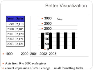
- 13. Better Visualization 3000 2500 2000 1500 1000 500 0 1999 2000 2001 2002 2003 Axis from 0 to 2000 scale gives correct impression of small change + small formatting tricks Year Sales 1999 2,110 2000 2,105 2001 2,120 2002 2,121 2003 2,124 Sales Sales
- 14. Pie Chart • Pie chart summarises a set of categorical/nominal data • But use with care… • … too many segments are harder to compare than in a bar chart Should we have a long lecture? Favourite movie genres