Accelerated Grid Theming
6 likes4,332 views

I co-presented these slides with Todd Nienkerk of FourKitchens.com -- We presented at Drupal Camp Dallas, as well as Design 4 Drupal at MIT.


Ad
More Related Content
Viewers also liked (20)
Similar to Accelerated Grid Theming (20)


Ad
More from Nathan Smith (20)


Ad
Recently uploaded (20)


Accelerated Grid Theming
- 1. Accelerated grid theming using NineSixty + Nathan Smith and Todd Nienkerk DrupalCamp Dallas | August 2, 2009
- 3. Nathan Smith Designer and developer Fellowship Technologies Drupal skill level: N00b Todd Nienkerk Co-founder, designer, and developer Four Kitchens Drupal skill level: Expert(-ish)! Photo of Nathan: Travis Isaacs; Photo of Todd: Kristin Hillery
- 4. What is a grid system?
- 5. History of the grid ‣ The practice of using a grid to guide design and page layout is nearly a century old ‣ In the 1910s and 1920s, ornamental design gave way to Rationalism and New Objectivity ‣ This shift in design was part of a much larger movement towards function over form ‣ Helvetica typeface and Bauhaus architecture Source: Grids are Good by Khoi Vinh and Mark Boulton
- 6. Typographic grids ‣ After World War II, a number of graphic designers, influenced by the modernist ideas of Die neue Typographie (The New Typography), questioned the relevance of the conventional page layout of the time ‣ They devised a flexible system to help designers achieve coherency in organizing the page Source: Grid (page layout) on Wikipedia
- 7. Nearly a century ago ‣ Modernists looked to build a new aesthetic by... ‣ deriving beauty from the innate qualities of the machine ‣ championing standardization ‣ Sound familiar? Source: Grids are Good by Khoi Vinh and Mark Boulton
- 8. Today ‣ Web designers have turned to grid-based design in order to... ‣ derive beauty from the innate qualities of the browser ‣ champion standardization ‣ 16 years after the invention of the web, we are finally embracing a century-old design philosophy Source: Grids are Good by Khoi Vinh and Mark Boulton
- 9. Grid systems on the web ‣ On the web, grid systems usually take the form of CSS frameworks ‣ A framework is a “reuseable abstraction of code wrapped in a well-defined API”1 ‣ A collection of tools and shortcuts designed to minimize code and make your life easier 1 Source: Software framework on Wikipedia
- 10. Examples of frameworks ‣ Ruby on Rails is a well-known Ruby framework ‣ jQuery is a JavaScript framework ‣ Drupal itself can be considered a web application framework ‣ Includes many APIs for working with databases, fields, and web forms
- 11. CSS frameworks ‣ Apply the principles of software frameworks to web design ‣ They provide standardized rules and shortcuts for: ‣ browser resets ‣ typography ‣ navigation ‣ print style ‣ and...
- 12. Layout ‣ When applied to web design, grid systems are CSS frameworks that provides standardized rules and shortcuts for building a website’s layout
- 13. “I’m convinced that the people railing against CSS frameworks are just trying to drum up some false job security.” —Jeff Croft, designer and author JeffCroft.com | What’s not to love about CSS frameworks?
- 14. Why use a grid system?
- 15. 1) Saves time 2) Saves money 3) Reduces frustration
- 16. Stop reinventing the wheel ‣ Reduces the amount of CSS and markup you need to duplicate each time you start a project ‣ No need to refer to old projects to figure out how to implement layouts
- 17. Multi-bodied hydra ‣ Many “dragons” share the same facade ‣ To render in a browser, all data has to pass through HTML ‣ .NET, ColdFusion, Java, Perl, PHP, Ruby, Python, etc. Photo from Lernaean Hydra on Wikipedia
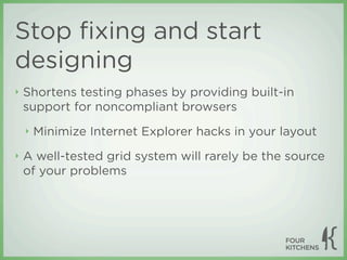
- 18. Stop fixing and start designing ‣ Shortens testing phases by providing built-in support for noncompliant browsers ‣ Minimize Internet Explorer hacks in your layout ‣ A well-tested grid system will rarely be the source of your problems
- 19. “Embrace constraints” — Mark Kraemer, National UX Practice Lead, EMC.com ‣ All modern displays support at least 1024×768 resolution ‣ Despite the many advances in web technology, it’s all just rectangles Photo: Aaron Schmidt on Flickr (Creative Commons BY-NC-SA)
- 20. Stop deconstructing CSS ‣ Understanding someone else’s design is much easier when a standard grid system is used
- 21. Enforcing a grid can accelerate design while maintaining order Photo: jontidmarsh on Flickr (Creative Commons BY-SA)
- 22. “Our craft is becoming a commodity and the people in charge don’t care about the quality of the markup, CSS or how short our JavaScript is. What matters is how fast you can get it to market, how many people it reaches and how cheaply it can be built.” —Christian Heilmann, Standards evangelist at Yahoo Think Vitamin | Web development is moving on — Are you?
- 23. How do grid systems work?
- 24. Columns ‣ Grid systems are built using columns ‣ Columns are a grid system’s smallest unit of measurement ‣ Most grid systems contain 12–16 columns Example based on 960.gs (12-column)
- 25. Column width ‣ Page regions (header, content, sidebars, etc.) are defined by column width ‣ As in: “The header is eight columns wide” Example based on 960.gs (12-column)
- 26. Gutters (margins) ‣ Margins or padding are used to create gutters between columns ‣ These gutters provide margins between page regions Example based on 960.gs (12-column)
- 27. Lean and versatile CSS ‣ A grid system’s CSS should: ‣ Be lean and efficient ‣ Be versatile and reusable ‣ Ensure consistent behavior across all common browsers — even IE6
- 28. Wrapping <div> elements ‣ In fixed-width grid systems, the entire layout is wrapped inside a single <div> element ‣ <div> elements wrap the page regions and define their widths according to the number of columns they span ‣ These <div> elements may be nested to create regions within regions
- 29. Floating <div> elements ‣ The wrapping <div> class: grid-12 elements are assigned a column width using a class: class: grid-4 grid-4 CSS class class: grid-4 ‣ Because these classes class: grid-8 also float the elements, they simply fall into class: grid-6 class: grid-6 place on the page Example based on 960.gs (12-column)
- 30. What can grid systems look like? Examples of grid-based layouts
- 31. Layout A: Content left, sidebar right Example based on 960.gs (12-column)
- 32. Layout B: Content between sidebars Example based on 960.gs (12-column)
- 33. Layout C: Content right with two left sidebars Example based on 960.gs (12-column)
- 34. Layout D: Whatever Example based on 960.gs (12-column)
- 35. Layout E: The Mondriaan Painting by Piet Mondriaan (later Mondrian)
- 36. How 960.gs works
- 37. What is 960.gs? ‣ 960.gs — also known as the 960 Grid System — was created by Nathan Smith in order to “streamline web development workflow” ‣ It’s both a prototyping and development framework ‣ “The premise of the system is ideally suited to rapid prototyping, but it would work equally well when integrated into a production environment.” Source: 960.gs
- 38. Inspiration: Khoi Vinh Subtraction.com | Grid Computing… and Design
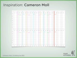
- 39. Inspiration: Cameron Moll Cameron Moll | Gridding the 960
- 40. Inspiration: Brandon Schauer Adaptive Path | Sketchboards: Discover Better + Faster UX Solutions
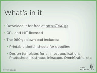
- 41. What’s in it ‣ Download it for free at http://960.gs ‣ GPL and MIT licensed ‣ The 960.gs download includes: ‣ Printable sketch sheets for doodling ‣ Design templates for all most applications: Photoshop, Illustrator, Inkscape, OmniGraffle, etc. Source: 960.gs
- 42. Technical specs ‣ 960px wide with a 940px usable area ‣ Two versions: 12- and 16-column ‣ These can be implemented separately or simultaneously ‣ Each column has a 10px margin on the left and right, which creates a 20px gutter between columns Source: 960.gs
- 43. 12-column version Columns are 60px wide Gutters are 20px wide 10px margin on the left and Available right prevents collision with working area browser chrome is 940px wide Source: 960.gs
- 44. 16-column version Columns are 40px wide Everything else remains the same Source: 960.gs
- 45. Using both versions simultaneously ‣ 12- and 16-column layouts can be used on the same page Halves Quarters
- 46. ‣ This flexibility allows designers to work with both 60px- and 40px-wide columns ‣ If 12 or 16 columns don’t suit you, 960 is also divisible by 2, 3, 4, 5, 6, 8, 10, 15, 20, 24, 30, 32, 40, 48, 60, 64, 80, 96, 120, 160, 192, 240, 320 and 480
- 47. CSS and markup Note: 960.gs uses underscores in its CSS class names. To avoid confusion, the examples that follow will use hyphens instead, as this is The Drupal Way.
- 48. Containers ‣ Grids must be wrapped in a container <div> .container-12, .container-16 { ‣ Containers center the margin-left: auto; content and define margin-right: auto; which version of the width: 960px; } grid will be implemented
- 49. Grids ‣ Grids are held inside .grid-1, .grid-2, containers and are .grid-3, floated left so they fall ... into place .grid-16 { display: inline; automatically float: left; position: relative; ‣ They also provide 10px margin-left: 10px; margins on the left and margin-right: 10px; } right
- 50. Grid widths ‣ The width of each grid is determined by the .container-12 .grid-1 { container that wraps it width: 60px; } ‣ For example, a one- .container-16 .grid-1 { column grid is either width: 40px; 60px or 40px } depending on whether it’s a 12- or 16-column layout
- 51. ‣ Note that grid width does not increase by 60px or 40px each time ‣ Each increase must account for the 20px gutter between grids .container-12 .grid-1 { .container-16 .grid-1 { width: 60px; width: 40px; } } .container-12 .grid-2 { .container-16 .grid-2 { width: 140px; width: 100px; } } .container-12 .grid-3 { .container-16 .grid-3 { width: 300px; width: 160px; } }
- 52. Putting containers and grids together .container-12 .grid-3 .grid-6 .grid-3
- 53. Prefixes and suffixes ‣ If you want to leave space between .container-12 .prefix-1 { columns, use a prefix padding-left: 80px; or suffix class } .container-12 .suffix-1 { ‣ Prefix classes add padding-right: 80px; padding to the left of a } column ‣ Suffix classes add padding to the right
- 54. Adding a prefix and suffix .container-12 .grid-4 .grid-3 .prefix-1 .grid-3 .suffix-1
- 55. Multiple rows .container-12 .grid-12 .grid-4 .grid-3 .prefix-1 .grid-3 .suffix-1
- 56. Multiple rows: markup <div class="container-12"> The container <div> defines the layout <!-- row 1 --> <div class="grid-12"> version in use This grid occupies the full width </div> <!-- row 2 --> <div class="grid-3"> One wide No need to put </div> each row in its own <div class="grid-4 prefix-1 suffix-1"> wrapping <div> Four wide with a prefix and suffix of one each </div> <div class="grid-3"> One wide </div> </div> <!-- /container -->
- 57. Stack content vertically with nested grids .grid-6 .container-12 .grid-6 .grid-3 .grid-3 .grid-6
- 58. ‣ Here’s the catch: Because each grid includes a 10px left and right margin, nesting grids can break your layout .grid-6 .container-12 .grid-6 .grid-3 .grid-6 .grid-3
- 59. Alpha and omega fix broken nesting ‣ When nesting grids, use the alpha and omega classes to remove the margins ‣ alpha removes the left margin. It’s the first nested grid. ‣ omega removes the right margin. It’s the last nested grid.
- 60. .grid-6 .container-12 .grid-3 .grid-3 .alpha .omega .grid-3 .grid-3 .grid-6 .alpha .omega .alpha removed .omega removed the left margin the right margin
- 61. “In the time you could argue the relevance of naming conventions like these, I just built a 16 column layout.” —Matthew Anderson, designer at OneHub.com Onehub.com | Why We Chose 960.gs for Our CSS Framework
- 62. Additional resources ‣ 960 Gridder and bookmarklet ‣ Variable grid system generator ‣ Other grid systems based on 960.gs ‣ Fluid 960.gs ‣ Typogridphy: Typographical and grid layout CSS framework ‣ and...
- 64. About NineSixty ‣ NineSixty is the Drupal port of 960.gs ‣ Developed by Joon Park, aka dvessel on Drupal.org ‣ Intended to be used as a base theme ‣ Currently a candidate for Drupal 7 core ‣ Follow the debate on groups.drupal.org Source: Drupal.org
- 65. NineSixty’s improvements ‣ Content-first layout using “push” and “pull” classes ‣ These classes have been added back to 960.gs ‣ Dynamic grid widths based on context ‣ Debugging tools and grid visualization ‣ Right-to-left (RTL) language support
- 66. Content-first layout ‣ A design convention in which the content is output as close to the top of the markup as possible ‣ Content should be output before all sidebars ‣ Some designers believe it should be output before a site’s main navigation ‣ This can be very difficult to achieve on a site with one or more left columns
- 67. Push and pull classes ‣ Content-first layout can be achieved in NineSixty by “pushing” the content grid to the right while “pulling” a sidebar to the left ‣ These classes use the same naming convention as .grid-X, .prefix-X, and .suffix-X, where X is the grid’s width: ‣ .push-X and .pull-X
- 68. ‣ Push and pull values should match the grid value of the opposite grid <div class="container-12"> <div id="content" class="grid-6 push-3"> Match numbers to Content swap locations </div> <div id="sidebar-left" class="grid-3 pull-6"> Sidebar: Left </div> <div id="sidebar-right" class="grid-3"> Sidebar: Right </div> </div> Source: NineSixty’s README.txt
- 69. Before adding push and pull .container-12 .grid-6 .grid-3 .grid-3 <div class="container-12"> <div id="content" class="grid-6"> Content </div> <div id="sidebar-left" class="grid-3"> Sidebar: Left </div> <div id="sidebar-right" class="grid-3"> Sidebar: Right </div> </div>
- 70. After adding push and pull .container-12 .grid-3 .grid-6 .grid-3 .pull-6 .push-3 <div class="container-12"> <div id="content" class="grid-6 push-3"> Content </div> <div id="sidebar-left" class="grid-3 pull-6"> Sidebar: Left </div> <div id="sidebar-right" class="grid-3"> Sidebar: Right </div> </div>
- 71. Dynamic grid widths ‣ In some cases, you may want grids to resize themselves when a region isn’t populated ‣ For example, a 3-6-3 layout should become 3-9 if the right column is empty ‣ Dynamic width assignment is handled using the ns() function ‣ Defined in template.php
- 72. Structure of ns() These “pairs” Default subtract from the value default value ns('class-X', $region, Y, $region, Z, ...) ‣ X, Y, and Z are all width values ‣ class can be grid, prefix, suffix, push, or pull ‣ $region can be any theme region ‣ Use as many pairs as you like
- 73. Implementing ns() From page.tpl.php: <div id="main" class="column <?php print ns('grid-16', $left, 4, $right, 3) . ' ' . ns('push-4', !$left, 4); ?>"> <?php print $content; ?> </div> <?php if ($left): ?> <div id="sidebar-left" class="column sidebar region grid-4 <? php print ns('pull-12', $right, 3); ?>"> <?php print $left; ?> </div> <?php endif; ?> <?php if ($right): ?> <div id="sidebar-right" class="column sidebar region grid-3"> <?php print $right; ?> </div> <?php endif; ?> Source: NineSixty’s page.tpl.php
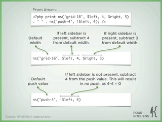
- 74. From #main: <?php print ns('grid-16', $left, 4, $right, 3) . ' ' . ns('push-4', !$left, 4); ?> If left sidebar is If right sidebar is Default present, subtract 4 present, subtract 3 width from default width. from default width. ns('grid-16', $left, 4, $right, 3) If left sidebar is not present, subtract Default 4 from the push value. This will result push value in no push, as 4-4 = 0 ns('push-4', !$left, 4) Source: NineSixty’s page.tpl.php
- 75. From #sidebar-left: <?php php print ns('pull-12', $right, 3); ?> If right sidebar is Default present, subtract 3 pull value from default pull value ns('pull-12', $right, 3) Source: NineSixty’s page.tpl.php
- 76. NineSixty in action ‣ Visit http://ninesixty.fkdemos.com to see how NineSixty... ‣ uses push and pull classes to generate content- first layout ‣ dynamically assigns grid widths based on context ‣ can be used to create different layouts
- 77. Planned improvements to NineSixty ‣ Split 12- and 16-column CSS into separate files ‣ Slimmer CSS and faster page loads ‣ Add vertical rhythm ‣ Standardized, more professional typesetting ‣ See A List Apart’s “Setting type on the web” Source: Joon Park's Twitter feed (@dvessel)
- 78. Implementing a grid- based layout Using NineSixty to build your site
- 79. When not to use a grid ‣ Implementing a grid will probably be impossible if your site’s layout... ‣ uses irregular column sizes ‣ has irregular margins or gutters ‣ has a width that isn’t divisible by a sane number
- 80. ‣ Implementing a grid will be difficult — but not impossible — if your site’s layout... ‣ has gutter widths of odd numbers ‣ is fluid ‣ wasn’t designed on a grid
- 81. Getting started ‣ Do not change the NineSixty theme on your site! ‣ Hacking NineSixty is like hacking core: It will make upgrading your site very difficult ‣ Instead, subtheme NineSixty or create a totally new theme based on NineSixty
- 82. Subtheme ‣ This method is best if your site is (or can be) 960px wide and can utilize 12 or 16 columns ‣ Subtheming instructions and resources on Drupal.org: ‣ Subtheming quick and dirty ‣ Sub-themes, their structure and inheritance
- 83. Build a new theme ‣ You should build a new theme when your site’s layout... ‣ isn’t 960px wide ‣ doesn’t use 12 or 16 columns ‣ It’s more efficient to use a new theme than to override virtually all of NineSixty’s CSS
- 84. Do the math ‣ Be prepared to crunch numbers ‣ Building a new theme can be very confusing ‣ Spreadsheets can help you visualize column, margins, and gutters Image source: Client project
- 85. The grid equation (Canvas - ((Total units - 1) x Gutter)) ÷ Total units = Unit ‣ Examples (remember that the true “canvas” size of 960.gs is actually 940px): ‣ (940 - ((12 - 1) x 20)) ÷ 12 = 60 ‣ (940 - ((16 - 1) x 20)) ÷ 16 = 40 Source: Grids are Good by Khoi Vinh and Mark Boulton
- 86. Examples 960.gs as a development and prototyping system
- 87. Refresh Boston: 16 columns refreshboston.org
- 89. Pepsi comp: 16 columns
- 90. AAFES comp: 12 columns Credits
- 92. Drupal.org redesign: 12 columns infrastructure.drupal.org/drupal.org-style-guide/prototype.html
- 93. Case study Four Kitchens’ company website
- 94. ‣ Subtheme of NineSixty ‣ 12-column version Source: fourkitchens.com
- 96. Header promos Right column grid-4 grid-3 Content column grid-8 Gutter grid-1 Source: fourkitchens.com/blog
- 98. Content column Gutter Right column grid-8 grid-1 grid-3 Footer columns grid-3 Sub-footer Gutter Sub-footer content column grid-1 right column grid-8 grid-3 Source: fourkitchens.com
- 99. Appendix
- 100. Learn more about grids ‣ The Grid System ‣ “The ultimate resource in grid systems” ‣ The Grid System’s Flickr pool ‣ My bookmarks tagged “gridsystems”
- 101. Downloads ‣ 960 grid system: 960.gs ‣ NineSixty theme for Drupal: drupal.org/project/ ninesixty ‣ This and other presentations are available for download at fourkitchens.com/presentations
- 102. Contact Nathan ‣ Email: [email protected] ‣ Twitter: twitter.com/nathansmith
- 103. Contact Todd ‣ Email: [email protected] ‣ also works for Google Chat and AIM ‣ Skype: toddatfk ‣ Twitter: twitter.com/toddross
- 104. Credits ‣ “History of the grid” slides were ‣ This presentation was created and borrowed heavily from Khoi Vinh delivered by Nathan Smith of and Mark Boulton’s presentation Fellowship Tech and Todd Ross Grids are Good and from Nienkerk, co-founder of Four Wikipedia Kitchens ‣ Piet Mondriaan painting was found somewhere online. Copyright holder is unknown ‣ The items listed above are exempt from this presentation’s Creative Commons license
- 105. All content in this presentation, except where noted otherwise, is Creative Commons Attribution- ShareAlike 3.0 licensed and copyright 2009 Four Kitchen Studios, LLC.