SlideShare a Scribd company logo
ADVANCED
CSS TRICKS &
TECHNIQUES
Robert Richelieu
Twitter: @azoblu3
WHO AM I?
FIXED TABLE LAYOUTS
* Not widely known
* Changes the way tables are rendered
* More predictable layout
CURVE TEXT AROUND A FLOATED
IMAGE
shape-outside property
 Allows geometric shapes to be set, in order to define an area for text to flow
around.
 The shape must have its dimensions specified.
 Set the height and width of the element.
 These will be used by the shape function to create a coordinate system that is used when wrapping text
around the image.
Provides functionality to create these shapes:
 Circle
 shape-outside: circle(50%);
 Ellipse
 shape-outside: ellipse(50px 100px at 50% 50%);
 Polygon
 clip-path: polygon(0% 0%, 100% 0%, 50% 100%);
shape-outside: polygon(0% 0%, 100% 0%, 50% 100%);
CURVE TEXT AROUND A FLOATED
IMAGE
 Circle
 shape-outside: circle(50%);
 The full notation for circle() is circle(r at cx cy) where r is the radius of the circle and
cx and cy are the coordinates for the center of the circle.
 If you omit them, the center of the image will be used as the default values.
CURVE TEXT AROUND A FLOATED
IMAGE
 Ellipse
 shape-outside: ellipse(50px 100px at 50% 50%);
 Ellipse is a variation of the circle where the item is elongated on either the
horizontal or vertical axis.
 The full notation for ellipse() is ellipse(rx ry at cx cy)
 rx and ry are the radiuses for the ellipse and cx and cy are the coordinates for the center of the ellipse.
CURVE TEXT AROUND A FLOATED
IMAGE
 Polygon
 clip-path: polygon(0% 0%, 100% 0%, 50% 100%);
shape-outside: polygon(0% 0%, 100% 0%, 50% 100%);
 The polygon function provides an unlimited range of shapes.
 The full notation for polygon() is polygon(x1 y1, x2 y2, …)
 each pair specifies the x & y coordinates for a vertex of the polygon.
 To use the polygon() function you must specify a minimum of 3 pairs of vertex.
 Polygon is used with a clip-path
 The clip-path CSS property creates a clipping region that defines what part of an element should be
displayed.
 Anything inside the region is displayed, while anything outside is hidden.
COLOR FADE ON HOVER
 We use CSS3 transitions
 Applied on the element on a normal state
 Easy way to make your links (or any other element) look nice
 Compatible accross the board
-webkit-transition-property: color, background;
-webkit-transition-duration: 1s, 1s;
-webkit-transition-timing-function: linear, ease-in;
STYLE BROKEN IMAGES
 Broken images can happen, whatever you do.
 Using CSS, it is possible to style broken images and provide custom
error messages to your visitors.
 Two facts about the way the <img> element behaves:
1. We can apply regular typography-related styling to the <img> element.
 These styles will be applied to the alternative text, if it is displayed, and will not affect the working image.
2. The <img> element is replaced element, its appearance and dimensions are
defined by an external resource.
 Because the element is controlled by an external source, the :before and :after pseudo-elements typically
shouldn’t work with it. However, when the image is broken and not loaded, these pseudo-elements can
appear.
 Unfortunately, not all browsers handle broken images in the same
way.
 For some browsers, even though the image is not displayed, the pseudo-elements
don't show up at all.
ATTRIBUTE SELECTORS
 Attribute selectors are case-sensitive, and are written inside
brackets [ ]
 There are different types of matches you can find with an attribute
selector, and the syntax is different for each.
 Each of the more complex attribute selectors build on the syntax of
the exact match selector.
ATTRIBUTE SELECTORS
Selector empty or not:
 div[data-attr='']
 div:not([data-attr=''])
Attribute...
 contains exact value: a[href="http://www.google.com"]
 Starts with value: h3[rel^="external"]
 Ends with value: h3[rel$="external"]
 Attribute is within a space-separated list: [rel~="friend"]
 Attribute is within a dash-separated list: [rel|="friend"]
 Multiple attributes match: h3[rel="handsome"][title^="Important"]
COMMA-SEPARATED LISTS
Display an unordered list as a comma-separated list.
Can be usefull when having multiple items from a database that you
want to display as text without having to pre-format it
programmatically.
ul.styled, ul.styled > li{ display: inline; list-style: none; padding: 0; }
ul.styled > li:not(:last-child)::after { content: ","; }
ul.styled > li:last-child::after { content: "."; }
Use with CAUTION...
This may not be ideal for accessibility, specifically screen readers.
Copy/paste from the browser doesn't work with CSS-generated
content.
CREATING SHAPES USING CSS
Common shapes:
 Square
 Rectangle
 Circle
 Oval
 Triangle
CREATING SHAPES USING CSS
 Square:
 #square { background-color: red; width: 100px; height: 100px; }
 Rectangle:
 #rectangle { background-color: red; width: 200px; height: 100px; }
 Circle:
 #circle { background-color: red; width: 100px; height: 100px; -moz-border-
radius: 50px; -webkit-border-radius: 50px; border-radius: 50px; }
 Oval:
 #oval { background-color: red; border-radius: 100px / 50px; height: 100px;
width: 200px; -moz-border-radius: 100px / 50px; -webkit-border-radius:
100px / 50px; }
CREATING SHAPES USING CSS
 It's interresting to note that when 2 borders meet, they do so at an angle, allowing
us to create triangles!
 Triangle Up:
 #triangle-up { border-left: 50px solid transparent; border-right: 50px solid
transparent; border-bottom: 100px solid red; width: 0; height: 0; }
 Triangle Down:
 #triangle-down { width: 0; height: 0; border-left: 50px solid transparent;
border-right: 50px solid transparent; border-top: 100px solid red; }
BOX SHADOW VS. DROP SHADOW
CSS FLUID SIZING
 The viewport is tha area of your browser where actual content is
displayed, in other words your web browser without its toolbars and
buttons.
 The units we use are vw, vh, vmin and vmax.
 1 vw: 1/100th viewport width
 1 vh: 1/100th viewport height
 1 vmin: 1/100th of the smallest side
 1 vmax: 1/100th of the largest side
 1vmax equals 1vh in portrait mode
 1vmax will equal 1vw in landscape mode
 NOTE: IE11 uses vm instead of vmin. It does not support vmax.
CALC()
Native CSS way to do simple math right in CSS as a replacement for
any length value (or pretty much any number value).
It has four simple math operators:
 add (+),
 subtract (-),
 multiply (*),
 and divide (/).
Being able to do math in code is nice and a welcome addition to a
language that is fairly number heavy.
THANK YOU!
Robert Richelieu
Twitter: @azoblu3
LinkedIn: https://www.linkedin.com/in/robert-richelieu-6133a2aa/
Facebook: https://www.facebook.com/rrichelieu
Example
files: https://drive.google.com/open?id=1fumPPwRo1wvCKwOw5qQgVrenJnnchFJ5
Come talk to me! I don't bite!
Ad

More Related Content

What's hot (8)

Sketch3 學習筆記
Sketch3 學習筆記Sketch3 學習筆記
Sketch3 學習筆記
Chuan Yang
 
Intro to HTML5 Canvas
Intro to HTML5 CanvasIntro to HTML5 Canvas
Intro to HTML5 Canvas
Juho Vepsäläinen
 
Canvas - HTML 5
Canvas - HTML 5Canvas - HTML 5
Canvas - HTML 5
Jaeni Sahuri
 
HTML 5_Canvas
HTML 5_CanvasHTML 5_Canvas
HTML 5_Canvas
Vishakha Vaidya
 
Introduction to HTML5 Canvas
Introduction to HTML5 CanvasIntroduction to HTML5 Canvas
Introduction to HTML5 Canvas
Mindy McAdams
 
響應式網頁實作坊
響應式網頁實作坊響應式網頁實作坊
響應式網頁實作坊
Chih-cheng Wang
 
DrawingML Subject: Shape Properties & Effects
DrawingML Subject: Shape Properties & EffectsDrawingML Subject: Shape Properties & Effects
DrawingML Subject: Shape Properties & Effects
Shawn Villaron
 
HTML5 Canvas
HTML5 CanvasHTML5 Canvas
HTML5 Canvas
Robyn Overstreet
 
Sketch3 學習筆記
Sketch3 學習筆記Sketch3 學習筆記
Sketch3 學習筆記
Chuan Yang
 
Introduction to HTML5 Canvas
Introduction to HTML5 CanvasIntroduction to HTML5 Canvas
Introduction to HTML5 Canvas
Mindy McAdams
 
響應式網頁實作坊
響應式網頁實作坊響應式網頁實作坊
響應式網頁實作坊
Chih-cheng Wang
 
DrawingML Subject: Shape Properties & Effects
DrawingML Subject: Shape Properties & EffectsDrawingML Subject: Shape Properties & Effects
DrawingML Subject: Shape Properties & Effects
Shawn Villaron
 

Similar to Advanced CSS Tricks and Techniques (20)

CSS and CSS3
CSS and CSS3CSS and CSS3
CSS and CSS3
Robyn Overstreet
 
CSS 3
CSS 3CSS 3
CSS 3
Doncho Minkov
 
CSS 3 Overview
CSS 3 OverviewCSS 3 Overview
CSS 3 Overview
Danilo Sousa
 
Lecture-8.pptx
Lecture-8.pptxLecture-8.pptx
Lecture-8.pptx
vishal choudhary
 
Fundamental CSS3
Fundamental CSS3Fundamental CSS3
Fundamental CSS3
Achmad Solichin
 
Drawing a Circle Three Ways: Generating Graphics for the Web
Drawing a Circle Three Ways: Generating Graphics for the WebDrawing a Circle Three Ways: Generating Graphics for the Web
Drawing a Circle Three Ways: Generating Graphics for the Web
Cloudinary
 
GOTO Berlin - You can use CSS for that
GOTO Berlin - You can use CSS for thatGOTO Berlin - You can use CSS for that
GOTO Berlin - You can use CSS for that
Rachel Andrew
 
CSS
CSSCSS
CSS
ARJUN
 
Web Layout
Web LayoutWeb Layout
Web Layout
Shawn Calvert
 
Cordova training - Day 3 : Advanced CSS 3
Cordova training - Day 3 : Advanced CSS 3Cordova training - Day 3 : Advanced CSS 3
Cordova training - Day 3 : Advanced CSS 3
Binu Paul
 
CSS Cascade Style Sheet
CSS Cascade Style SheetCSS Cascade Style Sheet
CSS Cascade Style Sheet
Adeel Rasheed
 
Css
CssCss
Css
Rathan Raj
 
CSS for basic learner
CSS for basic learnerCSS for basic learner
CSS for basic learner
Yoeung Vibol
 
CSS3
CSS3CSS3
CSS3
Doncho Minkov
 
The Creative New World of CSS
The Creative New World of CSSThe Creative New World of CSS
The Creative New World of CSS
Rachel Andrew
 
CSS-3 Course Slide
CSS-3 Course SlideCSS-3 Course Slide
CSS-3 Course Slide
BoneyGawande
 
HTML5 and CSS3 – exploring mobile possibilities - Dynabyte event
HTML5 and CSS3 – exploring mobile possibilities - Dynabyte eventHTML5 and CSS3 – exploring mobile possibilities - Dynabyte event
HTML5 and CSS3 – exploring mobile possibilities - Dynabyte event
Robert Nyman
 
MTA managing the graphical interface by using css
MTA managing the graphical interface by using cssMTA managing the graphical interface by using css
MTA managing the graphical interface by using css
Dhairya Joshi
 
Big Design Conference: CSS3
Big Design Conference: CSS3 Big Design Conference: CSS3
Big Design Conference: CSS3
Wynn Netherland
 
SVGo: a Go Library for SVG generation
SVGo: a Go Library for SVG generationSVGo: a Go Library for SVG generation
SVGo: a Go Library for SVG generation
Anthony Starks
 
Drawing a Circle Three Ways: Generating Graphics for the Web
Drawing a Circle Three Ways: Generating Graphics for the WebDrawing a Circle Three Ways: Generating Graphics for the Web
Drawing a Circle Three Ways: Generating Graphics for the Web
Cloudinary
 
GOTO Berlin - You can use CSS for that
GOTO Berlin - You can use CSS for thatGOTO Berlin - You can use CSS for that
GOTO Berlin - You can use CSS for that
Rachel Andrew
 
Cordova training - Day 3 : Advanced CSS 3
Cordova training - Day 3 : Advanced CSS 3Cordova training - Day 3 : Advanced CSS 3
Cordova training - Day 3 : Advanced CSS 3
Binu Paul
 
CSS Cascade Style Sheet
CSS Cascade Style SheetCSS Cascade Style Sheet
CSS Cascade Style Sheet
Adeel Rasheed
 
CSS for basic learner
CSS for basic learnerCSS for basic learner
CSS for basic learner
Yoeung Vibol
 
The Creative New World of CSS
The Creative New World of CSSThe Creative New World of CSS
The Creative New World of CSS
Rachel Andrew
 
CSS-3 Course Slide
CSS-3 Course SlideCSS-3 Course Slide
CSS-3 Course Slide
BoneyGawande
 
HTML5 and CSS3 – exploring mobile possibilities - Dynabyte event
HTML5 and CSS3 – exploring mobile possibilities - Dynabyte eventHTML5 and CSS3 – exploring mobile possibilities - Dynabyte event
HTML5 and CSS3 – exploring mobile possibilities - Dynabyte event
Robert Nyman
 
MTA managing the graphical interface by using css
MTA managing the graphical interface by using cssMTA managing the graphical interface by using css
MTA managing the graphical interface by using css
Dhairya Joshi
 
Big Design Conference: CSS3
Big Design Conference: CSS3 Big Design Conference: CSS3
Big Design Conference: CSS3
Wynn Netherland
 
SVGo: a Go Library for SVG generation
SVGo: a Go Library for SVG generationSVGo: a Go Library for SVG generation
SVGo: a Go Library for SVG generation
Anthony Starks
 
Ad

Recently uploaded (20)

34 Mobile Payment (Thomas Lerner (auth.).pdf
34 Mobile Payment (Thomas Lerner (auth.).pdf34 Mobile Payment (Thomas Lerner (auth.).pdf
34 Mobile Payment (Thomas Lerner (auth.).pdf
Nguyễn Minh
 
Determining Glass is mechanical textile
Determining  Glass is mechanical textileDetermining  Glass is mechanical textile
Determining Glass is mechanical textile
Azizul Hakim
 
Perguntas dos animais - Slides ilustrados de múltipla escolha
Perguntas dos animais - Slides ilustrados de múltipla escolhaPerguntas dos animais - Slides ilustrados de múltipla escolha
Perguntas dos animais - Slides ilustrados de múltipla escolha
socaslev
 
23 Introduction to E-Commerce ( PDFDrive ) (1).pdf
23 Introduction to E-Commerce ( PDFDrive ) (1).pdf23 Introduction to E-Commerce ( PDFDrive ) (1).pdf
23 Introduction to E-Commerce ( PDFDrive ) (1).pdf
Nguyễn Minh
 
34 Turban Electronic Commerce 2018_ A Managerial and Social Networks Perspect...
34 Turban Electronic Commerce 2018_ A Managerial and Social Networks Perspect...34 Turban Electronic Commerce 2018_ A Managerial and Social Networks Perspect...
34 Turban Electronic Commerce 2018_ A Managerial and Social Networks Perspect...
Nguyễn Minh
 
Breaking Down the Latest Spectrum Internet Plans.pdf
Breaking Down the Latest Spectrum Internet Plans.pdfBreaking Down the Latest Spectrum Internet Plans.pdf
Breaking Down the Latest Spectrum Internet Plans.pdf
Internet Bundle Now
 
API-First Approach To Shopify Salesforce Integration_ Why Developers Prefer I...
API-First Approach To Shopify Salesforce Integration_ Why Developers Prefer I...API-First Approach To Shopify Salesforce Integration_ Why Developers Prefer I...
API-First Approach To Shopify Salesforce Integration_ Why Developers Prefer I...
CartCoders
 
APNIC -Policy Development Process, presented at Local APIGA Taiwan 2025
APNIC -Policy Development Process, presented at Local APIGA Taiwan 2025APNIC -Policy Development Process, presented at Local APIGA Taiwan 2025
APNIC -Policy Development Process, presented at Local APIGA Taiwan 2025
APNIC
 
How to Switch Hosting Providers in Vancouver Without Any Downtime
How to Switch Hosting Providers in Vancouver Without Any DowntimeHow to Switch Hosting Providers in Vancouver Without Any Downtime
How to Switch Hosting Providers in Vancouver Without Any Downtime
steve198109
 
水印成绩单加拿大Mohawk文凭莫霍克学院在读证明毕业证
水印成绩单加拿大Mohawk文凭莫霍克学院在读证明毕业证水印成绩单加拿大Mohawk文凭莫霍克学院在读证明毕业证
水印成绩单加拿大Mohawk文凭莫霍克学院在读证明毕业证
Taqyea
 
IoT PPT introduction to internet of things
IoT PPT introduction to internet of thingsIoT PPT introduction to internet of things
IoT PPT introduction to internet of things
VaishnaviPatil3995
 
Application Layer Application Layer Application Layer
Application Layer Application Layer Application LayerApplication Layer Application Layer Application Layer
Application Layer Application Layer Application Layer
Tito208863
 
Cloud-to-cloud Migration presentation.pptx
Cloud-to-cloud Migration presentation.pptxCloud-to-cloud Migration presentation.pptx
Cloud-to-cloud Migration presentation.pptx
marketing140789
 
Computers Networks Computers Networks Computers Networks
Computers Networks Computers Networks Computers NetworksComputers Networks Computers Networks Computers Networks
Computers Networks Computers Networks Computers Networks
Tito208863
 
How to Install & Activate ListGrabber - eGrabber
How to Install & Activate ListGrabber - eGrabberHow to Install & Activate ListGrabber - eGrabber
How to Install & Activate ListGrabber - eGrabber
eGrabber
 
Understanding the Tor Network and Exploring the Deep Web
Understanding the Tor Network and Exploring the Deep WebUnderstanding the Tor Network and Exploring the Deep Web
Understanding the Tor Network and Exploring the Deep Web
nabilajabin35
 
Bombardino-Crocodilo-Diving-into-Italian-Brainrot.pptx
Bombardino-Crocodilo-Diving-into-Italian-Brainrot.pptxBombardino-Crocodilo-Diving-into-Italian-Brainrot.pptx
Bombardino-Crocodilo-Diving-into-Italian-Brainrot.pptx
HarrisWelton
 
Fractures In Chronic Kidney Disease Patients - Copy (3).pptx
Fractures In Chronic Kidney Disease Patients - Copy (3).pptxFractures In Chronic Kidney Disease Patients - Copy (3).pptx
Fractures In Chronic Kidney Disease Patients - Copy (3).pptx
ChaitanJaunky1
 
34 E-commerce - business, technology and society (2022).pdf
34 E-commerce - business, technology and society (2022).pdf34 E-commerce - business, technology and society (2022).pdf
34 E-commerce - business, technology and society (2022).pdf
Nguyễn Minh
 
data science data stoger Presentation1.pptx
data science data stoger Presentation1.pptxdata science data stoger Presentation1.pptx
data science data stoger Presentation1.pptx
sandeepsherkhane830
 
34 Mobile Payment (Thomas Lerner (auth.).pdf
34 Mobile Payment (Thomas Lerner (auth.).pdf34 Mobile Payment (Thomas Lerner (auth.).pdf
34 Mobile Payment (Thomas Lerner (auth.).pdf
Nguyễn Minh
 
Determining Glass is mechanical textile
Determining  Glass is mechanical textileDetermining  Glass is mechanical textile
Determining Glass is mechanical textile
Azizul Hakim
 
Perguntas dos animais - Slides ilustrados de múltipla escolha
Perguntas dos animais - Slides ilustrados de múltipla escolhaPerguntas dos animais - Slides ilustrados de múltipla escolha
Perguntas dos animais - Slides ilustrados de múltipla escolha
socaslev
 
23 Introduction to E-Commerce ( PDFDrive ) (1).pdf
23 Introduction to E-Commerce ( PDFDrive ) (1).pdf23 Introduction to E-Commerce ( PDFDrive ) (1).pdf
23 Introduction to E-Commerce ( PDFDrive ) (1).pdf
Nguyễn Minh
 
34 Turban Electronic Commerce 2018_ A Managerial and Social Networks Perspect...
34 Turban Electronic Commerce 2018_ A Managerial and Social Networks Perspect...34 Turban Electronic Commerce 2018_ A Managerial and Social Networks Perspect...
34 Turban Electronic Commerce 2018_ A Managerial and Social Networks Perspect...
Nguyễn Minh
 
Breaking Down the Latest Spectrum Internet Plans.pdf
Breaking Down the Latest Spectrum Internet Plans.pdfBreaking Down the Latest Spectrum Internet Plans.pdf
Breaking Down the Latest Spectrum Internet Plans.pdf
Internet Bundle Now
 
API-First Approach To Shopify Salesforce Integration_ Why Developers Prefer I...
API-First Approach To Shopify Salesforce Integration_ Why Developers Prefer I...API-First Approach To Shopify Salesforce Integration_ Why Developers Prefer I...
API-First Approach To Shopify Salesforce Integration_ Why Developers Prefer I...
CartCoders
 
APNIC -Policy Development Process, presented at Local APIGA Taiwan 2025
APNIC -Policy Development Process, presented at Local APIGA Taiwan 2025APNIC -Policy Development Process, presented at Local APIGA Taiwan 2025
APNIC -Policy Development Process, presented at Local APIGA Taiwan 2025
APNIC
 
How to Switch Hosting Providers in Vancouver Without Any Downtime
How to Switch Hosting Providers in Vancouver Without Any DowntimeHow to Switch Hosting Providers in Vancouver Without Any Downtime
How to Switch Hosting Providers in Vancouver Without Any Downtime
steve198109
 
水印成绩单加拿大Mohawk文凭莫霍克学院在读证明毕业证
水印成绩单加拿大Mohawk文凭莫霍克学院在读证明毕业证水印成绩单加拿大Mohawk文凭莫霍克学院在读证明毕业证
水印成绩单加拿大Mohawk文凭莫霍克学院在读证明毕业证
Taqyea
 
IoT PPT introduction to internet of things
IoT PPT introduction to internet of thingsIoT PPT introduction to internet of things
IoT PPT introduction to internet of things
VaishnaviPatil3995
 
Application Layer Application Layer Application Layer
Application Layer Application Layer Application LayerApplication Layer Application Layer Application Layer
Application Layer Application Layer Application Layer
Tito208863
 
Cloud-to-cloud Migration presentation.pptx
Cloud-to-cloud Migration presentation.pptxCloud-to-cloud Migration presentation.pptx
Cloud-to-cloud Migration presentation.pptx
marketing140789
 
Computers Networks Computers Networks Computers Networks
Computers Networks Computers Networks Computers NetworksComputers Networks Computers Networks Computers Networks
Computers Networks Computers Networks Computers Networks
Tito208863
 
How to Install & Activate ListGrabber - eGrabber
How to Install & Activate ListGrabber - eGrabberHow to Install & Activate ListGrabber - eGrabber
How to Install & Activate ListGrabber - eGrabber
eGrabber
 
Understanding the Tor Network and Exploring the Deep Web
Understanding the Tor Network and Exploring the Deep WebUnderstanding the Tor Network and Exploring the Deep Web
Understanding the Tor Network and Exploring the Deep Web
nabilajabin35
 
Bombardino-Crocodilo-Diving-into-Italian-Brainrot.pptx
Bombardino-Crocodilo-Diving-into-Italian-Brainrot.pptxBombardino-Crocodilo-Diving-into-Italian-Brainrot.pptx
Bombardino-Crocodilo-Diving-into-Italian-Brainrot.pptx
HarrisWelton
 
Fractures In Chronic Kidney Disease Patients - Copy (3).pptx
Fractures In Chronic Kidney Disease Patients - Copy (3).pptxFractures In Chronic Kidney Disease Patients - Copy (3).pptx
Fractures In Chronic Kidney Disease Patients - Copy (3).pptx
ChaitanJaunky1
 
34 E-commerce - business, technology and society (2022).pdf
34 E-commerce - business, technology and society (2022).pdf34 E-commerce - business, technology and society (2022).pdf
34 E-commerce - business, technology and society (2022).pdf
Nguyễn Minh
 
data science data stoger Presentation1.pptx
data science data stoger Presentation1.pptxdata science data stoger Presentation1.pptx
data science data stoger Presentation1.pptx
sandeepsherkhane830
 
Ad

Advanced CSS Tricks and Techniques

  • 1. ADVANCED CSS TRICKS & TECHNIQUES Robert Richelieu Twitter: @azoblu3
  • 3. FIXED TABLE LAYOUTS * Not widely known * Changes the way tables are rendered * More predictable layout
  • 4. CURVE TEXT AROUND A FLOATED IMAGE shape-outside property  Allows geometric shapes to be set, in order to define an area for text to flow around.  The shape must have its dimensions specified.  Set the height and width of the element.  These will be used by the shape function to create a coordinate system that is used when wrapping text around the image. Provides functionality to create these shapes:  Circle  shape-outside: circle(50%);  Ellipse  shape-outside: ellipse(50px 100px at 50% 50%);  Polygon  clip-path: polygon(0% 0%, 100% 0%, 50% 100%); shape-outside: polygon(0% 0%, 100% 0%, 50% 100%);
  • 5. CURVE TEXT AROUND A FLOATED IMAGE  Circle  shape-outside: circle(50%);  The full notation for circle() is circle(r at cx cy) where r is the radius of the circle and cx and cy are the coordinates for the center of the circle.  If you omit them, the center of the image will be used as the default values.
  • 6. CURVE TEXT AROUND A FLOATED IMAGE  Ellipse  shape-outside: ellipse(50px 100px at 50% 50%);  Ellipse is a variation of the circle where the item is elongated on either the horizontal or vertical axis.  The full notation for ellipse() is ellipse(rx ry at cx cy)  rx and ry are the radiuses for the ellipse and cx and cy are the coordinates for the center of the ellipse.
  • 7. CURVE TEXT AROUND A FLOATED IMAGE  Polygon  clip-path: polygon(0% 0%, 100% 0%, 50% 100%); shape-outside: polygon(0% 0%, 100% 0%, 50% 100%);  The polygon function provides an unlimited range of shapes.  The full notation for polygon() is polygon(x1 y1, x2 y2, …)  each pair specifies the x & y coordinates for a vertex of the polygon.  To use the polygon() function you must specify a minimum of 3 pairs of vertex.  Polygon is used with a clip-path  The clip-path CSS property creates a clipping region that defines what part of an element should be displayed.  Anything inside the region is displayed, while anything outside is hidden.
  • 8. COLOR FADE ON HOVER  We use CSS3 transitions  Applied on the element on a normal state  Easy way to make your links (or any other element) look nice  Compatible accross the board -webkit-transition-property: color, background; -webkit-transition-duration: 1s, 1s; -webkit-transition-timing-function: linear, ease-in;
  • 9. STYLE BROKEN IMAGES  Broken images can happen, whatever you do.  Using CSS, it is possible to style broken images and provide custom error messages to your visitors.  Two facts about the way the <img> element behaves: 1. We can apply regular typography-related styling to the <img> element.  These styles will be applied to the alternative text, if it is displayed, and will not affect the working image. 2. The <img> element is replaced element, its appearance and dimensions are defined by an external resource.  Because the element is controlled by an external source, the :before and :after pseudo-elements typically shouldn’t work with it. However, when the image is broken and not loaded, these pseudo-elements can appear.  Unfortunately, not all browsers handle broken images in the same way.  For some browsers, even though the image is not displayed, the pseudo-elements don't show up at all.
  • 10. ATTRIBUTE SELECTORS  Attribute selectors are case-sensitive, and are written inside brackets [ ]  There are different types of matches you can find with an attribute selector, and the syntax is different for each.  Each of the more complex attribute selectors build on the syntax of the exact match selector.
  • 11. ATTRIBUTE SELECTORS Selector empty or not:  div[data-attr='']  div:not([data-attr='']) Attribute...  contains exact value: a[href="http://www.google.com"]  Starts with value: h3[rel^="external"]  Ends with value: h3[rel$="external"]  Attribute is within a space-separated list: [rel~="friend"]  Attribute is within a dash-separated list: [rel|="friend"]  Multiple attributes match: h3[rel="handsome"][title^="Important"]
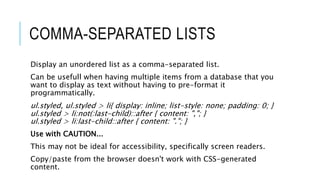
  • 12. COMMA-SEPARATED LISTS Display an unordered list as a comma-separated list. Can be usefull when having multiple items from a database that you want to display as text without having to pre-format it programmatically. ul.styled, ul.styled > li{ display: inline; list-style: none; padding: 0; } ul.styled > li:not(:last-child)::after { content: ","; } ul.styled > li:last-child::after { content: "."; } Use with CAUTION... This may not be ideal for accessibility, specifically screen readers. Copy/paste from the browser doesn't work with CSS-generated content.
  • 13. CREATING SHAPES USING CSS Common shapes:  Square  Rectangle  Circle  Oval  Triangle
  • 14. CREATING SHAPES USING CSS  Square:  #square { background-color: red; width: 100px; height: 100px; }  Rectangle:  #rectangle { background-color: red; width: 200px; height: 100px; }  Circle:  #circle { background-color: red; width: 100px; height: 100px; -moz-border- radius: 50px; -webkit-border-radius: 50px; border-radius: 50px; }  Oval:  #oval { background-color: red; border-radius: 100px / 50px; height: 100px; width: 200px; -moz-border-radius: 100px / 50px; -webkit-border-radius: 100px / 50px; }
  • 15. CREATING SHAPES USING CSS  It's interresting to note that when 2 borders meet, they do so at an angle, allowing us to create triangles!  Triangle Up:  #triangle-up { border-left: 50px solid transparent; border-right: 50px solid transparent; border-bottom: 100px solid red; width: 0; height: 0; }  Triangle Down:  #triangle-down { width: 0; height: 0; border-left: 50px solid transparent; border-right: 50px solid transparent; border-top: 100px solid red; }
  • 16. BOX SHADOW VS. DROP SHADOW
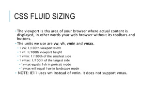
  • 17. CSS FLUID SIZING  The viewport is tha area of your browser where actual content is displayed, in other words your web browser without its toolbars and buttons.  The units we use are vw, vh, vmin and vmax.  1 vw: 1/100th viewport width  1 vh: 1/100th viewport height  1 vmin: 1/100th of the smallest side  1 vmax: 1/100th of the largest side  1vmax equals 1vh in portrait mode  1vmax will equal 1vw in landscape mode  NOTE: IE11 uses vm instead of vmin. It does not support vmax.
  • 18. CALC() Native CSS way to do simple math right in CSS as a replacement for any length value (or pretty much any number value). It has four simple math operators:  add (+),  subtract (-),  multiply (*),  and divide (/). Being able to do math in code is nice and a welcome addition to a language that is fairly number heavy.
  • 19. THANK YOU! Robert Richelieu Twitter: @azoblu3 LinkedIn: https://www.linkedin.com/in/robert-richelieu-6133a2aa/ Facebook: https://www.facebook.com/rrichelieu Example files: https://drive.google.com/open?id=1fumPPwRo1wvCKwOw5qQgVrenJnnchFJ5 Come talk to me! I don't bite!

Editor's Notes

  • #4: This is a CSS property for tables that, it seems to me, is well-supported, little known, and super useful. It changes the way that tables are rendered such that it gives you a sturdier, more predictable layout.
  • #5: shape-outside property Allows geometric shapes to be set, in order to define an area for text to flow around. The shape must have dimensions specified.  Set the height and width of the element.  This will be used by the shape function to create a coordinate system that is used when wrapping text around the image. The shape outside property provides functionality to create these shape: Circle shape-outside: circle(50%); Ellipse shape-outside: ellipse(50px 100px at 50% 50%); Polygon clip-path: polygon(0% 0%, 100% 0%, 50% 100%);  shape-outside: polygon(0% 0%, 100% 0%, 50% 100%);
  • #6: Circle shape-outside: circle(50%); The full notation for circle() is circle(r at cx cy) where r is the radius of the circle and cx and cy are the coordinates for the center of the circle.  If you omit them, the center of the image will be used as the default values.
  • #7: Ellipse shape-outside: ellipse(50px 100px at 50% 50%); Ellipse is a variation of the circle where the item is elongated on either the horizontal or vertical axis. The full notation for ellipse() is ellipse(rx ry at cx cy)  rx and ry are the radiuses for the ellipse and cx and cy are the coordinates for the center of the ellipse.
  • #8: Polygon clip-path: polygon(0% 0%, 100% 0%, 50% 100%);  shape-outside: polygon(0% 0%, 100% 0%, 50% 100%); The polygon function provides an unlimited range of shapes.  The full notation for polygon() is polygon(x1 y1, x2 y2, …)  each pair specifies the x & y coordinates for a vertex of the polygon. To use the polygon() function you must specify a minimum of 3 pairs of vertex. Polygon is used with a clip-path.  The clip-path CSS property creates a clipping region that defines what part of an element should be displayed.  Anything inside the region is displayed, while anything outside is hidden.
  • #9: * Easy way to make your links (or any other element) look nice * Compatible accross the board * We use CSS3 transitions * Applied on the element on a normal state -webkit-transition-property: color, background;  -webkit-transition-duration: 1s, 1s;  -webkit-transition-timing-function: linear, ease-in;
  • #10:  Broken images can happen, whatever you do.   Using CSS, it is possible to style broken images and provide custom error messages to your visitors. Two facts about the way the <img> element behaves: We can apply regular typography-related styling to the <img> element.  These styles will be applied to the alternative text, if it is displayed, and will not affect the working image. The <img> element is replaced element, its appearance and dimensions are defined by an external resource.  Because the element is controlled by an external source, the :before and :after pseudo-elements typically shouldn’t work with it. However, when the image is broken and not loaded, these pseudo-elements can appear.
  • #11: Selector empty or not: div[data-attr=''] & div:not([data-attr='']) Attribute... contains exact value:     a[href="http://www.google.com"] Starts with value:    h3[rel^="external"] Ends with value:    h3[rel$="external"] Attribute is within a space-separated list:    [rel~="friend"] Attribute is within a dash-separated list:    [rel|="friend"] Multiple attributes match:    h3[rel="handsome"][title^="Important"]
  • #12: Selector empty or not: div[data-attr=''] & div:not([data-attr='']) Attribute... contains exact value:     a[href="http://www.google.com"] Starts with value:    h3[rel^="external"] Ends with value:    h3[rel$="external"] Attribute is within a space-separated list:    [rel~="friend"] Attribute is within a dash-separated list:    [rel|="friend"] Multiple attributes match:    h3[rel="handsome"][title^="Important"]
  • #13: Display an unordered list as a comma-separated list. Can be usefull when having multiple items from a database that you want to display as text without having to pre-format it programmatically. Use with CAUTION... This may not be ideal for accessibility, specifically screen readers.  Copy/paste from the browser doesn't work with CSS-generated content. 
  • #14: Common shapes: Square Rectangle Circle Oval Triangle
  • #15: Square: #square { background-color: red; width: 100px; height: 100px; } Rectangle: #rectangle { background-color: red; width: 200px; height: 100px; }  Circle: #circle { background-color: red; width: 100px; height: 100px; -moz-border-radius: 50px; -webkit-border-radius: 50px; border-radius: 50px; }  Oval:  #oval { background-color: red; border-radius: 100px / 50px; height: 100px; width: 200px; -moz-border-radius: 100px / 50px; -webkit-border-radius: 100px / 50px; }
  • #16: It's interresting to note that when 2 borders meet, they do so at an angle, allowing us to create triangles! Triangle Up: #triangle-up { border-left: 50px solid transparent; border-right: 50px solid transparent; border-bottom: 100px solid red; width: 0; height: 0; }  Triangle Down: #triangle-down { width: 0; height: 0; border-left: 50px solid transparent; border-right: 50px solid transparent; border-top: 100px solid red; }
  • #17: The difference between box-shadow and filter: drop-shadow() really boils down to the CSS box model: one sees it and the other disregards it.  It's annoying, but makes sense. CSS uses a box model, where the element's edges are bound in the shape of a rectangle. Even in cases where the shape of the element does not appear to be a box, the box is still there and that is was box-shadow is applied to. Filters are not bound to the box model. That means the outline of our triangle is recognized and the transparency around it is ignored so that the intended shape receives the shadow.
  • #18: The viewport is tha area of your browser where actual content is displayed, in other words your web browser without its toolbars and buttons. The units we use are vw, vh, vmin and vmax. vw: 1/100th viewport width  vh: 1/100th viewport height  vmin: 1/100th of the smallest side  vmax: 1/100th of the largest side 1vmax equals 1vh in portrait mode 1vmax will equal 1vw in landscape mode IE9 uses vm instead of vmin. It does not support vmax.
  • #19: calc() is a native CSS way to do simple math right in CSS as a replacement for any length value (or pretty much any number value). It has four simple math operators: add (+), subtract (-), multiply (*), and divide (/). Being able to do math in code is nice and a welcome addition to a language that is fairly number heavy.