SlideShare a Scribd company logo
Jetpack
Compose
a new way to implement UI on Android
Nelson Glaube
r

@nglauber
Jetpack Compose is a
modern declarative UI
Toolkit to simplify and
accelerate native Android
UI development with less
code, powe
rf
ul tools, and
intuitive Kotlin APIs.
Imperative UI x Declarative UI
• In Imperative UI, an UI entity is fully de
fi
ned and then it is updated using
public methods and/or prope
rt
ies (e.g: Android View class).


• In Declarative UI, the UI and its state is de
fi
ned together and a
framework has the responsibility to update this state (which will cause
the UI re
fl
ects the changes automatically).
Motivation
• It’s not easy (or simple) to create a custom view…


• Current toolkit was created in 2008, but UIs are much more complex
nowadays…


• Declarative UI approach becomes popular among mobile developers
thanks to frameworks like React Native, Swi
ft
UI and Flu
tt
er.
Jetpack Compose
• A new way of thinking the UI development: components over screens.


• Compatible with existing Android apps, so you can adopt it progressively.


•
⚠︎
Currently in Beta stage! Don’t use it in production (yet)!
Ge
tt
ing sta
rt
ed
with Compose
Android Studio 4.2
(Preview)
Compose Preview
Interactive Mode
Launch
Composable
@Preview
setContent
class MainActivity : ComponentActivity()
{

override fun onCreate(savedInstanceState: Bundle?)
{

super.onCreate(savedInstanceState
)

setContent
{

MyAppTheme
{

Surface(color = MaterialTheme.colors.background)
{

Greeting("Android"
)

}

}

}

}

}

@Composabl
e

fun Greeting(name: String)
{

Text(text = "Hello $name!"
)

}
setContent
class MainActivity : ComponentActivity()
{

override fun onCreate(savedInstanceState: Bundle?)
{

super.onCreate(savedInstanceState
)

setContent
{

MyAppTheme
{

Surface(color = MaterialTheme.colors.background)
{

Greeting("Android"
)

}

}

}

}

}

@Composabl
e

fun Greeting(name: String)
{

Text(stringResource(R.string.hello, name)
)

}
Material Theme
• De
fi
ne application’s theme with its respective colors, fonts, shapes, …


• O
ft
en is the root element of the screen (but you can nested themes).
setContent {


MyAppTheme {


Greeting("Android")


}


}
Material Theme
@Composable


fun MyAppTheme(


darkTheme: Boolean = isSystemInDarkTheme(),


content: @Composable () -> Unit) {


val colors = if (darkTheme) {


DarkColorPalette


} else {


LightColorPalette


}


MaterialTheme(


colors = colors,


typography = Typography,


shapes = Shapes,


content = content


)


}


private val DarkColorPalette =


darkColors(


primary = Purple200,


primaryVariant = Purple700,


secondary = Teal200


)


private val LightColorPalette =


lightColors(


primary = Purple500,


primaryVariant = Purple700,


secondary = Teal200


)
Modi
fi
ers
• Decorate an element


• Provide layout parameters


• Assign behavior


• They’re chained and the order is signi
fi
cant!
val shape = CutCornerShape(topStart = 16.dp, bottomEnd = 16.dp)


Text(


text = "Text 1",


style = TextStyle(


color = Color.White,


fontWeight = FontWeight.Bold,


textAlign = TextAlign.Center),


modifier = Modifier.fillMaxWidth()


.padding(16.dp)


.border(2.dp, MaterialTheme.colors.secondary, shape)


.padding(1.dp)


.background(MaterialTheme.colors.primary, shape)


.clickable(onClick = {


// Click event


})


.padding(16.dp)


)
val shape = RoundedCornerShape(8.dp)


Text(


text = "Text 1",


style = TextStyle(


color = Color.White,


fontWeight = FontWeight.Bold,


textAlign = TextAlign.Center),


modifier = Modifier.fillMaxWidth()


.padding(16.dp)


.border(2.dp, MaterialTheme.colors.secondary, shape)


.padding(1.dp)


.background(MaterialTheme.colors.primary, shape)


.clickable(onClick = {


// Click event


})


.padding(16.dp)


)
val shape = CircleShape


Text(


text = "Text 1",


style = TextStyle(


color = Color.White,


fontWeight = FontWeight.Bold,


textAlign = TextAlign.Center),


modifier = Modifier.fillMaxWidth()


.padding(16.dp)


.border(2.dp, MaterialTheme.colors.secondary, shape)


.padding(1.dp)


.background(MaterialTheme.colors.primary, shape)


.clickable(onClick = {


// Click event


})


.padding(16.dp)


)
Layouts
Column Row Box Constraint


Layout
Box(modifier = Modifier.fillMaxWidth()) {


Column(


modifier = Modifier


.padding(16.dp)


.fillMaxWidth()


) {


Text("Column Text 1")


Text("Column Text 2")


Row(


modifier = Modifier.fillMaxWidth(),


horizontalArrangement = Arrangement.SpaceEvenly


) {


Text(text = "Row Text 1")


Text(text = "Row Text 2")


}


}


Text(


"Stack Text",


modifier = Modifier


.align(Alignment.TopEnd)


.padding(end = 16.dp, top = 16.dp)


)


}
ConstraintLayout
implementation "androidx.constraintlayout:constraintlayout-compose:1.0.0-alpha05
"
ConstraintLayout(modifier = Modifier.fillMaxSize().padding(16.dp)) {


val (text1Ref, edit1Ref, btn1Ref, btn2Ref) = createRefs()


Text("User registration", modifier = Modifier.constrainAs(text1Ref) {


top.linkTo(parent.top)


centerHorizontallyTo(parent)


})


TextField(modifier = Modifier.padding(top = 8.dp)


.constrainAs(edit1Ref) {


start.linkTo(parent.start)


end.linkTo(parent.end)


top.linkTo(text1Ref.bottom)


})


Button(onClick = {}, modifier = Modifier.padding(top = 8.dp)


.constrainAs(btn1Ref) {


end.linkTo(edit1Ref.end)


top.linkTo(edit1Ref.bottom)


}


)


TextButton(onClick = {}, modifier = Modifier.padding(end = 8.dp)


.constrainAs(btn2Ref) {


end.linkTo(btn1Ref.start)


baseline.linkTo(btn1Ref.baseline)


}


)


}
👇
More
components…
Bu
tt
on
Button(onClick = {}) {


Text("Button")


}


OutlinedButton(onClick = {}) {


Text("OutlinedButton")


}


TextButton(onClick = {}) {


Text("TextButton")


}
Bu
tt
on
Button(onClick = {})
{

if (isLoading)
{

CircularProgressIndicator(color = Color.White
)

} else
{

Text("Button"
)

}

}
Image
Image
(

painterResource(R.drawable.recife)
,

contentDescription = null
,

contentScale = ContentScale.FillHeigh
t

)
Image
(

painterResource(R.drawable.ic_android_orange)
,

contentDescription = null
,

contentScale = ContentScale.Fit
,

colorFilter = ColorFilter.tint(Color.Cyan
)

)
• Window Insets


• System UI (status and navigation bars
colors)


• AppCompat Theme Adapter


• ViewPager like
• Flexbox layout


• Swipe to refresh


• Image loading (Glide and Coil)


https://github.com/google/accompanist
Image from the network
Image
(

rememberCoilPainter
(

request = "https://img.com/img.jpg”
,

)
,

contentDescription = null
,

modifier = Modifier.size(50.dp, 50.dp
)

)
Image
(

rememberGlidePainter
(

request = "https://img.com/img.jpg”
,

)
,

contentDescription = null
,

modifier = Modifier.size(50.dp, 50.dp
)

)
Column + Scroll
Column(modifier = Modifie
r

.verticalScroll(rememberScrollState()
)

)
{

for (i in 0..200)
{

Text
(

"Item: $i"
,

modifier = Modifie
r

.padding(8.dp
)

.fillMaxWidth(
)

)

}

}
Row + Scroll
Row(modifier = Modifie
r

.horizontalScroll(rememberScrollState()
)

)
{

for (i in 0..200)
{

Text
(

"Item: $i"
,

modifier = Modifie
r

.padding(8.dp
)

)

}

}
Lists in current toolkit
• De
fi
ne a layout
fi
le for each item of the list


• Create an adapter subclass (view holder, get count, in
fl
ate view, …)


• Declare a RecyclerView/ListView in the screen’s XML
fi
le


• Set up everything in your activity/fragment


• What about you need a header and/or a footer?
🤦
List in Compose
@Composabl
e

fun UserListScreen(users: List<User>)
{

LazyColumn
(

modifier = Modifier.fillMaxSize())
{

item
{

Text("Header"
,

Modifier.fillMaxWidth().padding(8.dp
)

)

}

items(users) { user -
>

Text("${user.name} - ${user.age}"
,

Modifier.fillMaxWidth().padding(8.dp
)

)

}

}

}
List in Compose (with index)
@Composabl
e

fun UserListScreen(users: List<User>)
{

LazyColumn
(

modifier = Modifier.fillMaxSize())
{

item
{

Text("Header"
,

Modifier.fillMaxWidth().padding(8.dp
)

)

}

itemsIndexed(users) { index, user -
>

Text("${user.name} - ${user.age}"
,

Modifier.fillMaxWidth().padding(8.dp
)

)

}

}

}
Sca
ff
old
Scaffold(


topBar = {...},


floatingActionButton = {...},


bottomBar = {...}


) {...}
TopAppBar
(

title = { Text(text = "Compose") }
,

backgroundColor = MaterialTheme.colors.primary
,

contentColor = Color.Yellow
,

actions =
{

IconButton(onClick = {})
{

Icon(Icons.Default.Search, "Search"
)

}

IconButton
(

onClick = { …
}

)
{

Icon(Icons.Filled.MoreVert, "More"
)

DropdownMenu(…
)

}
}

)
FloatingActionButton
(

onClick = { … }
,

backgroundColor = Color.Red
,

contentColor = Color.Whit
e

)
{

Icon(Icons.Filled.Add, "Add"
)

}
BottomAppBar(


backgroundColor = MaterialTheme.colors.primary,


content = {


BottomNavigationItem(


icon = { Icon(Icons.Filled.Home) },


selected = selectedTab == 0,


onClick = { selectedTab = 0 },


selectedContentColor = Color.White,


unselectedContentColor = Color.DarkGray,


label = { Text(text = "Home") }


)


BottomNavigationItem(…)


}


)
State
• State in an app is any value that can change over time. 


• Component is updated when state has changed
var nameState by remember { mutableStateOf("") }
TextField
(

value = nameState
,

label = { Text("Name") }
,

onValueChange = { s: String -
>

nameState =
s

}

)
State
data class Score
(

var team: String
,

var score: In
t

)
State
class Score
(

team: String
,

score: In
t

)
{

var team by mutableStateOf(team
)

var score by mutableStateOf(score)
}
class Score
(

team: String
,

score: In
t

)
{

var team by mutableStateOf(team
)

var score by mutableStateOf(score)
}
@Composabl
e

fun TeamScore(score: Score)
{

Column(horizontalAlignment = Alignment.CenterHorizontally)
{

Text(text = score.team, style = MaterialTheme.typography.h6
)

Button
(

content = { Text("+") }
,

onClick = { score.score += 1
}

)

Text(text = score.score.toString(), style = MaterialTheme.typography.h5
)

Button
(

content = { Text("-") }
,

onClick = { score.score = max(score.score - 1, 0)
}

)

}

}
@Composabl
e

fun ScoreScreen(homeScore: Score, visitorScore: Score)
{

Column
(

modifier = Modifier.fillMaxSize()
,

verticalArrangement = Arrangement.Center
,

horizontalAlignment = Alignment.CenterHorizontall
y

)
{

Row
{

TeamScore(score = homeScore
)

Text(text = "x"
,

modifier = Modifier.padding(horizontal = 8.dp)
,

style = MaterialTheme.typography.h6
)

TeamScore(score = visitorScore
)

}

OutlinedButton
(

modifier = Modifier.padding(top = 16.dp)
,

content = { Text("Reset") }
,

onClick =
{

homeScore.score =
0

visitorScore.score =
0

}

)

}

}
Compose in your
MVVM app
Observing state
• LiveData.observeAsState


• Flow.collectAsState


• Observable.subscribeAsState
View Model
UI
state event
LiveData
@Composabl
e

fun UserScreen
(

usersLiveData: LiveData<List<UserBinding>>
,

onSaveUser: (UserBinding) -> Unit
,

onDeleteUser: (UserBinding) -> Uni
t

) {
val users by usersLiveData.observeAsState(
)

Column(modifier = Modifier.fillMaxSize())
{

InputPanel(currentUser, onInsertUser = { user ->
onSaveUser(user
)

}
)

UserList
(

users = users ?: emptyList()
,

onDeleteUser = onDeleteUser
)

}

}
LiveData
@Composabl
e

fun UserScreen
(

usersLiveData: LiveData<List<UserBinding>>
,

onSaveUser: (UserBinding) -> Unit
,

onDeleteUser: (UserBinding) -> Uni
t

) {
val users by usersLiveData.observeAsState(
)

Column(modifier = Modifier.fillMaxSize()) {
InputPanel(currentUser, onInsertUser = { user ->
onSaveUser(user
)

}
)

UserList
(

users = users ?: emptyList()
,

onDeleteUser = onDeleteUser
)

}

}
LiveData
@Composabl
e

fun UserScreen
(

usersLiveData: LiveData<List<UserBinding>>
,

onSaveUser: (UserBinding) -> Unit
,

onDeleteUser: (UserBinding) -> Uni
t

) {
val users by usersLiveData.observeAsState(
)

Column(modifier = Modifier.fillMaxSize())
{

InputPanel(currentUser, onInsertUser = { user ->
onSaveUser(user
)

}
)

UserList
(

users = users ?: emptyList()
,

onDeleteUser = onDeleteUser
)

}

}
LiveData
UserScreen
(

usersLiveData = viewModel.allUsers
,

onSaveUser = { user ->
 

viewModel.saveUser(user
)

}
,

onDeleteUser = { user -
>

viewModel.deleteUser(user
)

}

)

@Composabl
e

fun UserScreen
(

usersLiveData: LiveData<List<UserBinding>>
,

onSaveUser: (UserBinding) -> Unit
,

onDeleteUser: (UserBinding) -> Uni
t

) { …
}
ViewModel + LiveData + Compose
@Composabl
e

fun UserScreen
(

viewModel: UsersViewMode
l

) {
val users by viewModel.allUsers.observeAsState(
)

Column(modifier = Modifier.fillMaxSize())
{

InputPanel(currentUser, onInsertUser = { user ->
viewModel.saveUser(user
)

}
)

UserList
(

users = users ?: emptyList()
,

onDeleteUser = { user -
>

viewModel.deleteUser(user
)

}
)

}

}
ViewModel + LiveData + Compose
@Composabl
e

fun UserScreen()
{

val viewModel: UsersViewModel = viewModel()
val users by viewModel.allUsers.observeAsState(
)

Column(modifier = Modifier.fillMaxSize())
{

InputPanel(currentUser, onInsertUser = { user ->
viewModel.saveUser(user
)

}
)

UserList
(

users = users ?: emptyList()
,

onDeleteUser = { user -
>

viewModel.deleteUser(user
)

}
)

}

}

implementation "androidx.lifecycle:lifecycle-viewmodel-compose:<version>
"
Interoperability
In fragments…
class MyFragment: Fragment()
{

override fun onCreateView
(

inflater: LayoutInflater
,

container: ViewGroup?
,

savedInstanceState: Bundle
?

): View?
{

return ComposeView(requireContext()).apply
{

setContent
{

AppTheme
{

YourComposable(
)

}

}

}

}

}
In fragments…
class MyFragment: Fragment()
{

override fun onCreateView
(

inflater: LayoutInflater
,

container: ViewGroup?
,

savedInstanceState: Bundle
?

): View?
{

return ComposeView(requireContext()).apply
{

setContent
{

AppTheme
{

YourComposable(
)

}

}

}

}

}
In layout
fi
les
<androidx.compose.ui.platform.ComposeVie
w

android:id="@+id/my_composable
"

android:layout_width="wrap_content
"

android:layout_height="wrap_content" /
>

findViewById<ComposeView>(R.id.my_composable).setContent
{

MaterialTheme
{

Surface
{

Text(text = "Hello!"
)

}

}

}
ComposeView
class MyComposeVie
w

@JvmOverloads constructor(context: Context, attrs: AttributeSet? = null)
:

AbstractComposeView(context, attrs)
{

@Composabl
e

override fun Content()
{

MyComposableFunction(
)

}

}

<br.com.nglauber.MyComposeVie
w

android:layout_width="match_parent
"

android:layout_height="match_parent"/
>
@Composabl
e

fun MyCalendar(onDateUpdate: (Date) -> Unit)
{

AndroidView
(

factory = { context: Context -
>

val view
=

LayoutInflater.from(context).inflate(R.layout.my_layout, null, false
)

val textView = view.findViewById<TextView>(R.id.txtDate
)

val calendarView = view.findViewById<CalendarView>(R.id.calendarView
)

calendarView?.setOnDateChangeListener { cv, year, month, day -
>

val date = Calendar.getInstance().apply
{

set(year, month, day
)

}.tim
e

textView?.text = date.toString(
)

onDateUpdate(date
)

}
vie
w

}
,

update = { view -
>

// Update vie
w

}

)

}
@Composabl
e

fun MyCalendar(onDateUpdate: (Date) -> Unit)
{

AndroidView(
factory = { context: Context -
>

val view
=

LayoutInflater.from(context).inflate(R.layout.my_layout, null, false
)

val textView = view.findViewById<TextView>(R.id.txtDate
)

val calendarView = view.findViewById<CalendarView>(R.id.calendarView
)

calendarView?.setOnDateChangeListener { cv, year, month, day -
>

val date = Calendar.getInstance().apply
{

set(year, month, day
)

}.tim
e

textView?.text = date.toString(
)

onDateUpdate(date
)

}
vie
w

}
,

update = { view -
>

// Update vie
w

}

)

}
@Composabl
e

fun MyCalendar(onDateUpdate: (Date) -> Unit)
{

AndroidView
(

factory = { context: Context -
>

val view
=

LayoutInflater.from(context).inflate(R.layout.my_layout, null, false
)

val textView = view.findViewById<TextView>(R.id.txtDate
)

val calendarView = view.findViewById<CalendarView>(R.id.calendarView
)

calendarView?.setOnDateChangeListener { cv, year, month, day -
>

val date = Calendar.getInstance().apply
{

set(year, month, day
)

}.tim
e

textView?.text = date.toString(
)

onDateUpdate(date
)

}
vie
w

},
update = { view -
>

// Update vie
w

}

)

}
AndroidViewBinding
android
{

..
.

viewBinding
{

enabled = tru
e

}

}
implementation "androidx.compose.ui:ui-viewbinding:$compose_version"
AndroidViewBinding(factory = MyBindingLayoutBinding::inflate)
{

textView.text = "My Text
"

seekBar.progress = 5
0

}
Resource
fi
les
• stringResources(R.string.your_string)


• dimensionResource(R.dimen.padding_small)


• colorResource(R.color.blue)


• …
On con
fi
g changes…
Unlike the current UI toolkit, the state is not saved automatically across
con
fi
guration changes.
var state by rememberSaveable
{

mutableStateOf("Compose!!!"
)

}
Coroutines
E
ff
ects
• LaunchedE
ff
ect


• DisposableE
ff
ect
LaunchedEffect(someKey)
{

// do something on launc
h

}
DisposableEffect(someKey)
{

// do something on launc
h

onDispose {
 

// Cleanu
p

}

}
Coroutines
LaunchedEffect launch a coroutine when
the composition is added and it is
automatically cancelled when the execution
leaves the composition.
@Composabl
e

fun MyComposable()
{

val welcomeMsg = remember { mutableStateOf("Initial")
}

LaunchedEffect(welcomeMsg)
{

val s = withContext(Dispatchers.IO)
{

delay(5_000
)

"Hello Compose!
"

}

welcomeMsg.value =
s

}

Text(text = welcomeMsg.value
)

}
Coroutines
rememberCoroutineScope returns the
associated CoroutineScope to a given
position of the composition. It should be used
to launch coroutines as response of callback
events
@Composabl
e

fun MyComposable()
{

val scope = rememberCoroutineScope(
)

val count = remember { mutableStateOf(0)
}

Text(text = "Current count: ${count.value}"
)

Button(onClick =
{

scope.launch {
 

for (i in 1..10)
{

withContext(Dispatchers.IO)
{

delay(1_000
)

}

count.value =
i

}

}

}, content = { Text("Start!") }
)

}
Learn more…
• Samples (goo.gle/compose-samples)


• Codelabs (goo.gle/compose-codelabs)


• Documentation (goo.gle/compose-docs)


• Issue Tracker (goo.gle/compose-feedback)


• Slack Channel (goo.gle/compose-slack)
Wrap up
• The way of Compose works seems very interesting, once it is following
the same modern paradigm of other UI toolkits.


• Compose is also available for desktop apps (alpha) and now for web
(preview)!


• Jetpack Compose is in beta stage (beta-06), so DON’T USE IN
PRODUCTION!


• Be prepared, because declarative is the new standard 😉
Thank you!
Nelson Glaube
r

@nglauber

More Related Content

What's hot (20)

PDF
Try Jetpack Compose
LutasLin
 
PDF
Jetpack compose
LutasLin
 
PPTX
Kotlin Jetpack Tutorial
Simplilearn
 
PDF
Compose Camp - Jetpack Compose for Android Developers Introduction Session De...
JassGroup TICS
 
PDF
Jetpack Compose - A Lightning Tour
Matthew Clarke
 
PDF
Jetpack Compose.pdf
SumirVats
 
PDF
Introduction to kotlin
NAVER Engineering
 
PPT
Ionic Framework
Thinh VoXuan
 
PDF
Introduction to Redux
Ignacio Martín
 
PPTX
Introduction to Kotlin Language and its application to Android platform
EastBanc Tachnologies
 
PDF
Introduction to kotlin for android app development gdg ahmedabad dev fest 2017
Hardik Trivedi
 
PDF
1 kotlin vs. java: some java issues addressed in kotlin
Sergey Bandysik
 
PDF
Introduction to Spring Boot!
Jakub Kubrynski
 
PPTX
C sharp
sanjay joshi
 
PPTX
UI Programming with Qt-Quick and QML
Emertxe Information Technologies Pvt Ltd
 
PPTX
Introduction to Spring Framework
Serhat Can
 
PDF
Swift Programming Language
Anıl Sözeri
 
PPTX
Intro to React
Justin Reock
 
PDF
Kotlin - Better Java
Dariusz Lorenc
 
PDF
Android Jetpack
Tudor Sirbu
 
Try Jetpack Compose
LutasLin
 
Jetpack compose
LutasLin
 
Kotlin Jetpack Tutorial
Simplilearn
 
Compose Camp - Jetpack Compose for Android Developers Introduction Session De...
JassGroup TICS
 
Jetpack Compose - A Lightning Tour
Matthew Clarke
 
Jetpack Compose.pdf
SumirVats
 
Introduction to kotlin
NAVER Engineering
 
Ionic Framework
Thinh VoXuan
 
Introduction to Redux
Ignacio Martín
 
Introduction to Kotlin Language and its application to Android platform
EastBanc Tachnologies
 
Introduction to kotlin for android app development gdg ahmedabad dev fest 2017
Hardik Trivedi
 
1 kotlin vs. java: some java issues addressed in kotlin
Sergey Bandysik
 
Introduction to Spring Boot!
Jakub Kubrynski
 
C sharp
sanjay joshi
 
UI Programming with Qt-Quick and QML
Emertxe Information Technologies Pvt Ltd
 
Introduction to Spring Framework
Serhat Can
 
Swift Programming Language
Anıl Sözeri
 
Intro to React
Justin Reock
 
Kotlin - Better Java
Dariusz Lorenc
 
Android Jetpack
Tudor Sirbu
 

Similar to Android Jetpack Compose - Turkey 2021 (20)

PDF
Jetpack Compose a nova forma de implementar UI no Android
Nelson Glauber Leal
 
PDF
compose_speaker_session.pdf
AnkurAgarwal151093
 
PPTX
Compose camp 2.pptx
MadheswarKonidela
 
PPTX
Compose Camp Day 2.pptx
RajatKumarNayak5
 
PDF
Diving deep in compose.pdf
AnkurAgarwal151093
 
PPTX
Consistent UI Across Android Devices
Irene Duke
 
PDF
What's new in android: jetpack compose 2024
Toru Wonyoung Choi
 
PDF
COMPOSE CAMP SESSION 4.pdf
AbhishekS325285
 
PDF
Mobile Programming - 6 Textfields, Button, Showing Snackbars and Lists
AndiNurkholis1
 
PPTX
Day 2.pptx
AkankshaPathak42
 
PDF
Mobile Programming - 3 Rows, Column and Basic Sizing
AndiNurkholis1
 
PPTX
Material Design - Høgskolen Ringerike 2017
Konstantin Loginov
 
PPTX
08ui.pptx
KabadaSori
 
PDF
Jetpack Compose - Hands-on February 2020
Pedro Veloso
 
PDF
Something old, Something new.pdf
MaiaGrotepass1
 
PPTX
Jetpack Compose - Android’s modern toolkit for building native UI
Gilang Ramadhan
 
PDF
Reactive UI in android - Gil Goldzweig Goldbaum, 10bis
DroidConTLV
 
PDF
Mobile Programming - 2 Jetpack Compose
AndiNurkholis1
 
PPTX
Material Design Android
Samiullah Farooqui
 
PDF
Kotlin Multiplatform in Action - Alexandr Pogrebnyak - IceRockDev
DroidConTLV
 
Jetpack Compose a nova forma de implementar UI no Android
Nelson Glauber Leal
 
compose_speaker_session.pdf
AnkurAgarwal151093
 
Compose camp 2.pptx
MadheswarKonidela
 
Compose Camp Day 2.pptx
RajatKumarNayak5
 
Diving deep in compose.pdf
AnkurAgarwal151093
 
Consistent UI Across Android Devices
Irene Duke
 
What's new in android: jetpack compose 2024
Toru Wonyoung Choi
 
COMPOSE CAMP SESSION 4.pdf
AbhishekS325285
 
Mobile Programming - 6 Textfields, Button, Showing Snackbars and Lists
AndiNurkholis1
 
Day 2.pptx
AkankshaPathak42
 
Mobile Programming - 3 Rows, Column and Basic Sizing
AndiNurkholis1
 
Material Design - Høgskolen Ringerike 2017
Konstantin Loginov
 
08ui.pptx
KabadaSori
 
Jetpack Compose - Hands-on February 2020
Pedro Veloso
 
Something old, Something new.pdf
MaiaGrotepass1
 
Jetpack Compose - Android’s modern toolkit for building native UI
Gilang Ramadhan
 
Reactive UI in android - Gil Goldzweig Goldbaum, 10bis
DroidConTLV
 
Mobile Programming - 2 Jetpack Compose
AndiNurkholis1
 
Material Design Android
Samiullah Farooqui
 
Kotlin Multiplatform in Action - Alexandr Pogrebnyak - IceRockDev
DroidConTLV
 
Ad

More from Nelson Glauber Leal (20)

PDF
Insights no desenvolvimento Android para 2024
Nelson Glauber Leal
 
PDF
Seu primeiro app Android e iOS com Compose Multiplatform
Nelson Glauber Leal
 
PDF
Desenvolvimento Moderno de Aplicações Android 2023
Nelson Glauber Leal
 
PDF
Novidades incríveis do Android em 2023
Nelson Glauber Leal
 
PDF
Novidades das Bibliotecas Jetpack do Android (2021)
Nelson Glauber Leal
 
PDF
Aplicações assíncronas no Android com
Coroutines & Jetpack
Nelson Glauber Leal
 
PDF
Aplicações assíncronas no Android com
Coroutines & Jetpack
Nelson Glauber Leal
 
PDF
O que é preciso para ser um desenvolvedor Android
Nelson Glauber Leal
 
PDF
Arquitetando seu app Android com Jetpack
Nelson Glauber Leal
 
PDF
Arquitetando seu app Android com Jetpack
Nelson Glauber Leal
 
PDF
Aplicações Assíncronas no Android com Coroutines e Jetpack
Nelson Glauber Leal
 
PDF
Mastering Kotlin Standard Library
Nelson Glauber Leal
 
PDF
Aplicações assíncronas no Android com Coroutines & Jetpack
Nelson Glauber Leal
 
PDF
Introdução ao Desenvolvimento Android com Kotlin
Nelson Glauber Leal
 
PDF
Persisting Data on SQLite using Room
Nelson Glauber Leal
 
PDF
Arquitetando seu aplicativo Android com Jetpack
Nelson Glauber Leal
 
PDF
Desenvolvimento Moderno de Aplicativos Android
Nelson Glauber Leal
 
PDF
Desenvolvimento Moderno de aplicativos Android
Nelson Glauber Leal
 
PDF
Turbinando o desenvolvimento Android com Kotlin
Nelson Glauber Leal
 
PDF
Tudo que você precisa saber sobre Constraint Layout
Nelson Glauber Leal
 
Insights no desenvolvimento Android para 2024
Nelson Glauber Leal
 
Seu primeiro app Android e iOS com Compose Multiplatform
Nelson Glauber Leal
 
Desenvolvimento Moderno de Aplicações Android 2023
Nelson Glauber Leal
 
Novidades incríveis do Android em 2023
Nelson Glauber Leal
 
Novidades das Bibliotecas Jetpack do Android (2021)
Nelson Glauber Leal
 
Aplicações assíncronas no Android com
Coroutines & Jetpack
Nelson Glauber Leal
 
Aplicações assíncronas no Android com
Coroutines & Jetpack
Nelson Glauber Leal
 
O que é preciso para ser um desenvolvedor Android
Nelson Glauber Leal
 
Arquitetando seu app Android com Jetpack
Nelson Glauber Leal
 
Arquitetando seu app Android com Jetpack
Nelson Glauber Leal
 
Aplicações Assíncronas no Android com Coroutines e Jetpack
Nelson Glauber Leal
 
Mastering Kotlin Standard Library
Nelson Glauber Leal
 
Aplicações assíncronas no Android com Coroutines & Jetpack
Nelson Glauber Leal
 
Introdução ao Desenvolvimento Android com Kotlin
Nelson Glauber Leal
 
Persisting Data on SQLite using Room
Nelson Glauber Leal
 
Arquitetando seu aplicativo Android com Jetpack
Nelson Glauber Leal
 
Desenvolvimento Moderno de Aplicativos Android
Nelson Glauber Leal
 
Desenvolvimento Moderno de aplicativos Android
Nelson Glauber Leal
 
Turbinando o desenvolvimento Android com Kotlin
Nelson Glauber Leal
 
Tudo que você precisa saber sobre Constraint Layout
Nelson Glauber Leal
 
Ad

Recently uploaded (20)

PPTX
API DOCUMENTATION | API INTEGRATION PLATFORM
philipnathen82
 
PDF
How to get the licensing right for Microsoft Core Infrastructure Server Suite...
Q-Advise
 
PDF
Show Which Projects Support Your Strategy and Deliver Results with OnePlan df
OnePlan Solutions
 
PPTX
Transforming Lending with IntelliGrow – Advanced Loan Software Solutions
Intelli grow
 
PDF
Step-by-Step Guide to Install SAP HANA Studio | Complete Installation Tutoria...
SAP Vista, an A L T Z E N Company
 
PDF
How AI in Healthcare Apps Can Help You Enhance Patient Care?
Lilly Gracia
 
PDF
Windows 10 Professional Preactivated.pdf
asghxhsagxjah
 
PDF
AI Image Enhancer: Revolutionizing Visual Quality”
docmasoom
 
PDF
Code and No-Code Journeys: The Maintenance Shortcut
Applitools
 
PPTX
Smart Doctor Appointment Booking option in odoo.pptx
AxisTechnolabs
 
PDF
ESUG 2025: Pharo 13 and Beyond (Stephane Ducasse)
ESUG
 
PDF
Notification System for Construction Logistics Application
Safe Software
 
PPTX
PCC IT Forum 2025 - Legislative Technology Snapshot
Gareth Oakes
 
PDF
Message Level Status (MLS): The Instant Feedback Mechanism for UAE e-Invoicin...
Prachi Desai
 
PDF
Introduction to Apache Iceberg™ & Tableflow
Alluxio, Inc.
 
PPTX
BB FlashBack Pro 5.61.0.4843 With Crack Free Download
cracked shares
 
PPT
Brief History of Python by Learning Python in three hours
adanechb21
 
PDF
custom development enhancement | Togglenow.pdf
aswinisuhu
 
PPTX
Function & Procedure: Function Vs Procedure in PL/SQL
Shani Tiwari
 
PDF
AI Software Engineering based on Multi-view Modeling and Engineering Patterns
Hironori Washizaki
 
API DOCUMENTATION | API INTEGRATION PLATFORM
philipnathen82
 
How to get the licensing right for Microsoft Core Infrastructure Server Suite...
Q-Advise
 
Show Which Projects Support Your Strategy and Deliver Results with OnePlan df
OnePlan Solutions
 
Transforming Lending with IntelliGrow – Advanced Loan Software Solutions
Intelli grow
 
Step-by-Step Guide to Install SAP HANA Studio | Complete Installation Tutoria...
SAP Vista, an A L T Z E N Company
 
How AI in Healthcare Apps Can Help You Enhance Patient Care?
Lilly Gracia
 
Windows 10 Professional Preactivated.pdf
asghxhsagxjah
 
AI Image Enhancer: Revolutionizing Visual Quality”
docmasoom
 
Code and No-Code Journeys: The Maintenance Shortcut
Applitools
 
Smart Doctor Appointment Booking option in odoo.pptx
AxisTechnolabs
 
ESUG 2025: Pharo 13 and Beyond (Stephane Ducasse)
ESUG
 
Notification System for Construction Logistics Application
Safe Software
 
PCC IT Forum 2025 - Legislative Technology Snapshot
Gareth Oakes
 
Message Level Status (MLS): The Instant Feedback Mechanism for UAE e-Invoicin...
Prachi Desai
 
Introduction to Apache Iceberg™ & Tableflow
Alluxio, Inc.
 
BB FlashBack Pro 5.61.0.4843 With Crack Free Download
cracked shares
 
Brief History of Python by Learning Python in three hours
adanechb21
 
custom development enhancement | Togglenow.pdf
aswinisuhu
 
Function & Procedure: Function Vs Procedure in PL/SQL
Shani Tiwari
 
AI Software Engineering based on Multi-view Modeling and Engineering Patterns
Hironori Washizaki
 

Android Jetpack Compose - Turkey 2021

  • 1. Jetpack Compose a new way to implement UI on Android Nelson Glaube r @nglauber
  • 2. Jetpack Compose is a modern declarative UI Toolkit to simplify and accelerate native Android UI development with less code, powe rf ul tools, and intuitive Kotlin APIs.
  • 3. Imperative UI x Declarative UI • In Imperative UI, an UI entity is fully de fi ned and then it is updated using public methods and/or prope rt ies (e.g: Android View class). • In Declarative UI, the UI and its state is de fi ned together and a framework has the responsibility to update this state (which will cause the UI re fl ects the changes automatically).
  • 4. Motivation • It’s not easy (or simple) to create a custom view… • Current toolkit was created in 2008, but UIs are much more complex nowadays… • Declarative UI approach becomes popular among mobile developers thanks to frameworks like React Native, Swi ft UI and Flu tt er.
  • 5. Jetpack Compose • A new way of thinking the UI development: components over screens. • Compatible with existing Android apps, so you can adopt it progressively. • ⚠︎ Currently in Beta stage! Don’t use it in production (yet)!
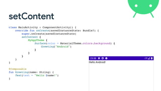
  • 9. setContent class MainActivity : ComponentActivity() { override fun onCreate(savedInstanceState: Bundle?) { super.onCreate(savedInstanceState ) setContent { MyAppTheme { Surface(color = MaterialTheme.colors.background) { Greeting("Android" ) } } } } } @Composabl e fun Greeting(name: String) { Text(text = "Hello $name!" ) }
  • 10. setContent class MainActivity : ComponentActivity() { override fun onCreate(savedInstanceState: Bundle?) { super.onCreate(savedInstanceState ) setContent { MyAppTheme { Surface(color = MaterialTheme.colors.background) { Greeting("Android" ) } } } } } @Composabl e fun Greeting(name: String) { Text(text = "Hello $name!" ) }
  • 11. setContent class MainActivity : ComponentActivity() { override fun onCreate(savedInstanceState: Bundle?) { super.onCreate(savedInstanceState ) setContent { MyAppTheme { Surface(color = MaterialTheme.colors.background) { Greeting("Android" ) } } } } } @Composabl e fun Greeting(name: String) { Text(text = "Hello $name!" ) }
  • 12. setContent class MainActivity : ComponentActivity() { override fun onCreate(savedInstanceState: Bundle?) { super.onCreate(savedInstanceState ) setContent { MyAppTheme { Surface(color = MaterialTheme.colors.background) { Greeting("Android" ) } } } } } @Composabl e fun Greeting(name: String) { Text(text = "Hello $name!" ) }
  • 13. setContent class MainActivity : ComponentActivity() { override fun onCreate(savedInstanceState: Bundle?) { super.onCreate(savedInstanceState ) setContent { MyAppTheme { Surface(color = MaterialTheme.colors.background) { Greeting("Android" ) } } } } } @Composabl e fun Greeting(name: String) { Text(stringResource(R.string.hello, name) ) }
  • 14. Material Theme • De fi ne application’s theme with its respective colors, fonts, shapes, … • O ft en is the root element of the screen (but you can nested themes). setContent { MyAppTheme { Greeting("Android") } }
  • 15. Material Theme @Composable fun MyAppTheme( darkTheme: Boolean = isSystemInDarkTheme(), content: @Composable () -> Unit) { val colors = if (darkTheme) { DarkColorPalette } else { LightColorPalette } MaterialTheme( colors = colors, typography = Typography, shapes = Shapes, content = content ) } private val DarkColorPalette = darkColors( primary = Purple200, primaryVariant = Purple700, secondary = Teal200 ) private val LightColorPalette = lightColors( primary = Purple500, primaryVariant = Purple700, secondary = Teal200 )
  • 16. Modi fi ers • Decorate an element • Provide layout parameters • Assign behavior • They’re chained and the order is signi fi cant!
  • 17. val shape = CutCornerShape(topStart = 16.dp, bottomEnd = 16.dp) Text( text = "Text 1", style = TextStyle( color = Color.White, fontWeight = FontWeight.Bold, textAlign = TextAlign.Center), modifier = Modifier.fillMaxWidth() .padding(16.dp) .border(2.dp, MaterialTheme.colors.secondary, shape) .padding(1.dp) .background(MaterialTheme.colors.primary, shape) .clickable(onClick = { // Click event }) .padding(16.dp) )
  • 18. val shape = CutCornerShape(topStart = 16.dp, bottomEnd = 16.dp) Text( text = "Text 1", style = TextStyle( color = Color.White, fontWeight = FontWeight.Bold, textAlign = TextAlign.Center), modifier = Modifier.fillMaxWidth() .padding(16.dp) .border(2.dp, MaterialTheme.colors.secondary, shape) .padding(1.dp) .background(MaterialTheme.colors.primary, shape) .clickable(onClick = { // Click event }) .padding(16.dp) )
  • 19. val shape = CutCornerShape(topStart = 16.dp, bottomEnd = 16.dp) Text( text = "Text 1", style = TextStyle( color = Color.White, fontWeight = FontWeight.Bold, textAlign = TextAlign.Center), modifier = Modifier.fillMaxWidth() .padding(16.dp) .border(2.dp, MaterialTheme.colors.secondary, shape) .padding(1.dp) .background(MaterialTheme.colors.primary, shape) .clickable(onClick = { // Click event }) .padding(16.dp) )
  • 20. val shape = CutCornerShape(topStart = 16.dp, bottomEnd = 16.dp) Text( text = "Text 1", style = TextStyle( color = Color.White, fontWeight = FontWeight.Bold, textAlign = TextAlign.Center), modifier = Modifier.fillMaxWidth() .padding(16.dp) .border(2.dp, MaterialTheme.colors.secondary, shape) .padding(1.dp) .background(MaterialTheme.colors.primary, shape) .clickable(onClick = { // Click event }) .padding(16.dp) )
  • 21. val shape = RoundedCornerShape(8.dp) Text( text = "Text 1", style = TextStyle( color = Color.White, fontWeight = FontWeight.Bold, textAlign = TextAlign.Center), modifier = Modifier.fillMaxWidth() .padding(16.dp) .border(2.dp, MaterialTheme.colors.secondary, shape) .padding(1.dp) .background(MaterialTheme.colors.primary, shape) .clickable(onClick = { // Click event }) .padding(16.dp) )
  • 22. val shape = CircleShape Text( text = "Text 1", style = TextStyle( color = Color.White, fontWeight = FontWeight.Bold, textAlign = TextAlign.Center), modifier = Modifier.fillMaxWidth() .padding(16.dp) .border(2.dp, MaterialTheme.colors.secondary, shape) .padding(1.dp) .background(MaterialTheme.colors.primary, shape) .clickable(onClick = { // Click event }) .padding(16.dp) )
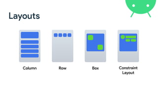
  • 23. Layouts Column Row Box Constraint 
 Layout
  • 24. Box(modifier = Modifier.fillMaxWidth()) { Column( modifier = Modifier .padding(16.dp) .fillMaxWidth() ) { Text("Column Text 1") Text("Column Text 2") Row( modifier = Modifier.fillMaxWidth(), horizontalArrangement = Arrangement.SpaceEvenly ) { Text(text = "Row Text 1") Text(text = "Row Text 2") } } Text( "Stack Text", modifier = Modifier .align(Alignment.TopEnd) .padding(end = 16.dp, top = 16.dp) ) }
  • 25. Box(modifier = Modifier.fillMaxWidth()) { Column( modifier = Modifier .padding(16.dp) .fillMaxWidth() ) { Text("Column Text 1") Text("Column Text 2") Row( modifier = Modifier.fillMaxWidth(), horizontalArrangement = Arrangement.SpaceEvenly ) { Text(text = "Row Text 1") Text(text = "Row Text 2") } } Text( "Stack Text", modifier = Modifier .align(Alignment.TopEnd) .padding(end = 16.dp, top = 16.dp) ) }
  • 26. Box(modifier = Modifier.fillMaxWidth()) { Column( modifier = Modifier .padding(16.dp) .fillMaxWidth() ) { Text("Column Text 1") Text("Column Text 2") Row( modifier = Modifier.fillMaxWidth(), horizontalArrangement = Arrangement.SpaceEvenly ) { Text(text = "Row Text 1") Text(text = "Row Text 2") } } Text( "Stack Text", modifier = Modifier .align(Alignment.TopEnd) .padding(end = 16.dp, top = 16.dp) ) }
  • 27. Box(modifier = Modifier.fillMaxWidth()) { Column( modifier = Modifier .padding(16.dp) .fillMaxWidth() ) { Text("Column Text 1") Text("Column Text 2") Row( modifier = Modifier.fillMaxWidth(), horizontalArrangement = Arrangement.SpaceEvenly ) { Text(text = "Row Text 1") Text(text = "Row Text 2") } } Text( "Stack Text", modifier = Modifier .align(Alignment.TopEnd) .padding(end = 16.dp, top = 16.dp) ) }
  • 29. ConstraintLayout(modifier = Modifier.fillMaxSize().padding(16.dp)) { val (text1Ref, edit1Ref, btn1Ref, btn2Ref) = createRefs() Text("User registration", modifier = Modifier.constrainAs(text1Ref) { top.linkTo(parent.top) centerHorizontallyTo(parent) }) TextField(modifier = Modifier.padding(top = 8.dp) .constrainAs(edit1Ref) { start.linkTo(parent.start) end.linkTo(parent.end) top.linkTo(text1Ref.bottom) }) Button(onClick = {}, modifier = Modifier.padding(top = 8.dp) .constrainAs(btn1Ref) { end.linkTo(edit1Ref.end) top.linkTo(edit1Ref.bottom) } ) TextButton(onClick = {}, modifier = Modifier.padding(end = 8.dp) .constrainAs(btn2Ref) { end.linkTo(btn1Ref.start) baseline.linkTo(btn1Ref.baseline) } ) }
  • 30. ConstraintLayout(modifier = Modifier.fillMaxSize().padding(16.dp)) { val (text1Ref, edit1Ref, btn1Ref, btn2Ref) = createRefs() Text("User registration", modifier = Modifier.constrainAs(text1Ref) { top.linkTo(parent.top) centerHorizontallyTo(parent) }) TextField(modifier = Modifier.padding(top = 8.dp) .constrainAs(edit1Ref) { start.linkTo(parent.start) end.linkTo(parent.end) top.linkTo(text1Ref.bottom) }) Button(onClick = {}, modifier = Modifier.padding(top = 8.dp) .constrainAs(btn1Ref) { end.linkTo(edit1Ref.end) top.linkTo(edit1Ref.bottom) } ) TextButton(onClick = {}, modifier = Modifier.padding(end = 8.dp) .constrainAs(btn2Ref) { end.linkTo(btn1Ref.start) baseline.linkTo(btn1Ref.baseline) } ) }
  • 31. ConstraintLayout(modifier = Modifier.fillMaxSize().padding(16.dp)) { val (text1Ref, edit1Ref, btn1Ref, btn2Ref) = createRefs() Text("User registration", modifier = Modifier.constrainAs(text1Ref) { top.linkTo(parent.top) centerHorizontallyTo(parent) }) TextField(modifier = Modifier.padding(top = 8.dp) .constrainAs(edit1Ref) { start.linkTo(parent.start) end.linkTo(parent.end) top.linkTo(text1Ref.bottom) }) Button(onClick = {}, modifier = Modifier.padding(top = 8.dp) .constrainAs(btn1Ref) { end.linkTo(edit1Ref.end) top.linkTo(edit1Ref.bottom) } ) TextButton(onClick = {}, modifier = Modifier.padding(end = 8.dp) .constrainAs(btn2Ref) { end.linkTo(btn1Ref.start) baseline.linkTo(btn1Ref.baseline) } ) } 👇
  • 32. ConstraintLayout(modifier = Modifier.fillMaxSize().padding(16.dp)) { val (text1Ref, edit1Ref, btn1Ref, btn2Ref) = createRefs() Text("User registration", modifier = Modifier.constrainAs(text1Ref) { top.linkTo(parent.top) centerHorizontallyTo(parent) }) TextField(modifier = Modifier.padding(top = 8.dp) .constrainAs(edit1Ref) { start.linkTo(parent.start) end.linkTo(parent.end) top.linkTo(text1Ref.bottom) }) Button(onClick = {}, modifier = Modifier.padding(top = 8.dp) .constrainAs(btn1Ref) { end.linkTo(edit1Ref.end) top.linkTo(edit1Ref.bottom) } ) TextButton(onClick = {}, modifier = Modifier.padding(end = 8.dp) .constrainAs(btn2Ref) { end.linkTo(btn1Ref.start) baseline.linkTo(btn1Ref.baseline) } ) } 👇
  • 33. ConstraintLayout(modifier = Modifier.fillMaxSize().padding(16.dp)) { val (text1Ref, edit1Ref, btn1Ref, btn2Ref) = createRefs() Text("User registration", modifier = Modifier.constrainAs(text1Ref) { top.linkTo(parent.top) centerHorizontallyTo(parent) }) TextField(modifier = Modifier.padding(top = 8.dp) .constrainAs(edit1Ref) { start.linkTo(parent.start) end.linkTo(parent.end) top.linkTo(text1Ref.bottom) }) Button(onClick = {}, modifier = Modifier.padding(top = 8.dp) .constrainAs(btn1Ref) { end.linkTo(edit1Ref.end) top.linkTo(edit1Ref.bottom) } ) TextButton(onClick = {}, modifier = Modifier.padding(end = 8.dp) .constrainAs(btn2Ref) { end.linkTo(btn1Ref.start) baseline.linkTo(btn1Ref.baseline) } ) } 👇
  • 34. ConstraintLayout(modifier = Modifier.fillMaxSize().padding(16.dp)) { val (text1Ref, edit1Ref, btn1Ref, btn2Ref) = createRefs() Text("User registration", modifier = Modifier.constrainAs(text1Ref) { top.linkTo(parent.top) centerHorizontallyTo(parent) }) TextField(modifier = Modifier.padding(top = 8.dp) .constrainAs(edit1Ref) { start.linkTo(parent.start) end.linkTo(parent.end) top.linkTo(text1Ref.bottom) }) Button(onClick = {}, modifier = Modifier.padding(top = 8.dp) .constrainAs(btn1Ref) { end.linkTo(edit1Ref.end) top.linkTo(edit1Ref.bottom) } ) TextButton(onClick = {}, modifier = Modifier.padding(end = 8.dp) .constrainAs(btn2Ref) { end.linkTo(btn1Ref.start) baseline.linkTo(btn1Ref.baseline) } ) } 👇
  • 36. Bu tt on Button(onClick = {}) { Text("Button") } OutlinedButton(onClick = {}) { Text("OutlinedButton") } TextButton(onClick = {}) { Text("TextButton") }
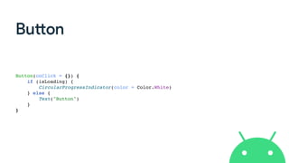
  • 37. Bu tt on Button(onClick = {}) { if (isLoading) { CircularProgressIndicator(color = Color.White ) } else { Text("Button" ) } }
  • 38. Image Image ( painterResource(R.drawable.recife) , contentDescription = null , contentScale = ContentScale.FillHeigh t ) Image ( painterResource(R.drawable.ic_android_orange) , contentDescription = null , contentScale = ContentScale.Fit , colorFilter = ColorFilter.tint(Color.Cyan ) )
  • 39. • Window Insets • System UI (status and navigation bars colors) • AppCompat Theme Adapter • ViewPager like • Flexbox layout • Swipe to refresh • Image loading (Glide and Coil) https://github.com/google/accompanist
  • 40. Image from the network Image ( rememberCoilPainter ( request = "https://img.com/img.jpg” , ) , contentDescription = null , modifier = Modifier.size(50.dp, 50.dp ) ) Image ( rememberGlidePainter ( request = "https://img.com/img.jpg” , ) , contentDescription = null , modifier = Modifier.size(50.dp, 50.dp ) )
  • 41. Column + Scroll Column(modifier = Modifie r .verticalScroll(rememberScrollState() ) ) { for (i in 0..200) { Text ( "Item: $i" , modifier = Modifie r .padding(8.dp ) .fillMaxWidth( ) ) } }
  • 42. Row + Scroll Row(modifier = Modifie r .horizontalScroll(rememberScrollState() ) ) { for (i in 0..200) { Text ( "Item: $i" , modifier = Modifie r .padding(8.dp ) ) } }
  • 43. Lists in current toolkit • De fi ne a layout fi le for each item of the list • Create an adapter subclass (view holder, get count, in fl ate view, …) • Declare a RecyclerView/ListView in the screen’s XML fi le • Set up everything in your activity/fragment • What about you need a header and/or a footer? 🤦
  • 44. List in Compose @Composabl e fun UserListScreen(users: List<User>) { LazyColumn ( modifier = Modifier.fillMaxSize()) { item { Text("Header" , Modifier.fillMaxWidth().padding(8.dp ) ) } items(users) { user - > Text("${user.name} - ${user.age}" , Modifier.fillMaxWidth().padding(8.dp ) ) } } }
  • 45. List in Compose (with index) @Composabl e fun UserListScreen(users: List<User>) { LazyColumn ( modifier = Modifier.fillMaxSize()) { item { Text("Header" , Modifier.fillMaxWidth().padding(8.dp ) ) } itemsIndexed(users) { index, user - > Text("${user.name} - ${user.age}" , Modifier.fillMaxWidth().padding(8.dp ) ) } } }
  • 46. Sca ff old Scaffold( topBar = {...}, floatingActionButton = {...}, bottomBar = {...} ) {...}
  • 47. TopAppBar ( title = { Text(text = "Compose") } , backgroundColor = MaterialTheme.colors.primary , contentColor = Color.Yellow , actions = { IconButton(onClick = {}) { Icon(Icons.Default.Search, "Search" ) } IconButton ( onClick = { … } ) { Icon(Icons.Filled.MoreVert, "More" ) DropdownMenu(… ) } } )
  • 48. FloatingActionButton ( onClick = { … } , backgroundColor = Color.Red , contentColor = Color.Whit e ) { Icon(Icons.Filled.Add, "Add" ) }
  • 49. BottomAppBar( backgroundColor = MaterialTheme.colors.primary, content = { BottomNavigationItem( icon = { Icon(Icons.Filled.Home) }, selected = selectedTab == 0, onClick = { selectedTab = 0 }, selectedContentColor = Color.White, unselectedContentColor = Color.DarkGray, label = { Text(text = "Home") } ) BottomNavigationItem(…) } )
  • 50. BottomAppBar( backgroundColor = MaterialTheme.colors.primary, content = { BottomNavigationItem( icon = { Icon(Icons.Filled.Home) }, selected = selectedTab == 0, onClick = { selectedTab = 0 }, selectedContentColor = Color.White, unselectedContentColor = Color.DarkGray, label = { Text(text = "Home") } ) BottomNavigationItem(…) } )
  • 51. State • State in an app is any value that can change over time.  • Component is updated when state has changed var nameState by remember { mutableStateOf("") } TextField ( value = nameState , label = { Text("Name") } , onValueChange = { s: String - > nameState = s } )
  • 52. State data class Score ( var team: String , var score: In t )
  • 53. State class Score ( team: String , score: In t ) { var team by mutableStateOf(team ) var score by mutableStateOf(score) }
  • 54. class Score ( team: String , score: In t ) { var team by mutableStateOf(team ) var score by mutableStateOf(score) }
  • 55. @Composabl e fun TeamScore(score: Score) { Column(horizontalAlignment = Alignment.CenterHorizontally) { Text(text = score.team, style = MaterialTheme.typography.h6 ) Button ( content = { Text("+") } , onClick = { score.score += 1 } ) Text(text = score.score.toString(), style = MaterialTheme.typography.h5 ) Button ( content = { Text("-") } , onClick = { score.score = max(score.score - 1, 0) } ) } }
  • 56. @Composabl e fun ScoreScreen(homeScore: Score, visitorScore: Score) { Column ( modifier = Modifier.fillMaxSize() , verticalArrangement = Arrangement.Center , horizontalAlignment = Alignment.CenterHorizontall y ) { Row { TeamScore(score = homeScore ) Text(text = "x" , modifier = Modifier.padding(horizontal = 8.dp) , style = MaterialTheme.typography.h6 ) TeamScore(score = visitorScore ) } OutlinedButton ( modifier = Modifier.padding(top = 16.dp) , content = { Text("Reset") } , onClick = { homeScore.score = 0 visitorScore.score = 0 } ) } }
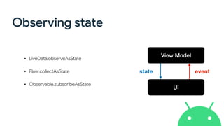
  • 58. Observing state • LiveData.observeAsState • Flow.collectAsState • Observable.subscribeAsState View Model UI state event
  • 59. LiveData @Composabl e fun UserScreen ( usersLiveData: LiveData<List<UserBinding>> , onSaveUser: (UserBinding) -> Unit , onDeleteUser: (UserBinding) -> Uni t ) { val users by usersLiveData.observeAsState( ) Column(modifier = Modifier.fillMaxSize()) { InputPanel(currentUser, onInsertUser = { user -> onSaveUser(user ) } ) UserList ( users = users ?: emptyList() , onDeleteUser = onDeleteUser ) } }
  • 60. LiveData @Composabl e fun UserScreen ( usersLiveData: LiveData<List<UserBinding>> , onSaveUser: (UserBinding) -> Unit , onDeleteUser: (UserBinding) -> Uni t ) { val users by usersLiveData.observeAsState( ) Column(modifier = Modifier.fillMaxSize()) { InputPanel(currentUser, onInsertUser = { user -> onSaveUser(user ) } ) UserList ( users = users ?: emptyList() , onDeleteUser = onDeleteUser ) } }
  • 61. LiveData @Composabl e fun UserScreen ( usersLiveData: LiveData<List<UserBinding>> , onSaveUser: (UserBinding) -> Unit , onDeleteUser: (UserBinding) -> Uni t ) { val users by usersLiveData.observeAsState( ) Column(modifier = Modifier.fillMaxSize()) { InputPanel(currentUser, onInsertUser = { user -> onSaveUser(user ) } ) UserList ( users = users ?: emptyList() , onDeleteUser = onDeleteUser ) } }
  • 62. LiveData @Composabl e fun UserScreen ( usersLiveData: LiveData<List<UserBinding>> , onSaveUser: (UserBinding) -> Unit , onDeleteUser: (UserBinding) -> Uni t ) { val users by usersLiveData.observeAsState( ) Column(modifier = Modifier.fillMaxSize()) { InputPanel(currentUser, onInsertUser = { user -> onSaveUser(user ) } ) UserList ( users = users ?: emptyList() , onDeleteUser = onDeleteUser ) } }
  • 63. LiveData @Composabl e fun UserScreen ( usersLiveData: LiveData<List<UserBinding>> , onSaveUser: (UserBinding) -> Unit , onDeleteUser: (UserBinding) -> Uni t ) { val users by usersLiveData.observeAsState( ) Column(modifier = Modifier.fillMaxSize()) { InputPanel(currentUser, onInsertUser = { user -> onSaveUser(user ) } ) UserList ( users = users ?: emptyList() , onDeleteUser = onDeleteUser ) } }
  • 64. LiveData UserScreen ( usersLiveData = viewModel.allUsers , onSaveUser = { user -> viewModel.saveUser(user ) } , onDeleteUser = { user - > viewModel.deleteUser(user ) } ) @Composabl e fun UserScreen ( usersLiveData: LiveData<List<UserBinding>> , onSaveUser: (UserBinding) -> Unit , onDeleteUser: (UserBinding) -> Uni t ) { … }
  • 65. ViewModel + LiveData + Compose @Composabl e fun UserScreen ( viewModel: UsersViewMode l ) { val users by viewModel.allUsers.observeAsState( ) Column(modifier = Modifier.fillMaxSize()) { InputPanel(currentUser, onInsertUser = { user -> viewModel.saveUser(user ) } ) UserList ( users = users ?: emptyList() , onDeleteUser = { user - > viewModel.deleteUser(user ) } ) } }
  • 66. ViewModel + LiveData + Compose @Composabl e fun UserScreen() { val viewModel: UsersViewModel = viewModel() val users by viewModel.allUsers.observeAsState( ) Column(modifier = Modifier.fillMaxSize()) { InputPanel(currentUser, onInsertUser = { user -> viewModel.saveUser(user ) } ) UserList ( users = users ?: emptyList() , onDeleteUser = { user - > viewModel.deleteUser(user ) } ) } } implementation "androidx.lifecycle:lifecycle-viewmodel-compose:<version> "
  • 68. In fragments… class MyFragment: Fragment() { override fun onCreateView ( inflater: LayoutInflater , container: ViewGroup? , savedInstanceState: Bundle ? ): View? { return ComposeView(requireContext()).apply { setContent { AppTheme { YourComposable( ) } } } } }
  • 69. In fragments… class MyFragment: Fragment() { override fun onCreateView ( inflater: LayoutInflater , container: ViewGroup? , savedInstanceState: Bundle ? ): View? { return ComposeView(requireContext()).apply { setContent { AppTheme { YourComposable( ) } } } } }
  • 71. ComposeView class MyComposeVie w @JvmOverloads constructor(context: Context, attrs: AttributeSet? = null) : AbstractComposeView(context, attrs) { @Composabl e override fun Content() { MyComposableFunction( ) } } <br.com.nglauber.MyComposeVie w android:layout_width="match_parent " android:layout_height="match_parent"/ >
  • 72. @Composabl e fun MyCalendar(onDateUpdate: (Date) -> Unit) { AndroidView ( factory = { context: Context - > val view = LayoutInflater.from(context).inflate(R.layout.my_layout, null, false ) val textView = view.findViewById<TextView>(R.id.txtDate ) val calendarView = view.findViewById<CalendarView>(R.id.calendarView ) calendarView?.setOnDateChangeListener { cv, year, month, day - > val date = Calendar.getInstance().apply { set(year, month, day ) }.tim e textView?.text = date.toString( ) onDateUpdate(date ) } vie w } , update = { view - > // Update vie w } ) }
  • 73. @Composabl e fun MyCalendar(onDateUpdate: (Date) -> Unit) { AndroidView( factory = { context: Context - > val view = LayoutInflater.from(context).inflate(R.layout.my_layout, null, false ) val textView = view.findViewById<TextView>(R.id.txtDate ) val calendarView = view.findViewById<CalendarView>(R.id.calendarView ) calendarView?.setOnDateChangeListener { cv, year, month, day - > val date = Calendar.getInstance().apply { set(year, month, day ) }.tim e textView?.text = date.toString( ) onDateUpdate(date ) } vie w } , update = { view - > // Update vie w } ) }
  • 74. @Composabl e fun MyCalendar(onDateUpdate: (Date) -> Unit) { AndroidView ( factory = { context: Context - > val view = LayoutInflater.from(context).inflate(R.layout.my_layout, null, false ) val textView = view.findViewById<TextView>(R.id.txtDate ) val calendarView = view.findViewById<CalendarView>(R.id.calendarView ) calendarView?.setOnDateChangeListener { cv, year, month, day - > val date = Calendar.getInstance().apply { set(year, month, day ) }.tim e textView?.text = date.toString( ) onDateUpdate(date ) } vie w }, update = { view - > // Update vie w } ) }
  • 75. AndroidViewBinding android { .. . viewBinding { enabled = tru e } } implementation "androidx.compose.ui:ui-viewbinding:$compose_version" AndroidViewBinding(factory = MyBindingLayoutBinding::inflate) { textView.text = "My Text " seekBar.progress = 5 0 }
  • 77. On con fi g changes… Unlike the current UI toolkit, the state is not saved automatically across con fi guration changes. var state by rememberSaveable { mutableStateOf("Compose!!!" ) }
  • 79. E ff ects • LaunchedE ff ect • DisposableE ff ect LaunchedEffect(someKey) { // do something on launc h } DisposableEffect(someKey) { // do something on launc h onDispose { // Cleanu p } }
  • 80. Coroutines LaunchedEffect launch a coroutine when the composition is added and it is automatically cancelled when the execution leaves the composition. @Composabl e fun MyComposable() { val welcomeMsg = remember { mutableStateOf("Initial") } LaunchedEffect(welcomeMsg) { val s = withContext(Dispatchers.IO) { delay(5_000 ) "Hello Compose! " } welcomeMsg.value = s } Text(text = welcomeMsg.value ) }
  • 81. Coroutines rememberCoroutineScope returns the associated CoroutineScope to a given position of the composition. It should be used to launch coroutines as response of callback events @Composabl e fun MyComposable() { val scope = rememberCoroutineScope( ) val count = remember { mutableStateOf(0) } Text(text = "Current count: ${count.value}" ) Button(onClick = { scope.launch { for (i in 1..10) { withContext(Dispatchers.IO) { delay(1_000 ) } count.value = i } } }, content = { Text("Start!") } ) }
  • 82. Learn more… • Samples (goo.gle/compose-samples) • Codelabs (goo.gle/compose-codelabs) • Documentation (goo.gle/compose-docs) • Issue Tracker (goo.gle/compose-feedback) • Slack Channel (goo.gle/compose-slack)
  • 83. Wrap up • The way of Compose works seems very interesting, once it is following the same modern paradigm of other UI toolkits. • Compose is also available for desktop apps (alpha) and now for web (preview)! • Jetpack Compose is in beta stage (beta-06), so DON’T USE IN PRODUCTION! • Be prepared, because declarative is the new standard 😉