SlideShare a Scribd company logo
Bootstrap tutorial
Bootstrap
AbouttheTutorial
Twitter Bootstrap is the most popular front end framework in the recent time. It is sleek,
intuitive, and powerful mobile first front-end framework for faster and easier web
development. It uses HTML, CSS and Javascript.
This tutorial will teach you the basics of Bootstrap Framework using which you can
create web projects with ease. The tutorial is divided into sections such as Bootstrap
Basic Structure, Bootstrap CSS, Bootstrap Layout Components and Bootstrap Plugins.
Each of these sections contain related topics with simple and useful examples.
Audience
This tutorial has been prepared for anyone who has a basic knowledge of HTML and CSS
and has an urge to develop websites. After completing this tutorial you will find yourself
at a moderate level of expertise in developing web projects using Twitter Bootstrap.
Prerequisites
Before you start proceeding with this tutorial, we are assuming that you are already
aware about the basics of HTML and CSS. If you are not well aware of these concepts,
then we will suggest you to go through our short tutorial on HTML Tutorial and CSS
Tutorial.
Copyright&Disclaimer
Copyright 2014 by Tutorials Point (I) Pvt. Ltd.
All the content and graphics published in this e-book are the property of Tutorials Point
(I) Pvt. Ltd. The user of this e-book is prohibited to reuse, retain, copy, distribute or
republish any contents or a part of contents of this e-book in any manner without written
consent of the publisher.
We strive to update the contents of our website and tutorials as timely and as precisely
as possible, however, the contents may contain inaccuracies or errors. Tutorials Point (I)
Pvt. Ltd. provides no guarantee regarding the accuracy, timeliness or completeness of
our website or its contents including this tutorial. If you discover any errors on our
website or in this tutorial, please notify us at contact@tutorialspoint.com
i
Bootstrap
TableofContents
About the Tutorial····································································································································i
Audience··················································································································································i
Prerequisites············································································································································i
Copyright & Disclaimer·····························································································································i
Table of Contents····································································································································ii
1. BOOTSTRAP ─ OVERVIEW······························································································1
2. BOOTSTRAP ─ ENVIRONMENT SETUP············································································3
Download Bootstrap ·······························································································································3
File structure···········································································································································3
HTML Template·······································································································································4
3. BOOTSTRAP ─ GRID SYSTEM·························································································6
What is a Grid?········································································································································6
What is Bootstrap Grid System?··············································································································6
Working of Bootstrap Grid System··········································································································6
Media Queries·········································································································································7
Grid Options············································································································································8
Responsive Column Resets····················································································································14
Offset Columns······································································································································15
Nesting Columns ···································································································································16
Column Ordering···································································································································17
4. BOOTSTRAP ─ CSS OVERVIEW ····················································································19
HTML5 doctype ·····································································································································19
Mobile First···········································································································································19
Responsive Images································································································································20
ii
Bootstrap
Typography and Links····························································································································20
Normalize··············································································································································20
Containers·············································································································································20
5. BOOTSTRAP ─ TYPOGRAPHY························································································22
Headings ···············································································································································22
Lead Body Copy·····································································································································23
Emphasis···············································································································································23
Abbreviations········································································································································24
Addresses··············································································································································24
Blockquotes ··········································································································································25
Lists·······················································································································································26
6. BOOTSTRAP ─ CODE····································································································29
7. BOOTSTRAP ─ TABLES···································································································30
Basic Table ············································································································································30
Optional Table Classes ··························································································································31
Contextual classes·································································································································35
Responsive tables ·································································································································37
8. BOOTSTRAP ─ FORMS··································································································39
Form Layout··········································································································································39
Supported Form Controls······················································································································42
Static Control ········································································································································45
Form Control States ······························································································································46
Form Control Sizing ·······························································································································49
Help Text···············································································································································50
iii
Bootstrap
9. BOOTSTRAP ─ BUTTONS······························································································51
Button Size············································································································································52
Button State··········································································································································54
Button Tags···········································································································································57
10. BOOTSTRAP ─ IMAGES·································································································58
11. BOOTSTRAP ─ HELPER CLASSES···················································································59
Close icon··············································································································································59
Carets····················································································································································59
Quick Floats ··········································································································································59
Center Content Blocks···························································································································60
Clearfix··················································································································································60
Showing and Hiding Content ·················································································································61
Screen Reader Content··························································································································61
12. BOOTSTRAP ─ RESPONSIVE UTILITIES··········································································62
Print Classes··········································································································································62
13. BOOTSTRAP ─ GLYPHICONS·························································································64
What are Glyphicons? ···························································································································64
Where to find Glyphicons?····················································································································64
Usage ····················································································································································64
14. BOOTSTRAP ─ DROPDOWNS ·······················································································66
Options ·················································································································································67
15. BOOTSTRAP ─ BUTTON GROUPS ·················································································70
Basic Button Group ·······························································································································71
Button Toolbar······································································································································71
Button Size············································································································································72
iv
Bootstrap
Nesting··················································································································································72
Vertical Buttongroup·····························································································································73
16. BOOTSTRAP ─ BUTTON DROPDOWNS·········································································75
Split Button Dropdowns························································································································76
Button Dropdown Size ··························································································································77
Dropup Variation ··································································································································78
17. BOOTSTRAP ─ INPUT GROUPS·····················································································80
Basic Input Group··································································································································80
Input Group Sizing·································································································································81
Checkboxes and Radio Addons··············································································································82
Button Addons······································································································································83
Buttons with Dropdowns ······················································································································84
Segmented Buttons·······························································································································85
18. BOOTSTRAP ─ NAVIGATION ELEMENTS·······································································88
Tabular Navigation or Tabs ···················································································································88
Pills Navigation ·····································································································································88
Justified Nav··········································································································································90
Disabled Links ·······································································································································90
Dropdowns ···········································································································································91
19. BOOTSTRAP ─ NAVBAR································································································94
Default Navbar······································································································································94
Responsive Navbar································································································································95
Forms in Navbar····································································································································96
Buttons in Navbar ·································································································································97
Text in Navbar·······································································································································98
Non-nav Links········································································································································98
v
Bootstrap
Component Alignment ··························································································································99
Fixed to Top ········································································································································101
Fixed to Bottom ··································································································································102
Static Top ············································································································································103
Inverted Navbar ··································································································································104
20. BOOTSTRAP ─ BREADCRUMB ····················································································106
21. BOOTSTRAP ─ PAGINATION·······················································································107
Pagination···········································································································································107
Pager···················································································································································110
22. BOOTSTRAP ─ LABELS································································································112
23. BOOTSTRAP ─ BADGES ······························································································113
Active Nav States ································································································································113
24. BOOTSTRAP ─ JUMBOTRON ·······················································································115
25. BOOTSTRAP ─ PAGE HEADER·······················································································117
26. BOOTSTRAP ─ THUMBNAILS························································································118
Adding Custom Content ······················································································································119
27. BOOTSTRAP ─ ALERTS··································································································122
Dismissal Alerts···································································································································122
Links in Alerts······································································································································124
28. BOOTSTRAP ─ PROGRESS BARS ··················································································125
Default Progress Bar····························································································································125
Alternate Progress Bar ························································································································125
Striped Progress Bar····························································································································127
Animated Progress Bar························································································································128
vi
Bootstrap
Stacked Progress Bar···························································································································128
29. BOOTSTRAP ─ MEDIA OBJECT····················································································130
30. BOOTSTRAP ─ LIST GROUP ························································································135
Adding Badges to List Group ···············································································································135
Linking List Group Items······················································································································136
Add Custom Content to List Group······································································································137
31. BOOTSTRAP ─ PANELS·······························································································139
Panel with Heading ·····························································································································139
Panel with Footer································································································································140
Panel Contextual Alternatives·············································································································141
Panel with Tables································································································································142
Panel with Listgroups··························································································································143
32. BOOTSTRAP ─ WELLS·································································································145
Sizing···················································································································································145
33. BOOTSTRAP ─ PLUGINS OVERVIEW···········································································146
Data Attributes ···································································································································146
Programmatic API ·······························································································································146
No Conflict ··········································································································································147
Events ·················································································································································147
34. BOOTSTRAP ─ TRANSITION PLUGIN··········································································148
Use Cases ············································································································································148
35. BOOTSTRAP ─ MODAL PLUGIN··················································································149
Usage ··················································································································································149
Options ···············································································································································151
Methods··············································································································································152
vii
Bootstrap
Events ·················································································································································154
36. BOOTSTRAP ─ DROPDOWN PLUGIN ·········································································157
Usage ··················································································································································157
Options ···············································································································································159
Methods··············································································································································160
37. BOOTSTRAP ─ SCROLLSPY PLUGIN·············································································162
Usage ··················································································································································162
Options ···············································································································································164
Methods··············································································································································165
Events ·················································································································································168
38. BOOTSTRAP ─ TAB PLUGIN······························································································172
Usage ··················································································································································172
Fade Effect ··········································································································································173
Methods··············································································································································174
Events ·················································································································································177
39. BOOTSTRAP ─ TOOLTIP PLUGIN·······················································································180
Usage ··················································································································································180
Options ···············································································································································182
Methods··············································································································································183
Events ·················································································································································185
40. BOOTSTRAP ─ POPOVER PLUGIN·····················································································187
Usage ··················································································································································187
Options ···············································································································································188
Methods··············································································································································190
Events ·················································································································································192
viii
Bootstrap
41. BOOTSTRAP ─ ALERT PLUGIN ···················································································194
Usage ··················································································································································194
Options ···············································································································································195
Methods··············································································································································195
Events ·················································································································································196
42. BOOTSTRAP ─ BUTTON PLUGIN·················································································198
Loading State ······································································································································198
Single Toggle ·······································································································································199
Checkbox·············································································································································199
Radio···················································································································································200
Usage ··················································································································································200
Options ···············································································································································200
Methods··············································································································································200
43. BOOTSTRAP ─ COLLAPSE PLUGIN ·············································································204
Usage ··················································································································································206
Options ···············································································································································207
Methods··············································································································································207
Events ·················································································································································210
44. BOOTSTRAP ─ CAROUSEL PLUGIN ·············································································213
Optional Captions ·······························································································································214
Usage ··················································································································································215
Options ···············································································································································216
Methods··············································································································································216
Events ·················································································································································219
ix
Bootstrap
45. BOOTSTRAP ─ AFFIX PLUGIN ·····················································································222
Usage ··················································································································································222
Positioning via CSS ······························································································································228
Options ···············································································································································229
x
1. Bootstrap ─ Overview
What is Twitter Bootstrap?
Bootstrap is a sleek, intuitive, and powerful, mobile first front-end framework for faster
and easier web development. It uses HTML, CSS, and Javascript.
Bootstrap was developed by Mark Otto and Jacob Thornton at Twitter. It was released as
an open source product in August 2011 on GitHub.
Why Use Bootstrap?
 Mobile first approach: Bootstrap 3 framework consists of Mobile first styles
throughout the entire library instead of them in separate files.
 Browser Support: It is supported by all popular browsers.
 Easy to get started: With just the knowledge of HTML and CSS anyone can get
started with Bootstrap. Also the Bootstrap official site has a good documentation.
 Responsive design: Bootstrap's responsive CSS adjusts to Desktops, Tablets
and Mobiles. More about the responsive design is in the chapter Bootstrap
Responsive Design.
 Provides a clean and uniform solution for building an interface for developers.
 It contains beautiful and functional built-in components which are easy to
customize.
 It also provides web-based customization.
 And best of all it is an open source.
1
Bootstrap
What Bootstrap Package Includes?
 Scaffolding: Bootstrap provides a basic structure with Grid System, link
styles, and background. This is covered in detail in the section Bootstrap
Basic Structure.
 CSS: Bootstrap comes with the feature of global CSS settings, fundamental
HTML elements styled and enhanced with extensible classes, and an
advanced grid system. This is covered in detail in the section Bootstrap with
CSS.
 Components: Bootstrap contains over a dozen reusable components built
to provide iconography, dropdowns, navigation, alerts, pop-overs, and much
more. This is covered in detail in the section Layout Components.
 JavaScript Plugins: Bootstrap contains over a dozen custom jQuery plugins.
You can easily include them all, or one by one. This is covered in details in the
section Bootstrap Plugins.
 Customize: You can customize Bootstrap's components, LESS variables, and
jQuery plugins to get your very own version.
2
2. Bootstrap ─ Environment Setup
It is very easy to setup and start using Bootstrap. This chapter will explain how to
download and setup Bootstrap. We will also discuss the Bootstrap file structure, and
demonstrate its usage with an example.
DownloadBootstrap
You can download the latest version of Bootstrap from http://getbootstrap.com/. When
you click on this link, you will get to see a screen as below:
Here you can see two buttons:
 Download Bootstrap: Clicking this, you can download the precompiled
and minified versions of Bootstrap CSS, JavaScript, and fonts. No documentation or
original source code files are included.
 Download Source: Clicking this, you can get the latest Bootstrap LESS
and JavaScript source code directly from GitHub.
If you work with Bootstrap's uncompiled source code, you need to compile the LESS files
to produce usable CSS files. For compiling LESS files into CSS, Bootstrap officially
supports only Recess, which is Twitter's CSS hinter based on less.js.
For better understanding and ease of use, we shall use precompiled version of Bootstrap
throughout the tutorial. As the files are complied and minified, you don't have to bother
every time including separate files for individual functionality. At the time of writing this
tutorial the latest version (Bootstrap 3) was downloaded.
Filestructure
Precompiled Bootstrap
Once the compiled version Bootstrap is downloaded, extract the ZIP file, and you will see
the following file/directory structure:
3
Bootstrap
As you can see, there are compiled CSS and JS (bootstrap.*), as well as compiled and
minified CSS and JS (bootstrap.min.*). Fonts from Glyphicons are included, as it is the
optional Bootstrap theme.
Bootstrap Source Code
If you have downloaded the Bootstrap source code then the file structure would be as
follows:
 The files under less/, js/, and fonts/ are the source code for Bootstrap CSS, JS,
and icon fonts (respectively).
 The dist/ folder includes everything listed in the precompiled download section
above.
 docs-assets/, examples/, and all *.html files are Bootstrap documentation.
HTMLTemplate
A basic HTML template using Bootstrap would look like this:
<!DOCTYPE html>
<html>
<head>
<title>Bootstrap 101 Template</title>
<meta name="viewport" content="width=device-width, initial-scale=1.0">
<!-- Bootstrap -->
<link href="css/bootstrap.min.css" rel="stylesheet">
Bootstrap
<!-- HTML5 Shim and Respond.js IE8 support of HTML5 elements and media queries
-->
<!-- WARNING: Respond.js doesn't work if you view the page
via file:// -->
<!--[if lt IE 9]>
<script src="https://oss.maxcdn.com/libs/html5shiv/3.7.0/
html5shiv.js"></script>
<script src="https://oss.maxcdn.com/libs/respond.js/1.3.0/
respond.min.js"></script>
<![endif]-->
</head>
<body>
<h1>Hello, world!</h1>
<!-- jQuery (necessary for Bootstrap's JavaScript plugins) -->
<script src="https://code.jquery.com/jquery.js"></script>
<!-- Include all compiled plugins (below), or include individual files as needed
-->
<script src="js/bootstrap.min.js"></script>
</body>
</html>
Here you can see the jquery.js, bootstrap.min.js and bootstrap.min.css files that
are included to make a normal HTM file to the Bootstrapped Template. Just make sure to
include jQuery library before you include Bootstrap library.
More details about each of the elements in this above piece of code will be discussed in
the chapter Bootstrap CSS Overview.
This template structure is already included as part of the Try it (online compiler) tool.
Hence in all the examples (in the following chapters) of this tutorial you will only see the
contents of the <body> element. Once you click on the Try it option available at the top
right corner of example, and you will see the entire code.
Example
Now let's try an example using the above template. Try the following example using Try
it option available at the top right corner of the below sample code box on our website:
<h1>Hello, world!</h1>
In all the subsequent chapters we have used dummy text from the site
http://www.lipsum.com/.
5
3. Bootstrap ─ Grid System
In this chapter, we shall discuss the Bootstrap Grid System.
WhatisaGrid?
As put by Wikipedia:
In graphic design, a grid is a structure (usually two-dimensional) made up of a series of
intersecting straight (vertical, horizontal) lines used to structure the content. It is widely
used to design layout and content structure in print design. In web design, it is a very
effective method to create a consistent layout rapidly and effectively using HTML and
CSS.
To put in simple words, grids in web design organize and structure content, makes the
websites easy to scan and reduces the cognitive load on users.
WhatisBootstrapGridSystem?
As put by the official documentation of Bootstrap for grid system:
Bootstrap includes a responsive, mobile first fluid grid system that appropriately scales
up to 12 columns as the device or viewport size increases. It includes predefined classes
for easy layout options, as well as powerful mixins for generating more semantic layouts.
Let us understand the above statement. Bootstrap 3 is mobile first in the sense that the
code for Bootstrap now starts by targeting smaller screens like mobile devices, tablets,
and then “expands” components and grids for larger screens such as laptops, desktops.
Mobile First Strategy
 Content
o Determine what is most important.
 Layout
o Design to smaller widths first.
o Base CSS address mobile device first; media queries address for tablet,
desktops.
 Progressive Enhancement
o Add elements as screen size increases.
WorkingofBootstrapGridSystem
Grid systems are used for creating page layouts through a series of rows and columns
that house your content. Here's how the Bootstrap grid system works:
 Rows must be placed within a .container class for proper alignment and padding.
 Use rows to create horizontal groups of columns. 6
Bootstrap
 Content should be placed within the columns, and only columns may be the
immediate children of rows.
 Predefined grid classes like .row and .col-xs-4 are available for quickly making
grid layouts. LESS mixins can also be used for more semantic layouts.
 Columns create gutters (gaps between column content) via padding. That
padding is offset in rows for the first and the last column via negative margin
on .rows.
 Grid columns are created by specifying the number of twelve available columns
you wish to span. For example, three equal columns would use three .col-xs-4.
MediaQueries
Media query is a really fancy term for "conditional CSS rule". It simply applies some
CSS, based on certain conditions set forth. If those conditions are met, the style is
applied.
Media Queries in Bootstrap allow you to move, show and hide content based on the
viewport size. Following media queries are used in LESS files to create the key
breakpoints in the Bootstrap grid system.
/* Extra small devices (phones, less than 768px) */
/* No media query since this is the default in Bootstrap */
/* Small devices (tablets, 768px and up) */
@media (min-width: @screen-sm-min) { ... }
/* Medium devices (desktops, 992px and up) */
@media (min-width: @screen-md-min) { ... }
/* Large devices (large desktops, 1200px and up) */
@media (min-width: @screen-lg-min) { ... }
Occasionally these are expanded to include a max-width to limit CSS to a narrower set
of devices.
@media (max-width: @screen-xs-max) { ... }
@media (min-width: @screen-sm-min) and (max-width: @screen-sm-max) { ... }
@media (min-width: @screen-md-min) and (max-width: @screen-md-max) { ... }
@media (min-width: @screen-lg-min) { ... }
Media queries have two parts, a device specification and then a size rule. In the above
case, the following rule is set:
7
Bootstrap
Let us consider this line:
@media (min-width: @screen-sm-min) and (max-width: @screen-sm-max) { ... }
For all devices no matter what kind with min-width: @screen-sm-min, if the width of the
screen gets smaller than @screen-sm-max, then do something.
GridOptions
The following table summarizes aspects of how Bootstrap grid system works across
multiple devices:
Extra small
devices
Phones
(<768px)
Small devices
Tablets
(≥768px)
Medium
devices
Desktops
(≥992px)
Large devices
Desktops
(≥1200px)
Grid
behavior
Horizontal at
all times
Collapsed to
start, horizontal
above
breakpoints
Collapsed to
start, horizontal
above
breakpoints
Collapsed to
start, horizontal
above
breakpoints
Max
container
width
None (auto) 750px 970px 1170px
Class
prefix
.col-xs- .col-sm- .col-md- .col-lg-
# of
columns
12 12 12 12
Max
column
width
Auto 60px 78px 95px
Gutter
width
30px
(15px on each
side of a
column)
30px
(15px on each
side of a
column)
30px
(15px on each
side of a
column)
30px
(15px on each side
of a column)
Nestable Yes Yes Yes Yes
Offsets Yes Yes Yes Yes
8
Bootstrap
Column
ordering
Yes Yes Yes Yes
Basic Grid Structure
Following is basic structure of Bootstrap grid:
<div class="container">
<div class="row">
<div class="col-*-*"></div>
</div>
<div class="row">...</div>
</div>
<div class="container">....
Let us see some simple grid examples:
Example: Stacked-to-horizontal
Let us see a simple grid example with simple layout: two columns, two paragraphs per
column. (Here styling for each column is used. You can avoid it.)
<div class="container">
<h1>Hello, world!</h1>
<div class="row">
<div class="col-md-6" style="background-color: #dedef8; box-shadow:
inset 1px -1px 1px #444, inset -1px 1px 1px #444;">
<p>Lorem ipsum dolor sit amet, consectetur adipisicing elit, sed do
eiusmod tempor incididunt ut labore et dolore magna aliqua. Ut
enim ad minim veniam, quis nostrud exercitation ullamco laboris
nisi ut aliquip ex ea commodo consequat.
</p>
<p>Sed ut perspiciatis unde omnis iste natus error sit voluptatem
accusantium doloremque laudantium, totam rem aperiam, eaque ipsa
quae ab illo inventore veritatis et quasi architecto beatae
vitae dicta sunt explicabo.
</p>
9
Bootstrap
</div>
<div class="col-md-6" style="background-color: #dedef8;box-shadow:
inset 1px -1px 1px #444, inset -1px 1px 1px #444;">
<p>Sed ut perspiciatis unde omnis iste natus error sit voluptatem
accusantium doloremque laudantium.
</p>
<p> Neque porro quisquam est, qui dolorem ipsum quia dolor sit
amet, consectetur, adipisci velit, sed quia non numquam eius
modi tempora incidunt ut labore et dolore magnam aliquam quaerat
voluptatem.
</p>
</div>
</div>
Details
 <div class="container">...</div> element is added to ensure proper
centering and maximum width for layout.
 Once container is added, next you need to think in terms of rows. Add <div
class="row">...</div> and columns <div class="col-md-6"></div> inside
the rows.
 Every row in the grid is made up of 12 units and you can define the desired size
of your columns using those units. In our example we have two columns each
made of 6 units wide i.e 6+6=12.
You can try some more options like:
<div class="col-md-3"></div> and <div class="col-md-9"></div>
or <div class="col-md-7"></div> and <div class="col-md-5"></div>.
Experiment and make sure that the sum always needs to be 12.
10
Bootstrap
Example: Medium and Large Device
We have seen the basic grid system in ‘Example: Stacked-to-horizontal’. Here we have
used 2 divs and gave them the 50%/50% split at the medium viewport width:
<div class="col-md-6">....</div>
But at large, your design could really be better as a 33%/66%. So what we’re going to
do is, set it up to change the column widths at the breakpoint:
<div class="col-md-6 col-lg-4">....</div>
Now Bootstrap is going to say “at the medium size, I look at classes with md in them
and use those. At the large size, I look at classes with the word lg in them and use
those. In this case, our 2 divs will go from a 50%/50% split and then up to a 33%/66%.
Check it out in the following example. (Here styling for each column is used. You can
avoid it.)
<div class="container">
<h1>Hello, world!</h1>
<div class="row">
<div class="col-md-6 col-lg-4" style="background-color: #dedef8;
box-shadow: inset 1px -1px 1px #444, inset -1px 1px 1px #444;">
<p>Lorem ipsum dolor sit amet, consectetur adipisicing elit, sed do
eiusmod tempor incididunt ut labore et dolore magna aliqua. Ut
enim ad minim veniam, quis nostrud exercitation ullamco laboris
nisi ut aliquip ex ea commodo consequat.
</p>
<p>Sed ut perspiciatis unde omnis iste natus error sit voluptatem
accusantium doloremque laudantium, totam rem aperiam, eaque ipsa
quae ab illo inventore veritatis et quasi architecto beatae
vitae dicta sunt explicabo.
</p>
</div>
<div class="col-md-6 col-lg-8"" style="background-color: #dedef8;
box-shadow: inset 1px -1px 1px #444, inset -1px 1px 1px #444;">
11
Bootstrap
<p>Sed ut perspiciatis unde omnis iste natus error sit voluptatem
accusantium doloremque laudantium.
</p>
<p> Neque porro quisquam est, qui dolorem ipsum quia dolor sit
amet, consectetur, adipisci velit, sed quia non numquam eius
modi tempora incidunt ut labore et dolore magnam aliquam quaerat
voluptatem.
</p>
</div>
</div>
Example: Mobile, tablet, desktops
We have seen an example for Medium and Large Device. Now let us take it to another
level, where we would want to change it for the extra small phone size as well. Say we
want to add the option for the columns to be split 75%/25% for tablets, we go like this:
<div class="col-sm-3 col-md-6 col-lg-4">....</div>
<div class="col-sm-9 col-md-6 col-lg-8">....</div>
Now this gives us 3 different column layouts at each point. On a phone, it will be 75% on
the left, and 25% on the right. On a tablet, it will be 50%/50% again, and on a large
viewport, it will be 33%/66%. Three different layouts for each of the three responsive
sizes. Check it out in the following example. (Here styling for each column is used. You
can avoid it.)
<div class="container">
<h1>Hello, world!</h1>
<div class="row">
<div class="col-sm-3 col-md-6 col-lg-8"
style="background-color: #dedef8; box-shadow:
inset 1px -1px 1px #444,
12
Bootstrap
inset -1px 1px 1px #444;">
<p>Lorem ipsum dolor sit amet, consectetur adipisicing elit, sed do eiusmod
tempor incididunt ut labore et dolore magna aliqua. Ut enim ad minim veniam,
quis nostrud exercitation ullamco laboris nisi ut aliquip ex ea commodo
consequat.
</p>
<p>Sed ut perspiciatis unde omnis iste natus error sit voluptatem
accusantium doloremque laudantium, totam rem aperiam, eaque ipsa
quae ab illo inventore veritatis et quasi architecto beatae vitae dicta
sunt explicabo.
</p> </div>
<div class="col-sm-9 col-md-6 col-lg-4"
style="background-color: #dedef8; box-shadow:
inset 1px -1px 1px #444, inset -1px 1px 1px
#444;">
<p>Sed ut perspiciatis unde omnis iste natus error sit voluptatem
accusantium doloremque laudantium.
</p>
<p> Neque porro quisquam est, qui dolorem ipsum quia dolor sit
amet, consectetur, adipisci velit, sed quia non numquam eius
modi tempora incidunt ut labore et dolore magnam aliquam quaerat
voluptatem.
</p>
</div>
</div>
13
Bootstrap
ResponsiveColumnResets
With the four tiers of grids available, you are bound to run into issues where at certain
breakpoints, the columns don't clear quite right as one is taller than the other. To fix
that, use a combination of a class .clearfix and the responsive utility classes as shown in
the following example:
<div class="container">
<div class="row" >
<div class="col-xs-6 col-sm-3"
style="background-color: #dedef8;
box-shadow: inset 1px -1px 1px #444, inset -1px 1px 1px #444;"> <p>Lorem
ipsum dolor sit amet, consectetur adipisicing elit.</p>
</div>
<div class="col-xs-6 col-sm-3"
style="background-color: #dedef8;box-shadow:
inset 1px -1px 1px #444, inset -1px 1px 1px #444;">
<p>Lorem ipsum dolor sit amet, consectetur adipisicing elit, sed do eiusmod
tempor incididunt ut labore et dolore magna aliqua. Ut
enim ad minim veniam, quis nostrud exercitation ullamco laboris
nisi ut aliquip ex ea commodo consequat.
</p>
<p>Lorem ipsum dolor sit amet, consectetur adipisicing elit, sed do
eiusmod tempor incididunt ut.
</p>
</div>
<div class="clearfix visible-xs"></div>
<div class="col-xs-6 col-sm-3"
style="background-color: #dedef8;
box-shadow:inset 1px -1px 1px #444, inset -1px 1px 1px #444;"> <p>Ut enim
ad minim veniam, quis nostrud exercitation ullamco
laboris nisi ut aliquip ex ea commodo consequat. </p>
</div>
<div class="col-xs-6 col-sm-3"
style="background-color: #dedef8;box-shadow:
14
Bootstrap
inset 1px -1px 1px #444, inset -1px 1px 1px #444;">
<p>Lorem ipsum dolor sit amet, consectetur adipisicing elit, sed do eiusmod
tempor incididunt ut labore et dolore magna aliqua. Ut enim ad minim
</p> </div>
</div>
</div>
Resize your viewport or check it out on your phone for a desired result of this example.
OffsetColumns
Offsets are a useful feature for more specialized layouts. They can be used to push
columns over for more spacing (for example). The .col-xs=* classes don’t support
offsets, but they are easily replicated by using an empty cell.
To use offsets on large displays, use the .col-md-offset-* classes. These classes
increase the left margin of a column by * columns where * range from 1 to 11.
In the following example, we have <div class="col-md-6">..</div>. We will center this
using class .col-md-offset-3.
<div class="container">
<h1>Hello, world!</h1>
<div class="row" >
<div class="col-xs-6 col-md-offset-3"
style="background-color: #dedef8;box-shadow:
inset 1px -1px 1px #444, inset -1px 1px 1px #444;">
<p>Lorem ipsum dolor sit amet, consectetur adipisicing elit. </p> </div>
</div>
</div>
15
Bootstrap
NestingColumns
To nest your content with the default grid, add a new .row and set of .col-md-
* columns within an existing .col-md-* column. Nested rows should include a set of
columns that add up to 12.
In the following example, the layout has two columns, with the second one being split
into four boxes over two rows.
<div class="container">
<h1>Hello, world!</h1>
<div class="row">
<div class="col-md-3" style="background-color: #dedef8;box-shadow: inset
1px -1px 1px #444, inset -1px 1px 1px #444;">
<h4>First Column</h4>
<p>Lorem ipsum dolor sit amet, consectetur adipisicing elit.</p> </div>
<div class="col-md-9" style="background-color: #dedef8;box-shadow: inset
1px -1px 1px #444, inset -1px 1px 1px #444;"> <h4>Second Column- Split
into 4 boxes</h4>
<div class="row">
<div class="col-md-6" style="background-color: #B18904;
box-shadow: inset 1px -1px 1px #444, inset -1px 1px 1px 444;">
<p>Consectetur art party Tonx culpa semiotics. Pinterest
assumenda minim organic quis.
</p>
</div>
<div class="col-md-6" style="background-color: #B18904;
box-shadow: inset 1px -1px 1px #444, inset -1px 1px 1px 444;"> <p> sed do
eiusmod tempor incididunt ut labore et dolore magna
aliqua. Ut enim ad minim veniam, quis nostrud exercitation ullamco laboris
nisi ut aliquip ex ea commodo consequat.
</p> </div>
</div>
16
Bootstrap
<div class="row">
<div class="col-md-6" style="background-color: #B18904;
box-shadow: inset 1px -1px 1px #444, inset -1px 1px 1px 444;"> <p>quis nostrud
exercitation ullamco laboris nisi ut
aliquip ex ea commodo consequat. </p>
</div>
<div class="col-md-6" style="background-color: #B18904;
box-shadow: inset 1px -1px 1px #444, inset -1px 1px 1px #444;"> <p>Lorem ipsum
dolor sit amet, consectetur adipisicing elit,
sed do eiusmod tempor incididunt ut labore et dolore magna aliqua. Ut enim ad
minim.</p>
</div> </div>
</div> </div>
</div>
ColumnOrdering
Another nice feature of Bootstrap grid system is that you can easily write the columns in
an order, and show them in another one. You can easily change the order of built-in grid
columns with .col-md-push-* and .col-md-pull-* modifier classes where * range
from 1 to11.
In the following example we have two columns layout with left column being the
narrowest and acting as a sidebar. We will swap the order of these columns using .col-
md-push-* and.col-md-pull-* classes.
<div class="container">
<h1>Hello, world!</h1>
<div class="row">
17
Bootstrap
<p>Before Ordering</p>
<div class="col-md-4" style="background-color: #dedef8;
box-shadow: inset 1px -1px 1px #444, inset -1px 1px 1px #444;"> I am on
left
</div>
<div class="col-md-8" style="background-color: #dedef8;
box-shadow: inset 1px -1px 1px #444, inset -1px 1px 1px #444;"> I am on
right
</div>
</div><br>
<div class="row"> <p>After
Ordering</p>
<div class="col-md-4 col-md-push-8"
style="background-color: #dedef8; box-shadow:
inset 1px -1px 1px #444, inset -1px 1px 1px
#444;">
I was on left </div>
<div class="col-md-8 col-md-pull-4"
style="background-color: #dedef8; box-shadow:
inset 1px -1px 1px #444, inset -1px 1px 1px
#444;">
I was on right </div>
</div>
</div>
18
4. Bootstrap ─ CSS Overview
This chapter provides an overview of the key pieces of Bootstrap's infrastructure,
including Bootstrap's approach to better, faster, stronger web development.
HTML5doctype
Bootstrap makes use of certain HTML elements and CSS properties that require the use
of the HTML5 doctype. Hence, include the below piece of code for HTML5 doctype at the
beginning of all your projects using Bootstrap.
<!DOCTYPE html>
<html>
....
</html>
MobileFirst
Since Bootstrap 3 has been launched, Bootstrap has become ‘mobile first’. It means
mobile first styles can be found throughout the entire library instead of them in separate
files. You need to add the viewport meta tag to the <head> element, to ensure
proper rendering and touch zooming on mobile devices.
<meta name="viewport" content="width=device-width, initial-scale=1.0">
 width property controls the width of the device. Setting it to device-width will
make sure that it is rendered across various devices (mobiles, desktops, tablets...)
properly.
 initial-scale=1.0 ensures that when loaded, your web page will be rendered at a
1:1 scale, and no zooming will be applied out of the box.
Add user-scalable=no to the content attribute, to disable zooming capabilities on
mobile devices as shown below. Users are only able to scroll and not zoom with this
change, and results in your site feeling a bit more like a native application.
<meta name="viewport" content="width=device-width,
initial-scale=1.0,
maximum-scale=1.0,
user-scalable=no">
Normally maximum-scale=1.0 is used along with user-scalable=no. As mentioned above
user-scalable=no may give users an experience more like a native app, hence
Bootstrap doesn't recommend using this attribute.
19
Bootstrap
ResponsiveImages
Bootstrap 3 allows you to make the images responsive by adding a class .img-
responsive to the <img> tag. This class applies max-width: 100%; and height:
auto; to the image so that it scales nicely to the parent element.
<img src="..." class="img-responsive" alt="Responsive image">
TypographyandLinks
Bootstrap sets a basic global display (background), typography, and link styles:
 Basic Global display: Sets background-color: #fff; on the <body> element.
 Typography: Uses the @font-family-base, @font-size-base, and @line-height-
base attributes as the typographic base.
 Link styles: Sets the global link color via attribute @link-color and apply link
underlines only on:hover.
If you intend to use LESS code, you may find all these within scaffolding.less.
Normalize
Bootstrap uses Normalize to establish cross browser consistency.
Normalize.css is a modern, HTML5-ready alternative to CSS resets. It is a small CSS file
that provides better cross-browser consistency in the default styling of HTML elements.
Containers
Use class .container to wrap a page's content and easily center the content's as shown
below.
<div class="container">
...
</div>
Take a look at the .container class in bootstrap.css file:
.container {
padding-right: 15px;
padding-left: 15px;
margin-right: auto;
margin-left: auto;
}
Note that, due to padding and fixed widths, containers are not nestable by default.
20
Bootstrap
Take a look at bootstrap.css file:
@media (min-width: 768px) {
.container {
width: 750px;
}
}
Here you can see that CSS has media-queries for containers with width. This helps for
applying responsiveness and within those the container class is modified accordingly to
render the grid system properly.
21
5. Bootstrap ─ Typography
Bootstrap uses Helvetica Neue, Helvetica, Arial, and sans-serif in its default font stack.
Using typography feature of Bootstrap you can create headings, paragraphs, lists and
other inline elements. Let see learn each one of these in the following sections.
Headings
All HTML headings (h1 to h6) are styled in Bootstrap. An example is shown below:
<h1>I'm Heading1 h1</h1>
<h2>I'm Heading2 h2</h2>
<h3>I'm Heading3 h3</h3>
<h4>I'm Heading4 h4</h4>
<h5>I'm Heading5 h5</h5>
<h6>I'm Heading6 h6</h6>
The above code segment with Bootstrap will produce following result:
Inline Subheadings
To add an inline subheading to any of the headings, simply add <small> around any of
the elements or add .small class and you will get smaller text in a lighter color as shown
in the example below:
<h1>I'm Heading1 h1. <small>I'm secondary Heading1 h1</small></h1>
<h2>I'm Heading2 h2. <small>I'm secondary Heading2 h2</small></h2>
<h3>I'm Heading3 h3. <small>I'm secondary Heading3 h3</small></h3>
<h4>I'm Heading4 h4. <small>I'm secondary Heading4 h4</small></h4>
<h5>I'm Heading5 h5. <small>I'm secondary Heading5 h5</small></h5>
<h6>I'm Heading6 h6. <small>I'm secondary Heading1 h6</small></h6>
22
34
Bootstrap
The above code segment with Bootstrap will produce the following result:
LeadBodyCopy
To add some emphasis to a paragraph, add class="lead". This will give you a larger
font size, lighter weight, and a taller line height as in the following example:
<h2>Lead Example</h2>
<p class="lead">This is an example paragraph demonstrating the use of lead
body copy. This is an example paragraph demonstrating the use of lead body
copy.This is an example paragraph demonstrating the use of lead body copy.This
is an example paragraph demonstrating the use of lead body copy.This is an
example paragraph demonstrating the use of lead body copy.</p>
Emphasis
HTML's default emphasis tags such as <small>, sets text at 85% the size of the parent,
<strong> emphasizes a text with heavier font-weight, and <em> emphasizes a text
in italics.
Bootstrap offers a few classes that can be used to provide emphasis on texts as seen
in the following example:
35
Bootstrap
End of ebook preview
If you liked what you saw…
Buy it from our store @ https://store.tutorialspoint.com
Ad

More Related Content

What's hot (14)

W3css tutorial
W3css tutorialW3css tutorial
W3css tutorial
HlaingChuLay
 
MeasureWorks - Online Tuesday - Time = Money
MeasureWorks - Online Tuesday - Time = MoneyMeasureWorks - Online Tuesday - Time = Money
MeasureWorks - Online Tuesday - Time = Money
MeasureWorks
 
Vb.net tutorial
Vb.net tutorialVb.net tutorial
Vb.net tutorial
YogitaVats2
 
Introduction to web design
Introduction to web designIntroduction to web design
Introduction to web design
Fitra Sani
 
How to rank google documen sharing
How to rank google documen sharingHow to rank google documen sharing
How to rank google documen sharing
Ana Fraser
 
TechSEO Boost 2018: SEO, WPO, SPA, AMP, PWA & Other Acronyms: Performance tha...
TechSEO Boost 2018: SEO, WPO, SPA, AMP, PWA & Other Acronyms: Performance tha...TechSEO Boost 2018: SEO, WPO, SPA, AMP, PWA & Other Acronyms: Performance tha...
TechSEO Boost 2018: SEO, WPO, SPA, AMP, PWA & Other Acronyms: Performance tha...
Catalyst
 
Traffic generationxplosion
Traffic generationxplosionTraffic generationxplosion
Traffic generationxplosion
Barrie Edwards
 
WordPress Optimisation - A4UExpo
WordPress Optimisation - A4UExpoWordPress Optimisation - A4UExpo
WordPress Optimisation - A4UExpo
Joost de Valk
 
WordPress SEO by Yoast Tutorial for Beginners
WordPress SEO by Yoast Tutorial for BeginnersWordPress SEO by Yoast Tutorial for Beginners
WordPress SEO by Yoast Tutorial for Beginners
WPBrix.com
 
Bring a Web Page Alive with jQuery
Bring a Web Page Alive with jQueryBring a Web Page Alive with jQuery
Bring a Web Page Alive with jQuery
LearnNowOnline
 
30 word press_tips_you_can_use_today!
30 word press_tips_you_can_use_today!30 word press_tips_you_can_use_today!
30 word press_tips_you_can_use_today!
Flora Runyenje
 
Web Development Tutorial Workshop for Beginners - Learn Responsive Web Design...
Web Development Tutorial Workshop for Beginners - Learn Responsive Web Design...Web Development Tutorial Workshop for Beginners - Learn Responsive Web Design...
Web Development Tutorial Workshop for Beginners - Learn Responsive Web Design...
Bootstrap Creative
 
TechSEO Boost 2018: Python for SEOs
TechSEO Boost 2018: Python for SEOsTechSEO Boost 2018: Python for SEOs
TechSEO Boost 2018: Python for SEOs
Catalyst
 
Bootstrap 4 Online Training Course Book Sample
Bootstrap 4 Online Training Course Book SampleBootstrap 4 Online Training Course Book Sample
Bootstrap 4 Online Training Course Book Sample
Bootstrap Creative
 
MeasureWorks - Online Tuesday - Time = Money
MeasureWorks - Online Tuesday - Time = MoneyMeasureWorks - Online Tuesday - Time = Money
MeasureWorks - Online Tuesday - Time = Money
MeasureWorks
 
Introduction to web design
Introduction to web designIntroduction to web design
Introduction to web design
Fitra Sani
 
How to rank google documen sharing
How to rank google documen sharingHow to rank google documen sharing
How to rank google documen sharing
Ana Fraser
 
TechSEO Boost 2018: SEO, WPO, SPA, AMP, PWA & Other Acronyms: Performance tha...
TechSEO Boost 2018: SEO, WPO, SPA, AMP, PWA & Other Acronyms: Performance tha...TechSEO Boost 2018: SEO, WPO, SPA, AMP, PWA & Other Acronyms: Performance tha...
TechSEO Boost 2018: SEO, WPO, SPA, AMP, PWA & Other Acronyms: Performance tha...
Catalyst
 
Traffic generationxplosion
Traffic generationxplosionTraffic generationxplosion
Traffic generationxplosion
Barrie Edwards
 
WordPress Optimisation - A4UExpo
WordPress Optimisation - A4UExpoWordPress Optimisation - A4UExpo
WordPress Optimisation - A4UExpo
Joost de Valk
 
WordPress SEO by Yoast Tutorial for Beginners
WordPress SEO by Yoast Tutorial for BeginnersWordPress SEO by Yoast Tutorial for Beginners
WordPress SEO by Yoast Tutorial for Beginners
WPBrix.com
 
Bring a Web Page Alive with jQuery
Bring a Web Page Alive with jQueryBring a Web Page Alive with jQuery
Bring a Web Page Alive with jQuery
LearnNowOnline
 
30 word press_tips_you_can_use_today!
30 word press_tips_you_can_use_today!30 word press_tips_you_can_use_today!
30 word press_tips_you_can_use_today!
Flora Runyenje
 
Web Development Tutorial Workshop for Beginners - Learn Responsive Web Design...
Web Development Tutorial Workshop for Beginners - Learn Responsive Web Design...Web Development Tutorial Workshop for Beginners - Learn Responsive Web Design...
Web Development Tutorial Workshop for Beginners - Learn Responsive Web Design...
Bootstrap Creative
 
TechSEO Boost 2018: Python for SEOs
TechSEO Boost 2018: Python for SEOsTechSEO Boost 2018: Python for SEOs
TechSEO Boost 2018: Python for SEOs
Catalyst
 
Bootstrap 4 Online Training Course Book Sample
Bootstrap 4 Online Training Course Book SampleBootstrap 4 Online Training Course Book Sample
Bootstrap 4 Online Training Course Book Sample
Bootstrap Creative
 

Similar to Bootstrap tutorial (20)

Bootstrap tutorial
Bootstrap tutorialBootstrap tutorial
Bootstrap tutorial
ASAD RAZA
 
Bootstrap tutorial
Bootstrap tutorialBootstrap tutorial
Bootstrap tutorial
Fajar Baskoro
 
Hbase tutorial
Hbase tutorialHbase tutorial
Hbase tutorial
Ashoka Vanjare
 
Bootstrap tutorial
Bootstrap tutorialBootstrap tutorial
Bootstrap tutorial
John Michael Duata
 
Bootstrap tutorial
Bootstrap tutorialBootstrap tutorial
Bootstrap tutorial
fredy roni obregon rodriguez
 
Bootstrap tutorial
Bootstrap tutorialBootstrap tutorial
Bootstrap tutorial
Zafer Galip Ozberk
 
Book scrum tutorial
Book   scrum tutorialBook   scrum tutorial
Book scrum tutorial
Satya Harish
 
Matlab tutorial
Matlab tutorialMatlab tutorial
Matlab tutorial
Prof EEE
 
Javascript tutorial
Javascript tutorialJavascript tutorial
Javascript tutorial
Doeun KOCH
 
design_pattern_tutorial.pdf
design_pattern_tutorial.pdfdesign_pattern_tutorial.pdf
design_pattern_tutorial.pdf
badrfathallah2
 
Design pattern tutorial
Design pattern tutorialDesign pattern tutorial
Design pattern tutorial
HarikaReddy115
 
Website Designing Company In Faridabad
Website Designing Company In FaridabadWebsite Designing Company In Faridabad
Website Designing Company In Faridabad
Css Founder
 
#1 Website designing Company in Delhi
#1 Website designing Company in Delhi #1 Website designing Company in Delhi
#1 Website designing Company in Delhi
Css Founder
 
css_tutorial PD: Generate, view, or edit PDFs in web apps.
css_tutorial PD: Generate, view, or edit PDFs in web apps.css_tutorial PD: Generate, view, or edit PDFs in web apps.
css_tutorial PD: Generate, view, or edit PDFs in web apps.
helloraja
 
Hadoop tutorial
Hadoop tutorialHadoop tutorial
Hadoop tutorial
Abinash Pattanaik
 
Hadoop tutorial
Hadoop tutorialHadoop tutorial
Hadoop tutorial
Ashoka Vanjare
 
Jqueryui tutorial
Jqueryui tutorialJqueryui tutorial
Jqueryui tutorial
HarikaReddy115
 
javascript_tutorial.pdf
javascript_tutorial.pdfjavascript_tutorial.pdf
javascript_tutorial.pdf
kaouthar20
 
Javascript tutorial
Javascript tutorialJavascript tutorial
Javascript tutorial
HarikaReddy115
 
Computer programming tutorial
Computer programming tutorialComputer programming tutorial
Computer programming tutorial
eugenenyagaka
 
Bootstrap tutorial
Bootstrap tutorialBootstrap tutorial
Bootstrap tutorial
ASAD RAZA
 
Book scrum tutorial
Book   scrum tutorialBook   scrum tutorial
Book scrum tutorial
Satya Harish
 
Matlab tutorial
Matlab tutorialMatlab tutorial
Matlab tutorial
Prof EEE
 
Javascript tutorial
Javascript tutorialJavascript tutorial
Javascript tutorial
Doeun KOCH
 
design_pattern_tutorial.pdf
design_pattern_tutorial.pdfdesign_pattern_tutorial.pdf
design_pattern_tutorial.pdf
badrfathallah2
 
Design pattern tutorial
Design pattern tutorialDesign pattern tutorial
Design pattern tutorial
HarikaReddy115
 
Website Designing Company In Faridabad
Website Designing Company In FaridabadWebsite Designing Company In Faridabad
Website Designing Company In Faridabad
Css Founder
 
#1 Website designing Company in Delhi
#1 Website designing Company in Delhi #1 Website designing Company in Delhi
#1 Website designing Company in Delhi
Css Founder
 
css_tutorial PD: Generate, view, or edit PDFs in web apps.
css_tutorial PD: Generate, view, or edit PDFs in web apps.css_tutorial PD: Generate, view, or edit PDFs in web apps.
css_tutorial PD: Generate, view, or edit PDFs in web apps.
helloraja
 
javascript_tutorial.pdf
javascript_tutorial.pdfjavascript_tutorial.pdf
javascript_tutorial.pdf
kaouthar20
 
Computer programming tutorial
Computer programming tutorialComputer programming tutorial
Computer programming tutorial
eugenenyagaka
 
Ad

More from Ashoka Vanjare (20)

Tika tutorial
Tika tutorialTika tutorial
Tika tutorial
Ashoka Vanjare
 
Sqlite perl
Sqlite perlSqlite perl
Sqlite perl
Ashoka Vanjare
 
Sqoop tutorial
Sqoop tutorialSqoop tutorial
Sqoop tutorial
Ashoka Vanjare
 
Xpath tutorial
Xpath tutorialXpath tutorial
Xpath tutorial
Ashoka Vanjare
 
Xml tutorial
Xml tutorialXml tutorial
Xml tutorial
Ashoka Vanjare
 
Xsd tutorial
Xsd tutorialXsd tutorial
Xsd tutorial
Ashoka Vanjare
 
Xslt tutorial
Xslt tutorialXslt tutorial
Xslt tutorial
Ashoka Vanjare
 
Xquery xpath
Xquery xpathXquery xpath
Xquery xpath
Ashoka Vanjare
 
Postgresql tutorial
Postgresql tutorialPostgresql tutorial
Postgresql tutorial
Ashoka Vanjare
 
Postgresql quick guide
Postgresql quick guidePostgresql quick guide
Postgresql quick guide
Ashoka Vanjare
 
Perl tutorial final
Perl tutorial finalPerl tutorial final
Perl tutorial final
Ashoka Vanjare
 
Perltut
PerltutPerltut
Perltut
Ashoka Vanjare
 
Php7 tutorial
Php7 tutorialPhp7 tutorial
Php7 tutorial
Ashoka Vanjare
 
Mongodb tutorial
Mongodb tutorialMongodb tutorial
Mongodb tutorial
Ashoka Vanjare
 
Maven tutorial
Maven tutorialMaven tutorial
Maven tutorial
Ashoka Vanjare
 
Mahout tutorial
Mahout tutorialMahout tutorial
Mahout tutorial
Ashoka Vanjare
 
Learn embedded systems tutorial
Learn embedded systems tutorialLearn embedded systems tutorial
Learn embedded systems tutorial
Ashoka Vanjare
 
Learn data structures algorithms tutorial
Learn data structures algorithms tutorialLearn data structures algorithms tutorial
Learn data structures algorithms tutorial
Ashoka Vanjare
 
Learn c standard library
Learn c standard libraryLearn c standard library
Learn c standard library
Ashoka Vanjare
 
Learn c programming
Learn c programmingLearn c programming
Learn c programming
Ashoka Vanjare
 
Ad

Recently uploaded (20)

Metal alkyne complexes.pptx in chemistry
Metal alkyne complexes.pptx in chemistryMetal alkyne complexes.pptx in chemistry
Metal alkyne complexes.pptx in chemistry
mee23nu
 
introduction to machine learining for beginers
introduction to machine learining for beginersintroduction to machine learining for beginers
introduction to machine learining for beginers
JoydebSheet
 
five-year-soluhhhhhhhhhhhhhhhhhtions.pdf
five-year-soluhhhhhhhhhhhhhhhhhtions.pdffive-year-soluhhhhhhhhhhhhhhhhhtions.pdf
five-year-soluhhhhhhhhhhhhhhhhhtions.pdf
AdityaSharma944496
 
DT REPORT by Tech titan GROUP to introduce the subject design Thinking
DT REPORT by Tech titan GROUP to introduce the subject design ThinkingDT REPORT by Tech titan GROUP to introduce the subject design Thinking
DT REPORT by Tech titan GROUP to introduce the subject design Thinking
DhruvChotaliya2
 
Degree_of_Automation.pdf for Instrumentation and industrial specialist
Degree_of_Automation.pdf for  Instrumentation  and industrial specialistDegree_of_Automation.pdf for  Instrumentation  and industrial specialist
Degree_of_Automation.pdf for Instrumentation and industrial specialist
shreyabhosale19
 
Artificial Intelligence (AI) basics.pptx
Artificial Intelligence (AI) basics.pptxArtificial Intelligence (AI) basics.pptx
Artificial Intelligence (AI) basics.pptx
aditichinar
 
Mathematical foundation machine learning.pdf
Mathematical foundation machine learning.pdfMathematical foundation machine learning.pdf
Mathematical foundation machine learning.pdf
TalhaShahid49
 
railway wheels, descaling after reheating and before forging
railway wheels, descaling after reheating and before forgingrailway wheels, descaling after reheating and before forging
railway wheels, descaling after reheating and before forging
Javad Kadkhodapour
 
International Journal of Distributed and Parallel systems (IJDPS)
International Journal of Distributed and Parallel systems (IJDPS)International Journal of Distributed and Parallel systems (IJDPS)
International Journal of Distributed and Parallel systems (IJDPS)
samueljackson3773
 
Data Structures_Introduction to algorithms.pptx
Data Structures_Introduction to algorithms.pptxData Structures_Introduction to algorithms.pptx
Data Structures_Introduction to algorithms.pptx
RushaliDeshmukh2
 
"Feed Water Heaters in Thermal Power Plants: Types, Working, and Efficiency G...
"Feed Water Heaters in Thermal Power Plants: Types, Working, and Efficiency G..."Feed Water Heaters in Thermal Power Plants: Types, Working, and Efficiency G...
"Feed Water Heaters in Thermal Power Plants: Types, Working, and Efficiency G...
Infopitaara
 
Smart Storage Solutions.pptx for production engineering
Smart Storage Solutions.pptx for production engineeringSmart Storage Solutions.pptx for production engineering
Smart Storage Solutions.pptx for production engineering
rushikeshnavghare94
 
QA/QC Manager (Quality management Expert)
QA/QC Manager (Quality management Expert)QA/QC Manager (Quality management Expert)
QA/QC Manager (Quality management Expert)
rccbatchplant
 
some basics electrical and electronics knowledge
some basics electrical and electronics knowledgesome basics electrical and electronics knowledge
some basics electrical and electronics knowledge
nguyentrungdo88
 
"Boiler Feed Pump (BFP): Working, Applications, Advantages, and Limitations E...
"Boiler Feed Pump (BFP): Working, Applications, Advantages, and Limitations E..."Boiler Feed Pump (BFP): Working, Applications, Advantages, and Limitations E...
"Boiler Feed Pump (BFP): Working, Applications, Advantages, and Limitations E...
Infopitaara
 
Avnet Silica's PCIM 2025 Highlights Flyer
Avnet Silica's PCIM 2025 Highlights FlyerAvnet Silica's PCIM 2025 Highlights Flyer
Avnet Silica's PCIM 2025 Highlights Flyer
WillDavies22
 
Development of MLR, ANN and ANFIS Models for Estimation of PCUs at Different ...
Development of MLR, ANN and ANFIS Models for Estimation of PCUs at Different ...Development of MLR, ANN and ANFIS Models for Estimation of PCUs at Different ...
Development of MLR, ANN and ANFIS Models for Estimation of PCUs at Different ...
Journal of Soft Computing in Civil Engineering
 
ELectronics Boards & Product Testing_Shiju.pdf
ELectronics Boards & Product Testing_Shiju.pdfELectronics Boards & Product Testing_Shiju.pdf
ELectronics Boards & Product Testing_Shiju.pdf
Shiju Jacob
 
π0.5: a Vision-Language-Action Model with Open-World Generalization
π0.5: a Vision-Language-Action Model with Open-World Generalizationπ0.5: a Vision-Language-Action Model with Open-World Generalization
π0.5: a Vision-Language-Action Model with Open-World Generalization
NABLAS株式会社
 
Explainable-Artificial-Intelligence-XAI-A-Deep-Dive (1).pptx
Explainable-Artificial-Intelligence-XAI-A-Deep-Dive (1).pptxExplainable-Artificial-Intelligence-XAI-A-Deep-Dive (1).pptx
Explainable-Artificial-Intelligence-XAI-A-Deep-Dive (1).pptx
MahaveerVPandit
 
Metal alkyne complexes.pptx in chemistry
Metal alkyne complexes.pptx in chemistryMetal alkyne complexes.pptx in chemistry
Metal alkyne complexes.pptx in chemistry
mee23nu
 
introduction to machine learining for beginers
introduction to machine learining for beginersintroduction to machine learining for beginers
introduction to machine learining for beginers
JoydebSheet
 
five-year-soluhhhhhhhhhhhhhhhhhtions.pdf
five-year-soluhhhhhhhhhhhhhhhhhtions.pdffive-year-soluhhhhhhhhhhhhhhhhhtions.pdf
five-year-soluhhhhhhhhhhhhhhhhhtions.pdf
AdityaSharma944496
 
DT REPORT by Tech titan GROUP to introduce the subject design Thinking
DT REPORT by Tech titan GROUP to introduce the subject design ThinkingDT REPORT by Tech titan GROUP to introduce the subject design Thinking
DT REPORT by Tech titan GROUP to introduce the subject design Thinking
DhruvChotaliya2
 
Degree_of_Automation.pdf for Instrumentation and industrial specialist
Degree_of_Automation.pdf for  Instrumentation  and industrial specialistDegree_of_Automation.pdf for  Instrumentation  and industrial specialist
Degree_of_Automation.pdf for Instrumentation and industrial specialist
shreyabhosale19
 
Artificial Intelligence (AI) basics.pptx
Artificial Intelligence (AI) basics.pptxArtificial Intelligence (AI) basics.pptx
Artificial Intelligence (AI) basics.pptx
aditichinar
 
Mathematical foundation machine learning.pdf
Mathematical foundation machine learning.pdfMathematical foundation machine learning.pdf
Mathematical foundation machine learning.pdf
TalhaShahid49
 
railway wheels, descaling after reheating and before forging
railway wheels, descaling after reheating and before forgingrailway wheels, descaling after reheating and before forging
railway wheels, descaling after reheating and before forging
Javad Kadkhodapour
 
International Journal of Distributed and Parallel systems (IJDPS)
International Journal of Distributed and Parallel systems (IJDPS)International Journal of Distributed and Parallel systems (IJDPS)
International Journal of Distributed and Parallel systems (IJDPS)
samueljackson3773
 
Data Structures_Introduction to algorithms.pptx
Data Structures_Introduction to algorithms.pptxData Structures_Introduction to algorithms.pptx
Data Structures_Introduction to algorithms.pptx
RushaliDeshmukh2
 
"Feed Water Heaters in Thermal Power Plants: Types, Working, and Efficiency G...
"Feed Water Heaters in Thermal Power Plants: Types, Working, and Efficiency G..."Feed Water Heaters in Thermal Power Plants: Types, Working, and Efficiency G...
"Feed Water Heaters in Thermal Power Plants: Types, Working, and Efficiency G...
Infopitaara
 
Smart Storage Solutions.pptx for production engineering
Smart Storage Solutions.pptx for production engineeringSmart Storage Solutions.pptx for production engineering
Smart Storage Solutions.pptx for production engineering
rushikeshnavghare94
 
QA/QC Manager (Quality management Expert)
QA/QC Manager (Quality management Expert)QA/QC Manager (Quality management Expert)
QA/QC Manager (Quality management Expert)
rccbatchplant
 
some basics electrical and electronics knowledge
some basics electrical and electronics knowledgesome basics electrical and electronics knowledge
some basics electrical and electronics knowledge
nguyentrungdo88
 
"Boiler Feed Pump (BFP): Working, Applications, Advantages, and Limitations E...
"Boiler Feed Pump (BFP): Working, Applications, Advantages, and Limitations E..."Boiler Feed Pump (BFP): Working, Applications, Advantages, and Limitations E...
"Boiler Feed Pump (BFP): Working, Applications, Advantages, and Limitations E...
Infopitaara
 
Avnet Silica's PCIM 2025 Highlights Flyer
Avnet Silica's PCIM 2025 Highlights FlyerAvnet Silica's PCIM 2025 Highlights Flyer
Avnet Silica's PCIM 2025 Highlights Flyer
WillDavies22
 
ELectronics Boards & Product Testing_Shiju.pdf
ELectronics Boards & Product Testing_Shiju.pdfELectronics Boards & Product Testing_Shiju.pdf
ELectronics Boards & Product Testing_Shiju.pdf
Shiju Jacob
 
π0.5: a Vision-Language-Action Model with Open-World Generalization
π0.5: a Vision-Language-Action Model with Open-World Generalizationπ0.5: a Vision-Language-Action Model with Open-World Generalization
π0.5: a Vision-Language-Action Model with Open-World Generalization
NABLAS株式会社
 
Explainable-Artificial-Intelligence-XAI-A-Deep-Dive (1).pptx
Explainable-Artificial-Intelligence-XAI-A-Deep-Dive (1).pptxExplainable-Artificial-Intelligence-XAI-A-Deep-Dive (1).pptx
Explainable-Artificial-Intelligence-XAI-A-Deep-Dive (1).pptx
MahaveerVPandit
 

Bootstrap tutorial

  • 2. Bootstrap AbouttheTutorial Twitter Bootstrap is the most popular front end framework in the recent time. It is sleek, intuitive, and powerful mobile first front-end framework for faster and easier web development. It uses HTML, CSS and Javascript. This tutorial will teach you the basics of Bootstrap Framework using which you can create web projects with ease. The tutorial is divided into sections such as Bootstrap Basic Structure, Bootstrap CSS, Bootstrap Layout Components and Bootstrap Plugins. Each of these sections contain related topics with simple and useful examples. Audience This tutorial has been prepared for anyone who has a basic knowledge of HTML and CSS and has an urge to develop websites. After completing this tutorial you will find yourself at a moderate level of expertise in developing web projects using Twitter Bootstrap. Prerequisites Before you start proceeding with this tutorial, we are assuming that you are already aware about the basics of HTML and CSS. If you are not well aware of these concepts, then we will suggest you to go through our short tutorial on HTML Tutorial and CSS Tutorial. Copyright&Disclaimer Copyright 2014 by Tutorials Point (I) Pvt. Ltd. All the content and graphics published in this e-book are the property of Tutorials Point (I) Pvt. Ltd. The user of this e-book is prohibited to reuse, retain, copy, distribute or republish any contents or a part of contents of this e-book in any manner without written consent of the publisher. We strive to update the contents of our website and tutorials as timely and as precisely as possible, however, the contents may contain inaccuracies or errors. Tutorials Point (I) Pvt. Ltd. provides no guarantee regarding the accuracy, timeliness or completeness of our website or its contents including this tutorial. If you discover any errors on our website or in this tutorial, please notify us at [email protected] i
  • 3. Bootstrap TableofContents About the Tutorial····································································································································i Audience··················································································································································i Prerequisites············································································································································i Copyright & Disclaimer·····························································································································i Table of Contents····································································································································ii 1. BOOTSTRAP ─ OVERVIEW······························································································1 2. BOOTSTRAP ─ ENVIRONMENT SETUP············································································3 Download Bootstrap ·······························································································································3 File structure···········································································································································3 HTML Template·······································································································································4 3. BOOTSTRAP ─ GRID SYSTEM·························································································6 What is a Grid?········································································································································6 What is Bootstrap Grid System?··············································································································6 Working of Bootstrap Grid System··········································································································6 Media Queries·········································································································································7 Grid Options············································································································································8 Responsive Column Resets····················································································································14 Offset Columns······································································································································15 Nesting Columns ···································································································································16 Column Ordering···································································································································17 4. BOOTSTRAP ─ CSS OVERVIEW ····················································································19 HTML5 doctype ·····································································································································19 Mobile First···········································································································································19 Responsive Images································································································································20 ii
  • 4. Bootstrap Typography and Links····························································································································20 Normalize··············································································································································20 Containers·············································································································································20 5. BOOTSTRAP ─ TYPOGRAPHY························································································22 Headings ···············································································································································22 Lead Body Copy·····································································································································23 Emphasis···············································································································································23 Abbreviations········································································································································24 Addresses··············································································································································24 Blockquotes ··········································································································································25 Lists·······················································································································································26 6. BOOTSTRAP ─ CODE····································································································29 7. BOOTSTRAP ─ TABLES···································································································30 Basic Table ············································································································································30 Optional Table Classes ··························································································································31 Contextual classes·································································································································35 Responsive tables ·································································································································37 8. BOOTSTRAP ─ FORMS··································································································39 Form Layout··········································································································································39 Supported Form Controls······················································································································42 Static Control ········································································································································45 Form Control States ······························································································································46 Form Control Sizing ·······························································································································49 Help Text···············································································································································50 iii
  • 5. Bootstrap 9. BOOTSTRAP ─ BUTTONS······························································································51 Button Size············································································································································52 Button State··········································································································································54 Button Tags···········································································································································57 10. BOOTSTRAP ─ IMAGES·································································································58 11. BOOTSTRAP ─ HELPER CLASSES···················································································59 Close icon··············································································································································59 Carets····················································································································································59 Quick Floats ··········································································································································59 Center Content Blocks···························································································································60 Clearfix··················································································································································60 Showing and Hiding Content ·················································································································61 Screen Reader Content··························································································································61 12. BOOTSTRAP ─ RESPONSIVE UTILITIES··········································································62 Print Classes··········································································································································62 13. BOOTSTRAP ─ GLYPHICONS·························································································64 What are Glyphicons? ···························································································································64 Where to find Glyphicons?····················································································································64 Usage ····················································································································································64 14. BOOTSTRAP ─ DROPDOWNS ·······················································································66 Options ·················································································································································67 15. BOOTSTRAP ─ BUTTON GROUPS ·················································································70 Basic Button Group ·······························································································································71 Button Toolbar······································································································································71 Button Size············································································································································72 iv
  • 6. Bootstrap Nesting··················································································································································72 Vertical Buttongroup·····························································································································73 16. BOOTSTRAP ─ BUTTON DROPDOWNS·········································································75 Split Button Dropdowns························································································································76 Button Dropdown Size ··························································································································77 Dropup Variation ··································································································································78 17. BOOTSTRAP ─ INPUT GROUPS·····················································································80 Basic Input Group··································································································································80 Input Group Sizing·································································································································81 Checkboxes and Radio Addons··············································································································82 Button Addons······································································································································83 Buttons with Dropdowns ······················································································································84 Segmented Buttons·······························································································································85 18. BOOTSTRAP ─ NAVIGATION ELEMENTS·······································································88 Tabular Navigation or Tabs ···················································································································88 Pills Navigation ·····································································································································88 Justified Nav··········································································································································90 Disabled Links ·······································································································································90 Dropdowns ···········································································································································91 19. BOOTSTRAP ─ NAVBAR································································································94 Default Navbar······································································································································94 Responsive Navbar································································································································95 Forms in Navbar····································································································································96 Buttons in Navbar ·································································································································97 Text in Navbar·······································································································································98 Non-nav Links········································································································································98 v
  • 7. Bootstrap Component Alignment ··························································································································99 Fixed to Top ········································································································································101 Fixed to Bottom ··································································································································102 Static Top ············································································································································103 Inverted Navbar ··································································································································104 20. BOOTSTRAP ─ BREADCRUMB ····················································································106 21. BOOTSTRAP ─ PAGINATION·······················································································107 Pagination···········································································································································107 Pager···················································································································································110 22. BOOTSTRAP ─ LABELS································································································112 23. BOOTSTRAP ─ BADGES ······························································································113 Active Nav States ································································································································113 24. BOOTSTRAP ─ JUMBOTRON ·······················································································115 25. BOOTSTRAP ─ PAGE HEADER·······················································································117 26. BOOTSTRAP ─ THUMBNAILS························································································118 Adding Custom Content ······················································································································119 27. BOOTSTRAP ─ ALERTS··································································································122 Dismissal Alerts···································································································································122 Links in Alerts······································································································································124 28. BOOTSTRAP ─ PROGRESS BARS ··················································································125 Default Progress Bar····························································································································125 Alternate Progress Bar ························································································································125 Striped Progress Bar····························································································································127 Animated Progress Bar························································································································128 vi
  • 8. Bootstrap Stacked Progress Bar···························································································································128 29. BOOTSTRAP ─ MEDIA OBJECT····················································································130 30. BOOTSTRAP ─ LIST GROUP ························································································135 Adding Badges to List Group ···············································································································135 Linking List Group Items······················································································································136 Add Custom Content to List Group······································································································137 31. BOOTSTRAP ─ PANELS·······························································································139 Panel with Heading ·····························································································································139 Panel with Footer································································································································140 Panel Contextual Alternatives·············································································································141 Panel with Tables································································································································142 Panel with Listgroups··························································································································143 32. BOOTSTRAP ─ WELLS·································································································145 Sizing···················································································································································145 33. BOOTSTRAP ─ PLUGINS OVERVIEW···········································································146 Data Attributes ···································································································································146 Programmatic API ·······························································································································146 No Conflict ··········································································································································147 Events ·················································································································································147 34. BOOTSTRAP ─ TRANSITION PLUGIN··········································································148 Use Cases ············································································································································148 35. BOOTSTRAP ─ MODAL PLUGIN··················································································149 Usage ··················································································································································149 Options ···············································································································································151 Methods··············································································································································152 vii
  • 9. Bootstrap Events ·················································································································································154 36. BOOTSTRAP ─ DROPDOWN PLUGIN ·········································································157 Usage ··················································································································································157 Options ···············································································································································159 Methods··············································································································································160 37. BOOTSTRAP ─ SCROLLSPY PLUGIN·············································································162 Usage ··················································································································································162 Options ···············································································································································164 Methods··············································································································································165 Events ·················································································································································168 38. BOOTSTRAP ─ TAB PLUGIN······························································································172 Usage ··················································································································································172 Fade Effect ··········································································································································173 Methods··············································································································································174 Events ·················································································································································177 39. BOOTSTRAP ─ TOOLTIP PLUGIN·······················································································180 Usage ··················································································································································180 Options ···············································································································································182 Methods··············································································································································183 Events ·················································································································································185 40. BOOTSTRAP ─ POPOVER PLUGIN·····················································································187 Usage ··················································································································································187 Options ···············································································································································188 Methods··············································································································································190 Events ·················································································································································192 viii
  • 10. Bootstrap 41. BOOTSTRAP ─ ALERT PLUGIN ···················································································194 Usage ··················································································································································194 Options ···············································································································································195 Methods··············································································································································195 Events ·················································································································································196 42. BOOTSTRAP ─ BUTTON PLUGIN·················································································198 Loading State ······································································································································198 Single Toggle ·······································································································································199 Checkbox·············································································································································199 Radio···················································································································································200 Usage ··················································································································································200 Options ···············································································································································200 Methods··············································································································································200 43. BOOTSTRAP ─ COLLAPSE PLUGIN ·············································································204 Usage ··················································································································································206 Options ···············································································································································207 Methods··············································································································································207 Events ·················································································································································210 44. BOOTSTRAP ─ CAROUSEL PLUGIN ·············································································213 Optional Captions ·······························································································································214 Usage ··················································································································································215 Options ···············································································································································216 Methods··············································································································································216 Events ·················································································································································219 ix
  • 11. Bootstrap 45. BOOTSTRAP ─ AFFIX PLUGIN ·····················································································222 Usage ··················································································································································222 Positioning via CSS ······························································································································228 Options ···············································································································································229 x
  • 12. 1. Bootstrap ─ Overview What is Twitter Bootstrap? Bootstrap is a sleek, intuitive, and powerful, mobile first front-end framework for faster and easier web development. It uses HTML, CSS, and Javascript. Bootstrap was developed by Mark Otto and Jacob Thornton at Twitter. It was released as an open source product in August 2011 on GitHub. Why Use Bootstrap?  Mobile first approach: Bootstrap 3 framework consists of Mobile first styles throughout the entire library instead of them in separate files.  Browser Support: It is supported by all popular browsers.  Easy to get started: With just the knowledge of HTML and CSS anyone can get started with Bootstrap. Also the Bootstrap official site has a good documentation.  Responsive design: Bootstrap's responsive CSS adjusts to Desktops, Tablets and Mobiles. More about the responsive design is in the chapter Bootstrap Responsive Design.  Provides a clean and uniform solution for building an interface for developers.  It contains beautiful and functional built-in components which are easy to customize.  It also provides web-based customization.  And best of all it is an open source. 1
  • 13. Bootstrap What Bootstrap Package Includes?  Scaffolding: Bootstrap provides a basic structure with Grid System, link styles, and background. This is covered in detail in the section Bootstrap Basic Structure.  CSS: Bootstrap comes with the feature of global CSS settings, fundamental HTML elements styled and enhanced with extensible classes, and an advanced grid system. This is covered in detail in the section Bootstrap with CSS.  Components: Bootstrap contains over a dozen reusable components built to provide iconography, dropdowns, navigation, alerts, pop-overs, and much more. This is covered in detail in the section Layout Components.  JavaScript Plugins: Bootstrap contains over a dozen custom jQuery plugins. You can easily include them all, or one by one. This is covered in details in the section Bootstrap Plugins.  Customize: You can customize Bootstrap's components, LESS variables, and jQuery plugins to get your very own version. 2
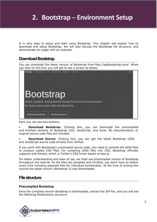
  • 14. 2. Bootstrap ─ Environment Setup It is very easy to setup and start using Bootstrap. This chapter will explain how to download and setup Bootstrap. We will also discuss the Bootstrap file structure, and demonstrate its usage with an example. DownloadBootstrap You can download the latest version of Bootstrap from http://getbootstrap.com/. When you click on this link, you will get to see a screen as below: Here you can see two buttons:  Download Bootstrap: Clicking this, you can download the precompiled and minified versions of Bootstrap CSS, JavaScript, and fonts. No documentation or original source code files are included.  Download Source: Clicking this, you can get the latest Bootstrap LESS and JavaScript source code directly from GitHub. If you work with Bootstrap's uncompiled source code, you need to compile the LESS files to produce usable CSS files. For compiling LESS files into CSS, Bootstrap officially supports only Recess, which is Twitter's CSS hinter based on less.js. For better understanding and ease of use, we shall use precompiled version of Bootstrap throughout the tutorial. As the files are complied and minified, you don't have to bother every time including separate files for individual functionality. At the time of writing this tutorial the latest version (Bootstrap 3) was downloaded. Filestructure Precompiled Bootstrap Once the compiled version Bootstrap is downloaded, extract the ZIP file, and you will see the following file/directory structure: 3
  • 15. Bootstrap As you can see, there are compiled CSS and JS (bootstrap.*), as well as compiled and minified CSS and JS (bootstrap.min.*). Fonts from Glyphicons are included, as it is the optional Bootstrap theme. Bootstrap Source Code If you have downloaded the Bootstrap source code then the file structure would be as follows:  The files under less/, js/, and fonts/ are the source code for Bootstrap CSS, JS, and icon fonts (respectively).  The dist/ folder includes everything listed in the precompiled download section above.  docs-assets/, examples/, and all *.html files are Bootstrap documentation. HTMLTemplate A basic HTML template using Bootstrap would look like this: <!DOCTYPE html> <html> <head> <title>Bootstrap 101 Template</title> <meta name="viewport" content="width=device-width, initial-scale=1.0"> <!-- Bootstrap --> <link href="css/bootstrap.min.css" rel="stylesheet">
  • 16. Bootstrap <!-- HTML5 Shim and Respond.js IE8 support of HTML5 elements and media queries --> <!-- WARNING: Respond.js doesn't work if you view the page via file:// --> <!--[if lt IE 9]> <script src="https://oss.maxcdn.com/libs/html5shiv/3.7.0/ html5shiv.js"></script> <script src="https://oss.maxcdn.com/libs/respond.js/1.3.0/ respond.min.js"></script> <![endif]--> </head> <body> <h1>Hello, world!</h1> <!-- jQuery (necessary for Bootstrap's JavaScript plugins) --> <script src="https://code.jquery.com/jquery.js"></script> <!-- Include all compiled plugins (below), or include individual files as needed --> <script src="js/bootstrap.min.js"></script> </body> </html> Here you can see the jquery.js, bootstrap.min.js and bootstrap.min.css files that are included to make a normal HTM file to the Bootstrapped Template. Just make sure to include jQuery library before you include Bootstrap library. More details about each of the elements in this above piece of code will be discussed in the chapter Bootstrap CSS Overview. This template structure is already included as part of the Try it (online compiler) tool. Hence in all the examples (in the following chapters) of this tutorial you will only see the contents of the <body> element. Once you click on the Try it option available at the top right corner of example, and you will see the entire code. Example Now let's try an example using the above template. Try the following example using Try it option available at the top right corner of the below sample code box on our website: <h1>Hello, world!</h1> In all the subsequent chapters we have used dummy text from the site http://www.lipsum.com/. 5
  • 17. 3. Bootstrap ─ Grid System In this chapter, we shall discuss the Bootstrap Grid System. WhatisaGrid? As put by Wikipedia: In graphic design, a grid is a structure (usually two-dimensional) made up of a series of intersecting straight (vertical, horizontal) lines used to structure the content. It is widely used to design layout and content structure in print design. In web design, it is a very effective method to create a consistent layout rapidly and effectively using HTML and CSS. To put in simple words, grids in web design organize and structure content, makes the websites easy to scan and reduces the cognitive load on users. WhatisBootstrapGridSystem? As put by the official documentation of Bootstrap for grid system: Bootstrap includes a responsive, mobile first fluid grid system that appropriately scales up to 12 columns as the device or viewport size increases. It includes predefined classes for easy layout options, as well as powerful mixins for generating more semantic layouts. Let us understand the above statement. Bootstrap 3 is mobile first in the sense that the code for Bootstrap now starts by targeting smaller screens like mobile devices, tablets, and then “expands” components and grids for larger screens such as laptops, desktops. Mobile First Strategy  Content o Determine what is most important.  Layout o Design to smaller widths first. o Base CSS address mobile device first; media queries address for tablet, desktops.  Progressive Enhancement o Add elements as screen size increases. WorkingofBootstrapGridSystem Grid systems are used for creating page layouts through a series of rows and columns that house your content. Here's how the Bootstrap grid system works:  Rows must be placed within a .container class for proper alignment and padding.  Use rows to create horizontal groups of columns. 6
  • 18. Bootstrap  Content should be placed within the columns, and only columns may be the immediate children of rows.  Predefined grid classes like .row and .col-xs-4 are available for quickly making grid layouts. LESS mixins can also be used for more semantic layouts.  Columns create gutters (gaps between column content) via padding. That padding is offset in rows for the first and the last column via negative margin on .rows.  Grid columns are created by specifying the number of twelve available columns you wish to span. For example, three equal columns would use three .col-xs-4. MediaQueries Media query is a really fancy term for "conditional CSS rule". It simply applies some CSS, based on certain conditions set forth. If those conditions are met, the style is applied. Media Queries in Bootstrap allow you to move, show and hide content based on the viewport size. Following media queries are used in LESS files to create the key breakpoints in the Bootstrap grid system. /* Extra small devices (phones, less than 768px) */ /* No media query since this is the default in Bootstrap */ /* Small devices (tablets, 768px and up) */ @media (min-width: @screen-sm-min) { ... } /* Medium devices (desktops, 992px and up) */ @media (min-width: @screen-md-min) { ... } /* Large devices (large desktops, 1200px and up) */ @media (min-width: @screen-lg-min) { ... } Occasionally these are expanded to include a max-width to limit CSS to a narrower set of devices. @media (max-width: @screen-xs-max) { ... } @media (min-width: @screen-sm-min) and (max-width: @screen-sm-max) { ... } @media (min-width: @screen-md-min) and (max-width: @screen-md-max) { ... } @media (min-width: @screen-lg-min) { ... } Media queries have two parts, a device specification and then a size rule. In the above case, the following rule is set: 7
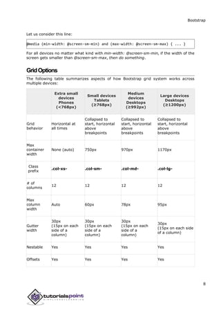
  • 19. Bootstrap Let us consider this line: @media (min-width: @screen-sm-min) and (max-width: @screen-sm-max) { ... } For all devices no matter what kind with min-width: @screen-sm-min, if the width of the screen gets smaller than @screen-sm-max, then do something. GridOptions The following table summarizes aspects of how Bootstrap grid system works across multiple devices: Extra small devices Phones (<768px) Small devices Tablets (≥768px) Medium devices Desktops (≥992px) Large devices Desktops (≥1200px) Grid behavior Horizontal at all times Collapsed to start, horizontal above breakpoints Collapsed to start, horizontal above breakpoints Collapsed to start, horizontal above breakpoints Max container width None (auto) 750px 970px 1170px Class prefix .col-xs- .col-sm- .col-md- .col-lg- # of columns 12 12 12 12 Max column width Auto 60px 78px 95px Gutter width 30px (15px on each side of a column) 30px (15px on each side of a column) 30px (15px on each side of a column) 30px (15px on each side of a column) Nestable Yes Yes Yes Yes Offsets Yes Yes Yes Yes 8
  • 20. Bootstrap Column ordering Yes Yes Yes Yes Basic Grid Structure Following is basic structure of Bootstrap grid: <div class="container"> <div class="row"> <div class="col-*-*"></div> <div class="col-*-*"></div> </div> <div class="row">...</div> </div> <div class="container">.... Let us see some simple grid examples: Example: Stacked-to-horizontal Let us see a simple grid example with simple layout: two columns, two paragraphs per column. (Here styling for each column is used. You can avoid it.) <div class="container"> <h1>Hello, world!</h1> <div class="row"> <div class="col-md-6" style="background-color: #dedef8; box-shadow: inset 1px -1px 1px #444, inset -1px 1px 1px #444;"> <p>Lorem ipsum dolor sit amet, consectetur adipisicing elit, sed do eiusmod tempor incididunt ut labore et dolore magna aliqua. Ut enim ad minim veniam, quis nostrud exercitation ullamco laboris nisi ut aliquip ex ea commodo consequat. </p> <p>Sed ut perspiciatis unde omnis iste natus error sit voluptatem accusantium doloremque laudantium, totam rem aperiam, eaque ipsa quae ab illo inventore veritatis et quasi architecto beatae vitae dicta sunt explicabo. </p> 9
  • 21. Bootstrap </div> <div class="col-md-6" style="background-color: #dedef8;box-shadow: inset 1px -1px 1px #444, inset -1px 1px 1px #444;"> <p>Sed ut perspiciatis unde omnis iste natus error sit voluptatem accusantium doloremque laudantium. </p> <p> Neque porro quisquam est, qui dolorem ipsum quia dolor sit amet, consectetur, adipisci velit, sed quia non numquam eius modi tempora incidunt ut labore et dolore magnam aliquam quaerat voluptatem. </p> </div> </div> Details  <div class="container">...</div> element is added to ensure proper centering and maximum width for layout.  Once container is added, next you need to think in terms of rows. Add <div class="row">...</div> and columns <div class="col-md-6"></div> inside the rows.  Every row in the grid is made up of 12 units and you can define the desired size of your columns using those units. In our example we have two columns each made of 6 units wide i.e 6+6=12. You can try some more options like: <div class="col-md-3"></div> and <div class="col-md-9"></div> or <div class="col-md-7"></div> and <div class="col-md-5"></div>. Experiment and make sure that the sum always needs to be 12. 10
  • 22. Bootstrap Example: Medium and Large Device We have seen the basic grid system in ‘Example: Stacked-to-horizontal’. Here we have used 2 divs and gave them the 50%/50% split at the medium viewport width: <div class="col-md-6">....</div> <div class="col-md-6">....</div> But at large, your design could really be better as a 33%/66%. So what we’re going to do is, set it up to change the column widths at the breakpoint: <div class="col-md-6 col-lg-4">....</div> <div class="col-md-6 col-lg-4">....</div> Now Bootstrap is going to say “at the medium size, I look at classes with md in them and use those. At the large size, I look at classes with the word lg in them and use those. In this case, our 2 divs will go from a 50%/50% split and then up to a 33%/66%. Check it out in the following example. (Here styling for each column is used. You can avoid it.) <div class="container"> <h1>Hello, world!</h1> <div class="row"> <div class="col-md-6 col-lg-4" style="background-color: #dedef8; box-shadow: inset 1px -1px 1px #444, inset -1px 1px 1px #444;"> <p>Lorem ipsum dolor sit amet, consectetur adipisicing elit, sed do eiusmod tempor incididunt ut labore et dolore magna aliqua. Ut enim ad minim veniam, quis nostrud exercitation ullamco laboris nisi ut aliquip ex ea commodo consequat. </p> <p>Sed ut perspiciatis unde omnis iste natus error sit voluptatem accusantium doloremque laudantium, totam rem aperiam, eaque ipsa quae ab illo inventore veritatis et quasi architecto beatae vitae dicta sunt explicabo. </p> </div> <div class="col-md-6 col-lg-8"" style="background-color: #dedef8; box-shadow: inset 1px -1px 1px #444, inset -1px 1px 1px #444;"> 11
  • 23. Bootstrap <p>Sed ut perspiciatis unde omnis iste natus error sit voluptatem accusantium doloremque laudantium. </p> <p> Neque porro quisquam est, qui dolorem ipsum quia dolor sit amet, consectetur, adipisci velit, sed quia non numquam eius modi tempora incidunt ut labore et dolore magnam aliquam quaerat voluptatem. </p> </div> </div> Example: Mobile, tablet, desktops We have seen an example for Medium and Large Device. Now let us take it to another level, where we would want to change it for the extra small phone size as well. Say we want to add the option for the columns to be split 75%/25% for tablets, we go like this: <div class="col-sm-3 col-md-6 col-lg-4">....</div> <div class="col-sm-9 col-md-6 col-lg-8">....</div> Now this gives us 3 different column layouts at each point. On a phone, it will be 75% on the left, and 25% on the right. On a tablet, it will be 50%/50% again, and on a large viewport, it will be 33%/66%. Three different layouts for each of the three responsive sizes. Check it out in the following example. (Here styling for each column is used. You can avoid it.) <div class="container"> <h1>Hello, world!</h1> <div class="row"> <div class="col-sm-3 col-md-6 col-lg-8" style="background-color: #dedef8; box-shadow: inset 1px -1px 1px #444, 12
  • 24. Bootstrap inset -1px 1px 1px #444;"> <p>Lorem ipsum dolor sit amet, consectetur adipisicing elit, sed do eiusmod tempor incididunt ut labore et dolore magna aliqua. Ut enim ad minim veniam, quis nostrud exercitation ullamco laboris nisi ut aliquip ex ea commodo consequat. </p> <p>Sed ut perspiciatis unde omnis iste natus error sit voluptatem accusantium doloremque laudantium, totam rem aperiam, eaque ipsa quae ab illo inventore veritatis et quasi architecto beatae vitae dicta sunt explicabo. </p> </div> <div class="col-sm-9 col-md-6 col-lg-4" style="background-color: #dedef8; box-shadow: inset 1px -1px 1px #444, inset -1px 1px 1px #444;"> <p>Sed ut perspiciatis unde omnis iste natus error sit voluptatem accusantium doloremque laudantium. </p> <p> Neque porro quisquam est, qui dolorem ipsum quia dolor sit amet, consectetur, adipisci velit, sed quia non numquam eius modi tempora incidunt ut labore et dolore magnam aliquam quaerat voluptatem. </p> </div> </div> 13
  • 25. Bootstrap ResponsiveColumnResets With the four tiers of grids available, you are bound to run into issues where at certain breakpoints, the columns don't clear quite right as one is taller than the other. To fix that, use a combination of a class .clearfix and the responsive utility classes as shown in the following example: <div class="container"> <div class="row" > <div class="col-xs-6 col-sm-3" style="background-color: #dedef8; box-shadow: inset 1px -1px 1px #444, inset -1px 1px 1px #444;"> <p>Lorem ipsum dolor sit amet, consectetur adipisicing elit.</p> </div> <div class="col-xs-6 col-sm-3" style="background-color: #dedef8;box-shadow: inset 1px -1px 1px #444, inset -1px 1px 1px #444;"> <p>Lorem ipsum dolor sit amet, consectetur adipisicing elit, sed do eiusmod tempor incididunt ut labore et dolore magna aliqua. Ut enim ad minim veniam, quis nostrud exercitation ullamco laboris nisi ut aliquip ex ea commodo consequat. </p> <p>Lorem ipsum dolor sit amet, consectetur adipisicing elit, sed do eiusmod tempor incididunt ut. </p> </div> <div class="clearfix visible-xs"></div> <div class="col-xs-6 col-sm-3" style="background-color: #dedef8; box-shadow:inset 1px -1px 1px #444, inset -1px 1px 1px #444;"> <p>Ut enim ad minim veniam, quis nostrud exercitation ullamco laboris nisi ut aliquip ex ea commodo consequat. </p> </div> <div class="col-xs-6 col-sm-3" style="background-color: #dedef8;box-shadow: 14
  • 26. Bootstrap inset 1px -1px 1px #444, inset -1px 1px 1px #444;"> <p>Lorem ipsum dolor sit amet, consectetur adipisicing elit, sed do eiusmod tempor incididunt ut labore et dolore magna aliqua. Ut enim ad minim </p> </div> </div> </div> Resize your viewport or check it out on your phone for a desired result of this example. OffsetColumns Offsets are a useful feature for more specialized layouts. They can be used to push columns over for more spacing (for example). The .col-xs=* classes don’t support offsets, but they are easily replicated by using an empty cell. To use offsets on large displays, use the .col-md-offset-* classes. These classes increase the left margin of a column by * columns where * range from 1 to 11. In the following example, we have <div class="col-md-6">..</div>. We will center this using class .col-md-offset-3. <div class="container"> <h1>Hello, world!</h1> <div class="row" > <div class="col-xs-6 col-md-offset-3" style="background-color: #dedef8;box-shadow: inset 1px -1px 1px #444, inset -1px 1px 1px #444;"> <p>Lorem ipsum dolor sit amet, consectetur adipisicing elit. </p> </div> </div> </div> 15
  • 27. Bootstrap NestingColumns To nest your content with the default grid, add a new .row and set of .col-md- * columns within an existing .col-md-* column. Nested rows should include a set of columns that add up to 12. In the following example, the layout has two columns, with the second one being split into four boxes over two rows. <div class="container"> <h1>Hello, world!</h1> <div class="row"> <div class="col-md-3" style="background-color: #dedef8;box-shadow: inset 1px -1px 1px #444, inset -1px 1px 1px #444;"> <h4>First Column</h4> <p>Lorem ipsum dolor sit amet, consectetur adipisicing elit.</p> </div> <div class="col-md-9" style="background-color: #dedef8;box-shadow: inset 1px -1px 1px #444, inset -1px 1px 1px #444;"> <h4>Second Column- Split into 4 boxes</h4> <div class="row"> <div class="col-md-6" style="background-color: #B18904; box-shadow: inset 1px -1px 1px #444, inset -1px 1px 1px 444;"> <p>Consectetur art party Tonx culpa semiotics. Pinterest assumenda minim organic quis. </p> </div> <div class="col-md-6" style="background-color: #B18904; box-shadow: inset 1px -1px 1px #444, inset -1px 1px 1px 444;"> <p> sed do eiusmod tempor incididunt ut labore et dolore magna aliqua. Ut enim ad minim veniam, quis nostrud exercitation ullamco laboris nisi ut aliquip ex ea commodo consequat. </p> </div> </div> 16
  • 28. Bootstrap <div class="row"> <div class="col-md-6" style="background-color: #B18904; box-shadow: inset 1px -1px 1px #444, inset -1px 1px 1px 444;"> <p>quis nostrud exercitation ullamco laboris nisi ut aliquip ex ea commodo consequat. </p> </div> <div class="col-md-6" style="background-color: #B18904; box-shadow: inset 1px -1px 1px #444, inset -1px 1px 1px #444;"> <p>Lorem ipsum dolor sit amet, consectetur adipisicing elit, sed do eiusmod tempor incididunt ut labore et dolore magna aliqua. Ut enim ad minim.</p> </div> </div> </div> </div> </div> ColumnOrdering Another nice feature of Bootstrap grid system is that you can easily write the columns in an order, and show them in another one. You can easily change the order of built-in grid columns with .col-md-push-* and .col-md-pull-* modifier classes where * range from 1 to11. In the following example we have two columns layout with left column being the narrowest and acting as a sidebar. We will swap the order of these columns using .col- md-push-* and.col-md-pull-* classes. <div class="container"> <h1>Hello, world!</h1> <div class="row"> 17
  • 29. Bootstrap <p>Before Ordering</p> <div class="col-md-4" style="background-color: #dedef8; box-shadow: inset 1px -1px 1px #444, inset -1px 1px 1px #444;"> I am on left </div> <div class="col-md-8" style="background-color: #dedef8; box-shadow: inset 1px -1px 1px #444, inset -1px 1px 1px #444;"> I am on right </div> </div><br> <div class="row"> <p>After Ordering</p> <div class="col-md-4 col-md-push-8" style="background-color: #dedef8; box-shadow: inset 1px -1px 1px #444, inset -1px 1px 1px #444;"> I was on left </div> <div class="col-md-8 col-md-pull-4" style="background-color: #dedef8; box-shadow: inset 1px -1px 1px #444, inset -1px 1px 1px #444;"> I was on right </div> </div> </div> 18
  • 30. 4. Bootstrap ─ CSS Overview This chapter provides an overview of the key pieces of Bootstrap's infrastructure, including Bootstrap's approach to better, faster, stronger web development. HTML5doctype Bootstrap makes use of certain HTML elements and CSS properties that require the use of the HTML5 doctype. Hence, include the below piece of code for HTML5 doctype at the beginning of all your projects using Bootstrap. <!DOCTYPE html> <html> .... </html> MobileFirst Since Bootstrap 3 has been launched, Bootstrap has become ‘mobile first’. It means mobile first styles can be found throughout the entire library instead of them in separate files. You need to add the viewport meta tag to the <head> element, to ensure proper rendering and touch zooming on mobile devices. <meta name="viewport" content="width=device-width, initial-scale=1.0">  width property controls the width of the device. Setting it to device-width will make sure that it is rendered across various devices (mobiles, desktops, tablets...) properly.  initial-scale=1.0 ensures that when loaded, your web page will be rendered at a 1:1 scale, and no zooming will be applied out of the box. Add user-scalable=no to the content attribute, to disable zooming capabilities on mobile devices as shown below. Users are only able to scroll and not zoom with this change, and results in your site feeling a bit more like a native application. <meta name="viewport" content="width=device-width, initial-scale=1.0, maximum-scale=1.0, user-scalable=no"> Normally maximum-scale=1.0 is used along with user-scalable=no. As mentioned above user-scalable=no may give users an experience more like a native app, hence Bootstrap doesn't recommend using this attribute. 19
  • 31. Bootstrap ResponsiveImages Bootstrap 3 allows you to make the images responsive by adding a class .img- responsive to the <img> tag. This class applies max-width: 100%; and height: auto; to the image so that it scales nicely to the parent element. <img src="..." class="img-responsive" alt="Responsive image"> TypographyandLinks Bootstrap sets a basic global display (background), typography, and link styles:  Basic Global display: Sets background-color: #fff; on the <body> element.  Typography: Uses the @font-family-base, @font-size-base, and @line-height- base attributes as the typographic base.  Link styles: Sets the global link color via attribute @link-color and apply link underlines only on:hover. If you intend to use LESS code, you may find all these within scaffolding.less. Normalize Bootstrap uses Normalize to establish cross browser consistency. Normalize.css is a modern, HTML5-ready alternative to CSS resets. It is a small CSS file that provides better cross-browser consistency in the default styling of HTML elements. Containers Use class .container to wrap a page's content and easily center the content's as shown below. <div class="container"> ... </div> Take a look at the .container class in bootstrap.css file: .container { padding-right: 15px; padding-left: 15px; margin-right: auto; margin-left: auto; } Note that, due to padding and fixed widths, containers are not nestable by default. 20
  • 32. Bootstrap Take a look at bootstrap.css file: @media (min-width: 768px) { .container { width: 750px; } } Here you can see that CSS has media-queries for containers with width. This helps for applying responsiveness and within those the container class is modified accordingly to render the grid system properly. 21
  • 33. 5. Bootstrap ─ Typography Bootstrap uses Helvetica Neue, Helvetica, Arial, and sans-serif in its default font stack. Using typography feature of Bootstrap you can create headings, paragraphs, lists and other inline elements. Let see learn each one of these in the following sections. Headings All HTML headings (h1 to h6) are styled in Bootstrap. An example is shown below: <h1>I'm Heading1 h1</h1> <h2>I'm Heading2 h2</h2> <h3>I'm Heading3 h3</h3> <h4>I'm Heading4 h4</h4> <h5>I'm Heading5 h5</h5> <h6>I'm Heading6 h6</h6> The above code segment with Bootstrap will produce following result: Inline Subheadings To add an inline subheading to any of the headings, simply add <small> around any of the elements or add .small class and you will get smaller text in a lighter color as shown in the example below: <h1>I'm Heading1 h1. <small>I'm secondary Heading1 h1</small></h1> <h2>I'm Heading2 h2. <small>I'm secondary Heading2 h2</small></h2> <h3>I'm Heading3 h3. <small>I'm secondary Heading3 h3</small></h3> <h4>I'm Heading4 h4. <small>I'm secondary Heading4 h4</small></h4> <h5>I'm Heading5 h5. <small>I'm secondary Heading5 h5</small></h5> <h6>I'm Heading6 h6. <small>I'm secondary Heading1 h6</small></h6> 22
  • 34. 34 Bootstrap The above code segment with Bootstrap will produce the following result: LeadBodyCopy To add some emphasis to a paragraph, add class="lead". This will give you a larger font size, lighter weight, and a taller line height as in the following example: <h2>Lead Example</h2> <p class="lead">This is an example paragraph demonstrating the use of lead body copy. This is an example paragraph demonstrating the use of lead body copy.This is an example paragraph demonstrating the use of lead body copy.This is an example paragraph demonstrating the use of lead body copy.This is an example paragraph demonstrating the use of lead body copy.</p> Emphasis HTML's default emphasis tags such as <small>, sets text at 85% the size of the parent, <strong> emphasizes a text with heavier font-weight, and <em> emphasizes a text in italics. Bootstrap offers a few classes that can be used to provide emphasis on texts as seen in the following example:
  • 35. 35 Bootstrap End of ebook preview If you liked what you saw… Buy it from our store @ https://store.tutorialspoint.com