SlideShare a Scribd company logo
BUILDING WEBSITES FOR RETINA DISPLAYS:

  MAKING FRIENDS
   WITH PIXELS
              Shoshi Roberts
                @shoshizilla
PIXEL PERFECTION,
            NOT JUST FOR APPS
• Many devices have a 2x pixel density or higher (the iPhone 4
 is among them)

• Images   that are not optimized for them will be blurry and sad

• There   is no automatic standard for including hi-res images


      BUT THERE ARE SOME SOLUTIONS...
HOW BLURRY?
Not Optimized   Optimized
HOW BLURRY?
Not Optimized   Optimized
SHOW ME THE CODE!
#1 - FLUID LAYOUT

• First, use
          responsive or fluid design to create a page that
 looks great on all devices

• Alternatively, make   a mobile specific version of your site
#2 - USE CSS3
• Really, as    much as you like

• Mobile browsers, especially webkit, are largely up to date
  and support the latest properties.

• CSS3   for gradients, shadows, etc. will eliminate the need
  for using images in many cases

• It   improves performance! (like anything, when used in moderation)
#3 - OPTIMIZE YOUR IMAGES


• Make   2 versions:

 • One   at normal size (e.g. 100px by 100px)

 • One   at double size (e.g. 200px by 200px)
#4A - WRITE MEDIA QUERIES
h1.icon {
  width: 100px;
  height: 100px;
  /* This is your 100px by 100px image */
  background: transparent url(icon.png) 0 0 no-repeat;
}
@media screen and (-webkit-min-device-pixel-ratio: 2) and
                   (-o-min-device-pixel-ratio: 2) and
                   (min--moz-device-pixel-ratio: 2) and
                   (min-device-pixel-ratio: 2) {
  h1.icon {
    /* This is your 200px by 200px image */
    background: transparent url(icon-2x.png) 0 0 no-repeat;
       -moz-background-size: 100px 100px;    /* Firefox 3.6) */
          -o-background-size: 100px 100px;   /* Opera 9.5 */
    -webkit-background-size: 100px 100px;    /* Safari 3.0 */
             background-size: 100px 100px;
  }
}
#4B - OR USE SVG
HTML
<object data="icon.svg" type="image/svg+xml" class="vector">
</object>


CSS - Fluid
.vector {
  /* Use whatever percentages you like, the content will scale */
  width: 90%;
  height: 90%;
}
#5 - TEST, TEST, TEST!


• Look   at it on as many devices as you can.

• Pay   the most attention to the platforms your users visit on.
WRAPPING IT UP


• The   arms race for pixel density is on, make images that scale

• Use   a CSS3 when you can

• Use   media queries and SVG to optimize your image display
THANKS
        AND HAPPY HACKING!


  @shoshizilla for @ladieswhocode
Special Thanks to @mintdigital for hosting

More Related Content

PPTX
Power point essentials
nuttela_pants
 
PPTX
Making Your Site Printable: Booster Conference
Adrian Roselli
 
PDF
DrupalCamp NYC Panels Presentation - April 2014
Suzanne Dergacheva
 
PDF
Firefox for Mobile
foxymary
 
PDF
Marek-Martin Matyska, Gamajun Games
White Nights Conference
 
PPTX
Question 6
finnleyyy
 
PPT
Device channels v/s Responsive web design
Prashanth BS
 
PPTX
Mobile game development using Starling
Ahmad Arif
 
Power point essentials
nuttela_pants
 
Making Your Site Printable: Booster Conference
Adrian Roselli
 
DrupalCamp NYC Panels Presentation - April 2014
Suzanne Dergacheva
 
Firefox for Mobile
foxymary
 
Marek-Martin Matyska, Gamajun Games
White Nights Conference
 
Question 6
finnleyyy
 
Device channels v/s Responsive web design
Prashanth BS
 
Mobile game development using Starling
Ahmad Arif
 

What's hot (20)

PPTX
Question 6
RoseGMediaWork
 
PDF
Jakub Dočkal, Alda Games
White Nights Conference
 
PPTX
Grade vi presentation and visual effects
Ankita Shirke
 
PPTX
Planning- Editing and software
megansimpson28
 
PPTX
Lean video production software
LoCoMoTion Project
 
PPT
How to do a slideshow upload
creativeartsclass
 
PPTX
Changing the Wordpress theme
Edotensei15
 
PDF
Responsive Web Design
Nir Elbaz
 
PPTX
Power point essentials
valell
 
PPT
PowerPoint - Quick Reminders
cm_scholz
 
PPTX
The metro design language for app developers
Willem Meints
 
PPTX
Exploring Microsoft Surface
Indezine.com
 
PPTX
Equipment list
uahproductions
 
PPTX
Hb98908 midterm articulate powerpoint version
heatherb98908
 
PDF
Infinity Blade and beyond
ozlael ozlael
 
PPTX
SIUE IRIS Omeka Workshop
Kayla Hays
 
PDF
Customizability in Design Systems
Sarah Federman
 
PDF
Wdes105 day 2
Gene Babon
 
PPTX
Adobe Lightroom Training Workshop Slides
John Mauremootoo
 
PPTX
Lightroom Overview
Christopher Cookson
 
Question 6
RoseGMediaWork
 
Jakub Dočkal, Alda Games
White Nights Conference
 
Grade vi presentation and visual effects
Ankita Shirke
 
Planning- Editing and software
megansimpson28
 
Lean video production software
LoCoMoTion Project
 
How to do a slideshow upload
creativeartsclass
 
Changing the Wordpress theme
Edotensei15
 
Responsive Web Design
Nir Elbaz
 
Power point essentials
valell
 
PowerPoint - Quick Reminders
cm_scholz
 
The metro design language for app developers
Willem Meints
 
Exploring Microsoft Surface
Indezine.com
 
Equipment list
uahproductions
 
Hb98908 midterm articulate powerpoint version
heatherb98908
 
Infinity Blade and beyond
ozlael ozlael
 
SIUE IRIS Omeka Workshop
Kayla Hays
 
Customizability in Design Systems
Sarah Federman
 
Wdes105 day 2
Gene Babon
 
Adobe Lightroom Training Workshop Slides
John Mauremootoo
 
Lightroom Overview
Christopher Cookson
 
Ad

Similar to Building Websites for Retina Displays: Making Friends with Pixels (20)

PDF
Responsive design
John Doxaras
 
PDF
Responsive websites. Toolbox
Wojtek Zając
 
PPSX
Responsive Web Design: Tips and Tricks
Gautam Krishnan
 
PDF
Responsive web - CC FE & UX
JWORKS powered by Ordina
 
PDF
Responsive Websites
Joe Seifi
 
KEY
Responsive Design & Mobile First
Luke Brooker
 
PDF
Responsive Web Design
CLEVER°FRANKE
 
PDF
Designing for mobile
Dee Sadler
 
PDF
Designing for The Modern Web
Sara Cannon
 
PDF
Mobile First Responsive Design
Jason Grigsby
 
PPTX
Using Responsive Web Design To Make Your Web Work Everywhere
Chris Love
 
PDF
[SF HTML5] Responsive Cross-Device Development with Web Standards (2013)
Tomomi Imura
 
PDF
Sbwire 531031
Tourism Dental India
 
PDF
A Responsive Design Case Study - What We Did Wrong Building ResponsiveDesign....
Aidan Foster
 
PDF
The Magic and Pain of Responsive Design
Matthias Lau
 
PPTX
Secrets of responsive web design by Sameera Thilakasiri
Sameera Thilakasiri
 
PDF
Html 5 mobile - nitty gritty
Mario Noble
 
PDF
Responsive Web Site Design
Jussi Pohjolainen
 
PDF
Responsive web design
Netcetera
 
KEY
The future of BYU web design
Nate Walton
 
Responsive design
John Doxaras
 
Responsive websites. Toolbox
Wojtek Zając
 
Responsive Web Design: Tips and Tricks
Gautam Krishnan
 
Responsive web - CC FE & UX
JWORKS powered by Ordina
 
Responsive Websites
Joe Seifi
 
Responsive Design & Mobile First
Luke Brooker
 
Responsive Web Design
CLEVER°FRANKE
 
Designing for mobile
Dee Sadler
 
Designing for The Modern Web
Sara Cannon
 
Mobile First Responsive Design
Jason Grigsby
 
Using Responsive Web Design To Make Your Web Work Everywhere
Chris Love
 
[SF HTML5] Responsive Cross-Device Development with Web Standards (2013)
Tomomi Imura
 
Sbwire 531031
Tourism Dental India
 
A Responsive Design Case Study - What We Did Wrong Building ResponsiveDesign....
Aidan Foster
 
The Magic and Pain of Responsive Design
Matthias Lau
 
Secrets of responsive web design by Sameera Thilakasiri
Sameera Thilakasiri
 
Html 5 mobile - nitty gritty
Mario Noble
 
Responsive Web Site Design
Jussi Pohjolainen
 
Responsive web design
Netcetera
 
The future of BYU web design
Nate Walton
 
Ad

Recently uploaded (20)

PDF
How Open Source Changed My Career by abdelrahman ismail
a0m0rajab1
 
PPTX
The Future of AI & Machine Learning.pptx
pritsen4700
 
PDF
Unlocking the Future- AI Agents Meet Oracle Database 23ai - AIOUG Yatra 2025.pdf
Sandesh Rao
 
PDF
NewMind AI Weekly Chronicles - July'25 - Week IV
NewMind AI
 
PPTX
Simple and concise overview about Quantum computing..pptx
mughal641
 
PPTX
OA presentation.pptx OA presentation.pptx
pateldhruv002338
 
PDF
Doc9.....................................
SofiaCollazos
 
PDF
How ETL Control Logic Keeps Your Pipelines Safe and Reliable.pdf
Stryv Solutions Pvt. Ltd.
 
PDF
AI Unleashed - Shaping the Future -Starting Today - AIOUG Yatra 2025 - For Co...
Sandesh Rao
 
PDF
Trying to figure out MCP by actually building an app from scratch with open s...
Julien SIMON
 
PDF
SparkLabs Primer on Artificial Intelligence 2025
SparkLabs Group
 
PPTX
AI and Robotics for Human Well-being.pptx
JAYMIN SUTHAR
 
PDF
A Strategic Analysis of the MVNO Wave in Emerging Markets.pdf
IPLOOK Networks
 
PDF
MASTERDECK GRAPHSUMMIT SYDNEY (Public).pdf
Neo4j
 
PDF
Structs to JSON: How Go Powers REST APIs
Emily Achieng
 
PDF
The Future of Mobile Is Context-Aware—Are You Ready?
iProgrammer Solutions Private Limited
 
PDF
Using Anchore and DefectDojo to Stand Up Your DevSecOps Function
Anchore
 
PDF
Accelerating Oracle Database 23ai Troubleshooting with Oracle AHF Fleet Insig...
Sandesh Rao
 
PDF
Oracle AI Vector Search- Getting Started and what's new in 2025- AIOUG Yatra ...
Sandesh Rao
 
PDF
Responsible AI and AI Ethics - By Sylvester Ebhonu
Sylvester Ebhonu
 
How Open Source Changed My Career by abdelrahman ismail
a0m0rajab1
 
The Future of AI & Machine Learning.pptx
pritsen4700
 
Unlocking the Future- AI Agents Meet Oracle Database 23ai - AIOUG Yatra 2025.pdf
Sandesh Rao
 
NewMind AI Weekly Chronicles - July'25 - Week IV
NewMind AI
 
Simple and concise overview about Quantum computing..pptx
mughal641
 
OA presentation.pptx OA presentation.pptx
pateldhruv002338
 
Doc9.....................................
SofiaCollazos
 
How ETL Control Logic Keeps Your Pipelines Safe and Reliable.pdf
Stryv Solutions Pvt. Ltd.
 
AI Unleashed - Shaping the Future -Starting Today - AIOUG Yatra 2025 - For Co...
Sandesh Rao
 
Trying to figure out MCP by actually building an app from scratch with open s...
Julien SIMON
 
SparkLabs Primer on Artificial Intelligence 2025
SparkLabs Group
 
AI and Robotics for Human Well-being.pptx
JAYMIN SUTHAR
 
A Strategic Analysis of the MVNO Wave in Emerging Markets.pdf
IPLOOK Networks
 
MASTERDECK GRAPHSUMMIT SYDNEY (Public).pdf
Neo4j
 
Structs to JSON: How Go Powers REST APIs
Emily Achieng
 
The Future of Mobile Is Context-Aware—Are You Ready?
iProgrammer Solutions Private Limited
 
Using Anchore and DefectDojo to Stand Up Your DevSecOps Function
Anchore
 
Accelerating Oracle Database 23ai Troubleshooting with Oracle AHF Fleet Insig...
Sandesh Rao
 
Oracle AI Vector Search- Getting Started and what's new in 2025- AIOUG Yatra ...
Sandesh Rao
 
Responsible AI and AI Ethics - By Sylvester Ebhonu
Sylvester Ebhonu
 

Building Websites for Retina Displays: Making Friends with Pixels

  • 1. BUILDING WEBSITES FOR RETINA DISPLAYS: MAKING FRIENDS WITH PIXELS Shoshi Roberts @shoshizilla
  • 2. PIXEL PERFECTION, NOT JUST FOR APPS • Many devices have a 2x pixel density or higher (the iPhone 4 is among them) • Images that are not optimized for them will be blurry and sad • There is no automatic standard for including hi-res images BUT THERE ARE SOME SOLUTIONS...
  • 5. SHOW ME THE CODE!
  • 6. #1 - FLUID LAYOUT • First, use responsive or fluid design to create a page that looks great on all devices • Alternatively, make a mobile specific version of your site
  • 7. #2 - USE CSS3 • Really, as much as you like • Mobile browsers, especially webkit, are largely up to date and support the latest properties. • CSS3 for gradients, shadows, etc. will eliminate the need for using images in many cases • It improves performance! (like anything, when used in moderation)
  • 8. #3 - OPTIMIZE YOUR IMAGES • Make 2 versions: • One at normal size (e.g. 100px by 100px) • One at double size (e.g. 200px by 200px)
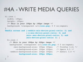
  • 9. #4A - WRITE MEDIA QUERIES h1.icon { width: 100px; height: 100px; /* This is your 100px by 100px image */ background: transparent url(icon.png) 0 0 no-repeat; } @media screen and (-webkit-min-device-pixel-ratio: 2) and (-o-min-device-pixel-ratio: 2) and (min--moz-device-pixel-ratio: 2) and (min-device-pixel-ratio: 2) { h1.icon { /* This is your 200px by 200px image */ background: transparent url(icon-2x.png) 0 0 no-repeat; -moz-background-size: 100px 100px; /* Firefox 3.6) */ -o-background-size: 100px 100px; /* Opera 9.5 */ -webkit-background-size: 100px 100px; /* Safari 3.0 */ background-size: 100px 100px; } }
  • 10. #4B - OR USE SVG HTML <object data="icon.svg" type="image/svg+xml" class="vector"> </object> CSS - Fluid .vector { /* Use whatever percentages you like, the content will scale */ width: 90%; height: 90%; }
  • 11. #5 - TEST, TEST, TEST! • Look at it on as many devices as you can. • Pay the most attention to the platforms your users visit on.
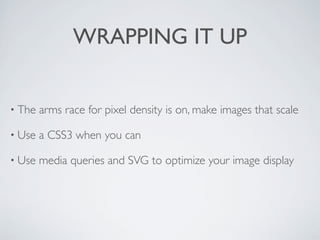
  • 12. WRAPPING IT UP • The arms race for pixel density is on, make images that scale • Use a CSS3 when you can • Use media queries and SVG to optimize your image display
  • 13. THANKS AND HAPPY HACKING! @shoshizilla for @ladieswhocode Special Thanks to @mintdigital for hosting