Creating Acessible floating labels
1 like•2,906 views

The document discusses the concept of floating labels in form controls, where labels initially appear on top of inputs and 'float' when focused. It highlights various user experience and accessibility concerns, such as low contrast, lack of clear identification, and issues for users with cognitive or visual impairments. The author shares methods for implementing floating labels using CSS without JavaScript, emphasizing the importance of testing for accessibility and usability in real environments.


Creating Acessible floating labels
- 2. Demo
- 5. Floating labels are labels that are associated with form controls such as input and textarea elements.
- 6. These floating labels are initially displayed on top of the form control, and then “floated” up and out of the form control when it receives focus.
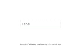
- 7. Label Example of a Floating Label in static state
- 8. Label Example of a Floating Label in focus state
- 9. This often includes a minimalistic approach to the design of the form controls.
- 10. This means that input and textarea elements are often displayed with a border-bottom only, so that they appear more like lines to write on rather than inputs to enter data into.
- 12. Floating Input
- 13. Why use them?
- 14. Generally speaking, I am not a fan of floating labels - except in some specific circumstances.
- 15. The solution has some advantages but also has potential User Experience and Accessibility issues.
- 16. The obvious question is: if you’re not a fan, why give a presentation about them?
- 17. Recently, the team I work with suggested looking into floating labels as an option. So, I decided to try to create a non-JavaScript version that was usable and accessible.
- 18. Hopefully this presentation will provide you with some things to consider before using floating labels, or help you make them more usable and accessible.
- 20. Concern 1. Is it a form control?
- 21. My main concern is that if a minimalist design approach is used, it may not be clear to users that the element is actually a form control at all.
- 22. First name Last Name Email Example of form using floating labels - in static state
- 23. This lack of clear identification could be problematic for a range of different audiences including cognitive impaired and those that are “technology challenged”.
- 24. Concern 2. Low contrast labels
- 25. The initial labels often have very low contrast - trying to replicate the appearance of a placeholder.
- 26. First name Last Name Email Example of form using floating labels showing low contrast labels
- 27. This means that critical information - the form labels themselves - may not be readable for some types of vision impaired users.
- 28. Concern 3. Is it already filled in?
- 29. At the other end of the spectrum, if the label has a strong contrast it could then be mistaken for a value - as if the form control has already been filled in.
- 30. First name Last Name Email Example of form using floating labels showing high contrast labels
- 31. Again, this could be problematic for cognitive impaired and/or “technology challenged” users.
- 32. Concern 4. Labels are too small
- 33. In some cases, the labels are displayed in a very small font- size.
- 34. First name Last Name Email Example of form using floating labels with a very small font-size
- 35. This can be problematic for anyone with diminished eye-sight - especially when it is critical information like a form label.
- 36. Concern 5. Lack of focus state
- 37. In many cases, the form controls and labels have no focus state.
- 38. This can cause major issues for keyboard-only users as they may not be able to identify the elements that are currently in focus.
- 39. Test, test, test
- 40. Bottom line, if you are thinking about using a floating label solution, make sure you test with real users to make sure it is suitable in the proposed environment before going too far!
- 41. And of course, make sure that any solution is accessible to the widest possible range of audiences and assistive technologies.
- 42. Two main methods
- 43. While there are a range of different methods that can be used to create floating labels, the two most common methods are:
- 45. In the static state, the label is displayed on top of the input. When the input receives focus, the label is animated upwards so that it sits above the input.
- 46. Label Example of a Floating Label showing label in static state
- 47. Label Example of a Floating Label showing label in focus state
- 48. Method 2: Placeholder and label
- 49. In the static state, the placeholder is displayed inside the input. When the input receives focus, the placeholder becomes invisible, and the label is animated into view, above the input.
- 50. Placeholder Example of a Floating Label showing placeholder in static state
- 51. Placeholder Label Example of a Floating Label showing placeholder fading and label appearing
- 52. Label Example of a Floating Label showing label above input
- 53. Which one to use?
- 54. We will be looking at how to achieve a usable and accessible version of the second method because it allows us to display a separate placeholder and label value.
- 55. This means we can display more detailed instructions via the placeholder, and then simpler information via the label.
- 56. Add your first name Example of a Floating Label showing placeholder
- 57. First name Example of a Floating Label showing label
- 58. Desired outcomes
- 59. A lot of the outcomes listed below are to help these floating label controls to be more discoverable.
- 60. Static state
- 61. Before any user interaction with a form control, the placeholder should be visible and the label should be hidden
- 62. Placeholder Example of a Floating Label showing placeholder
- 63. The placeholder should be of sufficient color contrast.
- 64. Placeholder Placeholder text set to #666 - AA Compliant
- 65. Hover state
- 66. If a user hovers over the form control, the placeholder and form control should change in appearance to indicate that the form control is interactive.
- 67. Ideally, the form control could change in hover state so that the border appears on all sides of the element - to help make it more discoverable.
- 68. Placeholder Example of a Floating Label in static state
- 69. Placeholder Example of a Floating Label in hover state
- 70. Focus state
- 71. If a user focuses on the form control (via mouse click or by tabbing to the element), four things should happen:
- 72. The placeholder should gradually fade to invisible.
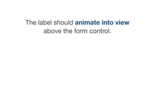
- 73. The label should animate into view above the form control.
- 74. A border should appear on all sides of the form control.
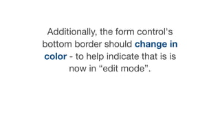
- 75. Additionally, the form control's bottom border should change in color - to help indicate that is is now in “edit mode”.
- 76. Placeholder Example of a Floating Label in static state
- 77. Label Placeholder Example of a Floating Label showing placeholder fading and label appearing
- 78. Label Example of a Floating Label in focus state
- 79. Post focus state
- 80. When focus leaves the form control, two things should happen:
- 81. The label should remain in view but change color to indicate that it is no longer in “edit mode” and has been completed.
- 82. The form control’s border-bottom color should return to the original border-bottom color.
- 83. Placeholder Example of a Floating Label in static state
- 84. Label Placeholder Example of a Floating Label showing placeholder fading and label appearing
- 85. Label Example of a Floating Label in focus state
- 86. User value here Label Example of a Floating Label in post-focus state
- 87. No JavaScript
- 88. My final desired outcome was to try to make a version that did not use any JavaScript - unlike most of the other examples I’d seen.
- 89. I think JavaScript plays an important role in modern web development, but it concerns me that developers are relying on JavaSCript for simple things like positioning and animated form labels.
- 90. In order to meet all of the desired outcomes, I’ve had to use one experimental CSS selector. This means that this one aspect of the solution will only work in more modern browsers.
- 91. However, the solution does use basic progressive enhancement, so almost all of the functionality should be stable for older browsers.
- 92. The markup
- 93. Label placement
- 94. For this method, I needed the label information to appear after the form control in source order.
- 95. This allowed me to style the label based on the state of the input. For example, I was then able to change the style of the label when the control was in focus.
- 96. // adjacent sibling selector .floating-‐label__control:focus + .floating-‐label__label { }
- 97. In an ideal world, label content should be placed before all form controls in source order - except for radio buttons and checkboxes.
- 98. However, I used the “for” and “id” attributes to explicitly associate the label to the form control.
- 99. <div class="floating-‐label"> <label for="input1"> <input class="floating-‐label__control" type="text" placeholder="Add your first name" id="input1" required> <span class="floating-‐label__label">First Name</span> </label> </div>
- 100. I also wrapped the label around the form control and label content.
- 101. <div class="floating-‐label"> <label for="input1"> <input class="floating-‐label__control" type="text" placeholder="Add your first name" id="input1" required> <span class="floating-‐label__label">First Name</span> </label> </div>
- 102. Finally, I placed the label content inside a span element, so that I could style the label content separately to the overall label and the form control.
- 103. <div class="floating-‐label"> <label for="input1"> <input class="floating-‐label__control" type="text" placeholder="Add your first name" id="input1" required> <span class="floating-‐label__label">First Name</span> </label> </div>
- 104. The class names
- 105. For this solution I used a BEM-like naming conversion to make the solution day to understand for other developers. This meant writing the selectors as modules, sub-modules and modifiers. BEM = Block, Element, Module
- 106. // module -‐ or parent element .floating-‐label { } // sub-‐module -‐ or child elements .floating-‐label__control { } .floating-‐label__label { } // modifier .floating-‐label__control-‐-‐disabled { }
- 107. <div class="floating-‐label"> <label for="input1"> <input class="floating-‐label__input" type="text" placeholder="Add your first name" id="input1" required> <span class="floating-‐label__label">First Name</span> </label> </div>
- 108. The SCSS
- 109. I’m going to quickly show some of the SCSS used to create the final floating label solution. I won’t show all of it, but you can check out the repo for the finer details if interested.
- 110. Also, I am using SCSS rather than CSS as it gives me a little bit more control - allowing me to set some variables that can be used multiple times across the various rules.
- 111. Variables
- 112. All of the variables can be defined once at the top of the SCSS file.
- 113. // variables $color-‐input-‐text: #000; $color-‐placeholder: #666; $color-‐placeholder-‐hover: #000; $color-‐placeholder-‐disabled: #ccc; $color-‐label: #1f7c8a; $color-‐label-‐focus: #3655b1; $color-‐border: #ddd; $color-‐border-‐focus: #3655b1; $color-‐disabled-‐background: #f5f5f5; $label-‐size: 14px;
- 114. Parent
- 115. I need to set the parent to position: relative as I’m going to position the label content relative to this parent.
- 116. // floating-‐label .floating-‐label { position: relative; margin: 30px 0 40px; }
- 117. Control
- 118. For the controls, I am going to set the border to transparent, then reset the border-‐bottom to a soft gray.
- 119. // control .floating-‐label__control { width: 100%; border: none; border: 1px solid transparent; border-‐bottom: 1px solid $color-‐border; padding: .5em; resize: none; color: $color-‐input-‐text; background: #fff; }
- 120. I then need to style the various states of the control - in this case hover and focus.
- 121. // control when in hover .floating-‐label__control:hover { border: 1px solid $color-‐border; }
- 122. // control when in focus .floating-‐label__control:focus { border: 1px solid $color-‐border; border-‐bottom: 1px solid $color-‐border-‐focus; outline: none; }
- 123. I can also style the input once it has been filled in using the valid pseudo-class. Keep in mind that this is only supported by the latest browsers.
- 124. // control when in focus and valid -‐ filled in .floating-‐label__control:valid { border: 1px solid transparent; border-‐bottom: 1px solid $color-‐border; padding-‐left: 0; }
- 125. Label
- 126. Next, I need to set position: absolute on the label content and initially position it down over the top of the input. It also has an initial opacity of “0”.
- 127. // label .floating-‐label__label { position: absolute; top: -‐15px; left: 0; opacity: 0; color: $color-‐label-‐focus; font-‐size: $label-‐size; }
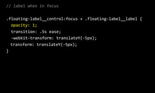
- 128. When the input comes into focus, I will then style the label content so that the opacity transitions from “0” to “1”.
- 129. // label when in focus .floating-‐label__control:focus + .floating-‐label__label { opacity: 1; transition: .5s ease; -‐webkit-‐transform: translateY(-‐5px); transform: translateY(-‐5px); }
- 130. placeholder
- 131. Finally, I am styling the placeholders in their various states. I’ve only included some of the rules used in the final product as they are quite extensive.
- 132. // placeholder ::-‐webkit-‐input-‐placeholder { opacity: 1; color: $color-‐placeholder; }
- 133. // placeholder hover .floating-‐label__control:hover::-‐webkit-‐input-‐placeholder { color: $color-‐placeholder-‐hover; }
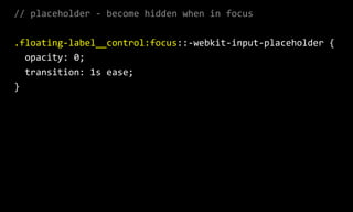
- 134. // placeholder -‐ become hidden when in focus .floating-‐label__control:focus::-‐webkit-‐input-‐placeholder { opacity: 0; transition: 1s ease; }
- 135. More…
- 136. Floating labels are problematic Adam Silver https://medium.com/simple-human/floating-labels-are-a-bad- idea-82edb64220f6
- 137. Are Float Labels Really That Problematic After All? Matt D. Smith https://blog.prototypr.io/are-float-labels-really-that- problematic-after-all-da7ffe7d5417
- 138. Russ Weakley Max Design Site: maxdesign.com.au Twitter: twitter.com/russmaxdesign Slideshare: slideshare.net/maxdesign Linkedin: linkedin.com/in/russweakley