


Creating charts and graphics
- 1. Creating charts and graphics
- 2. • In this chapter, you will learn how to • ✔ Create charts. • ✔ Customize the appearance of charts. • ✔ Find trends in your data. • ✔ Summarize your data by using sparklines. • ✔ Create dynamic charts by using PivotCharts. • ✔ Create diagrams by using SmartArt. • ✔ Create shapes and mathematical equations.
- 4. Creating Charts: 1. Select the data you want to summarize visually and 2. Then on the Insert tab, in the Charts group Click the type of chart you want to create to have Excel display the available chart subtypes.
- 5. Creating Charts: (cont.) If Excel doesn’t plot your data the way you want it to, you can change the axis on which Excel plots a data column. The most common reason for incorrect data plotting is that the column to be plotted on the horizontal axis contains numerical data instead of textual data.
- 6. Creating Charts: (cont.) You can change which data Excel applies to the vertical axis. To change: 1. Select the chart 2. On the Design tab, in the Data group, click Select Data to display the Select Data Source dialog box.
- 7. Creating Charts: (cont.) The Year column doesn’t belong in the Legend Entries (Series) pane, which corresponds to a column chart’s vertical axis. To remove a column from an axis: 1. Select the column’s name 2. Click Remove. To add the column to the Horizontal (Category) Axis Labels pane: 1. Click that pane’s Edit button to display the Axis Labels dialog box. -------------------------------------------- In the Axis Labels dialog box, Click the Collapse Dialog button at the right edge of the Axis Label Range field, Select the cells to provide the values for the horizontal axis (not including the column header, if any), click the Expand Dialog button, and then click OK . Click OK again to close the Select Data Source dialog box and revise your chart.
- 8. Creating Charts: (cont.) After you create your chart, you can change its size to reflect whether the chart should dominate its worksheet or take on a role as another informative element on the worksheet. To resize a chart: 1. Select the chart. 2. Drag one of the handles on the chart’s edges. To move the chart to a new chart sheet: 1. Select the New Sheet option. 2. Type the new sheet’s name in the accompanying field.
- 9. Customizing the Appearance of Charts
- 10. Customizing the Appearance of Charts: To change a chart’s appearance: 1. Select the chart 2. On the Design tab, click a style in the Chart Styles gallery.
- 11. Customizing the Appearance of Charts: When you create a chart by using the tools in the Insert tab’s Charts group, Excel creates an attractive chart that focuses on the data. In most cases, the chart has a title, legend (list of data series displayed in the chart), horizontal lines in the body of the chart to make it easier to discern individual values, and axis labels. • In the Axes group, clicking Gridlines enables you to determine whether the chart displays horizontal and vertical gridlines and, if it does, at what value intervals they should appear.
- 12. Customizing the Appearance of Charts: In addition to changing your chart’s layout, you can control the appearance of each element within the chart. To select a chart element to format: 1. Click that element. 2. If you want to change the formatting of the data series named Volume in the column chart you created in the previous exercise, clicking any column in the series selects the entire series. Any formatting changes you make then apply to every point in the entire series. If you want to change a single data point. 1. Select the entire series 2. Click the chart element (for example, a column) that represents the data point you want to change.
- 13. Customizing the Appearance of Charts: You can display a list of the selectable chart elements by: 1. Selecting the chart 2. Then on the Format tab, in the Current Selection group, clicking the Chart Elements arrow. 3. Then just click the desired chart element to select it.
- 14. Summarize your data by using spark lines
- 15. Finding Trends your Data : 1. Right Click on your data “ Chart “ 2. Choose add Trendline
- 16. Finding Trends your Data : 1. On the Layout tab, in the Analysis group click Trendline, then Click on More Trendline Options 1. Choose the type of trends, example: linear, the other distributions used for scientific and engineering applications 2. Tell Excel how far ahead to project the data trend , Type the number of years in forecast area’s, Forward Box 3. Click on Close to add Trendline on the chart. Result
- 17. Summarizing your Data by Sparklines : 3 Types of Sparklines : 1. Line; impact versions of the standard line chart 2. Column; impact versions of the standard line chart 3. Win/loss; indicates wither a cell value is positive ( win), negative ( loos) or zero ( a tie) To create each on you have to : 1. Select the data you want to summarize 2. Insert Tab 3. Sparkline group 4. Click on the type of Sparkline you want
- 18. Summarizing your Data by Sparklines : 1. Go to Insert Tab 2. In the Sparklines, click on Line 3. In the Data Range type the range of the cells that contain the data on which you want to base the sparklines, In the location Range write where you want the sparklines to be placed
- 19. Summarizing your Data by Sparklines : 1. Go to Insert Tab 1. In the Sparklines, click on Column 3. In the Data Range type the range of the cells that contain the data on which you want to base the sparklines, In the location Range write where you want the sparklines to be placed
- 20. 1. Go to Insert Tab 2. In the Sparklines, click on Win/loss 3. In the Data Range type the range of the cells that contain the data on which you want to base the sparklines, In the location Range write where you want the sparklines to be placed Summarizing your Data by Sparklines :
- 21. Summarizing your Data by Sparklines : To clear the Sparklines : 1. Click the cell added in it the Sparkline 2. Click Design contextual tab 3. Group group 4. Click on Clear bottom OR 1. select the unwanted Sparkline 2. Right Click, click Sparklines 3. select Clear selected Sparkline
- 22. you can create dynamic charts, or PivotCharts, to reflect the contents and organization of a PivotTable. • Just click any cell in a list or Excel table you would use to create a PivotTable, and then click the Insert tab. In the Tables group, in the PivotTable list, click PivotChart to create the chart. To create a PivotChart from an existing PivotTable, click a cell in the PivotTable, display the Insert tab and then, in the Charts group, click the type of chart you want to create. After you complete either of these procedures, Excel displays a new PivotChart in your workbook.
- 24. • Any changes to the PivotTable on which the PivotChart is based are reflected in the PivotChart. For instance, if you click 2006 in the Year list of a revenue analysis PivotTable and then click OK, both the PivotTable and the PivotChart will show only revenues from 2006.
- 26. • PivotChart has tools you can filter the data in the PivotChart and PivotTable. Clicking the Year arrow, clicking (All) in the list that appears, and then clicking OK will restore the PivotChart to its original configuration. • If you ever want to change the chart type of an existing chart, you can do so by selecting the chart and then, on the Design tab, in the Type group, clicking Change Chart Type to display the Change Chart Type dialog box. When you select the type you want and click OK, Excel re-creates your chart. • Important If your data is the wrong type to be represented by the chart type you select, Excel displays an error message.
- 27. • In this exercise, you’ll create a PivotTable and associated PivotChart, change the underlying data and update the PivotChart to reflect that change, change the PivotChart’s type, and then filter a PivotTable and PivotChart. • SET UP You need the RevenueAnalysis_start workbook located in your Chapter10 Moodle website. Open the RevenueAnalysis_start workbook, and save it as RevenueAnalysis. Then follow the steps provided in a file on moodle.
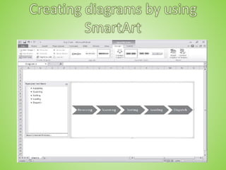
- 28. • SmartArt summarizes the company’s processes for the board of directors by creating diagrams. • SmartArt. To create a SmartArt graphic, on the Insert tab, in the Illustrations group, click SmartArt to display the Choose A SmartArt Graphic dialog box.
- 30. • Choose A SmartArt Graphic Clicking All displays every available SmartArt graphic type. The following table lists the nine types of diagrams you can create by using the Choose A SmartArt Graphic dialog box.
- 31. • Tip Some of the diagram types can be used to illustrate several types of relationships. Be sure to examine all your options before you decide on the type of diagram to use to illustrate your point. • After you click the button representing the type of diagram you want to create, clicking OK adds the diagram to your worksheet.
- 33. • Excel displays the SmartArt Tools Design and Format contextual tabs. • use the tools on the Design contextual tab to change the graphic’s layout, style, or color scheme. • the Create Graphic group, which is home to tools you can use to add a shape to theSmartArt graphic, add text to the graphic, and promote or demote shapes withinthe graphic.
- 35. • The Text Pane, located to the left of the SmartArt graphic, enables you to add text to a shape without having to click and type within the shape. • you can move a shape by right-clicking the shape you want to move and then clicking Cut on the shortcut menu that appears. To paste the shape back into the graphic, right-click the shape to the left of where you want the pasted shape to appear, and then click Paste.
- 36. • If you want to add a shape to a SmartArt graphic, to add a step to a process then on the Design contextual tab, in the Create Graphic group, click Add Shape, and then click the option that represents where you want the new shape to appear in relation to the selected shape. • You can edit the graphic’s elements by using the buttons on the Format contextual tab as well as by right-clicking the shape and then clicking Format Shape to display the Format Shape dialog box. If you have selected the text in a shape, you can use the tools in the Font group on the Home tab to change the text’s appearance.
- 37. • In this exercise, you’ll create an organization chart, fill in the shapes, delete a shape, add a • shape, change the layout of the diagram without changing the information it embodies, • and change the formatting of one of the diagram elements. • SET UP You need the OrgChart_start workbook located in your Chapter10 Moodle website. Open the OrgChart_start workbook, and save it as OrgChart. Then follow the steps provided in a file on moodle.
- 38. • You can also augment your worksheets by adding objects such as geometric shapes, lines, flowchart symbols, and banners. • click the Insert tab and then, in the Illustrations group, click the Shapes button to display the shapes available. When you click a shape in the gallery, your mouse pointer changes from a white arrow to a thin black crosshair. To draw your shape, click anywhere in the worksheet and drag the mouse pointer until your shape is the size you want. When you release the mouse button, your shape appears and Excel displays the Drawing Tools Format contextual tab on the ribbon.
- 39. • You can resize a shape by clicking the shape and then dragging one of the resizing handles around the edge of the shape. Dragging a handle on a side of the shape lets you drag that side to a new position; dragging a handle on the corner of the shape lets you affect height and width simultaneously. If you hold down the Shift key while you drag a shape’s corner, Excel keeps the shape’s height and width in proportion as you drag the corner. To rotate a shape, select the shape and then drag the green circle at the top of the selection outline in a circle until the shape is in the orientation you want.
- 40. • you can use the controls on the Format contextual tab to change its formatting. To apply a pre-defined style, click the More button at the bottom right corner of the Shape Styles group’s gallery and then click the style you want to apply. If none of the pre- defined styles are exactly what you want, you can use the Shape Fill, Shape Outline, and Shape Effects buttons’ options to change those aspects of the shape’s appearance.
- 41. • If you want to use a shape as a label or header in a worksheet, you can add text to the shape’s interior. To do so, select the shape and begin typing; when you’re done adding text, click outside the shape to deselect it. You can edit a shape’s text by moving the mouse pointer over the text. When the mouse pointer is in position for you to edit the text, it will change from a white pointer with a four-pointed arrow to a black I- bar. You can then click the text to start editing it. If you want to change the text’s appearance, you can use the commands on the Home tab or on the Mini Toolbar that appears when you select the text.
- 43. • You can move a shape within your worksheet by dragging it to a new position. If your worksheet contains multiple shapes, you can align and distribute them within the worksheet. Aligning shapes horizontally means arranging them so they are lined up by their top edge, bottom edge, or center. Aligning them vertically means they have the same right edge, left edge, or center. To align a series of shapes, hold down the Ctrl key and click the shapes you want to align. Then, on the Format contextual tab, in the Arrange group, click Align, and then click the alignment option you want. • Distributing shapes moves the shapes so they have a consistent horizontal or vertical distance between them. To do so, select three or more shapes on a worksheet, click the Format contextual tab and then, in the Arrange group, click Align and then click either Distribute Horizontally or Distribute Vertically.
- 44. • If you have multiple shapes on a worksheet, you will find that Excel arranges them from front to back, placing newer shapes in front of older shapes.
- 45. • To change the order of the shapes, select the shape in the back, click the Format contextual tab, and then, in the Arrange group, click Bring Forward. When you do, Excel moves the back shape in front of the front shape. Clicking Send Backward has the opposite effect, moving the selected shape one layer back in the order. If you click the Bring Forward button’s arrow, you can choose to bring a shape all the way to the front of the order; similarly, by clicking the Send Backward button’s arrow, you can choose to send a shape to the back of the order. • One other way to work with shapes in Excel is to add mathematical equations to their interior. As an example, a business analyst might evaluate Consolidated Messenger’s financial performance using a ratio that can be expressed using an equation. To add an equation to a shape, click the shape and then, on the Insert tab, in the Symbols group, click Equation, and then click the Equation Tools Design contextual tab on the ribbon to display the new interface for editing equations.
- 46. • Click any of the controls in the Structures group to begin creating an equation of that type. You can fill in the details of a structure by adding text normally or by adding symbols from the gallery in the Symbols group.
- 47. • In this exercise, you’ll create a circle and a rectangle, change the shapes’ formatting, reorder the shapes, align the shapes, add text to the circle, and then add an equation to the rectangle. • SET UP You need the OrgChart_start workbook located in your Chapter10 Moodle website. Open the OrgChart_start workbook, and save it as OrgChart. Then follow the steps provided in a file on moodle.
- 48. • You can use charts to summarize large sets of data in an easy-to-follow visual format. • You’re not stuck with the chart you create; if you want to change it, you can. • If you format many of your charts the same way, creating a chart template can save • you a lot of work in the future. • Adding chart labels and a legend makes your chart much easier to follow. • If your chart data represents a series of events over time (such as monthly or • yearly sales), you can use trendline analysis to extrapolate future events based on the past data. • With sparklines, which are new in Excel 2010, you can summarize your data in a compact space, providing valuable context for values in your worksheets. • With a PivotChart, you can rearrange your chart on the fly, emphasizing different aspects of the same data without having to create a new chart for each view. • With Excel, you can quickly create and modify common business and organizational diagrams, such as organization charts and process diagrams. • You can create and modify shapes to enhance your workbook’s visual impact. • The improved equation editing capabilities help Excel 2010 users communicate their thinking to their colleagues.