


![Advantages:
a. Training a linear regression model is usually much faster than methods such as neural networks.
b. Linear regression models are simple and require minimum memory to implement.
c. By examining the magnitude and sign of the regression coefficients you can infer how predictor
variables affect the target outcome.
• There are two important shortcomings of linear regression:
1. Predictive ability: The linear regression fit often has low bias but high variance. Recall that
expected test error is a combination of these two quantities. Prediction accuracy can sometimes be
improved by sacrificing some small amount of bias in order to decrease the variance.
2. Interpretative ability: Linear regression freely assigns a coefficient to each predictor variable.
When the number of variables p is large, we may sometimes seek, for the sake of interpretation, a
smaller set of important variables.
Least Squares Regression Line
Least square method
• The method of least squares is about estimating parameters by minimizing the squared discrepancies
between observed data, on the one hand and their expected values on the other.
• The Least Squares (LS) criterion states that the sum of the squares of errors is minimum. The least-
squares solutions yield y(x) whose elements sum to 1, but do not ensure the outputs to be in the range
[0, 1].
• How to draw such a line based on data points observed? Suppose a imaginary line of y = a + bx.
• Imagine a vertical distance between the line and a data point E = Y - E(Y). This error is the deviation
of the data point from the imaginary line, regression line. Then what is the best values of a and b? A
and b that minimizes the sum of such errors.
• Deviation does not have good properties for computation. Then why do we use squares of deviation?
Let us get a and b that can minimize the sum of squared deviations rather than the sum of deviations.
This method is called least squares.
• Least squares method minimizes the sum of squares of errors. Such a and b are called least squares
estimators i.e. estimators of parameters a and B.
• The process of getting parameter estimators (e.g., a and b) is called estimation. Lest squares method
is the estimation method of Ordinary Least Squares (OLS).](https://image.slidesharecdn.com/cs3351-foundationsofdatasciencenotes-240830150925-c94f3f04/85/CS3352-Foundations-of-Data-Science-Notes-pdf-79-320.jpg)


![Introduction to Python
• Python is a high-level scripting language which can be used for a wide variety of text processing,
system administration and internet-related tasks.
• Python is a true object-oriented language, and is available on a wide variety of platforms.
• Python was developed in the early 1990's by Guido van Rossum, then at CWI in Amsterdam, and
currently at CNRI in Virginia.
• Python 3.0 was released in Year 2008.
• Python statements do not need to end with a special character.
• Python relies on modules, that is, self-contained programs which define a variety of functions and
data types.
• A module is a file containing Python definitions and statements. The file name is the module name
with the suffix .py appended.
• Within a module, the module's name (as a string) is available as the value of the global
variable_name_.
• If a module is executed directly however, the value of the global variable_name will be "_main_".
• Modules can contain executable statements aside from definitions. These are executed only the first
time the module name is encountered in an import statement as well as if the file is executed as a
script.
• Integrated Development Environment (IDE) is the basic interpreter and editor environment that you
can use along with Python. This typically includes an editor for creating and modifying programs, a
translator for executing programs, and a program debugger. A debugger provides a means of taking
control of the execution of a program to aid in finding program errors.
• Python is most commonly translated by use of an interpreter. It provides the very useful ability to
execute in interactive mode. The window that provides this interaction is referred to as the Python
shell.
• Python support two basic modes: Normal mode and interactive mode
• Normal mode: The normal mode is the mode where the scripted and finished.py files are run in the
Python interpreter. This mode is also called as script mode.
• Interactive mode is a command line shell which gives immediate feedback for each statement, while
running previously fed statements in active memory.
• Start the Python interactive interpreter by typing python with no arguments at the command line.
• To access the Python shell, open the terminal of your operating system and then type "python".
Press the enter key and the Python shell will appear.
C:Windowssystem32>python
Python 3.5.0 (v3.5.0:374f501f4567, Sep 13 2015, 02:27:37) [MSC v.1900 64 bit (AMD64)] on win32
Type "help", "copyright", "credits" or "license" for more information.
>>>
• The >>> indicates that the Python shell is ready to execute and send your commands to the Python
interpreter. The result is immediately displayed on the Python shell as soon as the Python interpreter
interprets the command.](https://image.slidesharecdn.com/cs3351-foundationsofdatasciencenotes-240830150925-c94f3f04/85/CS3352-Foundations-of-Data-Science-Notes-pdf-88-320.jpg)


![• The main data structure in NumPy is the ndarray, which is a shorthand name for N- dimensional
array. When working with NumPy, data in an ndarray is simply referred to as an array. It is a fixed-
sized array in memory that contains data of the same type, such as integers or floating point values.
•The data type supported by an array can be accessed via the "dtype" attribute on the array. The
dimensions of an array can be accessed via the "shape" attribute that returns a tuple describing the
length of each dimension.
• Array attributes are essential to find out the shape, dimension, item size etc.
• ndarray.shape: By using this method in numpy, we can know the array dimensions. It can also be
used to resize the array. Each array has attributes ndim (the number of dimensions), shape (the size
of each dimension), and size (the total size of the array).
• ndarray.size: The total number of elements of the array. This is equal to the product of the elements
of the array's shape.
• ndarray.dtype: An object describing the data type of the elements in the array. Recall that NumPy's
ND-arrays are homogeneous: they can only posses numbers of a uniform data type.
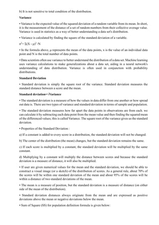
b) Indexing of arrays
• Array indexing always refers to the use of square brackets ("[ ]') to index the elements of the array.
In order to access a single element of an array we can refer to its index.
• Fig. 4.4.1 shows the indexing of an ndarray mono-dimensional.
>>> a = np.arange(25, 31)
>>>P
array([25, 26, 27, 28, 29, 30])
>>>P[3]
28
• The NumPy arrays also accept negative indexes. These indexes have the same incremental sequence
from 0 to -1, -2, and so on,
>>>P[-1]
30
>>>P[-6]
25
• In a multidimensional array, we can access items using a comma-separated tuple of indices. To
select multiple items at once, we can pass array of indexes within the square brackets.
>>>a[[1, 3, 4]]](https://image.slidesharecdn.com/cs3351-foundationsofdatasciencenotes-240830150925-c94f3f04/85/CS3352-Foundations-of-Data-Science-Notes-pdf-91-320.jpg)
![array([26, 28, 29])
• Moving on to the two-dimensional case, namely, the matrices, they are represented as rectangular
arrays consisting of rows and columns, defined by two axes, where axis 0 is represented by the rows
and axis 1 is represented by the columns. Thus, indexing in this case is represented by a pair of values
: the first value is the index of the row and the second is the index of the column.
• Fig. 4.4.2 shows the indexing of a bi-dimensional array.
>>> A = np.arange(10, 19).reshape((3, 3))
>>> A
array([[10, 11, 12],
[13, 14, 15],
[16, 17, 18]])
c) Slicing of arrays
• Slicing is the operation which allows to extract portions of an array to generate new ones. Whereas
using the Python lists the arrays obtained by slicing are copies, in NumPy, arrays are views onto the
same underlying buffer.
• Slicing of array in Python means to access sub-parts of an array. These sub-parts can be stored in
other variables and further modified.
• Depending on the portion of the array, to extract or view the array, make use of the slice syntax; that
is, we will use a sequence of numbers separated by colons (':') within the square brackets.
• Synatx : arr[ start stop step],
Arr[slice(start, stop, step)]
• The start parameter represents the starting index, stop is the ending index, and step is the number
of items that are "stepped" over. If any of these are unspecified, they default to the values start=0,
stop-size of dimension, step-1.
importnumpy as np
arr = np.array([1,2,3,4])
print(arr[1:3:2])
print(arr[:3])
print(arr[::2])
Output:
[2]
[1 2 3]
[13]](https://image.slidesharecdn.com/cs3351-foundationsofdatasciencenotes-240830150925-c94f3f04/85/CS3352-Foundations-of-Data-Science-Notes-pdf-92-320.jpg)
![Multidimensional sub-arrays:
• Multidimensional slices work in the same way, with multiple slices separated by commas. For
example:
In[24]: x2
Out[24]: array([[12, 5, 2, 4],
[ 7, 6, 8, 8],
[ 1, 6, 7, 7]])
In[25]: x2[:2, :3] # two rows, three columns
Out[25]: array([[12, 5, 2],
[ 7, 6, 8]])
In[26]: x2[:3, ::2] # all rows, every other column
Out[26]: array([[12, 2],
[7, 8],
[ 1, 7]])
• Let us create an array using the package Numpy and access its columns.
# Creating an array
importnumpy as np
a= np.array([[1,2,3],[4,5,6],[7,8,9]])
• Now let us access the elements column-wise. In order to access the elements in a column-wise
manner colon(:) symbol is used let us see that with an example.
importnumpy as np
a = np.array([[1,2,3],[4,5,6],[7,8,9]])
print(a[:,1])
Output:
[258]
d) Reshaping of array
•The numpy.reshape() function is used to reshape a numpy array without changing the data in the
array.
• Syntax:
numpy.reshape(a, newshape, order='C')
Where order: {'C', 'F', 'A'}, optional Read the elements of a using this index order, and place the
elements into the reshaped array using this index order.
Step 1: Create a numpy array of shape (8,)
num_array = np.array([1,2,3,4,5,6,7,8])
num_array](https://image.slidesharecdn.com/cs3351-foundationsofdatasciencenotes-240830150925-c94f3f04/85/CS3352-Foundations-of-Data-Science-Notes-pdf-93-320.jpg)
![Output:
array([1, 2, 3, 4, 5, 6, 7, 8])
Step 2: Use np.reshape() function with new shape as (4,2)
np.reshape(num_array,(4,2))
array([[1,2],
[3,4],
[5,6],
[7,8]])
• The shape of the input array has been changed to a (4,2). This is a 2-D array and contains the same
data present in the original input 1-D array.
e) Array concatenation and splitting
• np.concatenate() constructor is used to concatenate or join two or more arrays into one. The only
required argument is list or tuple of arrays.
#first, import numpy
importnumpy as np
# making two arrays to concatenate
arr1 = np.arange(1,4)
arr2 = np.arange(4,7)
print("Arrays to concatenate:")
print(arr1); print(arr2)
print("After concatenation:")
print(np.concatenate([arr1,arr2]))
Arrays to concatenate:
[1 2 3]
[4 5 6]
After concatenation:
[1 2 3 4 5 6]
Computations on Arrays
• Computation on NumPy arrays can be very fast, or it can be very slow. Using vectorized operations,
fast computations is possible and it is implemented by using NumPy's universial functions (ufuncs).
• A universal function (ufuncs) is a function that operates on ndarrays in an element-by- element
fashion, supporting array broadcasting, type casting, and several other standard features. The ufunc
is a "vectorized" wrapper for a function that takes a fixed number of specific inputs and produces a
fixed number of specific outputs.
• Functions that work on both scalars and arrays are known as ufuncs. For arrays, ufuncs apply the
function in an element-wise fashion. Use of ufuncs is an esssential aspect of vectorization and
typically much more computtionally efficient than using an explicit loop over each element.](https://image.slidesharecdn.com/cs3351-foundationsofdatasciencenotes-240830150925-c94f3f04/85/CS3352-Foundations-of-Data-Science-Notes-pdf-94-320.jpg)

![print("The division of {0} and {1} is {2}'.format(num1, num2, div))
print("The modulus of {0} and {1} is {2}'.format(num1, num2, mod))
print("The exponentiation of {0} and {1} is {2}'.format(num1, num2, exp))
print("The floor division between {0} and {1} is {2}'.format(num1, num2,floordiv))
Absolute value :
• NumPy understands Python's built-in arithmetic operators, it also understands Python's built-in
absolute value function. The abs() function returns the absolute magnitude or value of input passed
to it as an argument. It returns the actual value of input without taking the sign into consideration.
• The abs() function accepts only a single arguement that has to be a number and it returns the absolute
magnitude of the number. If the input is of type integer or float, the abs() function returns the absolute
magnitude/value. If the input is a complex number, the abs() function returns only the magnitude
portion of the number.
Syntax: abs(number)
Where the number can be of integer type, floating point type or a complex number.
• Example:
num -25.79
print("Absolute value:", abs(num))
• Output:
Absolute value : 25.79
Trigonometric functions:
• The numpy package provides trigonometric functions which can be used to calculate trigonometric
ratios for a given angle in radians.
Example:
importnumpy as np
Arr = np.array([0, 30, 60, 90])
#converting the angles in radians
Arr = Arr*np.pi/180](https://image.slidesharecdn.com/cs3351-foundationsofdatasciencenotes-240830150925-c94f3f04/85/CS3352-Foundations-of-Data-Science-Notes-pdf-96-320.jpg)
![print("nThe sin value of angles:")
print(np.sin(Arr))
print("nThe cos value of angles:")
print(np.cos(Arr))
print("nThe tan value of angles:")
print(np.tan(Arr))
Comparisons, Masks and Boolean Logic
• Masking means to extract, modify, count or otherwise manipulate values in an array based on some
criterion.
• Boolean masking, also called boolean indexing, is a feature in Python NumPy that allows for the
filtering of values in numpy arrays. There are two main ways to carry out boolean masking:
a) Method one: Returning the result array.
b) Method two: Returning a boolean array.
Comparison operators as ufuncs
• The result of these comparison operators is always an array with a Boolean data type. All six of the
standard comparison operations are available. For example, we might wish to count all values greater
than a certain value, or perhaps remove all outliers that are above some threshold. In NumPy, Boolean
masking is often the most efficient way to accomplish these types of tasks.
x = np.array([1,2,3,4,5])
print(x<3) # less than
print(x>3) # greater than
print(x<=3) # less than or equal
print(x>=3) #greater than or equal
print(x!=3) #not equal
print(x==3) #equal
• Comparison operators and their equivalent :
Boolean array:
• A boolean array is a numpy array with boolean (True/False) values. Such array can be obtained by
applying a logical operator to another numpy array:](https://image.slidesharecdn.com/cs3351-foundationsofdatasciencenotes-240830150925-c94f3f04/85/CS3352-Foundations-of-Data-Science-Notes-pdf-97-320.jpg)
![importnumpyasnp
a = np.reshape(np.arange(16), (4,4)) # create a 4x4 array of integers
print(a)
[[ 0 1 2 3]
[ 4 5 6 7]
[ 8 9 10 11]
[12 13 14 15]]
large values (a>10) # test which elements of a are greated than 10
print(large_values)
[[False FalseFalse False]
[False FalseFalse False]
[False Falsefalse True]
[ TrueTrueTrue True]]
even_values = (a%2==0) # test which elements of a are even
print(even_values)
[[True False True False]
[True False True False]
[True False True False]
[True False True False]]
Logical operations on boolean arrays
• Boolean arrays can be combined using logical operators :
b = ~(a%3 == 0) # test which elements of a are not divisible by 3
print('array a:n{}n'.format(a))
print('array b:n{}'.format(b))
array a:
[[ 0 1 2 3]
[ 4 5 6 7]
[ 8 9 10 11]
[12 13 14 15]]
array b:
[[False TrueTrue False]](https://image.slidesharecdn.com/cs3351-foundationsofdatasciencenotes-240830150925-c94f3f04/85/CS3352-Foundations-of-Data-Science-Notes-pdf-98-320.jpg)
![[ TrueTrue False True]
[True False True True]
[False TrueTrue False]]
Fancy Indexing
• With NumPy array fancy indexing, an array can be indexed with another NumPy array, a Python
list, or a sequence of integers, whose values select elements in the indexed array.
• Example: We first create a NumPy array with 11 floating-point numbers and then index the array
with another NumPy array and Python list, to extract element numbers 0, 2 and 4 from the original
array :
importnumpy as np
A = np.linspace(0, 1, 11)
print(A)
print(A[np.array([0, 2, 4])])
# The same thing can be accomplished by indexing with a Python list
print(A[[0, 2, 4]])
Output:
[0. 0.1 0.2 0.3 0.4 0.5 0.6 0.7 0.8 0.9 1.0 ].
[0. 0.2 0.4]
[0. 0.2 0.4]
Structured Arrays
• A structured Numpy array is an array of structures. As numpy arrays are homogeneous i.e. they can
contain data of same type only. So, instead of creating a numpy array of int or float, we can create
numpy array of homogeneous structures too.
• First of all import numpy module i.e.
importnumpy as np
• Now to create a structure numpy array we can pass a list of tuples containing the structure elements
i.e.
[('Ram', 22.2, 3), ('Rutu', 39.4, 5), ('Rupu', 55.5, 6), ('Iresh', 99.9, 7)]
• But as elements of a Numpy array are homogeneous, so how will be the size and type of structure
will be decided? For that we need to pass the type of above structure type i.e. schema in dtype
parameter.
• Let's create a dtype for above structure i.e.
# Creating the type of a structure
dtype = [('Name', (np.str_, 10)), ('Marks', np.float64), ('GradeLevel', np.int32)]
• Let's create a numpy array based on this dtype i.e.
# Creating a StrucuredNumpy array](https://image.slidesharecdn.com/cs3351-foundationsofdatasciencenotes-240830150925-c94f3f04/85/CS3352-Foundations-of-Data-Science-Notes-pdf-99-320.jpg)
![structuredArr= np.array([('Ram', 22.2, 3), ('Rutu', 39.4, 5), ('Rupu', 55.5,
6), ('Iresh', 99.9, 7)], dtype=dtype)
• It will create a structured numpy array and its contents will be,
[('Ram', 22.2, 3), ('Rutu', 39.4, 5), ('Rupu', 55.5, 6), ('Iresh', 99.9, 7)]
• Let's check the data type of the above created numpy array is,
print(structured Arr.dtype)
Output:
[('Name', '<U10'), ('Marks', '<f8'), ('GradeLevel', '<i4')]
Creating structured arrays:
• Structured array data types can be specified in a number of ways.
1. Dictionary method :
np.dtype({'names': ('name', 'age', 'weight'),
'formats': ('U10', '14', 'f8')})
Output: dtype([('name', '<U10'), ('age', '<i4'), ('weight', '<f8')])
2. Numerical types can be specified with Python types or NumPydtypes instead :
np.dtype({'names': ('name', 'age', 'weight'),
'formats':((np.str_, 10), int, np.float32)})
Output: dtype([('name', '<U10'), ('age', '<i8'), ('weight', '<f4')])
3. A compound type can also be specified as a list of tuples :
np.dtype([('name', 'S10'), ('age', 'i4'), ('weight', 'f8')])
Output: dtype([('name', 'S10'), ('age', '<i4'), ('weight', '<f8')])
NumPy data types:
• Below is a listing of all data types available in NumPy and the characters that represent them.
1) I - integer
2) b - boolean
3) u - unsigned integer
4) f - float
5) c - complex float
6) m - timedelta
7) M - datetime
8) O - object
9) S - string
10) U - unicode string
11) V - fixed for other types of memory](https://image.slidesharecdn.com/cs3351-foundationsofdatasciencenotes-240830150925-c94f3f04/85/CS3352-Foundations-of-Data-Science-Notes-pdf-100-320.jpg)
![Data Manipulation with Pandas
• Pandas is a high-level data manipulation tool developed by Wes McKinney. It is built on the Numpy
package and its key data structure is called the DataFrame.
• DataFrames allow you to store and manipulate tabular data in rows of observations and columns of
variables.
• Pandas is built on top of the NumPy package, meaning a lot of the structure of NumPy is used or
replicated in Pandas. Data in pandas is often used to feed statistical analysis in SciPy, plotting
functions from Matplotlib and machine learning algorithms in Scikit-learn.
• Pandas is the library for data manipulation and analysis. Usually, it is the starting point for your data
science tasks. It allows you to read/write data from/to multiple sources. Process the missing data,
align your data, reshape it, merge and join it with other data, search data, group it, slice it.
Create DataFrame with Duplicate Data
• Duplicate data creates the problem for data science project. If database is large, then processing
duplicate data means wastage of time.
• Finding duplicates is important because it will save time, space false result. how to easily and
efficiently you can remove the duplicate data using drop_duplicates() function in pandas.
• Create Dataframe with Duplicate data
import pandas as pd
raw_data={'first_name': ['rupali', 'rupali', 'rakshita','sangeeta', 'mahesh', 'vilas'],
'last_name': ['dhotre', 'dhotre', 'dhotre','Auti', 'jadhav', 'bagad'],
'RNo': [12, 12, 1111111, 36, 24, 73],
'TestScore1': [4, 4, 4, 31, 2, 3],
'TestScore2': [25, 25, 25, 57, 62, 70]}
df = pd.DataFrame(raw_data, columns = ['first_name', 'last_name', 'age', 'preTestScore',
'postTestScore'])
df
Drop duplicates
df.drop_duplicates()
• Drop duplicates in the first name column, but take the last observation in the duplicated set
df.drop_duplicates (['first_name'], keep='last')](https://image.slidesharecdn.com/cs3351-foundationsofdatasciencenotes-240830150925-c94f3f04/85/CS3352-Foundations-of-Data-Science-Notes-pdf-101-320.jpg)
![Creating a Data Map and Data Plan
• Overview of dataset is given by data map. Data map is used for finding potential problems in data,
such as redundant variables, possible errors, missing values and variable transformations.
• Try creating a Python script that converts a Python dictionary into a Pandas DataFrame, then print
the DataFrame to screen.
import pandas as pd
scottish_hills={'Ben Nevis': (1345, 56.79685, -5.003508),
'Ben Macdui': (1309, 57.070453, -3.668262),
'Braeriach': (1296, 57.078628, -3.728024),
'Cairn Toul': (1291, 57.054611, -3.71042),
'Sgòr an Lochain Uaine': (1258, 57.057999, -3.725416)}
dataframe = pd.DataFrame(scottish_hills)
print(dataframe)
Manipulating and Creating Categorical Variables
• Categorical variable is one that has a specific value from a limited selection of values. The number
of values is usually fixed.
• Categorical features can only take on a limited, and usually fixed, number of possible values. For
example, if a dataset is about information related to users, then you will typically find features like
country, gender, age group, etc. Alternatively, if the data you are working with is related to products,
you will find features like product type, manufacturer, seller and so on.
• Method for creating a categorical variable and then using it to check whether some data falls within
the specified limits.
import pandas as pd
cycle_colors=pd.Series(['Blue', 'Red', 'Green'], dtype='category')
cycle_data = pd.Series( pd.Categorical(['Yellow', 'Green', 'Red', 'Blue', 'Purple'],
categories=cycle_colors, ordered=False))
find_entries = pd.isnull(cycle_data)
print cycle_colors
print
print cycle_data
print
print find_entries [find_entries==True]
• Here cycle_color is a categorical variable. It contains the values Blue, Red, and Green as color.
Renaming Levels and Combining Levels
• Data frame variable names are typically used many times when wrangling data. Good names for
these variables make it easier to write and read wrangling programs.](https://image.slidesharecdn.com/cs3351-foundationsofdatasciencenotes-240830150925-c94f3f04/85/CS3352-Foundations-of-Data-Science-Notes-pdf-102-320.jpg)
![• Categorical data has a categories and a ordered property, which list their possible values and whether
the ordering matters or not.
• Renaming categories is done by assigning new values to the Series.cat.categories property or by
using the Categorical.rename_categories() method :
In [41]: s = pd.Series(["a","b","c","a"], dtype="category")
In [41]: s
Out[43]:
0 a
1 b
2 C
3 a
dtype: category
Categories (3, object): [a, b, c]
In [44]: s.cat.categories=["Group %s" % g for g in s.cat.categories]
In [45]: s
Out[45]:
0 Group a
1 Group b
2 Group c
3 Group a
dtype: category
Categories (3, object): [Group a, Group b, Group c]
In [46]: s.cat.rename_categories([1,2,3])
Out[46]:
0 1
1 2
2 3
3 1
dtype: category
Categories (3, int64): [1, 2, 3]
Dealing with Dates and Times Values
• Dates are often provided in different formats and must be converted into single format Date Time
objects before analysis.
• Python provides two methods of formatting date and time.
1. str() = It turns a datetime value into a string without any formatting.](https://image.slidesharecdn.com/cs3351-foundationsofdatasciencenotes-240830150925-c94f3f04/85/CS3352-Foundations-of-Data-Science-Notes-pdf-103-320.jpg)
![2. strftime() function= It define how user want the datetime value to appear after
conversion.
1. Using pandas.to_datetime() with a date
import pandas as pd
#input in mm.dd.yyyy format
date = ['21.07.2020']
# output in yyyy-mm-dd format
print(pd.to_datetime(date))
2. Using pandas.to_datetime() with a date and time
import pandas as pd
# date (mm.dd.yyyy) and time (H:MM:SS)
date [21.07.2020 11:31:01 AM']
# output in yyyy-mm-dd HH:MM:SS
print(pd.to_datetime(date))
• We can convert a string to datetime using strptime() function. This function is available in datetime
and time modules to parse a string to datetime and time objects respectively.
• Python strptime() is a class method in datetime class. Its syntax is :
datetime.strptime(date_string, format)
• Both the arguments are mandatory and should be string
import datetime
format="%a %b %d %H:%M:%S %Y"
today = datetime.datetime.today()
print 'ISO:', today
s = today.strftime(format)
print 'strftime:', s
d = datetime.datetime.strptime(s, format)
print 'strptime:', d.strftime(format)
$ python datetime_datetime_strptime.py
ISO : 2013-02-21 06:35:45.707450
strftime: Thu Feb 21 06:35:45 2013
strptime: Thu Feb 21 06:35:45 2013
• Time Zones: Within datetime, time zones are represented by subclasses of tzinfo. Since tzinfo is
an abstract base class, you need to define a subclass and provide appropriate implementations for a
few methods to make it useful.](https://image.slidesharecdn.com/cs3351-foundationsofdatasciencenotes-240830150925-c94f3f04/85/CS3352-Foundations-of-Data-Science-Notes-pdf-104-320.jpg)

![In [1]: import pandas as pd
In [2]: data = {'Position': ['GK', 'GK', 'GK', 'DF', 'DF', 'DF",
'MF', 'MF", 'MF', 'CF', 'CF', 'CF'],
'Name': ['De Gea', 'Coutois', 'Allison', 'VanDijk',
'Ramos', 'Godin', 'Hazard', 'Kante', 'De Bruyne', 'Ronaldo'
'Messi', 'Neymar'],
'Overall': ['91','88', '89', '89', '91', '90', '91', '90', '92', '94', '93', '92'],
'Rank': ['1st', '3rd', '2nd', '3rd','1st', '2nd', '2nd', '3rd', '1st', '1st', '2nd', '3rd']}
In [3]: fifa19 = pd.DataFrame(data, columns=['Position', 'Name', 'Overall', 'Rank'])
In [4]: fifa19
Out[4]:
• From above Dataframe, we notice that the index is the default Pandas index; the columns 'Position'
and 'Rank' both have values or objects that are repeated. This could sometimes pose a problem for us
when we want to analyse the data. What we would like to do is to use meaningful indexes that
uniquely identify each row and makes it easier to get a sense of the data we are working with. This is
where MultiIndex or Hierarchical Indexing comes in.
• We do this by using the set_index() method. For Hierarchical indexing, we use set_index() method
for passing a list to represent how we want the rows to be identified uniquely.
In [5]: fif19.set_index(['Position', 'Rank'], drop = False)
In [6]: fifa19
Out[6];](https://image.slidesharecdn.com/cs3351-foundationsofdatasciencenotes-240830150925-c94f3f04/85/CS3352-Foundations-of-Data-Science-Notes-pdf-106-320.jpg)
![• We can see from the code above that we have set our new indexes to 'Position' and 'Rank' but there
is a replication of these columns. This is because we passed drop-False which keeps the columns
where they are. The default method, however, is drop-True so without indicating drop=False the two
columns will be set as the indexes and the columns deleted automatically.
In [7]: fifa19.set_index(['Position', 'Rank'])
Out[7]: Name Overall
Position Rank
GK 1st De Gea91
GK 3rd Coutios88
GK 2nd Allison 89
DF 3rd Van Dijk 89
DF 1st Ramos 91
DF 2nd Godin 90
MF 2nd Hazard 91
MF 3rd Kante90
MF 1st De Bruyne 92
CF 1st Ronaldo 94
CF 2nd Messi93
CF 3rd Neymar92
• We use set_index() with an ordered list of column labels to make the new indexes. To verify that
we have indeed set our DataFrame to a hierarchical index, we call the .index attribute.
In [8]: fifa19-fifa 19.set_index(['Position', 'Rank'])](https://image.slidesharecdn.com/cs3351-foundationsofdatasciencenotes-240830150925-c94f3f04/85/CS3352-Foundations-of-Data-Science-Notes-pdf-107-320.jpg)
![In [9]: fifa19.index
Out[9]: MultiIndex(levels = [['CF', 'DF', 'GK', 'MF'],
['1st', '2nd', '3rd']],
codes = [[2, 2, 2, 1, 1, 1, 3, 3, 3, 0, 0, 0],
[0, 2, 1, 2,0,1, 1, 2, 0, 0, 1, 2]],
names= ['Position', 'Rank'])
Combining Datasets
• Whether it is to concatenate several datasets from different csv files or to merge sets of aggregated
data from different google analytics accounts, combining data from various sources is critical to
drawing the right conclusions and extracting optimal value from data analytics.
• When using pandas, data scientists often have to concatenate multiple pandas DataFrame; either
vertically (adding lines) or horizontally (adding columns).
DataFrame.append
• This method allows to add another dataframe to an existing one. While columns with matching
names are concatenated together, columns with different labels are filled with NA.
>>>df1
ints bools
0 0 True
11 False
2 2 True
>>> df2
ints floats
0 3 1.5
1 4 2.5
2 5 3.5
>>> df1.append(df2).
ints bools floats
0 0 True NaN
1 1 False NaN
2 2 True NaN
0 3 NaN 1.5
1 4 NaN 2.5
2 5 NaN 3.5
• In addition to this, DataFrame.append provides other flexibilities such as resetting the resulting
index, sorting the resulting data or raising an error when the resulting index includes duplicate
records.](https://image.slidesharecdn.com/cs3351-foundationsofdatasciencenotes-240830150925-c94f3f04/85/CS3352-Foundations-of-Data-Science-Notes-pdf-108-320.jpg)
![Pandas.concat
• We can concat dataframes both vertically (axis=0) and horizontally (axis=1) by using the
Pandas.concat function. Unlike DataFrame.append, Pandas.concat is not a method but a function that
takes a list of objects as input. On the other hand, columns with different labels are filled with NA
values as for DataFrame.append.
>>> df3
bools floats
0 False 4.5
1 True 5.5
2 False 6.5
>>>pd.concat([df1, df2, df3])
ints bools floats
0 0.0 True NaN
1 1.0 False NaN
2 2.0 True NaN
0 3.0 NaN 1.5
1 4.0 NaN 2.5
2 5.0 NaN 3.5
0 NaN False 4.5
1 NaN True 5.5
2 NaN False 6.5
Aggregation and Grouping
• Pandas aggregation methods are as follows:
a) count() Total number of items
b) first(), last(): First and last item
c) mean(), median(): Mean and median
d) min(), max(): Minimum and maximum
e) std(), var(): Standard deviation and variance
f) mad(): Mean absolute deviation
g) prod(): Product of all items
h) sum(): Sum of all items.
• Sample CSV file is as follows:](https://image.slidesharecdn.com/cs3351-foundationsofdatasciencenotes-240830150925-c94f3f04/85/CS3352-Foundations-of-Data-Science-Notes-pdf-109-320.jpg)
![• The date column can be parsed using the extremely handy dateutil library.
import pandas as pd
importdateutil
# Load data from csv file
data = pd.DataFrame.from_csv('phone_data.csv')
# Convert date from string to date times
data['date'] = data['date'].apply(dateutil.parser.parse, dayfirst=True)
• Once the data has been loaded into Python, Pandas makes the calculation of different statistics very
simple. For example, mean, max, min, standard deviations and more for columns are easily
calculable:
# How many rows the dataset
data['item'].count()
Out[38]: 830
# What was the longest phone call / data entry?
data['duration'].max()
Out[39]: 10528.0
# How many seconds of phone calls are recorded in total?
data['duration'][data['item'] == 'call'].sum()
Out[40]: 92321.0
# How many entries are there for each month?
data['month'].value_counts()](https://image.slidesharecdn.com/cs3351-foundationsofdatasciencenotes-240830150925-c94f3f04/85/CS3352-Foundations-of-Data-Science-Notes-pdf-110-320.jpg)
![Out[41]:
2014-11 230
2015-01 205
2014-12 157
2015-02 137
2015-03 101
dtype: int64
# Number of non-null unique network entries
data['network'].nunique()
Out[42]: 9
groupby() function :
• groupby essentially splits the data into different groups depending on a variable of user choice.
• The groupby() function returns a GroupBy object, but essentially describes how the rows of the
original data set has been split. The GroupBy object groups variable is a dictionary whose keys are
the computed unique groups and corresponding values being the axis labels belonging to each group.
• Functions like max(), min(), mean(), first(), last() can be quickly applied to the GroupBy object to
obtain summary statistics for each group.
• The GroupBy object supports column indexing in the same way as the DataFrame and returns a
modified GroupBy object.
Pivot Tables
• A pivot table is a similar operation that is commonly seen in spreadsheets and other programs that
operate on tabular data. The pivot table takes simple column-wise data as input, and groups the entries
into a two-dimensional table that provides a multidimensional summarization of the data.
• A pivot table is a table of statistics that helps summarize the data of a larger table by "pivoting" that
data. Pandas gives access to creating pivot tables in Python using the .pivot_table() function.
• The syntax of the .pivot_table() function:
import pandas as pd
pd.pivot_table(
data=,
values=None,
index=None,
columns=None,
aggfunc='mean',
fill_value =None,
margins=False,
dropna=True,
margins_name='All',
observed=False,
sort=True
)
• To use the pivot method in Pandas, we need to specify three parameters:
1. Index: Which column should be used to identify and order the rows vertically.
2. Columns: Which column should be used to create the new columns in reshaped DataFrame. Each
unique value in the column stated here will create a column in new DataFrame.
3. Values: Which column(s) should be used to fill the values in the cells of DataFrame.](https://image.slidesharecdn.com/cs3351-foundationsofdatasciencenotes-240830150925-c94f3f04/85/CS3352-Foundations-of-Data-Science-Notes-pdf-111-320.jpg)
![• Import modules:
import pandas as pd
Create dataframe :
raw_data={'regiment': ['Nighthawks', 'Nighthawks', 'Nighthawks', 'Nighthawks','Dragoons','
Dragoons', 'Dragoons', 'Dragoons', 'Scouts', 'Scouts', 'Scouts', 'Scouts'],
'company': ['1st', '1st', '2nd', '2nd', '1st', '1st', '2nd', '2nd', '1st', '1st', '2nd','2nd'],
'TestScore': [4,24,31,2,3,4,24,31,2,3,2,3]}
df pd.DataFrame(raw_data, columns=['regiment','company', 'TestScore'])
df
• Create a pivot table of group means, by company and regiment
pd.pivot_table(df,index=['regiment','company'], aggfunc='mean')
• Create a pivot table of group score counts, by company and regiment
df.pivot_table(index=['regiment', 'company'], aggfunc='count')](https://image.slidesharecdn.com/cs3351-foundationsofdatasciencenotes-240830150925-c94f3f04/85/CS3352-Foundations-of-Data-Science-Notes-pdf-112-320.jpg)

![UNIT V: Data Visualization
Syllabus
Importing Matplotlib - Line plots - Scatter plots - visualizing errors - density and contour plots
Histograms - legends - colors - subplots - text and annotation - customization three dimensional
plotting - Geographic Data with Basemap - Visualization with Seaborn.
Importing Matplotlib
• Matplotlib is a cross-platform, data visualization and graphical plotting library for Python and its
numerical extension NumPy.
• Matplotlib is a comprehensive library for creating static, animated, and interactive visualizations
in Python.
• Matplotlib is a plotting library for the Python programming language. It allows to make quality
charts in few lines of code. Most of the other python plotting library are build on top of Matplotlib.
• The library is currently limited to 2D output, but it still provides you with the means to express
graphically the data patterns.
Visualizing Information: Starting with Graph
• Data visualization is the presentation of quantitative information in a graphical form. In other
words, data visualizations turn large and small datasets into visuals that are easier for the human
brain to understand and process.
• Good data visualizations are created when communication, data science, and design collide. Data
visualizations done right offer key insights into complicated datasets in ways that are meaningful
and intuitive.
• A graph is simply a visual representation of numeric data. MatPlotLib supports a large number of
graph and chart types.
• Matplotlib is a popular Python package used to build plots. Matplotlib can also be used to make
3D plots and animations.
• Line plots can be created in Python with Matplotlib's pyplot library. To build a line plot, first
import Matplotlib. It is a standard convention to import Matplotlib's pyplot library as plt.
• To define a plot, you need some values, the matplotlib.pyplot module, and an idea of what you
want to display.
import matplotlib.pyplot as plt
plt.plot([1,2,3],[5,7,4])
plt.show()
• The plt.plot will "draw" this plot in the background, but we need to bring it to the screen when
we're ready, after graphing everything we intend to.
• plt.show(): With that, the graph should pop up. If not, sometimes can pop under, or you may have
gotten an error. Your graph should look like :](https://image.slidesharecdn.com/cs3351-foundationsofdatasciencenotes-240830150925-c94f3f04/85/CS3352-Foundations-of-Data-Science-Notes-pdf-114-320.jpg)

![Example 5.1.1: Write a simple python program that draws a line graph where x = [1,2,3,4]
and y = [1,4,9,16] and gives both axis label as "X-axis" and "Y-axis".
Solution:
importmatplotlib.pyplot as plt
importnumpy as np
# define data values
x = np.array([1, 2, 3, 4]) # X-axis points
y = x*2 # Y-axis points
print("Values of :")
print("Values of Y):")
print (Y)
plt.plot(X, Y)
# Set the x axis label of the current axis.
plt.xlabel('x-axis')
# Set the y axis label of the current axis.
plt.ylabel('y-axis')
# Set a title
plt.title('Draw a line.')
# Display the figure.
plt.show()
Saving Work to Disk
• Matplotlib plots can be saved as image files using the plt.savefig() function.
• The .savefig() method requires a filename be specified as the first argument. This filename can be
a full path. It can also include a particular file extension if desired. If no extension is provided, the
configuration value of savefig.format is used instead.
• The .savefig() also has a number of useful optional arguments :](https://image.slidesharecdn.com/cs3351-foundationsofdatasciencenotes-240830150925-c94f3f04/85/CS3352-Foundations-of-Data-Science-Notes-pdf-116-320.jpg)
![1. dpi can be used to set the resolution of the file to a numeric value.
2. transparent can be set to True, which causes the background of the chart to be transparent.
3. bbox_inches can be set to alter the size of the bounding box (whitespace) around the output
image. In most cases, if no bounding box is desired, using bbox_inches = 'tight' is ideal.
4. If bbox_inches is set to 'tight', then the pad_inches option specifies the amount of padding around
the image.
Setting the Axis, Ticks, Grids
• The axes define the x and y plane of the graphic. The x axis runs horizontally, and the y axis runs
vertically.
• An axis is added to a plot layer. Axis can be thought of as sets of x and y axis that lines and bars
are drawn on. An Axis contains daughter attributes like axis labels, tick labels, and line thickness.
• The following code shows how to obtain access to the axes for a plot :
fig = plt.figure()
axes = fig.add_axes([0.1, 0.1, 0.8, 0.8]) # left, bottom, width, height (range 0 to 1)
axes.plot(x, y, 'r')
axes.set_xlabel('x')
axes.set_ylabel('y')
axes.set_title('title');
Output:
• A grid can be added to a Matplotlib plot using the plt.grid() command. By defaut, the grid is turned
off. To turn on the grid use:
plt.grid(True)
• The only valid options are plt.grid(True) and plt.grid(False). Note that True and False are
capitalized and are not enclosed in quotes.](https://image.slidesharecdn.com/cs3351-foundationsofdatasciencenotes-240830150925-c94f3f04/85/CS3352-Foundations-of-Data-Science-Notes-pdf-117-320.jpg)

![• MatPlotLib Colors are as follows:
Adding Markers
• Markers add a special symbol to each data point in a line graph. Unlike line style and color, markers
tend to be a little less susceptible to accessibility and printing issues.
• Basically, the matplotlib tries to have identifiers for the markers which look similar to the marker:
1. Triangle-shaped: v, <, > Λ
2. Cross-like: *,+, 1, 2, 3, 4
3. Circle-like: 0,., h, p, H, 8
• Having differently shaped markers is a great way to distinguish between different groups of data
points. If your control group is all circles and your experimental group is all X's the difference pops
out, even to colorblind viewers.
N = x.size // 3
ax.scatter(x[:N], y[:N], marker="o")
ax.scatter(x[N: 2* N], y[N: 2* N], marker="x")
ax.scatter(x[2* N:], y[2 * N:], marker="s")
• There's no way to specify multiple marker styles in a single scatter() call, but we can separate our
data out into groups and plot each marker style separately. Here we chopped our data up into three
equal groups.](https://image.slidesharecdn.com/cs3351-foundationsofdatasciencenotes-240830150925-c94f3f04/85/CS3352-Foundations-of-Data-Science-Notes-pdf-119-320.jpg)
![Using Labels, Annotations and Legends
• To fully document your graph, you usually have to resort to labels, annotations, and legends. Each
of these elements has a different purpose, as follows:
1. Label: Make it easy for the viewer to know the name or kind of data illustrated
2. Annotation: Help extend the viewer's knowledge of the data, rather than simply identify it.
3. Legend: Provides cues to make identification of the data group easier.
• The following example shows how to add labels to your graph:
values = [1, 5, 8, 9, 2, 0, 3, 10, 4, 7]
import matplotlib.pyplot as plt
plt.xlabel('Entries')
plt.ylabel('Values')
plt.plot(range(1,11), values)
plt.show()
• Following example shows how to add annotation to a graph:
import matplotlib.pyplot as plt
W = 4
h = 3
d = 70
plt.figure(figsize=(w, h), dpi=d)
plt.axis([0, 5, 0, 5])
x = [0, 3, 5]
y = [1, 4, 3.5]
label_x = 1
label_y = 4
arrow_x = 3
arrow_y= 4
arrow_properties=dict(
facecolor="black", width=0.5,
headwidth=4, shrink=0.1)
plt.annotate("maximum", xy=(arrow_x, arrow_y),
xytext=(label_x, label_y),
arrowprops arrow_properties)
plt.plot(x, y)
plt.savefig("out.png")](https://image.slidesharecdn.com/cs3351-foundationsofdatasciencenotes-240830150925-c94f3f04/85/CS3352-Foundations-of-Data-Science-Notes-pdf-120-320.jpg)
![Output:
Creating a legend
• There are several options available for customizing the appearance and behavior of the plot legend.
By default the legend always appears when there are multiple series and only appears on mouseover
when there is a single series. By default the legend shows point values when the mouse is over the
graph but not when the mouse leaves.
• Alegend documents the individual elements of a plot. Each line is presented in a table that contains
a label for it so that people can differentiate between each line.
import matplotlib.pyplot as plt
import numpy as np
x = np.linspace(-10, 9, 20)
y = x ** 3
Z = x ** 2
figure = plt.figure()
axes = figure.add_axes([0,0,1,1])
axes.plot(x, z, label="Square Function")
axes.plot(x, y, label="Cube Function")
axes.legend()
• In the script above we define two functions: square and cube using x, y and z variables. Next, we
first plot the square function and for the label parameter, we pass the value Square Function.
• This will be the value displayed in the label for square function. Next, we plot the cube function
and pass Cube Function as value for the label parameter.
• The output looks likes this:](https://image.slidesharecdn.com/cs3351-foundationsofdatasciencenotes-240830150925-c94f3f04/85/CS3352-Foundations-of-Data-Science-Notes-pdf-121-320.jpg)
![Scatter Plots
• Ascatter plot is a visual representation of how two variables relate to each other. we can use scatter
plots to explore the relationship between two variables, for example by looking for any correlation
between them.
• Matplotlib also supports more advanced plots, such as scatter plots. In this case, the scatter
function is used to display data values as a collection of x, y coordinates represented by standalone
dots.
importmatplotlib.pyplot as plt
#X axis values:
x = [2,3,7,29,8,5,13,11,22,33]
# Y axis values:
y = [4,7,55,43,2,4,11,22,33,44]
# Create scatter plot:
plt.scatter(x, y)
plt.show()
• Comparing plt.scatter() and plt.plot(): We can also produce the scatter plot shown above using
another function within matplotlib.pyplot. Matplotlib'splt.plot() is a general-purpose plotting
function that will allow user to create various different line or marker plots.
• We can achieve the same scatter plot as the one obtained in the section above with the following
call to plt.plot(), using the same data:
plt.plot(x, y, "o")
plt.show()
• In this case, we had to include the marker "o" as a third argument, as otherwise plt.plot() would
plot a line graph. The plot created with this code is identical to the plot created earlier with
plt.scatter().
. • Here's a rule of thumb that can use :
a) If we need a basic scatter plot, use plt.plot(), especially if we want to prioritize performance.
b) If we want to customize our scatter plot by using more advanced plotting features, use
plt.scatter().
• Example: We can create a simple scatter plot in Python by passing x and y values to plt.scatter():
# scatter_plotting.py
importmatplotlib.pyplot as plt
plt.style.use('fivethirtyeight')
x = [2, 4, 6, 6, 9, 2, 7, 2, 6, 1, 8, 4, 5, 9, 1, 2, 3, 7, 5, 8, 1, 3]
y = [7, 8, 2, 4, 6, 4, 9, 5, 9, 3, 6, 7, 2, 4, 6, 7, 1, 9, 4, 3, 6, 9]
plt.scatter(x, y)
plt.show()](https://image.slidesharecdn.com/cs3351-foundationsofdatasciencenotes-240830150925-c94f3f04/85/CS3352-Foundations-of-Data-Science-Notes-pdf-122-320.jpg)
![Output:
Creating Advanced Scatterplots
• Scatterplots are especially important for data science because they can show data patterns that
aren't obvious when viewed in other ways.
import matplotlib.pyplot as plt
x_axis1 =[1, 2, 3, 4, 5, 6, 7, 8, 9, 10]
y_axis1 =[5, 16, 34, 56, 32, 56, 32, 12, 76, 89]
x_axis2 = [1, 2, 3, 4, 5, 6, 7, 8, 9, 10]
y_axis2 = [53, 6, 46, 36, 15, 64, 73, 25, 82, 9]
plt.title("Prices over 10 years")
plt.scatter(x_axis1, y_axis1, color = 'darkblue', marker='x', label="item 1")
plt.scatter(x_axis2, y_axis2, color='darkred', marker='x', label="item 2")
plt.xlabel("Time (years)")
plt.ylabel("Price (dollars)")
plt.grid(True)
plt.legend()
plt.show()
• The chart displays two data sets. We distinguish between them by the colour of the marker.
Visualizing Errors
• Error bars are included in Matplotlib line plots and graphs. Error is the difference between the
calculated value and actual value.
• Without error bars, bar graphs provide the perception that a measurable or determined number is
defined to a high level of efficiency. The method matplotlib.pyplot.errorbar() draws y vs. x as planes
and/or indicators with error bars associated.
• Adding the error bar in Matplotlib, Python. It's very simple, we just have to write the value of the
error. We use the command:
plt.errorbar(x, y, yerr = 2, capsize=3)](https://image.slidesharecdn.com/cs3351-foundationsofdatasciencenotes-240830150925-c94f3f04/85/CS3352-Foundations-of-Data-Science-Notes-pdf-123-320.jpg)
![Where:
x = The data of the X axis.
Y = The data of the Y axis.
yerr = The error value of the Y axis. Each point has its own error value.
xerr = The error value of the X axis.
capsize = The size of the lower and upper lines of the error bar
• A simple example, where we only plot one point. The error is the 10% on the Y axis.
importmatplotlib.pyplot as plt
x = 1
y = 20
y_error = 20*0.10 ## El 10% de error
plt.errorbar(x,y, yerr = y_error, capsize=3)
plt.show()
Output:
• We plot using the command "plt.errorbar (...)", giving it the desired characteristics.
importmatplotlib.pyplot as plt
importnumpy as np
x = np.arange(1,8)
y = np.array([20,10,45,32,38,21,27])
y_error = y * 0.10 ##El 10%
plt.errorbar(x, y, yerr = y_error,
linestyle="None", fmt="ob", capsize=3, ecolor="k")
plt.show()](https://image.slidesharecdn.com/cs3351-foundationsofdatasciencenotes-240830150925-c94f3f04/85/CS3352-Foundations-of-Data-Science-Notes-pdf-124-320.jpg)
![• Parameters of the errorbar :
a) yerr is the error value in each point.
b) linestyle, here it indicate that we will not plot a line.
c) fmt, is the type of marker, in this case is a point ("o") blue ("b").
d) capsize, is the size of the lower and upper lines of the error bar.
e) ecolor, is the color of the error bar. The default color is the marker color.
Output:
• Multiple lines in MatplotlibErrorbar in Python : The ability to draw numerous lines in almost the
same plot is critical. We'll draw many errorbars in the same graph by using this scheme.
importnumpy as np
importmatplotlib.pyplot as plt
fig = plt.figure()
x = np.arange(20)
y = 4* np.sin(x / 20 * np.pi)
yerr = np.linspace (0.06, 0.3, 20)
plt.errorbar(x, y + 8, yerr = yerr, )
plt.errorbar(x, y + 6, yerr = yerr,
uplims = True, )
plt.errorbar(x, y + 4, yerr = yerr,
uplims = True,
lolims True, )
upperlimits = [True, False] * 6
lowerlimits = [False, True]* 6](https://image.slidesharecdn.com/cs3351-foundationsofdatasciencenotes-240830150925-c94f3f04/85/CS3352-Foundations-of-Data-Science-Notes-pdf-125-320.jpg)


![• Histograms can display a large amount of data and the frequency of the data values. The median
and distribution of the data can be determined by a histogram. In addition, it can show any outliers
or gaps in the data.
• Matplotlib provides a dedicated function to compute and display histograms: plt.hist()
• Code for creating histogram with randomized data :
import numpy as np
import matplotlib.pyplot as plt
x = 40* np.random.randn(50000)
plt.hist(x, 20, range=(-50, 50), histtype='stepfilled',
align='mid', color='r', label="Test Data')
plt.legend()
plt.title(' Histogram')
plt.show()
Legend
• Plot legends give meaning to a visualization, assigning labels to the various plot elements. Legends
are found in maps - describe the pictorial language or symbology of the map. Legends are used in
line graphs to explain the function or the values underlying the different lines of the graph.
• Matplotlib has native support for legends. Legends can be placed in various positions: A legend
can be placed inside or outside the chart and the position can be moved. The legend() method adds
the legend to the plot.
• To place the legend inside, simply call legend():
import matplotlib.pyplot as plt
import numpy as np
y = [2,4,6,8,10,12,14,16,18,20]
y2 = [10,11,12,13,14,15,16,17,18,19]
x = np.arange(10)
fig = plt.figure()
ax = plt.subplot(111)
ax.plot(x, y, label='$y = numbers')
ax.plot(x, y2, label='$y2 = other numbers')
plt.title('Legend inside')
ax.legend()
plt.show()](https://image.slidesharecdn.com/cs3351-foundationsofdatasciencenotes-240830150925-c94f3f04/85/CS3352-Foundations-of-Data-Science-Notes-pdf-129-320.jpg)

![Matplotlib legend on bottom
importmatplotlib.pyplotasplt
importnumpyasnp
y1 = [2,4,6,8,10,12,14,16,18,20]
y2 = [10,11,12,13,14,15,16,17,18,19]
x = np.arange(10)
fig = plt.figure()
ax = plt.subplot(111)
ax.plot(x, y, label='$y = numbers')
ax.plot(x, y2, label='$y2= = other numbers')
plt.title('Legend inside')
ax.legend(loc='upper center', bbox_to_anchor=(0.5, -0.05),
shadow=True, ncol=2)
plt.show()
Output:
Subplots
• Subplots mean groups of axes that can exist in a single matplotlib figure. subplots() function in
the matplotlib library, helps in creating multiple layouts of subplots. It provides control over all the
individual plots that are created.
• subplots() without arguments returns a Figure and a single Axes. This is actually the simplest and
recommended way of creating a single Figure and Axes.
fig, ax = plt.subplots()
ax.plot(x,y)
ax.set_title('A single plot')](https://image.slidesharecdn.com/cs3351-foundationsofdatasciencenotes-240830150925-c94f3f04/85/CS3352-Foundations-of-Data-Science-Notes-pdf-131-320.jpg)
![Output:
• There are 3 different ways (at least) to create plots (called axes) in matplotlib. They are:plt.axes(),
figure.add_axis() and plt.subplots()
• plt.axes(): The most basic method of creating an axes is to use the plt.axes function. It takes
optional argument for figure coordinate system. These numbers represent [bottom, left, width,
height] in the figure coordinate system, which ranges from 0 at the bottom left of the figure to 1 at
the top right of the figure.
• Plot just one figure with (x,y) coordinates: plt.plot(x, y).
• By calling subplot(n,m,k), we subdidive the figure into n rows and m columns and specify that
plotting should be done on the subplot number k. Subplots are numbered row by row, from left to
right.
importmatplotlib.pyplotasplt
importnumpyasnp
frommathimportpi
plt.figure(figsize=(8,4)) # set dimensions of the figure
x=np.linspace (0,2*pi,100)
foriinrange(1,7):
plt.subplot(2,3,i)# create subplots on a grid with 2 rows and 3 columns
plt.xticks([])# set no ticks on x-axis
plt.yticks([])# set no ticks on y-axis
plt.plot(np.sin(x), np.cos(i*x))
plt.title('subplot'+'(2,3,' + str(i)+')')
plt.show()
Output:](https://image.slidesharecdn.com/cs3351-foundationsofdatasciencenotes-240830150925-c94f3f04/85/CS3352-Foundations-of-Data-Science-Notes-pdf-132-320.jpg)

![Output:
Example :
importplotly.graph_objectsasgo
fig=go.Figure()
fig.add_trace(go.Scatter(
x=[0,1,2,3,4,5,6,7,8],
y=[0,1,3,2,4,3,4,6,5]
))
fig.add_trace(go.Scatter(
x=[0,1,2,3,4,5,6,7,8],
y=[0,4,5,1,2,2,3,4,2]
))
fig.add_annotation(x=2,y=5,
text="Text annotation with arrow",
showarrow=True,
arrowhead=1)
fig.add_annotation(x=4,y=4,
text="Text annotation without arrow",
showarrow=False,
yshift = 10)
fig.update_layout(showlegend=False)
fig.show()](https://image.slidesharecdn.com/cs3351-foundationsofdatasciencenotes-240830150925-c94f3f04/85/CS3352-Foundations-of-Data-Science-Notes-pdf-134-320.jpg)

![importnumpyasnp
importmatplotlib.pyplotasplt
# A selection of functions on rnabcissa points for 0 <= x < 1
rn=100
rx=np.linspace(0,1,rn, endpoint=False)
deftophat(rx):
"""Top hat function: y = 1 for x < 0.5, y=0 for x >= 0.5"""
ry=np.ones(rn)
ry[rx>=0.5]=0
returnry
# A dictionary of functions to choose from
ry={half-sawtooth':lambdarx:rx.copy(),
'top-hat':tophat,
'sawtooth':lambdarx:2*np.abs(rx-0.5)}
# Repeat the chosen function nrep times
nrep=4
x=np.linspace (0,nrep,nrep*rn, endpoint=False)
y=np.tile(ry['top-hat'] (rx), nrep)
fig=plt.figure()
ax=fig.add_subplot(111)
ax.plot(x,y,'k',lw=2)
# Add a bit of padding around the plotted line to aid visualization
ax.set_ylim(-0.1,1.1)
ax.set_xlim(x[0]-0.5,x[-1]+0.5)
# Customize the tick marks and turn the grid on
ax.minorticks_on()
ax.tick_params (which='major',length=10, width=2,direction='inout')
ax.tick_params(which='minor',length=5,width=2, direction='in')
ax.grid(which='both')
plt.show()](https://image.slidesharecdn.com/cs3351-foundationsofdatasciencenotes-240830150925-c94f3f04/85/CS3352-Foundations-of-Data-Science-Notes-pdf-136-320.jpg)


Ad
More Related Content
What's hot (20)
Similar to CS3352-Foundations of Data Science Notes.pdf (20)


Ad
Recently uploaded (20)


Ad
CS3352-Foundations of Data Science Notes.pdf
- 1. UNIT I: Introduction Syllabus Data Science : Benefits and uses - facets of data Defining research goals - Retrieving data - Data preparation - Exploratory Data analysis - build the model presenting findings and building applications Warehousing - Basic Statistical descriptions of Data. Data Science • Data is measurable units of information gathered or captured from activity of people, places and things. • Data science is an interdisciplinary field that seeks to extract knowledge or insights from various forms of data. At its core, Data Science aims to discover and extract actionable knowledge from data that can be used to make sound business decisions and predictions. Data science combines math and statistics, specialized programming, advanced analytics, Artificial Intelligence (AI) and machine learning with specific subject matter expertise to uncover actionable insights hidden in an organization's data. • Data science uses advanced analytical theory and various methods such as time series analysis for predicting future. From historical data, Instead of knowing how many products sold in previous quarter, data science helps in forecasting future product sales and revenue more accurately. • Data science is devoted to the extraction of clean information from raw data to form actionable insights. Data science practitioners apply machine learning algorithms to numbers, text, images, video, audio and more to produce artificial intelligence systems to perform tasks that ordinarily require human intelligence. • The data science field is growing rapidly and revolutionizing so many industries. It has incalculable benefits in business, research and our everyday lives. • As a general rule, data scientists are skilled in detecting patterns hidden within large volumes of data and they often use advanced algorithms and implement machine learning models to help businesses and organizations make accurate assessments and predictions. Data science and big data evolved from statistics and traditional data management but are now considered to be distinct disciplines. • Life cycle of data science: 1. Capture: Data acquisition, data entry, signal reception and data extraction. 2. Maintain Data warehousing, data cleansing, data staging, data processing and data architecture. 3. Process Data mining, clustering and classification, data modeling and data summarization. 4. Analyze: Data reporting, data visualization, business intelligence and decision making. 5. Communicate: Exploratory and confirmatory analysis, predictive analysis, regression, text mining and qualitative analysis. Big Data • Big data can be defined as very large volumes of data available at various sources, in varying degrees of complexity, generated at different speed i.e. velocities and varying degrees of ambiguity, which cannot be processed using traditional technologies, processing methods, algorithms or any commercial off-the-shelf solutions.
- 2. • 'Big data' is a term used to describe collection of data that is huge in size and yet growing exponentially with time. In short, such a data is so large and complex that none of the traditional data management tools are able to store it or process it efficiently. Characteristics of Big Data • Characteristics of big data are volume, velocity and variety. They are often referred to as the three V's. 1. Volume Volumes of data are larger than that conventional relational database infrastructure can cope with. It consisting of terabytes or petabytes of data. 2. Velocity: The term 'velocity' refers to the speed of generation of data. How fast the data is generated and processed to meet the demands, determines real potential in the data. It is being created in or near real-time. 3. Variety: It refers to heterogeneous sources and the nature of data, both structured and unstructured. • These three dimensions are also called as three V's of Big Data. • Two other characteristics of big data is veracity and value. a) Veracity: • Veracity refers to source reliability, information credibility and content validity. • Veracity refers to the trustworthiness of the data. Can the manager rely on the fact that the data is representative? Every good manager knows that there are inherent discrepancies in all the data collected. • Spatial veracity: For vector data (imagery based on points, lines and polygons), the quality varies. It depends on whether the points have been GPS determined or determined by unknown origins or manually. Also, resolution and projection issues can alter veracity. • For geo-coded points, there may be errors in the address tables and in the point location algorithms associated with addresses. • For raster data (imagery based on pixels), veracity depends on accuracy of recording instruments in satellites or aerial devices and on timeliness. b) Value: • It represents the business value to be derived from big data. • The ultimate objective of any big data project should be to generate some sort of value for the company doing all the analysis. Otherwise, user just performing some technological task for technology's sake.
- 3. • For real-time spatial big data, decisions can be enhance through visualization of dynamic change in such spatial phenomena as climate, traffic, social-media-based attitudes and massive inventory locations. • Exploration of data trends can include spatial proximities and relationships. • Once spatial big data are structured, formal spatial analytics can be applied, such as spatial autocorrelation, overlays, buffering, spatial cluster techniques and location quotients. Difference between Data Science and Big Data Comparison between Cloud Computing and Big Data
- 4. Benefits and Uses of Data Science • Data science example and applications: a) Anomaly detection: Fraud, disease and crime b) Classification: Background checks; an email server classifying emails as "important" c) Forecasting: Sales, revenue and customer retention d) Pattern detection: Weather patterns, financial market patterns e) Recognition: Facial, voice and text f) Recommendation: Based on learned preferences, recommendation engines can refer user to movies, restaurants and books g) Regression: Predicting food delivery times, predicting home prices based on amenities h) Optimization: Scheduling ride-share pickups and package deliveries Benefits and Use of Big Data • Benefits of Big Data: 1. Improved customer service 2. Businesses can utilize outside intelligence while taking decisions 3. Reducing maintenance costs 4. Re-develop our products: Big Data can also help us understand how others perceive our products so that we can adapt them or our marketing, if need be. 5. Early identification of risk to the product/services, if any 6. Better operational efficiency • Some of the examples of big data are: 1. Social media: Social media is one of the biggest contributors to the flood of data we have today. Facebook generates around 500+ terabytes of data every day in the form of content generated by the users like status messages, photos and video uploads, messages, comments etc. 2. Stock exchange: Data generated by stock exchanges is also in terabytes per day. Most of this data is the trade data of users and companies. 3. Aviation industry: Asingle jet engine can generate around 10 terabytes of data during a 30 minute flight. 4. Survey data: Online or offline surveys conducted on various topics which typically has hundreds and thousands of responses and needs to be processed for analysis and visualization by creating a cluster of population and their associated responses. 5. Compliance data: Many organizations like healthcare, hospitals, life sciences, finance etc has to file compliance reports.
- 5. Facets of Data • Very large amount of data will generate in big data and data science. These data is various types and main categories of data are as follows: a) Structured b) Natural language c) Graph-based d) Streaming e) Unstructured f) Machine-generated g) Audio, video and images Structured Data • Structured data is arranged in rows and column format. It helps for application to retrieve and process data easily. Database management system is used for storing structured data. • The term structured data refers to data that is identifiable because it is organized in a structure. The most common form of structured data or records is a database where specific information is stored based on a methodology of columns and rows. • Structured data is also searchable by data type within content. Structured data is understood by computers and is also efficiently organized for human readers. • An Excel table is an example of structured data. Unstructured Data • Unstructured data is data that does not follow a specified format. Row and columns are not used for unstructured data. Therefore it is difficult to retrieve required information. Unstructured data has no identifiable structure. • The unstructured data can be in the form of Text: (Documents, email messages, customer feedbacks), audio, video, images. Email is an example of unstructured data. • Even today in most of the organizations more than 80 % of the data are in unstructured form. This carries lots of information. But extracting information from these various sources is a very big challenge. • Characteristics of unstructured data: 1. There is no structural restriction or binding for the data. 2. Data can be of any type. 3. Unstructured data does not follow any structural rules. 4. There are no predefined formats, restriction or sequence for unstructured data. 5. Since there is no structural binding for unstructured data, it is unpredictable in nature.
- 6. Natural Language • Natural language is a special type of unstructured data. • Natural language processing enables machines to recognize characters, words and sentences, then apply meaning and understanding to that information. This helps machines to understand language as humans do. • Natural language processing is the driving force behind machine intelligence in many modern real- world applications. The natural language processing community has had success in entity recognition, topic recognition, summarization, text completion and sentiment analysis. •For natural language processing to help machines understand human language, it must go through speech recognition, natural language understanding and machine translation. It is an iterative process comprised of several layers of text analysis. Machine - Generated Data • Machine-generated data is an information that is created without human interaction as a result of a computer process or application activity. This means that data entered manually by an end-user is not recognized to be machine-generated. • Machine data contains a definitive record of all activity and behavior of our customers, users, transactions, applications, servers, networks, factory machinery and so on. • It's configuration data, data from APIs and message queues, change events, the output of diagnostic commands and call detail records, sensor data from remote equipment and more. • Examples of machine data are web server logs, call detail records, network event logs and telemetry. • Both Machine-to-Machine (M2M) and Human-to-Machine (H2M) interactions generate machine data. Machine data is generated continuously by every processor-based system, as well as many consumer-oriented systems. • It can be either structured or unstructured. In recent years, the increase of machine data has surged. The expansion of mobile devices, virtual servers and desktops, as well as cloud- based services and RFID technologies, is making IT infrastructures more complex. Graph-based or Network Data •Graphs are data structures to describe relationships and interactions between entities in complex systems. In general, a graph contains a collection of entities called nodes and another collection of interactions between a pair of nodes called edges. • Nodes represent entities, which can be of any object type that is relevant to our problem domain. By connecting nodes with edges, we will end up with a graph (network) of nodes. • A graph database stores nodes and relationships instead of tables or documents. Data is stored just like we might sketch ideas on a whiteboard. Our data is stored without restricting it to a predefined model, allowing a very flexible way of thinking about and using it. • Graph databases are used to store graph-based data and are queried with specialized query languages such as SPARQL. • Graph databases are capable of sophisticated fraud prevention. With graph databases, we can use relationships to process financial and purchase transactions in near-real time. With fast graph queries,
- 7. we are able to detect that, for example, a potential purchaser is using the same email address and credit card as included in a known fraud case. • Graph databases can also help user easily detect relationship patterns such as multiple people associated with a personal email address or multiple people sharing the same IP address but residing in different physical addresses. • Graph databases are a good choice for recommendation applications. With graph databases, we can store in a graph relationships between information categories such as customer interests, friends and purchase history. We can use a highly available graph database to make product recommendations to a user based on which products are purchased by others who follow the same sport and have similar purchase history. • Graph theory is probably the main method in social network analysis in the early history of the social network concept. The approach is applied to social network analysis in order to determine important features of the network such as the nodes and links (for example influencers and the followers). • Influencers on social network have been identified as users that have impact on the activities or opinion of other users by way of followership or influence on decision made by other users on the network as shown in Fig. 1.2.1. • Graph theory has proved to be very effective on large-scale datasets such as social network data. This is because it is capable of by-passing the building of an actual visual representation of the data to run directly on data matrices. Audio, Image and Video • Audio, image and video are data types that pose specific challenges to a data scientist. Tasks that are trivial for humans, such as recognizing objects in pictures, turn out to be challenging for computers. •The terms audio and video commonly refers to the time-based media storage format for sound/music and moving pictures information. Audio and video digital recording, also referred as audio and video codecs, can be uncompressed, lossless compressed or lossy compressed depending on the desired quality and use cases.
- 8. • It is important to remark that multimedia data is one of the most important sources of information and knowledge; the integration, transformation and indexing of multimedia data bring significant challenges in data management and analysis. Many challenges have to be addressed including big data, multidisciplinary nature of Data Science and heterogeneity. • Data Science is playing an important role to address these challenges in multimedia data. Multimedia data usually contains various forms of media, such as text, image, video, geographic coordinates and even pulse waveforms, which come from multiple sources. Data Science can be a key instrument covering big data, machine learning and data mining solutions to store, handle and analyze such heterogeneous data. Streaming Data Streaming data is data that is generated continuously by thousands of data sources, which typically send in the data records simultaneously and in small sizes (order of Kilobytes). • Streaming data includes a wide variety of data such as log files generated by customers using your mobile or web applications, ecommerce purchases, in-game player activity, information from social networks, financial trading floors or geospatial services and telemetry from connected devices or instrumentation in data centers. Difference between Structured and Unstructured Data Data Science Process Data science process consists of six stages: 1. Discovery or Setting the research goal 2. Retrieving data 3. Data preparation 4. Data exploration 5. Data modeling 6. Presentation and automation
- 9. • Fig. 1.3.1 shows data science design process. • Step 1: Discovery or Defining research goal This step involves acquiring data from all the identified internal and external sources, which helps to answer the business question. • Step 2: Retrieving data It collection of data which required for project. This is the process of gaining a business understanding of the data user have and deciphering what each piece of data means. This could entail determining exactly what data is required and the best methods for obtaining it. This also entails determining what each of the data points means in terms of the company. If we have given a data set from a client, for example, we shall need to know what each column and row represents. • Step 3: Data preparation Data can have many inconsistencies like missing values, blank columns, an incorrect data format, which needs to be cleaned. We need to process, explore and condition data before modeling. The clean data, gives the better predictions. • Step 4: Data exploration Data exploration is related to deeper understanding of data. Try to understand how variables interact with each other, the distribution of the data and whether there are outliers. To achieve this use descriptive statistics, visual techniques and simple modeling. This steps is also called as Exploratory Data Analysis. • Step 5: Data modeling In this step, the actual model building process starts. Here, Data scientist distributes datasets for training and testing. Techniques like association, classification and clustering are applied to the training data set. The model, once prepared, is tested against the "testing" dataset. • Step 6: Presentation and automation Deliver the final baselined model with reports, code and technical documents in this stage. Model is deployed into a real-time production environment after thorough testing. In this stage, the key findings are communicated to all stakeholders. This helps to decide if the project results are a success or a failure based on the inputs from the model.
- 10. Defining Research Goals • To understand the project, three concept must understand: what, why and how. a) What is expectation of company or organization? b) Why does a company's higher authority define such research value? c) How is it part of a bigger strategic picture? • Goal of first phase will be the answer of these three questions. • In this phase, the data science team must learn and investigate the problem, develop context and understanding and learn about the data sources needed and available for the project. 1. Learning the business domain: • Understanding the domain area of the problem is essential. In many cases, data scientists will have deep computational and quantitative knowledge that can be broadly applied across many disciplines. • Data scientists have deep knowledge of the methods, techniques and ways for applying heuristics to a variety of business and conceptual problems. 2. Resources: • As part of the discovery phase, the team needs to assess the resources available to support the project. In this context, resources include technology, tools, systems, data and people. 3. Frame the problem: • Framing is the process of stating the analytics problem to be solved. At this point, it is a best practice to write down the problem statement and share it with the key stakeholders. • Each team member may hear slightly different things related to the needs and the problem and have somewhat different ideas of possible solutions. 4. Identifying key stakeholders: • The team can identify the success criteria, key risks and stakeholders, which should include anyone who will benefit from the project or will be significantly impacted by the project. • When interviewing stakeholders, learn about the domain area and any relevant history from similar analytics projects. 5. Interviewing the analytics sponsor: • The team should plan to collaborate with the stakeholders to clarify and frame the analytics problem. • At the outset, project sponsors may have a predetermined solution that may not necessarily realize the desired outcome. • In these cases, the team must use its knowledge and expertise to identify the true underlying problem and appropriate solution. • When interviewing the main stakeholders, the team needs to take time to thoroughly interview the project sponsor, who tends to be the one funding the project or providing the high-level requirements. • This person understands the problem and usually has an idea of a potential working solution.
- 11. 6. Developing initial hypotheses: • This step involves forming ideas that the team can test with data. Generally, it is best to come up with a few primary hypotheses to test and then be creative about developing several more. • These Initial Hypotheses form the basis of the analytical tests the team will use in later phases and serve as the foundation for the findings in phase. 7. Identifying potential data sources: • Consider the volume, type and time span of the data needed to test the hypotheses. Ensure that the team can access more than simply aggregated data. In most cases, the team will need the raw data to avoid introducing bias for the downstream analysis. Retrieving Data • Retrieving required data is second phase of data science project. Sometimes Data scientists need to go into the field and design a data collection process. Many companies will have already collected and stored the data and what they don't have can often be bought from third parties. • Most of the high quality data is freely available for public and commercial use. Data can be stored in various format. It is in text file format and tables in database. Data may be internal or external. 1. Start working on internal data, i.e. data stored within the company • First step of data scientists is to verify the internal data. Assess the relevance and quality of the data that's readily in company. Most companies have a program for maintaining key data, so much of the cleaning work may already be done. This data can be stored in official data repositories such as databases, data marts, data warehouses and data lakes maintained by a team of IT professionals. • Data repository is also known as a data library or data archive. This is a general term to refer to a data set isolated to be mined for data reporting and analysis. The data repository is a large database infrastructure, several databases that collect, manage and store data sets for data analysis, sharing and reporting. • Data repository can be used to describe several ways to collect and store data: a) Data warehouse is a large data repository that aggregates data usually from multiple sources or segments of a business, without the data being necessarily related. b) Data lake is a large data repository that stores unstructured data that is classified and tagged with metadata. c) Data marts are subsets of the data repository. These data marts are more targeted to what the data user needs and easier to use. d) Metadata repositories store data about data and databases. The metadata explains where the data source, how it was captured and what it represents. e) Data cubes are lists of data with three or more dimensions stored as a table. Advantages of data repositories: i. Data is preserved and archived. ii. Data isolation allows for easier and faster data reporting. iii. Database administrators have easier time tracking problems. iv. There is value to storing and analyzing data.
- 12. Disadvantages of data repositories: i. Growing data sets could slow down systems. ii. A system crash could affect all the data. iii. Unauthorized users can access all sensitive data more easily than if it was distributed across several locations. 2. Do not be afraid to shop around • If required data is not available within the company, take the help of other company, which provides such types of database. For example, Nielsen and GFK are provides data for retail industry. Data scientists also take help of Twitter, LinkedIn and Facebook. • Government's organizations share their data for free with the world. This data can be of excellent quality; it depends on the institution that creates and manages it. The information they share covers a broad range of topics such as the number of accidents or amount of drug abuse in a certain region and its demographics. 3. Perform data quality checks to avoid later problem • Allocate or spend some time for data correction and data cleaning. Collecting suitable, error free data is success of the data science project. • Most of the errors encounter during the data gathering phase are easy to spot, but being too careless will make data scientists spend many hours solving data issues that could have been prevented during data import. • Data scientists must investigate the data during the import, data preparation and exploratory phases. The difference is in the goal and the depth of the investigation. • In data retrieval process, verify whether the data is right data type and data is same as in the source document. • With data preparation process, more elaborate checks performed. Check any shortcut method is used. For example, check time and data format. • During the exploratory phase, Data scientists focus shifts to what he/she can learn from the data. Now Data scientists assume the data to be clean and look at the statistical properties such as distributions, correlations and outliers. Data Preparation • Data preparation means data cleansing, Integrating and transforming data. Data Cleaning • Data is cleansed through processes such as filling in missing values, smoothing the noisy data or resolving the inconsistencies in the data. • Data cleaning tasks are as follows: 1. Data acquisition and metadata 2. Fill in missing values 3. Unified date format 4. Converting nominal to numeric 5. Identify outliers and smooth out noisy data
- 13. 6. Correct inconsistent data • Data cleaning is a first step in data pre-processing techniques which is used to find the missing value, smooth noise data, recognize outliers and correct inconsistent. • Missing value: These dirty data will affects on miming procedure and led to unreliable and poor output. Therefore it is important for some data cleaning routines. For example, suppose that the average salary of staff is Rs. 65000/-. Use this value to replace the missing value for salary. • Data entry errors: Data collection and data entry are error-prone processes. They often require human intervention and because humans are only human, they make typos or lose their concentration for a second and introduce an error into the chain. But data collected by machines or computers isn't free from errors either. Errors can arise from human sloppiness, whereas others are due to machine or hardware failure. Examples of errors originating from machines are transmission errors or bugs in the extract, transform and load phase (ETL). • Whitespace error: Whitespaces tend to be hard to detect but cause errors like other redundant characters would. To remove the spaces present at start and end of the string, we can use strip() function on the string in Python. • Fixing capital letter mismatches: Capital letter mismatches are common problem. Most programming languages make a distinction between "Chennai" and "chennai". • Python provides string conversion like to convert a string to lowercase, uppercase using lower(), upper(). • The lower() Function in python converts the input string to lowercase. The upper() Function in python converts the input string to uppercase. Outlier • Outlier detection is the process of detecting and subsequently excluding outliers from a given set of data. The easiest way to find outliers is to use a plot or a table with the minimum and maximum values. • Fig. 1.6.1 shows outliers detection. Here O1 and O2 seem outliers from the rest. • An outlier may be defined as a piece of data or observation that deviates drastically from the given norm or average of the data set. An outlier may be caused simply by chance, but it may also indicate measurement error or that the given data set has a heavy-tailed distribution.
- 14. • Outlier analysis and detection has various applications in numerous fields such as fraud detection, credit card, discovering computer intrusion and criminal behaviours, medical and public health outlier detection, industrial damage detection. • General idea of application is to find out data which deviates from normal behaviour of data set. Dealing with Missing Value • These dirty data will affects on miming procedure and led to unreliable and poor output. Therefore it is important for some data cleaning routines. How to handle noisy data in data mining? • Following methods are used for handling noisy data: 1. Ignore the tuple: Usually done when the class label is missing. This method is not good unless the tuple contains several attributes with missing values. 2. Fill in the missing value manually: It is time-consuming and not suitable for a large data set with many missing values. 3. Use a global constant to fill in the missing value: Replace all missing attribute values by the same constant. 4. Use the attribute mean to fill in the missing value: For example, suppose that the average salary of staff is Rs 65000/-. Use this value to replace the missing value for salary. 5. Use the attribute mean for all samples belonging to the same class as the given tuple. 6. Use the most probable value to fill in the missing value. Correct Errors as Early as Possible • If error is not corrected in early stage of project, then it create problem in latter stages. Most of the time, we spend on finding and correcting error. Retrieving data is a difficult task and organizations spend millions of dollars on it in the hope of making better decisions. The data collection process is errorprone and in a big organization it involves many steps and teams. • Data should be cleansed when acquired for many reasons: a) Not everyone spots the data anomalies. Decision-makers may make costly mistakes on information based on incorrect data from applications that fail to correct for the faulty data. b) If errors are not corrected early on in the process, the cleansing will have to be done for every project that uses that data. c) Data errors may point to a business process that isn't working as designed. d) Data errors may point to defective equipment, such as broken transmission lines and defective sensors. e) Data errors can point to bugs in software or in the integration of software that may be critical to the company Combining Data from Different Data Sources 1. Joining table • Joining tables allows user to combine the information of one observation found in one table with the information that we find in another table. The focus is on enriching a single observation.
- 15. • A primary key is a value that cannot be duplicated within a table. This means that one value can only be seen once within the primary key column. That same key can exist as a foreign key in another table which creates the relationship. A foreign key can have duplicate instances within a table. • Fig. 1.6.2 shows Joining two tables on the CountryID and CountryName keys. 2. Appending tables • Appending table is called stacking table. It effectively adding observations from one table to another table. Fig. 1.6.3 shows Appending table. (See Fig. 1.6.3 on next page) • Table 1 contains x3 value as 3 and Table 2 contains x3 value as 33.The result of appending these tables is a larger one with the observations from Table 1 as well as Table 2. The equivalent operation in set theory would be the union and this is also the command in SQL, the common language of relational databases. Other set operators are also used in data science, such as set difference and intersection.
- 16. 3. Using views to simulate data joins and appends • Duplication of data is avoided by using view and append. The append table requires more space for storage. If table size is in terabytes of data, then it becomes problematic to duplicate the data. For this reason, the concept of a view was invented. • Fig. 1.6.4 shows how the sales data from the different months is combined virtually into a yearly sales table instead of duplicating the data. Transforming Data • In data transformation, the data are transformed or consolidated into forms appropriate for mining. Relationships between an input variable and an output variable aren't always linear. • Reducing the number of variables: Having too many variables in the model makes the model difficult to handle and certain techniques don't perform well when user overload them with too many input variables. • All the techniques based on a Euclidean distance perform well only up to 10 variables. Data scientists use special methods to reduce the number of variables but retain the maximum amount of data. Euclidean distance: • Euclidean distance is used to measure the similarity between observations. It is calculated as the square root of the sum of differences between each point. Euclidean distance = √(X1-X2)2 + (Y1-Y2)2 Turning variable into dummies: • Variables can be turned into dummy variables. Dummy variables canonly take two values: true (1) or false√ (0). They're used to indicate the absence of acategorical effect that may explain the observation.
- 17. Exploratory Data Analysis • Exploratory Data Analysis (EDA) is a general approach to exploring datasets by means of simple summary statistics and graphic visualizations in order to gain a deeper understanding of data. • EDA is used by data scientists to analyze and investigate data sets and summarize their main characteristics, often employing data visualization methods. It helps determine how best to manipulate data sources to get the answers user need, making it easier for data scientists to discover patterns, spot anomalies, test a hypothesis or check assumptions. • EDA is an approach/philosophy for data analysis that employs a variety of techniques to: 1. Maximize insight into a data set; 2. Uncover underlying structure; 3. Extract important variables; 4. Detect outliers and anomalies; 5. Test underlying assumptions; 6. Develop parsimonious models; and 7. Determine optimal factor settings.
- 18. • With EDA, following functions are performed: 1. Describe of user data 2. Closely explore data distributions 3. Understand the relations between variables 4. Notice unusual or unexpected situations 5. Place the data into groups 6. Notice unexpected patterns within groups 7. Take note of group differences • Box plots are an excellent tool for conveying location and variation information in data sets, particularly for detecting and illustrating location and variation changes between different groups of data. • Exploratory data analysis is majorly performed using the following methods: 1. Univariate analysis: Provides summary statistics for each field in the raw data set (or) summary only on one variable. Ex : CDF,PDF,Box plot 2. Bivariate analysis is performed to find the relationship between each variable in the dataset and the target variable of interest (or) using two variables and finding relationship between them. Ex: Boxplot, Violin plot. 3. Multivariate analysis is performed to understand interactions between different fields in the dataset (or) finding interactions between variables more than 2. • A box plot is a type of chart often used in explanatory data analysis to visually show the distribution of numerical data and skewness through displaying the data quartiles or percentile and averages. 1. Minimum score: The lowest score, exlcuding outliers. 2. Lower quartile: 25% of scores fall below the lower quartile value. 3. Median: The median marks the mid-point of the data and is shown by the line that divides the box into two parts. 4. Upper quartile: 75 % of the scores fall below the upper quartiel value. 5. Maximum score: The highest score, excluding outliers. 6. Whiskers: The upper and lower whiskers represent scores outside the middle 50%. 7. The interquartile range: This is the box plot showing the middle 50% of scores.
- 19. • Boxplots are also extremely usefule for visually checking group differences. Suppose we have four groups of scores and we want to compare them by teaching method. Teaching method is our categorical grouping variable and score is the continuous outcomes variable that the researchers measured. Build the Models • To build the model, data should be clean and understand the content properly. The components of model building are as follows: a) Selection of model and variable b) Execution of model c) Model diagnostic and model comparison • Building a model is an iterative process. Most models consist of the following main steps: 1. Selection of a modeling technique and variables to enter in the model 2. Execution of the model 3. Diagnosis and model comparison Model and Variable Selection • For this phase, consider model performance and whether project meets all the requirements to use model, as well as other factors: 1. Must the model be moved to a production environment and, if so, would it be easy to implement? 2. How difficult is the maintenance on the model: how long will it remain relevantif left untouched? 3. Does the model need to be easy to explain? Model Execution • Various programming language is used for implementing the model. For model execution, Python provides libraries like StatsModels or Scikit-learn. These packages use several of the most popular techniques.
- 20. • Coding a model is a nontrivial task in most cases, so having these libraries available can speed up the process. Following are the remarks on output: a) Model fit: R-squared or adjusted R-squared is used. b) Predictor variables have a coefficient: For a linear model this is easy to interpret. c) Predictor significance: Coefficients are great, but sometimes not enough evidence exists to show that the influence is there. • Linear regression works if we want to predict a value, but for classify something, classification models are used. The k-nearest neighbors method is one of the best method. • Following commercial tools are used : 1. SAS enterprise miner: This tool allows users to run predictive and descriptive models based on large volumes of data from across the enterprise. 2. SPSS modeler: It offers methods to explore and analyze data through a GUI. 3. Matlab: Provides a high-level language for performing a variety of data analytics, algorithms and data exploration. 4. Alpine miner: This tool provides a GUI front end for users to develop analytic workflows and interact with Big Data tools and platforms on the back end. • Open Source tools: 1. R and PL/R: PL/R is a procedural language for PostgreSQL with R. 2. Octave: A free software programming language for computational modeling, has some of the functionality of Matlab. 3. WEKA: It is a free data mining software package with an analytic workbench. The functions created in WEKA can be executed within Java code. 4. Python is a programming language that provides toolkits for machine learning and analysis. 5. SQL in-database implementations, such as MADlib provide an alterative to in memory desktop analytical tools. Model Diagnostics and Model Comparison Try to build multiple model and then select best one based on multiple criteria. Working with a holdout sample helps user pick the best-performing model. • In Holdout Method, the data is split into two different datasets labeled as a training and a testing dataset. This can be a 60/40 or 70/30 or 80/20 split. This technique is called the hold-out validation technique. Suppose we have a database with house prices as the dependent variable and two independent variables showing the square footage of the house and the number of rooms. Now, imagine this dataset has 30 rows. The whole idea is that you build a model that can predict house prices accurately. • To 'train' our model or see how well it performs, we randomly subset 20 of those rows and fit the model. The second step is to predict the values of those 10 rows that we excluded and measure how well our predictions were. • As a rule of thumb, experts suggest to randomly sample 80% of the data into the training set and 20% into the test set.
- 21. • The holdout method has two, basic drawbacks: 1. It requires extra dataset. 2. It is a single train-and-test experiment, the holdout estimate of error rate will be misleading if we happen to get an "unfortunate" split. Presenting Findings and Building Applications • The team delivers final reports, briefings, code and technical documents. • In addition, team may run a pilot project to implement the models in a production environment. • The last stage of the data science process is where user soft skills will be most useful. • Presenting your results to the stakeholders and industrializing your analysis process for repetitive reuse and integration with other tools. Data Mining • Data mining refers to extracting or mining knowledge from large amounts of data. It is a process of discovering interesting patterns or Knowledge from a large amount of data stored either in databases, data warehouses or other information repositories. Reasons for using data mining: 1. Knowledge discovery: To identify the invisible correlation, patterns in the database. 2. Data visualization: To find sensible way of displaying data. 3. Data correction: To identify and correct incomplete and inconsistent data. Functions of Data Mining • Different functions of data mining are characterization, association and correlation analysis, classification, prediction, clustering analysis and evolution analysis. 1. Characterization is a summarization of the general characteristics or features of a target class of data. For example, the characteristics of students can be produced, generating a profile of all the University in first year engineering students. 2. Association is the discovery of association rules showing attribute-value conditions that occur frequently together in a given set of data. 3. Classification differs from prediction. Classification constructs a set of models that describe and distinguish data classes and prediction builds a model to predict some missing data values. 4. Clustering can also support taxonomy formation. The organization of observations into a hierarchy of classes that group similar events together. 5. Data evolution analysis describes and models' regularities for objects whose behaviour changes over time. It may include characterization, discrimination, association, classification or clustering of time-related data. Data mining tasks can be classified into two categories: descriptive and predictive. Predictive Mining Tasks • To make prediction, predictive mining tasks performs inference on the current data. Predictive analysis provides answers of the future queries that move across using historical data as the chief principle for decisions
- 22. • It involves the supervised learning functions used for the prediction of the target value. The methods fall under this mining category are the classification, time-series analysis and regression. • Data modeling is the necessity of the predictive analysis, which works by utilizing some variables to anticipate the unknown future data values for other variables. • It provides organizations with actionable insights based on data. It provides an estimation regarding the likelihood of a future outcome. • To do this, a variety of techniques are used, such as machine learning, data mining, modeling and game theory. • Predictive modeling can, for example, help to identify any risks or opportunities in the future. • Predictive analytics can be used in all departments, from predicting customer behaviour in sales and marketing, to forecasting demand for operations or determining risk profiles for finance. • A very well-known application of predictive analytics is credit scoring used by financial services to determine the likelihood of customers making future credit payments on time. Determining such a risk profile requires a vast amount of data, including public and social data. • Historical and transactional data are used to identify patterns and statistical models and algorithms are used to capture relationships in various datasets. • Predictive analytics has taken off in the big data era and there are many tools available for organisations to predict future outcomes. Descriptive Mining Task • Descriptive Analytics is the conventional form of business intelligence and data analysis, seeks to provide a depiction or "summary view" of facts and figures in an understandable format, to either inform or prepare data for further analysis. • Two primary techniques are used for reporting past events: data aggregation and data mining. • It presents past data in an easily digestible format for the benefit of a wide business audience. • A set of techniques for reviewing and examining the data set to understand the data and analyze business performance. • Descriptive analytics helps organisations to understand what happened in the past. It helps to understand the relationship between product and customers. • The objective of this analysis is to understanding, what approach to take in the future. If we learn from past behaviour, it helps us to influence future outcomes. • It also helps to describe and present data in such format, which can be easily understood by a wide variety of business readers. Architecture of a Typical Data Mining System • Data mining refers to extracting or mining knowledge from large amounts of data. It is a process of discovering interesting patterns or knowledge from a large amount of data stored either in databases, data warehouses. • It is the computational process of discovering patterns in huge data sets involving methods at the intersection of AI, machine learning, statistics and database systems. • Fig. 1.10.1 (See on next page) shows typical architecture of data mining system.
- 23. • Components of data mining system are data source, data warehouse server, data mining engine, pattern evaluation module, graphical user interface and knowledge base. • Database, data warehouse, WWW or other information repository: This is set of databases, data warehouses, spreadsheets or other kinds of data repositories. Data cleaning and data integration techniques may be apply on the data. • Data warehouse server based on the user's data request, data warehouse server is responsible for fetching the relevant data. • Knowledge base is helpful in the whole data mining process. It might be useful for guiding the search or evaluating the interestingness of the result patterns. The knowledge base might even contain user beliefs and data from user experiences that can be useful in the process of data mining. • The data mining engine is the core component of any data mining system. It consists of a number of modules for performing data mining tasks including association, classification, characterization, clustering, prediction, time-series analysis etc. • The pattern evaluation module is mainly responsible for the measure of interestingness of the pattern by using a threshold value. It interacts with the data mining engine to focus the search towards interesting patterns. • The graphical user interface module communicates between the user and the data mining system. This module helps the user use the system easily and efficiently without knowing the real complexity behind the process. • When the user specifies a query or a task, this module interacts with the data mining system and displays the result in an easily understandable manner.
- 24. Classification of DM System • Data mining system can be categorized according to various parameters. These are database technology, machine learning, statistics, information science, visualization and other disciplines. • Fig. 1.10.2 shows classification of DM system. • Multi-dimensional view of data mining classification. Data Warehousing • Data warehousing is the process of constructing and using a data warehouse. A data warehouse is constructed by integrating data from multiple heterogeneous sources that support analytical reporting, structured and/or ad hoc queries and decision making. Data warehousing involves data cleaning, data integration and data consolidations. • A data warehouse is a subject-oriented, integrated, time-variant and non-volatile collection of data in support of management's decision-making process. A data warehouse stores historical data for purposes of decision support. • A database an application-oriented collection of data that is organized, structured, coherent, with minimum and controlled redundancy, which may be accessed by several users in due time.
- 25. • Data warehousing provides architectures and tools for business executives to systematically organize, understand and use their data to make strategic decisions. • A data warehouse is a subject-oriented collection of data that is integrated, time-variant, non- volatile, which may be used to support the decision-making process. • Data warehouses are databases that store and maintain analytical data separately from transaction- oriented databases for the purpose of decision support. Data warehouses separate analysis workload from transaction workload and enable an organization to consolidate data from several source. • Data organization in data warehouses is based on areas of interest, on the major subjects of the organization: Customers, products, activities etc. databases organize data based on enterprise applications resulted from its functions. • The main objective of a data warehouse is to support the decision-making system, focusing on the subjects of the organization. The objective of a database is to support the operational system and information is organized on applications and processes. • A data warehouse usually stores many months or years of data to support historical analysis. The data in a data warehouse is typically loaded through an extraction, transformation and loading (ETL) process from multiple data sources. • Databases and data warehouses are related but not the same. • A database is a way to record and access information from a single source. A database is often handling real-time data to support day-to-day business processes like transaction processing. • A data warehouse is a way to store historical information from multiple sources to allow you to analyse and report on related data (e.g., your sales transaction data, mobile app data and CRM data). Unlike a database, the information isn't updated in real-time and is better for data analysis of broader trends. • Modern data warehouses are moving toward an Extract, Load, Transformation (ELT) architecture in which all or most data transformation is performed on the database that hosts the data warehouse. • Goals of data warehousing: 1. To help reporting as well as analysis. 2. Maintain the organization's historical information. 3. Be the foundation for decision making. "How are organizations using the information from data warehouses ?" • Most of the organizations makes use of this information for taking business decision like : a) Increasing customer focus: It is possible by performing analysis of customer buying. b) Repositioning products and managing product portfolios by comparing the performance of last year sales. c) Analysing operations and looking for sources of profit. d) Managing customer relationships, making environmental corrections and managing the cost of corporate assets. Characteristics of Data Warehouse 1. Subject oriented Data are organized based on how the users refer to them. A data warehouse can be used to analyse a particular subject area. For example, "sales" can be a particular subject.
- 26. 2. Integrated: All inconsistencies regarding naming convention and value representations are removed. For example, source A and source B may have different ways of identifying a product, but in a data warehouse, there will be only a single way of identifying a product. 3. Non-volatile: Data are stored in read-only format and do not change over time. Typical activities such as deletes, inserts and changes that are performed in an operational application environment are completely non-existent in a DW environment. 4. Time variant: Data are not current but normally time series. Historical information is kept in a data warehouse. For example, one can retrieve files from 3 months, 6 months, 12 months or even previous data from a data warehouse. Key characteristics of a Data Warehouse 1. Data is structured for simplicity of access and high-speed query performance. 2. End users are time-sensitive and desire speed-of-thought response times. 3. Large amounts of historical data are used. 4. Queries often retrieve large amounts of data, perhaps many thousands of rows. 5. Both predefined and ad hoc queries are common. 6. The data load involves multiple sources and transformations. Multitier Architecture of Data Warehouse • Data warehouse architecture is a data storage framework's design of an organization. A data warehouse architecture takes information from raw sets of data and stores it in a structured and easily digestible format. • Data warehouse system is constructed in three ways. These approaches are classified the number of tiers in the architecture. a) Single-tier architecture. b) Two-tier architecture. c) Three-tier architecture (Multi-tier architecture). • Single tier warehouse architecture focuses on creating a compact data set and minimizing the amount of data stored. While it is useful for removing redundancies. It is not effective for organizations with large data needs and multiple streams. • Two-tier warehouse structures separate the resources physically available from the warehouse itself. This is most commonly used in small organizations where a server is used as a data mart. While it is more effective at storing and sorting data. Two-tier is not scalable and it supports a minimal number of end-users. Three tier (Multi-tier) architecture: • Three tier architecture creates a more structured flow for data from raw sets to actionable insights. It is the most widely used architecture for data warehouse systems. • Fig. 1.11.1 shows three tier architecture. Three tier architecture sometimes called multi-tier architecture. • The bottom tier is the database of the warehouse, where the cleansed and transformed data is loaded. The bottom tier is a warehouse database server.
- 27. • The middle tier is the application layer giving an abstracted view of the database. It arranges the data to make it more suitable for analysis. This is done with an OLAP server, implemented using the ROLAP or MOLAP model. • OLAPS can interact with both relational databases and multidimensional databases, which lets them collect data better based on broader parameters. • The top tier is the front-end of an organization's overall business intelligence suite. The top-tier is where the user accesses and interacts with data via queries, data visualizations and data analytics tools. • The top tier represents the front-end client layer. The client level which includes the tools and Application Programming Interface (API) used for high-level data analysis, inquiring and reporting. User can use reporting tools, query, analysis or data mining tools. Needs of Data Warehouse 1) Business user: Business users require a data warehouse to view summarized data from the past. Since these people are non-technical, the data may be presented to them in an elementary form. 2) Store historical data: Data warehouse is required to store the time variable data from the past. This input is made to be used for various purposes. 3) Make strategic decisions: Some strategies may be depending upon the data in the data warehouse. So, data warehouse contributes to making strategic decisions. 4) For data consistency and quality Bringing the data from different sources at a commonplace, the user can effectively undertake to bring the uniformity and consistency in data.
- 28. 5) High response time: Data warehouse has to be ready for somewhat unexpected loads and types of queries, which demands a significant degree of flexibility and quick response time. Benefits of Data Warehouse a) Understand business trends and make better forecasting decisions. b) Data warehouses are designed to perform well enormous amounts of data. c) The structure of data warehouses is more accessible for end-users to navigate, understand and query. d) Queries that would be complex in many normalized databases could be easier to build and maintain in data warehouses. e) Data warehousing is an efficient method to manage demand for lots of information from lots of users. f) Data warehousing provide the capabilities to analyze a large amount of historical data. Difference between ODS and Data Warehouse Metadata • Metadata is simply defined as data about data. The data that is used to represent other data is known as metadata. In data warehousing, metadata is one of the essential aspects. • We can define metadata as follows: a) Metadata is the road-map to a data warehouse. b) Metadata in a data warehouse defines the warehouse objects. c) Metadata acts as a directory. This directory helps the decision support system to locate the contents of a data warehouse. • In a data warehouse, we create metadata for the data names and definitions of a given data warehouse. Along with this metadata, additional metadata is also created for time-stamping any extracted data, the source of extracted data. Why is metadata necessary in a data warehouse ? a) First, it acts as the glue that links all parts of the data warehouses. b) Next, it provides information about the contents and structures to the developers. c) Finally, it opens the doors to the end-users and makes the contents recognizable in their terms.
- 29. • Fig. 1.11.2 shows warehouse metadata Basic Statistical Descriptions of Data • For data preprocessing to be successful, it is essential to have an overall picture of our data. Basic statistical descriptions can be used to identify properties of the data and highlight which data values should be treated as noise or outliers. • Basic statistical descriptions can be used to identify properties of the data and highlight which data values should be treated as noise or outliers. • For data preprocessing tasks, we want to learn about data characteristics regarding both central tendency and dispersion of the data. • Measures of central tendency include mean, median, mode and midrange. • Measures of data dispersion include quartiles, interquartile range (IQR) and variance. • These descriptive statistics are of great help in understanding the distribution of the data. Measuring the Central Tendency • We look at various ways to measure the central tendency of data, include: Mean, Weighted mean, Trimmed mean, Median, Mode and Midrange. 1. Mean : • The mean of a data set is the average of all the data values. The sample mean x is the point estimator of the population mean μ.
- 30. 2. Median : Sum of the values of then observations Number of observations in the sample Sum of the values of the N observations Number of observations in the population • The median of a data set is the value in the middle when the data items are arranged in ascending order. Whenever a data set has extreme values, the median is the preferred measure of central location. • The median is the measure of location most often reported for annual income and property value data. A few extremely large incomes of property values can inflate the mean. • For an off number of observations: 7 observations= 26, 18, 27, 12, 14, 29, 19. Numbers in ascending order = 12, 14, 18, 19, 26, 27, 29 • The median is the middle value. Median=19 • For an even number of observations: 8 observations = 26 18 29 12 14 27 30 19 Numbers in ascending order =12, 14, 18, 19, 26, 27, 29, 30 The median is the average of the middle two values. 3. Mode: • The mode of a data set is the value that occurs with greatest frequency. The greatest frequency can occur at two or more different values. If the data have exactly two modes, the data have exactly two modes, the data are bimodal. If the data have more than two modes, the data are multimodal. • Weighted mean: Sometimes, each value in a set may be associated with a weight, the weights reflect the significance, importance or occurrence frequency attached to their respective values. • Trimmed mean: A major problem with the mean is its sensitivity to extreme (e.g., outlier) values. Even a small number of extreme values can corrupt the mean. The trimmed mean is the mean obtained after cutting off values at the high and low extremes. • For example, we can sort the values and remove the top and bottom 2 % before computing the mean. We should avoid trimming too large a portion (such as 20 %) at both ends as this can result in the loss of valuable information. • Holistic measure is a measure that must be computed on the entire data set as a whole. It cannot be computed by partitioning the given data into subsets and merging the values obtained for the measure in each subset. Measuring the Dispersion of Data • An outlier is an observation that lies an abnormal distance from other values in a random sample from a population. • First quartile (Q1): The first quartile is the value, where 25% of the values are smaller than Q1 and 75% are larger. • Third quartile (Q3): The third quartile is the value, where 75 % of the values are smaller than Q3 and 25% are larger.
- 31. • The box plot is a useful graphical display for describing the behavior of the data in the middle as well as at the ends of the distributions. The box plot uses the median and the lower and upper quartiles. If the lower quartile is Q1 and the upper quartile is Q3, then the difference (Q3 - Q1) is called the interquartile range or IQ. • Range: Difference between highest and lowest observed values Variance : • The variance is a measure of variability that utilizes all the data. It is based on the difference between the value of each observation (x;) and the mean (x) for a sample, u for a population). • The variance is the average of the squared between each data value and the mean. Standard Deviation : • The standard deviation of a data set is the positive square root of the variance. It is measured in the same in the same units as the data, making it more easily interpreted than the variance. • The standard deviation is computed as follows:
- 32. Difference between Standard Deviation and Variance Graphic Displays of Basic Statistical Descriptions • There are many types of graphs for the display of data summaries and distributions, such as Bar charts, Pie charts, Line graphs, Boxplot, Histograms, Quantile plots and Scatter plots. 1. Scatter diagram • Also called scatter plot, X-Y graph. • While working with statistical data it is often observed that there are connections between sets of data. For example the mass and height of persons are related, the taller the person the greater his/her mass. • To find out whether or not two sets of data are connected scatter diagrams can be used. Scatter diagram shows the relationship between children's age and height. • A scatter diagram is a tool for analyzing relationship between two variables. One variable is plotted on the horizontal axis and the other is plotted on the vertical axis. • The pattern of their intersecting points can graphically show relationship patterns. Commonly a scatter diagram is used to prove or disprove cause-and-effect relationships. • While scatter diagram shows relationships, it does not by itself prove that one variable causes other. In addition to showing possible cause and effect relationships, a scatter diagram can show that two
- 33. variables are from a common cause that is unknown or that one variable can be used as a surrogate for the other. 2. Histogram • A histogram is used to summarize discrete or continuous data. In a histogram, the data are grouped into ranges (e.g. 10-19, 20-29) and then plotted as connected bars. Each bar represents a range of data. • To construct a histogram from a continuous variable you first need to split the data into intervals, called bins. Each bin contains the number of occurrences of scores in the data set that are contained within that bin. • The width of each bar is proportional to the width of each category and the height is proportional to the frequency or percentage of that category. 3. Line graphs • It is also called stick graphs. It gives relationships between variables. • Line graphs are usually used to show time series data that is how one or more variables vary over a continuous period of time. They can also be used to compare two different variables over time. • Typical examples of the types of data that can be presented using line graphs are monthly rainfall and annual unemployment rates. • Line graphs are particularly useful for identifying patterns and trends in the data such as seasonal effects, large changes and turning points. Fig. 1.12.1 show line graph. (See Fig. 1.12.1 on next page) • As well as time series data, line graphs can also be appropriate for displaying data that are measured over other continuous variables such as distance. • For example, a line graph could be used to show how pollution levels vary with increasing distance from a source or how the level of a chemical varies with depth of soil. • In a line graph the x-axis represents the continuous variable (for example year or distance from the initial measurement) whilst the y-axis has a scale and indicated the measurement. • Several data series can be plotted on the same line chart and this is particularly useful for analysing and comparing the trends in different datasets. • Line graph is often used to visualize rate of change of a quantity. It is more useful when the given data has peaks and valleys. Line graphs are very simple to draw and quite convenient to interpret.
- 34. 4. Pie charts • A type of graph is which a circle is divided into sectors that each represents a proportion of whole. Each sector shows the relative size of each value. • Apie chart displays data, information and statistics in an easy to read "pie slice" format with varying slice sizes telling how much of one data element exists. • Pie chart is also known as circle graph. The bigger the slice, the more of that particular data was gathered. The main use of a pie chart is to show comparisons. Fig. 1.12.2 shows pie chart. (See Fig. 1.12.2 on next page) • Various applications of pie charts can be found in business, school and at home. For business pie charts can be used to show the success or failure of certain products or services. • At school, pie chart applications include showing how much time is allotted to each subject. At home pie charts can be useful to see expenditure of monthly income in different needs. • Reading of pie chart is as easy figuring out which slice of an actual pie is the biggest. Limitation of pie chart: • It is difficult to tell the difference between estimates of similar size. Error bars or confidence limits cannot be shown on pie graph. Legends and labels on pie graphs are hard to align and read. • The human visual system is more efficient at perceiving and discriminating between lines and line lengths rather than two-dimensional areas and angles. • Pie graphs simply don't work when comparing data.
- 35. Two Marks Questions with Answers Q.1 What is data science? Ans; • Data science is an interdisciplinary field that seeks to extract knowledge or insights from various forms of data. • At its core, data science aims to discover and extract actionable knowledge from data that can be used to make sound business decisions and predictions. • Data science uses advanced analytical theory and various methods such as time series analysis for predicting future. Q.2 Define structured data. Ans. Structured data is arranged in rows and column format. It helps for application to retrieve and process data easily. Database management system is used for storing structured data. The term structured data refers to data that is identifiable because it is organized in a structure. Q.3 What is data? Ans. Data set is collection of related records or information. The information may be on some entity or some subject area. Q.4 What is unstructured data? Ans. Unstructured data is data that does not follow a specified format. Row and columns are not used for unstructured data. Therefore it is difficult to retrieve required information. Unstructured data has no identifiable structure. Q.5 What is machine - generated data? Ans. Machine-generated data is an information that is created without human interaction as a result of a computer process or application activity. This means that data entered manually by an end-user is not recognized to be machine-generated. Q.6 Define streaming data. Ans; Streaming data is data that is generated continuously by thousands of data sources, which typically send in the data records simultaneously and in small sizes (order of Kilobytes). Q.7 List the stages of data science process. Ans.: Stages of data science process are as follows: 1. Discovery or Setting the research goal 2. Retrieving data 3. Data preparation 4. Data exploration 5. Data modeling 6. Presentation and automation Q.8 What are the advantages of data repositories? Ans.: Advantages are as follows:
- 36. i. Data is preserved and archived. ii. Data isolation allows for easier and faster data reporting. iii. Database administrators have easier time tracking problems. iv. There is value to storing and analyzing data. Q.9 What is data cleaning? Ans. Data cleaning means removing the inconsistent data or noise and collecting necessary information of a collection of interrelated data. Q.10 What is outlier detection? Ans. : Outlier detection is the process of detecting and subsequently excluding outliers from a given set of data. The easiest way to find outliers is to use a plot or a table with the minimum and maximum values. Q.11 Explain exploratory data analysis. Ans. : Exploratory Data Analysis (EDA) is a general approach to exploring datasets by means of simple summary statistics and graphic visualizations in order to gain a deeper understanding of data. EDA is used by data scientists to analyze and investigate data sets and summarize their main characteristics, often employing data visualization methods. Q.12 Define data mining. Ans. : Data mining refers to extracting or mining knowledge from large amounts of data. It is a process of discovering interesting patterns or Knowledge from a large amount of data stored either in databases, data warehouses, or other information repositories. Q.13 What are the three challenges to data mining regarding data mining methodology? Ans. Challenges to data mining regarding data mining methodology include the following: 1. Mining different kinds of knowledge in databases, 2. Interactive mining of knowledge at multiple levels of abstraction, 3. Incorporation of background knowledge. Q.14 What is predictive mining? Ans. Predictive mining tasks perform inference on the current data in order to make predictions. Predictive analysis provides answers of the future queries that move across using historical data as the chief principle for decisions. Q.15 What is data cleaning? Ans. Data cleaning means removing the inconsistent data or noise and collecting necessary information of a collection of interrelated data. Q.16 List the five primitives for specifying a data mining task. Ans. : 1. The set of task-relevant data to be mined 2. The kind of knowledge to be mined 3. The background knowledge to be used in the discovery process
- 37. 4. The interestingness measures and thresholds for pattern evaluation 5. The expected representation for visualizing the discovered pattern. Q.17 List the stages of data science process. Ans. Data science process consists of six stages: 1. Discovery or Setting the research goal 2. Retrieving data 3. Data preparation 4. Data exploration 5. Data modeling 6. Presentation and automation Q.18 What is data repository? Ans. Data repository is also known as a data library or data archive. This is a general term to refer to a data set isolated to be mined for data reporting and analysis. The data repository is a large database infrastructure, several databases that collect, manage and store data sets for data analysis, sharing and reporting. Q.19 List the data cleaning tasks? Ans. Data cleaning are as follows: 1. Data acquisition and metadata 2. Fill in missing values 3. Unified date format 4. Converting nominal to numeric 5. Identify outliers and smooth out noisy data 6. Correct inconsistent data Q.20 What is Euclidean distance? Ans. Euclidean distance is used to measure the similarity between observations. It is calculated as the square root of the sum of differences between each point.
- 38. UNIT II : Describing Data Syllabus Types of Data - Types of Variables - Describing Data with Tables and Graphs -Describing Data with Averages - Describing Variability - Normal Distributions and Standard (z) Scores. Types of Data • Data is collection of facts and figures which relay something specific, but which are not organized in any way. It can be numbers, words, measurements, observations or even just descriptions of things. We can say, data is raw material in the production of information. • Data set is collection of related records or information. The information may be on some entity or some subject area. • Collection of data objects and their attributes. Attributes captures the basic characteristics of an object • Each row of a data set is called a record. Each data set also has multiple attributes, each of which gives information on a specific characteristic. Qualitative and Quantitative Data • Data can broadly be divided into following two types: Qualitative data and quantitative data. Qualitative data: • Qualitative data provides information about the quality of an object or information which cannot be measured. Qualitative data cannot be expressed as a number. Data that represent nominal scales such as gender, economic status, religious preference are usually considered to be qualitative data. • Qualitative data is data concerned with descriptions, which can be observed but cannot be computed. Qualitative data is also called categorical data. Qualitative data can be further subdivided into two types as follows: 1. Nominal data 2. Ordinal data Qualitative data: • Qualitative data is the one that focuses on numbers and mathematical calculations and can be calculated and computed. • Qualitative data are anything that can be expressed as a number or quantified. Examples of quantitative data are scores on achievement tests, number of hours of study or weight of a subject. These data may be represented by ordinal, interval or ratio scales and lend themselves to most statistical manipulation.
- 39. • There are two types of qualitative data: Interval data and ratio data. Difference between Qualitative and Quantitative Data Advantages and Disadvantages of Qualitative Data 1. Advantages: • It helps in-depth analysis • Qualitative data helps the market researchers to understand the mindset of their customers. • Avoid pre-judgments 2. Disadvantages: • Time consuming • Not easy to generalize • Difficult to make systematic comparisons Advantages and Disadvantages of Quantitative Data 1. Advantages: • Easier to summarize and make comparisons. • It is often easier to obtain large sample sizes • It is less time consuming since it is based on statistical analysis. 2. Disadvantages: • The cost is relatively high. • There is no accurate generalization of data the researcher received
- 40. Ranked Data • Ranked data is a variable in which the value of the data is captured from an ordered set, which is recorded in the order of magnitude. Ranked data is also called as Ordinal data. • Ordinal represents the "order." Ordinal data is known as qualitative data or categorical data. It can be grouped, named and also ranked. • Characteristics of the Ranked data: a) The ordinal data shows the relative ranking of the variables b) It identifies and describes the magnitude of a variable c) Along with the information provided by the nominal scale, ordinal scales give the rankings of those variables d) The interval properties are not known e) The surveyors can quickly analyze the degree of agreement concerning the identified order of variables • Examples: a) University ranking : 1st , 9th , 87th ... b) Socioeconomic status: poor, middle class, rich. c) Level of agreement: yes, maybe, no. d) Time of day: dawn, morning, noon, afternoon, evening, night Scale of Measurement • Scales of measurement, also called levels of measurement. Each level of measurement scale has specific properties that determine the various use of statistical analysis. • There are four different scales of measurement. The data can be defined as being one of the four scales. The four types of scales are: Nominal, ordinal, interval and ratio. Nominal • A nominal data is the 1 level of measurement scale in which the numbers serve as "tags" or "labels" to classify or identify the objects. • A nominal data usually deals with the non-numeric variables or the numbers that do not have any value. While developing statistical models, nominal data are usually transformed before building the model. • It is also known as categorical variables. Characteristics of nominal data: 1. A nominal data variable is classified into two or more categories. In this measurement mechanism, the answer should fall into either of the classes. 2. It is qualitative. The numbers are used here to identify the objects. 3. The numbers don't define the object characteristics. The only permissible aspect of numbers in the nominal scale is "counting".
- 41. • Example: 1. Gender: Male, female, other. 2. Hair Color: Brown, black, blonde, red, other. Interval • Interval data corresponds to a variable in which the value is chosen from an interval set. • It is defined as a quantitative measurement scale in which the difference between the two variables is meaningful. In other words, the variables are measured in an exact manner, not as in a relative way in which the presence of zero is arbitrary. • Characteristics of interval data: a) The interval data is quantitative as it can quantify the difference between the values. b) It allows calculating the mean and median of the variables. c) To understand the difference between the variables, you can subtract the values between the variables. d) The interval scale is the preferred scale in statistics as it helps to assign any numerical values to arbitrary assessment such as feelings, calender types, etc. • Examples: 1. Celsius temperature 2. Fahrenheit temperature 3. Time on a clock with hands. Ratio • Any variable for which the ratios can be computed and are meaningful is called ratio data. • It is a type of variable measurement scale. It allows researchers to compare the differences or intervals. The ratio scale has a unique feature. It processes the character of the origin or zero points. • Characteristics of ratio data: a) Ratio scale has a feature of absolute zero. b) It doesn't have negative numbers, because of its zero-point feature. c) It affords unique opportunities for statistical analysis. The variables can be orderly added, subtracted, multiplied, divided. Mean, median and mode can be calculated using the ratio scale. d) Ratio data has unique and useful properties. One such feature is that it allows unit conversions like kilogram - calories, gram - calories, etc. • Examples: Age, weight, height, ruler measurements, number of children. Example 2.1.1: Indicate whether each of the following terms is qualitative; ranked or quantitative: (a) ethnic group (b) academic major (c) age (d) family size (e) net worth (in Rupess) (f) temperature (g) sexual preference (h) second-place finish (i) IQ score (j) gender
- 42. Solution : (a) ethnic group→ Qualitative (b) age → Quantitative (c) family size → Quantitative (d) academic major → Qualitative (e) sexual preference → Qualitative (f) IQ score → Quantitative (g) net worth (in Rupess) → Quantitative (h) second-place finish → ranked (i) gender → Qualitative (j) temperature → Quantitative Types of Variables • Variable is a characteristic or property that can take on different values. Discrete and Continuous Variables Discrete variables: • Quantitative variables can be further distinguished in terms of whether they are discrete or continuous. • The word discrete means countable. For example, the number of students in a class is countable or discrete. The value could be 2, 24, 34 or 135 students, but it cannot be 23/32 or 12.23 students. • Number of page in the book is a discrete variable. Discrete data can only take on certain individual values. Continuous variables: • Continuous variables are a variable which can take all values within a given interval or range. A continuous variable consists of numbers whose values, at least in theory, have no restrictions. • Example of continuous variables is Blood pressure, weight, high and income. • Continuous data can take on any value in a certain range. Length of a file is a continuous variable. Difference between Discrete variables and Continuous variables
- 43. Approximate Numbers • Approximate number is defined as a number approximated to the exact number and there is always a difference between the exact and approximate numbers. • For example, 2, 4, 9 are exact numbers as they do not need any approximation. • But √2, л, √3 are approximate numbers as they cannot be expressed exactly by a finite digits. They can be written as 1.414, 3.1416, 1.7320 etc which are only approximations to the true values. • Whenever values are rounded off, as is always the case with actual values for continuous variables, the resulting numbers are approximate, never exact. • An approximate number is one that does have uncertainty. A number can be approximate for one of two reasons: a) The number can be the result of a measurement. b) Certain numbers simply cannot be written exactly in decimal form. Many fractions and all irrational numbers fall into this category Independent and Dependent Variables • The two main variables in an experiment are the independent and dependent variable. An experiment is a study in which the investigator decides who receives the special treatment. 1. Independent variables • An independent variable is the variable that is changed or controlled in a scientific experiment to test the effects on the dependent variable. • An independent variable is a variable that represents a quantity that is being manipulated in an experiment. • The independent variable is the one that the researcher intentionally changes or controls. • In an experiment, an independent variable is the treatment manipulated by the investigator. Mostly in mathematical equations, independent variables are denoted by 'x'. • Independent variables are also termed as "explanatory variables," "manipulated variables," or "controlled variables." In a graph, the independent variable is usually plotted on the X-axis. 2. Dependent variables • A dependent variable is the variable being tested and measured in a scientific experiment. • The dependent variable is 'dependent' on the independent variable. As the experimenter changes the independent variable, the effect on the dependent variable is observed and recorded. • The dependent variable is the factor that the research measures. It changes in response to the independent variable or depends upon it. • A dependent variable represents a quantity whose value depends on how the independent variable is manipulated. • Mostly in mathematical equations, dependent variables are denoted by 'y'. • Dependent variables are also termed as "measured variable," the "responding variable," or the "explained variable". In a graph, dependent variables are usually plotted on the Y-axis.
- 44. • When a variable is believed to have been influenced by the independent variable, it is called a dependent variable. In an experimental setting, the dependent variable is measured, counted or recorded by the investigator. • Example: Suppose we want to know whether or not eating breakfast affects student test scores. The factor under the experimenter's control is the presence or absence of breakfast, so we know it is the independent variable. The experiment measures test scores of students who ate breakfast versus those who did not. Theoretically, the test results depend on breakfast, so the test results are the dependent variable. Note that test scores are the dependent variable, even if it turns out there is no relationship between scores and breakfast. Observational Study • An observational study focuses on detecting relationships between variables not manipulated by the investigator. An observational study is used to answer a research question based purely on what the researcher observes. There is no interference or manipulation of the research subjects and no control and treatment groups. • These studies are often qualitative in nature and can be used for both exploratory and explanatory research purposes. While quantitative observational studies exist, they are less common. • Observational studies are generally used in hard science, medical and social science fields. This is often due to ethical or practical concerns that prevent the researcher from conducting a traditional experiment. However, the lack of control and treatment groups means that forming inferences is difficult and there is a risk of confounding variables impacting user analysis. Confounding Variable • Confounding variables are those that affect other variables in a way that produces spurious or distorted associations between two variables. They confound the "true" relationship between two variables. Confounding refers to differences in outcomes that occur because of differences in the baseline risks of the comparison groups. • For example, if we have an association between two variables (X and Y) and that association is due entirely to the fact that both X and Y are affected by a third variable (Z), then we would say that the association between X and Y is spurious and that it is a result of the effect of a confounding variable (Z). • A difference between groups might be due not to the independent variable but to a confounding variable. • For a variable to be confounding: a) It must have connected with independent variables of interest and b) It must be connected to the outcome or dependent variable directly. • Consider the example, in order to conduct research that has the objective that alcohol drinkers can have more heart disease than non-alcohol drinkers such that they can be influenced by another factor. For instance, alcohol drinkers might consume cigarettes more than non drinkers that act as a confounding variable (consuming cigarettes in this case) to study an association amidst drinking alcohol and heart disease. • For example, suppose a researcher collects data on ice cream sales and shark attacks and finds that the two variables are highly correlated. Does this mean that increased ice cream sales cause more shark attacks? That's unlikely. The more likely cause is the confounding variable temperature. When it is warmer outside, more people buy ice cream and more people go in the ocean.
- 45. Describing Data with Tables Frequency Distributions for Quantitative Data • Frequency distribution is a representation, either in a graphical or tabular format, that displays the number of observations within a given interval. The interval size depends on the data being analyzed and the goals of the analyst. • In order to find the frequency distribution of quantitative data, we can use the following table that gives information about "the number of smartphones owned per family." • For such quantitative data, it is quite straightforward to make a frequency distribution table. People either own 1, 2, 3, 4 or 5 laptops. Then, all we need to do is to find the frequency of 1, 2, 3, 4 and 5. Arrange this information in table format and called as frequency table for quantitative data. • When observations are sorted into classes of single values, the result is referred to as a frequency distribution for ungrouped data. It is the representation of ungrouped data and is typically used when we have a smaller data set. • A frequency distribution is a means to organize a large amount of data. It takes data from a population based on certain characteristics and organizes the data in a way that is comprehensible to an individual that wants to make assumptions about a given population. • Types of frequency distribution are grouped frequency distribution, ungrouped frequency distribution, cumulative frequency distribution, relative frequency distribution and relative cumulative frequency distribution 1. Grouped data: • Grouped data refers to the data which is bundled together in different classes or categories. • Data are grouped when the variable stretches over a wide range and there are a large number of observations and it is not possible to arrange the data in any order, as it consumes a lot of time. Hence, it is pertinent to convert frequency into a class group called a class interval.
- 46. • Suppose we conduct a survey in which we ask 15 familys how many pets they have in their home. The results are as follows: 1, 1, 1, 1, 2, 2, 2, 3, 3, 4, 5, 5, 6, 7, 8 • Often we use grouped frequency distributions, in which we create groups of values and then summarize how many observations from a dataset fall into those groups. Here's an example of a grouped frequency distribution for our survey data : Guidelines for Constructing FD 1. All classes should be of the same width. 2. Classes should be set up so that they do not overlap and so that each piece of data belongs to exactly one class. 3. List all classes, even those with zero frequencies. 4. There should be between 5 and 20 classes. 5. The classes are continuous. • The real limits are located at the midpoint of the gap between adjacent tabled boundaries; that is, one-half of one unit of measurement below the lower tabled boundary and one-half of one unit of measurement above the upper tabled boundary. • Table 2.3.4 gives a frequency distribution of the IQ test scores for 75 adults. • IQ score is a quantitative variable and according to Table, eight of the individuals have an IQ score between 80 and 94, fourteen have scores between 95 and 109, twenty-four have scores between 110 and 124, sixteen have scores between 125 and 139 and thirteen have scores between 140 and 154. • The frequency distribution given in Table is composed of five classes. The classes are: 80-94, 95- 109, 110- 124, 125-139 and 140- 154. Each class has a lower class limit and an upper class limit. The lower class limits for this distribution are 80, 95, 110, 125 and 140. The upper class limits are 94,109, 124, 139 and 154.
- 47. • If the lower class limit for the second class, 95, is added to the upper class limit for the first class,94 and the sum divided by 2, the upper boundary for the first class and the lower boundary for the second class is determined. Table 2.3.5 gives all the boundaries for Table 2.3.5. • If the lower class limit is added to the upper class limit for any class and the sum divided by 2, the class mark for that class is obtained. The class mark for a class is the midpoint of the class and is sometimes called the class midpoint rather than the class mark. Example 2.3.1: Following table gives the frequency distribution for the cholesterol values of 45 patients in a cardiac rehabilitation study. Give the lower and upper class limits and boundaries as well as the class marks for each class. • Solution: Below table gives the limits, boundaries and marks for the classes. Example 2.3.2: The IQ scores for a group of 35 school dropouts are as follows:
- 48. a) Construct a frequency distribution for grouped data. b) Specify the real limits for the lowest class interval in this frequency distribution. • Solution: Calculating the class width (123-69)/ 10=54/10=5.4≈ 5 a) Frequency distribution for grouped data b) Real limits for the lowest class interval in this frequency distribution = 64.5-69.5. Example 2.3.3: Given below are the weekly pocket expenses (in Rupees) of a group of 25 students selected at random. 37, 41, 39, 34, 41, 26, 46, 31, 48, 32, 44, 39, 35, 39, 37, 49, 27, 37, 33, 38, 49, 45, 44, 37, 36 Construct a grouped frequency distribution table with class intervals of equal widths, starting from 25-30, 30-35 and so on. Also, find the range of weekly pocket expenses. Solution:
- 49. • In the given data, the smallest value is 26 and the largest value is 49. So, the range of the weekly pocket expenses = 49-26=23. Outliers • 'In statistics, an Outlier is an observation point that is distant from other observations.' • An outlier is a value that escapes normality and can cause anomalies in the results obtained through algorithms and analytical systems. There, they always need some degrees of attention. • Understanding the outliers is critical in analyzing data for at least two aspects: a) The outliers may negatively bias the entire result of an analysis; b) The behavior of outliers may be precisely what is being sought. • The simplest way to find outliers in data is to look directly at the data table, the dataset, as data scientists call it. The case of the following table clearly exemplifies a typing error, that is, input of the data. • The field of the individual's age Antony Smith certainly does not represent the age of 470 years. Looking at the table it is possible to identify the outlier, but it is difficult to say which would be the correct age. There are several possibilities that can refer to the right age, such as: 47, 70 or even 40 years. Relative and Cumulative Frequency Distribution • Relative frequency distributions show the frequency of each class as a part or fraction of the total frequency for the entire distribution. Frequency distributions can show either the actual number of observations falling in each range or the percentage of observations. In the latter instance, the distribution is called a relative frequency distribution. • To convert a frequency distribution into a relative frequency distribution, divide the frequency for each class by the total frequency for the entire distribution. • A relative frequency distribution lists the data values along with the percent of all observations belonging to each group. These relative frequencies are calculated by dividing the frequencies for each group by the total number of observations.
- 50. • Example: Suppose we take a sample of 200 India family's and record the number of people living there. We obtain the following: Cumulative frequency: • A cumulative frequency distribution can be useful for ordered data (e.g. data arranged in intervals, measurement data, etc.). Instead of reporting frequencies, the recorded values are the sum of all frequencies for values less than and including the current value. • Example: Suppose we take a sample of 200 India family's and record the number of people living there. We obtain the following:
- 51. • To convert a frequency distribution into a cumulative frequency distribution, add to the frequency of each class the sum of the frequencies of all classes ranked below it. Frequency Distributions for Qualitative (Nominal) Data • In the set of observations, any single observation is a word, numerical code or letter, then data are qualitative data. Frequency distributions for qualitative data are easy to construct. • It is possible to convert frequency distributions for qualitative variables into relative frequency distribution. • If measurement is ordinal because observations can be ordered from least to most, cumulative frequencies can be used Graphs for Quantitative Data 1. Histogram • A histogram is a special kind of bar graph that applies to quantitative data (discrete or continuous). The horizontal axis represents the range of data values. The bar height represents the frequency of data values falling within the interval formed by the width of the bar. The bars are also pushed together with no spaces between them. • A diagram consisting of rectangles whose area is proportional to the frequency of a variable and whose width is equal to the class interval. • Here the data values only take on integer values, but we still split the range of values into intervals. In this case, the intervals are [1,2), [2,3), [3,4), etc. Notice that this graph is also close to being bell- shaped. A symmetric, bell-shaped distribution is called a normal distribution. • Fig. 2.4.1 shows histogram. • Notice that all the rectangles are adjacent and they have no gaps between them unlike a bar graph. • This histogram above is called a frequency histogram. If we had used the relative frequency to make the histogram, we would call the graph a relative frequency histogram. • If we had used the percentage to make the histogram, we would call the graph a percentage histogram.
- 52. • A relative frequency histogram is the same as a regular histogram, except instead of the bar height representing frequency, it now represents the relative frequency (so the y-axis runs from 0 to 1, which is 0% to 100%). 2. Frequency polygon • Frequency polygons are a graphical device for understanding the shapes of distributions. They serve the same purpose as histograms, but are especially helpful for comparing sets of data. Frequency polygons are also a good choice for displaying cumulative frequency distributions. • We can say that frequency polygon depicts the shapes and trends of data. It can be drawn with or without a histogram. • Suppose we are given frequency and bins of the ages from another survey as shown in Table 2.4.1. • The midpoints will be used for the position on the horizontal axis and the frequency for the vertical axis. From Table 2.4.1 we can then create the frequency polygon as shown in Fig. 2.4.2. • A line indicates that there is a continuous movement. A frequency polygon should therefore be used for scale variables that are binned, but sometimes a frequency polygon is also used for ordinal variables. • Frequency polygons are useful for comparing distributions. This is achieved by overlaying the frequency polygons drawn for different data sets.
- 53. Example 2.4.1: The frequency polygon of a frequency distribution is shown below. Answer the following about the distribution from the histogram. (i) What is the frequency of the class interval whose class mark is 15? (ii) What is the class interval whose class mark is 45? (iii) Construct a frequency table for the distribution. • Solution: (i) Frequency of the class interval whose class mark is 15 → 8 (ii) Class interval whose class mark is 45→40-50 (iii) As the class marks of consecutive overlapping class intervals are 5, 15, 25, 35, 45, 55 we find the class intervals are 0 - 10, 10-20, 20 - 30, 30 - 40, 40 - 50, 50 - 60. Therefore, the frequency table is constructed as below.
- 54. 3. Steam and Leaf diagram: • Stem and leaf diagrams allow to display raw data visually. Each raw score is divided into a stem and a leaf. The leaf is typically the last digit of the raw value. The stem is the remaining digits of the raw value. • Data points are split into a leaf (usually the ones digit) and a stem (the other digits) • To generate a stem and leaf diagram, first create a vertical column that contains all of the stems. Then list each leaf next to the corresponding stem. In these diagrams, all of the scores are represented in the diagram without the loss of any information. • A stem-and-leaf plot retains the original data. The leaves are usually the last digit in each data value and the stems are the remaining digits. • Create a stem-and-leaf plot of the following test scores from a group of college freshmen. • Stem and Leaf Diagram : Graph for Qualitative (Nominal) Data • There are a couple of graphs that are appropriate for qualitative data that has no natural ordering. 1. Bar graphs • Bar Graphs are like histograms, but the horizontal axis has the name of each category and there are spaces between the bars. • Usually, the bars are ordered with the categories in alphabetical order. One variant of a bar graph is called a Pareto Chart. These are bar graphs with the categories ordered by frequency, from largest to smallest. • Fig. 2.5.1 shows bar graph.
- 55. • Bars of a bar graph can be represented both vertically and horizontally. • In bar graph, bars are used to represent the amount of data in each category; one axis displays the categories of qualitative data and the other axis displays the frequencies. Misleading Graph • It is a well known fact that statistics can be misleading. They are often used to prove a point and can easily be twisted in favour of that point. • Good graphs are extremely powerful tools for displaying large quantities of complex data; they help turn the realms of information available today into knowledge. But, unfortunately, some graphs deceive or mislead. • This may happen because the designer chooses to give readers the impression of better performance or results than is actually the situation. In other cases, the person who prepares the graph may want to be accurate and honest, but may mislead the reader by a poor choice of a graph form or poor graph construction. • The following things are important to consider when looking at a graph: 1. Title 2. Labels on both axes of a line or bar chart and on all sections of a pie chart 3. Source of the data 4. Key to a pictograph 5. Uniform size of a symbol in a pictograph 6. Scale: Does it start with zero? If not, is there a break shown 7. Scale: Are the numbers equally spaced? • A graph can be altered by changing the scale of the graph. For example, data in the two graphs of Fig. 2.6.1 are identical, but scaling of the Y-axis changes the impression of the magnitude of differences. Example 2.6.1: Construct a frequency distribution for the number of different residences occupied by graduating seniors during their college career, namely: 1, 4, 2, 3, 3, 1, 6, 7, 4, 3, 3, 9, 2, 4, 2, 2, 3, 2, 3, 4, 4, 2, 3, 3, 5. What is the shape of this distribution? Solution: Normal distribution: The normal distribution is one of the most commonly encountered types of data distribution, especially in social sciences. Due to its bell-like shape, the normal distribution is also referred to as the bell curve.
- 56. Histogram of given data: Describing Data with Averages • Averages consist of numbers (or words) about which the data are, in some sense, centered. They are often referred to as measures of central tendency. It is already covered in section 1.12.1. 1.12.1 Measuring the Central Tendency • We look at various ways to measure the central tendency of data, include: Mean, Weighted mean, Trimmed mean, Median, Mode and Midrange. 1. Mean : • The mean of a data set is the average of all the data values. The sample mean x is the point estimator of the population mean μ. 2. Median : Sum of the values of then observations Number of observations in the sample Sum of the values of the N observations Number of observations in the population • The median of a data set is the value in the middle when the data items are arranged in ascending order. Whenever a data set has extreme values, the median is the preferred measure of central location. • The median is the measure of location most often reported for annual income and property value data. A few extremely large incomes of property values can inflate the mean. • For an off number of observations: 7 observations== 26, 18, 27, 12, 14, 29, 19. Numbers in ascending order 12, 14, 18, 19, 26, 27, 29 • The median is the middle value. Median=19 • For an even number of observations : 8 observations=26 18 29 12 14 27 30 19 Numbers in ascending order=12, 14, 18, 19, 26, 27, 29,30 The median is the average of the middle two values.
- 57. 3. Mode: • The mode of a data set is the value that occurs with greatest frequency. The greatest frequency can occur at two or more different values. If the data have exactly two modes, the data have exactly two modes, the data are bimodal. If the data have more than two modes, the data are multimodal. • Weighted mean : Sometimes, each value in a set may be associated with a weight, the weights reflect the significance, importance or occurrence frequency attached to their respective values. • Trimmed mean: A major problem with the mean is its sensitivity to extreme (e.g., outlier) values. Even a small number of extreme values can corrupt the mean. The trimmed mean is the mean obtained after cutting off values at the high and low extremes. • For example, we can sort the values and remove the top and bottom 2 % before computing the mean. We should avoid trimming too large a portion (such as 20 %) at both ends as this can result in the loss of valuable information. • Holistic measure is a measure that must be computed on the entire data set as a whole. It cannot be computed by partitioning the given data into subsets and merging the values obtained for the measure in each subset. Describing Variability • Variability, almost by definition, is the extent to which data points in a statistical distribution or data set diverge, vary from the average value, as well as the extent to which these data points differ from each other. Variability refers to the divergence of data from its mean value and is commonly used in the statistical and financial sectors. • The goal for variability is to obtain a measure of how spread out the scores are in a distribution. A measure of variability usually accompanies a measure of central tendency as basic descriptive statistics for a set of scores. • Central tendency describes the central point of the distribution and variability describes how the scores are scattered around that central point. Together, central tendency and variability are the two primary values that are used to describe a distribution of scores. • Variability serves both as a descriptive measure and as an important component of most inferential statistics. As a descriptive statistic, variability measures the degree to which the scores are spread out or clustered together in a distribution. • Variability can be measured with the range, the interquartile range and the standard deviation/variance. In each case, variability is determined by measuring distance. Range • The range is the total distance covered by the distribution, from the highest score to the lowest score (using the upper and lower real limits of the range). Range=Maximum value - Minimum value Merits : a) It is easier to compute. b) It can be used as a measure of variability where precision is not required. Demerits : a) Its value depends on only two scores
- 58. b) It is not sensitive to total condition of the distribution. Variance • Variance is the expected value of the squared deviation of a random variable from its mean. In short, it is the measurement of the distance of a set of random numbers from their collective average value. Variance is used in statistics as a way of better understanding a data set's distribution. • Variance is calculated by finding the square of the standard deviation of a variable. σ2 = Σ(Χ - μ)2 /N • In the formula above, μ represents the mean of the data points, x is the value of an individual data point and N is the total number of data points. • Data scientists often use variance to better understand the distribution of a data set. Machine learning uses variance calculations to make generalizations about a data set, aiding in a neural network's understanding of data distribution. Variance is often used in conjunction with probability distributions. Standard Deviation • Standard deviation is simply the square root of the variance. Standard deviation measures the standard distance between a score and the mean. Standard deviation=√Variance • The standard deviation is a measure of how the values in data differ from one another or how spread out data is. There are two types of variance and standard deviation in terms of sample and population. • The standard deviation measures how far apart the data points in observations are from each. we can calculate it by subtracting each data point from the mean value and then finding the squared mean of the differenced values; this is called Variance. The square root of the variance gives us the standard deviation. • Properties of the Standard Deviation : a) If a constant is added to every score in a distribution, the standard deviation will not be changed. b) The center of the distribution (the mean) changes, but the standard deviation remains the same. c) If each score is multiplied by a constant, the standard deviation will be multiplied by the same constant. d) Multiplying by a constant will multiply the distance between scores and because the standard deviation is a measure of distance, it will also be multiplied. • If user are given numerical values for the mean and the standard deviation, we should be able to construct a visual image (or a sketch) of the distribution of scores. As a general rule, about 70% of the scores will be within one standard deviation of the mean and about 95% of the scores will be within a distance of two standard deviations of the mean. • The mean is a measure of position, but the standard deviation is a measure of distance (on either side of the mean of the distribution). • Standard deviation distances always originate from the mean and are expressed as positive deviations above the mean or negative deviations below the mean. • Sum of Square (SS) for population definition formula is given below:
- 59. Sum of Square (SS) = Σ(x-μ)2 • Sum of Square (SS) for population computation formula is given below: SS= ΣΧ2 - (ΣΧ)2 / N • Sum of Squares for sample definition formula: SS = Σ (X-X ̄ )2 • Sum of Squares for sample computation formula : SS = Σx2 - (Σx)2 /n Example 2.8.1: The heights of animals are: 600 mm, 470 mm, 170 mm, 430 mm and 300 mm. Find out the mean, the variance and the standard deviation. Solution: Mean = 600+ 470 + 170+ 430 + 300 / 5 =1970 /5= 394 σ2 = Σ(Χ - μ)2 / N Variance = (600-394)2 + (470-394)2 + (170-394)2 + (430-394)2 + (300-394)2 /5 Variance = 42436+5776+ 50176 + 1296 +8836 / 5 Variance = 21704 Standard deviation = √Variance = √21704 = 142.32 ≈ 142 Example 2.8.2: Using the computation formula for the sum of squares, calculate the population standard deviation for the scores: 1, 3, 7, 2, 0, 4, 7, 3. Solution: Calculate mean of data Mean = 1+3+7+2+0+4+7+3 / 8 = 3.375 Variance = (3.375-1)2 + (3.375-3)2 + (3.375-7)2 + (3.375-2)2 + (3.375-0)2 + (3.375−4)2 + (3.375 − 7)2 + (3.375 – 3)2 /8 = (-2.375)2 + (0.375)2 + (3.625)2 + (−1.375)2 + (-3.375)2 + (0.625)2 + (3.625)2 + (−0.375)2 /8 = 5.64+0.14+13.14+1.89+11.39+0.39+13.14+0.14 /8 = 45.87 /8 = 5.73 Variance = 5.73 The population standard deviation is the square root of the variance = (5.73)1/2 = 2.393 The Interquartile Range • The interquartile range is the distance covered by the middle 50% of the distribution (the difference between Q1 and Q3). • Fig. 2.8.1 shows IQR.
- 60. • The first quartile, denoted Q1, is the value in the data set that holds 25% of the values below it. The third quartile, denoted Q3, is the value in the data set that holds 25% of the values above it. Example 2.8.3: Determine the values of the range and the IQR for the following sets of data. (a) Retirement ages: 60, 63, 45, 63, 65, 70, 55, 63, 60, 65, 63 (b) Residence changes: 1, 3, 4, 1, 0, 2, 5, 8, 0, 2, 3, 4, 7, 11, 0, 2, 3, 4 Solution: a) Retirement ages: 60, 63, 45, 63, 65, 70, 55, 63, 60, 65, 63 Range = Max number - Min number = 70-45 Range = 25 IQR: Step 1: Arrange given number form lowest to highest. 45, 55, 60, 60, 63, 63, 63, 63, 65, 65, 70 ↑ Median Q1=60 , Q3 65 IQR = Q3-Q1=65-60 = 5 Normal Distributions and Standard (z) Scores • The normal distribution is a continuous probability distribution that is symmetrical on both sides of the mean, so the right side of the center is a mirror image of the left side. The area under the normal distribution curve represents probability and the total area under the curve sums to one. • The normal distribution is often called the bell curve because the graph of its probability density looks like a bell. It is also known as called Gaussian distribution, after the German mathematician Carl Gauss who first described it.
- 61. • Fig. 2.9.1 shows normal curve. • A normal distribution is determined by two parameters the mean and the variance. A normal distribution with a mean of 0 and a standard deviation of 1 is called a standard normal distribution. z Scores • The Z-score or standard score, is a fractional representation of standard deviations from the mean value. Accordingly, z-scores often have a distribution with no average and standard deviation of 1. Formally, the z-score is defined as : Z = X-μ / σ where μ is mean, X is score and σ is standard deviation • The z-score works by taking a sample score and subtracting the mean score, before then dividing by the standard deviation of the total population. The z-score is positive if the value lies above the mean and negative if it lies below the mean. • A z score consists of two parts: a) Positive or negative sign indicating whether it's above or below the mean; and b) Number indicating the size of its deviation from the mean in standard deviation units • Why are z-scores important? • It is useful to standardized the values (raw scores) of a normal distribution by converting them into z-scores because: (a) It allows researchers to calculate the probability of a score occurring within a standard normal distribution; (b) And enables us to compare two scores that are from different samples (which may have different means and standard deviations). • Using the z-score technique, one can now compare two different test results based on relative performance, not individual grading scale.
- 62. Example 2.9.1: A class of 50 students who have written the science test last week. Rakshita student scored 93 in the test while the average score of the class was 68. Determine the z-score for Rakshita's test mark if the standard deviation is 13. Solution: Given, Rakshita's test score, x = 93, Mean (u) = 68, Standard deviation (σ) = 13 The z- score for Rakshita's test score can be calculated using formula as, Ꮓ = X- μ / σ = 93-68 / 13 = 1.923 Example 2.9.2: Express each of the following scores as a z score: (a) Margaret's IQ of 135, given a mean of 100 and a standard deviation of 15 (b) A score of 470 on the SAT math test, given a mean of 500 and a standard deviation of 100. Solution : a) Margaret's IQ of 135, given a mean of 100 and a standard deviation of 15 Given, Margaret's IQ (X) = 135, Mean (u) = 100, Standard deviation (o) = 15 The z-score for Margaret's calculated using formula as, Z = X- μ / σ = 135-100 / 15 =2.33 b) A score of 470 on the SAT math test, given a mean of 500 and a standard deviation of 100 Given, Score (X) = 470, Mean (u) = 500, Standard deviation (6)= 100 The z-score for Margaret's calculated using formula as, Z = X-μ / σ = 470-500 /100 = 0.33 Standard Normal Curve • If the original distribution approximates a normal curve, then the shift to standard or z-scores will always produce a new distribution that approximates the standard normal curve. • Although there is an infinite number of different normal curves, each with its own mean and standard deviation, there is only one standard normal curve, with a mean of 0 and a standard deviation of 1. Example 2.9.3: Suppose a random variable is normally distributed with a mean of 400 and a standard deviation 100. Draw a normal curve with parameter label. Solution:
- 63. Two Marks Questions with Answers Q.1 Define qualitative data. Ans. Qualitative data provides information about the quality of an object or information which cannot be measured. Qualitative data cannot be expressed as a number. Data that represent nominal scales such as gender, economic status and religious preference are usually considered to be qualitative data. It is also called categorical data. Q.2 What is quantitative data ? Ans. Quantitative data is the one that focuses on numbers and mathematical calculations and can be calculated and computed. Quantitative data are anything that can be expressed as a number or quantified. Examples of quantitative data are scores on achievement tests, number of hours of study or weight of a subject. Q.3 What is nominal data ? Ans. : A nominal data is the 1st level of measurement scale in which the numbers serve as "tags" or "labels" to classify or identify the objects. Nominal data is type of qualitative data. A nominal data usually deals with the non-numeric variables or the numbers that do not have any value. While developing statistical models, nominal data are usually transformed before building the model. Q.4 Describe ordinal data. Ans. : Ordinal data is a variable in which the value of the data is captured from an ordered set, which is recorded in the order of magnitude. Ordinal represents the "order." Ordinal data is known as qualitative data or categorical data. It can be grouped, named and also ranked. Q.5 What is an interval data ? Ans. Interval data corresponds to a variable in which the value is chosen from an interval set. It is defined as a quantitative measurement scale in which the difference between the two variables is meaningful. In other words, the variables are measured in an exact manner, not as in a relative way in which the presence of zero is arbitrary. Q.6 What do you mean observational study? Ans. An observational study focuses on detecting relationships between variables not manipulated by the investigator. An observational study is used to answer a research question based purely on what the researcher observes. There is no interference or manipulation of the research subjects and no control and treatment groups. Q.7 What is frequency distribution? Ans. Frequency distribution is a representation, either in a graphical or tabular format, that displays the number of observations within a given interval. The interval size depends on the data being analyzed and the goals of the analyst. Q.8 What is cumulative frequency? Ans. A cumulative frequency distribution can be useful for ordered data (e.g. data arranged in intervals, measurement data, etc.). Instead of reporting frequencies, the recorded values are the sum of all frequencies for values less than and including the current value. Q.9 Explain histogram.
- 64. Ans. A histogram is a special kind of bar graph that applies to quantitative data (discrete or continuous). The horizontal axis represents the range of data values. The bar height represents the frequency of data values falling within the interval formed by the width of the bar. The bars are also pushed together with no spaces between them. Q.10 What is goal of variability? Ans. The goal for variability is to obtain a measure of how spread out the scores are in a distribution. A measure of variability usually accompanies a measure of central tendency as basic descriptive statistics for a set of scores. Q.11 How to calculate range? Ans. The range is the total distance covered by the distribution, from the highest score to the lowest score (using the upper and lower real limits of the range). Range = Maximum value - Minimum value Q.12 What is an Independent variables? Ans. An independent variable is the variable that is changed or controlled in a scientific experiment to test the effects on the dependent variable. Q.13 What is an observational study? Ans. An observational study focuses on detecting relationships between variables not manipulated by the investigator. An observational study is used to answer a research question based purely on what the researcher observes. There is no interference or manipulation of the research subjects and no control and treatment groups. Q.14 Explain frequency polygon. Ans. : Frequency polygons are a graphical device for understanding the shapes of distributions. They serve the same purpose as histograms, but are especially helpful for comparing sets of data. Frequency polygons are also a good choice for displaying cumulative frequency distributions. Q.15 What is Steam and Leaf diagram? Ans. Stem and leaf diagrams allow to display raw data visually. Each raw score is divided into a stem and a leaf. The leaf is typically the last digit of the raw value. The stem is the remaining digits of the raw value. Data points are split into a leaf (usually the ones digit) and a stem (the other digits). .
- 65. UNIT III: Describing Relationships Syllabus Correlation - Scatter plots - correlation coefficient for quantitative data - computational formula for correlation coefficient - Regression - regression line - least squares regression line - Standard error of estimate - interpretation of R2 - multiple regression equations - regression towards the mean. Correlation • When one measurement is made on each observation, uni-variate analysis is applied. If more than one measurement is made on each observation, multivariate analysis is applied. Here we focus on bivariate analysis, where exactly two measurements are made on each observation. • The two measurements will be called X and Y. Since X and Y are obtained for each observation, the data for one observation is the pair (X, Y). • Some examples: 1. Height (X) and weight (Y) are measured for each individual in a sample. 2. Stock market valuation (X) and quarterly corporate earnings (Y) are recorded for each company in a sample. 3. A cell culture is treated with varying concentrations of a drug and the growth rate (X) and drug concentrations (Y) are recorded for each trial. 4. Temperature (X) and precipitation (Y) are measured on a given day at a set of weather stations. •There is difference in bivariate data and two sample data. In two sample data, the X and Y values are not paired and there are not necessarily the same number of X and Y values. • Correlation refers to a relationship between two or more objects. In statistics, the word correlation refers to the relationship between two variables. Correlation exists between two variables when one of them is related to the other in some way. • Examples: One variable might be the number of hunters in a region and the other variable could be the deer population. Perhaps as the number of hunters increases, the deer population decreases. This is an example of a negative correlation: As one variable increases, the other decreases. A positive correlation is where the two variables react in the same way, increasing or decreasing together. Temperature in Celsius and Fahrenheit has a positive correlation. • The term "correlation" refers to a measure of the strength of association between two variables. • Covariance is the extent to which a change in one variable corresponds systematically to a change in another. Correlation can be thought of as a standardized covariance. • The correlation coefficient r is a function of the data, so it really should be called the sample correlation coefficient. The (sample) correlation coefficient r estimates the population correlation coefficient p. • If either the X, or the Y; values are constant (i.e. all have the same value), then one of the sample standard deviations is zero and therefore the correlation coefficient is not defined.
- 66. Types of Correlation 1. Positive and negative 2. Simple and multiple 3. Partial and total 4. Linear and non-linear. 1. Positive and negative • Positive correlation: Association between variables such that high scores on one variable tends to have high scores on the other variable. A direct relation between the variables. • Negative correlation: Association between variables such that high scores on one variable tends to have low scores on the other variable. An inverse relation between the variables. 2. Simple and multiple • Simple: It is about the study of only two variables, the relationship is described as simple correlation. • Example: Quantity of money and price level, demand and price. • Multiple: It is about the study of more than two variables simultaneously, the relationship is described as multiple correlations. • Example: The relationship of price, demand and supply of a commodity. 3. Partial and total correlation • Partial correlation: Analysis recognizes more than two variables but considers only two variables keeping the other constant. Example: Price and demand, eliminating the supply side. • Total correlation is based on all the relevant variables, which is normally not feasible. In total correlation, all the facts are taken into account. 4. Linear and non-linear correlation • Linear correlation: Correlation is said to be linear when the amount of change in one variable tends to bear a constant ratio to the amount of change in the other. The graph of the variables having a linear relationship will form a straight line. • Non linear correlation: The correlation would be non-linear if the amount of change in one variable does not bear a constant ratio to the amount of change in the other variable. Classification of correlation •Two methods are used for finding relationship between variables. 1. Graphic methods 2. Mathematical methods. • Graphic methods contain two sub methods: Scatter diagram and simple graph. • Types of mathematical methods are, a. Karl 'Pearson's coefficient of correlation
- 67. b. Spearman's rank coefficient correlation c. Coefficient of concurrent deviation d. Method of least squares. Coefficient of Correlation Correlation: The degree of relationship between the variables under consideration is measure through the correlation analysis. • The measure of correlation called the correlation coefficient. The degree of relationship is expressed by coefficient which range from correlation (- 1 ≤ r≥ + 1). The direction of change is indicated by a sign. • The correlation analysis enables us to have an idea about the degree and direction of the relationship between the two variables under study. • Correlation is a statistical tool that helps to measure and analyze the degree of relationship between two variables. Correlation analysis deals with the association between two or more variables. • Correlation denotes the interdependency among the variables for correlating two phenomenon, it is essential that the two phenomenon should have cause-effect relationship and if such relationship does not exist then the two phenomenon cannot be correlated. • If two variables vary in such a way that movement in one are accompanied by movement in other, these variables are called cause and effect relationship. Properties of Correlation 1. Correlation requires that both variables be quantitative. 2. Positive r indicates positive association between the variables and negative r indicates negative association. 3. The correlation coefficient (r) is always a number between - 1 and + 1. 4. The correlation coefficient (r) is a pure number without units. 5. The correlation coefficient measures clustering about a line, but only relative to the SD's. 6. The correlation can be misleading in the presence of outliers or nonlinear association. 7. Correlation measures association. But association does not necessarily show causation. Example 3.1.1: A sample of 6 children was selected, data about their age in years and weight in kilograms was recorded as shown in the following table. It is required to find the correlation between age and weight.
- 68. Solution : X = Variable age is the independent variable Y = Variable weight is the dependent • Other formula for calculating correlation coefficient is as follows: Interpreting the correlation coefficient Cr = Σ (Zx Zy)/N •Because the relationship between two sets of data is seldom perfect, the majority of correlation coefficients are fractions (0.92, -0.80 and the like). • When interpreting correlation coefficients it is sometimes difficult to determine what is high, low and average. • The value of correlation coefficient 'r' ranges from - 1 to +1. • If r = + 1, then the correlation between the two variables is said to be perfect and positive. •If r = -1, then the correlation between the two variables is said to be perfect and negative. • If r = 0, then there exists no correlation between the variables.
- 69. Example 3.1.2: A sample of 12 fathers and their elder sons gave the following data about their heights in inches. Calculate the coefficient of rank correlation. Solution: Example 3.1.3: Calculate coefficient of correlation between age of cars and annual maintenance and comment. Solution: Let, x = Age of cars y= Annual maintenance cost, n = 7 Calculate X ̄ = 2+4+6+ 7+ 8+10+12 / 7 = 49/7= 7 Calculate Ȳ = 1600+ 1500+ 1800+ 1900+ 1700 + 2100 + 2000 /7 = 12600 / 7 = 1800
- 70. =3700/4427.188 = 0.8357 Coefficient of correlation r = 0.8357 Example 3.1.4: Calculate coefficient of correlation from the following data. Solution: In the problem statement, both series items are in small numbers. So there is no need to take deviations. Computation of coefficient of correlation = 46 / 5.29 × 9.165 r = 0.9488
- 71. Scatter Plots • When two variables x and y have an association (or relationship), we say there exists a correlation between them. Alternatively, we could say x and y are correlated. To find such an association, we usually look at a scatterplot and try to find a pattern. • Scatterplot (or scatter diagram) is a graph in which the paired (x, y) sample data are plotted with a horizontal x axis and a vertical y axis. Each individual (x, y) pair is plotted as a single point. • One variable is called independent (X) and the second is called dependent (Y). Example: • Fig. 3.2.1 shows the scatter diagram.
- 72. • The pattern of data is indicative of the type of relationship between your two variables : 1. Positive relationship 2. Negative relationship 3. No relationship. • The scattergram can indicate a positive relationship, a negative relationship or a zero relationship. Advantages of Scatter Diagram 1. It is a simple to implement and attractive method to find out the nature of correlation. 2. It is easy to understand. 3. User will get rough idea about correlation (positive or negative correlation). 4. Not influenced by the size of extreme item 5. First step in investing the relationship between two variables. Disadvantage of scatter diagram • Can not adopt an exact degree of correlation. Correlation Coefficient for Quantitative Data • The product moment correlation, r, summarizes the strength of association between two metric (interval or ratio scaled) variables, say X and Y. It is an index used to determine whether a linear or straight-line relationship exists between X and Y. • As it was originally proposed by Karl Pearson, it is also known as the Pearson correlation coefficient. It is also referred to as simple correlation, bivariate correlation or merely the correlation coefficient. • The correlation coefficient between two variables will be the same regardless of their underlying units of measurement. • It measures the nature and strength between two variables of the quantitative type.
- 73. • The sign of r denotes the nature of association. While the value of r denotes the strength of association. • If the sign is positive this means the relation is direct (an increase in one variable is associated with an increase in the other variable and a decrease in one variable is associated with a decrease in the other variable). • While if the sign is negative this means an inverse or indirect relationship (which means an increase in one variable is associated with a decrease in the other). • The value of r ranges between (-1) and (+ 1). The value of r denotes the strength of the association as illustrated by the following diagram, 1. If r = Zero this means no association or correlation between the two variables. 2. If 0 < r <0.25 = Weak correlation. 3. If 0.25 ≤ r < 0.75 = Intermediate correlation. 4. If 0.75 ≤ r< 1 = Strong correlation. 5. If r=1= Perfect correlation • Pearson's 'r' is the most common correlation coefficient. Karl Pearson's Coefficient of Correlation denoted by - 'r' The coefficient of correlation 'r' measure the degree of linear relationship between two variables say x and y. • Formula for calculating correlation coefficient (r) : 1. When deviation taken from actual mean : 2. When deviation taken from an assumed mean:
- 74. Example 3.3.1: Compute Pearson's coefficient of correlation between maintains cost and sales as per the data given below. Solution: Given data: n= 10 X= Maintains cost y=Sales cost Calculate coefficient of correlation. Correlation coefficient is positively correlated.
- 75. Example 3.3.2: A random sample of 5 college students is selected and their grades in operating system and software engineering are found to be ? Calculate Pearson's rank correlation coefficient? Solution: Example 3.3.3: Find Karl Pearson's correlation coefficient for the following paired data. Solution: Let x = Wages y = Cost of living Karl Pearson's correlation coefficient r = 0.847
- 76. Example 3.3.4: Find Karl Pearson's correlation coefficient for the following paired data. What inference would you draw from estimate? Solution: Regression • For an input x, if the output is continuous, this is called a regression problem. For example, based on historical information of demand for tooth paste in your supermarket, you are asked to predict the demand for the next month. • Regression is concerned with the prediction of continuous quantities. Linear regression is the oldest and most widely used predictive model in the field of machine learning. The goal is to minimize the sum of the squared errors to fit a straight line to a set of data points. • It is one of the supervised learning algorithms. A regression model requires the knowledge of both the dependent and the independent variables in the training data set.
- 77. • Simple Linear Regression (SLR) is a statistical model in which there is only one independent variable and the functional relationship between the dependent variable and the regression coefficient is linear. • Regression line is the line which gives the best estimate of one variable from the value of any other given variable. • The regression line gives the average relationship between the two variables in mathematical form. For two variables X and Y, there are always two lines of regression. • Regression line of Y on X: Gives the best estimate for the value of Y for any specific given values of X: where Y = a + bx a = Y - intercept b = Slope of the line Y = Dependent variable X = Independent variable • By using the least squares method, we are able to construct a best fitting straight line to the scatter diagram points and then formulate a regression equation in the form of: ŷ = a + bx ŷ = ȳ + b(x- x ̄ ) • Regression analysis is the art and science of fitting straight lines to patterns of data. In a linear regression model, the variable of interest ("dependent" variable) is predicted from k other variables ("independent" variables) using a linear equation. • If Ydenotes the dependent variable and X1, ..., Xk are the independent variables, then the assumption is that the value of Y at time t in the data sample is determined by the linear equation: Y1 = β0 + β1 X1t + B2 X2t +… + βk Xkt + εt where the betas are constants and the epsilons are independent and identically distributed normal random variables with mean zero. Regression Line • Away of making a somewhat precise prediction based upon the relationships between two variables. The regression line is placed so that it minimizes the predictive error. • The regression line does not go through every point; instead it balances the difference between all data points and the straight-line model. The difference between the observed data value and the predicted value (the value on the straight line) is the error or residual. The criterion to determine the line that best describes the relation between two variables is based on the residuals. Residual = Observed - Predicted • A negative residual indicates that the model is over-predicting. A positive residual indicates that the model is under-predicting.
- 78. Linear Regression • The simplest form of regression to visualize is linear regression with a single predictor. A linear regression technique can be used if the relationship between X and Y can be approximated with a straight line. • Linear regression with a single predictor can be expressed with the equation: y = Ɵ2x + Ɵ1 + e • The regression parameters in simple linear regression are the slope of the line (Ɵ2), the angle between a data point and the regression line and the y intercept (Ɵ1) the point where x crosses the y axis (X = 0). • Model 'Y', is a linear function of 'X'. The value of 'Y' increases or decreases in linear manner according to which the value of 'X' also changes. Nonlinear Regression: • Often the relationship between x and y cannot be approximated with a straight line. In this case, a nonlinear regression technique may be used. • Alternatively, the data could be preprocessed to make the relationship linear. In Fig. 3.4.2 shows nonlinear regression. (Refer Fig. 3.4.2 on previous page) • The X and Y have a nonlinear relationship.sp • If data does not show a linear dependence we can get a more accurate model using a nonlinear regression model. • For example: y = W0 + W1X + W2 X2 + W3 X3 • Generalized linear model is foundation on which linear regression can be applied to modeling categorical response variables.
- 79. Advantages: a. Training a linear regression model is usually much faster than methods such as neural networks. b. Linear regression models are simple and require minimum memory to implement. c. By examining the magnitude and sign of the regression coefficients you can infer how predictor variables affect the target outcome. • There are two important shortcomings of linear regression: 1. Predictive ability: The linear regression fit often has low bias but high variance. Recall that expected test error is a combination of these two quantities. Prediction accuracy can sometimes be improved by sacrificing some small amount of bias in order to decrease the variance. 2. Interpretative ability: Linear regression freely assigns a coefficient to each predictor variable. When the number of variables p is large, we may sometimes seek, for the sake of interpretation, a smaller set of important variables. Least Squares Regression Line Least square method • The method of least squares is about estimating parameters by minimizing the squared discrepancies between observed data, on the one hand and their expected values on the other. • The Least Squares (LS) criterion states that the sum of the squares of errors is minimum. The least- squares solutions yield y(x) whose elements sum to 1, but do not ensure the outputs to be in the range [0, 1]. • How to draw such a line based on data points observed? Suppose a imaginary line of y = a + bx. • Imagine a vertical distance between the line and a data point E = Y - E(Y). This error is the deviation of the data point from the imaginary line, regression line. Then what is the best values of a and b? A and b that minimizes the sum of such errors. • Deviation does not have good properties for computation. Then why do we use squares of deviation? Let us get a and b that can minimize the sum of squared deviations rather than the sum of deviations. This method is called least squares. • Least squares method minimizes the sum of squares of errors. Such a and b are called least squares estimators i.e. estimators of parameters a and B. • The process of getting parameter estimators (e.g., a and b) is called estimation. Lest squares method is the estimation method of Ordinary Least Squares (OLS).
- 80. Disadvantages of least square 1. Lack robustness to outliers. 2. Certain datasets unsuitable for least squares classification. 3. Decision boundary corresponds to ML solution. Example 3.4.1: Fit a straight line to the points in the table. Compute m and b by least squares. Standard Error of Estimate • The standard error of estimate represents a special kind of standard deviation that reflects tells that we the magnitude of predictive error. The standard error of estimate, denoted S approximately how large the prediction errors (residuals) are for our data set in the same units as Y. Definition formula for standard error of estimate = √Sum of square / √n-2 Definition formula for standard error of estimate = √Y-Y' / √(n-2) Computation formula for standard error of estimate: Sy/x = √SSy(1-r2 ) /n-2
- 81. Example 3.4.2: Define linear and nonlinear regression using figures. Calculate the value of Y for X = 100 based on linear regression prediction method. Solution
- 82. Interpretation of R2 • The following measures are used to validate the simple linear regression models: 1. Co-efficient of determination (R-square). 2. Hypothesis test for the regression coefficient b1. 3. Analysis of variance for overall model validity (relevant more for multiple linear regression). 4. Residual analysis to validate the regression model assumptions. 5. Outlier analysis. • The primary objective of regression is to explain the variation in Y using the knowledge of X. The coefficient of determination (R-square) measures the percentage of variation in Y explained by the model (ẞ0 + ẞ1 X). Characteristics of R-square: • Here are some basic characteristics of the measure: 1. Since R2 is a proportion, it is always a number between 0 and 1. 2. If R2 = 1, all of the data points fall perfectly on the regression line. The predictor x accounts for all of the variation in y!. 3. If R2 = 0, the estimated regression line is perfectly horizontal. The predictor x accounts for none of the variation in y! • Coefficient of determination, R2 a measure that assesses the ability of a model to predict or explain an outcome in the linear regression setting. More specifically, R2 indicates the proportion of the variance in the dependent variable (Y) that is predicted or explained by linear regression and the predictor variable (X, also known as the independent variable). • In general, a high R2 value indicates that the model is a good fit for the data, although interpretations of fit depend on the context of analysis. An R2 of 0.35, for example, indicates that 35 percent of the variation in the outcome has been explained just by predicting the outcome using the covariates included in the model. • That percentage might be a very high portion of variation to predict in a field such as the social sciences; in other fields, such as the physical sciences, one would expect R2 to be much closer to 100 percent. • The theoretical minimum R2 is 0. However, since linear regression is based on the best possible fit, R2 will always be greater than zero, even when the predictor and outcome variables bear no relationship to one another. • R2 increases when a new predictor variable is added to the model, even if the new predictor is not associated with the outcome. To account for that effect, the adjusted R2 incorporates the same information as the usual R2 but then also penalizes for the number of predictor variables included in the model. • As a result, R2 increases as new predictors are added to a multiple linear regression model, but the adjusted R increases only if the increase in R2 is greater than one would expect from chance alone. In such a model, the adjusted R2 is the most realistic estimate of the proportion of the variation that is predicted by the covariates included in the model.
- 83. Spurious Regression • The regression is spurious when we regress one random walk onto another independent random walk. It is spurious because the regression will most likely indicate a non-existing relationship: 1. The coefficient estimate will not converge toward zero (the true value). Instead, in the limit the coefficient estimate will follow a non-degenerate distribution. 2. The t value most often is significant. 3. R2 is typically very high. • Spurious regression is linked to serially correlated errors. • Granger and Newbold(1974) pointed out that along with the large t-values strong evidence of serially correlated errors will appear in regression analysis, stating that when a low value of the Durbin-Watson statistic is combined with a high value of the t-statistic the relationship is not true. Hypothesis Test for Regression Co-Efficient (t-Test) • The regression co-efficient (ẞ1) captures the existence of a linear relationship between the response variable and the explanatory variable. If ẞi = 0, we can conclude that there is no statistically significant linear relationship between the two variables. • Using the Analysis of Variance (ANOVA), we can test whether the overall model is statistically significant. However, for a simple linear regression, the null and alternative hypotheses in ANOVA and t-test are exactly same and thus there will be no difference in the p-value. Residual analysis • Residual (error) analysis is important to check whether the assumptions of regression models have been satisfied. It is performed to check the following: 1. The residuals are normally distributed. 2. The variance of residual is constant (homoscedasticity). 3. The functional form of regression is correctly specified. 4. If there are any outliers. Multiple Regression Equations • Multiple linear regression is an extension of linear regression, which allows a response variable, y to be modelled as a linear function of two or more predictor variables. • In a multiple regression model, two or more independent variables, i.e. predictors are involved in the model. The simple linear regression model and the multiple regression model assume that the dependent variable is continuous.
- 84. Difference between Simple and Multiple Regression Regression Towards the Mean • Regression toward the mean refers to a tendency for scores, particularly extreme scores, to shrink toward the mean. Regression toward the mean appears among subsets of extreme observations for a wide variety of distributions. • The rule goes that, in any series with complex phenomena that are dependent on many variables, where chance is involved, extreme outcomes tend to be followed by more moderate ones. • The effects of regression to the mean can frequently be observed in sports, where the effect causes plenty of unjustified speculations. • It basically states that if a variable is extreme the first time we measure it, it will be closer to the average the next time we measure it. In technical terms, it describes how a random variable that is outside the norm eventually tends to return to the norm. • For example, our odds of winning on a slot machine stay the same. We might hit a "winning streak" which is, technically speaking, a set of random variables outside the norm. But play the machine long enough and the random variables will regress to the mean (i.e. "return to normal") and we shall end up losing. • Consider a sample taken from a population. The value of the variable will be some distance from the mean. For instance, we could take a sample of people, it could be just one measure their heights and then determine the average height of the sample. This value will be some distance away from the average height of the entire population of people, though the distance might be zero. • Regression to the mean usually happens because of sampling error. A good sampling technique is to randomly sample from the population. If we asymmetrically sampled, then results may be abnormally high or low for the average and therefore would regress back to the mean. Regression to the mean can also happen because we take a very small, unrepresentative sample. Regression fallacy • Regression fallacy assumes that a situation has returned to normal due to corrective actions having been taken while the situation was abnormal. It does not take into consideration normal fluctuations. • An example of this could be a business program failing and causing problems which is then cancelled. The return to "normal", which might be somewhat different from the original situation or a situation of "new normal" could fall into the category of regression fallacy. This is considered an informal fallacy.
- 85. Two Marks Questions with Answers Q.1 What is correlation? Ans. : Correlation refers to a relationship between two or more objects. In statistics, the word correlation refers to the relationship between two variables. Correlation exists between two variables when one of them is related to the other in some way. Q.2 Define positive and negative correlation. Ans. : • Positive correlation: Association between variables such that high scores on one variable tends to have high scores on the other variable. A direct relation between the variables. • Negative correlation: Association between variables such that high scores on one variable tends to have low scores on the other variable. An inverse relation between the variables. Q.3 What is cause and effect relationship? Ans. If two variables vary in such a way that movement in one are accompanied by movement in other, these variables are called cause and effect relationship. Q.4 Explain advantages of scatter diagram. Ans. 1. It is a simple to implement and attractive method to find out the nature of correlation. 2. It is easy to understand. 3. User will get rough idea about correlation (positive or negative correlation). 4. Not influenced by the size of extreme item. 5. First step in investing the relationship between two variables. Q.5 What is regression problem? Ans. For an input x, if the output is continuous, this is called a regression problem. Q.6 What are assumptions of regression? Ans. The regression has five key assumptions: Linear relationship, Multivariate normality, No or little multi-collinearity and No auto-correlation. Q.7 What is regression analysis used for? Ans. : Regression analysis is a form of predictive modelling technique which investigates the relationship between a dependent (target) and independent variable (s) (predictor). This technique is used for forecasting, time series modelling and finding the causal effect relationship between the variables. Q.8 What are the types of regressions? Ans. Types of regression are linear regression, logistic regression, polynomial regression, stepwise regression, ridge regression, lasso regression and elastic-net regression. Q.9 What do you mean by least square method? Ans. Least squares is a statistical method used to determine a line of best fit by minimizing the sum of squares created by a mathematical function. A "square" is determined by squaring the distance between a data point and the regression line or mean value of the data set.
- 86. Q.10 What is correlation analysis? Ans. Correlation is a statistical analysis used to measure and describe the relationship between two variables. A correlation plot will display correlations between the values of variables in the dataset. If two variables are correlated, X and Y then a regression can be done in order to predict scores on Y from the scores on X. Q.11 What is multiple regression equations? Ans. Multiple linear regression is an extension of linear regression, which allows a response variable, y to be modelled as a linear function of two or more predictor variables. In a multiple regression model, two or more independent variables, i.e. predictors are involved in the model. The simple linear regression model and the multiple regression model assume that the dependent variable is continuous.
- 87. UNIT IV: Python Libraries for Data Wrangling Syllabus Basics of Numpy arrays - aggregations - computations on arrays - comparisons, masks, boolean logic - fancy indexing - structured arrays - Data manipulation with Pandas - data indexing and selection operating on data - missing data - Hierarchical indexing - combining datasets - aggregation and grouping - pivot tables. Data Wrangling • Data Wrangling is the process of transforming data from its original "raw" form into a more digestible format and organizing sets from various sources into a singular coherent whole for further processing. • Data wrangling is also called as data munging. • The primary purpose of data wrangling can be described as getting data in coherent shape. In other words, it is making raw data usable. It provides substance for further proceedings. • Data wrangling covers the following processes: 1. Getting data from the various source into one place 2. Piecing the data together according to the determined setting 3. Cleaning the data from the noise or erroneous, missing elements. • Data wrangling is the process of cleaning, structuring and enriching raw data into a desired format for better decision making in less time. • There are typically six iterative steps that make up the data wrangling process: 1. Discovering: Before you can dive deeply, you must better understand what is in your data, which will inform how you want to analyze it. How you wrangle customer data, for example, may be informed by where they are located, what they bought, or what promotions they received. 2. Structuring: This means organizing the data, which is necessary because raw data comes in many different shapes and sizes.Asingle column may turn into several rows for easier analysis. One column may become two. Movement of data is made for easier computation and analysis. 3. Cleaning: What happens when errors and outliers skew your data? You clean the data. What happens when state data is entered as AP or Andhra Pradesh or Arunachal Pradesh? You clean the data. Null values are changed and standard formatting implemented, ultimately increasing data quality. 4. Enriching Here you take stock in your data and strategize about how other additional data might augment it. Questions asked during this data wrangling step might be : what new types of data can I derive from what I already have or what other information would better inform my decision making about this current data? 5. Validating Validation rules are repetitive programming sequences that verify data consistency, quality, and security. Examples of validation include ensuring uniform distribution of attributes that should be distributed normally (e.g. birth dates) or confirming accuracy of fields through a check across data. 6. Publishing: Analysts prepare the wrangled data for use downstream, whether by a particular user or software and document any particular steps taken or logic used to wrangle said data. Data wrangling gurus understand that implementation of insights relies upon the ease with which it can be accessed and utilized by others.
- 88. Introduction to Python • Python is a high-level scripting language which can be used for a wide variety of text processing, system administration and internet-related tasks. • Python is a true object-oriented language, and is available on a wide variety of platforms. • Python was developed in the early 1990's by Guido van Rossum, then at CWI in Amsterdam, and currently at CNRI in Virginia. • Python 3.0 was released in Year 2008. • Python statements do not need to end with a special character. • Python relies on modules, that is, self-contained programs which define a variety of functions and data types. • A module is a file containing Python definitions and statements. The file name is the module name with the suffix .py appended. • Within a module, the module's name (as a string) is available as the value of the global variable_name_. • If a module is executed directly however, the value of the global variable_name will be "_main_". • Modules can contain executable statements aside from definitions. These are executed only the first time the module name is encountered in an import statement as well as if the file is executed as a script. • Integrated Development Environment (IDE) is the basic interpreter and editor environment that you can use along with Python. This typically includes an editor for creating and modifying programs, a translator for executing programs, and a program debugger. A debugger provides a means of taking control of the execution of a program to aid in finding program errors. • Python is most commonly translated by use of an interpreter. It provides the very useful ability to execute in interactive mode. The window that provides this interaction is referred to as the Python shell. • Python support two basic modes: Normal mode and interactive mode • Normal mode: The normal mode is the mode where the scripted and finished.py files are run in the Python interpreter. This mode is also called as script mode. • Interactive mode is a command line shell which gives immediate feedback for each statement, while running previously fed statements in active memory. • Start the Python interactive interpreter by typing python with no arguments at the command line. • To access the Python shell, open the terminal of your operating system and then type "python". Press the enter key and the Python shell will appear. C:Windowssystem32>python Python 3.5.0 (v3.5.0:374f501f4567, Sep 13 2015, 02:27:37) [MSC v.1900 64 bit (AMD64)] on win32 Type "help", "copyright", "credits" or "license" for more information. >>> • The >>> indicates that the Python shell is ready to execute and send your commands to the Python interpreter. The result is immediately displayed on the Python shell as soon as the Python interpreter interprets the command.
- 89. • For example, to print the text "Hello World", we can type the following: >>> print("Hello World") Hello World >>> • In script mode, a file must be created and saved before executing the code to get results. In interactive mode, the result is returned immediately after pressing the enter key. • In script mode, you are provided with a direct way of editing your code. This is not possible in interactive mode. Features of Python Programming 1. Python is a high-level, interpreted, interactive and object-oriented scripting language. 2. It is simple and easy to learn. 3. It is portable. 4. Python is free and open source programming language. 5. Python can perform complex tasks using a few lines of code. 6. Python can run equally on different platforms such as Windows, Linux, UNIX, and Macintosh, etc 7. It provides a vast range of libraries for the various fields such as machine learning, web developer, and also for the scripting. Advantages and Disadvantages of Python Advantages of Python • Ease of programming • Minimizes the time to develop and maintain code •Modular and object-oriented •Large community of users • A large standard and user-contributed library Disadvantages of python • Interpreted and therefore slower than compiled languages • Decentralized with packages Numpy • NumPy, short for Numerical Python, is the core library for scientific computing in Python. It has been designed specifically for performing basic and advanced array operations. It primarily supports multi-dimensional arrays and vectors for complex arithmetic operations. •A library is a collection of files (called modules) that contains functions for use by other programs. A Python library is a reusable chunk of code that you may want to include in your programs. • Many popular Python libraries are NumPy, SciPy, Pandas and Scikit-Learn. Python visualization libraries are matplotlib and Seaborn. • NumPy has risen to become one of the most popular Python science libraries and just secured a round of grant funding.
- 90. • NumPy's multidimensional array can perform very large calculations much more easily and efficiently than using the Python standard data types. • To get started, NumPy has many resources on their website, including documentation and tutorials. • NumPy (Numerical Python) is a perfect tool for scientific computing and performing basic and advanced array operations. • The library offers many handy features performing operations on a n-arrays and matrices in Python. It helps to process arrays that store values of the same data type and makes performing math operations on arrays easier. In fact, the vectorization of mathematical operations on the NumPy array type increases performance and accelerates the execution time. • Numpy is the core library for scientific computing in Python. It provides a high performance multidimensional array object and tools for working with these arrays. • NumPy is the fundamental package needed for scientific computing with Python. It contains: a) A powerful N-dimensional array object b) Basic linear algebra functions c) Basic Fourier transforms d) Sophisticated random number capabilities e) Tools for integrating Fortran code f) Tools for integrating C/C++ code. • NumPy is an extension package to Python for array programming. It provides "closer to the hardware" optimization, which in Python means C implementation. Basics of Numpy Arrays • Numpy array is a powerful N-dimensional array object which is in the form of rows and columns. We can initialize NumPy arrays from nested Python lists and access it elements. NumPy array is a collection of elements that have the same data type. • A one-dimensional NumPy array can be thought of as a vector, a two-dimensional array as a matrix (i.e., a set of vectors), and a three-dimensional array as a tensor (i.e., a set of matrices). • To define an array manually, we can use the np.array() function. • Basic array manipulations are as follows : 1. Attributes of arrays: It define the size, shape, memory consumption, and data types of arrays. 2. Indexing of arrays: Getting and setting the value of individual array elements. 3. Slicing of arrays: Getting and setting smaller subarrays within a larger array. 4. Reshaping of arrays: Changing the shape of a given array. 5. Joining and splitting of arrays: Combining multiple arrays into one, and splitting one array into many. a) Attributes of array • In Python, arrays from the NumPy library, called N-dimensional arrays or the ndarray, are used as the primary data structure for representing data.
- 91. • The main data structure in NumPy is the ndarray, which is a shorthand name for N- dimensional array. When working with NumPy, data in an ndarray is simply referred to as an array. It is a fixed- sized array in memory that contains data of the same type, such as integers or floating point values. •The data type supported by an array can be accessed via the "dtype" attribute on the array. The dimensions of an array can be accessed via the "shape" attribute that returns a tuple describing the length of each dimension. • Array attributes are essential to find out the shape, dimension, item size etc. • ndarray.shape: By using this method in numpy, we can know the array dimensions. It can also be used to resize the array. Each array has attributes ndim (the number of dimensions), shape (the size of each dimension), and size (the total size of the array). • ndarray.size: The total number of elements of the array. This is equal to the product of the elements of the array's shape. • ndarray.dtype: An object describing the data type of the elements in the array. Recall that NumPy's ND-arrays are homogeneous: they can only posses numbers of a uniform data type. b) Indexing of arrays • Array indexing always refers to the use of square brackets ("[ ]') to index the elements of the array. In order to access a single element of an array we can refer to its index. • Fig. 4.4.1 shows the indexing of an ndarray mono-dimensional. >>> a = np.arange(25, 31) >>>P array([25, 26, 27, 28, 29, 30]) >>>P[3] 28 • The NumPy arrays also accept negative indexes. These indexes have the same incremental sequence from 0 to -1, -2, and so on, >>>P[-1] 30 >>>P[-6] 25 • In a multidimensional array, we can access items using a comma-separated tuple of indices. To select multiple items at once, we can pass array of indexes within the square brackets. >>>a[[1, 3, 4]]
- 92. array([26, 28, 29]) • Moving on to the two-dimensional case, namely, the matrices, they are represented as rectangular arrays consisting of rows and columns, defined by two axes, where axis 0 is represented by the rows and axis 1 is represented by the columns. Thus, indexing in this case is represented by a pair of values : the first value is the index of the row and the second is the index of the column. • Fig. 4.4.2 shows the indexing of a bi-dimensional array. >>> A = np.arange(10, 19).reshape((3, 3)) >>> A array([[10, 11, 12], [13, 14, 15], [16, 17, 18]]) c) Slicing of arrays • Slicing is the operation which allows to extract portions of an array to generate new ones. Whereas using the Python lists the arrays obtained by slicing are copies, in NumPy, arrays are views onto the same underlying buffer. • Slicing of array in Python means to access sub-parts of an array. These sub-parts can be stored in other variables and further modified. • Depending on the portion of the array, to extract or view the array, make use of the slice syntax; that is, we will use a sequence of numbers separated by colons (':') within the square brackets. • Synatx : arr[ start stop step], Arr[slice(start, stop, step)] • The start parameter represents the starting index, stop is the ending index, and step is the number of items that are "stepped" over. If any of these are unspecified, they default to the values start=0, stop-size of dimension, step-1. importnumpy as np arr = np.array([1,2,3,4]) print(arr[1:3:2]) print(arr[:3]) print(arr[::2]) Output: [2] [1 2 3] [13]
- 93. Multidimensional sub-arrays: • Multidimensional slices work in the same way, with multiple slices separated by commas. For example: In[24]: x2 Out[24]: array([[12, 5, 2, 4], [ 7, 6, 8, 8], [ 1, 6, 7, 7]]) In[25]: x2[:2, :3] # two rows, three columns Out[25]: array([[12, 5, 2], [ 7, 6, 8]]) In[26]: x2[:3, ::2] # all rows, every other column Out[26]: array([[12, 2], [7, 8], [ 1, 7]]) • Let us create an array using the package Numpy and access its columns. # Creating an array importnumpy as np a= np.array([[1,2,3],[4,5,6],[7,8,9]]) • Now let us access the elements column-wise. In order to access the elements in a column-wise manner colon(:) symbol is used let us see that with an example. importnumpy as np a = np.array([[1,2,3],[4,5,6],[7,8,9]]) print(a[:,1]) Output: [258] d) Reshaping of array •The numpy.reshape() function is used to reshape a numpy array without changing the data in the array. • Syntax: numpy.reshape(a, newshape, order='C') Where order: {'C', 'F', 'A'}, optional Read the elements of a using this index order, and place the elements into the reshaped array using this index order. Step 1: Create a numpy array of shape (8,) num_array = np.array([1,2,3,4,5,6,7,8]) num_array
- 94. Output: array([1, 2, 3, 4, 5, 6, 7, 8]) Step 2: Use np.reshape() function with new shape as (4,2) np.reshape(num_array,(4,2)) array([[1,2], [3,4], [5,6], [7,8]]) • The shape of the input array has been changed to a (4,2). This is a 2-D array and contains the same data present in the original input 1-D array. e) Array concatenation and splitting • np.concatenate() constructor is used to concatenate or join two or more arrays into one. The only required argument is list or tuple of arrays. #first, import numpy importnumpy as np # making two arrays to concatenate arr1 = np.arange(1,4) arr2 = np.arange(4,7) print("Arrays to concatenate:") print(arr1); print(arr2) print("After concatenation:") print(np.concatenate([arr1,arr2])) Arrays to concatenate: [1 2 3] [4 5 6] After concatenation: [1 2 3 4 5 6] Computations on Arrays • Computation on NumPy arrays can be very fast, or it can be very slow. Using vectorized operations, fast computations is possible and it is implemented by using NumPy's universial functions (ufuncs). • A universal function (ufuncs) is a function that operates on ndarrays in an element-by- element fashion, supporting array broadcasting, type casting, and several other standard features. The ufunc is a "vectorized" wrapper for a function that takes a fixed number of specific inputs and produces a fixed number of specific outputs. • Functions that work on both scalars and arrays are known as ufuncs. For arrays, ufuncs apply the function in an element-wise fashion. Use of ufuncs is an esssential aspect of vectorization and typically much more computtionally efficient than using an explicit loop over each element.
- 95. NumPy's Ufuncs : • Ufuncs are of two types: unary ufuncs and binary ufuncs. • Unary ufuncs operate on a single input and binary ufuncs, which operate on two inputs. • Arithmetic operators implemented in NumPy is as follows: • Example of Arithmetic Operators: Python Code # Taking input num1 = input('Enter first number:') num2 = input('Enter second number:') # Addition sum = float(num1) + float(num2) # Subtraction min =float(num1) - float(num2) # Multiplication mul = float(num1)* float(num2) #Division div = float(num1) / float(num2) #Modulus mod = float(num1) % float(num2) #Exponentiation exp =float(num1)**float(num2) #Floor Division floordiv = float(num1) // float(num2) print("The sum of {0} and {1} is {2}'.format(num1, num2, sum)) print("The subtraction of {0} and {1} is {2}'.format(num1, num2, min)) print("The multiplication of {0} and {1} is {2}'.format(num1, num2, mul))
- 96. print("The division of {0} and {1} is {2}'.format(num1, num2, div)) print("The modulus of {0} and {1} is {2}'.format(num1, num2, mod)) print("The exponentiation of {0} and {1} is {2}'.format(num1, num2, exp)) print("The floor division between {0} and {1} is {2}'.format(num1, num2,floordiv)) Absolute value : • NumPy understands Python's built-in arithmetic operators, it also understands Python's built-in absolute value function. The abs() function returns the absolute magnitude or value of input passed to it as an argument. It returns the actual value of input without taking the sign into consideration. • The abs() function accepts only a single arguement that has to be a number and it returns the absolute magnitude of the number. If the input is of type integer or float, the abs() function returns the absolute magnitude/value. If the input is a complex number, the abs() function returns only the magnitude portion of the number. Syntax: abs(number) Where the number can be of integer type, floating point type or a complex number. • Example: num -25.79 print("Absolute value:", abs(num)) • Output: Absolute value : 25.79 Trigonometric functions: • The numpy package provides trigonometric functions which can be used to calculate trigonometric ratios for a given angle in radians. Example: importnumpy as np Arr = np.array([0, 30, 60, 90]) #converting the angles in radians Arr = Arr*np.pi/180
- 97. print("nThe sin value of angles:") print(np.sin(Arr)) print("nThe cos value of angles:") print(np.cos(Arr)) print("nThe tan value of angles:") print(np.tan(Arr)) Comparisons, Masks and Boolean Logic • Masking means to extract, modify, count or otherwise manipulate values in an array based on some criterion. • Boolean masking, also called boolean indexing, is a feature in Python NumPy that allows for the filtering of values in numpy arrays. There are two main ways to carry out boolean masking: a) Method one: Returning the result array. b) Method two: Returning a boolean array. Comparison operators as ufuncs • The result of these comparison operators is always an array with a Boolean data type. All six of the standard comparison operations are available. For example, we might wish to count all values greater than a certain value, or perhaps remove all outliers that are above some threshold. In NumPy, Boolean masking is often the most efficient way to accomplish these types of tasks. x = np.array([1,2,3,4,5]) print(x<3) # less than print(x>3) # greater than print(x<=3) # less than or equal print(x>=3) #greater than or equal print(x!=3) #not equal print(x==3) #equal • Comparison operators and their equivalent : Boolean array: • A boolean array is a numpy array with boolean (True/False) values. Such array can be obtained by applying a logical operator to another numpy array:
- 98. importnumpyasnp a = np.reshape(np.arange(16), (4,4)) # create a 4x4 array of integers print(a) [[ 0 1 2 3] [ 4 5 6 7] [ 8 9 10 11] [12 13 14 15]] large values (a>10) # test which elements of a are greated than 10 print(large_values) [[False FalseFalse False] [False FalseFalse False] [False Falsefalse True] [ TrueTrueTrue True]] even_values = (a%2==0) # test which elements of a are even print(even_values) [[True False True False] [True False True False] [True False True False] [True False True False]] Logical operations on boolean arrays • Boolean arrays can be combined using logical operators : b = ~(a%3 == 0) # test which elements of a are not divisible by 3 print('array a:n{}n'.format(a)) print('array b:n{}'.format(b)) array a: [[ 0 1 2 3] [ 4 5 6 7] [ 8 9 10 11] [12 13 14 15]] array b: [[False TrueTrue False]
- 99. [ TrueTrue False True] [True False True True] [False TrueTrue False]] Fancy Indexing • With NumPy array fancy indexing, an array can be indexed with another NumPy array, a Python list, or a sequence of integers, whose values select elements in the indexed array. • Example: We first create a NumPy array with 11 floating-point numbers and then index the array with another NumPy array and Python list, to extract element numbers 0, 2 and 4 from the original array : importnumpy as np A = np.linspace(0, 1, 11) print(A) print(A[np.array([0, 2, 4])]) # The same thing can be accomplished by indexing with a Python list print(A[[0, 2, 4]]) Output: [0. 0.1 0.2 0.3 0.4 0.5 0.6 0.7 0.8 0.9 1.0 ]. [0. 0.2 0.4] [0. 0.2 0.4] Structured Arrays • A structured Numpy array is an array of structures. As numpy arrays are homogeneous i.e. they can contain data of same type only. So, instead of creating a numpy array of int or float, we can create numpy array of homogeneous structures too. • First of all import numpy module i.e. importnumpy as np • Now to create a structure numpy array we can pass a list of tuples containing the structure elements i.e. [('Ram', 22.2, 3), ('Rutu', 39.4, 5), ('Rupu', 55.5, 6), ('Iresh', 99.9, 7)] • But as elements of a Numpy array are homogeneous, so how will be the size and type of structure will be decided? For that we need to pass the type of above structure type i.e. schema in dtype parameter. • Let's create a dtype for above structure i.e. # Creating the type of a structure dtype = [('Name', (np.str_, 10)), ('Marks', np.float64), ('GradeLevel', np.int32)] • Let's create a numpy array based on this dtype i.e. # Creating a StrucuredNumpy array
- 100. structuredArr= np.array([('Ram', 22.2, 3), ('Rutu', 39.4, 5), ('Rupu', 55.5, 6), ('Iresh', 99.9, 7)], dtype=dtype) • It will create a structured numpy array and its contents will be, [('Ram', 22.2, 3), ('Rutu', 39.4, 5), ('Rupu', 55.5, 6), ('Iresh', 99.9, 7)] • Let's check the data type of the above created numpy array is, print(structured Arr.dtype) Output: [('Name', '<U10'), ('Marks', '<f8'), ('GradeLevel', '<i4')] Creating structured arrays: • Structured array data types can be specified in a number of ways. 1. Dictionary method : np.dtype({'names': ('name', 'age', 'weight'), 'formats': ('U10', '14', 'f8')}) Output: dtype([('name', '<U10'), ('age', '<i4'), ('weight', '<f8')]) 2. Numerical types can be specified with Python types or NumPydtypes instead : np.dtype({'names': ('name', 'age', 'weight'), 'formats':((np.str_, 10), int, np.float32)}) Output: dtype([('name', '<U10'), ('age', '<i8'), ('weight', '<f4')]) 3. A compound type can also be specified as a list of tuples : np.dtype([('name', 'S10'), ('age', 'i4'), ('weight', 'f8')]) Output: dtype([('name', 'S10'), ('age', '<i4'), ('weight', '<f8')]) NumPy data types: • Below is a listing of all data types available in NumPy and the characters that represent them. 1) I - integer 2) b - boolean 3) u - unsigned integer 4) f - float 5) c - complex float 6) m - timedelta 7) M - datetime 8) O - object 9) S - string 10) U - unicode string 11) V - fixed for other types of memory
- 101. Data Manipulation with Pandas • Pandas is a high-level data manipulation tool developed by Wes McKinney. It is built on the Numpy package and its key data structure is called the DataFrame. • DataFrames allow you to store and manipulate tabular data in rows of observations and columns of variables. • Pandas is built on top of the NumPy package, meaning a lot of the structure of NumPy is used or replicated in Pandas. Data in pandas is often used to feed statistical analysis in SciPy, plotting functions from Matplotlib and machine learning algorithms in Scikit-learn. • Pandas is the library for data manipulation and analysis. Usually, it is the starting point for your data science tasks. It allows you to read/write data from/to multiple sources. Process the missing data, align your data, reshape it, merge and join it with other data, search data, group it, slice it. Create DataFrame with Duplicate Data • Duplicate data creates the problem for data science project. If database is large, then processing duplicate data means wastage of time. • Finding duplicates is important because it will save time, space false result. how to easily and efficiently you can remove the duplicate data using drop_duplicates() function in pandas. • Create Dataframe with Duplicate data import pandas as pd raw_data={'first_name': ['rupali', 'rupali', 'rakshita','sangeeta', 'mahesh', 'vilas'], 'last_name': ['dhotre', 'dhotre', 'dhotre','Auti', 'jadhav', 'bagad'], 'RNo': [12, 12, 1111111, 36, 24, 73], 'TestScore1': [4, 4, 4, 31, 2, 3], 'TestScore2': [25, 25, 25, 57, 62, 70]} df = pd.DataFrame(raw_data, columns = ['first_name', 'last_name', 'age', 'preTestScore', 'postTestScore']) df Drop duplicates df.drop_duplicates() • Drop duplicates in the first name column, but take the last observation in the duplicated set df.drop_duplicates (['first_name'], keep='last')
- 102. Creating a Data Map and Data Plan • Overview of dataset is given by data map. Data map is used for finding potential problems in data, such as redundant variables, possible errors, missing values and variable transformations. • Try creating a Python script that converts a Python dictionary into a Pandas DataFrame, then print the DataFrame to screen. import pandas as pd scottish_hills={'Ben Nevis': (1345, 56.79685, -5.003508), 'Ben Macdui': (1309, 57.070453, -3.668262), 'Braeriach': (1296, 57.078628, -3.728024), 'Cairn Toul': (1291, 57.054611, -3.71042), 'Sgòr an Lochain Uaine': (1258, 57.057999, -3.725416)} dataframe = pd.DataFrame(scottish_hills) print(dataframe) Manipulating and Creating Categorical Variables • Categorical variable is one that has a specific value from a limited selection of values. The number of values is usually fixed. • Categorical features can only take on a limited, and usually fixed, number of possible values. For example, if a dataset is about information related to users, then you will typically find features like country, gender, age group, etc. Alternatively, if the data you are working with is related to products, you will find features like product type, manufacturer, seller and so on. • Method for creating a categorical variable and then using it to check whether some data falls within the specified limits. import pandas as pd cycle_colors=pd.Series(['Blue', 'Red', 'Green'], dtype='category') cycle_data = pd.Series( pd.Categorical(['Yellow', 'Green', 'Red', 'Blue', 'Purple'], categories=cycle_colors, ordered=False)) find_entries = pd.isnull(cycle_data) print cycle_colors print print cycle_data print print find_entries [find_entries==True] • Here cycle_color is a categorical variable. It contains the values Blue, Red, and Green as color. Renaming Levels and Combining Levels • Data frame variable names are typically used many times when wrangling data. Good names for these variables make it easier to write and read wrangling programs.
- 103. • Categorical data has a categories and a ordered property, which list their possible values and whether the ordering matters or not. • Renaming categories is done by assigning new values to the Series.cat.categories property or by using the Categorical.rename_categories() method : In [41]: s = pd.Series(["a","b","c","a"], dtype="category") In [41]: s Out[43]: 0 a 1 b 2 C 3 a dtype: category Categories (3, object): [a, b, c] In [44]: s.cat.categories=["Group %s" % g for g in s.cat.categories] In [45]: s Out[45]: 0 Group a 1 Group b 2 Group c 3 Group a dtype: category Categories (3, object): [Group a, Group b, Group c] In [46]: s.cat.rename_categories([1,2,3]) Out[46]: 0 1 1 2 2 3 3 1 dtype: category Categories (3, int64): [1, 2, 3] Dealing with Dates and Times Values • Dates are often provided in different formats and must be converted into single format Date Time objects before analysis. • Python provides two methods of formatting date and time. 1. str() = It turns a datetime value into a string without any formatting.
- 104. 2. strftime() function= It define how user want the datetime value to appear after conversion. 1. Using pandas.to_datetime() with a date import pandas as pd #input in mm.dd.yyyy format date = ['21.07.2020'] # output in yyyy-mm-dd format print(pd.to_datetime(date)) 2. Using pandas.to_datetime() with a date and time import pandas as pd # date (mm.dd.yyyy) and time (H:MM:SS) date [21.07.2020 11:31:01 AM'] # output in yyyy-mm-dd HH:MM:SS print(pd.to_datetime(date)) • We can convert a string to datetime using strptime() function. This function is available in datetime and time modules to parse a string to datetime and time objects respectively. • Python strptime() is a class method in datetime class. Its syntax is : datetime.strptime(date_string, format) • Both the arguments are mandatory and should be string import datetime format="%a %b %d %H:%M:%S %Y" today = datetime.datetime.today() print 'ISO:', today s = today.strftime(format) print 'strftime:', s d = datetime.datetime.strptime(s, format) print 'strptime:', d.strftime(format) $ python datetime_datetime_strptime.py ISO : 2013-02-21 06:35:45.707450 strftime: Thu Feb 21 06:35:45 2013 strptime: Thu Feb 21 06:35:45 2013 • Time Zones: Within datetime, time zones are represented by subclasses of tzinfo. Since tzinfo is an abstract base class, you need to define a subclass and provide appropriate implementations for a few methods to make it useful.
- 105. Missing Data • Data can have missing values for a number of reasons such as observations that were not recorded and data corruption. Handling missing data is important as many machine learning algorithms do not support data with missing values. • You can load the dataset as a Pandas DataFrame and print summary statistics on each attribute. # load and summarize the dataset from pandas import read_csv # load the dataset dataset = read_csv('csv file name', header=None) # summarize the dataset print(dataset.describe()) • In Python, specifically Pandas, NumPy and Scikit-Learn, we mark missing values as NaN. Values with a NaN value are ignored from operations like sum, count, etc. • Use the isnull() method to detect the missing values. Pandas Dataframe provides a function isnull(), it returns a new dataframe of same size as calling dataframe, it contains only True and False only. With True at the place NaN in original dataframe and False at other places. Encoding missingness: • The fillna() function is used to fill NA/NaN values using the specified method. • Syntax : DataFrame.fillna(value=None, method=None, axis=None, inplace=False, limit=None, downcast=None, **kwargs) Where 1. value: It is a value that is used to fill the null values. 2. method: A method that is used to fill the null values. 3. axis: It takes int or string value for rows/columns. 4. inplace: If it is True, it fills values at an empty place. 5. limit: It is an integer value that specifies the maximum number of consecutive forward/backward NaN value fills. 6. downcast: It takes a dict that specifies what to downcast like Float64 to int64. Hierarchical Indexing • Hierarchical indexing is a method of creating structured group relationships in data. • A MultiIndex or Hierarchical index comes in when our DataFrame has more than two dimensions. As we already know, a Series is a one-dimensional labelled NumPy array and a DataFrame is usually a two-dimensional table whose columns are Series. In some instances, in order to carry out some sophisticated data analysis and manipulation, our data is presented in higher dimensions. • A MultiIndex adds at least one more dimension to the data. A Hierarchical Index as the name suggests is ordering more than one item in terms of their ranking. • To createDataFrame with player ratings of a few players from the Fifa 19 dataset.
- 106. In [1]: import pandas as pd In [2]: data = {'Position': ['GK', 'GK', 'GK', 'DF', 'DF', 'DF", 'MF', 'MF", 'MF', 'CF', 'CF', 'CF'], 'Name': ['De Gea', 'Coutois', 'Allison', 'VanDijk', 'Ramos', 'Godin', 'Hazard', 'Kante', 'De Bruyne', 'Ronaldo' 'Messi', 'Neymar'], 'Overall': ['91','88', '89', '89', '91', '90', '91', '90', '92', '94', '93', '92'], 'Rank': ['1st', '3rd', '2nd', '3rd','1st', '2nd', '2nd', '3rd', '1st', '1st', '2nd', '3rd']} In [3]: fifa19 = pd.DataFrame(data, columns=['Position', 'Name', 'Overall', 'Rank']) In [4]: fifa19 Out[4]: • From above Dataframe, we notice that the index is the default Pandas index; the columns 'Position' and 'Rank' both have values or objects that are repeated. This could sometimes pose a problem for us when we want to analyse the data. What we would like to do is to use meaningful indexes that uniquely identify each row and makes it easier to get a sense of the data we are working with. This is where MultiIndex or Hierarchical Indexing comes in. • We do this by using the set_index() method. For Hierarchical indexing, we use set_index() method for passing a list to represent how we want the rows to be identified uniquely. In [5]: fif19.set_index(['Position', 'Rank'], drop = False) In [6]: fifa19 Out[6];
- 107. • We can see from the code above that we have set our new indexes to 'Position' and 'Rank' but there is a replication of these columns. This is because we passed drop-False which keeps the columns where they are. The default method, however, is drop-True so without indicating drop=False the two columns will be set as the indexes and the columns deleted automatically. In [7]: fifa19.set_index(['Position', 'Rank']) Out[7]: Name Overall Position Rank GK 1st De Gea91 GK 3rd Coutios88 GK 2nd Allison 89 DF 3rd Van Dijk 89 DF 1st Ramos 91 DF 2nd Godin 90 MF 2nd Hazard 91 MF 3rd Kante90 MF 1st De Bruyne 92 CF 1st Ronaldo 94 CF 2nd Messi93 CF 3rd Neymar92 • We use set_index() with an ordered list of column labels to make the new indexes. To verify that we have indeed set our DataFrame to a hierarchical index, we call the .index attribute. In [8]: fifa19-fifa 19.set_index(['Position', 'Rank'])
- 108. In [9]: fifa19.index Out[9]: MultiIndex(levels = [['CF', 'DF', 'GK', 'MF'], ['1st', '2nd', '3rd']], codes = [[2, 2, 2, 1, 1, 1, 3, 3, 3, 0, 0, 0], [0, 2, 1, 2,0,1, 1, 2, 0, 0, 1, 2]], names= ['Position', 'Rank']) Combining Datasets • Whether it is to concatenate several datasets from different csv files or to merge sets of aggregated data from different google analytics accounts, combining data from various sources is critical to drawing the right conclusions and extracting optimal value from data analytics. • When using pandas, data scientists often have to concatenate multiple pandas DataFrame; either vertically (adding lines) or horizontally (adding columns). DataFrame.append • This method allows to add another dataframe to an existing one. While columns with matching names are concatenated together, columns with different labels are filled with NA. >>>df1 ints bools 0 0 True 11 False 2 2 True >>> df2 ints floats 0 3 1.5 1 4 2.5 2 5 3.5 >>> df1.append(df2). ints bools floats 0 0 True NaN 1 1 False NaN 2 2 True NaN 0 3 NaN 1.5 1 4 NaN 2.5 2 5 NaN 3.5 • In addition to this, DataFrame.append provides other flexibilities such as resetting the resulting index, sorting the resulting data or raising an error when the resulting index includes duplicate records.
- 109. Pandas.concat • We can concat dataframes both vertically (axis=0) and horizontally (axis=1) by using the Pandas.concat function. Unlike DataFrame.append, Pandas.concat is not a method but a function that takes a list of objects as input. On the other hand, columns with different labels are filled with NA values as for DataFrame.append. >>> df3 bools floats 0 False 4.5 1 True 5.5 2 False 6.5 >>>pd.concat([df1, df2, df3]) ints bools floats 0 0.0 True NaN 1 1.0 False NaN 2 2.0 True NaN 0 3.0 NaN 1.5 1 4.0 NaN 2.5 2 5.0 NaN 3.5 0 NaN False 4.5 1 NaN True 5.5 2 NaN False 6.5 Aggregation and Grouping • Pandas aggregation methods are as follows: a) count() Total number of items b) first(), last(): First and last item c) mean(), median(): Mean and median d) min(), max(): Minimum and maximum e) std(), var(): Standard deviation and variance f) mad(): Mean absolute deviation g) prod(): Product of all items h) sum(): Sum of all items. • Sample CSV file is as follows:
- 110. • The date column can be parsed using the extremely handy dateutil library. import pandas as pd importdateutil # Load data from csv file data = pd.DataFrame.from_csv('phone_data.csv') # Convert date from string to date times data['date'] = data['date'].apply(dateutil.parser.parse, dayfirst=True) • Once the data has been loaded into Python, Pandas makes the calculation of different statistics very simple. For example, mean, max, min, standard deviations and more for columns are easily calculable: # How many rows the dataset data['item'].count() Out[38]: 830 # What was the longest phone call / data entry? data['duration'].max() Out[39]: 10528.0 # How many seconds of phone calls are recorded in total? data['duration'][data['item'] == 'call'].sum() Out[40]: 92321.0 # How many entries are there for each month? data['month'].value_counts()
- 111. Out[41]: 2014-11 230 2015-01 205 2014-12 157 2015-02 137 2015-03 101 dtype: int64 # Number of non-null unique network entries data['network'].nunique() Out[42]: 9 groupby() function : • groupby essentially splits the data into different groups depending on a variable of user choice. • The groupby() function returns a GroupBy object, but essentially describes how the rows of the original data set has been split. The GroupBy object groups variable is a dictionary whose keys are the computed unique groups and corresponding values being the axis labels belonging to each group. • Functions like max(), min(), mean(), first(), last() can be quickly applied to the GroupBy object to obtain summary statistics for each group. • The GroupBy object supports column indexing in the same way as the DataFrame and returns a modified GroupBy object. Pivot Tables • A pivot table is a similar operation that is commonly seen in spreadsheets and other programs that operate on tabular data. The pivot table takes simple column-wise data as input, and groups the entries into a two-dimensional table that provides a multidimensional summarization of the data. • A pivot table is a table of statistics that helps summarize the data of a larger table by "pivoting" that data. Pandas gives access to creating pivot tables in Python using the .pivot_table() function. • The syntax of the .pivot_table() function: import pandas as pd pd.pivot_table( data=, values=None, index=None, columns=None, aggfunc='mean', fill_value =None, margins=False, dropna=True, margins_name='All', observed=False, sort=True ) • To use the pivot method in Pandas, we need to specify three parameters: 1. Index: Which column should be used to identify and order the rows vertically. 2. Columns: Which column should be used to create the new columns in reshaped DataFrame. Each unique value in the column stated here will create a column in new DataFrame. 3. Values: Which column(s) should be used to fill the values in the cells of DataFrame.
- 112. • Import modules: import pandas as pd Create dataframe : raw_data={'regiment': ['Nighthawks', 'Nighthawks', 'Nighthawks', 'Nighthawks','Dragoons',' Dragoons', 'Dragoons', 'Dragoons', 'Scouts', 'Scouts', 'Scouts', 'Scouts'], 'company': ['1st', '1st', '2nd', '2nd', '1st', '1st', '2nd', '2nd', '1st', '1st', '2nd','2nd'], 'TestScore': [4,24,31,2,3,4,24,31,2,3,2,3]} df pd.DataFrame(raw_data, columns=['regiment','company', 'TestScore']) df • Create a pivot table of group means, by company and regiment pd.pivot_table(df,index=['regiment','company'], aggfunc='mean') • Create a pivot table of group score counts, by company and regiment df.pivot_table(index=['regiment', 'company'], aggfunc='count')
- 113. Two Marks Questions with Answers Q.1 Define data wrangling ? Ans. Data wrangling is the process of transforming data from its original "raw" form into a more digestible format and organizing sets from various sources into a singular coherent whole for further processing. Q.2 What is Python? Ans. Python is a high-level scripting language which can be used for a wide variety of text processing, system administration and internet-related tasks. Python is a true object-oriented language and is available on a wide variety of platforms. Q.3 What is NumPy ? Ans. NumPy, short for Numerical Python, is the core library for scientific computing in Python. It has been designed specifically for performing basic and advanced array operations. It primarily supports multi-dimensional arrays and vectors for complex arithmetic operations. Q.4 What is an aggregation function ? Ans. An aggregation function is one which takes multiple individual values and returns a summary. In the majority of the cases, this summary is a single value. The most common aggregation functions are a simple average or summation of values. Q.5 What is Structured Arrays? Ans. A structured Numpy array is an array of structures. As numpy arrays are homogeneous i.e. they can contain data of same type only. So, instead of creating a numpy array of int or float, we can create numpy array of homogeneous structures too. Q.6 Describe Pandas. Ans. Pandas is a high-level data manipulation tool developed by Wes McKinney. It is built on the Numpy package and its key data structure is called the DataFrame. DataFrames allow you to store and manipulate tabular data in rows of observations and columns of variables. Pandas is built on top of the NumPy package, meaning a lot of the structure of NumPy is used or replicated in Pandas. Q.7 How to Manipulating and Creating Categorical Variables? Ans. Categorical variable is one that has a specific value from a limited selection of values. The number of values is usually fixed. Categorical features can only take on a limited and usually fixed, number of possible values. For example, if a dataset is about information related to users, then user will typically find features like country, gender, age group, etc. Alternatively, if the data we are working with is related to products, you will find features like product type, manufacturer, seller and so on. Q.8 Explain Hierarchical Indexing. Ans; Hierarchical indexing is a method of creating structured group relationships in data. A MultiIndex or Hierarchical index comes in when our DataFrame has more than two dimensions. As we already know, a Series is a one-dimensional labelled NumPy array and a DataFrame is usually a two-dimensional table whose columns are Series. In some instances, in order to carry out some sophisticated data analysis and manipulation, our data is presented in higher dimensions. Q.9 What is Pivot Tables? Ans. : A pivot table is a similar operation that is commonly seen in spreadsheets and other programs that operate on tabular data. The pivot table takes simple column-wise data as input and groups the entries into a two-dimensional table that provides a multidimensional summarization of the data.
- 114. UNIT V: Data Visualization Syllabus Importing Matplotlib - Line plots - Scatter plots - visualizing errors - density and contour plots Histograms - legends - colors - subplots - text and annotation - customization three dimensional plotting - Geographic Data with Basemap - Visualization with Seaborn. Importing Matplotlib • Matplotlib is a cross-platform, data visualization and graphical plotting library for Python and its numerical extension NumPy. • Matplotlib is a comprehensive library for creating static, animated, and interactive visualizations in Python. • Matplotlib is a plotting library for the Python programming language. It allows to make quality charts in few lines of code. Most of the other python plotting library are build on top of Matplotlib. • The library is currently limited to 2D output, but it still provides you with the means to express graphically the data patterns. Visualizing Information: Starting with Graph • Data visualization is the presentation of quantitative information in a graphical form. In other words, data visualizations turn large and small datasets into visuals that are easier for the human brain to understand and process. • Good data visualizations are created when communication, data science, and design collide. Data visualizations done right offer key insights into complicated datasets in ways that are meaningful and intuitive. • A graph is simply a visual representation of numeric data. MatPlotLib supports a large number of graph and chart types. • Matplotlib is a popular Python package used to build plots. Matplotlib can also be used to make 3D plots and animations. • Line plots can be created in Python with Matplotlib's pyplot library. To build a line plot, first import Matplotlib. It is a standard convention to import Matplotlib's pyplot library as plt. • To define a plot, you need some values, the matplotlib.pyplot module, and an idea of what you want to display. import matplotlib.pyplot as plt plt.plot([1,2,3],[5,7,4]) plt.show() • The plt.plot will "draw" this plot in the background, but we need to bring it to the screen when we're ready, after graphing everything we intend to. • plt.show(): With that, the graph should pop up. If not, sometimes can pop under, or you may have gotten an error. Your graph should look like :
- 115. • This window is a matplotlib window, which allows us to see our graph, as well as interact with it and navigate it Line Plot • More than one line can be in the plot. To add another line, just call the plot (x,y) function again. In the example below we have two different values for y (y1, y2) that are plotted onto the chart. import matplotlib.pyplot as plt import numpy as np x = np.linspace(-1, 1, 50) y1 = 2*x+ 1 y2 = 2**x + 1 plt.figure(num = 3, figsize=(8, 5)) plt.plot(x, y2) plt.plot(x, y1, linewidth=1.0, linestyle='--' ) plt.show() • Output of the above code will look like this:
- 116. Example 5.1.1: Write a simple python program that draws a line graph where x = [1,2,3,4] and y = [1,4,9,16] and gives both axis label as "X-axis" and "Y-axis". Solution: importmatplotlib.pyplot as plt importnumpy as np # define data values x = np.array([1, 2, 3, 4]) # X-axis points y = x*2 # Y-axis points print("Values of :") print("Values of Y):") print (Y) plt.plot(X, Y) # Set the x axis label of the current axis. plt.xlabel('x-axis') # Set the y axis label of the current axis. plt.ylabel('y-axis') # Set a title plt.title('Draw a line.') # Display the figure. plt.show() Saving Work to Disk • Matplotlib plots can be saved as image files using the plt.savefig() function. • The .savefig() method requires a filename be specified as the first argument. This filename can be a full path. It can also include a particular file extension if desired. If no extension is provided, the configuration value of savefig.format is used instead. • The .savefig() also has a number of useful optional arguments :
- 117. 1. dpi can be used to set the resolution of the file to a numeric value. 2. transparent can be set to True, which causes the background of the chart to be transparent. 3. bbox_inches can be set to alter the size of the bounding box (whitespace) around the output image. In most cases, if no bounding box is desired, using bbox_inches = 'tight' is ideal. 4. If bbox_inches is set to 'tight', then the pad_inches option specifies the amount of padding around the image. Setting the Axis, Ticks, Grids • The axes define the x and y plane of the graphic. The x axis runs horizontally, and the y axis runs vertically. • An axis is added to a plot layer. Axis can be thought of as sets of x and y axis that lines and bars are drawn on. An Axis contains daughter attributes like axis labels, tick labels, and line thickness. • The following code shows how to obtain access to the axes for a plot : fig = plt.figure() axes = fig.add_axes([0.1, 0.1, 0.8, 0.8]) # left, bottom, width, height (range 0 to 1) axes.plot(x, y, 'r') axes.set_xlabel('x') axes.set_ylabel('y') axes.set_title('title'); Output: • A grid can be added to a Matplotlib plot using the plt.grid() command. By defaut, the grid is turned off. To turn on the grid use: plt.grid(True) • The only valid options are plt.grid(True) and plt.grid(False). Note that True and False are capitalized and are not enclosed in quotes.
- 118. Defining the Line Appearance and Working with Line Style • Line styles help differentiate graphs by drawing the lines in various ways. Following line style is used by Matplotlib. • Matplotlib has an additional parameter to control the colour and style of the plot. plt.plot(xa, ya 'g') • This will make the line green. You can use any colour of red, green, blue, cyan, magenta, yellow, white or black just by using the first character of the colour name in lower case (use "k" for black, as "b" means blue). • You can also alter the linestyle, for example two dashes -- makes a dashed line. This can be used added to the colour selector, like this: plt.plot(xa, ya 'r--') • You can use "-" for a solid line (the default), "-." for dash-dot lines, or ":" for a dotted line. Here is an example : from matplotlib import pyplot as plt import numpy as np xa = np.linspace(0, 5, 20) ya = xa**2 plt.plot(xa, ya, 'g') ya = 3*xa plt.plot(xa, ya, 'r--') plt.show() Output:
- 119. • MatPlotLib Colors are as follows: Adding Markers • Markers add a special symbol to each data point in a line graph. Unlike line style and color, markers tend to be a little less susceptible to accessibility and printing issues. • Basically, the matplotlib tries to have identifiers for the markers which look similar to the marker: 1. Triangle-shaped: v, <, > Λ 2. Cross-like: *,+, 1, 2, 3, 4 3. Circle-like: 0,., h, p, H, 8 • Having differently shaped markers is a great way to distinguish between different groups of data points. If your control group is all circles and your experimental group is all X's the difference pops out, even to colorblind viewers. N = x.size // 3 ax.scatter(x[:N], y[:N], marker="o") ax.scatter(x[N: 2* N], y[N: 2* N], marker="x") ax.scatter(x[2* N:], y[2 * N:], marker="s") • There's no way to specify multiple marker styles in a single scatter() call, but we can separate our data out into groups and plot each marker style separately. Here we chopped our data up into three equal groups.
- 120. Using Labels, Annotations and Legends • To fully document your graph, you usually have to resort to labels, annotations, and legends. Each of these elements has a different purpose, as follows: 1. Label: Make it easy for the viewer to know the name or kind of data illustrated 2. Annotation: Help extend the viewer's knowledge of the data, rather than simply identify it. 3. Legend: Provides cues to make identification of the data group easier. • The following example shows how to add labels to your graph: values = [1, 5, 8, 9, 2, 0, 3, 10, 4, 7] import matplotlib.pyplot as plt plt.xlabel('Entries') plt.ylabel('Values') plt.plot(range(1,11), values) plt.show() • Following example shows how to add annotation to a graph: import matplotlib.pyplot as plt W = 4 h = 3 d = 70 plt.figure(figsize=(w, h), dpi=d) plt.axis([0, 5, 0, 5]) x = [0, 3, 5] y = [1, 4, 3.5] label_x = 1 label_y = 4 arrow_x = 3 arrow_y= 4 arrow_properties=dict( facecolor="black", width=0.5, headwidth=4, shrink=0.1) plt.annotate("maximum", xy=(arrow_x, arrow_y), xytext=(label_x, label_y), arrowprops arrow_properties) plt.plot(x, y) plt.savefig("out.png")
- 121. Output: Creating a legend • There are several options available for customizing the appearance and behavior of the plot legend. By default the legend always appears when there are multiple series and only appears on mouseover when there is a single series. By default the legend shows point values when the mouse is over the graph but not when the mouse leaves. • Alegend documents the individual elements of a plot. Each line is presented in a table that contains a label for it so that people can differentiate between each line. import matplotlib.pyplot as plt import numpy as np x = np.linspace(-10, 9, 20) y = x ** 3 Z = x ** 2 figure = plt.figure() axes = figure.add_axes([0,0,1,1]) axes.plot(x, z, label="Square Function") axes.plot(x, y, label="Cube Function") axes.legend() • In the script above we define two functions: square and cube using x, y and z variables. Next, we first plot the square function and for the label parameter, we pass the value Square Function. • This will be the value displayed in the label for square function. Next, we plot the cube function and pass Cube Function as value for the label parameter. • The output looks likes this:
- 122. Scatter Plots • Ascatter plot is a visual representation of how two variables relate to each other. we can use scatter plots to explore the relationship between two variables, for example by looking for any correlation between them. • Matplotlib also supports more advanced plots, such as scatter plots. In this case, the scatter function is used to display data values as a collection of x, y coordinates represented by standalone dots. importmatplotlib.pyplot as plt #X axis values: x = [2,3,7,29,8,5,13,11,22,33] # Y axis values: y = [4,7,55,43,2,4,11,22,33,44] # Create scatter plot: plt.scatter(x, y) plt.show() • Comparing plt.scatter() and plt.plot(): We can also produce the scatter plot shown above using another function within matplotlib.pyplot. Matplotlib'splt.plot() is a general-purpose plotting function that will allow user to create various different line or marker plots. • We can achieve the same scatter plot as the one obtained in the section above with the following call to plt.plot(), using the same data: plt.plot(x, y, "o") plt.show() • In this case, we had to include the marker "o" as a third argument, as otherwise plt.plot() would plot a line graph. The plot created with this code is identical to the plot created earlier with plt.scatter(). . • Here's a rule of thumb that can use : a) If we need a basic scatter plot, use plt.plot(), especially if we want to prioritize performance. b) If we want to customize our scatter plot by using more advanced plotting features, use plt.scatter(). • Example: We can create a simple scatter plot in Python by passing x and y values to plt.scatter(): # scatter_plotting.py importmatplotlib.pyplot as plt plt.style.use('fivethirtyeight') x = [2, 4, 6, 6, 9, 2, 7, 2, 6, 1, 8, 4, 5, 9, 1, 2, 3, 7, 5, 8, 1, 3] y = [7, 8, 2, 4, 6, 4, 9, 5, 9, 3, 6, 7, 2, 4, 6, 7, 1, 9, 4, 3, 6, 9] plt.scatter(x, y) plt.show()
- 123. Output: Creating Advanced Scatterplots • Scatterplots are especially important for data science because they can show data patterns that aren't obvious when viewed in other ways. import matplotlib.pyplot as plt x_axis1 =[1, 2, 3, 4, 5, 6, 7, 8, 9, 10] y_axis1 =[5, 16, 34, 56, 32, 56, 32, 12, 76, 89] x_axis2 = [1, 2, 3, 4, 5, 6, 7, 8, 9, 10] y_axis2 = [53, 6, 46, 36, 15, 64, 73, 25, 82, 9] plt.title("Prices over 10 years") plt.scatter(x_axis1, y_axis1, color = 'darkblue', marker='x', label="item 1") plt.scatter(x_axis2, y_axis2, color='darkred', marker='x', label="item 2") plt.xlabel("Time (years)") plt.ylabel("Price (dollars)") plt.grid(True) plt.legend() plt.show() • The chart displays two data sets. We distinguish between them by the colour of the marker. Visualizing Errors • Error bars are included in Matplotlib line plots and graphs. Error is the difference between the calculated value and actual value. • Without error bars, bar graphs provide the perception that a measurable or determined number is defined to a high level of efficiency. The method matplotlib.pyplot.errorbar() draws y vs. x as planes and/or indicators with error bars associated. • Adding the error bar in Matplotlib, Python. It's very simple, we just have to write the value of the error. We use the command: plt.errorbar(x, y, yerr = 2, capsize=3)
- 124. Where: x = The data of the X axis. Y = The data of the Y axis. yerr = The error value of the Y axis. Each point has its own error value. xerr = The error value of the X axis. capsize = The size of the lower and upper lines of the error bar • A simple example, where we only plot one point. The error is the 10% on the Y axis. importmatplotlib.pyplot as plt x = 1 y = 20 y_error = 20*0.10 ## El 10% de error plt.errorbar(x,y, yerr = y_error, capsize=3) plt.show() Output: • We plot using the command "plt.errorbar (...)", giving it the desired characteristics. importmatplotlib.pyplot as plt importnumpy as np x = np.arange(1,8) y = np.array([20,10,45,32,38,21,27]) y_error = y * 0.10 ##El 10% plt.errorbar(x, y, yerr = y_error, linestyle="None", fmt="ob", capsize=3, ecolor="k") plt.show()
- 125. • Parameters of the errorbar : a) yerr is the error value in each point. b) linestyle, here it indicate that we will not plot a line. c) fmt, is the type of marker, in this case is a point ("o") blue ("b"). d) capsize, is the size of the lower and upper lines of the error bar. e) ecolor, is the color of the error bar. The default color is the marker color. Output: • Multiple lines in MatplotlibErrorbar in Python : The ability to draw numerous lines in almost the same plot is critical. We'll draw many errorbars in the same graph by using this scheme. importnumpy as np importmatplotlib.pyplot as plt fig = plt.figure() x = np.arange(20) y = 4* np.sin(x / 20 * np.pi) yerr = np.linspace (0.06, 0.3, 20) plt.errorbar(x, y + 8, yerr = yerr, ) plt.errorbar(x, y + 6, yerr = yerr, uplims = True, ) plt.errorbar(x, y + 4, yerr = yerr, uplims = True, lolims True, ) upperlimits = [True, False] * 6 lowerlimits = [False, True]* 6
- 126. plt.errorbar(x, y, yerr = yerr, uplims =upperlimits, lolims = lowerlimits, ) plt.legend(loc='upper left') plt.title('Example') plt.show() Output: Density and Contour Plots • It is useful to display three-dimensional data in two dimensions using contours or color- coded regions. Three Matplotlib functions are used for this purpose. They are : a) plt.contour for contour plots, b) plt.contourf for filled contour plots, c) plt.imshow for showing images. 1. Contour plot : • A contour line or isoline of a function of two variables is a curve along which the function has a constant value. It is a cross-section of the three-dimensional graph of the function f(x, y) parallel to the x, y plane. • Contour lines are used e.g. in geography and meteorology. In cartography, a contour line joins points of equal height above a given level, such as mean sea level. • We can also say in a more general way that a contour line of a function with two variables is a curve which connects points with the same values. import numpy as np xlist = np.linspace(-3.0, 3.0, 3) ylist = np.linspace(-3.0, 3.0, 4) X, Y = np.meshgrid(xlist, ylist
- 127. print(xlist) print(ylist) print(X) print(Y) Output: Changing the colours and the line style importmatplotlib.pyplot as plt plt.figure() cp = plt.contour(X, Y, Z, colors='black', linestyles='dashed') plt.clabel(cp, inline=True, fontsize=10) plt.title('Contour Plot') plt.xlabel('x (cm)) plt.ylabel('y (cm)') plt.show() Output:
- 128. • When creating a contour plot, we can also specify the color map. There are different classes of color maps. Matplotlib gives the following guidance : a) Sequential: Change in lightness and often saturation of color incrementally, often using a single hue; should be used for representing information that has ordering. b) Diverging: Change in lightness and possibly saturation of two different colors that meet in the middle at an unsaturated color; should be used when the information being plotted has a critical middle value, such as topography or when the data deviates around zero. c) Cyclic : Change in lightness of two different colors that meet in the middle and beginning/end at an unsaturated color; should be used for values that wrap around at the endpoints, such as phase angle, wind direction, or time of day. d) Qualitative: Often are miscellaneous colors; should be used to represent information which does not have ordering or relationships. • This data has both positive and negative values, which zero representing a node for the wave function. There are three important display options for contour plots: the undisplaced shape key, the scale factor, and the contour scale. a) The displaced shape option controls if and how the deformed model is shown in comparison to the undeformed (original) geometry. The "Deformed shape only" is the default and provides no basis for comparison. b) The "Deformed shape with undeformed edge" option overlays the contour plot on an outline of the original model. c) The "Deformed shape with undeformed model" option overlays the contour plot on the original finite element model. Histogram • In a histogram, the data are grouped into ranges (e.g. 10 - 19, 20 - 29) and then plotted as connected bars. Each bar represents a range of data. The width of each bar is proportional to the width of each category, and the height is proportional to the frequency or percentage of that category. • It provides a visual interpretation of numerical data by showing the number of data points that fall within a specified range of values called "bins". • Fig. 5.5.1 shows histogram.
- 129. • Histograms can display a large amount of data and the frequency of the data values. The median and distribution of the data can be determined by a histogram. In addition, it can show any outliers or gaps in the data. • Matplotlib provides a dedicated function to compute and display histograms: plt.hist() • Code for creating histogram with randomized data : import numpy as np import matplotlib.pyplot as plt x = 40* np.random.randn(50000) plt.hist(x, 20, range=(-50, 50), histtype='stepfilled', align='mid', color='r', label="Test Data') plt.legend() plt.title(' Histogram') plt.show() Legend • Plot legends give meaning to a visualization, assigning labels to the various plot elements. Legends are found in maps - describe the pictorial language or symbology of the map. Legends are used in line graphs to explain the function or the values underlying the different lines of the graph. • Matplotlib has native support for legends. Legends can be placed in various positions: A legend can be placed inside or outside the chart and the position can be moved. The legend() method adds the legend to the plot. • To place the legend inside, simply call legend(): import matplotlib.pyplot as plt import numpy as np y = [2,4,6,8,10,12,14,16,18,20] y2 = [10,11,12,13,14,15,16,17,18,19] x = np.arange(10) fig = plt.figure() ax = plt.subplot(111) ax.plot(x, y, label='$y = numbers') ax.plot(x, y2, label='$y2 = other numbers') plt.title('Legend inside') ax.legend() plt.show()
- 130. Output: • If we add a label to the plot function, the value will be used as the label in the legend command. There is another argument that we can add to the legend function: We can define the location of the legend inside of the axes plot with the parameter "loc". If we add a label to the plot function, the values will be used in the legend command: frompolynomialsimportPolynomial importnumpyasnp importmatplotlib.pyplotasplt p=Polynomial(-0.8,2.3,0.5,1,0.2) p_der=p.derivative() fig, ax=plt.subplots() X=np.linspace (-2,3,50, endpoint=True) F=p(X) F_derivative=p_der(X) ax.plot(X,F,label="p") ax.plot(X,F_derivative,label="derivation of p") ax.legend(loc='upper left') Output:
- 131. Matplotlib legend on bottom importmatplotlib.pyplotasplt importnumpyasnp y1 = [2,4,6,8,10,12,14,16,18,20] y2 = [10,11,12,13,14,15,16,17,18,19] x = np.arange(10) fig = plt.figure() ax = plt.subplot(111) ax.plot(x, y, label='$y = numbers') ax.plot(x, y2, label='$y2= = other numbers') plt.title('Legend inside') ax.legend(loc='upper center', bbox_to_anchor=(0.5, -0.05), shadow=True, ncol=2) plt.show() Output: Subplots • Subplots mean groups of axes that can exist in a single matplotlib figure. subplots() function in the matplotlib library, helps in creating multiple layouts of subplots. It provides control over all the individual plots that are created. • subplots() without arguments returns a Figure and a single Axes. This is actually the simplest and recommended way of creating a single Figure and Axes. fig, ax = plt.subplots() ax.plot(x,y) ax.set_title('A single plot')
- 132. Output: • There are 3 different ways (at least) to create plots (called axes) in matplotlib. They are:plt.axes(), figure.add_axis() and plt.subplots() • plt.axes(): The most basic method of creating an axes is to use the plt.axes function. It takes optional argument for figure coordinate system. These numbers represent [bottom, left, width, height] in the figure coordinate system, which ranges from 0 at the bottom left of the figure to 1 at the top right of the figure. • Plot just one figure with (x,y) coordinates: plt.plot(x, y). • By calling subplot(n,m,k), we subdidive the figure into n rows and m columns and specify that plotting should be done on the subplot number k. Subplots are numbered row by row, from left to right. importmatplotlib.pyplotasplt importnumpyasnp frommathimportpi plt.figure(figsize=(8,4)) # set dimensions of the figure x=np.linspace (0,2*pi,100) foriinrange(1,7): plt.subplot(2,3,i)# create subplots on a grid with 2 rows and 3 columns plt.xticks([])# set no ticks on x-axis plt.yticks([])# set no ticks on y-axis plt.plot(np.sin(x), np.cos(i*x)) plt.title('subplot'+'(2,3,' + str(i)+')') plt.show() Output:
- 133. Text and Annotation • When drawing large and complex plots in Matplotlib, we need a way of labelling certain portion or points of interest on the graph. To do so, Matplotlib provides us with the "Annotation" feature which allows us to plot arrows and text labels on the graphs to give them more meaning. • There are four important parameters that you must always use with annotate(). a) text: This defines the text label. Takes a string as a value. b) xy: The place where you want your arrowhead to point to. In other words, the place you want to annotate. This is a tuple containing two values, x and y. c) xytext: The coordinates for where you want to text to display. d) arrowprops: A dictionary of key-value pairs which define various properties for the arrow, such as color, size and arrowhead type. Example : importmatplotlib.pyplot as plt importnumpy as np fig, ax = plt.subplots() x = np.arange(0.0, 5.0, 0.01) y =np.sin(2* np.pi *x) # Annotation ax.annotate('Local Max', xy = (3.3, 1), xytext (3, 1.8), arrowprops = dict(facecolor = 'green', shrink =0.05)) ax.set_ylim(-2, 2) plt.plot(x, y) plt.show()
- 134. Output: Example : importplotly.graph_objectsasgo fig=go.Figure() fig.add_trace(go.Scatter( x=[0,1,2,3,4,5,6,7,8], y=[0,1,3,2,4,3,4,6,5] )) fig.add_trace(go.Scatter( x=[0,1,2,3,4,5,6,7,8], y=[0,4,5,1,2,2,3,4,2] )) fig.add_annotation(x=2,y=5, text="Text annotation with arrow", showarrow=True, arrowhead=1) fig.add_annotation(x=4,y=4, text="Text annotation without arrow", showarrow=False, yshift = 10) fig.update_layout(showlegend=False) fig.show()
- 135. Output: Customization • A tick is a short line on an axis. For category axes, ticks separate each category. For value axes, ticks mark the major divisions and show the exact point on an axis that the axis label defines. Ticks are always the same color and line style as the axis. • Ticks are the markers denoting data points on axes. Matplotlib's default tick locators and formatters are designed to be generally sufficient in many common situations. Position and labels of ticks can be explicitly mentioned to suit specific requirements. • Fig. 5.9.1 shows ticks. • Ticks come in two types: major and minor. a) Major ticks separate the axis into major units. On category axes, major ticks are the only ticks available. On value axes, one major tick appears for every major axis division. b) Minor ticks subdivide the major tick units. They can only appear on value axes. One minor tick appears for every minor axis division. • By default, major ticks appear for value axes. xticks is a method, which can be used to get or to set the current tick locations and the labels. • The following program creates a plot with both major and minor tick marks, customized to be thicker and wider than the default, with the major tick marks point into and out of the plot area.
- 136. importnumpyasnp importmatplotlib.pyplotasplt # A selection of functions on rnabcissa points for 0 <= x < 1 rn=100 rx=np.linspace(0,1,rn, endpoint=False) deftophat(rx): """Top hat function: y = 1 for x < 0.5, y=0 for x >= 0.5""" ry=np.ones(rn) ry[rx>=0.5]=0 returnry # A dictionary of functions to choose from ry={half-sawtooth':lambdarx:rx.copy(), 'top-hat':tophat, 'sawtooth':lambdarx:2*np.abs(rx-0.5)} # Repeat the chosen function nrep times nrep=4 x=np.linspace (0,nrep,nrep*rn, endpoint=False) y=np.tile(ry['top-hat'] (rx), nrep) fig=plt.figure() ax=fig.add_subplot(111) ax.plot(x,y,'k',lw=2) # Add a bit of padding around the plotted line to aid visualization ax.set_ylim(-0.1,1.1) ax.set_xlim(x[0]-0.5,x[-1]+0.5) # Customize the tick marks and turn the grid on ax.minorticks_on() ax.tick_params (which='major',length=10, width=2,direction='inout') ax.tick_params(which='minor',length=5,width=2, direction='in') ax.grid(which='both') plt.show()
- 137. Output: Three Dimensional Plotting • Matplotlib is the most popular choice for data visualization. While initially developed for plotting 2-D charts like histograms, bar charts, scatter plots, line plots, etc., Matplotlib has extended its capabilities to offer 3D plotting modules as well. • First import the library : importmatplotlib.pyplot as plt from mpl_toolkits.mplot3d import Axes3D • The first one is a standard import statement for plotting using matplotlib, which you would see for 2D plotting as well. The second import of the Axes3D class is required for enabling 3D projections. It is, otherwise, not used anywhere else. • Create figure and axes fig = plt.figure(figsize=(4,4)) ax = fig.add_subplot(111, projection='3d') Output:
- 138. Example : fig=plt.figure(figsize=(8,8)) ax=plt.axes(projection='3d') ax.grid() t=np.arange(0,10*np.pi,np.pi/50) x=np.sin(t) y=np.cos(t) ax.plot3D(x,y,t) ax.set_title('3D Parametric Plot') # Set axes label ax.set_xlabel('x',labelpad=20) ax.set_ylabel('y', labelpad=20) ax.set_zlabel('t', labelpad=20) plt.show() Output: Geographic Data with Basemap • Basemap is a toolkit under the Python visualization library Matplotlib. Its main function is to draw 2D maps, which are important for visualizing spatial data. Basemap itself does not do any plotting, but provides the ability to transform coordinates into one of 25 different map projections. • Matplotlib can also be used to plot contours, images, vectors, lines or points in transformed coordinates. Basemap includes the GSSH coastline dataset, as well as datasets from GMT for rivers, states and national boundaries. • These datasets can be used to plot coastlines, rivers and political boundaries on a map at several different resolutions. Basemap uses the Geometry Engine-Open Source (GEOS) library at the bottom to clip coastline and boundary features to the desired map projection area. In addition, basemap provides the ability to read shapefiles. • Basemap cannot be installed using pip install basemap. If Anaconda is installed, you can install basemap using canda install basemap.
- 139. • Example objects in basemap: a) contour(): Draw contour lines. b) contourf(): Draw filled contours. c) imshow(): Draw an image. d) pcolor(): Draw a pseudocolor plot. e) pcolormesh(): Draw a pseudocolor plot (faster version for regular meshes). f) plot(): Draw lines and/or markers. g) scatter(): Draw points with markers. h) quiver(): Draw vectors.(draw vector map, 3D is surface map) i) barbs(): Draw wind barbs (draw wind plume map) j) drawgreatcircle(): Draw a great circle (draws a great circle route) • For example, if we wanted to show all the different types of endangered plants within a region, we would use a base map showing roads, provincial and state boundaries, waterways and elevation. Onto this base map, we could add layers that show the location of different categories of endangered plants. One added layer could be trees, another layer could be mosses and lichens, another layer could be grasses. Basemap basic usage: import warnings warnings.filterwarmings('ignore') frommpl_toolkits.basemap import Basemap importmatplotlib.pyplot as plt map = Basemap() map.drawcoastlines() # plt.show() plt.savefig('test.png') Output:
- 140. Visualization with Seaborn • Seaborn is a Python data visualization library based on Matplotlib. It provides a high-level interface for drawing attractive and informative statistical graphics. Seaborn is an open- source Python library. • Seaborn helps you explore and understand your data. Its plotting functions operate on dataframes and arrays containing whole datasets and internally perform the necessary semantic mapping and statistical aggregation to produce informative plots. • Its dataset-oriented, declarative API. User should focus on what the different elements of your plots mean, rather than on the details of how to draw them. • Keys features: a) Seaborn is a statistical plotting library b) It has beautiful default styles c) It also is designed to work very well with Pandas dataframe objects. Seaborn works easily with dataframes and the Pandas library. The graphs created can also be customized easily. • Functionality that seaborn offers: a) A dataset-oriented API for examining relationships between multiple variables b) Convenient views onto the overall structure of complex datasets c) Specialized support for using categorical variables to show observations or aggregate statistics d) Options for visualizing univariate or bivariate distributions and for comparing them between subsets of data e) Automatic estimation and plotting of linear regression models for different kinds of dependent variables f) High-level abstractions for structuring multi-plot grids that let you easily build complex visualizations g) Concise control over matplotlib figure styling with several built-in themes h) Tools for choosing color palettes that faithfully reveal patterns in your data. Plot a Scatter Plot in Seaborn : importmatplotlib.pyplot as plt importseaborn as sns import pandas as pd df = pd.read_csv('worldHappiness2016.csv'). sns.scatterplot(data= df, x = "Economy (GDP per Capita)", y = plt.show()
- 141. Output: Difference between Matplotlib and Seaborn
- 142. Two Marks Questions with Answers Q.1What is data visualization? Ans. : Data visualization is the graphical representation of information and data. Q.2 Which concept is used in data visualization? Ans.: Data visualization based on two concepts: 1. Each attribute of training data is visualized in a separate part of screen. 2. Different class labels of training objects are represented by different colors. Q.3 List the benefits of data visualization. Ans.: • Constructing ways in absorbing information. Data visualization enables users to receive vast amounts of information regarding operational and business conditions. • Visualize relationships and patterns in businesses. • More collaboration and sharing of information. • More self-service functions for the end users. Q.4 Why big data visualization is important? Ans. Reasons: • It provides clear knowledge about patterns of data. • Detects hidden structures in data. • Identify areas that need to be improved. • Help us to understand which products to place where. • Clarify factors which influence human behaviour. Q.5 Explain Matplotlib. Ans. Matplotlib is a cross-platform, data visualization and graphical plotting library for Python and its numerical extension NumPy. Matplotlib is a comprehensive library for creating static, animated and interactive visualizations in Python. Matplotlib is a plotting library for the Python programming language. It allows to make quality charts in few lines of code. Most of the other python plotting library are build on top of Matplotlib. Q.6 What is contour plot ? Ans. A contour line or isoline of a function of two variables is a curve along which the function has a constant value. It is a cross-section of the three-dimensional graph of the function f(x, y) parallel to the x, y plane. Contour lines are used e.g. in geography and meteorology. In cartography, a contour line joins points of equal height above a given level, such as mean sea level. Q.7 Explain legends. Ans. Plot legends give meaning to a visualization, assigning labels to the various plot elements. Legends are found in maps describe the pictorial language or symbology of the map. Legends are used in line graphs to explain the function or the values underlying the different lines of the graph. Q.8 What is subplots?
- 143. Ans. Subplots mean groups of axes that can exist in a single matplotlib figure. subplots() function in the matplotlib library, helps in creating multiple layouts of subplots. It provides control over all the individual plots that are created. Q.9 What is use of tick? Ans. A tick is a short line on an axis. For category axes, ticks separate each category. For value axes, ticks mark the major divisions and show the exact point on an axis that the axis label defines. Ticks are always the same color and line style as the axis. • Ticks are the markers denoting data points on axes. Matplotlib's default tick locators and formatters are designed to be generally sufficient in many common situations. Position and labels of ticks can be explicitly mentioned to suit specific requirements. Q.10 Describe in short Basemap. Ans. • Basemap is a toolkit under the Python visualization library Matplotlib. Its main function is to draw 2D maps, which are important for visualizing spatial data. Basemap itself does not do any plotting, but provides the ability to transform coordinates into one of 25 different map projections. • Matplotlib can also be used to plot contours, images, vectors, lines or points in transformed coordinates. Basemap includes the GSSH coastline dataset, as well as datasets from GMT for rivers, states and national boundaries. Q.11 What is Seaborn? Ans. : • Seaborn is a Python data visualization library based on Matplotlib. It provides a high-level interface for drawing attractive and informative statistical graphics. Seaborn is an opensource Python library. • Its dataset-oriented, declarative API. User should focus on what the different elements of your plots mean, rather than on the details of how to draw them.