CSS - OOCSS, SMACSS and more
184 likes114,034 views

An introduction to the changing world of CSS. Slides from Brisbane Web Designer Meetup 13 March 2013.


Ad
More Related Content
What's hot (20)
Viewers also liked (20)


![[译]Efficient, maintainable CSS](https://cdn.slidesharecdn.com/ss_thumbnails/efficient-091215042328-phpapp01-thumbnail.jpg?width=560&fit=bounds)


Ad
Similar to CSS - OOCSS, SMACSS and more (20)


Ad
More from Russ Weakley (20)


Recently uploaded (20)


CSS - OOCSS, SMACSS and more
- 1. CSS oocss, smacss & more...
- 2. what’s wro ng with CSS
- 3. “ CSS is simple... It’s simple to understand. But CSS is not simple to use or maintain. ” http://chriseppstein.github.com/blog/2009/09/20/why-stylesheet-abstraction-matters/
- 4. Issues If you’ve ever worked on a medium to large website, you have probably come across a range of issues with CSS.
- 5. Repetition Lots of floats, font-size references, heading levels repeated...
- 6. Unmanageable It may have started out well, but it has become a mess?
- 7. Weight war You need to add some CSS - so you have to start adding to selectors in order to win.
- 8. Coupling Your CSS is specifically tied to HTML or location...
- 9. CSS sucks! Developers have been telling us for years that “CSS sucks”. We all know it’s time for our CSS practices to evolve.
- 10. New stuff! Luckily, there are a wide range of exciting new developments to explore.
- 11. Biases aside... Before we start... put aside any biases. At least until after the presentation, when you can rip into me :)
- 12. ss oc oriented css o object
- 13. What is OOCSS?
- 14. In 2009, Nicole Sullivan introduced a new way of looking at CSS. She defined this as Object Oriented CSS (OOCSS).
- 15. Statistics After optimising Facebook’s CSS, she discovered some amazing statistics... about how we reapply CSS properties throughout our style sheets.
- 16. Facebook: Facebook blue 261 Unique colors 548 colors 6,498 Salesforce: padding 3,668 h1-h6 511
- 17. “ “We have been doing it all wrong.... Our best practices are killing us” ” Nicole Sullivan
- 18. “ The purpose of OOCSS is to encourage code reuse and, ultimately, faster and more efficient stylesheets that are easier to add to and maintain. ” http://coding.smashingmagazine.com/2011/12/12/an-introduction-to-object-oriented-css-oocss/
- 19. Looking for patterns - rows
- 20. Abstraction One of the key aims of OOCSS is to abstract as many components of the layout as possible.
- 21. Example Can you see any repeating visual patterns?
- 24. Rows The first layout pattern could be the rows.
- 25. row row row row
- 26. row row row row
- 27. Past practice In the past, people may have styled these rows using a series of IDs.
- 29. OOCSS aims 1. use a single class so that it can be reused as needed 2. abstract the module down to core purposes
- 30. Core purposes These rows have two purposes: 1. clear each row 2. trigger the block formatting context.
- 32. Re-use Then we can write one simple, but very powerful class that can be reused anywhere in the layout.
- 33. .row { ! clear: left; Clears each row ! overflow: hidden; Triggers block formatting ! zoom: 1; Triggers haslayout in IE5-7 ! _overflow: visible; IE6 underscore hack }
- 34. Different rows
- 35. Different rows Did you notice that two of the rows were different? They have different background colours and additional padding above and below.
- 37. New names? We could now add some classes based on the purpose of these rows - such as “news” and “footer”.
- 38. .news { ! padding: 1em 0; ! background-color: blue;! } .footer { ! padding: 1em 0; ! background-color: pink;! }
- 39. Abstract However, it would be better to abstract these names further so that they are more flexible.
- 40. .row { ! clear: left; ! overflow: hidden; ! zoom: 1; ! _overflow: visible; } .row-alt1 { ! padding: 1em 0; ! background-color: blue;! } .row-alt2 { ! padding: 1em 0; ! background-color: pink;! }
- 41. <div class="row"></div> <div class="row"></div> <div class="row row-alt1"></div> <div class="row row-alt2"></div>
- 42. Further If you wanted, these could be abstracted even further into padding and backgrounds as separate concepts.
- 43. .row-padding { ! padding: 1em 0; } .bg-color1 { ! background-color: blue;! } .bg-color2 { ! background-color: pink;! }
- 44. <div class="row"></div> <div class="row"></div> <div class="row row-padding bg-color1"></div> <div class="row row-padding bg-color2"></div>
- 45. Up to you It depends on the site and circumstances as to how far you think you need to abstract these concepts.
- 46. The row module
- 47. Primary module The “row” class is our primary module. The additional classes are “modifiers” as they modify the primary class.
- 48. Modifiers Modifiers should not rewrite any aspect of the primary module, they only modify or add to the primary module.
- 49. Types of class Primary module Sub-module Modifier .row-alt1 .row-alt1
- 50. Looking for patterns - columns
- 51. Columns The second layout pattern could be the columns. The wide layout looks like it has four columns.
- 52. Column 1 Column 2 Column 3 Column 4
- 53. Patterns Some of the rows spread across all columns. Others spread across two or one column.
- 54. Column 1 Column 2 Column 3 Column 4 4 columns 2 columns 2 columns 2 columns 2 columns 1 columns 1 columns 1 columns 1 columns
- 55. Framework 1 To be safe, we should assume we need containers for 4, 3, 2 and 1 column widths. We can convert these column options into a simple grid framework.
- 56. Wide layout Class names 4 column box .w-4col 3 column box .w-3col 2 column box .w-2col 1 column box .w-1col
- 57. <div class="row"> ! <div class="w-4col"></div> </div> <div class="row"> ! <div class="w-2col"></div> ! <div class="w-2col"></div> </div> <div class="row row-alt1"> ! <div class="w-2col"></div> ! <div class="w-2col"></div> </div> <div class="row row-alt2"> ! <div class="w-1col"></div> ! <div class="w-1col"></div> ! <div class="w-1col"></div> ! <div class="w-1col"></div> </div>
- 58. Narrow The same is true of the narrow layout, except this time it has only two overall columns.
- 59. Column 1 Column 2
- 60. 2 columns 1 columns 1 columns 1 columns 1 columns 1 columns 1 columns
- 61. Framework 2 We could also create a second, different grid for narrow screen. This would allow us to control whether columns sat beside each other or below at a narrower screen size.
- 62. Narrow layout Class names 2 column box .n-2col 1 column box .n-2col
- 63. <div class="row"> ! <div class="w-4col"></div> </div> <div class="row"> ! <div class="w-2col n-2col"></div> ! <div class="w-2col n-2col"></div> </div> <div class="row row-alt1"> ! <div class="w-2col n-2col"></div> ! <div class="w-2col n-2col"></div> </div> <div class="row row-alt2"> ! <div class="w-1col n-2col"></div> ! <div class="w-1col n-2col"></div> ! <div class="w-1col n-2col"></div> ! <div class="w-1col n-2col"></div> </div>
- 64. Control! With these two simple grids, we can control complicated layouts - both wide and narrow.
- 65. Looking for patterns - boxes
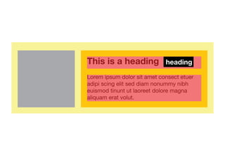
- 66. Boxes? You may have noticed that there were also a series of smaller boxes, each with an image to the left or right.
- 68. Core purpose 1. contain content 2. feature object to left or right 3. content beside feature object 4. margin below
- 69. Adaptable box We need to create an adaptable box: - could be placed anywhere - any width or height - any feature content - feature content could be left/right - any content inside the body
- 70. Target We need to be able to target - the overall box - the object (left or right) - the body content within the box - a possible heading (h1-h6) - possibly even the contents itself
- 71. box box body This is a heading heading box box feature Lorem ipsum dolor sit amet consect etuer adipi scing elit sed diam nonummy nibh box content euismod tinunt ut laoreet dolore magna aliquam erat volut.
- 72. There are a range of possible class we could use here. .box { } .box-feature { } .box-feature-alt { } .box-body { } .box-heading { } .box-content { }
- 73. Width Do not give the box a width - allow it to spread to fit the width of any parent container.
- 74. Contain floats This box module must contain (and therefore wrap around) either a left or right floating object. We can solve this by triggering the block formatting context on the parent.
- 75. .box { ! overflow: hidden; Triggers block formatting ! zoom: 1; ! _overflow: visible; ! margin-bottom: 1em; }
- 76. Location Agnostic The box must work when placed anywhere within the layout. The box must be “location agnostic”. aside .box { } .box { }
- 77. Sit beside The box may contain objects that have varying widths. We need our content box (“box-body”) to sit beside these objects, regardless of their widths.
- 78. BFC again We can solve this by triggering the block formatting context on the “box-body” class.
- 79. box-body This is a heading Lorem ipsum dolor sit amet consect etuer adipi scing elit sed diam nonummy nibh euismod tinunt ut laoreet dolore magna aliquam erat volut.
- 80. .box-body { ! overflow: hidden; Triggers block formatting ! zoom: 1; ! _overflow: visible; }
- 81. The box module
- 82. Powerful box We have just made a very powerful box. Nicole Sullivan refers to this box as the “media” element.
- 83. .box,.box-body { ! overflow: hidden; ! zoom: 1; ! _overflow: visible; } .box { margin: 0 0 10px; } .box-feature { ! float: left; ! margin: 0 10px 0 0; } .box-feature-alt { ! float: right; ! margin: 0 0 0 10px; }
- 84. Primary module In this case, the “box” class is our primary module. There are no modifiers, but there are a range of sub-modules.
- 85. Sub-modules Sub-modules are other classes associated with the primary module. They do not alter or add directly to the primary module.
- 86. Types of class Primary module Sub-module Modifier .row-alt1 .row-alt1 .box .box-feature .box-body
- 87. Moving forward
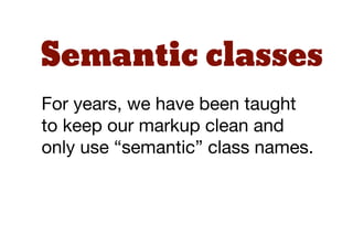
- 88. Semantic classes For years, we have been taught to keep our markup clean and only use “semantic” class names.
- 89. Break the rules? OOCSS seems to break both of these rules - and in a big way. But have we been thinking about “semantic” class names in the wrong way?
- 90. “ HTML class names offer no semantic value to search engines or screen readers, aside from microformats. ” http://www.brettjankord.com/2013/02/09/thoughts-on-semantic-html-class-names-and-maintainability/
- 91. “ Rather than concerning ourselves with creating semantic class names, I think we should be thinking about creating sensible class names. Sensible class names offer semantics, but they ” also offer flexibility/reusability. http://www.brettjankord.com/2013/02/09/thoughts-on-semantic-html-class-names-and-maintainability/
- 92. “ If your class is called “blue” and you want to change it to red, you have far bigger problems than class names to deal with! ” https://speakerdeck.com/andyhume/css-for-grown-ups-maturing-best-practises
- 93. Move forward In order to move forward, especially on large scale sites, we cannot keep using old practices.
- 94. Solution? OOCSS offers front end developers an alternative - light weight, modular CSS that can be re-used repeatedly across sites.
- 95. acss srmtecture css achi
- 96. What is SMACSS?
- 97. “ SMACSS is more style guide than rigid framework - an attempt to document a consistent approach to site development when using CSS. ” http://alistapart.com/article/frameworksfordesigners
- 98. In 2011, Jonathan Snook introduced a new way of looking at CSS architecture. He called this Scalable and Modular Architecture for CSS (SMACSS)
- 99. Categorization
- 100. Categories Base rules Layout rules Module (and sub-module) rules State rules Theme rules
- 101. Base Base rules are the defaults. They are almost exclusively single element selectors.
- 102. Layout Layout rules divide the page into sections. Layouts hold one or more modules together.
- 103. Modules Modules are the reusable, modular parts of our design. They are the callouts, the sidebar sections, the product lists and so on.
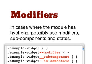
- 104. SMACSS allows for primary modules, modifiers and sub-modules, though they are labelled slightly differently.
- 105. Primary module Sub-module Modifier Sub-component Sub-module .row-alt1 .row-alt1 .box .box-feature .box-body
- 106. States State rules are ways to describe how our modules or layouts will look when in a particular state. Is it hidden or expanded?
- 107. Themes Theme rules describe how the layout or modules might look.
- 108. Naming Convention
- 109. Avoid IDs Use classes rather than IDs for styling purposes. Classes are more flexible. Using classes can reduce specificity issues.
- 110. Meaningful Class names should be meaningful for other authors, so that other developers can understand their purpose.
- 111. Pattern Class names should follow understandable patterns.
- 112. Prefixes Use “pseudo-namespaces” as prefixes - so that modules, modifiers and sub-modules can be identified.
- 113. Modifiers Possibly use different naming conventions for modifiers, sub-modules and states. .example-widget { } .example-widget--modifier { } .example-widget__sub-module { } .example-widget--is-somestate { }
- 114. Decouple HTML/CSS
- 115. “ I’ve noticed that designers traditionally write CSS that is deeply tied to the HTML that it is designed to style. How do we begin to decouple the two for more flexible development with ” less refactoring? http://coding.smashingmagazine.com/2012/04/20/decoupling-html-from-css/
- 116. Decouple So how do we “decouple” our HTML and CSS. 1. using additional class names 2. using child selectors
- 117. Example To see this in action, let’s look at the “box” example from earlier. What if we wanted to style the heading inside the “box-body”.
- 118. This is a heading heading Lorem ipsum dolor sit amet consect etuer adipi scing elit sed diam nonummy nibh euismod tinunt ut laoreet dolore magna aliquam erat volut.
- 119. Style the h2? We could style this heading using something like this: .box { } .box h2 { }
- 120. <div class="box"> ! <img class="box-feature" ! src="dummy-140.png" alt=""> ! <div class="box-body"> ! ! <h2>Heading</h2> ! ! </p>Lorem ipsum dolor</p> ! </div> </div>
- 121. Problem? The problem is that the CSS is “coupled” with the HTML. What happens if there is an <h3> element inside the box?
- 122. One solution would be to set all heading levels. .box { } .box h1 { } .box h2 { } .box h3 { } .box h4 { } .box h5 { } .box h6 { }
- 123. Use a class However, the safest way to “uncouple” the CSS and HTML would be to use a simple class.
- 124. <div class="box"> ! <img class="box-feature" ! src="dummy-140.png" alt=""> ! <div class="box-body"> ! ! <h2 class="box-heading"> ! ! ! Heading</h2> ! ! </p>Lorem ipsum dolor</p> ! </div> </div>
- 125. More flexible Now our HTML and CSS are more flexible. It doesn’t matter what heading level is used. .box { } .box-heading { }
- 126. a closer look at modules
- 127. Guidelines The following “module” guidelines apply regardless of whether you are coming from OOCSS or SMACSS.
- 128. Rule 1: keep modules simple
- 129. “ By making your base objects this simple your choices become boolean; you use the object or you don’t. The object is either entirely suitable as a basis, or entirely _un_suitable. ” http://csswizardry.com/2012/06/the-open-closed-principle-applied-to-css/
- 130. Keep ‘em simple The base module should be defined as simply as possible. This means that they are highly flexible.
- 131. Let’s use an example of our “row” class. What if we added some padding to this rule? .row { ! clear: left; ! overflow: hidden; ! padding: 20px 0; }
- 132. But what if we want a row that doesn’t have padding? The problem is that this rule is now very specifically defined. It is therefore not as flexible.
- 133. Rule 2: don’t undo styles
- 134. “ Any CSS that unsets styles (apart from in a reset) should start ringing alarm bells... Rulesets should only ever inherit and add to previous ones, never undo. ” http://csswizardry.com/2012/11/code-smells-in-css/
- 135. Don’t undo Leading on from the first rule, you should avoid writing rules to undo a previous module.
- 136. For example, what if you wanted almost all of your headings to have a border-bottom? h2 { ! font-size: 1.5em ! margin-bottom: 1em; ! padding-bottom: 1em; ! border-bottom: 1px solid red; }
- 137. But in some cases you might want a heading without a border-bottom.
- 138. You could write a new rule like this: .no-border { ! padding-bottom: 0; ! border-bottom: none; }
- 139. This is not ideal. It is much better to write sub-modules that add styles, rather than write sub- modules to undo styles.
- 140. So, a better way might be to write two rules like this:
- 141. /* default style */ h2 { ! font-size: 1.5em ! margin-bottom: 1em; } /* only when border needed */ .headline { ! padding-bottom: 1em; ! border-bottom: 1px solid red; }
- 142. Rule 3: extend but don’t modify
- 143. Don’t modify Base modules can be extended using sub-modules. However, the base module itself should never be modified.
- 144. This is based on the object oriented programming “open/ close principle”.
- 145. “ Software entities (classes, modules, functions, etc.) should be open for extension, but closed for modification. ” http://en.wikipedia.org/wiki/Open/closed_principle
- 146. If a based module needs to be modified to suit a specific case, it is probably better to create a new module.
- 147. Rule 4: think before adding new modules
- 148. Don’t rush It is always tempting to add a module based on your need at the time... as well as based on the needs of the system.
- 149. This often happens after the initial planning and build has been done. It’s easy to be tempted by “I’ll just drop this new class in at the bottom of my CSS”.
- 150. However, adding poorly structured new modules, without rigorous abstraction, will lead to bloated, hard-to-manage CSS.
- 151. ices coding pract
- 152. Comment conventions
- 153. DocBlock There is a growing trend to use the DocBlock as an overall comment convention. In fact, a movement around this type of commenting began over 6 years ago with the CSSdoc group
- 154. “ "A DocBlock is an extended C++- style PHP comment that begins with "/**" and has an "*" at the beginning of every line. DocBlocks precede the element they are documenting... ” http://en.wikipedia.org/wiki/PHPDoc
- 155. /** * Short desc * * Long description first sentence starts * and continues on this line for a while * finally concluding here at the end of * this paragraph * * The blank line above denotes a paragraph */
- 156. Formatting CSS rules
- 157. Single line? In the early days of CSS, a lot of developers preferred single line CSS rules as they could easily see the selectors.
- 158. Multi-line Today, with the complexity of individual rules, most developers seem to prefer either the multi-line format, or multi-line with indenting format.
- 159. CSS Tricks rule formatting poll Multi-line Format with Indenting 44% Multi-line Format 28% Single-line Format 11% Single-line Format with Indenting/Tabbing 5% Mostly Single-line Format 5% Single-line Format with Tabbing 4% Other 3% *CSS-tricks poll: http://css-tricks.com/different-ways-to-format-css/
- 160. .navigation_rss_icon { ! position: absolute; ! left: 940px; ! bottom: 0px; } #navigation_rss { ! position: absolute; ! left: 720px; ! font-family: Verdana, Arial, Helvetica, sans-serif; ! text-transform: uppercase; ! color: #897567; ! line-height: 2.5em; } #navigation_rss li { ! display: inline; } #navigation_rss li a:link, #navigation_rss li a:visited { ! color: #fffffe; ! text-decoration: none;
- 161. .navigation_rss_icon { position: absolute; left: 940px; bottom: 0px; } #navigation_rss { position: absolute; left: 720px; font-family: Verdana, Arial, Helvetica, sans-serif; text-transform: uppercase; color: #897567; line-height: 2.5em; } #navigation_rss li { display: inline; } #navigation_rss li a:link, #navigation_rss li a:visited { color: #fffffe; text-decoration: none;
- 162. Declaration order
- 163. Alphabet? Similarly, many developers used to prefer to sort their declarations alphabetically.
- 164. Group Today, most people prefer to group their declarations by type.
- 165. CSS Tricks declaration formatting poll Grouped by type 45% 45% Random - 39% 39% Alphabet - 14% 14% By line - 2% 2% *CSS-tricks poll: http://css-tricks.com/different-ways-to-format-css/
- 166. .selector { /* Positioning */ position: absolute; z-index: 10; top: 0; right: 0; /* Display & Box Model */ display: inline-block; overflow: hidden; box-sizing: border-box; width: 100px; height: 100px; padding: 10px; border: 10px solid #333; margin: 10px; /* Color */ background: #000; color: #fff /* Text */
- 167. Of course, many tools and pre- processors take care of this for you. If your tools do not have this capability, take a look at CSS Comb http://csscomb.com/
- 168. get busy!
- 169. Russ Weakley Max Design Site: maxdesign.com.au Twitter: twitter.com/russmaxdesign Slideshare: slideshare.net/maxdesign Linkedin: linkedin.com/in/russweakley