CSS3 Media Queries
86 likes23,398 views

Media queries allow CSS styles to be applied conditionally based on characteristics of the device viewing the content, like screen width. They provide a way to target specific devices and change layouts without changing the HTML. The document discusses the syntax of media queries, including using media types, features, expressions, and keywords. It provides examples of using media queries to load different style sheets or apply different CSS rules for different screen widths.


Ad
More Related Content
What's hot (20)
Viewers also liked (11)


Ad
Similar to CSS3 Media Queries (20)


Ad
More from Russ Weakley (20)


Recently uploaded (20)


CSS3 Media Queries
- 2. Why should you care about media queries?
- 3. Media queries are one of the most exciting aspects about CSS today.
- 4. Media queries will allow us to change our layouts to suit the exact need of different devices - without changing the content.
- 5. For example, we will be able to move away from “one-size-fits- all” solutions such as liquid, elastic and fixed width layouts.
- 6. Let’s take a standard 3 column 1000px wide layout…
- 8. Imagine if it could become a 2 column 800px wide if the user has a narrower browser window…
- 10. …or a single column 400px wide layout if the user has a mobile device or a very narrow browser window…
- 12. And all done with CSS alone - no JavaScript…
- 13. This is just one quick example of how media queries can help us deliver CSS in new and exciting ways
- 14. But… before we talk about media queries, we need to do a quick overview of media types.
- 15. So, what are media types?
- 16. CSS can be used to specify how a document is presented in different media.
- 17. There are ten media types defined in CSS 2.1
- 18. all suitable for all devices aural for speech synthesizers braille for Braille tactile feedback devices embossed for paged Braille printers handheld for handheld devices print for print material projection for projected presentations screen for color computer screens tty for teletypes and terminals tv for television type devices
- 19. There are five methods that can be used to specify media for style sheets.
- 20. Method 1: <link> within HTML
- 21. You can use a <link> element in the head of your HTML document to specify the target media of an external style sheet. <link rel="stylesheet" href="a.css" type="text/css" media=”screen" />
- 22. Method 2: <?xml stylesheet> within XML
- 23. You can use <?xml-stylesheet ?> in the head of your XML document to specify the target media of an external style sheet. <?xml-stylesheet media="screen" rel="stylesheet" href="example.css" ?>
- 24. Method 3: @import within HTML
- 25. You can use @import in the head if your HTML document to specify the target media of an external style sheet. <style type="text/css" media="screen"> @import "a.css";</style>
- 26. Warning: @import should be avoided as it can cause issues in some versions of Internet Explorer. http://www.stevesouders.com/blog/2009/04/09/dont-use-import/
- 27. Method 4: @import within CSS
- 28. You can specify the target medium within a CSS file using @import @import url("a.css") screen;
- 29. Media-types within @import rules are not supported by IE5, IE6 or IE7. The rule is ignored.
- 30. Method 5: @media within CSS
- 31. You can specify the target medium within a CSS file using @media @media screen { body { color: blue; } }
- 32. Why should we care about these five methods?
- 33. Because you can use these five methods to define not only media types, but media queries
- 35. Media queries are a CSS3 extension to media types that gives us more control over rendering across different devices. <link rel="stylesheet" type="text/css" href="a.css" media="screen and (color)">
- 36. A media query is a logical expression that is either true or false.
- 37. The CSS associated with the media query expression is only applied to the device if the expression is true.
- 38. Media query syntax
- 39. A media query generally consists of a media type and zero or more expressions. <link rel="stylesheet" type="text/css" href="a.css" media=”screen and (color)"> Media type Expression
- 40. An expression consists of zero or more keywords and a media feature. <link rel="stylesheet" type="text/css" href="a.css" media=”screen and (color)"> Keyword Media feature
- 41. Media features are placed within brackets. <link rel="stylesheet" type="text/css" href="a.css" media=”screen and (color)"> Media feature
- 42. A media feature can be used without a media type or keyword. The media type is assumed to be “all”. <link rel="stylesheet" type="text/css" href="a.css" media=”(color)"> Media feature
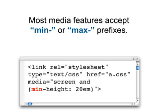
- 43. Most media features accept “min-” or “max-” prefixes. <link rel="stylesheet" type="text/css" href="a.css" media="screen and (min-height: 20em)">
- 44. Media features can often be used without a value. <link rel="stylesheet" type="text/css" href="a.css" media="screen and (color)">
- 45. Media features only accept single values: one keyword, one number, or a number with a unit identifier. Except aspect-ratio and device-aspect-ration which require two numbers (orientation: portrait) (min-width: 20em) (min-color: 2) (device-aspect-ratio: 16/9)
- 46. The full media feature list
- 47. Feature Value min/max aspect-ratio ratio (integer/integer) yes color integer yes color-index integer yes device-aspect-ratio ratio (integer/integer) yes device-height length yes device-width length yes grid integer no height length yes monochrome integer yes orientation keyword (portrait/landscape) no resolution resolution (dpi) yes scan keyword (progressive/interlace) no width length yes
- 48. A simple example
- 49. The CSS file in this example should be applied to screen devices that are capable of representing color. <link rel="stylesheet" type="text/css" href="a.css" media="screen and (color)">
- 50. This same media enquiry could be used with @import via HTML. <style type="text/css" media="screen and (color) "> @import "a.css";</style>
- 51. It could be used with @import via CSS. @import url("a.css") screen and (color);
- 52. Or using @media via CSS. @media screen and (color) { body { color: blue; } }
- 54. You can use multiple expressions in a media query if you join them with the “and” keyword.
- 55. The CSS file in this example will be applied by hand-held devices, but only if the viewport width is at > 20em and < 40em. <link rel="stylesheet" type="text/css" href="a.css" media="handheld and (min-width:20em) and (max-width:40em)">
- 56. Comma separated
- 57. You can also use multiple, comma-separated media queries. The comma acts like an “or” keyword.
- 58. The CSS file in this example will be applied to screen with color or handheld devices with color. <link rel="stylesheet" type="text/css" href="a.css" media="screen and (color), handheld and (color)">
- 59. Using the “not” keyword
- 60. You can use the not keyword in a media query if you want your CSS to be ignored by a specific device.
- 61. The CSS file in this example will be applied to all devices except those with color screens. <link rel="stylesheet" type="text/css" href="a.css" media="not screen and (color)">
- 62. Using the “only” expression
- 63. The CSS file in this example will be applied only to all devices with color screens. <link rel="stylesheet" type="text/css" href="a.css" media="only screen and (color)">
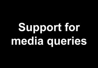
- 65. Browser support for media queries: IE8 no Firefox 3.6 yes Safari 4 yes Opera 10 yes Chrome 5 yes * Based on basic testing only
- 66. What do other browsers see?
- 67. Browsers that do not support media queries should still support the media type. <link rel="stylesheet" type="text/css" href="a.css" media="screen and (color)">
- 68. The “only” keyword is sometimes used to hide CSS from devices that do not support media queries, but may read the media type. <link rel="stylesheet" type="text/css" href="a.css" media="only screen and (color)">
- 69. Targeting the iPhone
- 70. The iPhone does not support handheld media type. Apple recommends targeting the iPhone using media queries.
- 71. This rule will be applied by the iPhone which has a maximum device width (screen width) of 480px. <link rel="stylesheet" type="text/css" href="a.css" media="only screen and (max-device-width: 480px)" >
- 72. Using media queries to control layouts
- 73. So, how could we use media queries to change a page layout so that it can appear wide, medium or narrow depending on the width of the screen?
- 74. Here is a quick step by step example
- 75. Step 1: Add a link to your style sheet <link rel="stylesheet" type="text/css" href=”master.css" media="screen" >
- 76. Step 2: Add your “wide page layout” CSS rules into your CSS file
- 77. Step 3: Add a @media rule with a media query @media screen and (max-width:999px) { /* add your rules here */ }
- 78. Step 4: Add your “medium page layout” CSS rules inside this @media rule.
- 79. Step 5: Add a second @media rule with a media query @media screen and (max-width:480px) { /* add your rules here */ }
- 80. Step 6: Add your “narrow page layout” CSS rules inside this new @media rule.
- 81. Your CSS file should be structured something like this: Wide page layout CSS rules @media screen and (max-width:999px) { Medium page layout CSS rules } @media screen and (max-width:480px) { Narrow page layout CSS rules }
- 82. A note on the CSS
- 83. Devices wider than 1000px will see the “wide page layout” CSS only.
- 84. Devices narrower than 1000px will see the “wide page layout” CSS AND the “medium page layout” CSS.
- 85. Devices narrower than 480px will see the “wide page layout”, “medium page layout” and “narrow page layout” CSS.
- 86. What does this mean?
- 87. This means that rules written inside each @media statements must override the previous rules.
- 88. A quick recap
- 89. I believe that as media queries become supported, we will see a radical change in the way we develop websites in the future.
- 90. Now is a good time to get your head around these powerful CSS3 expressions so that you are ready when the time comes!
- 91. We’re done