CSS3: Ripe and Ready
5 likes•31,689 views

The document discusses CSS3, its new features, modularity, and browser compatibility, emphasizing the need for developers to understand CSS3's rules and tools for effective web design. It highlights various CSS3 modules, color properties, and techniques for achieving cross-browser compatibility, including the use of vendor prefixes and tools like Modernizr. Additionally, it covers resources for learning and using CSS3 effectively in web development.


![Column gap & rule properties
• column-gap
• Column-rule-width
• Column-rule-style
• Column-rule-color
• Column-rule (shorthand)
– <column-rule-width> || <border-style> || [
<color> | transparent ]
163](https://image.slidesharecdn.com/presentationcss3ripereadyrwx-111201140136-phpapp02/85/CSS3-Ripe-and-Ready-163-320.jpg)


![CSS3 Selector Specification
• General sibling • Pseudo-elements*
E~F
*all pseudo-elements
indicated with :: in CSS3
• Attribute presence
– a[attribute="value"]
– a[attribute~="value"]
– a[attribute|="value"]
• Attribute substrings
– a[attribute^="value"]
– a[attribute$="value"]
– a[attribute*="value"]
190](https://image.slidesharecdn.com/presentationcss3ripereadyrwx-111201140136-phpapp02/85/CSS3-Ripe-and-Ready-190-320.jpg)


![Combinator Selectors: Attribute presence
selector[attribute="value"] targets a selector with a
particular attribute and specific value.
Example:
img[src=“catchathief.jpg”] {border:
1px solid #999; }
selector [attribute~="value"] targets a selector with
a particular attribute and value where the value is
one of multiple values separated by a space.
Example
img[alt~="CSI"] {border: 1px
#ff8000 solid;}
194](https://image.slidesharecdn.com/presentationcss3ripereadyrwx-111201140136-phpapp02/85/CSS3-Ripe-and-Ready-194-320.jpg)
![Combinator Selectors: Attribute presence
selector [attribute|="value"] targets an element
with an attribute that contains values separated
by a hypen in a list.
Example:
img[title|="large"] {border: 1px
solid #000; }
195](https://image.slidesharecdn.com/presentationcss3ripereadyrwx-111201140136-phpapp02/85/CSS3-Ripe-and-Ready-195-320.jpg)
![Combinator Selectors: Attribute substrings
selector [attribute^="value"] targets an element
with an attribute that begins with a prefix of
“value”.
Example:
img[title^=“th_"] { border: 1px
solid #000; }
selector [attribute$="value"] targets an element
with an attribute which ends with a suffix of
“value.”
Example:
img[title$=“png"] { border: 1px
196 solid #000; }](https://image.slidesharecdn.com/presentationcss3ripereadyrwx-111201140136-phpapp02/85/CSS3-Ripe-and-Ready-196-320.jpg)
![Combinator Selectors: Attribute substrings
selector [attribute*="value"] targets an element
with an attribute that contains “value” as any
part of a value string.
Example:
img[title*="large"] {border: 1px
solid #000; }
197](https://image.slidesharecdn.com/presentationcss3ripereadyrwx-111201140136-phpapp02/85/CSS3-Ripe-and-Ready-197-320.jpg)


![Pseudo-elements: State
The :enabled and :disabled pseudo-classes
allow developers to specify the
appearance of user interface elements
(form controls) that are enabled or
disabled, provided that the browser
allows styling of form controls.
Example:
input[type="text"]:enabled {
background:#ffc; }
input[type="text"]:disabled {
219
background:#ddd; }](https://image.slidesharecdn.com/presentationcss3ripereadyrwx-111201140136-phpapp02/85/CSS3-Ripe-and-Ready-219-320.jpg)


CSS3: Ripe and Ready
- 1. CSS3: Ripe & Ready! Denise Jacobs // 1 Rich Web Experience // December 1, 2011
- 2. Sweet Tweets Who I am: @denisejacobs This fine event: #rwx2011 @nofluff What I’m talkin’ ‘bout: #css3ripe 2
- 3. A little about me Denise R. Jacobs is an author, speaker, design thinker, and educator. She is the author of The CSS Detective Guide, and is a co-author for InterAct with Web Standards: A Holistic Approach to Web Design. She is a Consultant Web Design Trainer and Creativity Evangelist based in Miami, Florida. 3 CSSDetectiveGuide.com & InterActWithWebStandards.com
- 4. Ripe? 4
- 5. Ready? 5
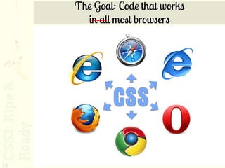
- 6. The goal 6
- 7. How??? 7
- 8. Start here… 1. Know Your CSS3 • Getting started • What’s new • Rules of the road • Helping tools and scripts • Properties • Standard effects • Advanced effects • Selectors 8
- 9. What’s New in CSS3 9
- 10. What’s New in CSS3? CSS3 is the third generation of the CSS specification recommendations from the W3C. In CSS3 there are new selectors, pseudo- elements and classes, properties, and values specifically created to answer the needs and solve the problems of modern web design and development. 10
- 11. CSS3 Modularity CSS3 has been broken up into different unique modules. This means is that, for example, the particular CSS properties and values for layout is grouped into one specific module. 11
- 12. CSS3 Modularity: Benefits • Browser producers can now implement CSS3 module by module • Speeds up the browser implementation process • Encourages innovation 12
- 13. The CSS3 Modules • Template Layout • Values and Units • Backgrounds and Borders • Web Fonts • Ruby • Behavioral Extensions to CSS • Basic User Interface • Line Layout • Basic Box Model • Flexible Box Layout • Grid Positioning • Image Values • Speech • 2D Transformations • Marquee • Multi-column Layout • Style Attribute Syntax • 3D Transformations • Cascading and Inheritance • Namespaces • Color • Transitions • Fonts • Animations • Text • View Module • Generated Content for Paged • Media Queries Media • Paged Media • Generated and Replaced • Selectors Content 13
- 14. Resources: New in CSS3 http://www.w3.org/TR/tr-groups-all# tr_Cascading_Style_Sheets__CSS__ Working_Group 14
- 15. Colors in CSS3: RGB • Regular RGB rgb(x, x, x): ex. rgb(255, 0, 0) • RBG with alpha-opacity rgba(x, x, x, y): An RGB value ex. rgba(255, 0, 0, 0.2) 15
- 16. RGBA Color Alpha opacity: 0.0 = 0% = no opacity 1.0 = 100% = full opacity 16
- 17. Colors in CSS3: HSL HSL stands for hue, saturation, and luminosity (lightness) • Regular HSL hsl(x%, x%, x%): ex. hsl(0, 100%, 50%) • HSL with alpha-opacity hsla(x%, x%, x%, y): ex. hsla(0, 100%, 50%, 0.5) 17
- 18. HSL Color Wheel 0º – Red 60º – Yellow 120º – Green 180º – Cyan 240º – Blue 300º – Magenta 18
- 19. HSL Color Picker Tool http://www.workwithcolor.com/hsl-color-picker-01.htm 19
- 20. Getting Started with CSS3: The Rules of the Road 20
- 21. CSS3 Browser Compatibility 21 http://www.flickr.com/photos/sfllaw/222795669/
- 22. The Scoop • Many properties are browser-specific, requiring vendor prefixes • Plus there is a standard property • There are syntax differences between browser-specific properties and the standard property • All of this causes an increase in the amount of CSS 22
- 23. Code bloat in action Ideally: Reality: a.polaroid:active { a.polaroid:active { z-index: 999; z-index: 999; border-color: #6A6A6A; border-color: #6A6A6A; box-shadow: 15px 15px 20px -webkit-box-shadow: 15px rgba(0,0, 0, 0.4); 15px 20px rgba(0,0, 0, transform: rotate(0deg) 0.4); scale(1.05); -moz-box-shadow: 15px 15px } 20px rgba(0,0, 0, 0.4); box-shadow: 15px 15px 20px rgba(0,0, 0, 0.4); -webkit-transform: rotate(0deg) scale(1.05); -moz-transform: rotate(0deg) scale(1.05); transform: rotate(0deg) scale(1.05); } 23
- 24. None of the older IEs support CSS3 …as in “not any.” 6 7 8 24 http://www.flickr.com/photos/johnsnape/4258191545/
- 26. IE9 now supports CSS3 …But still not as fully as the other browsers yet. 26
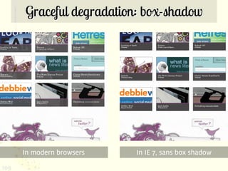
- 27. Resources: IE9 CSS3 support http://msdn.microsoft.com/en- us/ie/ff468705.aspx#_Web_standards_sup port http://msdn.microsoft.com/en- us/library/cc351024%28v=vs.85%29.aspx http://www.impressivewebs.com/css3- support-ie9/ 27
- 28. Tools you’ll need: 1. CSS3 Property browser support charts 2. CSS3 Selector browser support charts 3. CSS3 Specifications 4. All browsers to test in and/or cross-browser testers 28
- 29. CSS3 Property browser support charts http://www.findmebyip.com/ litmus 29
- 30. CSS3 Selector browser support charts http://www.standardista.com/css3/ css3-selector-browser-support 30
- 31. The CSS3 Specifications The CSS3 Specifications are THE resource for finding out exactly is the intented behavior and use of any given property. http://www.w3.org/standards/techs/ css#w3c_all 31
- 32. Cross-browser testers http://tredosoft.com/Multiple_IE http://crossbrowsertesting.com/ (paid) http://browsershots.org/ (free) 32
- 33. CSS3 & Cross- browser Coding 33 http://www.flickr.com/photos/scfiasco/4490322916/
- 34. The Goal: Code that works in all most browsers 34
- 35. Not all browsers are created equal 35
- 36. How can we achieve compatibility? 36 http://www.flickr.com/photos/barretthall/205175534/
- 37. Steps to get as close as possible 1. Leverage source order 2. Filter it 3. Let tools do all of the work 37
- 38. Leverage source order • Place default properties first • Place browser-specific properties ahead of standard properties • The standard properties will override the vendor’s when the standard is established. 38
- 39. A Proper Stack .gradient { color: #fff; 39
- 40. A Proper Stack .gradient { color: #fff; background: #aaaaaa url(gradient_slice.jpg) 0 0 x-repeat; /*fallback background color & image*/ 40
- 41. A Proper Stack .gradient { color: #fff; background: #aaaaaa url(gradient_slice.jpg) 0 0 x-repeat; /*fallback background color & image*/ background-image: -moz-linear-gradient(top, #07407c, #aaaaaa); /* gradient for Mozilla */ 41
- 42. A Proper Stack .gradient { color: #fff; background: #aaaaaa url(gradient_slice.jpg) 0 0 x-repeat; /*fallback background color & image*/ background-image: -moz-linear-gradient(top, #07407c, #aaaaaa); /* gradient for Mozilla */ background-image: -webkit-gradient(linear,left top,left bottom,color-stop(0, #07407c),color- stop(1, #aaaaaa)); /* gradient for the Webkits */ 42
- 43. A Proper Stack .gradient { color: #fff; background: #aaaaaa url(gradient_slice.jpg) 0 0 x-repeat; /*fallback background color & image*/ background-image: -moz-linear-gradient(top, #07407c, #aaaaaa); /* gradient for Mozilla */ background-image: -webkit-gradient(linear,left top,left bottom,color-stop(0, #07407c),color- stop(1, #aaaaaa)); /* gradient for the Webkits */ -ms-filter: "progid:DXImageTransform.Microsoft.gradient(sta rtColorStr='#07407c', EndColorStr='#aaaaaa')"; /* filter for IE8 (& IE9) */ 43
- 44. A Proper Stack .gradient { color: #fff; background: #aaaaaa url(gradient_slice.jpg) 0 0 x-repeat; /*fallback background color & image*/ background-image: -moz-linear-gradient(top, #07407c, #aaaaaa); /* gradient for Mozilla */ background-image: -webkit-gradient(linear,left top,left bottom,color-stop(0, #07407c),color- stop(1, #aaaaaa)); /* gradient for the Webkits */ -ms-filter: "progid:DXImageTransform.Microsoft.gradient(sta rtColorStr='#07407c', EndColorStr='#aaaaaa')"; /* filter for IE8 (& IE9) */ filter: progid:DXImageTransform.Microsoft.gradient(star tColorStr='#07407c', EndColorStr='#aaaaaa'); } /* filter for IE7 and lower */ 44
- 45. Apply a Filter • If you must have the effect in IE lt 8, such as alpha opacity, gradient, shadow, transitions etc. you could use a proprietary IE filter. • The -ms-filter attribute is an extension to CSS. This syntax will allow other CSS parsers to skip the value of this unknown property completely and safely. It also avoids future name clashes with other CSS parsers. • In IE 8 mode, filters must be prefixed with "-ms-" and the PROGID must be in single or double quotes to make sure IE 8 renders the filters properly. 45
- 46. Filters: {Caveat Coder} • IE filters work, but are essentially hacks – IE filters are proprietary and thus not part of any standard specification, and never will be 46
- 47. Resources: IE Filters Microsoft Visual Filters and Transitions Reference http://msdn.microsoft.com/en-us/library/ ms532853%28v=VS.85%29.aspx 47
- 48. Let the tools do the work • We’ll talk about those next! 48
- 49. CSS3 Tools 49 http://www.flickr.com/photos/johnsnape/4258191545/
- 50. Useful CSS3 Tools 1. CSS3 Generators 2. Helper Scripts 3. Browser Feature Detection 4. Templates 50
- 51. CSS3 Generators 51 http://www.flickr.com/photos/latca/841730130/
- 54. CSS3Maker.com 54
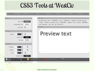
- 55. CSS3 Tools at WestCiv 55 http://westciv.com/tools/
- 56. More CSS3 Generators http://border-radius.com http://www.colorzilla.com/ gradient-editor/ http://csscorners.com http://border-image.com 56
- 57. Helper Scripts 57 http://www.flickr.com/photos/keystricken/386106987/
- 58. Get a helping hand… These scripts help IE lt 8 behave like CSS3- compliant browsers. However, support of CSS3 properties varies between scripts. 58
- 59. ie-7.js (includes IE8 and IE9) 59 http://code.google.com/p/ie7-js/
- 60. CSS3Pie.com 60
- 61. CSS Sandpaper 61 http://www.useragentman.com/blog/csssandpaper-a-css3-javascript-library/
- 62. Browser Feature Detection 62 http://www.flickr.com/photos/johnsnape/4258191545/
- 63. Modernizr.com 63
- 64. What does Modernizr do? Modernizr detects which CSS3 (and HTML5) properties are supported by the browser, and appends classes to the <html> tag, which then allows you to create styles to target specific properties to individual browsers. It is a premier progressive enhancement tool! 64
- 65. How to use Modernizr http://www.alistapart.com/articles/taking- advantage-of-html5-and-css3-with- modernizr/ http://webdesignernotebook.com/css/ how-to-use-modernizr http://www.ericlightbody.com/2010/ modernizr-your-tool-for-html5-and-css3- functionality/ 65
- 66. Templates 66 http://www.flickr.com/photos/jazzmasterson/275796175/
- 67. HTML5Boilerplate.com Paul Irish’s HTML5 template file http://html5boilerplate.com/ 67
- 69. Webfonts 69
- 70. @font-face 70 http://lostworldsfairs.com/moon/
- 71. @font-face • Note: – Actually part of the CSS2.1 specification. – Therefore, the IEs do support it! • Tips & issues – When you decide to use a font as a webfont, you have to be sure that the EULA supports it. – One way to avoid that is to use ONLY fonts that are listed as approved webfonts. • Browser Support – IE lt 8 require fonts to be in EOT format – IE9 now supports WOFF 71
- 72. @font-face bug: IE lt 8 @font-face super bullet-proofing The problem: @font-face doesn’t work, even with the proper normal syntax. What gives? 72
- 73. @font-face bug: Webkit @font-face bold and italics “bug” The problem: Applying font-weight:bold or font- style: italic to @font-face'd text doesn’t work. 73
- 74. Solution: IE proof @font-face + faux variations Example: @font-face { font-family: 'MyFontFamily'; src: url('myfont-webfont.eot?#iefix‘) format('embedded-opentype'), url('myfont-webfont.woff') format('woff'), url('myfont- webfont.ttf')format('truetype'), url('myfont-webfont.svg#svgFontName') format('svg'); font-weight:normal; font-style:normal; font-variant:normal; } 74
- 75. Graceful degradation: @font-face • Desired font should display in all browsers. If not, fallback fonts will display • Extra credit: image replacement through conditional comments 75
- 76. Graceful degradation: @font-face In modern browsers In IE 8: fallback font 76
- 77. FontSquirrel.com 77 http://www.fontsquirrel.com/fontface/generator
- 78. Webfont Services Instead of generating the webfonts yourself, you can pay a service where the webfonts are hosted elsewhere, and you link to them and use the fonts on their server. 78
- 79. Webfont Services 79 http://www.typekit.com
- 80. Webfont Services http://www.typotheque http://www.webtype.com .com/webfonts http://www.fontslive.com http://typekit.com http://www.extensis.com/en http://fontdeck.com /WebINK/ http://kernest.com http://webfonts.fonts.com http://www.ascenderfonts http://webfonts.info/wiki/in .com/webfonts/ dex.php?title=Category:W ebfont_Services 80
- 81. Google Font Directory http://code.google.com/webfonts 81
- 82. Google Font API Method 1: Head Link <link href='http://fonts.googleapis.com/css?f amily=IM+Fell+DW+Pica' rel='stylesheet' type='text/css'> #headline h1 { text-align: center; font-size: 8em; color: #111; text-shadow: 0px 2px 3px #555; font-family: 'IM Fell DW Pica', arial, serif; } That’s it! Just two copy and paste actions and you’ve got 82 yourself a fancy new webfont.
- 83. Google Font API Method 2: @Import @import url(http://fonts.googleapis.com/cs s?family=Inconsolata); Simply paste this into the very top of your CSS page, then copy the font-family CSS snippet and paste. 83
- 84. Resources: @font-face • http://www.delicious.com/denisejacobs/ font-face 84
- 85. @font-face Resources • http://www.fontsquirrel.com/ • http://code.google.com/apis/webfonts/doc s/getting_started.html 85
- 86. New Visual Effects in CSS3 86
- 87. New Visual Effects in CSS3 • border-radius • rgba color • box-shadow • text-shadow • gradient 87
- 88. border-radius 88 http://oh-hai.biz
- 90. border-radius • Tips & issues – Different syntax for mozilla, webkit, and opera browsers • Browser Support – IE lt 8 does not support, IE9 does 90
- 91. border-radius Syntax comparison breakdown: • -moz allows multiple values for each position • -webkit individual values 91 • Standard is like mozilla
- 92. border-radius #contentcolumn { -moz-border-radius: 20px 20px 0 0; -webkit-border-top-left-radius: 20px; -webkit-border-top-right-radius: 20px; border-radius: 20px 20px 0 0; } 92
- 93. Graceful Degradation: border-radius • Square corners are okay • Extra credit: serve images through conditional comments 93
- 94. Graceful Degradation: border-radius In modern browsers In IE 7, image replacement through conditional comments 94
- 95. Graceful Degradation: border-radius In modern browsers In IE 6, no image replacement 95
- 97. border-radius Resources http://www.delicious.com/denisejacobs/ border-radius 97
- 98. rgba 98 http://aarronwalter.com/designer/
- 99. rgba • Tips & issues – More granular control of the color opacity of a particular element • Browser Support – IE lt 8 does not support, IE9 does – There is an IE filter that will give transparency with a color. 99
- 100. Cross-browser: rgba • Place after regular rgb color property to override in modern browsers; older browsers will ignore it • IE lt 8 bug: use the property background instead of background-color for the regular color 100
- 101. Graceful degradation: rgba In modern browsers In IE 7, no rgba 101
- 102. Full solution: rgba .rgba { background-color: #ff0000; /* fallback color in hexidecimal. */ background-color: transparent; /* transparent is key for the filter to work in IE8. best done through conditional comments */ background-color: rgba(255, 0, 0, 0.3); -ms-filter: "progid:DXImageTransform.Microsoft.gradient (startColorstr=#4CFF0000, endColorstr=#4CFF0000)"; /* filter for IE8 */ filter: progid:DXImageTransform.Microsoft.gradient( startColorstr=#4CFF0000, endColorstr=#4CFF0000); /* filter for older IEs */ } 102
- 103. Inspiration: rgba • http://aarronwalter.com/2010/11/01/color- mixing-with-rgba/ 103
- 104. box-shadow 104 http://badassideas.com/work/
- 105. box-shadow • Tips & issues – Different syntax for mozilla, webkit, and opera browsers • Browser Support – IE lt 8 does not support, IE9 does – There is a filter for IE: shadow (actually there are 2: shadow and dropshadow, but shadow is said to be better) 105
- 106. box-shadow .portfolio { -moz-box-shadow: 0 5px 20px rgba(0,0,0,0.6); -webkit-box-shadow: 0 5px 20px rgba(0,0,0,0.6); box-shadow: 0 5px 20px rgba(0,0,0,0.6); } 106
- 107. Full solution: box-shadow .boxshadow { -moz-box-shadow: 3px 3px 10px #333; -webkit-box-shadow: 3px 3px 10px #333; box-shadow: 3px 3px 10px #333; /*standard*/ -ms-filter: "progid:DXImageTransform.Microsoft.Shad ow(Strength=4, Direction=135, Color='#333333')"; /* For IE 8 */ filter: progid:DXImageTransform.Microsoft.Shado w(Strength=4, Direction=135, Color='#333333'); /* For IE 5.5 - 7 */ } 107
- 108. Graceful degradation: box-shadow • Okay if users don’t see effect, doesn’t affect usability of the page. • However, there is a filter for IE: shadow (actually there are 2: dropshadow as well, but shadow is said to be better) • Extra credit: serve images through conditional comments if you didn’t want to use the filter. 108
- 109. Graceful degradation: box-shadow In modern browsers In IE 7, sans box shadow 109
- 110. Inspiration: box-shadow 110 http://nicolasgallagher.com/css-drop-shadows-without-images/demo/
- 111. Resources: box-shadow http://www.delicious.com/denisejacobs/ box-shadow 111
- 112. text-shadow 112 http://www.bountybev.com
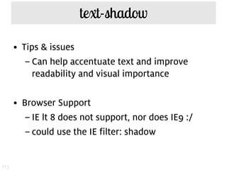
- 113. text-shadow • Tips & issues – Can help accentuate text and improve readability and visual importance • Browser Support – IE lt 8 does not support, nor does IE9 :/ – could use the IE filter: shadow 113
- 114. Graceful degradation: text-shadow • If it doesn’t show up, that’s okay • No impact on accessibility • However, there is an IE filter: shadow. • Extra credit: image replacement 114
- 115. Graceful degradation: text-shadow In modern browsers In IE 7 without text shadow 115
- 116. Full solution: text-shadow .textshadow h2 { text-shadow:1px 1px 2px rgba(48,80,82,0.8); -ms-filter: "progid:DXImageTransform.Microsoft.Shad ow(Strength=2, Direction=135, Color='#305052')"; /* For IE 8+ */ filter: progid:DXImageTransform.Microsoft.Shado w(Strength=2, Direction=135, Color='#305052'); /* For IE 5.5 - 7 */ } 116
- 117. Inspiration: text shadow 117 http://www.midwinter-dg.com/blog_demos/css-text-shadows/
- 118. Inspiration: text shadow 118 http://desandro.com/articles/the-new-lens-flare/
- 119. Resources: text-shadow http://www.delicious.com/denisejacobs/ text-shadow 119
- 120. gradient 120 http://raymondjay.com/
- 121. Old skool: Gradient background 121
- 122. gradient • Tips & issues – Very different syntax for mozilla and webkit browsers previously – Newer syntax for current and future browsers • Browser Support – IE does not support, so will still need a fallback image for those browsers 122
- 123. gradient #mainnav li a { background-color: #f7f6f4; background-image: url(bg_navitems.gif); background-image: -moz-linear-gradient(100% 100% 90deg, #ccc9ba, #ffffff); background-image: -webkit-gradient(linear, 0% 0%, 0% 100%, from(#ffffff), to(#ccc9ba)); } 123
- 124. Graceful degradation: gradient • Gradient will not appear older browsers • Establish fallback background image first in code 124
- 125. Graceful degradation: gradient In modern browsers In IE, with fallback image; conditional comment for rounded corners 125
- 126. gradient: Full solution .gradient { color: #fff; background: #aaaaaa url(gradient_slice.jpg) 0 0 x-repeat; /*background color matches one of the stop colors. The gradient_slice.jpg is 1px wide */ background-image: -moz-linear-gradient(top, #07407c, #aaaaaa); background-image: -webkit-gradient(linear,left top,left bottom,color-stop(0, #07407c),color- stop(1, #aaaaaa)); -ms-filter: "progid:DXImageTransform.Microsoft.gradient(sta rtColorStr='#07407c', EndColorStr='#aaaaaa')"; /* IE8+ */ filter: progid:DXImageTransform.Microsoft.gradient(star tColorStr='#07407c', EndColorStr='#aaaaaa'); /* IE7- */ } 126
- 127. Inspiration: gradients 127 http://leaverou.me/css3patterns/
- 128. Inspiration: gradients http://leaverou.me/2011/03/beveled-corners-negative-border-radius-with-css3-gradients/ 128
- 129. Colorzilla gradient tool 129 http://www.colorzilla.com/gradient-editor/
- 130. Tools: gradient http://www.colorzilla.com/gradient-editor/ http://www.westciv.com/tools/gradients/ http://css3please.com http://css3generator.com 130
- 131. Resources: gradient http://www.delicious.com/denisejacobs/ gradient 131
- 132. Advanced Visual Effects in CSS3 132
- 133. CSS3 for Advanced Visual Presentation 1. border-image 2. multiple background images 3. background-size 4. multiple text columns 133
- 134. border-image 134 http://www.spoongraphics.com/blog/
- 135. border-image Borders can now be created using images and sections thereof for enhanced visual design. • Tips & issues – Documentation on best use is sparse – No adequate fall-back techniques for graceful degradation – Vendor prefixes for Mozilla and webkit • Browser support 135 – The IEs do not support
- 136. border-image div.note div.border { -moz-border-image: url(/https/www.slideshare.net/playground/awesome-overlays/border- image.png) 5 5 5 5 stretch; -webkit-border-image: url(/https/www.slideshare.net/playground/awesome-overlays/border- image.png) 5 5 5 5 stretch; border-image: url(/https/www.slideshare.net/playground/awesome- overlays/border-image.png) 5 5 5 5 stretch; } 136
- 137. Border-image.com 137
- 138. Resources: border-image http://www.delicious.com/denisejacobs/ border-image 138
- 139. Multiple backgrounds 139 http://www.lostworldsfairs.com
- 140. Multiple backgrounds • Tips & issues: – The backgrounds are shown according to the order listed, with the first background image listed is the one “on top” and the rest stack underneath it. – Can use CSS3 gradients (which are like background images) in conjunction with multiple background images. • Browser support: – IE lt 8 does not support, but IE9 does 140
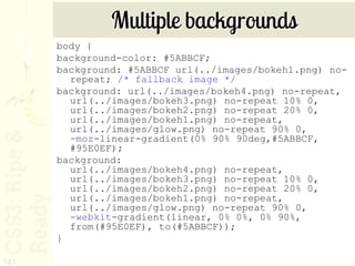
- 141. Multiple backgrounds body { background-color: #5ABBCF; background: #5ABBCF url(../images/bokeh1.png) no- repeat; /* fallback image */ background: url(../images/bokeh4.png) no-repeat, url(../images/bokeh3.png) no-repeat 10% 0, url(../images/bokeh2.png) no-repeat 20% 0, url(../images/bokeh1.png) no-repeat, url(../images/glow.png) no-repeat 90% 0, -moz-linear-gradient(0% 90% 90deg,#5ABBCF, #95E0EF); background: url(../images/bokeh4.png) no-repeat, url(../images/bokeh3.png) no-repeat 10% 0, url(../images/bokeh2.png) no-repeat 20% 0, url(../images/bokeh1.png) no-repeat, url(../images/glow.png) no-repeat 90% 0, -webkit-gradient(linear, 0% 0%, 0% 90%, from(#95E0EF), to(#5ABBCF)); } 141
- 142. Resources: multiple backgrounds http://www.delicious.com/denisejacobs/ multiplebackgrounds 142
- 143. background-size 143 http://www.alistapart.com/articles/supersize-that-background-please/
- 144. background-size You can set the size of a background image and make sure it covers the entire background of a page, no matter what the size. • Tips & Issues: – Vendor prefixes for mozilla, webkit, and opera • Browser support: – IE lt 8 does not support, but IE9 does 144
- 145. background-size values contain • Scales the image, while preserving its intrinsic aspect ratio (if any), to the largest size such that both its width and its height can fit inside the background positioning area. Contain always fits the entire image within your viewport, leaving opaque borders on either the top-bottom or the left-right whenever the ratio of the background image and browser window are not the 145
- 146. background-size values cover • Scales the image, while preserving its intrinsic aspect ratio (if any), to the smallest size such that both its width and its height can completely cover the background positioning area. Cover always fills the browser window. You can control how your image is aligned within the viewport by using the background-position property. 146
- 147. background-size Example: body { background: #000 url(myBackground_1280x960.jpg) center center fixed no-repeat; -moz-background-size: cover; -webkit-background-size: cover; -o-background-size: cover; background-size: cover; } 147
- 148. Inspiration: background-size 148 Launchrock.com
- 149. Resources: background-size • http://www.delicious.com/denisejacobs/ backgroundsize • http://www.alistapart.com/articles/ supersize-that-background-please/ • http://www.w3.org/TR/css3- background/#the-background-size 149
- 150. masks 150 http://webkit.org/blog/181/css-masks/
- 151. masks • Masks allow you to overlay the content of a box with a pattern that can be used to knock out portions of that box in the final display. • Masks work ONLY in Webkit browsers. • You can use other images, gradients, and 151
- 152. mask types New mask properties: -webkit-mask (background) -webkit-mask-attachment (background-attachment) -webkit-mask-clip (background- clip) -webkit-mask-origin (background- origin) -webkit-mask-image (background- image) -webkit-mask-repeat (background- repeat) -webkit-mask-composite (background-composite) -webkit-mask-box-image (border- image) 152
- 153. masks Example code: Using an image <img src="kate.png" style="-webkit- mask-box-image: url(mask.png) 75 stretch;"> Using a gradient <img src="kate.png" style="-webkit- mask-image: -webkit- gradient(linear, left top, left bottom, from(rgba(0,0,0,1)), to(rgba(0,0,0,0)))"> 153
- 154. Resources: masks http://www.delicious.com/denisejacobs/mas ks 154
- 155. box-reflect 155 http://lab.simurai.com/css/umbrui/
- 156. box-reflect • A reflection is a replica of the original object with its own specific transform and mask. • Reflections will update automatically as the source changes. If you hover over links, you’ll see the hover effect happen in the reflection. • The reflection will have no effect on layout (other than being part of a container’s 156 overflow)
- 157. box-reflect: syntax Syntax: -webkit-box-reflect: <direction> <offset> <mask-box-image> <direction> can be one of above, below, left or right. <offset> is a length or percentage that specifies the distance of the reflection from the edge of the original border box (using the direction specified). It can be omitted, in which case it defaults to 0. <mask-box-image> is a mask-box-image that can be used to overlay the reflection. If omitted, the reflection has no mask. 157
- 158. box-reflect Example: <img src="bubbles.jpg" style="border:5px solid white; -webkit-box-reflect:below 5px; -webkit-gradient(linear, left top, left bottom, from(transparent), color-stop(0.5, transparent), to(white));"> 158
- 159. Resources: box-reflect http://www.delicious.com/denisejacobs/box- reflect 159
- 160. Multiple text columns 160 http://www.yaili.com
- 161. Multiple text columns You can have one div containing a number of paragraphs which can be displayed in columns, with no float or height manipulations. • Tips & Issues: – Some of the properties are not widely supported, and many of the related (like dividers, breakers, etc.) haven’t been implemented or aren’t supported yet either. 161
- 162. Multiple column properties • Column-number • Column-width • Columns (shorthand) – <‘column-width’> || <‘column-count’> 162
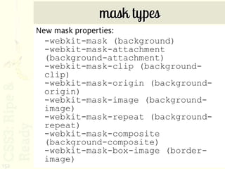
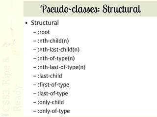
- 163. Column gap & rule properties • column-gap • Column-rule-width • Column-rule-style • Column-rule-color • Column-rule (shorthand) – <column-rule-width> || <border-style> || [ <color> | transparent ] 163
- 164. Column span • Can span multiple columns 164
- 165. Multiple text columns Example: div.three-col { -webkit-column-count: 3; -webkit-column-gap: 15px; -moz-column-count: 3; -moz-column-gap: 15px; column-count: 3; column-gap: 15px; } 165
- 166. Resources: multiple columns http://www.delicious.com/denisejacobs/ multiplecolumns 166
- 167. 2d Transformations with CSS3 167
- 168. transform (2d) 168 http://www.zurb.com/playground/css3-polaroids/
- 169. transform • Tips & issues – Mozilla, Webkit, and Opera vendor prefixes; no standard yet. • Browser Support – IE lt 8 does not support, but IE9 does 169
- 170. 2D Transformations Different kinds of transforms: • rotate • scale • skew • translate • matrix 170
- 171. Transform: graceful degradation • Leave images/elements in standard orientation or shape • There is an IE filter: matrix. • Extra credit: serve images or image sprites with conditional comments 171
- 172. Transform: graceful degradation In modern browsers In IE 7 without transform 172
- 173. transform/rotate: full solution .rotate { -moz-transform: rotate(-5deg); -webkit-transform: rotate(-5deg); -o-transform: rotate(-5deg); transform: rotate(-5deg); filter: progid:DXImageTransform.Microsoft.Matrix(sizing Method='auto expand', M11=0.9961946980917455, M12=0.08715574274765817, M21=- 0.08715574274765817, M22=0.9961946980917455); -ms-filter: "progid:DXImageTransform.Microsoft.Matrix(M11=0 .9961946980917455, M12=0.08715574274765817, M21=-0.08715574274765817, M22=0.9961946980917455, sizingMethod='auto expand')"; zoom: 1; } 173
- 174. transform: multiple You can apply multiple transform properties to one element. Example: .enlargen:hover { -webkit-transform: translate(-50%, -50%) scale(2) rotate(0); -moz-transform: translate(-50%, -50%) scale(2) rotate(0); -o-transform: translate(-50%, -50%) scale(2) rotate(0); transform: translate(-50%, -50%) scale(2) rotate(0); } 174
- 175. Resources: 2D transforms http://www.delicious.com/denisejacobs/ transform 175
- 176. Animation with CSS3 176
- 177. Animation 1. transitions 2. animation (the webkits only) A Tip: Be subtle – it’s more effective 177
- 179. transition 179 http://timvandamme.com/
- 180. transition You can create subtle transitions between hover states on elements. The transitions smooth out visual jumps. • Tips & issues – Be sure to put the transition effect on the correct element 180
- 181. transition Example: #id_of_element { -webkit-transition: all 1s ease-in-out; -moz-transition: all 1s ease-in-out; -o-transition: all 1s ease-in-out; transition: all 1s ease-in-out; } 181
- 182. Animation 182 http://www.css3exp.com/moon/
- 183. Animation You can create subtle animations in the browser! • Tips & issues: – Plan out the animation sequence ahead of time – Be aware of style order in the CSS 183
- 184. Animation div { animation-name: diagonal-slide; animation-duration: 5s; animation-iteration-count: 10; } @keyframes diagonal-slide { from { left: 0; top: 0; } to { left: 100px; top: 100px; } } 184
- 185. Resources: Animation http://www.delicious.com/denisejacobs/ animation 185
- 186. CSS3 Selectors 186 http://www.flickr.com/photos/jamiecampbell/446301597/
- 187. CSS3 Selectors Advanced selectors give us the power to target elements that are not part of the document tree and/or those that are generated dynamically. • Tips & issues – There are a lot of options to choose from! – Great to use for progressive enhancement – Need to be aware of changes to specificity 187
- 189. The Hierarchy “Family Tree” • An ancestor is any element that is connected to other elements but is higher up the document tree, no matter how many levels up. For example, in the document above, both the <html> and <body> tags are ancestors of the <p> tag. • A descendant is any element connected to an ancestor, but lower in the document tree, no matter how many levels down. In our example, the <em>, <a>, and <img> are descendants of the <body> tag. • A parent is an element directly above a connected element in the document tree. A parent element is also an ancestor, but an element can have ancestors that are not its parents. • A child element is directly below a connected element. A child is a descendant, but an element can have descendants that are not its children. • Sibling elements share the same parent, and are on the same level as each other in the hierarchy. 189
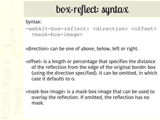
- 190. CSS3 Selector Specification • General sibling • Pseudo-elements* E~F *all pseudo-elements indicated with :: in CSS3 • Attribute presence – a[attribute="value"] – a[attribute~="value"] – a[attribute|="value"] • Attribute substrings – a[attribute^="value"] – a[attribute$="value"] – a[attribute*="value"] 190
- 191. CSS3 Selectors • Pseudo-classes – Structural – Target • :nth-child(n) • :target • :nth-last-child(n) • :nth-of-type(n) • :nth-last-of-type(n) – Negation • :last-child • :not(s) • :first-of-type • :last-of-type – State • :only-child • :enabled • :only-of-type • :disabled • :empty • :checked • :indeterminate 191
- 192. CSS3 Selector Support 192 http://www.findmebyip.com/litmus
- 193. Combinator Selectors: General Sibling A general sibling selector (also known as adjacent) selects an element that shares the same parent as another element in the document tree. Syntax: sibling selector ~ sibling selector {property: value; } E ~ F Example: p ~ dd {font-family: Georgia, 193 serif;}
- 194. Combinator Selectors: Attribute presence selector[attribute="value"] targets a selector with a particular attribute and specific value. Example: img[src=“catchathief.jpg”] {border: 1px solid #999; } selector [attribute~="value"] targets a selector with a particular attribute and value where the value is one of multiple values separated by a space. Example img[alt~="CSI"] {border: 1px #ff8000 solid;} 194
- 195. Combinator Selectors: Attribute presence selector [attribute|="value"] targets an element with an attribute that contains values separated by a hypen in a list. Example: img[title|="large"] {border: 1px solid #000; } 195
- 196. Combinator Selectors: Attribute substrings selector [attribute^="value"] targets an element with an attribute that begins with a prefix of “value”. Example: img[title^=“th_"] { border: 1px solid #000; } selector [attribute$="value"] targets an element with an attribute which ends with a suffix of “value.” Example: img[title$=“png"] { border: 1px 196 solid #000; }
- 197. Combinator Selectors: Attribute substrings selector [attribute*="value"] targets an element with an attribute that contains “value” as any part of a value string. Example: img[title*="large"] {border: 1px solid #000; } 197
- 198. Lab Time Let’s apply the general sibling and attribute selectors to our page. Let’s see how we can make the page look exactly the same but with the new CSS3 selectors. 198
- 199. CSS3 Pseudo- classes 199
- 200. Pseudo-classes: Structural • Structural – :root – :nth-child(n) – :nth-last-child(n) – :nth-of-type(n) – :nth-last-of-type(n) – :last-child – :first-of-type – :last-of-type – :only-child – :only-of-type 200
- 201. Old skool: zebra striping 201
- 202. Nth child selector tester http://leaverou.me/demos/nth.html 202
- 203. The :nth-child() pseudo-class The :nth-child() pseudo-class targets an element that has a certain number of siblings before it in the document tree. This argument, which is placed within the parentheses, can be a number, a keyword, or a formula. A number x matches the x-th child. Example: • p:nth-child(3) { color:#f00; 203 }
- 204. The :nth-child() pseudo-class The keywords odd and even can be used to match child elements whose index is odd or even. The index of an element’s first child is 1, so this rule will match any p element that is the first, third, fifth, and so on, child of its parent element. Example: p:nth-child(odd) { color:#f00; } The formula an + b can be used to create more complex repeating patterns. In the formula, a represents a cycle size, n is a counter starting at 0, and b represents an offset value. All values are integers. Example: 204 p:nth-child(3n+1) { color:#f00; }
- 205. The :nth-last-child() pseudo-class The :nth-last-child() pseudo-class works just like the :nth-child() pseudo-class, except that it targets an element that has a certain number of siblings after it in the document tree. In other words, it starts counting from the last child instead of the first, and counts backwards. Example: tr:nth-last-child(2) { background:#ff0;} 205
- 206. The :nth-of-type() pseudo-class The :nth-of-type() pseudo-class works exactly like the :nth-child() pseudo-class, but only counts those elements that are of the same type as the element the rule is applied to. Example: p:nth-of-type(3) { background:#ff0;} 206
- 207. The :nth-last-of-type() pseudo-class The :nth-last-of-type() pseudo-class targets an element that has a certain number of siblings of the same element type after it in the document tree. Just like the :nth-last-child() pseudo-class, it starts counting from the last child instead of the first, and counts backwards. Example: p:nth-last-of- 207 type(2){background:#ff0;}
- 208. The :last-child pseudo-class The :last-child pseudo-class targets an element that is the last child of its parent element. It is the same as :nth-last-child(1). Example: p:last-child {background:#ff0;} 208
- 209. The :first-of-type pseudo-class The :first-of-type pseudo-class targets an element that is the first sibling of its type. it is the same as :nth-of-type(1). Example: p:first-of-type { background:#ff0;} 209
- 210. The :last-of-type pseudo-class The :last-of-type pseudo-class targets an element that is the last sibling of its type. it is the same as :nth-last-of-type(1). Example p:last-of- type{background:#ff0;} 210
- 211. The :only-of-type pseudo-class The :only-of-type pseudo-class targets an element whose parent element has no other children of the same element type. It is the same (but with a lower specificity) as :first-of-type :last-of-type or :nth-of- type(1):nth-last-of-type(1). Example: p:only-of- type{background:#ff0;} 211
- 212. The :only-child pseudo-class The :only-child pseudo-class targets an element whose parent element has no other element children. It is the same (but with a lower specificity) as :first-child:last-child or :nth-child(1):nth- last-child(1). Example: p:only-child {background:#ff0;} 212
- 213. Lab Time Let’s apply the CSS3 pseudo-classes selectors to our page. Let’s see how we can make the page look exactly the same but with the new CSS3 selectors. 213
- 214. Pseudo-classes: State • :root • :not • :target 214
- 215. The :root pseudo-class The :root pseudo-class targets the document’s root element. In HTML, the root element is always the HTML element. :root actually has a higher specificity than html. Example: :root { background:#ff0; } 215
- 216. Pseudo-class: Negation :not targets all elements that are not indicated. A very useful pseudo-class. Example: *:not(img) {text-align: left;} (This would match all elements except images.) 216
- 217. Pseudo-class: Target :target targets the target of a url on a page – most often used for fragment identifiers. Example: div.window:target { opacity: 1; z-index: 7; } 217
- 218. Pseudo-classes: State • :enabled • :disabled • :checked • :indeterminate 218
- 219. Pseudo-elements: State The :enabled and :disabled pseudo-classes allow developers to specify the appearance of user interface elements (form controls) that are enabled or disabled, provided that the browser allows styling of form controls. Example: input[type="text"]:enabled { background:#ffc; } input[type="text"]:disabled { 219 background:#ddd; }
- 220. The :checked pseudo-class The :checked pseudo-class allows developers to specify the appearance of checked radio and checkbox elements. Again, this is provided that the browser allows styling of form controls. Example: input:checked {border:1px solid #090;} 220
- 221. CSS3 Selector Helper Script http://www.selectivizr.com 221
- 222. Resources: CSS3 Selectors • http://www.delicious.com/denisejacobs/se lectors+css3 • http://inspectelement.com/tutorials/a- look-at-some-of-the-new-selectors- introduced-in-css3/ • http://24ways.org/2009/cleaner-code- with-css3-selectors 222
- 223. Tools: CSS3 Selectors • http://www.quirksmode.org/ compatibility.html • http://www.findmebyip.com/litmus 223
- 224. Resources: CSS3 Selectors • http://www.delicious.com/denisejacobs/ selectors+css3 • http://inspectelement.com/tutorials/a- look-at-some-of-the-new-selectors- introduced-in-css3/ • http://24ways.org/2009/ cleaner-code-with-css3-selectors 224
- 225. The End? 225 http://www.flickr.com/photos/ilike/3707503212/
- 226. Today 226
- 228. Tomorrow 228
- 229. This is just the beginning! My Delicious links are HUGE compendia of all things related to CSS3, updated as I find new articles, resources and tools! http://delicious.com/denisejacobs/css3 http://delicious.com/denisejacobs/ css3training 229
- 230. Article-lations 230
- 231. On Netmagzine.com http://www.netmagazine.com/features/ http://www.netmagazine.com/features/ top-10-css3-techniques 21-top-tools-responsive-web-design 231
- 232. A library of resources 232 http://upload.wikimedia.org/wikipedia/commons/e/e2/New_York_State_Library_1900.jpg
- 233. CSS3, hot off the presses! The Book of CSS3 233 by Peter Gasston
- 234. Project-based CSS3 Stunning CSS3 234 by Zoe Mikely Gillenwater
- 235. CSS3 Condensed and Explained CSS3 For Web Designers 235 by Dan Cederholm
- 236. The book on Responsive Web Design Responsive Web Design by Ethan Marcotte 236
- 237. CSS3 and Media Queries Hardboiled Web Design 237 by Andy Clarke
- 238. Flexible Layouts Flexible Web Design 238 by Zoe Mickley Gillenwater
- 239. Timeless CSS Solutions CSS Mastery 239 by Andy Budd, et al
- 240. Proactive coding & graceful degradation CssDetectiveGuide.com 240
- 241. Holistic Web Design Interact with Web Standards: A Holistic Approach to Web Design 241
- 242. Where to find me: DeniseJacobs.com [email protected] twitter.com/denisejacobs slideshare.net/denisejacobs 242