


![You have a message.
You have a message.
You have a message.
You have a message.
You have a message.
You have a message.
You have a message.
You have a message.
Loop doesn’t exit until you typed ‘Casanova’
name = ''
while name != 'Casanova':
print('Please type your name.')
name = input()
print('Congratulations!')
For loop for i in range(10):
print(i ** 2)
Here’s the output: 0
1
4
9
16
25
36
49
64
81
#Adding numbers from 0 to 100
total = 0
for num in range(101):
total = total + num
print(total)
When you run this, the sum will be 5050.
#Another example. Positive and negative reviews.
all_reviews = [5, 5, 4, 4, 5, 3, 2, 5, 3, 2, 5, 4, 3, 1, 1, 2, 3, 5, 5]
positive_reviews = []
for i in all_reviews:
if i > 3:
print('Pass')](https://image.slidesharecdn.com/dataanalysisfromscratchwithpythonbeginnerguide-200112040731/85/Data-analysis-from-scratch-with-python-beginner-guide-21-320.jpg)
![positive_reviews.append(i)
else:
print('Fail')
print(positive_reviews)
print(len(positive_reviews))
ratio_positive = len(positive_reviews) / len(all_reviews)
print('Percentage of positive reviews: ')
print(ratio_positive * 100)
When you run this, you should see: Pass
Pass
Pass
Pass
Pass
Fail
Fail
Pass
Fail
Fail
Pass
Pass
Fail
Fail
Fail
Fail
Fail
Pass
Pass
[5, 5, 4, 4, 5, 5, 5, 4, 5, 5]
10
Percentage of positive reviews:
52.63157894736842
Functions def hello():
print('Hello world!')
hello()
Define the function, tell what it should do, and then use or call it later.
def add_numbers(a,b):](https://image.slidesharecdn.com/dataanalysisfromscratchwithpythonbeginnerguide-200112040731/85/Data-analysis-from-scratch-with-python-beginner-guide-22-320.jpg)
![print(a + b)
add_numbers(5,10)
add_numbers(35,55)
#Check if a number is odd or even.
def even_check(num):
if num % 2 == 0:
print('Number is even.')
else:
print('Hmm, it is odd.')
even_check(50)
even_check(51)
Lists my_list = [‘eggs’, ‘ham’, ‘bacon’] #list with strings colours = [‘red’,
‘green’, ‘blue’]
cousin_ages = [33, 35, 42] #list with integers mixed_list = [3.14, ‘circle’, ‘eggs’, 500] #list with integers
and strings #Working with lists colours = [‘red’, ‘blue’, ‘green’]
colours[0] #indexing starts at 0, so it returns first item in the list which is ‘red’
colours[1] #returns second item, which is ‘green’
#Slicing the list my_list = [0, 1, 2, 3, 4, 5, 6, 7, 8, 9]
print(my_list[0:2]) #returns [0, 1]
print(my_list[1:]) #returns [1, 2, 3, 4, 5, 6, 7, 8, 9]
print(my_list[3:6]) #returns [3, 4, 5]
#Length of list my_list = [0,1,2,3,4,5,6,7,8,9]
print(len(my_list)) #returns 10
#Assigning new values to list items colours = ['red', 'green', 'blue']
colours[0] = 'yellow'
print(colours) #result should be ['yellow', 'green', 'blue']
#Concatenation and appending colours = ['red', 'green', 'blue']
colours.append('pink')
print(colours)
The result will be:
['red', 'green', 'blue', 'pink']
fave_series = ['GOT', 'TWD', 'WW']
fave_movies = ['HP', 'LOTR', 'SW']
fave_all = fave_series + fave_movies
print(fave_all)
This prints ['GOT', 'TWD', 'WW', 'HP', 'LOTR', 'SW']](https://image.slidesharecdn.com/dataanalysisfromscratchwithpythonbeginnerguide-200112040731/85/Data-analysis-from-scratch-with-python-beginner-guide-23-320.jpg)


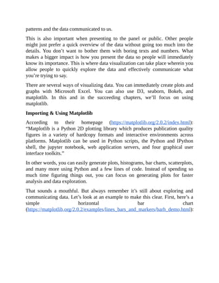
![6. A Quick Example
Iris Dataset
Let’s quickly see how data analysis and machine learning work in real world
data sets. The goal here is to quickly illustrate the potential of Python and
machine learning on some interesting problems.
In this particular example, the goal is to predict the species of an Iris flower
based on the length and width of its sepals and petals. First, we have to create a
model based on a dataset with the flowers’ measurements and their
corresponding species. Based on our code, our computer will “learn from the
data” and extract patterns from it. It will then apply what it learned to a new
dataset. Let’s look at the code.
#importing the necessary libraries from sklearn.datasets import load_iris
from sklearn import tree
from sklearn.metrics import accuracy_score
import numpy as np
#loading the iris dataset
iris = load_iris()
x = iris.data #array of the data
y = iris.target #array of labels (i.e answers) of each data entry
#getting label names i.e the three flower species
y_names = iris.target_names
#taking random indices to split the dataset into train and test
test_ids = np.random.permutation(len(x))
#splitting data and labels into train and test
#keeping last 10 entries for testing, rest for training
x_train = x[test_ids[:-10]]
x_test = x[test_ids[-10:]]
y_train = y[test_ids[:-10]]
y_test = y[test_ids[-10:]]
#classifying using decision tree
clf = tree.DecisionTreeClassifier()
#training (fitting) the classifier with the training set
clf.fit(x_train, y_train)](https://image.slidesharecdn.com/dataanalysisfromscratchwithpythonbeginnerguide-200112040731/85/Data-analysis-from-scratch-with-python-beginner-guide-28-320.jpg)
![#predictions on the test dataset
pred = clf.predict(x_test)
print(pred) #predicted labels i.e flower species
print(y_test) #actual labels
print((accuracy_score(pred, y_test)))*100 #prediction accuracy #Reference: http://docs.python-
guide.org/en/latest/scenarios/ml/
If we run the code, we’ll get something like this: [0 1 1 1 0 2 0 2 2 2]
[0 1 1 1 0 2 0 2 2 2]
100.0
The first line contains the predictions (0 is Iris setosa, 1 is Iris versicolor, 2 is Iris
virginica). The second line contains the actual flower species as indicated in the
dataset. Notice the prediction accuracy is 100%, which means we correctly
predicted each flower’s species.
These might all seem confusing at first. What you need to understand is that the
goal here is to create a model that predicts a flower’s species. To do that, we split
the data into training and test sets. We run the algorithm on the training set and
use it against the test set to know the accuracy. The result is we’re able to predict
the flower’s species on the test set based on what the computer learned from the
training set.
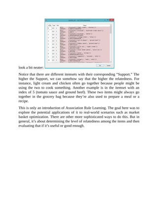
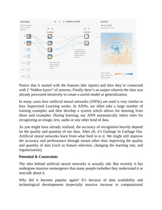
Potential & Implications
It’s a quick and simple example. But its potential and implications can be
enormous. With just a few modifications, you can apply the workflow to a wide
variety of tasks and problems.
For instance, we might be able to apply the same methodology on other flower
species, plants, and animals. We can also apply this in other Classification
problems (more on this later) such as determining if a cancer is benign or
malignant, if a person is a very likely customer, or if there’s a human face in the
photo.
The challenge here is to get enough quality data so our computer can properly
get “good training.” It’s a common methodology to first learn from the training
set and then apply the learning into the test set and possibly new data in the
future (this is the essence of machine learning).
It’s obvious now why many people are hyped about the true potential of data
analysis and machine learning. With enough data, we can create automated](https://image.slidesharecdn.com/dataanalysisfromscratchwithpythonbeginnerguide-200112040731/85/Data-analysis-from-scratch-with-python-beginner-guide-29-320.jpg)


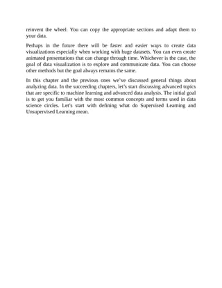
![plt.show()
import matplotlib.pyplot as plt
from numpy.random import rand
fig, ax = plt.subplots()
for color in ['red', 'green', 'blue']:
n = 750
x, y = rand(2, n)
scale = 200.0 * rand(n)
ax.scatter(x, y, c=color, s=scale, label=color,
alpha=0.3, edgecolors='none')
ax.legend()
ax.grid(True)](https://image.slidesharecdn.com/dataanalysisfromscratchwithpythonbeginnerguide-200112040731/85/Data-analysis-from-scratch-with-python-beginner-guide-41-320.jpg)

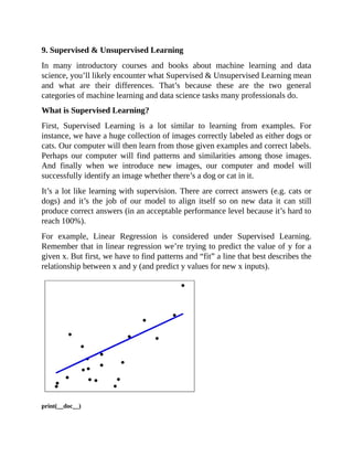
![# Code source: Jaques Grobler
# License: BSD 3 clause
import matplotlib.pyplot as plt
import numpy as np
from sklearn import datasets, linear_model
from sklearn.metrics import mean_squared_error, r2_score
# Load the diabetes dataset
diabetes = datasets.load_diabetes()
# Use only one feature
diabetes_X = diabetes.data[:, np.newaxis, 2]
# Split the data into training/testing sets
diabetes_X_train = diabetes_X[:-20]
diabetes_X_test = diabetes_X[-20:]
# Split the targets into training/testing sets
diabetes_y_train = diabetes.target[:-20]
diabetes_y_test = diabetes.target[-20:]
# Create linear regression object
regr = linear_model.LinearRegression()
# Train the model using the training sets
regr.fit(diabetes_X_train, diabetes_y_train)
# Make predictions using the testing set
diabetes_y_pred = regr.predict(diabetes_X_test)
# The coefficients
print('Coefficients: n', regr.coef_)
# The mean squared error
print("Mean squared error: %.2f"
% mean_squared_error(diabetes_y_test, diabetes_y_pred))
# Explained variance score: 1 is perfect prediction
print('Variance score: %.2f' % r2_score(diabetes_y_test, diabetes_y_pred))
# Plot outputs
plt.scatter(diabetes_X_test, diabetes_y_test, color='black')
plt.plot(diabetes_X_test, diabetes_y_pred, color='blue', linewidth=3)
plt.xticks(())
plt.yticks(())](https://image.slidesharecdn.com/dataanalysisfromscratchwithpythonbeginnerguide-200112040731/85/Data-analysis-from-scratch-with-python-beginner-guide-45-320.jpg)


![5.1,66029.00
5.3,83088.00
5.9,81363.00
6.0,93940.00
6.8,91738.00
7.1,98273.00
7.9,101302.00
8.2,113812.00
8.7,109431.00
9.0,105582.00
9.5,116969.00
9.6,112635.00
10.3,122391.00
10.5,121872.00
Here’s the Python code for fitting Simple Linear Regression to the Training Set:
# Importing the libraries
import matplotlib.pyplot as plt
import pandas as pd
# Importing the dataset
dataset = pd.read_csv('Salary_Data.csv')
X = dataset.iloc[:, :-1].values
y = dataset.iloc[:, 1].values
# Splitting the dataset into the Training set and Test set
from sklearn.model_selection import train_test_split
X_train, X_test, y_train, y_test = train_test_split(X, y, test_size = 1/3,
random_state = 0)
# Fitting Simple Linear Regression to the Training set
from sklearn.linear_model import LinearRegression
regressor = LinearRegression()
regressor.fit(X_train, y_train)
# Predicting the Test set results
y_pred = regressor.predict(X_test)](https://image.slidesharecdn.com/dataanalysisfromscratchwithpythonbeginnerguide-200112040731/85/Data-analysis-from-scratch-with-python-beginner-guide-49-320.jpg)


![63408.86,129219.61,46085.25,California,97427.84
55493.95,103057.49,214634.81,Florida,96778.92
46426.07,157693.92,210797.67,California,96712.8
46014.02,85047.44,205517.64,New York,96479.51
28663.76,127056.21,201126.82,Florida,90708.19
44069.95,51283.14,197029.42,California,89949.14
20229.59,65947.93,185265.1,New York,81229.06
38558.51,82982.09,174999.3,California,81005.76
28754.33,118546.05,172795.67,California,78239.91
27892.92,84710.77,164470.71,Florida,77798.83
23640.93,96189.63,148001.11,California,71498.49
15505.73,127382.3,35534.17,New York,69758.98
22177.74,154806.14,28334.72,California,65200.33
1000.23,124153.04,1903.93,New York,64926.08
1315.46,115816.21,297114.46,Florida,49490.75
0,135426.92,0,California,42559.73
542.05,51743.15,0,New York,35673.41
0,116983.8,45173.06,California,14681.4
Notice that there are multiple features or independent variables (R&D Spend,
Administration, Marketing Spend, State). Again, the goal here is to reveal or
discover a relationship between the independent variables and the target (Profit).
Also notice that under the column ‘State’, the data is in text (not numbers).
You’ll see New York, California, and Florida instead of numbers. How do you
deal with this kind of data?
One convenient way to do that is by transforming categorical data (New York,
California, Florida) into numerical data. We can accomplish this if we use the
following lines of code: from sklearn.preprocessing import LabelEncoder,
OneHotEncoder
labelencoder = LabelEncoder()
X[:, 3] = labelencoder.fit_transform(X[:, 3]) #Note this
onehotencoder = OneHotEncoder(categorical_features = [3])
X = onehotencoder.fit_transform(X).toarray() Pay attention to X[:, 3] =
labelencoder.fit_transform(X[:, 3]) What we did there is to transform the data
in the fourth column (State). It’s number 3 because Python indexing starts at zero
(0). The goal was to transform categorical variables data into something we can](https://image.slidesharecdn.com/dataanalysisfromscratchwithpythonbeginnerguide-200112040731/85/Data-analysis-from-scratch-with-python-beginner-guide-53-320.jpg)
![work on. To do this, we’ll create “dummy variables” which take the values of 0
or 1. In other words, they indicate the presence or absence of something.
For example, we have the following data with categorical variables: 3.5, New
York 2.0, California 6.7, Florida If we use dummy variables, the above data
will be transformed into this: 3.5, 1, 0, 0
2.0, 0, 1, 0
6.7, 0, 0, 1
Notice that the column for State became equivalent to 3 columns:
New York California Florida
3.5 1 0 0
2.0 0 1 0
6.7 0 0 1
As mentioned earlier, dummy variables indicate the presence or absence of
something. They are commonly used as “substitute variables” so we can do a
quantitative analysis on qualitative data. From the new table above we can
quickly see that 3.5 is for New York (1 New York, 0 California, and 0 Florida).
It’s a convenient way of representing categories into numeric values.
However, there’s this so-called “dummy variable trap” wherein there’s an extra
variable that could have been removed because it can be predicted from the
others. In our example above, notice that when the columns for New York and
California are zero (0), automatically you’ll know it’s Florida. You can already
know which State it is even with just the 2 variable.
Continuing with our work on 50_Startups.csv, we can avoid the dummy variable
trap by including this in our code: X = X[:, 1:]
Let’s review our work so far: import numpy as np
import matplotlib.pyplot as plt
import pandas as pd](https://image.slidesharecdn.com/dataanalysisfromscratchwithpythonbeginnerguide-200112040731/85/Data-analysis-from-scratch-with-python-beginner-guide-54-320.jpg)
![# Importing the dataset
dataset = pd.read_csv('50_Startups.csv')
X = dataset.iloc[:, :-1].values
y = dataset.iloc[:, 4].values Let’s look at the data: dataset.head()
Then, we transform categorical variables into numeric ones (dummy variables):
# Encoding categorical data
from sklearn.preprocessing import LabelEncoder, OneHotEncoder
labelencoder = LabelEncoder()
X[:, 3] = labelencoder.fit_transform(X[:, 3])
onehotencoder = OneHotEncoder(categorical_features = [3])
X = onehotencoder.fit_transform(X).toarray() # Avoiding the Dummy
Variable Trap
X = X[:, 1:]
After those data preprocessing steps, the data would somehow look like this:
Notice that there are no categorical variables (New York, California, Florida)
and we’ve removed the “redundant variable” to avoid the dummy variable trap.](https://image.slidesharecdn.com/dataanalysisfromscratchwithpythonbeginnerguide-200112040731/85/Data-analysis-from-scratch-with-python-beginner-guide-55-320.jpg)

![http://chem-eng.utoronto.ca/~datamining/dmc/decision_tree_reg.htm
Instead of plotting and fitting a line, there are decision nodes and leaf nodes.
Let’s quickly look at an example to see how it works (using
Position_Salaries.csv): The dataset: Position,Level,Salary
Business Analyst,1,45000
Junior Consultant,2,50000
Senior Consultant,3,60000
Manager,4,80000
Country Manager,5,110000
Region Manager,6,150000
Partner,7,200000
Senior Partner,8,300000
C-level,9,500000
CEO,10,1000000
# Decision Tree Regression
# Importing the libraries
import numpy as np
import matplotlib.pyplot as plt
import pandas as pd
# Importing the dataset
dataset = pd.read_csv('Position_Salaries.csv')
X = dataset.iloc[:, 1:2].values
y = dataset.iloc[:, 2].values
# Splitting the dataset into the Training set and Test set
"""from sklearn.cross_validation import train_test_split
X_train, X_test, y_train, y_test = train_test_split(X, y, test_size = 0.2, random_state = 0)"""
# Fitting Decision Tree Regression to the dataset
from sklearn.tree import DecisionTreeRegressor](https://image.slidesharecdn.com/dataanalysisfromscratchwithpythonbeginnerguide-200112040731/85/Data-analysis-from-scratch-with-python-beginner-guide-57-320.jpg)

![again and again and then getting the results of each.
In code, this would look a lot like this: # Random Forest Regression
# Importing the libraries
import numpy as np
import matplotlib.pyplot as plt
import pandas as pd
%matplotlib inline
# Importing the dataset
dataset = pd.read_csv('Position_Salaries.csv')
X = dataset.iloc[:, 1:2].values
y = dataset.iloc[:, 2].values
# Splitting the dataset into the Training set and Test set
"""from sklearn.cross_validation import train_test_split
X_train, X_test, y_train, y_test = train_test_split(X, y, test_size = 0.2,
random_state = 0)"""
# Feature Scaling
"""from sklearn.preprocessing import StandardScaler
sc_X = StandardScaler()
X_train = sc_X.fit_transform(X_train)
X_test = sc_X.transform(X_test)
sc_y = StandardScaler()
y_train = sc_y.fit_transform(y_train)"""
# Fitting Random Forest Regression to the dataset
from sklearn.ensemble import RandomForestRegressor
regressor = RandomForestRegressor(n_estimators = 300, random_state = 0)
regressor.fit(X, y)
# Predicting a new result
y_pred = regressor.predict(6.5)
# Visualising the Random Forest Regression results (higher resolution)](https://image.slidesharecdn.com/dataanalysisfromscratchwithpythonbeginnerguide-200112040731/85/Data-analysis-from-scratch-with-python-beginner-guide-59-320.jpg)

![Regression) is based on probability (e.g. the probability of a data point if it’s a 0
or 1).
As with Regression in the previous chapter wherein there’s this so-called black
box, the behind the scenes of Logistic Regression for Classification can seem
complex. Good news is its implementation is straightforward especially when
we use Python and scikit-learn: Here’s a peek of the dataset first
(‘Social_Network_Ads.csv’):
# Logistic Regression
# Importing the libraries
import numpy as np
import matplotlib.pyplot as plt
import pandas as pd
%matplotlib inline
# Importing the dataset
dataset = pd.read_csv('Social_Network_Ads.csv')
X = dataset.iloc[:, [2, 3]].values
y = dataset.iloc[:, 4].values
# Splitting the dataset into the Training set and Test set
from sklearn.model_selection import train_test_split
X_train, X_test, y_train, y_test = train_test_split(X, y, test_size = 0.25, random_state = 0)
# Feature Scaling
from sklearn.preprocessing import StandardScaler
sc = StandardScaler()
X_train = sc.fit_transform(X_train)
X_test = sc.transform(X_test)](https://image.slidesharecdn.com/dataanalysisfromscratchwithpythonbeginnerguide-200112040731/85/Data-analysis-from-scratch-with-python-beginner-guide-63-320.jpg)
![# Fitting Logistic Regression to the Training set
from sklearn.linear_model import LogisticRegression
classifier = LogisticRegression(random_state = 0)
classifier.fit(X_train, y_train)
# Predicting the Test set results
y_pred = classifier.predict(X_test)
# Making the Confusion Matrix
from sklearn.metrics import confusion_matrix
cm = confusion_matrix(y_test, y_pred)
# Visualising the Training set results
from matplotlib.colors import ListedColormap
X_set, y_set = X_train, y_train
X1, X2 = np.meshgrid(np.arange(start = X_set[:, 0].min() - 1, stop = X_set[:, 0].max() + 1, step =
0.01),
np.arange(start = X_set[:, 1].min() - 1, stop = X_set[:, 1].max() + 1, step = 0.01))
plt.contourf(X1, X2, classifier.predict(np.array([X1.ravel(), X2.ravel()]).T).reshape(X1.shape),
alpha = 0.75, cmap = ListedColormap(('red', 'green')))
plt.xlim(X1.min(), X1.max())
plt.ylim(X2.min(), X2.max())
for i, j in enumerate(np.unique(y_set)):
plt.scatter(X_set[y_set == j, 0], X_set[y_set == j, 1],
c = ListedColormap(('red', 'green'))(i), label = j)
plt.title('Logistic Regression (Training set)')
plt.xlabel('Age')
plt.ylabel('Estimated Salary')
plt.legend()
plt.show()
# Visualising the Test set results
from matplotlib.colors import ListedColormap
X_set, y_set = X_test, y_test
X1, X2 = np.meshgrid(np.arange(start = X_set[:, 0].min() - 1, stop = X_set[:, 0].max() + 1, step =
0.01),
np.arange(start = X_set[:, 1].min() - 1, stop = X_set[:, 1].max() + 1, step = 0.01))
plt.contourf(X1, X2, classifier.predict(np.array([X1.ravel(), X2.ravel()]).T).reshape(X1.shape),
alpha = 0.75, cmap = ListedColormap(('red', 'green')))
plt.xlim(X1.min(), X1.max())
plt.ylim(X2.min(), X2.max())
for i, j in enumerate(np.unique(y_set)):
plt.scatter(X_set[y_set == j, 0], X_set[y_set == j, 1],
c = ListedColormap(('red', 'green'))(i), label = j)
plt.title('Logistic Regression (Test set)')
plt.xlabel('Age')
plt.ylabel('Estimated Salary')
plt.legend()
plt.show() When we run this, you’ll see the following visualizations in your Jupyter Notebook:](https://image.slidesharecdn.com/dataanalysisfromscratchwithpythonbeginnerguide-200112040731/85/Data-analysis-from-scratch-with-python-beginner-guide-64-320.jpg)


![# Importing the dataset
dataset = pd.read_csv('Social_Network_Ads.csv')
X = dataset.iloc[:, [2, 3]].values
y = dataset.iloc[:, 4].values
# Splitting the dataset into the Training set and Test set
from sklearn.model_selection import train_test_split
X_train, X_test, y_train, y_test = train_test_split(X, y, test_size = 0.25,
random_state = 0)
# Feature Scaling
from sklearn.preprocessing import StandardScaler
sc = StandardScaler()
X_train = sc.fit_transform(X_train)
X_test = sc.transform(X_test)
# Fitting K-NN to the Training set
from sklearn.neighbors import KNeighborsClassifier
classifier = KNeighborsClassifier(n_neighbors = 5, metric = 'minkowski', p
= 2)
classifier.fit(X_train, y_train)
# Predicting the Test set results
y_pred = classifier.predict(X_test)
# Making the Confusion Matrix
from sklearn.metrics import confusion_matrix
cm = confusion_matrix(y_test, y_pred)
# Visualising the Training set results
from matplotlib.colors import ListedColormap
X_set, y_set = X_train, y_train
X1, X2 = np.meshgrid(np.arange(start = X_set[:, 0].min() - 1, stop = X_set[:,
0].max() + 1, step = 0.01),
np.arange(start = X_set[:, 1].min() - 1, stop = X_set[:, 1].max() + 1, step =
0.01))](https://image.slidesharecdn.com/dataanalysisfromscratchwithpythonbeginnerguide-200112040731/85/Data-analysis-from-scratch-with-python-beginner-guide-67-320.jpg)
![plt.contourf(X1, X2, classifier.predict(np.array([X1.ravel(),
X2.ravel()]).T).reshape(X1.shape),
alpha = 0.75, cmap = ListedColormap(('red', 'green')))
plt.xlim(X1.min(), X1.max())
plt.ylim(X2.min(), X2.max())
for i, j in enumerate(np.unique(y_set)):
plt.scatter(X_set[y_set == j, 0], X_set[y_set == j, 1],
c = ListedColormap(('red', 'green'))(i), label = j)
plt.title('K-NN (Training set)')
plt.xlabel('Age')
plt.ylabel('Estimated Salary')
plt.legend()
plt.show()
# Visualising the Test set results
from matplotlib.colors import ListedColormap
X_set, y_set = X_test, y_test
X1, X2 = np.meshgrid(np.arange(start = X_set[:, 0].min() - 1, stop = X_set[:,
0].max() + 1, step = 0.01),
np.arange(start = X_set[:, 1].min() - 1, stop = X_set[:, 1].max() + 1, step =
0.01))
plt.contourf(X1, X2, classifier.predict(np.array([X1.ravel(),
X2.ravel()]).T).reshape(X1.shape),
alpha = 0.75, cmap = ListedColormap(('red', 'green')))
plt.xlim(X1.min(), X1.max())
plt.ylim(X2.min(), X2.max())
for i, j in enumerate(np.unique(y_set)):
plt.scatter(X_set[y_set == j, 0], X_set[y_set == j, 1],
c = ListedColormap(('red', 'green'))(i), label = j)
plt.title('K-NN (Test set)')
plt.xlabel('Age')
plt.ylabel('Estimated Salary')
plt.legend()
plt.show() When we run this in Jupyter Notebook, we should see the following](https://image.slidesharecdn.com/dataanalysisfromscratchwithpythonbeginnerguide-200112040731/85/Data-analysis-from-scratch-with-python-beginner-guide-68-320.jpg)

![Notice that branches and leaves result from breaking down the dataset into
smaller subsets. In Classification, we can similarly apply this through the
following code (again using the Social_Network_Ads.csv): # Decision Tree
Classification
# Importing the libraries
import numpy as np
import matplotlib.pyplot as plt
import pandas as pd
%matplotlib inline
# Importing the dataset
dataset = pd.read_csv('Social_Network_Ads.csv')
X = dataset.iloc[:, [2, 3]].values
y = dataset.iloc[:, 4].values
# Splitting the dataset into the Training set and Test set
from sklearn.model_selection import train_test_split
X_train, X_test, y_train, y_test = train_test_split(X, y, test_size = 0.25,
random_state = 0)
# Feature Scaling
from sklearn.preprocessing import StandardScaler
sc = StandardScaler()
X_train = sc.fit_transform(X_train)
X_test = sc.transform(X_test)](https://image.slidesharecdn.com/dataanalysisfromscratchwithpythonbeginnerguide-200112040731/85/Data-analysis-from-scratch-with-python-beginner-guide-70-320.jpg)
![# Fitting Decision Tree Classification to the Training set
from sklearn.tree import DecisionTreeClassifier
classifier = DecisionTreeClassifier(criterion = 'entropy', random_state = 0)
classifier.fit(X_train, y_train)
# Predicting the Test set results
y_pred = classifier.predict(X_test)
# Making the Confusion Matrix
from sklearn.metrics import confusion_matrix
cm = confusion_matrix(y_test, y_pred)
# Visualising the Training set results
from matplotlib.colors import ListedColormap
X_set, y_set = X_train, y_train
X1, X2 = np.meshgrid(np.arange(start = X_set[:, 0].min() - 1, stop = X_set[:,
0].max() + 1, step = 0.01),
np.arange(start = X_set[:, 1].min() - 1, stop = X_set[:, 1].max() + 1, step =
0.01))
plt.contourf(X1, X2, classifier.predict(np.array([X1.ravel(),
X2.ravel()]).T).reshape(X1.shape),
alpha = 0.75, cmap = ListedColormap(('red', 'green')))
plt.xlim(X1.min(), X1.max())
plt.ylim(X2.min(), X2.max())
for i, j in enumerate(np.unique(y_set)):
plt.scatter(X_set[y_set == j, 0], X_set[y_set == j, 1],
c = ListedColormap(('red', 'green'))(i), label = j)
plt.title('Decision Tree Classification (Training set)')
plt.xlabel('Age')
plt.ylabel('Estimated Salary')
plt.legend()
plt.show()
# Visualising the Test set results
from matplotlib.colors import ListedColormap
X_set, y_set = X_test, y_test
X1, X2 = np.meshgrid(np.arange(start = X_set[:, 0].min() - 1, stop = X_set[:,](https://image.slidesharecdn.com/dataanalysisfromscratchwithpythonbeginnerguide-200112040731/85/Data-analysis-from-scratch-with-python-beginner-guide-71-320.jpg)
![0].max() + 1, step = 0.01),
np.arange(start = X_set[:, 1].min() - 1, stop = X_set[:, 1].max() + 1, step =
0.01))
plt.contourf(X1, X2, classifier.predict(np.array([X1.ravel(),
X2.ravel()]).T).reshape(X1.shape),
alpha = 0.75, cmap = ListedColormap(('red', 'green')))
plt.xlim(X1.min(), X1.max())
plt.ylim(X2.min(), X2.max())
for i, j in enumerate(np.unique(y_set)):
plt.scatter(X_set[y_set == j, 0], X_set[y_set == j, 1],
c = ListedColormap(('red', 'green'))(i), label = j)
plt.title('Decision Tree Classification (Test set)')
plt.xlabel('Age')
plt.ylabel('Estimated Salary')
plt.legend()
plt.show() The most important difference is in this block of code: from
sklearn.tree import DecisionTreeClassifier
classifier = DecisionTreeClassifier(criterion = 'entropy', random_state = 0)
classifier.fit(X_train, y_train) When we run the whole code (including the data
visualization), we’ll see this:](https://image.slidesharecdn.com/dataanalysisfromscratchwithpythonbeginnerguide-200112040731/85/Data-analysis-from-scratch-with-python-beginner-guide-72-320.jpg)
![Notice the huge difference compared to Logistic Regression and K-Nearest
Neighbors (K-NN). In these latter two, there are just two boundaries. But here in
our Decision Tree Classification, there are points outside the main red region
that fall inside “mini red regions.” As a result, our model was able to capture
data points that might be impossible otherwise (e.g. when using Logistic
Regression).
Random Forest Classification
Recall from the previous chapter about Regression that a Random Forest is a
collection or ensemble of many decision trees. This also applies to Classification
wherein many decision trees are used and the results are averaged.
# Random Forest Classification
# Importing the libraries
import numpy as np
import matplotlib.pyplot as plt
import pandas as pd
%matplotlib inline
# Importing the dataset
dataset = pd.read_csv('Social_Network_Ads.csv')
X = dataset.iloc[:, [2, 3]].values
y = dataset.iloc[:, 4].values
# Splitting the dataset into the Training set and Test set
from sklearn.model_selection import train_test_split
X_train, X_test, y_train, y_test = train_test_split(X, y, test_size = 0.25, random_state = 0)
# Feature Scaling
from sklearn.preprocessing import StandardScaler](https://image.slidesharecdn.com/dataanalysisfromscratchwithpythonbeginnerguide-200112040731/85/Data-analysis-from-scratch-with-python-beginner-guide-73-320.jpg)
![sc = StandardScaler()
X_train = sc.fit_transform(X_train)
X_test = sc.transform(X_test)
# Fitting Random Forest Classification to the Training set
from sklearn.ensemble import RandomForestClassifier
classifier = RandomForestClassifier(n_estimators = 10, criterion = 'entropy', random_state = 0)
classifier.fit(X_train, y_train)
# Predicting the Test set results
y_pred = classifier.predict(X_test)
# Making the Confusion Matrix
from sklearn.metrics import confusion_matrix
cm = confusion_matrix(y_test, y_pred)
# Visualising the Training set results
from matplotlib.colors import ListedColormap
X_set, y_set = X_train, y_train
X1, X2 = np.meshgrid(np.arange(start = X_set[:, 0].min() - 1, stop = X_set[:, 0].max() + 1, step =
0.01),
np.arange(start = X_set[:, 1].min() - 1, stop = X_set[:, 1].max() + 1, step = 0.01))
plt.contourf(X1, X2, classifier.predict(np.array([X1.ravel(), X2.ravel()]).T).reshape(X1.shape),
alpha = 0.75, cmap = ListedColormap(('red', 'green')))
plt.xlim(X1.min(), X1.max())
plt.ylim(X2.min(), X2.max())
for i, j in enumerate(np.unique(y_set)):
plt.scatter(X_set[y_set == j, 0], X_set[y_set == j, 1],
c = ListedColormap(('red', 'green'))(i), label = j)
plt.title('Random Forest Classification (Training set)')
plt.xlabel('Age')
plt.ylabel('Estimated Salary')
plt.legend()
plt.show()
# Visualising the Test set results
from matplotlib.colors import ListedColormap
X_set, y_set = X_test, y_test
X1, X2 = np.meshgrid(np.arange(start = X_set[:, 0].min() - 1, stop = X_set[:, 0].max() + 1, step =
0.01),
np.arange(start = X_set[:, 1].min() - 1, stop = X_set[:, 1].max() + 1, step = 0.01))
plt.contourf(X1, X2, classifier.predict(np.array([X1.ravel(), X2.ravel()]).T).reshape(X1.shape),
alpha = 0.75, cmap = ListedColormap(('red', 'green')))
plt.xlim(X1.min(), X1.max())
plt.ylim(X2.min(), X2.max())
for i, j in enumerate(np.unique(y_set)):
plt.scatter(X_set[y_set == j, 0], X_set[y_set == j, 1],
c = ListedColormap(('red', 'green'))(i), label = j)
plt.title('Random Forest Classification (Test set)')
plt.xlabel('Age')](https://image.slidesharecdn.com/dataanalysisfromscratchwithpythonbeginnerguide-200112040731/85/Data-analysis-from-scratch-with-python-beginner-guide-74-320.jpg)


![In this example we’re more interested in grouping the Customers according to
their Annual Income and Spending Score.
X = dataset.iloc[:, [3, 4]].values Our goal here is to reveal the clusters and help the marketing department
formulate their strategies. For instance, we might subdivide the Customers in 5 distinct groups:
1. Medium Annual Income, Medium Spending Score
2. High Annual Income, Low Spending Score
3. Low Annual Income, Low Spending Score
4. Low Annual Income, High Spending Score
5. High Annual Income, High Spending Score
It’s worthwhile to pay attention to the #2 Group (High Annual Income, Low
Spending Score). If there’s a sizable number of customers that fall under this
group, it could mean a huge opportunity for the mall. These customers have high
Annual Income and yet they’re spending or using most of their money elsewhere
(not in the Mall). If we could know that they’re in sufficient numbers, the
marketing department could formulate specific strategies to entice Cluster #2 to
buy more from the Mall.
Although the number of clusters is often arbitrary, there are ways to find that
optimal number. One such way is through the Elbow Method and WCSS
(within-cluster sums of squares). Here’s the code to accomplish this: from
sklearn.cluster import KMeans
wcss = []
for i in range(1, 11):
kmeans = KMeans(n_clusters = i, init = 'k-means++', random_state = 42)
kmeans.fit(X)](https://image.slidesharecdn.com/dataanalysisfromscratchwithpythonbeginnerguide-200112040731/85/Data-analysis-from-scratch-with-python-beginner-guide-78-320.jpg)
![wcss.append(kmeans.inertia_)
plt.plot(range(1, 11), wcss)
plt.title('The Elbow Method')
plt.xlabel('Number of clusters')
plt.ylabel('WCSS')
plt.show()
Notice that the “elbow” points at 5 (number of clusters). Coincidentally, this
number was also the “desired” number of groups that will subdivide the dataset
according to their Annual Income and Spending Score.
After determining the optimal number of clusters, we can then proceed with
applying K-Means to the dataset and then performing data visualization: kmeans
= KMeans(n_clusters = 5, init = 'k-means++', random_state = 42)
y_kmeans = kmeans.fit_predict(X) plt.scatter(X[y_kmeans == 0, 0],
X[y_kmeans == 0, 1], s = 100, c = 'red', label = 'Cluster 1')
plt.scatter(X[y_kmeans == 1, 0], X[y_kmeans == 1, 1], s = 100, c = 'blue',
label = 'Cluster 2')
plt.scatter(X[y_kmeans == 2, 0], X[y_kmeans == 2, 1], s = 100, c = 'green',
label = 'Cluster 3')
plt.scatter(X[y_kmeans == 3, 0], X[y_kmeans == 3, 1], s = 100, c = 'cyan',
label = 'Cluster 4')
plt.scatter(X[y_kmeans == 4, 0], X[y_kmeans == 4, 1], s = 100, c =
'magenta', label = 'Cluster 5')
plt.scatter(kmeans.cluster_centers_[:, 0], kmeans.cluster_centers_[:, 1], s =
300, c = 'yellow', label = 'Centroids')
plt.title('Clusters of customers')
plt.xlabel('Annual Income (k$)')](https://image.slidesharecdn.com/dataanalysisfromscratchwithpythonbeginnerguide-200112040731/85/Data-analysis-from-scratch-with-python-beginner-guide-79-320.jpg)


![sets (product sets) and their corresponding level of relatedness or support to one
another. Here’s a peek of the dataset to give you a better idea:
shrimp,almonds,avocado,vegetables mix,green grapes,whole weat
flour,yams,cottage cheese,energy drink,tomato juice,low fat yogurt,green
tea,honey,salad,mineral water,salmon,antioxydant juice,frozen
smoothie,spinach,olive oil
burgers,meatballs,eggs
chutney
turkey,avocado
mineral water,milk,energy bar,whole wheat rice,green tea
low fat yogurt
whole wheat pasta,french fries
soup,light cream,shallot
frozen vegetables,spaghetti,green tea
french fries Those are listed according to the transactions where they appear.
For example, in the first transaction the customer bought different things (from
shrimp to olive oil). In the second transaction the customer bought burgers,
meatballs, and eggs.
As before, let’s import the necessary library/libraries so that we can work on the
data: import pandas as pd
dataset = pd.read_csv('Market_Basket_Optimisation.csv', header = None)
Next is we add the items in a list so that we can work on them much easier. We
can accomplish this by initializing an empty list and then running a for loop (still
remember how to do all these?): transactions = []
for i in range(0, 7501):
transactions.append([str(dataset.values[i,j]) for j in range(0, 20)]) After
we’ve done that, we should then generate a list of “related products” with their
corresponding level of support or relatedness. One way to accomplish this is by
the implementation of the Apriori algorithm (for association rule learning).
Thankfully, we don’t have to write anything from scratch.
We can use Apyori which is a simple implementation of the Apriori algorithm.
You can find it here for your reference:
https://pypi.org/project/apyori/#description
It’s prebuilt for us and almost ready for our own usage. It’s similar to how we
use scikit-learn, pandas, and numpy. Instead of starting from scratch, we already](https://image.slidesharecdn.com/dataanalysisfromscratchwithpythonbeginnerguide-200112040731/85/Data-analysis-from-scratch-with-python-beginner-guide-84-320.jpg)
![have blocks of code we can simply implement. Take note that coding everything
from scratch is time consuming and technically challenging.
To implement Apyori, we can import it similarly as how we import other
libraries: from apyori import apriori Next is we set up the rules (the levels of
minimum relatedness) so we can somehow generate a useful list of related items.
That’s because almost any two items might have some level of relatedness. The
objective here is to include only the list that could be useful for us.
rules = apriori(transactions, min_support = 0.003, min_confidence = 0.2,
min_lift = 3, min_length = 2) Well that’s the implementation of Apriori using
Apyori. The next step is to generate and view the results. We can accomplish this
using the following block of code: results = list(rules)
results_list = []
for i in range(0, len(results)):
results_list.append('RULE:t' + str(results[i][0]) + 'nSUPPORT:t' +
str(results[i][1]))
print (results_list) When you run all the code in Jupyter Notebook, you’ll see
something like this:
It’s messy and almost incomprehensible. But if you run it in Spyder (another
useful data science package included in Anaconda installation), the result will](https://image.slidesharecdn.com/dataanalysisfromscratchwithpythonbeginnerguide-200112040731/85/Data-analysis-from-scratch-with-python-beginner-guide-85-320.jpg)


![data from Ads_CTR_Optimisation.csv) to better illustrate the idea: As usual we
first import the necessary libraries so that we can work on our data (and also for
data visualization) import matplotlib.pyplot as plt
import pandas as pd
%matplotlib inline #so plots can show in our Jupyter Notebook We then
import the dataset and take a peek dataset =
pd.read_csv('Ads_CTR_Optimisation.csv') dataset.head(10)
In each round, the ads are displayed and it’s indicated which one/ones were
clicked (0 if not clicked, 1 if clicked). As discussed earlier, the goal is to explore
first, pick the winner and then exploit it.
One popular way to achieve this is by Thompson Sampling. Simply, it addresses
the exploration-exploitation dilemma (trying to achieve a balance) by sampling
or trying the promising actions while ignoring or discarding actions that are
likely to underperform. The algorithm works on probabilities and this can be
expressed in code through the following: import random
N = 10000
d = 10
ads_selected = []
numbers_of_rewards_1 = [0] * d
numbers_of_rewards_0 = [0] * d
total_reward = 0
for n in range(0, N):
ad = 0
max_random = 0](https://image.slidesharecdn.com/dataanalysisfromscratchwithpythonbeginnerguide-200112040731/85/Data-analysis-from-scratch-with-python-beginner-guide-89-320.jpg)
![for i in range(0, d):
random_beta = random.betavariate(numbers_of_rewards_1[i] + 1,
numbers_of_rewards_0[i] + 1)
if random_beta > max_random:
max_random = random_beta
ad = i
ads_selected.append(ad)
reward = dataset.values[n, ad]
if reward == 1:
numbers_of_rewards_1[ad] = numbers_of_rewards_1[ad] + 1
else:
numbers_of_rewards_0[ad] = numbers_of_rewards_0[ad] + 1
total_reward = total_reward + reward When we run and the code and
visualize: plt.hist(ads_selected)
plt.title('Histogram of ads selections')
plt.xlabel('Ads')
plt.ylabel('Number of times each ad was selected')
plt.show()
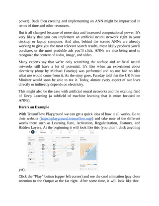
Notice that the implementation of Thompson sampling can be very complex. It’s
an interesting algorithm which is widely popular in online ad optimization, news
article recommendation, product assortment and other business applications.
There are other interesting algorithms and heuristics such as Upper Confidence
Bound. The goal is to earn while learning. Instead of later analysis, our
algorithm can perform and adjust in real time. We’re hoping to maximize the
reward by trying to balance the tradeoff between exploration and exploitation
(maximize immediate performance or “learn more” to improve future](https://image.slidesharecdn.com/dataanalysisfromscratchwithpythonbeginnerguide-200112040731/85/Data-analysis-from-scratch-with-python-beginner-guide-90-320.jpg)


![will remain like this:
Pay attention to the Output. Notice that the Classification seems worse. Instead
of enclosing most of the yellow points under the Yellow region, there are a lot of
misses (many yellow points fall under the Blue region instead). This occurred
because of the change in parameters we’ve done.
For instance, the Learning Rate has a huge effect on accuracy and achieving just
the right convergence. If we make the Learning Rate too low, convergence might
take a lot of time. And if the Learning Rate is too high (as with our example
earlier), we might not reach the convergence at all because we overshot it and
missed.
There are several ways to achieve convergence within reasonable time (e.g.
Learning Rate is just right, more hidden layers, probably fewer or more Features
to include, applying Regularization). But “overly optimizing” for everything
might not make economic sense. It’s good to set a clear objective at the start and
stick to it. If there are other interesting or promising opportunities that pop up,
you might want to further tune the parameters and improve the model’s
performance.
Anyway, if you want to get an idea how an ANN might look like in Python,
here’s a sample code: X = np.array([ [0,0,1],[0,1,1],[1,0,1],[1,1,1] ])
y = np.array([[0,1,1,0]]).T
syn0 = 2*np.random.random((3,4)) - 1
syn1 = 2*np.random.random((4,1)) - 1
for j in xrange(60000):
l1 = 1/(1+np.exp(-(np.dot(X,syn0))))
l2 = 1/(1+np.exp(-(np.dot(l1,syn1))))
l2_delta = (y - l2)*(l2*(1-l2))
l1_delta = l2_delta.dot(syn1.T) * (l1 * (1-l1))](https://image.slidesharecdn.com/dataanalysisfromscratchwithpythonbeginnerguide-200112040731/85/Data-analysis-from-scratch-with-python-beginner-guide-96-320.jpg)


Data analysis from scratch with python beginner guide
- 4. Preface “Humanity is on the verge of digital slavery at the hands of AI and biometric technologies. One way to prevent that is to develop inbuilt modules of deep feelings of love and compassion in the learning algorithms.” ― Amit Ray, Compassionate Artificial Superintelligence AI 5.0 - AI with Blockchain, BMI, Drone, IOT, and Biometric Technologies If you are looking for a complete guide to the Python language and its library that will help you to become an effective data analyst, this book is for you. This book contains the Python programming you need for Data Analysis. Why the AI Sciences Books are different? The AI Sciences Books explore every aspect of Artificial Intelligence and Data Science using computer Science programming language such as Python and R. Our books may be the best one for beginners; it's a step-by-step guide for any person who wants to start learning Artificial Intelligence and Data Science from scratch. It will help you in preparing a solid foundation and learn any other high- level courses will be easy to you. Step By Step Guide and Visual Illustrations and Examples The Book give complete instructions for manipulating, processing, cleaning, modeling and crunching datasets in Python. This is a hands-on guide with practical case studies of data analysis problems effectively. You will learn pandas, NumPy, IPython, and Jupiter in the Process. Who Should Read This? This book is a practical introduction to data science tools in Python. It is ideal for analyst’s beginners to Python and for Python programmers new to data science and computer science. Instead of tough math formulas, this book contains several graphs and images.
- 6. Edited by Davies Company Ebook Converted and Cover by Pixels Studio Publised by AI Sciences LLC ISBN-13: 978-1721942817 ISBN-10: 1721942815 The contents of this book may not be reproduced, duplicated or transmitted without the direct written permission of the author. Under no circumstances will any legal responsibility or blame be held against the publisher for any reparation, damages, or monetary loss due to the information herein, either directly or indirectly.
- 7. Legal Notice: You cannot amend, distribute, sell, use, quote or paraphrase any part or the content within this book without the consent of the author. Disclaimer Notice: Please note the information contained within this document is for educational and entertainment purposes only. No warranties of any kind are expressed or implied. Readers acknowledge that the author is not engaging in the rendering of legal, financial, medical or professional advice. Please consult a licensed professional before attempting any techniques outlined in this book. By reading this document, the reader agrees that under no circumstances is the author responsible for any losses, direct or indirect, which are incurred as a result of the use of information contained within this document, including, but not limited to, errors, omissions, or inaccuracies. From AI Sciences Publisher
- 14. Introduction Why read on? First, you’ll learn how to use Python in data analysis (which is a bit cooler and a bit more advanced than using Microsoft Excel). Second, you’ll also learn how to gain the mindset of a real data analyst (computational thinking). More importantly, you’ll learn how Python and machine learning applies to real world problems (business, science, market research, technology, manufacturing, retail, financial). We’ll provide several examples on how modern methods of data analysis fit in with approaching and solving modern problems. This is important because the massive influx of data provides us with more opportunities to gain insights and make an impact in almost any field. This recent phenomenon also provides new challenges that require new technologies and approaches. In addition, this also requires new skills and mindsets to successfully navigate through the challenges and successfully tap the fullest potential of the opportunities being presented to us. For now, forget about getting the “sexiest job of the 21st century” (data scientist, machine learning engineer, etc.). Forget about the fears about artificial intelligence eradicating jobs and the entire human race. This is all about learning (in the truest sense of the word) and solving real world problems. We are here to create solutions and take advantage of new technologies to make better decisions and hopefully make our lives easier. And this starts at building a strong foundation so we can better face the challenges and master advanced concepts.
- 15. 2. Why Choose Python for Data Science & Machine Learning Python is said to be a simple, clear and intuitive programming language. That’s why many engineers and scientists choose Python for many scientific and numeric applications. Perhaps they prefer getting into the core task quickly (e.g. finding out the effect or correlation of a variable with an output) instead of spending hundreds of hours learning the nuances of a “complex” programming language. This allows scientists, engineers, researchers and analysts to get into the project more quickly, thereby gaining valuable insights in the least amount of time and resources. It doesn’t mean though that Python is perfect and the ideal programming language on where to do data analysis and machine learning. Other languages such as R may have advantages and features Python has not. But still, Python is a good starting point and you may get a better understanding of data analysis if you use it for your study and future projects. Python vs R You might have already encountered this in Stack Overflow, Reddit, Quora, and other forums and websites. You might have also searched for other programming languages because after all, learning Python or R (or any other programming language) requires several weeks and months. It’s a huge time investment and you don’t want to make a mistake. To get this out of the way, just start with Python because the general skills and concepts are easily transferable to other languages. Well, in some cases you might have to adopt an entirely new way of thinking. But in general, knowing how to use Python in data analysis will bring you a long way towards solving many interesting problems. Many say that R is specifically designed for statisticians (especially when it comes to easy and strong data visualization capabilities). It’s also relatively easy to learn especially if you’ll be using it mainly for data analysis. On the other hand, Python is somewhat flexible because it goes beyond data analysis. Many data scientists and machine learning practitioners may have chosen Python because the code they wrote can be integrated into a live and dynamic web application. Although it’s all debatable, Python is still a popular choice especially among
- 16. beginners or anyone who wants to get their feet wet fast with data analysis and machine learning. It’s relatively easy to learn and you can dive into full time programming later on if you decide this suits you more. Widespread Use of Python in Data Analysis There are now many packages and tools that make the use of Python in data analysis and machine learning much easier. TensorFlow (from Google), Theano, scikit-learn, numpy, and pandas are just some of the things that make data science faster and easier. Also, university graduates can quickly get into data science because many universities now teach introductory computer science using Python as the main programming language. The shift from computer programming and software development can occur quickly because many people already have the right foundations to start learning and applying programming to real world data challenges. Another reason for Python’s widespread use is there are countless resources that will tell you how to do almost anything. If you have any question, it’s very likely that someone else has already asked that and another that solved it for you (Google and Stack Overflow are your friends). This makes Python even more popular because of the availability of resources online. Clarity Due to the ease of learning and using Python (partly due to the clarity of its syntax), professionals are able to focus on the more important aspects of their projects and problems. For example, they could just use numpy, scikit-learn, and TensorFlow to quickly gain insights instead of building everything from scratch. This provides another level of clarity because professionals can focus more on the nature of the problem and its implications. They could also come up with more efficient ways of dealing with the problem instead of getting buried with the ton of info a certain programming language presents. The focus should always be on the problem and the opportunities it might introduce. It only takes one breakthrough to change our entire way of thinking about a certain challenge and Python might be able to help accomplish that because of its clarity and ease.
- 17. 3. Prerequisites & Reminders Python & Programming Knowledge By now you should understand the Python syntax including things about variables, comparison operators, Boolean operators, functions, loops, and lists. You don’t have to be an expert but it really helps to have the essential knowledge so the rest becomes smoother. You don’t have to make it complicated because programming is only about telling the computer what needs to be done. The computer should then be able to understand and successfully execute your instructions. You might just need to write few lines of code (or modify existing ones a bit) to suit your application. Also, many of the things that you’ll do in Python for data analysis are already routine or pre-built for you. In many cases you might just have to copy and execute the code (with a few modifications). But don’t get lazy because understanding Python and programming is still essential. This way, you can spot and troubleshoot problems in case an error message appears. This will also give you confidence because you know how something works. Installation & Setup If you want to follow along with our code and execution, you should have Anaconda downloaded and installed in your computer. It’s free and available for Windows, macOS, and Linux. To download and install, go to https://www.anaconda.com/download/ and follow the succeeding instructions from there. The tool we’ll be mostly using is Jupyter Notebook (already comes with Anaconda installation). It’s literally a notebook wherein you can type and execute your code as well as add text and notes (which is why many online instructors use it). If you’ve successfully installed Anaconda, you should be able to launch Anaconda Prompt and type jupyter notebook on the blinking underscore. This will then launch Jupyter Notebook using your default browser. You can then create a new notebook (or edit it later) and run the code for outputs and visualizations (graphs, histograms, etc.). These are convenient tools you can use to make studying and analyzing easier
- 18. and faster. This also makes it easier to know which went wrong and how to fix them (there are easy to understand error messages in case you mess up). Is Mathematical Expertise Necessary? Data analysis often means working with numbers and extracting valuable insights from them. But do you really have to be expert on numbers and mathematics? Successful data analysis using Python often requires having decent skills and knowledge in math, programming, and the domain you’re working on. This means you don’t have to be an expert in any of them (unless you’re planning to present a paper at international scientific conferences). Don’t let many “experts” fool you because many of them are fakes or just plain inexperienced. What you need to know is what’s the next thing to do so you can successfully finish your projects. You won’t be an expert in anything after you read all the chapters here. But this is enough to give you a better understanding about Python and data analysis. Back to mathematical expertise. It’s very likely you’re already familiar with mean, standard deviation, and other common terms in statistics. While going deeper into data analysis you might encounter calculus and linear algebra. If you have the time and interest to study them, you can always do anytime or later. This may or may not give you an edge on the particular data analysis project you’re working on. Again, it’s about solving problems. The focus should be on how to take a challenge and successfully overcome it. This applies to all fields especially in business and science. Don’t let the hype or myths to distract you. Focus on the core concepts and you’ll do fine.
- 19. 4. Python Quick Review Here’s a quick Python review you can use as reference. If you’re stuck or need help with something, you can always use Google or Stack Overflow. To have Python (and other data analysis tools and packages) in your computer, download and install Anaconda. Python Data Types are strings (“You are awesome.”), integers (-3, 0, 1), and floats (3.0, 12.5, 7.77). You can do mathematical operations in Python such as: 3 + 3 print(3+3) 7 -1 5 * 2 20 / 5 9 % 2 #modulo operation, returns the remainder of the division 2 ** 3 #exponentiation, 2 to the 3rd power Assigning values to variables: myName = “Thor” print(myName) #output is “Thor” x = 5 y = 6 print(x + y) #result is 11 print(x*3) #result is 15 Working on strings and variables: myName = “Thor” age = 25 hobby = “programming” print('Hi, my name is ' + myname + ' and my age is ' + str(age) + '. Anyway, my hobby is ' + hobby + '.') Result is Hi, my name is Thon and my age is 25. Anyway, my hobby is programming. Comments # Everything after the hashtag in this line is a comment. # This is to keep your sanity. # Make it understandable to you, learners, and other programmers. Comparison Operators >>>8 == 8 True >>>8 > 4
- 24. Those are just the basics. You might still need to refer to this whenever you’re doing anything related to Python. You can also refer to Python 3 Documentation for more extensive information. It’s recommended that you bookmark that for future reference. For quick review, you can also refer to Learn python3 in Y Minutes. Tips for Faster Learning If you want to learn faster, you just have to devote more hours each day in learning Python. Take note that programming and learning how to think like a programmer takes time. There are also various cheat sheets online you can always use. Even experienced programmers don’t know everything. Also, you actually don’t have to learn everything if you’re just starting out. You can always go deeper anytime if something interests you or you want to stand out in job applications or startup funding.
- 25. 5. Overview & Objectives Let’s set some expectations here so you know where you’re going. This is also to introduce about the limitations of Python, data analysis, data science, and machine learning (and also the key differences). Let’s start. Data Analysis vs Data Science vs Machine Learning Data Analysis and Data Science are almost the same because they share the same goal, which is to derive insights from data and use it for better decision making. Often, data analysis is associated with using Microsoft Excel and other tools for summarizing data and finding patterns. On the other hand, data science is often associated with using programming to deal with massive data sets. In fact, data science became popular as a result of the generation of gigabytes of data coming from online sources and activities (search engines, social media). Being a data scientist sounds way cooler than being a data analyst. Although the job functions might be similar and overlapping, it all deals with discovering patterns and generating insights from data. It’s also about asking intelligent questions about the nature of the data (e.g. Are data points form organic clusters? Is there really a connection between age and cancer?). What about machine learning? Often, the terms data science and machine learning are used interchangeably. That’s because the latter is about “learning from data.” When applying machine learning algorithms, the computer detects patterns and uses “what it learned” on new data. For instance, we want to know if a person will pay his debts. Luckily we have a sizable dataset about different people who either paid his debt or not. We also have collected other data (creating customer profiles) such as age, income range, location, and occupation. When we apply the appropriate machine learning algorithm, the computer will learn from the data. We can then input new data (new info from a new applicant) and what the computer learned will be applied to that new data. We might then create a simple program that immediately evaluates whether a person will pay his debts or not based on his information (age, income range, location, and occupation). This is an example of using data to predict someone’s
- 26. likely behavior. Possibilities Learning from data opens a lot of possibilities especially in predictions and optimizations. This has become a reality thanks to availability of massive datasets and superior computer processing power. We can now process data in gigabytes within a day using computers or cloud capabilities. Although data science and machine learning algorithms are still far from perfect, these are already useful in many applications such as image recognition, product recommendations, search engine rankings, and medical diagnosis. And to this moment, scientists and engineers around the globe continue to improve the accuracy and performance of their tools, models, and analysis. Limitations of Data Analysis & Machine Learning You might have read from news and online articles that machine learning and advanced data analysis can change the fabric of society (automation, loss of jobs, universal basic income, artificial intelligence takeover). In fact, the society is being changed right now. Behind the scenes machine learning and continuous data analysis are at work especially in search engines, social media, and e-commerce. Machine learning now makes it easier and faster to do the following: ● Are there human faces in the picture? ● Will a user click an ad? (is it personalized and appealing to him/her?) ● How to create accurate captions on YouTube videos? (recognise speech and translate into text) ● Will an engine or component fail? (preventive maintenance in manufacturing) ● Is a transaction fraudulent? ● Is an email spam or not? These are made possible by availability of massive datasets and great processing power. However, advanced data analysis using Python (and machine learning) is not magic. It’s not the solution to all problem. That’s because the accuracy and performance of our tools and models heavily depend on the integrity of data and our own skill and judgment.
- 27. Yes, computers and algorithms are great at providing answers. But it’s also about asking the right questions. Those intelligent questions will come from us humans. It also depends on us if we’ll use the answers being provided by our computers. Accuracy & Performance The most common use of data analysis is in successful predictions (forecasting) and optimization. Will the demand for our product increase in the next five years? What are the optimal routes for deliveries that lead to the lowest operational costs? That’s why an accuracy improvement of even just 1% can translate into millions of dollars of additional revenues. For instance, big stores can stock up certain products in advance if the results of the analysis predicts an increasing demand. Shipping and logistics can also better plan the routes and schedules for lower fuel usage and faster deliveries. Aside from improving accuracy, another priority is on ensuring reliable performance. How can our analysis perform on new data sets? Should we consider other factors when analyzing the data and making predictions? Our work should always produce consistently accurate results. Otherwise, it’s not scientific at all because the results are not reproducible. We might as well shoot in the dark instead of making ourselves exhausted in sophisticated data analysis. Apart from successful forecasting and optimization, proper data analysis can also help us uncover opportunities. Later we can realize that what we did is also applicable to other projects and fields. We can also detect outliers and interesting patterns if we dig deep enough. For example, perhaps customers congregate in clusters that are big enough for us to explore and tap into. Maybe there are unusually higher concentrations of customers that fall into a certain income range or spending level. Those are just typical examples of the applications of proper data analysis. In the next chapter, let’s discuss one of the most used examples in illustrating the promising potential of data analysis and machine learning. We’ll also discuss its implications and the opportunities it presents.
- 28. 6. A Quick Example Iris Dataset Let’s quickly see how data analysis and machine learning work in real world data sets. The goal here is to quickly illustrate the potential of Python and machine learning on some interesting problems. In this particular example, the goal is to predict the species of an Iris flower based on the length and width of its sepals and petals. First, we have to create a model based on a dataset with the flowers’ measurements and their corresponding species. Based on our code, our computer will “learn from the data” and extract patterns from it. It will then apply what it learned to a new dataset. Let’s look at the code. #importing the necessary libraries from sklearn.datasets import load_iris from sklearn import tree from sklearn.metrics import accuracy_score import numpy as np #loading the iris dataset iris = load_iris() x = iris.data #array of the data y = iris.target #array of labels (i.e answers) of each data entry #getting label names i.e the three flower species y_names = iris.target_names #taking random indices to split the dataset into train and test test_ids = np.random.permutation(len(x)) #splitting data and labels into train and test #keeping last 10 entries for testing, rest for training x_train = x[test_ids[:-10]] x_test = x[test_ids[-10:]] y_train = y[test_ids[:-10]] y_test = y[test_ids[-10:]] #classifying using decision tree clf = tree.DecisionTreeClassifier() #training (fitting) the classifier with the training set clf.fit(x_train, y_train)
- 29. #predictions on the test dataset pred = clf.predict(x_test) print(pred) #predicted labels i.e flower species print(y_test) #actual labels print((accuracy_score(pred, y_test)))*100 #prediction accuracy #Reference: http://docs.python- guide.org/en/latest/scenarios/ml/ If we run the code, we’ll get something like this: [0 1 1 1 0 2 0 2 2 2] [0 1 1 1 0 2 0 2 2 2] 100.0 The first line contains the predictions (0 is Iris setosa, 1 is Iris versicolor, 2 is Iris virginica). The second line contains the actual flower species as indicated in the dataset. Notice the prediction accuracy is 100%, which means we correctly predicted each flower’s species. These might all seem confusing at first. What you need to understand is that the goal here is to create a model that predicts a flower’s species. To do that, we split the data into training and test sets. We run the algorithm on the training set and use it against the test set to know the accuracy. The result is we’re able to predict the flower’s species on the test set based on what the computer learned from the training set. Potential & Implications It’s a quick and simple example. But its potential and implications can be enormous. With just a few modifications, you can apply the workflow to a wide variety of tasks and problems. For instance, we might be able to apply the same methodology on other flower species, plants, and animals. We can also apply this in other Classification problems (more on this later) such as determining if a cancer is benign or malignant, if a person is a very likely customer, or if there’s a human face in the photo. The challenge here is to get enough quality data so our computer can properly get “good training.” It’s a common methodology to first learn from the training set and then apply the learning into the test set and possibly new data in the future (this is the essence of machine learning). It’s obvious now why many people are hyped about the true potential of data analysis and machine learning. With enough data, we can create automated
- 30. systems on predicting events and classifying objects. With enough X-ray images with corrects labels (with lung cancer or not), our computers can learn from the data and make instant classification of a new unlabeled X-ray image. We can also apply a similar approach to other medical diagnosis and related fields. Back then, data analysis is widely used for studying the past and preparing reports. But now, it can be used instantaneously to predict outcomes in real time. This is the true power of data, wherein we can use it to make quick and smart decisions. Many experts agree that we’re just still scratching the surface of the power of performing data analysis using significantly large datasets. In the years to come, we’ll be able to encounter applications never been thought before. Many tools and approaches will also become obsolete as a result of these changes. But many things will remain the same and the principles will always be there. That’s why in the following chapters, we’ll focus more on getting into the mindset of a savvy data analyst. We’ll explore some approaches in doing things but these will only be used to illustrate timeless and important points. For example, the general workflow and process in data analysis involve these things: ● Identifying the problem (asking the right questions) ● Getting & processing data ● Visualizing data ● Choosing an approach and algorithm ● Evaluating the output ● Trying other approaches & comparing the results ● Knowing if the results are good enough (knowing when to stop) It’s good to determine the objective of the project first so we can set clear expectations and boundaries on our project. Second, let’s then gather data (or get access to it) so we can start the proper analysis. Let’s do that in the next chapter.
- 31. 7. Getting & Processing Data Garbage In, Garbage Out. This is true especially in data analysis. After all, the accuracy of our analysis heavily depends on the quality of our data. If we we put in garbage, expect garbage to come out. That’s why data analysts and machine learning engineers spend extra time in getting and processing quality data. To accomplish this, the data should be in the right format to make it usable for analysis and other purposes. Next, the data should be processed properly so we can apply algorithms to it and make sure we’re doing proper analysis. CSV Files CSV files are perhaps the most common data format you’ll encounter in data science and machine learning (especially when using Python). CSV means comma-separated values. The values in different columns are separated by commas. Here’s an example: Product, Price cabbage,6.8 lettuce,7.2 tomato,4.2 It’s a simple 2-column example. In many modern data analysis projects, it may look something like this: RowNumber,CustomerId,Surname,CreditScore,Geography,Gender,Age,Tenure…. 1,15634602,Hargrave,619,France,Female,42,2,0,1,1,1,101348.88,1 2,15647311,Hill,608,Spain,Female,41,1,83807.86,1,0,1,112542.58,0 3,15619304,Onio,502,France,Female,42,8,159660.8,3,1,0,113931.57,1 4,15701354,Boni,699,France,Female,39,1,0,2,0,0,93826.63,0 5,15737888,Mitchell,850,Spain,Female,43,2,125510.82,1,1,1,79084.1,0 6,15574012,Chu,645,Spain,Male,44,8,113755.78,2,1,0,149756.71,1 7,15592531,Bartlett,822,France,Male,50,7,0,2,1,1,10062.8,0 8,15656148,Obinna,376,Germany,Female,29,4,115046.74,4,1,0,119346.88,1 9,15792365,He,501,France,Male,44,4,142051.07,2,0,1,74940.5,0 10,15592389,H?,684,France,Male,27,2,134603.88,1,1,1,71725.73,0 11,15767821,Bearce,528,France,Male,31,6,102016.72,2,0,0,80181.12,0 12,15737173,Andrews,497,Spain,Male,24,3,0,2,1,0,76390.01,0 13,15632264,Kay,476,France,Female,34,10,0,2,1,0,26260.98,0 14,15691483,Chin,549,France,Female,25,5,0,2,0,0,190857.79,0 15,15600882,Scott,635,Spain,Female,35,7,0,2,1,1,65951.65,0 16,15643966,Goforth,616,Germany,Male,45,3,143129.41,2,0,1,64327.26,0 17,15737452,Romeo,653,Germany,Male,58,1,132602.88,1,1,0,5097.67,1 18,15788218,Henderson,549,Spain,Female,24,9,0,2,1,1,14406.41,0 19,15661507,Muldrow,587,Spain,Male,45,6,0,1,0,0,158684.81,0 20,15568982,Hao,726,France,Female,24,6,0,2,1,1,54724.03,0 21,15577657,McDonald,732,France,Male,41,8,0,2,1,1,170886.17,0 22,15597945,Dellucci,636,Spain,Female,32,8,0,2,1,0,138555.46,0
- 32. 23,15699309,Gerasimov,510,Spain,Female,38,4,0,1,1,0,118913.53,1 24,15725737,Mosman,669,France,Male,46,3,0,2,0,1,8487.75,0 25,15625047,Yen,846,France,Female,38,5,0,1,1,1,187616.16,0 26,15738191,Maclean,577,France,Male,25,3,0,2,0,1,124508.29,0 27,15736816,Young,756,Germany,Male,36,2,136815.64,1,1,1,170041.95,0 28,15700772,Nebechi,571,France,Male,44,9,0,2,0,0,38433.35,0 29,15728693,McWilliams,574,Germany,Female,43,3,141349.43,1,1,1,100187.43,0 30,15656300,Lucciano,411,France,Male,29,0,59697.17,2,1,1,53483.21,0 31,15589475,Azikiwe,591,Spain,Female,39,3,0,3,1,0,140469.38,1 …. Real world data (especially in e-commerce, social media, and online ads) could contain millions of rows and thousands of columns. CSV files are convenient to work with and you can easily find lots of them from different online sources. It’s structured and Python also allows easy processing of it by writing a few lines of code: import pandas as pd dataset = pd.read_csv('Data.csv') This step is often necessary before Python and your computer can work on the data. So whenever you’re working on a CSV file and you’re using Python, it’s good to immediately have those two lines of code at the top of your project. Then, we set the input values (X) and the output values (y). Often, the y values are our target outputs. For example, the common goal is to learn how certain values of X affect the corresponding y values. Later on, that learning can be applied on new X values and see if that learning is useful in predicting y values (unknown at first). After the data becomes readable and usable, often the next step is to ensure that the values don’t vary much in scale and magnitude. That’s because values in certain columns might be in a different league than the others. For instance, the ages of customers can range from 18 to 70. But the income range are in the range of 100000 to 9000000. The gap in the ranges of the two columns would have a huge effect on our model. Perhaps the income range will contribute largely to the resulting predictions instead of treating both ages and income range equally. To do feature scaling (scaling values in the same magnitude), one way to do this is by using the following lines of code: from sklearn.preprocessing import StandardScaler sc_X = StandardScaler() X_train = sc_X.fit_transform(X_train)
- 33. X_test = sc_X.transform(X_test) # sc_y = StandardScaler() # y_train = sc_y.fit_transform(y_train) The goal here is to scale the values in the same magnitude so all the values from different columns or features will contribute to the predictions and outputs. In data analysis and machine learning, it’s often a general requirement to divide the dataset into Training Set and Test Set. After all, we need to create a model and test its performance and accuracy. We use the Training Set so our computer can learn from the data. Then, we use that learning against the Test Set and see if its performance is good enough. A common way to accomplish this is through the following code: from sklearn.model_selection import train_test_split X_train, X_test, y_train, y_test = train_test_split(X, y, test_size = 0.2, random_state = 0) Here, we imported something from scikit-learn (free software machine learning library for the Python programming language) and perform a split on the dataset. The division is often 80% Training Set and 20% Test Set (test_size = 0.2). The random_state can be any value as long as you remain consistent through the succeeding parts of your project. You can actually use different ratios on dividing your dataset. Some use a ratio of 70-30 or even 60-40. Just keep in mind that the Training Set should be plenty enough for any meaningful to learn. It’s similar with gaining different life experiences so we can gain a more accurate representation of reality (e.g. use of several mental models as popularized by Charlie Munger, long-time business partner of Warren Buffett). That’s why it’s recommended to gather more data to make the “learning” more accurate. With scarce data, our system might fail to recognize patterns. Our algorithm might even overgeneralize on limited data, which results to the algorithm failing to work on new data. In other words, it shows excellent results when we use our existing data, but it fails spectacularly when new data is used. There are also cases when we already have sufficient amount of data for meaningful learning to occur. Often we won’t need to gather more data because the effect could be negligible (e.g. 0.0000001% accuracy improvement) or huge investments in time, effort, and money would be required. In these cases it might be best to work on what we have already than looking for something new.
- 34. Feature Selection We might have lots of data. But are all of them useful and relevant? Which columns and features are likely to be contributing to the result? Often, some of our data are just irrelevant to our analysis. For example, is the name of the startup affects its funding success? Is there any relation between a person’s favorite color and her intelligence? Selecting the most relevant features is also a crucial task in processing data. Why waste precious time and computing resources on including irrelevant features/columns in our analysis? Worse, would the irrelevant features skew our analysis? The answer is yes. As mentioned early in the chapter, Garbage In Garbage Out. If we include irrelevant features in our analysis, we might also get inaccurate and irrelevant results. Our computer and algorithm would be “learning from bad examples” which results to erroneous results. To eliminate the Garbage and improve the accuracy and relevance of our analysis, Feature Selection is often done. As the term implies, we select “features” that have the biggest contribution and immediate relevance with the output. This makes our predictive model simpler and easier to understand. For example, we might have 20+ features that describe customers. These features include age, income range, location, gender, whether they have kids or not, spending level, recent purchases, highest educational attainment, whether they own a house or not, and over a dozen more attributes. However, not all of these may have any relevance with our analysis or predictive model. Although it’s possible that all these features may have some effect, the analysis might be too complex for it to become useful. Feature Selection is a way of simplifying analysis by focusing on relevance. But how do we know if a certain feature is relevant? This is where domain knowledge and expertise comes in. For example, the data analyst or the team should have knowledge about retail (in our example above). This way, the team can properly select the features that have the most impact to the predictive model or analysis. Different fields often have different relevant features. For instance, analyzing retail data might be totally different than studying wine quality data. In retail we
- 35. focus on features that influence people’s purchases (and in what quantity). On the other hand, analyzing wine quality data might require studying the wine’s chemical constituents and their effects on people’s preferences. In addition, it requires some domain knowledge to know which features are interdependent with one another. In our example above about wine quality, substances in the wine might react with one another and hence affect the amounts of such substances. When you increase the amount of a substance, it may increase or decrease the amount of another. It’s also the case with analyzing business data. More customers also means more sales. People from higher income groups might also have higher spending levels. These features are interdependent and excluding a few of those could simplify our analysis. Selecting the most appropriate features might also take extra time especially when you’re dealing with a huge dataset (with hundreds or even thousands of columns). Professionals often try different combinations and see which yields the best results (or look for something that makes the most sense). In general, domain expertise could be more important than the data analysis skill itself. After all, we should start with asking the right questions than focusing on applying the most elaborate algorithm to the data. To figure out the right questions (and the most important ones), you or someone from your team should have an expertise on the subject. Online Data Sources We’ve discussed how to process data and select the most relevant features. But where do we get data in the first place? How do we ensure their credibility? And for beginners, where to get data so they can practice analyzing data? You can start with the UCI Machine Learning Repository (https://archive.ics.uci.edu/ml/datasets.html) wherein you can access datasets about business, engineering, life sciences, social sciences, and physical sciences. You can find data about El Nino, social media, handwritten characters, sensorless drive diagnosis, bank marketing, and more. It’s more than enough to fill your time for months and years if you get serious on large-scale data analysis. You can also find more interesting datasets in Kaggle
- 36. (https://www.kaggle.com/datasets) such as data about Titanic Survival, grocery shopping, medical diagnosis, historical air quality, Amazon reviews, crime statistics, and housing prices. Just start with those two and you’ll be fine. It’s good to browse through the datasets as early as today so that you’ll get ideas and inspiration on what to do with data. Take note that data analysis is about exploring and solving problems, which is why it’s always good to explore out there so you can be closer to the situations and challenges. Internal Data Source If you’re planning to work in a company, university, or research institution, there’s a good chance you’ll work with internal data. For example, if you’re working in a big ecommerce company, expect that you’ll work on the data your company gathers and generates. Big companies often generate megabytes of data every second. These are being stored and/or processed into a database. Your job then is to make sense of those endless streams of data and use the derived insights for better efficiency or profitability. First, the data being gathered should be relevant to the operations of the business. Perhaps the time of purchase, the category where the product falls under, and if it’s offered in discount are all relevant. These information should then be stored in the database (with backups) so your team can analyze it later. The data can be stored in different formats and file types such as CSV, SQLite, JSON, and BigQuery. The file type your company chose might had depended on convenience and existing infrastructure. It’s important to know how to work with these file types (often they’re mentioned in job descriptions) so you can make meaningful analysis.
- 37. 8. Data Visualization Data visualization makes it easier and faster to make meaningful analysis on the data. In many cases it’s one of the first steps when performing a data analysis. You access and process the data and then start visualizing it for quick insights (e.g. looking for obvious patterns, outliers, etc.) Goal of Visualization Exploring and communicating data is the main goal of data visualization. When the data is visualized (in a bar chart, histogram, or other forms), patterns become immediately obvious. You’ll know quickly if there’s a rising trend (line graph) or the relative magnitude of something in relation to other factors (e.g. using a pie chart). Instead of telling people the long list of numbers, why not just show it to them for better clarity? For example, let’s look at the worldwide search trend on the word ‘bitcoin’: https://trends.google.com/trends/explore?q=bitcoin Immediately you’ll notice there’s a temporary massive increase in interest about ‘bitcoin’ but generally it steadily decreases over time after that peak. Perhaps during the peak there’s massive hype about the technological and social impact of bitcoin. And then the hype naturally died down because people were already familiar with it or it’s just a natural thing about hypes. Whichever is the case, data visualization allowed us to quickly see the patterns in a much clearer way. Remember the goal of data visualization which is to explore and communicate data. In this example, we’re able to quickly see the
- 38. patterns and the data communicated to us. This is also important when presenting to the panel or public. Other people might just prefer a quick overview of the data without going too much into the details. You don’t want to bother them with boring texts and numbers. What makes a bigger impact is how you present the data so people will immediately know its importance. This is where data visualization can take place wherein you allow people to quickly explore the data and effectively communicate what you’re trying to say. There are several ways of visualizing data. You can immediately create plots and graphs with Microsoft Excel. You can also use D3, seaborn, Bokeh, and matplotlib. In this and in the succeeding chapters, we’ll focus on using matplotlib. Importing & Using Matplotlib According to their homepage (https://matplotlib.org/2.0.2/index.html): “Matplotlib is a Python 2D plotting library which produces publication quality figures in a variety of hardcopy formats and interactive environments across platforms. Matplotlib can be used in Python scripts, the Python and IPython shell, the jupyter notebook, web application servers, and four graphical user interface toolkits.” In other words, you can easily generate plots, histograms, bar charts, scatterplots, and many more using Python and a few lines of code. Instead of spending so much time figuring things out, you can focus on generating plots for faster analysis and data exploration. That sounds a mouthful. But always remember it’s still about exploring and communicating data. Let’s look at an example to make this clear. First, here’s a simple horizontal bar chart (https://matplotlib.org/2.0.2/examples/lines_bars_and_markers/barh_demo.html):
- 40. libraries, set the data, and describe how it should be shown. Writing it all from scratch might be difficult. The good news is we can copy the code examples and modify it according to our purposes and new data. Aside from horizontal bar charts, matplotlib is also useful for creating and displaying scatterplots, boxplots, and other visual representations of data: """ Simple demo of a scatter plot. """ import numpy as np import matplotlib.pyplot as plt N = 50 x = np.random.rand(N) y = np.random.rand(N) colors = np.random.rand(N) area = np.pi * (15 * np.random.rand(N))**2 # 0 to 15 point radii plt.scatter(x, y, s=area, c=colors, alpha=0.5)
- 42. plt.show() Source of images and code: https://matplotlib.org/2.0.2/gallery.html These are just to show you the usefulness and possibilities in using matplotlib. Notice that you can make publication-quality data visualizations. Also notice that you can modify the example codes to your purpose. There’s no need to
- 43. reinvent the wheel. You can copy the appropriate sections and adapt them to your data. Perhaps in the future there will be faster and easier ways to create data visualizations especially when working with huge datasets. You can even create animated presentations that can change through time. Whichever is the case, the goal of data visualization is to explore and communicate data. You can choose other methods but the goal always remains the same. In this chapter and the previous ones we’ve discussed general things about analyzing data. In the succeeding chapters, let’s start discussing advanced topics that are specific to machine learning and advanced data analysis. The initial goal is to get you familiar with the most common concepts and terms used in data science circles. Let’s start with defining what do Supervised Learning and Unsupervised Learning mean.
- 44. 9. Supervised & Unsupervised Learning In many introductory courses and books about machine learning and data science, you’ll likely encounter what Supervised & Unsupervised Learning mean and what are their differences. That’s because these are the two general categories of machine learning and data science tasks many professionals do. What is Supervised Learning? First, Supervised Learning is a lot similar to learning from examples. For instance, we have a huge collection of images correctly labeled as either dogs or cats. Our computer will then learn from those given examples and correct labels. Perhaps our computer will find patterns and similarities among those images. And finally when we introduce new images, our computer and model will successfully identify an image whether there’s a dog or cat in it. It’s a lot like learning with supervision. There are correct answers (e.g. cats or dogs) and it’s the job of our model to align itself so on new data it can still produce correct answers (in an acceptable performance level because it’s hard to reach 100%). For example, Linear Regression is considered under Supervised Learning. Remember that in linear regression we’re trying to predict the value of y for a given x. But first, we have to find patterns and “fit” a line that best describes the relationship between x and y (and predict y values for new x inputs). print(__doc__)
- 46. plt.show() Source:http://scikit-learn.org/stable/auto_examples/linear_model/plot_ols.html#sphx-glr-auto- examples-linear-model-plot-ols-py It looks like a simple example. However, that line was a result of iteratively minimising the residual sum of squares between the true values and the predictions. In other words, the goal was to produce the correct prediction using what the model learned from previous examples. Another task that falls under Supervised Learning is Classification. Here, the goal is to correctly classify new data into either of the two categories. For instance, we want to know if an incoming email is spam or not. Again, our model will learn from examples (emails correctly labeled as spam or not). With that “supervision”, we can then create a model that will correctly predict if a new email is spam or not. What is Unsupervised Learning? In contrast, Unsupervised Learning means there’s no supervision or guidance. It’s often thought of as having no correct answers, just acceptable ones. For example, in Clustering (this falls under Unsupervised Learning) we’re trying to discover where data points aggregate (e.g. are there natural clusters?). Each data point is not labeled anything so our model and computer won’t be learning from examples. Instead, our computer is learning to identify patterns without any external guidance. This seems to be the essence of true Artificial Intelligence wherein the computer can learn without human intervention. It’s about learning from the data itself and trying to find the relationship between different inputs (notice there’s no expected output here in contrast to Regression and Classification discussed earlier). The focus is on inputs and trying to find the patterns and relationships among them. Perhaps there are natural clusters or there are clear associations among the inputs. It’s also possible that there’s no useful relationship at all. How to Approach a Problem Many data scientists approach a problem in a binary way. Does the task fall under Supervised or Unsupervised Learning? The quickest way to figure it out is by determining the expected output. Are we trying to predict y values based on new x values (Supervised Learning, Regression)? Is a new input under category A or category B based on previously
- 47. labeled data (Supervised Learning, Classification)? Are we trying to discover and reveal how data points aggregate and if there are natural clusters (Unsupervised Learning, Clustering)? Do inputs have an interesting relationship with one another (do they have a high probability of co-occurrence)? Many advanced data analysis problems fall under those general questions. After all, the objective is always to predict something (based on previous examples) or explore the data (find out if there are patterns).
- 48. 10. Regression In the previous chapter we’ve talked about Unsupervised and Supervised Learning, including a bit about Linear Regression. In this chapter let’s focus on Regression (predicting an output based on a new input and previous learning). Basically, Regression Analysis allows us to discover if there’s a relationship between an independent variable/s and a dependent variable (the target). For example, in a Simple Linear Regression we want to know if there’s a relationship between x and y. This is very useful in forecasting (e.g. where is the trend going) and time series modelling (e.g. temperature levels by year and if global warming is true). Simple Linear Regression Here we’ll be dealing with one independent variable and one dependent. Later on we’ll be dealing with multiple variables and show how can they be used to predict the target (similar to what we talked about predicting something based on several features/attributes). For now, let’s see an example of a Simple Linear Regression wherein we analyze Salary Data (Salary_Data.csv). Here’s the dataset (comma-separated values and the columns are years, experience, and salary): YearsExperience,Salary 1.1,39343.00 1.3,46205.00 1.5,37731.00 2.0,43525.00 2.2,39891.00 2.9,56642.00 3.0,60150.00 3.2,54445.00 3.2,64445.00 3.7,57189.00 3.9,63218.00 4.0,55794.00 4.0,56957.00 4.1,57081.00 4.5,61111.00 4.9,67938.00
- 49. 5.1,66029.00 5.3,83088.00 5.9,81363.00 6.0,93940.00 6.8,91738.00 7.1,98273.00 7.9,101302.00 8.2,113812.00 8.7,109431.00 9.0,105582.00 9.5,116969.00 9.6,112635.00 10.3,122391.00 10.5,121872.00 Here’s the Python code for fitting Simple Linear Regression to the Training Set: # Importing the libraries import matplotlib.pyplot as plt import pandas as pd # Importing the dataset dataset = pd.read_csv('Salary_Data.csv') X = dataset.iloc[:, :-1].values y = dataset.iloc[:, 1].values # Splitting the dataset into the Training set and Test set from sklearn.model_selection import train_test_split X_train, X_test, y_train, y_test = train_test_split(X, y, test_size = 1/3, random_state = 0) # Fitting Simple Linear Regression to the Training set from sklearn.linear_model import LinearRegression regressor = LinearRegression() regressor.fit(X_train, y_train) # Predicting the Test set results y_pred = regressor.predict(X_test)
- 50. # Visualising the Training set results plt.scatter(X_train, y_train, color = 'red') plt.plot(X_train, regressor.predict(X_train), color = 'blue') plt.title('Salary vs Experience (Training set)') plt.xlabel('Years of Experience') plt.ylabel('Salary') plt.show() # Visualising the Test set results plt.scatter(X_test, y_test, color = 'red') plt.plot(X_train, regressor.predict(X_train), color = 'blue') plt.title('Salary vs Experience (Test set)') plt.xlabel('Years of Experience') plt.ylabel('Salary') plt.show() The overall goal here is to create a model that will predict Salary based on Years of Experience. First, we create a model using the Training Set (70% of the dataset). It will then fit a line that is close as possible with most of the data points. After the line is created, we then apply that same line to the Test Set (the remaining 30% or 1/3 of the dataset).
- 51. Notice that the line performed well both on the Training Set and the Test Set. As a result, there’s a good chance that the line or our model will also perform well on new data. Let’s have a recap of what happened. First, we imported the necessary libraries (pandas for processing data, matplotlib for data visualization). Next, we imported the dataset and assigned X (the independent variable) to Years of Experience and y (the target) to Salary. We then split the dataset into Training Set (⅔) and Test Set (⅓). Then, we apply the Linear Regression model and fitted a line (with the help of scikit-learn, which is a free software machine learning library for the Python programming language). This is accomplished through the following lines of code: from sklearn.linear_model import LinearRegression regressor = LinearRegression() regressor.fit(X_train, y_train) After learning from the Training Set (X_train and y_train), we then apply that regressor to the Test Set (X_test) and compare the results using data visualization (matplotlib). It’s a straightforward approach. Our model learns from the Training Set and then applies that to the Test Set (and see if the model is good enough). This is the essential principle of Simple Linear Regression. Multiple Linear Regression That also similarly applies to Multiple Linear Regression. The goal is still to fit a line that best shows the relationship between an independent variable and the
- 53. 63408.86,129219.61,46085.25,California,97427.84 55493.95,103057.49,214634.81,Florida,96778.92 46426.07,157693.92,210797.67,California,96712.8 46014.02,85047.44,205517.64,New York,96479.51 28663.76,127056.21,201126.82,Florida,90708.19 44069.95,51283.14,197029.42,California,89949.14 20229.59,65947.93,185265.1,New York,81229.06 38558.51,82982.09,174999.3,California,81005.76 28754.33,118546.05,172795.67,California,78239.91 27892.92,84710.77,164470.71,Florida,77798.83 23640.93,96189.63,148001.11,California,71498.49 15505.73,127382.3,35534.17,New York,69758.98 22177.74,154806.14,28334.72,California,65200.33 1000.23,124153.04,1903.93,New York,64926.08 1315.46,115816.21,297114.46,Florida,49490.75 0,135426.92,0,California,42559.73 542.05,51743.15,0,New York,35673.41 0,116983.8,45173.06,California,14681.4 Notice that there are multiple features or independent variables (R&D Spend, Administration, Marketing Spend, State). Again, the goal here is to reveal or discover a relationship between the independent variables and the target (Profit). Also notice that under the column ‘State’, the data is in text (not numbers). You’ll see New York, California, and Florida instead of numbers. How do you deal with this kind of data? One convenient way to do that is by transforming categorical data (New York, California, Florida) into numerical data. We can accomplish this if we use the following lines of code: from sklearn.preprocessing import LabelEncoder, OneHotEncoder labelencoder = LabelEncoder() X[:, 3] = labelencoder.fit_transform(X[:, 3]) #Note this onehotencoder = OneHotEncoder(categorical_features = [3]) X = onehotencoder.fit_transform(X).toarray() Pay attention to X[:, 3] = labelencoder.fit_transform(X[:, 3]) What we did there is to transform the data in the fourth column (State). It’s number 3 because Python indexing starts at zero (0). The goal was to transform categorical variables data into something we can
- 54. work on. To do this, we’ll create “dummy variables” which take the values of 0 or 1. In other words, they indicate the presence or absence of something. For example, we have the following data with categorical variables: 3.5, New York 2.0, California 6.7, Florida If we use dummy variables, the above data will be transformed into this: 3.5, 1, 0, 0 2.0, 0, 1, 0 6.7, 0, 0, 1 Notice that the column for State became equivalent to 3 columns: New York California Florida 3.5 1 0 0 2.0 0 1 0 6.7 0 0 1 As mentioned earlier, dummy variables indicate the presence or absence of something. They are commonly used as “substitute variables” so we can do a quantitative analysis on qualitative data. From the new table above we can quickly see that 3.5 is for New York (1 New York, 0 California, and 0 Florida). It’s a convenient way of representing categories into numeric values. However, there’s this so-called “dummy variable trap” wherein there’s an extra variable that could have been removed because it can be predicted from the others. In our example above, notice that when the columns for New York and California are zero (0), automatically you’ll know it’s Florida. You can already know which State it is even with just the 2 variable. Continuing with our work on 50_Startups.csv, we can avoid the dummy variable trap by including this in our code: X = X[:, 1:] Let’s review our work so far: import numpy as np import matplotlib.pyplot as plt import pandas as pd
- 55. # Importing the dataset dataset = pd.read_csv('50_Startups.csv') X = dataset.iloc[:, :-1].values y = dataset.iloc[:, 4].values Let’s look at the data: dataset.head() Then, we transform categorical variables into numeric ones (dummy variables): # Encoding categorical data from sklearn.preprocessing import LabelEncoder, OneHotEncoder labelencoder = LabelEncoder() X[:, 3] = labelencoder.fit_transform(X[:, 3]) onehotencoder = OneHotEncoder(categorical_features = [3]) X = onehotencoder.fit_transform(X).toarray() # Avoiding the Dummy Variable Trap X = X[:, 1:] After those data preprocessing steps, the data would somehow look like this: Notice that there are no categorical variables (New York, California, Florida) and we’ve removed the “redundant variable” to avoid the dummy variable trap.
- 56. Now we’re all set to dividing the dataset into Training Set and Test Set. We can do this with the following lines of code: from sklearn.model_selection import train_test_split X_train, X_test, y_train, y_test = train_test_split(X, y, test_size = 0.2, random_state = 0) 80% Training Set, 20% Test Set. Next step is we can then create a regressor and “fit the line” (and use that line on Test Set): from sklearn.linear_model import LinearRegression regressor = LinearRegression() regressor.fit(X_train, y_train) # Predicting the Test set results y_pred = regressor.predict(X_test) y_pred (predicted Profit values on the X_test) will be like this: However, is that all there is? Are all the variables (R&D Spend, Administration, Marketing Spend, State) responsible for the target (Profit). Many data analysts perform additional steps to create better models and predictors. They might be doing Backward Elimination (e.g. eliminating variables one by one until there’s one or two left) so we’ll know which of the variables is making the biggest contribution to our results (and therefore more accurate predictions). There are other ways of making the making the model yield more accurate predictions. It depends on your objectives (perhaps you want to use all the data variables) and resources (not just money and computational power, but also time constraints). Decision Tree The Regression method discussed so far is very good if there’s a linear relationship between the independent variables and the target. But what if there’s no linearity (but the dependent variables can still be used to predict the target)? This is where other methods such as Decision Tree Regression comes in. Note that it sounds different from Simple Linear Regression and Multiple Linear Regression. There’s no linearity and it works differently. Decision Tree Regression works by breaking down the dataset into smaller and smaller subsets. Here’s an illustration that better explains it:
- 57. http://chem-eng.utoronto.ca/~datamining/dmc/decision_tree_reg.htm Instead of plotting and fitting a line, there are decision nodes and leaf nodes. Let’s quickly look at an example to see how it works (using Position_Salaries.csv): The dataset: Position,Level,Salary Business Analyst,1,45000 Junior Consultant,2,50000 Senior Consultant,3,60000 Manager,4,80000 Country Manager,5,110000 Region Manager,6,150000 Partner,7,200000 Senior Partner,8,300000 C-level,9,500000 CEO,10,1000000 # Decision Tree Regression # Importing the libraries import numpy as np import matplotlib.pyplot as plt import pandas as pd # Importing the dataset dataset = pd.read_csv('Position_Salaries.csv') X = dataset.iloc[:, 1:2].values y = dataset.iloc[:, 2].values # Splitting the dataset into the Training set and Test set """from sklearn.cross_validation import train_test_split X_train, X_test, y_train, y_test = train_test_split(X, y, test_size = 0.2, random_state = 0)""" # Fitting Decision Tree Regression to the dataset from sklearn.tree import DecisionTreeRegressor
- 58. regressor = DecisionTreeRegressor(random_state = 0) regressor.fit(X, y) # Predicting a new result y_pred = regressor.predict(6.5) # Visualising the Decision Tree Regression results (higher resolution) X_grid = np.arange(min(X), max(X), 0.01) X_grid = X_grid.reshape((len(X_grid), 1)) plt.scatter(X, y, color = 'red') plt.plot(X_grid, regressor.predict(X_grid), color = 'blue') plt.title('Truth or Bluff (Decision Tree Regression)') plt.xlabel('Position level') plt.ylabel('Salary') plt.show() When you run the previous code, you should see the following in the Jupyter Notebook: Notice that there’s no linear relationship between the Position Level and the Salary. Instead, it’s somewhat a step-wise result. We can still see the relationship between Position Level and Salary, but it’s expressed in different terms (seemingly non-straightforward approach). Random Forest As discussed earlier, Decision Tree Regression can be good to use when there’s not much linearity between an independent variable and a target. However, this approach uses the dataset once to come up with results. That’s because in many cases, it’s always good to get different results from different approaches (e.g. many decision trees) and then averaging those results. To solve this, many data scientists use Random Forest Regression. This is simply a collection or ensemble of different decision trees wherein random different subsets are used and then the results are averaged. It’s like creating decision trees
- 59. again and again and then getting the results of each. In code, this would look a lot like this: # Random Forest Regression # Importing the libraries import numpy as np import matplotlib.pyplot as plt import pandas as pd %matplotlib inline # Importing the dataset dataset = pd.read_csv('Position_Salaries.csv') X = dataset.iloc[:, 1:2].values y = dataset.iloc[:, 2].values # Splitting the dataset into the Training set and Test set """from sklearn.cross_validation import train_test_split X_train, X_test, y_train, y_test = train_test_split(X, y, test_size = 0.2, random_state = 0)""" # Feature Scaling """from sklearn.preprocessing import StandardScaler sc_X = StandardScaler() X_train = sc_X.fit_transform(X_train) X_test = sc_X.transform(X_test) sc_y = StandardScaler() y_train = sc_y.fit_transform(y_train)""" # Fitting Random Forest Regression to the dataset from sklearn.ensemble import RandomForestRegressor regressor = RandomForestRegressor(n_estimators = 300, random_state = 0) regressor.fit(X, y) # Predicting a new result y_pred = regressor.predict(6.5) # Visualising the Random Forest Regression results (higher resolution)
- 60. X_grid = np.arange(min(X), max(X), 0.01) X_grid = X_grid.reshape((len(X_grid), 1)) plt.scatter(X, y, color = 'red') plt.plot(X_grid, regressor.predict(X_grid), color = 'blue') plt.title('Truth or Bluff (Random Forest Regression)') plt.xlabel('Position level') plt.ylabel('Salary') plt.show() Notice that it’s a lot similar to the Decision Tree Regression earlier. After all, Random Forest (from the term itself) is a collection of “trees.” If there’s not much deviation in our dataset, the result should look almost the same. Let’s compare them for easy visualization:
- 61. Many data scientists prefer Random Forest because it averages results which can effectively reduce errors. Looking at the code it seems straightforward and simple. But behind the scenes there are complex algorithms at play. It’s sort of a black box wherein there’s an input, there’s a black box and there’s the result. We have not much idea about what happens inside the black box (although we can still find out if we dig through the mathematics). We’ll encounter this again and again as we discuss more about data analysis and machine learning.
- 62. 11. Classification Spam or not spam? This is one of the most popular uses and examples of Classification. Just like Regression, Classification is also under Supervised Learning. Our model learns from labelled data (“with supervision”). Then, our system applies that learning to new dataset. For example, we have a dataset with different email messages and each one was labelled either Spam or Not Spam. Our model might then find patterns or commonalities among email messages that are marked Spam. When performing a prediction, our model might try to find those patterns and commonalities in new email messages. There are different approaches in doing successful Classification. Let’s discuss a few of them: Logistic Regression In many Classification tasks, the goal is to determine whether it’s 0 or 1 using two independent variables. For example, given that the Age and Estimated Salary determine an outcome such as when the person purchased or not, how can we successfully create a model that shows their relationships and use that for prediction? This sounds confusing which is why it’s always best to look at an example: Here our two variables are Age and Estimated Salary. Each data point is then classified either as 0 (didn’t buy) or 1 (bought). There’s a line that separates the two (with color legends for easy visualization). This approach (Logistic
- 63. Regression) is based on probability (e.g. the probability of a data point if it’s a 0 or 1). As with Regression in the previous chapter wherein there’s this so-called black box, the behind the scenes of Logistic Regression for Classification can seem complex. Good news is its implementation is straightforward especially when we use Python and scikit-learn: Here’s a peek of the dataset first (‘Social_Network_Ads.csv’): # Logistic Regression # Importing the libraries import numpy as np import matplotlib.pyplot as plt import pandas as pd %matplotlib inline # Importing the dataset dataset = pd.read_csv('Social_Network_Ads.csv') X = dataset.iloc[:, [2, 3]].values y = dataset.iloc[:, 4].values # Splitting the dataset into the Training set and Test set from sklearn.model_selection import train_test_split X_train, X_test, y_train, y_test = train_test_split(X, y, test_size = 0.25, random_state = 0) # Feature Scaling from sklearn.preprocessing import StandardScaler sc = StandardScaler() X_train = sc.fit_transform(X_train) X_test = sc.transform(X_test)
- 65. It’s a common step to learn first from the Training Set and then apply that learning to the Test Set (and see if the model is good enough in predicting the result for new data points). After all this is the essence of Supervised Learning. First, there’s training and supervision. Next, the lesson will be applied to new situations. As you notice in the visualization for the Test Set, most of the green dots fall under the green region (with a few red dots though because it’s hard to achieve 100% accuracy in logistic regression). This means our model could be good enough for predicting whether a person with a certain Age and Estimated Salary would purchase or not. Also pay extra attention to the following blocks of code: # Feature Scaling from sklearn.preprocessing import StandardScaler sc = StandardScaler()
- 66. X_train = sc.fit_transform(X_train) X_test = sc.transform(X_test) We first transformed the data into the same range or scale to avoid skewing or heavy reliance on a certain variable. In our dataset, the Estimated Salary is expressed in thousands while age is expressed in a smaller scale. We have to make them in the same range so we can get a more reasonable model. Well, aside from Logistic Regression, there are other ways of performing Classification tasks. Let’s discuss them next. K-Nearest Neighbors Notice that Logistic Regression seems to have a linear boundary between 0s and 1s. As a result, it misses a few of the data points that should have been on the other side. Thankfully, there are non-linear models that can capture more data points in a more accurate manner. One of them is through the use of K-Nearest Neighbors. It works by having a “new data point” and then counting how many neighbors belong to either category. If more neighbors belong to category A than category B, then the new point should belong to category A. Therefore, the classification of a certain point is based on the majority of its nearest neighbors (hence the name). This can often be accomplished by the following code: from sklearn.neighbors import KNeighborsClassifier classifier = KNeighborsClassifier(n_neighbors = 5, metric = 'minkowski', p = 2) classifier.fit(X_train, y_train) Again, instead of starting from scratch, we’re importing “prebuilt code” that makes our task faster and easier. The behind the scenes could be learned and studied. But for many purposes, the prebuilt ones are good enough to make reasonably useful models. Let’s look at an example of how to implement this using again the data set ‘Social_Network_Ads.csv’: # K-Nearest Neighbors (K-NN) # Importing the libraries import numpy as np import matplotlib.pyplot as plt import pandas as pd %matplotlib inline
- 67. # Importing the dataset dataset = pd.read_csv('Social_Network_Ads.csv') X = dataset.iloc[:, [2, 3]].values y = dataset.iloc[:, 4].values # Splitting the dataset into the Training set and Test set from sklearn.model_selection import train_test_split X_train, X_test, y_train, y_test = train_test_split(X, y, test_size = 0.25, random_state = 0) # Feature Scaling from sklearn.preprocessing import StandardScaler sc = StandardScaler() X_train = sc.fit_transform(X_train) X_test = sc.transform(X_test) # Fitting K-NN to the Training set from sklearn.neighbors import KNeighborsClassifier classifier = KNeighborsClassifier(n_neighbors = 5, metric = 'minkowski', p = 2) classifier.fit(X_train, y_train) # Predicting the Test set results y_pred = classifier.predict(X_test) # Making the Confusion Matrix from sklearn.metrics import confusion_matrix cm = confusion_matrix(y_test, y_pred) # Visualising the Training set results from matplotlib.colors import ListedColormap X_set, y_set = X_train, y_train X1, X2 = np.meshgrid(np.arange(start = X_set[:, 0].min() - 1, stop = X_set[:, 0].max() + 1, step = 0.01), np.arange(start = X_set[:, 1].min() - 1, stop = X_set[:, 1].max() + 1, step = 0.01))
- 68. plt.contourf(X1, X2, classifier.predict(np.array([X1.ravel(), X2.ravel()]).T).reshape(X1.shape), alpha = 0.75, cmap = ListedColormap(('red', 'green'))) plt.xlim(X1.min(), X1.max()) plt.ylim(X2.min(), X2.max()) for i, j in enumerate(np.unique(y_set)): plt.scatter(X_set[y_set == j, 0], X_set[y_set == j, 1], c = ListedColormap(('red', 'green'))(i), label = j) plt.title('K-NN (Training set)') plt.xlabel('Age') plt.ylabel('Estimated Salary') plt.legend() plt.show() # Visualising the Test set results from matplotlib.colors import ListedColormap X_set, y_set = X_test, y_test X1, X2 = np.meshgrid(np.arange(start = X_set[:, 0].min() - 1, stop = X_set[:, 0].max() + 1, step = 0.01), np.arange(start = X_set[:, 1].min() - 1, stop = X_set[:, 1].max() + 1, step = 0.01)) plt.contourf(X1, X2, classifier.predict(np.array([X1.ravel(), X2.ravel()]).T).reshape(X1.shape), alpha = 0.75, cmap = ListedColormap(('red', 'green'))) plt.xlim(X1.min(), X1.max()) plt.ylim(X2.min(), X2.max()) for i, j in enumerate(np.unique(y_set)): plt.scatter(X_set[y_set == j, 0], X_set[y_set == j, 1], c = ListedColormap(('red', 'green'))(i), label = j) plt.title('K-NN (Test set)') plt.xlabel('Age') plt.ylabel('Estimated Salary') plt.legend() plt.show() When we run this in Jupyter Notebook, we should see the following
- 69. visualizations: Notice that the boundary is non-linear. This is the case because of the different approach by K-Nearest Neighbors (K-NN). Also notice that there are still misses (e.g. few red dots are still in the green region). To capture them all may require the use of a bigger dataset or another method (or perhaps there’s no way to capture all of them because our data and model will never be perfect). Decision Tree Classification As with Regression, many data scientists also implement Decision Trees in Classification. As mentioned in the previous chapter, creating a decision tree is about breaking down a dataset into smaller and smaller subsets while branching them out (creating an associated decision tree). Here’s a simple example so you can understand it better:
- 70. Notice that branches and leaves result from breaking down the dataset into smaller subsets. In Classification, we can similarly apply this through the following code (again using the Social_Network_Ads.csv): # Decision Tree Classification # Importing the libraries import numpy as np import matplotlib.pyplot as plt import pandas as pd %matplotlib inline # Importing the dataset dataset = pd.read_csv('Social_Network_Ads.csv') X = dataset.iloc[:, [2, 3]].values y = dataset.iloc[:, 4].values # Splitting the dataset into the Training set and Test set from sklearn.model_selection import train_test_split X_train, X_test, y_train, y_test = train_test_split(X, y, test_size = 0.25, random_state = 0) # Feature Scaling from sklearn.preprocessing import StandardScaler sc = StandardScaler() X_train = sc.fit_transform(X_train) X_test = sc.transform(X_test)
- 72. 0].max() + 1, step = 0.01), np.arange(start = X_set[:, 1].min() - 1, stop = X_set[:, 1].max() + 1, step = 0.01)) plt.contourf(X1, X2, classifier.predict(np.array([X1.ravel(), X2.ravel()]).T).reshape(X1.shape), alpha = 0.75, cmap = ListedColormap(('red', 'green'))) plt.xlim(X1.min(), X1.max()) plt.ylim(X2.min(), X2.max()) for i, j in enumerate(np.unique(y_set)): plt.scatter(X_set[y_set == j, 0], X_set[y_set == j, 1], c = ListedColormap(('red', 'green'))(i), label = j) plt.title('Decision Tree Classification (Test set)') plt.xlabel('Age') plt.ylabel('Estimated Salary') plt.legend() plt.show() The most important difference is in this block of code: from sklearn.tree import DecisionTreeClassifier classifier = DecisionTreeClassifier(criterion = 'entropy', random_state = 0) classifier.fit(X_train, y_train) When we run the whole code (including the data visualization), we’ll see this:
- 73. Notice the huge difference compared to Logistic Regression and K-Nearest Neighbors (K-NN). In these latter two, there are just two boundaries. But here in our Decision Tree Classification, there are points outside the main red region that fall inside “mini red regions.” As a result, our model was able to capture data points that might be impossible otherwise (e.g. when using Logistic Regression). Random Forest Classification Recall from the previous chapter about Regression that a Random Forest is a collection or ensemble of many decision trees. This also applies to Classification wherein many decision trees are used and the results are averaged. # Random Forest Classification # Importing the libraries import numpy as np import matplotlib.pyplot as plt import pandas as pd %matplotlib inline # Importing the dataset dataset = pd.read_csv('Social_Network_Ads.csv') X = dataset.iloc[:, [2, 3]].values y = dataset.iloc[:, 4].values # Splitting the dataset into the Training set and Test set from sklearn.model_selection import train_test_split X_train, X_test, y_train, y_test = train_test_split(X, y, test_size = 0.25, random_state = 0) # Feature Scaling from sklearn.preprocessing import StandardScaler
- 75. plt.ylabel('Estimated Salary') plt.legend() plt.show() When we run the code, we’ll see the following: Notice the similarities between the Decision Tree and Random Forest. After all, they take a similar approach of breaking down a dataset into smaller subsets. The difference is that Random Forest uses randomness and averaging different decision trees to come up with a more accurate model.
- 76. 12. Clustering In the previous chapters, we’ve discussed Supervised Learning (Regression & Classification). We’ve learned about learning from “labelled” data. There were already correct answers and our job back then was to learn how to arrive at those answers and apply the learning to new data. But in this chapter it will be different. That’s because we’ll be starting with Unsupervised Learning wherein there were no correct answers or labels given. In other words, there’s only input data but there’s no output. There’s no supervision when learning from data. In fact, Unsupervised Learning is said to embody the essence of Artificial Intelligence. That’s because there’s not much human supervision or intervention. As a result, the algorithms are left on their own to discover things from data. This is especially the case in Clustering wherein the goal is to reveal organic aggregates or “clusters” in data. Goals & Uses of Clustering This is a form of Unsupervised Learning where there are no labels or in many cases there are no truly correct answers. That’s because there were no correct answers in the first place. We just have a dataset and our goal is to see the groupings that have organically formed. We’re not trying to predict an outcome here. The goal is to look for structures in the data. In other words, we’re “dividing” the dataset into groups wherein members have some similarities or proximities. For example, each ecommerce customer might belong to a particular group (e.g. given their income and spending level). If we have gathered enough data points, it’s likely there are aggregates. At first the data points will seem scattered (no pattern at all). But once we apply a Clustering algorithm, the data will somehow make sense because we’ll be able to easily visualize the groups or clusters. Aside from discovering the natural groupings, Clustering algorithms may also reveal outliers for Anomaly Detection (we’ll also discuss this later). Clustering is being applied regularly in the fields of marketing, biology, earthquake studies, manufacturing, sensor outputs, product categorization, and
- 77. other scientific and business areas. However, there are no rules set in stone when it comes to determining the number of clusters and which data point should belong to a certain cluster. It’s up to our objective (or if the results are useful enough). This is also where our expertise in a particular domain comes in. As with other data analysis and machine learning algorithms and tools, it’s still about our domain knowledge. This way we can look at and analyze the data in the proper context. Even with the most advanced tools and techniques, the context and objective are still crucial in making sense of data. K-Means Clustering One way to make sense of data through Clustering is by K-Means. It’s one of the most popular Clustering algorithms because of its simplicity. It works by partitioning objects into k clusters (number of clusters we specified) based on feature similarity. Notice that the number of clusters is arbitrary. We can set it into any number we like. However, it’s good to make the number of clusters just enough to make our work meaningful and useful. Let’s discuss an example to illustrate this. Here we have data about Mall Customers (‘Mall_Customers.csv’) where info about their Gender, Age, Annual Income, and Spending Score are indicated. The higher the Spending Score (out of 100), the more they spend at the Mall. To start, we import the necessary libraries: import numpy as np import matplotlib.pyplot as plt import pandas as pd %matplotlib inline Then we import the data and take a peek: dataset = pd.read_csv('Mall_Customers.csv') dataset.head(10)
- 78. In this example we’re more interested in grouping the Customers according to their Annual Income and Spending Score. X = dataset.iloc[:, [3, 4]].values Our goal here is to reveal the clusters and help the marketing department formulate their strategies. For instance, we might subdivide the Customers in 5 distinct groups: 1. Medium Annual Income, Medium Spending Score 2. High Annual Income, Low Spending Score 3. Low Annual Income, Low Spending Score 4. Low Annual Income, High Spending Score 5. High Annual Income, High Spending Score It’s worthwhile to pay attention to the #2 Group (High Annual Income, Low Spending Score). If there’s a sizable number of customers that fall under this group, it could mean a huge opportunity for the mall. These customers have high Annual Income and yet they’re spending or using most of their money elsewhere (not in the Mall). If we could know that they’re in sufficient numbers, the marketing department could formulate specific strategies to entice Cluster #2 to buy more from the Mall. Although the number of clusters is often arbitrary, there are ways to find that optimal number. One such way is through the Elbow Method and WCSS (within-cluster sums of squares). Here’s the code to accomplish this: from sklearn.cluster import KMeans wcss = [] for i in range(1, 11): kmeans = KMeans(n_clusters = i, init = 'k-means++', random_state = 42) kmeans.fit(X)
- 79. wcss.append(kmeans.inertia_) plt.plot(range(1, 11), wcss) plt.title('The Elbow Method') plt.xlabel('Number of clusters') plt.ylabel('WCSS') plt.show() Notice that the “elbow” points at 5 (number of clusters). Coincidentally, this number was also the “desired” number of groups that will subdivide the dataset according to their Annual Income and Spending Score. After determining the optimal number of clusters, we can then proceed with applying K-Means to the dataset and then performing data visualization: kmeans = KMeans(n_clusters = 5, init = 'k-means++', random_state = 42) y_kmeans = kmeans.fit_predict(X) plt.scatter(X[y_kmeans == 0, 0], X[y_kmeans == 0, 1], s = 100, c = 'red', label = 'Cluster 1') plt.scatter(X[y_kmeans == 1, 0], X[y_kmeans == 1, 1], s = 100, c = 'blue', label = 'Cluster 2') plt.scatter(X[y_kmeans == 2, 0], X[y_kmeans == 2, 1], s = 100, c = 'green', label = 'Cluster 3') plt.scatter(X[y_kmeans == 3, 0], X[y_kmeans == 3, 1], s = 100, c = 'cyan', label = 'Cluster 4') plt.scatter(X[y_kmeans == 4, 0], X[y_kmeans == 4, 1], s = 100, c = 'magenta', label = 'Cluster 5') plt.scatter(kmeans.cluster_centers_[:, 0], kmeans.cluster_centers_[:, 1], s = 300, c = 'yellow', label = 'Centroids') plt.title('Clusters of customers') plt.xlabel('Annual Income (k$)')
- 80. plt.ylabel('Spending Score (1-100)') plt.legend() plt.show() There we have it. We have 5 clusters and Cluster #2 (blue points, High Annual Income and Low Spending Score) is significant enough. It might be worthwhile for the marketing department to focus on that group. Also notice the Centroids (the yellow points). This is a part of how K-Means clustering works. It’s an iterative approach where random points are placed initially until they converge to a minimum (e.g. sum of distances is minimized). As mentioned earlier, it can all be arbitrary and it may depend heavily on our judgment and possible application. We can set n_clusters into anything other than 5. We only used the Elbow Method so we can have a more sound and consistent basis for the number of clusters. But it’s still up to our judgment what should we use and if the results are good enough for our application. Anomaly Detection Aside from revealing the natural clusters, it’s also a common case to see if there are obvious points that don’t belong to those clusters. This is the heart of detecting anomalies or outliers in data. This is a crucial task because any large deviation from the normal can cause a catastrophe. Is a credit card transaction fraudulent? Is a login activity suspicious (you might be logging in from a totally different location or device)? Are the temperature and pressure levels in a tank being maintained consistently (any outlier might cause explosions and operational halt)? Is a certain data point caused by wrong entry or measurement (e.g. perhaps inches were used instead of
- 81. centimeters)? With straightforward data visualization we can immediately see the outliers. We can then evaluate if these outliers present a major threat. We can also see and assess those outliers by referring to the mean and standard deviation. If a data point deviates by a standard deviation from the mean, it could be an anomaly. This is also where our domain expertise comes in. If there’s an anomaly, how serious are the consequences? For instance, there might be thousands of purchase transactions happening in an online store every day. If we’re too tight with our anomaly detection, many of those transactions will be rejected (which results to loss of sales and profits). On the other hand, if we’re allowing much freedom in our anomaly detection our system would approve more transactions. However, this might lead to complaints later and possibly loss of customers in the long term. Notice here that it’s not all about algorithms especially when we’re dealing with business cases. Each field might require a different sensitivity level. There’s always a tradeoff and either of the options could be costly. It’s a matter of testing and knowing if our system of detecting anomalies is sufficient for our application.
- 82. 13. Association Rule Learning This is a continuation of Unsupervised Learning. In the previous chapter we’ve discovered natural patterns and aggregates in Mall_Customers.csv. There was not much supervision and guidance on how the “correct answers” should look like. We’ve allowed the algorithms to discover and study the data. As a result, we’re able to gain insights from the data that we can use. In this chapter we’ll focus on Association Rule Learning. The goal here is discover how items are “related” or associated with one another. This can be very useful in determining which products should be placed together in grocery stores. For instance, many customers might always be buying bread and milk together. We can then rearrange some shelves and products so the bread and milk will be near to each other. This can also be a good way to recommend related products to customers. For example, many customers might be buying diapers online and then purchasing books about parenting later. These two products have strong associations because they mark the customer’s life transition (having a baby). Also if we notice a demand surge in diapers, we might also get ready with parenting books. This is a good way to somehow forecast and prepare for future demands by buying supplies in advance. In grocery shopping or any business involved in retail and wholesale transactions, Association Rule Learning can be very useful in optimization (encouraging customers to buy more products) and matching supply with demand (e.g. sales improvement in one product also signals the same thing to another related product). Explanation So how do we determine the “level of relatedness” of items to one another and create useful groups out of it.? One straightforward approach is by counting the transactions that involve a particular set. For example, we have the following transactions: Transaction Purchases 1 Egg, ham, hotdog
- 83. 2 Egg, ham, milk 3 Egg, apple, onion 4 Beer, milk, juice Our target set is {Egg, ham}. Notice that this combination of purchases occurred in 2 transactions (Transactions 1 and 2). In other words, this combination happened 50% of the time. It’s a simple example but if we’re studying 10,000 transactions and 50% is still the case, of course there’s a strong association between egg and ham. We might then realize that it’s worthwhile to put eggs and hams together (or offer them in a bundle) to make our customers’ lives easier (while we also make more sales). The higher the percentage of our target set in the total transactions, the better. Or, if the percentage still falls under our arbitrary threshold (e.g. 30%, 20%), we could still pay attention to a particular set and make adjustments to our products and offers. Aside from calculating the actual percentage, another way to know how “popular” an itemset is by working on probabilities. For example, how likely is product X to appear with product Y? If there’s a high probability, we can somehow say that the two products are closely related. Those are ways of estimating the “relatedness” or level of association between two products. One or a combination of approaches might be already enough for certain applications. Perhaps working on probabilities yields better results. Or, prioritising a very popular itemset (high percentage of occurrence) results to more transactions. In the end, it might be about testing different approaches (and combinations of products) and then seeing which one yields the optimal results. It might be even the case that a combination of two products with very low relatedness allow for more purchases to happen. Apriori Whichever is the case, let’s explore how it all applies to the real world. Let’s call the problem “Market Basket Optimization.” Our goal here is to generate a list of
- 84. sets (product sets) and their corresponding level of relatedness or support to one another. Here’s a peek of the dataset to give you a better idea: shrimp,almonds,avocado,vegetables mix,green grapes,whole weat flour,yams,cottage cheese,energy drink,tomato juice,low fat yogurt,green tea,honey,salad,mineral water,salmon,antioxydant juice,frozen smoothie,spinach,olive oil burgers,meatballs,eggs chutney turkey,avocado mineral water,milk,energy bar,whole wheat rice,green tea low fat yogurt whole wheat pasta,french fries soup,light cream,shallot frozen vegetables,spaghetti,green tea french fries Those are listed according to the transactions where they appear. For example, in the first transaction the customer bought different things (from shrimp to olive oil). In the second transaction the customer bought burgers, meatballs, and eggs. As before, let’s import the necessary library/libraries so that we can work on the data: import pandas as pd dataset = pd.read_csv('Market_Basket_Optimisation.csv', header = None) Next is we add the items in a list so that we can work on them much easier. We can accomplish this by initializing an empty list and then running a for loop (still remember how to do all these?): transactions = [] for i in range(0, 7501): transactions.append([str(dataset.values[i,j]) for j in range(0, 20)]) After we’ve done that, we should then generate a list of “related products” with their corresponding level of support or relatedness. One way to accomplish this is by the implementation of the Apriori algorithm (for association rule learning). Thankfully, we don’t have to write anything from scratch. We can use Apyori which is a simple implementation of the Apriori algorithm. You can find it here for your reference: https://pypi.org/project/apyori/#description It’s prebuilt for us and almost ready for our own usage. It’s similar to how we use scikit-learn, pandas, and numpy. Instead of starting from scratch, we already
- 85. have blocks of code we can simply implement. Take note that coding everything from scratch is time consuming and technically challenging. To implement Apyori, we can import it similarly as how we import other libraries: from apyori import apriori Next is we set up the rules (the levels of minimum relatedness) so we can somehow generate a useful list of related items. That’s because almost any two items might have some level of relatedness. The objective here is to include only the list that could be useful for us. rules = apriori(transactions, min_support = 0.003, min_confidence = 0.2, min_lift = 3, min_length = 2) Well that’s the implementation of Apriori using Apyori. The next step is to generate and view the results. We can accomplish this using the following block of code: results = list(rules) results_list = [] for i in range(0, len(results)): results_list.append('RULE:t' + str(results[i][0]) + 'nSUPPORT:t' + str(results[i][1])) print (results_list) When you run all the code in Jupyter Notebook, you’ll see something like this: It’s messy and almost incomprehensible. But if you run it in Spyder (another useful data science package included in Anaconda installation), the result will
- 86. look a bit neater: Notice that there are different itemsets with their corresponding “Support.” The higher the Support, we can somehow say that the higher the relatedness. For instance, light cream and chicken often go together because people might be using the two to cook something. Another example is in the itemset with an index of 5 (tomato sauce and ground beef). These two items might always go together in the grocery bag because they’re also used to prepare a meal or a recipe. This is only an introduction of Association Rule Learning. The goal here was to explore the potential applications of it to real-world scenarios such as market basket optimization. There are other more sophisticated ways to do this. But in general, it’s about determining the level of relatedness among the items and then evaluating that if it’s useful or good enough.
- 87. 14. Reinforcement Learning Notice that in the previous chapters, the focus is on working on past information and then deriving insights from it. In other words, we’re much focused on the past than on the present and future. But for data science and machine learning to become truly useful, the algorithms and systems should work on real-time situations. For instance, we require systems that learn real-time and adjusts accordingly to maximize the rewards. What is Reinforcement Learning? This is where Reinforcement Learning (RL) comes in. In a nutshell, RL is about reinforcing the correct or desired behaviors as time passes. A reward for every correct behavior and a punishment otherwise. Recently RL was implemented to beat world champions at the game of Go and successfully play various Atari video games (although Reinforcement Learning there was more sophisticated and incorporated deep learning). As the system learns from reinforcement, it was able to achieve a goal or maximize the reward. One simple example is in the optimization of click-through rates (CTR) of online ads. Perhaps you have 10 ads that essentially say the same thing (maybe the words and designs are slightly different from one another). At first you want to know which ad performs best and yields the highest CTR. After all, more clicks could mean more prospects and customers for your business. But if you want to maximize the CTR, why not perform the adjustments as the ads are being run? In other words, don’t wait for your entire ad budget to run out before knowing which one performed best. Instead, find out which ads are performing best while they’re being run. Make adjustments early on so later only the highest-performing ads will be shown to the prospects. It’s very similar to a famous problem in probability theory about the multi-armed bandit problem. Let’s say you have a limited resource (e.g. advertising budget) and some choices (10 ad variants). How will you allocate your resource among those choices so you can maximize your gain (e.g. optimal CTR)? First, you have to “explore” and try the ads one by one. Of course, if you’re seeing that Ad 1 performs unusually well, you’ll “exploit” it and run it for the rest of the campaign. You don’t need to waste your money on underperforming
- 88. ads. Stick to the winner and continuously exploit its performance. There’s one catch though. Early on Ad 1 might be performing well so we’re tempted to use it again and again. But what if Ad 2 catches up and if we let things unfold Ad 2 will produce higher gains? We’ll never know because the performance of Ad 1 was already exploited. There will always be tradeoffs in many data analysis and machine learning projects. That’s why it’s always recommended to set performance targets beforehand instead of wondering about the what-ifs later. Even in the most sophisticated techniques and algorithms, tradeoffs and constraints are always there. Comparison with Supervised & Unsupervised Learning Notice that the definition of Reinforcement Learning doesn’t exactly fit under either Supervised or Unsupervised Learning. Remember that Supervised Learning is about learning through supervision and training. On the other hand, Unsupervised Learning is actually revealing or discovering insights from unstructured data (no supervision, no labels). One key difference compared to RL is in maximizing the set reward, learning from user interaction, and the ability to update itself in real time. Remember that RL is first about exploring and exploiting. In contrast, both Supervised and Unsupervised Learning can be more about passively learning from historical data (not real time). There’s a fine boundary among the 3 because all of them are still concerned about optimization in one way or another. Whichever is the case, all 3 have useful applications in both scientific and business settings. Applying Reinforcement Learning RL is particularly useful in many business scenarios such as optimizing click- through rates. How can we maximize the number of clicks for a headline? Take note that news stories often have limited lifespans in terms of their relevance and popularity. Given that limited resource (time), how can we immediately show the best performing headline? This is also the case in maximising the CTR of online ads. We have a limited ad budget and we want to get the most out of it. Let’s explore an example (using the
- 89. data from Ads_CTR_Optimisation.csv) to better illustrate the idea: As usual we first import the necessary libraries so that we can work on our data (and also for data visualization) import matplotlib.pyplot as plt import pandas as pd %matplotlib inline #so plots can show in our Jupyter Notebook We then import the dataset and take a peek dataset = pd.read_csv('Ads_CTR_Optimisation.csv') dataset.head(10) In each round, the ads are displayed and it’s indicated which one/ones were clicked (0 if not clicked, 1 if clicked). As discussed earlier, the goal is to explore first, pick the winner and then exploit it. One popular way to achieve this is by Thompson Sampling. Simply, it addresses the exploration-exploitation dilemma (trying to achieve a balance) by sampling or trying the promising actions while ignoring or discarding actions that are likely to underperform. The algorithm works on probabilities and this can be expressed in code through the following: import random N = 10000 d = 10 ads_selected = [] numbers_of_rewards_1 = [0] * d numbers_of_rewards_0 = [0] * d total_reward = 0 for n in range(0, N): ad = 0 max_random = 0
- 90. for i in range(0, d): random_beta = random.betavariate(numbers_of_rewards_1[i] + 1, numbers_of_rewards_0[i] + 1) if random_beta > max_random: max_random = random_beta ad = i ads_selected.append(ad) reward = dataset.values[n, ad] if reward == 1: numbers_of_rewards_1[ad] = numbers_of_rewards_1[ad] + 1 else: numbers_of_rewards_0[ad] = numbers_of_rewards_0[ad] + 1 total_reward = total_reward + reward When we run and the code and visualize: plt.hist(ads_selected) plt.title('Histogram of ads selections') plt.xlabel('Ads') plt.ylabel('Number of times each ad was selected') plt.show() Notice that the implementation of Thompson sampling can be very complex. It’s an interesting algorithm which is widely popular in online ad optimization, news article recommendation, product assortment and other business applications. There are other interesting algorithms and heuristics such as Upper Confidence Bound. The goal is to earn while learning. Instead of later analysis, our algorithm can perform and adjust in real time. We’re hoping to maximize the reward by trying to balance the tradeoff between exploration and exploitation (maximize immediate performance or “learn more” to improve future
- 91. performance). It’s an interesting topic itself and if you want to dig deeper, you can read the following Thompson Sampling tutorial from Stanford: https://web.stanford.edu/~bvr/pubs/TS_Tutorial.pdf
- 92. 15. Artificial Neural Networks For us humans it’s very easy for us to recognize objects and digits. It’s also effortless for us to know the meaning of a sentence or piece of text. However, it’s an entirely different case with computers. What’s automatic and trivial for us could be an enormous task for computers and algorithms. In contrast, computers can perform long and complex mathematical calculations while we humans are terrible at it. It’s interesting that the capabilities of humans and computers are opposites or complementary. But the natural next step is to imitate or even surpass human capabilities. It’s like the goal is to replace humans at what they do best. In the near future we might not be able to tell the difference whether whom we’re talking to is human or not. An Idea of How the Brain Works To accomplish this, one of the most popular and promising ways is through the use of artificial neural networks. These are loosely inspired by how our neurons and brains work. The prevailing model about how our brains work is by neurons receiving, processing, and sending signals (may connect with other neurons, receive input from senses, or give an output). Although it’s not a 100% accurate understanding about the brain and neurons, this model is useful enough for many applications. This is the case in artificial neural networks wherein there are neurons (placed in one or few layers usually) receiving and sending signals. Here’s a basic illustration from TensorFlow Playground:
- 93. Notice that it started with the features (the inputs) and then they’re connected with 2 “hidden layers” of neurons. Finally there’s an output wherein the data was already processed iteratively to create a useful model or generalization. In many cases how artificial neural networks (ANNs) are used is very similar to how Supervised Learning works. In ANNs, we often take a large number of training examples and then develop a system which allows for learning from those said examples. During learning, our ANN automatically infers rules for recognizing an image, text, audio or any other kind of data. As you might have already realized, the accuracy of recognition heavily depend on the quality and quantity of our data. After all, it’s Garbage In Garbage Out. Artificial neural networks learn from what feed in to it. We might still improve the accuracy and performance through means other than improving the quality and quantity of data (such as feature selection, changing the learning rate, and regularization). Potential & Constraints The idea behind artificial neural networks is actually old. But recently it has undergone massive reemergence that many people (whether they understand it or not) talk about it. Why did it become popular again? It’s because of data availability and technological developments (especially massive increase in computational
- 94. power). Back then creating and implementing an ANN might be impractical in terms of time and other resources. But it all changed because of more data and increased computational power. It’s very likely that you can implement an artificial neural network right in your desktop or laptop computer. And also, behind the scenes ANNs are already working to give you the most relevant search results, most likely products you’ll purchase, or the most probable ads you’ll click. ANNs are also being used to recognize the content of audio, image, and video. Many experts say that we’re only scratching the surface and artificial neural networks still have a lot of potential. It’s like when an experiment about electricity (done by Michael Faraday) was performed and no one had no idea what use would come from it. As the story goes, Faraday told that the UK Prime Minister would soon be able to tax it. Today, almost every aspect of our lives directly or indirectly depends on electricity. This might also be the case with artificial neural networks and the exciting field of Deep Learning (a subfield of machine learning that is more focused on ANNs). Here’s an Example With TensorFlow Playground we can get a quick idea of how it all works. Go to their website (https://playground.tensorflow.org/) and take note of the different words there such as Learning Rate, Activation, Regularization, Features, and Hidden Layers. At the beginning it will look like this (you didn’t click anything yet): Click the “Play” button (upper left corner) and see the cool animation (pay close attention to the Output at the far right. After some time, it will look like this:
- 95. The connections became clearer among the Features, Hidden Layers, and Output. Also notice that the Output has a clear Blue region (while the rest falls in Orange). This could be a Classification task wherein blue dots belong to Class A while the orange ones belong to Class B. As the ANN runs, notice that the division between Classs A and Class B becomes clearer. That’s because the system is continuously learning from the training examples. As the learning becomes more solid (or as the rules are getting inferred more accurately), the classification also becomes more accurate. Exploring the TensorFlow Playground is a quick way to get an idea of how neural networks operate. It’s a quick visualization (although not a 100% accurate representation) so we can see the Features, Hidden Layers, and Output. We can even do some tweaking like changing the Learning Rate, the ratio of training to test data, and the number of Hidden Layers. For instance, we can set the number of hidden layers to 3 and change the Learning Rate to 1 (instead of 0.03 earlier). We should see something like this: When we click the Play button and let it run for a while, somehow the image
- 96. will remain like this: Pay attention to the Output. Notice that the Classification seems worse. Instead of enclosing most of the yellow points under the Yellow region, there are a lot of misses (many yellow points fall under the Blue region instead). This occurred because of the change in parameters we’ve done. For instance, the Learning Rate has a huge effect on accuracy and achieving just the right convergence. If we make the Learning Rate too low, convergence might take a lot of time. And if the Learning Rate is too high (as with our example earlier), we might not reach the convergence at all because we overshot it and missed. There are several ways to achieve convergence within reasonable time (e.g. Learning Rate is just right, more hidden layers, probably fewer or more Features to include, applying Regularization). But “overly optimizing” for everything might not make economic sense. It’s good to set a clear objective at the start and stick to it. If there are other interesting or promising opportunities that pop up, you might want to further tune the parameters and improve the model’s performance. Anyway, if you want to get an idea how an ANN might look like in Python, here’s a sample code: X = np.array([ [0,0,1],[0,1,1],[1,0,1],[1,1,1] ]) y = np.array([[0,1,1,0]]).T syn0 = 2*np.random.random((3,4)) - 1 syn1 = 2*np.random.random((4,1)) - 1 for j in xrange(60000): l1 = 1/(1+np.exp(-(np.dot(X,syn0)))) l2 = 1/(1+np.exp(-(np.dot(l1,syn1)))) l2_delta = (y - l2)*(l2*(1-l2)) l1_delta = l2_delta.dot(syn1.T) * (l1 * (1-l1))
- 97. syn1 += l1.T.dot(l2_delta) syn0 += X.T.dot(l1_delta) From https://iamtrask.github.io/2015/07/12/basic- python-network/ It’s a very simple example. In real world, artificial neural networks would look long and complex when written from scratch. Thankfully, how to work with them is becoming more “democratized,” which means even people with limited technical backgrounds would be able to take advantage of them.
- 98. 16. Natural Language Processing Can we make computers understand words and sentences? As mentioned in the previous chapter, one of the goals is to match or surpass important human capabilities. One of those capabilities is language (communication, knowing the meaning of something, arriving at conclusions based on the words and sentences). This is where Natural Language Processing or NLP comes in. It’s a branch of artificial intelligence wherein the focus is on understanding and interpreting human language. It can cover the understanding and interpretation of both text and speech. Have you ever done a voice search in Google? Are you familiar with chatbots (they automatically respond based on your inquiries and words)? What about Google Translate? Have you ever talked to an AI customer service system? It’s Natural Language Processing (NLP) at work. In fact, within a few or several years the NLP market might become a multi-billion dollar industry. That’s because it could be widely used in customer service, creation of virtual assistants (similar to Iron Man’s JARVIS), healthcare documentation, and other fields. Natural Language Processing is even used in understanding the content and gauging sentiments found in social media posts, blog comments, product reviews, news, and other online sources. NLP is very useful in these areas due to the massive availability of data from online activities. Remember that we can vastly improve our data analysis and machine learning model if we have sufficient amounts of quality data to work on. Analyzing Words & Sentiments One of the most common uses of NLP is in understanding the sentiment in a piece of text (e.g. Is it a positive or negative product review?What does the tweet say overall?). If we only have a dozen comments and reviews to read, we don’t need any technology to do the task. But what if we have to deal with hundreds or thousands of sentences to read? Technology is very useful in this large-scale task. Implementing NLP can make our lives a bit easier and even make the results a bit more consistent and reproducible.
- 99. To get started, let’s study Restaurant_Reviews.tsv (let’s take a peek): Wow... Loved this place. 1 Crust is not good. 0 Not tasty and the texture was just nasty. 0 Stopped by during the late May bank holiday off Rick Steve recommendation and loved it. 1 The selection on the menu was great and so were the prices. 1 Now I am getting angry and I want my damn pho. 0 Honeslty it didn't taste THAT fresh.) 0 The potatoes were like rubber and you could tell they had been made up ahead of time being kept under a warmer. 0 The fries were great too. 1 The first part is the statement wherein a person shares his/her impression or experience about the restaurant. The second part is whether that statement is negative or not (0 if negative, 1 if positive or Liked). Notice that this is very similar with Supervised Learning wherein there are labels early on. However, NLP is different because we’re dealing mainly with text and language instead of numerical data. Also, understanding text (e.g. finding patterns and inferring rules) can be a huge challenge. That’s because language is often inconsistent with no explicit rules. For instance, the meaning of the sentence can change dramatically by rearranging, omitting, or adding a few words in it. There’s also the thing about context wherein how the words are used greatly affect the meaning. We also have to deal with “filler” words that are only there to complete the sentence but not important when it comes to meaning. Understanding statements, getting the meaning and determining the emotional state of the writer could be a huge challenge. That’s why it’s really difficult even for experienced programmers to come up with a solution on how to deal with words and language. Using NLTK Thankfully, there are now suites of libraries and programs that make Natural Language Processing within reach even for beginner programmers and practitioners. One of the most popular suites is the Natural Language Toolkit (NLTK). With NLTK (developed by Steven Bird and Edward Loper in the Department of Computer and Information Science at the University of Pennsylvania.), text processing becomes a bit more straightforward because you’ll be implementing pre-built code instead of writing everything from scratch. In fact, many countries