SlideShare a Scribd company logo
DYNAMIC USER INTERFACES
for Desktop and Mobile

Iliyan Peychev
Liferay Core Developer
Agenda
●
    Responsive design using JavaScript - AlloyUI Viewport

●
    Responsive design using CSS - Media Queries

●
    Dynamically retrieving data – Pjax and A.Plugin.ScrollInfo

●
    The future - CSS Flexible Box Layout Module
Responsive design using JavaScript
    AlloyUI Viewport allows you to adapt your layout based
    on the following size groups:
●
    320px - smart phones in portrait mode
●
    480px - smart phones in landscape mode
●
    720px - for tablets in portrait mode
●
    960px - for Desktop browsers
Overwriting the magic numbers
These are in "defaults.viewport" namespace so you can
                    overwrite them.
                                                          JavaScript
 var viewport = YUI.AUI.namespace('defaults.viewport');

 viewport.columns = {
     ...
 };
Supports greater than or less than the
              specified widths.
●
    It is also possible to target widths, greater than or less
    than the specified.
●
    If you have a device with 600x800px screen resolution,
    you can still target that device with the CSS classes.
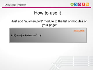
How to use it
Just add "aui-viewport" module to the list of modules on
                      your page:
                                             JavaScript
AUI().use('aui-viewport', ...);
How does it work
 It adds a few classes to the HTML element depending on
                  the width of the window:

                                                             HTML

 <html class="aui-view-gt320 aui-view-gt480 aui-view-gt720 aui-
 view-gt960 aui-view-960">


Based on these classes, you may create selectors which
              match some devices only.
AUI Viewport example
      Order the navigation items in a row for tablets...

                                                      CSS

#navigation li {
    display: inline;
    float: left;
}
AUI Viewport example
            ...or in column mode for smart phones

                                                    CSS

.aui-view-lt720 #navigation li {
     display: block;
     float: none;
}
Target specific browsers

                                              CSS
/* Browsers on smartphones */
.touch.aui-view-lt720 {}

/* Webkit based tablets and smartphones */
.webkit.aui-view-lt960 {}

/* Smaller browser views on just Windows */
.win.aui-view-720 {}
Pros and cons
                              Pros
●
    Simple and powerful
●
    Will work on browsers which don't support Media Queries
                              Cons
●
    Will not work if JavaScript is disabled
●
    JavaScript blocks rendering process
Supported browsers


                     6+
Responsive Design using Media Queries
Media Queries allow adapting the same content to a specific
                 range of output devices.
Responsive Design using Media Queries
Media Queries allow adapting the same content to a specific
                 range of output devices.
 CSS3 Media Queries extend the media queries we had in
       HTML4 [HTML401] and CSS2 [CSS21]:
‘aural’, ‘braille’, ‘handheld’, ‘print’, ‘projection’, ‘screen’, ‘tty’,
                                 ‘tv’
Loading CSS file only if needed
                                                          HTML
<link media="(min-width: 40.5em)" href="extensions.css"
rel="stylesheet" />


                                                          HTML
<link media="not screen and (color)" href="example.css"
rel="stylesheet" />
Example
        Apply a style sheet only in portrait orientation:

                                                            CSS

@media all and (orientation: portrait) {
….
}
A CSS pixel is not always a device pixel
  Web developers traditionally assumed a CSS pixel as a
                      device pixel.


 However, on high DPI devices (such as iPhone 4+) a CSS
     pixel may repsesent multiple pixels on screen.


If we set zoom magnifcation of 2x, then 1 CSS pixel would
 actually be represented by a 2×2 square of device pixels.
Resolving the situation
                                                             CSS
 @media
 only screen and ( -webkit-min-device-pixel-ratio: 2    ),
 only screen and ( min--moz-device-pixel-ratio: 2       ),
 only screen and ( -o-min-device-pixel-ratio:      2/1  ),
 only screen and ( min-device-pixel-ratio:        2     ),
 only screen and ( min-resolution:               192dpi ),
 only screen and ( min-resolution:               2dppx ) {

     /* Retina-specific stuff here */

 }


Opera requires fractions for the device-pixel-ratio
Param. Firefox 16 supports "min-resolution"
using the dppx unit.
Credits to css-tricks.com
Supported browsers


                     9+
Retrieving data
Retrieving data

 Pjax Utility
Pjax Utility
Progressively enhance normal links on a page.
Pjax Utility
       Progressively enhance normal links on a page.
In this way clicks result in the linked content being loaded via
                               Ajax.
How to use it
                  Plug the module to the content:

                                                    JavaScript
AUI().use('pjax', function (A) {
    new A.Pjax({container: '#content'});
});
Make the links Pjax-able
By default Pjax module will handle links which have ".yui3-
                       pjax" class.
 It is easy to customize this by overwriting "linkSelector"
                  attribute of Pjax module.
How does it work
●
    By default the Pjax instance listens to clicks on any link on
    the page that has a “yui3-pjax” class.
●
    When a “yui3-pjax” link is clicked, its URL will be loaded
    via Ajax and the loaded content will be inserted into the
    “#content” div, replacing its existing contents.
●
    When the Pjax Utility makes an Ajax request to the server,
    it adds a special X-PJAX HTTP header to the request.
A.Plugin.ScrollInfo

                   Useful when you want to:


●
    Implement infinite scrolling
●
    Lazy-load content
●
    Display data in the same way as native applications do it
How to use it
       Plug the module to a node (may be the page body):

var body = A.one('body');                                       JavaScript
body.plug(A.Plugin.ScrollInfo);

body.scrollInfo.on('scrollToBottom', function (event) {
    // Load more content when the user scrolls to the bottom of the page.
});
Provides useful information
Fires multiple events depending on the direction user scrolled the content:
●
    scrollToBottom – probably the most useful event
●
    scrollDown
●
    scrollLeft
●
    scrollRight
●
    scrollToLeft
●
    scrollToRight
●
    scrollToTop
●
    scrollUp
The future
The future

CSS Flexible Box Layout Module
●
    CSS box model optimized for user interface design.
●
    Similar to block layout.
●
    Designed for laying out more complex applications and
    webpages.
●
    Contents can be laid out in any flow direction.
●
    Display order can be reversed.
●
    Can “flex” contents sizes to respond to the available
    space.
The “Holy Grail Layout”
                       <header>

     <nav>             <article>                <aside>

●   Topic 1      Dynamic User Interfaces        Speakers
●   Topic 2
●   Topic 3
●   Topic 4
●   Topic 5

              <footer> Liferay Symposium 2012
The “Holy Grail Layout” source code
<!DOCTYPE html>                                  HTML

<header>Example Header</header>

<div id="main">

    <article>Dynamic User Interfaces</article>

    <nav>Topics</nav>

    <aside>Speakers</aside>

</div>

<footer>Liferay Symposium 2012</footer>
The “Holy Grail Layout”
                           <header>

     <nav>                 <article>               <aside>

●   Topic 1         Dynamic User Interfaces        Speakers
●   Topic 2
●   Topic 3
●   Topic 4
●   Topic 5

                 <footer> Liferay Symposium 2012


                          CSS
#main { display: flex; }
nav { order: 1; width: 200px; }
article { order: 2; flex: 1; }
aside { order: 3; width: 200px; }
What about mobile?
    Just restore document order and set the width to auto

@media screen and (max-width: 600px) {               CSS
  #main {
       flex-direction: column;
  }

    article {
         flex: none;
    }

    article, nav, aside {
         order: 0;
         width: auto;
    }
}
The “Holy Grail Layout” mobile view
                <header>

                 <article>

           Dynamic User Interfaces

                 <nav>
                 Topic 1

                 <aside>

                Speakers
        <footer> Liferay Symposium 2012
Creating a header
  Use “margin-left: auto” to separate flex items in “groups”.
 .header {                                              CSS
     display: flex;
 }

 .header .login {
     margin-left: auto;
 }

The result:
 Products Services Partners                           Sign In
Switching from row to column is
                 easy
●   The contents of a flex container can be laid out in any
    direction and in any order.
●   This functionality is exposed through the 'flex-direction',
    'flex-wrap', and 'order' properties.
●   Keep in mind this affects only the visual rendering and it
    will leave the speech order and navigation based on the
    source order.
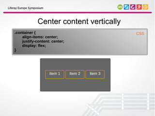
Center content vertically
.container {                                     CSS
    align-items: center;
    justify-content: center;
    display: flex;
}


                   Item 1      Item 2   Item 3
Reverse the order (row-reverse)
                                                CSS
.container {
    flex-direction: row-reverse;
    ...
}


                   Item 3     Item 2   Item 1
Reverse the order (column-reverse)
                                      CSS
.container {
    flex-direction: column-reverse;
    ...
}


                             Item 3

                             Item 2

                             Item 1
Multi-line flex container
Breaks its flex items across multiple lines. The cross size of each line is
   the minimum size necessary to contain the flex items on the line.

                                                                  CSS
.container { display: flex; width: 400px; }

.multi-line .item { width: 100px;}


 Item 1     Item 2     Item 3

 Item 4     Item 5
Multi-line auto flex container
Setting "flex: auto;" to the items will force them to absorb any free space
                                 remaining.

                                                                 CSS
.multi-line .item {
    flex: auto; /* or flex: 1 1 auto; */
    width: 100px;
}


  Item 1      Item 2        Item 3

  Item 4               Item 5
Supported browsers

                                                      10+

Notes:

Firefox Nightly (18.0a1, from 05.10.2012) requires to turn on
“layout.css.flexbox.enabled” in about:config

According to MSDN, IE10 will support the version from 22 March 2012
Summary
    Adapting the layout to the device the user is currently
    using:
●
    AlloyUI Viewport (JavaScript) and Media Queries (CSS)
Summary
    Adapting the layout to the device the user is currently
    using:
●
    AlloyUI Viewport (JavaScript) and Media Queries (CSS)
    Retrieving the data dynamically:
●
    Pjax Utility and ScrollInfo plugin
Summary
    Adapting the layout to the device the user is currently
    using:
●
    AlloyUI Viewport (JavaScript) and Media Queries (CSS)
    Retrieving the data dynamically:
●
    Pjax Utility and ScrollInfo plugin
    Looking at the future:
●
    Keep CSS Flexbox Layout in your radar and stay tuned :)
Questions?

Twitter   ipeychev
Google+ https://plus.google.com/101163834202763493709
email     iliyan.peychev@liferay.com
Ad

Recommended

Html5
Html5
mikusuraj
 
HTML5: An Introduction To Next Generation Web Development
Tilak Joshi
 
RESS – Responsive Webdesign and Server Side Components
Sven Wolfermann
 
Html5 on Mobile(For Developer)
Adam Lu
 
HTML5 and CSS3: does now really mean now?
Chris Mills
 
Device aware web frameworks for better programming
Suntae Kim
 
Understanding Webkit Rendering
Ariya Hidayat
 
Chrome Internals: Paint and Composition
Dzmitry Varabei
 
HTML5 - A Whirlwind tour
Lohith Goudagere Nagaraj
 
Html5 more than just html5 v final
Lohith Goudagere Nagaraj
 
Dive into HTML5: SVG and Canvas
Doris Chen
 
CSS3: Using media queries to improve the web site experience
Zoe Gillenwater
 
Using Web Standards to create Interactive Data Visualizations for the Web
philogb
 
Writing an extensible web testing framework ready for the cloud slide share
Mike Ensor
 
2022 HTML5: The future is now
Gonzalo Cordero
 
AspNetWhitePaper
AspNetWhitePaper
tutorialsruby
 
Intro to CSS3
Intro to CSS3
Denise Jacobs
 
Building Performance - ein Frontend-Build-Prozess für Java mit Maven
Oliver Ochs
 
A Snapshot of the Mobile HTML5 Revolution
James Pearce
 
HTML5 and the dawn of rich mobile web applications pt 2
James Pearce
 
Word camp nextweb
Word camp nextweb
Panagiotis Grigoropoulos
 
Building Cross Platform Mobile Web Apps
James Pearce
 
[SF HTML5] Responsive Cross-Device Development with Web Standards (2013)
[SF HTML5] Responsive Cross-Device Development with Web Standards (2013)
Tomomi Imura
 
Svcc 2013-css3-and-mobile
Oswald Campesato
 
Building high performing web pages
Nilesh Bafna
 
Devon 2011-f-1 반응형 웹 디자인
Daum DNA
 
Drupal 7 - The Top 40 Core Modules and What They Mean for You
Acquia
 
Wordcamp Thessaloniki 2011 The Nextweb
George Kanellopoulos
 
Media queries
Media queries
Kevin DeRudder
 
Responsive web design
Richa Goel
 

More Related Content

What's hot (20)

HTML5 - A Whirlwind tour
Lohith Goudagere Nagaraj
 
Html5 more than just html5 v final
Lohith Goudagere Nagaraj
 
Dive into HTML5: SVG and Canvas
Doris Chen
 
CSS3: Using media queries to improve the web site experience
Zoe Gillenwater
 
Using Web Standards to create Interactive Data Visualizations for the Web
philogb
 
Writing an extensible web testing framework ready for the cloud slide share
Mike Ensor
 
2022 HTML5: The future is now
Gonzalo Cordero
 
AspNetWhitePaper
AspNetWhitePaper
tutorialsruby
 
Intro to CSS3
Intro to CSS3
Denise Jacobs
 
Building Performance - ein Frontend-Build-Prozess für Java mit Maven
Oliver Ochs
 
A Snapshot of the Mobile HTML5 Revolution
James Pearce
 
HTML5 and the dawn of rich mobile web applications pt 2
James Pearce
 
Word camp nextweb
Word camp nextweb
Panagiotis Grigoropoulos
 
Building Cross Platform Mobile Web Apps
James Pearce
 
[SF HTML5] Responsive Cross-Device Development with Web Standards (2013)
[SF HTML5] Responsive Cross-Device Development with Web Standards (2013)
Tomomi Imura
 
Svcc 2013-css3-and-mobile
Oswald Campesato
 
Building high performing web pages
Nilesh Bafna
 
Devon 2011-f-1 반응형 웹 디자인
Daum DNA
 
Drupal 7 - The Top 40 Core Modules and What They Mean for You
Acquia
 
Wordcamp Thessaloniki 2011 The Nextweb
George Kanellopoulos
 
Dive into HTML5: SVG and Canvas
Doris Chen
 
CSS3: Using media queries to improve the web site experience
Zoe Gillenwater
 
Using Web Standards to create Interactive Data Visualizations for the Web
philogb
 
Writing an extensible web testing framework ready for the cloud slide share
Mike Ensor
 
2022 HTML5: The future is now
Gonzalo Cordero
 
Building Performance - ein Frontend-Build-Prozess für Java mit Maven
Oliver Ochs
 
A Snapshot of the Mobile HTML5 Revolution
James Pearce
 
HTML5 and the dawn of rich mobile web applications pt 2
James Pearce
 
Building Cross Platform Mobile Web Apps
James Pearce
 
[SF HTML5] Responsive Cross-Device Development with Web Standards (2013)
[SF HTML5] Responsive Cross-Device Development with Web Standards (2013)
Tomomi Imura
 
Building high performing web pages
Nilesh Bafna
 
Devon 2011-f-1 반응형 웹 디자인
Daum DNA
 
Drupal 7 - The Top 40 Core Modules and What They Mean for You
Acquia
 
Wordcamp Thessaloniki 2011 The Nextweb
George Kanellopoulos
 

Similar to Dynamic User Interfaces for Desktop and Mobile (20)

Media queries
Media queries
Kevin DeRudder
 
Responsive web design
Richa Goel
 
CSS3, Media Queries, and Responsive Design
Zoe Gillenwater
 
The Future of CSS Layout
Zoe Gillenwater
 
Introduction to CSS3
Doris Chen
 
Great Responsive-ability Web Design
Mike Wilcox
 
Html 5 mobile - nitty gritty
Mario Noble
 
Content strategy for mobile
Karolina Szczur
 
Mobile Best Practices
mintersam
 
Castro Chapter 11
Castro Chapter 11
Jeff Byrnes
 
Responsive Web Designs
Nusrat Khanom
 
The Mobile Development Landscape
Ambert Ho
 
Advanced CSS.pptx
Advanced CSS.pptx
DiyonaVas
 
Responsive Design Tools & Resources
Clarissa Peterson
 
Responsive Web Design
Julia Vi
 
CSS3: Simply Responsive
Denise Jacobs
 
Chapter 17: Responsive Web Design
Steve Guinan
 
Responsive Web Site Design
Jussi Pohjolainen
 
Fewd week7 slides
Fewd week7 slides
William Myers
 
CSS3: Ripe and Ready to Respond
Denise Jacobs
 
Responsive web design
Richa Goel
 
CSS3, Media Queries, and Responsive Design
Zoe Gillenwater
 
The Future of CSS Layout
Zoe Gillenwater
 
Introduction to CSS3
Doris Chen
 
Great Responsive-ability Web Design
Mike Wilcox
 
Html 5 mobile - nitty gritty
Mario Noble
 
Content strategy for mobile
Karolina Szczur
 
Mobile Best Practices
mintersam
 
Castro Chapter 11
Castro Chapter 11
Jeff Byrnes
 
Responsive Web Designs
Nusrat Khanom
 
The Mobile Development Landscape
Ambert Ho
 
Advanced CSS.pptx
Advanced CSS.pptx
DiyonaVas
 
Responsive Design Tools & Resources
Clarissa Peterson
 
Responsive Web Design
Julia Vi
 
CSS3: Simply Responsive
Denise Jacobs
 
Chapter 17: Responsive Web Design
Steve Guinan
 
CSS3: Ripe and Ready to Respond
Denise Jacobs
 
Ad

More from peychevi (7)

Client Extensions 101 - DEVCON 2023
peychevi
 
Extending Kubernetes with Operators
peychevi
 
Best practices for creating modular Web applications
peychevi
 
Modern Web Developement
peychevi
 
Creating a WYSIWYG Editor with React
peychevi
 
HTTP/2 and QUICK protocols. Optimizing the Web stack for HTTP/2 era
peychevi
 
Implementing AutoComplete for Freemarker and Velocity languages in ACE Editor
peychevi
 
Ad

Recently uploaded (20)

Mastering AI Workflows with FME by Mark Döring
Safe Software
 
Cyber Defense Matrix Workshop - RSA Conference
Priyanka Aash
 
UserCon Belgium: Honey, VMware increased my bill
stijn40
 
EIS-Webinar-Engineering-Retail-Infrastructure-06-16-2025.pdf
Earley Information Science
 
A Constitutional Quagmire - Ethical Minefields of AI, Cyber, and Privacy.pdf
Priyanka Aash
 
"Scaling in space and time with Temporal", Andriy Lupa.pdf
Fwdays
 
Raman Bhaumik - Passionate Tech Enthusiast
Raman Bhaumik
 
Smarter Aviation Data Management: Lessons from Swedavia Airports and Sweco
Safe Software
 
OWASP Barcelona 2025 Threat Model Library
PetraVukmirovic
 
Securing Account Lifecycles in the Age of Deepfakes.pptx
FIDO Alliance
 
9-1-1 Addressing: End-to-End Automation Using FME
Safe Software
 
cnc-processing-centers-centateq-p-110-en.pdf
AmirStern2
 
AI vs Human Writing: Can You Tell the Difference?
Shashi Sathyanarayana, Ph.D
 
"Database isolation: how we deal with hundreds of direct connections to the d...
Fwdays
 
CapCut Pro Crack For PC Latest Version {Fully Unlocked} 2025
pcprocore
 
Security Tips for Enterprise Azure Solutions
Michele Leroux Bustamante
 
From Manual to Auto Searching- FME in the Driver's Seat
Safe Software
 
WebdriverIO & JavaScript: The Perfect Duo for Web Automation
digitaljignect
 
The Future of Technology: 2025-2125 by Saikat Basu.pdf
Saikat Basu
 
"How to survive Black Friday: preparing e-commerce for a peak season", Yurii ...
Fwdays
 

Dynamic User Interfaces for Desktop and Mobile

  • 1. DYNAMIC USER INTERFACES for Desktop and Mobile Iliyan Peychev Liferay Core Developer
  • 2. Agenda ● Responsive design using JavaScript - AlloyUI Viewport ● Responsive design using CSS - Media Queries ● Dynamically retrieving data – Pjax and A.Plugin.ScrollInfo ● The future - CSS Flexible Box Layout Module
  • 3. Responsive design using JavaScript AlloyUI Viewport allows you to adapt your layout based on the following size groups: ● 320px - smart phones in portrait mode ● 480px - smart phones in landscape mode ● 720px - for tablets in portrait mode ● 960px - for Desktop browsers
  • 4. Overwriting the magic numbers These are in "defaults.viewport" namespace so you can overwrite them. JavaScript var viewport = YUI.AUI.namespace('defaults.viewport'); viewport.columns = { ... };
  • 5. Supports greater than or less than the specified widths. ● It is also possible to target widths, greater than or less than the specified. ● If you have a device with 600x800px screen resolution, you can still target that device with the CSS classes.
  • 6. How to use it Just add "aui-viewport" module to the list of modules on your page: JavaScript AUI().use('aui-viewport', ...);
  • 7. How does it work It adds a few classes to the HTML element depending on the width of the window: HTML <html class="aui-view-gt320 aui-view-gt480 aui-view-gt720 aui- view-gt960 aui-view-960"> Based on these classes, you may create selectors which match some devices only.
  • 8. AUI Viewport example Order the navigation items in a row for tablets... CSS #navigation li { display: inline; float: left; }
  • 9. AUI Viewport example ...or in column mode for smart phones CSS .aui-view-lt720 #navigation li { display: block; float: none; }
  • 10. Target specific browsers CSS /* Browsers on smartphones */ .touch.aui-view-lt720 {} /* Webkit based tablets and smartphones */ .webkit.aui-view-lt960 {} /* Smaller browser views on just Windows */ .win.aui-view-720 {}
  • 11. Pros and cons Pros ● Simple and powerful ● Will work on browsers which don't support Media Queries Cons ● Will not work if JavaScript is disabled ● JavaScript blocks rendering process
  • 13. Responsive Design using Media Queries
  • 14. Responsive Design using Media Queries Media Queries allow adapting the same content to a specific range of output devices.
  • 15. Responsive Design using Media Queries Media Queries allow adapting the same content to a specific range of output devices. CSS3 Media Queries extend the media queries we had in HTML4 [HTML401] and CSS2 [CSS21]: ‘aural’, ‘braille’, ‘handheld’, ‘print’, ‘projection’, ‘screen’, ‘tty’, ‘tv’
  • 16. Loading CSS file only if needed HTML <link media="(min-width: 40.5em)" href="extensions.css" rel="stylesheet" /> HTML <link media="not screen and (color)" href="example.css" rel="stylesheet" />
  • 17. Example Apply a style sheet only in portrait orientation: CSS @media all and (orientation: portrait) { …. }
  • 18. A CSS pixel is not always a device pixel Web developers traditionally assumed a CSS pixel as a device pixel. However, on high DPI devices (such as iPhone 4+) a CSS pixel may repsesent multiple pixels on screen. If we set zoom magnifcation of 2x, then 1 CSS pixel would actually be represented by a 2×2 square of device pixels.
  • 19. Resolving the situation CSS @media only screen and ( -webkit-min-device-pixel-ratio: 2 ), only screen and ( min--moz-device-pixel-ratio: 2 ), only screen and ( -o-min-device-pixel-ratio: 2/1 ), only screen and ( min-device-pixel-ratio: 2 ), only screen and ( min-resolution: 192dpi ), only screen and ( min-resolution: 2dppx ) { /* Retina-specific stuff here */ } Opera requires fractions for the device-pixel-ratio Param. Firefox 16 supports "min-resolution" using the dppx unit. Credits to css-tricks.com
  • 23. Pjax Utility Progressively enhance normal links on a page.
  • 24. Pjax Utility Progressively enhance normal links on a page. In this way clicks result in the linked content being loaded via Ajax.
  • 25. How to use it Plug the module to the content: JavaScript AUI().use('pjax', function (A) { new A.Pjax({container: '#content'}); });
  • 26. Make the links Pjax-able By default Pjax module will handle links which have ".yui3- pjax" class. It is easy to customize this by overwriting "linkSelector" attribute of Pjax module.
  • 27. How does it work ● By default the Pjax instance listens to clicks on any link on the page that has a “yui3-pjax” class. ● When a “yui3-pjax” link is clicked, its URL will be loaded via Ajax and the loaded content will be inserted into the “#content” div, replacing its existing contents. ● When the Pjax Utility makes an Ajax request to the server, it adds a special X-PJAX HTTP header to the request.
  • 28. A.Plugin.ScrollInfo Useful when you want to: ● Implement infinite scrolling ● Lazy-load content ● Display data in the same way as native applications do it
  • 29. How to use it Plug the module to a node (may be the page body): var body = A.one('body'); JavaScript body.plug(A.Plugin.ScrollInfo); body.scrollInfo.on('scrollToBottom', function (event) { // Load more content when the user scrolls to the bottom of the page. });
  • 30. Provides useful information Fires multiple events depending on the direction user scrolled the content: ● scrollToBottom – probably the most useful event ● scrollDown ● scrollLeft ● scrollRight ● scrollToLeft ● scrollToRight ● scrollToTop ● scrollUp
  • 32. The future CSS Flexible Box Layout Module
  • 33. CSS Flexible Box Layout Module ● CSS box model optimized for user interface design. ● Similar to block layout. ● Designed for laying out more complex applications and webpages. ● Contents can be laid out in any flow direction. ● Display order can be reversed. ● Can “flex” contents sizes to respond to the available space.
  • 34. The “Holy Grail Layout” <header> <nav> <article> <aside> ● Topic 1 Dynamic User Interfaces Speakers ● Topic 2 ● Topic 3 ● Topic 4 ● Topic 5 <footer> Liferay Symposium 2012
  • 35. The “Holy Grail Layout” source code <!DOCTYPE html> HTML <header>Example Header</header> <div id="main"> <article>Dynamic User Interfaces</article> <nav>Topics</nav> <aside>Speakers</aside> </div> <footer>Liferay Symposium 2012</footer>
  • 36. The “Holy Grail Layout” <header> <nav> <article> <aside> ● Topic 1 Dynamic User Interfaces Speakers ● Topic 2 ● Topic 3 ● Topic 4 ● Topic 5 <footer> Liferay Symposium 2012 CSS #main { display: flex; } nav { order: 1; width: 200px; } article { order: 2; flex: 1; } aside { order: 3; width: 200px; }
  • 37. What about mobile? Just restore document order and set the width to auto @media screen and (max-width: 600px) { CSS #main { flex-direction: column; } article { flex: none; } article, nav, aside { order: 0; width: auto; } }
  • 38. The “Holy Grail Layout” mobile view <header> <article> Dynamic User Interfaces <nav> Topic 1 <aside> Speakers <footer> Liferay Symposium 2012
  • 39. Creating a header Use “margin-left: auto” to separate flex items in “groups”. .header { CSS display: flex; } .header .login { margin-left: auto; } The result: Products Services Partners Sign In
  • 40. Switching from row to column is easy ● The contents of a flex container can be laid out in any direction and in any order. ● This functionality is exposed through the 'flex-direction', 'flex-wrap', and 'order' properties. ● Keep in mind this affects only the visual rendering and it will leave the speech order and navigation based on the source order.
  • 41. Center content vertically .container { CSS align-items: center; justify-content: center; display: flex; } Item 1 Item 2 Item 3
  • 42. Reverse the order (row-reverse) CSS .container { flex-direction: row-reverse; ... } Item 3 Item 2 Item 1
  • 43. Reverse the order (column-reverse) CSS .container { flex-direction: column-reverse; ... } Item 3 Item 2 Item 1
  • 44. Multi-line flex container Breaks its flex items across multiple lines. The cross size of each line is the minimum size necessary to contain the flex items on the line. CSS .container { display: flex; width: 400px; } .multi-line .item { width: 100px;} Item 1 Item 2 Item 3 Item 4 Item 5
  • 45. Multi-line auto flex container Setting "flex: auto;" to the items will force them to absorb any free space remaining. CSS .multi-line .item { flex: auto; /* or flex: 1 1 auto; */ width: 100px; } Item 1 Item 2 Item 3 Item 4 Item 5
  • 46. Supported browsers 10+ Notes: Firefox Nightly (18.0a1, from 05.10.2012) requires to turn on “layout.css.flexbox.enabled” in about:config According to MSDN, IE10 will support the version from 22 March 2012
  • 47. Summary Adapting the layout to the device the user is currently using: ● AlloyUI Viewport (JavaScript) and Media Queries (CSS)
  • 48. Summary Adapting the layout to the device the user is currently using: ● AlloyUI Viewport (JavaScript) and Media Queries (CSS) Retrieving the data dynamically: ● Pjax Utility and ScrollInfo plugin
  • 49. Summary Adapting the layout to the device the user is currently using: ● AlloyUI Viewport (JavaScript) and Media Queries (CSS) Retrieving the data dynamically: ● Pjax Utility and ScrollInfo plugin Looking at the future: ● Keep CSS Flexbox Layout in your radar and stay tuned :)
  • 50. Questions? Twitter ipeychev Google+ https://plus.google.com/101163834202763493709 email [email protected]