Ensuring Design Standards with Web Components
Download as PPTX, PDF1 like562 views

The document discusses building a design system using Polymer web components. It provides an overview of the key aspects of web components, including custom elements, HTML imports, templates, shadow DOM, and how they enable encapsulation and reuse of UI elements. It then demonstrates how to build a simple custom element in Polymer, including defining the element class, template, and styles. The presentation emphasizes how Polymer and web components help manage styles and build reusable, encapsulated UI components for design systems.


![Rendered Result:
Shadow DOM is awesome
Paragraph in the main document
my-element.html:
<style>
:host {
outline: 3px dashed blue;
display: block;
contain: content;
}
:host([disabled]) {
outline-color: #ccc;
}
:host([disabled]) > p {
border-color: #ccc;
} ...
</style>](https://image.slidesharecdn.com/ensuringdesignstandardswithwebcomponents-illinoiswebcon-180404202352/85/Ensuring-Design-Standards-with-Web-Components-82-320.jpg)
![Rendered Result:
Shadow DOM is awesome
Paragraph in the main document
my-element.html:
<style>
:host {
outline: 3px dashed blue;
display: block;
contain: content;
}
:host([disabled]) {
outline-color: #ccc;
}
:host([disabled]) > p {
border-color: #ccc;
} ...
</style>
index.html:
<my-element></my-element>
<p>Paragraph in the main
document</p>](https://image.slidesharecdn.com/ensuringdesignstandardswithwebcomponents-illinoiswebcon-180404202352/85/Ensuring-Design-Standards-with-Web-Components-83-320.jpg)
![Rendered Result:
Shadow DOM is awesome
Paragraph in the main document
my-element.html:
<style>
:host {
outline: 3px dashed blue;
display: block;
contain: content;
}
:host([disabled]) {
outline-color: #ccc;
}
:host([disabled]) > p {
border-color: #ccc;
} ...
</style>
index.html:
<my-element disabled></my-element>
<p>Paragraph in the main
document</p>](https://image.slidesharecdn.com/ensuringdesignstandardswithwebcomponents-illinoiswebcon-180404202352/85/Ensuring-Design-Standards-with-Web-Components-84-320.jpg)
![Rendered Result:
Shadow DOM is awesome
Paragraph in the main document
my-element.html:
<style>
:host {
outline: 3px dashed blue;
display: block;
contain: content;
}
:host([disabled]) {
outline-color: #ccc;
}
:host([disabled]) > p {
border-color: #ccc;
} ...
</style>
index.html:
<my-element></my-element>
<p>Paragraph in the main
document</p>](https://image.slidesharecdn.com/ensuringdesignstandardswithwebcomponents-illinoiswebcon-180404202352/85/Ensuring-Design-Standards-with-Web-Components-85-320.jpg)


`paper-tabs` makes it easy to explore
and switch between different views or
functional aspects of
an app, or to browse categorized data
sets.
Use `selected` property to get or set
the selected tab.
Example:
<paper-tabs selected="0">
<paper-tab>TAB 1</paper-tab>
<paper-tab>TAB 2</paper-tab>
<paper-tab>TAB 3</paper-tab>
</paper-tabs>](https://image.slidesharecdn.com/ensuringdesignstandardswithwebcomponents-illinoiswebcon-180404202352/85/Ensuring-Design-Standards-with-Web-Components-157-320.jpg)


![<script href="https://polaris.xfinity.com/polaris.js"></script>
<xc-header
tab="myaccount"
is-authed="[[isAuthed]]"
login-url="/login"
sign-out-url="/logout"
first-name="[[openidData.given_name]]"
user-name="[[openidData.preferred_username]]">
</xc-header>
<xc-footer></xc-footer>
View the Open Source code at https://github.com/Comcast/polaris
174 Ensuring Design Standards with Web Components - @JohnRiv @chiefcll](https://image.slidesharecdn.com/ensuringdesignstandardswithwebcomponents-illinoiswebcon-180404202352/85/Ensuring-Design-Standards-with-Web-Components-174-320.jpg)


Ensuring Design Standards with Web Components
- 1. Ensuring Design Standards with Web Components University of Illinois WebCon – April 5, 2018 John Riviello @JohnRiv Chris Lorenzo @Chiefcll
- 2. © Comcast
- 3. © Comcast
- 4. © Comcast
- 5. © Comcast
- 6. © Comcast
- 7. © Comcast
- 8. "Notebook beside the iPhone on Table" by PicJumbo is licensed under CC0 1.0
- 10. WHY?!? 1. Communication 2. Deviations "Alone" by Pixabay is licensed under CC0 1.0
- 11. “Designers should build products that solve needs instead of spending time on reinventions” - Jack Zankowski Creative Director, Comcast XD
- 16. "Mask, Ancient Artifact" by Pedro_Teixeira is licensed under CC0 1.0
- 17. "Abstract Business Code" by Pixabay is licensed under CC0 1.0
- 20. “And You Thought Buttons Were Easy?” - Nathan Curtis Source: https://medium.com/eightshapes-llc/and-you-thought-buttons-were-easy-26eb5b5c1871
- 21. Source: https://medium.com/eightshapes-llc/and-you-thought-buttons-were-easy-26eb5b5c1871 $100/hour x 200 hours = $20,000
- 22. Source: https://medium.com/eightshapes-llc/and-you-thought-buttons-were-easy-26eb5b5c1871 $20,000 x 50 teams = $1,000,000
- 23. Source: https://medium.com/eightshapes-llc/and-you-thought-buttons-were-easy-26eb5b5c1871 $20,000 x 50 teams = $1,000,000
- 24. "Books on Shelf in Library" by Pixabay is licensed under CC0 1.0
- 29. 118 contributors 245 contributors 707 contributors
- 30. “A design system’s value is realized when products ship features using parts from the system.” - Nathan Curtis Source: https://medium.com/eightshapes-llc/a-design-system-isn-t-a-project-it-s-a-product-serving-products-74dcfffef935
- 31. Design System Design & Development Source: http://atomicdesign.bradfrost.com/chapter-5/ Website Pattern Library Make changes to a pattern Applications and pattern library both update to reflect changes
- 34. Existing Frameworks Applications Web Platform Web Components built with Polymer (or not)
- 36. What Are Web Components? Ensuring Design Standards with Web Components - @JohnRiv @chiefcll36 4 Specs
- 37. What Are Web Components? 37 Custom Elements Ensuring Design Standards with Web Components - @JohnRiv @chiefcll
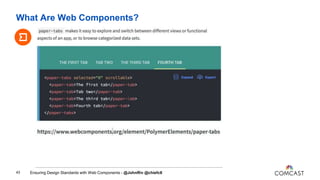
- 38. What Are Web Components? 38 Custom Elements •Provides a way for authors to build their own fully-featured DOM elements. <paper-tabs selected="0" scrollable> <paper-tab>The first tab</paper-tab> <paper-tab>Tab two</paper-tab> <paper-tab>The third tab</paper-tab> <paper-tab>Fourth tab</paper-tab> </paper-tabs> Ensuring Design Standards with Web Components - @JohnRiv @chiefcll
- 39. What Are Web Components? 39 Ensuring Design Standards with Web Components - @JohnRiv @chiefcll
- 40. What Are Web Components? 40 HTML Imports Ensuring Design Standards with Web Components - @JohnRiv @chiefcll
- 41. What Are Web Components? 41 HTML Imports • Means to import custom elements - <link rel="import" href="paper-tabs.html"> • Built-in deduplication • Componetize the HTML, CSS & JavaScript • Will be replaced by ES6 Modules - import "paper-tabs.js" Ensuring Design Standards with Web Components - @JohnRiv @chiefcll
- 42. What Are Web Components? 42 HTML Imports • Means to import custom elements - <link rel="import" href="paper-tabs.html"> • Built-in deduplication • Componetize the HTML, CSS & JavaScript • Will be replaced by ES6 Modules - import "paper-tabs.js" Ensuring Design Standards with Web Components - @JohnRiv @chiefcll
- 43. What Are Web Components? 43 Ensuring Design Standards with Web Components - @JohnRiv @chiefcll
- 44. What Are Web Components? 44 Templates Ensuring Design Standards with Web Components - @JohnRiv @chiefcll
- 45. What Are Web Components? 45 • Used to declare fragments of HTML - <template id="tab"> <div class="tab-content"></div> </template> • The element itself renders nothing • Can be cloned and inserted in the document via JavaScript, which will render the content Templates Ensuring Design Standards with Web Components - @JohnRiv @chiefcll
- 46. What Are Web Components? 46 Ensuring Design Standards with Web Components - @JohnRiv @chiefcll
- 47. What Are Web Components? 47 Shadow DOM Ensuring Design Standards with Web Components - @JohnRiv @chiefcll
- 48. What Are Web Components? 48 •Allows you to take a DOM subtree and hide it from the document scope •Hides CSS styles as well •Common examples from HTML5 include: <select>, <video>, & <input type="date"> Shadow DOM Ensuring Design Standards with Web Components - @JohnRiv @chiefcll
- 49. What Are Web Components? 49 Ensuring Design Standards with Web Components - @JohnRiv @chiefcll
- 50. Source: https://www.webcomponents.org/element/PolymerElements/paper-tabs
- 52. How do I build my Design System using Polymer?
- 53. “A style guide is an artifact of design process. A design system is a living, funded product with a roadmap & backlog, serving an ecosystem.” - Nathan Curtis Source: https://twitter.com/nathanacurtis/status/656829204235972608
- 54. You Need a TeamYou Need a Team
- 55. “Establish a high-quality, brand-aligned experience across our product through human guidance and internal tools.” - Jina Anne Source: https://medium.com/salesforce-ux/the-salesforce-team-model-for-scaling-a-design-system-d89c2a2d404b Salesforce.com Design Systems Team Objective:
- 56. "Person Workshop" is licensed under CC0 1.0 / Adjusted from original
- 60. Building Your Design System with Polymer CSS IS AWESOME 60 Source: https://philipwalton.github.io/talks/2015-10-26/#7 • Managing global names • Scoping/isolating styles • Specificity conflicts • Unpredictable matching • Managing style dependencies • Removing unused code Ensuring Design Standards with Web Components - @JohnRiv @chiefcll
- 62. my-element.html: <link rel="import" href="bower_components/polymer/polymer-element.html"> <dom-module id="my-element"> <template> <style> /* My Element Styles */ </style> <p>Shadow DOM is awesome</p> </template> <script> class MyElement extends Polymer.Element { static get is() { return 'my-element'; } } window.customElements.define(MyElement.is, MyElement); </script> </dom-module>
- 63. my-element.html: <link rel="import" href="bower_components/polymer/polymer-element.html"> <dom-module id="my-element"> <template> <style> /* My Element Styles */ </style> <p>Shadow DOM is awesome</p> </template> <script> class MyElement extends Polymer.Element { static get is() { return 'my-element'; } } window.customElements.define(MyElement.is, MyElement); </script> </dom-module> Import Polymer.Element
- 64. my-element.html: <link rel="import" href="bower_components/polymer/polymer-element.html"> <dom-module id="my-element"> <template> <style> /* My Element Styles */ </style> <p>Shadow DOM is awesome</p> </template> <script> class MyElement extends Polymer.Element { static get is() { return 'my-element'; } } window.customElements.define(MyElement.is, MyElement); </script> </dom-module> Styles we’ll be modifying
- 65. my-element.html: <link rel="import" href="bower_components/polymer/polymer-element.html"> <dom-module id="my-element"> <template> <style> /* My Element Styles */ </style> <p>Shadow DOM is awesome</p> </template> <script> class MyElement extends Polymer.Element { static get is() { return 'my-element'; } } window.customElements.define(MyElement.is, MyElement); </script> </dom-module> Template contains <p>
- 66. my-element.html: <link rel="import" href="bower_components/polymer/polymer-element.html"> <dom-module id="my-element"> <template> <style> /* My Element Styles */ </style> <p>Shadow DOM is awesome</p> </template> <script> class MyElement extends Polymer.Element { static get is() { return 'my-element'; } } window.customElements.define(MyElement.is, MyElement); </script> </dom-module> Polymer Boilerplate
- 67. my-element.html: <link rel="import" href="bower_components/polymer/polymer-element.html"> <dom-module id="my-element"> <template> <style> /* My Element Styles */ </style> <p>Shadow DOM is awesome</p> </template> <script> class MyElement extends Polymer.Element { static get is() { return 'my-element'; } } window.customElements.define(MyElement.is, MyElement); </script> </dom-module> index.html: <!doctype html> <html> <head> <title>Shadow DOM Demo</title> <script src="bower_components/webcomponentsjs/webcomponent s-loader.js"></script> <link rel="import" href="my-element.html"> <style> /* Main Document Styles */ </style> </head> <body> <my-element></my-element> <p>Paragraph in the main document</p> </body> </html>
- 68. my-element.html: <link rel="import" href="bower_components/polymer/polymer-element.html"> <dom-module id="my-element"> <template> <style> /* My Element Styles */ </style> <p>Shadow DOM is awesome</p> </template> <script> class MyElement extends Polymer.Element { static get is() { return 'my-element'; } } window.customElements.define(MyElement.is, MyElement); </script> </dom-module> index.html: <!doctype html> <html> <head> <title>Shadow DOM Demo</title> <script src="bower_components/webcomponentsjs/webcomponent s-loader.js"></script> <link rel="import" href="my-element.html"> <style> /* Main Document Styles */ </style> </head> <body> <my-element></my-element> <p>Paragraph in the main document</p> </body> </html> Load Polyfills (if needed)
- 69. my-element.html: <link rel="import" href="bower_components/polymer/polymer-element.html"> <dom-module id="my-element"> <template> <style> /* My Element Styles */ </style> <p>Shadow DOM is awesome/p> </template> <script> class MyElement extends Polymer.Element { static get is() { return 'my-element'; } } window.customElements.define(MyElement.is, MyElement); </script> </dom-module> index.html: <!doctype html> <html> <head> <title>Shadow DOM Demo</title> <script src="bower_components/webcomponentsjs/webcomponent s-loader.js"></script> <link rel="import" href="my-element.html"> <style> /* Main Document Styles */ </style> </head> <body> <my-element></my-element> <p>Paragraph in the main document</p> </body> </html> Import my-element.html
- 70. my-element.html: <link rel="import" href="bower_components/polymer/polymer-element.html"> <dom-module id="my-element"> <template> <style> /* My Element Styles */ </style> <p>Shadow DOM is awesome</p> </template> <script> class MyElement extends Polymer.Element { static get is() { return 'my-element'; } } window.customElements.define(MyElement.is, MyElement); </script> </dom-module> index.html: <!doctype html> <html> <head> <title>Shadow DOM Demo</title> <script src="bower_components/webcomponentsjs/webcomponent s-loader.js"></script> <link rel="import" href="my-element.html"> <style> /* Main Document Styles */ </style> </head> <body> <my-element></my-element> <p>Paragraph in the main document</p> </body> </html> Styles we’ll be modifying
- 71. index.html: <!doctype html> <html> <head> <title>Shadow DOM Demo</title> <script src="bower_components/webcomponentsjs/webcomponent s-loader.js"></script> <link rel="import" href="my-element.html"> <style> /* Main Document Styles */ </style> </head> <body> <my-element></my-element> <p>Paragraph in the main document</p> </body> </html> my-element.html: <link rel="import" href="bower_components/polymer/polymer-element.html"> <dom-module id="my-element"> <template> <style> /* My Element Styles */ </style> <p>Shadow DOM is awesome</p> </template> <script> class MyElement extends Polymer.Element { static get is() { return 'my-element'; } } window.customElements.define(MyElement.is, MyElement); </script> </dom-module> Body contains <my-element> & <p>
- 72. my-element.html: <link rel="import" href="bower_components/polymer/polymer-element.html"> <dom-module id="my-element"> <template> <style> /* My Element Styles */ </style> <p>Shadow DOM is awesome</p> </template> <script> class MyElement extends Polymer.Element { static get is() { return 'my-element'; } } window.customElements.define(MyElement.is, MyElement); </script> </dom-module> index.html: <!doctype html> <html> <head> <title>Shadow DOM Demo</title> <script src="bower_components/webcomponentsjs/webcomponent s-loader.js"></script> <link rel="import" href="my-element.html"> <style> /* Main Document Styles */ </style> </head> <body> <my-element></my-element> <p>Paragraph in the main document</p> </body> </html> Flattened DOM Tree: <body> <my-element> #shadow-root (open) <style>...</style> <p>Shadow DOM is awesome</p> </my-element> <p>Paragraph in the main document</p> </body>
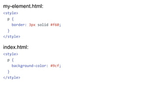
- 73. my-element.html: <style> p { border: 3px solid #f60; } </style>
- 74. my-element.html: <style> p { border: 3px solid #f60; } </style> index.html: <style> p { background-color: #9cf; } </style>
- 75. Rendered Result: Shadow DOM is awesome Paragraph in the main document my-element.html: <style> p { border: 3px solid #f60; } </style> index.html: <style> p { background-color: #9cf; } </style>
- 76. Rendered Result: Shadow DOM is awesome Paragraph in the main document my-element.html: <style> :host { } p { border: 3px solid #f60; } </style> :host selector
- 77. Rendered Result: Shadow DOM is awesome Paragraph in the main document my-element.html: <style> :host { } p { border: 3px solid #f60; } </style> Flattened DOM Tree: <body> <my-element> #shadow-root (open) <style>...</style> <p>Shadow DOM is awesome</p> </my-element> <p>Paragraph in the main document</p> </body>
- 78. Rendered Result: Shadow DOM is awesome Paragraph in the main document my-element.html: <style> :host { outline: 3px dashed blue; } p { border: 3px solid #f60; } </style>
- 79. Rendered Result: Shadow DOM is awesome Paragraph in the main document my-element.html: <style> :host { outline: 3px dashed blue; display: block; } p { border: 3px solid #f60; } </style>
- 80. Rendered Result: Shadow DOM is awesome Paragraph in the main document my-element.html: <style> :host { outline: 3px dashed blue; display: block; contain: content; } p { border: 3px solid #f60; } </style> See https://developers.google.com/web/updates/2016/06/css-containment for more information on contain
- 81. Rendered Result: Shadow DOM is awesome Paragraph in the main document my-element.html: <style> :host { outline: 3px dashed blue; display: block; contain: content; } p { border: 3px solid #f60; margin: 0; } </style> See https://developers.google.com/web/updates/2016/06/css-containment for more information on contain
- 82. Rendered Result: Shadow DOM is awesome Paragraph in the main document my-element.html: <style> :host { outline: 3px dashed blue; display: block; contain: content; } :host([disabled]) { outline-color: #ccc; } :host([disabled]) > p { border-color: #ccc; } ... </style>
- 83. Rendered Result: Shadow DOM is awesome Paragraph in the main document my-element.html: <style> :host { outline: 3px dashed blue; display: block; contain: content; } :host([disabled]) { outline-color: #ccc; } :host([disabled]) > p { border-color: #ccc; } ... </style> index.html: <my-element></my-element> <p>Paragraph in the main document</p>
- 84. Rendered Result: Shadow DOM is awesome Paragraph in the main document my-element.html: <style> :host { outline: 3px dashed blue; display: block; contain: content; } :host([disabled]) { outline-color: #ccc; } :host([disabled]) > p { border-color: #ccc; } ... </style> index.html: <my-element disabled></my-element> <p>Paragraph in the main document</p>
- 85. Rendered Result: Shadow DOM is awesome Paragraph in the main document my-element.html: <style> :host { outline: 3px dashed blue; display: block; contain: content; } :host([disabled]) { outline-color: #ccc; } :host([disabled]) > p { border-color: #ccc; } ... </style> index.html: <my-element></my-element> <p>Paragraph in the main document</p>
- 86. Rendered Result: Shadow DOM is awesome Paragraph in the main document my-element.html: <style> :host { outline: 3px dashed blue; display: block; contain: content; } p { border: 3px solid #f60; margin: 0; } </style> index.html: <my-element></my-element> <p>Paragraph in the main document</p>
- 87. Rendered Result: Shadow DOM is awesome Paragraph in the main document my-element.html: <style> :host { outline: 3px dashed blue; display: block; contain: content; } p { border: 3px solid #f60; margin: 0; } </style> index.html: <style> p { background-color: #9cf; } </style>
- 88. Rendered Result: Shadow DOM is awesome Paragraph in the main document index.html: <style> p { background-color: #9cf; } my-element { outline-color: red; } </style> my-element.html: <style> :host { outline: 3px dashed blue; display: block; contain: content; } p { border: 3px solid #f60; margin: 0; } </style>
- 89. Rendered Result: Shadow DOM is awesome Paragraph in the main document index.html: <style> p { background-color: #9cf; } my-element { outline-color: red; } my-element p { border-color: blue; } </style> my-element.html: <style> :host { outline: 3px dashed blue; display: block; contain: content; } p { border: 3px solid #f60; margin: 0; } </style>
- 90. Rendered Result: Shadow DOM is awesome Paragraph in the main document my-element.html: <style> :host { outline: 3px dashed blue; display: block; contain: content; } p { border: 3px solid #f60; margin: 0; } </style> index.html: <style> p { background-color: #9cf; } </style>
- 91. Rendered Result: Shadow DOM is awesome Paragraph in the main document my-element.html: <style> :host { outline: 3px dashed blue; display: block; contain: content; } p { border: 3px solid #f60; margin: 0; } </style> index.html: <my-element></my-element> <p>Paragraph in the main document</p>
- 92. Rendered Result: Shadow DOM is awesome Paragraph in the main document my-element.html: <style> :host { outline: 3px dashed blue; display: block; contain: content; } p { border: 3px solid #f60; margin: 0; } </style> index.html: <my-element> <ul> </ul> </my-element> <p>Paragraph in the main document</p>
- 93. Rendered Result: Shadow DOM is awesome Paragraph in the main document my-element.html: <style> :host { outline: 3px dashed blue; display: block; contain: content; } p { border: 3px solid #f60; margin: 0; } </style> index.html: <my-element> <ul> <li>This is Light DOM</li> <li>It needs a slot</li> </ul> </my-element> <p>Paragraph in the main
- 94. my-element.html: <template> <style> ... </style> <p>Shadow DOM is awesome</p> </template> Rendered Result: Shadow DOM is awesome Paragraph in the main document index.html: <my-element> <ul> <li>This is Light DOM</li> <li>It needs a slot</li> </ul> </my-element> <p>Paragraph in the main
- 95. my-element.html: <template> <style> ... </style> <p>Shadow DOM is awesome</p> <slot></slot> </template> Rendered Result: Shadow DOM is awesome • This is Light DOM • It needs a slot Paragraph in the main document
- 96. my-element.html: <template> <style> ... </style> <p>Shadow DOM is awesome</p> <slot></slot> </template> Rendered Result: Shadow DOM is awesome • This is Light DOM • It needs a slot Paragraph in the main document Flattened DOM Tree: <body> <my-element> #shadow-root (open) <style>...</style> <p>Shadow DOM is awesome</p> <slot> <ul> <li>This is Light DOM</li> <li>It needs a slot</li> </ul> </slot> </my-element> ...
- 97. my-element.html: <template> <style> ... </style> <p>Shadow DOM is awesome</p> <slot></slot> </template> Rendered Result: Shadow DOM is awesome • This is Light DOM • It needs a slot Paragraph in the main document Flattened DOM Tree: <body> <my-element> #shadow-root (open) <style>...</style> <p>Shadow DOM is awesome</p> <slot> <ul> <li>This is Light DOM</li> <li>It needs a slot</li> </ul> </slot> </my-element> ...
- 98. my-element.html: <template> <style> ... </style> <p>Shadow DOM is awesome</p> <slot></slot> </template> Rendered Result: Shadow DOM is awesome • This is Light DOM • It needs a slot Paragraph in the main document
- 99. my-element.html: <template> <style> ... ::slotted(ul) { } </style> <p>Shadow DOM is awesome</p> <slot></slot> </template> Rendered Result: Shadow DOM is awesome • This is Light DOM • It needs a slot Paragraph in the main document ::slotted() selector
- 100. my-element.html: <template> <style> ... ::slotted(ul) { margin: 0; } </style> <p>Shadow DOM is awesome</p> <slot></slot> </template> Rendered Result: Shadow DOM is awesome • This is Light DOM • It needs a slot Paragraph in the main document
- 101. my-element.html: <template> <style> ... ::slotted(ul) { margin: 0; } ::slotted(ul > li) { color: red; } </style> <p>Shadow DOM is awesome</p> <slot></slot> </template> Rendered Result: Shadow DOM is awesome • This is Light DOM • It needs a slot Paragraph in the main document
- 102. my-element.html: <template> <style> ... ::slotted(ul) { margin: 0; } </style> <p>Shadow DOM is awesome</p> <slot></slot> </template> Rendered Result: Shadow DOM is awesome • This is Light DOM • It needs a slot Paragraph in the main document
- 103. my-element.html: <template> <style> ... ::slotted(ul) { margin: 0; } </style> <p>Shadow DOM is awesome</p> <slot></slot> </template> Rendered Result: Shadow DOM is awesome • This is Light DOM • It needs a slot Paragraph in the main document index.html: <style> p { background-color: #9cf; } </style>
- 104. my-element.html: <template> <style> ... ::slotted(ul) { margin: 0; } </style> <p>Shadow DOM is awesome</p> <slot></slot> </template> Rendered Result: Shadow DOM is awesome • This is Light DOM • It needs a slot Paragraph in the main document index.html: <style> p { background-color: #9cf; } li { color: red; } </style>
- 105. my-element.html: <template> <style> ... ::slotted(ul) { margin: 0; } </style> <p>Shadow DOM is awesome</p> <slot></slot> </template> Rendered Result: Shadow DOM is awesome • This is Light DOM • It needs a slot Paragraph in the main document index.html: <style> p { background-color: #9cf; } ul { color: red; } </style>
- 106. my-element.html: <template> <style> ... ::slotted(ul) { margin: 0; color: blue; } </style> <p>Shadow DOM is awesome</p> <slot></slot> </template> Rendered Result: Shadow DOM is awesome • This is Light DOM • It needs a slot Paragraph in the main document index.html: <style> p { background-color: #9cf; } ul { color: red; } </style>
- 107. my-element.html: <template> <style> ... ::slotted(ul) { margin: 0; color: blue; } </style> <p>Shadow DOM is awesome</p> <slot></slot> </template> Rendered Result: Shadow DOM is awesome • This is Light DOM • It needs a slot Paragraph in the main document index.html: <style> p { background-color: #9cf; } </style>
- 108. my-element.html: <template> <style> ... ::slotted(ul) { margin: 0; color: blue; } </style> <p>Shadow DOM is awesome</p> <slot></slot> </template> Rendered Result: Shadow DOM is awesome • This is Light DOM • It needs a slot Paragraph in the main document index.html: <style> p { background-color: #9cf; } </style>
- 109. my-element.html: <template> <style> ... ::slotted(ul) { margin: 0; } </style> <p>Shadow DOM is awesome</p> <slot></slot> </template> Rendered Result: Shadow DOM is awesome • This is Light DOM • It needs a slot Paragraph in the main document index.html: <style> p { background-color: #9cf; } </style>
- 110. my-element.html: <template> <style> :host { outline: 3px dashed blue; display: block; contain: content; } p { border: 3px solid #f60; margin: 0; } ::slotted(ul) { ... Rendered Result: Shadow DOM is awesome • This is Light DOM • It needs a slot Paragraph in the main document index.html: <style> p { background-color: #9cf; } </style>
- 111. my-element.html: <template> <style> :host { outline: 3px dashed blue; display: block; contain: content; } p { border: 3px solid #f60; margin: 0; } ::slotted(ul) { ... Rendered Result: Shadow DOM is awesome • This is Light DOM • It needs a slot Paragraph in the main document index.html: <style> body { color: green; font-family: Calibri; } p { background-color: #9cf; }
- 112. my-element.html: <template> <style> :host { outline: 3px dashed blue; display: block; contain: content; color: initial; } p { border: 3px solid #f60; margin: 0; } ::slotted(ul) { ... Rendered Result: Shadow DOM is awesome • This is Light DOM • It needs a slot Paragraph in the main document index.html: <style> body { color: green; font-family: Calibri; } p { background-color: #9cf; }
- 113. my-element.html: <template> <style> :host { outline: 3px dashed blue; display: block; contain: content; all: initial; } p { border: 3px solid #f60; margin: 0; } ::slotted(ul) { ... Rendered Result: Shadow DOM is awesome • This is Light DOM • It needs a slot Paragraph in the main document index.html: <style> body { color: green; font-family: Calibri; } p { background-color: #9cf; }
- 114. CSS Custom Properties"Chameleon" by George is licensed under CC0 1.0
- 115. CSS Custom Properties Basic usage: <style> html { /* Define a Custom Property */ --body-text-color: gray; } p { /* Use a Custom Property */ color: var(--body-text-color); } </style> 115 Ensuring Design Standards with Web Components - @JohnRiv @chiefcll
- 116. CSS Custom Properties Basic usage: <style> html { /* Define a Custom Property */ --body-text-color: gray; } p { /* Use a Custom Property with a fallback value */ color: var(--body-text-color, navy); } </style> 116 Ensuring Design Standards with Web Components - @JohnRiv @chiefcll
- 117. CSS Custom Properties Basic usage: <style> html { /* Define a Custom Property */ --body-text-color: gray; } p { /* Use a Custom Property with multiple fallback values */ color: var(--body-text-color, var(--p-text-color, navy)); } </style> 117 Ensuring Design Standards with Web Components - @JohnRiv @chiefcll
- 118. my-element.html: <style> :host { outline: 3px dashed blue; display: block; contain: content; } p { border: 3px solid #f60; margin: 0; } ::slotted(ul) { margin: 0; ... Rendered Result: Shadow DOM is awesome • This is Light DOM • It needs a slot Paragraph in the main document index.html: <style> p { background-color: #9cf; } </style>
- 119. my-element.html: <style> :host { outline: 3px dashed blue; display: block; contain: content; } p { border: 3px solid var(--my-element-border-color, #f60); margin: 0; } ::slotted(ul) { Rendered Result: Shadow DOM is awesome • This is Light DOM • It needs a slot Paragraph in the main document index.html: <style> p { background-color: #9cf; } </style>
- 120. my-element.html: <style> :host { outline: 3px dashed blue; display: block; contain: content; } p { border: 3px solid var(--my-element-border-color, #f60); margin: 0; } ::slotted(ul) { Rendered Result: Shadow DOM is awesome • This is Light DOM • It needs a slot Paragraph in the main document index.html: <style> html { --my-element-border-color: purple; } p { background-color: #9cf; }
- 121. • Name colors: --xc-blue-sky: #0272B6; • Set variables for usage: --xc-link-color: var(--xc-blue-sky); • Useful to name Custom Property hooks in the format of --element-property: var(--my-element-border-color, #f60); • Besides colors, gaps and/or padding factors are useful: --xc-main-gap: 16px; --xc-large-gap: 24px; padding: var(--xc-main-gap); padding: calc(1.5*var(--xc-main-gap)); CSS Custom Properties Tips 121 Ensuring Design Standards with Web Components - @JohnRiv @chiefcll
- 122. CSS Mixins"Mix Colorful Color" is licensed under CC0 1.0
- 123. my-element.html: <link rel="import" href="bower_components/polymer/ polymer.html"> ... <style> ... p { border: 3px solid var(--my-element-border-color, #f60); margin: 0; @apply --my-element-p; } ... Rendered Result: Shadow DOM is awesome • This is Light DOM • It needs a slot Paragraph in the main document
- 124. my-element.html: <link rel="import" href="bower_components/polymer/ polymer.html"> ... <style> ... p { border: 3px solid var(--my-element-border-color, #f60); margin: 0; @apply --my-element-p; } ... Rendered Result: Shadow DOM is awesome • This is Light DOM • It needs a slot Paragraph in the main document Import polymer.html or add shadycss/apply-shim.html
- 125. my-element.html: <link rel="import" href="bower_components/polymer/ polymer.html"> ... <style> ... p { border: 3px solid var(--my-element-border-color, #f60); margin: 0; @apply --my-element-p; } ... Rendered Result: Shadow DOM is awesome • This is Light DOM • It needs a slot Paragraph in the main document Use `@apply` to add the mixin hook
- 126. my-element.html: <link rel="import" href="bower_components/polymer/ polymer.html"> ... <style> ... p { border: 3px solid var(--my-element-border-color, #f60); margin: 0; @apply --my-element-p; } ... Rendered Result: Shadow DOM is awesome • This is Light DOM • It needs a slot Paragraph in the main document Polymer CSS Mixin Format: <custom-style> <style> selector { --mixin-name: { /* rules */ }; } </style>
- 127. my-element.html: <link rel="import" href="bower_components/polymer/ polymer.html"> ... <style> ... p { border: 3px solid var(--my-element-border-color, #f60); margin: 0; @apply --my-element-p; } ... Rendered Result: Shadow DOM is awesome • This is Light DOM • It needs a slot Paragraph in the main document Polymer CSS Mixin Format: <custom-style> <style> selector { --mixin-name: { /* rules */ }; } </style>
- 128. my-element.html: <link rel="import" href="bower_components/polymer/ polymer.html"> ... <style> ... p { border: 3px solid var(--my-element-border-color, #f60); margin: 0; @apply --my-element-p; } ... Rendered Result: Shadow DOM is awesome • This is Light DOM • It needs a slot Paragraph in the main document Polymer CSS Mixin Format: <custom-style> <style> selector { --mixin-name: { /* rules */ }; } </style>
- 129. my-element.html: <link rel="import" href="bower_components/polymer/ polymer.html"> ... <style> ... p { border: 3px solid var(--my-element-border-color, #f60); margin: 0; @apply --my-element-p; } ... Rendered Result: Shadow DOM is awesome • This is Light DOM • It needs a slot Paragraph in the main document Polymer CSS Mixin Format: <custom-style> <style> selector { --mixin-name: { } } </style>
- 130. my-element.html: <link rel="import" href="bower_components/polymer/ polymer.html"> ... <style> ... p { border: 3px solid var(--my-element-border-color, #f60); margin: 0; @apply --my-element-p; } ... Rendered Result: Shadow DOM is awesome • This is Light DOM • It needs a slot Paragraph in the main document Polymer CSS Mixin Format: <custom-style> <style> selector { --mixin-name: { /* rules */ }; } </style>
- 131. my-element.html: <link rel="import" href="bower_components/polymer/ polymer.html"> ... <style> ... p { border: 3px solid var(--my-element-border-color, #f60); margin: 0; @apply --my-element-p; } ... Rendered Result: Shadow DOM is awesome • This is Light DOM • It needs a slot Paragraph in the main document Polymer CSS Mixin Format: <custom-style> <style> selector { --mixin-name: { /* rules */ }; } </style>
- 132. my-element.html: <link rel="import" href="bower_components/polymer/ polymer.html"> ... <style> ... p { border: 3px solid var(--my-element-border-color, #f60); margin: 0; @apply --my-element-p; } ... Rendered Result: Shadow DOM is awesome • This is Light DOM • It needs a slot Paragraph in the main document Polymer CSS Mixin Format: <custom-style> <style> selector { --mixin-name: { /* rules */ }; } </style> </custom-style>
- 133. my-element.html: <link rel="import" href="bower_components/polymer/ polymer.html"> ... <style> ... p { border: 3px solid var(--my-element-border-color, #f60); margin: 0; @apply --my-element-p; } ... Rendered Result: Shadow DOM is awesome • This is Light DOM • It needs a slot Paragraph in the main document
- 134. my-element.html: <link rel="import" href="bower_components/polymer/ polymer.html"> ... <style> ... p { border: 3px solid var(--my-element-border-color, #f60); margin: 0; @apply --my-element-p; } ... Rendered Result: Shadow DOM is awesome • This is Light DOM • It needs a slot Paragraph in the main document index.html: <style> html { --my-element-border-color: purple; } } p { background-color: #9cf; } ... </style>
- 135. my-element.html: <link rel="import" href="bower_components/polymer/ polymer.html"> ... <style> ... p { border: 3px solid var(--my-element-border-color, #f60); margin: 0; @apply --my-element-p; } ... Rendered Result: Shadow DOM is awesome • This is Light DOM • It needs a slot Paragraph in the main document index.html: <style> html { --my-element-p { background: red; font-style: italic; }; ... } ... </style>
- 136. my-element.html: <link rel="import" href="bower_components/polymer/ polymer.html"> ... <style> ... p { border: 3px solid var(--my-element-border-color, #f60); margin: 0; @apply --my-element-p; } ... Rendered Result: Shadow DOM is awesome • This is Light DOM • It needs a slot Paragraph in the main document index.html: <custom-style> <style> html { --my-element-p: { background: red; font-style: italic; }; ... } ... </style> </custom-style>
- 137. my-element.html: <link rel="import" href="bower_components/polymer/ polymer.html"> ... <style> ... p { border: 3px solid var(--my-element-border-color, #f60); margin: 0; @apply --my-element-p; } ... Rendered Result: Shadow DOM is awesome • This is Light DOM • It needs a slot Paragraph in the main document index.html: <custom-style> <style> html { --my-element-p: { background: red; font-style: italic; }; ... } ... </style> </custom-style> Style in my-element.html after shim is applied: <style> p { border: 3px solid var(--my-element-border-color, #f60); margin: 0; background: var(--my-element-p_-_background); font-style: var(--my-element-p_-_font-style); } </style>
- 138. my-element.html: <link rel="import" href="bower_components/polymer/ polymer.html"> ... <style> ... p { border: 3px solid var(--my-element-border-color, #f60); margin: 0; @apply --my-element-p; } ... Rendered Result: Shadow DOM is awesome • This is Light DOM • It needs a slot Paragraph in the main document index.html: <custom-style> <style> html { --my-element-p: { background: red; font-style: italic; }; ... } ... </style> </custom-style> Style in my-element.html after shim is applied: <style> p { border: 3px solid var(--my-element-border-color, #f60); margin: 0; background: var(--my-element-p_-_background); font-style: var(--my-element-p_-_font-style); } </style>
- 139. my-element.html: <link rel="import" href="bower_components/polymer/ polymer.html"> ... <style> ... p { border: 3px solid var(--my-element-border-color, #f60); margin: 0; @apply --my-element-p; } ... Rendered Result: Shadow DOM is awesome • This is Light DOM • It needs a slot Paragraph in the main document index.html: <custom-style> <style> html { --my-element-p: { background: red; font-style: italic; }; ... } ... </style> </custom-style> Style in my-element.html after shim is applied: <style> p { border: 3px solid var(--my-element-border-color, #f60); margin: 0; background: var(--my-element-p_-_background); font-style: var(--my-element-p_-_font-style); } </style>
- 140. my-element.html: <link rel="import" href="bower_components/polymer/ polymer.html"> ... <style> ... p { border: 3px solid var(--my-element-border-color, #f60); margin: 0; @apply --my-element-p; } ... Rendered Result: Shadow DOM is awesome • This is Light DOM • It needs a slot Paragraph in the main document index.html: <custom-style> <style> html { --my-element-p: { background: red; font-style: italic; }; ... } ... </style> </custom-style> Style in my-element.html after shim is applied: <style> p { border: 3px solid var(--my-element-border-color, #f60); margin: 0; background: var(--my-element-p_-_background); font-style: var(--my-element-p_-_font-style); } </style> Style in index.html after shim is applied: <custom-style> <style> html { --my-element-border-color: purple; --my-element-p_-_background: red; --my-element-p_-_font-style: italic; } </style> </custom-style>
- 141. my-element.html: <link rel="import" href="bower_components/polymer/ polymer.html"> ... <style> ... p { border: 3px solid var(--my-element-border-color, #f60); margin: 0; @apply --my-element-p; } ... Rendered Result: Shadow DOM is awesome • This is Light DOM • It needs a slot Paragraph in the main document index.html: <custom-style> <style> html { --my-element-p: { background: red; font-style: italic; }; ... } ... </style> </custom-style> Style in my-element.html after shim is applied: <style> p { border: 3px solid var(--my-element-border-color, #f60); margin: 0; background: var(--my-element-p_-_background); font-style: var(--my-element-p_-_font-style); } </style> Style in index.html after shim is applied: <custom-style> <style> html { --my-element-border-color: purple; --my-element-p_-_background: red; --my-element-p_-_font-style: italic; } </style> </custom-style>
- 142. my-element.html: <link rel="import" href="bower_components/polymer/ polymer.html"> ... <style> ... p { border: 3px solid var(--my-element-border-color, #f60); margin: 0; @apply --my-element-p; } ... Rendered Result: Shadow DOM is awesome • This is Light DOM • It needs a slot Paragraph in the main document index.html: <custom-style> <style> html { --my-element-p: { background: red; font-style: italic; }; ... } ... </style> </custom-style> Style in my-element.html after shim is applied: <style> p { border: 3px solid var(--my-element-border-color, #f60); margin: 0; background: var(--my-element-p_-_background); font-style: var(--my-element-p_-_font-style); } </style> Style in index.html after shim is applied: <custom-style> <style> html { --my-element-border-color: purple; --my-element-p_-_background: red; --my-element-p_-_font-style: italic; } </style> </custom-style>
- 143. • Used for setting styles in the main document, either: - Declared directly in the main document, or - Hoisted to the main document from an import • When would you want to include them in an import? - @font-face rules - Theming (declaring common variables & mixins) • <custom-style> & @apply can be loaded on their own via ShadyCSS (see https://github.com/webcomponents/shadycss) More <custom-style> notes 143 Ensuring Design Standards with Web Components - @JohnRiv @chiefcll
- 144. • This warning is unavoidable when using <custom-style>: • If you’re using at least Polymer 1.10.1 or 2.1.1, you’re good More <custom-style> notes 144 Ensuring Design Standards with Web Components - @JohnRiv @chiefcll
- 145. • Style Modules are Polymer’s way of sharing styles among Polymer Components • The styles are actually copied into the Shadow Root of the component they are included in - So only include what you actually need • Great way of sharing form element styles like buttons Another way to share styles: Style Modules 145 Ensuring Design Standards with Web Components - @JohnRiv @chiefcll
- 146. my-button-styles.html: <link rel="import" href="bower_components/polymer/polymer-element.html"> <dom-module id="my-button-styles"> <template> <style> button { background: #fff; border: 3px solid rebeccapurple; color: rebeccapurple; text-decoration: none; } button:hover { background: rebeccapurple; color: #fff; } button:focus { color: navy; background: powderblue; } </style> </template> </dom-module>
- 147. my-button-styles.html: <link rel="import" href="bower_components/polymer/polymer-element.html"> <dom-module id="my-button-styles"> <template> <style> button { background: #fff; border: 3px solid rebeccapurple; color: rebeccapurple; text-decoration: none; } button:hover { background: rebeccapurple; color: #fff; } button:focus { color: navy; background: powderblue; } </style> </template> </dom-module> Declare styles in a dom-module with an `id` attribute
- 148. my-button-styles.html: <link rel="import" href="bower_components/polymer/polymer-element.html"> <dom-module id="my-button-styles"> <template> <style> button { background: #fff; border: 3px solid rebeccapurple; color: rebeccapurple; text-decoration: none; } button:hover { background: rebeccapurple; color: #fff; } button:focus { color: navy; background: powderblue; } </style> </template> </dom-module> my-element.html: <link rel="import" href="bower_components/polymer/polymer-element.html"> <link rel="import" href="my-button-styles.html"> <dom-module id="my-element"> <template> <style include="my-button-styles"> /* Element-specific CSS goes here */ </style> ... </template> <script> class MyElement extends Polymer.Element { static get is() { return 'my-element'; } } window.customElements.define(MyElement.is, MyElement); </script> </dom-module>
- 149. my-button-styles.html: <link rel="import" href="bower_components/polymer/polymer-element.html"> <dom-module id="my-button-styles"> <template> <style> button { background: #fff; border: 3px solid rebeccapurple; color: rebeccapurple; text-decoration: none; } button:hover { background: rebeccapurple; color: #fff; } button:focus { color: navy; background: powderblue; } </style> </template> </dom-module> my-element.html: <link rel="import" href="bower_components/polymer/polymer-element.html"> <link rel="import" href="my-button-styles.html"> <dom-module id="my-element"> <template> <style include="my-button-styles"> /* Element-specific CSS goes here */ </style> ... </template> <script> class MyElement extends Polymer.Element { static get is() { return 'my-element'; } } window.customElements.define(MyElement.is, MyElement); </script> </dom-module> Import the styles
- 150. my-button-styles.html: <link rel="import" href="bower_components/polymer/polymer-element.html"> <dom-module id="my-button-styles"> <template> <style> button { background: #fff; border: 3px solid rebeccapurple; color: rebeccapurple; text-decoration: none; } button:hover { background: rebeccapurple; color: #fff; } button:focus { color: navy; background: powderblue; } </style> </template> </dom-module> my-element.html: <link rel="import" href="bower_components/polymer/polymer-element.html"> <link rel="import" href="my-button-styles.html"> <dom-module id="my-element"> <template> <style include="my-button-styles"> /* Element-specific CSS goes here */ </style> ... </template> <script> class MyElement extends Polymer.Element { static get is() { return 'my-element'; } } window.customElements.define(MyElement.is, MyElement); </script> </dom-module> Include the styles
- 151. my-button-styles.html: <link rel="import" href="bower_components/polymer/polymer-element.html"> <dom-module id="my-button-styles"> <template> <style> button { background: #fff; border: 3px solid rebeccapurple; color: rebeccapurple; text-decoration: none; } button:hover { background: rebeccapurple; color: #fff; } button:focus { color: navy; background: powderblue; } </style> </template> </dom-module> my-element.html: <link rel="import" href="bower_components/polymer/polymer-element.html"> <link rel="import" href="my-button-styles.html"> <dom-module id="my-element"> <template> <style include="my-button-styles"> /* Element-specific CSS goes here */ </style> ... </template> <script> class MyElement extends Polymer.Element { static get is() { return 'my-element'; } } window.customElements.define(MyElement.is, MyElement); </script> </dom-module> Add additional CSS here
- 153. ShadyCSS Shim Limitations • ::slotted needs a selector before it (such as :host) • External stylesheets within a shadow root cannot be shimmed - So no <link rel="stylesheet"> or @import • Avoid dynamic changes, including: - Changing a custom property value - Adding styles after the scoping shim is executed 153 Additional Details: https://github.com/webcomponents/shadycss#limitations Ensuring Design Standards with Web Components - @JohnRiv @chiefcll
- 154. "scroll-1410168" is licensed under CC0 1.0
- 155. Documenting Your Polymer Code • Document with JSDoc syntax - usejsdoc.org • Create a page that imports & includes iron-component-page • Generate the docs and load your page: $ npm i -g polymer-cli bower $ polymer analyze > analysis.json $ polymer serve --open 155 Additional Details: https://github.com/PolymerElements/iron-component-page Ensuring Design Standards with Web Components - @JohnRiv @chiefcll
- 157. <!-- Material design: [Tabs](https://www.google.com/design/s pec/components/tabs.html) `paper-tabs` makes it easy to explore and switch between different views or functional aspects of an app, or to browse categorized data sets. Use `selected` property to get or set the selected tab. Example: <paper-tabs selected="0"> <paper-tab>TAB 1</paper-tab> <paper-tab>TAB 2</paper-tab> <paper-tab>TAB 3</paper-tab> </paper-tabs>
- 159. <!-- ### Styling The following custom properties and mixins are available for styling: Custom property | Description | Default ----------------|-------------|------- --- `--paper-tabs-selection-bar-color` | Color for the selection bar | `-- paper-yellow-a100` `--paper-tabs-selection-bar` | Mixin applied to the selection bar | `{}` `--paper-tabs` | Mixin applied to the tabs | `{}` `--paper-tabs-content` | Mixin applied to the content container of tabs | `{}` `--paper-tabs-container` | Mixin applied to the layout container of
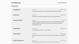
- 161. /** * If true, the tabs are aligned to bottom (the selection bar appears at the top). */ alignBottom: { type: Boolean, value: false }, /** * If true, tabs are automatically selected when focused using the * keyboard. */ autoselect: { type: Boolean, value: false },
- 165. © Comcast
- 168. MONO REPO MANY REPOS MONO REPO MANY REPOS vs. "Peñón de Ifach - Calpe - Spain" by Wyemji is licensed under CC BY-SA 3.0 "Mohegan Bluffs" by John Riviello is licensed under CC BY-SA 2.0
- 169. How do teams use my Polymer-Powered Design System?
- 170. { "name": "my-app", "flat": true, ... http://yarnpkg.com Why Yarn & not NPM? See https://github.com/package-community/discussions/issues/2
- 171. Using Web Components • Import the component - <link rel="import" href="https://your-web-component- cdn.com/iron-pages/iron-pages.html"> • Use your custom element as a normal HTML tag - <iron-pages> <div>Page 1 content</div> <div>Page 2 content</div> </iron-pages> 171 Ensuring Design Standards with Web Components - @JohnRiv @chiefcll
- 172. © Comcast
- 173. © Comcast
- 174. <script href="https://polaris.xfinity.com/polaris.js"></script> <xc-header tab="myaccount" is-authed="[[isAuthed]]" login-url="/login" sign-out-url="/logout" first-name="[[openidData.given_name]]" user-name="[[openidData.preferred_username]]"> </xc-header> <xc-footer></xc-footer> View the Open Source code at https://github.com/Comcast/polaris 174 Ensuring Design Standards with Web Components - @JohnRiv @chiefcll
- 175. Polymer-Powered Design Systems • Have a team of designers & developers responsible for your design system • Polymer & Web Components are a great way to build reusable components that work across multiple frameworks • Don’t forget your colons & semicolons when defining Polymer CSS Mixins • Embrace Demo Driven Development 175 Ensuring Design Standards with Web Components - @JohnRiv @chiefcll
- 176. Useful Links • WebComponents.org - webcomponents.org • Polymer Website - polymer-project.org • Polymer Slack - polymer-slack.herokuapp.com • Polymer 2.x Cheat Sheet - https://meowni.ca/posts/polymer-2-cheatsheet/ • How to use Polymer with Webpack - http://robdodson.me/how-to-use-polymer-with-webpack/ • PWAs with Polymer: a checklist - https://meowni.ca/posts/polymer-pwa-checklist/ • Custom Elements Everywhere - https://custom-elements-everywhere.com/ • Polycasts on YouTube - https://www.youtube.com/playlist?list=PLOU2XLYxmsII5c3Mgw6fNYCzaWrsM3sMN • 2017 Polymer Summit videos on YouTube - https://www.youtube.com/playlist?list=PLNYkxOF6rcIDP0PqVaJxqNWwIgvoEPzJi • End-to-End Polymer Apps - 2017 Chrome Dev Summit video - https://youtu.be/Wu2GCRkDecI • 2017 Google I/O Polymer videos on YouTube - https://www.youtube.com/playlist?list=PL_c6rbXV248du6m1VJABo32mP7sXWVb4m 176 Ensuring Design Standards with Web Components - @JohnRiv @chiefcll
- 177. Thank you! John Riviello @JohnRiv Chris Lorenzo @Chiefcll