SlideShare a Scribd company logo
RESPONSIVE WEB DESIGN WORKSHOP
           Kim Chee Leong
WHO AM I?


•   Kim Chee Leong

•   Software engineer, lead developer

•   Tech oriented, with a feeling for
    aesthetics on the web
WHO IS GWW?

•   Located in Amsterdam and Groningen

•   We create webapplications using Python-based frameworks

•   Our customers are goverments, non-profit organisations and larger companies.
Goldmund, Wyldebeast & Wunderliebe - Responsive Webdesign Workshop
A BIT OF HISTORY
THE WEB WAS SIMPLE
DAO OF WEB DESIGN


•   Written 13 years ago, this article still makes sense

•   New media tries to mimic old media

•   About creating pages which are adaptable

•   http://alistapart.com/article/dao
SAME OLD NEW MEDIUM?

“Well established hierarchies are not easily uprooted;
    Closely held beliefs are not easily released;
  So ritual enthralls generation after generation.”

               Tao Te Ching; 38 Ritual


                  A Dao of Web Design by John Allsopp - April 7, 2000
SAME OLD NEW MEDIUM?


The web is a new medium, although it has emerged
 from the medium of printing, whose skills, design
   language and conventions strongly influence it.


                A Dao of Web Design by John Allsopp - April 7, 2000
CONTROLLING WEB PAGES

   “... accepts the ebb and flow of things,
  Nurtures them, but does not own them,”

        Tao Te Ching; 2 Abstraction


             A Dao of Web Design by John Allsopp - April 7, 2000
ADAPTABILITY IS ACCESSIBILITY

            “The best of man is like water,
Which benefits all things, and does not contend with them,
       Which flows in places that others disdain,
        Where it is in harmony with the Way.”

                 Tao Te Ching; 8 Water


                    A Dao of Web Design by John Allsopp - April 7, 2000
THE WAY
     “The Way is shaped by use,
      But then the shape is lost.
     Do not hold fast to shapes
But let sensation flow into the world
As a river courses down to the sea.”

      Tao Te Ching; 32 Shapes


         A Dao of Web Design by John Allsopp - April 7, 2000
THE WAY


The web is a new medium, although it has emerged from
the medium of printing, whose skills, design language and
            conventions strongly influence it.


                   A Dao of Web Design by John Allsopp - April 7, 2000
FAST FORWARD TO TODAY


                                       Widescreen
Mobile    Tablet    Laptop   Desktop
                                          TV
phone
         E-reader
WEBSITES ON TODAYS DEVICES


•   Sites without a mobile ‘part’ are shown fairly well on modern phones

•   We have an app for that (most of the times..)

•   There are lot’s of devices which are internet-enabled, mobile and non-mobile
RESPONSIVE WEB DESIGN


•   Create websites which are adaptable

•   Screen width is important, which device is viewing doesn’t matter*

•   The same content, images and other resources on a website are used with RWD
RESPONSIVE WEB DESIGN
ALTERNATIVES TO RWD
MOBILE SPECIFIC WEBSITE


•   A separate website/URL with separate
    content

•   Not responsive!

•   For websites with a main goal of
    marketing a product or service
TRANSCODED WEBSITE


•   A separate website/URL with content
    transcoded (copied) from your main site

•   Not responsive!

•   Follows same structure as main website
APP STORE PRESENCE


•   Create an app and publish it on Apple’s App Store / Google Play

•   Your company is findable thru an app store

•   Easier access, just tap the app on your mobile device

•   You need to develop an app for every platform
ALTERNATIVE WRAP-UP
                    Mobile site   Transcoded site   Native app   Responsive site


  Optimized for
                        X               X               ~
slow connections

  Follows same
structure as main                       X               ~              X
       site

Works on a broad
                        ~               ~                              X
range of devices
Goldmund, Wyldebeast & Wunderliebe - Responsive Webdesign Workshop
WIRED.COM EXAMPLE


•   This is a ‘mobile specific’ website

•   Works great on mobile devices but is
    not responsive

•   Instead of depending on screen size, the
    site detects your device
RESPONSIVE WEB DESIGN
THE BASIC PRINCIPLES OF RWD

• Flexible   grid       •   When designing a responsive website
                            start with the smallest screen size and
                            move up to the bigger sizes.
• Flexible   media
                        •   Don’t use server-side stuff to detect
• Media   queries           mobile devices.

                        •   Most CSS3 techniques can be used

                        •   Doesn’t work on older browsers*
FLEXIBLE GRID

 .. this concept of a typographic
grid: a rational system of columns
and rows, upon which modules of
      content could be placed.

         Ethan Marcotte
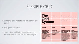
FLEXIBLE GRID


•   Elements of a website are positioned on
    a grid

•   The grid is adaptive

•   Many tools and boilerplate stylesheets
    are available to start with a flexible grid.
FLEXIBLE GRID
FLEXIBLE GRID TOOLS


•   http://gridpak.com

•   http://www.responsivegridsystem.com/

•   more? http://creativeoverflow.net/12-
    flexible-grid-tools-for-responsive-
    websites/
FLEXIBLE VALUES IN CSS

•   Margins and paddings in relative values

•   Fonts in em’s or rem’s


•   Don’t use pixels; one pixel on one
    platform is not a pixel on another

•   Elements in a site are adaptive when
    styled using flexible values
FLEXIBLE MARGINS/PADDINGS


•   Use relative values; percentages, em’s or
    rem’s

•   In this example a padding of 2% is set on
    the left and right side of the highlighted
    fieldset.
FLEXIBLE TYPESETTING

                                                        An em is a unit of
•   Use ‘em’ or ‘rem’ font-size values.            measurement in the field of
                                                    typography, equal to the
•   Em (often) equals 16px in height.             currently specified point size.
                                                  The name of em is related to
•   Problem with em-based font sizing is            M. Originally the unit was
    that the font size is nested. To solve this   derived from the width of the
    rem sizes can be used.                          capital “M” in the given
                                                             typeface.
FLEXIBLE TYPESETTING

•   target ÷ context = result


•   black text: 24px ÷ 16px = 1.5em

•   grey text: 11px ÷ 24px = 0.458333333333333em

•   grey text: 11px ÷ 16px = 0.6875rem
FLEXIBLE MEDIA


•   A CSS trick to fit image, videos and
    iframes in their container

•   Prevents images exceeding the width of
    their container
CSS3 MEDIA QUERIES
CSS3 MEDIA QUERIES


•   This meta element must be in the html header:
    •   <meta name="viewport" content="width=device-width; initial-scale=1.0; maximum-scale=1.0;" />


•   Media type screen is used

•   Do not use other media types to differentiate between devices
    •   ie: braille, embossed, handheld, print, projection, screen, speech, tty and tv
RWD EXAMPLE
  http://bit.ly/14T3tly
MOCK-UPS AND PROTOTYPING
MOCK-UPS

•   Create mock-ups for phone, tablet and
    desktop

•   Start with the smallest screen size and
    move up to bigger sizes

•   Think about your site before you’ll start
    building

•   Mocking-up a site design should be quick
    and easy todo
BALSAMIQ MOCK-UPS
JETSTRAP.COM PROTOTYPING
DIVSHOT.COM PROTOTYPING
TOOLS TO TEST YOUR RESPONSIVE SITE


•   http://mattkersley.com/responsive/

•   http://www.responsinator.com/

•   Use Google Chrome to set an user agent and viewport
TOOLS TO TEST YOUR RESPONSIVE SITE

•   Apple: connect your iPad/iPhone to your Apple computer

    •   http://bit.ly/Qy06v8 (developer.apple.com)

•   Android: use the Development Kit to connect an Android device to the Chrome
    browser

    •   http://bit.ly/IIc78S (developers.google.com)
JAVASCRIPT LIBRARIES

•   Modernizr (http://modernizr.com)
    •   Fallback for older browsers which don’t support CSS3 and HTML5

•   Hammer.js (http://eightmedia.github.com/hammer.js/)
    •   Library for multi-touch gestures

•   Enquire.js (http://wicky.nillia.ms/enquire.js/)
    •   JavaScript library for responding to CSS media queries
OTHER USEFUL LINKS

•   http://mediaqueri.es/

•   http://www.onextrapixel.com/2012/06/13/really-useful-resources-and-tools-for-responsive-web-design/

•   http://techblog.safaribooksonline.com/2012/11/28/touch-input-and-responsive-web-design/


•   http://www.nathanleighdavis.com/articles/responding-to-touch/

•   http://www.webdesignerdepot.com/2012/07/adaptive-images-solving-the-responsive-image-problem/
REFERENCES


•   http://alistapart.com/article/responsive-web-design

•   http://alistapart.com/article/dao

•   http://www.html5rocks.com/en/mobile/responsivedesign/

•   http://elliotjaystocks.com/blog/has-adaptive-design-failed-of-course-it-bloody-hasnt/
PHOTO CREDITS
•   http://www.flickr.com/photos/quinnanya/7375601158          •   http://www.flickr.com/photos/dvortygirl/2376598010

•   http://thefutureofmediaismobile.com/2012/02/responsive-   •
    ux-design/

•   http://www.thegridsystem.org/

•   http://www.flickr.com/photos/joyceslee/7912438718

•   http://www.flickr.com/photos/arrrrt/7494837030

•   http://www.flickr.com/photos/
    87462844@N00/5983242010/

More Related Content

What's hot (18)

KEY
Michael Slater Mobile Opportunity
NorthBayWeb
 
PPTX
20 web design trends - at the moment
Marco Santo
 
PDF
Mobile web vs. native apps: It's not about technology, it's about psychology
iQcontent
 
PDF
Guidelines for Responsive UX Design 11/16/19
Robert Stribley
 
PDF
The Top Ten Elements Your Noprofit's Strategic Website Should Have
guidecreative
 
PDF
Introducing the Book as iPad App
Nicole Hennig
 
PPTX
Going beyond the pale 10292012
bamboolibrarian
 
PDF
The Book as App: Multi-Touch Ebooks and Their Future in Libraries
Nicole Hennig
 
PPTX
Guidelines for Responsive UX Design 11/15/2018
Robert Stribley
 
PDF
Domain7: Mobile Web Design Approach
Ryan Hanawalt
 
PDF
MFEA 2015 - 20 Ways to Ruin a Perfectly Good Festival Website
Saffire
 
PDF
Librarians as rational optimists: using top tech trends to build our future
Nicole Hennig
 
PDF
Designing for Growth, Academy Xi
Hayden Bleasel
 
PDF
App store economics
Mugunth Kumar
 
PPTX
Guidelines for Responsive UX Design 07/07/2018
Robert Stribley
 
PDF
Evaluating your Website - FDL ACU presentation by BrownBoots Interactive
BrownBoots Interactive, Inc.
 
PDF
Designing and Theming Drupal for Mobile Devices
David Lanier
 
KEY
Why Do Mobile Projects Fail?
Indiginox
 
Michael Slater Mobile Opportunity
NorthBayWeb
 
20 web design trends - at the moment
Marco Santo
 
Mobile web vs. native apps: It's not about technology, it's about psychology
iQcontent
 
Guidelines for Responsive UX Design 11/16/19
Robert Stribley
 
The Top Ten Elements Your Noprofit's Strategic Website Should Have
guidecreative
 
Introducing the Book as iPad App
Nicole Hennig
 
Going beyond the pale 10292012
bamboolibrarian
 
The Book as App: Multi-Touch Ebooks and Their Future in Libraries
Nicole Hennig
 
Guidelines for Responsive UX Design 11/15/2018
Robert Stribley
 
Domain7: Mobile Web Design Approach
Ryan Hanawalt
 
MFEA 2015 - 20 Ways to Ruin a Perfectly Good Festival Website
Saffire
 
Librarians as rational optimists: using top tech trends to build our future
Nicole Hennig
 
Designing for Growth, Academy Xi
Hayden Bleasel
 
App store economics
Mugunth Kumar
 
Guidelines for Responsive UX Design 07/07/2018
Robert Stribley
 
Evaluating your Website - FDL ACU presentation by BrownBoots Interactive
BrownBoots Interactive, Inc.
 
Designing and Theming Drupal for Mobile Devices
David Lanier
 
Why Do Mobile Projects Fail?
Indiginox
 

Similar to Goldmund, Wyldebeast & Wunderliebe - Responsive Webdesign Workshop (20)

PDF
Everything Old is New Again: The State of Web Design
Maria D'Amato
 
PPTX
Responsive Design: What is it? How do we do it? How much will it cost?
Karin Tracy
 
PPTX
Responsive Web Design
Julia Vi
 
PPTX
Mobile Best Practices
mintersam
 
PDF
Responsive Web Site Design
Jussi Pohjolainen
 
PPTX
Responsive Web Design for Foodies
David Ip
 
PDF
Great Responsive-ability Web Design
Mike Wilcox
 
PPTX
Getting Down & Dirty with Responsive Web Design
martinridgway
 
PDF
Web designtrends 5-29-2013
Angela Bowman
 
PDF
How to create a mobile version of your website
Mahmoud Farrag
 
PPTX
Responsive web design ppt
NAWAZ KHAN
 
PPT
Responsive Web Design: How the mobile web has changed the way we think and work
vq20
 
PPTX
Responsive Web Design_2013
Achieve Internet
 
PPSX
Creating Large-Scale Responsive Websites
Keith Doyle
 
PPT
The Mobile Development Landscape
Ambert Ho
 
PDF
Design4Drupal Boston 2013 - Bumps in the Road to Responsive
Salem Ghoweri
 
PDF
Module 08: Responsive Web Design
Daniel Drew Turner
 
PDF
Responsive Web Design - Why and How
Judi Wunderlich
 
PDF
responsive awareness
onehundred_be
 
PPTX
Responsive web design
Ana-Maria Birtea
 
Everything Old is New Again: The State of Web Design
Maria D'Amato
 
Responsive Design: What is it? How do we do it? How much will it cost?
Karin Tracy
 
Responsive Web Design
Julia Vi
 
Mobile Best Practices
mintersam
 
Responsive Web Site Design
Jussi Pohjolainen
 
Responsive Web Design for Foodies
David Ip
 
Great Responsive-ability Web Design
Mike Wilcox
 
Getting Down & Dirty with Responsive Web Design
martinridgway
 
Web designtrends 5-29-2013
Angela Bowman
 
How to create a mobile version of your website
Mahmoud Farrag
 
Responsive web design ppt
NAWAZ KHAN
 
Responsive Web Design: How the mobile web has changed the way we think and work
vq20
 
Responsive Web Design_2013
Achieve Internet
 
Creating Large-Scale Responsive Websites
Keith Doyle
 
The Mobile Development Landscape
Ambert Ho
 
Design4Drupal Boston 2013 - Bumps in the Road to Responsive
Salem Ghoweri
 
Module 08: Responsive Web Design
Daniel Drew Turner
 
Responsive Web Design - Why and How
Judi Wunderlich
 
responsive awareness
onehundred_be
 
Responsive web design
Ana-Maria Birtea
 
Ad

Recently uploaded (20)

PDF
Arcee AI - building and working with small language models (06/25)
Julien SIMON
 
PPTX
Top Managed Service Providers in Los Angeles
Captain IT
 
PDF
Apache CloudStack 201: Let's Design & Build an IaaS Cloud
ShapeBlue
 
PDF
Wojciech Ciemski for Top Cyber News MAGAZINE. June 2025
Dr. Ludmila Morozova-Buss
 
PDF
Novus-Safe Pro: Brochure-What is Novus Safe Pro?.pdf
Novus Hi-Tech
 
PDF
Women in Automation Presents: Reinventing Yourself — Bold Career Pivots That ...
DianaGray10
 
PDF
Smart Air Quality Monitoring with Serrax AQM190 LITE
SERRAX TECHNOLOGIES LLP
 
PDF
Empowering Cloud Providers with Apache CloudStack and Stackbill
ShapeBlue
 
PDF
CIFDAQ Weekly Market Wrap for 11th July 2025
CIFDAQ
 
PDF
HCIP-Data Center Facility Deployment V2.0 Training Material (Without Remarks ...
mcastillo49
 
PDF
Français Patch Tuesday - Juillet
Ivanti
 
PDF
Ampere Offers Energy-Efficient Future For AI And Cloud
ShapeBlue
 
PPTX
Darren Mills The Migration Modernization Balancing Act: Navigating Risks and...
AWS Chicago
 
PPTX
Building a Production-Ready Barts Health Secure Data Environment Tooling, Acc...
Barts Health
 
PDF
Sustainable and comertially viable mining process.pdf
Avijit Kumar Roy
 
PDF
Windsurf Meetup Ottawa 2025-07-12 - Planning Mode at Reliza.pdf
Pavel Shukhman
 
PPTX
MSP360 Backup Scheduling and Retention Best Practices.pptx
MSP360
 
PDF
Blockchain Transactions Explained For Everyone
CIFDAQ
 
PDF
How Startups Are Growing Faster with App Developers in Australia.pdf
India App Developer
 
PPTX
Building Search Using OpenSearch: Limitations and Workarounds
Sease
 
Arcee AI - building and working with small language models (06/25)
Julien SIMON
 
Top Managed Service Providers in Los Angeles
Captain IT
 
Apache CloudStack 201: Let's Design & Build an IaaS Cloud
ShapeBlue
 
Wojciech Ciemski for Top Cyber News MAGAZINE. June 2025
Dr. Ludmila Morozova-Buss
 
Novus-Safe Pro: Brochure-What is Novus Safe Pro?.pdf
Novus Hi-Tech
 
Women in Automation Presents: Reinventing Yourself — Bold Career Pivots That ...
DianaGray10
 
Smart Air Quality Monitoring with Serrax AQM190 LITE
SERRAX TECHNOLOGIES LLP
 
Empowering Cloud Providers with Apache CloudStack and Stackbill
ShapeBlue
 
CIFDAQ Weekly Market Wrap for 11th July 2025
CIFDAQ
 
HCIP-Data Center Facility Deployment V2.0 Training Material (Without Remarks ...
mcastillo49
 
Français Patch Tuesday - Juillet
Ivanti
 
Ampere Offers Energy-Efficient Future For AI And Cloud
ShapeBlue
 
Darren Mills The Migration Modernization Balancing Act: Navigating Risks and...
AWS Chicago
 
Building a Production-Ready Barts Health Secure Data Environment Tooling, Acc...
Barts Health
 
Sustainable and comertially viable mining process.pdf
Avijit Kumar Roy
 
Windsurf Meetup Ottawa 2025-07-12 - Planning Mode at Reliza.pdf
Pavel Shukhman
 
MSP360 Backup Scheduling and Retention Best Practices.pptx
MSP360
 
Blockchain Transactions Explained For Everyone
CIFDAQ
 
How Startups Are Growing Faster with App Developers in Australia.pdf
India App Developer
 
Building Search Using OpenSearch: Limitations and Workarounds
Sease
 
Ad

Goldmund, Wyldebeast & Wunderliebe - Responsive Webdesign Workshop

  • 1. RESPONSIVE WEB DESIGN WORKSHOP Kim Chee Leong
  • 2. WHO AM I? • Kim Chee Leong • Software engineer, lead developer • Tech oriented, with a feeling for aesthetics on the web
  • 3. WHO IS GWW? • Located in Amsterdam and Groningen • We create webapplications using Python-based frameworks • Our customers are goverments, non-profit organisations and larger companies.
  • 6. A BIT OF HISTORY
  • 7. THE WEB WAS SIMPLE
  • 8. DAO OF WEB DESIGN • Written 13 years ago, this article still makes sense • New media tries to mimic old media • About creating pages which are adaptable • http://alistapart.com/article/dao
  • 9. SAME OLD NEW MEDIUM? “Well established hierarchies are not easily uprooted; Closely held beliefs are not easily released; So ritual enthralls generation after generation.” Tao Te Ching; 38 Ritual A Dao of Web Design by John Allsopp - April 7, 2000
  • 10. SAME OLD NEW MEDIUM? The web is a new medium, although it has emerged from the medium of printing, whose skills, design language and conventions strongly influence it. A Dao of Web Design by John Allsopp - April 7, 2000
  • 11. CONTROLLING WEB PAGES “... accepts the ebb and flow of things, Nurtures them, but does not own them,” Tao Te Ching; 2 Abstraction A Dao of Web Design by John Allsopp - April 7, 2000
  • 12. ADAPTABILITY IS ACCESSIBILITY “The best of man is like water, Which benefits all things, and does not contend with them, Which flows in places that others disdain, Where it is in harmony with the Way.” Tao Te Ching; 8 Water A Dao of Web Design by John Allsopp - April 7, 2000
  • 13. THE WAY “The Way is shaped by use, But then the shape is lost. Do not hold fast to shapes But let sensation flow into the world As a river courses down to the sea.” Tao Te Ching; 32 Shapes A Dao of Web Design by John Allsopp - April 7, 2000
  • 14. THE WAY The web is a new medium, although it has emerged from the medium of printing, whose skills, design language and conventions strongly influence it. A Dao of Web Design by John Allsopp - April 7, 2000
  • 16. FAST FORWARD TO TODAY Widescreen Mobile Tablet Laptop Desktop TV phone E-reader
  • 17. WEBSITES ON TODAYS DEVICES • Sites without a mobile ‘part’ are shown fairly well on modern phones • We have an app for that (most of the times..) • There are lot’s of devices which are internet-enabled, mobile and non-mobile
  • 18. RESPONSIVE WEB DESIGN • Create websites which are adaptable • Screen width is important, which device is viewing doesn’t matter* • The same content, images and other resources on a website are used with RWD
  • 21. MOBILE SPECIFIC WEBSITE • A separate website/URL with separate content • Not responsive! • For websites with a main goal of marketing a product or service
  • 22. TRANSCODED WEBSITE • A separate website/URL with content transcoded (copied) from your main site • Not responsive! • Follows same structure as main website
  • 23. APP STORE PRESENCE • Create an app and publish it on Apple’s App Store / Google Play • Your company is findable thru an app store • Easier access, just tap the app on your mobile device • You need to develop an app for every platform
  • 24. ALTERNATIVE WRAP-UP Mobile site Transcoded site Native app Responsive site Optimized for X X ~ slow connections Follows same structure as main X ~ X site Works on a broad ~ ~ X range of devices
  • 26. WIRED.COM EXAMPLE • This is a ‘mobile specific’ website • Works great on mobile devices but is not responsive • Instead of depending on screen size, the site detects your device
  • 29. THE BASIC PRINCIPLES OF RWD • Flexible grid • When designing a responsive website start with the smallest screen size and move up to the bigger sizes. • Flexible media • Don’t use server-side stuff to detect • Media queries mobile devices. • Most CSS3 techniques can be used • Doesn’t work on older browsers*
  • 30. FLEXIBLE GRID .. this concept of a typographic grid: a rational system of columns and rows, upon which modules of content could be placed. Ethan Marcotte
  • 31. FLEXIBLE GRID • Elements of a website are positioned on a grid • The grid is adaptive • Many tools and boilerplate stylesheets are available to start with a flexible grid.
  • 33. FLEXIBLE GRID TOOLS • http://gridpak.com • http://www.responsivegridsystem.com/ • more? http://creativeoverflow.net/12- flexible-grid-tools-for-responsive- websites/
  • 34. FLEXIBLE VALUES IN CSS • Margins and paddings in relative values • Fonts in em’s or rem’s • Don’t use pixels; one pixel on one platform is not a pixel on another • Elements in a site are adaptive when styled using flexible values
  • 35. FLEXIBLE MARGINS/PADDINGS • Use relative values; percentages, em’s or rem’s • In this example a padding of 2% is set on the left and right side of the highlighted fieldset.
  • 36. FLEXIBLE TYPESETTING An em is a unit of • Use ‘em’ or ‘rem’ font-size values. measurement in the field of typography, equal to the • Em (often) equals 16px in height. currently specified point size. The name of em is related to • Problem with em-based font sizing is M. Originally the unit was that the font size is nested. To solve this derived from the width of the rem sizes can be used. capital “M” in the given typeface.
  • 37. FLEXIBLE TYPESETTING • target ÷ context = result • black text: 24px ÷ 16px = 1.5em • grey text: 11px ÷ 24px = 0.458333333333333em • grey text: 11px ÷ 16px = 0.6875rem
  • 38. FLEXIBLE MEDIA • A CSS trick to fit image, videos and iframes in their container • Prevents images exceeding the width of their container
  • 40. CSS3 MEDIA QUERIES • This meta element must be in the html header: • <meta name="viewport" content="width=device-width; initial-scale=1.0; maximum-scale=1.0;" /> • Media type screen is used • Do not use other media types to differentiate between devices • ie: braille, embossed, handheld, print, projection, screen, speech, tty and tv
  • 41. RWD EXAMPLE http://bit.ly/14T3tly
  • 43. MOCK-UPS • Create mock-ups for phone, tablet and desktop • Start with the smallest screen size and move up to bigger sizes • Think about your site before you’ll start building • Mocking-up a site design should be quick and easy todo
  • 47. TOOLS TO TEST YOUR RESPONSIVE SITE • http://mattkersley.com/responsive/ • http://www.responsinator.com/ • Use Google Chrome to set an user agent and viewport
  • 48. TOOLS TO TEST YOUR RESPONSIVE SITE • Apple: connect your iPad/iPhone to your Apple computer • http://bit.ly/Qy06v8 (developer.apple.com) • Android: use the Development Kit to connect an Android device to the Chrome browser • http://bit.ly/IIc78S (developers.google.com)
  • 49. JAVASCRIPT LIBRARIES • Modernizr (http://modernizr.com) • Fallback for older browsers which don’t support CSS3 and HTML5 • Hammer.js (http://eightmedia.github.com/hammer.js/) • Library for multi-touch gestures • Enquire.js (http://wicky.nillia.ms/enquire.js/) • JavaScript library for responding to CSS media queries
  • 50. OTHER USEFUL LINKS • http://mediaqueri.es/ • http://www.onextrapixel.com/2012/06/13/really-useful-resources-and-tools-for-responsive-web-design/ • http://techblog.safaribooksonline.com/2012/11/28/touch-input-and-responsive-web-design/ • http://www.nathanleighdavis.com/articles/responding-to-touch/ • http://www.webdesignerdepot.com/2012/07/adaptive-images-solving-the-responsive-image-problem/
  • 51. REFERENCES • http://alistapart.com/article/responsive-web-design • http://alistapart.com/article/dao • http://www.html5rocks.com/en/mobile/responsivedesign/ • http://elliotjaystocks.com/blog/has-adaptive-design-failed-of-course-it-bloody-hasnt/
  • 52. PHOTO CREDITS • http://www.flickr.com/photos/quinnanya/7375601158 • http://www.flickr.com/photos/dvortygirl/2376598010 • http://thefutureofmediaismobile.com/2012/02/responsive- • ux-design/ • http://www.thegridsystem.org/ • http://www.flickr.com/photos/joyceslee/7912438718 • http://www.flickr.com/photos/arrrrt/7494837030 • http://www.flickr.com/photos/ 87462844@N00/5983242010/