


Ad
More Related Content
What's hot (19)
Similar to How to use MetaMapp and ChemRICH software for metabolomics ? (20)


Ad
More from Dinesh Barupal (6)


Ad
Recently uploaded (20)


How to use MetaMapp and ChemRICH software for metabolomics ?
- 1. Unit 2.5 MetaMapp and ChemRICH exercise Dinesh Barupal [email protected]
- 3. Input file : MetaMapp R- Package (openCPU version) Network file Node attribute file How to use MetaMapp ?
- 4. How to get SMILES codes ?
- 5. How to use MetaMapp ? Prepare the input file. • This is the minimum input • No duplicate CIDs are allowed Example : spring_2018_metabolomics_course_metamapp_ example.xlsx
- 6. About the example dataset • Comparison of the plasma metabolome in Non alcoholic fatty liver disease subjects and the controls. • HILIC + CSH assays • ~ 650 identified metabolites. • Unpublished (you can write a paper out of it).
- 7. MetaMapp input file errors - • Duplicate PubChem CIDs • Duplicate names • Missing SMILES codes • Missing p-value or fold-change • Headers mismatch • > 1000 compounds
- 8. How to use MetaMapp ? Obtaining the MetaMapp files. • Go to http://metamapp.fiehnlab.ucdavis.edu Copy and paste your data in this box Click here Now, click on these two buttons chemsim_krp_07.sif node_attributes_chemsim_krp_07.tsv Both files are provided in the example folder for the case study.
- 9. chemsim_krp_07.sif node_attributes_chemsim_krp_07.tsv Structure of the created files. Both files will be imported in the Cytoscape software for visualization KRP – KEGG Reaction Pairs – biochemical relationships TMSIM – Tanimoto similarity – chemical relationships
- 10. What is Cytoscape ? The most used network visualization and analysis tool. http://journals.plos.org/plosbiology/article?id=10.1371%2Fjournal.pbio.1001843http://www.cytoscape.org/ Backed by strong institutions
- 11. Visualize a range of experimental data on a network graph Useful graph layout algorithms Graph theory calculations Easy organization of multiple networks for comparisons. Faster navigation of large networks Filter and query the network Contributed plugins Works on PC, Max and Linux system USB drive contains a copy of Cytoscape software Cytoscape basic features
- 12. Click here Start Cytoscape software Locate the chemsim_krp_07.sif file and click import. The file shall be in your download folder or you can use the file in the example folder. How to use Cytoscape?
- 13. Import a new network If you want to import a new network file in already running Cytoscape Select the .sif file
- 14. Visualization panel Table panel highlights the data related to selected node (yellow). Cytoscape windwos
- 15. Show graphics details Tip: if you don’t see the labels/edges/shapes/colors in graph, click on “Show graphics details”.
- 16. Visualize using the yFiles (organic layout). You can try other layout methods, but this one is recommended. Layout a network graph
- 17. Network graph after organic layout
- 18. Now import your Node Attributes file
- 19. Import your Node Attributes file
- 20. Import your Node Attributes file “Key” symbol should be PubChem_ID
- 21. Import your Node Attributes file Table panel after importing the node attributes.
- 22. Data visualization All visual properties can be accessed in the style tab. Node color Node size Node label Node label position Node Label font size Edge color Edge width Network background color
- 23. Change network background color 1 2 3 Select black background color or any color you like.
- 24. Double click here click here Node coloring : “Node Fill color”
- 25. Red = higher Blue = lower Yellow = no change Node coloring : “Node Fill color”
- 26. Change node label You can choose any label from the node attribute file. You need to zoom in to see the labels Use the scroll button to zoom in and out.
- 27. If you don’t see the labels
- 28. Intermediate network graph crowded, overlapping labels and unpublishable.
- 29. Change label font size Showing labels for only the significant compounds. It is bit clearer.
- 30. Change node size Select the values by press the left click on mouse. Then right click. Node size rules FC 1.0 – size = 20 FC >1 & <2 --size = 60 FC >2 & < 3 -- size = 100 FC >3 & < 5 --size = 150 FC > 5-- size = 200
- 31. Intermediate network graph Bit clearer, has experimental results. Highlighting the clusters that are changed. Not yet publication ready
- 32. Node moving Press “control” key and click left mouse button and select the area Now you can move these nodes
- 33. Intermediate network graph Not yet publication ready
- 34. Change edge colors This box must be checked. The visual property is under the subtab – “edge”
- 35. Intermediate network graph KEGG reactions Chemical similarity Lipids Amino acids and amines
- 36. Observations • Several fatty acids and DAGs are increased in NAFLD plasma. • Metformin was higher in NAFLD subjects along with increased in MTA and Hypoxanthine. • PE, CER, PC and CEs were decreased in the NAFLD subjects. • Stachydrine- orange juice related compound was 5- fold lower in the NFALD subjects. • One carbon and lipid metabolism were altered in the NAFLD subjects.
- 37. Cluster detection Check this box Large network can be divided into smaller modules for better visualization and interpretation
- 38. Useful buttons in the menu-bar Zoom in Zoom out Zoom-all Zoom in selected You will use these often.
- 40. Create a sub-network Select a cluster by pressing “Ctrl” and then left click and make a square box. Once selected the nodes, Prese Ctrl+N to make a new network Show graphics details
- 41. Node label position Click on the label position It will make label position property available in the style tab.
- 42. Select right side nodes Click on this box to change the property for selected node. Drag the object box to the left and click ok Node label position
- 43. Increase the scaling factor to remove the overlaps of labels. Scaling Focused view of the fatty acids and DG cluster.
- 44. Network navigation Click on a network you want to visualize Create subnetworks for – • Sphingolipids • Cholesteroyl esters • TGs • Phopspholipids • One carbon metabolism
- 45. Sphingolipid cluster Cholestroyl esters PC cluster + acetyl carnitines Focused visualization of clusters Clearer, readable, less crowded. This can go in a paper.
- 46. One carbon metabolism and FAFLD
- 47. The commonly used anti-diabetic agent metformin targets mitochondrial complex I and thus decreases the NAD+/NADH ratio. Metformin also inhibits cancer cell growth, in part through inhibition of biosynthetic metabolism (Griss et al., 2015). Metformin-induced growth inhibition can be partially rescued by supplementation with hypoxanthine and thymidine, products of 1C metabolism (Corominas-Faja et al., 2012). It remains unclear, however, if the impact of metformin on 1C metabolism is clinically significant at normal therapeutic doses. One carbon metabolism and FAFLD Increased homocysteine also occurs in liver disease, including non-alcoholic fatty liver disease (NAFLD) (Dai et al., 2016). In animals fed high-fat diets to induce NAFLD, liver 1C metabolism is dysregulated, as evidenced by intrahepatic increases in SAH and free homocysteine and decreases in methionine and the GNMT enzyme (Pacana et al., 2015). At the same time, deletions of 1C enzymes lead to development of liver disease.
- 48. Save the session for future
- 49. Export the network as a pdf file
- 51. ChemRICH : Data preparation Example dataset available in the chemrich example folder spring_2018_metabolomics_course_chemrich_example Use PubChem Identified Exchange Service to obtain identifiers, InchiKeys and SMILES for compound names.
- 52. ChemRICH input file errors - • Duplicate PubChem CIDs • Duplicate names • Missing SMILES codes • Missing p-value or fold-change • Headers mismatch • > 1000 compounds
- 53. Perform ChemRICH analysis www.ChemRICH.us Paste your data in this box
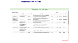
- 54. Explanation of results Editable power-point slide
- 56. Download/interact with results Imino Acids Saturated_Lysophosphatidylcholines Lysophospholipids Unsaturated_Lysophosphatidylcholines NewCluster_32 Cholestenes Phosphatidylethanolamines NewCluster_14 Unsaturated_Phosphatidylcholines Sphingomyelins Diglycerides Plasmalogens Unsaturated_Ceramides Galactosylceramides Cholesterol Esters 0 10 20 30 0 5 10 15 20 median XlogP of clusters -log(pvalue)