


module-5-session-1.pptx module 5 session
- 1. MODULE 5: RHIS Data Analysis SESSION 1: Key Concepts of Data Analysis ROUTINE HEALTH INFORMATION SYSTEMS A Curriculum on Basic Concepts and Practice The complete RHIS curriculum is available here: https://www.measureevaluation.org/our-work/ routine-health-information-systems/rhis-curriculum
- 2. Session 1: Learning Objectives • Objectives • By the end of this session, participants will be able to: • Define key concepts of data analysis • Use data analysis terminology • Select the appropriate chart
- 3. Session 1: Topics Covered Topics Covered • Descriptive analysis o Ratio, proportion, percentage, and rate o Median, mean, and trend • Selection of the appropriate chart
- 4. Data Analysis: Key Concepts
- 5. Data Analysis Analysis: Turning raw data into useful information Purpose: To provide answers to questions being asked by a health program Even the greatest amount and best quality of data mean nothing if data are not properly analyzed—or analyzed at all.
- 6. Data Analysis Analysis does not mean using a computer software package. Analysis is looking at the data in light of the questions you need to answer: • How would you analyze data to determine: “Is my program meeting its objectives?”
- 7. Answering Program Questions Question: Is my program meeting its objectives? Analysis: Compare program targets and actual program performance to learn how far you are from the targets Interpretation: Why have you achieved or not achieved a target, and what does this mean for your program? Answering may require more information.
- 8. Descriptive Analysis Describes the sample/target population (demographic and clinical characteristics) Does not define causality; tells you what, not why Example: Average number of clients seen per month
- 9. Basic Terminology and Concepts Statistical terms • Ratio • Proportion • Percentage • Rate • Mean • Median • Trend
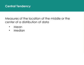
- 10. Central Tendency Measures of the location of the middle or the center of a distribution of data • Mean • Median
- 11. Mean The average of your dataset The value obtained by dividing the sum of a set of quantities by the number of quantities in the set Example: (22+18+30+19+37+33) = 159 ÷ 6 = 26.5 The mean is sensitive to extreme values
- 12. Calculating the Mean Average number of clients counseled per month January: 30 February: 45 March: 38 April: 41 May: 37 June: 40 30+45+38+41+37+40 = 231 clients 231 clients ÷ 6 months = 38.5 Mean = 38.5 clients/month
- 13. Median The middle of a distribution (when numbers are in order: that is, half of the numbers are above the median and half are below the median) The median is not as sensitive to extreme values as the mean. Odd number of numbers, median = the middle number Median of 2, 4, 7 = 4 Even number of numbers, median = mean of the two middle numbers Median of 2, 4, 7, 12 => (4+7) /2 = 5.5
- 14. Calculating the Median Client 1 – 2 Client 2 – 134 Client 3 – 67 Client 4 – 10 Client 5 – 221 Median of clients 1–5 = 67 Median of clients 1–4 = 100.5 (67+134=201/2 = 100.5)
- 15. Mean vs. Median: When to Use One or the Other? EXAMPLE 1 # patients / dr. Facility 1 20 Facility 2 22 Facility 3 26 Facility 4 29 Facility 5 34 Facility 6 38 Facility 7 39 Mean = ? 29.7 Median = ? 29
- 16. Mean vs. Median: When to Use One or the Other? EXAMPLE 1 # patients / dr. Facility 1 8 Facility 2 38 Facility 3 39 Facility 4 40 Facility 5 45 Facility 6 46 Facility 7 140 Mean = ? 50.8 Median = ? 40
- 17. Use the Mean or the Median? CD4 count Client 1 9 Client 2 11 Client 3 92 Client 4 92 Client 5 95 Client 6 100 Client 7 100 Client 8 101 Client 9 104 Client 10 206
- 18. Trend A trend is a pattern of gradual change in a condition, output, or process, or an average or general tendency of a series of data points to move in a certain direction over time, represented by a line or curve on a graph. To follow a trend you must not only be aware of what is currently happening but also be astute enough to predict what is going to happen in the future.
- 19. 19 Calculating Trends 2008 2009 2010 2011 0 20 40 60 80 100 120 140 160 180 200 Adults and children on antiretroviral therapy (ART), 2008–2011 # adults on ART # children on ART # of people (in thousands)
- 20. 20 Calculating Trends Jan Feb M ar A pr M ay Jun Jul A ug Sep O ct N ov D ec 0 20 40 60 80 100 120 140 160 180 200 Adults on ART and children on ART, 2011 # adults on ART # children on ART # of people (Hundreds)
- 21. 21 Key Messages Purpose of analysis: Provide answers to programmatic questions Descriptive analyses describe the sample or target population. Descriptive analyses do not define causality. That is, they tell you what, not why.
- 22. SELECT THE RIGHT CHART
- 23. Types of Charts
- 24. 5 QUESTIONS TO ASK YOURSELF WHEN CHOOSING A CHART
- 25. 5 Questions to Ask Yourself When Choosing a Chart 1. Want to compare values? Charts are perfect for comparing one or many value sets, and they can easily show the low and high values in the data sets. Use these charts to show comparisons: • Column/bar • Circular area • Line • Scatter plot • Bullet
- 26. 5 Questions to Ask Yourself When Choosing a Chart 2. Want to show the composition of something? To show how individual parts make up the whole of something (such as the device used for mobile visitors to your website, or total sales broken down by sales rep) Use these charts to show composition: • Pie • Stacked bar • Stacked column • Area
- 27. 5 Questions to Ask Yourself When Choosing a Chart 3. Want to understand the distribution of your data? Distribution charts help you to understand outliers, the normal tendency, and the range of information in your values. Use these charts to show distribution: • Scatter plot • Line • Column • Bar
- 28. 5 Questions to Ask Yourself When Choosing a Chart 4. Interested in analyzing trends in your data set? If you want more information about how a data set performed during a specific period, there are specific chart types that do this extremely well. Use these charts to analyze trends: • Line • Dual-axis line • Column
- 29. 5 Questions to Ask Yourself When Choosing a Chart 5. Want to better understand the relationships among value sets? Relationship charts are designed to show how one variable relates to one or many different variables. You could show how something positively affects (or has no effect, or negatively affects) another variable. Use these charts to show relationships: • Scatter plot • Bubble • Line
- 30. Examples of Charts to Choose When Analyzing Data Column • To show a comparison among different items • To show a comparison of items over time % of HIV-positive women per region
- 31. Examples of Charts to Choose When Analyzing Data Bar • Should be used to avoid clutter when one data label is long or if you have more than 10 items to compare • Can also be used to display negative numbers Enrollment of HIV clients in ART in 3 regions
- 32. Line A line chart reveals trends or progress over time. • Can be used to show many different categories of data Use a line chart to show a continuous data set. Number of clinicians working in each clinic in Years 1–4 Examples of Charts to Choose When Analyzing Data
- 33. Examples of Charts to Choose When Analyzing Data Dual axis • Used with 2–3 data sets, at least one of which is based on a continuous set of data, and another of which is better suited to being grouped by category • Should be used to visualize a correlation, or the lack thereof, between these three data sets .
- 34. Example of Charts to Choose When Analyzing Data Area • Useful for showing part-to-whole relationships, such as individual data’s contribution to the total for a given period • Helps you analyze both overall and individual trend information Enrollment of HIV clients in ART in 3 regions
- 35. Example of Charts to Choose When Analyzing Data Stacked bar • Should be used to compare many items and show the composition of each one • Represents components of a whole and compares wholes Number of months female and male patients have been enrolled in HIV care, by age group
- 36. Example of Charts to Choose When Analyzing Data Pie • Represents percentages, with the segments totaling 100
- 37. Example of Charts to Choose When Analyzing Data Scatter plot • Can show relationship between two variables, or reveal the distribution trends • Should be used when there are many data points, and you want to highlight similarities in the data set • Useful when you are looking for outliers or want to understand the distribution of your data Customer happiness, by response time
- 38. ROUTINE HEALTH INFORMATION SYSTEMS A Curriculum on Basic Concepts and Practice This presentation was produced with the support of the United States Agency for International Development (USAID) under the terms of MEASURE Evaluation cooperative agreement AID-OAA-L-14-00004. MEASURE Evaluation is implemented by the Carolina Population Center, University of North Carolina at Chapel Hill in partnership with ICF International; John Snow, Inc.; Management Sciences for Health; Palladium; and Tulane University. The views expressed in this presentation do not necessarily reflect the views of USAID or the United States government.
Editor's Notes
- #4: To begin this module, we are going to go over key concepts of data analysis. The objective of this session is to provide a basic understand of important calculations that are useful in our work. We will also explore a few analysis topics to be able to better advise and/or understand information that pertains to the workplace.
- #5: Although the terms “data” and “information” often are used interchangeably, there is a distinction. Data refers to raw, unprocessed numbers, measurements, or text. Information refers to data that are processed, organized, structured, or presented in a specific context. The process of transforming data into information is data analysis. NOTE to facilitator: Read slide.
- #6: Data analysis does not necessarily mean using a complicated computer analysis package. It means taking the data that you collect and looking at them in the context of the questions that you need to answer. For example, if you need to know whether your program is meeting its objectives, or if it’s on track, you would look at your program targets and compare them to the actual program performance. This is analysis. Later, we will take this one step further and talk about interpretation. (For example, through analysis, you find that your program achieved only 10% of its target; now you have to figure out why).
- #7: With regard to data demand and use (DDU), we talk a lot about answering programmatic questions. Let’s take a minute to discuss what that means. Suppose you need to know if your program is on track. You probably would look at your program targets and compare them to the actual program performance. This is analysis. Interpretation is using the analysis to further explore your findings and understand the implications for your program. In many cases, this means using additional information, such as vital statistics, population-based surveys, and qualitative data, to supplement the routine service statistics. NOTE to facilitator: Read the slide.
- #8: The world of data analysis is vast and can be complex. In this course, we focus on descriptive analyses that will be most helpful in the. This unit reviews the most common data analysis terms and techniques used for descriptive analysis. In the next session, we’ll apply these techniques to monitoring and evaluation (M&E). NOTE to facilitator: Read the slide.
- #9: This slide lists the basic statistical terms used in data analysis. In this session we will mostly be covering the mean , median, and trend.
- #10: Now let’s talk about central tendency. The most commonly investigated characteristic of a collection of data (or data set) is its center, or the point around which the observations tend to cluster. Measures of central tendency measure the middle or center of a distribution of data. We will discuss the mean and the median.
- #11: The mean is the most frequently used measure to look at the central values of a data set. The mean takes into consideration the magnitude of every value, which makes it sensitive to extreme values. If there are data in the data set with extreme values―extremely low or high compared to most other values in the dataset―the mean may not be the most accurate method to use in assessing the point around which the observations tend to cluster. Use the mean when the data are normally distributed (symmetric). To calculate the mean, you add up all of your figures and divide by the total number of figures, as in the example here.
- #12: Let’s do one together. Who wants to volunteer to calculate the average number of clients counseled per month? NOTE to facilitator: Wait for a participant to answer before responding. On this slide, you see the total number of clients counseled per month from January through June. You add them together and get 231; then divide by 6 (the number of months) and you get 38.5 (231÷ 6). So, the average number of clients counseled per month is 38.5.
- #13: The median is another measurement of central tendency, but it is not as sensitive to extreme values as the mean, because it takes into consideration the ordering and relative magnitude of the values. We therefore use the median when data are not symmetric or skewed. If a list of values is ranked from smallest to largest, then half of the values are greater than or equal to the median and the other half are less than or equal to it. When there is an odd number of values, the median is the middle value. For example, for the first list on the slide (2, 4, 7), the median is 4. When there is an even number of values, the median is the average of the two midpoint values. For example, for the 2nd list (2, 4, 7, 12), you add 4+7 to get 11, and then divide that by 2 to get 5.5. The median for this list is 5.5. Remember: For the median, you have to rank (or order) the figures before you can calculate it.
- #14: Let’s do one together. Who wants to volunteer to find the median number of clients? NOTE to facilitator: Wait for a participant to answer before responding. Here we have an odd number of clients, so we reorder the numbers (smallest to largest) and select the middle number = 67. How about if we have an even number? (Facilitator: Click for the first client to disappear). In this case, we reorder the numbers from smallest to largest, add the two middle figures (67+134), and divide by 2 to get 100.5.
- #15: In this example, use the numbers displayed and quickly calculate the mean and median. Write down your answers. The mean is often overused. Keep in mind it is not uncommon to find extreme (low or high) scores that affect the mean calculation. See next slide Note that the mean and median are nearly equal (29.7 = mean and 29 = median). Also note that the range of data points is not large. The smallest number is 20; the highest is 39. The range is not substantial.
- #16: In this example, we have different results. Again, use the data in the table and calculate the mean and median. Write down your answers. Note that the mean is quite a bit higher than the median (mean = 50.8 and median = 40). This would represent a substantial difference if we were assessing facilities’ compliance with national standards of 40 patients per doctor. If we used the mean, we may think that overall, facilities are not meeting the national standard. However, if we exclude the outliers, we find that overall most facilities are actually meeting the standard, but a few facilities are not.
- #17: Let’s now look at this example. Do we use the mean or the median? NOTE to facilitator: Wait for a participant to answer before responding. We can see that there are outliers that may skew the data, so we want to use the median. If we rank the values in the table, we get: 9.0, 11.0, 92, 92, 95, 100, 100, 101, 104, 206. Because there is an even number of observations, the median is calculated as: 95+100 = 195/2 = 97.5 We are choosing the two middle numbers (95 and 100), adding them together to get 195, and then dividing by 2.
- #19: When information is available across several points of time, a trend estimation can be helpful to interpret the data and observe increases, decreases, or static behavior. There are different periods to consider when deciding how to observe the trend in data. Data can be observed from century to century, decade to decade, year to year, month to month, or day to day. Analyzing trends in data can be incredibly helpful to look at when changes occurred, which can assist in determining why this change may have occurred. Trend estimates can also be helpful to do a quick projection of data. Overall, in the most basic form, trends can help us determine if we are on track to meeting targets, and if program or policy changes are moving outcomes in the direction we intend. Trend data are often best displayed using a line graph. The graph above shows # of adults on ART and # children on ART for 2008, 2009, 2010, and 2011. For both indicators there is a general upward trend.
- #20: This graph compares the same indicators but month-by-month only for the year 2011. The trend for adult treatment is a general increase through July, then a sharp decrease and steady decline through the end of the year. The trend for treatment of children is a gradual increase through October, with a slight dip down and stagnant level observed for the last two months of the year. Say these data were taken from all treatment sites in one province. The graph on the previous slide would lead us to believe that this province is increasing ART treatment both for adults and children. Consequently, if we were to make a decision for this province―for example, to set their 2012 targets―we may aim high given the rate at which the site has been able to grow clients. Conversely, the graph on this slide may cause us to reconsider, given the sharp decrease in adult treatment from July–December. Instead of assigning higher targets and suggesting that this province is performing well, we may instead be concerned about the performance of this province. In that case, we will seek to explain the dip in July, and explore how we can reverse the downward trend. In setting the program’s targets, we may consider something closer to the 2011 achievements, in hopes that the program can get ART enrollment back up to where it was earlier in the year. NOTE: The 2011 summary data for #adults on ART has been the median value of the month of July which was at 180. It would have been preferable to take the mean of the 2011 data for #adults on ART which will be substantially lower than 180.
- #21: We have come to the end of Part 1 on the key concepts in data analysis. The key messages of this module are: NOTE to facilitator: Read slide.
- #23: This slide shows a broad spectrum of charts depending the types of questions you want to address and the types of variables you have in hands.
- #30: Regions 3 and 4 are not meeting their targets
- #32: A lot of variation is observed before Year 3 between clinics. From Year 3 to 4, the numbers of clinicians seem to improve for all the clinics--particularly for Clinics 1 and 2.
- #33: There is a regular increase in both the # of PMTCT patients tested and the number of PMTCT patients tested who received their results. At the same time, the percentage of HIV-positive women is dropping over time (1 point between 2000 and 2006).
- #34: The enrollment of HIV clients in Region b and Region a represent almost the double of Region c. This does not mean in any way that those regions ( a and b) are doing better than the Region c. More information might be needed to do any comparison.
- #36: Most of the patients were enrolled in Quarter 1, and far less in Quarter 4.
- #37: The happiest customers tend to respond early enough in this survey’s results.