SlideShare a Scribd company logo
Flexbox 
Zoe Mickley Gillenwater @zomigi
Responsive Day Out
June 2015
Inspiration
Responsive
I work for
Responsive Flexbox Inspiration (Responsive Day Out)
674,000+ properties
42 languages
54 currencies
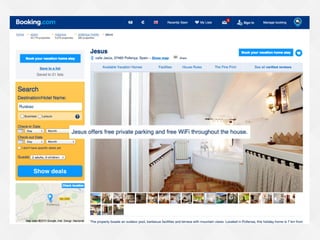
Content extremes on Booking.com
Shortest property name: 2 characters
Longest property name: 109 characters
How big do I make this thing?
%
em/rem
vw/vh
Relative units of measurement
are your best guess at the
ideal, but they’re still a guess.
Flexbox gets us closer to the
ideal, because it lets us design
without units.
Example: a responsive form
from http://jobs.theguardian.com/
My copy of that form
Same floats, same percentage widths
The trouble with explicit sizing
Since the select and button are sized by a
percentage, not sized automatically by their
content, this can happen:
Box too small for its content Box too big for its content
Use the flex property instead
Tells browser starting size (including content
size) and whether item can grow or shrink
width: 33.333%
flex: auto
Fill up remaining space
width: 16.666%
flex: none
Size to content exactly
Form fields are a pain in the butt
The fields and button don’t all match each
other exactly in height
Fix alignment with flexbox
Turn each field wrapper into flex container so
field inside will stretch to match height of its
line:
.flexbox .jobs-form_field-wrapper {
display: flex;
align-items: stretch; /* default */
width: auto;
}
Fields misaligned without flexbox Fields match height due to align-items
Smarter sizing
Non-flexbox
Flexbox enhanced
Content-driven breakpoints
aren’t perfect.
Automatic breakpoint with flexbox
Booking’s responsive customer service form
doesn’t use any media queries
http://www.booking.com/content/cs.html
All of the CSS for those 2 layouts
form.cs-message {
display: flex;
flex-flow: row wrap;
margin-right: -10px;
}
input.cs-message__text {
flex: 1 0 40%;
width: 43%;
float: left;
margin-right: 10px;
padding: 8px 10px;
}
1 property creates
2 responsive layouts,
both always full width
Taking advantage of variable space
Task: add a
message about
low availability
of the room
price shown:
“We have only X
left on our site!”
How about right here
in this lovely big gap?
Taking advantage of variable space
Problem: the gap
is not always big
enough to hold a
sentence of text
Taking advantage of variable space
Solution: use
flexbox to place
text beside price
when space
allows; otherwise,
it can wrap below
price
Taking advantage of variable space
Non-flexbox Flexbox enhanced
Improved wrapping
Non-flexbox Flexbox enhanced
Flexbox with float fallback
.iw_mini_details_wrapper {
display: flex;
flex-wrap: wrap;
justify-content: space-between;
align-items: baseline;
}
.iw_mini_review_score_wrapper {
float: left;
}
.iw_mini_price_wrapper {
float: right;
}
Flexbox properties on
container override
floating automatically
in supporting browsers
Floating gets used by
old browsers
Improved wrapping in RWD layout
With float or text-align With flex or justify-content
These examples don’t look wrong
or broken without flexbox.
Flexbox just enhances their sizing
and spacing to look better.
Flexbox can also enhance
visual ordering.
Reordering mobile content
In RWD, narrow-view
(mobile) stacking order
doesn’t always match
needed HTML order for
wide-view (desktop)
layout
Keep HTML order needed
for desktop and use
flexbox order property
only on mobile, since
browser support is better
and layout is simpler
there
Problem Solution
Example: moving a photo on mobile
Flexbox enhanced Non-flexbox
Reorder for good, not evil.
Reordering on The Guardian
Stacking order you
see when narrow
is the HTML order,
unchanged
1
2
3
4
5
6
Reordering on The Guardian
Reordered using
flexbox when wide
12 3
4 56
flex-direction: row-reverse
Flexbox requires a mental shift
in how you think about and
approach layout.
RWD is not binary.
Responsiveness is a continuum.
Flexbox can help make your site
more responsive.
Flexbox is not
ALL
 or NOTHING
Thanks!
Zoe Mickley Gillenwater
@zomigi
design@zomigi.com
zomigi.com | stunningcss3.com | flexiblewebbook.com
Photo credits: “oh.my.goshk” by Abulic Monkey and “A Cone Undone” by patersor on Flickr.
Ad

More Related Content

Similar to Responsive Flexbox Inspiration (Responsive Day Out) (7)

Using Flexbox Today (Frontier Conf 2016)
Using Flexbox Today (Frontier Conf 2016)Using Flexbox Today (Frontier Conf 2016)
Using Flexbox Today (Frontier Conf 2016)
Zoe Gillenwater
 
Flexbox every developers dream
Flexbox every developers dreamFlexbox every developers dream
Flexbox every developers dream
2019gracesmith
 
Show & tell - Flex in flux
Show & tell - Flex in fluxShow & tell - Flex in flux
Show & tell - Flex in flux
Dan Dineen
 
Leveling Up With Flexbox (Smart Web Conference)
Leveling Up With Flexbox (Smart Web Conference)Leveling Up With Flexbox (Smart Web Conference)
Leveling Up With Flexbox (Smart Web Conference)
Zoe Gillenwater
 
Understanding the flex layout
Understanding the flex layoutUnderstanding the flex layout
Understanding the flex layout
Barak Drechsler
 
Putting Flexbox into Practice (Fronteers)
Putting Flexbox into Practice (Fronteers)Putting Flexbox into Practice (Fronteers)
Putting Flexbox into Practice (Fronteers)
Zoe Gillenwater
 
Putting Flexbox into Practice
Putting Flexbox into PracticePutting Flexbox into Practice
Putting Flexbox into Practice
Zoe Gillenwater
 
Using Flexbox Today (Frontier Conf 2016)
Using Flexbox Today (Frontier Conf 2016)Using Flexbox Today (Frontier Conf 2016)
Using Flexbox Today (Frontier Conf 2016)
Zoe Gillenwater
 
Flexbox every developers dream
Flexbox every developers dreamFlexbox every developers dream
Flexbox every developers dream
2019gracesmith
 
Show & tell - Flex in flux
Show & tell - Flex in fluxShow & tell - Flex in flux
Show & tell - Flex in flux
Dan Dineen
 
Leveling Up With Flexbox (Smart Web Conference)
Leveling Up With Flexbox (Smart Web Conference)Leveling Up With Flexbox (Smart Web Conference)
Leveling Up With Flexbox (Smart Web Conference)
Zoe Gillenwater
 
Understanding the flex layout
Understanding the flex layoutUnderstanding the flex layout
Understanding the flex layout
Barak Drechsler
 
Putting Flexbox into Practice (Fronteers)
Putting Flexbox into Practice (Fronteers)Putting Flexbox into Practice (Fronteers)
Putting Flexbox into Practice (Fronteers)
Zoe Gillenwater
 
Putting Flexbox into Practice
Putting Flexbox into PracticePutting Flexbox into Practice
Putting Flexbox into Practice
Zoe Gillenwater
 

More from Zoe Gillenwater (17)

Show vs. Tell in UX Design (Front in Amsterdam)
Show vs. Tell in UX Design (Front in Amsterdam)Show vs. Tell in UX Design (Front in Amsterdam)
Show vs. Tell in UX Design (Front in Amsterdam)
Zoe Gillenwater
 
CSS Lessons Learned the Hard Way (ConvergeSE)
CSS Lessons Learned the Hard Way (ConvergeSE)CSS Lessons Learned the Hard Way (ConvergeSE)
CSS Lessons Learned the Hard Way (ConvergeSE)
Zoe Gillenwater
 
CSS Lessons Learned the Hard Way (Beyond Tellerand)
CSS Lessons Learned the Hard Way (Beyond Tellerand)CSS Lessons Learned the Hard Way (Beyond Tellerand)
CSS Lessons Learned the Hard Way (Beyond Tellerand)
Zoe Gillenwater
 
CSS Lessons Learned the Hard Way (Generate Conf)
CSS Lessons Learned the Hard Way (Generate Conf)CSS Lessons Learned the Hard Way (Generate Conf)
CSS Lessons Learned the Hard Way (Generate Conf)
Zoe Gillenwater
 
Just One (CSS Dev Conference keynote)
Just One (CSS Dev Conference keynote)Just One (CSS Dev Conference keynote)
Just One (CSS Dev Conference keynote)
Zoe Gillenwater
 
CSS3 Layout
CSS3 LayoutCSS3 Layout
CSS3 Layout
Zoe Gillenwater
 
Building Responsive Layouts
Building Responsive LayoutsBuilding Responsive Layouts
Building Responsive Layouts
Zoe Gillenwater
 
The Future of CSS Layout
The Future of CSS LayoutThe Future of CSS Layout
The Future of CSS Layout
Zoe Gillenwater
 
Building Responsive Layouts
Building Responsive LayoutsBuilding Responsive Layouts
Building Responsive Layouts
Zoe Gillenwater
 
CSS3, Media Queries, and Responsive Design
CSS3, Media Queries, and Responsive DesignCSS3, Media Queries, and Responsive Design
CSS3, Media Queries, and Responsive Design
Zoe Gillenwater
 
CSS3: Using media queries to improve the web site experience
CSS3: Using media queries to improve the web site experienceCSS3: Using media queries to improve the web site experience
CSS3: Using media queries to improve the web site experience
Zoe Gillenwater
 
Web Accessibility
Web AccessibilityWeb Accessibility
Web Accessibility
Zoe Gillenwater
 
Real-world CSS3
Real-world CSS3Real-world CSS3
Real-world CSS3
Zoe Gillenwater
 
Designing with CSS3 Effectively & Efficiently
Designing with CSS3 Effectively & EfficientlyDesigning with CSS3 Effectively & Efficiently
Designing with CSS3 Effectively & Efficiently
Zoe Gillenwater
 
Effective and Efficient Design with CSS3
Effective and Efficient Design with CSS3Effective and Efficient Design with CSS3
Effective and Efficient Design with CSS3
Zoe Gillenwater
 
Highly Maintainable, Efficient, and Optimized CSS
Highly Maintainable, Efficient, and Optimized CSSHighly Maintainable, Efficient, and Optimized CSS
Highly Maintainable, Efficient, and Optimized CSS
Zoe Gillenwater
 
Designing CSS Layouts for the Flexible Web
Designing CSS Layouts for the Flexible WebDesigning CSS Layouts for the Flexible Web
Designing CSS Layouts for the Flexible Web
Zoe Gillenwater
 
Show vs. Tell in UX Design (Front in Amsterdam)
Show vs. Tell in UX Design (Front in Amsterdam)Show vs. Tell in UX Design (Front in Amsterdam)
Show vs. Tell in UX Design (Front in Amsterdam)
Zoe Gillenwater
 
CSS Lessons Learned the Hard Way (ConvergeSE)
CSS Lessons Learned the Hard Way (ConvergeSE)CSS Lessons Learned the Hard Way (ConvergeSE)
CSS Lessons Learned the Hard Way (ConvergeSE)
Zoe Gillenwater
 
CSS Lessons Learned the Hard Way (Beyond Tellerand)
CSS Lessons Learned the Hard Way (Beyond Tellerand)CSS Lessons Learned the Hard Way (Beyond Tellerand)
CSS Lessons Learned the Hard Way (Beyond Tellerand)
Zoe Gillenwater
 
CSS Lessons Learned the Hard Way (Generate Conf)
CSS Lessons Learned the Hard Way (Generate Conf)CSS Lessons Learned the Hard Way (Generate Conf)
CSS Lessons Learned the Hard Way (Generate Conf)
Zoe Gillenwater
 
Just One (CSS Dev Conference keynote)
Just One (CSS Dev Conference keynote)Just One (CSS Dev Conference keynote)
Just One (CSS Dev Conference keynote)
Zoe Gillenwater
 
Building Responsive Layouts
Building Responsive LayoutsBuilding Responsive Layouts
Building Responsive Layouts
Zoe Gillenwater
 
The Future of CSS Layout
The Future of CSS LayoutThe Future of CSS Layout
The Future of CSS Layout
Zoe Gillenwater
 
Building Responsive Layouts
Building Responsive LayoutsBuilding Responsive Layouts
Building Responsive Layouts
Zoe Gillenwater
 
CSS3, Media Queries, and Responsive Design
CSS3, Media Queries, and Responsive DesignCSS3, Media Queries, and Responsive Design
CSS3, Media Queries, and Responsive Design
Zoe Gillenwater
 
CSS3: Using media queries to improve the web site experience
CSS3: Using media queries to improve the web site experienceCSS3: Using media queries to improve the web site experience
CSS3: Using media queries to improve the web site experience
Zoe Gillenwater
 
Designing with CSS3 Effectively & Efficiently
Designing with CSS3 Effectively & EfficientlyDesigning with CSS3 Effectively & Efficiently
Designing with CSS3 Effectively & Efficiently
Zoe Gillenwater
 
Effective and Efficient Design with CSS3
Effective and Efficient Design with CSS3Effective and Efficient Design with CSS3
Effective and Efficient Design with CSS3
Zoe Gillenwater
 
Highly Maintainable, Efficient, and Optimized CSS
Highly Maintainable, Efficient, and Optimized CSSHighly Maintainable, Efficient, and Optimized CSS
Highly Maintainable, Efficient, and Optimized CSS
Zoe Gillenwater
 
Designing CSS Layouts for the Flexible Web
Designing CSS Layouts for the Flexible WebDesigning CSS Layouts for the Flexible Web
Designing CSS Layouts for the Flexible Web
Zoe Gillenwater
 
Ad

Recently uploaded (20)

Emily's slide design 101 - training module
Emily's slide design 101 - training moduleEmily's slide design 101 - training module
Emily's slide design 101 - training module
yourmisswright
 
Are you Transitioning or Refining Now..?
Are you Transitioning or Refining Now..?Are you Transitioning or Refining Now..?
Are you Transitioning or Refining Now..?
Gregory Vigneaux
 
Modern Gradient Startup Pitch Deck PowerPoint Presentation and Google Slides ...
Modern Gradient Startup Pitch Deck PowerPoint Presentation and Google Slides ...Modern Gradient Startup Pitch Deck PowerPoint Presentation and Google Slides ...
Modern Gradient Startup Pitch Deck PowerPoint Presentation and Google Slides ...
SlidesBrain
 
Halstead’s_Software_Science_&_Putnam’s_Model[1].pptx
Halstead’s_Software_Science_&_Putnam’s_Model[1].pptxHalstead’s_Software_Science_&_Putnam’s_Model[1].pptx
Halstead’s_Software_Science_&_Putnam’s_Model[1].pptx
prachiikumarii1
 
behiriskfactorsxyzkskeb210217133906 (1).pdf
behiriskfactorsxyzkskeb210217133906 (1).pdfbehiriskfactorsxyzkskeb210217133906 (1).pdf
behiriskfactorsxyzkskeb210217133906 (1).pdf
ShakibulHasan14
 
MOCCAE SUSTAINABLE TROPHY 2025 Presentation.pdf
MOCCAE SUSTAINABLE TROPHY 2025 Presentation.pdfMOCCAE SUSTAINABLE TROPHY 2025 Presentation.pdf
MOCCAE SUSTAINABLE TROPHY 2025 Presentation.pdf
asfianoor1
 
Oversized Off White Pulka Dot Cotton Shirt
Oversized Off White Pulka Dot Cotton ShirtOversized Off White Pulka Dot Cotton Shirt
Oversized Off White Pulka Dot Cotton Shirt
ZNKL.in
 
interpolacrcrdcrdrcrdctctfct frfctfction.ppt
interpolacrcrdcrdrcrdctctfct frfctfction.pptinterpolacrcrdcrdrcrdctctfct frfctfction.ppt
interpolacrcrdcrdrcrdctctfct frfctfction.ppt
pawan070201
 
Wondershare Filmora Crack Free Download 2025
Wondershare Filmora Crack Free Download 2025Wondershare Filmora Crack Free Download 2025
Wondershare Filmora Crack Free Download 2025
Designer
 
AR.AKSHAYA PAMBALATH-PORTFOLIOFINAL_.pdf
AR.AKSHAYA PAMBALATH-PORTFOLIOFINAL_.pdfAR.AKSHAYA PAMBALATH-PORTFOLIOFINAL_.pdf
AR.AKSHAYA PAMBALATH-PORTFOLIOFINAL_.pdf
akshayap23
 
Venngage AI Infographic Generator- AI-powered visuals that turn your ideas in...
Venngage AI Infographic Generator- AI-powered visuals that turn your ideas in...Venngage AI Infographic Generator- AI-powered visuals that turn your ideas in...
Venngage AI Infographic Generator- AI-powered visuals that turn your ideas in...
Venngage AI Infographic Generator
 
Prof House interior Design Project exter
Prof House interior Design Project exterProf House interior Design Project exter
Prof House interior Design Project exter
NagudiBridget
 
Flowers Coloring Pages Activity Worksheet in Black and White Illustrative Style
Flowers Coloring Pages Activity Worksheet in Black and White Illustrative StyleFlowers Coloring Pages Activity Worksheet in Black and White Illustrative Style
Flowers Coloring Pages Activity Worksheet in Black and White Illustrative Style
Likazelika
 
Lori Vanzant's portfolio. Please take a look!
Lori Vanzant's portfolio. Please take a look!Lori Vanzant's portfolio. Please take a look!
Lori Vanzant's portfolio. Please take a look!
vanzan01
 
19 Best B,u,y Verified Cash App Accounts
19 Best B,u,y Verified Cash App Accounts19 Best B,u,y Verified Cash App Accounts
19 Best B,u,y Verified Cash App Accounts
https://sellsusa.com/product/buy-verified-cash-app-accounts/
 
Lori Vanzant Online Presence. Take a look!
Lori Vanzant Online Presence. Take a look!Lori Vanzant Online Presence. Take a look!
Lori Vanzant Online Presence. Take a look!
vanzan01
 
2nd taxonomy, nomen microorganisms-.pptx
2nd  taxonomy, nomen  microorganisms-.pptx2nd  taxonomy, nomen  microorganisms-.pptx
2nd taxonomy, nomen microorganisms-.pptx
ayeleasefa2
 
Download Chimera Tool Setup V42.47.0924 [Latest Version]
Download Chimera Tool Setup V42.47.0924 [Latest Version]Download Chimera Tool Setup V42.47.0924 [Latest Version]
Download Chimera Tool Setup V42.47.0924 [Latest Version]
Designer
 
Doodle Table of Contents Infographics by Slidesgo.pptx
Doodle Table of Contents Infographics by Slidesgo.pptxDoodle Table of Contents Infographics by Slidesgo.pptx
Doodle Table of Contents Infographics by Slidesgo.pptx
binhyennghlu
 
Lori Vanzant Portfolio. Take a look! ty.
Lori Vanzant Portfolio. Take a look! ty.Lori Vanzant Portfolio. Take a look! ty.
Lori Vanzant Portfolio. Take a look! ty.
vanzan01
 
Emily's slide design 101 - training module
Emily's slide design 101 - training moduleEmily's slide design 101 - training module
Emily's slide design 101 - training module
yourmisswright
 
Are you Transitioning or Refining Now..?
Are you Transitioning or Refining Now..?Are you Transitioning or Refining Now..?
Are you Transitioning or Refining Now..?
Gregory Vigneaux
 
Modern Gradient Startup Pitch Deck PowerPoint Presentation and Google Slides ...
Modern Gradient Startup Pitch Deck PowerPoint Presentation and Google Slides ...Modern Gradient Startup Pitch Deck PowerPoint Presentation and Google Slides ...
Modern Gradient Startup Pitch Deck PowerPoint Presentation and Google Slides ...
SlidesBrain
 
Halstead’s_Software_Science_&_Putnam’s_Model[1].pptx
Halstead’s_Software_Science_&_Putnam’s_Model[1].pptxHalstead’s_Software_Science_&_Putnam’s_Model[1].pptx
Halstead’s_Software_Science_&_Putnam’s_Model[1].pptx
prachiikumarii1
 
behiriskfactorsxyzkskeb210217133906 (1).pdf
behiriskfactorsxyzkskeb210217133906 (1).pdfbehiriskfactorsxyzkskeb210217133906 (1).pdf
behiriskfactorsxyzkskeb210217133906 (1).pdf
ShakibulHasan14
 
MOCCAE SUSTAINABLE TROPHY 2025 Presentation.pdf
MOCCAE SUSTAINABLE TROPHY 2025 Presentation.pdfMOCCAE SUSTAINABLE TROPHY 2025 Presentation.pdf
MOCCAE SUSTAINABLE TROPHY 2025 Presentation.pdf
asfianoor1
 
Oversized Off White Pulka Dot Cotton Shirt
Oversized Off White Pulka Dot Cotton ShirtOversized Off White Pulka Dot Cotton Shirt
Oversized Off White Pulka Dot Cotton Shirt
ZNKL.in
 
interpolacrcrdcrdrcrdctctfct frfctfction.ppt
interpolacrcrdcrdrcrdctctfct frfctfction.pptinterpolacrcrdcrdrcrdctctfct frfctfction.ppt
interpolacrcrdcrdrcrdctctfct frfctfction.ppt
pawan070201
 
Wondershare Filmora Crack Free Download 2025
Wondershare Filmora Crack Free Download 2025Wondershare Filmora Crack Free Download 2025
Wondershare Filmora Crack Free Download 2025
Designer
 
AR.AKSHAYA PAMBALATH-PORTFOLIOFINAL_.pdf
AR.AKSHAYA PAMBALATH-PORTFOLIOFINAL_.pdfAR.AKSHAYA PAMBALATH-PORTFOLIOFINAL_.pdf
AR.AKSHAYA PAMBALATH-PORTFOLIOFINAL_.pdf
akshayap23
 
Venngage AI Infographic Generator- AI-powered visuals that turn your ideas in...
Venngage AI Infographic Generator- AI-powered visuals that turn your ideas in...Venngage AI Infographic Generator- AI-powered visuals that turn your ideas in...
Venngage AI Infographic Generator- AI-powered visuals that turn your ideas in...
Venngage AI Infographic Generator
 
Prof House interior Design Project exter
Prof House interior Design Project exterProf House interior Design Project exter
Prof House interior Design Project exter
NagudiBridget
 
Flowers Coloring Pages Activity Worksheet in Black and White Illustrative Style
Flowers Coloring Pages Activity Worksheet in Black and White Illustrative StyleFlowers Coloring Pages Activity Worksheet in Black and White Illustrative Style
Flowers Coloring Pages Activity Worksheet in Black and White Illustrative Style
Likazelika
 
Lori Vanzant's portfolio. Please take a look!
Lori Vanzant's portfolio. Please take a look!Lori Vanzant's portfolio. Please take a look!
Lori Vanzant's portfolio. Please take a look!
vanzan01
 
Lori Vanzant Online Presence. Take a look!
Lori Vanzant Online Presence. Take a look!Lori Vanzant Online Presence. Take a look!
Lori Vanzant Online Presence. Take a look!
vanzan01
 
2nd taxonomy, nomen microorganisms-.pptx
2nd  taxonomy, nomen  microorganisms-.pptx2nd  taxonomy, nomen  microorganisms-.pptx
2nd taxonomy, nomen microorganisms-.pptx
ayeleasefa2
 
Download Chimera Tool Setup V42.47.0924 [Latest Version]
Download Chimera Tool Setup V42.47.0924 [Latest Version]Download Chimera Tool Setup V42.47.0924 [Latest Version]
Download Chimera Tool Setup V42.47.0924 [Latest Version]
Designer
 
Doodle Table of Contents Infographics by Slidesgo.pptx
Doodle Table of Contents Infographics by Slidesgo.pptxDoodle Table of Contents Infographics by Slidesgo.pptx
Doodle Table of Contents Infographics by Slidesgo.pptx
binhyennghlu
 
Lori Vanzant Portfolio. Take a look! ty.
Lori Vanzant Portfolio. Take a look! ty.Lori Vanzant Portfolio. Take a look! ty.
Lori Vanzant Portfolio. Take a look! ty.
vanzan01
 
Ad

Responsive Flexbox Inspiration (Responsive Day Out)

  • 1. Flexbox Zoe Mickley Gillenwater @zomigi Responsive Day Out June 2015 Inspiration Responsive
  • 8. Content extremes on Booking.com Shortest property name: 2 characters Longest property name: 109 characters
  • 9. How big do I make this thing?
  • 11. Relative units of measurement are your best guess at the ideal, but they’re still a guess.
  • 12. Flexbox gets us closer to the ideal, because it lets us design without units.
  • 13. Example: a responsive form from http://jobs.theguardian.com/
  • 14. My copy of that form Same floats, same percentage widths
  • 15. The trouble with explicit sizing Since the select and button are sized by a percentage, not sized automatically by their content, this can happen: Box too small for its content Box too big for its content
  • 16. Use the flex property instead Tells browser starting size (including content size) and whether item can grow or shrink width: 33.333% flex: auto Fill up remaining space width: 16.666% flex: none Size to content exactly
  • 17. Form fields are a pain in the butt The fields and button don’t all match each other exactly in height
  • 18. Fix alignment with flexbox Turn each field wrapper into flex container so field inside will stretch to match height of its line: .flexbox .jobs-form_field-wrapper { display: flex; align-items: stretch; /* default */ width: auto; } Fields misaligned without flexbox Fields match height due to align-items
  • 21. Automatic breakpoint with flexbox Booking’s responsive customer service form doesn’t use any media queries http://www.booking.com/content/cs.html
  • 22. All of the CSS for those 2 layouts form.cs-message { display: flex; flex-flow: row wrap; margin-right: -10px; } input.cs-message__text { flex: 1 0 40%; width: 43%; float: left; margin-right: 10px; padding: 8px 10px; } 1 property creates 2 responsive layouts, both always full width
  • 23. Taking advantage of variable space Task: add a message about low availability of the room price shown: “We have only X left on our site!” How about right here in this lovely big gap?
  • 24. Taking advantage of variable space Problem: the gap is not always big enough to hold a sentence of text
  • 25. Taking advantage of variable space Solution: use flexbox to place text beside price when space allows; otherwise, it can wrap below price
  • 26. Taking advantage of variable space Non-flexbox Flexbox enhanced
  • 28. Flexbox with float fallback .iw_mini_details_wrapper { display: flex; flex-wrap: wrap; justify-content: space-between; align-items: baseline; } .iw_mini_review_score_wrapper { float: left; } .iw_mini_price_wrapper { float: right; } Flexbox properties on container override floating automatically in supporting browsers Floating gets used by old browsers
  • 29. Improved wrapping in RWD layout
  • 30. Improved wrapping in RWD layout With float or text-align With flex or justify-content
  • 31. These examples don’t look wrong or broken without flexbox. Flexbox just enhances their sizing and spacing to look better.
  • 32. Flexbox can also enhance visual ordering.
  • 33. Reordering mobile content In RWD, narrow-view (mobile) stacking order doesn’t always match needed HTML order for wide-view (desktop) layout Keep HTML order needed for desktop and use flexbox order property only on mobile, since browser support is better and layout is simpler there Problem Solution
  • 34. Example: moving a photo on mobile
  • 35. Example: moving a photo on mobile Flexbox enhanced Non-flexbox
  • 36. Reorder for good, not evil.
  • 37. Reordering on The Guardian Stacking order you see when narrow is the HTML order, unchanged 1 2 3 4 5 6
  • 38. Reordering on The Guardian Reordered using flexbox when wide 12 3 4 56 flex-direction: row-reverse flex-direction: row-reverse
  • 39. Flexbox requires a mental shift in how you think about and approach layout.
  • 40. RWD is not binary. Responsiveness is a continuum. Flexbox can help make your site more responsive.
  • 41. Flexbox is not ALL or NOTHING
  • 42. Thanks! Zoe Mickley Gillenwater @zomigi [email protected] zomigi.com | stunningcss3.com | flexiblewebbook.com Photo credits: “oh.my.goshk” by Abulic Monkey and “A Cone Undone” by patersor on Flickr.