Responsive Web Design & Workflows for Todays Web (THE UX-MEN at The Hive, Hong Kong)
24 likes27,868 views

A primer on responsive design, various aspects on this technique, various examples, challenges and best practices in form of a case study of a past project as well as considerations and lessons learned.


Ad
More Related Content
What's hot (11)
Viewers also liked (6)
Ad
Similar to Responsive Web Design & Workflows for Todays Web (THE UX-MEN at The Hive, Hong Kong) (20)


Ad
More from Holger Bartel (14)


Recently uploaded (20)


Responsive Web Design & Workflows for Todays Web (THE UX-MEN at The Hive, Hong Kong)
- 2. Holger Bartel @foobartel [email protected]
- 3. Responsive Web Design & Workflows for Today's Web
- 4. What I’ll Talk About Today ★ A Primer on RWD ★ RWD IRL - A Case Study ★ RWD Workflow ★ Conclusions & Lessons Learned
- 5. Perception & Status Quo
- 6. “We don’t need a mobile site”
- 10. New Devices Since 09/12 4"-5" Smartphones 9"-10" Tablets Apple iPhone 5 (4" Apple iOS 6.0) iPad Gen 4 (9.7" Apple iOS 6.0) Nokia Lumia 920 (4.5" Microsoft Windows 8) Microsoft Surface Tablet (10.6" Microsoft Windows 8) HTC Windows Phone 8X (4.3" Microsoft Windows 8) Kindle Fire HD (8.9" Google Android 4.0 modified) HTC Windows Phone 8S (4.0" Microsoft Windows 8) Lenovo ThinkPad Tablet 2 (10.1" Microsoft Windows 8) Motorola Droid RAZR HD (4.7" Google Android 4.0) Acer Iconia Tab W510 (10.1" Microsoft Windows 8) Motorola Droid RAZR M (4.3" Google Android 4.0) Dell Latitude 10 (10.1" Microsoft Windows 8) Google/LG Nexus 4 (4.7" Google Android 4.2) Dell XPS 10 (10.1" Microsoft Windows 8) Asus Vivo Tab RT (10.1" Microsoft Windows 8) 5"-6" Phone/Tablet Hybrids Google/LG Nexus 10 (10.055” Google Android 4.2) Samsung Galaxy Note II (5.5" Google Android 4.0) 11"-17" Laptops & Convertibles (Tablet/Laptop) 7"-8" Tablets 13" MacBook Pro with Retina (13" Apple OSX 10.8) iPad Mini (7.9" Apple iOS 6.0) Lenovo IdeaPad Yoga 13 (13.3" Microsoft Windows 8) Kindle Fire HD (7" Google Android 4.0 modified) Lenovo ThinkPad Twist (12.5" Microsoft Windows 8) Kindle Fire (7" Google Android 4.0 modified) Toshiba Satellite U925T (12.5" Microsoft Windows 8) Google/LG Nexus 7 (7" Google Android 4.2) Dell XPS 12 (12.5" Microsoft Windows 8) Lenovo IdeaTab Lynx (11.6" Microsoft Windows 8) 20"-30" Desktops Samsung ATIV Smart PC 500T/700T (11.6" Microsoft Windows 8) Sony Tap 20 (20" touch screen Microsoft Windows 8) Acer Iconia W700 (11.6" Microsoft Windows 8) 21.5-inch iMac (21.5" Apple OSX 10.8) Sony Vaio Duo 11 (11.6" Microsoft Windows 8) 27-inch iMac (27" Apple OSX 10.8) Samsung Chromebook (11.6" Google Chrome OS) http://www.lukew.com/ff/entry.asp?1646
- 11. “ It is the nature of the web to be flexible, and it should be our role as designers and developers to embrace this. – John Allsopp http://www.alistapart.com/articles/dao/
- 12. What Is RWD? ★ Fluid Grids ★ Flexible Images ★ Media Queries http://www.macrojuice.com/multimedia/responsive-web-design/
- 13. bradfrostweb.com
- 15. Media Queries in HTML
- 16. Breakpoints ★ basic.css ★ 480.css ★ 600.css (Tablets Portrait) ★ 768.css ★ 992.css (Desktop)
- 17. Make It Work In Your HTML Code In Your CSS Code
- 18. Browser Support http://caniuse.com/#feat=css-mediaqueries
- 19. Resources www.abookapart.com
- 20. “ Responsive design is not about mobile. It's not about tablets. It's not about desktops. It's about The Web. – Jeremy Keith (@adactio)
- 23. Concept ★ Responsive Design or Website + App? ★ Requirements ★ Usability und Performance ★ Project Start: October 2011
- 24. Experimental Client + Established Trust = Happy Designer & Developer :)
- 27. “ By 2013, mobile phones will overtake PCs as the most common Web access device worldwide. – Gartner (13.01.2010)
- 28. Mobile Access ★ 2010: ~3.300 (ca. 2,5%) ★ 2011: ~8.800 (ca. 6%) ★ 2012: ??
- 29. Content Strategy ★ Content First! ★ Simplify Structure, What’s Needed? ★ Design With Final Content
- 30. Designing In The Browser ★ Quick results & real testing ★ Use advantages of HTML5/CSS3 ★ Prototyping extremely fast ★ Easy Changes (Colors, Fontsize, etc.) ★ Decide right in the browser
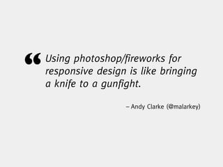
- 31. “ Using photoshop/fireworks for responsive design is like bringing a knife to a gunfight. – Andy Clarke (@malarkey)
- 33. The Common Workflow Content Strategy Planning And Strategy User Research Copy Wireframes Visual Lorem Ipsum Design Dev Lorem Ipsum Test Pon Kattera (@pkattera) - Design Process in the Responsive Age
- 34. The RWD Process User Content Iterative Design & Development Prototype Handover Planner, UX Planner, UX, Visual, Tech UX, Visual, Tech UX, Visual Tech Test Prototype User Content Sketch RWD Research Strategy Prototype Visual Design Wireframe Pon Kattera (@pkattera) - Design Process in the Responsive Age
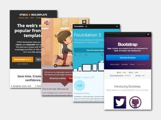
- 35. Frameworks
- 38. Foundation ★ Responsive Grid ★ Navigation & Form Elements ★ Tabs, Buttons, Alerts, Labels, Tooltips ★ Since Foundation 3: Sass/Compass
- 53. The Waterfall Process Content Strategy Planning And Strategy User Research Copy Wireframes Visual Lorem Ipsum Design Dev Lorem Ipsum Test Pon Kattera (@pkattera) - Design Process in the Responsive Age
- 54. The RWD Process User Content Iterative Design & Development Prototype Handover Planner, UX Planner, UX, Visual, Tech UX, Visual, Tech UX, Visual, Tech Test Prototype User Content Sketch RWD Research Strategy Prototype Visual Design Wireframe Pon Kattera (@pkattera) - Design Process in the Responsive Age
- 55. Frontend ★ Rebuild Prototype? ★ Produce valid & clean code ★ Build Modules not pages ★ Create re-usable Code
- 56. Into The Unknown ★ Display Size & Resolution ★ Different Browsers & -versions ★ Different Device Capabilities ★ Connection Speed, Bandwidth
- 57. A Website doesn’t have to look exactly the same on different devices!
- 62. Building Modules
- 67. Open Device Labs opendevicelab.com
- 68. Open Device Labs opendevicelab.hk
- 70. Responsive Images ★ Avoid unnecessary data ★ Same images for all devices ★ When to use Retina images? ★ <img> Tag isn’t ready yet ★ Polyfills = Just a workaround
- 74. Server Side Image Processing - RESS
- 76. Alternatives http://css-tricks.com/which-responsive-images-solution-should-you-use/
- 77. Conclusions
- 78. Lessons Learned ★ Do not rush, set timing generously (Content Strategy, RWD, Frontend, CMS) ★ Mobile First - Content First Design
- 79. Seperate Layout & Design http://styletil.es/
- 80. Lessons Learned ★ Do not rush, set timing generously (Content Strategy, RWD, Frontend, CMS) ★ Mobile First - Content First Design ★ Separate Layout & Design ★ Use LESS/Sass & Compass
- 81. Important to Remember ★ Test early and often ★ Put your JavaScript at the bottom
- 82. Cost & Benefits
- 83. The Last 3 Years Year 2010 2011 2012 Mobile 3.300 9.000 20.400 (%) (2,5%) (6%) (14%) Jul-Aug 1.900 4.500 12.500 (%) (3,5%) (7.5%) (18%)
- 84. The fact is that responsive web design costs more… than doing nothing. Sure, you could continue building sites the old fashioned way and ignore the multitude of web-enabled devices accessing the web now and in the future. But this is 2012. At the very least a web experience should have at least some mobile consideration, and at the very most a site should be full- on mobile optimized. http://bradfrostweb.com/blog/web/how-much-does-a-responsive-web-design-cost/
- 85. “ If you want to be relevant on the web today, your website must adapt and perform on all the devices that use the web. – Mobify
- 86. Thank You. Holger Bartel @foobartel [email protected] Credits: @beckenhaub