[rwdsummit] Adaptive Images in Responsive Web Design
35 likes27,355 views

The document summarizes Christopher Schmitt's presentation at RWD Summit 2014 on adaptive images in responsive web design. It discusses using feature testing over browser sniffing to determine screen resolution and bandwidth. It presents techniques like srcset, picture, and JavaScript solutions to serve appropriately sized images. It also covers workarounds like background-size, SVG, and font-based solutions when native techniques are not supported. The focus is on building responsive images that scale with the device and load quickly.


![[rwdsummit] Adaptive Images in Responsive Web Design](https://image.slidesharecdn.com/adaptive-imagesv18-1-140325201134-phpapp02/85/rwdsummit-Adaptive-Images-in-Responsive-Web-Design-7-320.jpg)
![[rwdsummit] Adaptive Images in Responsive Web Design](https://image.slidesharecdn.com/adaptive-imagesv18-1-140325201134-phpapp02/85/rwdsummit-Adaptive-Images-in-Responsive-Web-Design-8-320.jpg)
![[rwdsummit] Adaptive Images in Responsive Web Design](https://image.slidesharecdn.com/adaptive-imagesv18-1-140325201134-phpapp02/85/rwdsummit-Adaptive-Images-in-Responsive-Web-Design-9-320.jpg)
![[rwdsummit] Adaptive Images in Responsive Web Design](https://image.slidesharecdn.com/adaptive-imagesv18-1-140325201134-phpapp02/85/rwdsummit-Adaptive-Images-in-Responsive-Web-Design-10-320.jpg)
![[rwdsummit] Adaptive Images in Responsive Web Design](https://image.slidesharecdn.com/adaptive-imagesv18-1-140325201134-phpapp02/85/rwdsummit-Adaptive-Images-in-Responsive-Web-Design-11-320.jpg)

![[rwdsummit] Adaptive Images in Responsive Web Design](https://image.slidesharecdn.com/adaptive-imagesv18-1-140325201134-phpapp02/85/rwdsummit-Adaptive-Images-in-Responsive-Web-Design-13-320.jpg)
![[rwdsummit] Adaptive Images in Responsive Web Design](https://image.slidesharecdn.com/adaptive-imagesv18-1-140325201134-phpapp02/85/rwdsummit-Adaptive-Images-in-Responsive-Web-Design-14-320.jpg)
![[rwdsummit] Adaptive Images in Responsive Web Design](https://image.slidesharecdn.com/adaptive-imagesv18-1-140325201134-phpapp02/85/rwdsummit-Adaptive-Images-in-Responsive-Web-Design-15-320.jpg)

![[rwdsummit] Adaptive Images in Responsive Web Design](https://image.slidesharecdn.com/adaptive-imagesv18-1-140325201134-phpapp02/85/rwdsummit-Adaptive-Images-in-Responsive-Web-Design-17-320.jpg)
![[rwdsummit] Adaptive Images in Responsive Web Design](https://image.slidesharecdn.com/adaptive-imagesv18-1-140325201134-phpapp02/85/rwdsummit-Adaptive-Images-in-Responsive-Web-Design-18-320.jpg)


![72 points-per-inch
x [1+(1/3)]
= 96 PPI](https://image.slidesharecdn.com/adaptive-imagesv18-1-140325201134-phpapp02/85/rwdsummit-Adaptive-Images-in-Responsive-Web-Design-38-320.jpg)

![[rwdsummit] Adaptive Images in Responsive Web Design](https://image.slidesharecdn.com/adaptive-imagesv18-1-140325201134-phpapp02/85/rwdsummit-Adaptive-Images-in-Responsive-Web-Design-40-320.jpg)
![[In 2013, Intel sees their
product line] offer a higher
resolution experience than a
top-of-the-line 1080p HDTV.”
“
http://liliputing.com/2012/04/intel-retina-laptop-
desktop-displays-coming-in-2013.html](https://image.slidesharecdn.com/adaptive-imagesv18-1-140325201134-phpapp02/85/rwdsummit-Adaptive-Images-in-Responsive-Web-Design-41-320.jpg)


![[rwdsummit] Adaptive Images in Responsive Web Design](https://image.slidesharecdn.com/adaptive-imagesv18-1-140325201134-phpapp02/85/rwdsummit-Adaptive-Images-in-Responsive-Web-Design-47-320.jpg)


![Native speed test
// @Modernizr's network-connection.js
connection = navigator.connection || {
type: 0 }, // polyfill
isSlowConnection = connection.type == 3
|| connection.type == 4
| /^[23]g$/.test(connection.type);
http://davidbcalhoun.com/2010/using-navigator-connection-android](https://image.slidesharecdn.com/adaptive-imagesv18-1-140325201134-phpapp02/85/rwdsummit-Adaptive-Images-in-Responsive-Web-Design-55-320.jpg)


![Filament .htaccess
# Responsive Images
# Mobile-First images that scale responsively and responsibly
# Copyright 2010, Scott Jehl, Filament Group, Inc
# Dual licensed under the MIT or GPL Version 2 licenses.
# //Start Responsive Images
RewriteEngine On
# direct image requests to temp
RewriteCond %{QUERY_STRING} full=(.*)&?
RewriteRule (.*)rwd-router/.*.(jpe?g|png|gif|webp) $1%1 [L]
# ignore trap for non-image requests, rewrite URL without trap segment
RewriteRule (.*)rwd-router/(.*)$ $1$2
# //End Responsive Images
https://github.com/filamentgroup/Responsive-Images](https://image.slidesharecdn.com/adaptive-imagesv18-1-140325201134-phpapp02/85/rwdsummit-Adaptive-Images-in-Responsive-Web-Design-59-320.jpg)


![[rwdsummit] Adaptive Images in Responsive Web Design](https://image.slidesharecdn.com/adaptive-imagesv18-1-140325201134-phpapp02/85/rwdsummit-Adaptive-Images-in-Responsive-Web-Design-93-320.jpg)
![[rwdsummit] Adaptive Images in Responsive Web Design](https://image.slidesharecdn.com/adaptive-imagesv18-1-140325201134-phpapp02/85/rwdsummit-Adaptive-Images-in-Responsive-Web-Design-94-320.jpg)


![Modernizr check
if(!Modernizr.svg){
var images =
document.getElementsByTagName("img");
for(var i = 0; i < images.length; i++){
var src = images[i].src.split(".");
images[i].src = src[0] + ".png";
}
}
http://stackoverflow.com/questions/12846852/
svg-png-extension-switch](https://image.slidesharecdn.com/adaptive-imagesv18-1-140325201134-phpapp02/85/rwdsummit-Adaptive-Images-in-Responsive-Web-Design-100-320.jpg)


![[rwdsummit] Adaptive Images in Responsive Web Design](https://image.slidesharecdn.com/adaptive-imagesv18-1-140325201134-phpapp02/85/rwdsummit-Adaptive-Images-in-Responsive-Web-Design-104-320.jpg)
![[rwdsummit] Adaptive Images in Responsive Web Design](https://image.slidesharecdn.com/adaptive-imagesv18-1-140325201134-phpapp02/85/rwdsummit-Adaptive-Images-in-Responsive-Web-Design-105-320.jpg)
![[rwdsummit] Adaptive Images in Responsive Web Design](https://image.slidesharecdn.com/adaptive-imagesv18-1-140325201134-phpapp02/85/rwdsummit-Adaptive-Images-in-Responsive-Web-Design-106-320.jpg)


![Font-based icons
<style>
[data-icon]:before {
font-family: 'icon-font';
content: attr(data-icon);
}
</style>
<a href="http://example.com/cloud/save/">
<span data-icon="C" aria-hidden="true"></span>
Save to Cloud
</a>](https://image.slidesharecdn.com/adaptive-imagesv18-1-140325201134-phpapp02/85/rwdsummit-Adaptive-Images-in-Responsive-Web-Design-112-320.jpg)
![[rwdsummit] Adaptive Images in Responsive Web Design](https://image.slidesharecdn.com/adaptive-imagesv18-1-140325201134-phpapp02/85/rwdsummit-Adaptive-Images-in-Responsive-Web-Design-114-320.jpg)
![[rwdsummit] Adaptive Images in Responsive Web Design](https://image.slidesharecdn.com/adaptive-imagesv18-1-140325201134-phpapp02/85/rwdsummit-Adaptive-Images-in-Responsive-Web-Design-115-320.jpg)
![[rwdsummit] Adaptive Images in Responsive Web Design](https://image.slidesharecdn.com/adaptive-imagesv18-1-140325201134-phpapp02/85/rwdsummit-Adaptive-Images-in-Responsive-Web-Design-116-320.jpg)
![[rwdsummit] Adaptive Images in Responsive Web Design](https://image.slidesharecdn.com/adaptive-imagesv18-1-140325201134-phpapp02/85/rwdsummit-Adaptive-Images-in-Responsive-Web-Design-117-320.jpg)


![[rwdsummit] Adaptive Images in Responsive Web Design](https://image.slidesharecdn.com/adaptive-imagesv18-1-140325201134-phpapp02/85/rwdsummit-Adaptive-Images-in-Responsive-Web-Design-122-320.jpg)


![[rwdsummit] Adaptive Images in Responsive Web Design](https://image.slidesharecdn.com/adaptive-imagesv18-1-140325201134-phpapp02/85/rwdsummit-Adaptive-Images-in-Responsive-Web-Design-129-320.jpg)
![[rwdsummit] Adaptive Images in Responsive Web Design](https://image.slidesharecdn.com/adaptive-imagesv18-1-140325201134-phpapp02/85/rwdsummit-Adaptive-Images-in-Responsive-Web-Design-130-320.jpg)


![[rwdsummit] Adaptive Images in Responsive Web Design](https://image.slidesharecdn.com/adaptive-imagesv18-1-140325201134-phpapp02/85/rwdsummit-Adaptive-Images-in-Responsive-Web-Design-134-320.jpg)


![[rwdsummit] Adaptive Images in Responsive Web Design](https://image.slidesharecdn.com/adaptive-imagesv18-1-140325201134-phpapp02/85/rwdsummit-Adaptive-Images-in-Responsive-Web-Design-142-320.jpg)
![[rwdsummit] Adaptive Images in Responsive Web Design](https://image.slidesharecdn.com/adaptive-imagesv18-1-140325201134-phpapp02/85/rwdsummit-Adaptive-Images-in-Responsive-Web-Design-143-320.jpg)


![[rwdsummit] Adaptive Images in Responsive Web Design](https://image.slidesharecdn.com/adaptive-imagesv18-1-140325201134-phpapp02/85/rwdsummit-Adaptive-Images-in-Responsive-Web-Design-149-320.jpg)


![[parisweb] Adaptive Images in Responsive Web Design](https://cdn.slidesharecdn.com/ss_thumbnails/adaptive-imagesv15v2-131014003217-phpapp01-thumbnail.jpg?width=560&fit=bounds)
![[funka] Adaptive Images in Responsive Web Design](https://cdn.slidesharecdn.com/ss_thumbnails/adaptive-images-funkav5-150415072902-conversion-gate01-thumbnail.jpg?width=560&fit=bounds)
![[CSSDevConf] Adaptive Images in Responsive Web Design 2014](https://cdn.slidesharecdn.com/ss_thumbnails/adaptive-images-cssdevconf-141013185313-conversion-gate02-thumbnail.jpg?width=560&fit=bounds)
![[Austin WordPress Meetup] Adaptive Images in Responsive Web Design](https://cdn.slidesharecdn.com/ss_thumbnails/adaptiveimages-wpaustinmeetup-150204100924-conversion-gate01-thumbnail.jpg?width=560&fit=bounds)
![[cssdevconf] Adaptive Images in Responsive Web Design](https://cdn.slidesharecdn.com/ss_thumbnails/adaptive-imagesv16-131021133151-phpapp01-thumbnail.jpg?width=560&fit=bounds)
![[wcatx] Adaptive Images in Responsive Web Design](https://cdn.slidesharecdn.com/ss_thumbnails/wcatx-adaptive-images-130518143751-phpapp01-thumbnail.jpg?width=560&fit=bounds)
![[peachpit] Adaptive Images in Responsive Web Design](https://cdn.slidesharecdn.com/ss_thumbnails/peachpit-schmitt-adaptive-images-v2-130925150604-phpapp01-thumbnail.jpg?width=560&fit=bounds)
![[refreshpitt] Adaptive Images in Responsive Web Design](https://cdn.slidesharecdn.com/ss_thumbnails/adaptive-imagesv10-130609110047-phpapp01-thumbnail.jpg?width=560&fit=bounds)
![[refreshaustin] Adaptive Images in Responsive Web Design](https://cdn.slidesharecdn.com/ss_thumbnails/adaptive-imagesv7-130410122323-phpapp02-thumbnail.jpg?width=560&fit=bounds)
![[HEWEBFL] Adaptive Images in Responsive Web Design](https://cdn.slidesharecdn.com/ss_thumbnails/hewebfl-adaptive-images2-130423085801-phpapp02-thumbnail.jpg?width=560&fit=bounds)
![[wvbcn] Adaptive Images in Responsive Web Design](https://cdn.slidesharecdn.com/ss_thumbnails/adaptive-imagesv13v2-130629093334-phpapp01-thumbnail.jpg?width=560&fit=bounds)
![[convergese] Adaptive Images in Responsive Web Design](https://cdn.slidesharecdn.com/ss_thumbnails/2012-adaptive-images-convergese-120509135732-phpapp01-thumbnail.jpg?width=560&fit=bounds)
![[HEWEBAR 2012] Adaptive Images in Responsive Web Design](https://cdn.slidesharecdn.com/ss_thumbnails/hewebar-2012-adaptive-images-in-rwd-120729151800-phpapp02-thumbnail.jpg?width=560&fit=bounds)


![[psuweb] Adaptive Images in Responsive Web Design](https://cdn.slidesharecdn.com/ss_thumbnails/adaptive-images-psuwebv2-130606095220-phpapp01-thumbnail.jpg?width=560&fit=bounds)
Ad
More Related Content
What's hot (20)
Similar to [rwdsummit] Adaptive Images in Responsive Web Design (20)
![[drupalcampatx] Adaptive Images in Responsive Web Design](https://cdn.slidesharecdn.com/ss_thumbnails/adaptive-imagesv12v2-130623122711-phpapp01-thumbnail.jpg?width=560&fit=bounds)
![[cssdevconf] Adaptive Images in RWD](https://cdn.slidesharecdn.com/ss_thumbnails/adaptive-imagesv6-121210084537-phpapp02-thumbnail.jpg?width=560&fit=bounds)
![[rwdsummit2012] Adaptive Images in Responsive Web Design](https://cdn.slidesharecdn.com/ss_thumbnails/schmitt-adaptive-imagesv2-120829225201-phpapp02-thumbnail.jpg?width=560&fit=bounds)
![[html5tx] Adaptive Images in Responsive Web Design](https://cdn.slidesharecdn.com/ss_thumbnails/adaptive-images-html5tx-130202100125-phpapp01-thumbnail.jpg?width=560&fit=bounds)


Ad
More from Christopher Schmitt (12)

![[artifactconf] Github for People Who Don't Code](https://cdn.slidesharecdn.com/ss_thumbnails/github-for-people-that-dont-code-131115221827-phpapp02-thumbnail.jpg?width=560&fit=bounds)
![[jqconatx] Adaptive Images for Responsive Web Design](https://cdn.slidesharecdn.com/ss_thumbnails/adaptive-imagesv14-130911193737-phpapp01-thumbnail.jpg?width=560&fit=bounds)

![[sxsw2013] Extremely Compressed JPEGs](https://cdn.slidesharecdn.com/ss_thumbnails/adaptive-imagesfordwmgv7-130312172016-phpapp01-thumbnail.jpg?width=560&fit=bounds)
![[amigos] HTML5 and CSS3](https://cdn.slidesharecdn.com/ss_thumbnails/html5-and-css3v6-130208132048-phpapp01-thumbnail.jpg?width=560&fit=bounds)
![[convergefl] Adaptive Images in Responsive Web Design](https://cdn.slidesharecdn.com/ss_thumbnails/christopher-schmitt-adaptive-images-121014200507-phpapp02-thumbnail.jpg?width=560&fit=bounds)
![[HEWEBAR 2012] Beyond Desktop Browsing (HTML5)](https://cdn.slidesharecdn.com/ss_thumbnails/hewebar-2012-beyond-desktop-browsing-120729151254-phpapp01-thumbnail.jpg?width=560&fit=bounds)
![[O'Reilly] HTML5 Design](https://cdn.slidesharecdn.com/ss_thumbnails/html5-workshop-111215160913-phpapp01-thumbnail.jpg?width=560&fit=bounds)
![[heweb11] CSS3 Makeover](https://cdn.slidesharecdn.com/ss_thumbnails/css3-makeover-111027113114-phpapp01-thumbnail.jpg?width=560&fit=bounds)
![[heweb11] HTML5 Makeover](https://cdn.slidesharecdn.com/ss_thumbnails/html5-makeover-111027112644-phpapp01-thumbnail.jpg?width=560&fit=bounds)
![[edUi] HTML5 Workshop](https://cdn.slidesharecdn.com/ss_thumbnails/html5-workshop-2-111014103112-phpapp02-thumbnail.jpg?width=560&fit=bounds)
Ad
Recently uploaded (20)


![Halstead’s_Software_Science_&_Putnam’s_Model[1].pptx](https://cdn.slidesharecdn.com/ss_thumbnails/halsteadssoftwarescienceputnamsmodel1-250502175814-4c85707e-thumbnail.jpg?width=560&fit=bounds)


[rwdsummit] Adaptive Images in Responsive Web Design
- 1. RWD SUMMIT 2014 ADAPTIVE IMAGESIN RESPONSIVE WEB DESIGN CHRISTOPHER SCHMITT @teleject
- 3. @teleject
- 12. y x
- 19. WHY DON’T WE ASK THE BROWSER? (cc) flic.kr/p/vUBHv
- 20. alert("User-agent header sent: " + navigator.userAgent);
- 21. alert("User-agent header sent: " + navigator.userAgent);
- 22. Mozilla/1.0 (Win3.1) http://www.useragentstring.com/ (cc) flic.kr/p/vUBHv
- 23. Mozilla/1.0 (Win3.1) Mozilla/1.22 (compatible; MSIE 2.0; Windows 95) (cc) flic.kr/p/vUBHv http://www.useragentstring.com/
- 24. Mozilla/5.0 (Macintosh; Intel Mac OS X 10_7_3) AppleWebKit/ 534.55.3 (KHTML, like Gecko) Version/5.1.5 Safari/534.55.3 (cc) flic.kr/p/vUBHv http://www.useragentstring.com/
- 25. Mozilla/5.0 (Macintosh; Intel Mac OS X 10_7_3) AppleWebKit/ 534.55.3 (KHTML, like Gecko) Version/5.1.5 Safari/534.55.3 http://webaim.org/blog/user-agent-string-history/ (cc) flic.kr/p/vUBHv
- 27. FEATURE TESTINGvs. BROWSER SNIFFING 1 2 3
- 28. FEATURE TESTINGvs. BROWSER SNIFFING 1 Browser width 2 3
- 29. A scripting approach var myWidth = 0, myHeight = 0; if( typeof( window.innerWidth ) == 'number' ) { //Non-IE myWidth = window.innerWidth; myHeight = window.innerHeight; } else if( document.documentElement && ( document.documentElement.clientWidth || document.documentElement.clientHeight ) ) { //IE 6+ in 'standards compliant mode' myWidth = document.documentElement.clientWidth; myHeight = document.documentElement.clientHeight; } http://www.howtocreate.co.uk/tutorials/javascript/browserwindow
- 30. The jQuery approach // returns width of browser viewport $(window).width(); // returns height of browser viewport $(window).height(); // returns width of HTML document $(document).width(); // returns height of HTML document $(document).height(); http://api.jquery.com/width/ & http://api.jquery.com/height/
- 31. CSS media queries // default, mobile-1st CSS rules devices go here @media screen and (min-width: 480px) { ... } @media screen and (min-width: 600px) { ... } @media screen and (min-width: 768px) { ... } @media screen and (min-width: 910px) { ... }
- 33. BROWSER WIDTH GIVES US FRAME, NOT THE CANVAS
- 34. FEATURE TESTINGvs. BROWSER SNIFFING 1 Browser width 2 Screen resolution 3
- 35. 72PPIHAS SERVED US WELL (cc) flic.kr/p/6tjjRP
- 36. 72 points-per-inch = 72 pixels-per-inch
- 37. 96PPI IF A WINDOWS USER
- 38. 72 points-per-inch x [1+(1/3)] = 96 PPI
- 39. 78μm goo.gl/zpkFy 78μm “RETINA” DISPLAYS300ppi at 12 inches from the eyes
- 41. [In 2013, Intel sees their product line] offer a higher resolution experience than a top-of-the-line 1080p HDTV.” “ http://liliputing.com/2012/04/intel-retina-laptop- desktop-displays-coming-in-2013.html
- 42. 72 PPI
- 43. 240
- 44. 240 PPI
- 45. 240 PPI
- 46. 72 PPI
- 48. RETINA DISPLAYS = LARGER IMAGES, LARGER FILE SIZES
- 49. FEATURE TESTINGvs. BROWSER SNIFFING 1 Browser width 2 Screen resolution 3 Bandwidth
- 50. (cc) flic.kr/p/4DziUN SPEED TESTS HINDER SPEED, USER EXPERIENCE
- 51. Testing for speed of an internet connection is like stepping in front of a car to see how fast it is.” “ (cc) flic.kr/p/4DziUN
- 52. Testing for speed of an internet connection is like stepping in front of a car to see how fast it is.” “ But, Christopher, you only have to test it once.”“ (cc) flic.kr/p/4DziUN
- 55. Native speed test // @Modernizr's network-connection.js connection = navigator.connection || { type: 0 }, // polyfill isSlowConnection = connection.type == 3 || connection.type == 4 | /^[23]g$/.test(connection.type); http://davidbcalhoun.com/2010/using-navigator-connection-android
- 56. FEATURE TESTINGvs. BROWSER SNIFFING 1 Browser width 2 Screen resolution 3 Bandwidth
- 57. IMGGIMME THAT OLD SCHOOL 1 2 3
- 58. 1 .htaccess 2 3 IMGGIMME THAT OLD SCHOOL
- 59. Filament .htaccess # Responsive Images # Mobile-First images that scale responsively and responsibly # Copyright 2010, Scott Jehl, Filament Group, Inc # Dual licensed under the MIT or GPL Version 2 licenses. # //Start Responsive Images RewriteEngine On # direct image requests to temp RewriteCond %{QUERY_STRING} full=(.*)&? RewriteRule (.*)rwd-router/.*.(jpe?g|png|gif|webp) $1%1 [L] # ignore trap for non-image requests, rewrite URL without trap segment RewriteRule (.*)rwd-router/(.*)$ $1$2 # //End Responsive Images https://github.com/filamentgroup/Responsive-Images
- 60. Filament .htaccess <script src="responsiveimgs.js"></script> <img src="sample-content/running-sml.jpg? full=sample-content/running-lrg.jpg" /> 8+4+
- 61. ...the server has no way to know what resolution the client’s device is, so it can’t send the appropriately sized embeded images.” “ http://mattwilcox.net/archive/entry/id/1053/
- 63. ADD .HTACCESS, JS, PHP 5, GD lib*, & THEN <IMG>
- 64. 1 .htaccess 2 <picture> and/or srcset 3 GIMME THAT OLD SCHOOL IMG
- 65. media queries in HTML <video controls> <source type="video/mp4" src="video/windowsill_small.mp4" media="all and (max-width: 480px), all and (max-device-width: 480px)"> <source type="video/webm" src="video/windowsill_small.webm" media="all and (max-width: 480px), all and (max-device-width: 480px)"> <source type="video/mp4" src="video/windowsill.mp4"> <source type="video/webm" src="video/windowsill.webm"> <!-- proper fallback content goes here --> </video> http://www.w3.org/community/respimg/2012/03/15/polyfilling- picture-without-the-overhead/
- 66. <span data-picture data-alt="A giant stone face at The Bayon temple in Angkor Thom, Cambodia"> <span data-src="small.jpg"></span> <span data-src="medium.jpg" data-media="(min-width: 400px)"></span> <span data-src="large.jpg" data-media="(min-width: 800px)"></span> <span data-src="extralarge.jpg" data-media="(min-width: 1000px)"></span> <noscript> <img src="small.jpg" alt="A giant stone face at The Bayon temple in Angkor Thom, Cambodia"> </noscript> </span> https://github.com/scottjehl/picturefill
- 67. ADD IF-ELSE HTML, JS, BORROW <VIDEO>, & THEN <IMG>
- 68. @srcset standard? <h1><img alt="The Breakfast Combo" src="banner.jpeg" srcset="banner-HD.jpeg 2x, banner-phone.jpeg 100w, banner-phone-HD.jpeg 100w 2x"> </h1> http://www.whatwg.org/specs/web-apps/current-work/multipage/ embedded-content-1.html#attr-img-srcset
- 71. <picture width="500" height="500"> <source media="(min-width: 45em)" src="large.jpg"> <source media="(min-width: 18em)" src="med.jpg"> <source src="small.jpg"> <img src="small.jpg" alt=""> <p>Accessible text</p> </picture> http://www.whatwg.org/specs/web-apps/current-work/multipage/ embedded-content-1.html#attr-img-srcset
- 72. <picture width="500" height="500"> <source media="(min-width: 45em)" srcset="large-1.jpg 1x, large-2.jpg 2x"> <source media="(min-width: 18em)" srcset="med-1.jpg 1x, med-2.jpg 2x"> <source srcset="small-1.jpg 1x, small-2.jpg 2x"> <img src="small-1.jpg" alt=""> <p>Accessible text</p> </picture> http://www.whatwg.org/specs/web-apps/current-work/multipage/ embedded-content-1.html#attr-img-srcset
- 73. 1 .htaccess 2 <picture> and/or srcset 3 HiSRC GIMME THAT OLD SCHOOL IMG
- 74. Set, forget it HiSRC <script src="https://ajax.googleapis.com/ajax/ libs/jquery/1.7.2/jquery.min.js"></script> <script src="hisrc.js"></script> <script> $(document).ready(function(){ $(".hisrc img").hisrc(); }); </script> https://github.com/teleject/hisrc
- 75. Set, forget it HiSRC <div class="hisrc"> <img src="halloween-mobile-1st.png" data-1x="halloween-x1.png" data-2x="halloween-x2.jpg" alt="Celebrating Halloween in style" /> </div>
- 76. Set, forget it HiSRC <div class="hisrc"> <img src="halloween-mobile-1st.png" data-1x="halloween-x1.png" data-2x="halloween-x2.jpg" alt="Celebrating Halloween in style" /> </div>
- 77. SERIES OF CHECKS TO FIND OUT RESPONSIVE PATH FOR IMAGES...
- 78. DO NATIVE SPEED TEST FOR MOBILE DEVICES FIRST... http://davidbcalhoun.com/2010/using-navigator-connection-android
- 79. $.hisrc.devicePixelRatio = 1; if(window.devicePixelRatio !== undefined) { $.hisrc.devicePixelRatio = window.devicePixelRatio }; Check pixel density... https://gist.github.com/2428356
- 81. LESS THAN 4G MEANS MOBILE IMAGES LEFT IN PLACE
- 82. BETWEEN 4G & 300 Kbps MEANS REGULAR DESKTOP IMAGES SWAPPED IN
- 83. FAST SPEED & HIGH DENSITY, RETINA IMAGES SWAPPED IN https://github.com/crdeutsch/hisrc/tree/v2
- 84. http://css-tricks.com/which- responsive-images-solution- should-you-use/
- 86. http://css-tricks.com/which- responsive-images-solution- should-you-use/ ALL SOLUTIONS HAVE 2x HTTP REQUESTS + JAVASCRIPT
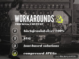
- 87. WORKAROUNDSTRICKS in CONTEXT 1 2 3 & (cc) flic.kr/p/64fGf6
- 88. WORKAROUNDSTRICKS 1 background-size: 100% 2 3 & (cc) flic.kr/p/64fGf6
- 90. background-size: 100% <a href="example.com/link">Download on Github</a> .download a { padding: .095em .8em; background: url(../img/arrow.png) no-repeat; background-size: 100%; margin-left: .4em; -webkit-transition: margin 0.15s ease-out; -moz-transition: margin 0.15s ease-out; text-decoration: none; } 9+5+9+ 11.6+17+
- 91. WORKAROUNDSTRICKS in CONTEXT 1 background-size: auto 2 SVG 3 & (cc) flic.kr/p/64fGf6
- 92. SVG
- 95. Native SVG http://caniuse.com/#search=SVG%20in%20HTML%20img%20element
- 96. PNG 16kb SVG 7kb 9+5+9+ 11.6+17+
- 100. Modernizr check if(!Modernizr.svg){ var images = document.getElementsByTagName("img"); for(var i = 0; i < images.length; i++){ var src = images[i].src.split("."); images[i].src = src[0] + ".png"; } } http://stackoverflow.com/questions/12846852/ svg-png-extension-switch
- 102. WORKAROUNDSTRICKS in CONTEXT 1 background-size: auto 2 SVG 3 font-based solutions & (cc) flic.kr/p/64fGf6
- 103. ...if you use <meta charset="utf-8"> (you should be for HTML5), you’re adding common Unicode characters like and ✆, and you don’t need a specific font’s version... just copy and paste them into your HTML.” “
- 108. Font-based RWD http://ilovetypography.com/2012/04/11/designing-type-systems/ avg file size 40kb/per font
- 112. Font-based icons <style> [data-icon]:before { font-family: 'icon-font'; content: attr(data-icon); } </style> <a href="http://example.com/cloud/save/"> <span data-icon="C" aria-hidden="true"></span> Save to Cloud </a>
- 113. WORKAROUNDSTRICKS in CONTEXT 1 background-size: 100% 2 SVG 3 font-based solutions & (cc) flic.kr/p/64fGf6 4 compressed JPEGs
- 118. iCloud iOS 5 OSX Lion iPad 2 iPhone OS The world’s most advanced desktop operating system advances even further. With over 250 new features including Multi-Touch gestures, Mission Control, full-screen apps, and Launchpad, OS X Lion takes the Mac further than ever. Learn More X Lion
- 119. iCloud iOS 5 OSX Lion iPad 2 iPhone OS The world’s most advanced desktop operating system advances even further. With over 250 new features including Multi-Touch gestures, Mission Control, full-screen apps, and Launchpad, OS X Lion takes the Mac further than ever. Learn More X Lion ! " ← ↑
- 120. iCloud iOS 5 OSX Lion iPad 2 iPhone OS The world’s most advanced desktop operating system advances even further. With over 250 new features including Multi-Touch gestures, Mission Control, full-screen apps, and Launchpad, OS X Lion takes the Mac further than ever. Learn More X Lion ! ↙ " ← ← ↗ ↑ ↖ ↑ ↖
- 121. (cc) flic.kr/p/64fGf6
- 123. 446kb < 8,755.2kb (cc) flic.kr/p/64fGf6 0% vs 100%
- 124. <picture> Patch <picture alt="A giant stone face at The Bayon temple in Angkor Thom, Cambodia"> <!-- <source src="small.jpg"> --> <source src="small.jpg"> <!-- <source src="medium.jpg" media="(min-width: 400px)"> --> <source src="medium.jpg" media="(min-width: 400px)"> <!-- <source src="large.jpg" media="(min-width: 800px)"> --> <source src="large.jpg" media="(min-width: 800px)"> <!-- Fallback content for non-JS browsers. Same src as the initial source element. --> <noscript><img src="small.jpg" alt="A giant stone face at The Bayon temple in Angkor Thom, Cambodia"></noscript> </picture> http://www.w3.org/community/respimg/2012/03/15/polyfilling- picture-without-the-overhead/
- 125. Size Type Dimensions Display Px Density File Size Extreme 2276x1400 1x & 2x 446kb Extra Large 1024x1536 2x 1,745kb Extra Large 512x768 1x 503kb Large 640x960 2x 746kb Large 320x480 1x 223kb Medium 500x750 2x 485kb Medium 250x375 1x 145kb
- 126. Size Type Dimensions Display Px Density File Size Extreme 2276x1400 1x & 2x 446kb Extra Large 1024x1536 2x 1,745kb Extra Large 512x768 1x 503kb Large 640x960 2x 746kb Large 320x480 1x 223kb Medium 500x750 2x 485kb Medium 250x375 1x 145kb
- 127. <img src="rock-climber.jpg" alt="" /> One Image, One IMG
- 131. (cc) flic.kr/p/64fGf6 COMBO MOVESCLOWN CAR TECHNIQUE + HIGHLY COMPRESSED JPEGS
- 132. <svg xmlns="http://www.w3.org/2000/svg" viewBox="0 0 300 329" preserveAspectRatio="xMidYMid meet"> <title>Clown Car Technique</title> <style> svg { background-size: 100% 100%; background-repeat: no-repeat; } @media screen and (max-width: 400px) { svg {background-image: url(images/small.png");} } @media screen and (min-width: 401px) and (max-width: 700px) { svg {background-image: url(images/medium.png);} } @media screen and (min-width: 701px) and (max-width: 1000px) { svg {background-image: url(images/big.png);} } @media screen and (min-width: 1001px) { https://github.com/estelle/clowncar
- 133. <svg xmlns="http://www.w3.org/2000/svg" viewBox="0 0 300 329" preserveAspectRatio="xMidYMid meet"> <title>Clown Car Technique</title> <style> svg { background-size: 100% 100%; background-repeat: no-repeat; } @media screen and (max-width: 400px) { svg {background-image: url(images/small.png");} } @media screen and (min-width: 401px) and (max-width: 700px) { svg {background-image: url(images/medium.png);} } @media screen and (min-width: 701px) and (max-width: 1000px) { svg {background-image: url(images/big.png);} } @media screen and (min-width: 1001px) { https://github.com/estelle/clowncar
- 136. Size Type Dimensions Display Px Density File Size Extreme 2276x1400 1x & 2x 446kb Extra Large 1024x1536 2x 1,745kb Extra Large 512x768 1x 503kb Large 640x960 2x 746kb Large 320x480 1x 223kb Medium 500x750 2x 485kb Medium 250x375 1x 145kb
- 137. @media screen and (min-width: 401px), screen and (max-width: 800px) and (-webkit-min-device-pixel- ratio: 1.75) { svg { background-image: url("extremely-highly-compressed.jpg"); outline: red solid 5px; } } http://codepen.io/teleject/pen/KlzBe Combo Move: Compressed JPEG
- 141. COMBO MOVEDON’T BLAME THE PLAYER 1 2 3 No additional HTTP request1 # of images = 2 No JavaScript http://codepen.io/teleject/pen/KlzBe
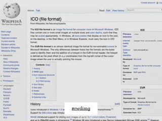
- 144. IMGGIMME THAT NEW SCHOOL 1 2 3 #rwdimg
- 145. IMGGIMME THAT NEW SCHOOL 1 2 3 simple design for users #rwdimg 1
- 146. IMGGIMME THAT NEW SCHOOL 1 2 3 simple design for users browser, server handshake #rwdimg 2
- 147. IMGGIMME THAT NEW SCHOOL 1 2 3 simple design for users browser, server handshake same, several formats #rwdimg 3
- 148. #rwdimg
- 150. #rwdimg
- 151. #rwdimg
- 152. #rwdimg
- 153. #rwdimg <link rel="shortcut icon" href="/assets/favicon.ico" /> Favicon
- 154. #rwdimg <link rel="apple-touch-icon-precomposed" sizes="144x144" href="apple-touch-icon-144x144-precomposed.png" /> <link rel="apple-touch-icon-precomposed" sizes="114x114" href="apple-touch-icon-114x114-precomposed.png" /> <link rel="apple-touch-icon-precomposed" sizes="72x72" href="apple-touch-icon-72x72-precomposed.png" /> <link rel="apple-touch-icon-precomposed" href="apple-touch-icon-precomposed.png" /> Mobile iOS Bookmarks
- 155. #rwdimg
- 156. THANK YOU!CHRISTOPHER SCHMITT @teleject The Non Breaking Space Podcast - http://nonbreakingspace.tv/