Successfully Implement Responsive Design Behavior with Adobe Experience Manager
1 like2,919 views

This document discusses how to manage responsive design behaviors using Adobe Experience Manager. It describes the challenge of displaying content across different devices which may have varying screen sizes and resolutions. The solution presented allows content authors to determine which content is displayed at specific breakpoints and manage the grid layout. It involves building components that use listeners and logic to dynamically handle the display of regions and columns based on the targeted device or screen size. The demonstration shows how authors can control responsive behavior through the new components.


Ad
More Related Content
What's hot (20)
Viewers also liked (18)


Ad
Similar to Successfully Implement Responsive Design Behavior with Adobe Experience Manager (20)


Ad
More from Perficient, Inc. (20)


Recently uploaded (20)


Successfully Implement Responsive Design Behavior with Adobe Experience Manager
- 1. Successfully Manage Responsive Design Behaviors Using Adobe Experience Manager August 26, 2014
- 2. About Perficient Perficient is a leading information technology consulting firm serving clients throughout North America. We help clients implement business-driven technology solutions that integrate business processes, improve worker productivity, increase customer loyalty and create a more agile enterprise to better respond to new business opportunities.
- 3. Perficient Profile • Founded in 1997 • Public, NASDAQ: PRFT • 2013 revenue $373 million • Major market locations throughout North America • Atlanta, Boston, Charlotte, Chicago, Cincinnati, Columbus, Dallas, Denver, Detroit, Fairfax, Houston, Indianapolis, Los Angeles, Minneapolis, New Orleans, New York City, Northern California, Philadelphia, Southern California, St. Louis, Toronto and Washington, D.C. • Global delivery centers in China, Europe and India • >2,100 colleagues • Dedicated solution practices • ~85% repeat business rate • Alliance partnerships with major technology vendors • Multiple vendor/industry technology and growth awards
- 4. BUSINESS SOLUTIONS Business Intelligence Business Process Management Customer Experience and CRM Enterprise Performance Management Enterprise Resource Planning Experience Design (XD) Management Consulting Our Solutions Expertise TECHNOLOGY SOLUTIONS Business Integration/SOA Cloud Services Commerce Content Management Custom Application Development Education Information Management Mobile Platforms Platform Integration Portal & Social
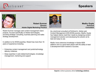
- 5. Speakers Madhu Gupta Technical Consultant As a technical consultant at Perficient’s Adobe web Content Management (EIS-WCM) practice, Madhu Gupta has helped clients meet their needs by designing content management solution and developing the solution at its best and easy to use. Madhu have extensive knowledge in Adobe AEM platform and is a good team player with the ability to lead a development team towards a success. Robert Sumner Director, Adobe Digital Marketing Practice Robert Sumner manages web content management client projects, focused specifically on Adobe technologies, providing strategic consulting, business planning and sales strategy development. In addition to his WCM expertise, Robert has more than 16 years of experience including: • Enterprise content management and portal technology delivery initiatives • Deep expertise in web-related technologies, knowledge management, mentoring and support
- 6. Session Agenda 1.Overview 2.The Challenge 3.The Solution 4.Demonstration 5.Q&A
- 7. Overview From mobile browsers to netbooks and tablets, users are visiting your sites from an Planning Requirements Design Implementation Deployment Testing increasing array of devices and browsers. “Day by day, the number of devices, platforms, and browsers that need to work with your site grows. Responsive web design represents a fundamental shift in how we’ll build websites for the decade to come.” – Jeffrey Veen
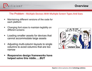
- 8. Overview The Problem - Multiple Devices With Multiple Screen Types And Sizes Maintaining different versions of the code for each platform Changing font sizes to maintain legibility on different screens Loading smaller assets for devices that cannot accommodate large assets Adjusting multi-column layouts to single columns to avoid columns that are too narrow Responsive design frameworks have helped solve this riddle…..BUT
- 9. Our Specific Challenge Our requirements stated that: Determining which content should be displayed within a specific block or region. Allowing an author to choose which content blocks to remove from a certain breakpoint Allowing authors to manage the grid layout within body content areas where they have authorization (truly flexible templates) Offer a series of pre-defined responsive behaviors for grid layout on a page
- 10. Solution Managing Responsive Content within AEM Components Allowing your content authors to manage which content is displayed at certain breakpoints within a responsive framework.
- 11. Solution For every row, there are twelve zones within Bootstrap's responsive framework http://getbootstrap.com/css/ Column 3 (offset 5, colspan 2) Column 1 (no offset, colspan 2) Column 2 (no offset, colspan 2) <di v> <ul > #t hi s i s t he l i ne of code f or col umn 1 <l i cl ass=" vi si bl e- md vi si bl e- s vi si bl e- d vi si bl e- l g col - md- 2 col - s- 2 col - d- of f set - 1 col - d- 3 col - l g- of f set - 1 col - l g- 3" > <cq: i ncl ude pat h=" UI D1" r esour ceType=" f oundat i on/ component s/ par sys" / > </ l i > #t hi s i s t he l i ne of code f or col umn 2 <l i cl ass=" vi si bl e- md vi si bl e- s vi si bl e- d vi si bl e- l g col - md- 2 col - s- 2 col - d- of f set - 2 col - d- 2 col - l g- 3" > <cq: i ncl ude pat h=" UI D2" r esour ceType=" f oundat i on/ component s/ par sys" / > </ l i > #t hi s i s t he l i ne of code f or col umn 3 <l i cl ass=" vi si bl e- md vi si bl e- s vi si bl e- d vi si bl e- l g col - md- of f set - 5 col - md- 2 col - s-of f set - 5 col - s- 2 col - d- of f set - 1 col - d- 2 col - l g- of f set - 2 col - l g- 2" > <cq: i ncl ude pat h=" UI D3" r esour ceType=" f oundat i on/ component s/ par sys" / > </ l i > </ ul > </ di v> Presets Advanced Column 1 Column 2 Column 3 Column Span 2 Offset 0 Visible x (please check this if this column is visible in this breakpoint Mobile Break Point Column Span 3 Offset 1 Visible x (please check this if this column is visible in this breakpoint Tablet Break Point Column Span 2 Offset 0 Visible x (please check this if this column is visible in this breakpoint Desktop Break Point Column Span 3 Offset 1 Visible x (please check this if this column is visible in this breakpoint Widescreen Break Point 1 2 3 4 5 6 7 8 9 10 11 12 Column 1 (offset 1, colspan 3) Column 2 (offset 2, colspan 2) Desktop (d) Column 1 (no offset, colspan 2) Column 2 (no offset, colspan 2) Mobile (md) Column 1 (offset 1, colspan 3) Column 2 (no offset, colspan 3) Widescreen (lg) Column 3 (offset 1, colspan 2) Column 3 (offset 2, colspan 2) Rendered code that I believe will represent the above Tablet (s) Column 3 (offset 2, colspan 2)
- 12. Demonstration Region Blocks of Content Desktop Content Tablet Content Mobile and Other Device Content Should I display this at the Tablet Breakpoint?
- 13. Demonstration Column Grid Control Desktop Content Tablet Content Mobile and Other Device Content Show this at these Tablet Breakpoint?
- 14. Demo
- 15. How’d We Do It Region Component Select title and background styles Hide certain devices from the component configuration Logic is written to handle the show/hide at different break point for different devices
- 16. How’d We Do It Column Component Select number of columns to display Advanced options to hide certain devices for each column defined CQ listeners are being utilized in dialog with extJS logic to dynamically show/hide the tab for columns Hidetabs, managetabs, render properties are utilized in CQ Dialog Different column tab have its own listeners to show/hide in different device
- 17. Summary Give authors the ability to choose which content is displayed within a given responsive breakpoint Provide authors with ability to determine which responsive grid layout to use for a given page. Pros Cons More flexible templates More development work up front (if not using bootstrap) More flexibility within the current Column Control Component re-use for any all customers (Assumes using bootstrap)
- 18. As a reminder, please submit your questions in the chat box We will get to as many as possible
- 19. Daily unique content about content management, user experience, portals and other enterprise information technology solutions across a variety of industries. Perficient.com/SocialMedia Facebook.com/Perficient Twitter.com/Perficient
- 20. Thank you for your participation today. Please fill out the survey at the close of this session.