


![StackPane root=new StackPane();
root.getChildren().add(bt);
Scene scene = new Scene(root,600,400);
primaryStage.setScene(scene);
primarystage.setTitle(“First JavaFX Application”);
primarySatge.show();
}
public static void main(String args[])
{
launch(args);
}
}
Layouts
JavaFX provides several layout panes that manage the process of placing elements in a scene. For
example, the FlowPane class provides a flow layout and the GridPane class supports a row/column
grid-basedlayout. Several other layouts, such as BorderPane, which organizes output within four
border areas and a center, are available. Each inherits Node. The layouts are packaged in
javafx.scene.layout.
A JAVAFX Application Skeleton:
import javafx.application.*;
import javafx.scene.*;
import javafx.stage.*;
import javafx.scene.layout.*;
public class JavaFXSkel extends Application
{
public static void main(String args[])
{
System.out.println(“Launching JavaFX application”);
//Start the JavaFX application by calling launch()
launch(args);
}
public void init() //Override init() method.
{
System.out.println(“Inside the init() method”);
}](https://image.slidesharecdn.com/unit5-javafxeventhandlingcontrolsandcomponents-240217030851-05632246/85/UNIT-5-JavaFX-Event-Handling-Controls-and-Components-pdf-8-320.jpg)

![Build a Simple Scene Graph:
//Demonstrate a simple scene graph that contains a Label
import javafx.application.*;
import javafx.scene.*;
import javafx.stage.*;
import javafx.scene.layout.*;
import javafx.scene.control.*;
public class SimpleSceneGraphDemo extends Application
{
public static void main(String[] args)
{
//Start the JavaFX application by calling launch()
launch(args);
}
public void start(Stage myStage) //Override start() method.
{
mystage.setTitle(“Demonstrate a Simple Scene Graph”); //Give the stage a title
FlowPane() rootNode = new FlowPane(); //Use a FlowPane for the root node.
Scene myScene = new Scene(rootNode,300,200); //Create a Scene.
//Set the Scene on the stage
myStage.setScene(myScene);
//Create a Label
Label myLabel = new Label(“A Simple JavaFX label”);
//Add the label to the Scene graph
rootNode.getChildren().add(myLabel);
//Show the stage and its Scene
myStage.show();
}
}
Output:](https://image.slidesharecdn.com/unit5-javafxeventhandlingcontrolsandcomponents-240217030851-05632246/85/UNIT-5-JavaFX-Event-Handling-Controls-and-Components-pdf-10-320.jpg)


![//Introduce JavaFX events and buttons
import javafx.application.*;
import javafx.scene.*;
import javafx.stage.*;
import javafx.scene.layout.*;
import javafx.scene.control.*;
import javafx.event.*;
import javafx.geometry.*;
public class JavaFXEventDemo extends Application
{
Label response;
public static void main(String[] args)
{
//Start the JavaFX application by calling launch()
launch(args);
}
public void start(Stage myStage) //Override start() method.
{
mystage.setTitle(“Introducing Buttons and Events”); //Give the stage a title
//Use a FlowPane for the root node. In this case, Vertical and Horizontal gaps of 10
FlowPane rootNode = new FlowPane(10,10);
//Center the controls in the scene
rootNode.setAlignment(Pos.CENTER);
//Create a Scene
Scene myScene = new Scene(rootNode,300,100)
//Set the Scene on the Stage
myStage.setScene(myScene);
//Create a Label
response=new Label(“Push a Button”);
//Create two push buttons
Button btnFirst = new Button(“First”);
Button btnSecond = new Button(“Second”);
//Handle the action events for the First button
btnFirst.setOnAction(new EventHandler<ActionEvent>( )
{](https://image.slidesharecdn.com/unit5-javafxeventhandlingcontrolsandcomponents-240217030851-05632246/85/UNIT-5-JavaFX-Event-Handling-Controls-and-Components-pdf-13-320.jpg)

![JavaFX control: Checkbox
JavaFX defines a rich set of controls that are packaged in javafx.scene.control. The
CheckBox is one of the JavaFX controls that represents a special type of button. CheckBox supports three
states. The first two are checked or unchecked and this is the default behavior. The third state is
indeterminate (also called undefined). For example, the third state of checkbox is used to indicate that the
state of some option has not been set or that the option is not relevant to a specific situation.
Check Box defines two constructors. The first is the default constructor. The second form
of constructor allows to specify a string that identifies the box.
Its general form is CheckBox(String str) –creates a checkbox that has the text specified by
str as a label and the CheckBox generates an action event when it is clicked. The action event handler can
be set on a CheckBox by calling setOnAction() method. To obtain the state of a check box isSelected()
method will be invoked and its syntax is as follows
final boolean isSelected() -It returns true if the checkbox is selected and false otherwise
//Demonstrate checkboxes
import javafx.application.*;
import javafx.scene.*;
import javafx.stage.*;
import javafx.scene.layout.*;
import javafx.scene.control.*;
import javafx.event.*;
import javafx.geometry.*;
public class CheckBoxDemo extends Application
{
CheckBox cbKeyboard;
CheckBox cbMouse;
Checkbox cbTouchScreen;
Label response;
Label selected;
String inputDevices = “ ”;
public static void main(String[] args)
{
//Start the JavaFX application by calling launch()](https://image.slidesharecdn.com/unit5-javafxeventhandlingcontrolsandcomponents-240217030851-05632246/85/UNIT-5-JavaFX-Event-Handling-Controls-and-Components-pdf-15-320.jpg)


![//Handle events generated by the keyboard
import javafx.application.*;
import javafx.scene.*;
import javafx.stage.*;
import javafx.scene.layout.*;
import javafx.scene.control.*;
import javafx.event.*;
import javafx.geometry.*;
import javafx.scene.input.*;
public class KeyEventDemo extends Application
{
Label prompt;
Label showKey;
public static void main(String[] args)
{
//start the JAVAFX application by calling launch()
launch(args);
}
//Override the start() method.
public void start(Stage mySatge)
{
//Give the stage a title.
mystage.setTitle(“Handle Keyboard Events”);
//Use a FlowPane for the root node. In this case, Vertical gap of 10
FlowPane rootNode = new FlowPane(Orientation.VERTICAL,0,10);
//Center the controls in the scene.
rootNode.setAlignment(Pos.CENTER);
//Create a Scene
Scene myScene = new Scene(rootNode,300,100)
//Set the Scene on the Stage
myStage.setScene(myScene);
//Create labels.
prompt=new Label(“Press a key”);
showKey=new Label(“ ”);](https://image.slidesharecdn.com/unit5-javafxeventhandlingcontrolsandcomponents-240217030851-05632246/85/UNIT-5-JavaFX-Event-Handling-Controls-and-Components-pdf-20-320.jpg)


![causes MouseButton.MIDDLE to be returned. If no button was clicked, such as in the case of MouseEvent
resulting from a move, then getButton( ) returns MouseButton.NONE.
final int getClickCount()-Method is called to obtain, the number of times, a mouse button has been
clicked
final double getSceneX() and final double getSceneY() method is called to obtain the location of
the mouse at the time an event occurred. For example, if the mouse is 10 units right and 5 units down from
the upper-left corner, then getSceneX( ) will return 10 and getSceneY( ) will return 5.
//Handle Mouse events
import javafx.application.*;
import javafx.scene.*;
import javafx.stage.*;
import javafx.scene.layout.*;
import javafx.scene.control.*;
import javafx.event.*;
import javafx.geometry.*;
import javafx.scene.input.*;
public class MouseEventDemo extends Application
{
Label showEvent;
Label showLocation;
public static void main(String[] args)
{
//start the JAVAFX application by calling launch()
launch(args);
}
//Override the start() method.
public void start(Stage mySatge)
{
//Give the stage a title.
mystage.setTitle(“Handle Mouse Events”);
//Use a FlowPane for the root node. In this case, Vertical gap of 10
FlowPane rootNode = new FlowPane(Orientation.VERTICAL,0,10);
//Center the controls in the scene.](https://image.slidesharecdn.com/unit5-javafxeventhandlingcontrolsandcomponents-240217030851-05632246/85/UNIT-5-JavaFX-Event-Handling-Controls-and-Components-pdf-23-320.jpg)


![//Demonstrate a toggle button
import javafx.application.*;
import javafx.scene.*;
import javafx.stage.*;
import javafx.scene.layout.*;
import javafx.scene.control.*;
import javafx.event.*;
import javafx.geometry.*;
public class ToggleButtonDemo extends Application
{
ToggleButton tbToggle;
Label response;
public static void main(String[] args)
{
//Start the JavaFX application by calling launch()
launch(args);
}
public void start(Stage myStage) //Override start() method.
{
mystage.setTitle(“Demonstrate a Toggle Buttons”); //Give the stage a title
//Use a FlowPane for the root node. In this case, Vertical and Horizontal gaps of 10
FlowPane rootNode = new FlowPane(10,10);
//Center the controls in the scene
rootNode.setAlignment(Pos.CENTER);
//Create a Scene
Scene myScene = new Scene(rootNode,300,100)
//Set the Scene on the Stage
myStage.setScene(myScene);
//Create a Label
response=new Label(“Push the Button”);
//Create the toggle button.
tbToggle = new ToggleButton(“Toggle”);
//Handle the action events for the toggle button
tbToggle.setOnAction(new EventHandler<ActionEvent>( )
{](https://image.slidesharecdn.com/unit5-javafxeventhandlingcontrolsandcomponents-240217030851-05632246/85/UNIT-5-JavaFX-Event-Handling-Controls-and-Components-pdf-28-320.jpg)


![public static void main(String[] args)
{
//Start the JavaFX application by calling launch()
launch(args);
}
public void start(Stage myStage) //Override start() method.
{
mystage.setTitle(“Demonstrate Radio Buttons”); //Give the stage a title
//Use a FlowPane for the root node. In this case, Vertical gap of 10
FlowPane rootNode = new FlowPane(Orientation.VERTICAL,0,10);
//Center the controls vertically, left-align them horizontally.
rootNode.setAlignment(Pos.CENTER_LEFT);
//Create a Scene
Scene myScene = new Scene(rootNode,300,100)
//Set the Scene on the Stage
myStage.setScene(myScene);
//Create the prompting Label
prompt=new Label(“Select Primary Input Device”);
//Create a Label that will report the selection
prompt=new Label(“”);
//Create the radio buttons.
rbKeyboard = new RadioButton(“Keyboard”);
rbMouse = new RadioButton(“Mouse”);
rbTouchscreen = new RadioButton(“Touch Screen”);
//Create a toggle group
tg=new ToggleGroup();
//Add each button to a toggle group.
rbKeyboard.setToggleGroup(tg);
rbMouse.setToggleGroup(tg);
rbTouchscreen.setToggleGroup(tg);
//Handle the action events for the radio buttons
rbKeyboard.setOnAction(new EventHandler<ActionEvent>( )
{
public void handle(ActionEvent ae)
{](https://image.slidesharecdn.com/unit5-javafxeventhandlingcontrolsandcomponents-240217030851-05632246/85/UNIT-5-JavaFX-Event-Handling-Controls-and-Components-pdf-31-320.jpg)


![It returns a reference to the model. MultipleSelectionModel is a class that defines the model used for
multiple selections, and it inherits SelectionModel. However, multiple selections are allowed in a ListView
only if multiple-selection mode is turned on.
Using the model returned by getSelectionModel( ), you will obtain a reference to the selected item property
that defines what takes place when an element in the list is selected. This is done by calling
selectedItemProperty( ),which is of the form,
final ReadOnlyObjectProperty<T> selectedItemProperty()
Then add the change listener to this property by calling addListener() on the property, passing in the change
listener.
Example Program: creates a list view that displays various types of apples, allowing the user to select one.
When one is chosen, the selection is displayed.
//Demonstrate ListView.
import javafx.application.*;
import javafx.scene.*;
import javafx.stage.*;
import javafx.scene.layout.*;
import javafx.scene.control.*;
import javafx.geometry.*;
import javafx.beans.value.*;
import javafx.collections.*;
public class ListViewDemo extends Application
{
Label response;
ListView<String> lvApple;
public static void main(String[] args)
{
//Start the JavaFX application by calling launch()
launch(args);
}
public void start(Stage myStage) //Override start() method.
{
mystage.setTitle(“ListView Demo”); //Give the stage a title
//Use a FlowPane for the root node. In this case, Vertical and Horizontal gaps of 10](https://image.slidesharecdn.com/unit5-javafxeventhandlingcontrolsandcomponents-240217030851-05632246/85/UNIT-5-JavaFX-Event-Handling-Controls-and-Components-pdf-34-320.jpg)


![Here T specifies the type of entries. Combo box defines two constructors. The first is the
default constructor, which creates an empty Combo Box. The Second constructor allows to specify
the entries in the list,
ComboBox(ObservableList<T> list)
Here, list specifies a list of items that will be displayed. It is an object of type
ObservableList. ObservableList defines a list of observable objects. It inherits java.util.List. An easy
way to create an ObservableList is to use the factory method observableArrayList( ), which is a static
method defined by the FXCollections class.
AComboBox generates an action event when its selection changes. It will also generate a
change event. It is also possible to ignore events and simply obtain the current selection when needed
by calling getValue() method.
final T getValue()
If the value of a combo box has not yet been set, getValue() will return null. setValue()
method is called to set the value of a ComboBox.
final void setValue(T newVal)
Here, newVal becomes the new value.
//Demonstrate a ComboBox.
import javafx.application.*;
import javafx.scene.*;
import javafx.stage.*;
import javafx.scene.layout.*;
import javafx.scene.control.*;
import javafx.geometry.*;
import javafx.collections.*;
import javafx.event.*;
public class ComboBoxDemo extends Application
{
Label response;
ComboBox<String> cbApple;
public static void main(String[] args)
{
//Start the JavaFX application by calling launch()](https://image.slidesharecdn.com/unit5-javafxeventhandlingcontrolsandcomponents-240217030851-05632246/85/UNIT-5-JavaFX-Event-Handling-Controls-and-Components-pdf-39-320.jpg)


![Label response;
ChoiceBox<String> cbApple;
public static void main(String[] args)
{
//Start the JavaFX application by calling launch()
launch(args);
}
public void start(Stage myStage) //Override start() method.
{
mystage.setTitle(“ChoiceBox Demo”); //Give the stage a title
//Use a FlowPane for the root node. In this case, Vertical and Horizontal gaps of 10
FlowPane rootNode = new FlowPane(10,10);
//Center the controls in the scene.
rootNode.setAlignment(Pos.CENTER);
//Create a Scene
Scene myScene = new Scene(rootNode,220,140);
//Set the Scene on the Stage
myStage.setScene(myScene);
//Create a Label.
response=new Label(“Select Your Apple”);
//Create an ObservableList of entries for the choice box.
ObservableList<String>appleTypes = FXCollections.observableArrayList(“Winesap”, “Cortland”,
“Gala”, “Golden Delicious”, “Fuji”, “Jonathan”);
//Create the choice box
cbApple = new ChoiceBox<String>(appleTypes);
//Set the initial selection
cbApple.setValue(“Winesap”);
//Get the choice box selection model.
SingleSelectionModel<String> cbSelModel = cbApple.getSelectionModel();
//Use a change listener to watch for changes to the selection.](https://image.slidesharecdn.com/unit5-javafxeventhandlingcontrolsandcomponents-240217030851-05632246/85/UNIT-5-JavaFX-Event-Handling-Controls-and-Components-pdf-43-320.jpg)

![All three controls inherit TextInputControl, which defines much of the text control’s functionality.
TextField defines two constructors. The first is the default constructor, which creates an empty textfield
that has the default size. The second allows to specify the initial contents of the field.
Method used to set the size of the TextField control is as follows
final void setPrefColumnCount(int columns)
The columns value is used by TextField to determine its size.
Two methods to set and get the text from TextField control are
1) final void setText(String str)
2) final String getText()
One useful TextField option is the ability to set a prompting message that is displayed inside the text field
when the user attempts to use a blank field. This is achieved by calling setPromptText() method. Its
Syntax is,
final void setPromptText(String str)
Here, str is the string displayed in the text field when no text has been entered. It is displayed using low
intensity (such as gray tone).
//Demonstrate a text field
import javafx.application.*;
import javafx.scene.*;
import javafx.stage.*;
import javafx.scene.layout.*;
import javafx.scene.control.*;
import javafx.event.*;
import javafx.geometry.*;
public class TextFieldDemo extends Application
{
Label response;
TextField tf;
Button btnGetText;
Button btnReverse;
public static void main(String[] args)
{](https://image.slidesharecdn.com/unit5-javafxeventhandlingcontrolsandcomponents-240217030851-05632246/85/UNIT-5-JavaFX-Event-Handling-Controls-and-Components-pdf-45-320.jpg)


![Methods to position the ScrollPane are
void setHvalue(double newHval)
final void setVvalue(double newVval)
The new horizontal position is specified by newHval, and the new vertical position is specified by
newVval. By default, scroll bar positions start at zero.
//Demonstrate a ScrollPane
//This Program scrolls the contents of a multiline
//label, but any other type of Node can be scrolled
import javafx.application.*;
import javafx.scene.*;
import javafx.stage.*;
import javafx.scene.layout.*;
import javafx.scene.control.*;
import javafx.event.*;
import javafx.geometry.*;
public class ScrollPaneDemo extends Application
{
ScrollPane scrlPane;
Button btnReset;
public static void main(String[] args)
{
//Start the JavaFX application by calling launch()
launch(args);
}
public void start(Stage myStage) //Override start() method.
{
mystage.setTitle(“Demonstrate a ScrollPane”); //Give the stage a title
//Use a FlowPane for the root node. In this case, Vertical and Horizontal gaps of 10
FlowPane rootNode = new FlowPane(10,10);
//Center the controls in the scene
rootNode.setAlignment(Pos.CENTER);
//Create a Scene
Scene myScene = new Scene(rootNode,300,100)](https://image.slidesharecdn.com/unit5-javafxeventhandlingcontrolsandcomponents-240217030851-05632246/85/UNIT-5-JavaFX-Event-Handling-Controls-and-Components-pdf-49-320.jpg)


![FlowPane
FlowPane lays out content line by line, with lines wrapping as needed. By default, a horizontal
flow is used but it is possible to specify a vertical flow. The FlowPane layout wraps all the nodes in a flow.
A horizontal flow pane wraps the elements of the pane at its height, while a vertical flow pane wraps the
element at its width.
The class named FlowPane of the package javafx.scene.layout represents the Flow Pane layout
and the method setPrefWrapLength() is used to specify the wrap length. The Wrap length is the
length at which the next element will be wrapped to the next line.
Syntax: final void setPrefWrapLength(double len) Here, len specifies the preferred length.
//Demonstrate FlowPane preferred length
import javafx.application.*;
import javafx.scene.*;
import javafx.stage.*;
import javafx.scene.layout.*;
import javafx.scene.control.*;
public class FlowPanewidthDemo extends Application{
public static void main(String[] args){
launch(args); //Start the JavaFX application by calling launch()
}
public void start(Stage myStage) //Override start() method.{
mystage.setTitle(“Demonstrate FlowPane Length”); //Give the stage a title
Label one = new Label(“Label 1”);
Label two = new Label(“Label 2”);
Label three = new Label(“Label 3”);
Label four = new Label(“Label 4”);
Label five = new Label(“Label 5”);
Label six = new Label(“Label 6”);
Label seven = new Label(“Label 7”);
Label eight = new Label(“Label 8”);
Label nine = new Label(“Label 9”);
//Create a FlowPane that holds nine labels.
FlowPane labelPane = new FlowPane(10,10);
labelPane.getChildren().addAll(one,two,three,four,five,six,seven,eight,nine);
//Set the preferred length to 150,
// which will result in three columns of three labels each](https://image.slidesharecdn.com/unit5-javafxeventhandlingcontrolsandcomponents-240217030851-05632246/85/UNIT-5-JavaFX-Event-Handling-Controls-and-Components-pdf-52-320.jpg)
![labelPane.setPrefWrapLength(150);
//Create the root node of the scene graph and add
//the label pane to it.
FlowPane rootNode = new FlowPane();
rootNode.getChildren().add(labelPane);
Scene myScene = new Scene(rootNode,300,200); //Create a Scene.
myStage.setScene(myScene); //Set the Scene on the stage
myStage.show(); //Show the stage and its Scene
} }
OUTPUT:
HBox and VBox Layout:
The HBox layout arranges all the nodes or GUI components in a Scene graph in a single horizontal
row. The class named HBox of the package javafx.scene.layout represents the horizontal box layout
Syntax:
HBox(double hGap)
VBox(double vGap)
Here, hGap p specifies the horizontal space between elements and vGap specifies the vertical gap. When
thedefault constructor is used, the gap is zero in both cases.
//Demonstrate HBox layout
import javafx.application.*;
import javafx.scene.*;
import javafx.stage.*;
import javafx.scene.layout.*;
import javafx.scene.control.*;
public class HBoxDemo extends Application
{
public static void main(String[] args)](https://image.slidesharecdn.com/unit5-javafxeventhandlingcontrolsandcomponents-240217030851-05632246/85/UNIT-5-JavaFX-Event-Handling-Controls-and-Components-pdf-53-320.jpg)
![{
//Start the JavaFX application by calling launch()
launch(args);
}
public void start(Stage myStage) //Override start() method.
{
mystage.setTitle(“Demonstrate a Simple Scene Graph”); //Give the stage a title
HBox rootNode = new HBox(); //Use HBox layout for the root node.
Scene myScene = new Scene(rootNode,300,200); //Create a Scene.
//Set the Scene on the stage
myStage.setScene(myScene);
//Create Buttons
Button bt1 = new Button(“click me”);
Button bt2 = new Button(“click me”);
Button bt3 = new Button(“click me”);
Button bt4 = new Button(“click me”);
Button bt5 = new Button(“click me”);
Button bt6 = new Button(“click me”);
//Add buttons to the Scene graph
rootNode.getChildren().addAll(bt1,bt2,bt3,bt4,bt5,bt6);
//Show the stage and its Scene
myStage.show();
} }
//Demonstrate VBox layout
import javafx.application.*;
import javafx.scene.*;
import javafx.stage.*;
import javafx.scene.layout.*;
import javafx.scene.control.*;
public class VBoxDemo extends Application
{
public static void main(String[] args)
{
//Start the JavaFX application by calling launch()
launch(args);
}
public void start(Stage myStage) //Override start() method.](https://image.slidesharecdn.com/unit5-javafxeventhandlingcontrolsandcomponents-240217030851-05632246/85/UNIT-5-JavaFX-Event-Handling-Controls-and-Components-pdf-54-320.jpg)

![static void setAlignment(Node what, Pos how) Here, what specifies the element being aligned and how
specifies the alignment. Pos is an enumeration that specifies alignment constants, such as Pos.CENTER,
Pos.BOTTOM_RIGHT, and Pos.TOP_LEFT. It is packaged in javafx.geometry.
The margins provide a gap between the edges of the node and the edges of a border position, thus
preventing the two from crashing. To set the margins, static method setMargin( ) is to be called. Its Syntax
is,
Syntax: static void setMargin(Node what, Insets margin) Here, what specifies the node for which the
margin specified by margin is set.
//Demonstrate BorderPane
import javafx.application.*;
import javafx.scene.*;
import javafx.stage.*;
import javafx.scene.control.*;
import javafx.geometry.*;
import javafx.scene.layout.*;
public class BorderPaneDemo extends Application
{
public static void main(String[] args)
{
launch(args); //Start the JavaFX application by calling launch()
}
public void start(Stage myStage) //Override the start() method
{
myStage.setTitle(“Demonstrate BorderPane”); //Give the stage a title.
BorderPane rootNode=new BorderPane(); //Use a BorderPane
Scene myScene = new Scene(rootNode,340,200); //Create a Scene
myStage.setScene(myScene); //Set the Scene on the Stage
//Create controls and put them into the five BorderPane locations.
//Center
TextField tfCenter = new TextField(“This text field is in the center”);
BorderPane.setAlignment(tfCenter,Pos.CENTER);
rootNode.setCenter(tfCenter);](https://image.slidesharecdn.com/unit5-javafxeventhandlingcontrolsandcomponents-240217030851-05632246/85/UNIT-5-JavaFX-Event-Handling-Controls-and-Components-pdf-56-320.jpg)


![{
public static void main(String[] args)
{
//Start the JavaFX application by calling launch()
launch(args);
}
public void start(Stage myStage) //Override start() method.
{
mystage.setTitle(“Demonstrate StackPane Layout”); //Give the stage a title
//Create a text field and two labels.
TextField tf = new TextField();
Tf.setMaxWidth(120);
Label lblTop = new Label(“Enter Your Name”);
Label lblBottom = new Label(“Name required for Forum Access”);
//Create the StackPane
StackPane rootNode = new StackPane();
//By default, nodes are centered. The following aligns the labels to the top and bottom center.
StackPane.setAlignment(lblTop,Pos.TOP_CENTER);
StackPane.setAlignment(lblBottom,Pos.BOTTOM_CENTER);
//Add the labels and Textfield to the scene graph
rootNode.getChildren().addAll(tf, lblTop, lblBottom);
//Create a Scene
Scene myScene = new Scene(rootNode,220,140);
//Set the Scene on the Stage
myStage.setScene(myScene);
//Show the stage and its scene
myStage.show();
}
}
OUTPUT](https://image.slidesharecdn.com/unit5-javafxeventhandlingcontrolsandcomponents-240217030851-05632246/85/UNIT-5-JavaFX-Event-Handling-Controls-and-Components-pdf-59-320.jpg)
![JavaFX GridPane Layout
GridPane Layout provides a way to layout the controls using a row/column format. When
using GridPane, need to specify the row and column indices in which a control to be placed. Thus,
GridPane layout gives a way to position controls at specific locations within a two-dimensional grid.
GridPane provides only the default constructor. The location at which a child node is added to
the grid is specified by setting its row and column indices.
There are various ways to position controls at specific locations within a two-dimensional grid
1) static void setConstraints(Node what, int column, int row)
Here, what is the node affected and column, row specifies its location in the grid.
2) setRowIndex() and setColumnIndex() method can also be used to specify the rows and
column indices in which a control to be placed in the grid.
3) void add(Node child, int column, int row) method defined by GridPane can also be used to
specify the row and column positions in the grid.
final void setVgap(double gap) and final void setHgap(double gap) method is used to set
the vertical and horizontal gap around a control within the grid pane layout. Here gap specifies the space
between controls. setPadding() method is used to set the padding within the grid pane layout.
//Demonstrate GridPane Layout
import javafx.application.*;
import javafx.scene.*;
import javafx.stage.*;
import javafx.scene.layout.*;
import javafx.scene.control.*;
import javafx.geometry.*;
public class GridPaneDemo extends Application
{
public static void main(String[] args)
{
//Start the JavaFX application by calling launch()
launch(args);
}
public void start(Stage myStage) //Override start() method.](https://image.slidesharecdn.com/unit5-javafxeventhandlingcontrolsandcomponents-240217030851-05632246/85/UNIT-5-JavaFX-Event-Handling-Controls-and-Components-pdf-60-320.jpg)


![MenuItem
MenuItem encapsulates an element in a menu. This element can either be a selection linked to
some program action, such as Save or Close, or it can cause a submenu to be displayed.
MenuItem defines the following three constructors:
MenuItem( )
MenuItem(String name)
MenuItem(String name, Node image)
The first creates an empty menu item. The second to specify the name of the item, and the
third enables to include an image.
A MenuItem generates an action event when selected. Register an action event handler for
such an event by calling setOnAction( ), when handling button events. Allows to fire an action event on a
menu item by calling fire( ).
The method final void setDisable(boolean disable), here disable is true, the menu item is
disabled and cannot be selected. If disable is false, the item is enabled.
//Demonstrate Menus
import javafx.application.*;
import javafx.scene.*;
import javafx.stage.*;
import javafx.scene.layout.*;
import javafx.scene.control.*;
import javafx.event.*;
import javafx.geometry.*;
public class MenuDemo extends Application
{
Label response;
public static void main(String[] args)
{
//Start the JavaFX application by calling launch()
launch(args);
}
public void start(Stage myStage) //Override start() method.
{](https://image.slidesharecdn.com/unit5-javafxeventhandlingcontrolsandcomponents-240217030851-05632246/85/UNIT-5-JavaFX-Event-Handling-Controls-and-Components-pdf-63-320.jpg)


More Related Content
What's hot (20)
Similar to UNIT 5-JavaFX Event Handling, Controls and Components.pdf (20)


More from SakkaravarthiS1 (6)


Recently uploaded (20)


UNIT 5-JavaFX Event Handling, Controls and Components.pdf
- 1. RAMCO INSTITUTE OF TECHNOLOGY Department of Information Technology Academic Year: 2023 – 2024 (Odd Semester) CS3391 & Object-Oriented Programming UNIT V – JAVAFX EVENT HANDLING, CONTROLS AND COMPONENTS (9+1 SKILL) 10 JAVAFX Events and Controls: Event Basics – Handling Key and Mouse Events. Controls: Checkbox, ToggleButton – RadioButtons – ListView – ComboBox – ChoiceBox – Text Controls –ScrollPane. Layouts – FlowPane – HBox and VBox – BorderPane – StackPane – GridPane. Menus – Basics – Menu – Menu bars – MenuItem. JAVAFX Events and Controls: Introduction to JavaFX: JavaFX is a set of graphics and media packages that enables developers to design, create, test, debug and deploy rich client applications that operate consistently across diverse platforms. JavaFX is a Java library used to develop Desktop applications as well as Rich Internet Applications (RIA). The applications built in JavaFX, can run on multiple platforms including Web, Mobile and Desktops. JavaFX is intended to replace swing in Java applications as a GUI framework. However, It provides more functionalities than swing. Like Swing, JavaFX also provides its own components and doesn't depend upon the operating system. It is lightweight and hardware accelerated. It supports various operating systems including Windows, Linux and Mac OS. Features of JavaFX: Feature Description Rich Set of APIs JavaFX provides a rich set of API's to develop GUI applications. FXML FXML is the XML based Declarative mark up language. The coding can be done in FXML to provide the more enhanced GUI to the user. Scene Builder Scene Builder generates FXML mark-up which can be ported to an IDE. Web view Web pages can be embedded with JavaFX applications. Web View uses WebKitHTML technology to embed web pages.
- 2. Buit-in UI Controls JavaFX contains Built-in components which are not dependent on operating system. The UI component are just enough to develop a full featured application. CSS like styling JavaFX code can be embedded with the CSS to improve the style of the application. We can enhance the view of our application with the simple knowledge of CSS. JAVAFX Framework: JAVAFX framework is contained in packages that begin with the javafx prefix. There are more than 30 JavaFX packages in its API library. Some of them are, javafx.application, javafx.stage, javafx.scene, and javafx.scene.layout. JAVAFX APPLICATION STRUCTURE: JavaFX application is divided hierarchically into three main components known as Stage, Scene and nodes. LifeCycle Methods of JavaFX Application i) void init() The init( ) method is called when the application begins execution. It is used to perform various initializations ii) abstract void start(Stage primarystage) The start( ) method is called after init( ) that can be used to construct and set the scene. iii) void stop() stop() method is called when the application is terminated
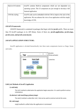
- 3. Stage: Stage in a JavaFX application acts like a container for all the JavaFX objects. Primary Stage is created internally by the platform. The object of primary stage is passed to start() method. Then show() method is called on the primary stage object in order to show the primary stage. Initially, the primary Stage looks like following. Scene ➢ Scene actually holds all the physical contents (nodes) of a JavaFX application. Javafx.scene.Scene class provides all the methods to deal with a scene object. Creating scene is necessary in order to visualize the contents on the stage. ➢ At one instance, the scene object can only be added to one stage. In order to implement Scene in JavaFX application, that must import javafx.scene package. The Scene can be created by creating the Scene class object and passing the layout object into the Scene class constructor. Scene Graph ➢ Scene Graph exists at the lowest level of the hierarchy. It can be seen as the collection of various nodes. A node is the element which is visualized on the stage. It can be any button, text box, layout, image, radio button, check box, etc. ➢ The nodes are implemented in a tree kind of structure. There is always one root in the scene graph. This will act as a parent node for all the other nodes present in the scene graph. However, this node may be any of the layouts available in the JavaFX system. ➢ The leaf nodes exist at the lowest level in the tree hierarchy. Each of the node present in the scene graphs represents classes of javafx.scene package Steps to be followed to create a basic JavaFX application: ➢ Import javafx.application.Application class ➢ Inherit Application class into userdefined class. ➢ Override start() method of Application class
- 4. Creating a First JavaFX Application Step1: Extend javafx.application.Application and override start() start() method is the starting point of constructing a JavaFX application therefore it is needed to override start method of javafx.application.Application class. Object of the class javafx.stage.Stage is passed into the start() method therefore import this class and pass its object into start method. JavaFX.application.Application needs to be imported in order to override start method. import javafx.application.Application; import javafx.stage.Stage; public class Hello_World extends Application{ @Override public void start(Stage primaryStage) throws Exception { // TODO } } Step2: Create a Button In order to create a button, it is needed to import javafx.scene.control.Button. A button can be created by instantiating the javafx.scene.control.Button class. import javafx.application.Application; import javafx.scene.control.Button import javafx.stage.Stage; public class Hello_World extends Application{ @Override public void start(Stage primaryStage) throws Exception { // demo is for creating a button Button bt = new Button(“Click”); } } Step3: Create a Layout and add button to it JavaFX provides layout to visualize the widgets properly. Here javafx.scene.layout.StackPane class is used to create a layout. It exists at the top level of the scene graph and can be seen as a root node. All the other nodes (buttons, texts, etc.) need to be added to this layout.
- 5. import javafx.application.Application; import javafx.scene.control.Button import javafx.stage.Stage; import javafx.scene.layout.StackPane; public class Hello_World extends Application{ @Override public void start(Stage primaryStage) throws Exception { // demo is for creating a button Button bt = new Button(“Click”); StackPane root=new StackPane(); root.getChildren().add(bt); } } Step 4: Create a Scene The layout needs to be added to a scene. Scene remains at the higher level in the hierarchy of application structure. It can be created by instantiating javafx.scene.Scene class. Then, pass the layout object to the scene class constructor. import javafx.application.Application; import javafx.scene.Scene; import javafx.scene.control.Button import javafx.stage.Stage; import javafx.scene.layout.StackPane; public class Hello_World extends Application{ @Override public void start(Stage primaryStage) throws Exception { // demo is for creating a button Button bt = new Button(“Click”); StackPane root=new StackPane(); root.getChildren().add(bt); Scene scene = new Scene(root); } }
- 6. Step 5: Prepare the Stage javafx.stage.Stage class provides some important methods which are required to be called to set some attributes for the stage like setting the title of the stage. Also need to call show() method without which, the stage won't be shown. import javafx.application.Application; import javafx.scene.Scene; import javafx.scene.control.Button import javafx.stage.Stage; import javafx.scene.layout.StackPane; public class Hello_World extends Application{ @Override public void start(Stage primaryStage) throws Exception { // demo is for creating a button Button bt = new Button(“Click”); StackPane root=new StackPane(); root.getChildren().add(bt); Scene scene = new Scene(root); primaryStage.setScene(scene); primarystage.setTitle(“First JavaFX Application”); primarySatge.show(); } } Step 6: Create an event for the button To create an event for the button, call setOnAction() on the button and define a anonymous class Event Handler as a parameter to the method. Inside this anonymous class, define a method handle() which contains the code for how the event is handled. import javafx.application.Application; import javafx.scene.Scene; import javafx.scene.control.Button import javafx.stage.Stage; import javafx.scene.layout.StackPane; public class Hello_World extends Application{ @Override public void start(Stage primaryStage) throws Exception {
- 7. Button bt = new Button(“Click”); btn1.setOnAction(new EventHandler<ActionEvent>) { @Override publicvoid handle(ActionEvent arg0) { // TODO Auto-generated method stub System.out.println("hello world"); } }); StackPane root=new StackPane(); root.getChildren().add(bt); Scene scene = new Scene(root,600,400); primaryStage.setScene(scene); primarystage.setTitle(“First JavaFX Application”); primarySatge.show(); } } Step 7: Create the main method Create a main method in which the application is launched by invoking launch() method and pass the command line arguments to it. import javafx.application.Application; import javafx.scene.Scene; import javafx.scene.control.Button import javafx.stage.Stage; import javafx.scene.layout.StackPane; public class Hello_World extends Application { @Override public void start(Stage primaryStage) throws Exception { // demo is for creating a button Button bt = new Button(“Click”); btn1.setOnAction(new EventHandler<ActionEvent>() { @Override publicvoid handle(ActionEvent arg0) { // TODO Auto-generated method stub System.out.println("hello world"); } });
- 8. StackPane root=new StackPane(); root.getChildren().add(bt); Scene scene = new Scene(root,600,400); primaryStage.setScene(scene); primarystage.setTitle(“First JavaFX Application”); primarySatge.show(); } public static void main(String args[]) { launch(args); } } Layouts JavaFX provides several layout panes that manage the process of placing elements in a scene. For example, the FlowPane class provides a flow layout and the GridPane class supports a row/column grid-basedlayout. Several other layouts, such as BorderPane, which organizes output within four border areas and a center, are available. Each inherits Node. The layouts are packaged in javafx.scene.layout. A JAVAFX Application Skeleton: import javafx.application.*; import javafx.scene.*; import javafx.stage.*; import javafx.scene.layout.*; public class JavaFXSkel extends Application { public static void main(String args[]) { System.out.println(“Launching JavaFX application”); //Start the JavaFX application by calling launch() launch(args); } public void init() //Override init() method. { System.out.println(“Inside the init() method”); }
- 9. public void start(Stage myStage) //Override start() method. { System.out.println(“Inside the start() method”); //Give the stage a title mystage.setTitle(“JavaFX Skeleton”); //Create a root node. In this case, a flow layout is used, but several alternatives exist FlowPane() rootNode = new FlowPane(); //Create a Scene Scene myscene = new Scene(rootNode,300,200) //Set the Scene on the Stage myStage.setScene(myScene); //Show the Stage and its Scene myStage.show(); } // Override stop() method. public void stop() { System.out.println(“Inside the stop() method”); } } Output: Also Produces the following output on the console Launching JavaFX application Inside init() method Inside start() method Inside stop() method
- 10. Build a Simple Scene Graph: //Demonstrate a simple scene graph that contains a Label import javafx.application.*; import javafx.scene.*; import javafx.stage.*; import javafx.scene.layout.*; import javafx.scene.control.*; public class SimpleSceneGraphDemo extends Application { public static void main(String[] args) { //Start the JavaFX application by calling launch() launch(args); } public void start(Stage myStage) //Override start() method. { mystage.setTitle(“Demonstrate a Simple Scene Graph”); //Give the stage a title FlowPane() rootNode = new FlowPane(); //Use a FlowPane for the root node. Scene myScene = new Scene(rootNode,300,200); //Create a Scene. //Set the Scene on the stage myStage.setScene(myScene); //Create a Label Label myLabel = new Label(“A Simple JavaFX label”); //Add the label to the Scene graph rootNode.getChildren().add(myLabel); //Show the stage and its Scene myStage.show(); } } Output:
- 11. Event Basics: JavaFX uses the delegation event model approach to event handling. A Source such as a control, generates an event and sends it to one or more listeners, which handle the event. To receive an event, the handler for the event must first be registered with the event source. When the event occurs, the handler is called. It must respond then respond to the event and return. Thus, a user-interface element delegates the processing of an event to a separate event handler. Event class: The base class for JavaFX events is the Event class, which is packaged in javafx.event.Event inherits java.util.EventObject, which means that JavaFX events share the same basic functionality as other Java events. When a JavaFX event is generated, it is encapsulated within an Event instance. Event supports several methods that help to manage events. For example, to obtain the source of the event and the event type. Several subclasses of Event are defined, which represent various types of events. The one example to introduce event handling is ActionEvent. It encapsulates action events generated by several JavaFX controls, including the push button. The EventHandler Interface: Events are handled by implementing the EventHandler interface, Which is also in javafx.event. It is a generic interface with the following form: interface EventHandler<T extends Event> Here, T specifies the type of event that the handler will handle. It defines one method called handle() which receives the event object as an argument. void handle(T eventObj) Here, eventObj is the event that was generated. Typically event handlers are implemented through anonymous inner classes. There are two basic ways to specify a handler for an event. 1. addEventHandler() which is defined by the Node class. 2. Convenience methods use the prefix setOn and set an event handler property. For example: Button bt =new Button(); bt.setOnAction(new EventHandler<ActionEvent>(){ public void handle(ActionEvent ae) { } });
- 12. The Event Dispatch Chain In JavaFX, events are processed via an event dispatch chain. Event Dispatch Chain is a path from the top element in the scene graph (typically the stage) to the target of the event, which is the control that generated the event. When an event is processed, two main phases occur. First, the event is passed from the top element down the chain to the target of the event. This is called event capturing. After the target node processes the event, the event is passed back up the chain, thus allowing parent nodes a chance to process the event, if required. This is called event bubbling. Event handlers are called during the event bubbling phase. Introducing the Button Control In JavaFX, the push button control is provided by the Button class, which is in javafx.scene.control.Button inherits a fairly long list of base classes that includes ButtonBase, Labeled, Region, Control, Parent, and Node. Buttons can contain text, graphics, or both. Button has three constructors. The first is the default constructor, the second constructor allows a string to be specified as Button(String str), str is the message that is shown in the button. The third constructor allows to include an image. Demonstrating Event Handling and the Button The following program demonstrate both event handling and the button control. It uses two buttons and a label. The buttons are called First and Second. Each time a button is pressed, the content of the label is set to display which button was pressed.
- 13. //Introduce JavaFX events and buttons import javafx.application.*; import javafx.scene.*; import javafx.stage.*; import javafx.scene.layout.*; import javafx.scene.control.*; import javafx.event.*; import javafx.geometry.*; public class JavaFXEventDemo extends Application { Label response; public static void main(String[] args) { //Start the JavaFX application by calling launch() launch(args); } public void start(Stage myStage) //Override start() method. { mystage.setTitle(“Introducing Buttons and Events”); //Give the stage a title //Use a FlowPane for the root node. In this case, Vertical and Horizontal gaps of 10 FlowPane rootNode = new FlowPane(10,10); //Center the controls in the scene rootNode.setAlignment(Pos.CENTER); //Create a Scene Scene myScene = new Scene(rootNode,300,100) //Set the Scene on the Stage myStage.setScene(myScene); //Create a Label response=new Label(“Push a Button”); //Create two push buttons Button btnFirst = new Button(“First”); Button btnSecond = new Button(“Second”); //Handle the action events for the First button btnFirst.setOnAction(new EventHandler<ActionEvent>( ) {
- 14. public void handle(ActionEvent ae) { response.setText(“First Button was pressed.”); } }); btnSecond.setOnAction(new EventHandler<ActionEvent>( ) { public void handle(ActionEvent ae) { response.setText(“Second Button was pressed.”); } }); //Add the label and buttons to the Scene Graph rootNode.getChildren().adAll(btnFirst,btnSecond,response); //Show the stage and its Scene myStage.show(); } } OUTPUT:
- 15. JavaFX control: Checkbox JavaFX defines a rich set of controls that are packaged in javafx.scene.control. The CheckBox is one of the JavaFX controls that represents a special type of button. CheckBox supports three states. The first two are checked or unchecked and this is the default behavior. The third state is indeterminate (also called undefined). For example, the third state of checkbox is used to indicate that the state of some option has not been set or that the option is not relevant to a specific situation. Check Box defines two constructors. The first is the default constructor. The second form of constructor allows to specify a string that identifies the box. Its general form is CheckBox(String str) –creates a checkbox that has the text specified by str as a label and the CheckBox generates an action event when it is clicked. The action event handler can be set on a CheckBox by calling setOnAction() method. To obtain the state of a check box isSelected() method will be invoked and its syntax is as follows final boolean isSelected() -It returns true if the checkbox is selected and false otherwise //Demonstrate checkboxes import javafx.application.*; import javafx.scene.*; import javafx.stage.*; import javafx.scene.layout.*; import javafx.scene.control.*; import javafx.event.*; import javafx.geometry.*; public class CheckBoxDemo extends Application { CheckBox cbKeyboard; CheckBox cbMouse; Checkbox cbTouchScreen; Label response; Label selected; String inputDevices = “ ”; public static void main(String[] args) { //Start the JavaFX application by calling launch()
- 16. launch(args); } public void start(Stage myStage) //Override start() method. { mystage.setTitle(“Demonstrate Check Boxes”); //Give the stage a title //Use a FlowPane for the root node. In this case, Vertical gap of 10 FlowPane rootNode = new FlowPane(Orientation.VERTICAL,0,10); //Center the controls vertically; left-align them horizontally. rootNode.setAlignment(Pos.CENTER); //Create a Scene Scene myScene = new Scene(rootNode,300,100) //Set the Scene on the Stage myStage.setScene(myScene); //Create a Label Label heading =new Label(“Select Input Devices”); //Create a Label that will report that the state of the selected checkbox response=new Label(“No Devices Selected”); //Create a Label that will report all input devices selected. selected = new Label(“Supported Devices:,bone>”); //Create the checkboxes cbKeyboard = new CheckBox(“Keyboard”); cbMouse = new CheckBox(“Mouse”); cbTouchScreen = new CheckBox(“Touch Screen”); //Handle action events for the check boxes. cbKeyboard.setOnAction(new EventHandler<ActionEvent>( ) { public void handle(ActionEvent ae) { if(cbKeyboard.isSelected()) response.setText(“Keyboard Selected.”); else response.setText(“Keyboard cleared.”);
- 17. showAll(); } }); cbMouse.setOnAction(new EventHandler<ActionEvent>( ) { public void handle(ActionEvent ae) { if(cbMouse.isSelected()) response.setText(“Mouse Selected.”); else response.setText(“Mouse cleared.”); showAll(); } }); cbTouchScreen.setOnAction(new EventHandler<ActionEvent>( ) { public void handle(ActionEvent ae) { if(cbTouchScreen.isSelected()) response.setText(“Touch Screen Selected.”); else response.setText(“Touch Screen cleared.”); showAll(); } }); //Add controls to the Scene Graph rootNode.getChildren().addAll(heading,cbKeyboard,cbMouse,cbTouchScreen,response,selected); //Show the stage and its Scene myStage.show(); } //Update and show the input devices list. void showall() { inputDevices= “ ”;
- 18. //Use isSelected() to determine the state of the checkboxes. if(cbKeyboard.isSelected()) inputDevices=”Keyboard”; if(cbMouse.isSelected()) inputDevices += “Mouse”; if(cbTouchScreen.isSelected()) inputDevices += “Touch Screen”; if(inputDevices.equals(“”)) inputDevices = “<none>”; selected.setText(“Supported devices:”+inputDevices); } } OUTPUT: Handling Key and Mouse Events: When a key is typed on the keyboard, a KeyEvent is generated. KeyEvents can be handled by instances of various classes, and both the Node and Scene classes define convenience methods that support KeyEvents. When a key event is handled by a Node, events are received only when that node has input focus. When a key event is handled by a Scene, events are received when the scene has input focus. KeyEvent is packaged in javafx.scene.input. There are three types of key events: a key is pressed; a key is released; and a key is typed. These events are represented by the fields KEY_PRESSED, KEY_RELEASED, and KEY_TYPED, which are defined by KeyEvent as objects of EventType.
- 19. A key-pressed event is generated when a key is pressed on the keyboard. A key-released event is generated when the key is released. A key-typed event is generated when a normal character on the keyboard, such as A, K, 9, or + is typed. Both Node and Scene define convenience methods to register an event handler for the various types of key events. They are i) final void setOnKeyPressed(EventHandler<?super KeyEvent> handler) ii) final void setOnKeyReleased(EventHandler<?super KeyEvent> handler) iii) final void setOnKeyTyped(EventHandler<?super KeyEvent> handler) Use of final String getCharacter() method: When a key-typed event is received, the character can be obtained by calling getCharacter() method on the event. For both key-pressed and key-released events, getCharacter( ) does not return a valid character. Instead, it returns CHAR_UNDEFINED, which is a string defined by KeyEvent. Use of final KeyCode getCode() method: For key-pressed and key-released events, the key code associated with events can be obtained by calling getCode() on the key event. For key-typed events, the return value does not represent a key. Instead, the value KeyCode.UNDEFINED is returned Key codes are enumeration constants defined by KeyCode, which is packaged in javafx.scene.input. A large number of codes are defined because they represent the various keys on a keyboard. Here are a few examples. KeyCode Meaning RIGHT The Stand-alone RIGHT ARROW Key LEFT The Stand-alone LEFT ARROW Key KP_RIGHT The RIGHT ARROW Key on the number pad KP_LEFT The LEFT ARROW Key on the number pad F1 The F1 Key F10 The F10 Key ALT The ALT Key CONTROL The CTRL Key SHIFT The SHIFT Key
- 20. //Handle events generated by the keyboard import javafx.application.*; import javafx.scene.*; import javafx.stage.*; import javafx.scene.layout.*; import javafx.scene.control.*; import javafx.event.*; import javafx.geometry.*; import javafx.scene.input.*; public class KeyEventDemo extends Application { Label prompt; Label showKey; public static void main(String[] args) { //start the JAVAFX application by calling launch() launch(args); } //Override the start() method. public void start(Stage mySatge) { //Give the stage a title. mystage.setTitle(“Handle Keyboard Events”); //Use a FlowPane for the root node. In this case, Vertical gap of 10 FlowPane rootNode = new FlowPane(Orientation.VERTICAL,0,10); //Center the controls in the scene. rootNode.setAlignment(Pos.CENTER); //Create a Scene Scene myScene = new Scene(rootNode,300,100) //Set the Scene on the Stage myStage.setScene(myScene); //Create labels. prompt=new Label(“Press a key”); showKey=new Label(“ ”);
- 21. //Handle a key-typed event on the scene. myscene.setOnKeyTyped(new EventHandler<KeyEvent>( ) { public void handle(KeyEvent ke) { showKey.setText(“You typed”+ke.getCharacter()); } }); //Handle a key-pressed event on the scene. myscene.setOnKeyPressed(new EventHandler<KeyEvent>( ) { public void handle(KeyEvent ke) { switch(ke.getCode()) { case RIGHT: showKey.setText(“You Pressed Right Arrow.”); break; case LEFT: showKey.setText(“You Pressed Left Arrow.”); break; case F10: showKey.setText(“You Pressed F10.”); break; case ALT: showKey.setText(“You Pressed Alt.”); break; } } }); //Add the labels to the scene graph rootNode.getChildren().addAll(prompt,showKey); //Show the stage and its Scene. mystage.show(); }
- 22. } OUTPUT: Handling Mouse Events: Mouse events are represented by the MouseEvent class, which is packaged in javafx.scene.input. Like KeyEvent, a MouseEvent can be handled by instances of various classes, and the Node and Scene classes define convenience methods for mouse events. When a mouse event is handled by a Node, mouse events are received only when that node has input focus. When a mouse event is handled by a Scene, mouse events are received when the scene has input focus. There are a number of different types of events that can be generated by the mouse. For example, an event is generated when the mouse is moved, when a button is clicked or released, when the mouse enters or exits an element that handles mouse events, or when the mouse is dragged. As a result, a number of EventType objects are defined by MouseEvent that represent the events, such as MOUSE_CLICKED and MOUSE_MOVED Both Node and Scene define convenience methods that can be used to register event handlers for mouse events. final void setOnMouseClicked(EventHandler handler) final void setOnMouseMoved(EventHandler handler) MouseEvent defines a number of methods that helps to determine precisely what has occurred. For example, the getButton() method can be used to determine which mouse button was clicked. Syntax: final MouseButton getButton() The button that was clicked is returned as one of the values defined by the MouseButton enumeration. If the left button was clicked, MouseButton.PRIMARY is returned. If the right button was clicked, the return value is MouseButton.SECONDARY. For a mouse with a middle button, clicking it
- 23. causes MouseButton.MIDDLE to be returned. If no button was clicked, such as in the case of MouseEvent resulting from a move, then getButton( ) returns MouseButton.NONE. final int getClickCount()-Method is called to obtain, the number of times, a mouse button has been clicked final double getSceneX() and final double getSceneY() method is called to obtain the location of the mouse at the time an event occurred. For example, if the mouse is 10 units right and 5 units down from the upper-left corner, then getSceneX( ) will return 10 and getSceneY( ) will return 5. //Handle Mouse events import javafx.application.*; import javafx.scene.*; import javafx.stage.*; import javafx.scene.layout.*; import javafx.scene.control.*; import javafx.event.*; import javafx.geometry.*; import javafx.scene.input.*; public class MouseEventDemo extends Application { Label showEvent; Label showLocation; public static void main(String[] args) { //start the JAVAFX application by calling launch() launch(args); } //Override the start() method. public void start(Stage mySatge) { //Give the stage a title. mystage.setTitle(“Handle Mouse Events”); //Use a FlowPane for the root node. In this case, Vertical gap of 10 FlowPane rootNode = new FlowPane(Orientation.VERTICAL,0,10); //Center the controls in the scene.
- 24. rootNode.setAlignment(Pos.CENTER); //Create a Scene Scene myScene = new Scene(rootNode,300,100) //Set the Scene on the Stage myStage.setScene(myScene); //Create Labels showEvent = new Label(“Use the Mouse”); showLocation = new Label(“”); //Handle a mouse click event on the scene. myscene.setOnMouseClicked(new EventHandler<MouseEvent>( ) { public void handle(MouseEvent me) { int clickcount=me.getClickCount(); String times= “time”; if(clickcount > 1) times +=”s”; switch(me.getButton()) { case PRIMARY: showEvent.setText(“Primary button clicked”+clickcount+ “”+times); break; case MIDDLE: showEvent.setText(“Middle button clicked”+clickcount+ “”+times); break; case SECONDARY: showEvent.setText(“Secondary button clicked”+clickcount+“”+times); break; } } });
- 25. //Handle a mouse move event on the scene. myscene.setOnMouseMoved(new EventHandler<MouseEvent>( ) { public void handle(MouseEvent me) { showLocation.setText(“Mouse at”+me.getSceneX()+ “,”+me.getSceneY()); } }); //Add the labels to the scene graph rootNode.getChildren().addAll(showEvent,showLocation); //Show the stage and its scene. mystage.show(); } } OUTPUT:
- 26. JavaFX controls-Introduction JavaFX controls are GUI components such as Label, TextFields, Buttons, Toggle button Checkbox, Radio button, ListView, Combo box, Choice box, Scroll Pane etc. S.No Control Description 1 Label Label is a component that is used to define a simple text on the screen. Typically, a label is placed with the node, it describes. 2 Button Button is a component that controls the function of the application. Button class is used to create a labelled button. 3 Toggle Button A Toggle button looks like a Push button, but it acts differently because it has two states: pressed and released. When the user presses a toggle button, it stays pressed rather than popping back up as a regular push button does. only when the user click the toggle button a second time, it releases (pops up). 4 RadioButton The Radio Button is used to provide various options to the user. The user can choose only one option among all. A radio button is either selected or deselected. 5 CheckBox Check Box is used to get the kind of information from the user which contains various choices. User marked the checkbox either on (true) or off(false). 6 TextField Text Field is GUI Component that allows one line of text to be entered 7 TextArea TextArea supports to enter multiline of text. 7 PasswordField PasswordField is used to get the user's password. Whatever is typed in the password field is not shown on the screen to anyone. 8 Menu JavaFX provides a Menu class to implement menus. Menu is the main component of any application. 9 ComboBox A combo box enables the user to choose one option from a predefined list of choices at a time, but it will also display a drop-down list that allows the user to select a different item. 10 ListView List views are controls that display a list of entries from which the user can select one or more.
- 27. 11 ChoiceBox ChoiceBox allows the user to select an option from a drop-down list. The selection is shown as checked in the list. Only single selection is supported 12 ScrollPane The JavaFX ScrollPane control is a container that has two scrollbars around the component it contains if the component is larger than the visible area of the ScrollPane. The scrollbars enable the user to scroll around the component shown inside the ScrollPane, so different parts of the component can be seen. 13 Slider A Slider is a Popular GUI component that presents a track on which an indicator, usually called the thumb, runs. The track is labelled with numbers that indicate the range of the slider and with tick marks that help indicate the position of the thumb. For example, Sliders are frequently used to set the value of some attribute within a range such as the volume, treble and base controls for an audio system. ToggleButton A Toggle button looks like a Push button, but it acts differently because it has two states: pressed and released. When the user presses a toggle button, it stays pressed rather than popping back up as a regular push button does. only when the user click the toggle button a second time, it releases (pops up). In JavaFX, a toggle button is encapsulated in the ToggleButton class. Like Button, ToggleButton is also derived from ButtonBase. It implements the Toggle interface, which defines functionality common to all types of two-state buttons. Syntax: ToggleButton(String str) - Here, str is the text displayed in the button. Like a push button, a ToggleButton generates an action event, when it is clicked. Because ToggleButton defines a two-state control, it is commonly used to let the user select an option.When the button is pressed, the option is selected. When the button is released, the option is deselected. For this reason, a program will usually need to determine the toggle button’s state. To do this, isSelected( ) method is used as follows final boolean isSelected( ) It returns true if the button is pressed and false otherwise
- 28. //Demonstrate a toggle button import javafx.application.*; import javafx.scene.*; import javafx.stage.*; import javafx.scene.layout.*; import javafx.scene.control.*; import javafx.event.*; import javafx.geometry.*; public class ToggleButtonDemo extends Application { ToggleButton tbToggle; Label response; public static void main(String[] args) { //Start the JavaFX application by calling launch() launch(args); } public void start(Stage myStage) //Override start() method. { mystage.setTitle(“Demonstrate a Toggle Buttons”); //Give the stage a title //Use a FlowPane for the root node. In this case, Vertical and Horizontal gaps of 10 FlowPane rootNode = new FlowPane(10,10); //Center the controls in the scene rootNode.setAlignment(Pos.CENTER); //Create a Scene Scene myScene = new Scene(rootNode,300,100) //Set the Scene on the Stage myStage.setScene(myScene); //Create a Label response=new Label(“Push the Button”); //Create the toggle button. tbToggle = new ToggleButton(“Toggle”); //Handle the action events for the toggle button tbToggle.setOnAction(new EventHandler<ActionEvent>( ) {
- 29. public void handle(ActionEvent ae) { if(tbToggle.isSelected()) response.setText(“Button is down”); else response.setText(“Button is up.”); } }); //Add the label and buttons to the Scene Graph rootNode.getChildren().addAll(tbToggle,response); //Show the stage and its Scene myStage.show(); } } OUTPUT: JavaFX Radio Button: RadioButton are used to manage a group of mutually exclusive buttons. In such a group, only one button can be selected at any one time. They are supported by the RadioButton class, which extends both ButtonBase and ToggleButton. RadioButton also implements the Toggle interface. In essence, RadioButton is a unique style of ToggleButton. Radio buttons are the primary control employed when the user must select only one option among several alternatives. Syntax: RadioButton(String str) , Here str is the label for the button
- 30. In order for their mutually exclusive nature to be activated, radio buttons must be configured into a group. Only one of the buttons in the group can be selected at any time. For example, if a user presses a radiobutton that is in a group, any previously selected button in that group is automatically cleared. A button group is created by the ToggleGroup class, which is packaged in javafx.scene.control. ToggleGroup provides only a default constructor. Radio buttons are added to the toggle group by calling the setToggleGroup( ) method on the button. The Syntax is as follows final void setToggleGroup(ToggleGroup tg) Here, tg is a reference to the toggle group to which the button is added. After all radio buttons have been added to the same group, their mutually exclusive behavior will be enabled. when radio buttons are used in a group, one of the buttons is selected when the group is first displayed in the GUI. One way to do this is by calling setSelected( ) on the button that need to select. The Syntax is as follows final void setSelected(boolean state) If state is true, the button is selected. otherwise, it is deselected. Although the button is selected, no action event is generated. /**A Simple demonstration of Radio Buttons. This Program responds to the action events generated by a radio button selection. It also uses fire() to set the initial selection.*/ import javafx.application.*; import javafx.scene.*; import javafx.stage.*; import javafx.scene.layout.*; import javafx.scene.control.*; import javafx.event.*; import javafx.geometry.*; public class RadioButtonDemo extends Application { Label response; Label prompt; RadioButton rbKeyboard; RadioButton rbMouse; RadioButton rbTouchscreen; ToggleGroup tg;
- 31. public static void main(String[] args) { //Start the JavaFX application by calling launch() launch(args); } public void start(Stage myStage) //Override start() method. { mystage.setTitle(“Demonstrate Radio Buttons”); //Give the stage a title //Use a FlowPane for the root node. In this case, Vertical gap of 10 FlowPane rootNode = new FlowPane(Orientation.VERTICAL,0,10); //Center the controls vertically, left-align them horizontally. rootNode.setAlignment(Pos.CENTER_LEFT); //Create a Scene Scene myScene = new Scene(rootNode,300,100) //Set the Scene on the Stage myStage.setScene(myScene); //Create the prompting Label prompt=new Label(“Select Primary Input Device”); //Create a Label that will report the selection prompt=new Label(“”); //Create the radio buttons. rbKeyboard = new RadioButton(“Keyboard”); rbMouse = new RadioButton(“Mouse”); rbTouchscreen = new RadioButton(“Touch Screen”); //Create a toggle group tg=new ToggleGroup(); //Add each button to a toggle group. rbKeyboard.setToggleGroup(tg); rbMouse.setToggleGroup(tg); rbTouchscreen.setToggleGroup(tg); //Handle the action events for the radio buttons rbKeyboard.setOnAction(new EventHandler<ActionEvent>( ) { public void handle(ActionEvent ae) {
- 32. response.setText(“Primary input device is Keyboard”); } }); rbMouse.setOnAction(new EventHandler<ActionEvent>( ) { public void handle(ActionEvent ae) { response.setText(“Primary input device is Mouse”); } }); rbTouchscreen.setOnAction(new EventHandler<ActionEvent>( ) { public void handle(ActionEvent ae) { response.setText(“Primary input device is Touch screen”); } }); //Fire the event for the first selection. This causes that radio button to be selected and an action //event for that button to occur rbKeyboard.fire(); //Add the label and buttons to the Scene Graph rootNode.getChildren().addAll(prompt,rbKeyboard,rbMouse,rbTouchscreen,response); //Show the stage and its Scene myStage.show(); } } OUTPUT:
- 33. JavaFX ListView control: List views are controls that display a list of entries from which the user can select one or more. Also, the number of entries in the list can increase or decrease during the execution of the program. The ListView class encapsulates a list view. ListView is a generic class that is declared as follows class ListView<T> Here, T specifies the type of entries stored in the list view ListView(ObservableList<T> list), Here, list specifies a list of the items that will be displayed. It is an object of type ObservableList, which defines a list of observable objects. It inherits java.util.List. Thus, it supports the standard collection methods. ObservableList is packaged in javafx.collections. The easiest way to create an ObservableList for use in a ListView is to use the factory method observableArrayList( ), which is a static method defined by the FXCollections class (which is also packaged in javafx.collections). Syntax: observableArrayList() method static <E> ObservableList<E> observableArrayList(E…elements) Here, E specifies the type of elements, which are passed via elements. To alter the size and height of the list view control, use the setPrefHeight and setPrefWidth methods. Its Syntax is of the form, final void setPrefHeight(double height) final void setPrefWidth(double width) Alternativately, a single call is invoked to set both dimensions at the same time by use of setPrefSize(). Its Syntax is of the form, void setPrefSize(double width, double height) There are two basic ways in which a ListView can be used. 1) First way is to ignore events generated by the list and simply obtain the selection in the list when the program needs it. 2) Second way, is to monitor the list for changes by registering a change listener. This lets to respond each time the user changes a selection in the list. To listen for change events, the selection model used by the ListView must be obtained. This is done by calling getSelectionModel() on the list, which is of the form as follows, final MultipleSelectionModel<T>getSelectionModel()
- 34. It returns a reference to the model. MultipleSelectionModel is a class that defines the model used for multiple selections, and it inherits SelectionModel. However, multiple selections are allowed in a ListView only if multiple-selection mode is turned on. Using the model returned by getSelectionModel( ), you will obtain a reference to the selected item property that defines what takes place when an element in the list is selected. This is done by calling selectedItemProperty( ),which is of the form, final ReadOnlyObjectProperty<T> selectedItemProperty() Then add the change listener to this property by calling addListener() on the property, passing in the change listener. Example Program: creates a list view that displays various types of apples, allowing the user to select one. When one is chosen, the selection is displayed. //Demonstrate ListView. import javafx.application.*; import javafx.scene.*; import javafx.stage.*; import javafx.scene.layout.*; import javafx.scene.control.*; import javafx.geometry.*; import javafx.beans.value.*; import javafx.collections.*; public class ListViewDemo extends Application { Label response; ListView<String> lvApple; public static void main(String[] args) { //Start the JavaFX application by calling launch() launch(args); } public void start(Stage myStage) //Override start() method. { mystage.setTitle(“ListView Demo”); //Give the stage a title //Use a FlowPane for the root node. In this case, Vertical and Horizontal gaps of 10
- 35. FlowPane rootNode = new FlowPane(10,10); //Center the controls in the scene. rootNode.setAlignment(Pos.CENTER); //Create a Scene Scene myScene = new Scene(rootNode,220,140); //Set the Scene on the Stage myStage.setScene(myScene); //Create a Label. response=new Label(“Select Your Apple”); //Create an ObservableList of entries for the list view. ObservableList<String>appleTypes = FXCollections.observableArrayList(“Winesap”, “Cortland”, “Gala”, “Golden Delicious”, “Fuji”, “Jonathan”); //Create the list view lvApple = new ListView<String>(appleTypes); //Set the preferred height and width lvApple.setPrefSize(80,80); //Get the list view selection model. MultipleSelectionModel<String> lvSelModel = lvApple.getSelectionModel(); //Use a change listener to respond to a change of selection within a listview. lvSelModel.selectedItemProperty().addListener(new ChangeListener<String>(){ public void changed(ObservableValue<? extends String> changed, String oldVal, String newVal) { //Display the selection response.setText(“Apple selected is”+newVal); } }); //Add the label and list view to the scene graph. rootNode.getChildren().addAll(lvApple,response); //Show the stage and its scene
- 36. myStage.show(); } } OUTPUT: Enabling Multiple Selections in ListView Control When there is a need to allow more than one item to be selected, setSelectionMode() method is explicitly called on the ListView model. The Syntax is as follows, final void setSelectionMode(SelectionMode mode) Here, mode must be either SelectionMode.MULTIPLE or SelectionMode.SINGLE. SelectionMode is an enumeration packaged in javafx.scene.control When multiple-selection mode is enabled, getSelectedItems() method is called on the selection model to retrieve a list of the selected items. The Syntax is ObservableList<T> getSelectedItems() , it returns an ObservableList of the items. To try multiple selections, modify the preceding program as follows. First, add this line: lvSelModel.setSelectionMode(SelectionMode.MULTIPLE); It enables multiple-selection mode for lvApple. Next, replace the change event handler with the one shown below lvSelModel.selectedItemProperty().addListener(new ChangeListener<String>(){ public void changed(ObservableValue<? extends String> changed, String oldVal, String newVal) { String selItems = “ ”;
- 37. ObservableList<String> selected = lvSelModel.getSelectedItems(); //Display the selection for(String item:selected) { selItems += “n ”+item; } response.setText(“All selected apples:”+selItems); } }); OUTPUT: Changing the ListView Dynamically: Once a list has been created, the items can be added or removed from it. add() method is used to add an item to a list whereas, addAll() method to add a list of items. Also remove() method is used to remove the item from list. final ObservableList<T> getItems() It returns a reference to the backing list.
- 38. The backing list can be set after the ListView instance has been created by using setItems() method which is of the form as follows final void setItems(ObservableList<T> itemList) Here, itemList is a reference to the new backing list. Obtaining ListView Item Indices To obtain the index of a selected item when a change event occurs, first obtain the selection model bycalling getSelectionModel( ) on the list, as before. Then, using this model, obtain a reference to the selectedindex property by calling selectedIndexProperty( ) method. final ReadOnlyIntegerProperty selectedIndexProperty( ) This method returns a ReadOnlyIntegerProperty. This is because the index of a selection is represented by an integer value. Then, add a change listener to the object returned by selectedIndexProperty( ). lvSelModel.selectedIndexProperty().addListener(new ChangeListener<Number>(){ public void changed(ObservableValue<? extends Number> changed, Number oldVal, Number newVal) { //Display the selection response.setText(“The index of the apple selected is:”+newVal); } }); Combo Box JavaFX provides a variation of a list control called the combo box, which is implemented by the ComboBox class. A combo box displays one selection, but it will also display a drop-down list that allows the user to select a different item. Also, Combo box allows the user to edit a selection. Combo box is designed for single selection. ComboBox is a generic class that is declared as follows class ComboBox<T>
- 39. Here T specifies the type of entries. Combo box defines two constructors. The first is the default constructor, which creates an empty Combo Box. The Second constructor allows to specify the entries in the list, ComboBox(ObservableList<T> list) Here, list specifies a list of items that will be displayed. It is an object of type ObservableList. ObservableList defines a list of observable objects. It inherits java.util.List. An easy way to create an ObservableList is to use the factory method observableArrayList( ), which is a static method defined by the FXCollections class. AComboBox generates an action event when its selection changes. It will also generate a change event. It is also possible to ignore events and simply obtain the current selection when needed by calling getValue() method. final T getValue() If the value of a combo box has not yet been set, getValue() will return null. setValue() method is called to set the value of a ComboBox. final void setValue(T newVal) Here, newVal becomes the new value. //Demonstrate a ComboBox. import javafx.application.*; import javafx.scene.*; import javafx.stage.*; import javafx.scene.layout.*; import javafx.scene.control.*; import javafx.geometry.*; import javafx.collections.*; import javafx.event.*; public class ComboBoxDemo extends Application { Label response; ComboBox<String> cbApple; public static void main(String[] args) { //Start the JavaFX application by calling launch()
- 40. launch(args); } public void start(Stage myStage) //Override start() method. { mystage.setTitle(“ComboBox Demo”); //Give the stage a title //Use a FlowPane for the root node. In this case, Vertical and Horizontal gaps of 10 FlowPane rootNode = new FlowPane(10,10); //Center the controls in the scene. rootNode.setAlignment(Pos.TOP_CENTER); //Create a Scene Scene myScene = new Scene(rootNode,220,140); //Set the Scene on the Stage myStage.setScene(myScene); //Create a Label. response=new Label(); //Create an ObservableList of entries for the combo box. ObservableList<String>appleTypes = FXCollections.observableArrayList(“Winesap”, “Cortland”, “Gala”, “Golden Delicious”, “Fuji”, “Jonathan”); //Create a combo box cbApple = new ComboBox<String>(appleTypes); //Set the default value. cbApple.setValue(“Winesap”); //Set the response label to indicate the default selection. response.setText(“Selected apple is”+cbApple.getValue()); //Listen for action events on the combo box. cbApple.setOnAction(new EventHandler<ActionEvent>() { public void handle(ActionEvent ae) { response.setText(“Selected apple is”+cbApple.getValue()); }
- 41. }); //Add the label and combo box to the scene graph. rootNode.getChildren().addAll(cbApple,response); //Show the stage and its scene myStage.show(); } } Output: Like ListView, the size of a ComboBox can be set by use of setPrefWidth( ), setPrefHeight( ), or setPrefSize( ), but the default size is appropriate. Enable Combo Box Editing ComboBox can be configured to allow the user to edit a selection. final void setEditable(boolean enable) If enable is true, editing is enabled. Otherwise, it is disabled.
- 42. Choice Box JavaFX provides a variation of a list control called the Choice box, which is implemented by the ChoiceBox class. ChoiceBox is a generic class that is declared as follows class ChoiceBox<T> Here, T specifies the type of entries stored in the choice box. Choice box defines two constructors. The first is the default constructor, which creates an empty Choice Box. The Second constructor allows to specify the entries in the list, ChoiceBox(ObservableList<T> list) Here, list specifies a list of items that will be displayed. It is an object of type ObservableList. ObservableList defines a list of observable objects. It inherits java.util.List. An easy way to create an ObservableList is to use the factory method observableArrayList( ), which is a static method defined by the FXCollections class. To listen for change events, the selection model used by the Choice box must be obtained. This is done by calling getSelectionModel() on the ChoiceBox, which is of the form as follows, final SingleSelectionModel<T>getSelectionModel() It returns a reference to the model. SingleSelectionModel is a class that defines the model used for single selections. ChoiceBox supports only single selection. Then add the change listener to the object returned by selectedItemProperty( ) when called on the selection model. setValue() method is called to set the value of a ChoiceBox. whereas getValue() method is used to obtain the value of ChoiceBox. //Demonstrate a choice box import javafx.application.*; import javafx.scene.*; import javafx.stage.*; import javafx.scene.layout.*; import javafx.scene.control.*; import javafx.geometry.*; import javafx.beans.value.*; import javafx.collections.*; public class ChoiceBoxDemo extends Application {
- 43. Label response; ChoiceBox<String> cbApple; public static void main(String[] args) { //Start the JavaFX application by calling launch() launch(args); } public void start(Stage myStage) //Override start() method. { mystage.setTitle(“ChoiceBox Demo”); //Give the stage a title //Use a FlowPane for the root node. In this case, Vertical and Horizontal gaps of 10 FlowPane rootNode = new FlowPane(10,10); //Center the controls in the scene. rootNode.setAlignment(Pos.CENTER); //Create a Scene Scene myScene = new Scene(rootNode,220,140); //Set the Scene on the Stage myStage.setScene(myScene); //Create a Label. response=new Label(“Select Your Apple”); //Create an ObservableList of entries for the choice box. ObservableList<String>appleTypes = FXCollections.observableArrayList(“Winesap”, “Cortland”, “Gala”, “Golden Delicious”, “Fuji”, “Jonathan”); //Create the choice box cbApple = new ChoiceBox<String>(appleTypes); //Set the initial selection cbApple.setValue(“Winesap”); //Get the choice box selection model. SingleSelectionModel<String> cbSelModel = cbApple.getSelectionModel(); //Use a change listener to watch for changes to the selection.
- 44. cbSelModel.selectedItemProperty().addListener(new ChangeListener<String>(){ public void changed(ObservableValue<? extends String> changed, String oldVal, String newVal) { //Display the selection response.setText(“Apple selected is”+newVal); } }); //Add the label and list view to the scene graph. rootNode.getChildren().addAll(cbApple,response); //Show the stage and its scene myStage.show(); } } Output: JavaFX Text Controls JavaFX supports three forms of text controls namely 1.TextField- Which allows one line of text to be entered. 2.TextArea-Which supports multiline text 3.PasswordField- Which can be used to input passwords because what is typed is not shown
- 45. All three controls inherit TextInputControl, which defines much of the text control’s functionality. TextField defines two constructors. The first is the default constructor, which creates an empty textfield that has the default size. The second allows to specify the initial contents of the field. Method used to set the size of the TextField control is as follows final void setPrefColumnCount(int columns) The columns value is used by TextField to determine its size. Two methods to set and get the text from TextField control are 1) final void setText(String str) 2) final String getText() One useful TextField option is the ability to set a prompting message that is displayed inside the text field when the user attempts to use a blank field. This is achieved by calling setPromptText() method. Its Syntax is, final void setPromptText(String str) Here, str is the string displayed in the text field when no text has been entered. It is displayed using low intensity (such as gray tone). //Demonstrate a text field import javafx.application.*; import javafx.scene.*; import javafx.stage.*; import javafx.scene.layout.*; import javafx.scene.control.*; import javafx.event.*; import javafx.geometry.*; public class TextFieldDemo extends Application { Label response; TextField tf; Button btnGetText; Button btnReverse; public static void main(String[] args) {
- 46. //Start the JavaFX application by calling launch() launch(args); } public void start(Stage myStage) //Override start() method. { mystage.setTitle(“Demonstrate a TextField”); //Give the stage a title //Use a FlowPane for the root node. In this case, Vertical and Horizontal gaps of 10 FlowPane rootNode = new FlowPane(10,10); //Center the controls in the scene rootNode.setAlignment(Pos.CENTER); //Create a Scene Scene myScene = new Scene(rootNode,300,100) //Set the Scene on the Stage myStage.setScene(myScene); //Create a Label response=new Label(String:”); //Create button that gets the text btnGetText = new Button(“Get String”); //Create button that reverses the text btnReverse = new Button(“Reverse”); //Create a text field tf=new TextField(); //Set the Prompt tf.setPromptText(“Enter a String”); //Set preferred column count tf.setPrefColumnCount(15); //Handle the action events for the text field. Action events are generated //When ENTER is pressed while the text field has input focus. In this case, // the text in the field is obtained and displayed. tf.setOnAction(new EventHandler<ActionEvent>( ) { public void handle(ActionEvent ae) { response.setText(“String:”+tf.getText()); }
- 47. }); //Get text from the text field when the button is pressed and display it btnGetText.setOnAction(new EventHandler<ActionEvent>( ) { public void handle(ActionEvent ae) { response.setText(“String:”+tf.getText()); } }); //Get text from the text field when the button is pressed and reverse it // using a StringBuilder and then display it. btnReverse.setOnAction(new EventHandler<ActionEvent>( ) { public void handle(ActionEvent ae) { StringBuilder str = new StringBuilder(tf.getText()); tf.setText(str.reverse().toString()); } }); //Use a separator to better organize the layout. Separator separator = new Separator(); separator.setPrefWidth(200); //Add controls to the Scene Graph rootNode.getChildren().adAll(tf,btnGetText, btnReverse, separator, response); //Show the stage and its Scene myStage.show(); } } OUTPUT:
- 48. TextArea control: TextArea supports to enter multiline text and it does not generate an action event when ENTER is pressed. Since, TextArea supports multiline editing, ENTER is used to advance the caret to the next line. A TextArea will have a default size, but it allows to set the size explicitly by using the setPrefColumnCount( ) and setPrefRowCount( ) methods JavaFX control: ScrollPane The JavaFX ScrollPane control is a container that has two scrollbars around the component it contains if the component is larger than the visible area of the ScrollPane. The scrollbars enable the user to scroll around the component shown inside the ScrollPane, so different parts of the component can be seen. The JavaFX ScrollPane controls is represented by the JavaFX class javafx.scene.control.ScrollPane. Syntax: to create ScrollPane 1.ScrollPane scrollpane = new ScrollPane() //Default constructor to create scrollpane. 2. ScrollPane scrollpane = ScrollPane(Node content) Here, content specifies the information to be scrolled. When using the default constructor, it is possible to add the node to be scrolled by calling setContent( ). Its Syntax is, final void setContent(Node content) Viewport The viewport is the viewable area of a scroll pane. It is the area in which the content being scrolled is displayed. Thus, the viewport displays the visible portion of the content. The scroll bars scroll the content through the viewport. Thus, by moving a scroll bar, can change what part of the content is visible. Also, it is possible to set the viewport dimensions by using two methods: 1) final void setPrefViewportHeight(double height) 2) final void setPrefViewportWidth(double width) Here, width specifies the width of the viewport and height specifies the height. The current viewport height and width can be obtained by calling getPrefViewportHeight( ) and getPrefViewportWidth( ) methods. Each returns the indicated value. In its default behavior, a ScrollPane will dynamically add or remove a scroll bar as needed. For example, if the component is taller than the viewport, a vertical scroll bar is added. If the component will completely fit within the viewport, the scroll bars are removed. ScrollPane offers the ability to pan its contents by dragging the mouse. By default, this feature is off. To turn it on, use setPannable( ), shown here: final void setPannable(boolean enable) If enable is true, then panning is allowed. Otherwise, it is disabled.
- 49. Methods to position the ScrollPane are void setHvalue(double newHval) final void setVvalue(double newVval) The new horizontal position is specified by newHval, and the new vertical position is specified by newVval. By default, scroll bar positions start at zero. //Demonstrate a ScrollPane //This Program scrolls the contents of a multiline //label, but any other type of Node can be scrolled import javafx.application.*; import javafx.scene.*; import javafx.stage.*; import javafx.scene.layout.*; import javafx.scene.control.*; import javafx.event.*; import javafx.geometry.*; public class ScrollPaneDemo extends Application { ScrollPane scrlPane; Button btnReset; public static void main(String[] args) { //Start the JavaFX application by calling launch() launch(args); } public void start(Stage myStage) //Override start() method. { mystage.setTitle(“Demonstrate a ScrollPane”); //Give the stage a title //Use a FlowPane for the root node. In this case, Vertical and Horizontal gaps of 10 FlowPane rootNode = new FlowPane(10,10); //Center the controls in the scene rootNode.setAlignment(Pos.CENTER); //Create a Scene Scene myScene = new Scene(rootNode,300,100)
- 50. //Set the Scene on the Stage myStage.setScene(myScene); //Create a Label that will be scrolled. Label scrlLabel = new Label(“Scrollpane streamlines the process of n”+” adding scrollbars to a Node Whose n”+ “contents exceed the allotted space.n”+ “It also enables a control to fit in a n”+ “smaller space than it otherwise would. n” + “ Because of its ease-of-use, scrollpane n”+ “offers an elegant solution to a wide range n” + “of user interface design challenges.”); //Create a scrollpane, setting scrlLabel as the content. scrlPane = new ScrollPane(scrlLabel); //set the viewport width and height scrlPane.setPrefViewportWidth(130); scrlPane.setPrefViewportHeight(80); //Enable Panning scrlPane.setPannable(true); //Create a reset button. btnReset = new Button(“Reset ScrollBar Positions”); //Handle action events for the reset button btnReset.setOnAction(new EventHandler<ActionEvent>( ) { public void handle(ActionEvent ae) { //Set the scroll bars to their zero position. scrlPane.setVvalue(0); scrlPane.setHvalue(0); } }); //Add the scroll pane and button to the scene graph. rootNode.getChildren().addAll(scrlPane, btnReset); //Show the stage and its scene myStage.show(); } }
- 51. OUTPUT: Layout Pane: A layout pane manages the layout of components on the screen. Some UI controls are Button, Toggle button, Checkbox, Radiobutton, Combobox, ListView, Scroll Pane, Textcontrols etc. In otherwords, Layout containers or panes can be used to allow for flexible and dynamic arrangements of UI controls within a scene graph of a JavaFX application. JavaFX supports eight general purpose layout panes 1) FlowPane- arranges its content nodes in either a horizontal or vertical “flow”, wrapping at the specified width (for horizontal) or height (for vertical) 2) HBox- arranges its content nodes horizontally in a single row 3) VBox - arranges its content nodes vertically in a single column 4) Border Pane- lays out its content nodes in the top, bottom, right, left or center region 5) StackPane- places its content nodes in a back-to-front single stack 6) GridPane- enables the developer to create a flexible grid of rows and columns in which to layout content nodes. 7) TilePane- 8) AnchorPane Each of the above mentioned layout is represented by a class and all these classes belongs to the package javafx.layout. The class named Pane is the base class of all the layouts in JavaFX.
- 52. FlowPane FlowPane lays out content line by line, with lines wrapping as needed. By default, a horizontal flow is used but it is possible to specify a vertical flow. The FlowPane layout wraps all the nodes in a flow. A horizontal flow pane wraps the elements of the pane at its height, while a vertical flow pane wraps the element at its width. The class named FlowPane of the package javafx.scene.layout represents the Flow Pane layout and the method setPrefWrapLength() is used to specify the wrap length. The Wrap length is the length at which the next element will be wrapped to the next line. Syntax: final void setPrefWrapLength(double len) Here, len specifies the preferred length. //Demonstrate FlowPane preferred length import javafx.application.*; import javafx.scene.*; import javafx.stage.*; import javafx.scene.layout.*; import javafx.scene.control.*; public class FlowPanewidthDemo extends Application{ public static void main(String[] args){ launch(args); //Start the JavaFX application by calling launch() } public void start(Stage myStage) //Override start() method.{ mystage.setTitle(“Demonstrate FlowPane Length”); //Give the stage a title Label one = new Label(“Label 1”); Label two = new Label(“Label 2”); Label three = new Label(“Label 3”); Label four = new Label(“Label 4”); Label five = new Label(“Label 5”); Label six = new Label(“Label 6”); Label seven = new Label(“Label 7”); Label eight = new Label(“Label 8”); Label nine = new Label(“Label 9”); //Create a FlowPane that holds nine labels. FlowPane labelPane = new FlowPane(10,10); labelPane.getChildren().addAll(one,two,three,four,five,six,seven,eight,nine); //Set the preferred length to 150, // which will result in three columns of three labels each
- 53. labelPane.setPrefWrapLength(150); //Create the root node of the scene graph and add //the label pane to it. FlowPane rootNode = new FlowPane(); rootNode.getChildren().add(labelPane); Scene myScene = new Scene(rootNode,300,200); //Create a Scene. myStage.setScene(myScene); //Set the Scene on the stage myStage.show(); //Show the stage and its Scene } } OUTPUT: HBox and VBox Layout: The HBox layout arranges all the nodes or GUI components in a Scene graph in a single horizontal row. The class named HBox of the package javafx.scene.layout represents the horizontal box layout Syntax: HBox(double hGap) VBox(double vGap) Here, hGap p specifies the horizontal space between elements and vGap specifies the vertical gap. When thedefault constructor is used, the gap is zero in both cases. //Demonstrate HBox layout import javafx.application.*; import javafx.scene.*; import javafx.stage.*; import javafx.scene.layout.*; import javafx.scene.control.*; public class HBoxDemo extends Application { public static void main(String[] args)
- 54. { //Start the JavaFX application by calling launch() launch(args); } public void start(Stage myStage) //Override start() method. { mystage.setTitle(“Demonstrate a Simple Scene Graph”); //Give the stage a title HBox rootNode = new HBox(); //Use HBox layout for the root node. Scene myScene = new Scene(rootNode,300,200); //Create a Scene. //Set the Scene on the stage myStage.setScene(myScene); //Create Buttons Button bt1 = new Button(“click me”); Button bt2 = new Button(“click me”); Button bt3 = new Button(“click me”); Button bt4 = new Button(“click me”); Button bt5 = new Button(“click me”); Button bt6 = new Button(“click me”); //Add buttons to the Scene graph rootNode.getChildren().addAll(bt1,bt2,bt3,bt4,bt5,bt6); //Show the stage and its Scene myStage.show(); } } //Demonstrate VBox layout import javafx.application.*; import javafx.scene.*; import javafx.stage.*; import javafx.scene.layout.*; import javafx.scene.control.*; public class VBoxDemo extends Application { public static void main(String[] args) { //Start the JavaFX application by calling launch() launch(args); } public void start(Stage myStage) //Override start() method.
- 55. { mystage.setTitle(“Demonstrate a Simple Scene Graph”); //Give the stage a title VBox rootNode = new VBox(); //Use VBox layout for the root node. Scene myScene = new Scene(rootNode,300,200); //Create a Scene. myStage.setScene(myScene); //Set the Scene on the stage Button bt1 = new Button(“click me”); //Create Buttons Button bt2 = new Button(“click me”); Button bt3 = new Button(“click me”); Button bt4 = new Button(“click me”); Button bt5 = new Button(“click me”); Button bt6 = new Button(“click me”); //Add buttons to the Scene graph rootNode.getChildren().addAll(bt1,bt2,bt3,bt4,bt5,bt6); //Show the stage and its Scene myStage.show(); } } BorderPane Layout BorderPane implements a layout style that defines five locations to which an item can be added. The first is the center. The other four are the sides (i.e., borders): top, bottom, left, and right. BorderPane is useful when it is needed to organize a window that has a header and footer, content, and various controls on the left and/or right. BorderPane defines three constructors. The first is the default constructor. When using the default constructor, a node can be assigned to a location by use of the following methods: final void setCenter(Node item) final void setTop(Node item) final void setBottom(Node item) final void setLeft(Node item) final void setRight(Node item) The other two BorderPane constructors that allows to assign a node to the indicated positions BorderPane(Node centerPos) BorderPane(Node centerPos,Node topPos, Node rightPos, Node bottomPos, Node leftPos)
- 56. static void setAlignment(Node what, Pos how) Here, what specifies the element being aligned and how specifies the alignment. Pos is an enumeration that specifies alignment constants, such as Pos.CENTER, Pos.BOTTOM_RIGHT, and Pos.TOP_LEFT. It is packaged in javafx.geometry. The margins provide a gap between the edges of the node and the edges of a border position, thus preventing the two from crashing. To set the margins, static method setMargin( ) is to be called. Its Syntax is, Syntax: static void setMargin(Node what, Insets margin) Here, what specifies the node for which the margin specified by margin is set. //Demonstrate BorderPane import javafx.application.*; import javafx.scene.*; import javafx.stage.*; import javafx.scene.control.*; import javafx.geometry.*; import javafx.scene.layout.*; public class BorderPaneDemo extends Application { public static void main(String[] args) { launch(args); //Start the JavaFX application by calling launch() } public void start(Stage myStage) //Override the start() method { myStage.setTitle(“Demonstrate BorderPane”); //Give the stage a title. BorderPane rootNode=new BorderPane(); //Use a BorderPane Scene myScene = new Scene(rootNode,340,200); //Create a Scene myStage.setScene(myScene); //Set the Scene on the Stage //Create controls and put them into the five BorderPane locations. //Center TextField tfCenter = new TextField(“This text field is in the center”); BorderPane.setAlignment(tfCenter,Pos.CENTER); rootNode.setCenter(tfCenter);
- 57. //Right Slider sldrRight=new Slider(0.0,100.0,50.0); sldrRight.setOrientation(Orientation.VERTICAL); sldRight.setPrefWidth(60); sldrRight.setShowTickLabels(true); sldrRight.setShowTickMarks(true); BorderPane.setAlignment(sldrRight, Pos.CENTER); rootNode.setRight(sldrRight); //Left Button btnAlpha = new Button(“Alpha”); Button btnBeta = new Button(“Beta”); Button btnGamma = new Button(“Gamma”); btnAlpha.setPrefWidth(60); btnBeta.setPrefWidth(60); btnGamma.setPrefWidth(60); Label vbLabel = new Label(“vbox on left”); VBox vbLeft = new VBox(10); vbLeft.getChildren().addAll(vbLabel, btnAlpha, btnBeta, btnGamma); vbLeft.setAlignment(Pos.CENTER); rootNode.setLeft(vbLeft); BorderPane.setAlignment(vbLeft, Pos.CENTER); //Set Margin for left Location. BorderPane.setMargin(vbLeft, new Insets(10,10,10,10)); //Top Label lblTop = new Label(“This Label is displayed along the top.”); BorderPane.setAlignment(lblTop,Pos.CENTER); rootNode.setTop(lblTop); //Bottom Label lblBottom = new Label(“This label is displayed along the bottom”); BorderPane.setAlignment(lblBottom, Pos.CENTER); rootNode.setBottom(lblBottom); //Show the Stage and its Scene.
- 58. myStage.show(); } } Output: JavaFX StackPane Layout StackPane Layout is based on the Z-order, with one node placed on top of another, in a stack-like fashion. This layout can be very useful when programmer want to overlay one control with another. StackPane layout is represented by javafx.scene.layout.StackPane class. The Class StackPane contains two constructor 1. StackPane()- default constructor 2. StackPane(Node? Children) The static setAlignment() method is used to set the alignment of each node in a StackPane layout //Demonstrate StackPane Layout import javafx.application.*; import javafx.scene.*; import javafx.stage.*; import javafx.scene.layout.*; import javafx.scene.control.*; import javafx.geometry.*; public class StackPaneDemo extends Application
- 59. { public static void main(String[] args) { //Start the JavaFX application by calling launch() launch(args); } public void start(Stage myStage) //Override start() method. { mystage.setTitle(“Demonstrate StackPane Layout”); //Give the stage a title //Create a text field and two labels. TextField tf = new TextField(); Tf.setMaxWidth(120); Label lblTop = new Label(“Enter Your Name”); Label lblBottom = new Label(“Name required for Forum Access”); //Create the StackPane StackPane rootNode = new StackPane(); //By default, nodes are centered. The following aligns the labels to the top and bottom center. StackPane.setAlignment(lblTop,Pos.TOP_CENTER); StackPane.setAlignment(lblBottom,Pos.BOTTOM_CENTER); //Add the labels and Textfield to the scene graph rootNode.getChildren().addAll(tf, lblTop, lblBottom); //Create a Scene Scene myScene = new Scene(rootNode,220,140); //Set the Scene on the Stage myStage.setScene(myScene); //Show the stage and its scene myStage.show(); } } OUTPUT
- 60. JavaFX GridPane Layout GridPane Layout provides a way to layout the controls using a row/column format. When using GridPane, need to specify the row and column indices in which a control to be placed. Thus, GridPane layout gives a way to position controls at specific locations within a two-dimensional grid. GridPane provides only the default constructor. The location at which a child node is added to the grid is specified by setting its row and column indices. There are various ways to position controls at specific locations within a two-dimensional grid 1) static void setConstraints(Node what, int column, int row) Here, what is the node affected and column, row specifies its location in the grid. 2) setRowIndex() and setColumnIndex() method can also be used to specify the rows and column indices in which a control to be placed in the grid. 3) void add(Node child, int column, int row) method defined by GridPane can also be used to specify the row and column positions in the grid. final void setVgap(double gap) and final void setHgap(double gap) method is used to set the vertical and horizontal gap around a control within the grid pane layout. Here gap specifies the space between controls. setPadding() method is used to set the padding within the grid pane layout. //Demonstrate GridPane Layout import javafx.application.*; import javafx.scene.*; import javafx.stage.*; import javafx.scene.layout.*; import javafx.scene.control.*; import javafx.geometry.*; public class GridPaneDemo extends Application { public static void main(String[] args) { //Start the JavaFX application by calling launch() launch(args); } public void start(Stage myStage) //Override start() method.
- 61. { mystage.setTitle(“Demonstrate GridPane Layout”); //Give the stage a title //Create text fields and labels. TextField tfName = new TextField(); Tf.setMaxWidth(120); TextField tfPhone = new TextField(); Tf.setMaxWidth(120); TextField tfEmail = new TextField(); Tf.setMaxWidth(120); Label lblName = new Label(“Enter Your Name”); Label lblPhone = new Label(“Enter Your Phone Number”); Label lblEmail = new Label(“Enter e-mail address”); //Create the GridPane GridPane rootNode = new GridPane(); rootNode.setPadding(new Insets(10,10,10,10)); //Set Vertical and Horizontal gap between controls. rootNode.setVgap(10); rootNode.setHgap(10); //Add First Column rootNode.add(lblName,0,0); rootNode.add(lblPhone,0,1); rootNode.add(lblEmail,0,2); //Add Second Column rootNode.add(tfName,0,0); rootNode.add(tfPhone,0,1); rootNode.add(tfEmail,0,2); //Create a Scene Scene myScene = new Scene(rootNode,220,140); //Set the Scene on the Stage myStage.setScene(myScene); //Show the stage and its scene myStage.show(); } }
- 62. OUTPUT: Menu Basics JavaFX provides a Menu class to implement menus. Menu is the main component of any application. In JavaFX, javafx.scene.control.Menu class provides all the methods to deal with menus. This class needs to be instantiated to create a Menu. MenuBar MenuBar is essentially a container for menus. It is the control that supplies the main menu of an application. Like all JavaFX controls, MenuBar control inherits Node. Thus it can be added to a scene graph. Syntax: To Create a MenuBar MenuBar mb = new MenuBar() final ObservableList<Menu> getMenus() method returns a list of the menus managed by the menu bar. Menu In JavaFX, Menu class encapsulates a menu, which is populated with MenuItems. Syntax to create a Menu is as follows, Menu(String name) – It creates a menu that has the name specified by name. Menu(String name, Node image)- Specify an image along with text Each menu maintains a list of menu items that it contains. After a menu has been constructed, menu item can be added to the Menu. The method add() or addAll() is used to add menu items to the menu. final ObservableList getItems( ) method returns the list of menu items currently associated with the menu. Also remove() method is used to remove an menu item from the menu and size( ) method is used to obtain the size of the list.
- 63. MenuItem MenuItem encapsulates an element in a menu. This element can either be a selection linked to some program action, such as Save or Close, or it can cause a submenu to be displayed. MenuItem defines the following three constructors: MenuItem( ) MenuItem(String name) MenuItem(String name, Node image) The first creates an empty menu item. The second to specify the name of the item, and the third enables to include an image. A MenuItem generates an action event when selected. Register an action event handler for such an event by calling setOnAction( ), when handling button events. Allows to fire an action event on a menu item by calling fire( ). The method final void setDisable(boolean disable), here disable is true, the menu item is disabled and cannot be selected. If disable is false, the item is enabled. //Demonstrate Menus import javafx.application.*; import javafx.scene.*; import javafx.stage.*; import javafx.scene.layout.*; import javafx.scene.control.*; import javafx.event.*; import javafx.geometry.*; public class MenuDemo extends Application { Label response; public static void main(String[] args) { //Start the JavaFX application by calling launch() launch(args); } public void start(Stage myStage) //Override start() method. {
- 64. mystage.setTitle(“Demonstrate Menus”); //Give the stage a title //Use a BorderPane for the root node BorderPane rootNode = new BorderPane(); //Create a Scene Scene myScene = new Scene(rootNode,220,140); //Set the Scene on the Stage myStage.setScene(myScene); //Create a label that will report the Selection response = new Label(“MenuDemo”); //Create the menu bar MenuBar mb= new MenuBar( ); //Create the File Menu Menu fileMenu = new Menu(“File”); MenuItem open = new MenuItem(“Open”); MenuItem close = new MenuItem(“Close”); MenuItem save = new MenuItem(“Save”); MenuItem exit = new MenuItem(“Exit”); fileMenu.getItems().addAll(open, close, save, new SeparatorMenuItem().exit); //Add File menu to the menu bar mb.getMenus().add(fileMenu); //Create the options Menu. Menu optionsMenu = new Menu(“Options”); // Create the Input Devices submenu. Menu inDevicesMenu = new Menu(“Input Devices”); MenuItem keyboard = new MenuItem(“Keyboard”); MenuItem mouse = new MenuItem(“Mouse”); MenuItem touchscreen = new MenuItem(“Touchscreen”); inDevicesMenu.getItems().addAll(keyboard,mouse,touchscreen); optionsMenu.getItems().add(inDevicesMenu); //Create the Clock Style submenu. Menu clockMenu = new Menu(“Clock Style”); MenuItem analog = new MenuItem(“Analog”);
- 65. MenuItem digital = new MenuItem(“Digital”); clockMenu.getItems().addAll(analog,digital); optionsMenu.getItems().add(clockMenu); //Add a Separator. optionsMenu.getItems().add(new SeparatorMenuItem()); //Create the Reset menu item MenuItem reset = new MenuItem(“Reset”); optionsMenu.getItems().add(reset); //Add Options menu to the menu bar mb.getMenus().add(optionsMenu); // Create the Help Menu Menu helpMenu = new Menu(“Help”); MenuItem about = new MenuItem(“About”); helpMenu.getItems().add(about); //Add Help menu to the menu bar mb.getMenus().add(helpMenu); //Create one event handler that will handle all menu action events. EventHandler<ActionEvent> MEHandler = new EventHandler<ActionEvent>() { public void handle(ActionEvent ae) { String name = (MenuItem)ae.getTarget()).getText(); //If exit is chosen, the program is terminated if(name.equals(“Exit”)) Platform.exit(); response.setText(name+ “selected”); } }; //Set action event handlers for the menu items. open.setOnAction(MEHandler); close.setOnAction(MEHandler); save.setOnAction(MEHandler); exit.setOnAction(MEHandler); keyboard.setOnAction(MEHandler);
- 66. mouse.setOnAction(MEHandler); touchscreen.setOnAction(MEHandler); analog.setOnAction(MEHandler); digital.setOnAction(MEHandler); reset.setOnAction(MEHandler); about.setOnAction(MEHandler); //Add the menu bar to the top of the border pane and //the response label to the center position. rootNode.setTop(mb); rootNode.setCenter(response); //Show the stage and its scene myStage.show(); } } Output: