User experience guidelines for Universal Windows Platform (UWP) appsUwp app design guidelines v1509
2 likes2,594 views

This document provides guidance for designing Universal Windows Platform (UWP) apps, including: - An overview of UWP apps and how they can run across devices from phones to PCs. - Built-in features like effective pixels, universal input, universal controls, and default styles that help create apps for multiple devices. - Information on common device types like phones, phablets, and tablets to help design experiences for each form factor.


![Guidelines for command bars
© 2015 Microsoft. All rights reserved. | August 2015 87
Instead, use a radio button group that has three options: Not spicy, Spicy, and Extra spicy.
(HTML only) Enclose the check box within a label so that clicking the label toggles the check box. Doing so
increases the size of the selection area and makes the check box more accessible to touch users.
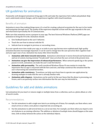
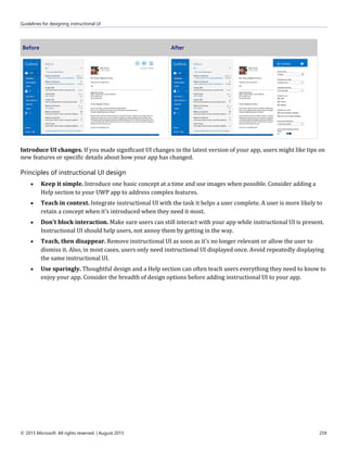
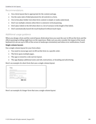
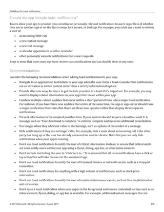
Guidelines for command bars
Command bars provide users with easy access to actions, and can be used to show commands or options that are
specific to the user's context, such as a photo selection or drawing mode. They can also be used for navigation
among app pages or between app sections. Command bars can be used with any navigation pattern.
Command bars consist of two components: the action space, for placing commands or nav items that you want to
remain visible, and the "More" area, which is represented on the command bar as an ellipsis [•••]. The "More" area
opens a drop-down list view menu for commands and nav items that are accessed less frequently. Selecting the
[•••] button opens the menu and reveals text labels for each item in the action space. If no items exist within
"More," then the drop-down isn't opened, though text labels are still revealed for items in the action space.
Placement of command bar
Command bars can be placed at the top of the screen, at the bottom of the screen, at both the top and bottom of the
screen, and inline.
For mobile devices, if you're placing just one command bar in your app, put it at the bottom of the screen
for easy reachability. If your app has tabs on the bottom, consider placing the command bar at the top so
that the UI isn't too bottom-heavy.](https://image.slidesharecdn.com/uwp-app-design-guidelines-v1509-160216232516/85/User-experience-guidelines-for-Universal-Windows-Platform-UWP-appsUwp-app-design-guidelines-v1509-87-320.jpg)
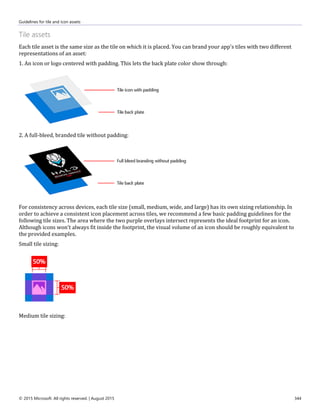
![Guidelines for command bars
© 2015 Microsoft. All rights reserved. | August 2015 88
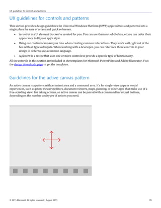
For larger screens, if you're placing just one command bar, we recommend placing it at the top of the
screen.
You can also place command bars inline, so that people can use them for contextual actions.
Command bars can be placed in the following screen regions on single-view screens (left example) and on multi-
view screens (right example). Inline command bars can be placed anywhere in the action space.
Placement of actions
Prioritize the actions that go in the command bar based on their visibility.
Place the most important commands, the ones that you want to remain visible in the bar, in the first few
slots of the action space. On the smallest screens (320 epx width), between 2-4 items will fit in the
command bar's action space, depending on other on-screen UI.
Place less-important commands later in the bar's action space or within the first few slots of the "More"
area. These commands will be visible when the bar has enough screen real estate, but will fall into the
"More" area's drop-down menu when there isn't enough room.
Place the least-important commands within the "More" area. These commands will always appear in the
drop-down menu.
Items in the actions space can be visualized with either icons or buttons. When only using icons, include a text
label. The text label appears under the icon when the [•••] is selected.
If there is a command that would appear consistently across pages, it's best to keep that command in a consistent
location. We recommended placing Accept, Yes, and OK commands to the left of Reject, No, and Cancel. Consistency
gives users the confidence to move around the system and helps them transfer their knowledge of app navigation
from app to app.
Although you can place all actions within the "More" drop-down menu so that only the [•••] is visible on the
command bar, keep in mind that hiding all actions could confuse users.](https://image.slidesharecdn.com/uwp-app-design-guidelines-v1509-160216232516/85/User-experience-guidelines-for-Universal-Windows-Platform-UWP-appsUwp-app-design-guidelines-v1509-88-320.jpg)
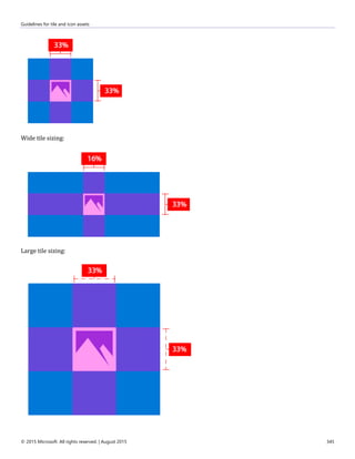
![Guidelines for command bars
© 2015 Microsoft. All rights reserved. | August 2015 89
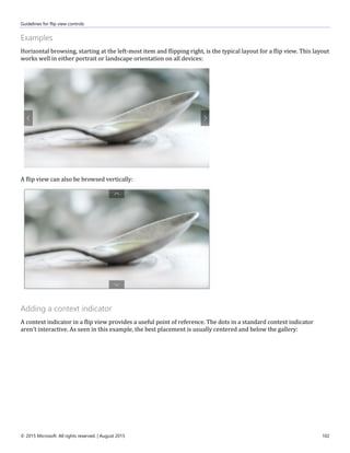
Command bar flyouts and tooltips
Consider logical groupings for the commands, such as placing Reply, Reply All, and Forward in a Respond menu.
Because text labels are hidden for command bar actions unless [•••] is selected, consider using tooltips for action
icons.
The "More" area
The "More" affordance [•••] is the visible entry point for the menu, and sits on the far-right of the toolbar
adjacent to primary actions.
Each action in the primary action space is represented by an icon. Selecting the overflow menu reveals text
labels for each of the actions in the primary action space.
The overflow menu space is allocated for actions that are less frequently used.
Actions can come and go between the primary action space and the overflow menu at breakpoints. You can
also designate actions to always remain in the primary action space regardless of screen or app window
size.](https://image.slidesharecdn.com/uwp-app-design-guidelines-v1509-160216232516/85/User-experience-guidelines-for-Universal-Windows-Platform-UWP-appsUwp-app-design-guidelines-v1509-89-320.jpg)


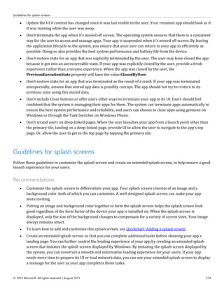
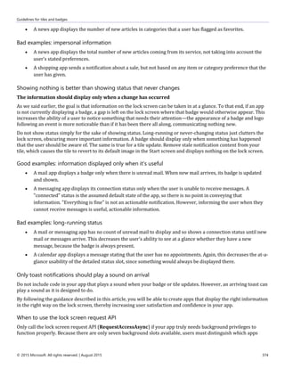
![Guidelines for creating custom data formats
© 2015 Microsoft. All rights reserved. | August 2015 236
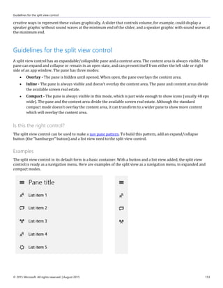
Populating the DataPackage
JavaScript
var uris = new Array();
uris[0] = new Windows.Foundation.Uri("http://www.msn.com");
uris[1] = new Windows.Foundation.Uri("http://www.microsoft.com");
var dp = new Windows.ApplicationModel.DataTransfer.DataPackage();
dp.setData("UriCollection", uris);
C#
System.Uri[] uris = new System.Uri[2];
uris[0] = new System.Uri("http://www.msn.com");
uris[1] = new System.Uri("http://www.microsoft.com");
DataPackage dp = new DataPackage();
dp.SetData("UriCollection", uris);
Retrieving the data
JavaScript
if (dpView.contains("UriCollection")) {
dpView.getDataAsync("UriCollection").done(function(uris) {
// Array.isArray doesn’t work – uris is projected from InspectableArray
if (uris.toString() === "[object ObjectArray]") {
var validUriArray = true;
for (var i = 0; (true === validUriArray) && (i < uris.length); i++) {
validUriArray = (uris[i] instanceof Windows.Foundation.Uri);
}
if (validUriArray) {
// Type validated data
}
}
}
}
C#
if (dpView.Contains("UriCollection"))
{
System.Uri[] retUris = await dpView.GetDataAsync("UriCollection") as
System.Uri[];
if (retUris != null)
{
// Retrieved Uri collection from DataPackageView
}
}](https://image.slidesharecdn.com/uwp-app-design-guidelines-v1509-160216232516/85/User-experience-guidelines-for-Universal-Windows-Platform-UWP-appsUwp-app-design-guidelines-v1509-236-320.jpg)


Ad
More Related Content
What's hot (20)
Similar to User experience guidelines for Universal Windows Platform (UWP) appsUwp app design guidelines v1509 (20)


![[4developers2016] - Nowe wyzwania w tworzeniu Universal Windows Application n...](https://cdn.slidesharecdn.com/ss_thumbnails/liguzinski-160608102813-thumbnail.jpg?width=560&fit=bounds)

![Presentation[1]](https://cdn.slidesharecdn.com/ss_thumbnails/a079c96b-ce50-4b5a-809a-93d9f9d48071-150801075340-lva1-app6892-thumbnail.jpg?width=560&fit=bounds)


Ad
More from Dan Vitoriano (20)


Ad
Recently uploaded (20)


![Halstead’s_Software_Science_&_Putnam’s_Model[1].pptx](https://cdn.slidesharecdn.com/ss_thumbnails/halsteadssoftwarescienceputnamsmodel1-250502175814-4c85707e-thumbnail.jpg?width=560&fit=bounds)


User experience guidelines for Universal Windows Platform (UWP) appsUwp app design guidelines v1509
- 1. User experience guidelines for Universal Windows Platform (UWP) apps A great app starts with a great user interface. Learn how to design a Universal Windows Platform (UWP) app that looks fantastic on all Windows 10-based devices, from phones and tablets to PCs and Surface Hub. For the online version of these guidelines, see the Design UWP Apps section of the Windows Dev Center. This article contains information that is specific to UWP apps and Windows 10. For Windows 8.1 guidance, please download the Windows 8.1 guidelines PDF.
- 2. Disclaimer: This document is provided “as-is”. Information and views expressed in this document, including URL and other Internet website references, may change without notice. You bear the risk of using it. Some examples depicted herein are provided for illustration only and are fictitious. No real association or connection is intended or should be inferred. This document does not provide you with any legal rights to any intellectual property in any Microsoft product. You may copy and use this document for your internal, reference purposes. © 2015 Microsoft. All rights reserved. Microsoft, Windows, Windows Media, Windows Phone, Windows Vista, the Windows logo, Bing, Calibri, Cambria, DirectX, Halo, Hotmail, InPrivate, IntelliSense, Internet Explorer, Internet Explorer logo, MSN, Nirmala, OneDrive, OpenType, Outlook, PowerPoint, Segoe, Silverlight, Skype, Skype logo, Visio, Visual Basic, Visual Studio, Wonderwall, Wordament, and Xbox are trademarks of the Microsoft group of companies. All other trademarks are property of their respective owners.
- 3. Introduction to Universal Windows Platform (UWP) apps © 2015 Microsoft. All rights reserved. | August 2015 3 Table of contents Introduction to Universal Windows Platform (UWP) apps.............................................................................6 Device primer for Universal Windows Platform (UWP) apps.....................................................................12 Plan your Universal Windows Platform (UWP) app .......................................................................................17 Responsive design 101 for Universal Windows Platform (UWP) apps...................................................27 UI basics for Universal Windows Platform (UWP) apps ...............................................................................37 Navigation design basics for Universal Windows Platform (UWP) apps...............................................41 Command design basics for Universal Windows Platform (UWP) apps................................................50 Content design basics for Universal Windows Platform (UWP) apps.....................................................57 Guidelines for Universal Windows Platform (UWP) apps............................................................................60 UX guidelines for animations...........................................................................................................................66 Guidelines for add and delete animations...........................................................................................66 Guidelines for content transition animations......................................................................................67 Guidelines for drag animations ................................................................................................................67 Guidelines for edge-based UI animations............................................................................................68 Guidelines for fade animations.................................................................................................................69 Guidelines for page transition animations...........................................................................................70 Guidelines for pointer click animations.................................................................................................72 Guidelines for pop-up UI animations.....................................................................................................72 Guidelines for reposition animations .....................................................................................................72 UX guidelines for app settings and data.....................................................................................................73 Guidelines for app settings ........................................................................................................................73 Guidelines for roaming app data.............................................................................................................75 UX guidelines for controls and patterns .....................................................................................................78 Guidelines for the active canvas pattern...............................................................................................78 Guidelines for auto-suggest boxes.........................................................................................................80 Guidelines for back buttons.......................................................................................................................81 Guidelines for buttons..................................................................................................................................82 Guidelines for the camera capture UI ....................................................................................................83 Guidelines for check boxes.........................................................................................................................84 Guidelines for command bars...................................................................................................................87 Guidelines for context menus ...................................................................................................................90 Guidelines for date and time controls ...................................................................................................92 Guidelines for dialog controls...................................................................................................................97 Guidelines for filtering and sorting .........................................................................................................99 Guidelines for flip view controls.............................................................................................................101 Guidelines for flyouts..................................................................................................................................104 Guidelines for the hub control................................................................................................................105 Guidelines for hyperlinks...........................................................................................................................110 Guidelines for labels....................................................................................................................................111 Guidelines for lists........................................................................................................................................112 Guidelines for a master/details pattern...............................................................................................118 Guidelines for the media player .............................................................................................................122
- 4. Introduction to Universal Windows Platform (UWP) apps © 2015 Microsoft. All rights reserved. | August 2015 4 Guidelines for navigation panes.............................................................................................................124 Guidelines for progress controls............................................................................................................129 Guidelines for radio buttons....................................................................................................................138 Guidelines for the rating control............................................................................................................141 Guidelines for scroll bars...........................................................................................................................143 Guidelines for search ..................................................................................................................................144 Guidelines for semantic zoom ................................................................................................................148 Guidelines for sliders...................................................................................................................................150 Guidelines for the split view control.....................................................................................................153 Guidelines for tabs and pivots ................................................................................................................154 Guidelines for toggle switch controls ..................................................................................................157 Guidelines for tooltips................................................................................................................................160 Guidelines for Web views..........................................................................................................................162 UX guidelines for custom user interactions.............................................................................................163 Cortana design guidelines........................................................................................................................163 Keyboard design guidelines.....................................................................................................................176 Mouse design guidelines ..........................................................................................................................186 Pen design guidelines ................................................................................................................................188 Speech design guidelines .........................................................................................................................189 Touch design guidelines............................................................................................................................195 Touchpad design guidelines....................................................................................................................198 Multiple inputs design guidelines .........................................................................................................200 Guidelines for designing accessible apps...........................................................................................201 Guidelines for cross-slide..........................................................................................................................204 Guidelines for optical zoom and resizing...........................................................................................209 Guidelines for panning...............................................................................................................................211 Guidelines for rotation ...............................................................................................................................216 Guidelines for selecting text and images (Windows Runtime apps) .......................................219 Guidelines for targeting.............................................................................................................................223 Guidelines for visual feedback ................................................................................................................226 UX guidelines for files, data, and connectivity........................................................................................233 Guidelines for creating custom data formats ...................................................................................233 Guidelines for file pickers..........................................................................................................................237 Guidelines for file picker contracts........................................................................................................241 Guidelines for file types and URIs..........................................................................................................244 Guidelines for printing ...............................................................................................................................245 Guidelines for Proximity ............................................................................................................................245 Guidelines for thumbnails.........................................................................................................................247 UX guidelines for files, data, and globalization......................................................................................251 Guidelines for app resources...................................................................................................................251 Guidelines for globalization and localization....................................................................................251 UX guidelines for help and instructions ....................................................................................................256 Guidelines for app help..............................................................................................................................256 Guidelines for designing instructional UI ...........................................................................................256
- 5. Introduction to Universal Windows Platform (UWP) apps © 2015 Microsoft. All rights reserved. | August 2015 5 UX guidelines for identity and security......................................................................................................260 Guidelines for login .....................................................................................................................................260 Guidelines for accessing OneDrive from an app .............................................................................261 Guidelines for privacy-aware apps........................................................................................................264 Guidelines for single sign-on and connected accounts................................................................267 Guidelines for user names and account pictures ............................................................................270 UX guidelines for launch, suspend, and resume....................................................................................273 Guidelines for app suspend and resume ..................................................................................................273 Guidelines for splash screens.........................................................................................................................274 UX guidelines for layout and scaling..........................................................................................................280 Guidelines for multiple windows..................................................................................................................280 Guidelines for projection manager..............................................................................................................282 UX guidelines for maps and location .........................................................................................................284 Guidelines for maps...........................................................................................................................................284 Guidelines for geofencing apps....................................................................................................................286 Guidelines for location-aware apps ............................................................................................................289 UX guidelines for text and text input .........................................................................................................296 Guidelines for clipboard commands...........................................................................................................296 Guidelines for find-in-page............................................................................................................................298 Guidelines for fonts ...........................................................................................................................................302 Guidelines for form layouts ............................................................................................................................305 Guidelines for password boxes .....................................................................................................................317 Guidelines for Segoe MDL2 icons................................................................................................................318 Guidelines for spell checking.........................................................................................................................336 Guidelines for text input ..................................................................................................................................337 UX guidelines for tiles and notifications....................................................................................................342 Guidelines for tile and icon assets ...............................................................................................................342 Guidelines for lock screens.............................................................................................................................357 Guidelines for periodic notifications...........................................................................................................358 Guidelines for push notifications .................................................................................................................359 Guidelines for raw notifications....................................................................................................................360 Guidelines for scheduled notifications.......................................................................................................362 Guidelines for tiles and badges ....................................................................................................................363 Guidelines for toast notifications .................................................................................................................375 Downloads ...................................................................................................................................................................378
- 6. Introduction to Universal Windows Platform (UWP) apps © 2015 Microsoft. All rights reserved. | August 2015 6 Introduction to Universal Windows Platform (UWP) apps When you create a Universal Windows Platform (UWP) app, you're creating an app that has the potential to run on any Windows-powered device: Mobile device family: Windows Phones, phablets Desktop device family: Tablets, laptops, PCs Team device family: Surface hub IoT device family: Compact devices such as wearables or household appliances You can limit your app to a single device family (such as the mobile device family), or you can choose to make the app available on all devices running Windows. Just designing an app that looks good on all mobile devices can be a challenge. So how do you go about designing an app that provides a great user experience on several devices with dramatically different screen sizes and different input methods? Designing for multiple device families requires some additional consideration, planning, and design, but the Universal Windows Platform (UWP) provides a set of built-in features and universal building blocks that make it much easier to create a great user experience for multiple devices.
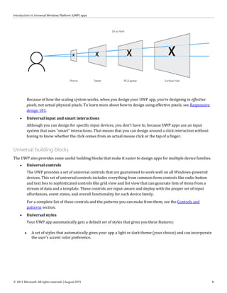
- 7. Introduction to Universal Windows Platform (UWP) apps © 2015 Microsoft. All rights reserved. | August 2015 7 Built-in features for designers Let's start by taking a look at some of the features that you get when you create a UWP app. You don't have to do anything to benefit from these features—they're automatic. Effective pixels and platform scaling When your app runs on a Windows-powered device, the system uses an algorithm to normalize the way controls, fonts, and other UI elements display on the screen. This scaling algorithm takes into account viewing distance and screen density (pixels per inch) to optimize for perceived size (rather than physical size). The scaling algorithm ensures that a 24 px font on Surface Hub 10 feet away is just as legible to the user as a 24 px font on 5” phone that's a few inches away.
- 8. Introduction to Universal Windows Platform (UWP) apps © 2015 Microsoft. All rights reserved. | August 2015 8 Because of how the scaling system works, when you design your UWP app, you're designing in effective pixels, not actual physical pixels. To learn more about how to design using effective pixels, see Responsive design 101. Universal input and smart interactions Although you can design for specific input devices, you don't have to, because UWP apps use an input system that uses "smart" interactions. That means that you can design around a click interaction without having to know whether the click comes from an actual mouse click or the tap of a finger. Universal building blocks The UWP also provides some useful building blocks that make it easier to design apps for multiple device families. Universal controls The UWP provides a set of universal controls that are guaranteed to work well on all Windows-powered devices. This set of universal controls includes everything from common form controls like radio button and text box to sophisticated controls like grid view and list view that can generate lists of items from a stream of data and a template. These controls are input-aware and deploy with the proper set of input affordances, event states, and overall functionality for each device family. For a complete list of these controls and the patterns you can make from them, see the Controls and patterns section. Universal styles Your UWP app automatically gets a default set of styles that gives you these features: A set of styles that automatically gives your app a light or dark theme (your choice) and can incorporate the user's accent color preference.
- 9. Introduction to Universal Windows Platform (UWP) apps © 2015 Microsoft. All rights reserved. | August 2015 9 A Segoe-based type ramp that ensures that app text looks crisp on all devices. Default animations for interactions. Automatic support for high-contrast modes. Our styles were designed with high-contrast in mind, so when your app runs on a device in high-contrast mode, it will display properly. Automatic support for other languages. Our default styles automatically select the correct font for every language that Windows supports. You can even use multiple languages in the same app and they'll be displayed properly. Built-in support for RTL reading order. You can customize these default styles to give your app a personal touch, or you can completely replace them with your own to create a unique visual experience. For example, here's a design for a weather app with a unique visual style:
- 10. Introduction to Universal Windows Platform (UWP) apps © 2015 Microsoft. All rights reserved. | August 2015 10 Universal templates We provide Adobe Illustrator and Microsoft PowerPoint templates that contain everything you need to get started designing UWP apps. These templates include the universal controls and layouts for every universal device size class. Download the Adobe illustrator templates Download the PowerPoint templates Frequently asked questions Can I create a single UI and use it for all devices? Yes, you can create a single UI and use it for all devices—you don't have to create a custom UI for each device family. Our design guidelines can help you create a single UI that works well on all devices. That said, you have the option to customize your UI for the screen space available to your app. For example, you can make your app hide certain UI elements when it runs on a phone-sized window so that there's more space for content. How much or how little you tailor your app for specific sizes is up to you. For more info, see the Responsive design 101 article.
- 11. Introduction to Universal Windows Platform (UWP) apps © 2015 Microsoft. All rights reserved. | August 2015 11 Does my UWP app have to run on all devices? No, your app doesn't have to run on all devices. You can't target a single device—such as phone—but you can limit your app to a device family, such as the mobile device family, which includes phones, phablets, and some tablets. When you publish your app, you can choose to make it available to all devices families, a few devices families, or only one device family. Next steps Now that you've been introduced to the potential, features, and benefits of UWP apps, check out Responsive design 101 to learn about designing a user interface for different screen sizes.
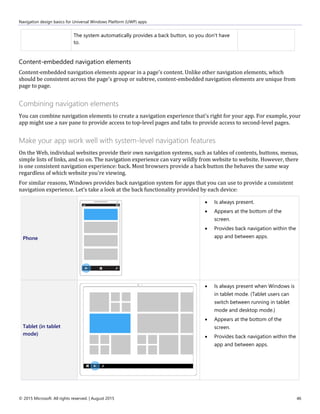
- 12. Device primer for Universal Windows Platform (UWP) apps © 2015 Microsoft. All rights reserved. | August 2015 12 Device primer for Universal Windows Platform (UWP) apps Getting to know the devices that support UWP apps will help you offer the best user experience for each form factor. When designing for a particular device, the main considerations include how the app will appear on that device, where, when, and how the app will be used on that device, and how the user will interact with that device. Phones and phablets The most widely-used of all computing devices, phones can do a lot with limited screen real estate and basic inputs. Phones are available in a variety of sizes; larger phones are called phablets. App experiences on phablets are similar to those on phones, but the larger screen of phablets enable some key changes in content consumption. Screen sizes 4” to 6” for phone 6+” to 7” for phablet Typical usage Primarily used in portrait orientation, mostly due to the ease of holding the phone with one hand and being able to fully interact with it that way. Experiences that work well in landscape include viewing photos and video, reading a book, and composing text. Mostly used by just one person, the owner of the device. Always within reach, usually stashed in a pocket or a bag. Used for brief periods of time. Users are often multitasking when using the phone. Text is entered in short bursts. UI considerations The small size of a phone's screen allows only one frame at a time to be viewed in both portrait and landscape orientations. All hierarchical navigation patterns on a phone use the "drill" model, with the user navigating through single-frame UI layers. Similar to phones, phablets in portrait mode can view only one frame at a time. But with the greater screen real estate available on a phablet, users have the ability to rotate to landscape orientation and stay there, so two app frames can be visible at a time. In both landscape and portrait orientations, be sure that there's enough screen real estate for the app bar when the on-screen keyboard is up.
- 13. Device primer for Universal Windows Platform (UWP) apps © 2015 Microsoft. All rights reserved. | August 2015 13 Inputs Touch Voice Typical device capabilities Microphone Camera Movement sensors Location sensors Tablets Ultra-portable tablet computers are equipped with touchscreens, cameras, microphones, and accelerometers. Screen sizes 7” to 13.3” Typical usage About 80% of tablet use is by the owner, with the other 20% being shared use. It’s most commonly used at home as a companion device while watching TV. It’s used for longer periods than phones and phablets. Text entered in short bursts. UI considerations In both landscape and portrait orientations, tablets allow two frames at a time. System back is located on the navigation bar. Inputs Touch Stylus External keyboard (occasionally) Mouse (occasionally) Voice (occasionally) Typical device capabilities Camera Microphone Movement and location sensors
- 14. Device primer for Universal Windows Platform (UWP) apps © 2015 Microsoft. All rights reserved. | August 2015 14 PCs and laptops Windows PCs and laptops include a wide array of devices and screen sizes. In general, PCs and laptops can display more info than phone or tablets. Screen sizes 13” and greater Typical usage Apps on desktops and laptops see shared use, but by one user at a time, and usually for longer periods. UI considerations Apps can have a windowed view, the size of which is determined by the user. Depending on window size, there can be between one and three frames. On larger monitors, the app can have more than three frames. When using an app on a desktop or laptop, the user has control over app files. As an app designer, be sure to provide the mechanisms to manage your app’s content. Consider including commands and features such as "Save As", "Recent files", and so on. System back is optional. When an app developer chooses to show it, it appears in the app title bar. Inputs Mouse Keyboard Touch on laptops and all-in-one desktops Gamepads, such as the Xbox controller, are sometimes used Typical device capabilities Camera Microphone
- 15. Device primer for Universal Windows Platform (UWP) apps © 2015 Microsoft. All rights reserved. | August 2015 15 Surface Hub devices Microsoft Surface Hub is large-screen team collaboration device designed for simultaneous use by multiple users. Screen sizes 55” and 84” Typical usage Apps on Surface Hub see shared use for short periods of time, such as in meetings. Surface Hub devices are mostly stationary and rarely moved. UI considerations Apps on Surface Hub can appear in one of four states - fill (a fixed view that occupies the available stage area, full (standard full-screen view), snapped (variable view that occupies the right or left sides of the stage) and background (hidden from view while the app is still running, available in task switcher). In snapped mode or fill modes, the system displays the Skype sidebar and shrinks the app horizontally. System back is optional. When an app developer chooses to show it, it appears in the app title bar. Inputs Touch Pen Voice Keyboard Touchpad (remote) Typical device capabilities Camera Microphone
- 16. Device primer for Universal Windows Platform (UWP) apps © 2015 Microsoft. All rights reserved. | August 2015 16 Windows IoT devices Windows IoT devices are an emerging class of devices centered around embedding small electronics, sensors, and connectivity within physical objects. These devices are usually connected through a network or the Internet to report on the real-world data they sense, and in some cases act on it. Devices can either have no screen (also known as “headless” devices) or are connected to a small screen (known as “headed” devices) with a screen size usually 3.5” or smaller. Screen sizes 3.5” or smaller Some devices have no screen Typical usage Usually connected through a network or the Internet to report on the real-world data they sense, and in some cases act on it. These devices can only run one application at a time unlike phones or other larger devices. It isn’t something that is interacted with all the time, but instead is available when you need it, out of the way when you don’t. App doesn’t have a dedicated back affordance, that is the developers responsibility. UI considerations "Headless" devices have no screen. Display for “headed” devices is minimal, only showing what is necessary due to limited screen real estate and functionality. Orientation is most times locked, so your app only needs to consider one display direction. Inputs Variable, depends on the device Typical device capabilities Variable, depends on the device Next steps Now that you've seen the different types of devices that can run UWP apps, check out Responsive design 101 to learn how to design a UI for them.
- 17. Plan your Universal Windows Platform (UWP) app © 2015 Microsoft. All rights reserved. | August 2015 17 Plan your Universal Windows Platform (UWP) app On Microsoft design teams, our process for creating apps consists of five distinct stages: concept, structure, dynamics, visual, and prototype. We encourage you to adopt a similar process and have fun making new experiences for the world to enjoy. Concept Focus your app When planning your Universal Windows Platform (UWP) app, you should determine not only what your app will do and who it's for, but also what your app will be great at. At the core of every great app is a strong concept that provides a solid foundation. Say you want to create a photo app. Thinking about the reasons users work with, save, and share their photos, you’ll realize that they want to relive memories, connect with others through the photos, and keep the photos safe. These, then, are the things that you want the app to be great at, and you use these experience goals to guide you through the rest of the design process. What's your app about? Start with a broad concept and list all of the things that you want to help users do with your app. For example, suppose you want to build an app that helps people plan their trips. Here are some ideas you might sketch out on the back of a napkin: Get maps of all the places on an itinerary, and take them with you on the trip. Find out about special events happening while you're in a city. Let travel buddies create separate but shareable lists of must-do activities and must-see attractions. Let travel buddies compile all of their photos to share with friends and family. Get recommended destinations based on flight prices. Find a consolidated list of deals for restaurants, shops, and activities around your destination.
- 18. Plan your Universal Windows Platform (UWP) app © 2015 Microsoft. All rights reserved. | August 2015 18 What's your app great at? Take a step back and look at your list of ideas to see if a particular scenario really jumps out at you. Challenge yourself to trim the list to just a single scenario that you want to focus on. In the process, you might cross off many good ideas, but saying "no" to them is crucial to making a single scenario great. After you choose a single scenario, decide how you would explain to an average person what your app is great at by writing it down in one sentence. For example: My travel app is great at helping friends create itineraries collaboratively for group trips. My workout app is great at letting friends track their workout progress and share their achievements with each other. My grocery app is great at helping families coordinate their weekly grocery shopping so they never miss or duplicate a purchase. This is your app's "great at" statement, and it can guide many design decisions and tradeoffs that you make as you build your app. Focus on the scenarios you want users to experience in your app, and be careful not to turn this into a feature list. It should be about what your users will be able to do, as opposed to what your app will be able to do. The design funnel It’s very tempting—having thought of an idea you like—to go ahead and develop it, perhaps even taking it quite a ways into production. But let’s say you do that and then another interesting idea comes along. It’s natural that you’ll be tempted to stick with the idea you’ve already invested in regardless of the relative merits of the two ideas. If only you’d thought of that other idea earlier in the process! Well, the design funnel is a technique to help uncover your best ideas as early as possible. The term "funnel" comes from its shape. At the wide end of the funnel, many ideas go in and each one is realized as a very low-fidelity design artifact (a sketch, perhaps, or a paragraph of text). As this collection of ideas travels through toward the narrow end of the funnel, the number of ideas is trimmed down while the fidelity of the artifacts representing the ideas increases. Each artifact should capture only the information necessary to judge one idea against another, or to answer a particular question such as "is this usable, or intuitive?" Put no more time and effort into each than that. Some ideas will fall by the wayside as you test them, and you’ll be okay with that because you won’t be invested in them any more than was necessary to judge the idea. Ideas that
- 19. Plan your Universal Windows Platform (UWP) app © 2015 Microsoft. All rights reserved. | August 2015 19 survive to move further into the funnel will receive successively high-fidelity treatments. In the end, you’ll have a single design artifact that represents the winning idea. This is the idea that won because of its merits, not merely because it came along first. You will have designed the best app you could. Structure Organization makes everything easier When you're happy with your concept, you're ready for the next stage—creating your app's blueprint. Information architecture (IA) gives your content the structural integrity it needs. It helps define your app's navigational model and, ultimately, your app's identity. By planning how your content will be organized—and how your users will discover that content—you can get a better idea of how users will experience your app. Good IA not only facilitates user scenarios, but it helps you envision the key screens to start with. The Audible app, for example, launches directly into a hub that provides access to the user's library, store, news, and stats. The experience is focused, so users can get and enjoy audiobooks quickly. Deeper levels of the app focus on more specific tasks. For related guidelines, see Navigation design basics. Dynamics Execute your concept If the concept stage is about defining your app's purpose, the dynamics stage is all about executing that purpose. This can be accomplished in many ways, such as using wireframes to sketch out your page flows (how you get from one place to the next within the app to achieve their goals), and thinking about the voice and the words used throughout your app's UI. Wireframes are a quick, low-fidelity tool to help you make critical decisions about your app's user flow. Your app flow should be tightly tied to your "great at" statement, and should help users achieve that single scenario that you want to light up. Great apps have flows that are easy to learn, and require minimal effort. Start thinking on a screen-to-screen level—see your app as if you're using it for the first time. When you pinpoint user scenarios for pages you create, you'll give people exactly what they want without lots of unnecessary screen touches. Dynamics are also about motion. The right motion capabilities will determine fluidity and ease of use from one page to the next.
- 20. Plan your Universal Windows Platform (UWP) app © 2015 Microsoft. All rights reserved. | August 2015 20 Common techniques to help with this step: Outline the flow: What comes first, what comes next? Storyboard the flow: How should users move through your UI to complete the flow? Prototype: Try out the flow with a quick prototype. What should users be able to do? For example, the travel app is "great at helping friends collaboratively create itineraries for group trips." Let's list the flows that we want to enable: Create a trip with general information. Invite friends to join a trip. Join a friend's trip. See itineraries recommended by other travelers. Add destinations and activities to trips. Edit and comment on destinations and activities that friends added. Share itineraries for friends and families to follow. Visual Speak without words Once you've established the dynamics of your app, you can make your app shine with the right visual polish. Great visuals define not only how your app looks, but how it feels and comes alive through animation and motion. Your choice of color palette, icon, and artwork are just a few examples of this visual language. All apps have their own unique identity, so explore the visual directions you can take with your app. Let the content guide the look and feel; don't let the look dictate your content.
- 21. Plan your Universal Windows Platform (UWP) app © 2015 Microsoft. All rights reserved. | August 2015 21 Prototype Refine your masterpiece Prototyping is a stage in the design funnel—a technique we talked about earlier—at which the artifact representing your idea develops into something more than a sketch, but less complicated than a complete app. A prototype might be a flow of hand-drawn screens shown to a user. The person running the test might respond to cues from the user by placing different screens down, or sticking or unsticking smaller pieces of UI on the pages, to simulate a running app. Or, a prototype might be a very simple app that simulates some workflows, provided the operator sticks to a script and pushes the right buttons. At this stage, your ideas begin to really come alive and your hard work is tested in earnest. When prototyping areas of your app, take the time to sculpt and refine the components that need it the most. To new developers, we can't stress enough: Making great apps is an iterative process. We recommend that you prototype early and often. Like any creative endeavor, the best apps are the product of intensive trial and error. Decide what features to include When you know what your users want and how you can help them get there, you can look at the specific tools in your toolbox. Explore the Universal Windows Platform (UWP) platform and associate features with your app's needs. Be sure to follow the user experience (UX) guidelines for each feature. Common techniques: Platform research: Find out what features the platform offers and how you can use them. Association diagrams: Connect your flows with features. Prototype: Exercise the features to ensure that they do what you need. App contracts Your app can participate in app contracts that enable broad, cross-app, cross-feature user flows. Share Let your users share content from your app with other people through other apps, and receive shareable content from other people and apps, too. Play To Let your users enjoy audio, video, or images streamed from your app to other devices in their home network. File picker and file picker extensions Let your users load and save their files from the local file system, connected storage devices, HomeGroup, or even other apps. You can also provide a file picker extension so other apps can load your app's content. Different views, form factors, and hardware configurations Windows puts users in charge and your app in the forefront. You want your app UI to shine on any device, using any input mode, in any orientation, in any hardware configuration, and in whatever circumstance the user decides to use it. Learn more about designing for different form factors. Touch first Windows provides a unique and distinctive touch experience that does more than simply emulate mouse functionality. For example, semantic zoom is a touch-optimized way to navigate through a large set of content. Users can pan or scroll through categories of content, and then zoom in on those categories to view more and more detailed information. You can use this to present your content in a more tactile, visual, and informative way than with traditional navigation and layout patterns like tabs. Of course, you can take advantage of a number of touch interactions, like rotate, pan, swipe, and others. Learn more about Touch and other user interactions.
- 22. Plan your Universal Windows Platform (UWP) app © 2015 Microsoft. All rights reserved. | August 2015 22 Engaging and fresh Be sure your app feels fresh and engages users with these standard experiences: Animations Use our library of animations to make your app fast and fluid for your users. Help users understand context changes and tie experiences together with visual transitions. Learn more about animating your UI. Toast notifications Let your users know about time-sensitive or personally relevant content through toast notifications, and invite them back to your app even when your app is closed. Learn more about tiles, badges, and toast notifications. Secondary tiles Promote interesting content and deep links from your app on the Start screen, and let your users launch your app directly on a specific page or view. Learn more about secondary tiles. App tiles Provide fresh and relevant updates to entice users back into your app. There's more info about this in the next section. Learn more about app tiles. Personalization Settings Let your users create the experience they want by saving app settings. Consolidate all of your settings on one screen, and then users can configure your app through a common mechanism that they are already familiar with. Learn more about Adding app settings. Roaming Create a continuous experience across devices by roaming data that lets users pick up a task right where they left off and preserves the UX they care most about, regardless of the device they're using. Make it easy to use your app anywhere—their kitchen family PC, their work PC, their personal tablet, and other form factors—by maintaining settings and states with roaming. Learn more about roaming application data. User tiles Make your app more personal to your users by loading their user tile image, or let the users set content from your app as their personal tile throughout Windows. Device capabilities Be sure your app takes full advantage of the capabilities of today's devices. Proximity gestures Let your users connect devices with other users who are physically in close proximity, by physically tapping the devices together (multiplayer games). Cameras and external storage devices Connect your users to their built-in or plugged-in cameras for chatting and conferencing, recording vlogs, taking profile pics, documenting the world around them, or whatever activity your app is great at. Accelerometers and other sensors Devices come with a number of sensors nowadays. Your app can dim or brighten the display based on ambient light, reflow the UI if the user rotates the display, or react to any physical movement. Geolocation Use geolocation information from standard web data or from geolocation sensors to help your users get around, find their position on a map, or get notices about nearby people, activities, and destinations. Let's consider the travel app example again. To be great at helping friends collaboratively create itineraries for group trips, you could use some of these features, just to name a few: Share: Users share upcoming trips and their itineraries to multiple social networks to share the pre-trip excitement with their friends and families. Search: Users search for and find activities or destinations from others' shared or public itineraries that they can include in their own trips. Notifications: Users are notified when travel companions update their itineraries.
- 23. Plan your Universal Windows Platform (UWP) app © 2015 Microsoft. All rights reserved. | August 2015 23 Settings: Users configure the app to their preference, like which trip should bring up notifications or which social groups are allowed to search the users' itineraries. Semantic zoom: Users navigate through the timeline of their itinerary and zoom in to see greater details of the long list of activities they've planned. User tiles: Users choose the picture they want to appear when they share their trip with friends. Decide how to monetize your app You have a lot of options for earning money from your app. If you decide to use in-app ads or sales, you'll want to design your UI to support that. For more information, see Plan for monetization. Design the UX for your app This is about getting the basics right. Now that you know what your app is great at, and you've figured out the flows that you want to support, you can start to think about the fundamentals of user experience (UX) design. How should you organize UI content? Most app content can be organized into some form of groupings or hierarchies. What you choose as the top-level grouping of your content should match the focus of your "great at" statement. To use the travel app as an example, there are multiple ways to group itineraries. If the focus of the app is discovering interesting destinations, you might group them based on interest, like adventure, fun in the sun, or romantic getaways. However, because the focus of the app is planning trips with friends, it makes more sense to organize itineraries based on social circles, like family, friends, or work. Choosing how you want to group your content helps you decide what pages or views you need in your app. The project templates in Microsoft Visual Studio offer the common app layout patterns that will suit most content needs. See UI basics and Templates to speed up your app development for more info. How should you present UI content? After you've decided how to organize your UI, you can define UX goals that specify how your UI gets built and presented to your user. In any scenario, you want to make sure that your user can continue using and enjoying your app as quickly as possible. To do this, decide what parts of your UI need to be presented first, and make sure that those parts are complete before you spend time building the noncritical parts. In the travel app, probably the first thing the user will want to do in the app is find a specific trip itinerary. To present this info as fast as possible, you should show the list of trips first, using a ListView control.
- 24. Plan your Universal Windows Platform (UWP) app © 2015 Microsoft. All rights reserved. | August 2015 24 What UI surfaces and commands do you need? Review the flows that you identified earlier. For each flow, create a rough outline of the steps users take. Let's look at the "Share itineraries for friends and families to follow" flow. We'll assume that the user has already created a trip. Sharing a trip itinerary might require these steps: 1. The user opens the app and sees a list of trips she created. 2. The user taps on the trip she wants to share. 3. The details of the trip appear on screen. 4. The user accesses some UI to initiate sharing. 5. The user selects or enters the email address or name of the friend she wants to share the trip with. 6. The user accesses some UI to finalize sharing. 7. Your app updates the trip details with the list of people she has shared her trip with. During this process, you begin to see what UI you need to create and the additional details you need to figure out (like drafting a standard email boilerplate for friends who aren't using your app yet). You also can start eliminating unnecessary steps. Perhaps the user doesn't actually need to see the details of the trip before sharing, for example. The cleaner the flow, the easier to use. For more details on how to use different surfaces, take a look at Command design basics. What should the flow feel like? When you have defined the steps your user will take, you can turn that flow into performance goals. For more info, see Plan for performance. How should you organize commands? Use your outline of the flow steps to identify potential commands that you need to design for. Then think about where to use those commands in your app. Always try to use the content. Whenever possible, let users directly manipulate the content on the app's canvas, rather than adding commands that act on the content. For example, in the travel app, let users rearrange their itinerary by dragging and dropping activities in a list on the canvas, rather than by selecting the activity and using Up or Down command buttons.
- 25. Plan your Universal Windows Platform (UWP) app © 2015 Microsoft. All rights reserved. | August 2015 25 If you can't use the content. Place commands on one of these UI surfaces if you are not able to use the content: In the command bar: You should put most commands on the command bar, which is usually hidden until the user taps to make it visible. On the app's canvas: If the user is on a page or view that has a single purpose, you can provide commands for that purpose directly on the canvas. There should be very few of these commands. In a context menu: You can use context menus for clipboard actions (such as cut, copy, and paste), or for commands that apply to content that cannot be selected (like adding a push pin to a location on a map). Decide how to lay out your app in each view. Windows supports landscape and portrait orientations and supports resizing apps to any width, from full screen to a minimum width. You want your app to look and work great at any size, on any screen, in either orientation. This means you need to plan the layout of your UI elements for different sizes and views. When you do this, your app UI changes fluidly to meet your user's needs and preferences. For more info on designing for different screen sizes, see Responsive design 101. Make a good first impression Think about what you want users to think, feel, or do when they first launch your app. Refer back to your "great at" statement. Even though you won't get a chance to personally tell your users what your app is great at, you can convey the message to them when you make your first impression. Take advantage of these: Tile and notifications The tile is the face of your app. Among the many other apps on a user's Start screen, what will make the user want to launch your app? Be sure your tile highlights your app's brand and shows what the app is great at. Use tile notifications so your app will always feel fresh and relevant, bringing the user back to your app again and again. Splash screen The splash screen should load as fast as possible, and remain on the screen only as long as you need to initialize your app state. What you show on the splash screen should express your app's personality.
- 26. Plan your Universal Windows Platform (UWP) app © 2015 Microsoft. All rights reserved. | August 2015 26 First launch Before users sign up for your service, log in to their account, or add their own content, what will they see? Try to demonstrate the value of your app before asking users for information. Consider showing sample content so people can look around and understand what your app does before you ask them to commit. Home page The home page is where you bring users each time they launch your app. The content here should have a clear focus, and immediately showcase what your app is tailored to do. Make this page great at one thing and trust that people will explore the rest of your app. Focus on eliminating distractions on the landing page, and not on discoverability. Validate your design Before you get too far into actually developing your app, you should validate your design or prototype against guidelines, user impressions, and requirements, to avoid having to rework it later. Each feature has a set of UX guidelines to help you polish your app, and a set of Store requirements that you must meet to publish your app in the Windows Store and the Windows Phone Store. You can use the Windows App Certification Kit to test for technical compliance with Store requirements. You can also use the performance tools in Visual Studio to make sure you're giving your users a great experience in every scenario.
- 27. Responsive design 101 for Universal Windows Platform (UWP) apps © 2015 Microsoft. All rights reserved. | August 2015 27 Responsive design 101 for Universal Windows Platform (UWP) apps In Introduction to UWP apps, we explained how you can choose to let your UWP app run on multiple Windows- powered devices that have different screen sizes. You don't have to customize your app for any specific devices or screen sizes; Windows works behind the scenes to ensure that your user interface is legible and functional across all devices. However, there are times when you might want to tailor your app for specific devices. For example, when your app runs on a PC or laptop, you might show additional content that would clutter up the screen of a smaller device like a phone. There are many ways to enhance your app for specific screen sizes; some of them are quick and simple, while others require some work. Designing with effective pixels In Introduction to UWP apps, we talked about how to design your UWP app, you're designing in effective pixels, not actual physical pixels. Effective pixels enable you to focus on the actual perceived size of a UI element without having to worry about the pixel density or viewing distance of different devices. For example, when you design a 1” by 1” element, that element will appear to be approximately 1” on all devices. On a very large screen with a high pixel density, the element might be 200 by 200 physical pixels, while on a smaller device like a phone, it might be 150 by 150 physical pixels. So, how does that impact the way you design your app? You can ignore the pixel density and the actual screen resolution when designing. Instead, design for the effective resolution (the resolution in effective pixels) for a size class (we define size classes later in this article). When the system scales your UI, it does so by multiples of 4. To ensure a crisp appearance, snap your designs to the 4x4 pixel grid: make margins, sizes and positions of UI elements, and the position (but not the size—text can be
- 28. Responsive design 101 for Universal Windows Platform (UWP) apps © 2015 Microsoft. All rights reserved. | August 2015 28 any size) of text a multiple of 4 effective pixels. This illustration shows design elements that map to the 4x4 pixel grid. The design element will always have crisp, sharp edges: This illustration shows design elements that don't map to the 4x4 grid. These design elements will have blurry, soft edges on some devices: Tip When creating screen mockups in image editing programs, set the PPI to 72 and set the image dimensions to the effective resolution for the size class you're targeting. (For a list of size classes and effective resolutions, see the Recommendations for specific size classes section of this article.)
- 29. Responsive design 101 for Universal Windows Platform (UWP) apps © 2015 Microsoft. All rights reserved. | August 2015 29 Why tailor your app for specific device families and screen sizes? The previous section described how UWP apps use effective pixels to guarantee that your design elements will be legible and usable on all Windows-powered devices. So, why would you ever want to customize your app's UI for a specific device family? NOTE Before we go any further, Windows doesn't provide a way for your app to detect the specific device your app is running on. It can tell you the device family (mobile, desktop, and so on) the app is running on, the effective resolution, and the amount of screen space available to the app (the size of the app's window). To make the most effective use of space and reduce the need to navigate If you design an app to look good on a device that has a small screen, such as a phone, the app will be usable on a PC with a much bigger display, but there will probably be some wasted space. You can customize the app to display more content when the screen is above a certain size. For example, a shopping app might display one merchandise category at a time on a phone, but show multiple categories and products simultaneously on a PC or laptop. By putting more content on the screen, you reduce the amount of navigation that the user needs to perform. To take advantage of devices' capabilities Certain devices are more likely to have certain device capabilities. For example, phones are likely to have a location sensor and a camera, while a PC might not have either. Your app can detect which capabilities are available and enable features that use them. To optimize for input The universal control library works with all input types (touch, pen, keyboard, mouse), but you can still optimize for certain input types by re-arranging your UI elements. For example, if you place navigation elements at the bottom of the screen, they'll be easier for phone users to access—but most PC users expect to see navigation elements toward the top of the screen. Responsive design techniques When you optimize your app's UI for specific screen widths, we say that you're creating a responsive design. Here are six responsive design techniques you can use to customize your app's UI. Reposition You can alter the location and position of app UI elements to get the most out of each device. In this example, the portrait view on phone or phablet necessitates a scrolling UI because only one full frame is visible at a time. When the app translates to a device that allows two full on-screen frames, whether in portrait or landscape orientation, frame B can occupy a dedicated space. If you're using a grid for positioning, you can stick to the same grid when UI elements are repositioned.
- 30. Responsive design 101 for Universal Windows Platform (UWP) apps © 2015 Microsoft. All rights reserved. | August 2015 30 In this example design for a photo app, the photo app repositions its content on larger screens. Resize You can optimize the frame size by adjusting the margins and size of UI elements. This could allow you, as the example here shows, to augment the reading experience on a larger screen by simply growing the content frame.
- 31. Responsive design 101 for Universal Windows Platform (UWP) apps © 2015 Microsoft. All rights reserved. | August 2015 31 Reflow By changing the flow of UI elements based on device and orientation, your app can offer an optimal display of content. For instance, when going to a larger screen, it might make sense to switch larger containers, add columns, and generate list items in a different way. This example shows how a single column of vertically scrolling content on phone or phablet can be reflowed on a larger screen to display two columns of text. Reveal You can reveal UI based on screen real estate, or when the device supports additional functionality, specific situations, or preferred screen orientations.
- 32. Responsive design 101 for Universal Windows Platform (UWP) apps © 2015 Microsoft. All rights reserved. | August 2015 32 In this example with tabs, the middle tab with the camera icon might be specific to the app on phone or phablet and not be applicable on larger devices, which is why it's revealed in the device on the right. Another common example of revealing or hiding UI applies to media player controls, where the button set is reduced on smaller devices and expanded on larger devices. The media player on PC, for instance, can handle far more on-screen functionality than it can on a phone. Part of the reveal-or-hide technique includes choosing when to display more metadata. When real estate is at a premium, such as with a phone or phablet, it's best to show a minimal amount of metadata. With a laptop or desktop PC, a significant amount of metadata can be surfaced. Some examples of how to handle showing or hiding metadata include: In an email app, you can display the user's avatar. In a music app, you can display more info about an album or artist. In a video app, you can display more info about a film or a show, such as showing cast and crew details. In any app, you can break apart columns and reveal more details. In any app, you can take something that's vertically stacked and lay it out horizontally. When going from phone or phablet to larger devices, stacked list items can change to reveal rows of list items and columns of metadata. Replace This technique lets you switch the UI for a specific device size-class or orientation. In this example, the nav pane and its compact, transient UI works well for a smaller device, but on a larger device tabs might be a better choice:
- 33. Responsive design 101 for Universal Windows Platform (UWP) apps © 2015 Microsoft. All rights reserved. | August 2015 33 Re-architect You can collapse or fork the architecture of your app to better target specific devices. In this example, going from the left device to the right device demonstrates the joining of pages.
- 34. Responsive design 101 for Universal Windows Platform (UWP) apps © 2015 Microsoft. All rights reserved. | August 2015 34 Here's an example of this technique applied to the design for a smart home app:
- 35. Responsive design 101 for Universal Windows Platform (UWP) apps © 2015 Microsoft. All rights reserved. | August 2015 35 Design breakpoints for specific size classes The number of device targets and screen sizes across the Windows 10 ecosystem is too great to worry about optimizing your UI for each one. Instead, we recommended designing for a few key widths (also called "breakpoints"): 320, 720, and 1024 epx. Tip When designing for specific breakpoints, design for the amount of screen space available to your app (the app's window). When the app is running full-screen, the app window is the same size of the screen, but in other cases, it's smaller. This table describes the different size classes and provides general recommendations for tailoring for those size classes.
- 36. Responsive design 101 for Universal Windows Platform (UWP) apps © 2015 Microsoft. All rights reserved. | August 2015 36 Size class small medium large Width in effective pixels 320 720 1024 Typical screen size (diagonal) 4” to 6” 6+" to 12" 13” and wider Typical devices Phones Tablet, phones with large screen PCs, laptops, Surface Hubs General recommendations Make navigation and interactions easier on hand-held devices by placing navigation and command elements at the bottom of the screen so that users can easily reach them with their thumbs. Center tab elements. Set left and right window margins to 12px to create a visual separation between the left and right edges of the app window. Use 1 column/region at a time. Use an icon to represent search (don't show a search box). Put the navigation pane in overlay mode to conserve screen space. If you're using the master detail element, use the stacked presentation mode to save screen space. Make tab elements left- aligned. Set left and right window margins to 24 px. We recommend creating a visual separation between the left and right edges of the app window. Up to two columns/regions Show the search box. Put the navigation pane into docked mode so that it always shows. Put navigation and command elements at the top of the app window. Make tab elements left- aligned. Set left and right window margins to 24 px. We recommend creating a visual separation between the left and right edges of the app window. Up to three columns/regions Show the search box. Put the navigation pane into docked mode so that it always shows.
- 37. UI basics for Universal Windows Platform (UWP) apps © 2015 Microsoft. All rights reserved. | August 2015 37 UI basics for Universal Windows Platform (UWP) apps A modern user interface is a complex thing, made up of text, shapes, colors, and animations which are ultimately made up out of individual pixels of the screen of the device you're using. When you start designing a user interface, the sheer number of choices can be overwhelming. To make things simpler, let's define the anatomy of an app from a design perspective. Let's say that an app is made up of screens and pages. Each page has a user interface, made up of three types of UI elements: navigation, commanding, and content elements. Anatomy of an app Navigation elements Navigation elements help users choose the content they want to display. Examples of navigation elements include tabs and pivots, hyperlinks, and nav panes. Navigation elements are covered in detail in the Navigation design basics article. Command elements Command elements initiate actions, such as manipulating, saving, or sharing content. Examples of command elements include button and the command bar. Command elements can also include keyboard shortcuts that aren't actually visible on the screen. Command elements are covered in detail in the Command design basics article. Content elements Content elements display the app's content. For a painting app, the content might be a drawing; for a news app, the content might be a news article. Content elements are covered in detail in the Content design basics article. At a minimum, an app has a splash screen and a home page that defines the user interface. A typical app will have multiple pages and screens, and navigation, command, and content elements might change from page to page. The following figure shows a hypothetical app structure with an assortment of pages, each of which has a different assortment of navigation, command, and content elements:
- 38. UI basics for Universal Windows Platform (UWP) apps © 2015 Microsoft. All rights reserved. | August 2015 38 Let's take a look at some common UI patterns for combining navigation, command, and content elements. Common UI patterns When you combine one or more elements, you create a pattern. These five UI patterns are commonly used to provide navigation, command, and content—most apps will use at least one. These UI elements can serve as the cornerstone when you build the UI for your app. (You can also combine UI patterns to provide more complex functionality.) UI element Description Active canvas Element types: Command + content The active canvas is for single-view apps or modal experiences, such as a browser, a document viewer, a photo viewer/editor, a painting app, or other apps that make use of a free-scrolling main view. It can contain top level and/or page level actions. This design for a photo editing app highlights the use of an active canvas:
- 39. UI basics for Universal Windows Platform (UWP) apps © 2015 Microsoft. All rights reserved. | August 2015 39 Master/details Element types: Navigation + content The master/details pattern displays a master list and the details for the currently selected item. This pattern is frequently used for email and contact lists/address books. This design for a stock-tracking app makes use of a master/details pattern: Nav pane Element types: Navigation + content A nav pane allows for many top-level navigation items while conserving screen real estate. It consists of three primary components: a button, a pane, and a content area. The button is a UI element that allows the user to open and close the pane. The pane is a container for navigation elements. The content area displays information from the selected navigation item. The nav pane can also exist in a docked state, in which the pane is always shown. This design for a smart home app features a nav pane pattern: Tabs and pivots Element types: Navigation + content Displays a persistent list of links to pages that also provides a quick way to move between different pivots (views or filters), typically in the same set of data. This design for a smart home app uses a tabs/pivots pattern:
- 40. UI basics for Universal Windows Platform (UWP) apps © 2015 Microsoft. All rights reserved. | August 2015 40 Create your own patterns Now that you understand the basic anatomy of an app and have seen a few common UI patterns, check out our design guidelines for navigation, commands, and content. These articles will help you understand when to use which UI elements and patterns. Navigation Learn how to design a great navigation experience by following three simple rules. Commands Learn about command elements and how to use them to create a great interaction experience. Content Content is what your app is all about. It's where the user's focus is the vast majority of the time they're using your app. This article provides recommendations for different types of content and content consumption experiences.
- 41. Navigation design basics for Universal Windows Platform (UWP) apps © 2015 Microsoft. All rights reserved. | August 2015 41 Navigation design basics for Universal Windows Platform (UWP) apps For some apps, it's possible to fit all of the app's content and functionality onto a single page and still provide a great user experience. But most apps need multiple pages for their content and functionality. When an app has more than one page, you need to design the navigation experience you want to provide. To create a great navigation experience, we recommend following these guidelines: Build the right navigation structure for your app. Building a navigation structure that makes sense to the user is crucial to creating a predictable navigation experience. Use the best navigation elements for your app's structure. Navigation elements can provide two services: they help the user get to the content they want, and some elements also let users know where they are within the app. However, they also take up space that the app could use for content or commanding elements, so it's important to use the navigation elements that are just right for your app's structure. Make your app work well with system-level navigation features, such as Back. To provide a consistent experience that feels intuitive, respond to system-level navigation features a way that users expect. Build the right navigation structure Let's look at an app as a collection of groups of pages, with each page containing a unique set of content or functionality. For example, a photo app might have a page for taking photos, a page for image editing, and another page for managing your image library. The way you arrange these pages into groups defines the app's navigation structure. There are two common ways to arrange a group of pages: In a hierarchy As peers Pages are organized into a tree-like structure. Each child page has only one parent, but a parent can have one or more child pages. To reach a child page, you travel through the parent. Pages exist side-by-side. You can go from one page to another in any order. A typical app will use both arrangements, with some portions being arranged as peers and some portions being arranged into hierarchies.
- 42. Navigation design basics for Universal Windows Platform (UWP) apps © 2015 Microsoft. All rights reserved. | August 2015 42 So, when should you arrange pages into hierarchies and when you should arrange them as peers? To answer that question we must consider the number of pages in the group, whether the pages should be traversed in a particular order, and the relationship between the pages. In general, flatter structures are easier to understand and faster to navigate, but sometimes it's appropriate to have a deep hierarchy. We recommend using a hierarchical relationship when: You expect the user to traverse the pages in a specific order. Arrange the hierarchy to enforce that order. There is a clear parent-child relationship between one of the pages and the other pages in the group. If there are more than 7 pages in the group. When there are more than 7 pages in the group, it might be difficult for users to understand how the pages are unique or to understand their current location within the group. If you don't think that's an issue for your app, go ahead and make the pages peers. Otherwise, consider using a hierarchical structure to break the pages into two or more smaller groups. (A hub control can help you group pages into categories.) We recommend using a peer relationship when: The pages can be viewed in any order. The pages are clearly distinct from each other and don't have an obvious parent/child relationship. There are fewer than 8 pages in the group. When there are more than 7 pages in the group, it might be difficult for users to understand how the pages are unique or to understand their current location within the group. If you don't think that's an issue for your app, go ahead and make the pages peers. Otherwise, consider using a hierarchical structure to break the pages into two or more smaller groups. (A hub control can help you group pages into categories.) Use the right navigation elements Navigation elements can provide two services: they help the user get to the content they want, and some elements also let users know where they are within the app. However, they also take up space that the app could use for content or commanding elements, so it's important to use the navigation elements that are just right for your app's structure. Peer-to-peer navigation elements Peer-to-peer navigation elements enable navigation between pages in the same level of the same subtree. For peer-to-peer navigation, we recommend using tabs or a navigation pane. Navigation element Description Tabs and pivot Displays a persistent list of links to pages at the same level.
- 43. Navigation design basics for Universal Windows Platform (UWP) apps © 2015 Microsoft. All rights reserved. | August 2015 43 Use tabs/pivots when: There are 2-5 pages. (You can use tabs/pivots when there are more than 5 pages, but it might be difficult to fit all the tabs/pivots on the screen.) You expect users to switch between pages frequently. This design for a smart home app uses tabs/pivots: Nav pane Displays a list of links to top-level pages. Use a navigation pane when: You don't expect users to switch between pages frequently. You want to conserve space at the expense of slowing down navigation operations. The pages exist at the top level. This design for a smart home app features a nav pane: If your navigation structure has multiple levels, we recommend that peer-to-peer navigation elements only link to the peers within their current subtree. Consider the following illustration, which shows a navigation structure that has three levels:
- 44. Navigation design basics for Universal Windows Platform (UWP) apps © 2015 Microsoft. All rights reserved. | August 2015 44 For level 1, the peer-to-peer navigation element should provide access to pages A, B, C, and D. At level 2, the peer-to-peer navigation elements for the A2 pages should only link to the other A2 pages. They should not link to level 2 pages in the C subtree. Hierarchical navigation elements Hierarchical navigation elements provide navigation between a parent page and its child pages. Navigation element Description Hub A hub is a special type of navigation control that provides previews/summaries of its child pages. Unlike the navigation pane or tabs, it provides navigation to these child pages through links and section headers embedded in the page itself. Use a hub when: You expect that users would want to view some of the content of the child pages without having to navigate to each one. Hubs promote discovery and exploration, which makes them well suited for media, news-reader, and shopping apps. Master/details Displays a list (master view) of item summaries. Selecting an item displays its corresponding items page in the details section. Use the Master/details element when: You expect users to switch between child items frequently.
- 45. Navigation design basics for Universal Windows Platform (UWP) apps © 2015 Microsoft. All rights reserved. | August 2015 45 You want to enable the user to perform high-level operations, such as deleting or sorting, on individual items or groups of items, and also want to enable the user to view or update the details for each item. Master/details elements are well suited for email inboxes, contact lists, and data entry. This design for a stock-tracking app makes use of a master/details pattern: Other navigation elements Navigation element Description Back Lets the user navigate back to the previous page. For mobile apps, the system automatically provides a back button, so you don't have to. For more info, see the Make your app work well with system- level navigation features section that appears later in this article. Content- embedded Content-embedded navigation elements appear in a page's content. Unlike other navigation elements, which should be consistent across the page's group or subtree, content-embedded navigation elements are unique from page to page. Examples of content-embedded navigation include hyperlinks and buttons. Historical navigation elements Historical navigation elements let users travel back the way they came. Navigation element Description Recommended depths Back Lets the user navigate back to the previous page. Any
- 46. Navigation design basics for Universal Windows Platform (UWP) apps © 2015 Microsoft. All rights reserved. | August 2015 46 The system automatically provides a back button, so you don't have to. Content-embedded navigation elements Content-embedded navigation elements appear in a page's content. Unlike other navigation elements, which should be consistent across the page's group or subtree, content-embedded navigation elements are unique from page to page. Combining navigation elements You can combine navigation elements to create a navigation experience that's right for your app. For example, your app might use a nav pane to provide access to top-level pages and tabs to provide access to second-level pages. Make your app work well with system-level navigation features On the Web, individual websites provide their own navigation systems, such as tables of contents, buttons, menus, simple lists of links, and so on. The navigation experience can vary wildly from website to website. However, there is one consistent navigation experience: back. Most browsers provide a back button the behaves the same way regardless of which website you're viewing. For similar reasons, Windows provides back navigation system for apps that you can use to provide a consistent navigation experience. Let’s take a look at the back functionality provided by each device: Phone Is always present. Appears at the bottom of the screen. Provides back navigation within the app and between apps. Tablet (in tablet mode) Is always present when Windows is in tablet mode. (Tablet users can switch between running in tablet mode and desktop mode.) Appears at the bottom of the screen. Provides back navigation within the app and between apps.
- 47. Navigation design basics for Universal Windows Platform (UWP) apps © 2015 Microsoft. All rights reserved. | August 2015 47 PC, Laptop, and Surface Hub (also known as "Desktop") Is disabled by default. Developers can choose to enable it. Appears in the app's title bar. Provides back navigation within the app only. Does not provide app-to- app navigation. When your app runs on a phone, tablet, or on a PC or laptop that has system back enabled, the system notifies your app when the back button is pressed. The user expects the back button to navigate to the previous location in the app's navigation history. It's up to you to decide which navigation actions to add to the navigation history and how to respond to the back button press. To provide an experience that's consistent with other apps, we recommend that you follow these patterns for these navigation actions: Navigation action Add to navigation history? Page to page, different peer groups Yes In this illustration, the user navigates from level 1 of the app to level 2, crossing peer groups, so the navigation is added to the navigation history. In the next illustration, the user navigates between two peer groups at the same level, again crossing peer groups, so the navigation is added to the navigation history. Page to page, same peer group, no on-screen navigation element The user navigates from one page to another with the same peer group. There is no navigation element Yes In the following illustration, the user navigates between two pages in the same peer group. The pages don't use tabs or a docked navigation pane, so the navigation is added to the navigation history.
- 48. Navigation design basics for Universal Windows Platform (UWP) apps © 2015 Microsoft. All rights reserved. | August 2015 48 that is always present (such as tabs/pivots or a docked navigation pane) that provides direct navigation to both pages. Page to page, same peer group, with an on-screen navigation element The user navigates from one page to another in the same peer group. Both pages are shown in the same navigation element. For example, both pages use the same tabs/pivots element, or both pages appear in a docked navigation pane. No When the user presses back, go back to the last page before the user navigated to the current peer group. Show a transient UI The app displays a pop-up or child window, such as a dialog, splash screen, or on-screen keyboard, or the app enters a special mode, such as multiple selection mode. No When the user presses the back button, dismiss the transient UI (hide the on-screen keyboard, cancel the dialog, etc.) and return to the page that spawned the transient UI. Enumerate items The app displays content for an on-screen item, such as the details for the selected item in master/details list. No. Enumerating items is similar to navigating within a peer group. When the user presses back, navigate to the page that preceded the current page that has the item enumeration.
- 49. Navigation design basics for Universal Windows Platform (UWP) apps © 2015 Microsoft. All rights reserved. | August 2015 49 These are our general recommendations for navigation history and back behavior. Resuming When the user switches to another app and returns to your app, we recommend returning to the last page in the navigation history.
- 50. Command design basics for Universal Windows Platform (UWP) apps © 2015 Microsoft. All rights reserved. | August 2015 50 Command design basics for Universal Windows Platform (UWP) apps In a Universal Windows Platform (UWP) app, command elements are the interactive UI elements that enable the user to perform actions, such as sending an email, deleting an item, or submitting a form. This article describes the command elements, such as buttons and check boxes, the interactions they support, and the command surfaces (such as command bars and context menus) for hosting them. Provide the right type of interactions When designing a command interface, the most important decision is choosing what users should be able to do. For example, if you're creating a photo app, the user will need tools to edit their photos. However, if you're creating a social media app that happens to display photos, image editing might not be a priority and so editing tools can be omitted to save space. Decide what you want users to accomplish and provide the tools to help them do it. For recommendations about how to plan the right interactions for your app, see Plan your app. Use the right command element for the interaction Using the right elements for the right interactions can mean the difference between an app that feels intuitive to use and one that seems difficult or confusing. The Universal Windows Platform (UWP) provides a large set of command elements, in the form of controls, that you can use in your app. Here's a list of some of the most common controls and a summary of the interactions they enable. Category Elements Interaction Buttons Button Triggers an immediate action, such as sending an email, confirming an action in a dialog, submitting form data. Date and time pickers calendar date picker, calendar view, date picker, time picker Enables the user to view and modify date and time info, such as when entering a credit card expiration date or setting an alarm. Lists drop-down list, list box, list view and grid view Presents items in an interactive list or a grid. Use these elements to let users select a movie from a list of new releases or manage an inventory. Predictive text entry Auto-suggest box Saves users time when entering data or performing queries by providing suggestions as they type. Selection controls check box, radio button, toggle switch Lets the user choose between different options, such as when completing a survey or configuring app settings. (For a complete list, see Controls and UI elements.) Place commands on the right surface You can place command elements on a number of surfaces in your app, including the app canvas (the content area of your app) or special command elements that can act as command containers, such as command bars, menus, dialogs, and flyouts. Here are some general recommendations for placing commands:
- 51. Command design basics for Universal Windows Platform (UWP) apps © 2015 Microsoft. All rights reserved. | August 2015 51 Whenever possible, let users directly manipulate the content on the app's canvas, rather than adding commands that act on the content. For example, in the travel app, let users rearrange their itinerary by dragging and dropping activities in a list on the canvas, rather than by selecting the activity and using Up or Down command buttons. Otherwise, place commands on one of these UI surfaces if users can't manipulate content directly: In the command bar: You should put most commands on the command bar, which helps to organize commands and makes them easy to access. On the app's canvas: If the user is on a page or view that has a single purpose, you can provide commands for that purpose directly on the canvas. There should be very few of these commands. In a context menu: You can use context menus for clipboard actions (such as cut, copy, and paste), or for commands that apply to content that cannot be selected (like adding a push pin to a location on a map). Here's a list of the command surfaces that Windows provides and recommendations for when to use them. Surface Description App canvas (content area) If a command is critical and is constantly needed for the user to complete the core scenarios, put it on the canvas (the content area of your app). Because you can put commands near (or on) the objects they affect, putting commands on the canvas makes them easy and obvious to use. However, choose the commands you put on the canvas carefully. Too many commands on the app canvas takes up valuable screen space and can overwhelm the user. If the command won't be frequently used, consider putting it in another command surface, such as menu or the command bar's "More" area. Command bar Command bars provide users with easy access to actions. You can use a command bar to show commands or options that are specific to the user's context, such as a photo selection or drawing mode. Command bars can be placed at the top of the screen, at the bottom of the screen, or at both the top and bottom of the screen. This design of a photo editing app shows the content area and the command bar:
- 52. Command design basics for Universal Windows Platform (UWP) apps © 2015 Microsoft. All rights reserved. | August 2015 52 For more information about command bars, see the Guidelines for command bar article. Menus and Context menus Sometimes it is more efficient to group multiple commands into a command menu. Menus let you present more options with less space. Menus can include interactive controls. Context menus can provide shortcuts to commonly-used actions and provide access to secondary commands that are only relevant in certain contexts. Context menus are for the following types of commands and command scenarios: Contextual actions on text selections, such as Copy, Cut, Paste, Check Spelling, and so on. Commands for an object that needs to be acted upon but that can't be selected or otherwise indicated. Showing clipboard commands. Custom commands. This example shows the design for a subway app that uses a context menu to modify the route, bookmark a route, or select another train.
- 53. Command design basics for Universal Windows Platform (UWP) apps © 2015 Microsoft. All rights reserved. | August 2015 53 For more info about context menus, see the Guidelines for context menu article. Dialog controls Dialogs are modal UI overlays that provide contextual app information. In most cases, dialogs block interactions with the app window until being explicitly dismissed, and often request some kind of action from the user. Dialogs can be disruptive and should only be used in certain situations. For more info, see the When to confirm or undo actions section. Flyout A lightweight contextual popup that displays UI related to what the user is doing. Use a flyout to: Show a menu. Show more detail about an item. Ask the user to confirm an action without blocking interaction with the app. Flyouts can be dismissed by tapping or clicking somewhere outside the flyout. For more info about flyout controls, see the Guidelines for flyouts article. When to confirm or undo actions No matter how well-designed the user interface is and no matter how careful the user is, at some point, all users will perform an action they wish they hadn't. Your app can help in these situations by requiring the user to confirm an action, or by providing a way of undoing recent actions. For actions that can't be undone and have major consequences, we recommend using a confirmation dialog. Examples of such actions include: Overwriting a file Not saving a file before closing Confirming permanent deletion of a file or data Making a purchase (unless the user opts out of requiring a confirmation) Submitting a form, such as signing up for something For actions that can be undone, offering a simple undo command is usually enough. Examples of such actions include: Deleting a file Deleting an email (not permanently) Modifying content or editing text Renaming a file Tip Be careful of how much your app uses confirmation dialogs; they can be very helpful when the user makes a mistake, but they are a hindrance whenever the user is trying to perform an action intentionally.
- 54. Command design basics for Universal Windows Platform (UWP) apps © 2015 Microsoft. All rights reserved. | August 2015 54 Optimize for specific input types UWP apps use a "smart" interaction input system that frees you from having to worry about the type of input your app is receiving. For example, you can design around a tap interaction without having to know whether the tap comes from a mouse click or the tap of a finger. That said, there are times when you might want to customize your app to take advantage of specific input types. Touch With touch, physical gestures from one or more fingers can be used to either emulate the direct manipulation of UI elements (such as panning, rotating, resizing, or moving), as an alternative input method (similar to mouse or pen), or as a complementary input method (to modify aspects of other input, such as smudging an ink stroke drawn with a pen). Tactile experiences such as this can provide more natural, real-world sensations for users as they interact with elements on a screen. Note Different devices can provide varying levels of touch support. A device might support single contact only, multi-touch (two or more contacts), or not support touch at all. Pen A pen (or stylus) can serve as a pixel precise pointing device, like a mouse. It is also the optimal device for digital ink input. The Windows ink platform, together with a pen, provides a natural way to create handwritten notes, drawings, and annotations. The platform supports capturing ink data from digitizer input, generating ink data, rendering that data as ink strokes on the output device, managing the ink data, and performing handwriting recognition. In addition to capturing the spatial movements of the pen as the user writes or draws, your app can also collect info such as pressure, shape, color, and opacity, to offer user experiences that closely resemble drawing on paper with a pen, pencil, or brush. Where pen and touch input diverge is the ability for touch to emulate direct manipulation of UI elements on the screen through physical gestures performed on those objects (such as swiping, sliding, dragging, rotating, and so on). Provide pen-specific UI commands, or affordances, to support these interactions. For example, use previous and next (or + and -) buttons to let users flip through pages of content, or rotate, resize, and zoom objects. Note There are two types of pen devices: active and passive. When we refer to pen devices here, we are referring to active pens that provide rich input data and are used primarily for precise ink and pointing interactions. Passive pens do not provide the same rich input data and basically emulate touch input. Mouse A mouse is best suited for productivity apps, user interactions that require pixel precision for targeting and commanding, or you need to support a high-density UI. Mouse input can be modified with the addition of various keyboard keys (Ctrl, Shift, Alt, and so on). These keys can be combined with the left mouse button, the right mouse button, the wheel button, and the X buttons for an expanded mouse-optimized command set. Similar to pen, where mouse and touch input diverge is the ability for touch to emulate direct manipulation of UI elements on the screen through physical gestures performed on those objects (such as swiping, sliding, dragging, rotating, and so on). Provide mouse-specific UI commands, or affordances, to support these interactions. For example, use previous and next (or + and -) buttons to let users flip through pages of content, or rotate, resize, and zoom objects.
- 55. Command design basics for Universal Windows Platform (UWP) apps © 2015 Microsoft. All rights reserved. | August 2015 55 Touchpad A touchpad combines both indirect multi-touch input with the precision input of a pointing device, such as a mouse. This combination makes the touchpad suited to both a touch-optimized UI and the smaller targets of productivity apps. Touchpads typically support a set of touch gestures that provide support similar to touch for direct manipulation of objects and UI. Because of this convergence of interaction experiences supported by touchpads, we recommend also providing mouse-style UI commands or affordances rather than relying solely on support for touch input. Provide touchpad- specific UI commands, or affordances, to support these interactions. For example, use previous and next (or + and - ) buttons to let users flip through pages of content, or rotate, resize, and zoom objects. Keyboard A keyboard is the primary input device for text, and is often indispensable to people with certain disabilities or users who consider it a faster and more efficient way to interact with an app. Users can interact with universal apps through a hardware keyboard and two software keyboards: the On-Screen Keyboard (OSK) and the touch keyboard. The OSK is a visual, software keyboard that you can use instead of the physical keyboard to type and enter data using touch, mouse, pen/stylus or other pointing device (a touch screen is not required). The OSK is provided for systems that don't have a physical keyboard, or for users whose mobility impairments prevent them from using traditional physical input devices. The OSK emulates most, if not all, the functionality of a hardware keyboard. The touch keyboard is a visual, software keyboard used for text entry with touch input. The touch keyboard is not a replacement for the OSK as it is used for text input only (it doesn't emulate the hardware keyboard) and appears only when a text field or other editable text control gets focus. The touch keyboard does not support app or system commands. Note The OSK has priority over the touch keyboard, which won't be shown if the OSK is present. Speech In Windows 10, you can extend Cortana's functionality to handle voice commands and launch an application to carry out a single action. A voice command is a single utterance, defined in a Voice Command Definition (VCD) file, directed at an installed app through Cortana. The app can be launched in the foreground or background, depending on the level and complexity of the interaction. For instance, voice commands that require additional context or user input are best handled in the foreground, while basic commands can be handled in the background. Integrating the basic functionality of your app, and providing a central entry point for the user to accomplish most of the tasks without opening your app directly, lets Cortana become a liaison between your app and the user. In many cases, this can save the user significant time and effort. For more info, see Cortana design guidelines. Alternatively, Windows 10 provides two speech components that you can integrate directly into your app: speech recognition and text-to-speech (also known as TTS, or speech synthesis). For more info, see the Speech design guidelines. Gesture A gesture is any form of user movement that is recognized as input for controlling or interacting with an application. Gestures take many forms, from simply using a hand to target something on the screen, to specific, learned patterns of movement, to long stretches of continuous movement using the entire body. Be careful when designing custom gestures, as their meaning can vary depending on locale and culture.
- 56. Command design basics for Universal Windows Platform (UWP) apps © 2015 Microsoft. All rights reserved. | August 2015 56 Gamepad/Controller The gamepad/controller is a highly specialized device typically dedicated to playing games. However, it is also used for to emulate basic keyboard input and provides a UI navigation experience very similar to the keyboard. Multiple inputs Just as people use a combination of voice and gesture when communicating with each other, multiple types and modes of input can also be useful when interacting with an app. However, these combined interactions need to be as intuitive and natural as possible as they can also create a very confusing experience. Accommodating as many users and devices as possible and designing your apps to work with as many input types (gesture, speech, touch, touchpad, mouse, and keyboard) as possible maximizes flexibility, usability, and accessibility.
- 57. Content design basics for Universal Windows Platform (UWP) apps © 2015 Microsoft. All rights reserved. | August 2015 57 Content design basics for Universal Windows Platform (UWP) apps The main purpose of any app is to provide access to content: in a photo-editing app, the photo is the content; in a travel app, maps and info about travel destinations is the content; and so on. Navigation elements provide access to content; command elements enable the user to interact with content; content elements display the actual content. This article provides content design recommendations for the three content scenarios. Design for the right content scenario There are three main content scenarios: Consumption: A primarily one-way experience where content is consumed. It includes tasks like reading, listening to music, watching videos, and photo and image viewing. Creation: A primarily one-way experience where the focus is creating new content. It can be broken down into making things from scratch, like shooting a photo or video, creating a new image in a painting app, or opening a fresh document. Interactive: A two-way content experience that includes consuming, creating, and revising content. Consumption-focused apps Content elements receive the highest priority in a consumption-focused app, followed by the navigation elements needed to help users find the content they want. Examples of consumption-focused apps include movie players, reading apps, music apps, and photo viewers. General recommendations for consumption-focused apps: Consider creating dedicated navigation pages and content-viewing pages, so that when users find the content they are looking for, they can view it on a dedicated page free of distractions. Consider creating a full-screen view option that expands the content to fill the entire screen and hides all other UI elements.
- 58. Content design basics for Universal Windows Platform (UWP) apps © 2015 Microsoft. All rights reserved. | August 2015 58 Creation-focused apps Content and command elements are the most import UI elements in a creation-focused app: command elements enable the user to create new content. Examples include painting apps, photo editing apps, video editing apps, and word processing apps. As an example, here's a design for a photo app that uses command bars to provide access to tools and photo manipulation options. Because all the commands are in the command bar, the app can devote most of its screen space to its content, the photo being edited. General recommendations for creation-focused apps: Minimize the use of navigation elements. Command elements are especially important in creation-focused apps. Since users will be executing a lot of commands, we recommend providing a command history/undo functionality. Apps with interactive content In an app with interactive content, users create, view, and edit content; many apps fit into this category. Examples of these types of apps include line of business apps, inventory management apps, cooking apps that enable the user to create or modify recipes.
- 59. Content design basics for Universal Windows Platform (UWP) apps © 2015 Microsoft. All rights reserved. | August 2015 59 These sort of apps need to balance all three UI elements: Navigation elements help users find and view content. If viewing and finding content is the most important scenario, prioritize navigation elements, filtering and sorting, and search. Command elements let the user create, edit, and manipulate content. General recommendations for apps with interactive content: It can be difficult to balance navigation, content, and command elements. If possible, consider creating separate screens for browsing, creating, and editing content, or providing mode switches. Commonly used content elements Here are some UI elements commonly used to display content. For a complete list, see Controls and UI elements. Category Elements Description Audio and video Media player, MediaTransportControls (XAML), audio (HTML), video (HTML) Plays audio and video. Image viewers Flip view, Image (XAML), img (HTML) Displays images. The flip view displays images in a collection, such as photos in an album or items in a product details page, one image at a time. Lists Drop-down list, list box, list view and grid view Presents items in an interactive list or a grid. Use these elements to let users select a movie from a list of new releases or manage an inventory. Text and text input XAML: TextBlock, TextBox, RichEditBox HTML: Nearly any HTML element can be used for displaying or editing text. Displays text. Some elements enable the user to edit text. For more info, see Guidelines for text and text input
- 60. Guidelines for Universal Windows Platform (UWP) apps © 2015 Microsoft. All rights reserved. | August 2015 60 Guidelines for Universal Windows Platform (UWP) apps Use this index of guidelines to help you design a great Universal Windows Platform (UWP) app. Subject categories in the index include animations, app settings and data, controls and patterns, custom user interactions, files, data, and connectivity, globalization and localization, help and instructions, identity and security, launch, suspend, and resume, layout and scaling, maps and location, text and text input, and tiles and notifications. Animations Purposeful, well-designed animations bring apps to life and make the experience feel crafted and polished. Tie experiences together and help users understand context changes by using visual transitions. The following articles cover nine key topics in animation. Add and delete animations Content transition animations Drag animations Edge-based UI animations Fade animations Page transition animations Pointer click animations Pop-up UI animations Reposition animations App settings and data App settings are the user-customizable portions of your UWP app. For example, a news reader app might let the user specify which news sources to display or how many columns to display on the screen. App settings Roaming app data Controls and patterns
- 61. Guidelines for Universal Windows Platform (UWP) apps © 2015 Microsoft. All rights reserved. | August 2015 61 Design your app's UI to showcase its content. Minimize distraction and help immerse users in the content by leaving only the most relevant elements on screen. Following these guidelines will help you provide a consistent, elegant, and compelling user experience. Active canvas Auto suggest box Back button Button Camera UI Check box Command bars Context menu Date and time controls Dialog controls Filtering and sorting Flip view Flyout Hub Hyperlinks Labels Lists Master/details Media player Nav pane Progress controls Radio button Rating Scroll bar Search Semantic zoom Slider Split view Tabs and pivots Toggle switch Tooltip Web view Custom user interactions Design interactions that keep the user in control, and make use of the screen or device edge to help users find commands with confidence. Cortana Keyboard Mouse Pen Speech Touch Touchpad Multiple inputs Accessibility Cross-slide Optical zoom and resizing Panning Rotation Selecting text and images Targeting Visual feedback
- 62. Guidelines for Universal Windows Platform (UWP) apps © 2015 Microsoft. All rights reserved. | August 2015 62 Files, data, and connectivity Access folders, files, and data from you app. To allow users to access data from an account or in cloud services like Microsoft OneDrive, you can provide them with a signed-in experience. Include app-data roaming in your app to give a seamless experience across devices. Custom data formats File pickers File picker contracts File types and URIs Printing Proximity Thumbnails Globalization and localization Windows is used worldwide, so design your app with that in mind. Separate resources like strings and images from their code to help make localization easy. App resources Globalization and localization Help and instructions Provide help or troubleshooting tips to your users, and teach them to interact effectively with your app. App help Instructional UI
- 63. Guidelines for Universal Windows Platform (UWP) apps © 2015 Microsoft. All rights reserved. | August 2015 63 Identity and security Provide a signed-in experience and allow users to access data from an account or in cloud services like OneDrive. Login OneDrive Devices that access personal data Single sign-on and connected accounts User names and account pictures Launch, suspend, and resume Create an inviting launch experience with a customized splash screen. Design your app to suspend when the user switches away from it and resume when the user switches back to it. App suspend and resume Splash screens Layout and scaling Design your app's layout to promote easy navigation, and choose the best place for all your UI elements. Create great app experiences for every form factor and every viewing option your users have. Multiple windows Projection manager
- 64. Guidelines for Universal Windows Platform (UWP) apps © 2015 Microsoft. All rights reserved. | August 2015 64 Maps and location Use geolocation features to provide maps, directions, and information about nearby places of interest. Maps Geofencing Location-aware apps Text and input The proper use of font sizes, weights, colors, tracking, spacing, and text-box controls can help give your UWP app a clean, uncluttered look that makes it easier to use. Clipboard commands Find-in-page Fonts Form layouts Password boxes Segoe UI symbol font Spell checking Text input Tiles and notifications
- 65. Guidelines for Universal Windows Platform (UWP) apps © 2015 Microsoft. All rights reserved. | August 2015 65 A tile is the front door into an app. Sitting on the Start screen, it's an extension of the app and can provide much more personal and engaging info than a traditional icon. Invest in designing a great tile to draw people into your app. Provide fresh content through live tiles and notifications to help people feel connected to your app. Tiles and icon assets Lock screens Periodic notifications Push notifications Raw notifications Scheduled notifications Tiles and badges Toast notifications
- 66. UX guidelines for animations © 2015 Microsoft. All rights reserved. | August 2015 66 UX guidelines for animations Purposeful, well-designed animations bring apps to life and make the experience feel crafted and polished. Help users understand context changes, and tie experiences together with visual transitions. Benefits of animation Animation is more than making things move; it’s a tool for creating a physical ecosystem for the user to live inside and manipulate through touch. The quality of the experience depends on how well the app responds to the user, and what kind of personality the UI communicates. Make sure that animation serves a purpose in your app. The best Universal Windows Platform (UWP) apps use animation to bring the UI to life. Animation should: Give feedback based on the user's behavior. Teach the user how to interact with the UI. Indicate how to navigate to previous or succeeding views. As a user spends more time inside your app, or as tasks in your app become more sophisticated, high-quality animation becomes increasingly important: it can be used to change how the user perceives their cognitive load and your app's ease of use. Animation has many other direct benefits: Animation adds hints towards interaction. Animation is directional: it moves forward and backward, in and out of content, leaving minimal "breadcrumb" clues as to how the user arrived at the present view. Animation can give the impression of enhanced performance. When network speeds lag or the system pauses to work, animations can make the user's wait feel shorter. Animation adds personality. The well-considered Windows Phone UI uses motion to create the impression that an app is concerned with the here and now, and helps counteract the sensation that the user is burrowing into nested hierarchies. Animation adds consistency. Transitions can help users learn how to operate new applications by drawing analogies to tasks that the user is already familiar with. Animation adds elegance. Animations can be used to let the user know that the phone is processing, not frozen, and it can passively surface new information that the user may be interested in. Guidelines for add and delete animations List animations let you insert or remove single or multiple items from a collection, such as a photo album or a list of search results. Recommendations Use list animations to add a single new item to an existing set of items. For example, use them when a new email arrives or when a new photo is imported into an existing set. Use list animations to add several items to a set at one time. For example, use them when you import a new set of photos to an existing collection. The addition or deletion of multiple items should happen at the same time, with no delay between the action on the individual objects.
- 67. Guidelines for content transition animations © 2015 Microsoft. All rights reserved. | August 2015 67 Use add and delete list animations as a pair. Whenever you use one of these animations, use the corresponding animation for the opposite action. Use list animations with a list of items to which you can add or delete one element or group of elements at once. Don't use list animations to display or remove a container. These animations are for members of a collection or set that is already being displayed. Use pop-up animations to show or hide a transient container on top of the app surface. Use content transition animations to display or replace a container that is part of the app surface. Don't use list animations on an entire set of items. Use the content transition animations to add or remove an entire collection within your container. Guidelines for content transition animations Content transition animations let you to change the content of an area of the screen while keeping the container or background constant. New content fades in. If there is existing content to be replaced, that content fades out. Recommendations Use an entrance animation when there is a set of new items to bring into an empty container. For example, after the initial load of an app, part of the app's content might not be immediately available for display. When that content is ready to be shown, use a content transition animation to bring that late content into the view. Use content transitions to replace one set of content with another set of content that already resides in the same container within a view. When bringing in new content, slide up (from bottom to top) that content into the view against the general page flow or reading order. Introduce new content in a logical manner, for example, introduce the most important piece of content last. If you have more than one container whose content is to be updated, trigger all of the transition animations simultaneously without any staggering or delay. Don't use content transition animations when the entire page is changing. In that case, use the page transition animations instead. Don't use content transition animations if the content is only refreshing. Content transition animations are meant to show movement. For refreshes, use fade animations. Guidelines for drag animations Use drag-and-drop animations when users move objects., such as moving an item within a list, or dropping an item on top of another.
- 68. Guidelines for edge-based UI animations © 2015 Microsoft. All rights reserved. | August 2015 68 Recommendations Drag start animation Use the drag start animation when the user begins to move an object. Include affected objects in the animation if and only if there are other objects that can be affected by the drag-and-drop operation. Use the drag end animation to complete any animation sequence that began with the drag start animation. This reverses the size change in the dragged object that was caused by the drag start animation. Drag end animation Use the drag end animation when the user drops a dragged object. Use the drag end animation in combination with add and delete animations for lists. Include affected objects in the drag end animation if and only if you included those same affected objects in the drag start animation. Don't use the drag end animation if you have not first used the drag start animation. You need to use both animations to return objects to their original sizes after the drag sequence is complete. Drag between enter animation Use the drag between enter animation when the user drags the drag source into a drop area where it can be dropped between two other objects. Choose a reasonable drop target area. This area should not be so small that it is difficult for the user to position the drag source for the drop. The recommended direction to move affected objects to show the drop area is directly apart from each other. Whether they move vertically or horizontally depends on the orientation of the affected objects to each other. Don't use the drag between enter animation if the drag source cannot be dropped in an area. The drag between enter animation tells the user that the drag source can be dropped between the affected objects. Drag between leave animation Use the drag between leave animation when the user drags an object away from an area where it could have been dropped between two other objects. Don't use the drag between leave animation if you have not first used the drag between enter animation. Guidelines for edge-based UI animations Edge-based animations show or hide UI that originates from the edge of the screen. The show and hide actions can be initiated either by the user or by the app. The UI can either overlay the app or be part of the main app surface. If the UI is part of the app surface, the rest of the app might need to be resized to accommodate it. Recommendations Use edge UI animations to show or hide a custom message or error bar that does not extend far into the screen.
- 69. Guidelines for fade animations © 2015 Microsoft. All rights reserved. | August 2015 69 Use panel animations to show UI that slides a significant distance into the screen, such as a task pane or a custom soft keyboard. Slide the UI in from the same edge it will be attached to. Slide the UI out to the same edge it came from. If the contents of the app need to resize in response to the UI sliding in or out, use fade animations for the resize. If the UI is sliding in, use a fade animation after the edge UI or panel animation. If the UI is sliding out, use a fade animation at the same time as the edge UI or panel animation. Don't apply these animations to notifications. Notifications should not be housed within edge-based UI. Don't apply the edge UI or panel animations to any UI container or control that is not at the edge of the screen. These animations are used only for showing, resizing, and dismissing UI at the edges of the screen. To move other types of UI, use reposition animations. Guidelines for fade animations Use fade animations to bring items into a view or to take items out of a view. The two common fade animations are fade-in and fade-out. Recommendations When your app transitions between unrelated or text-heavy elements, use a fade-out followed by a fade-in. This allows the outgoing object to completely disappear before the incoming object is visible. Fade in the incoming element or elements on top of the outgoing elements if the size of the elements remains constant, and if you want the user to feel that they're looking at the same item. Once the fade-in is complete, the outgoing item can be removed. This is only a viable option when the outgoing item will be completely covered by the incoming item. Avoid fade animations to add or delete items in a list. Instead, use the list animations created for that purpose.
- 70. Guidelines for page transition animations © 2015 Microsoft. All rights reserved. | August 2015 70 Avoid fade animations to change the entire contents of a page. Instead, use the page transition animations created for that purpose. Fade-out is a subtle way to remove an element. Guidelines for page transition animations Use page transition animations to display the first page of a newly launched app, or to transition between pages within an app. Note When only a portion of the screen's content will change, use content transition animations instead of page transition animations. Recommendations Split your page along natural borders or boundaries into a set of between two and five regions. Apply staggered timings to the regions so that the regions appear in sequence rather than all at once. For the most common page divisions and the order in which they should appear, see Additional usage guidance. Make sure that any content that the outgoing and incoming pages have in common stays in place, without any animations applied to them. For example, if a Back button is present on both the outgoing and incoming page, it should not be included in the transition animation. If the outgoing page does not have a Back button (such as an app's first page) but the incoming page does, the Back button should be specified as a separate region and that region should animate into view before any others. If your outgoing and incoming pages have different backgrounds, use the fade in animation to show the new background. Start the fade in animation at the same time as the page transition animation. If some of the content on the incoming page is not ready to immediately display, use the page transition animation to bring in as much content as is ready at that time. Meanwhile, if necessary, show a progress control while you ready the additional content. Once the additional content is ready to display, animate it into place based on its content area. For a large content area, use the content transition animation. For a small content area or discontinuous content, use the fade in animation. Slide the page into the view against the general page flow or reading order. For example, if the content on the incoming page flows from left to right, then the incoming page should slide in from right to left. In apps with right-to-left reading order, the incoming page should slide in from left to right. Similarly, when you split a page into sections as described in the following illustrations, the order that those sections are brought into the view should be the opposite of the reading order. Don't run page transition animations when a user resizes an app window. Page transition animations are only for navigating from one page to another within a specific view. The system handles the animation between the old and new layout when the view changes. Additional usage guidance The most common page divisions, including the order they should appear, are shown here:
- 71. Guidelines for page transition animations © 2015 Microsoft. All rights reserved. | August 2015 71 The most common page divisions, with Back buttons, are shown here. If the outgoing page does not have a Back button (such as an app's first page) but the incoming page does, the Back button should be specified as a separate region and that region should animate into view before any others. The most common page divisions used with an app that is displayed in a narrow width or portrait view, and the order in which the divisions should appear, are shown here. If the Back button is already present on the outgoing page, it should stay in place, not included in the animation.
- 72. Guidelines for pointer click animations © 2015 Microsoft. All rights reserved. | August 2015 72 Guidelines for pointer click animations Use pointer animations to provide users with visual feedback when the user taps on an item. The pointer down animation, which slightly shrinks and tilts the pressed item, plays when an item is first tapped. The pointer up animation, which restores the item to its original position, is played when the user releases the pointer. Recommendations When you use a pointer up animation, immediately trigger the animation when the user releases the pointer. This provides instant feedback to the user that their action has been recognized, even if the action triggered by the tap (such as navigating to a new page) is slower to respond. Guidelines for pop-up UI animations Use pop-up animations to show and hide pop-up UI for flyouts or custom pop-up UI elements. Pop-up elements are containers that appear over the app's content and are dismissed if the user taps or clicks outside of the pop-up element. Recommendations Use pop-up animations to show or hide custom pop-up UI elements that aren't a part of the app page itself. The common controls provided by Windows already have these animations built in. Don't use pop-up animations for tooltips or dialogs. Don't use pop-up animations to show or hide UI within the main content of your app; only use pop-up animations to show or hide a pop-up container that displays on top of the main app content. Guidelines for reposition animations Use the reposition animation to move an element or elements into a new position. Recommendations If you're showing or hiding edge-based UI, use edge-based UI animations. Edge-based UI is an element or container that is anchored at one edge of the screen.
- 73. UX guidelines for app settings and data © 2015 Microsoft. All rights reserved. | August 2015 73 UX guidelines for app settings and data App settings are the user-customizable portions of your Universal Windows Platform (UWP) app. For example, a news reader app might let the user specify which news sources to display or how many columns to display on the screen. App data is data that the app itself creates and manages. It includes runtime state, app settings, reference content (such as the dictionary definitions in a dictionary app), and other settings. App data is tied to the existence of the app and is only meaningful to that app. Guidelines for app settings App settings are the user-customizable portions of your app. For example, a news reader app might let the user specify which news sources to display or how many columns to display on the screen. This article describes best practices for creating and displaying app settings. Should I include a settings page in my app? Here are examples of settings that belong in a settings page: Configuration options that affect the behavior of the app and don't require frequent readjustment, like choosing between Celsius or Fahrenheit as default units for temperature in a weather app, changing account settings for a mail app, or accessibility options. Options that depend on the user's preferences, like music, sound effects, or color themes. App information that's not accessed very often, such as privacy policy, help, app version, or copyright info. Commands that are part of the typical app workflow (for example, changing the brush size in an art app) shouldn't be in a settings page. To learn more about command placement, see Command design basics. Examples It's best to keep settings pages simple and make use of binary (on/off) controls, such as this one that uses a toggle switch. Another example of a settings page. In this case, there's a link ("Properties") to more detailed settings.
- 74. Guidelines for app settings © 2015 Microsoft. All rights reserved. | August 2015 74 Recommendations General principles Create entry points for all of your app settings in your app setting's page. Keep your settings simple. Define smart defaults and keep the number of settings to a minimum. When a user changes a setting, the app should immediately reflect the change. Don't include commands that are part of common app workflow, like changing the brush color in an art app, in an app settings page. (For more info, see Command design basics.) Entry points Entry points are the labels that appear at the top of your setting's page. Once you have a list of settings you want to include, consider these guidelines for the entry points: Group similar or related options under one entry point. Avoid adding more than four entry points to your Settings pane. Display the same entry points regardless of the app context. If some settings are not relevant in a certain context, disable them in the Settings flyout. Use descriptive, one-word labels for your entry points when possible. For example, for account-related settings, name the entry "Accounts" rather than "Account settings." If you only want one entry point for your settings and the settings don't lend themselves to a descriptive label, use "Options" or "Defaults." If an entry point links directly to the web instead of to a flyout, let the user know this with a visual clue, for example, "Help (online)" or "Web forums" styled as a hyperlink. Consider grouping multiple links to the web into a flyout with a single entry point. For example, an "About" entry point could open a flyout with links to your terms of use, privacy policy, and app support. Combine less-used settings into a single entry point so that more common settings can each have their own entry point. Put content or links that only contain information in an "About" entry point. Don't duplicate the functionality in the "Permissions" pane. Windows provides this pane by default and you can't modify it. Add settings content to Settings flyouts Present content from top to bottom in a single column, scrollable if necessary. Limit scrolling to a maximum of twice the screen height.
- 75. Guidelines for roaming app data © 2015 Microsoft. All rights reserved. | August 2015 75 Use the following controls for app settings: Toggle switches: To let users set values on or off. Radio buttons: To let users choose one item from a set of up to 5 mutually exclusive, related options. Text input box: To let users enter text. Use the type of text input box that corresponds to the type of text you're getting from the user, such as an email or password. Hyperlinks: To take the user to another page within the app or to an external website. When a user clicks a hyperlink, the Settings flyout will be dismissed. Buttons: To let users initiate an immediate action without dismissing the current Settings flyout. Add a descriptive message if one of the controls is disabled. Place this message above the disabled control. Animate content and controls as a single block after the Settings flyout and header have animated. Animate content using the enterPage or EntranceThemeTransition animations with a 100px left offset. Use section headers, paragraphs, and labels to aid organize and clarify content, if necessary. If you need to repeat settings, use an additional level of UI or an expand/collapse model, but avoid hierarchies deeper than two levels. For example, a weather app that provides per-city settings could list the cities and let the user tap on the city to either open a new flyout or expand to show the settings options. If loading controls or web content takes time, use an indeterminate progress control to indicate to users that info is loading. For more info, see Guidelines for progress controls. Don't use buttons for navigation or to commit changes. Use hyperlinks to navigate to other pages, and instead of using a button to commit changes, automatically save changes to app settings when a user dismisses the Settings flyout. Guidelines for roaming app data When you store app data using the roaming ApplicationData APIs, Windows replicates this data to the cloud and synchronizes the data to all other user devices on which the app is installed. Follow these guidelines when you design your Universal Windows Platform (UWP) app to include roaming app data. Should my app using roaming data? Use roaming data to store a user's settings, preferences, and session info to create a cohesive app experience across multiple devices. Keep in mind that roaming data is associated with a user's Microsoft account. Roaming data will only sync if a user logs into her devices using the same Microsoft account and installs the app on several devices. For example, if a user installs your app on a second device after installing it on another device, all preferences set on the first device are automatically applied to the app on the second device (assuming the user uses the same Microsoft account to log into both devices). Any future changes to these settings and preferences will also transition automatically, providing a uniform experience regardless of device. By storing session info as roaming data, you'll enable users to continue an app session that was closed or abandoned on one device when they transfer to another device. Note These kinds of files won't roam even if they are placed in the RoamingFolder: File types that behave like folders (for example, files with the .zip and .cab extensions) Files that have names with leading spaces
- 76. Guidelines for roaming app data © 2015 Microsoft. All rights reserved. | August 2015 76 Files that have names with these unicode characters: e794, e795, e796, e7c7, e816, e817, e818, e81e, e826, e82b, e82c, e831, e832, e83b, e843, e854, e855, e864, e7e2, e7e3, and e7f3 File paths (file name + extension) that are longer than 256 characters Empty folders Files with open handles Recommendations Use roaming for user preferences and customizations, links, and small data files. For example, use roaming to preserve a user's background color preference across all devices. Use roaming to let users continue a task across devices. For example, roam app data like the contents of an drafted email or the most recently viewed page in a reader app. Handle the DataChanged event by updating app data. This event occurs when app data has just finished syncing from the cloud. Roam references to content rather than raw data. For example, roam a URL rather than the content of an online article. For important, time critical settings, use the HighPriority setting associated with RoamingSettings. Don't roam app data that is specific to a device. Some info is only pertinent locally, such as a path name to a local file resource. If you do decide to roam local information, make sure that the app can recover if the info isn't valid on the secondary device. Don't roam large sets of app data. There's a limit to the amount of app data an app may roam; use RoamingStorageQuota property to get this maximum. If an app hits this limit, no data can roam until the size of the app data store no longer exceeds the limit. When you design your app, consider how to put a bound on larger data so as to not exceed the limit. For example, if saving a game state requires 10KB each, the app might only allow the user store up to 10 games. Don't use roaming for data that relies on instant syncing. Windows doesn't guarantee an instant sync; roaming could be significantly delayed if a user is offline or on a high latency network. Ensure that your UI doesn't depend on instant syncing. Don't use roam frequently changing data. For example, if your app tracks frequently changing info, such as the position in a song by second, don't store this as roaming app data. Instead, pick a less frequent representation that still provides a good user experience, like the currently playing song. Additional usage guidance Roaming pre-requisites Any user can benefit from roaming app data if they use a Microsoft account to log on to their device. However, users and group policy administrators can switch off roaming app data on a device at any time. If a user chooses not to use a Microsoft account or disables roaming data capabilities, she will still be able to use your app, but app data be local to each device. Data stored in the PasswordVault will only transition if a user has made a device “trusted”. If a device isn't trusted, data secured in this vault will not roam.
- 77. Guidelines for roaming app data © 2015 Microsoft. All rights reserved. | August 2015 77 Conflict resolution Roaming app data is not intended for simultaneous use on more than one device at a time. If a conflict arises during synchronization because a particular data unit was changed on two devices, the system will always favor the value that was written last. This ensures that the app utilizes the most up-to-date information. If the data unit is a setting composite, conflict resolution will still occur on the level of the setting unit, which means that the composite with the latest change will be synchronized. When to write data Depending on the expected lifetime of the setting, data should be written at different times. Infrequently or slowly changing app data should be written immediately. However, app data that changes frequently should only be written periodically at regular intervals (such as once every 5 minutes), as well as when the app is suspended. For example, a music app might write the “current song” settings whenever a new song starts to play, however, the actual position in the song should only be written on suspend. Excessive usage protection The system has various protection mechanisms in place to avoid inappropriate use of resources. If app data does not transition as expected, it is likely that the device has been temporarily restricted. Waiting for some time will usually resolve this situation automatically and no action is required. Versioning App data can utilize versioning to upgrade from one data structure to another. The version number is different from the app version and can be set at will. Although not enforced, it is highly recommended that you use increasing version numbers, since undesirable complications (including data loss)could occur if you try to transition to a lower data version number that represents newer data. App data only roams between installed apps with the same version number. For example, devices on version 2 will transition data between each other and devices on version 3 will do the same, but no roaming will occur between a device running version 2 and a device running version 3. If you install a new app that utilized various version numbers on other devices, the newly installed app will sync the app data associated with the highest version number. Testing and tools Developers can lock their device in order to trigger a synchronization of roaming app data. If it seems that the app data does not transition within a certain time frame, please check the following items and make sure that: Your roaming data does not exceed the maximum size (see RoamingStorageQuota for details). Your files are closed and released properly. There are at least two devices running the same version of the app.
- 78. UX guidelines for controls and patterns © 2015 Microsoft. All rights reserved. | August 2015 78 UX guidelines for controls and patterns This section provides design guidelines for Universal Windows Platform (UWP) app controls and patterns into a single place for ease of access and quick reference. A control is a UI element that we've created for you. You can use them out-of-the box, or you can tailor their appearance to fit your app's style. Using our controls can save you time when creating common interactions. They work well right out of the box with all types of inputs. When working with a developer, you can reference these controls in your design in order to use a common language. A pattern is a recipe that uses one or more controls to provide a specific type of functionality. All the controls in this section are included in the templates for Microsoft PowerPoint and Adobe Illustrator. Visit the design downloads page to get the templates. Guidelines for the active canvas pattern An active canvas is a pattern with a content area and a command area. It's for single-view apps or modal experiences, such as photo viewers/editors, document viewers, maps, painting, or other apps that make use of a free-scrolling view. For taking actions, an active canvas can be paired with a command bar or just buttons, depending on the number and types of actions you need.
- 79. Guidelines for the active canvas pattern © 2015 Microsoft. All rights reserved. | August 2015 79 Examples This design of a photo editing app features an active canvas pattern, with a mobile example on the left, and a desktop example on the right. The image editing surface is a canvas, and the command bar at the bottom contains all of the contextual actions for the app. This design of a subway map app makes use of an active canvas with a simple UI strip at the top that has only two actions and a search box. Contextual actions are shown in the context menu, as seen on the right image. Implementing this pattern The active canvas pattern consists of a content area and a command area. Content area. The content area is usually a free-scrolling canvas. Multiple content areas can exist within an app.
- 80. Guidelines for auto-suggest boxes © 2015 Microsoft. All rights reserved. | August 2015 80 Command area. If you're placing a lot of commands, then a command bar, which responds based on screen size, could be the way to go. If you're not placing that many commands and aren't as concerned with a responsive UI, space-saving buttons work well. Guidelines for auto-suggest boxes The auto-suggest box is a text entry box that triggers a list of basic search suggestions. Suggested terms can draw from a combination of popular search terms and historical user-entered terms. Is this the right control? If you'd like a simple, customizable control that allows text search with a list of suggestions. Examples The entry point for the auto-suggest box consists of an optional header (XAML only) and a text box with optional hint text: The auto-suggest results list populates automatically once the user starts to enter text. The results list can appear above or below the text entry box. A "clear all" button appears: Recommendations When using the auto-suggest box to perform searches and no search results exist for the entered text, display a single-line "No results" message as the result so that users know their search request executed:
- 81. Guidelines for back buttons © 2015 Microsoft. All rights reserved. | August 2015 81 Guidelines for back buttons A back button provides backward navigation in the form of a button. Example The back button appears in the upper-left corner of the screen: Recommendations Use the back button in apps that have a hierarchical navigation pattern. Don't use the back button in apps with a flat navigation pattern. In flat navigation apps, the user typically moves through pages either through direct links within the content or through the nav bar.
- 82. Guidelines for buttons © 2015 Microsoft. All rights reserved. | August 2015 82 Guidelines for buttons A button gives the user a way to trigger an immediate action. Example Is this the right control? A button lets the user initiate an immediate action, such as submitting a form.
- 83. Guidelines for the camera capture UI © 2015 Microsoft. All rights reserved. | August 2015 83 Don't use a button when the action is to navigate to another page; use a link instead. Exception: For wizard navigation, use buttons labeled "Back" and "Next". For other types of backwards navigation or navigation to an upper level, use a Back button. Recommendations Make sure the purpose and state of a button are clear to the user. Use a concise, specific, self-explanatory text that clearly describes the action that the button performs. Usually button text content is a single word, a verb. If the button's text content is dynamic, for example, it is localized, consider how the button will resize and what will happen to controls around it. For command buttons with text content, use a minimum button width. Avoid narrow, short, or tall command buttons with text content. Use the default font unless your brand guidelines tell you to use something different. For an action that needs to be available across multiple pages within your app, instead of duplicating a button on multiple pages, consider using a bottom app bar. Expose only one or two buttons to the user at a time, for example, Accept and Cancel. If you need to expose more actions to the user, consider using checkboxes or radio buttons from which the user can select actions, with a single command button to trigger those actions. Use the default command button to indicate the most common or recommended action. Consider customizing your buttons. A button's shape is rectangular by default, but you can customize the visuals that make up the button's appearance. A button's content is usually text—for example, Accept or Cancel—but you could replace the text with an icon, or use an icon plus text. Make sure that as the user interacts with a button, the button changes state and appearance to provide feedback to the user. Normal, pressed, and disabled are examples of button states. Trigger the button's action when the user taps or presses the button. Usually the action is triggered when the user releases the button, but you also can set a button's action to trigger when a finger first presses it. Don't use a command button to set state. Don't change button text while the app is running; for example, don't change the text of a button that says "Next" to "Continue". Don't swap the default submit, reset, and button styles. Don't put too much content inside a button. Make the content concise and easy to understand (nothing more than a picture and some text). Guidelines for the camera capture UI The camera captureUI dialog enables users to capture photos or videos on devices that have an embedded or attached camera using the built-in camera UI. As part of the capture experience, users can crop their captured photos and trim their captured videos before they return to the calling application. In addition, users can also adjust some of the camera settings such as brightness, contrast, and exposure before capturing a photo or a video.
- 84. Guidelines for check boxes © 2015 Microsoft. All rights reserved. | August 2015 84 When is the camera UI available? The camera UI is available on devices that have an embedded or attached camera. Most phones, tablets, and laptops have an embedded camera. It's not as common for PCs and other devices to have a camera. Is this the right UI choice? Use the camera capture UI if you want to capture photos or video from your app with minimal code. Don't use the camera capture UI if you plan to have real-time feedback or control over the image that is being captured. For example, a barcode reader app might provide real-time feedback to the user as they scan a barcode using the camera, to let the user know whether the barcode is readable. In this case the camera dialog would not be the right option, because it does not provide any direct control over the captured video stream. You should instead use the MediaCapture API. Don't use the camera capture UI if you need to add custom controls to the user interface. You should instead use the MediaCapture API, if you need to add UI customization beyond what the camera dialog provides. Don't use the camera capture UI if you want to have low-level control of the capture process, including programmatic control of capture device controls such as focus, flash, and image stabilization. You should instead use the MediaCapture API. Recommendations Turn off cropping or trimming in the camera dialog if your application provides them. If your application is a video or photo editing application, or provides some photo or video editing capabilities, you should use the camera dialog with trimming and cropping turned off. Then, the trimming and cropping function in your application will not be redundant with what the camera dialog provides. Guidelines for check boxes A check box is used to select or deselect action items, and can be used for a single list item or for multiple list items. The control has three selections states: unselected, selected, and indeterminate. The indeterminate state appears when a collection of sub-choices have both unselected and selected states.
- 85. Guidelines for check boxes © 2015 Microsoft. All rights reserved. | August 2015 85 Example Is this the right control? Use a single check box for a binary yes/no choice, such as with a "Remember me?" login scenario or with a terms of service agreement. Use multiple check boxes for multi-select scenarios in which a user chooses one or more items from a group of choices that are not mutually exclusive. For a binary choice, the main difference between a check box and a toggle switch is that the check box is for status and the toggle switch is for action. You can delay committing a check box interaction (as part of a form submit, for example) while you should immediately commit a toggle switch interaction. Also, only check boxes allow for multi- selection. Create a group of check boxes when users can select any combination of options. Unlike radio buttons, where a group of radio buttons represents a single choice, each check box in a group represents a separate, independent choice. When there is more than one option but only one can be selected, use a radio button instead.
- 86. Guidelines for check boxes © 2015 Microsoft. All rights reserved. | August 2015 86 When an option applies to more than one object, you can use a check box to indicate whether the option applies to all, some, or none of those objects. When the option applies to some, but not all, of those objects, use the check box's indeterminate state to represent a mixed choice. One example of a mixed choice check box is a "Select all" check box that becomes indeterminate when a user selects some, but not all, sub-items. Recommendations Verify that the purpose and current state of the check box is clear. Verify that it is clear what is meant by the clearing the check box. For example, if you use a check box for Landscape orientation, it is not clear that clearing the check box means Portrait orientation. You could use two radio buttons instead – Landscape and Portrait. Limit check box text content to no more than two lines. Word the text content as a statement that the check mark makes true, and the absence of a check mark makes false. Use the default font unless your brand guidelines tell you to use another. If there are several choices to present, consider using a scroll viewer control with a layout panel inside it. Use the indeterminate state to indicate that an option is set for some, but not all, sub-choices. When using indeterminate state, use subordinate check boxes to show which options are selected and which are not. Design the UI so that the user can get see the sub-choices. If the text content is dynamic, consider how the control will resize and what happens to visuals around it. Don't put two check box groups next to each other, or users won't be able to tell which options belong with which group. Use group labels to separate the groups. Don't use a check box as an on/off control or to perform a command; use a toggle switch instead. Don't use a check box to display other controls, such as a dialog box. Don't use the indeterminate state to represent a third state. The indeterminate state is used to indicate that an option is set for some, but not all, sub-choices. So, don't allow users to set an indeterminate state directly. For an example of what not to do, this check box uses the indeterminate state to indicate medium spiciness:
- 87. Guidelines for command bars © 2015 Microsoft. All rights reserved. | August 2015 87 Instead, use a radio button group that has three options: Not spicy, Spicy, and Extra spicy. (HTML only) Enclose the check box within a label so that clicking the label toggles the check box. Doing so increases the size of the selection area and makes the check box more accessible to touch users. Guidelines for command bars Command bars provide users with easy access to actions, and can be used to show commands or options that are specific to the user's context, such as a photo selection or drawing mode. They can also be used for navigation among app pages or between app sections. Command bars can be used with any navigation pattern. Command bars consist of two components: the action space, for placing commands or nav items that you want to remain visible, and the "More" area, which is represented on the command bar as an ellipsis [•••]. The "More" area opens a drop-down list view menu for commands and nav items that are accessed less frequently. Selecting the [•••] button opens the menu and reveals text labels for each item in the action space. If no items exist within "More," then the drop-down isn't opened, though text labels are still revealed for items in the action space. Placement of command bar Command bars can be placed at the top of the screen, at the bottom of the screen, at both the top and bottom of the screen, and inline. For mobile devices, if you're placing just one command bar in your app, put it at the bottom of the screen for easy reachability. If your app has tabs on the bottom, consider placing the command bar at the top so that the UI isn't too bottom-heavy.
- 88. Guidelines for command bars © 2015 Microsoft. All rights reserved. | August 2015 88 For larger screens, if you're placing just one command bar, we recommend placing it at the top of the screen. You can also place command bars inline, so that people can use them for contextual actions. Command bars can be placed in the following screen regions on single-view screens (left example) and on multi- view screens (right example). Inline command bars can be placed anywhere in the action space. Placement of actions Prioritize the actions that go in the command bar based on their visibility. Place the most important commands, the ones that you want to remain visible in the bar, in the first few slots of the action space. On the smallest screens (320 epx width), between 2-4 items will fit in the command bar's action space, depending on other on-screen UI. Place less-important commands later in the bar's action space or within the first few slots of the "More" area. These commands will be visible when the bar has enough screen real estate, but will fall into the "More" area's drop-down menu when there isn't enough room. Place the least-important commands within the "More" area. These commands will always appear in the drop-down menu. Items in the actions space can be visualized with either icons or buttons. When only using icons, include a text label. The text label appears under the icon when the [•••] is selected. If there is a command that would appear consistently across pages, it's best to keep that command in a consistent location. We recommended placing Accept, Yes, and OK commands to the left of Reject, No, and Cancel. Consistency gives users the confidence to move around the system and helps them transfer their knowledge of app navigation from app to app. Although you can place all actions within the "More" drop-down menu so that only the [•••] is visible on the command bar, keep in mind that hiding all actions could confuse users.
- 89. Guidelines for command bars © 2015 Microsoft. All rights reserved. | August 2015 89 Command bar flyouts and tooltips Consider logical groupings for the commands, such as placing Reply, Reply All, and Forward in a Respond menu. Because text labels are hidden for command bar actions unless [•••] is selected, consider using tooltips for action icons. The "More" area The "More" affordance [•••] is the visible entry point for the menu, and sits on the far-right of the toolbar adjacent to primary actions. Each action in the primary action space is represented by an icon. Selecting the overflow menu reveals text labels for each of the actions in the primary action space. The overflow menu space is allocated for actions that are less frequently used. Actions can come and go between the primary action space and the overflow menu at breakpoints. You can also designate actions to always remain in the primary action space regardless of screen or app window size.
- 90. Guidelines for context menus © 2015 Microsoft. All rights reserved. | August 2015 90 Infrequently used actions can remain in the overflow menu even when the app bar is expanded on larger screens. Responsive guidance The same number of actions in the app bar should be visible in both portrait and landscape orientation, which reduces the user's cognitive load. The number of actions available should be determined by the device's width in portrait orientation. By targeting breakpoints, you can move actions in and out of the menu as the screen size or app window size changes. Guidelines for context menus The context menu is a lightweight menu that provides the user with instant actions. It can be filled with custom commands. Context menus can be dismissed by tapping or clicking somewhere outside the menu. Is this the right control? Context menus can be used for: Contextual actions on text selections, such as Copy, Cut, Paste, Check Spelling, and so on. Clipboard commands. Custom commands. Commands for an object that must be acted upon but that can't be selected or otherwise indicated. Examples Here's a typical single-pane context menu. This would be used for a shorter list of simple commands. Use separators as needed to group similar commands. A cascading context menu would be used for a more comprehensive collection of commands. It features one flyout level and can scroll. Use separators as needed to group similar commands.
- 91. Guidelines for context menus © 2015 Microsoft. All rights reserved. | August 2015 91 Usage guidance Use a separator between groups of commands in a context menu to: Distinguish groups of related commands. Group together sets of commands. Divide a predictable set of commands, such as clipboard commands (Cut / Copy / Paste), from app- specific or view-specific commands. On laptops and desktops, context menus and tooltips aren't limited to the application window and can paint outside of it. If the app tries to render a context menu completely outside of its window, an exception will be thrown. Recommendations Keep context menu commands short. Longer commands end up being truncated. Use sentence capitalization for each command name. In any context menu, show the fewest possible number of commands. If direct manipulation of a UI element is possible, avoid placing that command within a context menu. A context menu should be reserved for contextual commands that aren't otherwise discoverable on-screen.
- 92. Guidelines for date and time controls © 2015 Microsoft. All rights reserved. | August 2015 92 Guidelines for date and time controls Date and time controls let you view and set the date and time. This article provides design guidelines and helps you pick the right control. Which date or time control should you use? There are four date and time controls to choose from: Control Features Calendar view Displays a single date or a range of dates in month, year, or decade format. Doesn't have a picker surface. Calendar date picker Has calendar view's functionality, but includes a picker surface that allows you to select a single date or a range of dates. Date picker A compact alternative to calendar date picker. It can be used in forms, or just when space is at a premium.
- 93. Guidelines for date and time controls © 2015 Microsoft. All rights reserved. | August 2015 93 Time picker Compact picker that lets you choose a single time. Doesn't display the current time. Calendar view Calendar view lets you see a single date or a range of dates in month, year, or decade format. This control is read- only and has no picker surface for date entry. If you'd like a similar control with a picker surface, see the calendar date picker control. Calendar view has three expanded views: month, year, and decade. Month view, a standard monthly calendar: Year view, the calendar year with months:
- 94. Guidelines for date and time controls © 2015 Microsoft. All rights reserved. | August 2015 94 Decade view, a 10-year range: Calendar date picker Calendar date picker is the same as calendar view, but with a date entry field above the calendar. You can select a single date or a range of dates in month, year, or decade format. The entry point displays placeholder text if a date has not been set. The three expanded views include month, year, and decade. Each expanded view includes the date entry field at the top. Month view, a standard monthly calendar:
- 95. Guidelines for date and time controls © 2015 Microsoft. All rights reserved. | August 2015 95 Year view, the calendar year with months: Decade view, a 10-year range:
- 96. Guidelines for date and time controls © 2015 Microsoft. All rights reserved. | August 2015 96 Date picker The date picker control provides a standardized way to choose a specific date. The entry point displays the chosen date, and selecting the entry point expands a picker surface for the user to make a selection. The date picker overlays other UI; it doesn't push other UI out of the way. Tapping on the entry point expands a picker surface for the user to make a selection: Selecting the control's entry point expands it vertically from the middle:
- 97. Guidelines for dialog controls © 2015 Microsoft. All rights reserved. | August 2015 97 Time picker The time picker is used to select a single time for things like appointments. It's a static display that is set by the user and doesn't display the current time. The entry point displays the chosen time, and selecting the entry point expands a picker surface for the user to make a selection. The time picker overlays other UI; it doesn't push other UI out of the way. Tapping on the control's entry point expands it vertically from the middle: Guidelines for dialog controls Dialogs are modal UI overlays that provide contextual app information. In most cases, dialogs block interactions with the app window until being explicitly dismissed, and often request some kind of action from the user.
- 98. Guidelines for dialog controls © 2015 Microsoft. All rights reserved. | August 2015 98 Is this the right control? Use a dialog control to express important information that the user must read and acknowledge before proceeding. Use a dialog control to request a clear action from the user or to communicate an important message that the user should acknowledge. Examples include: When the user's security might be compromised When the user is about to permanently alter a valuable asset When the user is about to delete a valuable asset To confirm an in-app purchase Use an error dialog instead of an inline error when that error applies to the overall app context, such as a connectivity error. Use a question dialog when the app needs to ask the user a blocking question, such as when the app can't choose on the user's behalf. A blocking question can't be ignored or postponed, and should offer the user well-defined choices. Examples This is an example of a full-screen, single-button confirmation dialog. With this kind of dialog, the user is presented with a fair amount of information that they're expected to read before pressing the button to proceed. Here's an example of a two-button dialog that presents the user with an A/B choice. Generally, the amount of information presented in this dialog is brief.
- 99. Guidelines for filtering and sorting © 2015 Microsoft. All rights reserved. | August 2015 99 Recommendations Clearly identify the issue or the user's objective in the first line of the dialog's text. The dialog title is the main instruction and is optional. Use a short title to explain what people need to do with the dialog. Long titles do not wrap and are truncated. If you're using the dialog to deliver a simple message, error or question, you can optionally omit the title. Rely on the content text to deliver that core information. Make sure that the title relates directly to the button choices. The dialog content contains the descriptive text and is required. Present the message, error, or blocking question as simply as possible. If a dialog title is used, use the content area to provide more detail or define terminology. Don't repeat the title with slightly different wording. At least one dialog button must appear. Use buttons with text that identifies specific responses to the main instruction or content. An example is, "Do you want to allow AppName to access your location?", followed by "Allow" and "Block" buttons. Specific responses can be understood more quickly, resulting in efficient decision making. Error dialogs display the error message in the dialog box, along with any pertinent information. The only button used in an error dialog should be “Close” or a similar action. Don't use dialogs for errors that are contextual to a specific place on the page, such as validation errors (in password fields, for example), use the app's canvas itself to show inline errors. Guidelines for filtering and sorting Filtering and sorting commands let you view content in custom, organized arrays. Filter A filter command hides content within a list based on some criteria. For example, you might want to view store apps based on "Best rated."
- 100. Guidelines for filtering and sorting © 2015 Microsoft. All rights reserved. | August 2015 100 When to enable filters: Any list that contains more than few items can benefit from filtering. Lists that are large enough to require scrolling benefit the most. There are several ways to provide filtering: Free-form: You can use an auto suggest box to enable users to enter whatever text they want. Your app can show items with elements that match the filter text and hide everything else. Free-form filtering is good for users who are familiar with the items they are viewing and are looking for something specific. Because you can implement free-form filtering with just an auto suggest box, it also doesn't take up much screen space. Predefined filtering options: You can present the user with a limited, specific set of filtering options that are specific to the items in the list. For example, in a shopping app, you might enable the user to filter by price range, delivery time, or user rating. The benefits of predefined filtering options is that they help users who might not know exactly what they're looking for and enable more complex filtering than can be accomplished with a free-form filter. The downside to predefined filtering is that it can take up a significant amount of screen space, depending on the number of options your provide. Recommendations Be sure to inform the user whenever a filter is active. Otherwise, the user might not realize that there some items are being hidden. Always provide an easy way to clear the filter. Typical users will want to try a variety of filtering options; providing an easy mechanism for clearing the filter encourages the user to experiment. Make it obvious when filtering options are exclusive or additive, so that users know what behavior to expect.
- 101. Guidelines for flip view controls © 2015 Microsoft. All rights reserved. | August 2015 101 Sort Sort commands change the order in which content is displayed within a list. For example, a user might choose to sort destinations in a travel app by popularity. Unlike filtering, sorting doesn't hide items; it just changes the order. When to enable sorting: Any list that contains more than few items can benefit from sorting options. Lists that are large enough to require scrolling benefit the most. Recommendations Inform the user how items are sorted. Even if you don't provide additional options, letting the user know how items are sorted helps them understand how to browse through them. Guidelines for flip view controls Use a flip view for browsing images in a collection, such as photos in an album or items in a product details page, one image at a time. For touch devices, swiping across an item moves through the collection. For a mouse, navigation buttons appear on mouse hover. For a keyboard, arrow keys move through the collection. Is this the right control? Flip view is best for perusing images in small to medium collections (up to 25 or so items). Examples of such collections include items in a product details page or photos in a photo album. Although we don't recommend flip view for most large collections, the control is common for viewing individual images in a photo album.
- 102. Guidelines for flip view controls © 2015 Microsoft. All rights reserved. | August 2015 102 Examples Horizontal browsing, starting at the left-most item and flipping right, is the typical layout for a flip view. This layout works well in either portrait or landscape orientation on all devices: A flip view can also be browsed vertically: Adding a context indicator A context indicator in a flip view provides a useful point of reference. The dots in a standard context indicator aren't interactive. As seen in this example, the best placement is usually centered and below the gallery:
- 103. Guidelines for flip view controls © 2015 Microsoft. All rights reserved. | August 2015 103 For larger collections (10-25 items), consider using an indicator that provides more context, such as a film strip of thumbnails. Unlike a context indicator that uses simple dots, each thumbnail in the film strip shows a small version of the corresponding image and should be selectable: Recommendations Flip views work best for collections of up to 25 or so items. Avoid using a flip view control for larger collections, as the repetitive motion of flipping through each item can be tedious. An exception would be for photo albums, which often have hundreds or thousands of images. Photo albums almost always switch to a flip view once a photo has been selected in the grid view layout. For other large collections, consider a list view or grid view. For context indicators: The order of dots (or whichever visual marker you choose) works best when centered and below a horizontally-panning gallery. If you want a context indicator in a vertically-panning gallery, it works best centered and to the right of the images. The highlighted dot indicates the current item. Usually the highlighted dot is white and the other dots are gray. The number of dots can vary, but don't have so many that the user might struggle to find his or her place--10 dots is usually the maximum number to show.
- 104. Guidelines for flyouts © 2015 Microsoft. All rights reserved. | August 2015 104 Guidelines for flyouts A flyout is a lightweight contextual popup that displays UI related to what the user is doing. It includes placement and sizing logic, and can be used to show a menu, reveal a hidden control, show more detail about an item, or ask the user to confirm an action. Flyouts can be dismissed by tapping or clicking somewhere outside the flyout. Is this the right control? Flyouts can be used for: Contextual, transient UI. Warnings and confirmations, including ones related to potentially destructive actions. Displaying more information, such as details about an item on the screen. Second-level menus. Custom commands. Examples The minimum-size flyout can contain just a very basic message and no button. The example below shows the default flyout width. Text should wrap, and if the text amount exceeds its container, then a scrollbar should be present. This example demonstrates both on-screen placement and button placement of flyouts.
- 105. Guidelines for the hub control © 2015 Microsoft. All rights reserved. | August 2015 105 Recommendations As with other contextual UI, place a flyout next to the point from which it's called. Specify the object to which you want the flyout anchored, and the side of the object on which the flyout will appear. Try to position the flyout so that it doesn’t block important UI. The flyout should be dismissed as soon as something in it is selected. Flyout menus work best with just one level. Multiple flyout menu levels are difficult to navigate and provide a poor user experience. Guidelines for the hub control A hub control lets you organize app content into distinct, yet related, sections or categories. Sections in a hub are meant to be traversed in a preferred order, and can serve as the starting point for more detailed experiences.
- 106. Guidelines for the hub control © 2015 Microsoft. All rights reserved. | August 2015 106 Content in a hub can be displayed in a robust panning view that allows users to get a glimpse of what's new, what's available, and what's relevant. Hubs typically have a page header, while multiple content sections each get a section header. The hub control has several features that make it work well for building a content navigation pattern. Visual navigation A hub allows content to be displayed in a diverse, brief, easy-to-scan array. Categorization Each hub section allows for its content to be arranged in a logical order. Mixed content types With mixed content types, variable asset sizes and ratios are common. A hub allows each content type to be uniquely and neatly laid out in each hub section. Variable page and content widths Being a panoramic model, the hub allows for variability in its section widths. This is great for content of different depths, and allows a small-to-high number of items to format equally well. Flexible architecture If you'd prefer to keep your app architecture shallow, you can fit all channel content into a hub section summary. Is this the right control? The hub control works well for displaying large amounts of content that is arranged in a hierarchy. Hubs prioritize the browsing and discovery of new content, making them useful for displaying items in a store or a media collection.
- 107. Guidelines for the hub control © 2015 Microsoft. All rights reserved. | August 2015 107 Hub architecture The hub control has a hierarchical navigation pattern that support apps with a relational information architecture. A hub consists of different categories of content, each of which maps to the app's section pages. Section pages can be displayed in any form that best represents the scenario and content that the section contains. Layouts and panning/scrolling There are a number of ways to lay out and navigate content in a hub; just be sure that content lists in a hub always pan in a direction perpendicular to the direction in which the hub scrolls. Horizontal panning Vertical panning
- 108. Guidelines for the hub control © 2015 Microsoft. All rights reserved. | August 2015 108 Horizontal panning with vertically scrolling list/grid Vertical panning with horizontally scrolling list/grid
- 109. Guidelines for the hub control © 2015 Microsoft. All rights reserved. | August 2015 109 Examples The hub provides a great deal of design flexibility. This lets you design apps that have a wide variety of compelling and visually rich experiences. You can use a hero image or content section for the first group; a large image for the hero can be cropped both vertically and horizontally without losing the center of interest. Here is an example of a single hero image and how that image may be cropped for landscape, portrait, and narrow width. On mobile devices, one hub section is visible at a time.
- 110. Guidelines for hyperlinks © 2015 Microsoft. All rights reserved. | August 2015 110 Recommendations To let users know that there's more content in a hub section, we recommend clipping the content so that a certain amount of it peeks. Based on the needs of your app, you can add several hub sections to the hub control, with each one offering its own functional purpose. For example, one section could contain a series of links and controls, while another could be a repository for thumbnails. A user can pan between these sections using the gesture support built into the hub control. Having content dynamically reflow is the best way to accommodate different window sizes. If you have many hub sections, consider adding semantic zoom. This also makes it easier to find sections when the app is resized to a narrow width. We recommend not having an item in a hub section lead to another hub; instead, you can use interactive headers to navigate to another hub section or page. The hub is a starting point and is meant to be customized to fit the needs of your app. You can change the following aspects of a hub: Number of sections Type of content in each section Placement and order of sections Size of sections Spacing between sections Spacing between a section and the top or bottom of the hub Text style and size in headers and content Color of the background, sections, section headers, and section content Guidelines for hyperlinks When selected, hyperlinks navigate the user to another part of the app, to another app, or launch a specific uniform resource identifier (URI) using a separate browser app. There are two main types of hyperlink: text that appears inline as dynamic text, and a button that appears as marked-up text.
- 111. Guidelines for labels © 2015 Microsoft. All rights reserved. | August 2015 111 Is this the right control? Use a hyperlink when you need text that responds when selected and navigates the user to more information about the text that was selected. Choose the right type of hyperlink based on your needs: Use a text hyperlink if you want automatic line-breaking and don't necessarily need a large hit target. Hyperlink text is often small and can be difficult to target, especially for touch. Use a button if you don't want automatic line-breaking or just need a larger hit target. The button height is 44epx. Examples Here's an example of a hyperlink as a text element that appears inline in dynamic text: Here's an example of a hyperlink as a button. It appears as marked-up text, and can be placed inside a layout container: Recommendations Only use hyperlinks for navigation; don't use them for other actions. Use the Body style from the type ramp for text-based hyperlinks. Read about fonts and the Windows 10 type ramp. Keep discrete hyperlinks far enough apart so that the user can differentiate between them and has an easy time selecting each one. Add tooltips to hyperlinks that indicate to where the user will be directed. If the user will be directed to an external site, include the top-level domain name inside the tooltip, an style the text with a secondary font color. Guidelines for labels A label is the name or title of a control or a group of related controls. In XAML, many controls have a built-in Header property that you use to display the label. For controls that don't have a Header property, or to label groups of controls, you can use a TextBlock instead. In HTML, you can use the label element.
- 112. Guidelines for lists © 2015 Microsoft. All rights reserved. | August 2015 112 Recommendations Use a label to indicate to the user what they should enter into an adjacent control. You can also label a group of related controls, or display instructional text near a group of related controls. When labeling controls, write the label as a noun or a concise noun phrase, not as a sentence, and not as instructional text. Avoid colons or other punctuation. When you do have instructional text in a label, you can be more generous with text-string length and also use punctuation. Guidelines for lists Lists provide consistent, touch-optimized ways to display and interact with collection-based content. The four list patterns covered in this article include: List views, which are primarily used to display text-heavy content collections Grid views, which are primarily used to display image-heavy content collections Drop-down lists, which let users choose one item from an expanding list List boxes, which let users choose one item or multiple items from a box that can be scrolled List views List views let you categorize items and assign group headers, drag and drop items, curate content, and reorder items. Is this the right control? Use a list view to: Display a content collection that primarily consists of text. Navigate a single or categorized collection of content. Create the master pane in the master/details pattern. A master/details pattern is often used in email apps, in which one pane (the master) has a list of selectable items while the other pane (details) has a detailed view of the selected item. Examples When using a master/details pattern, you can use a list view to organize the master pane. The master pane displays a list of selectable items. When a user selects an item in the master pane, additional info about the selected item is displayed in the details pane. The details pane often contains a grid view.
- 113. Guidelines for lists © 2015 Microsoft. All rights reserved. | August 2015 113 You can chain together several lists to create complex master/detail hierarchies. For more info, see the master/details pattern. The example of a list layout has group headers and displays as a single-column: Recommendations
- 114. Guidelines for lists © 2015 Microsoft. All rights reserved. | August 2015 114 Items within a list should have the same behavior. If your list is divided into groups, you can use semantic zoom to make it easier for users to navigate through grouped content. Grid views Grid views are suited for arranging and browsing image-based content collections. A grid view layout scrolls vertically and pans horizontally. Items are laid out in a left-to-right, then top-to-bottom reading order. Is this the right control? Use a list view to: Display a content collection that primarily consists of images. Display content libraries. Format the two content views associated with semantic zoom. Examples This example shows a typical grid view layout, in this case for browsing apps. Metadata for grid view items is usually restricted to a few lines of text and an item rating. A grid view is an ideal solution for a content library, which is often used to present media such as pictures and videos. In a content library, users expect to be able to tap an item to invoke an action.
- 115. Guidelines for lists © 2015 Microsoft. All rights reserved. | August 2015 115 Recommendations Items within a list should have the same behavior. If your list is divided into groups, you can use semantic zoom to make it easier for users to navigate through grouped content. Drop-down lists Drop-down lists, also known as combo boxes, start in a compact state and expand to show a list of selectable items. A drop-down list supports either single selection or multiple selection. The selected item is always visible, and non- visible items come into view by tapping the selected item. Is this the right control? Use a drop-down list to let users select a single value from a set of items that can be adequately represented with single lines of text. Use a list or grid view instead of a drop-down to display items that contain multiple lines of text or images. When there are fewer than five items, consider using radio buttons (if only one item can be selected) or check boxes (if multiple items can be selected). Use a drop-down list when the selection items are of secondary importance in the flow of your app. If the default option is recommended for most users in most situations, showing all the items by using a list box might draw more attention to the options than necessary. You can save space and minimize distraction by using a drop-down list. Examples A drop-down list in its compact state can show a header. Although drop-down lists expand to support longer string lengths, avoid super-long strings that are difficult to read.
- 116. Guidelines for lists © 2015 Microsoft. All rights reserved. | August 2015 116 If the collection in a drop-down list is long enough, a scroll bar will appear to accommodate it. Logically group items in the list. Recommendations Limit the text content of the drop-down list item to a single line. Sort items in a drop-down list in the most logical order. Group together related options, place the most common options at the top, and order items alphabetically. Sort names in alphabetical order, numbers in numerical order, and dates in chronological order. List boxes A list box allows the user to choose either a single item or multiple items from a collection. List boxes are similar to drop-down lists, except that list boxes are always open—there is no compact (non-expanded) state for a list box. Items in the list can be scrolled if there isn't space to show everything. Is this the right control?
- 117. Guidelines for lists © 2015 Microsoft. All rights reserved. | August 2015 117 A list box can be useful when items in the list are important enough to prominently display, and when there's enough screen real estate to show the full list. A list box should draw the user's attention to the full set of alternatives in an important choice. By contrast, a drop-down list initially draws the user's attention to the selected item. Avoid using a list box if: There is a very small number of items for the list. A single-select list box that always has the same 2 options might be better presented as radio buttons. Also consider radio buttons when there are 3 or 4 static items in the list. The list box is single-select and it always has the same 2 options where one can be implied as not the other, such as "on" and "off." Use a single check box or a toggle switch. There is a very large number of items. A better choice for long lists are grid view and list view. For very long lists of grouped data, semantic zoom is preferred. The items are contiguous numerical values. If that's the case, consider a slider. The selection items are of secondary importance in the flow of your app or the default option is recommended for most users in most situations. Use a drop-down list instead. Recommendations The ideal range of items in a list box is 3 to 9. A list box works well when its items can dynamically vary. If possible, set the size of a list box so that its list of items don't need to be panned or scrolled. Verify that the purpose of the list box, and which items are currently selected, is clear. Reserve visual effects and animations for touch feedback, and for the selected state of items. Limit the list box item's text content to a single line. If the items are visuals, you can customize the size. If an item contains multiple lines of text or images, instead use a grid view or list view. Use the default font unless your brand guidelines indicate to use another. Don't use a list box to perform commands or to dynamically show or hide other controls. Selection mode Selection mode lets users select and take action on a single item or on multiple items. It can be invoked through a context menu, by using CTRL+click or SHIFT+click on an item, or by rolling-over a target on an item in a gallery view. When selection mode is active, check boxes appear next to each list item, and actions can appear at the top or the bottom of the screen. There are three selection modes: Single: The user can select only one item at a time. Multiple: The user can select multiple items without using a modifier. Extended: The user can select multiple items with a modifier, such as holding down the SHIFT key. Tapping anywhere on an item selects it. Tapping on the command bar action affects all selected items. If no item is selected, command bar actions should be inactive, except for "Select All". Selection mode doesn't have a light dismiss model; tapping outside of the frame in which selection mode is active won't cancel the mode. This is to prevent accidental deactivation of the mode. Clicking the back button dismisses the multi-select mode. Show a visual confirmation when an action is selected. Consider displaying a confirmation dialog for certain actions, especially destructive actions such as delete.
- 118. Guidelines for a master/details pattern © 2015 Microsoft. All rights reserved. | August 2015 118 Selection mode is confined to the page in which it is active, and can't affect any items outside of that page. The entry point to selection mode should be juxtaposed against the content it affects. For command bar recommendations, see guidelines for command bars. Guidelines for a master/details pattern The master/details pattern has a master pane (usually with a list view) and a details pane for content. When an item in the master list is selected, the details pane is updated. This pattern is frequently used for email and address books. Is this the right pattern? The master/details pattern works well if you want to: Build an email app, address book, or any app that is based on a list-details layout. Locate and prioritize a large collection of content. Allow the quick addition and removal of items from a list while working back-and-forth between contexts. Choose the right style When implementing the master/details pattern, we recommend that you use either the stacked style or the side- by-side style, based on the amount of available screen space.
- 119. Guidelines for a master/details pattern © 2015 Microsoft. All rights reserved. | August 2015 119 Available window width Recommended style 320 epx-719 epx Stacked 720 epx or wider Side-by-side Stacked style In the stacked style, only one pane is visible at a time: the master or the details. The user starts at the master pane and "drills down" to the details pane by selecting an item in the master list. To the user, it appears as though the master and details views exist on two separate pages. Create a stacked master/details pattern One way to create the stacked master/details pattern is to use separate pages for the master pane and the details pane. Place the list view that provides the master list on one page, and the content element for the details pane on a separate page.
- 120. Guidelines for a master/details pattern © 2015 Microsoft. All rights reserved. | August 2015 120 For the master pane, a list view control works well for presenting lists that can contain images and text. For the details pane, use the content element that makes the most sense. If you have a lot of separate fields, consider using a grid layout to arrange elements into a form. Side-by-side style In the side-by-side style, the master pane and details pane are visible at the same time. The list in the master pane has a selection visual to indicate the currently selected item. Selecting a new item in the master list updates the details pane. Create a side-by-side master/details pattern For the master pane, a list view control works well for presenting lists that can contain images and text. For the details pane, use the content element that makes the most sense. If you have a lot of separate fields, consider using a grid layout to arrange elements into a form.
- 121. Guidelines for a master/details pattern © 2015 Microsoft. All rights reserved. | August 2015 121 Examples This design of an app that tracks the stock market uses a master/details pattern. In this example of the app as it would appear on phone, the master pane/list is on the left, with the details pane on the right. This design of an app that tracks the stock market uses a master/details pattern. In this example of the app as it would appear on desktop, the master pane/list and details pane are both visible and full-screen. The master pane features a search box at the top and a command bar at the bottom.
- 122. Guidelines for the media player © 2015 Microsoft. All rights reserved. | August 2015 122 Guidelines for the media player The media player is used to view and listen to video, audio, and images. Media playback can be inline (embedded in a page or with a group of other controls) or in a dedicated full-screen view. Is this the right control? Use media player when you want to play audio or video. To display a collection of images, use a Flip view. Examples The media player supports single- and double-row controls layouts. The first example here is a single-row layout, with the play/pause button located to the left of the media timeline. This layout is best reserved for compact screens. The double-row controls layout (below) is recommended for most usage scenarios, especially on larger screens. This layout provides more space for controls and makes the timeline easier for the user to operate.
- 123. Guidelines for the media player © 2015 Microsoft. All rights reserved. | August 2015 123 Default buttons and options The media player comes with a standard set of buttons, some of which are displayed or hidden depending on device. Customization You can modify the player's button set, change the background of the control bar, and arrange layouts as you see fit. Just keep in mind that users expect a basic control set (play/pause, skip back, skip forward). Optional layouts In addition to standard media playback, the player comes with three alternate layouts for the following: Viewing frames during fast-forward and rewind "Next up" screen after media content completes playback Recommendations The media player comes in a dark theme and a light theme, but opt for the dark theme in most situations. The dark background provides better contrast, in particular for low-light conditions, and limits the control bar from interfering in the viewing experience. Encourage a dedicated viewing experience by promoting full-screen mode over inline mode. The full-screen viewing experience is optimal, and options are restricted in the inline mode. If you have the screen real estate, go with the double-row layout. It provides more space for controls than the compact single-row layout. Add whatever custom options you need to the media player to provide the best experience for your app, but keep in mind the following: Limit customization of the default controls, which have been optimized for the media playback experience. On phones and other mobile devices, the device chrome remains black, but on laptops and desktops the device chrome inherits the user's theme color. Try not to overload the control bar with too many options. Don't shrink the media timeline below its default minimum size, which will severely limit its effectiveness.
- 124. Guidelines for navigation panes © 2015 Microsoft. All rights reserved. | August 2015 124 Guidelines for navigation panes A navigation pane (or just "nav" pane) is a pattern that allows for many top-level navigation items while conserving screen real estate. The nav pane is widely used for mobile apps, but also works well on larger screens. When used as an overlay, the pane remains collapsed and out-of-the way until the user presses the button, which is handy for smaller screens. When used in its docked mode, the pane remains open, which allows greater utility if there's enough screen real estate. Is this the right pattern? The nav pane works well for: Apps with many top-level navigation items that are in the same class, such as a sports app with categories like Football, Baseball, Basketball, Soccer, and so on. Providing a consistent navigational experience across apps, provided that only navigational elements are placed within the pane. A medium-to-high number (5-10+) of top-level navigational categories. Preserving screen real estate (as an overlay). Navigation items that are infrequently accessed. (as an overlay). Drag-and-drop scenarios (when docked). Building a nav pane The nav pane pattern consists of a button, a pane for navigation categories, and a content area. The easiest way to build a nav pane is with a split view control, which comes with an empty pane and a content area that's always
- 125. Guidelines for navigation panes © 2015 Microsoft. All rights reserved. | August 2015 125 visible. The pane can either be visible or hidden, and can present itself from either the left side or right side of an app window. If you'd like to build a nav pane without the split view control, you'll need three primary components: a button, a pane, and a content area. The button allows the user to open and close the pane. The pane is a container for navigation elements. The content area displays information from the selected navigation item. The nav pane can also exist in a docked mode, in which the pane is always shown, so a button wouldn't be necessary in that case. Button The nav pane button is visualized, by default, as three stacked horizontal lines and is commonly referred to as the "hamburger" button. The button allows the user to open and close the pane when needed and does not move with the pane. We recommend placing the button in the upper-left corner of your app. The button does not move with the pane. The button is usually associated with a text string. At the top level of the app, the app title can be displayed next to the button. At lower levels of the app, the text string can be associated with the page that the user is currently on. Pane Headers for navigational categories go in the pane. Entry points to app settings and account management, if applicable, also go in the pane. Navigation headers can either be top-level, or nested top-level/second-level.
- 126. Guidelines for navigation panes © 2015 Microsoft. All rights reserved. | August 2015 126 Content area The content area is where information for the selected nav location is displayed. It can contain individual elements or other sub-level navigation. Nav pane variations The nav pane has two main variations, overlay and docked. An overlay collapses and expands as needed. A docked pane remains open by default. Overlay An overlay can be used on any screen size and in either portrait or landscape orientation. In its default (collapsed) state, the overlay takes up no real-estate, with only the button shown. Provides on-demand navigation that conserves screen real estate. Ideal for apps on phones and phablets. The pane is hidden by default, with only the button visible. Pressing the nav pane button opens and closes the overlay. The expanded state is transient and is dismissed when a selection is made, when the back button is used, or when the user taps outside of the pane.
- 127. Guidelines for navigation panes © 2015 Microsoft. All rights reserved. | August 2015 127 The overlay draws over the top of content and does not reflow content. Docked The navigation pane remains open. This mode is better suited for larger screens, generally tablets and above. In landscape orientation, the minimum screen width that can take advantage of the docked state is 720 epx. The docked state at this size may require special attention to content scaling. Supports drag-and-drop scenarios to and from the pane. The nav pane button is not required for this state. If the button is used, then the content area is pushed out and the content within that area will reflow. The selection should be shown on the list items to highlight where the user is in the navigation tree. When the device is too narrow in portrait orientation to display the docked pane, the following behavior is recommended when a device is rotated: Landscape-to-portrait. The pane collapses to either the overlay state or minimized state. Portrait-to-landscape. The pane reappears. Examples In this design for a news app, we see the nav pane collapsed on the left and expanded on the right. In the expanded pane, each content category in the list view (World, Local, and so on) has its own sub-categories for more granular navigation.
- 128. Guidelines for navigation panes © 2015 Microsoft. All rights reserved. | August 2015 128 Here's an example of the same news app design, but as it would appear on a laptop or desktop. In this example, the nav pane is collapsed and takes up no screen real estate. In this example, the nav pane is expanded, and pushes content to the right. In this view, a "Manage resources" button appears at the bottom of the pane. This is where you could put a button that navigates to app settings or a similar page that's not regularly accessed.
- 129. Guidelines for progress controls © 2015 Microsoft. All rights reserved. | August 2015 129 Guidelines for progress controls Windows Phone app: status bar progress indicator and progress bars
- 130. Guidelines for progress controls © 2015 Microsoft. All rights reserved. | August 2015 130 Description A progress control provides feedback to the user that a long-running operation is underway. A determinate progress bar shows the percentage of completion of an operation. An indeterminate progress bar, or a progress ring, shows that an operation is underway. A progress control is read only; it is not interactive. Is this the right control? It's not always necessary to show a progress control. Sometimes a task's progress is obvious enough on its own or the task completes so quickly that showing a progress control would be distracting. Here are some points to consider when determining whether you should show a progress control. Does the operation take more than two seconds to complete? If so, show a progress control as soon as the operation starts. If an operation takes more than two seconds to complete most of the time, but sometimes completes in under two seconds, wait 500ms before showing the control to avoid flickering. Is the operation waiting for the user to complete a task? If so, don't use a progress bar. Progress bars are for computer progress, not user progress. Does the user need to know that something is happening? For example, if the app is downloading something in the background and the user didn’t initiate the download, the user doesn’t need to know about it. Is the operation a background activity that doesn't block user activity and is of minimal (but still some) interest to the user? Use text and ellipses when your app is performing tasks that don't have to be visible all the time, but you still need to show the status. Use the ellipses to indicate that the task is ongoing. If there are multiple tasks or items, you can indicate the number of remaining tasks. When all tasks complete, dismiss the indicator. Can you use the content from the operation to visualize progress? If so, don't show a progress control. For example, when displaying images loaded from the disk, images appear on the screen one-by-one as they are loaded. Displaying a progress control would provide no benefit; it would just clutter the UI. Can you determine, relatively, how much of the total work is complete while the operation is progressing? If so, use a determinate progress bar, especially for operations that block the user. Use an indeterminate progress bar or ring otherwise. Even if all the user knows is that something is happening, that’s still helpful.
- 131. Guidelines for progress controls © 2015 Microsoft. All rights reserved. | August 2015 131 Recommendations Use the determinate progress bar when a task is determinate, that is when it has a well-defined duration or a predictable end. For example, if you can estimate remaining amount of work in time, bytes, files, or some other quantifiable units of measure, use a determinate progress bar. Here are some examples of determinate tasks: The app is downloading a 500k photo and has received 100k so far. The app is displaying a 15 second advertisement and 2 seconds have elapsed. Use the indeterminate progress ring for tasks that are not determinate and are modal (block user interaction). Use the indeterminate progress bar for tasks that are not determinate that are non-modal (don't block user interaction). Treat partially modal tasks as non-modal if the modal state lasts less than 2 seconds. Some tasks block interaction until some progress has been made, and then the user can start interacting with the app again. For example, when the user performs a search query, interaction is blocked until the first result is displayed. Treat tasks such as these as non-modal and use the indeterminate progress bar style if modal state lasts less than 2 seconds. If modal state can last more than 2 seconds, use the indeterminate progress ring for the modal phase of the task, and use the indeterminate progress bar for the non-modal phase. Consider providing a way to cancel or pause the operation that is in progress, particularly when the user is blocked awaiting the completion of the operation and has a good idea of how much longer the operation has left to run. Don't use the "wait cursor" to indicate activity, because users who use touch to interact with the system won't see it, and those users who use mouse don't need two ways to visualize activity (the cursor and the progress control). Show a single progress control for multiple active related tasks. If there are multiple related items on the screen that are all simultaneously performing some kind of activity, don't show multiple progress controls. Instead, show one that ends when the last task completes. For example, if the app downloads multiple photos, show a single progress control, instead of showing one for every photo. Don't change the location or size of the progress control while the task is running.
- 132. Guidelines for progress controls © 2015 Microsoft. All rights reserved. | August 2015 132 Guidelines for determinate tasks If the operation is modal (blocks user interaction), and takes longer than 10 seconds, provide a way to cancel it. The option to cancel should be available when the operation begins. Space progress updates evenly. Avoid situations where progress increases to over 80% and then stops for a long period of time. You want to speed up progress towards the end, not slow it down. Avoid drastic jumps, such as from 0% to 90%. After setting progress to 100%, wait until the determinate progress bar finishes animating before hiding it. If your task is stopped (by a user or an external condition), but a user can resume it, visually indicate that progress is paused. In JavaScript apps, you do this by using the win-paused CSS style. In C#/C++/VB apps, you do this by setting the ShowPaused property to true. Provide status text under the progress bar that tells the user what's going on. If the task is stopped and can’t be resumed or has to be restarted from scratch, visually indicate that there's an error. In JavaScript apps, you do this by using the win-error CSS style. In C#/C++/VB apps, you do this by setting the ShowError property to true. Replace the status text (underneath the bar) with a message that tells the user what happened and how to fix the issue (if possible). If some time (or action) is needed before you can provide determinate progress, use the indeterminate bar first, and then switch to the determinate bar. For example, if the first step of a download task is connecting to a server, you can’t estimate how long that takes. After the connection is established, switch to the determinate progress bar to show the download progress. Keep the progress bar in exactly the same place, and of the same size after the switch. If you have a list of items, such as a list of printers, and certain actions can initiate an operation on items in that list (such as installing a driver for one of the printers), show a determinate progress bar next to the item. Show the subject (label) of the task above the progress bar and status underneath. Don’t provide status text if what's happening is obvious. After the task completes, hide the progress bar. Use the status text to communicate the new state of an item.
- 133. Guidelines for progress controls © 2015 Microsoft. All rights reserved. | August 2015 133 To show a list of tasks, align the content in a grid so users can see the status at a glance. Show progress bars for all items, even those that are pending. Because the purpose of this list is to show ongoing operations, remove operations from the list when they complete. If a user initiated a task from the app bar and it blocks user interaction, show the progress control in the app bar. If it's clear what the progress bar is showing progress for, you can align progress bar to the top of the app bar and omit the label and status; otherwise, provide a label and status text. Disable interaction during the task by disabling controls in the app bar and ignoring input in the content area. Don’t decrement progress. Always increment the progress value. If you need to reverse an action, show the progress of reversal as you would show progress of any other action. Don’t restart progress (from 100% to 0%), unless it’s obvious to the user that a current step or task is not the last one. For example, suppose a task has two parts: downloading some data, and then processing and displaying the data. After the download is complete, reset the progress bar to 0% and begin showing the data processing progress. If it’s unclear to users that there are multiple steps in a task, collapse the tasks into a single 0-100% scale and update status text as you move from one task to the next.
- 134. Guidelines for progress controls © 2015 Microsoft. All rights reserved. | August 2015 134 Guidelines for modal, indeterminate tasks that use the progress ring Display the progress ring in the context of the action: show it near the location where the user initiated the action or where the resulting data will display. Provide status text to the right of the progress ring. Make the progress ring the same color as its status text. Disable controls that user shouldn’t interact with while the task is running. If the task results in an error, hide the progress indicator and status text and display an error message in their place. In a dialog, if an operation must complete before you move to the next screen, place the progress ring just above the button area, left-aligned with the content of the dialog. In an app window with right-aligned controls, place the progress ring to the left or just above the control that caused the action. Left-align the progress ring with related content. In an app window with left-aligned controls, place the progress ring to the right or just under the control that caused the action.
- 135. Guidelines for progress controls © 2015 Microsoft. All rights reserved. | August 2015 135 - or - If you are showing multiple items, place the progress ring and status text underneath the title of the item. If an error occurs, replace the progress ring and status with error text. Guidelines for non-modal, indeterminate tasks that use the progress bar If you show progress in a flyout, place the indeterminate progress bar at the top of the flyout and set its width so that it spans the entire flyout. This placement minimizes distraction but still communicates ongoing activity. Don't give the flyout a title, because a title prevents you from placing the progress bar at the top of the flyout.
- 136. Guidelines for progress controls © 2015 Microsoft. All rights reserved. | August 2015 136 If you show progress in an app window, place the indeterminate progress bar at the top of the app window, spanning the entire window. Guidelines for status text When you use the determinate progress bar, don’t show the progress percentage in the status text. The control already provides that info. If you use text to indicate activity without a progress control, use ellipsis to convey that the activity is ongoing. If you use a progress control, don't use ellipsis in your status text, because the progress control already indicates that the operation is ongoing. Guidelines for appearance and layout A determinate progress bar appears as a colored bar that grows to fill a gray background bar. The proportion of the total length that is colored indicates, relatively, how much of the operation is complete. An indeterminate progress bar or ring is made of continually moving colored dots. Choose the progress control's location and prominence based on its importance. Important progress controls can serve as a call-to-action, telling the user to resume a certain operation after the system has done its work. Some built-in Windows Phone apps use a status bar progress indicator at the top of the screen for important cases. You can do this, too, and configure it to be determinate or indeterminate. Cases that are less critical, such as during downloading, appear smaller and are restricted to one view. Use a label to show the progress value, or to describe the process taking place, or to indicate that the operation has been interrupted. A label is optional, but we highly recommend it. To describe the process taking place, use a gerund (an –ing verb), e.g. ‘connecting’, ‘downloading’, or ‘sending’. To indicate that progress is paused or has encountered an exception, use past participles, e.g. ‘paused’, ‘download failed’, or ‘canceled’. Determinate progress bar with label and status:
- 137. Guidelines for progress controls © 2015 Microsoft. All rights reserved. | August 2015 137 Multiple progress bars: Indeterminate progress ring with status text: Indeterminate progress bar: Additional usage guidance Decision tree for choosing a progress style Does the user need to know that something is happening? If the answer is no, don't show a progress control. Is info about how much time it will take to complete the task available?
- 138. Guidelines for radio buttons © 2015 Microsoft. All rights reserved. | August 2015 138 Yes: Does the task take more than two seconds to complete? Yes: Use a determinate progress bar. For tasks that take longer than 10 seconds, provide a way to cancel the task. No: Don't show a progress control. No: Are users blocked from interacting with the UI until the task is complete? Yes: Is this task part of a multi-step process where the user needs to know specific details of the operation? Yes: Use an indeterminate progress ring with status text horizontally centered in the screen. No: Use an indeterminate progress ring without text in the center of the screen. No: Is this a primary activity? Yes: Is progress related to a single, specific element in the UI? Yes: Use an inline indeterminate progress ring with status text next to its related UI element. No: Is a large amount of data being loaded into a list? Yes: Use the indeterminate progress bar at the top with placeholders to represent incoming content. No: Use the indeterminate progress bar at the top of the screen or surface. No: Use status text in an upper corner of the screen. Guidelines for radio buttons Radio buttons let users select one option from two or more choices. Each option is represented by one radio button; a user can select only one radio button in a radio button group. (If you're curious about the name, radio buttons are named for the channel preset buttons on a radio.)
- 139. Guidelines for radio buttons © 2015 Microsoft. All rights reserved. | August 2015 139 Is this the right control? Use radio buttons to present users with two or more mutually exclusive options, as here. Radio buttons add clarity and weight to very important options in your app. Use radio buttons when the options being presented are important enough to command more screen space and where the clarity of the choice demands very explicit options. Radio buttons emphasize all options equally, and that may draw more attention to the options than necessary. Consider using other controls, unless the options deserve extra attention from the user. For example, if the default option is recommended for most users in most situations, use a drop-down list instead. If there are only two mutually exclusive options, combine them into a single checkbox or toggle switch. For example, use a checkbox for "I agree" instead of two radio buttons for "I agree" and "I don't agree." When the user can select multiple options, use a checkbox or list box control instead. Don't use radio buttons when the options are numbers that have fixed steps, like 10, 20, 30. Use a slider control instead. If there are more than 8 options, use a drop-down list, a single-select list box, or a list view instead. If the available options are based on the app’s current context, or can otherwise vary dynamically, use a single- select list box instead. Note A group of radio buttons behaves like a single control when accessed via the keyboard. Only the selected choice is accessible using the Tab key but users can cycle through the group using arrow keys.
- 140. Guidelines for radio buttons © 2015 Microsoft. All rights reserved. | August 2015 140 Recommendations Make sure that the purpose and current state of a set of radio buttons is clear. Always give visual feedback when the user taps a radio button. Give visual feedback as the user interacts with radio buttons. Normal, pressed, checked, and disabled are examples of radio button states. A user taps a radio button to activate the related option. Tapping an activated option doesn’t deactivate it, but tapping another option transfers activation to that option. Reserve visual effects and animations for touch feedback, and for the checked state; in the unchecked state, radio button controls should appear unused or inactive (but not disabled). Limit the radio button’s text content to a single line. You can customize the radio button’s visuals to display a description of the option in smaller font size below the main line of text. If the text content is dynamic, consider how the button resizes and what will happen to visuals around it. Use the default font unless your brand guidelines tell you to use another. Enclose the radio button in a label element so that tapping the label selects the radio button. Place the label text after the radio button control, not before or above it. Consider customizing your radio buttons. By default, a radio button consists of two concentric circles—the inner one filled (and shown when the radio button is checked), the outer one stroked—and some text content. But we encourage you to be creative. Users are comfortable interacting directly with the content of an app. So you may choose to show the actual content on offer, whether that’s presented with graphics or as subtle textual toggle buttons. Don't put more than 8 options in a radio button group. When you need to present more options, use a drop- down list, list box, or a list view instead. Don't put two radio button groups next to each other. When two radio button groups are right next to each other, it's difficult to determine which buttons belong to which group. Use group labels to separate them. Additional usage guidance This illustration shows the proper way to position and space radio buttons.
- 141. Guidelines for the rating control © 2015 Microsoft. All rights reserved. | August 2015 141 Guidelines for the rating control The rating control lets users rate something by clicking an icon that represents a rating. It can display three types of ratings: an average rating, a tentative rating, and the user's rating. Note The rating control is available only in HTML. There is no XAML rating control. Example Is this the right control? Use the rating control to show the degree to which users like, appreciate, or are satisfied with an item or service. For example, use the rating control to let users rate a movie. Don't use it for other types of data that have a continuous range, such as screen brightness. (Use a slider for that). Don't use the rating control as a filter control. For example, if you want to let users filter search results to show restaurants with five stars, don't implement the filter with a rating control. Using the ratings control could mislead users into thinking that they are giving a new rating to the restaurant. You could use a drop-down list instead. Don't use a one-star rating control as a like/dislike control. You should use a check box instead. The rating control is not designed for a binary rating, for example, tapping on the control doesn't toggle the star on and off.
- 142. Guidelines for the rating control © 2015 Microsoft. All rights reserved. | August 2015 142 Recommendations Use tooltips to give users more context. You can customize the tooltip to show more meaningful words for each star, like "excellent, "very good," or "not bad," as shown here: Disable the rating control when you want to prevent the user from adding or modifying the rating. A disabled rating control continues to display the rating (if one is set), but doesn't allow the user to add or modify it. Suppose you want to restrict ratings to logged-in users. You can disable the rating control, and when users tap the control, you can send them to a log-in page. If the control cannot be enabled (it is read-only for the life of the app), make it smaller than other rating controls by setting the class attribute of the control host element to "win-small". Making the control smaller helps distinguish it from the other controls and also discourages interaction. Show the average rating and user rating at the same time. After the user provides a rating, the rating control displays the user's rating instead of the average rating. Whenever it's meaningful to your users, show them the average user rating in addition to their rating. Here are two ways you can display average rating: Display the average in an accompanying text string (such as "average: 3.5"). Use two rating controls together, one to show the user rating, and one that shows the average rating and doesn't allow user input.
- 143. Guidelines for scroll bars © 2015 Microsoft. All rights reserved. | August 2015 143 Don't change the default number of stars (the max rating) unless you must. By default, the rating control has 5 stars, with 1 being the lowest or worst rating and 5 being the highest or best. If your app follows this convention, it will be easy for users to interpret what the rating means. Don't disable the "Clear your rating" feature unless you must prevent users from deleting their ratings. Guidelines for scroll bars Panning and scrolling allows users to reach content that extends beyond the bounds of the screen. A scroll viewer control is composed of as much content as will fit in the viewport, and either one or two scroll bars. Touch gestures can be used to pan and zoom (the scroll bars fade in only during manipulation), and the pointer can be used to scroll. The flick gesture pans with inertia. Note Windows: There are two panning display modes based on the input device detected: panning indicators for touch; and scroll bars for other input devices including mouse, touchpad, keyboard, and stylus. Example Recommendations Use one-axis panning for content regions that extend beyond one viewport boundary (vertical or horizontal). Use two-axis panning for content regions that extend beyond both viewport boundaries (vertical and horizontal). Use the built-in scroll functionality in the list box, drop-down list, text input box, grid view, list view, and hub controls. With those controls, if there are too many items to show all at once, the user is able to scroll either horizontally or vertically over the list of items. If you want the user to pan in both directions around a larger area, and possibly to zoom, too, for example, if you want to allow the user to pan and zoom over a full-sized image (rather than an image sized to fit the screen) then place the image inside a scroll viewer. If the user will scroll through a long passage of text, configure the scroll viewer to scroll vertically only.
- 144. Guidelines for search © 2015 Microsoft. All rights reserved. | August 2015 144 Use a scroll viewer to contain one object only. Note that the one object can be a layout panel, in turn containing any number of objects of its own. Guidelines for search Search is one of the top ways users can find content in your app. The guidance in this article covers elements of the search experience, search scopes, implementation, and examples of search in context. Elements of the search experience Input. Text is the most common mode of search input and is the focus of this guidance. Other common input modes include voice and camera, but these typically require the ability to interface with device hardware and may require additional controls or custom UI within the app. Zero input. Once the user has activated the input field, but before the user has entered text, you can display what's called a "zero input canvas." The zero input canvas will commonly appear in the app canvas, so that auto- suggest replaces this content when the user begins to input their query. Recent search history, trending searches, contextual search suggestions, hints and tips are all good candidates for the zero input state. Query formulation/auto-suggest. Query formulation replaces zero input content as soon as the user begins to enter input. As the user enters a query string, they are provided with a continuously updated set of query suggestions or disambiguation options to help them expedite the input process and formulate an effective query. This behavior of query suggestions is built into the auto-suggest control, and is also a way to show the icon inside the search (like a microphone or a commit icon). Any behavior outside of this falls to the app.
- 145. Guidelines for search © 2015 Microsoft. All rights reserved. | August 2015 145 Results set. Search results commonly appear directly under the search input field. While this isn't a requirement, the juxtaposition of input and results maintains context and provides immediate access to query editing or entering new searches. This connection can be further communicated by replacing the hint text with the query that created the results set. One method to enable efficient access to both query editing and re-query is to highlight the previous query when the field is reactivated. This way, any keystroke will replace the previous string, but the string is maintained so that the user can position a cursor to edit or append the previous string. The results set can appear in any form that best communicates the content. A list view provides a good deal of flexibility and is well-suited to most searches. A grid view works well for images or other media, and a map can be used to communicate spatial distribution. Search scopes Search is a common feature, and users will encounter search UI in the shell and within many apps. Although search entry points tend to be similarly visualized, they can provide access to results that range from broad (web or device searches) to narrow (a user's contact list). The search entry point should be juxtaposed against the content being searched. Some common search scopes include: Global. Search across multiple sources of cloud and local content. Varied results include URLs, documents, media, actions, apps, and more. Web. Search a web index. Results include pages, entities, and answers. My stuff. Search across device(s), cloud, social graphs, and more. Results are varied, but are constrained by the connection to user account(s). Contextual/refine. Search across multiple sources of cloud and local content. Varied results include URLs, documents, media, actions, apps, and more. Use hint text to communicate search scope. Examples include: "Search Windows and the Web" "Search contacts list" "Search mailbox" "Search settings"
- 146. Guidelines for search © 2015 Microsoft. All rights reserved. | August 2015 146 "Search for a place" By effectively communicating the scope of a search input point, you can help ensure that the user expectation will be met by the capabilities of the search you are performing and reduce the possibility of frustration. Implementation For most apps, it's best to have a text input field as the search entry point, which provides a prominent visual footprint. In addition, hint text helps with discoverability and communicating the search scope. When search is a more secondary action, or when space is constrained, the search icon can serve as an entry point without the accompanying input field. When visualized as an icon, be sure that there's room for a modal search box, as seen in the below examples. Before clicking search icon: After clicking search icon: Search always uses a right-pointing magnifying glass glyph for the entry point. The glyph to use is Segoe UI Symbol, hex character code 0xE0094, and usually at 15 epx font size. The search entry point can be placed in a number of different areas, and its placement communicates both search scope and context. Searches that gather results from across an experience or external to the app are typically located within top-level app chrome, such as global command bars or navigation. As the search scope becomes more narrow or contextual, the placement will typically be more directly associated with the content to be searched, such as on a canvas, as a list header, or within contextual command bars. In all cases, the connection between search input and results or filtered content should be visually clear. In the case of scrollable lists, it's helpful to always have search input be visible. We recommend making the search input sticky and have content scroll behind it.
- 147. Guidelines for search © 2015 Microsoft. All rights reserved. | August 2015 147 Zero input and query formulation functionality is optional for contextual/refine searches, in which the list will be filtered in real-time by user input. Exceptions include cases where query formatting suggestions may be available, such as inbox filtering options (to:<input string>, from: <input string>, subject: <input string>, and so on). Example The examples in this section show search placed in context. Search as an action in the Windows tool bar: Search as an input on the app canvas: Search in a navigation pane:
- 148. Guidelines for semantic zoom © 2015 Microsoft. All rights reserved. | August 2015 148 Inline search is best reserved for cases where search is infrequently accessed or is highly contextual: Guidelines for semantic zoom A semantic zoom control enables the user to toggle between two different views of the same data set. It changes the parameters and layout of a graphical representation and modifies the display of the structure and selection of data.
- 149. Guidelines for semantic zoom © 2015 Microsoft. All rights reserved. | August 2015 149 Features An app can contain only one semantic zoom control. The size of the zoomed-out view is constrained by the bounds of the semantic zoom control. Tapping on a group header toggles views. Pinching as a way to toggle between views can be enabled. Active headers switch between views. Examples An address book is one example of a data set that can be much easier to navigate using a semantic zoom control. In this example, the semantic zoom makes use of a jump list. In one view is the complete, alphanumerical overview of people in the address book (left image), while the zoomed-in view displays the data in order and with greater detail (right image). Recommendations When using semantic zoom in your app, be sure that the item layout and panning direction don't change based on the zoom level. Layouts and panning interactions should be consistent and predictable across zoom levels. Semantic zoom enables the user to jump quickly to content, so limit the number of pages/screens to three in the zoomed-out mode. Too much panning diminishes the practicality of semantic zoom. Avoid using semantic zoom to change the scope of the content. For example, a photo album shouldn't switch to a folder view in File Explorer. Use a structure and semantics that are essential to the view. Use group names for items in a grouped collection.
- 150. Guidelines for sliders © 2015 Microsoft. All rights reserved. | August 2015 150 Use sort ordering for a collection that is ungrouped but sorted, such as chronological for dates or alphabetical for a list of names. Guidelines for sliders A slider control (also known as a range control) lets the user set a value in a given range by tapping—or scrubbing back and forth—on a track. Is this the right control? Use a slider when you want your users to be able to set defined, contiguous values (such as volume or brightness) or a range of discrete values (such as screen resolution settings). A slider is a good choice when you know that users think of the value as a relative quantity, not a numeric value. For example, users think about setting their audio volume to low or medium—not about setting the value to 2 or 5. Don't use a slider for binary settings. Use a toggle switch instead. Here are some additional factors to consider when deciding whether to use a slider: Does the setting seem like a relative quantity? If not, use radio buttons. Is the setting an exact, known numeric value? If so, use a numeric text box. Would a user benefit from instant feedback on the effect of setting changes? If so, use a slider. For example, users can choose a color more easily by immediately seeing the effect of changes to hue, saturation, or luminosity values. Does the setting have a range of four or more values? If not, use radio buttons. Can the user change the value? Sliders are for user interaction. If a user can't ever change the value, use read-only text instead. If you are deciding between a slider and a numeric text box, use a numeric text box if: Screen space is tight. The user is likely to prefer using the keyboard. Use a slider if: Users will benefit from instant feedback. Recommendations Size the control so that users can easily set the value they want. For settings with discrete values, make sure the user can easily select any value using the mouse. Make sure the endpoints of the slider always fit within the bounds of a view. Give immediate feedback while or after a user makes a selection (when practical). For example, the Windows volume control beeps to indicate the selected audio volume.
- 151. Guidelines for sliders © 2015 Microsoft. All rights reserved. | August 2015 151 Use labels to show the range of values. Exception: If the slider is vertically oriented and the top label is Maximum, High, More, or equivalent, you can omit the other labels because the meaning is clear. Disable all associated labels or feedback visuals when you disable the slider. Consider the direction of text when setting the flow direction and/or orientation of your slider. Script flows from left to right in some languages, and from right to left in others. Don't use a slider as a progress indicator. Don't change the size of the slider thumb from the default size. Don't create a continuous slider if the range of values is large and users will most likely select one of several representative values from the range. Instead, use those values as the only steps allowed. For example if time value might be up to 1 month but users only need to pick from 1 minute, 1 hour, 1 day or 1 month, then create a slider with only 4 step points. Additional usage guidance Choosing the right layout: horizontal or vertical You can orient your slider horizontally or vertically. Use these guidelines to determine which layout to use. Use a natural orientation. For example, if the slider represents a real-world value that is normally shown vertically (such as temperature), use a vertical orientation. If the control is used to seek within media, like in a video app, use a horizontal orientation. When using a slider in page that can be panned in one direction (horizontally or vertically), use a different orientation for the slider than the panning direction. Otherwise, users might swipe the slider and change its value accidentally when they try to pan the page. If you're still not sure which orientation to use, use the one that best fits your page layout. Guidelines for the range direction The range direction is the direction you move the slider when you slide it from its current value to its max value. For vertical slider, put the largest value at the top of the slider, regardless of reading direction. For example, for a volume slider, always put the maximum volume setting at the top of the slider. For other types of values (such as days of the week), follow the reading direction of the page. For horizontal styles, put the lower value on the left side of the slider for left-to-right page layout, and on the right for right-to-left page layout. The one exception to the previous guideline is for media seek bars: always put the lower value on the left side of the slider. Guidelines for steps and tick marks Use step points if you don't want the slider to allow arbitrary values between min and max. For example, if you use a slider to specify the number of movie tickets to buy, don't allow floating point values. Give it a step value of 1. If you specify steps (also known as snap points), make sure that the final step aligns to the slider's max value. Use tick marks when you want to show users the location of major or significant values. For example, a slider that controls a zoom might have tick marks for 50%, 100%, and 200%.
- 152. Guidelines for sliders © 2015 Microsoft. All rights reserved. | August 2015 152 Show tick marks when users need to know the approximate value of the setting. Show tick marks and a value label when users need to know the exact value of the setting they choose, without interacting with the control. Otherwise, they can use the value tooltip to see the exact value. Always show tick marks when step points aren't obvious. For example, if the slider is 200 pixels wide and has 200 snap points, you can hide the tick marks because users won't notice the snapping behavior. But if there are only 10 snap points, show tick marks. Guidelines for labels Slider labels The slider label indicates what the slider is used for. Use a label with no ending punctuation (this is the convention for all control labels). Position labels above the slider when the slider is in a form that places its most of its labels above their controls. Position labels to the sides when the slider is in a form that places most of its labels to the side of their controls. Avoid placing labels below the slider because the user's finger might occlude the label when the user touches the slider. Range labels The range, or fill, labels describe the slider's minimum and maximum values. Label the two ends of the slider range, unless a vertical orientation makes this unnecessary. Use only one word, if possible, for each label. Don't use ending punctuation. Make sure these labels are descriptive and parallel. Examples: Maximum/Minimum, More/Less, Low/High, Soft/Loud. Value labels A value label displays the current value of the slider. If you need a value label, display it below the slider. Center the text relative to the control and include the units (such as pixels). Since the slider’s thumb is covered during scrubbing, consider showing the current value some other way, with a label or other visual. A slider setting text size could render some sample text of the right size beside the slider. Appearance and interaction A slider is composed of a track and a thumb. The track is a bar (which can optionally show various styles of tick marks) representing the range of values that can be input. The thumb is a selector, which the user can position by either tapping the track or by scrubbing back and forth on it. A slider has a large touch target. To maintain touch accessibility, a slider should be positioned far enough away from the edge of the display. When you’re designing a custom slider, consider ways to present all the necessary info to the user with as little clutter as possible. Use a value label if a user needs to know the units in order to understand the setting; find
- 153. Guidelines for the split view control © 2015 Microsoft. All rights reserved. | August 2015 153 creative ways to represent these values graphically. A slider that controls volume, for example, could display a speaker graphic without sound waves at the minimum end of the slider, and a speaker graphic with sound waves at the maximum end. Guidelines for the split view control A split view control has an expandable/collapsible pane and a content area. The content area is always visible. The pane can expand and collapse or remain in an open state, and can present itself from either the left side or right side of an app window. The pane has three modes: Overlay - The pane is hidden until opened. When open, the pane overlays the content area. Inline - The pane is always visible and doesn't overlay the content area. The pane and content areas divide the available screen real estate. Compact - The pane is always visible in this mode, which is just wide enough to show icons (usually 48 epx wide). The pane and the content area divide the available screen real estate. Although the standard compact mode doesn't overlay the content area, it can transform to a wider pane to show more content which will overlay the content area. Is this the right control? The split view control can be used to make a nav pane pattern. To build this pattern, add an expand/collapse button (the "hamburger" button) and a list view need to the split view control. Examples The split view control in its default form is a basic container. With a button and a list view added, the split view control is ready as a navigation menu. Here are examples of the split view as a navigation menu, in expanded and compact modes.
- 154. Guidelines for tabs and pivots © 2015 Microsoft. All rights reserved. | August 2015 154 Recommendations When using split view for a navigation menu, we recommend placing in the pane navigation controls that allow access to other areas of the app. Using the pane for navigation provides a consistent user experience. In addition, this menu implementation can help familiarize users to all parts of an app, provide quick access to the app's home page, and can encourage users to explore more areas of the app. Guidelines for tabs and pivots Tabs and pivots are used for navigating frequently accessed, distinct content categories. The tab/pivot pattern is made of two or more content panes that have corresponding category headers. The headers persist on-screen and have a selection state that's clearly shown, so users are always aware of which category they're in. Tabs and pivots are effectively the same pattern, and both are built using the Pivot control. The basic functionality of the Pivot control is described later in this article. Features When building an app with the tabs/pivots pattern, there are a few key design variables to consider based on the pattern's configurable feature set. Header placement. Headers can be placed at the top or the bottom of the screen. Header labels. Headers can have an icon with text, text only, or icon only. Header alignment. Headers can be left-justified or centered.
- 155. Guidelines for tabs and pivots © 2015 Microsoft. All rights reserved. | August 2015 155 Top-level or sub-level navigation. Tabs/pivots can be used for either level of navigation, and can be stacked in a top-level/sub-level pattern. When there are two levels of tabs/pivots, the top-level and sub-level headers should have enough visual differentiation so that users can clearly separate the two. Touch gesture support. For devices that support touch gestures, you can use one of two interaction sets to navigate between content categories: 1. Tap on a tab/pivot header to navigate to that category, or swipe on the content area to navigate to the adjacent category. 2. Tap on a tab/pivot header to navigate to that category (no swipe). Pattern configurations The optimal arrangement of the tab/pivot pattern depends on the interaction scenario and the device(s) on which your app will appear. This table outlines some of the top scenarios and pattern configurations. Interaction scenario Recommended configuration Moving laterally between 2 to 5 top-level list or grid view content categories on a phone or phablet Tab/pivots: Placed at the top of the screen, centered Header labels: Icons + text Swipe on content area: Enabled Moving between a range of content categories on a phone or phablet in which swiping on a content area isn't practical for navigation Tab/pivots: Placed at the bottom of the screen, centered Header labels: Icons + text Swipe on content area: Disabled Top-level navigation with a mouse and keyboard -or- Page-level navigation on a touch device Tab/pivots: Placed at the top of the screen, left-aligned Header labels: Text-only Swipe on content area: Disabled Examples This design of a food truck app shows what placing tab/pivot headers on the top or bottom can look like. On mobile devices, placing them at the bottom works well for reachability.
- 156. Guidelines for tabs and pivots © 2015 Microsoft. All rights reserved. | August 2015 156 The food truck app design on laptop/desktop features text-only headers. Using icons with text for headers helps with touch targeting, but for mouse and keyboard, text-only headers work well.
- 157. Guidelines for toggle switch controls © 2015 Microsoft. All rights reserved. | August 2015 157 The Pivot control The tab/pivot navigation pattern is built using the Pivot control. The control comes with the basic functionality described in this section. The control features these touch gesture interactions: Tapping on a header navigates to that header's section content. Swiping left or right on a header navigates to the adjacent header/section. Swiping left or right on section content navigates to the adjacent header/section. The control comes in two modes: Stationary Pivots are stationary when all pivot headers fit within the allowed space. Tapping on a pivot label navigates to the corresponding page, though the pivot itself will not move. The active pivot is highlighted. Carousel Pivots carousel when all pivot headers don't fit within the allowed space. Tapping a pivot label navigates to the corresponding page, and the active pivot label will carousel into the first position. The control has built-in breakpoint functionality, which is based on the number of headers and the string length of the labels. Recommendations It's best to base the alignment of tab/pivot headers on screen size. For screen widths below 720 epx, center-aligning usually works better, while left-aligning for screen widths above 720 epx is recommended in most cases. When scaling a window, once the number of tabs/pivot headers exceeds available real estate, start pushing headers into the overflow area. Tabs/pivots can be used in either screen orientation, but be sure to maintain the same total number of headers (visible and hidden) in both landscape and portrait orientations. Avoid using more than 5 headers when using carousel (round-trip) mode, as having more than 5 can cause the user to lose orientation. On mobile devices, placing tabs/pivots at the bottom works well for reachability, if swiping is used in another part of the UI, and to avoid top-heavy UI. When the on-screen keyboard is deployed, headers can move off-screen to preserve space. Guidelines for toggle switch controls The toggle switch mimics a physical switch that allows users to turn things on or off. The control has two states: on (checked is true) and off (checked is false).
- 158. Guidelines for toggle switch controls © 2015 Microsoft. All rights reserved. | August 2015 158 Example Is this the right control? Use a toggle switch for binary operations that become effective immediately after the user changes it. For example, use a toggle switch to turn services or hardware components on or off. A good way to test whether you should use toggle switch is to think about whether you would use a physical switch to perform the action in your context. After the user toggles the switch on or off, you perform the corresponding action immediately.
- 159. Guidelines for toggle switch controls © 2015 Microsoft. All rights reserved. | August 2015 159 Choosing between toggle switch and check box In some cases, you could use either a toggle switch or check box. Follow these guidelines to choose between the two. Use a toggle switch for binary settings when changes become effective immediately after the user changes them. It's clear in the toggle switch case that the wireless is set to on. But in the checkbox case, users need to think about whether the wireless is on now or whether they need to check the box to turn wireless on. Use a checkbox when the user has to perform extra steps for changes to be effective. For example, if the user must click a "submit" or "next" button to apply changes, use a check box. Use check boxes or a List View when the user can select multiple items: Recommendations Replace the On and Off labels when there are more specific labels for the setting. If there are short (3-4 characters) labels that represent binary opposites that are more appropriate for a particular setting, use them. For example, you might use "Show/Hide" if the setting is "Show images." Using more specific labels can help when localizing the UI. Don't replace the On or Off label unless you must. You should use the default labels unless there are labels that are more specific for the setting. Don't use labels longer than 3 or 4 characters.
- 160. Guidelines for tooltips © 2015 Microsoft. All rights reserved. | August 2015 160 Guidelines for tooltips A tooltip is a short description that is linked to another control or object. Tooltips help users understand unfamiliar objects that aren't described directly in the UI. They display automatically when the user presses and holds or hovers the mouse pointer over a control. The tooltip disappears when the user moves the finger, the mouse pointer, or a pen pointer. Example Is this the right control? A tooltip is a short description that is linked to another control or object. Tooltips help users understand unfamiliar objects that aren't described directly in the UI. They display automatically when the user presses and holds or hovers the mouse pointer over a control. The tooltip disappears when the user moves the finger, the mouse pointer, or a pen pointer. Use a tooltip to reveal more info about a control before asking the user to perform an action. You can also use a tooltip to show the item under the finger during touchdown, so that users know where they are touching. (You should try to find other ways to disambiguate first, such as use a larger control, more spacing, or styling the control's active/hover state.) When should you use a tooltip? To decide, consider these questions: Is the info displayed based on pointer hover? If not, use another control. Display tips only as the result of user interaction—never display them on their own.
- 161. Guidelines for tooltips © 2015 Microsoft. All rights reserved. | August 2015 161 Does a control have a text label? If not, use a tooltip to provide the label. It is a good programming practice to label most controls and for these you don't need tooltips. Toolbar controls and command buttons with graphic labels need tooltips. Does an object benefit from a more detailed description or further info? If so, use a tooltip. But the text must be supplemental—that is, not essential to the primary tasks. If it is essential, put it directly in the UI so that users don't have to discover or hunt for it. Is the supplemental info an error, warning, or status? If so, use another UI element, such as a flyout. Do users need to interact with the tip? If so, use another control. Users can't interact with tips because moving the mouse makes them disappear. Do users need to print the supplemental info? If so, use another control. Will users find the tips annoying or distracting? If so, consider using another solution—including doing nothing at all. If you do use tips where they might be distracting, allow users to turn them off. One example of a good way to use tooltips is to show a preview of the linked website when users touch a hyperlink. Recommendations Use tooltips sparingly (or not at all). Tooltips are an interruption. A tooltip can be as distracting as a pop- up, so don't use them unless they add significant value. Keep the tooltip text concise. Tooltips are perfect for short sentences and sentence fragments. Large blocks of text are difficult to read and overwhelming. Create helpful, supplemental tooltip text. Tooltip text must be informative. Don't make it obvious or just repeat what is already on the screen. Because tooltip text isn't always visible, it should be supplemental info that users don't have to read. Communicate important info using self-explanatory control labels or in- place supplemental text. Use images when appropriate. Sometimes it's better to use an image in a tooltip. For example, when the user touches a hyperlink, you can use a tooltip to show a preview of the linked page. Don't use a tooltip to display text already visible in the UI. For example, don't put a tooltip on a button that shows the same text of the button unless touching the button blocks its text. Don't put interactive controls inside the tooltip. Don't put images that look like they are interactive inside the tooltip.
- 162. Guidelines for Web views © 2015 Microsoft. All rights reserved. | August 2015 162 Additional usage guidance Tooltips should be used sparingly, and only when they are adding distinct value for the user who is trying to complete a task. One rule of thumb is that if the information is available elsewhere in the same experience, you do not need a tooltip. A valuable tooltip will clarify an unclear action. Use a tooltip to reveal more info about a control before asking the user to perform an action. You can also use a tooltip to show the item under the finger during touchdown, so that users know where they are touching. Guidelines for Web views A web view control embeds a view into your app that looks and behaves like Microsoft Edge. Hyperlinks can also appear and function in a web view control. Use a web view control to display richly formatted HTML content from a remote web server, dynamically generated code, or content files in your app package. Rich content can also contain script code and communicate between the script and your app's code. Recommendations Make sure that the website loaded is formatted correctly for the device and uses colors, typography, and navigation that are consistent with the rest of your app. Input fields should be appropriately sized. Users may not realize that they can zoom in to enter text. If a web view doesn't look like the rest of your app, consider alternative controls or ways to accomplish relevant tasks. If your web view matches the rest of your app, users will see it all as one seamless experience.
- 163. UX guidelines for custom user interactions © 2015 Microsoft. All rights reserved. | August 2015 163 UX guidelines for custom user interactions Use the guidelines in this section to learn about different ways users can interact with your app, and the recommendations for designing an app that is easy to use. Cortana design guidelines Extend Cortana with functionality provided by your app, using voice commands. Launch your app, launch your app and execute a command, or, as discussed here, incorporate functionality from your app directly into the Cortana UI. A voice command is a single utterance with a specific intent, defined in a Voice Command Definition (VCD) file, directed at an installed app through Cortana. (A VCD file is an XML file that defines one or more voice commands, each with a specific intent.) Each voice command definition in the VCD can vary in complexity and can support anything from a single, constrained utterance to a collection of more flexible, natural language utterances, all denoting the same, specific intent. The target app can be launched in the foreground (the app takes focus) or activated in the background (Cortana retains focus but provides results from the app), depending on the complexity of the interaction. For example, voice commands that require additional context or user input (such as sending a message to a specific contact) are best handled in a foreground app, while basic commands can be handled in Cortana through a background app. Integrating the basic functionality of your app, and providing a central entry point for the user to accomplish most of the tasks without opening your app directly, lets Cortana become a liaison between your app and the user. In many cases, this can save the user significant time and effort. Designed and implemented thoughtfully, speech can be a robust and enjoyable way for people to interact with your app, complementing, or even replacing, keyboard, mouse, touch, and gestures. Cortana interaction design These guidelines and recommendations describe how your app can best use Cortana to interact with the user, help them accomplish a task, and communicate clearly how it's all happening. Cortana enables applications running in the background to prompt the user for confirmation or disambiguation, and in return provide the user with feedback on the status of the voice command. The process is lightweight, quick, and doesn’t force the user to leave the Cortana experience or switch context to the application. While the user should feel that Cortana is helping to make the process as light and easy as possible, you probably want Cortana to also be explicit that it's your app accomplishing the task. We use a trip planning and management app named Adventure Works integrated into the Cortana UI, shown here, to demonstrate many of the concepts and features we discuss.
- 164. Cortana design guidelines © 2015 Microsoft. All rights reserved. | August 2015 164 Conversational writing Successful Cortana interactions require you to follow some fundamental principles when crafting text-to-speech (TTS) and GUI strings. Principle Bad example Good example Efficient: Use as few words as possible and put the most important information up front. Sure can do, what movie would you like to search for today? We have a large collection. Sure, what movie are you looking for? Relevant: Provide information pertinent only to the task, content, and context. I’ve added this to your playlist. Just so you know, your battery is getting low. I’ve added this to your playlist. Clear: Avoid ambiguity. Use everyday language instead of technical jargon. No results for query "Trips to Las Vegas". I couldn’t find any trips to Las Vegas. Trustworthy: Be as accurate as possible. Be transparent about what’s going on in the background—if a task hasn’t finished yet, don’t say that it has. Respect privacy—don’t read private information out loud. I couldn’t find that movie, it must not have been released yet. I couldn’t find that movie in our catalogue.
- 165. Cortana design guidelines © 2015 Microsoft. All rights reserved. | August 2015 165 Write how people speak. Don’t emphasize grammatical accuracy over sounding natural. For example, ear-friendly verbal shortcuts like "wanna" or "gotta" are fine for TTS read out. Use the implied first-person tense where possible and natural. For example, "Looking for your next Adventure Works trip" implies that someone is doing the looking, but does not use the word "I" to specify. Use some variation to help make your app sound more natural. Provide different versions of your TTS and GUI strings to effectively say the same thing. For example, "What movie do you wanna see?" could have alternatives like "What movie would you like to watch?". People don’t say the same thing the exact same way every time. Just make sure to keep your TTS and GUI versions in sync. Use phrases like "OK" and "Alright" in your responses judiciously. While they can provide acknowledgment and a sense of progress, they can also get repetitive if used too often and without variation. Note Use acknowledgment phrases in TTS only. Due to the limited space on the Cortana canvas, don't repeat them in the corresponding GUI strings. Use contractions in your responses for more natural interactions and additional space saving on the Cortana canvas. For example," I can’t find that movie" instead of "I was unable to find that movie". Write for the ear, not the eye. Use language that the system understands. Users tend to repeat the terms they are presented with. Know what you display. Use some variation in your responses by rotating, or randomly selecting, from a collection of alternative responses. For example, "What movie do you wanna see?" and "What film would you like to watch?". This makes your app sound more natural and unique. Localization To initiate an action using a voice command, your app must register voice commands in the language the user has selected on their device (Settings > System > Speech > Speech Language). You should localize the voice commands your app responds to and all TTS and GUI strings. You should avoid lengthy GUI strings. The Cortana canvas provides three lines for responses and will truncate strings longer than that. Example This example demonstrates an end-to-end task flow for a background app in Cortana. We're using the Adventure Works app to cancel a trip to Las Vegas.
- 166. Cortana design guidelines © 2015 Microsoft. All rights reserved. | August 2015 166
- 167. Cortana design guidelines © 2015 Microsoft. All rights reserved. | August 2015 167 Here are the steps outlined in this image: 1. The user taps the microphone to initiate Cortana. 2. The user says "Cancel my Adventure Works trip to Vegas" to launch the Adventure Works app in the background. The app uses both Cortana speech and canvas to interact with the user. 3. Cortana transitions to a handoff screen that gives the user acknowledgment feedback ("I'll get Adventure Works on that."), a status bar, and a cancel button. 4. In this case, the user has multiple trips that match the query, so the app provides a disambiguation screen that lists all the matching results and asks, “Which one do you wanna cancel?” 5. The user specifies the "Vegas Tech Conference" item. 6. As the cancellation cannot be undone, the app provides a confirmation screen that asks the user to confirm their intent. 7. The user says "Yes". 8. The app then provides a completion screen that shows the result of the operation. We explore these steps in more detail below. Handoff Find trip no handoff screen:
- 168. Cortana design guidelines © 2015 Microsoft. All rights reserved. | August 2015 168 Cancel trip with handoff screen: Tasks that take less than 500ms for your app to respond, and require no additional information from the user, can be completed without further participation from Cortana, other than displaying the completion screen. If your application requires more than 500ms to respond, Cortana provides a handoff screen. The app icon and name are displayed, and you must provide both GUI and TTS handoff strings to indicate that the voice command was correctly understood. The handoff screen will be shown for up to 5 seconds; if your app doesn't respond within this time, Cortana presents a generic error screen. GUI and TTS guidelines for handoff screens Clearly indicate that the task is in progress. Use present tense. Use an action verb that confirms what task is initiating and reference the specific entity. Use a generic verb that doesn't commit to the requested, incomplete action. For example, "Looking for your trip" instead of "Canceling your trip". In this case, if no results are returned the user doesn't hear something like "Cancelling your trip to Las Vegas… I couldn’t find a trip to Las Vegas". Be clear that the task hasn’t already taken place if the app still needs to resolve the entity requested. For example, notice how we say “Looking for your trip” instead of “Cancelling your trip” because zero or more trips can be matched, and we don’t know the result yet.
- 169. Cortana design guidelines © 2015 Microsoft. All rights reserved. | August 2015 169 The GUI and TTS strings can be the same, but don’t need to be. Try to keep the GUI string short to avoid truncation and duplication of other visual assets. TTS GUI Looking for your next Adventure Works trip. Looking for your next trip… Searching for your Adventure Works trip to Falls City. Searching for trip to Falls City... Progress Cancel trip with progress screen: When a task takes a while between steps, your app needs to step in and update the user on what’s happening on a progress screen. The app icon is displayed, and you must provide both GUI and TTS progress strings to indicate that the task is underway. You should provide a link to your app with launch parameters to start the app in the appropriate state. This lets the user view or complete the task themselves. Cortana provides the link text (such as, "Go to Adventure Works"). Progress screens will show for 5 seconds each, after which they must be followed by another screen or the task will time out. These screens can follow a progress screen:
- 170. Cortana design guidelines © 2015 Microsoft. All rights reserved. | August 2015 170 Progress Confirmation (explicit, described later) Disambiguation Completion GUI and TTS guidelines for progress screens Use present tense. Use an action verb that confirms the task is underway. GUI: If the entity is shown, use a reference to it ("Cancelling this trip…"); if no entity is shown, explicitly call out the entity ("Cancelling 'Vegas Tech Conference'"). TTS: You should only include a TTS string on the first progress screen. If further progress screens are required, send an empty string, {}, as your TTS string, and provide a GUI string only. Conditions TTS GUI ENTITY READ ON PRIOR TURN / ENTITY SHOWN ON DISPLAY Cancelling this trip… Cancelling this trip… ENTITY NOT READ ON PRIOR TURN / ENTITY SHOWN ON DISPLAY Cancelling your trip to Vegas… Cancelling this trip… ENTITY NOT READ ON PRIOR TURN / ENTITY NOT SHOWN Cancelling your trip to Vegas… Cancelling your trip to Vegas… Confirmation Cancel trip with confirmation screen:
- 171. Cortana design guidelines © 2015 Microsoft. All rights reserved. | August 2015 171 Some tasks can be implicitly confirmed by the nature of the user’s command; others are potentially more sensitive and require explicit confirmation. Here are some guidelines for when to use explicit vs. implicit confirmation. Both GUI and TTS strings on the confirmation screen are specified by your app, and the app icon, if provided, is shown instead of the Cortana avatar. After the customer responds to the confirmation, your application must provide the next screen within 500 ms to avoid going to a progress screen. Use explicit when... Content is leaving the user (such as, a text message, email, or social post) An action can’t be undone (such as, making a purchase or deleting something) The result could be embarrassing (such as, calling the wrong person) More complex recognition is required (such as, open-ended transcription) Use implicit when... Content is saved for the user only (such as, a note-to-self) There’s an easy way to back out (such as, turning an alarm on or off) The task needs to be quick (such as, quickly capturing an idea before forgetting) Accuracy is high (such as, a simple menu)
- 172. Cortana design guidelines © 2015 Microsoft. All rights reserved. | August 2015 172 GUI and TTS guidelines for confirmation screens Use present tense. Ask the user an unambiguous question that can be answered with "Yes" or "No". The question should explicitly confirm what the user is trying to do and there should be no other obvious options. Provide a variation of the question for a re-prompt, in case the voice command is not understood the first time. GUI: If the entity is shown, use a reference to it. If no entity is shown, explicitly call out the entity. TTS: For clarity, always reference the specific item or entity, unless it was read out by the system on the previous turn. Conditions TTS GUI ENTITY NOT READ ON PRIOR TURN / ENTITY SHOWN ON DISPLAY Do you wanna cancel Vegas Tech Conference? Cancel this trip? ENTITY NOT READ ON PRIOR TURN / ENTITY NOT SHOWN Do you wanna cancel Vegas Tech Conference? Cancel Vegas Tech Conference? ENTITY READ ON PRIOR TURN / ENTITY NOT SHOWN Do you wanna cancel this trip? Cancel this trip? REPROMPT WITH ENTITY SHOWN Did you wanna cancel this trip? Did you want to cancel this trip? REPROMPT WITH ENTITY NOT SHOWN Did you wanna cancel this trip? Did you want to cancel Vegas Tech Conference? Disambiguation Cancel trip with disambiguation screen:
- 173. Cortana design guidelines © 2015 Microsoft. All rights reserved. | August 2015 173
- 174. Cortana design guidelines © 2015 Microsoft. All rights reserved. | August 2015 174 Some tasks might require the user to select from a list of entities to complete the task. Both GUI and TTS strings on the disambiguation screen are specified by your app, and the app icon, if provided, is shown instead of the Cortana avatar. After the customer responds to the disambiguation question, your application must provide the next screen within 500 ms to avoid going to a progress screen. GUI and TTS guidelines for disambiguation screens Use present tense. Ask the user an unambiguous question that can be answered with the title or text line of any entity displayed. Up to 10 entities can be displayed. Each entity should have a unique title. Provide a variation of the question for a re-prompt, in case the voice command is not understood the first time. TTS: For clarity, always reference the specific item or entity, unless it was spoken on the previous turn. TTS: Don't read out the entity list, unless there are three or fewer and they are short. Conditions TTS GUI PROMPT - 3 OR FEWER ITEMS Which Vegas trip do you wanna cancel? Vegas Tech Conference or Party in Vegas? Which one do you want to cancel? PROMPT - MORE THAN 3 ITEMS Which Vegas trip do you wanna cancel? Which one do you want to cancel? REPROMPT Which Vegas trip did you wanna cancel? Which one do you want to cancel? Completion Cancel trip with completion screen:
- 175. Cortana design guidelines © 2015 Microsoft. All rights reserved. | August 2015 175 On successful task completion, your app should inform the user that the requested task was completed successfully. Both GUI and TTS strings on the completion screen are specified by your app, and the app icon, if provided, is shown instead of the Cortana avatar. You should provide a link to your app with launch parameters to start the app in the appropriate state. This lets the user view or complete the task themselves. Cortana provides the link text (such as, "Go to Adventure Works"). GUI and TTS guidelines for completion screens Use past tense. Use an action verb to explicitly state that the task has completed. If the entity is shown, or it has been referenced on prior turn, only reference it. Conditions TTS GUI ENTITY SHOWN / ENTITY READ ON PRIOR TURN I’ve cancelled this trip. Cancelled this trip. ENTITY NOT SHOWN / ENTITY NOT READ ON PRIOR TURN I’ve cancelled your Vegas Tech Conference trip. Cancelled "Vegas Tech Conference."
- 176. Keyboard design guidelines © 2015 Microsoft. All rights reserved. | August 2015 176 Error Cancel trip with error screen: When one of the following errors occur, Cortana displays the same generic error message. The app service terminates unexpectedly. Cortana fails to communicate with the app service. The app fails to provide a screen after Cortana shows a handoff screen or a progress screen for 5 seconds. Keyboard design guidelines A keyboard is the primary input device for text, and is often indispensable to people with certain disabilities or users who consider it a faster and more efficient way to interact with an app. Users can interact with universal apps through a hardware keyboard and two software keyboards: the On-Screen Keyboard (OSK) and the touch keyboard. On-Screen Keyboard
- 177. Keyboard design guidelines © 2015 Microsoft. All rights reserved. | August 2015 177 The On-Screen Keyboard is a visual, software keyboard that you can use instead of the physical keyboard to type and enter data using touch, mouse, pen/stylus or other pointing device (a touch screen is not required). The On-Screen Keyboard is provided for systems that don't have a physical keyboard, or for users whose mobility impairments prevent them from using traditional physical input devices. The On- Screen Keyboard emulates most, if not all, the functionality of a hardware keyboard. The On-Screen Keyboard can be turned on from the Keyboard page in Settings > Ease of access. Note The On-Screen Keyboard has priority over the touch keyboard, which won't be shown if the On- Screen Keyboard is present. On-Screen Keyboard Touch keyboard The touch keyboard is a visual, software keyboard used for text entry with touch input. It is not a replacement for the On-Screen Keyboard as it's used for text input only (it doesn't emulate the hardware keyboard). Depending on the device, the touch keyboard appears when a text field or other editable text control gets focus, or when the user manually enables it through the Notification Center: Note The user might have to go to the Tablet mode screen in Settings > System and turn on "Make Windows more touch-friendly when using your device as a tablet" to enable the automatic appearance of the touch keyboard. If your app sets focus programmatically to a text input control, the touch keyboard is not invoked. This eliminates unexpected behaviors not instigated directly by the user. However, the keyboard does automatically hide when focus is moved programmatically to a non-text input control. The touch keyboard typically remains visible while the user navigates between controls in a form. This behavior can vary based on the other control types within the form. The following is a list of non-edit controls that can receive focus during a text entry session using the touch keyboard without dismissing the keyboard. Rather than needlessly churn the UI and potentially disorient the user, the touch keyboard remains in view because the user is likely to go back and forth between these controls and text entry with the touch keyboard. Check box Combo box Radio button Scroll bar
- 178. Keyboard design guidelines © 2015 Microsoft. All rights reserved. | August 2015 178 Tree Tree item Menu Menu bar Menu item Toolbar List List item Here are examples of different modes for the touch keyboard. The first image is the default layout, the second is the thumb layout (which might not be available in all languages). The touch keyboard in default layout mode The touch keyboard in expanded layout mode The touch keyboard in default thumb layout mode
- 179. Keyboard design guidelines © 2015 Microsoft. All rights reserved. | August 2015 179 The touch keyboard in numeric thumb layout mode Principles Successful keyboard interactions enable users to accomplish basic app scenarios using only the keyboard; that is, users can reach all interactive elements and activate default functionality. A number of factors can affect the degree of success, including keyboard navigation, access keys for accessibility, and accelerator (or shortcut) keys for advanced users. Note The touch keyboard does not support toggle and most system commands (see Patterns). Navigation To use a control (including navigation elements) with the keyboard, the control must have focus. One way for a control to receive keyboard focus is to make it accessible via tab navigation. A well designed keyboard navigation model provides a logical and predictable tab order that enables a user to explore and use your app quickly and efficiently. All interactive controls should have tab stops (unless they are in a group), whereas non-interactive controls, such as labels, should not. A set of related controls can be made into a control group and assigned a single tab stop. Control groups are used for sets of controls that behave like a single control, such as radio buttons. They can also be used when there too many controls to navigate efficiently with the Tab key alone. The arrow keys, Home, End, Page Up, and Page Down move input focus among the controls within a group (it is not possible to navigate out of a control group using these keys). You should set initial keyboard focus on the element that users will intuitively (or most likely) interact with first when your app starts. Often, this is the main content view of the app so that a user can immediately start using the arrow keys to scroll the app content. Don’t set initial keyboard focus on an element with potentially negative, or even disastrous, results. This can prevent loss of data or system access. Try to rank and present the most important commands, controls, and content first in both the tab order and the display order (or visual hierarchy). However, the actual display position can depend on the parent layout container and certain properties of the child elements that influence the layout. In particular, layouts that use a grid metaphor or a table metaphor can have a reading order quite different from the tab order. This is not always a problem, but you should test your app's functionality, both as a touchable UI and as a keyboard-accessible UI. Tab order should follow reading order, whenever possible. This can reduce confusion and is dependent on locale and language. Associate keyboard buttons with appropriate UI (back and forward buttons) in your app. Try to make navigating back to the start screen of your app and between key content as easy and straightforward as possible.
- 180. Keyboard design guidelines © 2015 Microsoft. All rights reserved. | August 2015 180 Use the arrow keys as keyboard shortcuts for proper inner navigation among child elements of composite elements. If tree view nodes have separate child elements for handling expand–collapse and node activation, use the left and right arrow keys to provide keyboard expand–collapse functionality. This is consistent with the platform controls. Because the touch keyboard occludes a large portion of the screen, the Universal Windows Platform (UWP) ensures that the input field with focus scrolls into view as a user navigates through the controls on the form, including controls that are not currently in view. Custom controls should emulate this behavior. In some cases, there are UI elements that should stay on the screen the entire time. Design the UI so that the form controls are contained in a panning region and the important UI elements are static. For example: Activation A control can be activated in a number of different ways, whether it currently has focus or not. Spacebar, Enter, and Esc The spacebar should activate the control with input focus. The Enter key should activate a default control or the control with input focus. A default control is the control with initial focus or one that responds
- 181. Keyboard design guidelines © 2015 Microsoft. All rights reserved. | August 2015 181 exclusively to the Enter key (typically it changes with input focus). In addition, the Esc key should close or exit transitory UI, such as menus and dialogs. The Calculator app shown here uses the spacebar to activate the button with focus, locks the Enter key to the “=” button, and locks the Esc key to the “C” button. Access keys and accelerator keys Implement keyboard shortcuts for key app functionality. (A shortcut is a key combination that enhances productivity by providing an efficient way for the user to access app functionality.) Provide keyboard shortcuts through access keys and accelerator keys (described later in the keyboard Patterns section) to support interaction with controls directly instead of navigating with the Tab key. Note While some controls have intrinsic labels, such as command buttons, check boxes, and radio buttons, other controls have external labels, such as list views. For controls with external labels, the access key is assigned to the label, which, when invoked, sets focus to an element or value within the associated control. The example here, shows the access keys for the Page Layout tab in Word. Here, the Indent Left text field value is highlighted after entering the access key identified in the associated label.
- 182. Keyboard design guidelines © 2015 Microsoft. All rights reserved. | August 2015 182 Usability and accessibility A well-designed keyboard interaction experience is an important aspect of software accessibility. It enables users with vision impairments or who have certain motor disabilities to navigate an app and interact with its features. Such users might be unable to operate a mouse and must, instead, rely on various assistive technologies that include keyboard enhancement tools and on-screen keyboards (along with screen enlargers, screen readers, and voice input utilities). For these users, comprehensiveness is more important than consistency. Experienced users often have a strong preference for using the keyboard, because keyboard-based commands can be entered more quickly and don't require removing their hands from the keyboard. For these users, efficiency and consistency are crucial; comprehensiveness is important only for the most frequently used commands. There are subtle distinctions when designing for usability and accessibility, which is why two different keyboard access mechanisms are supported. Access keys have the following characteristics: An access key is a shortcut to a UI element in your app. They use the Alt key plus an alphanumeric key. They are primarily for accessibility. They are assigned to all menus and most dialog box controls. They aren't intended to be memorized, so they are documented directly in the UI by underlining the corresponding control label character. They have effect only in the current window, and navigate to the corresponding menu item or control. They aren't assigned consistently because they can't always be. However, access keys should be assigned consistently for commonly used commands, especially commit buttons. They are localized. Because access keys aren't intended to be memorized, they are assigned to a character that is early in the label to make them easy to find, even if there is a keyword that appears later in the label. In contrast, accelerator keys have the following characteristics: An accelerator key is a shortcut to an app command. They primarily use Ctrl and Function key sequences (Windows system shortcut keys also use Alt+non- alphanumeric keys and the Windows logo key). They are primarily for efficiency for advanced users. They are assigned only to the most commonly used commands. They are intended to be memorized, and are documented only in menus, tooltips, and Help. They have effect throughout the entire program, but have no effect if they don't apply.
- 183. Keyboard design guidelines © 2015 Microsoft. All rights reserved. | August 2015 183 They must be assigned consistently because they are memorized and not directly documented. They aren't localized. Because accelerator keys are intended to be memorized, the most frequently used accelerator keys ideally use letters from the first or most memorable characters within the command's keywords, such as Ctrl+C for Copy and Ctrl+Q for Request. Users should be able to accomplish all tasks supported by your app using only the hardware keyboard or the On- Screen Keyboard. You should provide an easy way for users who rely on screen readers and other assistive technology to discover your app's accelerator keys. Communicate accelerator keys by using tooltips, accessible names, accessible descriptions, or some other form of on-screen communication. At a minimum, access and accelerator keys should be well documented in your app's Help content. Don’t assign well-known or standard accelerator keys to other functionality. For example, Ctrl+F is typically used for find or search. Don’t bother trying to assign access keys to all interactive controls in a dense UI. Just ensure the most important and the most used have access keys, or use control groups and assign an access key to the control group label. Don't change commands using keyboard modifiers. Doing so is undiscoverable and can cause confusion. Don't disable a control while it has input focus. This can interfere with keyboard input. To ensure successful keyboard interaction experiences, it is critical to test your app thoroughly and exclusively with the keyboard. Text input Always query the device capabilities when relying on keyboard input. On some devices (such as phone), the touch keyboard can only be used for text input as it does not provide many of the accelerators or command keys found on a hardware keyboard (such as alt, the function keys, or the Windows Logo key). Don't make users navigate the app using the touch keyboard. Depending on the control getting focus, the touch keyboard might get dismissed. Try to display the keyboard throughout the entire interaction with your form. This eliminates UI churn that can disorient the user in the middle of a form or text entry flow. Ensure that users can always see the input field that they're typing into. The touch keyboard occludes half of the screen, so the input field with focus should scroll into view as the user traverses the form. Patterns A standard hardware keyboard or OSK consists of seven types of keys, each supporting unique functionality: Character key: sends a literal character to the window with input focus. Modifier key: alters the function of a primary key when pressed simultaneously, such as Ctrl, Alt, Shift, and the Windows logo key. Navigation key: moves input focus or text input location, such as the Tab, Home, End, Page Up, Page Down, and directional arrow keys. Editing key: manipulates text, such as the Shift, Tab, Enter, Insert, Backspace, and Delete keys. Function key: performs a special function, such as F1 through F12 keys. Toggle key: puts the system into a mode, such as Caps Lock, ScrLk, and Num Lock keys.
- 184. Keyboard design guidelines © 2015 Microsoft. All rights reserved. | August 2015 184 Command key: performs a system task or command activation, such as Spacebar, Enter, Esc, Pause/Break, and Print Screen keys. In addition to these categories, a secondary class of keys and key combinations exist that can be used as shortcuts to app functionality: Access key: exposes controls or menu items by pressing the Alt key with a character key, indicated by underlining of the access key character assignment in a menu, or displaying of the access key character(s) in an overlay. Accelerator key: exposes app commands by pressing a function key or the Ctrl key with a character key. Your app might or might not have UI that corresponds to the command. The Notepad app is shown here with the expanded File menu that includes both access keys and accelerator keys. Keyboard commands The following is a comprehensive list of the keyboard interactions provided across the various devices that support keyboard input. Some devices and platforms require native keystrokes and interactions, these are noted. When designing custom controls and interactions, use this keyboard language consistently to make your app feel familiar, dependable, and easy to learn. Don't redefine the default keyboard shortcuts. The following tables list frequently used keyboard commands. For a complete list of keyboard commands, see Windows Keyboard Shortcut Keys. Navigation commands Action Key command Back Alt+Left or the back button on special keyboards
- 185. Keyboard design guidelines © 2015 Microsoft. All rights reserved. | August 2015 185 Forward Alt+Right Up Alt+Up Cancel or Escape from current mode Esc Move through items in a list Arrow key (Left, Right, Up, Down) Jump to next list of items Ctrl+Left Semantic zoom Ctrl++ or Ctrl+- Jump to a named item in a collection Start typing item name Next page Page Up, Page Down or Spacebar Next tab Ctrl+Tab Previous tab Ctrl+Shift+Tab Open app bar Windows+Z Activate or Navigate into an item Enter Select Spacebar Continuously select Shift+Arrow key Select all Ctrl+A Common commands Action Key command Pin an item Ctrl+Shift+1 Save Ctrl+S Find Ctrl+F Print Ctrl+P Copy Ctrl+C Cut Ctrl+X New item Ctrl+N Paste Ctrl+V Open Ctrl+O Open address (for example, a URL in browser) Ctrl+L or Alt+D
- 186. Mouse design guidelines © 2015 Microsoft. All rights reserved. | August 2015 186 Media navigation commands Action Key command Play/Pause Ctrl+P Next item Ctrl+F Preview item Ctrl+B Note: The media navigation key commands for Play/Pause and Next item are the same as the key commands for Print and Find, respectively. Common commands should take priority over media navigation commands. For example, if an app supports both plays media and prints, the key command Ctrl+P should print. Visual feedback Use focus rectangles only with keyboard interactions. If the user initiates a touch interaction, make the keyboard UI gradually fade away. This keeps the UI clean and uncluttered. Don't display visual feedback if an element doesn't support interaction (such as static text). Again, this keeps the UI clean and uncluttered. Try to display visual feedback concurrently for all elements that represent the same input target. Try to provide on-screen buttons (such as + and -) as hints for emulating touch-based manipulations such as panning, rotating, zooming, and so on. For more general guidance on visual feedback, see Guidelines for visual feedback. Mouse design guidelines Optimize your Universal Windows Platform (UWP) app design for touch input and get basic mouse support by default.
- 187. Mouse design guidelines © 2015 Microsoft. All rights reserved. | August 2015 187 Design and build UWP app that users can interact with through a mouse. Mouse input is best suited for user interactions that require precision when pointing and clicking. This inherent precision is naturally supported by the UI of Windows, which is optimized for the imprecise nature of touch. Where mouse and touch input diverge is the ability for touch to more closely emulate the direct manipulation of UI elements through physical gestures performed directly on those objects (such as swiping, sliding, dragging, rotating, and so on). Manipulations with a mouse typically require some other UI affordance, such as the use of handles to resize or rotate an object. This topic describes design considerations for mouse interactions. The UWP app mouse language A concise set of mouse interactions are used consistently throughout the system. Term Description Hover to learn Hover over an element to display more detailed info or teaching visuals (such as a tooltip) without a commitment to an action. Left-click for primary action Left-click an element to invoke its primary action (such as launching an app or executing a command). Scroll to change view Display scroll bars to move up, down, left, and right within a content area. Users can scroll by clicking scroll bars or rotating the mouse wheel. Scroll bars can indicate the location of the current view within the content area (panning with touch displays a similar UI). Right-click to select and command Right-click to display the navigation bar (if available) and the app bar with global commands. Right-click an element to select it and display the app bar with contextual commands for the selected element.
- 188. Pen design guidelines © 2015 Microsoft. All rights reserved. | August 2015 188 Note Right-click to display a context menu if selection or app bar commands are not appropriate UI behaviors. But we strongly recommend that you use the app bar for all command behaviors. UI commands to zoom Display UI commands in the app bar (such as + and -), or press Ctrl and rotate mouse wheel, to emulate pinch and stretch gestures for zooming. UI commands to rotate Display UI commands in the app bar, or press Ctrl+Shift and rotate mouse wheel, to emulate the turn gesture for rotating. Rotate the device itself to rotate the entire screen. Left-click and drag to rearrange Left-click and drag an element to move it. Left-click and drag to select text Left-click within selectable text and drag to select it. Double-click to select a word. Guidelines for visual feedback When a mouse is detected (through move or hover events), show mouse-specific UI to indicate functionality exposed by the element. If the mouse doesn't move for a certain amount of time, or if the user initiates a touch interaction, make the mouse UI gradually fade away. This keeps the UI clean and uncluttered. Don't use the cursor for hover feedback, the feedback provided by the element is sufficient (see Cursors below). Don't display visual feedback if an element doesn't support interaction (such as static text). Don't use focus rectangles with mouse interactions. Reserve these for keyboard interactions. Display visual feedback concurrently for all elements that represent the same input target. Provide buttons (such as + and -) for emulating touch-based manipulations such as panning, rotating, zooming, and so on. Pen design guidelines Optimize your Universal Windows Platform (UWP) app design for touch input and get basic pen support by default. The UWP app ink platform, together with a pen device, provides a natural way to create handwritten notes, drawings, and annotations. The platform supports capturing ink data from digitizer input, generating ink data, rendering that data as ink strokes on the output device, managing the ink data, and performing handwriting recognition.
- 189. Speech design guidelines © 2015 Microsoft. All rights reserved. | August 2015 189 This topic describes design considerations for pen interactions. For information about the implementation of pen interactions, see Responding to pen and stylus interactions. Pen interactions Design an app that users can interact with by using a pen to create handwritten notes, drawing, and annotations. A pen can serve as a precision pointing device. The more interesting case is using a pen as a drawing device associated with digital ink. The Windows ink platform, together with a pen device, provides a natural way to create handwritten notes, drawings, and annotations. In addition to capturing the spatial movements of the pen as the user writes or draws, your app can also collect info such as pressure, shape, color, and opacity, to offer user experiences that closely resemble drawing on paper with a pen, pencil, or brush. The inherent precision of pen input is supported naturally by the UI, which is optimized for the imprecise nature of touch. For guidance on visual feedback, see Guidelines for visual feedback. Speech design guidelines Integrate speech recognition and text-to-speech (also known as TTS, or speech synthesis) directly into the user experience of your app. Speech recognition: converts words spoken by the user into text for form input, for text dictation, to specify an action or command, and to accomplish tasks. Both pre-defined grammars for free-text dictation and web search, and custom grammars authored using Speech Recognition Grammar Specification (SRGS) Version 1.0 are supported. TTS: uses a speech synthesis engine (voice) to convert a text string into spoken words. The input string can be either basic, unadorned text or more complex Speech Synthesis Markup Language (SSML). SSML provides a standard way to control characteristics of speech output, such as pronunciation, volume, pitch, rate or speed, and emphasis. Note Using Cortana and customized voice commands, your app can be launched in the foreground (the app takes focus, just as if it was launched from the Start menu) or activated as a background service (Cortana retains focus but provides
- 190. Speech design guidelines © 2015 Microsoft. All rights reserved. | August 2015 190 results from the app). Commands that require additional context or user input (such as sending a message to a specific contact) are best handled in a foreground app, while basic commands can be handled in Cortana through a background app. If you are exposing functionality as a background service through voice commands in the Cortana UI, see the Cortana design guidelines. Designed and implemented thoughtfully, speech can be a robust and enjoyable way for people to interact with your app, complementing, or even replacing, keyboard, mouse, touch, and gestures. Speech interaction design These guidelines and recommendations describe how to best integrate both speech recognition and TTS into the interaction experience of your app. If you are considering supporting speech interactions in your app: What actions can be taken through speech? Can a user navigate between pages, invoke commands, or enter data as text fields, brief notes, or long messages? Is speech input a good option for completing a task? How does a user know when speech input is available? Is the app always listening, or does the user need to take an action for the app to enter listening mode? What phrases initiate an action or behavior? Do the phrases and actions need to be enumerated on screen? Are prompt, confirmation, and disambiguation screens or TTS required? What is the interaction dialog between app and user? Is a custom or constrained vocabulary required (such as medicine, science, or locale) for the context of your app? Is network connectivity required? Text input Speech for text input can range from short form (single word or phrase) to long form (continuous dictation). Short form input must be less than 10 seconds in length, while long form input session can be up to two minutes in length. (Long form input can be restarted without user intervention to give the impression of continuous dictation.) You should provide a visual cue to indicate that speech recognition is supported and available to the user and whether the user needs to turn it on. For example, a command bar button with a microphone glyph (see Guidelines for command bars) can be used to show both availability and state. Provide ongoing recognition feedback to minimize any apparent lack of response while recognition is being performed. Let users revise recognition text using keyboard input, disambiguation prompts, suggestions, or additional speech recognition. Stop recognition if input is detected from a device other than speech recognition, such as touch or keyboard. This probably indicates that the user has moved onto another task, such as correcting the recognition text or interacting with other form fields. Specify the length of time for which no speech input indicates that recognition is over. Do not automatically restart recognition after this period of time as it typically indicates the user has stopped engaging with your app.
- 191. Speech design guidelines © 2015 Microsoft. All rights reserved. | August 2015 191 Disable all continuous recognition UI and terminate the recognition session if a network connection is not available. Continuous recogntion requires a network connection. Commanding Speech input can initiate actions, invoke commands, and accomplish tasks. If space permits, consider displaying the supported responses for the current app context, with examples of valid input. This reduces the potential responses your app has to process and also eliminates confusion for the user. Try to frame your questions such that they elicit as specific a response as possible. For example, "What do you want to do today?" is very open ended and would require a very large grammar definition due to how varied the responses could be. Alternatively, "Would you like to play a game or listen to music?" constrains the response to one of two valid answers with a correspondingly small grammar definition. A small grammar is much easier to author and results in much more accurate recognition results. Request confirmation from the user when speech recognition confidence is low. If the user's intent is unclear, it's better to get clarification than to initiate an unintended action. You should provide a visual cue to indicate that speech recognition is supported and available to the user and whether the user needs to turn it on. For example, a command bar button with a microphone glyph (see Guidelines for command bars) can be used to show both availability and state. If the speech recognition switch is typically out of view, consider displaying a state indicator in the content area of the app. If recognition is initiated by the user, consider using the built-in recognition experience for consistency. The built- in experience includes customizable screens with prompts, examples, disambiguations, confirmations, and errors. The screens vary depending on the specified constraints: Pre-defined grammar (dictation or web search) The Listening screen. The Thinking screen. The Heard you say screen or the error screen. List of words or phrases, or a SRGS grammar file The Listening screen. The Did you say screen, if what the user said could be interpreted as more than one potential result. The Heard you say screen or the error screen. On the Listening screen you can: Customize the heading text. Provide example text of what the user can say. Specify whether the Heard you say screen is shown. Read the recognized string back to the user on the Heard you say screen. Here is an example of the built-in recognition flow for a speech recognizer that uses a SRGS-defined constraint. In this example, speech recognition is successful.
- 192. Speech design guidelines © 2015 Microsoft. All rights reserved. | August 2015 192 Always listening Your app can listen for and recognize speech input as soon as the app is launched, without user intervention. You should customize the grammar constraints based on the app context. This keeps the speech recognition experience very targeted and relevant to the current task, and minimizes errors. "What can I say?" When speech input is enabled, it's important to help users discover what exactly can be understood and what actions can be performed. If speech recognition is user enabled, consider using the command bar or a menu command to show all words and phrases supported in the current context. If speech recognition is always on, consider adding the phrase "What can I say?" to every page. When the user says this phrase, display all words and phrases supported in the current context. Using this phrase provides a consistent way for users to discover speech capabilities across the system. Recognition failures Speech recognition will fail. Failures happen when audio quality is poor, when only part of a phrase is recognized, or when no input is detected at all. Handle failure gracefully, help a user understand why recognition failed, and recover. Your app should inform the user that they weren't understood and that they need to try again.
- 193. Speech design guidelines © 2015 Microsoft. All rights reserved. | August 2015 193 Consider providing examples of one or more supported phrases. The user is likely to repeat a suggested phrase, which increases recognition success. You should display a list of potential matches for a user to select from. This can be far more efficient than going through the recognition process again. You should always support alternative input types, which is especially helpful for handling repeated recognition failures. For example, you could suggest that the user try to use a keyboard, or use touch or a mouse to select from a list of potential matches. Use the built-in speech recognition experience as it includes screens that inform the user that recognition was not successful and lets the user make another recognition attempt. Listen for and try to correct issues in the audio input. The speech recognizer can detect issues with the audio quality that might adversely affect speech recognition accuracy. You can use the information provided by the speech recognizer to inform the user of the issue and let them take corrective action, if possible. For example, if the volume setting on the microphone is too low, you can prompt the user to speak louder or turn the volume up. Constraints Constraints, or grammars, define the spoken words and phrases that can be matched by the speech recognizer. You can specify one of the pre-defined web service grammars or you can create a custom grammar that is installed with your app. Predefined grammars Predefined dictation and web-search grammars provide speech recognition for your app without requiring you to author a grammar. When using these grammars, speech recognition is performed by a remote web service and the results are returned to the device The default free-text dictation grammar can recognize most words and phrases that a user can say in a particular language, and is optimized to recognize short phrases. Free-text dictation is useful when you don't want to limit the kinds of things a user can say. Typical uses include creating notes or dictating the content for a message. The web-search grammar, like a dictation grammar, contains a large number of words and phrases that a user might say. However, it is optimized to recognize terms that people typically use when searching the web. Note Because predefined dictation and web-search grammars can be large, and because they are online (not on the device), performance might not be as fast as with a custom grammar installed on the device. These predefined grammars can be used to recognize up to 10 seconds of speech input and require no authoring effort on your part. However, they do require connection to a network. Custom grammars A custom grammar is designed and authored by you and is installed with your app. Speech recognition using a custom constraint is performed on the device. Programmatic list constraints provide a lightweight approach to creating simple grammars using a list of words or phrases. A list constraint works well for recognizing short, distinct phrases. Explicitly specifying all words in a grammar also improves recognition accuracy, as the speech recognition engine must only process speech to confirm a match. The list can also be programmatically updated.
- 194. Speech design guidelines © 2015 Microsoft. All rights reserved. | August 2015 194 An SRGS grammar is a static document that, unlike a programmatic list constraint, uses the XML format defined by the SRGS Version 1.0. An SRGS grammar provides the greatest control over the speech recognition experience by letting you capture multiple semantic meanings in a single recognition. Here are some tips for authoring SRGS grammars: Keep each grammar small. Grammars that contain fewer phrases tend to provide more accurate recognition than larger grammars that contain many phrases. It's better to have several smaller grammars for specific scenarios than to have a single grammar for your entire app. Let users know what to say for each app context and enable and disable grammars as needed. Design each grammar so users can speak a command in a variety of ways. For example, you can use the GARBAGE rule to match speech input that your grammar does not define. This lets users speak additional words that have no meaning to your app. For example, "give me", "and", "uh", "maybe", and so on. Use the sapi:subset element to help match speech input. This is a Microsoft extension to the SRGS specification to help match partial phrases. Try to avoid defining phrases in your grammar that contain only one syllable. Recognition tends to be more accurate for phrases containing two or more syllables. Avoid using phrases that sound similar. For example, phrases such as "hello", "bellow", and "fellow" can confuse the recognition engine and result in poor recognition accuracy. Note Which type of constraint type you use depends on the complexity of the recognition experience you want to create. Any could be the best choice for a specific recognition task, and you might find uses for all types of constraints in your app. Custom pronunciations If your app contains specialized vocabulary with unusual or fictional words, or words with uncommon pronunciations, you might be able to improve recognition performance for those words by defining custom pronunciations. For a small list of words and phrases, or a list of infrequently used words and phrases, you can create custom pronunciations in a SRGS grammar. See token Element for more info. For larger lists of words and phrases, or frequently used words and phrases, you can create separate pronunciation lexicon documents. See About Lexicons and Phonetic Alphabets for more info. Testing Test speech recognition accuracy and any supporting UI with your app's target audience. This is the best way to determine the effectiveness of the speech interaction experience in your app. For example, are users getting poor recognition results because your app isn't listening for a common phrase? Either modify the grammar to support this phrase or provide users with a list of supported phrases. If you already provide the list of supported phrases, ensure it is easily discoverable. Text-to-speech (TTS) TTS generates speech output from plain text or SSML. Try to design prompts that are polite and encouraging.
- 195. Touch design guidelines © 2015 Microsoft. All rights reserved. | August 2015 195 Consider whether you should read long strings of text. It's one thing to listen to a text message, but quite another to listen to a long list of search results that are difficult to remember. You should provide media controls to let users pause, or stop, TTS. You should listen to all TTS strings to ensure they are intelligible and sound natural. Stringing together an unusual sequence of words or speaking part numbers or punctuation might cause a phrase to become unintelligible. Speech can sound unnatural when the prosody or cadence is different from how a native speaker would say a phrase. Both issues can be addressed by using SSML instead of plain text as input to the speech synthesizer. For more info about SSML, see Use SSML to Control Synthesized Speech and Speech Synthesis Markup Language Reference. Touch design guidelines Create Universal Windows Platform (UWP) apps with intuitive and distinctive user interaction experiences that are optimized for touch but functionally consistent across input devices. Recommendations Design applications with touch interaction as the primary expected input method. Provide visual feedback for interactions of all types (touch, pen, stylus, mouse, etc.) Optimize targeting by adjusting touch target size, contact geometry, scrubbing and rocking. Optimize accuracy through the use of snap points and directional "rails". Provide tooltips and handles to help improve touch accuracy for tightly packed UI items. Don't use timed interactions whenever possible (example of appropriate use: touch and hold). Don't use the number of fingers used to distinguish the manipulation whenever possible. Additional usage guidance First and foremost, design your app with the expectation that touch will be the primary input method of your users. If you use the platform controls, support for touchpad, mouse, and pen/stylus requires no additional programming, because Windows provides this for free. However, keep in mind that a UI optimized for touch is not always superior to a traditional UI. Both provide advantages and disadvantages that are unique to a technology and application. In the move to a touch-first UI, it is important to understand the core differences between touch (including touchpad), pen/stylus, mouse, and keyboard input. Do not take familiar input device properties and behaviors for granted, as touch in Windows does more than simply emulate that functionality. You will find throughout these guidelines that touch input requires a different approach to UI design. Compare touch interaction requirements The following table shows some of the differences between input devices that you should consider when you design a touch-optimized app.
- 196. Touch design guidelines © 2015 Microsoft. All rights reserved. | August 2015 196 Factor Touch interactions Mouse, keyboard, pen/stylus interactions Touchpad Precision The contact area of a fingertip is greater than a single x-y coordinate, which increases the chances of unintended command activations. The mouse and pen/stylus supply a precise x-y coordinate. Same as mouse. The shape of the contact area changes throughout the movement. Mouse movements and pen/stylus strokes supply precise x-y coordinates. Keyboard focus is explicit. Same as mouse. There is no mouse cursor to assist with targeting. The mouse cursor, pen/stylus cursor, and keyboard focus all assist with targeting. Same as mouse. Human anatomy Fingertip movements are imprecise, because a straight-line motion with one or more fingers is difficult. This is due to the curvature of hand joints and the number of joints involved in the motion. It's easier to perform a straight-line motion with the mouse or pen/stylus because the hand that controls them travels a shorter physical distance than the cursor on the screen. Same as mouse. Some areas on the touch surface of a display device can be difficult to reach due to finger posture and the user's grip on the device. The mouse and pen/stylus can reach any part of the screen while any control should be accessible by the keyboard through tab order. Finger posture and grip can be an issue. Objects might be obscured by one or more fingertips or the user's hand. This is known as occlusion. Indirect input devices do not cause occlusion. Same as mouse. Object state Touch uses a two-state model: the touch surface of a display device is either touched (on) or not (off). There is no hover state that can trigger additional visual feedback. A mouse, pen/stylus, and keyboard all expose a three-state model: up (off), down (on), and hover (focus). Hover lets users explore and learn through tooltips associated with UI elements. Hover and focus effects can relay which objects are interactive and also help with targeting. Same as mouse. Rich interaction Supports multi-touch: multiple input points (fingertips) on a touch surface. Supports a single input point. Same as touch. Supports direct manipulation of objects through gestures such as tapping, dragging, sliding, pinching, and rotating. No support for direct manipulation as mouse, pen/stylus, and keyboard are indirect input devices. Same as mouse.
- 197. Touch design guidelines © 2015 Microsoft. All rights reserved. | August 2015 197 Note Indirect input has had the benefit of more than 25 years of refinement. Features such as hover-triggered tooltips have been designed to solve UI exploration specifically for touchpad, mouse, pen/stylus, and keyboard input. UI features like this have been re-designed for the rich experience provided by touch input, without compromising the user experience for these other devices. Use touch feedback Appropriate visual feedback during interactions with your app helps users recognize, learn, and adapt to how their interactions are interpreted by both the app and Windows 10. Visual feedback can indicate successful interactions, relay system status, improve the sense of control, reduce errors, help users understand the system and input device, and encourage interaction. Visual feedback is critical when the user relies on touch input for activities that require accuracy and precision based on location. Display feedback whenever and wherever touch input is detected, to help the user understand any custom targeting rules that are defined by your app and its controls. Create an immersive interaction experience The following techniques enhance the immersive experience of apps. Targeting Targeting is optimized through: Touch target sizes Clear size guidelines ensure that applications provide a comfortable UI that contains objects and controls that are easy and safe to target. Contact geometry The entire contact area of the finger determines the most likely target object. Scrubbing Items within a group are easily re-targeted by dragging the finger between them (for example, radio buttons). The current item is activated when the touch is released. Rocking Densely packed items (for example, hyperlinks) are easily re-targeted by pressing the finger down and, without sliding, rocking it back and forth over the items. Due to occlusion, the current item is identified through a tooltip or the status bar and is activated when the touch is released. Accuracy Design for sloppy interactions by using: Snap-points that can make it easier to stop at desired locations when users interact with content. Directional "rails" that can assist with vertical or horizontal panning, even when the hand moves in a slight arc. For more information, see Guidelines for panning. Occlusion Finger and hand occlusion is avoided through: Size and positioning of UI Make UI elements big enough so that they cannot be completely covered by a fingertip contact area.
- 198. Touchpad design guidelines © 2015 Microsoft. All rights reserved. | August 2015 198 Position menus and pop-ups above the contact area whenever possible. Tooltips Show tooltips when a user maintains finger contact on an object. This is useful for describing object functionality. The user can drag the fingertip off the object to avoid invoking the tooltip. For small objects, offset tooltips so they are not covered by the fingertip contact area. This is helpful for targeting. Handles for precision Where precision is required (for example, text selection), provide selection handles that are offset to improve accuracy. For more information, see Guidelines for selecting text and images. Timing Avoid timed mode changes in favor of direct manipulation. Direct manipulation simulates the direct, real-time physical handling of an object. The object responds as the fingers are moved. A timed interaction, on the other hand, occurs after a touch interaction. Timed interactions typically depend on invisible thresholds like time, distance, or speed to determine what command to perform. Timed interactions have no visual feedback until the system performs the action. Direct manipulation provides a number of benefits over timed interactions: Instant visual feedback during interactions make users feel more engaged, confident, and in control. Direct manipulations make it safer to explore a system because they are reversible—users can easily step back through their actions in a logical and intuitive manner. Interactions that directly affect objects and mimic real world interactions are more intuitive, discoverable, and memorable. They don't rely on obscure or abstract interactions. Timed interactions can be difficult to perform, as users must reach arbitrary and invisible thresholds. In addition, the following are strongly recommended: Manipulations should not be distinguished by the number of fingers used. Interactions should support compound manipulations. For example, pinch to zoom while dragging the fingers to pan. Interactions should not be distinguished by time. The same interaction should have the same outcome regardless of the time taken to perform it. Time-based activations introduce mandatory delays for users and detract from both the immersive nature of direct manipulation and the perception of system responsiveness. Note An exception to this is where you use specific timed interactions to assist in learning and exploration (for example, press and hold). Appropriate descriptions and visual cues have a great effect on the use of advanced interactions. Touchpad design guidelines Optimize your Universal Windows Platform (UWP) app design for touch input and get touchpad support by default.
- 199. Touchpad design guidelines © 2015 Microsoft. All rights reserved. | August 2015 199 Design your app so that users can interact with it through a touchpad. A touchpad combines both indirect multi- touch input with the precision input of a pointing device, such as a mouse. This combination makes the touchpad suited to both a touch-optimized UI and the smaller targets of productivity apps. The UWP app touchpad language A concise set of touchpad interactions are used consistently throughout the system. Term Description Tap two fingers to right-click Tap with two fingers simultaneously to display the app bar with global commands or on an element to select it and display the app bar with contextual commands. Note Tap two fingers to display a context menu if selection or app bar commands are not appropriate UI behaviors. However, we strongly recommend that you use the app bar for all command behaviors. Slide two fingers to pan Slide is used primarily for panning interactions but can also be used for moving, drawing, or writing. Pinch and stretch to zoom Pinch and stretch on the touchpad for resizing and semantic zoom. Left and right click zone Emulate the left and right button functionality of a mouse device. Hover to learn Hover over an element to display more detailed info or teaching visuals (such as a tooltip) without a commitment to an action. See more about tooltips.
- 200. Multiple inputs design guidelines © 2015 Microsoft. All rights reserved. | August 2015 200 Tap one finger for primary action Use a single finger to tap an element and invoke its primary action (such as launching an app or executing a command). Press and slide with one finger to rearrange Drag an element. Press and slide with one finger to select text Press within selectable text and slide to select it. Double-tap to select a word. Edges for system commands (system dependent) Swiping from the left edge (or right edge on right-to-left layouts) of the touchpad reveals a list of running apps. Guidelines for visual feedback When a touchpad cursor is detected (through move or hover events), show mouse-specific UI to indicate functionality exposed by the element. If the touchpad cursor doesn't move for a certain amount of time, or if the user initiates a touch interaction, make the touchpad UI gradually fade away. This keeps the UI clean and uncluttered. Don't use the cursor for hover feedback, the feedback provided by the element is sufficient. Don't display visual feedback if an element doesn't support interaction (such as static text). Don't use focus rectangles with touchpad interactions. Reserve these for keyboard interactions. Display visual feedback concurrently for all elements that represent the same input target. For more general guidance on visual feedback, see Guidelines for visual feedback. Multiple inputs design guidelines Just as people use a combination of voice and gesture when communicating with each other, multiple types and modes of input can also be useful when interacting with an app. Description To accommodate as many users and devices as possible, we recommend that you design your apps to work with as many input types as possible (gesture, speech, touch, touchpad, mouse, and keyboard). Doing so will maximize flexibility, usability, and accessibility. To begin, consider the various scenarios in which your app handles input. Try to be consistent throughout your app, and remember that the platform controls provide built-in support for multiple input types. Can users interact with the application through multiple input devices? Are all input methods supported at all times? With certain controls? At specific times or circumstances? Does one input method take priority?
- 201. Guidelines for designing accessible apps © 2015 Microsoft. All rights reserved. | August 2015 201 Single (or exclusive)-mode interactions With single-mode interactions, multiple input types are supported, but only one can be used per action. For example, speech recognition for commands, and gestures for navigation; or, text entry using touch or gestures, depending on proximity. Multimodal interactions With multimodal interactions, multiple input methods in sequence are used to complete a single action. Speech + gesture The user points to a product, and then says “Add to cart.” Speech + touch The user selects a photo using press and hold, and then says “Send photo.” Guidelines for designing accessible apps As you design your app, always keep in mind that your users have a wide range of abilities, disabilities, and preferences. Follow these principles of accessible design to ensure that your app is accessible to the widest possible audience, and helps attract more customers to your app in the Windows Store. Why plan for accessibility? Designing your app with accessibility in mind helps ensure that it works well in the following scenarios. Screen reading: Blind or visually impaired users rely on screen readers to help them create and maintain a mental model of your app's UI. Hearing information about the UI and including the names of UI elements, helps users understand the UI content and interact with your app. To support screen reading, your app needs to provide sufficient and correct information about its UI elements, including name, role, description, state, and value. You must also provide additional accessibility information for UI elements that contain dynamic content, such as a live region in a Windows Runtime app using JavaScript with HTML. The additional accessibility information lets screen readers announce changes that occur to the content. To provide accessibility information for a live region in HTML, set the aria-live attribute on elements that contain dynamic content. For more info see Making live regions accessible. To provide accessibility information for a live region using the ARIA metaphors for live content in XAML, use the attached property AutomationProperties.LiveSetting. Keyboard accessibility: The keyboard is integral to using a screen reader, and it is also important for users who prefer the keyboard as a more efficient way to interact with an app. An accessible app lets users access all interactive UI elements by keyboard only, enabling users to: Navigate the app by using the Tab and arrow keys. Activate UI elements by using the Spacebar and Enter keys. Access commands and controls by using keyboard shortcuts.
- 202. Guidelines for designing accessible apps © 2015 Microsoft. All rights reserved. | August 2015 202 The On-Screen Keyboard is available for systems that don't include a physical keyboard, or for users whose mobility impairments prevent them from using traditional physical input devices. Accessible visual experience: Visually impaired users need text to be displayed with a high contrast ratio. They also need a UI that looks good in high-contrast mode and scales properly after changing settings in the Ease of Access control panel. Where color is used to convey information, users with color blindness need color alternatives like text, shapes, and icons. Learn more about supporting high contrast themes for HTML or for XAML. Or learn more about meeting requirements for accessible text for HTML or for XAML. Recommendations Support screen reading by providing information about your app's UI elements, including name, role, description, state, and value. Let users navigate your app using the Tab and arrow keys. Activate UI elements by using the Spacebar and Enter keys. Access commands and controls by using keyboard shortcuts. Design text and UI to support high contrast themes. Ensure that text and UI to make appropriate scaling adjustments when Ease of Access settings are changed. Don’t use color as the only way to convey information. Users who are color blind cannot receive information that is conveyed only through color, such as in a color status indicator. Include other visual cues, preferably text, to ensure that information is accessible. Don’t use UI elements that flash more than three times per second. Flashing elements can cause some people to have seizures. It is best to avoid using UI elements that flash. Don’t change user context or activate functionality automatically. Context or activation changes should occur only when the user takes a direct action on a UI element that has focus. Changes in user context include changing focus, displaying new content, and navigating to a different page. Making context changes without involving the user can be disorienting for users who have disabilities. The exceptions to this requirement include displaying submenus, validating forms, displaying help text in another control, and changing context in response to an asynchronous event. Avoid building custom UI elements if you can use the default controls included with the Windows Runtime or controls that have already implemented Microsoft UI Automation support. Standard Windows Runtime controls are accessible by default and usually require adding only a few accessibility attributes that are app-specific. In contrast, implementing the AutomationPeer support for a true custom control is somewhat more involved. Don't put static text or other non-interactive elements into the tab order (for example, by setting the TabIndex property for an element that is not interactive). If non-interactive elements are in the tab order, that is against keyboard accessibility guidelines because it decreases efficiency of keyboard navigation for users. Many assistive technologies use tab order and ability to focus an element as part of their logic for how to present an app's interface to the assistive technology user. Text-only elements in the tab order can confuse users who expect only interactive elements in the tab order (buttons, check boxes, text input fields, combo boxes, lists, and so on). Avoid using absolute positioning of UI elements (such as in a Canvas element) because the presentation order often differs from the child element declaration order (which is the de facto logical order). Whenever
- 203. Guidelines for designing accessible apps © 2015 Microsoft. All rights reserved. | August 2015 203 possible, arrange UI elements in document or logical order to ensure that screen readers can read those elements in the correct order. If the visible order of UI elements can diverge from the document or logical order, use explicit tab index values (set TabIndex) to define the correct reading order. Don’t automatically refresh an entire app canvas unless it is really necessary for app functionality. If you need to automatically refresh page content, update only certain areas of the page. Assistive technologies generally must assume that a refreshed app canvas is a totally new structure, even if the effective changes were minimal. The cost of this to the assistive technology user is that any document view or description of the refreshed app now must be recreated and presented to the user again. Note If you do refresh content within a region, consider setting the AccessibilityProperties.LiveSetting accessibility property on that element to one of the non-default settings Polite or Assertive. Some assistive technologies can map this setting to the Accessible Rich Internet Applications (ARIA) concept of live regions and can thus inform the user that a region of content has changed. Note A deliberate page navigation that is initiated by the user is a legitimate case for refreshing the app's structure. But make sure that the UI item that initiates the navigation is correctly identified or named to give some indication that invoking it will result in a context change and page reload. Additional usage guidance Make your HTML custom controls accessible If you use an HTML custom control, you need to provide all of the basic accessibility information for the control, including the accessible name, role, state, value, and so on. You also need to ensure that the control is fully accessible by keyboard, and that the UI meets requirements for visual accessibility. For example, suppose you include a div element that represents a custom interactive element; that is, it handles the onclick event. You must: Set an accessible name for the div element. Set the role attribute to the corresponding interactive ARIA role, such as "button”. Set the tabindex attribute to include the element in the tab order. Add keyboard event handlers to support keyboard activation; that is, the keyboard equivalent of an onclick event handler. To learn more about exposing custom HTML UI elements for accessibility, see Accessible Rich Internet Applications (ARIA). Note The HTML5 canvas element doesn’t support accessibility. Because it doesn’t provide any way to expose accessibility information for its content, avoid using canvas unless it is absolutely necessary. If you do use canvas, treat it as a custom UI element. Make your XAML custom controls accessible If you use a XAML custom control, you might need to adjust some of the basic accessibility information for the control, including the accessible name, role, state, value, and so on. You also need to verify that the control is fully accessible by keyboard, and that the UI meets requirements for visual accessibility. When you create custom controls for XAML, you inherit the UI Automation support that was available for whichever control you used as the base class for your custom control. Sometimes that's good enough. But depending on the degree that you're
- 204. Guidelines for cross-slide © 2015 Microsoft. All rights reserved. | August 2015 204 customizing your control, you might also want to create a custom UI Automation peer class that modifies or augments the default UI Automation support. This is enabled by the APIs in Windows.UI.Xaml.Automation and Windows.UI.Xaml.Automation.Peers namespaces. Accessibility support in the development platform The Windows Runtime development platform supports accessibility in all stages of the development cycle: Creating: The code generated from the Microsoft Visual Studio app templates includes accessibility information. Coding: The development platform includes the following accessibility support during the coding stage. Microsoft IntelliSense in Visual Studio includes accessibility information. By using the standard HTML and platform controls, you can get most of your accessibility support as a default platform behavior. For example, the ratings control is fully accessible without any additional work, while the ListView controls require only an accessible name for the main list element—all other accessibility support is built in. The Windows Dev Center documentation includes accessibility guidelines and sample apps. Testing: The Windows Software Development Kit (SDK) includes accessibility testing tools. Learn more about testing your app for accessibility for HTML or for XAML. Selling: You can mark your app as accessible when you publish it in the Windows Store, enabling users to discover your app by using the Accessibility filter when browsing the store. Learn more about declaring your app as accessible in the Windows Store for HTML or for XAML. Guidelines for cross-slide Use cross-slide to support selection with the swipe gesture and drag (move) interactions with the slide gesture. Recommendations Use cross-slide for lists or collections that scroll in a single direction. Use cross-slide for item selection when the tap interaction is used for another purpose. Don't use cross-slide for adding items to a queue. Additional usage guidance Selection and drag are possible only within a content area that is pannable in one direction (vertical or horizontal). For either interaction to work, one panning direction must be locked and the gesture must be performed in the direction perpendicular to the panning direction. Here we demonstrate selecting and dragging an object using a cross-slide. The image on the left shows how an item is selected if a swipe gesture doesn't cross a distance threshold before the contact is lifted and the object released. The image on the right shows a sliding gesture that crosses a distance threshold and results in the object being dragged.
- 205. Guidelines for cross-slide © 2015 Microsoft. All rights reserved. | August 2015 205 The threshold distances used by the cross-slide interaction are shown in the following diagram. To preserve panning functionality, a small threshold of 2.7mm (approximately 10 pixels at target resolution) must be crossed before either a select or drag interaction is activated. This small threshold helps the system to differentiate cross-sliding from panning, and also helps ensure that a tap gesture is distinguished from both cross- sliding and panning. This image shows how a user touches an element in the UI, but moves their finger down slightly at contact. With no threshold, the interaction would be interpreted as a cross-slide because of the initial vertical movement. With the threshold, the movement is interpreted correctly as horizontal panning.
- 206. Guidelines for cross-slide © 2015 Microsoft. All rights reserved. | August 2015 206 When including cross-slide functionality in your app, use cross-slide for lists or collections that scroll in a single direction. In cases where the content area can be panned in two directions, such as web browsers or e-readers, the press-and-hold timed interaction should be used to invoke the context menu for objects such as images and hyperlinks. A horizontally panning two-dimensional list. Drag vertically to select or move an item. A vertically panning one-dimensional list. Drag horizontally to select or move an item. Selecting
- 207. Guidelines for cross-slide © 2015 Microsoft. All rights reserved. | August 2015 207 Selection is the marking, without launching or activating, of one or more objects. This action is analogous to a single mouse click, or Shift key and mouse click, on one or more objects. Cross-slide selection is achieved by touching an element and releasing it after a short dragging interaction. This method of selection dispenses with both the dedicated selection mode and the press-and-hold timed interaction required by other touch interfaces and does not conflict with the tap interaction for activation. In addition to the distance threshold, cross-slide selection is constrained to a 90° threshold area, as shown in the following diagram. If the object is dragged outside of this area, it is not selected. The cross-slide interaction is supplemented by a press-and-hold timed interaction, also referred to as a "self- revealing" interaction. This supplemental interaction activates an animation that indicates what action can be performed on the object. For more information on disambiguation UI, see Guidelines for visual feedback. The following screen shots demonstrate how the self-revealing animation works. 1. Press and hold to initiate the animation for the self-revealing interaction. The selected state of the item affects what is revealed by the animation: a check mark if unselected and no check mark if selected. 2. Select the item using the swipe gesture (up or down).
- 208. Guidelines for cross-slide © 2015 Microsoft. All rights reserved. | August 2015 208 3. The item is now selected. Override the selection behavior using the slide gesture to move the item. Use a single tap for selection in applications where it is the only primary action. The cross-slide self-revealing animation is displayed to disambiguate this functionality from the standard tap interaction for activation and navigation. Selection basket The selection basket is a visually distinct and dynamic representation of items that have been selected from the primary list or collection in the application. This feature is useful for tracking selected items and should be used by applications where: Items can be selected from multiple locations. Many items can be selected. An action or command relies upon the selection list. The content of the selection basket persists across actions and commands. For example, if you select a series of photographs from a gallery, apply a color correction to each photograph, and share the photographs in some fashion, the items remain selected.
- 209. Guidelines for optical zoom and resizing © 2015 Microsoft. All rights reserved. | August 2015 209 If no selection basket is used in an application, the current selection should be cleared after an action or command. For example, if you select a song from a play list and rate it, the selection should be cleared. The current selection should also be cleared when no selection basket is used and another item in the list or collection is activated. For example, if you select an inbox message, the preview pane is updated. Then, if you select a second inbox message, the selection of the previous message is canceled and the preview pane is updated. Queues A queue is not equivalent to the selection basket list and should not be treated as such. The primary distinctions include: The list of items in the selection basket is only a visual representation; the items in a queue are assembled with a specific action in mind. Items can be represented only once in the selection basket but multiple times in a queue. The order of items in the selection basket represents the order of selection. The order of items in a queue is directly related to functionality. For these reasons, the cross-slide selection interaction should not be used to add items to a queue. Instead, items should be added to a queue through a drag action. Drag Use drag to move one or more objects from one location to another. If more than one object needs to be moved, let users select multiple items and then drag all at one time. Guidelines for optical zoom and resizing This topic describes Windows zooming and resizing elements and provides user experience guidelines for using these interaction mechanisms in your apps. Description Optical zoom lets users magnify their view of the content within a content area (it is performed on the content area itself), whereas resizing enables users to change the relative size of one or more objects without changing the view of the content area (it is performed on the objects within the content area). Both optical zoom and resizing interactions are performed through the pinch and stretch gestures (moving fingers farther apart zooms in and moving them closer together zooms out), or by holding the Ctrl key down while scrolling the mouse scroll wheel, or by holding the Ctrl key down (with the Shift key, if no numeric keypad is available) and pressing the plus (+) or minus (-) key. The following diagrams demonstrate the differences between resizing and optical zooming. Optical zoom: User selects an area, and then zooms into the entire area.
- 210. Guidelines for optical zoom and resizing © 2015 Microsoft. All rights reserved. | August 2015 210 Resize: User selects an object within an area, and resizes that object. Note Optical zoom shouldn't be confused with semantic zoom. Although the same gestures are used for both interactions, semantic zoom refers to the presentation and navigation of content organized within a single view (such as the folder structure of a computer, a library of documents, or a photo album). Recommendations Use the following guidelines for apps that support either resizing or optical zooming: If maximum and minimum size constraints or boundaries are defined, use visual feedback to demonstrate when the user reaches or exceeds those boundaries. Use snap points to influence zooming and resizing behavior by providing logical points at which to stop the manipulation and ensure a specific subset of content is displayed in the viewport. Provide snap points for common zoom levels or logical views to make it easier for a user to select those levels. For example, photo apps might provide a resizing snap point at 100% or, in the case of mapping apps, snap points might be useful at city, state, and country views. Snap points enable users to be imprecise and still achieve their goals. If you're using XAML, see the snap points properties of ScrollViewer. There are two types of snap-points: Proximity - After the contact is lifted, a snap point is selected if inertia stops within a distance threshold of the snap point. Proximity snap points still allow a zoom or resize to end between snap points.
- 211. Guidelines for panning © 2015 Microsoft. All rights reserved. | August 2015 211 Mandatory - The snap point selected is the one that immediately precedes or succeeds the last snap point crossed before the contact was lifted (depending on the direction and velocity of the gesture). A manipulation must end on a mandatory snap point. Use inertia physics. These include the following: Deceleration: Occurs when the user stops pinching or stretching. This is similar to sliding to a stop on a slippery surface. Bounce: A slight bounce-back effect occurs when a size constraint or boundary is passed. Provide scaling handles for constrained resizing. Isometric, or proportional, resizing is the default if the handles are not specified. Don't use zooming to navigate the UI or expose additional controls within your app, use a panning region instead. For more info on panning, see Guidelines for panning. Don't put resizable objects within a resizable content area. Exceptions to this include: Drawing applications where resizable items can appear on a resizable canvas or art board. Webpages with an embedded object such as a map. Note In all cases, the content area is resized unless all touch points are within the resizable object. Guidelines for panning Panning or scrolling lets users navigate within a single view, to display the content of the view that does not fit within the viewport. Examples of views include the folder structure of a computer, a library of documents, or a photo album. Recommendations Panning indicators and scroll bars Ensure panning/scrolling is possible before loading content into your app. Display panning indicators and scroll bars to provide location and size cues. Hide them if you provide a custom navigation feature. Note Unlike standard scroll bars, panning indicators are purely informative. They are not exposed to input devices and cannot be manipulated in any way. Single-axis panning (one-dimensional overflow) Use one-axis panning for content regions that extend beyond one viewport boundary (vertical or horizontal). Vertical panning for a one-dimensional list of items. Horizontal panning for a grid of items. Don’t use mandatory snap-points with single-axis panning if a user must be able to pan and stop between snap-points. Mandatory snap-points guarantee that the user will stop on a snap-point. Use proximity snap- points instead.
- 212. Guidelines for panning © 2015 Microsoft. All rights reserved. | August 2015 212 Freeform panning (two-dimensional overflow) Use two-axis panning for content regions that extend beyond both viewport boundaries (vertical and horizontal). Override the default rails behavior and use freeform panning for unstructured content where the user is likely to move in multiple directions. Freeform panning is typically suited to navigating within images or maps. Paged view Use mandatory snap-points when the content is composed of discrete elements or you want to display an entire element. This can include pages of a book or magazine, a column of items, or individual images. A snap-point should be placed at each logical boundary. Each element should be sized or scaled to fit the view. Logical and key points Use proximity snap-points if there are key points or logical places in the content that a user will likely stop. For example, a section header. If maximum and minimum size constraints or boundaries are defined, use visual feedback to demonstrate when the user reaches or exceeds those boundaries. Chaining embedded or nested content Use single-axis panning (typically horizontal) and column layouts for text and grid-based content. In these cases, content typically wraps and flows naturally from column to column and keeps the user experience consistent and discoverable across apps. Don't use embedded pannable regions to display text or item lists. Because the panning indicators and scroll bars are displayed only when the input contact is detected within the region, it is not an intuitive or discoverable user experience. Don't chain or place one pannable region within another pannable region if they both pan in the same direction, as shown in the diagram under . This can result in the parent area being panned unintentionally when a boundary for the child area is reached. Consider making the panning axis perpendicular. Additional usage guidance Panning with touch, by using a swipe or slide gesture with one or more fingers, is like scrolling with the mouse. The panning interaction is most similar to rotating the mouse wheel or sliding the scroll box, rather than clicking the
- 213. Guidelines for panning © 2015 Microsoft. All rights reserved. | August 2015 213 scroll bar. Unless a distinction is made in an API or required by some device-specific Windows UI, we simply refer to both interactions as panning. Depending on the input device, the user pans within a pannable region by using one of these: A mouse, touchpad, or active pen/stylus to click the scroll arrows, drag the scroll box, or click within the scroll bar. The wheel button of the mouse to emulate dragging the scroll box. The extended buttons (XBUTTON1 and XBUTTON2), if supported by the mouse. The keyboard arrow keys to emulate dragging the scroll box or the page keys to emulate clicking within the scroll bar. Touch, touchpad, or passive pen/stylus to slide or swipe the fingers in the desired direction. Sliding involves moving the fingers slowly in the panning direction. This results in a one-to-one relationship, where the content pans at the same speed and distance as the fingers. Swiping, which involves rapidly sliding and lifting the fingers, results in the following physics being applied to the panning animation: Deceleration (inertia): Lifting the fingers causes panning to start decelerating. This is similar to sliding to a stop on a slippery surface. Absorption: Panning momentum during deceleration causes a slight bounce-back effect if either a snap point or a content area boundary is reached. Types of panning Single axis - panning is supported in one direction only (horizontal or vertical). Rails - panning is supported in all directions. However, once the user crosses a distance threshold in a specific direction, then panning is restricted to that axis. Freeform - panning is supported in all directions. Panning UI The interaction experience for panning is unique to the input device while still providing similar functionality. Pannable regions Pannable region behaviors are exposed to the app using JavaScript developers at design time through Cascading Style Sheets (CSS). There are two panning display modes based on the input device detected: Panning indicators for touch. Scroll bars for other input devices, including mouse, touchpad, keyboard, and stylus. Note Panning indicators are only visible when the touch contact is within the pannable region. Similarly, the scroll bar is only visible when the mouse cursor, pen/stylus cursor, or keyboard focus is within the scrollable region. Panning indicators Panning indicators are similar to the scroll box in a scroll bar. They indicate the proportion of displayed content to total pannable area and the relative position of the displayed content in the pannable area. The following diagram shows two pannable areas of different lengths and their panning indicators.
- 214. Guidelines for panning © 2015 Microsoft. All rights reserved. | August 2015 214 Panning behaviors Snap points Panning with the swipe gesture introduces inertia behavior into the interaction when the touch contact is lifted. With inertia, the content continues to pan until some distance threshold is reached without direct input from the user. Use snap points to modify this inertia behavior. Snap points specify logical stops in your app content. Cognitively, snap points act as a paging mechanism for the user and minimize fatigue from excessive sliding or swiping in large pannable regions. With them, you can handle imprecise user input and ensure a specific subset of content or key information is displayed in the viewport. There are two types of snap-points: Proximity - After the contact is lifted, a snap point is selected if inertia stops within a distance threshold of the snap point. Panning can still stop between proximity snap points. Mandatory - The snap point selected is the one that immediately precedes or succeeds the last snap point crossed before the contact was lifted (depending on the direction and velocity of the gesture). Panning must stop on a mandatory snap point. Panning snap-points are useful for applications such as web browsers and photo albums that emulate paginated content or have logical groupings of items that can be dynamically regrouped to fit within a viewport or display. The following diagrams show how panning to a certain point and releasing causes the content to automatically pan to a logical location. Swipe to pan. Lift touch contact. Pannable region stops at the snap point, not where the touch contact was lifted.
- 215. Guidelines for panning © 2015 Microsoft. All rights reserved. | August 2015 215 Rails Content can be wider and taller than the dimensions and resolution of a display device. For this reason, two- dimensional panning (horizontal and vertical) is often necessary. Rails improve the user experience in these cases by emphasizing panning along the axis of motion (vertical or horizontal). The following diagram demonstrates the concept of rails. Chaining embedded or nested content After a user hits a zoom or scroll limit on an element that has been nested within another zoomable or scrollable element, you can specify whether that parent element should continue the zooming or scrolling operation begun in its child element. This is called zoom or scroll chaining. Chaining is used for panning within a single-axis content area that contains one or more single-axis or freeform panning regions (when the touch contact is within one of these child regions). When the panning boundary of the child region is reached in a specific direction, panning is then activated on the parent region in the same direction. When a pannable region is nested inside another pannable region it's important to specify enough space between the container and the embedded content. In the following diagrams, one pannable region is placed inside another pannable region, each going in perpendicular directions. There is plenty of space for users to pan in each region.
- 216. Guidelines for rotation © 2015 Microsoft. All rights reserved. | August 2015 216 Without enough space, as shown in the following diagram, the embedded pannable region can interfere with panning in the container and result in unintentional panning in one or more of the pannable regions. This guidance is also useful for apps such as photo albums or mapping apps that support unconstrained panning within an individual image or map while also supporting single-axis panning within the album (to the previous or next images) or details area. In apps that provide a detail or options area corresponding to a freeform panning image or map, we recommend that the page layout start with the details and options area as the unconstrained panning area of the image or map might interfere with panning to the details area. Guidelines for rotation This topic describes the new Windows UI for rotation and provides user experience guidelines that should be considered when using this new interaction mechanism in your app. Recommendations Use rotation to help users directly rotate UI elements. Additional usage guidance Overview of rotation Depending on the input device, the rotation interaction is performed using: A mouse or active pen/stylus to move the rotation gripper of a selected object. Touch or passive pen/stylus to turn the object in the desired direction using the rotate gesture.
- 217. Guidelines for rotation © 2015 Microsoft. All rights reserved. | August 2015 217 When to use rotation Use rotation to help users directly rotate UI elements. The following diagrams show some of the supported finger positions for the rotation interaction. Note Intuitively, and in most cases, the rotation point is one of the two touch points unless the user can specify a rotation point unrelated to the contact points (for example, in a drawing or layout application). The following images demonstrate how the user experience can be degraded if the rotation point is not constrained in this way. This first picture shows the initial (thumb) and secondary (index finger) touch points: the index finger is touching a tree and the thumb is touching a log. In this second picture, rotation is performed around the initial (thumb) touch point. After the rotation, the index finger is still touching the tree trunk and the thumb is still touching the log (the rotation point).
- 218. Guidelines for rotation © 2015 Microsoft. All rights reserved. | August 2015 218 In this third picture, the center of rotation has been defined by the application (or set by the user) to be the center point of the picture. After the rotation, because the picture did not rotate around one of the fingers, the illusion of direct manipulation is broken (unless the user has chosen this setting). In this last picture, the center of rotation has been defined by the application (or set by the user) to be a point in the middle of the left edge of the picture. Again, unless the user has chosen this setting, the illusion of direct manipulation is broken in this case.
- 219. Guidelines for selecting text and images (Windows Runtime apps) © 2015 Microsoft. All rights reserved. | August 2015 219 Guidelines for selecting text and images (Windows Runtime apps) This topic describes selecting and manipulating text, images, and controls and provides user experience guidelines that should be considered when using these mechanisms in your apps. Recommendations Use font glyphs when implementing your own gripper UI. The gripper is a combination of two Segoe UI fonts that are available system-wide. Using font resources simplifies rendering issues at different dpi and works well with the various UI scaling plateaus. When implementing your own grippers, they should share the following UI traits: Circular shape Visible against any background Consistent size Provide a margin around the selectable content to accommodate the gripper UI. If your app enables text selection in a region that doesn't pan/scroll, allow a 1/2 gripper margin on the left and right sides of the text area and 1 gripper height on the top and bottom sides of the text area (as shown in the following images). This ensures that the entire gripper UI is exposed to the user and minimizes unintended interactions with other edge-based UI.
- 220. Guidelines for selecting text and images (Windows Runtime apps) © 2015 Microsoft. All rights reserved. | August 2015 220 Hide grippers UI during interaction. Eliminates occlusion by the grippers during the interaction. This is useful when a gripper isn't completely obscured by the finger or there are multiple text selection grippers. This eliminates visual artifacts when displaying child windows. Don't allow selection of UI elements such as controls, labels, images, proprietary content, and so on. Typically, UWP apps allow selection only within specific controls. Controls such as buttons, labels, and logos are not selectable. UWP apps using JavaScript require you to disable selection. Assess whether selection is an issue for your app and, if so, identify the areas of the UI where selection should be prohibited. For more information on disabling selection, see How to disable text and image selection. Additional usage guidance Text selection and manipulation is particularly susceptible to user experience challenges introduced by touch interactions. Mouse, pen/stylus, and keyboard input are highly granular: a mouse click or pen/stylus contact is typically mapped to a single pixel, and a key is pressed or not pressed. Touch input is not granular; it's difficult to map the entire surface of a fingertip to a specific x-y location on the screen to place a text caret accurately. Considerations and recommendations Use the built-in controls exposed through the language frameworks in Windows 10 to build apps that provide the full platform user interaction experience, including selection and manipulation behaviors. You'll find the interaction functionality of the built-in controls sufficient for the majority of apps. Text selection If your app requires a custom UI that supports text selection, we recommend that you follow the selection behaviors described here. Editable and non-editable content With touch, selection interactions are performed primarily through gestures such as a tap to set an insertion cursor or select a word, and a slide to modify a selection. As with other touch interactions, timed interactions are limited to the press and hold gesture to display informational UI. For more information, see Guidelines for visual feedback. Editable content Tapping within the left half of a word places the cursor to the immediate left of the word, while tapping within the right half places the cursor to the immediate right of the word. The following image demonstrates how to place an initial insertion cursor with gripper by tapping near the beginning or ending of a word.
- 221. Guidelines for selecting text and images (Windows Runtime apps) © 2015 Microsoft. All rights reserved. | August 2015 221 The following image demonstrates how to adjust a selection by dragging the gripper. The following images demonstrate how to invoke the context menu by tapping within the selection or on a gripper (press and hold can also be used).
- 222. Guidelines for selecting text and images (Windows Runtime apps) © 2015 Microsoft. All rights reserved. | August 2015 222 Note These interactions vary somewhat in the case of a misspelled word. Tapping a word that is marked as misspelled will both highlight the entire word and invoke the suggested spelling context menu. Non-editable content The following image demonstrates how to select a word by tapping within the word (no spaces are included in the initial selection). Follow the same procedures as for editable text to adjust the selection and display the context menu. Object manipulation Wherever possible, use the same (or similar) gripper resources as text selection when implementing custom object manipulation in a UWP app. This helps provide a consistent interaction experience across the platform.
- 223. Guidelines for targeting © 2015 Microsoft. All rights reserved. | August 2015 223 For example, grippers can also be used in image processing apps that support resizing and cropping or media player apps that provide adjustable progress bars, as shown in the following images. Media player with adjustable progress bar. Image editor with cropping grippers. Guidelines for targeting Touch targeting in Windows uses the full contact area of each finger that is detected by a touch digitizer. The larger, more complex set of input data reported by the digitizer is used to increase precision when determining the user's intended (or most likely) target. This topic describes the use of contact geometry for touch targeting and provides best practices for targeting in Windows Runtime apps. Measurements and scaling To remain consistent across different screen sizes and pixel densities, all target sizes are represented in physical units (millimeters). Physical units can be converted to pixels by using the following equation: Pixels = Pixel Density × Measurement The following example uses this formula to calculate the pixel size of a 9 mm target on a 135 pixel per inch (PPI) display at a 1x scaling plateau: Pixels = 135 PPI × 9 mm Pixels = 135 PPI × (0.03937 inches per mm × 9 mm) Pixels = 135 PPI × 0.35433 inches Pixels = 48 pixels
- 224. Guidelines for targeting © 2015 Microsoft. All rights reserved. | August 2015 224 This result must be adjusted according to each scaling plateau defined by the system. Thresholds Distance and time thresholds may be used to determine the outcome of an interaction. For example, when a touch-down is detected, a tap is registered if the object is dragged less than 2.7 mm from the touch-down point and the touch is lifted within 0.1 second or less of the touch-down. Moving the finger beyond this 2.7 mm threshold results in the object being dragged and either selected or moved (for more information, see Guidelines for cross-slide). Depending on your app, holding the finger down for longer than 0.1 second may cause the system to perform a self-revealing interaction (for more information, see Guidelines for visual feedback). Target sizes In general, set your touch target size to 9 mm square or greater (48x48 pixels on a 135 PPI display at a 1.0x scaling plateau). Avoid using touch targets that are less than 7 mm square. The following diagram shows how target size is typically a combination of a visual target, actual target size, and any padding between the actual target and other potential targets. The following table lists the minimum and recommended sizes for the components of a touch target. Target component Minimum size Recommended size Padding 2 mm Not applicable. Visual target size < 60% of actual size 90-100% of actual size Most users won't realize a visual target is touchable if it's less than 4.2 mm square (60% of the recommended minimum target size of 7 mm).
- 225. Guidelines for targeting © 2015 Microsoft. All rights reserved. | August 2015 225 Actual target size 7 mm square Greater than or equal to 9 mm square (48 x 48 px @ 1x) Total target size 11 x 11 mm (approximately 60 px: three 20-px grid units @ 1x) 13.5 x 13.5 mm (72 x 72 px @ 1x) This implies that the size of the actual target and padding combined should be larger than their respective minimums. These target size recommendations can be adjusted as required by your particular scenario. Some of the considerations that went into these recommendations include: Frequency of Touches: Consider making targets that are repeatedly or frequently pressed larger than the minimum size. Error Consequence: Targets that have severe consequences if touched in error should have greater padding and be placed further from the edge of the content area. This is especially true for targets that are touched frequently. Position in the content area Form factor and screen size Finger posture Touch visualizations Hardware and touch digitizers Targeting assistance Windows provides targeting assistance to support scenarios where the minimum size or padding recommendations presented here are not applicable; for example, hyperlinks on a webpage, calendar controls, drop down lists and combo boxes, or text selection. These targeting platform improvements and user interface behaviors work together with visual feedback (disambiguation UI) to improve user accuracy and confidence. For more information, see Guidelines for visual feedback. If a touchable element must be smaller than the recommended minimum target size, the following techniques can be used to minimize the targeting issues that result. Tethering Tethering is a visual cue (a connector from a contact point to the bounding rectangle of an object) used to indicate to a user that they are connected to, and interacting with, an object even though the input contact isn't directly in contact with the object. This can occur when: A touch contact was first detected within some proximity threshold to an object and this object was identified as the most likely target of the contact. A touch contact was moved off an object but the contact is still within a proximity threshold.
- 226. Guidelines for visual feedback © 2015 Microsoft. All rights reserved. | August 2015 226 Scrubbing Scrubbing means to touch anywhere within a field of targets and slide to select the desired target without lifting the finger until it is over the desired target. This is also referred to as "take-off activation", where the object that is activated is the one that was last touched when the finger was lifted from the screen. Use the following guidelines when you design scrubbing interactions: Scrubbing is used in conjunction with disambiguation UI. For more information, see Guidelines for visual feedback. Scrubbing takes precedence when performed on a pannable surface, such as a webpage. Scrubbing targets should be close together. An action is canceled when the user drags a finger off a scrubbing target. Tethering to a scrubbing target is specified if the actions performed by the target are non-destructive, such as switching between dates on a calendar. Tethering is specified in a single direction, horizontally or vertically. Guidelines for visual feedback Description Use visual feedback to show users when their interactions are detected, interpreted, and handled. Visual feedback can help users by encouraging interaction. It indicates the success of an interaction, which improves the user's sense of control. It also relays system status and reduces errors. Recommendations Provide visual feedback no matter how brief the contact. This helps the user to: Confirm that the touch screen is working. Identify whether the target is touch-enabled or responsive. Identify whether the user missed their intended target. Display feedback immediately for all interaction events. Provide feedback that consists of subtle, intuitive cues that don't distract users. Ensure touch targets stick to the fingertip during all manipulations. Enable selection of items with the swipe gesture when panning is constrained to one direction. Don't use touch visualizations in situations where they might interfere with the use of the app. For more info, see ShowGestureFeedback. Don't display feedback unless it is absolutely necessary. Keep the UI clean and uncluttered by not showing visual feedback unless you are adding value that is not available elsewhere. Never display tooltips if they repeat text that is already visible. Tooltips should be reserved for specific occasions, such as truncated text (text with ellipsis) that is not displayed when the item is selected, or where additional information is required to understand or use your app.
- 227. Guidelines for visual feedback © 2015 Microsoft. All rights reserved. | August 2015 227 Don't use the press and hold gesture for anything other than informational UI. Important Press and hold can be used for selection in cases where both horizontal and vertical panning is enabled. Don't customize the visual feedback behaviors of the built-in Windows gestures, as this can create an inconsistent and confusing user experience. Don't show visual feedback during panning or dragging; the actual movement of the object on the screen is sufficient. But if the content area doesn't pan or scroll, then use visualizations to indicate the boundary conditions. For more info, see Guidelines for panning. Don't display feedback for a control that isn't identified as the target. Visual feedback is critical when relying on touch input for activities that require accuracy and precision based on location. Displaying feedback every time you detect touch input helps the user understand any custom targeting heuristics defined by your app and its controls. Don't use feedback behavior intended for one input type with another. For example, a keyboard focus rectangle should be used only with keyboard input, not touch. Additional usage guidance Contact visualizations are especially critical for touch interactions that require accuracy and precision. For example, your app should clearly indicate the location of a tap to let a user know if they missed their target, how much they missed it by, and what adjustments they must make. If your app features custom interactions that require customized feedback, you should ensure the feedback is appropriate, spans input devices, and doesn't distract a user from their task. This can be a particular issue in game or drawing apps, where the visual feedback might conflict with or obscure critical UI. Important We don't recommend changing the interaction behavior of the built-in gestures. Feedback UI Feedback UI is generally dependent on the input device (touch, touchpad, mouse, pen/stylus, keyboard, and so on). For example, the built-in feedback for a mouse usually involves moving and changing the cursor, while touch and pen require contact visualizations, and keyboard input and navigation uses focus rectangles and highlighting. Use ShowGestureFeedback to set feedback behavior for the platform gestures. If customizing feedback UI, ensure you provide feedback that supports, and is suitable for, all input modes. Here are some examples of built-in contact visualizations:
- 228. Guidelines for visual feedback © 2015 Microsoft. All rights reserved. | August 2015 228 Touch visualization Mouse/touchpad visualization Pen visualization Keyboard visualization Informational UI (popups) One of the primary forms of visual feedback is informational UI (or disambiguation UI). Informational UI identifies and displays info about an object, describes functionality and how to access it, and provides guidance where necessary. Here are the different types of informational UI supported by UWP apps: Tooltips Rich tooltips Menus Message dialogs Flyouts Informational UI is particularly useful for overcoming fingertip occlusion (obstruction) and improving touch interactions with your app. It even has a built-in gesture dedicated to it: press and hold. Press and hold is a timed interaction. A timed interaction is acceptable in this case as it is used as a tool for learning and exploration. The recommended length of time depends on the type of informational UI. Here are the recommended time thresholds. Informational UI type Timing Activation Usage Occlusion tooltip (for scrubbing and small targets) 0 ms Yes For rapid clarification of actions. Typically used for commands. Occlusion tooltip (for actions) 200 ms Yes Rich tooltip ~2000 ms No For slower, more deliberate exploration and learning. Typically used with collection items. Self-revealing interaction ~2000 ms No
- 229. Guidelines for visual feedback © 2015 Microsoft. All rights reserved. | August 2015 229 Context menu ~2000 ms No Exposes a limited set of commands related to the selected object. Flyouts ~2000 ms No Exposes a limited set of commands related to the selected object. For more info on providing informational UI, see laying out your UI and flyouts. Tooltips Use tooltips to reveal more information about a control before asking the user to perform an action. Tooltips appear automatically when a user performs a press and hold gesture (or a hover event is detected) on a control or object. The tooltip disappears when the contact or cursor moves off the control or object. A tooltip can include text and images, but is not interactive. Occlusion tooltips for small targets Occlusion tooltips describe the occluded target. These tooltips are useful when targeting and activating items smaller than a standard touch target size, such as hyperlinks on a webpage. You can replace these tooltips with an informational pop-up after a certain time threshold has passed. For example, use an occlusion tooltip to show the occluded text of the hyperlink and then replace the tooltip with a pop-up containing the URL. Occlusion tooltips for actions and commands These tooltips describe the action or command that occurs when a user lifts their finger from an element. These tooltips are useful when targeting and activating a button or similar control. A small-target tooltip can be followed by an action tooltip after a certain time threshold has passed. In this case, the small-target tooltip should expand to include the additional info in the action tooltip. Rich tooltip These tooltips reveal secondary info about an element. For example, a rich tooltip could be a text description of an image, the full text of a truncated title, or other info relevant to the target. Rich tooltips typically contain info that doesn't need to be made available immediately and, in some cases, might be distracting if shown too quickly. A longer time threshold lets users be more deliberate about obtaining the info. After a rich tooltip is displayed, the object is no longer activated when the user lifts their finger. The reason for this is that info gleaned from the tooltip might influence the user to not to activate the item. We recommend that the visual design and info in the rich tooltip be distinct and more substantial than that of a standard tooltip. Context menu The context menu is a lightweight menu that gives users immediate access to actions (like clipboard commands) on text or UI objects in UWP apps. The touch-optimized context menu consists of two parts. A visual cue, the hint, is displayed as a result of a hold interaction. Then, the context menu itself is displayed after the hint disappears and the user lifts their finger. The following images demonstrate how to invoke the default context menu for text by tapping within a selection or on a gripper (press and hold can also be used).
- 230. Guidelines for visual feedback © 2015 Microsoft. All rights reserved. | August 2015 230 See context menus. Message dialog Use message dialogs to prompt users for a response, based on user action or app state, before continuing. Explicit user interaction is required and input to the app is blocked until the user responds. Here are some typical reasons to display a message dialog. Present urgent information Ask a question before continuing execution Display error messages Flyout A flyout is a lightweight UI panel displayed on a tap, click, or other activation that is used to present the user with information, questions, or a menu of options related to the current activity. It can be light dismissed (it disappears when the user touches or clicks outside the flyout panel or presses ESC). In other words, a flyout can be ignored. Unlike tooltips, flyouts can accept input. Unlike message dialogs, the app is still active and accepting input.
- 231. Guidelines for visual feedback © 2015 Microsoft. All rights reserved. | August 2015 231 Self-revealing UI A self-revealing interaction is an informative visual cue or animation that demonstrates how to perform an action with a target object and provides a preview of the result of that action. These next few images show the self-revealing interaction for a cross-slide selection on the Start screen. When a user touches an app tile (without dragging the tile) the tile slides down (as if being dragged) to reveal the selection check mark that would appear if the app were actually selected. Press finger down on an item to start the self-revealing interaction for selection. The self-revealing interaction demonstrates what action will be performed on the item.
- 232. Guidelines for visual feedback © 2015 Microsoft. All rights reserved. | August 2015 232 Without lifting the finger, swipe to actually select the item. If the user continues to slide their finger, the self-revealing visualization changes to show that the object can now be moved. After a self-revealing interaction is displayed, the object is no longer activated when the user lifts their finger.
- 233. UX guidelines for files, data, and connectivity © 2015 Microsoft. All rights reserved. | August 2015 233 UX guidelines for files, data, and connectivity This section includes guidance for accessing files and data from your app, and for connecting users to the Web. Guidelines for creating custom data formats Users share a variety of information when they're online. Successful apps take the time to analyze the types of information that users are most likely to share with others, and package that information so that the receiving apps can process it correctly. In many cases, the information users want to share falls into one of the six standard formats that Windows supports. However, there are some instances in which having a more targeted data type can create a better user experience. For these situations, your app can support custom data formats. Example To illustrate how to think about creating a custom format, consider the following example. At the fictional company, Fabrikam, a developer writes an app that shares files stored online. One option would be to use stream-backed StorageItems, but that could be time-consuming and inefficient because the target app would end up downloading the files locally to read them. Instead, the developer decides to create a custom format for use with these file types. First, the developer considers the definition of the new format. In this case, it's a collection of any file type (document, image, and so on) that is stored online. Because the files are on the web instead of the local machine, the developer decides to name the format WebFileItems. Next, the developer needs to decide on the specifics of the format, and decides on the following: The format should consist of an IPropertyValue that contains an InspectableArray that represents the Uniform Resource Identifiers (URIs). The format must contain at least 1 item, but there is no limit as to how many items it can contain. Any valid URI is allowed. URIs that are not accessible outside of the source application's boundary (such as authenticated URIs) are discouraged. With this information mapped out, the developer now has enough information to create and use a custom format. Should my app use custom formats? The share feature in Windows 10 supports six standard data formats: Text HTML Bitmap StorageItems URI RTF
- 234. Guidelines for creating custom data formats © 2015 Microsoft. All rights reserved. | August 2015 234 These formats are very versatile, which makes it easy for your app to quickly support sharing and receiving shared content. The drawback to these formats is that they don't always provide a rich description of the data for the receiving app. To illustrate this, consider the following string, which represents a postal address: 1234 Main Street, New York, NY 98208 An app can share this string using DataPackage.setText. But because the app that receives the text string won't know exactly what the string represents, it is limited in what it can do with that data. By using a custom data format, the source app can define the data being shared as a "place" using the http://schema.org/Place format. This gives the receiving app some additional information that it can use to process the information in way the user expects. Using existing schema formats allows your app to hook into a larger database of defined formats. Custom formats can also help you provide more efficient ways of sharing data. For example, a user has a collection of photos stored on Microsoft OneDrive, and decides to share some of them on a social network. This scenario is tricky to implement using the standard formats, for a few reasons: You can only use the URI format to share one item at a time. OneDrive shares collections as stream-backed StorageItems. Using StorageItems in this scenario would require that your app download each picture, and then share them. Text and HTML let you provide a list of links, but the meaning of those links is lost—the receiving app won't know that these links represent the pictures the user wants to share. Using an existing schema format or a custom format to share these pictures provides two main benefits: Your app can share the pictures faster, because you could create a collection of URIs, instead of downloading all the images locally. The receiving app would understand that these URIs represent images, and could process them accordingly. Recommendations Defining a custom format If you decide that your app can benefit from defining a custom format, there are a few things you should consider: Be sure you understand the standard data formats, so you don't create a custom format unnecessarily. You should check to see if there is an existing format on http://www.schema.org that would suit your scenario. It is more likely that another app would use an existing format over your custom format, which means that a greater audience could achieve your desired end-to-end scenarios. Consider the experiences you want to enable. It's important that you think about what actions your users want to take, and what data format best supports those actions. Make the definition of your custom format available to other app developers. When naming your format, make sure the name matches the contents of the format. For example, UriCollection indicates that any URI is valid, while WebImageCollection indicates that it contains only URIs that point to online images. Carefully consider the meaning of the format. Have a clear understanding of what the format represents and how it should be used. Review the structure of the format. Think through whether the format supports multiple items or serialization, and what limitations the format has.
- 235. Guidelines for creating custom data formats © 2015 Microsoft. All rights reserved. | August 2015 235 Don't change your custom format after you publish it. Consider it like an API: elements might get added or deprecated, but backward-compatibility and long-term support are important. Don't rely on format combinations. For example, don't expect an app to understand that if sees one format, it should also look for a second format. Each format must be self-contained. Adding custom formats to your app After you define a custom format, follow these recommendations when adding the format to your app: Test the format with other apps. Make sure that the data is processed correctly from the source app to the target app. Stick to the intended purpose of the format. Don't use it in unintended ways. If you're writing a source app, provide at least one standard format as well. This ensures that users can share data with apps that don't support the custom format. The experience may not be as ideal for the user, but it is better than not letting them share data with the apps they want. You should also document your format online so that other applications can know to adopt it. If you're writing a target app, consider supporting at least one standard format. This way, your app can receive data from source apps—even if they don't use the custom format you prefer. If you want to accept a specific custom format from another app, particularly one from a different company, you should double-check to see that it is documented publicly online. Undocumented formats are more likely to change without notice, potentially creating inconsistencies or breaking your app. Additional usage guidance Choosing a data type One of the most important decisions you’ll make when defining a custom format is the WinRT data type used for transferring it between source and target applications. The DataPackage class supports several data types for a custom format: Any scalar type (integer, string, DateTime, and so on) through IPropertyValue. IRandomAccessStream IRandomAccessStreamReference IUri IStorageItem A homogenous collection of any of the above items When defining a format, select the type appropriate for that data. It is very important that all consumers and recipients of this format use the same data type—even if there are different options—otherwise it may lead to unexpected data type mismatch failures in target applications. If you choose string as the data type for your format, you can retrieve it on the target side using the GetTextAsync(formatId) form of the GetTextAsync function. This function performs data-type checking for you. Otherwise, you have to use GetDataAsync, which means you must protect against potential data-type mismatches. For example, if a source application provides a single URI, and the target attempts to retrieve it as a collection of URIs, a mismatch occurs. To help prevent these collisions, you can add code similar to this:
- 236. Guidelines for creating custom data formats © 2015 Microsoft. All rights reserved. | August 2015 236 Populating the DataPackage JavaScript var uris = new Array(); uris[0] = new Windows.Foundation.Uri("http://www.msn.com"); uris[1] = new Windows.Foundation.Uri("http://www.microsoft.com"); var dp = new Windows.ApplicationModel.DataTransfer.DataPackage(); dp.setData("UriCollection", uris); C# System.Uri[] uris = new System.Uri[2]; uris[0] = new System.Uri("http://www.msn.com"); uris[1] = new System.Uri("http://www.microsoft.com"); DataPackage dp = new DataPackage(); dp.SetData("UriCollection", uris); Retrieving the data JavaScript if (dpView.contains("UriCollection")) { dpView.getDataAsync("UriCollection").done(function(uris) { // Array.isArray doesn’t work – uris is projected from InspectableArray if (uris.toString() === "[object ObjectArray]") { var validUriArray = true; for (var i = 0; (true === validUriArray) && (i < uris.length); i++) { validUriArray = (uris[i] instanceof Windows.Foundation.Uri); } if (validUriArray) { // Type validated data } } } } C# if (dpView.Contains("UriCollection")) { System.Uri[] retUris = await dpView.GetDataAsync("UriCollection") as System.Uri[]; if (retUris != null) { // Retrieved Uri collection from DataPackageView } }
- 237. Guidelines for file pickers © 2015 Microsoft. All rights reserved. | August 2015 237 Guidelines for file pickers The file picker allows an app to access files and folders, to attach files and folders, to open a file, and to save a file. Usage guidance To let the user choose files or folders in your app, add a control that calls the file picker. A common file picker flow consists of attaching files or folders to an email, as seen in the following examples. When the user selects "Attach," they should be taken to a list of common locations. Locations can consist of local storage, cloud storage, other apps, and more: Selecting a location should bring up a list. Either a list view or a grid view works well for folder structure. In this example, a list view is used, and folders are selectable:
- 238. Guidelines for file pickers © 2015 Microsoft. All rights reserved. | August 2015 238 Drilling down to the next level displays the structure in a grid view:
- 239. Guidelines for file pickers © 2015 Microsoft. All rights reserved. | August 2015 239 With multiselect, several files can be attached. Once files or folders are selected, tapping "OK" attaches the files/folders: Recommendations Add a control to your app that calls the file picker to let the user pick files for your app. Add a control to your app's UI that calls the file picker so that the user can specify the name, file type, and/or save location (like another app) of the file to save. We recommend that you let users explore, consume, and/or manage file content by creating dedicated pages and UI in your app. This helps users focus on their current task and helps ensure that when users pick files, their experience is uncluttered by unnecessary functionality. For example, a photo gallery app should provide a customized, dedicated page and UI that lets users organize and view picture files within the app. The app can then customize this UI to best suit the user's needs. When the user wants to add files to the gallery, it would call the file picker which provides an experience that is specialized for picking. If the user doesn't have to specify a file name, file type, or location to save to, we recommend that your app save the file automatically in the background (without launching a file picker). This helps eliminate unnecessary user interaction, making the process of saving a file faster and less intrusive. Whether picking or saving files and folders, customize the file picker to display only the file types that your app supports and that are relevant to the user's current task. For example, if the user is picking or saving a
- 240. Guidelines for file pickers © 2015 Microsoft. All rights reserved. | August 2015 240 video, set the file types so that the user can select or save only a video file that uses a format that your app can handle. This also applies to folder picking where the user is using files displayed in the file picker to help them determine which folder to select. By filtering the view to the proper file type, you help the user identify the correct folder faster. If the user is picking pictures or videos, set the view mode to Thumbnail. If the user is picking any other kind of files or folders, set the view mode to List. In some cases, the user may want to pick a picture/video or any other kind of file (for example, if the user is picking a file to attach to an email or to send via IM). In this case, you should support both view modes by adding two UI controls to your app. One control should call the file picker using the Thumbnail view mode so the user can pick pictures and videos and the other should call the file picker using the List view mode so that the user can pick other kinds of files. For example, a mail app would have two buttons: Attach Picture or Video and Attach Document. Whether picking or saving files and folders, customize the file picker by setting the commit button text appropriately for the user's current task. For example, if the user wants to pick a set of files to upload to your app, set the commit button text to "Upload". Whether picking or saving files and folders, customize the file picker to suggest the most relevant start location possible based on the user's current task and the list of possible start locations provided by the PickerLocationId enumeration. For example, if the user is picking pictures, you may want to set the suggested start location to the user's Pictures. If the user is picking a profile picture, call the file picker for picking a single file. If the user is picking photos to send to a friend, call the file picker for picking multiple files. If the user accepts the default file name that you provide, they won't have to take the time to enter a different name and they can complete the "save as" task faster. You can use the FileSavePicker.SuggestedFileName property to set the default file name. Set the file types to ensure that users can pick or save only file types that your app can handle. When accessing files or folders, set the view mode based on the kinds of items that the user is picking from. Set the commit button text to match the user's current task. Set the suggested start location to the most relevant location possible based on the user's current task. When accessing files, let the user pick a single file or multiple files based on the current task. When saving files, set a default file name for the file to save. Don't use the file picker to explore, consume, or manage file content. Don't use the file picker to save a file if a unique, user-specified file name or location is not needed.
- 241. Guidelines for file picker contracts © 2015 Microsoft. All rights reserved. | August 2015 241 Guidelines for file picker contracts Follow these guidelines to customize the file picker for apps that participate in the File Open Picker contract, the File Save Picker contract, or the Cached File Updater contract in order to provide other apps with access to the app's content, a save location, or file updates (respectively). Recommendations Provide files. Integrating with the File Open Picker contract lets your app provide users and other apps access to your app's content through the file picker. Provide a save location. Integrating with the File Save Picker contract lets your app provide users and other apps with a save location through the file picker. If your app provides a save location, you should also provide access to your app's content by integrating with the File Open Picker contract. Provide real-time file updates. Integrating with the Cached File Updater contract lets your app perform updates on files in your app's repository and provides updates to local versions of the files in your repository. This lets a user operate on a remote file that your app maintains in its repository as though that file were local. For example, the user could use a text editor app to edit a file and Microsoft OneDrive could update the version of that file in its repository. If your app updates files, it should also provide a save location and access to files by integrating with the File Save Picker contract and the File Open Picker contract, respectively. Usage guidance If your app provides files, a save location, or file updates through file pickers, design a page for your app that displays files (or other UI) to the user. This page will be displayed in the center area of the file picker. To learn more about this page and the file picker, see Integrating with file picker contracts. Design your file picker page to adapt to windows of all sizes. Design the page to display in the file picker (your file picker page) based on an existing page that your app uses to display files. If your app is providing files for the user to pick through a file picker, your app should have an existing page that lets users view files. We recommend that you design your file picker page so that it is consistent with this existing file-view page. To further ensure that users feel comfortable with your app's file picker page, use the same (or similar) navigation UI and error reporting for your file picker page as you use for your existing file-view app page. Especially in the case of navigation, users expect similar commands and locations using to be available in both the file picker page and the existing file-view page. Design your file picker page around your user's current task.
- 242. Guidelines for file picker contracts © 2015 Microsoft. All rights reserved. | August 2015 242 Keep the UI for your file picker page focused on the user's current task, such as helping users pick, save, or update files, by stripping out UI that is not directly related. For example, if a file picker is being used to access files that are provided by your app, remove UI that supports complex and/or detailed navigation, search, or information that cannot be picked. If you want to let the user perform other tasks like consumption, modification, and file management, add controls or other UI for those tasks to your main app. Set the title of the file picker to the name of the user's current location. This gives users a predictable way to orient themselves as they use your app from the file picker. All file locations that are accessible to your app should be accessible from your file picker page. If your app can normally access files in a particular location, your file picker page should also give access to files in that location. Access to locations should also be consistent across all file picker pages, if your app has more than one page. This ensures that users have predictable access to files and locations. Use the UI templates and controls available in Microsoft Visual Studio, which has built-in templates that you can use to create the file picker view for your Universal Windows Platform (UWP) apps. Keep sign-in and setup interactions simple when users launch your app through the file picker. If your sign- in or setup tasks are simple (one-step) let users complete those tasks through the file picker so that users don't have to change context. UX guidelines: File Open Picker contract Display files on your file picker page that are not accessible by using Windows or other apps. Differentiate your app from Windows and other apps by providing access to files in locations that are not accessible from other apps or from Windows, like your app's storage folders or remote servers. Design the UI of your file picker page to respond to the selection mode of the calling app. When an app calls a file picker to access files, the calling app specifies whether the user can pick a single item or multiple items. We recommend that you design your app page to indicate selected files appropriately and differently for each selection mode. For example, if the user is trying to select a profile picture (a single item selection) from files provided by your app, they might tap or click more than one photo while they try to decide which to pick. In this situation, your app UI would only allow one item to be selected at a time. Otherwise, if the user is trying to select multiple files to share with their friends (multiple item selection), your app UI would allow multiple items to be simultaneously selected. For webcam, photography, and camera apps, design the UI of your file picker page around taking pictures. Make sure users can get back into the app that they were using (the calling app or caller) by simplifying your app's UI for your file picker page. Limit the controls you provide on your file picker page to controls that let the user take a picture, and let the user apply a few pre-processing effects (like toggling the flash and zooming). All available controls must be visible on your file picker page because your command bar is not accessible to the user from the file picker. We recommend that you organize these controls on your file picker page similarly to the way they are organized in your command bar, and position them on your file
- 243. Guidelines for file picker contracts © 2015 Microsoft. All rights reserved. | August 2015 243 picker page as close as possible (at the top/bottom of the page) to where they appear in your command bar. UX guidelines: File Save Picker contract Let users save files to locations that are not easily accessible through Windows or other apps, like your app's storage folders or remote storage locations. Change the files displayed on your file picker page based on the file type selected. If the user changes file type in the file picker's file-type drop-down list, you should update your view to only display files that match the selected file type. Filtering displayed files by type provides the user with an easy, consistent method of identifying the types of files they're interested in. Allow the user to replace a file easily by selecting the file in your app's file picker page. If the user selects a file in your file picker page, you should automatically replace the file name in the file picker file name box so users can easily replace existing files. UX guidelines: Cached File Updater contract Provide a repository that can track and update files for users. If users use your app as a primary storage location where they regularly save and access files, you may want your app to track some files to provide real-time updates for users. Design your app and file picker page to present a robust repository. If people use your app as a primary storage location for their files, design your app and your associated file picker view to protect against data loss, which could be caused by frequent file updates or conflicting file versions. Let users resolve issues encountered during updates. To help ensure a successful update, your app should notify users in real-time (using UIRequested) when a file is being updated or saved and user intervention is needed to resolve an issue effectively. It's critical that your app help users resolve issues with credentials, file version conflicts, and disk capacity. The UI you create should be lightweight and focused specifically on resolving the issue. If more than one step is required (like login), all the steps should be handled in the your app's file picker page. Once complete, your app can enable the file picker commit UI. In addition, your app should update the file picker title to gives users context about where they are. If the problem cannot be solved in real-time by the user, or if you simply need let the user know what happened (perhaps an error occurred that the user can't resolve), notify the user of the problem the next time your app is launched instead of immediately when the problem occurs via UIRequested. Provide additional information about update and save operations from your normal app pages. Your main app UI should let users manage settings for in-progress and future operations, get information about in- progress and previous operations, and get information about any errors that have occurred.
- 244. Guidelines for file types and URIs © 2015 Microsoft. All rights reserved. | August 2015 244 Guidelines for file types and URIs Description In Windows 10, the relationship between apps and the file types they support differs from previous versions of Windows. By understanding these differences, you can provide a more consistent experience for your users. Recommendations Position the flyout near its point of invocation. Additional usage guidance Guidelines for Universal Windows Platform (UWP) apps When opening a file or URI, the user may need to use the Open With list to select which app to use as the default. Windows 10 implements this list as a flyout. Although you can't customize the contents of the Open With flyout, you can control its position in your app. Be sure to follow the guidelines and position the flyout near its point of invocation whenever possible. Here's an example of an ideal way to use the flyout. Notice that it's located right next to the button that called it. You can present files and URIs however you see fit—typically as a thumbnail or a hyperlink. The primary action for these items should be Open. This option should invoke the default handler for the file or URI, which might result in showing the Open With flyout. (We recommend that you assume that the flyout appears in some cases and position it accordingly.) If you choose to implement any secondary actions for files or URIs in your app, such as Save As or Download, consider letting the user choose an alternate app from an Open With flyout. Remember, UWP apps can't set, change, or query default apps for file types and URIs, so you shouldn't try to add that functionality to your app.
- 245. Guidelines for printing © 2015 Microsoft. All rights reserved. | August 2015 245 The Association launching sample provides examples of how to implement the preceding scenarios in the recommended way. Guidelines for printing Follow these guidelines when printing from your app. Recommendations When you call ShowPrintUIAsync, you must wrap it with a try/catch. This method throws an error if the device doesn’t support printing. Show an error message if the platform you’re on doesn't support printing. Don't change the order of the settings shown in the print window. Although the order of the settings shown to the user is customizable, retain the default order of settings to maintain a consistent experience for users. For example, the Copies settings are listed first in the default print experience; users expect this listing order in your app’s print experience too. Don't add more printer settings to the print window unless absolutely necessary. Instead, allow printer manufacturers to handle the addition of printer-specific settings. If the manufacturer provides printer- specific settings, users can click More Settings in the print window to display additional settings (assuming that the user has installed the Windows Store device app that enables this display). Do the least amount of work possible in the PrintTaskRequested event handler and the PrintTaskSourceRequestedHandler. These handlers are sensitive to timeouts. We recommend minimizing object initialization during print registration and saving heavy tasks for the Paginate event handler, when the PrintManager requests a collection of print pages to show in the print preview UI. Guidelines for proximity This topic describes best practices for using Proximity to connect apps and share content. Proximity is a great way to create a shared app experience between two instances of your app running on two different devices. In a Proximity-enabled app, app users simply tap two devices together to initiate a connection, or a user can browse to find another device in wireless range that is running the app. On a PC, the user can use Wi-Fi Direct to find the app running on other PCs. On Windows Phone, the user can use Bluetooth to find the app running on other Windows Phones. There are several ways to communicate using Proximity: Out-of-band sessions: You can establish a session using the PeerFinder object, which connects devices over an out-of-band transport (Bluetooth, Infrastructure network, or Wi-Fi Direct). Although the range for a tap is limited to 4 centimeters or less, the range for out-of-band transport options is much larger. You may not need to include Proximity in your app to share resources. If Windows supports your sharing scenario, then enable the Sharing contract and use built-in Windows functionality to share resources by using tap gestures. Note Wi-Fi Direct is not supported for Windows Phone Store apps.
- 246. Guidelines for proximity © 2015 Microsoft. All rights reserved. | August 2015 246 Browse for peers: You can establish a session by using the PeerFinder.FindAllPeersAsync() method. This method finds all remote peers that are running the same app, if they have also called the PeerFinder.Start() method to advertise that they are available for a peer session. Browsing for peers does not use a tap gesture, but instead uses Wi-Fi Direct to discover the remote peer establish a connection. Publishing and subscribing for messages: You can send or receive messages during a tap gesture by using the ProximityDevice object. If an app calls the ConnectAsync method to create a connection with a peer, the app will no longer advertise for a connection and will not be found by the FindAllPeersAsync() method until the app calls the StreamSocket.Close method to close the socket connection. You will only find peers when the device is within wireless range and the peer app is running in the foreground. If a peer app is running in the background, Proximity does not advertise for peer connections. If you open a socket connection by calling the ConnectAsync method, only one socket connection can be open at a time for the device. If your app, or another app calls the ConnectAsync method, then the existing socket connection will be closed. Each app on a device can have one open connection to a peer app on another device, if that connection was established using a tap gesture. You can open socket connections from one app to a peer app on multiple devices by tapping each device. If you create a connection using a tap gesture, a new tap gesture will not close the existing connection. You must call the StreamSocket.Close method of the socket object to create a new connection to the same peer app on the same peer device using a tap gesture. Note Proximity only creates StreamSocket objects for network connections. If your app requires a different type of connection object than a StreamSocket object, you cannot use Proximity to connect. Recommendations When your app browses for other peers that are running your app, do not continuously browse for peers. Instead, let the user initiate the action by providing an option to browse for peers within range. Always ask for user consent to start a connected Proximity experience and put an app in multi-user mode. Asking for consent should be straightforward and dismissible while users are running an app. For example, two people each playing a game should be given a chance to provide consent before they decide to play the game together through Proximity. If a tap occurs as the app launches, users should be given a chance to provide consent on the start menu or in the lobby of the app. When a user puts an app in multi-user mode, update the UI to display one of these three connection states: Waiting for a tap Connecting devices (show progress) Devices now connected, or connection failed. Revert to single-user mode if a connection breaks or can't be established. Provide a message for your user stating that the connection failed. Ensure that users can easily leave a Proximity experience. Don't continuously browse for other devices that are running the same app. Instead, provide the user an option to browse for peers within Wi-Fi range. Don't use Proximity if an app needs constant updates about the connection (for example, updates on bandwidth usage or speed).
- 247. Guidelines for thumbnails © 2015 Microsoft. All rights reserved. | August 2015 247 Guidelines for thumbnails These guidelines describe how to use thumbnail images to help users preview files as they browse in your Universal Windows Platform (UWP) app. Should my app include thumbnails? If your app allows users to browse files, let your users quickly preview those files by displaying thumbnail images. Use thumbnails when: Displaying previews for many items (like files and folders). For example, a photo gallery app should use thumbnails to give users a small view of each picture as they browse through their photo files. Displaying a preview for an individual item (like a specific file). For example, the user may want to see more information about a file, including a larger thumbnail for a better preview, before deciding whether to open the file. Recommendations Specify the thumbnail mode (picturesView, videosView, documentsView, musicView, listView, or singleItem) when you call a method to retrieve thumbnails. This ensures that thumbnail images are optimized for displaying the type of files your user wants to see. Use the singleItem mode to retrieve a thumbnail for a single item, regardless of file type. The other thumbnail modes (picturesView, videosView, documentsView, musicView, and listView) are meant to display previews of multiple files. Display generic placeholder images in place of thumbnails while the thumbnails load. Using placeholders in this way helps your app seem more responsive because users can interact with items before the preview images load. A placeholder images should be: Specific to the kind of item that it stands in for. For example, folders, pictures, and videos should all have their own specialized placeholders that use different icons, text, and/or colors. Of the same size and aspect ratio as the thumbnail image it stands in for. Displayed until the thumbnail image is loaded. If a thumbnail can't be retrieved, display a placeholder image instead. Use placeholder images with text labels to represent folders and file groups. This differentiates system constructs like folders and file groups from individual files. A visual distinction between these types of items will help make it easier for users who are browsing with your app. Be sure to include a text label for the placeholder that is either the name of the folder or the criteria used to form the group of files. If you can't retrieve a thumbnail for an item (like a file, folder, or file group), display a placeholder image. Display file info in addition to thumbnail images when providing previews for document and music files. This lets users identify key information about a file that may not be readily available from a thumbnail image alone. For example, you might display the name of the artist for a music file along with a thumbnail showing the album art. Don't display additional file info alongside thumbnails for picture and video files. In most cases, a thumbnail image is sufficient for users browsing through pictures and videos.
- 248. Guidelines for thumbnails © 2015 Microsoft. All rights reserved. | August 2015 248 Additional usage guidelines Recommended thumbnail modes and their features Display previews for Thumbnail modes Features of the retrieved thumbnail images Pictures Videos picturesView videosView Size: Medium, preferably at least 190 (if the image size is 190 x 130) Aspect ratio: Uniform, wide aspect ratio of about .7 (190 x 130 if the size is 190) Cropped for previews Good for aligning images in a grid because of uniform aspect ratio Documents Music documentsView musicView listView Size: Small, preferably at least 40 x 40 pixels Aspect ratio: Uniform, square aspect ratio Good for previewing album art because of the square aspect ratio Documents look the same as they look in a file picker window (it uses the same icons) Any single item (regardless of file type) singleItem Size: Large, at least 256 pixels on the longest side Aspect ratio: Variable, uses the original aspect ratio of the file Tip The features of thumbnail images for different modes might become even more specific in the future. To account for this, we recommend that you specify the thumbnail mode that most closely describes the kinds of files you want to display previews for. For example, if you want to display video files you should use the videosView thumbnail mode (unless you're displaying a single video file, in which case, use the singleItem mode). Why use recommended thumbnail modes? Here are examples showing how retrieved thumbnail images differ depending on file type and thumbnail mode. Item type When retrieved using: picturesView videosView When retrieved using: documentsView musicView listView When retrieved using: singleItem Picture The thumbnail is cropped to a square aspect ratio. The thumbnail image uses the original aspect ratio of the file.
- 249. Guidelines for thumbnails © 2015 Microsoft. All rights reserved. | August 2015 249 Video The thumbnail has an icon that differentiates it from pictures. The thumbnail is cropped to a square aspect ratio. The thumbnail image uses the original aspect ratio of the file. Music The thumbnail is an icon on a background of appropriate size. The background color is determined by the app associated with the file. If the file has album art, the thumbnail is the album art. Otherwise, the thumbnail is an icon on a background of appropriate size. The background color is determined by the app that is associated with the file. If the file has album art, the thumbnail is the album art and uses the original aspect ratio of the file. Otherwise, the thumbnail is just an icon. Document The thumbnail is an icon on a background of appropriate size. The background color is determined by the app that is associated with the file. The thumbnail is an icon on a background of appropriate size. The background color is determined by the app that is associated with the file. The document thumbnail, if one exists. Otherwise, the thumbnail is an icon.
- 250. © 2015 Microsoft. All rights reserved. | August 2015 250 Folder If there is a picture file in the folder, the picture thumbnail is used. If the folder doesn't contain a picture, no thumbnail is retrieved. No thumbnail image is retrieved. The thumbnail is an icon that represents a folder. File group If there is a picture file among the files in the group, the picture thumbnail is used. If the file group doesn't contain a picture, no thumbnail is retrieved. If there is a file that has album art among the files in the group, the thumbnail is the album art. If no album art exists in the file group, no thumbnail is retrieved. If there is a file that has album art among the files in the group, the thumbnail is the album art and uses the original aspect ratio of the file. Otherwise, the thumbnail is an icon that represents a group of files.
- 251. UX guidelines for files, data, and globalization © 2015 Microsoft. All rights reserved. | August 2015 251 UX guidelines for files, data, and globalization Consider how to design your app so that you can easily make it available in worldwide markets. Be sure that app resources, such as strings and images, are separated from their code, to help make localization easy. Guidelines for app resources Separating app resources, like strings and images, from code is one way to ease the process of maintaining and localizing your app. This topic describes best practices for using app resources in a Universal Windows Platform (UWP) app. Recommendations Creating resources Don't put resources, such as UI strings and images, in code. Instead, put them into resource files, such as .resjson or .resw files. Use qualifiers to support file and string resources that are tailored for different display scales, UI languages, or high contrast settings. Set the default language in the app manifest (package.appxmanifest). String resources, even those in the default language, should have a file or folder named with the language tag. Add comments to your string resource for the localizer. Referring to resources Add unique resource identifiers in the code and markup to refer to resources. Refer to images in markup, code, or manifest files without the qualifiers. Listen for events that fire when the system changes and it begins to use a different set of qualifiers. Reprocess the document so that the correct resources can be loaded. Guidelines for globalization and localization Follow these best practices when globalizing your apps for a wider audience and when localizing your apps for a specific market. Recommendations Globalization Prepare your app to easily adapt to different markets by choosing globally appropriate terms and images for your UI, using Globalization APIs to format app data, and avoiding assumptions based on location or language.
- 252. Guidelines for globalization and localization © 2015 Microsoft. All rights reserved. | August 2015 252 Recommendation Description Use the correct formats for numbers, dates, times, addresses, and phone numbers. The formatting used for numbers, dates, times, and other forms of data varies between cultures, regions, languages, and markets. If you're displaying numbers, dates, times, or other data, use Globalization APIs to get the format appropriate for a particular audience. Support international paper sizes. The most common paper sizes differ between countries, so if you include features that depend on paper size, like printing, be sure to support and test common international sizes. Support international units of measurement and currencies. Different units and scales are used in different countries, although the most popular are the metric system and the imperial system. If you deal with measurements, like length, temperature, or area, get the correct system measurement by using the Globalization namespace. If your app supports displaying currencies, make sure you use the correct formatting. You can also get the currency for the user’s geographic region by using the CurrenciesInUse property. Display text and fonts correctly. The ideal font, font size, and direction of text varies between different markets. Use Unicode for character encoding. By default, recent versions of Microsoft Visual Studio use Unicode character encoding for all documents. If you're using a different editor, be sure to save source files in the appropriate Unicode character encodings. All Windows Runtime APIs return UTF-16 encoded strings. Record the language of input. When your app asks users for text input, record the language of input. This ensures that when the input is displayed later it's presented to the user with the appropriate formatting. Use the CurrentInputMethodLanguage property to get the current input language. Don't use language to assume a user's location, and don't use location to assume a user's language. In Windows, the user's language and location are separate concepts. A user can speak a particular regional variant of a language, like en-gb for English as spoken in Great Britain, but the user can be in an entirely different country or region. Consider whether your apps require knowledge about the user's language, like for UI text, or location, like for licensing issues. Don't use colloquialisms and metaphors. Language that's specific to a demographic group, such as culture and age, can be hard to understand or translate, because only people in that demographic group use that language. Similarly, metaphors might make sense to one person but mean nothing to someone else. For example, a "bluebird" means something specific to those who are part of skiing culture, but those who aren’t part of that culture don’t understand the reference. If you plan to localize your app and you use an informal voice or tone, be sure that you adequately explain to localizers the meaning and voice to be translated.
- 253. Guidelines for globalization and localization © 2015 Microsoft. All rights reserved. | August 2015 253 Don't use technical jargon, abbreviations, or acronyms. Technical language is less likely to be understood by non-technical audiences or people from other cultures or regions, and it's difficult to translate. People don't use these kinds of words in everyday conversations. Technical language often appears in error messages to identify hardware and software issues. At times, this might be be necessary, but you should rewrite strings to be non-technical. Don't use images that might be offensive. Images that might be appropriate in your own culture may be offensive or misinterpreted in other cultures. Avoid use of religious symbols, animals, or color combinations that are associated with national flags or political movements. Avoid political offense in maps or when referring to regions. Maps may include controversial regional or national boundaries, and they're a frequent source of political offense. Be careful that any UI used for selecting a nation refers to it as a "country/region". Putting a disputed territory in a list labeled "Countries", like in an address form, could get you in trouble. Don't use string comparison by itself to compare language tags. BCP-47 language tags are complex. There are a number of issues when comparing language tags, including issues with matching script information, legacy tags, and multiple regional variants. The resource management system in Windows takes care of matching for you. You can specify a set of resources in any languages, and the system chooses the appropriate one for the user and the app. Don't assume that sorting is always alphabetic. For languages that don't use Latin script, sorting is based on things like pronunciation, number of pen strokes, and other factors. Even languages that use Latin script don't always use alphabetic sorting. For example, in some cultures, a phone book might not be sorted alphabetically. The system can handle sorting for you, but if you create your own sorting algorithm, be sure to take into account the sorting methods used in your target markets. Localization Recommendation Description Separate resources such as UI strings and images from code. Design your apps so that resources, like strings and images, are separated from your code. This enables them to be independently maintained, localized, and customized for different scaling factors, accessibility options, and a number of other user and machine contexts. Separate string resources from your app's code to create a single language- independent codebase. Always separate strings from app code and markup, and place them into a resource file, like a ResW or ResJSON file. Use the resource infrastructure in Windows to handle the selection of the most appropriate resources to match the user's runtime environment. For more info, see Guidelines for app resources.
- 254. Guidelines for globalization and localization © 2015 Microsoft. All rights reserved. | August 2015 254 Isolate other localizable resource files. Take other files that require localization, like images that contain text to be translated or that need to be changed due to cultural sensitivity, and place them in folders tagged with language names. Set your default language, and mark all of your resources, even the ones in your default language. Always set the default language for your apps appropriately. The default language determines the language that's used when the user doesn't speak any of the supported languages of the app. Mark default language resources, for example en-us/Logo.png, with their language, so the system can tell which language the resource is in and how it's used in particular situations. Determine the resources of your app that require localization. What needs to change if your app is to be localized for other markets? Text strings require translation into other languages. Images may need to be adapted for other cultures. Consider how localization affects other resources that your app uses, like audio or video. Use resource identifiers in the code and markup to refer to resources. Instead of having string literals or specific file names for images in your markup, use references to the resources. Be sure to use unique identifiers for each resource. Enable text size to increase. Allocate text buffers dynamically, since text size may expand when translated. If you must use static buffers, make them extra-large (perhaps doubling the length of the English string) to accommodate potential expansion when strings are translated. There also may be limited space available for a user interface. To accommodate localized languages, ensure that your string length is approximately 40% longer than what you would need for the English language. For really short strings, such as single words, you may needs as much as 300% more space. In addition, enabling multiline support and text-wrapping in a control will leave more space to display each string. Support mirroring. Text alignment and reading order can be left-to-right, as in English, or right-to- left (RTL), as in Arabic or Hebrew. If you are localizing your product into languages that use a different reading order than your own, be sure that the layout of your UI elements supports mirroring. Even items such as back buttons, UI transition effects, and images may need to be mirrored. Comment strings. Ensure that strings are properly commented, and only the strings that need to be translated are provided to localizers. Over-localization is a common source of problems. Use short strings. Shorter strings are easier to translate and enable translation recycling. Translation recycling saves money because the same string isn't sent to the localizer twice. Strings longer than 8192 characters may not be supported by some localization tools, so keep string length to 4000 or less.
- 255. Guidelines for globalization and localization © 2015 Microsoft. All rights reserved. | August 2015 255 Provide strings that contain an entire sentence. Provide strings that contain an entire sentence, instead of breaking the sentence into individual words, because the translation of words may depend on their position in a sentence. Also, don't assume that a phrase with multiple parameters will keep those parameters in the same order for every language. Optimize image and audio files for localization. Reduce localization costs by avoiding use of text in images or speech in audio files. If you're localizing to a language with a different reading direction than your own, using symmetrical images and effects make it easier to support mirroring. Don't re-use strings in different contexts. Don't re-use strings in different contexts, because even simple words like "on" and "off" may be translated differently, depending on the context.
- 256. UX guidelines for help and instructions © 2015 Microsoft. All rights reserved. | August 2015 256 UX guidelines for help and instructions Provide help or troubleshooting tips to your users, and teach them to effectively interact with your app. This section provides best practices for instructing users along the way as they use your app. Guidelines for app help These guidelines describe how to design effective Help content for your app. Help content should be a single page and can include text, links, and images. If you need to provide dynamic Help content, link to a support website or embed an online page in your Help section. Should my app include Help content? It's up to you whether to include Help; not every app needs a designated Help section. For example, if you app contains only one or two UI elements that might confuse a user, you could integrate instructional UI, create a simple in-app demo, or consider redesigning those elements instead of creating a separate help section. If you do create a designated Help section, it's best to keep it as succinct as possible. Recommendations Keep Help pages short and easy for users to browse. If your Help content doesn't fit on a single page or if you need to include dynamic content that'll need updating, link to a support website or embed an online page in your Help flyout. Keep in mind that linking to a web page takes your user out of the app experience. If possible, embed the online content to create a more cohesive user experience. Avoid technical terms and jargon. Don't use Help to document all your app features. If you want to provide detailed content about your app, consider providing a link to a support web page at the end of your Help content. Don't use Help to notify customers that a newer version of the app is available. Allow users to access Help from the Settings page. Guidelines for designing instructional UI Design an instructional UI that teaches users how to work with your Universal Windows Platform (UWP) app. Recommendations Use instructional UI to introduce a new user to what your app can do. Use for tips on new features or specific details about how your app has changed after an update. Integrate instructional UI with specific tasks. Don't block interaction with the application UI.
- 257. Guidelines for designing instructional UI © 2015 Microsoft. All rights reserved. | August 2015 257 Additional usage guidance In some circumstances, the best way to help users interact with your app is to teach them from within your app's UI. We use the term instructional UI to refer to this type of guidance. A great example is using a UI element, like inline text or a flyout, to tell a user when they need to use a touch interaction to complete a task. Keep in mind that instructional UI is not a replacement for thoughtful design. If you use it too often or out of context, you can disrupt the flow of your app and diminish its effectiveness. Before adding instructional UI, explore other ways to introduce users to your app. Here are some instances in which instructional UI can help your users learn. Help users discover touch interactions. Instructional UI can teach a player how to use touch gestures, as seen here in the game Cut the Rope: Make a great first impression. Consider using instructional UI to introduce a new user to what your app can do. For example, when Movie Moments launches for the first time, instructional UI prompts the user to begin creating movies:
- 258. Guidelines for designing instructional UI © 2015 Microsoft. All rights reserved. | August 2015 258 Guide users to take the next step in a complicated task. In the Windows Mail app, a hint at the bottom of the Inbox directs users to Settings to access older messages: When the user clicks the message, the app's Settings flyout appears on the right side of the screen and lets the user to complete the task. These examples show the Mail app before and after a user clicks the instructional UI message:
- 259. Guidelines for designing instructional UI © 2015 Microsoft. All rights reserved. | August 2015 259 Before After Introduce UI changes. If you made significant UI changes in the latest version of your app, users might like tips on new features or specific details about how your app has changed. Principles of instructional UI design Keep it simple. Introduce one basic concept at a time and use images when possible. Consider adding a Help section to your UWP app to address complex features. Teach in context. Integrate instructional UI with the task it helps a user complete. A user is more likely to retain a concept when it's introduced when they need it most. Don't block interaction. Make sure users can still interact with your app while instructional UI is present. Instructional UI should help users, not annoy them by getting in the way. Teach, then disappear. Remove instructional UI as soon as it's no longer relevant or allow the user to dismiss it. Also, in most cases, users only need instructional UI displayed once. Avoid repeatedly displaying the same instructional UI. Use sparingly. Thoughtful design and a Help section can often teach users everything they need to know to enjoy your app. Consider the breadth of design options before adding instructional UI to your app.
- 260. UX guidelines for identity and security © 2015 Microsoft. All rights reserved. | August 2015 260 UX guidelines for identity and security This section includes guidance for managing user info and connecting users to their accounts. You can allow users to access folders, files, and data from you app. To allow users to access data from an account or in cloud services like Microsoft OneDrive, you can provide them with a signed-in experience. Guidelines for login Many Universal Windows Platform (UWP) apps provide a personalized or premiere experience to users when they're logged in. Some apps require the user to log in to a registered account to get value from the app. Other apps provide a rich baseline experience for all users but enable enhanced features when the user is logged in. Recommendations Login settings If your app offers a way for users to log in to the app, create an account, or manage account settings, you should enable users to swipe from the edge and change the login settings in the Settings flyout. This design ensures predictability and ease of access, regardless of where the user might be in the app's workflow. Also, this design frees room on the app's canvas that would otherwise be dedicated to login-related UI. Required login If your app requires users to log in or create an account when the app first runs, design the first screen of the app to feature the login UI. Once the user is logged in, there is no need for an onscreen login UI. Recommended login If your app needs to elevate the login UI to the app's canvas, provide the controls inline in your content. This design ensures that users see the login option on the landing page when they first launch the app, but the login UI doesn’t get in the way of the overall experience. If your login UI is in a list view, place it as the first section of the control in the app's landing page. As users browse the app’s content or views, the logon UI scrolls out of view, but still has a presence in the app. Make sure the user can always find the login UI in the Settings flyout. This example shows a login UI hosted as the first section of the list view:
- 261. Guidelines for accessing OneDrive from an app © 2015 Microsoft. All rights reserved. | August 2015 261 Optional login If logging in to your app is optional, place the login UI in the Settings flyout so that it doesn't distract from the content in the app or consume space on the canvas. Some apps provide great value without requiring that users are logged in. For example, a news app may offer an initial view of news articles that are interesting to many different readers. User can gain a lot of value from the app without logging in. If your app requires a login UI that's specific to some content in the app, indicate the need for a user login by putting a contextual login button on the page. The button launches the Settings flyout that hosts the login UI. For example, a news app may require login if the user wants to post a comment on a news article. Logout UI Place logout UI in the Settings flyout. Once the user has logged in to the app, logging out happens rarely, if the app is delivering meaningful personal content. Provide users with a familiar place to log out if necessary. App personalization on login Design your app’s logged in experience with content that makes your app personal and connected. Once the user has logged in, update the app's content based on the user’s preferences, instead of showing generic content. Each app has a unique way of showing and delivering personal content, which enhances the user’s experience in the app. Avoid putting a persistent UI on the app's canvas that shows identity. There may be times when the user who logs in to the app is different than the user who logged in to Windows. For example, a friend using your laptop or tablet may want to log in to their social network. Having different identities across the Start screen and the app is more confusing than rewarding for users. Guidelines for accessing OneDrive from an app Follow these guidelines for designing a Universal Windows Platform (UWP) app that interacts with a Microsoft OneDrive user's files, documents, pictures, videos, folders, albums, or comments. Recommendations Users of OneDrive assume that Microsoft works to help protect the security and privacy of their data. They rely on OneDrive to help preserve their important documents, to save their photos, and to share their experiences with friends. Your app can enhance the value of OneDrive for users by providing considerate, well-designed access to their data. To maintain the trust that users have in OneDrive, have your app follow these design principles. Let the user opt in Users want to choose how apps handle their data. They expect an app to ask their permission before connecting to their account. They want to be notified before their data is changed. To meet their expectations, follow these practices: Upload files to OneDrive only in response to an explicit user request or choice.
- 262. Guidelines for accessing OneDrive from an app © 2015 Microsoft. All rights reserved. | August 2015 262 An app that connects to OneDrive should include a button that allows users to intentionally upload their files to OneDrive. If your app syncs files to OneDrive as its default, make the user aware of this and provide the opportunity to opt in before any data is saved. Your app must give users a way to actively sign into and out of their Microsoft account. (Keep in mind that, if the user has signed into Windows with their Microsoft account, your app can't explicitly sign them out.) Access only files that are owned by the signed-in user. Unless your app is meant for sharing files between OneDrive users, ensure it accesses only the signed-in user's files. Your app should access files and folders that have been shared with the user only if the user asks to do so. Conversely, your app should not save files to shared folders unless the user chooses to. Give users a choice about where they want data stored in their OneDrive. Your app can use the Windows file picker by using the Windows.Storage.Pickers namespace for opening and saving files to the user's OneDrive. If your app syncs multiple files, consider creating a uniquely named subfolder in the user's folders. Help protect the user's data and privacy Your app must not undermine the user's trust in their OneDrive. Handle user data discretely. Users assume that their files are shared only with people whom they select. Their important info must be preserved so that they can return to it when they need it. Important Once set, your app cannot change the permissions set on a OneDrive object programmatically. Upload files to OneDrive with user-only access as the default. Share files with others only if the user specifically requests that the files be shared. Warn the user about sharing links to files with others. When users request to share a link to their files, have your app inform them about the consequences of sharing. In particular, if your app allows users to share preauthenticated links to their files, tell them that anyone who received the link can view the files. File permissions are not evaluated for these links and anyone who opens the links can view the content. For more info, see OneDrive core concepts. Create links to OneDrive objects intentionally, based upon the use of the link. Whenever possible, share embedded, read-only, and read-write links. These links work only for users who have permission to view the file. Provide pre-authenticated links to files only when the user wants to share a folder or file with specific people. File permissions are not evaluated for these links and anyone who opens the links can view the content. For more info, see OneDrive core concepts. Alert the user when overwriting an existing file. When uploading a file to OneDrive, the default behavior for upload is to overwrite any existing file with the same name. Let the user know that an existing file is going to be overwritten if a conflict occurs. You can add an Overwrite header set to 'false' to prevent a file from being overwritten. Use OneDrive and Windows as intended
- 263. Guidelines for accessing OneDrive from an app © 2015 Microsoft. All rights reserved. | August 2015 263 It's tempting to use the storage that's freely available through OneDrive as a catch-all cloud-data solution. Even though it does present a lot of options for your app, OneDrive provides the most benefit to your app when used as intended. OneDrive is designed to provide users with access to their documents, photos, and other important info from any device. Use OneDrive for storing, viewing, editing documents, or creating and sharing photo albums. OneDrive is not intended as an alternative for storing scalable databases, sharing configuration files, or hosting web applications (as a few examples). It is meant solely for the easy storage and sharing of a user's discrete files. Ensure that the user has space in their OneDrive before uploading a file. Each OneDrive user has a limited amount of storage available. If your app attempts to save a file that pushes the user's account over its allotted quota, the call returns an error. It is a best practice to check users' available storage before saving a file to their OneDrive. Use the built-in Windows features. Whenever possible, use the Windows features and UI to host or interact with OneDrive. For instance, use the file picker provided by the Windows.Storage.Pickers namespace for opening and saving files. As another example, have your app use the Windows application data APIs to save smaller pieces of data across a user's devices. Additional usage guidance OneDrive provides users with a trustworthy and accessible place to store their files in the cloud. Users can access their OneDrive files from any Windows device by signing in with their Microsoft account. OneDrive gives users 7 gigabytes (GB) of free storage that they can use to save and share their photos, documents, videos, and audio files. Your app can provide users with access to the files and folders in their OneDrive. With the connection to OneDrive, your app gives users the ability to open, read, save, and download files from their OneDrive without cluttering their hard drive. The OneDrive APIs are designed to be used from within an app and integrate smoothly into your app's design. App designs for using OneDrive In a broad sense, OneDrive can play a role for any app that interacts with discrete files. If your app reads or displays files, saves files, or downloads or opens files, you can add OneDrive to the app's design. OneDrive integrates well into the architecture of your app, making use of the built-in features of Windows without requiring you to write a lot of extra code. Important The OneDrive APIs are in the Live Connect SDK. Before you start developing an app that connects to OneDrive, you need to install the Live Connect SDK and add a reference to the SDK in your project. To download the Live Connect SDK, go to the Live Connect SDK download page. To view the OneDrive API documentation, see OneDrive for Developers. Signing users into and out of their Microsoft account Of course, any app that interacts with OneDrive must provide the user with a way to sign in and sign out of the Microsoft account associated with OneDrive. While not an app design in itself, signing users into their account is a critical step in building an app that integrates with OneDrive. To learn more, see these resources:
- 264. Guidelines for privacy-aware apps © 2015 Microsoft. All rights reserved. | August 2015 264 For more info about how to sign users into their Microsoft account, see Signing users in. Saving new files or updating existing files in OneDrive For some users, OneDrive is their 'My Documents'. For users who prefer to use OneDrive for storing their files, your app can provide the option to save their data in OneDrive. For example, when they create new files in your app, you can offer OneDrive as a location to save. When they edit files in your app, they can save the edits back to their OneDrive. Realistically, any app that lets users to create new files can benefit from giving users access to OneDrive. For guidelines on how to build an app that integrates with OneDrive, see the dos and don'ts section. For more info about how to upload pictures, videos, and audio files from a user's OneDrive, see Albums, photos, videos, audio, and tags. For more info about how to save and update a file in a user's OneDrive, see Folders and files. Downloading, opening, and viewing files from OneDrive As we noted earlier, some users keep a lot of their data in the cloud. They expect to be able to view the data contained there. Your app can give users the option to open and read files from OneDrive. The app can download, open, and display the contents of the file for the user to view. For example, if your app plays videos, you can give users the ability to open movies from their OneDrive folders. Or your app can let users open and view a specific file type, as a reader. Note We recommend that your App do more than just allow users to view the files contained in their OneDrive. Windows comes with a OneDrive app. Users are more likely to download and install your app if it provides them with a unique experience. To learn more, have a look at these resources: For guidelines on how to build an app that integrates with OneDrive, see the dos and don'ts. For more info about how to download and view pictures, videos, and audio files from a user's OneDrive, see Albums, photos, videos, audio, and tags. For more info about how to download and open a file from a user's OneDrive, see Folders and files. Guidelines for privacy-aware apps Location, camera, microphone, contacts, etc., are resources that can access the user's personal data or cost the user money, so they are considered sensitive resources. In Windows 10, privacy settings let the user dynamically control access to sensitive resources. Privacy settings are managed in the Settings app (see the Privacy settings page). At any time, sensitive resources can be turned off or access to those resources can be revoked. Thus, your app must be prepared to handle these changes gracefully - you can't assume your app will always have access to a sensitive resource. For example, in the following image the user has configured their camera privacy settings to deny access to the Contoso app but grant access to all other apps. In this state, the Contoso app cannot access the camera even though it has specified the webcam capability. To the Contoso app, it's as though the camera doesn't exist.
- 265. Guidelines for privacy-aware apps © 2015 Microsoft. All rights reserved. | August 2015 265 Permissions for accessing sensitive resources are controlled on a per-user, per-app, per-resource basis. In other words, two users can set different privacy settings for the same app and each user can give the same app different permissions on different devices (for example, one set of permissions on their PC and a different set of permissions on their phone). Important For each sensitive resource, there is a 1:1 mapping to a corresponding app capability. App capabilities allow apps to use APIs that access sensitive resources. Recommendations Don't create your own prompt UI, as was recommended in Windows Phone 8. This will lead to double prompting for the same resource (your prompt UI plus the prompt from Windows 10). Don't create your own on/off toggles, which was required for some sensitive resources in Windows Phone 8 and 8.1. Don't access a sensitive resource until it's needed. Don't assume that a sensitive resource is available or that your app has permission to use it. Do check access to a sensitive resource before attempting to use it. Do be prepared to be denied access to a sensitive resource. Note that each capability may handle access denial different. If an API exists to request access to a sensitive resource, use that API before accessing it. If access to a sensitive resource is denied, provide a convenient link to the appropriate settings page in the Settings app.
- 266. Guidelines for privacy-aware apps © 2015 Microsoft. All rights reserved. | August 2015 266 Prompting for access to resources Some resources, such as location, require your app to prompt the user for permission before they access the resource. Windows provides the UI prompt, but your app triggers it by calling RequestAccessAsync or similar API. Here's an example of an app named Contoso requesting access to the user's location. In this example, the app called RequestAccessAsync before accessing the user’s location. When requesting access, your app must be in the foreground and RequestAccessAsync must be called from the UI thread. Until the user grants your app permission to the resource, your app can't access location data. Even if a user grants permission at the prompt, they may change their mind at any time. Always check for permission before attempting to access the resource. If APIs aren't available to check for permission, use error handling for cases when access is denied. Sensitive resources that require prompts The first time an app attempts to access the following sensitive resources, the operating system will prompt the user for permission. Each of these resources is prompted in one or more regions. Sensitive resource App capability Settings URI scheme Location location ms-settings:privacy-location Camera webcam ms-settings:privacy-webcam Messaging cellularMessaging ms-settings:privacy-messaging Recording microphone ms-settings:privacy-microphone Contacts contacts ms-settings:privacy-contacts Important Some regions require more prompts than others. Even if a prompt is not required in your local region, always use request access APIs when available (call them from the UI thread of your foreground app before accessing the resource). Handling when access is denied Access to each sensitive resource is managed in the Settings app. At any time, the user can turn off that resource or deny your app access to it. What happens to your app when it's denied a resource depends on what kind of resource it is. Each capability may handle access denial different. During testing of your app, use the Settings app to grant and deny access to resources to see that your app responds appropriately.
- 267. Guidelines for single sign-on and connected accounts © 2015 Microsoft. All rights reserved. | August 2015 267 Guidelines for single sign-on and connected accounts Follow these guidelines in your Universal Windows Platform (UWP) app to provide an authenticated experience to users who have Microsoft accounts. User authentication scenarios Users can use their Microsoft account credentials to sign in to devices running Windows 10. When they do this, Windows 10 works with your UWP app to enable authenticated experiences for them. These experiences include the following: A user can associate his or her most commonly used operating-system settings with a Microsoft account. These settings are available whenever the user signs in with that account on any device that is running Windows 10 and connected to the cloud. After the user signs in, that device automatically attempts to get the user's settings from the cloud and apply them to the device. UWP apps can store user-specific settings so that these settings roam across any devices running Windows 10. As with operating-system settings, these user-specific app settings are available whenever the user signs in with the same Microsoft account on any device that is running Windows 10 and is connected to the cloud. After the user signs in, that device automatically downloads the settings from the cloud and applies them when the app is installed. On Windows 10, a user can associate a Microsoft account with his or her sign-in credentials for any apps or websites, so that these credentials roam across any devices running Windows 10. After the user signs in with that account to a device running Windows 10 and then runs an app or visits a website, if the corresponding stored sign-in credentials are available, Windows 10 attempts to sign the user in automatically. When a user signs in with a Microsoft account to a device running Windows 10, any apps and services running on that device that also use Microsoft accounts for authentication can sign in with that user's Microsoft account and get data that the user has consented to share. When to use the Microsoft account authentication API The more you answer "yes" to the following questions, the more you should consider integrating your apps —and your apps' companion websites—with the Microsoft account authentication API. Is your app a UWP app? Does your app offer a personalized user experience? Does your app access proprietary cloud services or Microsoft cloud services like Outlook.com and Microsoft OneDrive? Does you app need to provide a user-authentication system, but you don't have the time, knowledge, or infrastructure to create one yourself? Here are a few categories of apps and companion websites that can benefit from the Microsoft account authentication API: Apps that access proprietary cloud services and that require user authentication. If your app accesses a cloud service and needs to authenticate the user, your code can request an authentication token that allows your app or website to access the cloud service on the user's behalf. The Microsoft account
- 268. Guidelines for single sign-on and connected accounts © 2015 Microsoft. All rights reserved. | August 2015 268 authentication API creates JavaScript Object Notation (JSON)-formatted authentication tokens for the cloud service to use; each authentication token contains a user ID that is specific to your app. To use the Microsoft account authentication APIs to get a JSON-formatted authentication token for use with a proprietary cloud service, see OnlineIdServiceTicketRequest. Apps and companion websites that access Microsoft cloud services like Outlook.com and OneDrive. If your app or its companion website accesses user data in Outlook.com or OneDrive, the Live Connect APIs manage some of the complexities of authentication tokens and make it a bit easier to write code to work with these cloud services. Adding user-authentication functionality to your UWP apps CAUTION On a Windows 10 device, a user can sign in to that device with a local or domain Windows account that is associated with (or connected to) a Microsoft account. The user can then run a UWP app that relies on this particular Microsoft account for sign-in. If the user does so, and if that UWP app attempts to sign the user out of the app later by using the guidelines that are described in the topic just mentioned, the user will not be successfully signed out. To prevent this, the app must not show a sign-out command because it won't sign the user out. Instead, the user has a couple of possible ways to sign out of the app: The user can disassociate (or disconnect) his or her Microsoft account from the local or domain Windows account. To do this, in PC settings (shown in the following screen shot), tap Users > Disconnect your Microsoft account > Finish. The user can switch to using a different account. To do this, on the Start screen, the user taps the account picture, taps Switch account, and then signs in with different account credentials. If the user follows either of these options, he or she is also automatically signed out of all UWP apps that rely on this particular Microsoft account for sign-in.
- 269. Guidelines for single sign-on and connected accounts © 2015 Microsoft. All rights reserved. | August 2015 269 Putting the user in control Whenever a user signs in with his or her Microsoft account (or with his or her local or domain Windows account that is connected to a Microsoft account) to a device running Windows 10, the user controls to what extent any app or companion website that uses the Microsoft account authentication APIs can act on his or her behalf. For example, when a user signs in to a participating app that accesses a Microsoft cloud service like Outlook.com or OneDrive, he or she is prompted to give an okay, or consent, to enable that app or its companion website to access the user's associated data or files from those particular cloud services. However, if the app doesn't want to access data from a Microsoft cloud service like Outlook.com or OneDrive but instead wants to access a proprietary cloud service, typically the user isn't prompted to provide consent unless the user explicitly chose to override this in PC settings > Privacy. However, using the Microsoft account authentication APIs, participating apps and websites can get a user ID that's unique to that app or website. The app or website can then associate data with that user ID. The next time the user signs in, the app or website receives that same user ID and can use it to retrieve any data it has already associated with that user. On Windows 10, a user can restrict all apps from accessing the name, picture, and other data associated with his or her account without consent. To do this, in PC settings (shown in the following screen shot), the user taps Privacy and then slides Let apps access my name, picture, and other account info to Off. (This option is set to On by default.) Responding to user sign-in and sign-out status changes Apps that use the Microsoft account authentication APIs must respond appropriately whenever a user connects or disconnects his or her Microsoft account from the local or domain Windows account. When a user does this, the ConnectedStateChange background task starts. Whenever this task starts, participating apps must check whether the user's ID for the app has been cleared. If the user's ID for the app has been cleared, the app must first clear any associated tile notifications for that user. If the app indicates whether users have signed in, the app's state should change to show that the user whose ID has been cleared is no longer signed in. However, the app should not reset to its default state. Instead, the app should assume that the user is still using it and is continuing where he or she left off, except in a signed-out state. The only difference is that the signed-out user may no longer have access to cloud services such as tile notifications. Note that this approach will result in different behaviors for
- 270. Guidelines for user names and account pictures © 2015 Microsoft. All rights reserved. | August 2015 270 different apps. Some apps may need to ask the user to sign in again to continue using them, and others may continue to work but in a signed-out state. Note If the app doesn't store app-specific data to the cloud for the user who has signed out, it's up to the app to decide what to do. We recommend that the app clear all app-specific data for that user from appearing. However, the app should also save this data locally in case the user reconnects his or her Microsoft account to the local or domain Windows account. If the user's ID for the app has not been cleared, it means that the user connected the same account that he or she was already using for the app, and there's nothing further for the app to do here. Guidelines for user names and account pictures In Windows 10, apps can retrieve the current user's name and image (called the account picture) and use them to identify and create personalized experiences for the user. For example, a messaging app could use the name and account picture to identify the user as a participant in a conversation, a game app could use them to identify the user as a player in a game's leader board page, and so on. Recommendations Use appropriate image sizes for the application interface. Use a status bar to indicate status as a small portion of the account picture. Don't use an account status icon that may be lost in the account picture behind it. Additional usage guidance If your app can take pictures, consider declaring your app as an account picture provider. That way, your app will be listed in the Account picture page under Personalize in PC settings. From there, users can select it to create a new account picture. To learn more, check out the Account picture name sample. Account picture sizes An app can retrieve the account picture as a small image, a large image, or a video (dynamic image). The images are sized to look great at the largest DPI plateau (1.8x):
- 271. Guidelines for user names and account pictures © 2015 Microsoft. All rights reserved. | August 2015 271 An account picture or video has a 448x448 frame size that can be up to five seconds long and five megabytes in size. Use a small image when the account picture is not a central part of a particular experience, such as displaying a long list of people. Use large images when you need to identify a small number of people in an app area, or when you need to clearly identify each user. For example, use large images for conversation participants in a messaging app or to display the caller's image for an incoming phone call. User name Apps can retrieve the user name by using members of the UserInformation class. The user's first and last name are available independently, as is the user's display name. Windows formats the display name so that it is in the correct order for the locale. Displaying an account picture and user name together We recommend one of the following formats for displaying an account picture together with the corresponding user name: Side-by-side. If sufficient space is available, display the account picture and user name side-by-side because this format is easiest for the user to read. The following example shows the preferred alignment and arrangement of the elements. Note that the user name is aligned with the top edge of the account picture, and any secondary information is displayed in a smaller font size smaller than the user name. Above-and-below. When space in constrained, display the user name below the account picture. Be aware, however, that the entire user name might not fit on a single line. Note that the user name is aligned with the left edge of the account picture, and secondary information has a smaller font size than the user name. Showing status If your app needs to combine status information with an account picture, we recommend that you use a status bar or an icon overlay. We prefer a status bar because it doesn't obstruct the image and is easier to notice. A status bar should be wide enough to be easily distinguished from the account picture image. Here are some examples of status bars:
- 272. Guidelines for user names and account pictures © 2015 Microsoft. All rights reserved. | August 2015 272 You can use icon overlays to communicate more complicated kinds of status. Icon overlays can get lost in the details of the image, so be sure to use icons that stand out clearly against a variety of backgrounds. Here are some examples of icon overlays:
- 273. UX guidelines for launch, suspend, and resume © 2015 Microsoft. All rights reserved. | August 2015 273 UX guidelines for launch, suspend, and resume This section provides guidelines for creating an inviting launch experience, and for designing your app to suspend when the user switches away from it and resume when the user switches back to it. Guidelines for app suspend and resume Design your app to suspend when the user switches away from it and resume when the user switches back to it. Carefully consider the purpose and usage patterns of your app to ensure that your user has the best experience possible when your app is suspended and resumed. Follow these guidelines when you design the suspend and resume behavior of your Universal Windows Platform (UWP) app. For a summary of the lifecycle of a UWP app, see App lifecycle. Note To improve system responsiveness in Windows 8.1 and Windows Phone 8.1 and later, apps are given low priority access to resources after they are suspended. To support this new priority, the suspend operation timeout is extended so that the app has the equivalent of the 5-second timeout for normal priority on Windows and a range of 1 to 10 seconds on Windows Phone. You cannot extend or alter this timeout window. Recommendations When resuming after a short period of time, return users to the state the app was in when the user left. For example, if a user navigates to another app before finishing an email, the user should be returned to the page with their unfinished email instead of the mail app's main landing page. When resuming after a long period of time, return users to your app's default landing page. For example, return a user to the main landing page of your news or weather app instead of returning them to an old, stale article or displaying outdated weather data. If appropriate, allow users to choose whether they want to restore their app to its previous state or start fresh. For example, when the user switches back to your game app, you could display a prompt so the user can decide whether to resume the game or start a new one. Save app data when the app is being suspended. Suspended apps don't receive notification when the system terminates them, so it is important to explicitly save app data to ensure that app state can be restored. If your app supports multiple launch points such as secondary tiles, and toast notifications, and File and URI associations, you should consider creating a separate navigation history for each launch point. When suspending, save the state associated with the primary launch point, and only save the state for secondary launch points in scenarios where it would frustrate the user to lose state. Saving too much state can cause the app to be slow to resume. Use saved app data to restore your app. Release exclusive resources and file handles when the app is being suspended. As stated earlier, suspended apps aren't notified when they're terminated, so make sure to release resources and handles (like webcams, I/O devices, external devices, and network resources) when your app is suspended to ensure that other apps can access them.
- 274. Guidelines for splash screens © 2015 Microsoft. All rights reserved. | August 2015 274 Update the UI if content has changed since it was last visible to the user. Your resumed app should look as if it was running while the user was away. Don't terminate the app when it's moved off screen. The operating system ensures that there is a consistent way for the user to access and manage apps. Your app is suspended when it's moved off screen. By leaving the application lifecycle to the system, you ensure that your user can return to your app as efficiently as possible. Doing so also provides the best system performance and battery life from the device. Don't restore state for an app that was explicitly terminated by the user. The user may have closed the app because it got into an unrecoverable state. If your app was explicitly closed by the user, provide a fresh experience rather than a resume experience. When the app was closed by the user, the PreviousExecutionState property will have the value ClosedByUser. Don't restore state for an app that was terminated as the result of a crash. If your app was terminated unexpectedly, assume that stored app data is possibly corrupt. The app should not try to restore to its previous state using this stored data. Don't include Close buttons or offer users other ways to terminate your app in its UI. Users should feel confident that the system is managing their apps for them. The system can terminate apps automatically to ensure the best system performance and reliability, and users can choose to close apps using gestures on Windows or through the Task Switcher on Windows Phone. Don't strand users on deep-linked pages. When the user launches your app from a launch point other than the primary tile, landing on a deep-linked page, provide UI to allow the user to navigate to the app's top page. Or, allow the user to get to the top page by tapping the primary tile. Guidelines for splash screens Follow these guidelines to customize the splash screen and create an extended splash screen, to help ensure a good launch experience for your users. Recommendations Customize the splash screen to differentiate your app. Your splash screen consists of an image and a background color, both of which you can customize. A well-designed splash screen can make your app more inviting. Putting an image and background color together to form the splash screen helps the splash screen look good regardless of the form factor of the device your app is installed on. When the splash screen is displayed, only the size of the background changes to compensate for a variety of screen sizes. Your image always remains intact. To learn how to add and customize this splash screen, see Quickstart: Adding a splash screen. Create an extended splash screen so that you can complete additional tasks before showing your app's landing page. You can further control the loading experience of your app by creating an extended splash screen that imitates the splash screen displayed by Windows. By imitating the splash screen displayed by the system, you can construct a smooth and informative loading experience for your users. If your app needs more time to prepare its UI or load network data, you can use your extended splash screen to display a message for the user as your app completes those tasks.
- 275. Guidelines for splash screens © 2015 Microsoft. All rights reserved. | August 2015 275 The extended splash screen for the Windows Store is shown below. Note that this screen is identical to the initial splash screen except it adds an "indeterminate ring" progress control to let users know the app is loading: For an overview of progress controls, like the indeterminate ring, see Guidelines for progress controls. Tip If you use fragment loading to load your extended splash screen, you may notice a flicker between the time when the Windows splash screen is dismissed and when your extended splash screen is displayed. You see this flicker because fragment loading begins to load your extended splash screen asynchronously, before the activated event handler finishes executing. You can avoid this unsightly flicker entirely by using the design pattern demonstrated by the Splash screen sample. Instead of loading the extended splash screen as fragments, it is simply painted on top of the app’s UI. When your additional loading tasks are complete you can then stop displaying your extended splash screen to reveal your app’s landing page. Don't use the splash screen or your extended splash screen to display advertisements. The purpose of the splash screen is to let users know, while the app is loading, that the app they wanted to start is starting. Introducing foreign elements into the splash screen reduces the user's confidence that they launched the correct app and makes the app harder to identify at a glance. Don't use your extended splash screen as a mechanism to display multiple, different splash screen images. The purpose of the splash screen and extended splash screen is to provide a smooth, polished loading experience for your users. Using your extended splash screen to display multiple, different splash screen images distracts from this purpose and could be jarring or confusing to your users. Instead, your extended splash screen should only continue the current loading experience while other tasks are completed. Don't use the splash screen or your extended splash screen to display an "about" page. The splash screen should not show version information or other app metadata. Display this information in your app's Windows Store description or within the app itself. User experience Use an image that clearly identifies your app. Use an image and color scheme that clearly identify your app, so that users are confident that they launched the correct app. Making a unique screen also helps reinforce your brand.
- 276. Guidelines for splash screens © 2015 Microsoft. All rights reserved. | August 2015 276 Use a transparent PNG as your splash screen image for best visual results. Using a transparent PNG lets the background color you chose show through your splash screen image. Otherwise, if the image has a different background color, your splash screen may look disjointed and unappealing. For Windows, provide a version of your splash screen image that is sized for all three scale factors. All apps must have a splash screen image that is 620 x 300 pixels, for when the device uses 1x scaling. We also recommend that you include additional splash screen images for 1.4x and 1.8x scaling. Providing images for all three scale factors helps you create a clean and consistent launch experience across different devices. When designing your splash screen, note that it is smaller than the screen, and centered. It does not fill the screen like a splash screen for a Windows Phone Store app does. Use the following table to determine the required size of splash screen image for each scale factor: Scale Image size (pixels) 1x 620 x 300 1.4x 868 x 420 1.8x 1116 x 540 For a Windows Phone Store app, provide the 2.4x asset at a minimum; preferably all. The image file assets themselves should have a transparent background. In your app manifest, set the value of the SplashScreen@Image property to "Assets<assetname>.png", and set a value for VisualElements@BackgroundColor. Use the following table to determine the required size of splash screen image for each scale factor: Scale Image size (pixels) 1x 480 x 800 1.4x 672 x 1120 2.4x 1152 x 1920 Choose an image that uses the area allotted by the system for the splash screen image. When you choose a splash screen image, try to take advantage of the space allotted at each scale factor. Refer to the scale and image size table to determine the size of the splash screen image for each scale factor. This helps you produce a high-quality splash screen, by ensuring the quality of the image. Show system and event-related UI after the splash screen is dismissed. You can determine when it is safe to show system or event-related UI by listening for the splash screen dismissed event. Otherwise, the associated UI (like the search pane, a message dialog, or web authentication broker) might show while the splash screen is displayed. This might cause unwanted visual effects. Start entrance animations after the splash screen is dismissed. Many apps wish to show content entrance animations each time the app’s landing page is loaded. You can determine when to start your animations by listening for the splash screen dismissed event.
- 277. Guidelines for splash screens © 2015 Microsoft. All rights reserved. | August 2015 277 Extended splash screens Make sure your extended splash screen looks like the splash screen that is displayed by Windows. Your extended splash screen should use the same background color and image as the Windows splash screen. Using a consistent image and background color helps ensure that the transition from the Windows splash screen to your app's extended splash screen looks professional and is not jarring for your users. Position your extended splash screen image at the coordinates where Windows displayed the splash screen image. Adjust the position of your extended splash screen to respond to resize events like rotation. Your extended splash screen should adjust the coordinates of its splash screen image, if the app is scaled or the device is rotated, by listening for the onresize event. This helps ensure that your app's loading experience looks smooth and professional, regardless of how users manipulate their devices or change the layout of apps on their screens. If you show your extended splash screen for more than a few seconds, add a progress ring so users know your app is still loading. Use the indeterminate progress ring control to let users know that your app hasn’t crashed and will be ready soon. Consider displaying a single line of text alongside the progress ring to briefly explain what your app is doing to your users. For example, your extended splash screen could feature a progress ring and a "Loading" message. Making your app seem more responsive and keeping your users informed is a great way to create a positive loading experience for users. Additional usage guidance Every Universal Windows Platform (UWP) app must have a splash screen, which consists of a splash screen image and a background color. You can customize both of these features. Windows displays this splash screen immediately when the user launches an app. This provides immediate feedback to users while app resources are initialized. As soon as your app is ready for interaction, Windows dismisses the splash screen. A well-designed splash screen can make your app more inviting. Windows Store uses a simple, understated splash screen:
- 278. Guidelines for splash screens © 2015 Microsoft. All rights reserved. | August 2015 278 This splash screen is created by combining a green background color with a transparent PNG. You can use the SplashScreen class to customize your app's launch experience by extending the splash screen and triggering entrance animations. Security considerations The following articles provide guidance for writing secure C++ code. Security Best Practices for C++ Patterns & Practices Security Guidance for Applications Troubleshooting JavaScript: Avoiding a flicker during the transition to your extended splash screen If you notice a flicker during the transition to your extended splash screen, add onload="" on your <img> tag like this: <img id="extendedSplashImage" src="/images/splash-sdk.png" alt="Splash screen image" onload="" />. This helps prevent flickering by making the system wait until your image has been rendered before it switches to your extended splash screen. C#: Avoiding a flicker during the transition to your extended splash screen You may notice a flicker during the transition to your extended splash screen. This flicker occurs if you activate the current window (by calling Window.Current.Activate) before the content of the page finishes rendering. You can reduce the likelihood of seeing a flicker by making sure your extended splash screen image has been read before you activate the current window. Additionally, you should use a timer to try to avoid the flicker by making your application wait briefly, 50ms for example, before you activate the current window. Unfortunately, there is no guaranteed way to prevent the flicker because XAML renders content asynchronously and there is no guaranteed way to predict when rendering will be complete. If you notice a flicker during the transition to your extended splash screen, follow these steps to make sure your extended splash screen image been read and that your app waits briefly before the current window is activated: 1. In ExtendedSplash.xaml, update the markup for your extended splash screen image to notify you when your extended splash screen image has been read. XAML <Image x:Name="extendedSplashImage" Source="Assets/SplashScreen.png" ImageOpened="extendedSplashImage_ImageOpened"/> 2. The ImageOpened event fires after the image has been read. As shown in the example, you should register for the ImageOpened event by adding the ImageOpened attribute and specifying the name of the event handler (extendedSplashImage_ImageOpened). 3. In ExtendedSplash.xaml, add code in your ExtendedSplash class that activates the current window based on a timer and after your extended splash screen image has been read. C# private DispatcherTimer showWindowTimer; private void OnShowWindowTimer(object sender, object e) { showWindowTimer.Stop();
- 279. Guidelines for splash screens © 2015 Microsoft. All rights reserved. | August 2015 279 // Activate/show the window, now that the splash image has rendered Window.Current.Activate(); } private void extendedSplashImage_ImageOpened(object sender, RoutedEventArgs e) { // ImageOpened means the file has been read, but the image hasn't been painted yet. // Start a short timer to give the image a chance to render, before showing the window // and starting the animation. showWindowTimer = new DispatcherTimer(); showWindowTimer.Interval = TimeSpan.FromMilliseconds(50); showWindowTimer.Tick += OnShowWindowTimer; showWindowTimer.Start(); } 4. This example shows both how to respond to an ImageOpened event and how to use a timer to make your application wait briefly before you activate the current window. 5. Revise your OnLaunched method like this: C# protected override void OnLaunched(LaunchActivatedEventArgs args) { if (args.PreviousExecutionState != ApplicationExecutionState.Running) { bool loadState = (args.PreviousExecutionState == ApplicationExecutionState.Terminated); ExtendedSplash extendedSplash = new ExtendedSplash(args.SplashScreen, loadState); Window.Current.Content = extendedSplash; } // ExtendedSplash will activate the window when its initial content has been painted. } 6. In the example, we have removed the call to Activate the current window. Instead that activation is performed by the ExtendedSplash object after the ImageOpened event fires to indicate that the extended splash screen image has been read. 7. Test your code on as many different devices and in as under as many difference circumstances as you can to make sure your code avoids the flicker effectively!
- 280. UX guidelines for layout and scaling © 2015 Microsoft. All rights reserved. | August 2015 280 UX guidelines for layout and scaling This section provides guidelines for laying out the elements of your app on each app page and for scaling and your app when users interact with it on devices of varying sizes and in resized windows. For guidelines about integrating advertising into the layout of your app, see the Ads in Apps site. Guidelines for multiple windows Support for multiple windows lets users to interact with different parts of your app at the same time. With multiple windows, users can compare content or view several specific pieces of content simultaneously. Follow these recommendations if you choose to support multiple windows in your Universal Windows Platform (UWP) app. Description In an app that supports multiple windows, each window behaves as if it is its own app. The user can resize each window, dismiss each window from the screen independently, and view each window separately in the list of recently used apps. Designing multiple windows If it makes sense for your app to support multiple windows, you'll need to decide what content you want to show in each window. For example, you can choose to have one main window and other secondary windows that have a specific, limited set of functionality, or you can design each new window as a copy of the original app window. You can also specify the title of the secondary window, which is displayed when the user switches between apps. You also designate where the new windows will open onscreen (relative to the original app window). A new window can be placed in one of the following locations: Next to the original window, sharing the screen space. In place of the main window. Not on the screen at all. Once the secondary window is initially displayed, the user controls the placement and size of the window. Examples The Mail app uses multiple windows. A user can view messages in the main app window or open a new window. This is useful when, for example, a user wants to compose a new message, but use the main window to search for other messages at the same time.
- 281. Guidelines for multiple windows © 2015 Microsoft. All rights reserved. | August 2015 281 Recommendations Provide a way for the user to navigate from a secondary window back to the main window. Provide a clear way for the user to open a new window. For example, add a button to the app bar for opening a new window. The Mail app has an Open Window button on its bottom app bar: Make sure the title of the new window reflects the contents of that window. The user should be able to differentiate between the windows of an app based on the title.
- 282. Guidelines for projection manager © 2015 Microsoft. All rights reserved. | August 2015 282 Subscribe to the consolidated event and, when the event fires, close the window's contents. The consolidated event occurs when the window is removed from the list of recently used apps or if the user executes a close gesture on it. If the new window replaces the original app window, provide custom animation when the windows switch. Enable new windows in an app for scenarios that enhance productivity and enable multitasking. Design new windows that allow users to accomplish tasks entirely within the window. Don't automatically open a new window when a user navigates to a different part of the app. The user should always initiate the opening of a new window. Don't require the user to open a new window to complete the main purpose of the app. Guidelines for projection manager Projection manager lets you project a separate window of your app on another screen. For example, a game app can display the main game-playing window on a larger monitor and display the game controls on the local screen. Or in a multi-player word game such as Scrabble, you can display the shared game board on a projected screen and display the user’s game pieces on the local screen. In the case of a presentation app, you can display the presentation in a window on a projected screen and display notes for the presenter on the local screen. By default, without using the projection manager, if a user connects to another display device, the app window is duplicated on the 2nd screen. When in duplicate mode, Windows automatically picks a resolution that works for both screens instead of using the screen info for the external screen, but this resolution might not be ideal for video playback or gaming. When you use the projection manager, Windows retrieves the resolution and the aspect ratio of the projection screen and optimizes the window display. The projection manager is similar to using multiple windows for an app. This table describes when to use multiple windows and when to use projection manager. Scenario Use multiple windows Use projection manager The user interacts with both windows Recommended Not recommended unless the external display is a touch device, such as Perceptive Pixel (PPI) by Microsoft The 2nd window is for display only, not for interaction Not recommended Recommended You expect the user to display the 2nd window on a screen that has a significantly different aspect ratio or resolution Not recommended Recommended Recommendations Let the user control the projection from the local app window. The user must be able to: Start a new projected window. Resume a window's projection after it's been interrupted.
- 283. Guidelines for projection manager © 2015 Microsoft. All rights reserved. | August 2015 283 Stop the projection after it has started. Swap the local and projected windows by using a control on the projected window. If the automatic placement of the windows is wrong and the projected window is placed on the local screen, the user must be able to swap the windows. Use the following icons to start projecting, stop projecting, or swap the windows. Code Icon Description U+E2B4 Start or resume projecting U+E2B3 Stop projecting U+E13C Swap projected view Don’t automatically start or stop the projection. Only user input should start or stop the projection. Note You can implement "resume" functionality to make it easy for a user to restart a projection after pausing, or after switching to other apps. If a projected window leaves the screen on which it is displayed, typically because of another app projecting, use StartProjectingAsync to resume display of the projected window. You can subscribe to the VisibilityChanged event to find out when a projected window leaves the screen on which it is displayed. You can subscribe to the consolidated event to find out when a projected window is removed from the list of recently used apps or is closed. Additional usage guidance Styling and layout You can choose the color and label text for icons you use to start, stop, and swap a projection. You can choose where to place the icons, but it's a good idea to place them in the bottom app bar and follow the guidance for app bar buttons. You cannot change the placement of the projected window, because it's determined automatically. A user who has a mouse, keyboard, or touchpad, can move the projected window after it's placed.
- 284. UX guidelines for maps and location © 2015 Microsoft. All rights reserved. | August 2015 284 UX guidelines for maps and location This section provides guidelines for geofencing and creating location-aware apps. Guidelines for maps Is this the right control? When you want a map within your app that allows users to view app-specific or general geographic information. Having a map control in your app means that users don't have to go outside your app to get that information. Note If you don't mind users going outside your app for that information, consider using the Windows Maps app to provide that information. Your app can launch the Windows Maps app to display specific maps, directions, and search results. Examples This example shows a map with a Streetside view:
- 285. Guidelines for maps © 2015 Microsoft. All rights reserved. | August 2015 285 This example shows a map with an aerial 3D view:
- 286. Guidelines for geofencing apps © 2015 Microsoft. All rights reserved. | August 2015 286 This example shows an app with both an aerial 3D view and a Streetside view: ex Recommendations Use ample screen space (or the entire screen) to display the map so that users don't have to pan and zoom excessively to view geographical information. If the map is only used to present a static, informational view, then using a smaller map might be more appropriate. If you go with a smaller, static map, base its dimensions on usability—small enough to conserve enough screen real estate, but large enough to remain legible. Embed the point of interests in the map scene using map elements; any additional information can be displayed as transient UI overlaying the map scene. Guidelines for geofencing apps Follow these best practices for geofencing in your app.
- 287. Guidelines for geofencing apps © 2015 Microsoft. All rights reserved. | August 2015 287 Recommendations If your app will need internet access when a Geofence event occurs, check for internet access before creating the geofence. If the app doesn't currently have internet access, you can prompt the user to connect to the internet before you set up the geofence. If internet access isn't possible, avoid consuming the power required for the geofencing location checks. Ensure the relevance of geofencing notifications by checking the time stamp and current location when a geofence event indicates changes to an Entered or Exited state. Create exceptions to manage cases when a device can't access location info, and notify the user if necessary. Location info may be unavailable because permissions are turned off, the device doesn't contain a GPS radio, the GPS signal is blocked, or the Wi-Fi signal isn't strong enough. In general, it isn't necessary to listen for geofence events in the foreground and background at the same time. However, if your app needs to listen for geofence events in both the foreground and background: Call the ReadReports method to find out if an event has occurred. Unregister your foreground event listener when your app isn't visible to the user and re-register when it becomes visible again. Don't use more than 1000 geofences per app. The system actually supports thousands of geofences per app, you can maintain good app performance to help reduce the app's memory usage by using no more than 1000. Don't create a geofence with a radius smaller than 50 meters. If your app needs to use a geofence with a small radius, advise users to use your app on a device with a GPS radio to ensure the best performance. Additional usage guidance Checking the time stamp and current location When an event indicates a change to an Entered or Exited state, check both the time stamp of the event and your current location. Various factors, such as the system not having enough resources to launch a background task, the user not noticing the notification, or the device being in standby (on Windows), may affect when the event is actually processed by the user. For example, the following sequence may occur: Your app creates a geofence and monitors the geofence for enter and exit events. The user moves the device inside of the geofence, causing an enter event to be triggered. Your app sends a notification to the user that they are now inside the geofence. The user was busy and does not notice the notification until 10 minutes later. During that 10 minute delay, the user has moved back outside of the geofence. From the timestamp, you can tell that the action occurred in the past. From the current location, you can see that the user is now back outside of the geofence. Depending on the functionality of your app, you may want to filter out this event. Background and foreground listeners In general, your app doesn't need to listen for Geofence events both in the foreground and in a background task at the same time. The cleanest method for handling a case where you might need both is to let the background task
- 288. Guidelines for geofencing apps © 2015 Microsoft. All rights reserved. | August 2015 288 handle the notifications. If you do set up both foreground and background geofence listeners, there is no guarantee which will be triggered first and so you must always call the ReadReports method to find out if an event has occurred. If you have set up both foreground and background geofence listeners, you should unregister your foreground event listener whenever your app is not visible to the user and re-register your app when it becomes visible again. Here's some example code that registers for the visibility event. C# Windows.UI.Core.CoreWindow coreWindow; coreWindow = CoreWindow.GetForCurrentThread(); // This needs to be set before InitializeComponent sets up event registration for app visibility coreWindow.VisibilityChanged += OnVisibilityChanged; JavaScript document.addEventListener("visibilitychange", onVisibilityChanged, false); When the visibility changes, you can then enable or disable the foreground event handlers as shown here. C# private void OnVisibilityChanged(CoreWindow sender, VisibilityChangedEventArgs args) { // NOTE: After the app is no longer visible on the screen and before the app is suspended // you might want your app to use toast notification for any geofence activity. // By registering for VisibiltyChanged the app is notified when the app is no longer visible in the foreground. if (args.Visible) { // register for foreground events GeofenceMonitor.Current.GeofenceStateChanged += OnGeofenceStateChanged; GeofenceMonitor.Current.StatusChanged += OnGeofenceStatusChanged; } else { // unregister foreground events (let background capture events) GeofenceMonitor.Current.GeofenceStateChanged -= OnGeofenceStateChanged; GeofenceMonitor.Current.StatusChanged -= OnGeofenceStatusChanged; } } JavaScript function onVisibilityChanged() { // NOTE: After the app is no longer visible on the screen and before the app is suspended // you might want your app to use toast notification for any geofence activity.
- 289. Guidelines for location-aware apps © 2015 Microsoft. All rights reserved. | August 2015 289 // By registering for VisibiltyChanged the app is notified when the app is no longer visible in the foreground. if (document.msVisibilityState === "visible") { // register for foreground events Windows.Devices.Geolocation.Geofencing.GeofenceMonitor.current.addEventListener("geofen cestatechanged", onGeofenceStateChanged); Windows.Devices.Geolocation.Geofencing.GeofenceMonitor.current.addEventListener("status changed", onGeofenceStatusChanged); } else { // unregister foreground events (let background capture events) Windows.Devices.Geolocation.Geofencing.GeofenceMonitor.current.removeEventListener("geo fencestatechanged", onGeofenceStateChanged); Windows.Devices.Geolocation.Geofencing.GeofenceMonitor.current.removeEventListener("sta tuschanged", onGeofenceStatusChanged); } } Sizing your geofences While GPS can provide the most accurate location info, geofencing can also use Wi-Fi or other location sensors to determine the user's current position. But using these other methods can affect the size of the geofences you can create. If the accuracy level is low, creating small geofences won't be useful. In general, it is recommended that you do not create a geofence with a radius smaller than 50 meters. Also, geofence background tasks only run periodically on Windows; if you use a small geofence, there's a possibility that you could miss an Enter or Exit event entirely. If your app needs to use a geofence with a small radius, advise users to use your app on a device with a GPS radio to ensure the best performance. Guidelines for location-aware apps This topic describes performance guidelines for apps that require access to a user's location. Recommendations Start using the location object only when the app requires location data. Call the RequestAccessAsync before accessing the user’s location. At that time, your app must be in the foreground and RequestAccessAsync must be called from the UI thread. Until the user grants your app permission to their location, your app can't access location data. If location isn't essential to your app, don't access it until the user tries to complete a task that requires it. For example, if a social networking app has a button for "Check in with my location," the app shouldn't access location until the user clicks the button. It's okay to immediately access location if it is required for your app's main function.
- 290. Guidelines for location-aware apps © 2015 Microsoft. All rights reserved. | August 2015 290 The first use of the Geolocator object must be made on the main UI thread of the foreground app, to trigger the consent prompt to the user. The first use of the Geolocator can be either the first call to getGeopositionAsync or the first registration of a handler for the positionChanged event. Tell the user how location data will be used. Provide UI to enable users to manually refresh their location. Display a progress bar or ring while waiting to get location data. For info on the available progress controls and how to use them, see Guidelines for progress controls. Show appropriate error messages or dialogs when location services are disabled or not available. If the location settings don't allow your app to access the user's location, we recommend providing a convenient link to the location privacy settings in the Settings app. For example, you could use a Hyperlink control or call the LaunchUriAsync method to launch the Settings app from code using the ms- settings:privacy-location URI. Clear cached location data and release the Geolocator when the user disables access to location info. Release the Geolocator object if the user turns off access to location info through Settings. The app will then receive ACCESS_DENIED results for any location API calls. If your app saves or caches location data, clear any cached data when the user revokes access to location info. Provide an alternate way to manually enter location info when location data is not available via location services. Provide UI for reenabling location services. For example, provie a refresh button that reinstantiates the Geolocator object and tries to get location info again. Have your app provide UI for reenabling location services— If the user re-enables location access after disabling it, there is no notification to the app. The status property does not change and there is no statusChanged event. Your app should create a new Geolocator object and call getGeopositionAsync to try to get updated location data, or subscribe again to positionChanged events. If the status then indicates that location has been re-enabled, clear any UI by which your app previously notified the user that location services were disabled, and respond appropriately to the new status. Your app should also try again to get location data upon activation, or when the user explicitly tries to use functionality that requires location info, or at any other scenario-appropriate time. Performance Use one-time location requests if your app doesn't need to receive location updates. For example, an app that adds a location tag to a photo doesn't need to receive location update events. Instead, it should request location using getGeopositionAsync, as described in Get current location. When you make a one-time location request, you should set the following values. Specify the accuracy requested by your app by setting the DesiredAccuracy or the DesiredAccuracyInMeters. See below for recommendations on using these parameters Set the max age parameter of GetGeopositionAsync to specify how long ago a location can have been obtained to be useful for your app. If your app can use a position that is a few seconds or minutes old, your app can receive a position almost immediately and contribute to saving device power.
- 291. Guidelines for location-aware apps © 2015 Microsoft. All rights reserved. | August 2015 291 Set the timeout parameter of GetGeopositionAsync. This is how long your app can wait for a position or an error to be returned. You will need to figure out the trade-offs between responsiveness to the user and accuracy your app needs. Use continuous location session when frequent position updates are required. Use positionChanged and statusChanged events for detecting movement past a specific threshold or for continuous location updates as they occur. When requesting location updates, you may want to specify the accuracy requested by your app by setting the DesiredAccuracy or the DesiredAccuracyInMeters. You should also set the frequency at which the location updates are needed, by using the MovementThreshold or the ReportInterval. Specify the movement threshold. Some apps need location updates only when the user has moved a large distance. For example, an app that provides local news or weather updates may not need location updates unless the user's location has changed to a different city. In this case, you adjust the minimum required movement for a location update event by setting the MovementThreshold property. This has the effect of filtering out PositionChanged events. These events are raised only when the change in position exceeds the movement threshold. Use reportInterval that aligns with your app experience and that minimizes the use of system resources. For example, a weather app may require a data update only every 15 minutes. Most apps, other than real-time navigation apps, don't require a highly accurate, constant stream of location updates. If your app doesn't require the most accurate stream of data possible, or requires updates infrequently, set the ReportInterval property to indicate the minimum frequency of location updates that your app needs. The location source can then conserve power by calculating location only when needed. Apps that do require real-time data should set ReportInterval to 0, to indicate that no minimum interval is specified. The default report interval is 1 second or as frequent as the hardware can support – whichever is shorter. Devices that provide location data may track the report interval requested by different apps, and provide data reports at the smallest requested interval. The app with the greatest need for accuracy thus receives the data it needs. Therefore, it's possible that the location provider will generate updates at a higher frequency than your app requested, if another app has requested more frequent updates. Note It isn't guaranteed that the location source will honor the request for the given report interval. Not all location provider devices track the report interval, but you should still provide it for those that do. To help conserve power, set the desiredAccuracy property to indicate to the location platform whether your app needs high-accuracy data. If no apps require high-accuracy data, the system can save power by not turning on GPS providers. Set desiredAccuracy to HIGH to enable the GPS to acquire data. Set desiredAccuracy to Default and use only a single-shot call pattern to minimize power consumption if your app uses location info solely for ad targeting. If your app has specific needs around accuracy, you may want to use the DesiredAccuracyInMeters property instead of using DesiredAccuracy. This is particularly useful on Windows Phone, where position can usually be obtained based on cellular beacons, Wi-Fi beacons and satellites. Picking a more
- 292. Guidelines for location-aware apps © 2015 Microsoft. All rights reserved. | August 2015 292 specific accuracy value will help the system identify the right technologies to use with the lowest power cost when providing a position. For example: If your app is obtaining location for ads tuning, weather, news, etc., an accuracy of 5000 meter is generally enough. If you app is displaying nearby deals in the neighborhood, an accuracy of 300 meter is generally good to provide results. If the user is looking for recommendations to nearby restaurants, we likely want to get a position within a block, so an accuracy of 100 meters is sufficient. If the user is trying to share his position, the app should request an accuracy of about 10 meters. Use the Geocoordinate.accuracy property if your app has specific accuracy requirements. For example, navigation apps should use the Geocoordinate.accuracy property to determine whether the available location data meets the app's requirements. Consider start-up delay. The first time an app requests location data, there might be a short delay (1-2 seconds) while the location provider starts up. Consider this in the design of your app's UI. For instance, you may want to avoid blocking other tasks pending the completion of the call to GetGeopositionAsync. Consider background behavior. If your app doesn't have focus, it won't receive location update events while it's suspended in the background. If your app tracks location updates by logging them, be aware of this. When the app regains focus, it receives only new events. It does not get any updates that occurred when it was inactive. Use raw and fusion sensors efficiently. There are two types of sensors: raw and fusion. Raw sensors include the accelerometer, gyrometer, and magnetometer. Fusion sensors include orientation, inclinometer, and compass. Fusion sensors get their data from combinations of the raw sensors. The Windows Runtime APIs can access all of these sensors except for the magnetometer. Fusion sensors are more accurate and stable than raw sensors, but they use more power. You should use the right sensors for the right purpose. Connected standby: When the PC is in connected standby state, Geolocator objects can always be instantiated. However, the Geolocator object will not find any sensors to aggregate and therefore calls to GetGeopositionAsync will time out after 7 seconds, PositionChanged event listeners will never be called, and StatusChanged event listeners will be called once with the NoData status. Additional usage guidance Detecting changes in location settings The user can turn off location functionality by using the location privacy settings in the Settings app. To detect when the user disables or re-enables location services: Handle the StatusChanged event. The Status property of the argument to the StatusChanged event has the value Disabled if the user turns off location services.
- 293. Guidelines for location-aware apps © 2015 Microsoft. All rights reserved. | August 2015 293 Check the error codes returned from GetGeopositionAsync. If the user has disabled location services, calls to GetGeopositionAsync fail with an ACCESS_DENIED error and the LocationStatus property has the value Disabled. If you have an app for which location data is essential—for example, a mapping app—, be sure to do the following: Handle the PositionChanged event to get updates if the user’s location changes. Handle the StatusChanged event as described previously, to detect changes in location settings. Note that the location service will return data as it becomes available. It may first return a location with a larger error radius and then update the location with more accurate information as it becomes available. Apps displaying the user's location would normally want to update the location as more accurate information becomes available. Graphical representations of location Have your app use Geocoordinate.accuracy to denote the user’s current location on the map clearly. There are three main bands for accuracy—an error radius of approximately 10 meters, an error radius of approximately 100 meters, and an error radius of greater than 1 kilometer. By using the accuracy information, you can ensure that your app displays location accurately in the context of the data available. For accuracy approximately equal to 10 meters (GPS resolution), location can be denoted by a dot or pin on the map. With this accuracy, latitude-longitude coordinates and street address can be shown as well. For accuracy between 10 and 500 meters (approximately 100 meters), location is generally received through Wi-Fi resolution. Location obtained from cellular has an accuracy of around 300 meters. In such a case, we recommend that your app show an error radius. For apps that show directions where a centering dot is required, such a dot can be shown with an error radius surrounding it.
- 294. Guidelines for location-aware apps © 2015 Microsoft. All rights reserved. | August 2015 294 If the accuracy returned is greater than 1 kilometer, you are probably receiving location info at IP-level resolution. This level of accuracy is often too low to pinpoint a particular spot on a map. Your app should zoom in to the city level on the map, or to the appropriate area based on the error radius (for example, region level). When location accuracy switches from one band of accuracy to another, provide a graceful transition between the different graphical representations. This can be done by: Making the transition animation smooth and keeping the transition fast and fluid. Waiting for a few consecutive reports to confirm the change in accuracy, to help prevent unwanted and too- frequent zooms.
- 295. Guidelines for location-aware apps © 2015 Microsoft. All rights reserved. | August 2015 295 Textual representations of location Some types of apps—for example, a weather app or a local information app—need ways to represent location textually at the different bands of accuracy. Be sure to display the location clearly and only down to the level of accuracy provided in the data. For accuracy approximately equal to 10 meters (GPS resolution), the location data received is fairly accurate and so can be communicated to the level of the neighborhood name. City name, state or province name, and country/region name can also be used. For accuracy approximately equal to 100 meters (Wi-Fi resolution), the location data received is moderately accurate and so we recommend that you display information down to the city name. Avoid using the neighborhood name. For accuracy greater than 1 kilometer (IP resolution), display only the state or province, or country/region name. Privacy considerations A user's geographic location is personally identifiable information (PII). The following website provides guidance for protecting user privacy. Microsoft Privacy For more info, see Guidelines for privacy-aware apps.
- 296. UX guidelines for text and text input © 2015 Microsoft. All rights reserved. | August 2015 296 UX guidelines for text and text input Consider how often we read text in our daily lives—in email, a book, a road sign, the prices on a menu, tire pressure markings, or posters on a street pole. We are constantly inundated with text that is entertaining, informational, instructive, and meaningful. At the heart of all these is typography and layout. This section includes info about fonts and typography, icons, text boxes, text forms, and copy and paste commands for text. It also includes guidelines for searching for specific text on a page, for example, in document viewer or reader apps. Guidelines for clipboard commands Clipboard commands (copy, cut, paste) provide users with a familiar way to transfer content from one location to another. With these commands you can help users transfer content: Within the same app Between Universal Windows Platform (UWP) apps Between Classic Windows applications Between UWP apps and Classic Windows applications Although Windows 10 supports other ways for apps to exchange information (such as through the share contract), copy and paste commands remain an expected part of the Windows experience. Your app should support them whenever possible. Recommendations Support copy and paste for any editable content that a user can explicitly select, such as a subset of a document or an image.
- 297. Guidelines for clipboard commands © 2015 Microsoft. All rights reserved. | August 2015 297 Consider supporting copy and paste commands for content that users might want to use somewhere else, for example: Images in a photo gallery application Computation results in a calculator Address in a restaurant-search application Be aware of rights management and other factors that might restrict the use of copy and paste commands. For example, if your app supports viewing rights-managed mail, a policy might restrict the user from copying all or parts of such content. Make sure it's clear what a user is copying, or to where a user can paste content. Provide support for paste only on editable regions and canvases in your app. Consider implementing an undo command, as copy and paste can lead to content being deleted or replaced. If a control already supports copy and paste, use the control's implementation. If you need to build your own implementation of copy and paste, make sure the experience you create is consistent with these controls. Consider supporting sharing if you are also supporting copy. Determine if users should access the copy and paste commands by using a context menu or the command bar. Use a context menu: For items that users can only select through tap-and-hold gestures, such as hyperlinks or embedded images. An example would be if your app displays an address to the user, and you want the user to be able to copy that address. A great user experience would be to create a Copy Address command that users can access when they either right-click or tap-and-hold the address. This command would then copy the address to the clipboard, from which the user can paste it into the app of their choice. For text selection (both editable and read-only). For paste operations in which the target is well-defined, such as a cursor location or a table cell. Use the command bar if the preceding guidelines don't apply. Some examples include: When your app supports the selection of multiple items. When the user can select a portion of an image. When the target of a paste command is clear—such as pasting a screen shot on a canvas. We strongly encourage supporting keyboard shortcuts for clipboard commands. Don't provide support for copying content that can't be selected either explicitly or through a context menu. Don't enable the paste command when the clipboard is empty or if it contains content that your app doesn't support.
- 298. Guidelines for find-in-page © 2015 Microsoft. All rights reserved. | August 2015 298 Guidelines for find-in-page Find-in-page enables users to find matches in the current body of text. Document viewers, readers, and browsers are the most typical apps that provide find-in-page. Recommendations Place a command bar in your app with find-in-page functionality to let the user search for on-page text. See the Examples section for placement details. Apps that provide find-in-page should have all necessary controls in a command bar. If your app includes a lot of functionality beyond find-in-page, you can provide a Find button in the top- level command bar as an entry point to another command bar that contains all of your find-in-page controls. The find-in-page command bar should remain visible when interacting with the touch keyboard. The touch keyboard appears when a user taps the input box. The find-in-page command bar should move up, so it's not obscured by the touch keyboard. Find-in-page should remain available while the user interacts with the view. Users need to interact with the in-view text while using find-in-page. For example, users may want to zoom in or out of a document or pan the view to read the text. Once the user starts using find-in-page, the command bar should remain available with a Close button to exit find-in-page. Enable the keyboard shortcut (CTRL+F). Implement the keyboard shortcut CTRL+F to enable the user to invoke the find-in-page command bar quickly. Include the basics of find-in-page functionality. These are the UI elements that you need in order to implement find-in-page: Input box Previous and Next buttons A match count Close (desktop-only) The view should highlight matches and scroll to show the next match on screen. Users can move quickly through the document by using the Previous and Next buttons and by using scroll bars or direct manipulation with touch. Find-and-replace functionality should work alongside the basic find-in-page functionality. For apps that have find-and-replace, ensure that find-in-page doesn't interfere with find-and-replace functionality. Include a match counter so that the user knows how many text matches there are on the page. Enable the keyboard shortcut (CTRL+F). Examples Provide an easy way to access the find-in-page feature. In this example on a mobile UI, "Find on page" appears after two "Add to..." commands in an expandable menu:
- 299. Guidelines for find-in-page © 2015 Microsoft. All rights reserved. | August 2015 299 After selecting find-in-page, the user enters a search term. Text suggestions can appear when a search term is being entered:
- 300. Guidelines for find-in-page © 2015 Microsoft. All rights reserved. | August 2015 300 If there isn't a text match in the search, a "No results" text string should appear in the results box:
- 301. Guidelines for find-in-page © 2015 Microsoft. All rights reserved. | August 2015 301 If there is a text match in the search, the first term should be highlighted in a distinct color, with succeeding matches in a more subtle tone of that same color palette, as seen in this example:
- 302. Guidelines for fonts © 2015 Microsoft. All rights reserved. | August 2015 302 Find-in-page has a match counter: Additional usage guidance Implementing find-in-page Document viewers, readers, and browsers, the likeliest app types to provide find-in-page, enable the user to have a full screen viewing/reading experience. Find-in-page functionality is secondary and should be located in a command bar. Guidelines for fonts The proper use of font sizes, weights, colors, tracking, and spacing can help give your Universal Windows Platform (UWP) app a clean, uncluttered look that makes it easier to use. Follow these guidelines when selecting fonts and specifying font sizes and colors.
- 303. Guidelines for fonts © 2015 Microsoft. All rights reserved. | August 2015 303 If you're looking for a list of Segoe UI Symbol icons, see Guidelines for Segoe UI Symbol icons. The Windows 10 type ramp The type ramp establishes a crucial design relationship from headlines to body text and ensures a clear and understandable hierarchy between the different levels. Users immediately understand where to find information and how to parse the page. Here's the type ramp that we recommend for UWP apps: Text style Typeface Weight Size (epx) Line spacing (epx) Word spacing Tracking (1/1000 em) XAML style key Header Segoe UI Light 46 56 100% 0 HeaderTextBlockStyle Subheader Segoe UI Light 34 40 100% 0 SubheaderTextBlockStyle Title Segoe UI Semilight 24 28 100% 0 TitleTextBlockStyle Subtitle Segoe UI Regular 20 24 100% 0 SubtitleTextBlockStyle Base Segoe UI Semibold 15 20 100% 0 BaseTextBlockStyle Body Segoe UI Regular 15 20 100% 0 BodyTextBlockStyle Caption Segoe UI Regular 12 14 100% 0 CaptionTextBlockStyle Recommended fonts You don't have to use the Segoe UI font for everything. You might use other fonts for certain scenarios, such as reading, or when display text in non-English languages. Here's the list of fonts that are guaranteed to be available in all Windows 10 editions that support UWP apps. Note If you use a font that's not in this list, your app may trigger an automatic download of the font data from a Microsoft service. This can have performance and other impacts that may be a concern, particularly for mobile devices. This might consume some of a user's mobile data plan or result in mobile data usage costs. UWP apps that will available on mobile devices should never use fonts for UI content other than fonts in this list. Font-family Styles Comment Arial Regular, Italic, Bold, Bold Italic, Black
- 304. Guidelines for fonts © 2015 Microsoft. All rights reserved. | August 2015 304 Calibri Regular, Italic, Bold, Bold Italic, Light, Light Italic Cambria Regular Cambria Math Regular Comic Sans MS Regular, Italic, Bold, Bold Italic Courier New Regular, Italic, Bold, Bold Italic Ebrima Regular, Bold User-interface font for African scripts (Ethiopic, N'Ko, Osmanya, Tifinagh, Vai) Gadugi Regular User-interface font for North American scripts (Canadian Syllabics, Cherokee) Georgia Regular, Italic, Bold, Bold Italic Javanese Text Regular Fallback font for Javanese script Regular Fallback font for Javanese script Leelawadee UI Regular, Semilight, Bold User-interface font for Southeast Asian scripts (Buginese, Lao, Khmer, Thai) Lucida Console Regular Malgun Gothic Regular User-interface font for Korean Microsoft Himalaya Regular Fallback font for Tibetan script Microsoft JhengHei Regular Microsoft JhengHei UI Regular User-interface font for Traditional Chinese Microsoft New Tai Lue Regular Fallback font for New Tai Lue script Microsoft PhagsPa Regular Fallback font for Phags-pa script Microsoft Tai Le Regular Fallback font for Tai Le script Microsoft YaHei Regular Microsoft YaHei UI Regular User-interface font for Simplified Chinese Microsoft Yi Baiti Regular Fallback font for Yi script Mongolian Baiti Regular Fallback font for Mongolian script
- 305. Guidelines for form layouts © 2015 Microsoft. All rights reserved. | August 2015 305 MV Boli Regular Fallback font for Thaana script Myanmar Text Regular Fallback font for Myanmar script Nirmala UI Regular, Semilight, Bold User-interface font for South Asian scripts (Bangla, Devanagari, Gujarati, Gurmukhi, Kannada, Malayalam, Odia, Ol Chiki, Sinhala, Sora Sompeng, Tamil, Telugu) Segoe MDL2 Assets Regular User-interface font for app icons Segoe Print Regular Segoe UI Regular, Italic, Bold, Bold Italic, Light, Semilight, Semibold, Black User-interface font for European and Middle East scripts (Arabic, Armenian, Cyrillic, Georgian, Greek, Hebrew, Latin), and also Lisu script Segoe UI Emoji Regular The version that ships on Windows Phone includes a white outline around each emoji to ensure that it will show up on any color background. It is metrically compatible with the version that ships on Windows. Segoe UI Historic Regular Fallback font for historic scripts Segoe UI Symbol Regular Fallback font for symbols SimSun Regular Times New Roman Regular, Italic, Bold, Bold Italic Trebuchet MS Regular, Italic, Bold, Bold Italic Verdana Regular, Italic, Bold, Bold Italic Webdings Regular Wingdings Regular Yu Gothic Medium Yu Gothic UI Regular User-interface font for Japanese Guidelines for form layouts Design forms that provide a great touch experience, optimize the use of screen real estate, and minimize panning/scrolling in your app.
- 306. Guidelines for form layouts © 2015 Microsoft. All rights reserved. | August 2015 306 Recommendations Use a form layout that is appropriate for the content and app. Use the same style of label placement for all controls in a form. Use in-line place holder text when form content is simple or easily understood. Don't use multiple columns when there is extensive vertical panning. Don't place labels to the left when there is a lot of variance in the length of the labels. Don't automatically launch the touch keyboard without touch input. Additional usage guidance When you design a form and the control layout, think about how you want the user to fill out the form and the effects panning/scrolling might have on the experience. Make sure you also consider the impact of the touch keyboard (it can use up to 50% of the screen in landscape orientation) and inline error notifications, if used. Single-column layouts Use a single-column layout for your form when: You want to encourage users to fill out the form in a specific order. The form spans multiple pages. The app is resized to a tall, narrow layout. The app displays additional notes and info, instructions, or branding and advertising. Here's an example of a short form that uses a single-column layout: Here's an example of a longer form that uses a single-column layout:
- 307. Guidelines for form layouts © 2015 Microsoft. All rights reserved. | August 2015 307 Instead of trying to fit a lot of controls into one very long form, consider breaking up the task into groups or into a sequence of several forms. Here's an example of a longer form that is broken up into groups:
- 308. Guidelines for form layouts © 2015 Microsoft. All rights reserved. | August 2015 308 Here's an example of a longer form that's broken up into multiple pages:
- 309. Guidelines for form layouts © 2015 Microsoft. All rights reserved. | August 2015 309 Here's an example of a form that uses a single-column layout because the UI contains additional notes and info:
- 310. Guidelines for form layouts © 2015 Microsoft. All rights reserved. | August 2015 310 When to use two-column layouts Use a two-column layout for short forms with limited vertical panning. The two-column layout makes the best use of screen real estate in landscape orientation. Remember to reserve ample gutter space between the two columns. Here's an example of a form that uses two columns: Don't use multiple columns when there is extensive vertical panning. To fill out the form, the user has to reach the bottom of the first column, move to the top of the second column, and then back down again. This experience becomes even more cumbersome if the touch keyboard is displayed. Here's an example of a form that uses two columns improperly:
- 311. Guidelines for form layouts © 2015 Microsoft. All rights reserved. | August 2015 311 When to use three or more columns Use three or more columns to make the best use of visible screen real estate in landscape orientation. This layout works well in fixed or horizontally panning screens, but is awkward in vertically panning screens. Use this layout only when the input order is not important. Label placement Most controls need a label. Place labels above controls or to the left of a control. Use the same style of label placement for all controls in a form. When to use upper label placement In general, place labels above controls. When using multi-column form layouts, always place labels above controls. Placing labels above controls helps establish the relationship between a label and its control and helps create a clean layout, as all labels and controls can be left-aligned. Placing labels above controls makes it easier to present long strings and handle localization and accessibility issues. Here are a two examples of upper label placement.
- 312. Guidelines for form layouts © 2015 Microsoft. All rights reserved. | August 2015 312 When to use left label placement In single-column forms where vertical real estate must be conserved, place labels to the left of controls when: The label strings are short and approximately the same length. There is enough horizontal space for the longest label string (in any locale). Here's an example of a form that uses left label placement. Don't place labels to the left when there is a lot of variance in the length of the labels as some labels will be too far away from their controls. Don't use left label placement in multi-column form layouts. The labels themselves might look like a separate column.
- 313. Guidelines for form layouts © 2015 Microsoft. All rights reserved. | August 2015 313 Inline placeholder text Sometimes you can simplify your layout by using inline placeholder text instead of labels. Use inline placeholder text when: The form pattern is commonly understood by a wide audience (for example, a user logon control or a password entry field). The label can easily be implied or construed after the data has been entered in the input field (since hint text disappears after data is entered). There are a limited number of input fields. Here's an example of a form that uses inline placeholder text: Button placement Align form buttons to the right, except when multiple buttons are embedded with other controls. To help a form appear more cohesive, buttons should match the alignment of those other controls. For example, in the PC Settings screen, the embedded buttons are left-aligned:
- 314. Guidelines for form layouts © 2015 Microsoft. All rights reserved. | August 2015 314 For more info about button placement, see the Guidelines for buttons. Focus and navigation The control that a user is interacting with on the form has focus. A user may use the Tab key on the keyboard to navigate through the controls on the form, including controls that are not currently in view. Ensure the panning region that contains the focused control auto-pans so that entire control is in view. There should be a minimum of 30 pixels between the control in focus and the edge of the screen or the top of the touch keyboard (if visible) to account for various edge gestures/UI and the text selection gripper.
- 315. Guidelines for form layouts © 2015 Microsoft. All rights reserved. | August 2015 315 In some cases, there are UI elements that should stay on the screen the entire time. Design the UI so that the form controls are contained in a panning region and the important UI elements are static. For example: Invoking and dismissing the touch keyboard For devices that support touch, the touch keyboard is displayed when the user taps an input text field. Don't make your app automatically launch the touch keyboard without this interaction. The keyboard can be dismissed in one of two ways: When the form is submitted. The Hide keyboard command is invoked, as shown here. The touch keyboard typically remains visible while the user navigates between controls in a form. This behavior can vary based on the other control types within the form. For more info, see the Guidelines for touch keyboard and handwriting panel. Layout examples Here's an example of a registration form that follows the guidelines in this document:
- 316. Guidelines for form layouts © 2015 Microsoft. All rights reserved. | August 2015 316 Here are recommended sizes for various elements, with spacing guidelines:
- 317. Guidelines for password boxes © 2015 Microsoft. All rights reserved. | August 2015 317 Guidelines for password boxes A password box is a text input box that conceals the characters typed in it for the sake of privacy. A password box looks like a text input box, except that it renders bullets in place of the text that has been entered. The bullet character can be customized. When the user starts entering text, or when changes are saved, the bullets continue to display. However, the number of bullets that remain won't necessarily equal the number of characters entered. When the user taps a password box that has already been filled in, the existing bullets become highlighted, allowing typing to replace the existing value.
- 318. Guidelines for Segoe MDL2 icons © 2015 Microsoft. All rights reserved. | August 2015 318 Is this the right control? A password box can collect a password or other private data, such as a Social Security number. For more than a word or two of input, consider turning on the password reveal button so that the user can peek at what's being typed. Examples The password box has several states, including these notable ones. A password box at rest can show hint text so that the user knows its purpose: A password box can also display hint text in its disabled state: When typing in a password box, the default behavior is to show bullets that hide the text being entered: Pressing the "reveal" button on the right gives a peek at the password text being entered: Recommendations Consider presenting two password boxes for account creation: one for the new password, and a second to confirm the new password. Only show a single password box for logins. When a password box is used to enter a PIN, consider providing an instant response as soon as the last number has been entered instead of using a confirmation button. Guidelines for Segoe MDL2 icons This topic lists the useful glyphs provided by the Segoe MDL2 Assets font that you can use as icons, and provides guidance around glyph usage. Recommendations Use these glyphs only when you can explicitly specify the Segoe MDL2 Assets font.
- 319. Guidelines for Segoe MDL2 icons © 2015 Microsoft. All rights reserved. | August 2015 319 Additional usage guidance The Windows 8/8.1 Segoe UI Symbol icon font has been replaced with the Segoe MDL2 Assets font effective with the release of Windows 10. It can be used in much the same manner as the older font, but many glyphs have been redrawn in the Windows 10 icon style with the font’s metrics set so that icons are aligned within the font’s em- square instead of on a typographic baseline. Note An Em is a unit of measure in the font. 1 Em in the font is equal to 100% of the specified point value at 72ppi. For example 16pt is equal to 16px at 72ppi (aka 100% Plateau). The new MDL2 fonts are designed so that the footprint of the icon area is a square Em. So if you put 16px for Width and Height in the code, you get a 16x16px icon footprint. That does not always mean the icon will be the full dimension of the footprint. The Segoe UI Symbol will still be available as a "legacy" resource. But it is advised that all applications be updated to use the new Segoe MDL2 Assets. Most of the icons and UI controls included in the Segoe MDL2 Assets font are mapped to the Private Use Area of Unicode (PUA). The PUA allows font developers to assign private Unicode values to glyphs that don’t map to existing code points. This is useful when creating a symbol font, but it creates an interoperability problem. If the font is not available, the glyphs won’t show up. Only use these glyphs when you can specify the Segoe MDL2 Assets font. If you are working with tiles, you can't use these glyphs because you can't specify the tile font and PUA glyphs are not available via font-fallback. Unlike with Segoe UI Symbol, the icons in the Segoe MDL2 Assets font are not intended for use in-line with text. This means that some older "tricks" like the progressive disclosure arrows no longer apply. Likewise, since all of the new icons are sized and positioned the same, they do not have to be made with zero width; we have just made sure they work as a set. Ideally, you can overlay two icons that were designed as a set and they will fall into place. We may do this to allow colorization in the code. For example, U+EA3A and U+EA3B were created for the Start tile Badge status. Because these are already centered the circle fill can be colored for different states. Segoe UI Symbol also relied on “zero width” glyphs for layering and colorization, as in this example, a black outline (U+E006) could be drawn on top of the zero-width red heart (U+E00B). All glyphs in Segoe MDL2 Assets have the same fixed width with a consistent height and left origin point, so layering and colorization effects can be achieved by drawing glyphs directly on top of each other. Many of the icons also have mirrored forms available for use in languages that use right-to-left text directionality such as Arabic, Farsi, and Hebrew. If you are developing an app in C#/VB/C++ and XAML, you can choose to use the Symbol enumeration instead of the Unicode ID to specify glyphs from the Segoe MDL2 Assets font. If you are developing an app in JavaScript and HTML, you can choose to use the AppBarIcon enumeration instead of the Unicode ID to specify glyphs from the Segoe MDL2 Assets font. Also, keep in mind that the Segoe MDL2 Assets font includes many more icons than we can show here. Many of these are intended for specialized purposed and are not typically used anywhere else. Hearts Code Symbol Enum Description
- 320. Guidelines for Segoe MDL2 icons © 2015 Microsoft. All rights reserved. | August 2015 320 U+E006 HeartLegacy Outlined heart U+E0A5 HeartFillLegacy Solid heart U+E007 HeartBrokenLegacy Broken heart U+E00B HeartFillZeroWidthLegacy Solid heart (zero width) U+E00C HeartBrokenZeroWidthLegacy Broken heart (zero width) Rating stars Code Symbol Enum Description U+E224 RatingStarLegacy Outlined star U+E0B4 RatingStarFillLegacy Solid star U+E00A RatingStarFillZeroWidthLegacy Solid star (zero width) U+E082 RatingStarFillReducedPaddingHTMLLegacy Solid star (reduced padding for use in HTML) U+E0B5 RatingStarFillSmallLegacy Small star U+E7C6 HalfStarLeft Half star, left side U+E7C7 HalfStarRight Half star, right side Checkbox components Code Symbol Enum Description U+E001 CheckMarkLegacy Check mark U+E002 CheckboxFillLegacy Filled checkbox U+E003 CheckboxLegacy Checkbox
- 321. Guidelines for Segoe MDL2 icons © 2015 Microsoft. All rights reserved. | August 2015 321 U+E004 CheckboxIndeterminateLegacy Indeterminate state U+E005 CheckboxCompositeReversedLegacy Reversed U+E008 CheckMarkZeroWidthLegacy Check mark (zero width) U+E009 CheckboxFillZeroWidthLegacy Fill (zero width) U+E0A2 CheckboxCompositeLegacy Composite U+E739 Checkbox Checkbox U+E73A CheckboxComposite Composite checkbox U+E73B CheckboxFill Filled checkbox U+E73C CheckboxIndeterminate Indeterminate state U+E73D CheckboxCompositeReversed Reversed composite U+E73E CheckMark Check mark Miscellaneous Code Symbol Enum Description U+E134 CommentLegacy Comment U+E113 FavoriteLegacy U+E195 UnfavoriteLegacy U+E734 FavoriteStar Favorite outlined U+E735 FavoriteStarFill U+E8D9 Unfavorite
- 322. Guidelines for Segoe MDL2 icons © 2015 Microsoft. All rights reserved. | August 2015 322 U+E19F LikeLegacy U+E19E DislikeLegacy U+E19D LikeDislikeLegacy U+E116 VideoLegacy U+E714 Video U+E20B MailMessageLegacy Mail legacy U+E248 ReplyLegacy Reply U+E249 Favorite2Legacy Favorite filled U+E24E Unfavorite2Legacy Unfavorite U+E25A MobileContactLegacy Mobile contact U+E25B BlockedLegacy Blocked contact U+E25C TypingIndicatorLegacy Typing indicator U+E25D PresenceChickletVideoLegacy Video presence chicklet U+E25E PresenceChickletLegacy Presence chicklet Scroll bar arrows Code Symbol Enum U+E00E ScrollChevronLeftLegacy U+E00F ScrollChevronRightLegacy U+E010 ScrollChevronUpLegacy
- 323. Guidelines for Segoe MDL2 icons © 2015 Microsoft. All rights reserved. | August 2015 323 U+E011 ScrollChevronDownLegacy U+E016 ScrollChevronLeftBoldLegacy U+E017 ScrollChevronRightBoldLegacy U+E018 ScrollChevronUpBoldLegacy U+E019 ScrollChevronDownBoldLegacy Back buttons Legacy glyphs for back buttons are available in 2 different sizes so that the weight of the outer ring is consistent at 20pt, and 42pt. Two new proportional chrome back buttons are also available. These glyphs are designed to support layering. Code Symbol Enum Description U+E0C4 BackBttnArrow20Legacy Back button arrow, 20pt U+E0A6 BackBttnArrow42Legacy Back button arrow, 42pt U+E0AD BackBttnMirroredArrow20Legacy Mirrored back button arrow reversed, 20pt U+E0AB BackBttnMirroredArrow42Legacy Mirrored back button arrow reversed, 42pt U+E830 ChromeBack Chrome back button U+EA47 ChromeBackMirrored Chrome back mirrored button Back arrows for HTML Add additional code to create circles around these glyphs. Code Symbol Enum Description U+E0D5 ArrowHTMLLegacy Arrow for HTML use U+E0AE ArrowHTMLMirroredLegacy Mirrored version of U+E0D5
- 324. Guidelines for Segoe MDL2 icons © 2015 Microsoft. All rights reserved. | August 2015 324 AppBar glyphs Use glyphs from the following list for an AppBar. By convention, they're referred to by their enum names. And they're designed as 20x20px icons with no circle. Code Symbol Enum U+E8FB Accept U+E910 Accounts U+E710 Add U+E8FA AddFriend U+E7EF Admin U+E8E3 AlignCenter U+E8E4 AlignLeft U+E8E2 Alignright U+E71D AllApps U+E723 Attach U+E8A2 AttachCamera U+E8D6 Audio U+E72B Back U+E73F BackToWindow U+E8F8 BlockContact U+E8DD Bold U+E8A4 Bookmarks
- 325. Guidelines for Segoe MDL2 icons © 2015 Microsoft. All rights reserved. | August 2015 325 U+E7C5 BrowsePhotos U+E8FD BulletedList U+E8EF Calculator U+E787 Calendar U+E8BF CalendarDay U+E8F5 CalendarReply U+E8C0 CalendarWeek U+E722 Camera U+E711 Cancel U+E8BA Caption U+E7F0 CC U+E8EA Cellphone U+E8C1 Characters U+E894 Clear U+E8E6 ClearSelection U+E89F ClosePane U+E753 Cloud U+E90A Comment U+E77B Contact
- 326. Guidelines for Segoe MDL2 icons © 2015 Microsoft. All rights reserved. | August 2015 326 U+E8D4 Contact2 U+E779 ContactInfo U+E8CF ContactPresence U+E8C8 Copy U+E7A8 Crop U+E8C6 Cut U+E74D Delete U+E8F0 Directions U+E8D8 DisableUpdates U+E8CD DisconnectDrive U+E8E0 Dislike U+E90E DockBottom U+E90C DockLeft U+E90D DockRight U+E8A5 Document U+E896 Download U+E70F Edit U+E899 Emoji U+E76E Emoji2
- 327. Guidelines for Segoe MDL2 icons © 2015 Microsoft. All rights reserved. | August 2015 327 U+E728 FavoriteList U+E734 FavoriteStar U+E735 FavoriteStarFill U+E71C Filter U+E11A FindLegacy U+E7C1 Flag U+E8B7 Folder U+E8D2 Font U+E8D3 Fontcolor U+E8E7 FontDecrease U+E8E8 FontIncrease U+E8E9 FontSize U+E72A Forward U+E908 FourBars U+E740 FullScreen U+E774 Globe U+E8AD Go U+E8FC GoToStart U+E8D1 GoToToday
- 328. Guidelines for Segoe MDL2 icons © 2015 Microsoft. All rights reserved. | August 2015 328 U+E778 Hangup U+E897 Help U+E8C5 HideBCC U+E7E6 Highlight U+E80F Home U+E8B5 Import U+E8B6 ImportAll U+E8C9 Important U+E8DB Italic U+E765 KeyboardClassic U+E89B LeaveChat U+E8F1 Library U+E8E1 Like U+E8DF LikeDislike U+E71B Link U+EA37 List U+E81D Location U+E715 Mail U+E8A8 MailFill
- 329. Guidelines for Segoe MDL2 icons © 2015 Microsoft. All rights reserved. | August 2015 329 U+E89C MailForward U+E8CA MailReply U+E8C2 MailReplyAll U+E912 Manage U+E8CE MapDrive U+E707 Mappin U+E77C Memo U+E8BD Message U+E720 Microphone U+E712 More U+E8DE MoveToFolder U+E90B MusicInfo U+E74F Mute U+E8F4 NewFolder U+E78B NewWindow U+E893 Next U+E905 OneBar U+E8E5 OpenFile U+E8DA OpenLocal
- 330. Guidelines for Segoe MDL2 icons © 2015 Microsoft. All rights reserved. | August 2015 330 U+E8A0 OpenPane U+E7AC OpenWith U+E8B4 Orientation U+E7EE OtherUser U+E1CE OutlineStarLegacy U+E7C3 Page U+E77F Paste U+E769 Pause U+E716 People U+E8D7 Permissions U+E717 Phone U+E780 PhoneBook U+E718 Pin U+E768 Play U+E8F3 PostUpdate U+E8FF Preview U+E8A1 PreviewLink U+E892 Previous U+E8D0 Priority
- 331. Guidelines for Segoe MDL2 icons © 2015 Microsoft. All rights reserved. | August 2015 331 U+E8A6 ProtectedDocument U+E8C3 Read U+E7A6 Redo U+E72C Refresh U+E8AF Remote U+E738 Remove U+E8AC Rename U+E90F Repair U+E8EE RepeatAll U+E8ED RepeatOne U+E730 ReportHacked U+E8EB Reshare U+E7AD Rotate U+E89E RotateCamera U+E74E Save U+E78C SaveLocal U+E8FE Scan U+E8B3 SelectAll U+E724 Send
- 332. Guidelines for Segoe MDL2 icons © 2015 Microsoft. All rights reserved. | August 2015 332 U+E7B5 SetLockScreen U+E97B SetTile U+E713 Settings U+E72D Share U+E719 Shop U+E8C4 ShowBCC U+E8BC ShowResults U+E8B1 Shuffle U+E786 Slideshow U+E1CF SolidStarLegacy U+E8CB Sort U+E71A Stop U+E913 Street U+E8AB Switch U+E8F9 SwitchApps U+E895 Sync U+E8F7 SyncFolder U+E8EC Tag U+E907 ThreeBars
- 333. Guidelines for Segoe MDL2 icons © 2015 Microsoft. All rights reserved. | August 2015 333 U+E7C9 TouchPointer U+E78A Trim U+E906 TwoBars U+E89A TwoPage U+E8DC Underline U+E7A7 Undo U+E8D9 UnFavorite U+E77A UnPin U+E8F6 UnSyncFolder U+E74A Up U+E898 Upload U+E8AA VideoChat U+E890 View U+E8A9 ViewAll U+E767 Volume U+E8B8 Webcam U+E909 World U+E904 ZeroBars U+E71E Zoom
- 334. Guidelines for Segoe MDL2 icons © 2015 Microsoft. All rights reserved. | August 2015 334 U+E8A3 ZoomIn U+E71F ZoomOut Battery icons Code Symbol Enum Code Symbol Enum E996 BatteryUnknown EC02 MobBatteryUnknown E850 Battery0 EBA0 MobBattery0 E851 Battery1 EBA1 MobBattery1 E852 Battery2 EBA2 MobBattery2 E853 Battery3 EBA3 MobBattery3 E854 Battery4 EBA4 MobBattery4 E855 Battery5 EBA5 MobBattery5 E856 Battery6 EBA6 MobBattery6 E857 Battery7 EBA7 MobBattery7 E858 Battery8 EBA8 MobBattery8 E859 Battery9 EBA9 MobBattery9 E83F Battery10 EBA0 MobBatter10 E85A BatteryCharging0 EBAB MobBatteryCharging0 E85B BatteryCharging1 EBAC MobBatteryCharging1 E85C BatteryCharging2 EBAD MobBatteryCharging2
- 335. Guidelines for Segoe MDL2 icons © 2015 Microsoft. All rights reserved. | August 2015 335 E85D BatteryCharging3 EBAE MobBatteryCharging3 E85E BatteryCharging4 EBAF MobBatteryCharging4 E85F BatteryCharging5 EBB0 MobBatteryCharging5 E860 BatteryCharging6 EBB1 MobBatteryCharging6 E861 BatteryCharging7 EBB2 MobBatteryCharging7 E862 BatteryCharging8 EBB3 MobBatteryCharging8 E83E BatteryCharging9 EBB4 MobBatteryCharging9 ea93 BatteryCharging10 EBB5 MobBatteryChargin10 E863 BatterySaver0 EBB6 MobBatterySaver0 E864 BatterySaver1 EBB7 MobBatterySaver1 E865 BatterySaver2 EBB8 MobBatterySaver2 E866 BatterySaver3 EBB9 MobBatterySaver3 E867 BatterySaver4 EBBA MobBatterySaver4 E868 BatterySaver5 EBBB MobBatterySaver5 E869 BatterySaver6 EBBC MobBatterySaver6 E86A BatterySaver7 EBBD MobBatterySaver7 E86B BatterySaver8 EBBE MobBatterySaver8 EA94 BatterySaver9 EBBF MobBatterySaver9 EA95 BatterySaver10 EBC0 MobBatterySaver10
- 336. Guidelines for spell checking © 2015 Microsoft. All rights reserved. | August 2015 336 Guidelines for spell checking During text entry and editing, spell checking informs the user that a word is misspelled by highlighting it with a red squiggle and providing a way for the user to correct the misspelling. Recommendations Use spell checking to help users as they enter words or sentences into text input controls. Spell checking works with touch, mouse, and keyboard inputs. Don't use spell checking when a word is not likely to be in the dictionary or if users wouldn't value spell checking. For example, don't turn it on for input boxes of passwords, telephone numbers, or names. Spell checking is disabled by default for these controls. Don't disable spell checking just because the current spell checking engine doesn't support your app language. When the spell checker doesn't support a language, it doesn't do anything, so there's no harm in leaving the option on. Also, some users might use an Input Method Editor (IME) to enter another language into your app, and that language might be supported. For example, when building a Japanese language app, even though the spell checking engine might not currently recognize that language, don't turn spell checking off. The user may switch to an English IME and type English into the app; if spell checking is enabled, the English will get spell checked. Additional usage guidance UWP apps provide a built-in spell checker for multiline and single text input boxes, and elements that have their contentEditable property set to true. Here's an example of the built-in spell checker: For more info, see: input type=text and textarea for JavaScript, or the TextBox class for Extensible Application Markup Language (XAML). Use spell checking with text input controls for these two purposes: To auto-correct misspellings. The spell checking engine automatically corrects misspelled words when it's confident about the correction. For example, the engine automatically changes "teh" to "the."
- 337. Guidelines for text input © 2015 Microsoft. All rights reserved. | August 2015 337 To show alternate spellings. When the spell checking engine is not confident about the corrections, it adds a red line under the misspelled word and displays the alternates in a context menu when you tap or right-click the word. For JavaScript controls, spell checking is turned on by default for multi-line text input controls and turned off for single-line controls. You can manually turn it on for single-line controls by setting the control's spellcheck property to true. You can disable spell checking for a control by setting its spellcheck property to false. For XAML TextBox controls, spell checking is turned off by default. You can turn it on by setting the IsSpellCheckEnabled property to true. Guidelines for text input Text input boxes let the user enter and edit characters with a physical or on-screen keyboard. Enabling text wrapping allows an input box to accept multiple lines of text. Example A standard text box is shown in four different states: single line typing text, text selection, disabled, multi-line entered text. Is this the right control? These questions will help answer if a standard text box, or another control, is the best fit for text input. Is it practical to efficiently enumerate all valid values? If so, consider using one of the selection controls, such as a check box, drop-down list, list box, radio button, slider, toggle switch, date picker, or time picker. Is there a fairly small set of valid values? If so, consider a drop-down list or a list box, especially if the values are more than a few characters long.
- 338. Guidelines for text input © 2015 Microsoft. All rights reserved. | August 2015 338 Is the valid data completely unconstrained? Or is the valid data only constrained by format (constrained length or character types)? If so, use a text input control. You can limit the number of characters that can be entered, and you can choose from a list of input scopes, which limit the input to a particular character set or format—for example, a number, a Uniform Resource Identifier (URI), or a currency. Does the value represent a data type that has a specialized common control? If so, use the appropriate control instead of a text input control. For example, use a DatePicker instead of a text input control to accept a date entry. If the data is strictly numeric: Is the value being entered approximate and/or relative to another quantity on the same page? If so, use a slider. Would the user benefit from instant feedback on the effect of setting changes? If so, use a slider, possibly with an accompanying control. Is the value entered likely to be adjusted after the result is observed, such as with volume or screen brightness? If so, use a slider. Recommendations Use a label or placeholder text if the purpose of the text box isn't clear. A label is visible whether or not the text input box has a value. Placeholder text is displayed inside the text input box and disappears once a value has been entered. Give the text box an appropriate width for the range of values that can be entered. Word length varies between languages, so take localization into account if you want your app to be world-ready. A text input box is typically single-line (text wrapping = off). When users need to enter or edit a long string, set the text input box to multi-line (text wrapping = on). Generally, a text input box is used for editable text. But you can make a text input box read-only so that its content can be read, selected, and copied, but not edited. If you need to reduce clutter in a view, consider making a set of text input boxes appear only when a controlling checkbox is checked. You can also bind the enabled state of a text input box to a control such as a checkbox. Consider how you want a text input box to behave when it contains a value and the user taps it. The default behavior is appropriate for editing the value rather than replacing it; the insertion point is placed between words and nothing is selected. If replacing is the most common use case for a given text input box, you can select all the text in the field whenever the control receives focus, and typing replaces the selection. If you want to limit the input to a particular character set or format—for example, a number, a URI, or a currency—set the input scope appropriately. This determines which on-screen keyboard is used. Single-line input boxes Use several single-line text boxes to capture many small pieces of text information. If the text boxes are related in nature, group those together. Make the size of single-line text boxes slightly wider than the longest anticipated input. If doing so makes the control too wide, separate it into two controls. For example, you could split a single address input into "Address line 1" and "Address line 2".
- 339. Guidelines for text input © 2015 Microsoft. All rights reserved. | August 2015 339 Set a maximum length for characters that can be entered. If the backing data source doesn't allow a long input string, limit the input and use a validation popup to let users know when they reach the limit. Use single-line text input controls to gather small pieces of text from users. The following example shows a single-line text box to capture an answer to a security question. The answer is expected to be short, and so a single-line text box is appropriate here. Because the information collected does not match any of the specialized input types that Windows recognizes, the generic "Text" type is appropriate. Use a set of short, fixed-sized, single-line text input controls to enter data with a specific format. Use a single-line, unconstrained text input control to enter or edit strings, combined with a command button that helps users select valid values. Use a single-line, number input control to enter or edit numbers. Use a single-line password input control to enter passwords and PINs securely. Use the single-line email input control to enter an email address. When you use an email input control, you get the following for free: When users navigate to the text box, the touch keyboard appears with an email-specific key layout. When users enter an invalid email format, a dialog appears to let them know. Use the URL input control for entering web addresses. Use the telephone number input control for entering telephone numbers. Don't use a text area with a row height of 1 to create a single-line text box. Instead, use the text box.
- 340. Guidelines for text input © 2015 Microsoft. All rights reserved. | August 2015 340 Don't use placeholder text to populate the text control, as text boxes clear placeholder text when the control is used. Instead, use the "value" attribute. Don't put another control right next to a password input box. The password input box has a password reveal button for users to verify the passwords they have typed, and having another control right next to it might make users accidentally reveal their passwords when they try to interact with the other control. To prevent this from happening, put some spacing between the password in put box and the other control, or put the other control on the next line. Multi-line text input controls When you create a rich text box, provide styling buttons and implement their actions. Use a font that's consistent with the style of your app. Make the height of the text control tall enough to accommodate typical entries. When capturing long spans of text with a maximum character or word count, use a plain text box and provide a live-running counter to show the user how many characters or words they have left before they reach the limit. You'll need to create the counter yourself; place it below the text box and dynamically update it as the user enters each character or word. To get started with a character counter, read about the string length property, which gets the number of characters in the current string object. Don't let your text input controls grow in height while users type. Don't use a multi-line text box when users only need a single line. Don't use a rich text control if a plain text control is adequate. Additional usage guidance Use a text input box to let the user enter a text value, or to edit a value already entered. You can limit the number of characters that can be entered, and you can choose from a list of input scopes, which limits the input to a particular character set or format—for example, a number, a URI, or a currency. Choosing the right multi-line text input control When users need to enter or edit long strings, use a multi-line text control. There are two types of multi-line text input control: the plain text input control and the rich text control. If the primary purpose of the multi-line text box is for creating documents (such as blog entries or the contents of an email message), and those documents require rich text, use a rich text box. If you want users to be able to format their text, use a rich text box. When capturing text that will only be consumed and not redisplayed to users, use a plain text input control. For all other scenarios, use a plain text input control.
- 341. Guidelines for text input © 2015 Microsoft. All rights reserved. | August 2015 341
- 342. UX guidelines for tiles and notifications © 2015 Microsoft. All rights reserved. | August 2015 342 UX guidelines for tiles and notifications The guidelines in this section will help you to create a personal, engaging experience for users through tiles and notifications. Guidelines for tile and icon assets App icon assets, which appear in a variety of forms throughout the Windows 10 operating system, are the calling cards for your Universal Windows Platform (UWP) app. These guidelines detail where app icon assets appear in the system, and provide in-depth design tips on how to create the most polished icons. Tile elements Elements are the basic components of a Start tile, and consist of a back plate, an icon, and an app title: The branding bar at the bottom of a tile is where the app name, badging, and counter (if used) appear:
- 343. Guidelines for tile and icon assets © 2015 Microsoft. All rights reserved. | August 2015 343 The height of the branding bar is based on the scale factor of the device on which it appears: Scale factor Effective pixels (epx) 100% 32 125% 40 150% 48 200% 64 400% 128 Tiles have fixed margins, and most content appears inside the margins: Margin width is based on the scale factor of the device on which it appears: Scale factor Effective pixels (epx) 100% 8 125% 10 150% 12 200% 16 400% 32
- 344. Guidelines for tile and icon assets © 2015 Microsoft. All rights reserved. | August 2015 344 Tile assets Each tile asset is the same size as the tile on which it is placed. You can brand your app's tiles with two different representations of an asset: 1. An icon or logo centered with padding. This lets the back plate color show through: 2. A full-bleed, branded tile without padding: For consistency across devices, each tile size (small, medium, wide, and large) has its own sizing relationship. In order to achieve a consistent icon placement across tiles, we recommend a few basic padding guidelines for the following tile sizes. The area where the two purple overlays intersect represents the ideal footprint for an icon. Although icons won't always fit inside the footprint, the visual volume of an icon should be roughly equivalent to the provided examples. Small tile sizing: Medium tile sizing:
- 345. Guidelines for tile and icon assets © 2015 Microsoft. All rights reserved. | August 2015 345 Wide tile sizing: Large tile sizing:
- 346. Guidelines for tile and icon assets © 2015 Microsoft. All rights reserved. | August 2015 346 In this example, the icon is too large for the tile: In this example, the icon is too small for the tile: The following padding ratios are optimal for horizontally or vertically oriented icons. For small tiles, limit the icon width and height to 66% of the tile size: For medium tiles, limit the icon width to 66% and height to 50% of tile size. This prevents overlapping of elements in the branding bar: For wide tiles, limit the icon width to 66% and height to 50% of tile size. This prevents overlapping of elements in the branding bar:
- 347. Guidelines for tile and icon assets © 2015 Microsoft. All rights reserved. | August 2015 347 For large tiles, limit the icon width and height to 50% of tile size: Some icons are designed to be horizontally or vertically oriented, while others have more complex shapes that prevent them from fitting squarely within the target dimensions. Icons that appear to be centered can be weighted to one side. In this case, parts of an icon may hang outside the recommended footprint, provided it occupies the same visual weight as a squarely fitted icon:
- 348. Guidelines for tile and icon assets © 2015 Microsoft. All rights reserved. | August 2015 348 With full-bleed assets, take into account elements that interact within the margins and edges of the tiles. Maintain margins of at least 16% of the height or width of the tile. This percentage represents double the width of the margins at the smallest tile sizes: In this example, margins are too tight: Tile assets in list views Tiles can also appear in a list view. Sizing guidelines for tile assets that appear in list views are a bit different than tile assets previously outlined. This section details those sizing specifics.
- 349. Guidelines for tile and icon assets © 2015 Microsoft. All rights reserved. | August 2015 349 Limit icon width and height to 75% of the tile size: For vertical and horizontal icon formats, limit width and height to 75% of the tile size: For full bleed artwork of important brand elements, maintain margins of at least 12.5%:
- 350. Guidelines for tile and icon assets © 2015 Microsoft. All rights reserved. | August 2015 350 In this example, the icon is too big inside its tile: In this example, the icon is too small inside its tile: Target-based assets Target-based assets appear on the Windows taskbar, task view, ALT+TAB, snap-assist, and the lower-right corner of Start tiles. You don't have to add padding to these assets; Windows will add padding if needed. These assets should account for a minimum footprint of 16px. Here's an example of these assets in the Windows taskbar:
- 351. Guidelines for tile and icon assets © 2015 Microsoft. All rights reserved. | August 2015 351 Although these UI will use a target-based asset on top of a colored backplate by default, you may use a target-based unplated asset as well. Unplated assets should be created with the possibility that they may appear on various background colors: These are size recommendations for target-based assets, at 100% scale: Iconic template app assets Apps that use the iconic template, such as Messaging, Phone, and Store, have target-based assets that can feature a badge (with the live counter). As with other target-based assets, no padding is needed. Iconic assets aren't part of the app manifest, but are part of a live tile payload. Assets are scaled to fit and centered within a 3:2 ratio container: For square assets, automatic centering within the container occurs:
- 352. Guidelines for tile and icon assets © 2015 Microsoft. All rights reserved. | August 2015 352 For non-square assets, automatic horizontal/vertical centering and snapping to the width/height of the container occurs: Splash screen assets The splash screen asset will be centered by whichever device it appears on:
- 353. Guidelines for tile and icon assets © 2015 Microsoft. All rights reserved. | August 2015 353 High-contrast assets High-contrast mode makes use of separate sets of assets for high-contrast white (white background with black text) and high-contrast black (black background with white text). If you don't provide high-contrast assets for your app, standard assets will be used. If your app's standard assets provide an acceptable viewing experience when rendered on a black-and-white background, then your app should look at least satisfactory in high-contrast mode. If your standard assets don't afford an acceptable viewing experience when rendered on a black-and-white background, consider specifically including high-contrast assets. These examples illustrate the two types of high-contrast assets: If you decide to provide high-contrast assets, you need to include both sets—both white-on-black and black-on- white. When including these assets in your package, you could create a "contrast-black" folder for white-on-black assets, and a "contrast-white" folder for black-on-white assets. Asset size tables At a bare minimum, we strongly recommend that you provide assets for the 100, 200, and 400 scale factors. Providing assets for all scale factors will provide the optimal user experience. Scale-based assets Category Element name At 100% scale At 125% scale At 150% scale At 200% scale At 400% scale Small Square71x71Logo 71x71 89x89 107x107 142x142 284x284 Medium Square150x150Logo 150x150 188x188 225x225 300x300 600x600 Wide Square310x150Logo 310x150 388x188 465x225 620x300 1240x600 Large (desktop only) Square310x310Logo 310x310 388x388 465x465 620x620 1240x1240 App list (icon) Square44x44Logo 44x44 55x55 66x66 88x88 176x176 File name examples for scale-based assets Category Element name At 100% scale At 125% scale At 150% scale At 200% scale At 400% scale
- 354. Guidelines for tile and icon assets © 2015 Microsoft. All rights reserved. | August 2015 354 Small Square71x 71Logo AppNameSmallTi le.scale-100.png AppNameSmallTi le.scale-125.png AppNameSmallTi le.scale-150.png AppNameSmallTi le.scale-200.png AppNameSmallTi le.scale-400.png Medium Square150 x150Logo AppNameMedTil e.scale-100.png AppNameMedTil e.scale-125.png AppNameMedTil e.scale-150.png AppNameMedTil e.scale-200.png AppNameMedTil e.scale-400.png Wide Square310 x150Logo AppNameWideTi le.scale-100.png AppNameWideTi le.scale-125.png AppNameWideTi le.scale-150.png AppNameWideTi le.scale-200.png AppNameWideTi le.scale-400.png Large (desktop only) Square310 x310Logo AppNameLargeTi le.scale-100.png AppNameLargeTi le.scale-125.png AppNameLargeTi le.scale-150.png AppNameLargeTi le.scale-200.png AppNameLargeTi le.scale-400.png App list (icon) Square44x 44Logo AppNameLargeTi le.scale-100.png AppNameLargeTi le.scale-125.png AppNameLargeTi le.scale-150.png AppNameLargeTi le.scale-200.png AppNameLargeTi le.scale-400.png Target-based assets Target-based assets are used across multiple scale factors. The element name for target-based assets is Square44x44Logo. We strongly recommend submitting the following assets as a bare minimum: 16x16, 24x24, 32x32, 48x48, 256x256 The following table lists all target-based asset sizes and corresponding file name examples: Asset size File name example 16x16* AppNameAppList.targetsize-16.png 24x24* AppNameAppList.targetsize-24.png 32x32* AppNameAppList.targetsize-32.png 48x48* AppNameAppList.targetsize-48.png 256x256* AppNameAppList.targetsize-256.png 20x20 AppNameAppList.targetsize-20.png 30x30 AppNameAppList.targetsize-30.png 36x36 AppNameAppList.targetsize-36.png 40x40 AppNameAppList.targetsize-40.png 60x60 AppNameAppList.targetsize-60.png 64x64 AppNameAppList.targetsize-64.png 72x72 AppNameAppList.targetsize-72.png 80x80 AppNameAppList.targetsize-80.png
- 355. Guidelines for tile and icon assets © 2015 Microsoft. All rights reserved. | August 2015 355 96x96 AppNameAppList.targetsize-96.png * Submit these asset sizes as a baseline Asset types Listed here are all asset types, their uses, and recommended file names. Tile assets Centered assets are generally used on the Start to showcase your app. File name format: *Tile.scale-*.PNG Impacted apps: Every UWP app Uses: Default Start tiles (desktop and mobile) Action center (desktop and mobile) Task switcher (mobile) Share picker (mobile) Picker (mobile) Store Scalable list assets with plate These assets are used on surfaces that request scale factors. Assets either get plated by the system or come with their own background color if the app includes that. File name format: *AppList.scale-*.PNG Impacted apps: Every UWP app Uses: Start all apps list (desktop) Start most-frequently used list (desktop) Task manager (desktop) Cortana search results Start all apps list (mobile) Settings Target-size list assets with plate These are fixed asset sizes that don't scale with plateaus. Mostly used for legacy experiences. Assets are checked by the system. File name format: *AppList.targetsize-*.PNG Impacted apps: Every UWP app Uses: Start jump list (desktop)
- 356. Guidelines for tile and icon assets © 2015 Microsoft. All rights reserved. | August 2015 356 Start lower corner of tile (desktop) Shortcuts (desktop) Control Panel (desktop) Target-size list assets without plate These are assets that don't get plated or scaled by the system. File name format: *AppList.targetsize-*_altform-unplated.PNG Impacted apps: Every UWP app Uses: Taskbar and extended UI (desktop) Taskbar jumplist Task view ALT+TAB File extension assets These are assets specific to file extensions. They appear next to Win32-style file association icons in File Explorer and must be theme-agnostic. Sizing is different on desktop and mobile platforms. File name format: *LogoExtensions.targetsize-*.PNG Impacted apps: Music, Video, Photos, Microsoft Edge, Microsoft Office Uses: File Explorer Cortana Various UI surfaces (desktop) Splash screen The asset that appears on your app's splash screen. Automatically scales on both desktop and mobile platforms. File name format: *SplashScreen.screen-100.PNG Impacted apps: Every UWP app Uses: App's splash screen Iconic tile assets These are assets for apps that make use of the iconic template. File name format: Not applicable Impacted apps: Messaging, Phone, Store, more Uses: Iconic tile
- 357. Guidelines for lock screens © 2015 Microsoft. All rights reserved. | August 2015 357 Guidelines for lock screens Users can customize the lock screen to use your app as the lock-screen provider when the Windows-powered device is locked. They can also change the basic notifications found in the lock screen (email, text, and so on) to reflect notifications provided by your app. This topic covers the best practices for implementing lock screen backgrounds and notifications. Lock screen options When the user chooses to use your app as the provider for a device's lock screen, the lock screen uses the badge and tile data you provide to display info about your app: An app can show a badge on the lock screen. App can show detailed status on the lock screen. This detailed status comes from the same content you provide for a medium Start tile. Note If your app uses adaptive tiles, it can't display detailed status on the lock screen. Changing the lock screen background The lock screen background is a static image that's displayed when a device is locked, as seen here: Universal Windows Platform (UWP) apps running on PCs and laptops can change the lock screen background. Make sure the user is OK with changing the lock screen background.
- 358. Guidelines for periodic notifications © 2015 Microsoft. All rights reserved. | August 2015 358 Guidelines for periodic notifications Periodic notifications update tiles and badges at a fixed time interval by polling a cloud service for new content. At the start of each polling interval, Windows sends a request to the service, downloads the content supplied by the service, and displays the fresh content on your app's tile. Should my app include periodic notifications? Use periodic notifications if your app provides content that needs to be updated at regular, fixed intervals. For example, this notification type would be well-suited for: A weather app that updates its live tile every 30 minutes to show the current forecast. An app that shares a new daily deal with users every morning. Keep in mind that periodic notifications can't be used with toast notifications. If you want to share pressing, time- sensitive alerts (like breaking news updates) or scheduled reminders with toasts, use push or scheduled notification options. Recommendations General Expire a periodic notification when it is no longer relevant. For examples, a special online offer that ends at midnight shouldn't be displayed after it has expired. Request updates from the server no more than once every 30 minutes. This interval keeps your tile feeling up-to-date without overwhelming your user. Feature notification content in a prominent place within your app, like the home or landing page. That way, when a user launches your app in response to a tile notification, he or she can easily find the content that initially attracted them. Don't use periodic updates for content that user's expect to receive immediately, like breaking news reports. Use Windows Push Notification Services (WNS) overview to deliver more time-sensitive updates. Don't use periodic notifications to show ads on your live tile. Tiles should never display ads. Coding Call the StartPeriodicUpdate or StartPeriodicUpdateBatch method each time your app is launched or brought into focus. This ensures that the tile content is updated each time the user launches or switches to your app. Update the tile and badge XML content on your web service to match the polling frequency of your client. For instance, if your app's tile is set to poll at half-hour intervals, update the content on your web service every half an hour. If your cloud service become unreachable or the user disconnects from the network for an extended period of time, remove outdated or irrelevant content from your tile. For example, a shopping deal that expires at midnight should set its expiration time to midnight. Use the startTime parameter in StartPeriodicUpdate or StartPeriodicUpdateBatch to cause the update to occur at a specific time of day. The startTime specifies the time of only the first poll, with subsequent
- 359. Guidelines for push notifications © 2015 Microsoft. All rights reserved. | August 2015 359 polling being timed from that occurrence. Setting the startTime to 2:00 PM with a recurrence interval of 24 hours would ensure that updates will always happen at or soon after 2:00 each day. Note Tiles can cycle through up to five notifications at a given time. If there are five notifications in the queue, the next new notification replaces the oldest notification in the queue by default. However, if you use StartPeriodicUpdateBatch, your service can tag notifications with X-WNS-Tag HTTP response headers and modify the queue's replacement policy. If a new notification arrives with a tag that matches the tag on any of the five existing notifications in the queue, the new notification replaces the older notification with the matching tag (instead of automatically replacing the oldest notification). Guidelines for push notifications Push notifications are sent from a cloud server to update your app's live tile or send toast notifications. This topic provides general and coding guidelines for using push notifications in your App. Should my app use push notifications? The push delivery method allows users to receive notifications from your app at any time, even when the app isn't running. Push notifications are an excellent option if you want your app to share: Real-time updates (like sports scores during the game) Content that's generated at unpredictable times (such as breaking news, incoming emails, or social media updates) Recommendations Follow the general tile and toast notification guidelines. Whether a tile or toast notification is generated locally or through the cloud, it should respect the same user guidelines. Respect your user's battery life. Users can receive notifications at any time, even when their device is in a low power state. The more notifications that you send, the more resources it will require and the more frequently you will wake up the device. Keep this in mind when you determine the frequency of your notifications. Choose the lowest frequency of notifications that still delivers a great user experience. Increasing the frequency of notifications doesn't necessarily increase the value of your app. For example, if your tile content is updated too frequently, some of your updates will never be seen by the user. Don't send confidential or sensitive data through push notifications. For example, a bank account number or password should never be sent in a notification. Don't use Windows Push Notification Services (WNS) to send critical notifications. Although WNS is reliable, the delivery of notifications isn't guaranteed. Don't use push notifications for ads or spam. WNS reserves the right to protect its users and, if an app's use of notifications is deemed inappropriate, the service can block the app from using push notifications. If users report that an app is exhibiting malicious intent, that app may be subjected to Windows Store removal policies.
- 360. Guidelines for raw notifications © 2015 Microsoft. All rights reserved. | August 2015 360 For developers Register your app in the Dashboard to use WNS. Your app server has to use the specific credentials provided by the Dashboard to authenticate and send notifications. Request a channel each time the app launches. Channel URLs can expire and are not guaranteed to remain the same each time you request one. If the returned channel URL is different than the URL that you had been using, update your reference in your app server. Validate that the channel URL is from WNS. Never attempt to push a notification to a service that isn't WNS. Ensure that your channel URLs use the domain "notify.windows.com" (Windows or Windows Phone) or "s.notify.live.net" (Windows Phone-only). Always secure your channel registration callback to your app server. When your app receives its channel URL and sends it to your app server, it should send that information securely. Authenticate and encrypt the mechanism used to receive and send channel URLs. Send both the channel URL and device ID to your app server, so that the app server can track to which devices the URLs are assigned. If a URL changes, then the app server can replace the old URL associated with that device ID. Reuse your access token. Because your access token can be used to send multiple notifications, your server should cache the access token so that it doesn't have to reauthenticate each time it wants to send a notification. If the token has expired, your app server will receive an error and you should authenticate your app server and retry the notification. Don't share your Package Security Identifier (PKSID) and secret key with anyone. Store these credentials on your app server in a secure manner. If you believe that your secret key has been compromised, generate a new key. Routinely generate a new secret key to present villains with a moving target. Guidelines for raw notifications A raw notification is a type of push notification without any associated UI, unlike the other three kinds of push notifications: toasts, tiles, and badges. As with other push notifications, Windows Push Notification Services (WNS) delivers raw notifications from your cloud service to your app. These guidelines describe how to create effective raw push notifications. Should my app use raw notifications? You can use raw notifications for a variety of purposes, including to trigger your app to run a background task if the user has given the app permission to do so. Raw notifications are also an excellent way to be informed when there's data available for your app to download from its cloud service. Your app could: Use the raw notification as a trigger to initiate a file download. For example, if a user purchases an e-book online, send a raw notification to the user's reading app to trigger the download of the new book. Use the raw notification to notify a communication app that there is an incoming instant message or phone call. The communication app can then establish the connection and use a local toast notification to get the user's attention.
- 361. Guidelines for raw notifications © 2015 Microsoft. All rights reserved. | August 2015 361 Use the raw notification to coordinate synchronization actions between the client and the cloud service, such as triggering the sync of the most recently read page of a book in a reader app. By using Windows Push Notification Services (WNS) to communicate with your app, you can avoid the processing overhead of creating persistent socket connections, sending HTTP GET messages, and other service-to-app connections. Recommendations Transmit the smallest amount of information in the raw notification that you can. Note that WNS doesn't allow raw notifications to send more than 5 KB of data. Use the notification to indicate that more information is available for the app to download from its cloud service, rather than including that information in the notification. Encode any binary data in the notification as base64 before it is included in a raw notification. This guarantees that the content will not be encoded incorrectly in transit and can be retrieved successfully by the client. Choose the lowest frequency of notifications that still delivers a great user experience. Request a channel each time the app launches. Channel URLs can expire and are not guaranteed to remain the same each time you request one. If the returned channel URL is different than the URL that you had been using, update your reference in your app server. Validate that the channel URL is from WNS. Never attempt to push a notification to a service that isn't WNS. Ensure that your channel URLs use the "windows.com" domain. Always secure your channel registration callback to your app server. When your app receives its channel URL and sends it to your app server, it should send that information securely. Authenticate and encrypt the mechanism used to receive and send channel URLs. Reuse your access token. Because your access token can be used to send multiple notifications, your server should cache the access token so that it doesn't have to reauthenticate each time it wants to send a notification. If the token has expired, your app server will receive an error. Authenticate your app server and retry the notification. Don't use raw notifications to stream information to an app by including small amounts of info in serial notifications. Raw notifications should be sent only in response to events that are triggered on the cloud service. Don't send raw notifications from a cloud service just to keep a background task running. This is an abuse of the user's battery life. A raw notification must communicate useful information to the app. Don't send raw notifications at a rate that causes the associated background task to exceed its resource quota. Don't use WNS to send critical notifications. Although WNS is reliable, the delivery of notifications isn't guaranteed. Don't use notifications for ads or spam. WNS reserves the right to protect its users and, if an app's use of notifications is deemed inappropriate, the service can block the app from using notifications. If users report that an app is exhibiting malicious intent, that app may be subjected to Windows Store removal policies. Don't include zero-sized payload content in a raw notification. Raw notifications without a payload are dropped by WNS and won't be delivered to your app.
- 362. Guidelines for scheduled notifications © 2015 Microsoft. All rights reserved. | August 2015 362 Don't send confidential or sensitive data through raw notifications. Don't share your Package Security Identifier (PKSID) and secret key with anyone. Store these credentials on your app server in a secure manner. Routinely generate a new secret key. If your secret key has been compromised, immediately generate a new one. Additional usage guidance Before using background tasks triggered by raw notifications in your app, consider the other available methods of communication. A user must explicitly give your app permission to run background tasks and only seven apps can have this permission at once. By using other communication mechanisms in your app, such as standard push notifications or toast updates, your app won't rely on a user allowing it to run background tasks. Alternatives to background tasks include: To get the user's attention, send a toast push notification. To update a tile, use a tile push notification. Guidelines for scheduled notifications You can use scheduled notifications to regularly update your app's tile or send toast notifications to a user. Follow these guidelines when adding scheduled tile and toast notifications to your app. Should my app use scheduled notifications? Use scheduled notifications if you want your app's tile, badge, or toast to be regularly updated with content from within your app. Scheduled notifications are identical to local notifications, except that they specify the time when a tile or badge should be updated or when a toast should appear. If your notification content is time-sensitive (like breaking news), appears at unpredictable times (like incoming emails), depends on data from outside of your app, or needs to be updated when your app isn't running, you'll need to use another form of notification delivery. Recommendations Follow the recommendations in Guidelines for tiles and Guidelines for toast notifications when planning the content for your tile or toast and determining how frequently each should be updated. Consider using background tasks to update the schedule periodically using the MaintenanceTrigger class. For example, your app can initially schedule notifications a week in advance and use the MaintenanceTrigger class to continue to schedule successive weeks on an ongoing basis, even without the user launching your app during any given week. Consider using a timeZoneChange system trigger to respond to changes to the system clock, such as Daylight Savings Time. By default, scheduled notifications are triggered in Coordinated Universal Time (UTC) and are not updated automatically in response to system clock changes. For example, a reminder app would need to change the scheduled time of the reminders when the system time changes. To do so, your app can use a background task that responds to the timeZoneChange trigger, adjusting its timing appropriately.
- 363. Guidelines for tiles and badges © 2015 Microsoft. All rights reserved. | August 2015 363 Guidelines for tiles and badges This topic describes best practices and globalization/localization recommendations for use when creating and updating your app's tile, both on the Start screen and on the lock screen. General guidelines Use only a small and medium tile if your app will not use tile notifications to send updates to the user. Wide and large tile content should always be fresh and regularly updated. If you aren't using a live tile, do not provide a wide or large logo in the manifest. Use only a small or medium tile with a badge if your app supports only scenarios with short summary notifications—that is, notifications that can be expressed through only a badge image or a single number. For instance, an SMS app that plans to use notifications to communicate only the number of new texts received would fit this scenario. Do not provide a wide logo in the manifest. Use the wide or large size tile only if your app has new and interesting content to display to the user and those notifications are updated frequently (at least weekly). Use the large tile to show multiple stories from a single notification simultaneously on a single tile, to display longer lists of items, or to show images that the user would appreciate seeing in a larger size on Start. Use the default tile image to reflect your app's brand, essentially as a canvas for your app's logo. Don't use live tiles if you don't have interesting, new, personalized content for the user. A calculator app, for instance, just isn't going to have that. Don't use live tiles to show advertisements. Default tiles If you are including a wide logo or both wide and large logos, consider the design relationship between the medium, wide, and large tile images that you will provide. Always remember that the user has the option to display your tile as any of the supported sizes and can change that size at any time. Here are some general rules: Center the logo vertically and horizontally in the tile. Keep the same vertical placement of the logo in both the square and wide tiles, which are of equal height. Keep the same proportional vertical placement of the logo in the large tile. Include the app name at the bottom of the tile if your logo image itself does not include it. Remember, however, that the small tile does not have the option of displaying the app name. The following examples show both situations. Tiles using the app name element defined in the manifest:
- 364. Guidelines for tiles and badges © 2015 Microsoft. All rights reserved. | August 2015 364 Tiles that include the app's name in the logo image: For apps with longer names, and because the name can wrap over two lines, make sure that your logo image and the name do not overlap. For example, a safe approach is to restrict your logo to about 80x80 pixels in the 100% image resource for the medium and wide tile sizes. If you make the space around the logo itself transparent in your image, your app's brand color (declared in the manifest) will show through with a gradient pre-applied to it as part of the Windows 10 look. This tactic would be used with a logo such as the mail app tile shown earlier. Don't design the default tile to include an explicit text call to launch the app, such as a tile that says "Click Me!" If your logo contains your app's name, don't repeat that name in the name field. Use one or the other, as shown here: Peek templates Use peek templates if your scenario includes image and text content that can each stand alone. For example, you might show a photo of a travel destination in the top of the template and the name of the location in the lower portion. A peek template grabs the user's attention when it animates, so be sure that it provides desirable content. Otherwise, you will just annoy your user. When you use a peek template, its display can start at either end (frame) of its cycle—text fully lowered or text fully raised—and animate up or down to the other frame. Therefore, make sure that the contents of each of your frames can stand alone.
- 365. Guidelines for tiles and badges © 2015 Microsoft. All rights reserved. | August 2015 365 Don't use peek templates to display information about things the user already knows about. For example, a paused video notification shown on a tile shouldn't use a peek template. Don't use peek templates for notifications that are not conceptually grouped. For example, a peek template shouldn't be used if the photo has nothing to do with the text. Don't use peek templates if the most important part of your notification could be off-screen due to the peek animation. For example, for a weather app that displays the temperature and an accompanying image (a smiling sun or a cloud), using a peek template would mean that the temperature (the point of the notification) isn't always visible. A static template that shows the image and temperature at the same time would be more useful to the user. Don't use peek templates when the text is needed to provide context for the image, such as in a news story. Badges Support just the medium tile size with a badge if your app supports only scenarios with short summary notifications. For instance, a short message service (SMS) app that plans to show only the number of new texts received. Remember that badges are seen even if the user resizes the tile to the small size. Display a number on your badge when the number is small enough to be meaningful in your scenario. If your badge is likely to always display a number of 50 or higher, then consider using a system glyph. Strategies to make the badge number less overwhelming include showing the count since the user last launched the app rather than the absolute count. For instance, showing the number of missed calls since the user last launched the app is more useful than showing the total number of missed calls since the app was installed. Use one of the provided system glyphs to indicate a change in cases where a number would be unhelpful or overwhelming. For instance, the number of new unread articles on a high volume RSS feed can be overwhelming. Instead, use the newMessage system glyph. Use a glyph if a number is not meaningful. For instance, if the tile shows a "paused" notification for a playlist, it should use the paused glyph because a number doesn't make any sense for this scenario. Use the newMessage glyph in cases where a number is ambiguous. For instance, "10" in a social media tile badge could mean 10 new requests, 10 new messages, 10 new notifications, or some combination of them all. Use the newMessage glyph in high-volume scenarios, such as mail or some social media, where the tile's badge could be continually displaying the maximum value of "99+". It can be overwhelming for the user to always see the maximum value and it conveys no useful information by remaining constant. Don't repeat badge numbers elsewhere in a wide tile's body content, because the two instances could be out of sync at times. Don't use a glyph if what the glyph tells the user never changes. Glyphs represent notifications and transient state, not any sort of permanent branding or state. Tile notifications Use what you know about the user to send personalized notifications to them through the tile. Tile notifications should be relevant to the user. The information you have to work with will be largely internal to your particular app and could be limited by a user's privacy choices. For example, a television streaming
- 366. Guidelines for tiles and badges © 2015 Microsoft. All rights reserved. | August 2015 366 service can show the user updates about their most-watched show, or a traffic condition app can use the user's current location (if the user allows that to be known) to show the most relevant map. Send frequent updates to the tile so the user feels that the app is connected and receiving fresh, live content. The cadence of tile notifications will depend on your specific app scenario. For example, a busy social media app might update every 15 minutes, a weather app every two hours, a news app a few times a day, a daily offers app once a day, and a magazine app monthly. If your app will update less than once a week, consider using a simple medium tile with a badge to avoid the appearance of stale content. Provide engaging and informative tile notifications so that users can make an informed decision about whether they need to launch your app. In general, a notification is an invitation to the user to launch the app for more details or to perform an action. For example, a notification might cause the user to want to respond to a social media post, read a full news story, or get the details about a sale. Send notifications about content hosted on the home or landing page of your app. That way, when the user launches your app in response to your notification, they can easily find the content that the notification was about. Additional usage guidance A tile is an app's representation on the Start screen. A tile allows you to present rich and engaging content to your user on Start when your app is not running. Tapping or clicking the tile launches the app. Tiles come in three square sizes (small, medium, and large) and one wide size. Several template variations are provided for the medium, wide, and large sizes, with text, images, or a combination of text and images. Some templates, called peek templates, consist of two stacked frames that scroll back and forth within the tile space. Peek templates are available for the medium and wide tile sizes. Tiles can be live (updated through notifications) or you can leave them static. Tiles begin as a default tile, defined in the app's manifest. A static tile will always display the default content, which is generally a full-tile logo image. A live tile can update the default tile to show new content, but can return to the default if the update expires or is removed. A tile can also display a status badge, which can be a number or a glyph. A medium, wide, or large tile can optionally show branding in one lower corner, either using the app's name (on a default or live tile) or a small icon (on live tiles only). Two very important points to always remember: The user can resize the tile to any size that the tile supports. There is no way for you to know which size is currently displayed on a user's Start screen. All tiles must support the small and medium tile sizes, but they can optionally also support the wide and large tile sizes. Note that large tile support requires wide tile support as well, so to support the large tile size, you must support all four tile sizes. Large and wide tiles should be used only when your tile supports live updates. If your tile supports live tiles, the user can turn tile notifications off and on at any time. When tile notifications are off, the tile is static. Tile design philosophy Your goal is to create an appealing tile for your app. If you use a live tile, your goal is to present engaging new content that the user will find valuable to see in their Start screen and that invites them to launch the app. To that end, avoid the overuse of loud colors. Simple, clean, elegantly designed tiles will be more successful than those that scream for attention like a petulant child. When designing your app, you might ask yourself "Why should I invest in a live tile?" There are several reasons:
- 367. Guidelines for tiles and badges © 2015 Microsoft. All rights reserved. | August 2015 367 Tiles are the "front door" to your app. A compelling live tile can draw users into your app when your app is not running. A user increasingly values an app that they use frequently. A live tile is a selling point that differentiates your app, both from other apps in the Windows Store (users are likely to prefer the app with the great live tile to a similar app with a static tile) and from apps on operating systems that only allow static tiles and icons on their home screens. If users like your live tile, a prominent placement of that tile in Start will drive re-engagement with your app. Serendipitous discovery of cool app content through the tile will make users happy. The use of a live tile will make the user more likely to pin your app from the Apps view to the Start screen so that they can see the live updates. If users don't like your tile, they might place it at the end of Start or unpin it altogether, turn off updates, or even uninstall your app. Some characteristics that make a live tile compelling are: Fresh, frequently updated content that makes users feel that your app is active even when it's not running. Example: Showing the latest headlines or a count of new emails. Personalized or tailored updates that use what you know about the user, such as interests that you allow the user to specify through app settings. Example: Deals of the day tailored to the user's hobbies. Content relevant to the user's current context. Example: A traffic condition app that uses the user's current location to display a relevant traffic map. Choosing between different tile sizes Your app will always have a small and medium tile. You must provide at least a medium tile image asset in your app's manifest. You can also provide an asset for the small tile, but if you don't, a scaled-down version of the medium tile asset will be used. You must decide whether you want to allow for a wide or a large tile as well. To support a wide tile, include a wide (wide310x150) logo image as part of your default tile in your app's manifest. If you don't include that default wide logo image, your tile will only support the small (square70x70) and medium (square150x150) sizes; it cannot be resized to the wide size by the user and it cannot accept wide notifications. To support a large (square310x310) tile, include both a wide logo image and a large logo image as part of your default tile in your app's manifest. If you don't include that default large logo image, your tile cannot be resized to the large size by the user and it cannot accept notifications that use the large templates. Because large tile support requires wide tile support, including a default large logo image without including a default wide logo image has the same result as leaving them both out. To support more tile sizes than your app currently supports, you must release a new version of your app with an updated manifest that includes the additional default logo images. Medium tiles show less content than wide and large tiles, so prioritize your content. Don't try to fit everything that you can show in a wide tile into a medium tile. Smaller still, the only live content supported by the small tile is badge notifications.
- 368. Guidelines for tiles and badges © 2015 Microsoft. All rights reserved. | August 2015 368 If you have wide tile content that consists of an image plus text, you can use a square peek template to break the content into two frames. However, do not use a peek template if the image by itself is not sufficient to convey the gist of the story. Notifications should supply template content for all supported tile sizes except the small tile, because it cannot know the current size of the tile. If a notification is defined using only a wide template and the tile is displayed as medium, or if the notification is defined using only a medium template and the tile is displayed as wide, the notification will not be shown. Using default tiles An app's default tile is defined in its manifest. It is static and generally simple in design. For some apps, the default tile is all that you'll ever need. If a user pins a tile from the Apps view to Start after the app is installed, the default tile is shown on the Start screen until that tile receives a notification. If you provided a wide logo image, you can specify whether the tile initially pins to Start as a medium or wide tile. By default, an app's tile is pinned as a wide tile, if the wide tile size is supported by the app through a wide logo image specified in the manifest; otherwise, the tile is pinned in the medium size. Once pinned, the user can resize the tile to any supported size. A live tile can revert to its default if it has no current, unexpired notifications to show. Using peek templates Peek templates supply tile content which cycles between two frames of information within the tile space. The upper frame is an image or image collection, and the lower frame is text or text plus an image. Other design considerations When determining how to convey an app's brand information in a tile, choose either the app's name, as shown here: or logo image, as shown here:
- 369. Guidelines for tiles and badges © 2015 Microsoft. All rights reserved. | August 2015 369 These items are originally defined in the app manifest and the developer can choose which of the two to display in each subsequent notification. However, after you make the choice of name or logo, you should stick with it for the sake of consistency. Note that, due to space constraints, some templates don't let you show the name—your only option is to show or hide the logo. Don't use the image or text elements to display app branding information in a tile notification. To reinforce your app's brand and provide consistency to the user, branding should be provided through the template's elements provided for that purpose: the app name (short name) or logo image. A live tile can change its appearance considerably from notification to notification, but the location of the name/logo is consistent. This ensures that users can find their favorite apps through a quick scan, seeing that information in the same place on each tile. If your app doesn't leverage the provided branding elements (name and logo), then it can be harder for users to quickly identify your app's tile. The following images show tiles that use the template's text and image elements to inappropriately convey branding. Note that in both cases, the tiles are also using the name or logo as designed, so the additional branding is redundant information. If your app's name does not fit in the space provided by the optional "short name", use a shorter version or a meaningful acronym. For example, you could use "Contoso Game" for the very addictive "Contoso Fun Game Version 3". Names that exceed the maximum number of pixels are truncated with an ellipsis. The maximum name length is approximately 40 English characters over two lines, but that varies with the specific letters involved. We encourage shorter app names from a design standpoint. Note that you can also specify a longer name for your app (the "display name") in your manifest. This name is used in the Apps view and in the tooltip, though not on the tile. Don't use tiles for advertisements. Avoid the overuse of loud colors in tiles. Simple, clean, elegantly designed tiles will be more successful than those that scream for attention like a petulant child. Don't use images with text on them; use a template with text fields for any text content. Text in an image will not look as sharp as rendered tile text. If an image asset isn't provided that is appropriate to the current display, the image might be scaled, which can further degrade its legibility.
- 370. Guidelines for tiles and badges © 2015 Microsoft. All rights reserved. | August 2015 370 Don't rely on tiles to send urgent, real-time information to the user. For instance, a tile is not the right surface for a communication app to inform the user of an incoming call. Toast notifications are a better medium for messages of a real-time nature. Avoid image content that looks like a hyperlink, button, or other control. Tiles do not support those elements and the entire tile is a single click target. Don't use relative time stamps or dates (for instance, "two hours ago") on tile notifications because those are static while time moves on, making the message inaccurate. Use an absolute date and time such as "11:00 A.M." Because an app's tile can only launch the app into its home screen, tile updates should concern elements of the app that are easily accessible from that home screen. For example, a news app's tile should only show articles that the user can easily find on the app's home page once they click on the tile. Using tile notifications Choosing the right notification method to update your tile There are several mechanisms which can be used to update a live tile: Local API calls One-time scheduled notifications, using local content Push notifications, sent from a cloud server Periodic notifications, which pull information from a cloud server at a fixed time interval The choice of which mechanism to use largely depends on the content you want to show and how frequently that content should be updated. The majority of apps will probably use a local API call to update the tile when the app is launched or the state changes within the app. This makes sure that the tile is up-to-date when it launches and exits. The choice of using local, push, scheduled, or polling notifications, alone or in some combination, completely depends upon the app. For example, a game can use local API calls to update the tile when a new high score is reached by the player. At the same time, that same game app could use push notifications to send that same user new high scores achieved by their friends. How often should your tile update? If you choose to use a live tile, consider how often the tile should be updated. For personalized content, such as message counts or whose turn it is in a game, we recommend that you update the tile as the information becomes available, particularly if the user would notice that the tile content was lagging, incorrect, or missing. For non-personalized content, such as weather updates, we recommend that the tile be updated no more than once every 30 minutes. This allows your tile to feel up-to-date without overwhelming your user. Expiration of tile and badge notifications Your tile's content should not persist longer than it is relevant. Set an expiration time on all tile and badge notifications that makes sense for your app. By default, local and scheduled tiles and badges never expire and tile and badge content sent through a push or periodic notification expires three days after it is sent. When a notification expires, the content is removed from the tile or queue and is no longer shown to the user. You can set a specific date and time for the notification content to expire. An explicit expiration time is particularly useful for content with a defined lifespan. Also, if your cloud service stops sending notifications, if your app is not
- 371. Guidelines for tiles and badges © 2015 Microsoft. All rights reserved. | August 2015 371 run for a long time, or if the user disconnects from the network for an extended period of time, explicit expiration assures the removal of stale content despite the system's connectivity state. For example, during a stock market's active trading day, you can set the expiration for a stock price update to twice that of your sending interval (such as one hour after you send the notification if you are sending notifications every half-hour). As another example, a news app might determine that one day is an appropriate expiration time for a daily news tile update. How you set the expiration depends on the delivery method. For push and periodic notifications, it is set in the HTTP headers used to communicate with the cloud service that delivers the notifications. For local and scheduled notifications, the expiration can be set as part of the API call. Tiles and badges on the lock screen To determine whether your app is a good candidate for a lock screen presence, you must understand the operation and limitations of the lock screen. A summary of the lock screen is given here. A maximum of seven app badges can appear on the lock screen. The badge information reflects the badge information on the app's Start screen tile. The badge (either a glyph or a number) is accompanied by a monochrome icon (logo image) to identify the app the badge is associated with. Only one of those seven apps can occupy a detailed status slot, which allows it to display the text content of the app's most recent tile update. The lock screen's detailed status tile does not show images included in that tile update. The user is in charge of which apps can display information on the lock screen, and which one of those apps can display detailed status. All apps that have a lock screen presence can also run background tasks. All apps that can run background tasks have a lock screen presence. An app cannot use background tasks without also claiming a slot on the lock screen. The notification queue is not supported by the lock screen's detailed status tile. Only the latest update is shown. An app with a lock screen presence, as long as it has set the Toast Capable option to "Yes" in its manifest, displays its received toast notifications on the lock screen when the lock screen is showing. Toast shown on the lock screen is identical to toast shown elsewhere. Tile updates, badge updates, and toast notifications are not specifically designed for or sent to the lock screen. You, as the sender, don't know if the device is currently locked. For an app with a lock screen presence, any notification is reflected both on the Start screen and on the lock screen. Characteristics of a good lock screen presence The only way that your app can have a lock screen presence is if the user gives their explicit permission. They can do this either in response to a request from your app (and you can ask only once), or manually through the Settings. By giving that permission, the user declares that the information coming from your app is important to them, which your app must then live up to. Therefore, your first consideration should be whether your app is a good candidate to have a lock screen presence at all. A good candidate for a lock screen presence will have these attributes: The information is quickly digestible The information is always up-to-date
- 372. Guidelines for tiles and badges © 2015 Microsoft. All rights reserved. | August 2015 372 The information is understandable without additional context The information should be personal and useful to the user Showing nothing is better than showing status that never changes Only toast notifications should play a sound on arrival The information is quickly digestible If the lock screen is displayed, the user isn't currently interacting with the device. Therefore, any update information that your app displays on the lock screen should be something that the user can take in and understand at a glance. As an analogy, think of an incoming call on a cell phone. You glance at the phone to see who is calling and either answer or let it go to voice mail. Information displayed on the lock screen should be as easy to take in and deal with as the cell phone display. All of the other characteristics support this one. The information is always up-to-date Good badge updates, tile updates, and toast notifications, whether they're shown on the Start screen or the lock screen, are all potentially actionable. Based on the information those notifications provide, the user can decide whether they want to launch the app in response, such as to read a new email or comment on a social media post. From the lock screen, that also means unlocking the device. Therefore, the information needs to be up-to-date so that the user is making an informed decision. If users begin to see that your app's information on the lock screen is not up-to-date, then you've lost their trust and they'll probably find a more reliably informative app to occupy that lock screen slot. Good examples: up-to-date information A messaging app sends a notification when a new message arrives. If that notification is ignored, the app updates its badge with a count of missed messages. If the user is present, they can turn on the screen to assess the importance of the message, and choose to respond promptly or let it wait. If the user isn't present, they will see an accurate count of missed messages when they return. A mail app uses its badge to display a count of its unread mail. It updates the badge immediately when a new mail arrives. A user can quickly turn on their screen to check how many unread emails they have, and they can be assured that the count is accurate. They have the information to decide if they want to unlock their device and read mail. Bad examples: out-of-date information A messaging app updates its badge with its count of missed messages only once every half hour. The user can't rely on the badge count in deciding whether they want to unlock the device. A weather app that uses the detailed status slot continues to show a severe weather alert after the alert has expired. This not only gives the user incorrect information, but is particularly egregious if the text specifies when the alert ends, making it obvious to the user that this is old information. The user loses confidence that the app is capable of keeping them properly informed. The app should have cleared this information when it expired. A calendar app continues to display an appointment that has passed. Again, the app should have cleared this information when it expired. The information is understandable without additional context This contextual information is not present on the lock screen:
- 373. Guidelines for tiles and badges © 2015 Microsoft. All rights reserved. | August 2015 373 The tile that goes with the badge, when the app is not allowed to display detailed status. Even when detailed status is shown, the badge is physically separate from the tile. The logo image next to a badge is the only identification of the app it represents. Images in tile updates. Only the text portion of the update is shown in the detailed status slot. The notification queue. Only the most recent update is shown in the detailed status slot. Therefore, your updates must be understandable to the user without the additional context available to you on the Start screen. Again, keep in mind that notifications cannot be specifically targeted at the lock screen. Therefore, all of your app's update communications must fall under the "understandable without additional context" rule. Note Unlike the detailed tile, toast includes both image (if present) and text—toast displayed on the lock screen is identical to toast displayed elsewhere, so it does not lose context. Good examples: understandable without additional context A mail app uses its badge to display the count of its unread mail. While its Start screen tile might display more information, such as text snippets from the most recent mails or pictures of the senders, what the badge is communicating is understandable without that extra information. A social networking app uses the detailed status slot to inform the user of their friends' recent activity. When a friend sends them a message, that friend's name is included in the notification text (for instance "Kyle sent you a new message!"). On the Start screen, the user can see a rich experience with their friend's picture in the notification, while on the lock screen, even though there is no image, the text still makes it clear who sent the message. Bad examples: not understandable without additional context A messaging app updates its tile with the latest received message, and shows only the sender's picture and the message text. In the Start screen, it is clear to the user who the message is from. In the lock screen, without the sender's picture, the user has no idea who sent the message. A social networking app updates its tile with a collage of photos, with no text. In the Start screen this is a pleasant, lively tile. On the lock screen, because there is no text in the tile update, nothing is displayed at all. The information should be personal and useful to the user Two of the main purposes of the lock screen are to provide a personalized surface for the user and to display app updates. Consider both of these purposes when you judge whether your app is a good candidate for a lock screen presence. Apps with a lock screen presence are very special—only seven can ever be on the lock screen at a time. By giving an app one of those precious lock screen slots, the user is stating that information coming from that app is important enough to be seen even when the user isn't actively using their device. Therefore, the app should provide information that is both personal and useful to the user. Note By definition, the lock screen is displayed when the device is locked. No login or other security hurdle is required to see the contents of the lock screen. Therefore, while the information displayed there is ideally personalized, keep in mind that anyone can see it. Good examples: information personalized to the user A mail app displays the number of unread emails in the user's account. A messaging app displays the number of missed messages sent to the user.
- 374. Guidelines for tiles and badges © 2015 Microsoft. All rights reserved. | August 2015 374 A news app displays the number of new articles in categories that a user has flagged as favorites. Bad examples: impersonal information A news app displays the total number of new articles coming from its service, not taking into account the user's stated preferences. A shopping app sends a notification about a sale, but not based on any item or category preference that the user has given. Showing nothing is better than showing status that never changes The information should display only when a change has occurred As we said earlier, the goal is that information on the lock screen can be taken in at a glance. To that end, if an app is not currently displaying a badge, a gap is left on the lock screen where that badge would otherwise appear. This increases the ability of a user to notice something that needs their attention—the appearance of a badge and logo following an event is more noticeable than if it has been there all along, communicating nothing new. Do not show status simply for the sake of showing status. Long-running or never-changing status just clutters the lock screen, obscuring more important information. A badge should display only when something has happened that the user should be aware of. The same is true for a tile update. Remove stale notification content from your tile, which causes the tile to revert to its default image in the Start screen and displays nothing on the lock screen. Good examples: information displayed only when it's useful A mail app displays a badge only when there is unread mail. When new mail arrives, its badge is updated and shown. A messaging app displays its connection status only when the user is unable to receive messages. A "connected" status is the assumed default state of the app, so there is no point in conveying that information. "Everything is fine" is not an actionable notification. However, informing the user when they cannot receive messages is useful, actionable information. Bad examples: long-running status A mail or messaging app has no count of unread mail to display and so shows a connection status until new mail or messages arrive. This decreases the user's ability to see at a glance whether they have a new message, because the badge is always present. A calendar app displays a message stating that the user has no appointments. Again, this decreases the at-a- glance usability of the detailed status slot, since something would always be displayed there. Only toast notifications should play a sound on arrival Do not include code in your app that plays a sound when your badge or tile updates. However, an arriving toast can play a sound as it is designed to do. By following the guidance described in this article, you will be able to create apps that display the right information in the right way on the lock screen, thereby increasing user satisfaction and confidence in your app. When to use the lock screen request API Only call the lock screen request API (RequestAccessAsync) if your app truly needs background privileges to function properly. Because there are only seven background slots available, users must distinguish which apps
- 375. Guidelines for toast notifications © 2015 Microsoft. All rights reserved. | August 2015 375 truly need background privileges to function properly and which work fine without them (even if they might gain additional functionality with them). If an app absolutely requires background privileges to meet user expectations, we recommend that it uses the request API to prompt the user to place the app on the lock screen. However, if an app will meet user expectations without having background privileges, we recommend that you do not explicitly prompt the user to place the app on the lock screen. Instead, let the user place their app on the lock screen through the Personalize page of PC Settings. Examples of apps that should call the request API: A messaging app that requires background privileges to receive messages when the app is not in the foreground A mail app that requires background privileges to sync the user's inbox when the app is not in the foreground Examples of apps that should not call the request API: A weather app that uses periodic notifications rather than background activity to update its forecast A news app that refreshes its badge count of new articles at a specific time of day Note Your app should not implement its own dialog to prompt users to add the app to the lock screen. If your app requires lock screen access to run properly, you should rely on the dialog presented by the lock screen request API. If a user previously denied lock screen rights to your app through this dialog, the dialog may not be shown again. In this case, you can use inline text in your app to direct users to the Personalize page of PC Settings to manually add your app to the lock screen. Guidelines for toast notifications This topic describes when to use toast notifications and provides recommendations for how to create and send toasts. Example A toast notification alerts a user that his or her favorite food truck changed its location.
- 376. Guidelines for toast notifications © 2015 Microsoft. All rights reserved. | August 2015 376 Should my app include toast notifications? Toasts allow your app to provide time-sensitive or personally relevant notifications to users regardless of whether they are in another app or on the Start screen, lock screen, or desktop. For example, you could use a toast to inform a user of: an incoming VOIP call a new instant message a new text message a calendar appointment or other reminder other personally valuable notifications that a user requests. Keep in mind that users must opt-in to receive toast notifications and can disable them at any time. Recommendations Consider the following recommendations when adding toast notifications to your app: Navigate to an appropriate destination in your app when the user clicks a toast. Consider that notifications are an invitation to switch context rather than a strictly informational update. Provide alternate ways for users to get the info provided in a toast if it's important. For example, you may want to display related information on your app's live tile or within your app. Combine multiple related updates that occur within a short period of time into a single toast notification. For instance, if you have three new updates that arrive at the same time, the app or app server should raise a single notification that states that there are three new updates rather than display three separate notifications. Present information in the simplest possible form. If your content doesn't require a headline, omit it. A message such as "Your download is complete." is entirely complete and needs no additional presentation. Use images when they add clear value to the message, such as a photo of the sender of a message. Hide notifications if they are no longer valid. For example, hide a toast about an incoming call if the other party has hung up or the user has already answered on another device. Note that you can only hide notifications when your app is running. Don't use toast notifications to notify the user of critical information. Instead, to ensure that critical alerts are seen, notify users within your app using a flyout, dialog, app bar, or other inline element. Don't include text telling the user to "click here to..." It is assumed that all toast notifications have a click or tap action that will take the user to the associated app. Don't use toast notifications to notify the user of transient failures or network events, such as a dropped connection. Don't use toast notifications for anything with a high volume of notifications, such as stock price information. Don't use toast notifications to notify the user of routine maintenance events, such as the completion of an anti-virus scan. Don't raise a toast notification when your app is in the foreground and a more contextual surface such as an inline element, flyout, dialog, or app bar is available. For example, additional instant messages that are
- 377. Guidelines for toast notifications © 2015 Microsoft. All rights reserved. | August 2015 377 related to an ongoing conversation that is in view should update the conversation inline rather than continue to raise a toast with each new message. Listen for the PushNotificationReceived event to intercept push notifications when your application is running. Don't add generic images such as icons or your app logo in the image field of a notification. Don't place your app's name in the text of the notification. Users will identify your app by its logo, which is automatically included in the toast notification. Don't use your app to ask users to enable toast notifications if they have chosen to disable them. Your app is expected to work without toast notifications. Don't automatically migrate your balloon notification scenarios to toast—consider that it may be more appropriate to notify the user when they aren't immersed in a full-screen experience (desktop style apps only). Don't use toast notifications for non-real-time information, such as a picture of the day. Don't hide toast notifications unless absolutely necessary. Don't notify the user of something they didn't ask to be notified about. For instance, don't assume that all users want to be notified each time one of their contacts appears online.
- 378. Downloads © 2015 Microsoft. All rights reserved. | August 2015 378 Downloads Visit the design downloads page to get app design templates for PowerPoint, Adobe Photoshop, and Adobe Illustrator.