Uxpin web ui design patterns 2014
20 likes12,074 views

Web UI Design Patterns and best-practices guide from http://www.uxpin.com -- the best online wireframing, UX & product management suite available anywhere.


Ad
More Related Content
What's hot (20)
Similar to Uxpin web ui design patterns 2014 (20)


Ad
More from MoodLabs (10)


Ad
Recently uploaded (20)


Uxpin web ui design patterns 2014
- 1. 1
- 2. 2 A Deeper Look At The Hottest Websites and Web Apps Today If you like Pinterest, OKCupid, Spotify, Amazon, Kickstarter, AirBnB, Yelp, Facebook, Dropbox, Quora, LinkedIn, Gmail, Eventbrite, Twitter, Mint, Mailchimp, Asana, RelateIQ or Flipboard... You’ll love what you see next. designed by Dominik Pacholczyk Web UI Design Patterns 2014
- 3. 3 INDEX 1....INTRODUCTION What Are UI Design Patterns? How Should I Use UI Design Patterns? 2....THE MOBILE, WEB (AND DESKTOP) CONVERGENCE Responsive Design Touch Screens 3....GETTING INPUT Flagging / Reporting Tagging Inline (Conversational) Forms Input Hints Natural Language Inputs Forgiving Formats Inline Validation Wizards / Stepped Forms Completeness Meters Action Context Keyboard Shortcuts Drag-and-Drop Actions Default Values & Autocomplete Immediate Immersion (or “Lazy Signups”) Social Login Notifications Discoverable Controls Expandable Inputs Undo
- 4. 4 4... NAVIGATION Jump to Section Single-Page Web Apps Recommendations Related Content Next Steps History / Recently Viewed Featured Content Infinite Scroll Walkthroughs & Coach Marks Overflow Menus Morphing Controls “Sticky” Fixed Navigation Vertical Navigation Popovers Slideouts, Sidebars & Drawers Links to Everything 5... SOCIAL Achievements & Badges Auto-Sharing Activity Feeds Friend Lists Follow Vote to Promote Pay To Promote Direct Messaging Like Find & Invite Friends 6... DATA & CONTENT MANAGEMENT Favorites & Bookmarks Stats / Dashboards Contextually-Aware Content Hover Controls
- 5. 5 Context Menus WYSIWYG Autosave Lightbox Photo Slideshows Full-Screen Modes Interactive Content Layers Maps As Backgrounds Group Friends & Content Grids Cards Hidden Information Empty States Direct Manipulation of Content & Data Draggable Objects 7... BEG, BORROW & STEAL – WHEN APPROPRIATE 8... ABOUT UXPIN
- 6. 6 1 Introduction A quick note from the author Share this ebook with friends!
- 7. 7 “There are only patterns, patterns on top of patterns, patterns that affect other patterns. Patterns hidden by patterns. Patterns within patterns...” Chuck Palahniuk For many, UI design patterns are challenging concepts to grasp and leverage. This is, in part, due to the lack of literature on the subject matter compared to the massive archives of technical design patterns. It is also due, in part, to the fact that it is human nature to use patterns in a similar manner to stencils - tracing the outli- nes without understanding the edges; every curve, line, twist, and turn in the sha- pes being drawn. In practice, patterns are often used interchangeably with specific features, copied as-is from one of the popular design pattern and wireframe libra- ries - see a full list in UXPin’s Guide to Wireframing.
- 8. 8 Because I believe understanding patterns is fundamental to good product design and development, I’ve shared an abundance of these best practices with you to help you as you brainstorm, sketch, wireframe, mockup, and prototype. I’ve seen a beautiful assortment of web applications outfitted with click, scroll, drag-and-drop, hover-enabled visual and functional solutions to the user’s everyday problems. To name a few, we’ve summarized patterns and elements of Pinterest, OKCupid, Spotify, Amazon, Kickstarter, AirBnB, Yelp, Facebook, Dropbox, Quora, LinkedIn, Gmail, Eventbrite, Twitter, Mint, Mailchimp, Asana, RelateIQ, Flipboard and many, many more. When you have the time, I’d also suggest looking at additional UI design patterns and elements in UXPin’s free Mobile UI Design Patterns, Web Design Trends, Mobile Design Trends, and The Guide to Wireframing e-books - bookmark them for later. We’d love your thoughts on what I’ve written. And feel free to include anyone else in this discussion by sharing this e-book. For the love of web, Chris Bank (co-written by Waleed Zuberi)
- 9. 9 What Are UI Design Patterns? Generally speaking, a UI design pattern is a reusable solution to a commonly occur- ring problem you might encounter every day. It is not a feature that can be plugged into your product design and it’s not a fi- nished design that can simply be coded. Rather, it is a formalized best practice, a guide or template, that designers, developers, and product managers (and anyone else who touches product) can use to solve common problems when designing a web application or system. Although it has to be utilized in the correct situation, it is generally language, device, and platform agnostic – although there may be techno- logical limitations depending on how the designs are ultimately implemented. And, of course, if implemented in the wrong context, they do more harm than good – but we’ll focus on the positives for now. How Should I Use UI Design Patterns? It’s surprising to see so many beautiful design pattern libraries that treat patterns like mockups; flat files vainly attempting to convey deeper product design concepts. They offer no explanation about the problems these patterns are solving and how decisions were made in the implementation of the pattern examples. A picture may be worth a thousand words, but it is more likely worthless if the picture is entirely misunderstood. Here’s what you need to think about when evaluating a design pattern and adapting it to your own needs: • Problem Summary: What user problem are you solving? Stay focused, and phra- se it like a user story – in one sentence only.
- 10. 10 • Solution: How have others solved this problem? Among others, few things to detail include user navigation (including shortcuts), getting user inputs, dealing with data and integrations with other services or applications, and displaying information and content (including defaults). • Example: Great, can you show me? Sometimes a screenshot or mockup is suffi- cient; other times, a user flows and/or additional notes are necessary to clearly communicate the pattern. • Usage: When should this pattern (not) be used? Among others, a few things to detail include product architecture, interface layout, device(s), programming lan- guage, absence or existence of other design patterns, type of user, and primary use cases. It takes practice and discipline to think about patterns in this manner if you haven’t yet been doing it. Take the time to answer these questions when designing your product because it could help you save a lot of time refactoring down the road when the your users and team ask for similar details.
- 11. 11 2 The Mobile, Web (And Desktop) Convergence
- 12. 12 At the heart of many of these new UI design patterns is the emergence of responsi- ve design, and incorporation of touch screens on traditional desktops and laptops. In the Mobile UI Design Patterns e-book, I talked in detail about animations and ge- stures heavily impacting mobile UI design patterns which is becoming increasingly relevant to web design as mobile and web continue to their convergence. Responsive Design Today, almost every company wants a mobile version of their website – and vice versa. And although many designers and developers reference “responsive design” as a fancy synonym for “resizeable on different devices,” it is far from this simple. Many have tried that approach and failed. Smashing Magazine summarizes a common definition of Responsive Web Design: “Responsive Web Design is the approach that suggests that design and de- velopment should respond to the user’s behavior and environment based on screen size, platform and orientation…” source: brolik.com/blog
- 13. 13 But it’s not just about adjustable screen resolutions and automatically resizable images. Practically speaking, a different product must be designed start-to-finish for each device (not just copy-pasted): one design for the BlackBerry, another for the iPhone, the iPad, Android, Kindle and so on. To make this process easier, appli- cations on web – which is quickly replacing Desktop applications – and mobile are increasingly designed and developed in the same way so changes made between application implementations are more easily understood and can be made more expediently. Here are a few common considerations to take when designing responsively: • Adjusting screen resolution – How do you adjust all of the application content and features to fit on different screen sizes? How do you account for portrait and landscape orientation? • Flexible images – How large or small are images on smaller screens? Do you crop parts of the images or surrounding content? • Custom layout structure – How does the navigation respond to smaller screens? How should the layout adjust for smaller-sized devices? • Showing or hiding content – What is the hierarchy of the content? How do you hide content so it’s still intuitively accessible when he user needs it? • Adding or removing content and features – What is or isn’t necessary on different applications, particularly web versus mobile? How do you make these changes without confusing the user when they switch between web and mobile? • Changing user interactions – How does a user interact with content, naviga- tion, action buttons, etc? Do does any content or feature in the product change due to this change in behavior?
- 14. 14 Touch Screens Although the iPad – in some respects, an oversized iPhone – is credited for popu- larizing large touchscreens, it was only the beginning. Not only has it ignited the development of many other large touchscreen devices but also hybrids, which ulti- mately increase the complexity of product design and development. And while large and small (mobile) touchscreen devices are similar in terms of hardware and OS, the diversity of products in each product class is testament to the differences in use cases for which they’re being designed. Granted, there are many iPhone applications that work seamlessly on the iPad. But that doesn’t change the way products are designed the same way resizing and re-ar- ranging applications between web and mobile isn’t really “Responsive Design.” The impact that large format touch screens has on product design will be quite large. These devices are a natural home not just for the viewers and small utilities we’ve seen on our phones, but also for creators and editors as we see on desktop plat- forms. Productivity applications, and sophisticated workflows will be the norm – and we’re just scratching the surface with apps like Dropbox, Mailbox, RelateIQ, Google Docs, and many others. source: screen resolution
- 15. 15 As Matt Gemmell points out, there are several key differences between large and small (mobile) touchscreen devices that impact how we must think about product design: • Display size – Web apps with more demanding presentation requirements will be at home here. Although you hold your smartphone closer to your face so the relative visual size between large and small touchscreens isn’t that different in many cases, the optionality of viewing content in even greater size and detail is a big benefit for this use case. • Virtual keyboard size – Web apps which focus on typing are now much more feasible, especially because external keyboards can also be used. • Multi-touch and Multi-hand – Web apps offering more advanced multi-hand and multi-touch controls are much more feasible, not only because of larger sur- face area but because users often only use one hand on their mobile devices but likely have two free hands when using larger devices. These differences in larger touchscreen devices leads to new UI conventions, which can be applied to large mobile devices like the Apple iPad, laptops like the Microsoft Surface Pro, or even larger touchscreens: • Master-detail visibility – On larger screens, you can see both a list of things (master) and also additional information about the currently-selected thing in the list (detail). On smaller screens, only one or the other is visible. • Look like viewer, behave like an editor – More real estate should allow for big- ger primary content and features for better viewing and interactivity, not neces- sarily more content and features to fill in all of the space. • Edit in place – Unlike other desktop platforms where there are globally-positio- ned editing UIs with floating palettes, toolbars, menus and status bars, touch screens require a greater level of direction between editing actions and the ob- ject being edited.
- 16. 16 • Make inspectors contextual – If you’re going to keep standard editing interfa- ces in standard positions, consider which elements of the UI are actually neces- sary or relevant, and scrap the rest. This is a common mistake even on traditional web and desktop applications where every control is displayed and the irrelevant ones are only greyed out. Don’t overload the user with options. • Use modes to simplify UI – Allowing the user to switch contexts easily in sec- tions of the application make it much easier to add and remove elements of the UI to keep it clear and uncluttered while providing the most relevant content and functionality. Make sure it’s simple, and not an excuse for feature creep. And don’t go overboard with the number of modes. • Add fewer features – While users have been trained to accept bloated applica- tions on computers and even the web, they have little tolerance on mobile and touch screens. Feature-creep is common in web and desktop applications; just look at Adobe Photoshop or Illustrator. Most users need only a small set of fe- atures. A nice side-effect of focused applications is that the UI is easier to design and comprehend. • Build for one hand, allow for two hands – The user should also have the option to use one hand and not be required to use two. Just because the user has twice the available hands (they typically only have 1 on smaller screens), don’t provide twice the UI. Dual-handed input should still be done in a discoverable and optional way so the user can enjoy the viewing benefits of a bigger screen and the simplicity of limited options. • Use the psychology of touch – Touch is emotionally important to people; it conveys the identity and “realness” of an object. With larger screens, users can make much stronger associations between the application and existing real- -world associations or new triggers can be developed more easily because of a greater visual feedback loop from actions taken on the application, compared to mobile.
- 18. 18 Flagging / Reporting EXAMPLES Pinterest, Airbnb, Facebook, Yelp
- 19. 19
- 20. 20 PROBLEM The user wants to mark content that isn’t helpful. SOLUTION Give users a way to easily mark and report content that doesn’t fit with the site’s standards or offends them in some way. This UI pattern lets the user community moderate itself in a way by letting users play the part of content-police. For web apps and communities that rely on user generated content to attract and engage their audiences, this is an essential part of giving users control over what goes on in the network. Sites like Facebook, Pinterest and Yelp let users flag content that vio- lates site policies or is otherwise undesirable. Airbnb and OKCupid let users mark profiles and listings that are suspicious and many sites like Amazon let users mark user reviews as either helpful or not. This helps add credibility to the user-generated content that is visible, and it can also be a good way of providing users with help, for example Facebook walks users through some questions about why they’re re- porting a profile or Page. While it eventually does submit a report to Facebook itself, the act of reporting it also helps the user clean up their timeline.
- 22. 22
- 23. 23 PROBLEM The user wants to categorize content. SOLUTION Let users organize content by adding appropriate keywords to help categorize it. This helps the user organize their own content and also makes it easier for other users to find similar content that has been tagged with the same keyword. Tags can be seen as an informal categorization as opposed to a top-down structure imposed by the site’s creators. For example Flickr allows users to organize photos in albums collections, but also by tagging them based on keywords that apply to the individual photo in a way that moves across the album hierarchy. Twitter popularized hashtags for users to “categorize” their tweet according to a topic or idea, and we’re seeing it being copied to other networks like Facebook and Google+ as well.
- 24. 24 Inline (Conversational) Forms EXAMPLES IFTTT, Tumblr, Kickstarter, Virgin America
- 25. 25
- 26. 26 PROBLEM The user feels more comfortable entering information. SOLUTION Use a conversational tone in forms that take user input, putting its function in con- text with what the user wants to accomplish rather than what your app wants to get out of them - good UI is user-centric rather than data collection centric, and this pattern can force the former. Virgin America’s, for example, flight booking form integrates the form field into user-centered action phrase. Not only does this look much better than standard dropdowns or radio buttons, it clearly indicates what the form will accomplish. The user logs on to the website with a clear objective (i.e. they want to book a flight from X to Y) and the form simply translates that into an action where X and Y can be modified. Kickstarter lays out their search filters similarly. Phrasing user input fields in this way can also have the benefit of eliminating errors or confusion about what kind of input is required. Instead of wordy form labels, you have an entire sentence to provide context. This “fill-in-the-blank” pattern also has
- 27. 27 the advantage of being more engaging, although it doesn’t fit well with long and complex forms. Virgin solves this problem by combining this with a Stepped Form, which we’ll look at later on.
- 28. 28 Input Hints EXAMPLES Facebook, Twitter, AirBnB, Skype
- 29. 29
- 30. 30 PROBLEM The user wants to know what kind of data to enter in an input field. SOLUTION Show instructions, examples or hints to help users figure out what they need to enter in an input field. If you’re not using the conversational pattern, some sort of input hints are a must but there are several ways of providing them. HTML5 allows an easy implementation of inline text that can appear as placeholders inside the input field. Alternatively, you can also provide hints and explanations as plain text below or to the side of the input field. Another way of showing this information is as a popover that appears when the user focuses on the particular field. The hint can stay visible for as long as the user is interacting with that field or it can disappe- ar when they begin entering their own information. Input hints are a great way of minimizing clutter around input fields while also eliminating confusion and possible errors that the user might face when dealing with them.
- 31. 31 Natural Language Inputs EXAMPLES Facebook, Google Calendar
- 32. 32 PROBLEM The user wants to enter data without having to worry about formats. SOLUTION Accept user input as sentences formed in natural language, leaving the interpreta- tion to the system rather than having the user enter the information into multiple input fields. The most popular implementation of this is perhaps Facebook’s Graph Search, which lets you phrase search queries like “People from Austin, TX who like Coldplay” or “Married men who like Prostitutes.” Similarly, to-do list manager Re- member the Milk lets users create tasks like “Meeting with Marcin on Tuesday,” which the app recognizes as an item with the due date of this Tuesday. While this is a resource-intensive pattern that requires some complex programming-fu in the backend, natural language inputs are a giant step towards simplifying the UX and making the interaction easier for the user.
- 33. 33 Forgiving Formats EXAMPLES IMDb, Facebook, Twitter, Yelp
- 34. 34
- 35. 35 PROBLEM The user wants to enter data without having to worry about formats. SOLUTION Accept multiple formats and variations in your form fields, leaving the interpretation to the system rather than to the user, who doesn’t want to think about the “correct” way of doing it. When there are multiple options or criteria for user input, indicating all the options can be messy — or, more importantly, fewer users than desired may be able to complete the desired action. Instead of cluttering the UI, you can instead have a single input field accept all the options and interpret them in the backend. Weather Underground for example uses a single field to accept zip codes, city, sta- tes, airports or countries. Similarly time tracking tool Harvest allows users to enter time in varying formats, for example 1.5 or 1:30 to specify an hour and a half. The Fa- cebook and Twitter login forms allow users to enter their username or email address to login instead of forcing them to choose one.
- 37. 37 PROBLEM The user wants immediate feedback about entered data. SOLUTION Inspect and validate user input as it is entered, rather than waiting for them to hit the submit button and bombarding them with validation errors. This makes data en- try a more interactive process, saving the user’s time by catching problems as they occur. Inline validation can be used to check if users have entered required infor- mation, to check for formatting errors in phone numbers or email addresses which are often mistyped, or even as feedback about the user’s input. The Gmail and Twit- ter signup forms also provide immediate feedback about the strength of the user’s desired password. Showing validation data inline against the relevant item prevents any confusion about what went wrong. The immediate feedback keeps the user’s focus on the problem. Inline validation is especially important when dealing with ac- count registration, long forms with many fields or complex formatting requirements.
- 38. 38 Wizards / Stepped Forms EXAMPLES Virgin America, MailChimp
- 39. 39
- 40. 40
- 41. 41 PROBLEM The user wants to provide information in as simple and contextually relevant way as possible. SOLUTION Break the user input process into smaller, more manageable steps that are pre- sented to the user one at a time. This pattern makes the most sense when the user’s input shapes how things proceed but it also smooths the user experience in situations that involve a lot of data entry. By breaking the process into steps or subtasks, you can provide the user detailed guidance for each step as well as ada- pt according to what the user has already entered, providing a cleaner and more personalized experience. Stepped input forms are also a great way of reducing the entry barrier for new users. For example, Mint.com starts the signup process by only asking for the user’s email, password and zip code - all the other details they need come later. Users will tend to put off or altogether avoid forms that are too long and demand too much cognitive load - everyone’s in a hurry these days. Big tasks bro- ken into smaller, bite-sized tasks are much easier to begin. The stepped form can keep the user’s focus by using “Back” and “Forward” buttons and also show them how many steps are left until they reach the end. Stepped forms also allow for pre- filled information to be used in later stages when the next step is loaded, and even change the number or type of inputs available based on prior answers, which could further simplify the task. The option of skipping certain steps also makes life easier for the user.
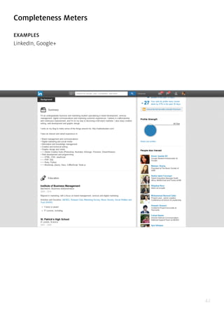
- 43. 43 PROBLEM The user wants to know how far they have come in completing a particular goal. SOLUTION Provide the user with a visual representation of their progress towards a goal. Most often this is shown as a percentage that quantifies how far they’ve come and how far they have to go to reach “100%”. The goal in question could be an arbitrary one aimed to increase engagement with the app or elicit particular actions such as get- ting more personal information to build a richer user experience, linking other acco- unts, inviting other users, sharing on social media, and so forth. For example, Lin- kedIn provides users with a profile “Strength Meter” that fills up as they add more information and sections to their profile. Combined with the Next Steps pattern to provide users with linked actions gives users a clear indication of what they need to do next to complete their end of the deal, making their interaction even more fric- tionless.
- 45. 45 PROBLEM The user wants to know the impact of their actions. SOLUTION Use language and statistics to show context around a user’s actions. There are se- veral important contexts the user needs to be aware of, for example the time or effort it will take to complete a certain action, what it will impact and whether it is time-sensitive. Booking.com pulls this off by adding a notification that informs the user when the last booking was made in the hotel they’re looking at, as well as how many people are currently viewing it, to give the user an indication of how much in demand the hotel is. Quora achieves the same effect by making a note of how many people are “waiting for an answer” by following a question, enticing the user to sub- mit an answer. Spotify and Amazon on the other hand provide context around their recommendations which are based on data collected from multiple users.
- 47. 47 PROBLEM The user wants to quickly complete certain tasks. SOLUTION Add shortcuts and hotkeys to your app that allow users to perform certain actions quickly using their keyboard instead of navigating with the mouse to press a button. This comes in especially handy for repetitive tasks, for example navigating through emails or handling tasks in Asana. While keyboard shortcuts are generally seen only as an accessibility feature, the added usability is helpful across the board for all users and can significantly improve the UX for advanced users. The problem with keyboard shortcuts however is that not everyone can remember them. Gmail solves this by showing a glossary when the user presses Ctrl+?; Dropbox does the same except with Ctrl+/, while Asana shows essential combinations across the bottom of the screen.
- 48. 48 Drag-and-Drop Actions EXAMPLES Google Drive, Dropbox, Asana
- 49. 49
- 50. 50 PROBLEM The user wants to quickly and naturally perform an action on a website using re- levant content or objects. SOLUTION Allow users to interact with content or objects through direct manipulation such as dragging-and-dropping. This action can be used for rearranging items as in Google Drive or Asana, and it can also be used for initiating file uploads. This translates the dragging patterns built in to OS interactions to the web much like the Draggable Content pattern. For example, when uploading a file, the user would usually switch from the file explorer to the browser’s upload window. This pattern replaces the clumsiness with a more seamless transition, letting users select and drop any num- ber of files into the browser window to upload it without having to click through file hierarchies to find and upload a file. Google Drive clearly indicates that it can ac- cept a dropped file by drawing an animated overlay over the page’s regular content. Dropbox, however, only indicates this with a border around the window and a small notification. Depending on your target users, though, it may be best to create an
- 51. 51 obvious indication rather than risk confusion. Asana and many other web applica- tions also let you upload files by dragging-and-dropping.
- 52. 52 Default Values & Autocomplete EXAMPLES YouTube, Amazon, Airbnb, Foursquare
- 53. 53
- 54. 54 PROBLEM The user wants to complete actions quickly. SOLUTION Anticipate frequently selected items and make data entry easier for the user by providing them with pre-populated default values or prompts based on suggestions and previously entered data. The UI can automatically adapt to smart defaults and input fields can be prefilled with the most common data. YouTube for example au- tomatically sets the language and region based on where the user is browsing from - this can be changed easily with controls at the bottom of the page, but most users will never need to even think about it. This can be paired with autocomplete functionality like in Google search, which significantly speeds up the user’s actions but also serves as hints or guides for users who want to explore a topic or theme. Google also prefills the country and phone number country code based on the user’s location, letting users skip a couple of steps. Twitter speeds things up by placing links to matched profiles in the search box so that the user can skip an interstitial search results page and go to the profile directly. This pattern can be particularly useful in standardizing user input and anti- cipating problems before they occur.
- 55. 55 Immersion (or “Lazy Signups”) EXAMPLES Stack Overflow, Airbnb, Ebay, Yelp
- 56. 56
- 57. 57
- 58. 58 PROBLEM The user wants to try things out before making a commitment. SOLUTION More applications are letting users immediately immerse themselves in an app be- fore anything else — even signing up or logging in. Remember, they can only do one thing at a time, and have limited time to test every new product out. With the growing specialization of web apps, it’s increasingly im- portant that you find quality user or customer leads before nurturing them — they may hate your product or quickly realize it’s not what they wanted. Asking users for the information you need to register their accounts can be a tough ask, and lower signup conversion rates even for qualified visitors. On a positive note, by letting them immediately experience your product, they may get more hooked because of how deeply they were able to explore the app on the first experience. This can work better than the onboarding walkthrough UI pattern we cover next, because it shows the user instead of telling them how things work.
- 59. 59 AirBnb allows you to browse through different living spaces and even create a li- sting before requiring sign up. SoundCloud allows people to listen to other people’s mashups/remixes without requiring sign up and Yelp lets users write reviews before asking for a login. This creates a much more welcoming environment for a large audience of music lovers who can enjoy listening to unique remixes of their favo- rite songs, while generating an attractive platform for current and future members who want to upload and share their own music with the largest population possible. Oftentimes, registration comes with an added benefit which makes it more attracti- ve. Late registrations may not always be a good idea, but the option to “try-before- -you-register” can be a great way to increase engagement with your app.
- 61. 61 PROBLEM The user wants an easier way of signing up and logging in. SOLUTION Integrate social sign-in methods that allow users to login through their existing accounts. This means they have one less username/password combination to wor- ry about, and at the same time, you don’t have to worry about password security as much. Facebook, Twitter and Google are the major OAuth login providers and depending on the platform and target audience, you can implement all or either of these in your app instead of having users set up a separate account that they may or may not end up using in the future. Using this signup and login pattern can also provide you with some basic data about the user (which feeds into data auto-po- pulation as they use the application), all the while making it easier on them by not forcing them to type their details into the strange new app they just downloaded. This simple feature can go a long way in drastically improving your UX, and no won- der this pattern is well on its way to becoming an expectation.
- 63. 63 PROBLEM The user wants to know about new activity or actions they should take at a glance. SOLUTION Highlight recent activity by visually marking new content. There are several imple- mentations of this pattern. Placing a small numbered badge on the menu label was popularized by iOS but can be seen seeping into web interfaces as well with many other web apps now like in LinkedIn, Facebook or Quora. Twitter does this as well but also highlights the label with a dot to indicate new activity in a more subtle way. Another way to display notifications is with a banner or other element in the page to get the user’s attention.
- 65. 65
- 66. 66 PROBLEM The user wants quick access to controls that are secondary or only relevant to speci- fic sections or content on the web page. SOLUTION Clear up the clutter and let users discover particular actions only when they need them. Users can usually access these invisible controls by either hovering over spe- cific sections or content on the web page or scrolling through the website. This allows for certain actions to stay off-screen until it makes sense to use them, sa- ving valuable real estate and offering a cleaner user interface. Individual settings for items in the Timeline on Facebook can be “discovered” behind a subtle triangle menu. Spotify uses a click-and-hold action to let users preview songs or playlists while browsing.
- 68. 68
- 69. 69 PROBLEM The user wants to focus on the content instead of sacrificing screen real estate to controls. SOLUTION Design controls that expand when the user clicks on them. This keeps these contro- ls out of the way until the user needs them. For example, Quartz conserves screen space by hiding the search bar behind an icon that expands into a search bar when the user clicks on it. Facebook collapses the comments sections on most posts in the Timeline until the user explicitly clicks on the Comment link. Another way of conserving screenspace is to have the input fields automatically expand to accom- modate larger amounts of text. The Facebook comments field enlarges itself depen- ding on how much text you write, but by default it is a single line. Similarly, Quora hides the WYSIWYG editor and only shows a plain text box until the user clicks on it.
- 70. 70 Undo EXAMPLES Gmail, Google Calendar, Asana, Facebook
- 71. 71
- 72. 72 PROBLEM The user wants to take actions quickly without interruptions (ex: confirmations) but with the option of reverting accidental actions. SOLUTION Provide an easy way for users to undo their actions instead of just asking them to confirm beforehand. Situations where an action can cause inconvenience or loss of data if done by accident or in haste, for example deleting an email or editing some text. The user may have completed an action because they didn’t know what to expect; a forgiving UI that let’s them experiment can be more engaging and friendly. The ability to undo is also great for power users, who will appreciate feeling more in control without the UI holding their hand throughout the process repeatedly asking if they’re sure they want to proceed. A confirmation popup can be useful at expla- ining what’s about to happen, but users may not understand the implications until they see the result of their action. Not to mention the time it saves. In cases like these it’s best to get out of the way while providing a safety net in case of mistakes. Allowing users to edit their input is another way of giving users a chance to “undo” their actions.
- 73. 73 4 Navigation
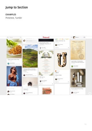
- 74. 74 Jump to Section EXAMPLES Pinterest, Tumblr
- 75. 75 PROBLEM The user wants to jump through whole sections of a web app or content quickly. SOLUTION Create a shortcut button or hot spot that takes users directly to a certain part of a web app, typically beginning or end but more commonly other specific points. For example, users can click a tab or button to scroll to the top of the page from where- ver they are. This comes in handy especially if you’re also implementing the Infinite Scroll pattern and the page can get really long as new content is loaded one after the other. If users want to access controls or information that is only visible at the top of the page, returning there after several pages worth of scrolling can be a ni- ghtmare. Pinterest solves this user headache by showing an unobtrusive “jump-to- -top” button that instantly scrolls the user back.
- 76. 76 Single-Page Web Apps EXAMPLES Gmail, Asana, Twitter, Spotify
- 77. 77
- 78. 78 PROBLEM The user wants a central place to view or take actions on most or all content so they don’t have to waste time navigating between pages. SOLUTION Use modern web development techniques to build a single-page app that doesn’t need to reload itself as the user browses through it. This pattern is more of a com- plete restructuring of how the web works rather than something you can hack into your app afterwards. In a way, the “page in a single-page app isn’t really a page in the traditional web sense, rather it’s more of a particular data view. Single-page web apps load asynchronously (using AJAX), in that they perform instantly witho- ut the user having to wait for separate pages to load between operations. Gmail is a good example of a single-page app that integrates multiple actions into a single “page”. The trend of single-page designs is a less-hardcore implementation of this UI pattern, where all content can be accessed on the same page. This makes brow- sing much faster and responsive, blurring the line between desktop and web apps. For web apps like Spotify, the single-page app pattern becomes essential when you
- 79. 79 consider that the user might play music in the background but also browse thro- ugh more music at the same time; having a single-page app eliminates the need for a page reload, so the music can keep playing. One considerations you’ll need to make when implementing a single-page app is the URL structure. Because content is loaded dynamically using JavaScript, URLs can become useless and accessing a particular view can become impossible if not done right. Web apps like Gmail and Twitter overcome this by explicitly generating unique URLs for each view, which also solves the problem of the browser’s Back button becoming unusable.
- 81. 81
- 82. 82 PROBLEM The user wants to know which content to view. SOLUTION Show content suggestions and recommendations at various points to help the user browse through your content. Using the information from the user’s profile prefe- rences or their past interactions in the app, Facebook, Eventbrite, Spotify and Yelp among many others generate tailored recommendations for their users to help them discover new and related content or connections. These recommendations can come in the form of “popular” or “recently posted” items. Facebook provides “related” pages based on the user’s interactions with posts in their timeline as well as a more dedicated recommendations section where users can discover new pages and people to follow. The stream of content available to users can be endless espe- cially in social web apps that feature user-generated content; providing a robust recommendations engine in the UI can be a great way to help them discover new content.
- 83. 83 Related Content EXAMPLES IMDb, Facebook, New York Times, Airbnb
- 84. 84
- 85. 85 PROBLEM The user wants to browse similar content if the current content isn’t exactly what they’re looking for or they simply want more. SOLUTION Show similar or related content to help the user find more items that are similar to what they’re currently viewing. Like Recommendations, this is becoming an es- sential UI pattern for web apps that feature user-generated content, except rather than tailoring the suggestions based on the user’s preferences or previous activity, Related Content is more about showing related items based on the way they are categorized and tagged. Amazon, TIME and New York Times are good examples of sites that show items and stories similar to the one currently being viewed. Medium takes this a step further by allowing readers to suggest related content by adding a link to the article’s Further Reading section.
- 87. 87 PROBLEM The user wants to know what next steps to take after finishing a task. SOLUTION Give the user a clear list of next steps that they can follow to enrich their experien- ce. Quora for example creates a to-do list for users to follow to complete their pro- file. LinkedIn does the same by showing a list of sections the user can add to their profile, pairing it with the Completeness Meter pattern to provide users with an incentive. Most complex web apps have multiple user flows, so providing users with a to-do list can be a great way of guiding them along. Another pattern this can be paired well with is Related Content; Medium does this well, by showing the teaser for another article when the user reaches the end of the current one. This keeps the user engaged and immersed in your UI.
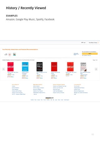
- 88. 88 History / Recently Viewed EXAMPLES Amazon, Google Play Music, Spotify, Facebook
- 89. 89
- 90. 90 PROBLEM The user wants to recall what they interacted with last. SOLUTION Let users pick up activities where they last left off. For example, Amazon keeps track of the user’s browsing history and shows recently viewed items so that they can get back to them easily if need be. Many web apps also keep track of what the user has been doing and the Facebook Timeline is the ultimate example of this. Not only does a user’s Timeline record posts made and photos uploaded, it also logs interac- tions with other pages and 3rd-party web apps like Spotify in an interactive history that the user can refer back to whenever needed. Google Play Music and Spotify keep track of recently played songs. This pattern helps users keep track of content they’ve interacted with and can also serve as a way of bookmarking things to do later.
- 91. 91 Featured Content EXAMPLES Airbnb, Etsy, Facebook, Flickr
- 92. 92
- 93. 93 PROBLEM The user wants to know what kind of content can be created with the app. SOLUTION Feature specific content front-and-center for users without it getting lost in the mix of often time-related content. This content could be paid, popular, new, or some other important variable. Featured content serves to show users the possibilities and helps them understand what the platform can accomplish as well as the things other users are using it for. Sites like Airbnb, Etsy and Flickr show random content on the front page that helps users explore the site without having to make a com- mitment beforehand, as well as encourages existing users by helping them reach greater audiences. On the other hand, it can also help particular pieces of content gain traction by giving it particular importance. Paid or “featured” content can be marked as such to clarify expectations.
- 94. 94 Infinite Scroll EXAMPLES Pinterest, Facebook, Twitter, Tumblr
- 95. 95
- 96. 96 PROBLEM The user wants to browse through all content. SOLUTION Automatically load the next set or page of content when the user reaches the bot- tom of the current page, creating the effect of an infinite scrolling page. This way new content is automatically loaded and the user does not have to wait after clic- king on a “next page” link. Infinite scrolling works best when there is a lot of content to show, as with most social media giants like Facebook, Twitter, Pinterest and Tum- blr among others. However while its great for browsing content, especially multi- media galleries, two basic problems are that users can become disoriented and lose their place. If they want to skip to a particular point or bookmark to come back later, infinite scroll can cause problems. Facebook works around this when browsing a Ti- meline by creating a pagination/infinite scroll hybrid that lets you jump to a particu- lar month or year. Pinterest integrates the Scroll to Top pattern, with a small button that lets users jump back to the start of the page.
- 97. 97 Walkthroughs & Coach Marks EXAMPLES Google+, Slack, Tumblr, Facebook
- 98. 98
- 99. 99 PROBLEM The user wants to know how to use the different features of the application. SOLUTION Design a walkthrough or tutorial that demonstrates how each function works. A lot of web apps have begun using this technique to show users around when they first launch and there are two basic ways of doing this. Some web apps, like Slack go the route of overlay instructions, highlighting important parts of the UI with “coach marks” to explain what they do. Slack takes things to the next level by integrating a chat bot that helps users set up their profile. This makes perfect sense given that Slack is a chat app, and the “Slackbot” walks the users through filling in their profile information like phone number and display name like a conversation. Alternatively, Tumblr presents a walkthrough to help the user get acquainted. This walkthrough is also a great time to collect important information that goes beyond simple registra- tions, much like a setup wizard. The importance of this pattern cannot be stressed enough for any application that isn’t immediately intuitive because the more a user knows about your product, the more reasons they’ll have to come back.
- 100. 100 Overflow Menus EXAMPLES Facebook, Spotify, Google, Pinterest
- 101. 101
- 102. 102 PROBLEM The user want quick access to additional options or actions they can perform. SOLUTION Hide extra options and buttons in an expandable menu so that they don’t clutter the main interface. Both Facebook and Google use “overflow menus” to maintain very clean user interfaces on their web apps by hiding the most important secondary options in an expandable menu. This can also be used to show the most important actions in terms of engagement. For example Pinterest keeps a share on Facebook button visible to help speed up a common and desirable user action on each “pin”. Alternatively, an overflow menu can be used to contain additional menu items or actions as they are incrementally added to the UI.
- 104. 104
- 105. 105 PROBLEM The user wants to perform different types of actions, but there’s limited screen real estate to show all these controls. SOLUTION Replace buttons and on-screen controls with alternative functionality. Depending on what the user is currently doing, the UI could entirely replace an element with another, e.g. “do” and “undo” or “add” and “delete.” This makes sense when the alternating actions are related in some way. Pinterest and Facebook use the same button for “like”/”unlike” to save space and also indicate the current state to the user. This UI design pattern saves real estate, makes undoing any action quick and clean, and is an overall playful solution.
- 106. 106 “Sticky” Fixed Navigation EXAMPLES Houzz, Facebook
- 107. 107
- 108. 108 PROBLEM The user wants to have access to the menus anytime while on the web page. SOLUTION The top, side, or bottom navigation stays in place while a page is scrolled. In some cases, headings from sub-sections may also become fixed while scrolling and repla- ce or be appended to the existing fixed navigation. The main navigation bar for both Google Plus and Pinterest sticks to the top of the page, allowing users to quickly access those menu items and filters whenever they need to. When paired with the Infinite Scroll pattern, a sticky navigation menu can be a great convenience for users who scroll past more than the first page’s worth of content.
- 110. 110 PROBLEM The user needs a way to navigate between different sections of the app, but there’s limited space to show this information. SOLUTION Important sections of the UI can be presented in a list, which the user can scroll through to get what they want. This also leaves the header and footer of the UI free for more “universal” navigation, such as action bars. Traditionally, most navigation patterns have been horizontal in the form of tabs or buttons. The vertical navigation pattern has emerged as a significant evolution to navigational design to deal with user-generated content like user timelines and infinite scrolling content.
- 112. 112 PROBLEM The user wants to view relevant information without losing their current place in the UI. SOLUTION Show important notifications and additional information in popovers. This UI pat- tern has the advantage of providing a lightweight and straightforward way of vie- wing additional information or taking a particular action, but they do so without pulling the user out of their current activity. Pinterest and Fitocracy use modal popo- vers for quick actions, and Facebook uses popovers to quickly show snippets of con- tent from the Activity Bar. The popover UI pattern is important for actions like these because they are being performed on the data and this way users always know what these controls apply to. With the content still visible in the background, the user can tweak sorting options or change the font size without having to go back and forth between the views - it all happens right there. Popovers and modal windows can also be used to display important notifications or notices where it’s essential to get the user’s attention because dismissing them requires a tap or swipe.
- 113. 113 Slideouts, Sidebars & Drawers EXAMPLES Spotify, Medium, New York Times, Pinterest
- 114. 114
- 115. 115 PROBLEM The user needs a way to navigate between different sections of the app without be- ing distracted in each individual section. SOLUTION A secondary section of the application – such as navigation, chat, settings, user profiles, etc. – is tucked away in a collapsible panel hidden under the main section when it is not needed. When accessed, it usually either moves the main section aside or slides over it. Since the slideout is in a separate layer from the main content in the application, there’s a lot of flexibility in terms of how content can be laid out inside the drawer - icons, text, and even simple controls are viable options to pro- vide quick access to important actions here. Often times, the drawer can be hidden under a “hamburger menu” or a simple arrow that indicates there’s more content there. It’s an easy way to hide all the less important things in a “side drawer” so that you only have to focus on how to distill the most important information in each view. Examples can be found everywhere. Asana, Spotify (search box), and Facebo- ok (chat boxes). Some more specific examples include Houzz, which has a sub-navi-
- 116. 116 gation drawer that disappears as you scroll down and reappears back at the top; and the New York Times, which hides a side drawer that appears on the left when the user clicks the ‘sections’ button at the top left side of the page. As you scroll down in Pinterest, an up-arrow button appears for easy navigation back to the top, and in its ‘How It Works’ page.
- 117. 117 Links to Everything EXAMPLES Spotify, Asana
- 118. 118 PROBLEM The user needs a consistent way of navigating through content without being distracted by additional content. SOLUTION Most or all user content within the app is linked, giving users the freedom to explo- re and find the exact information they’re looking for without hitting dead-ends or being distracted by a litany of hyperlinked text, additional buttons, calls to action, etc. that you would normally see on a website. If they want to interact with a piece of content in the app, odds are that they can tap on it and go to a new view for a more detailed experience. Content-heavy web apps like Asana and Spotify let users explore all kinds of content by clicking on it, for example clicking on an artist or user takes you to their profile, items can be clicked on, table heads can be clicked on to sort and many other actions.
- 119. 119 5 Social
- 120. 120 Achievements & Badges EXAMPLES Codecademy, Stackoverflow
- 121. 121 PROBLEM The user wants incremental encouragement and a general sense of progress SOLUTION Build gamification into the user’s interactions with the website. Apart from the regular user interactions like listening to a song or posting an update on a social network, many sites also want to encourage users to complete their profile infor- mation or interact more frequently with the app. In these cases it makes sense to provide some incentive to the user so that this extra step appeals to them. Gamifica- tion is one of the most popular ways of doing this, and like the Completeness Meter pattern discussed earlier it can be a great way of increasing user engagement. Ga- mification applies the mechanics that hook gamers in order to make the users more engaged on the site. A gamified app is characterized by rewards the user receives as they move through different stages of the “game”. For example users of Codeca- demy receive points and badges as they complete different tutorials. Stackoverflow and Quora implement the same and provide users with points that can be used to unlock additional features like asking targeted questions or contributing to protec- ted questions.
- 123. 123
- 124. 124 PROBLEM The user wants to easily share their activity with their social networks. SOLUTION Build and option that lets users automatically share particular interactions with their social networks. A lot of web apps like Tumblr, Spotify and Vimeo are building gra- nular sharing settings which allow users to automatically post updates to their ne- tworks based on their activity. These updates can be posted within the app or even shared with external social channels like Facebook or Twitter. Not only does this help the user engage with their friends and family in everyday activities like liste- ning to a song or reading an article on an external website, its also a great way to build awareness and engagement with the app itself. For interactions like uploading a photo to Carousel or a video to Vimeo, this pattern makes it even easier for users by eliminating an extra step in the process which they are most likely going to take regardless.
- 125. 125 Activity Feeds EXAMPLES Quora, Medium, Vimeo, Facebook
- 126. 126
- 127. 127 PROBLEM The user wants to keep up with what’s happening around them and get quick upda- tes on recent activity. SOLUTION Show recent activity that’s relevant to the user within the app. Aside from the obvio- us Facebook or Twitter news feeds, other web apps that contain an element of so- cial interaction, like Quora or Medium have implemented activity feeds that provide users with an overview of recent activity from their friends or people they follow. The activity stream can be used to aggregate recent actions by an individual user, commonly used on profile pages; more commonly however, activity feeds are used to aggregate multiple users from the perspective of one user. These feeds are extre- mely useful in demonstrating different features of the UI by showing how other users are interacting with it, and in this also plays a great word-of-mouth role.
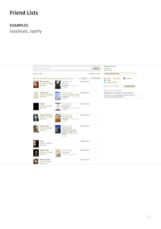
- 129. 129 PROBLEM The user wants to keep track of and engage a subset of their friends on the site. SOLUTION Show all the user’s connections or friends in a list. Spotify and Airbnb are part of the growing number of web apps that give you friend lists which can be used to help users engage with the app in a better way by keeping up with how people they know are using the app. Combined with the Follow pattern which we discuss next, a friend list gives users an easy way to keep track of this information, which comes in handy to give some social proof to content that the users are interacting with. Friend lists also come in handy when the users want to control who they share with. Whether it’s one-on-one communication or keeping track of someone’s tastes and preferences, the way users explore their blossoming friend groups will become in- creasingly contextual, requiring friends to become a more integral part of the con- tent-consumption experience.
- 130. 130 Follow EXAMPLES Google+, Quora, Pinterest, Spotify
- 131. 131
- 132. 132 PROBLEM The user wants to track and keep up to date with activity on topics or themes, not just people. SOLUTION Let users select items that they want to stay up to date with. Aside from the purely social web apps like Twitter, Pinterest and Spotify let you select friends, channels or artists that you want to keep track of, and updates are shown in the user’s newsfe- ed. Whether you have friends or not, there’s endless user-generated content to keep you busy. Users can gain access to a lot of varied content by “following” the activities and recommendations of other users and this pattern allows them to do so without having to worry about how many of their actual friends are using the app. Content shared with followers on sites like Google+ and Pinterest makes the content curation community possible and users can choose to follow topics, events, themes or even people to get fresh content built by and around the channel being followed. For the same reason friend lists will become an increasingly important UI design pattern, so will following.
- 133. 133 Vote to Promote EXAMPLES Medium, Reddit, Stackoverflow, Quora
- 134. 134
- 135. 135 PROBLEM The user wants to endorse and share content they like. SOLUTION Let users participate in content curation by designing a voting system, where con- tent they like can be promoted. The idea of crowd-sourced content curation was popularized by the likes of Digg and Reddit, and today we see almost every app that has user generated content integrate this pattern to bring up the best from the rest. On Reddit, Stackoverflow and Quora, users can vote on content created by other users. Not only does this create a history of what the user has upvoted or downvo- ted (see History pattern), it also gives users a way of popularizing content and like on Medium, publicly associate themselves with something they enjoyed.
- 136. 136 Pay To Promote EXAMPLES Quora, OKCupid, Facebook, Stackoverflow
- 137. 137
- 138. 138 PROBLEM The user wants to highlight certain content above the regular content feed. SOLUTION Let users pay to to promote their content. On sites like Quora and Facebook, users can give their posts a boost by paying a certain amount that gives them greater visibility in the content feed above the regular non-paid content. OKCupid allows users to give their profile a boost in views and LinkedIn does the same albeit as part of the paid membership plan rather than by individual content like in Facebook. This form of native advertising can be a great way of allowing users to gain traction and greater visibility while maintaining the user’s experience in the platform.
- 140. 140 PROBLEM The user wants to send private messages to their friends from within the system. SOLUTION Allow users to interact with each other in private messages alongside their other interactions. Instagram and many other web apps offer chat or direct messaging as an integral part of their experience. Private chat UI design patterns will continue to blossom across many web apps, not just traditional “social networks” now that users are finally comfortable sharing more private things online and they have substantial breadth in the content they’re generating online.
- 142. 142 PROBLEM The user wants to rate content in a simple way without having to worry about the degrees to which they like it. SOLUTION Simplify rating controls by making them binary choices - the user either likes it or dislikes it. Eliminating the fine-grain of stars and rating scores, this makes rating things easier for users as well as interpreting them. If I liked a video, should I rate it 4 stars or go all the way with 5 stars? YouTube and almost every application lets you like (or even dislike) everything in a binary way instead. A lot of web apps provide a way of showing appreciation by simply “liking” or “hearting” content.
- 143. 143 Find & Invite Friends EXAMPLES Pinterest, Airbnb
- 144. 144 PROBLEM The user wants to experience the application with their friends. SOLUTION Make the invitation process simple and easy to complete. Since word-of-mouth and referrals are a huge driver of growth especially in consumer applications, you’ll see this UI design pattern proliferate and evolve even more. Providing users with a way of connecting with and sharing the app with friends also gives them a better, more immersive experience even if just in terms of more content. The invite feature can be built into the onboarding pattern or even as the empty state design, both of which we’ve covered earlier.
- 145. 145 6 Data & Content Management
- 146. 146 Favorites & Bookmarks EXAMPLES Airbnb, Gmail, Facebook, Medium
- 147. 147
- 148. 148 PROBLEM The user wants to save and highlight content they like. SOLUTION Let users save and bookmark content for their reference. This UI pattern is more about personal organization rather than promoting content, and many web apps like Facebook, Gmail and Airbnb let users “star”, “favorite”, “save” or “bookmark” content privately, giving the user a way to come back to any place in the app that they might need later. As opposed to liking or sharing content that tends to get lost in the timeline as the user’s activity progresses, Favorites and Bookmarks can be used to mark content that the user would need to come back to, for example ne- ighborhoods a user is researching in Airbnb or a particular email that the user wants to mark as important. This UI pattern gives users a private way of highlighting im- portant content as opposed to taking an action on it like sharing or liking it.
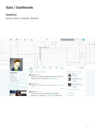
- 149. 149 Stats / Dashboards EXAMPLES Twitter, Quora, LinkedIn, Medium
- 150. 150
- 151. 151 PROBLEM The user wants to easily keep track of their activity and status. SOLUTION Present important information and statistics to summarize user activity and status in terms of numbers. Twitter and Quora show users the number of followers and tweets or answers they have for an indication of activity. While some web apps only show number of likes, shares or followers, others like Medium, LinkedIn and Quora also show users more detailed statistics about their activity using Dashboards that used to be limited to business applications. With the extensive tracking and analy- tics data available for user interactions, this pattern will become even more popular as users want to track their activity on the system and even analyze how they’re doing in comparison to others.
- 153. 153
- 154. 154 PROBLEM The user wants to interact with content in different ways based on the context without having to take additional actions. SOLUTION Change the state of content based on other settings in the application or it’s sizing, positioning, or other attribute. For example, you can auto-play multimedia content as the user scrolls past. This makes the consumption of user content much smo- other by eliminating the step where users stop and hit the play button. In terms of making things easier for users, this pattern makes sense but at the same time it is worth considering the annoyance it can cause. For that reason alone, this pattern is worth considering only for sites and networks that feature a lot of multimedia user-generated content where the user is browsing with the explicit intention of consuming that media. The user would probably not browse through a Vine timeline for any other reason than to watch the videos, so it makes sense. Facebook’s imple- mentation is a little suspect for the same reason.
- 155. 155 Hover Controls EXAMPLES Pinterest, Facebook, Stack Overflow, Pocket
- 156. 156
- 157. 157
- 158. 158
- 159. 159 PROBLEM The user wants to have access to controls without cluttering the content view. SOLUTION Hide actions and control buttons until a user hovers over the item they relate to. It’s always good to give the user complete control over content, but when an interface has a lot that can be acted upon, each button steals focus away from the content. This UI pattern hides these contextual controls until the user hovers over the con- tent with their mouse, keeping them out of the way until needed. Pinterest puts all focus on the photos, so the “heart”, “send” and “pin” buttons are invisible until you hover over the photo. This fits well with the modular cards UI pattern; since the but- tons appear over the image itself, there’s no confusion about which item they will act upon.
- 160. 160 Context Menus EXAMPLES Google Drive, Dropbox, Medium, Quora
- 161. 161
- 162. 162 PROBLEM The user wants to have access to controls without cluttering the content view. SOLUTION Put contextual action buttons in a menu that pops up when the user selects an item or right-clicks somewhere in the UI. A context menu opens up to show essential ac- tions that can be taken in the current view or upon the selected content. This makes things faster for users. Instead of having to scroll up to a toolbar, users can simply perform their desired action in place. The traditional context menu is triggered by a right click, and applications like Word Online, Google Drive, Evernote and Dropbox that emulate a desktop UI use them mostly for CRUD controls. Another implemen- tation of context menus is a menu that pops up when users select text on the page. Medium puts the “notes” button and “share as a tweet” button behind this kind of context menu, and Quora puts an option to quote the text in an answer.
- 164. 164 Problem The user wants to add formatted text and preview what their content looks like without having to worry about markup languages. SOLUTION Implement a WYSIWYG text editor that lets users format their entered text without having to go into Markdown formatting or HTML code. This gives users a clear pre- view of how their content will look once published and can be a great way of lowe- ring the barrier of entry for novice users. In the spirit of direct manipulation, this pattern is widely implemented in most blogging and email web apps, allowing users to edit and preview formatted multimedia content as they would in a text editor on their desktop.
- 166. 166 PROBLEM The user wants to protect their data and continue working without having to re- member to do so. SOLUTION Prevent accidental data loss by implementing an autosave feature in your app. Gma- il and Google Docs does this flawlessly, auto-saving your work every few seconds and preventing any “oh, no!” moments. The autosave pattern is an unobtrusive way of doing that without forcing the user to remember to save every few minu- tes. Browser crashes, power or connection failures, or even accidentally closing the browser tab are major annoyances that can be soothed when the user is assured that their work hasn’t been lost. With cheap data storage and other UI patterns like User History, it makes sense to preemptively save user data rather than risk losing it by mistake. Of course there needs to be a clear indication that the app is autosa- ving, and perhaps even an additional “Save” button to provide a greater feeling of control.
- 167. 167 Lightbox Photo Slideshows EXAMPLES Facebook, Pinterest
- 168. 168 PROBLEM The user wants to browse through multimedia content. SOLUTION Show multimedia content in a lightbox overlay. This modal window creates focus on the image or video content and breaks it free from the confines of the page’s design. It also puts users in a better position to simply browse through the gallery without being distracted with the surrounding “chrome” in the page. Most imple- mentations of this pattern also dim the background page behind the modal window and that prevents the user from losing their place in the main content view. This can come in handy particularly when paired with an infinite scroll pattern, as in Facebook and Pinterest. It’s faster than loading a new page for each image and also preserves the user’s flow when the want to back out of the multimedia gallery. For photo galleries, a modal lightbox slideshow is an essential UI pattern.
- 170. 170 PROBLEM The user wants to focus on content instead of being distracted with the UI. SOLUTION Design a full-screen mode that hides or minimizes the UI clutter around content. This helps users focus on what matters, rather than being distracted by the clutter of the UI. While multimedia web apps like YouTube and Vimeo let users view videos in full-screen mode, other web apps like Medium and Facebook are using the full- -screen concept to eliminate unnecessary “chrome” when the user wants to per- form particular actions. For example Facebook lets users browse photo albums in a Lightbox Photo Slideshow, which is another pattern that we cover, but this expands to the entire screen. Medium removes all distractions when the user is writing, ef- fectively achieving the same immersive effect as an otherwise traditional full-screen mode.
- 172. 172 Problem The user wants to know which items within a content view they can interact with in further detail. SOLUTION Layer interactive items to provide an “augmented reality” approach to your content. Yelp and Airbnb provide classic examples of this pattern: Next to the search results for different locations, these sites include a map that highlights each search result with a corresponding location ‘bubble.’ When users hover over the search result, the corresponding location bubble in the map becomes highlighted so that users can immediately see where each result is located. Additionally, users can interact with the map itself, e.g. by dragging to different locations - both Airbnb and Yelp have a ‘Search when map is moved button’ that automatically shows new location bubbles in the new areas of the map.
- 173. 173 Maps As Backgrounds EXAMPLES Airbnb, Foursquare
- 174. 174 PROBLEM The user wants to spatially place content on a map to see what’s going on around them. SOLUTION Provide maps as backgrounds when the user is browsing for information that’s local in nature. Web apps like Foursquare and Airbnb layer their listings onto the map view, transforming the user’s search and browsing activities into an immersi- ve experience. This makes sense for most location-based web apps which provide users information about localized content because it helps them place it according their own location on a map in a way that’s more intuitive than just browsing a list.
- 175. 175 Group Friends & Content EXAMPLES Google+, Facebook, Google Play Music, Ebay
- 176. 176
- 177. 177 Problem The user wants to organize content according to their own groupings. SOLUTION Allow users to sort and organize friends and followers inside the app. Google+ and Facebook among others allow users to group friends and content alike. Besides allowing users to sort their friends, web apps like Google Play Music and Ebay allow for content to be categorized into playlists and collections that not only help them organize the huge amounts of user-generated content for their own convenience, but also create a way for them to share these collections with their friends and fol- lowers. As content of all forms – including friend profiles – continues to proliferate, the ability for users to curate and organize things in a way that makes sense to them becomes more important.
- 179. 179
- 180. 180 PROBLEM The user wants content to be organized. SOLUTION Show snippets of content in a grid. Spotify and Google+ present all their content in a grid, as do Pinterest and Digg, effectively separating each item from the other whi- le maintaining a structure. Grids are a great alternative to the simple list views and work extremely well for content that can be represented visually, making it much more enjoyable for users to scroll through lots of content. Other sites that are con- tent heavy, like NY Times or CNN can also benefit from a grid layout to help provide some visual structure to the various pieces of content. Some like Pocket and Gro- upon also allow users to toggle between the grid and list views depending on their preferences.
- 181. 181 Cards EXAMPLES Twitter, Asana, Pinterest, Google+
- 182. 182
- 183. 183 PROBLEM The user wants to browse through content quickly and interact with it, without the detail views cluttering up the UI. SOLUTION Present snippets of information in bite-sized cards that can be manipulated to show more information if the user wants it. Popularized by the likes of Pinterest to show large image thumbnails in a compact layout, we see “card” views now being imple- mented in a variety of web apps beyond video and photo galleries on the web, and often this is combined with a Grid pattern. This pattern works best for “modules” of data that can be viewed or manipulated individually, like posts on Tumblr or Fa- cebook. Cards are a way to allow users to browse and discover all kinds of content in a more engaging way while accommodating responsive design trends, as well as social feed patterns.
- 185. 185 PROBLEM The user wants quick access secondary information that’s not usually necessary to show. SOLUTION Hide contextual information that’s not essential behind the UI but make it acces- sible for power users. Medium hides comments behind a number, subtly showing users that there’s additional information available. This keeps the user’s focus on the primary content without distracting them with extra clutter in the UI. As users become familiar with the system, the visual shortcuts become easier to spot. Go- ogle+ achieves the same effect by hiding multiple tags on each post and marking it with a colored bar to indicate extra tags other than the first one that is always visi- ble.
- 186. 186 Empty States EXAMPLES Airbnb, Pinterest, Tumblr, Spotify
- 187. 187
- 188. 188 PROBLEM The user needs to know why a section of the application is empty and what to do next. SOLUTION Make sure your UI provides a good first impression by designing for the “blank state,” that is the condition when there is no user data. This is the natural state of your UI and the first thing a user sees. It is also the point where many users decide whether its worth it to continue, so designing the empty state is very important. This is a great place to show some examples that will help users get started or sim- ply to show them instructions on how to proceed. Airbnb shows a mockup of how a particular section would look like once it’s populated by the user’s content, while Pinterest takes the opportunity to guide the user through what next steps they sho- uld take; other sites like Tumblr and Medium give users hints on what the empty area is and what it should be once the user takes a certain action.
- 189. 189 Direct Manipulation of Content & Data EXAMPLES Asana, Medium
- 190. 190 PROBLEM The user wants to interact with entered content or data in a direct and intuitive way. SOLUTION Allow for content to be edited directly without having to transition between editing or deleting modes. Letting users work with data directly on the screen can make your UI more engaging by eliminating the extra layer of interaction provided by a button or context menu. Instead of selecting the item and then toggling between individual CRUD (Create, Read, Update, Delete) states, users of Asana for example can directly tap on task names to edit or delete them. Other sites like Tumblr and Medium follow the same principle however they do include a toggle which moves the user into an editing mode. This pattern is an alternative to the WYSIWYG pattern discussed earlier but goes ahead of just giving users a preview of what their format- ted content will look like, showing them also how it looks in context of the surroun- ding content as well.
- 191. 191 Draggable Objects EXAMPLES Asana, Google Play Music
- 192. 192 PROBLEM The user wants to sort and organize items in a way that makes sense to them in the current view without pogo-sticking between master and detailed views of content. SOLUTION Content can be picked up and rearranged, or simply dragged across to perform an action. One great example of this pattern is when you’re arranging items on the ho- mescreen, but we see this being implemented in a lot of web apps as well. Google Play Music lets you drag and drop songs in a playlist to rearrange the order in which they’re played. Since this is a very interactive action, you should make sure the UI provides visual feedback in the form of animations or color changes to clearly indicate that something is happening. For example, items being dragged in Asana are highlighted with a shadow. Another visual cue is highlighting the drop target, that is the location where the item will fall when the user lets go.
- 193. 193 7 Beg, Borrow & Steal – When Appropriate Share this ebook with friends!
- 194. 194 Take these design patterns and elements, and tailor them to solve your own pro- blems and, most importantly, those of your users. Designers, developers, and product managers from all over the world collectively contribute to solving problems you’re likely trying to solve today. Why reinvent the wheel? Learn from their insights and even explicit solutions to move faster and smarter. Just remember that there is no one-size-fits-all solution when it comes to user experience design. Many of the patterns we’ve covered here work extremely well when mixed and matched with each other. And they should be tailored to your unique product, users, and team for optimal results. We’re constantly uncovering new design insights on our blog and design library so stay tuned for more. In the meantime, UXPin’s current free e-books – Mobile UI Design Patterns, Web Design Trends, Mobile Design Trends, and The Guide to Wire- framing – and, of course, The Design Pattern and Wireframing Libraries Guide have a bunch of examples as well. Best of luck!
- 195. 195 www.uxpin.com