SlideShare a Scribd company logo
2 December 2005
Information Visualisation
Visualisation Techniques
Prof. Beat Signer
Department of Computer Science
Vrije Universiteit Brussel
beatsigner.com
Beat Signer - Department of Computer Science - bsigner@vub.ac.be 2
April 1, 2021
Visual Encoding of Datasets
▪ So far we have seen the presentation (visual encoding)
of data types (see lecture 5)
▪ Visualisation techniques and visual encoding of datasets
▪ tables
▪ spatial data
- geometry
- fields
▪ network and trees
Beat Signer - Department of Computer Science - bsigner@vub.ac.be 3
April 1, 2021
Arrange Tables
Beat Signer - Department of Computer Science - bsigner@vub.ac.be 4
April 1, 2021
Arrange Tables …
Beat Signer - Department of Computer Science - bsigner@vub.ac.be 5
April 1, 2021
Arrange Tables …
▪ Why the arrange design choice?
▪ most crucial visual encoding since the use of space
dominates a user's mental model of a dataset
▪ spatial position covers three most effective channels
for ordered attributes → primacy of spatial position channels
- planar position against a common scale
- planar position along an unaligned scale
- length
▪ best channel for categorical attributes (grouping items
in the same region) is also about spatial position
Beat Signer - Department of Computer Science - bsigner@vub.ac.be 6
April 1, 2021
Arrange by Keys and Values
▪ Distinction between key and value attributes introduced
earlier is highly relevant for visually encoding table data
▪ Core design choices (idioms) for visually encoding
tables depend on the semantics of the table attributes
(key or value)
▪ scatterplot: visually encoding two value attributes
▪ bar chart: visually encoding one key and one value attribute
▪ heatmap: visually encoding two keys and one value attribute
▪ …
▪ Keys typically used to define a spatial region for each
item in which one or multiple value attributes are shown
Beat Signer - Department of Computer Science - bsigner@vub.ac.be 7
April 1, 2021
Express Values
▪ Spatial position channel can be used to
visually encode quantitative attributes
▪ each item is encoded with a mark at some position along an axis
▪ additional attributes encoded on the same mark via other non-
spatial channels (e.g. colour or size)
▪ glyphs can be used for more complex cases (multiple marks) as
shown later in this course
Beat Signer - Department of Computer Science - bsigner@vub.ac.be 8
April 1, 2021
Scatterplot Example (Bubble Plot)
▪ Each point mark
represents a country
▪ horizontal and vertical
positions encoding life
expectancy and infant
mortality
- colour channel for categorical
country attribute
- size channel for quantitative
population attribute (bubble plot)
▪ Highly negatively
correlated dataset
▪ downward sloping diagonal
Beat Signer - Department of Computer Science - bsigner@vub.ac.be 9
April 1, 2021
Scatterplot Example
▪ Relation between diamond price and weight
▪ Derived attributes (logarithmically scaled) in right figure
▪ strongly positively correlated attributes
- calculated regression line often superimposed to support the task
Beat Signer - Department of Computer Science - bsigner@vub.ac.be 10
April 1, 2021
Scatterplots
Scatterplots
What(Data) Table: two quantitative value attributes.
Why(Task) Find trends, outliers, distribution, correlation; locate clusters.
How(Encode) Express values with horizontal and vertical spatial position and point
marks.
Scale Hundreds of items.
Beat Signer - Department of Computer Science - bsigner@vub.ac.be 11
April 1, 2021
Separate, Order & Align Regions
▪ Categorical attributes have unordered identity semantics
▪ encoding them with spatial position would violate the principle of
expressiveness
▪ Use spatial regions to group similar categorical attributes
▪ distribution of regions via three operations
- separation into regions (based on categorical attribute)
- ordering of regions (based on ordered attribute)
- aligning of regions (optional, based on ordered attribute)
▪ One-dimensional list alignment often used for
a single key (separation with one region per item)
▪ view itself covers a two-dimensional area
- aligned list of items on one spatial dimension
- region in which the values are shown on a second dimension (e.g. bar charts)
Beat Signer - Department of Computer Science - bsigner@vub.ac.be 12
April 1, 2021
Bar Chart Example
▪ Categorical species key attribute separates the marks
along the horizontal spatial axis
▪ alphabetical ordering (left picture) → easy lookup by name
▪ data-driven ordering by weight (right picture) → easier to
see data trends
▪ Separate line marks for weight attribute in each region
Beat Signer - Department of Computer Science - bsigner@vub.ac.be 13
April 1, 2021
Bar Charts
Bar Charts
What(Data) Table: one quantitative value attribute, one categorical key attribute.
Why(Task) Lookup and compare values.
How(Encode) Line marks, express value attribute with aligned vertical position,
separate key attribute with horizontal position.
Scale Key attribute: dozens to hundreds of levels.
Beat Signer - Department of Computer Science - bsigner@vub.ac.be 14
April 1, 2021
Stacked Bar Chart Example
▪ Bars distributed along the
x-axis based on combina-
tion of processor and pro-
cedure
▪ More complex glyph for
each bar
▪ multiple sub-bars stacked
vertically
- uses colour (type of cache miss)
as well as length (number of
misses) coding
- common scale only for lowest
bar component → order of
stacking is relevant
Beat Signer - Department of Computer Science - bsigner@vub.ac.be 15
April 1, 2021
Stacked Bar Charts
Stacked Bar Charts
What(Data) Multidimensional table: one quantitative value attribute, two categorical
key attributes.
Why(Task) Part-to-whole relationship, lookup values, find trends.
How(Encode) Bar glyph with length-coded subcomponents of value attribute for each
category of secondary key attribute. Separate bars by category of
primary key attribute.
Scale Key attribute (main axis): dozens to hundreds of levels.
Key attribute (stacked glyph axis): several to one dozen.
Beat Signer - Department of Computer Science - bsigner@vub.ac.be 16
April 1, 2021
Streamgraph Example
▪ Music listening history example
▪ one time series per artist counting the number of times their music
was listened to each week
▪ Continuity of the horizontal layers
▪ emphasises legibility of individual streams
▪ deliberate organic silhouette (instead of x-axis as baseline
Beat Signer - Department of Computer Science - bsigner@vub.ac.be 17
April 1, 2021
Streamgraphs
Streamgraphs
What(Data) Multidimensional table: one quantitative value attribute (e.g. counts),
one ordered key attribute (time), one categorical key attribute.
What(Derived) One quantitative attribute (for computation of layer ordering).
Why(Task) Find trends.
How(Encode) Use derived geometry showing artist layers across time, layer height
encodes counts.
Scale Key attribute (time, main axis) hundreds of time points. Key attributes
(artists, not always over entire time axis): dozens to hundreds.
Beat Signer - Department of Computer Science - bsigner@vub.ac.be 18
April 1, 2021
Dot Chart vs. Line Chart Example
▪ Dot chart (dot plot) and line chart for the same dataset
showing a cat's weight over time
▪ trends are emphasised by line charts
▪ dot chart is like a bar chart where the quantitative attribute
is encoded with point marks rather than line marks
Beat Signer - Department of Computer Science - bsigner@vub.ac.be 19
April 1, 2021
Dot Charts
Dot Charts
What(Data) Table: one quantitative value attribute, one ordered key attribute.
Why(Task) Lookup and compare values.
How(Encode) Express value attribute with aligned vertical position and point marks.
Separate/order into horizontal regions by key attribute.
Scale Key attribute: dozens to hundreds of levels.
Beat Signer - Department of Computer Science - bsigner@vub.ac.be 20
April 1, 2021
Line Charts
▪ Line charts should only be used for ordered key attri-
butes but not for categorical key attributes!
▪ would imply trends that do not exist (violation of expressiveness
principle)
▪ Aspect ratio (width/height)
▪ we are better in judging angles close to 45°
▪ banking to 45° idiom computes the best aspect ratio with as many
lines as possible close to 45°
Line Charts
What(Data) Table: one quantitative value attribute, one ordered key attribute.
Why(Task) Show trends.
How(Encode) Dot chart with connection marks between dots.
Scale Key attribute: hundreds of levels.
Beat Signer - Department of Computer Science - bsigner@vub.ac.be 21
April 1, 2021
Matrix Alignment
▪ Datasets with two keys often arranged in a
two-dimensional matrix alignment
▪ one key distributed along the rows and one key along the columns
▪ rectangular cell in the matrix shows item values
▪ Examples of matrix alignments are heatmaps or the
scatterplot matrix (SPLOM)
Beat Signer - Department of Computer Science - bsigner@vub.ac.be 22
April 1, 2021
Heatmap Example
Beat Signer - Department of Computer Science - bsigner@vub.ac.be 23
April 1, 2021
Heatmaps
Heatmaps
What(Data) Table: two categorical key attributes, one quantitative value attribute.
Why(Task) Find clusters, outliers; summarise.
How(Encode) 2D matrix alignment of area marks, diverging colourmap.
Scale Items: one million. Categorical attribute levels: hundreds. Quantitative
attribute levels: 3 to11.
Beat Signer - Department of Computer Science - bsigner@vub.ac.be 24
April 1, 2021
Scatterplot Matrix (SPLOM) Example
Beat Signer - Department of Computer Science - bsigner@vub.ac.be 25
April 1, 2021
Scatterplot Matrix (SPLOM)
▪ Usually only the lower or upper triangle of the matrix is
shown (avoid redundancy)
Scatterplot Matrix (SPLOM)
What(Data) Table.
What(Derived) Ordered key attribute: list of original attributes.
Why(Task) Find correlation, trends, outliers.
How(Encode) Scatterplots in 2D matrix alignment.
Scale Attributes: one dozen. Items: dozens to hundreds.
Beat Signer - Department of Computer Science - bsigner@vub.ac.be 26
April 1, 2021
Volumetric Grids and Recursive Subdivison
▪ Volumetric grid aligns data in three dimensions
based on three key attributes
▪ typically not recommended for non-spatial (abstract)
data due to perceptual problems (e.g. occlusion or
perspective distortion)
▪ Recursive Subdivision
▪ recursively subdivides a cell via a list or matrix
and thereby supports multiple keys
▪ discussed later in the course
Beat Signer - Department of Computer Science - bsigner@vub.ac.be 27
April 1, 2021
Spatial Axis Orientation
▪ Rectilinear layouts
▪ regions or items are distributed along
an orthogonal horizontal and vertical axis
▪ Parallel layouts
▪ parallel coordinates can be used to visualise many quantitative
attributes at once
▪ provides overview over all attributes
- also shows the range of values for individual attributes
▪ Radial layouts
▪ items distributed around a circle using the angle channel in
addition to one or multiple linear spatial channels
- more efficient in showing periodic patterns
Beat Signer - Department of Computer Science - bsigner@vub.ac.be 28
April 1, 2021
Parallel Coordinates Example
Beat Signer - Department of Computer Science - bsigner@vub.ac.be 29
April 1, 2021
Parallel Coordinates
What(Data) Table: many value attributes.
Why(Task) Find trends, outliers, extremes, correlation.
How(Encode) Parallel layout: horizontal spatial position used to separate axes,
vertical spatial position used to express value along each aligned axis
with connection line marks as segments between them.
Scale Attributes: dozens along secondary axis. Items: hundreds.
Beat Signer - Department of Computer Science - bsigner@vub.ac.be 30
April 1, 2021
Radial Bar Chart Example
Radial Bar Charts
What(Data) Table: one quantitative attribute, one categorical attribute.
Why(Task) Find periodic patterns.
How(Encode) Length coding of line marks; radial layout.
Beat Signer - Department of Computer Science - bsigner@vub.ac.be 31
April 1, 2021
Pie Chart Examples
Pie chart Bar chart Polar area chart
Pie chart Normalised stacked bar chart
Relative contributions of parts to a whole
Pie chart versus bar chart accuracy
Stacked bar chart
Beat Signer - Department of Computer Science - bsigner@vub.ac.be 32
April 1, 2021
Pie Charts and Polar Area Charts
Pie Charts
What(Data) Table: one quantitative attribute, one categorical attribute.
Why(Task) Part-whole relationship.
How(Encode) Area marks (wedges) with angle channel; radial layout.
Scale One dozen categories.
Polar Area Charts
What(Data) Table: one quantitative attribute, one categorical attribute.
Why(Task) Part-whole relationship.
How(Encode) Area marks (wedges) with length channel; radial layout.
Scale One dozen categories.
Beat Signer - Department of Computer Science - bsigner@vub.ac.be 33
April 1, 2021
Normalised Stacked Bar Charts
What(Data) Multidimensional table: one quantitative value attribute, two
categorical key attributes.
What (Derived) One quantitative value attribute (normalised version of original
attribute).
Why(Task) Part-whole relationship.
How(Encode) Line marks with length channel; rectilinear layout.
Scale One dozen categories for stacked attribute. Several dozen categories
for axis attribute.
Beat Signer - Department of Computer Science - bsigner@vub.ac.be 34
April 1, 2021
Spatial Layout Density
▪ Layout can be dense or sparse
▪ Dense layout uses small and densely packed marks to
provide an overview of as many items as possible
▪ maximally dense layout uses a single pixel for each point mark
- only planar position and colour channels can be used
▪ Space-filling layout fills all available space in the view
▪ typically uses area marks for items and containment marks for
relationships (e.g. treemaps discussed later)
▪ maximises the available room for colour coding and might offer
space for labels
▪ disadvantage: cannot make use of white space in the layout
Beat Signer - Department of Computer Science - bsigner@vub.ac.be 35
April 1, 2021
Dense Software Overview Example
Beat Signer - Department of Computer Science - bsigner@vub.ac.be 36
April 1, 2021
Dense Software Overviews
What(Data) Text with numbered lines (source code, test results log).
What (Derived) Two quantitative attributes (test execution results).
Why(Task) Locate faults, summarise results and coverage.
How(Encode) Dense layout. Spatial position and line length from text ordering,
Colour channels of hue and brightness.
Scale Lines of text: ten thousand.
Beat Signer - Department of Computer Science - bsigner@vub.ac.be 37
April 1, 2021
Arrange Spatial Data
Beat Signer - Department of Computer Science - bsigner@vub.ac.be 38
April 1, 2021
Arrange Spatial Data …
▪ Two main spatial data types
▪ Geometry
▪ Spatial Fields
- scalar fields with single value associated with each cell in the field
- vector fields with multiple values associated with each cell
(e.g. computational fluid dynamics)
- tensor fields with matrix associated with each cell capturing more complex
structure (e.g. for stress, conductivity etc.)
▪ Given spatial position is the attribute of primary
importance
▪ use provided position as the substrate for the visual layout
Beat Signer - Department of Computer Science - bsigner@vub.ac.be 39
April 1, 2021
Geometry
▪ Geometric data does not necessarily have
attributes associated with it
▪ can be derived from raw source data
(e.g. geographic data about the earth)
▪ Geographic Data
▪ derive a geometry dataset based on abstractions (e.g. filtering,
aggregation or level of detail) on the underlying raw data
▪ cartographic data (non-spatial information) can be used
to size code the marks
- e.g. size of point marks representing cities by their population
▪ Other derived geometry data
▪ e.g. based on computations on spatial fields
Beat Signer - Department of Computer Science - bsigner@vub.ac.be 40
April 1, 2021
Choropleth Map Example
Beat Signer - Department of Computer Science - bsigner@vub.ac.be 41
April 1, 2021
Choropleth Map
Choropleth Map
What(Data) Geographic geometry data. Table with one quantitative attribute per
region.
Why(Task) Find clusters.
How(Encode) Space: use given geometry for area mark boundaries.
Colour: sequential segmented colourmap.
Beat Signer - Department of Computer Science - bsigner@vub.ac.be 42
April 1, 2021
Scalar Fields
▪ Scalar spatial field has a single value
associated with each spatially defined cell
▪ e.g. data from medical scans with radio-opacity (CT scan) or
proton density (MRI scan)
▪ Isocontours use isolines to represent the contours of a
particular level of the scalar value.
▪ isolines close together for regions with fast change
Beat Signer - Department of Computer Science - bsigner@vub.ac.be 43
April 1, 2021
Topographic Terrain Map Example
Beat Signer - Department of Computer Science - bsigner@vub.ac.be 44
April 1, 2021
Topographic Terrain Maps
What(Data) 2D spatial field; geographic data.
What (Derived) Geometry: set of isolines computed from the field.
Why(Task) Query shape.
How(Encode) Use given geographic data geometry of points, lines, and region
marks. Used derived geometry as line marks (blue in example).
Scale Dozens of contour levels.
Beat Signer - Department of Computer Science - bsigner@vub.ac.be 45
April 1, 2021
Arrange Networks and Trees
Beat Signer - Department of Computer Science - bsigner@vub.ac.be 46
April 1, 2021
Arrange Networks and Trees …
▪ Connections (links) can be represented
in different ways
▪ node-link diagrams with explicit connection marks
- well-suited for tasks that involve the understanding of the network topology
(e.g. shortest path between two nodes or finding all adjacent nodes)
▪ adjacency matrix
▪ enclosure with containment marks
- only works for trees but not for networks
Beat Signer - Department of Computer Science - bsigner@vub.ac.be 47
April 1, 2021
Node-Link Diagram Examples (Trees)
Triangular vertical node-link layout
Spline radial layout
Beat Signer - Department of Computer Science - bsigner@vub.ac.be 48
April 1, 2021
Node-Link Diagram Examples (Trees) …
Rectangular horizontal node-link layout Bubble tree node-link layout
Beat Signer - Department of Computer Science - bsigner@vub.ac.be 49
April 1, 2021
Force-Directed Placement Example
Force-directed placement with size coding of edges Force-directed placement of larger network with size coding of nodes
Beat Signer - Department of Computer Science - bsigner@vub.ac.be 50
April 1, 2021
Force-directed Placement
▪ Increased scalability via multilevel network idioms
▪ e.g. multilevel scalable force-directed placement (SFDP)
algorithm
Force-directed Placement
What(Data) Network.
Why(Task) Explore topology, locate paths.
How(Encode) Point marks for node, connection marks for links.
Scale Nodes: dozens to hundreds. Links: hundreds. Node/link density: L<4N.
Beat Signer - Department of Computer Science - bsigner@vub.ac.be 51
April 1, 2021
SFDP Example
Beat Signer - Department of Computer Science - bsigner@vub.ac.be 52
April 1, 2021
Multilevel Force-Directed Placement (SFDP)
Multilevel Force-directed Placement (SFDP)
What(Data) Network.
What (Derived) Cluster hierarchy on top of original network.
Why(Task) Explore topology, locate paths and clusters.
How(Encode) Point marks for nodes, connection marks for links.
Scale Nodes: 1000-10'000. Links: 1000-10'000. Node/link density: L<4N.
Beat Signer - Department of Computer Science - bsigner@vub.ac.be 53
April 1, 2021
Adjacency Matrix View Example
▪ Network nodes laid out along the horizontal and vertical
edges of a square region
▪ links between nodes indicated by colouring an area mark in the
cell forming the intersection of the two nodes' row and column
▪ additional attribute can be visualised by colouring the matrix cells
Beat Signer - Department of Computer Science - bsigner@vub.ac.be 54
April 1, 2021
Adjacency Matrix View
▪ Better scalability than node-link diagrams
▪ Predictability and stability and support for reordering
▪ Drawback: impossible to investigate topological structure
Adjacency Matrix View
What(Data) Network.
What (Derived) Table: network nodes as keys, link status between two nodes as
values.
Why(Task) "Explore" strongly connected networks.
How(Encode) Area marks in 2D matrix alignment.
Scale Nodes: 1000. Links: one million.
Beat Signer - Department of Computer Science - bsigner@vub.ac.be 55
April 1, 2021
Enclosure
▪ Containment marks are effective for showing
complete information about hierarchical structure
(instead of pairwise relationships only)
▪ Treemaps as an alternative to node-link diagrams
▪ hierarchical relationships shown via containment rather than
connection marks
Beat Signer - Department of Computer Science - bsigner@vub.ac.be 56
April 1, 2021
Treemap Example
Beat Signer - Department of Computer Science - bsigner@vub.ac.be 57
April 1, 2021
Treemaps
Treemaps
What(Data) Tree.
Why(Task) Query attributes at leaf nodes.
How(Encode) Area marks and containment, with rectilinear layout.
Scale Leaf nodes: one million. Links: one million.
Beat Signer - Department of Computer Science - bsigner@vub.ac.be 58
April 1, 2021
GrouseFlocks Example
▪ Visualisation for compound networks (tree on top
of a network)
▪ network nodes form the leaves of the tree
▪ tree encoded via containment on top of the original graph
(picture on the right)
Beat Signer - Department of Computer Science - bsigner@vub.ac.be 59
April 1, 2021
GrouseFlocks
Grouse Flocks
What(Data) Network.
What (Derived) Cluster hierarchy on top of the original network.
How(Encode) Connection marks for original network, containment marks for cluster
hierarchy
Beat Signer - Department of Computer Science - bsigner@vub.ac.be 60
April 1, 2021
Exercise 7
▪ Lab Session (online)
Beat Signer - Department of Computer Science - bsigner@vub.ac.be 61
April 1, 2021
Further Reading
▪ This lecture is mainly based on the
book Visualization Analysis & Design
▪ chapter 7
- Arrange Tables
▪ chapter 8
- Arrange Spatial Data
▪ chapter 9
- Arrange Networks and Trees
Beat Signer - Department of Computer Science - bsigner@vub.ac.be 62
April 1, 2021
References
▪ Visualization Analysis & Design, Tamara
Munzner, Taylor & Francis Inc, (Har/Psc edition),
May, November 2014,
ISBN-13: 978-1466508910
2 December 2005
Next Lecture
View Manipulation and Reduction

More Related Content

Similar to Visualisation Techniques - Lecture 8 - Information Visualisation (4019538FNR) (20)

PDF
UNit4d.pdf
SugumarSarDurai
 
PDF
Practical Data Visualization
Angela Zoss
 
PPTX
Data mining techniques unit 2
malathieswaran29
 
PPTX
Exploring Data (1).pptx
gina458018
 
PDF
Case Studies and Course Review - Lecture 12 - Information Visualisation (4019...
Beat Signer
 
PDF
Data Mining - Exploring Data
Darío Garigliotti
 
PPTX
Data Visulalization
Girish Khanzode
 
PPTX
Lec 3.pptx
AliAkbar99386
 
PPT
R-programming-training-in-mumbai
Unmesh Baile
 
PPT
17329274.ppt
KowsalyaG17
 
PDF
Interaction - Lecture 10 - Information Visualisation (4019538FNR)
Beat Signer
 
DOCX
Pg. 01Question Three Assignment 1Deadline Satur.docx
karlhennesey
 
PPTX
Module 2_ Introduction to Data Mining, Data Exploration and Data Pre-processi...
nikshaikh786
 
PPTX
Introduction to Data Visualization Slides
WorldsPhamous
 
PDF
Handbook Of Data Visualization Springer Handbooks Of Computational Statistics...
welkeanyon
 
PPTX
Data Visualization
Marco Torchiano
 
PPT
Indic threads pune12-grammar of graphicsa new approach to visualization-karan
IndicThreads
 
PDF
Visualization topic of big data analytics
deeparsh4616
 
PDF
UNit4.pdf
SugumarSarDurai
 
PPTX
Unit III.pptx
KennyPratheepKumar
 
UNit4d.pdf
SugumarSarDurai
 
Practical Data Visualization
Angela Zoss
 
Data mining techniques unit 2
malathieswaran29
 
Exploring Data (1).pptx
gina458018
 
Case Studies and Course Review - Lecture 12 - Information Visualisation (4019...
Beat Signer
 
Data Mining - Exploring Data
Darío Garigliotti
 
Data Visulalization
Girish Khanzode
 
Lec 3.pptx
AliAkbar99386
 
R-programming-training-in-mumbai
Unmesh Baile
 
17329274.ppt
KowsalyaG17
 
Interaction - Lecture 10 - Information Visualisation (4019538FNR)
Beat Signer
 
Pg. 01Question Three Assignment 1Deadline Satur.docx
karlhennesey
 
Module 2_ Introduction to Data Mining, Data Exploration and Data Pre-processi...
nikshaikh786
 
Introduction to Data Visualization Slides
WorldsPhamous
 
Handbook Of Data Visualization Springer Handbooks Of Computational Statistics...
welkeanyon
 
Data Visualization
Marco Torchiano
 
Indic threads pune12-grammar of graphicsa new approach to visualization-karan
IndicThreads
 
Visualization topic of big data analytics
deeparsh4616
 
UNit4.pdf
SugumarSarDurai
 
Unit III.pptx
KennyPratheepKumar
 

More from Beat Signer (20)

PDF
Use Cases and Course Review - Lecture 8 - Human-Computer Interaction (1023841...
Beat Signer
 
PDF
HCI Research Methods - Lecture 7 - Human-Computer Interaction (1023841ANR)
Beat Signer
 
PDF
Evaluation Methods - Lecture 6 - Human-Computer Interaction (1023841ANR)
Beat Signer
 
PDF
Design Guidelines and Models - Lecture 5 - Human-Computer Interaction (102384...
Beat Signer
 
PDF
Human Perception and Cognition - Lecture 4 - Human-Computer Interaction (1023...
Beat Signer
 
PDF
Requirements Analysis and Prototyping - Lecture 3 - Human-Computer Interactio...
Beat Signer
 
PDF
HCI and Interaction Design - Lecture 2 - Human-Computer Interaction (1023841ANR)
Beat Signer
 
PDF
Introduction - Lecture 1 - Human-Computer Interaction (1023841ANR)
Beat Signer
 
PDF
Indoor Positioning Using the OpenHPS Framework
Beat Signer
 
PDF
Personalised Learning Environments Based on Knowledge Graphs and the Zone of ...
Beat Signer
 
PDF
Cross-Media Technologies and Applications - Future Directions for Personal In...
Beat Signer
 
PDF
Bridging the Gap: Managing and Interacting with Information Across Media Boun...
Beat Signer
 
PDF
Codeschool in a Box: A Low-Barrier Approach to Packaging Programming Curricula
Beat Signer
 
PDF
The RSL Hypermedia Metamodel and Its Application in Cross-Media Solutions
Beat Signer
 
PDF
Human Perception and Colour Theory - Lecture 2 - Information Visualisation (4...
Beat Signer
 
PDF
Towards a Framework for Dynamic Data Physicalisation
Beat Signer
 
PDF
Cross-Media Information Spaces and Architectures (CISA)
Beat Signer
 
PDF
Cross-Media Document Linking and Navigation
Beat Signer
 
PDF
An Analysis of Cross-Document Linking Mechanisms
Beat Signer
 
PDF
Crossing Spaces: Towards Cross-Media Personal Information Management User Int...
Beat Signer
 
Use Cases and Course Review - Lecture 8 - Human-Computer Interaction (1023841...
Beat Signer
 
HCI Research Methods - Lecture 7 - Human-Computer Interaction (1023841ANR)
Beat Signer
 
Evaluation Methods - Lecture 6 - Human-Computer Interaction (1023841ANR)
Beat Signer
 
Design Guidelines and Models - Lecture 5 - Human-Computer Interaction (102384...
Beat Signer
 
Human Perception and Cognition - Lecture 4 - Human-Computer Interaction (1023...
Beat Signer
 
Requirements Analysis and Prototyping - Lecture 3 - Human-Computer Interactio...
Beat Signer
 
HCI and Interaction Design - Lecture 2 - Human-Computer Interaction (1023841ANR)
Beat Signer
 
Introduction - Lecture 1 - Human-Computer Interaction (1023841ANR)
Beat Signer
 
Indoor Positioning Using the OpenHPS Framework
Beat Signer
 
Personalised Learning Environments Based on Knowledge Graphs and the Zone of ...
Beat Signer
 
Cross-Media Technologies and Applications - Future Directions for Personal In...
Beat Signer
 
Bridging the Gap: Managing and Interacting with Information Across Media Boun...
Beat Signer
 
Codeschool in a Box: A Low-Barrier Approach to Packaging Programming Curricula
Beat Signer
 
The RSL Hypermedia Metamodel and Its Application in Cross-Media Solutions
Beat Signer
 
Human Perception and Colour Theory - Lecture 2 - Information Visualisation (4...
Beat Signer
 
Towards a Framework for Dynamic Data Physicalisation
Beat Signer
 
Cross-Media Information Spaces and Architectures (CISA)
Beat Signer
 
Cross-Media Document Linking and Navigation
Beat Signer
 
An Analysis of Cross-Document Linking Mechanisms
Beat Signer
 
Crossing Spaces: Towards Cross-Media Personal Information Management User Int...
Beat Signer
 
Ad

Recently uploaded (20)

PPTX
Nutri-QUIZ-Bee-Elementary.pptx...................
ferdinandsanbuenaven
 
PPTX
Optimizing Cancer Screening With MCED Technologies: From Science to Practical...
i3 Health
 
PPTX
Folding Off Hours in Gantt View in Odoo 18.2
Celine George
 
PDF
FULL DOCUMENT: Read the full Deloitte and Touche audit report on the National...
Kweku Zurek
 
PPSX
Health Planning in india - Unit 03 - CHN 2 - GNM 3RD YEAR.ppsx
Priyanshu Anand
 
PPTX
Various Psychological tests: challenges and contemporary trends in psychologi...
santoshmohalik1
 
PPTX
Maternal and Child Tracking system & RCH portal
Ms Usha Vadhel
 
PPTX
Latest Features in Odoo 18 - Odoo slides
Celine George
 
PPTX
ROLE OF ANTIOXIDANT IN EYE HEALTH MANAGEMENT.pptx
Subham Panja
 
PDF
Comprehensive Guide to Writing Effective Literature Reviews for Academic Publ...
AJAYI SAMUEL
 
PPTX
Modern analytical techniques used to characterize organic compounds. Birbhum ...
AyanHossain
 
PDF
Ziehl-Neelsen Stain: Principle, Procedu.
PRASHANT YADAV
 
PPTX
Capitol Doctoral Presentation -July 2025.pptx
CapitolTechU
 
PPTX
How to Define Translation to Custom Module And Add a new language in Odoo 18
Celine George
 
PDF
IMP NAAC REFORMS 2024 - 10 Attributes.pdf
BHARTIWADEKAR
 
PPTX
How to Configure Storno Accounting in Odoo 18 Accounting
Celine George
 
PDF
Right to Information.pdf by Sapna Maurya XI D
Directorate of Education Delhi
 
PPTX
ENGLISH LEARNING ACTIVITY SHE W5Q1.pptxY
CHERIEANNAPRILSULIT1
 
PPTX
How to Consolidate Subscription Billing in Odoo 18 Sales
Celine George
 
PPTX
national medicinal plants board mpharm.pptx
SHAHEEN SHABBIR
 
Nutri-QUIZ-Bee-Elementary.pptx...................
ferdinandsanbuenaven
 
Optimizing Cancer Screening With MCED Technologies: From Science to Practical...
i3 Health
 
Folding Off Hours in Gantt View in Odoo 18.2
Celine George
 
FULL DOCUMENT: Read the full Deloitte and Touche audit report on the National...
Kweku Zurek
 
Health Planning in india - Unit 03 - CHN 2 - GNM 3RD YEAR.ppsx
Priyanshu Anand
 
Various Psychological tests: challenges and contemporary trends in psychologi...
santoshmohalik1
 
Maternal and Child Tracking system & RCH portal
Ms Usha Vadhel
 
Latest Features in Odoo 18 - Odoo slides
Celine George
 
ROLE OF ANTIOXIDANT IN EYE HEALTH MANAGEMENT.pptx
Subham Panja
 
Comprehensive Guide to Writing Effective Literature Reviews for Academic Publ...
AJAYI SAMUEL
 
Modern analytical techniques used to characterize organic compounds. Birbhum ...
AyanHossain
 
Ziehl-Neelsen Stain: Principle, Procedu.
PRASHANT YADAV
 
Capitol Doctoral Presentation -July 2025.pptx
CapitolTechU
 
How to Define Translation to Custom Module And Add a new language in Odoo 18
Celine George
 
IMP NAAC REFORMS 2024 - 10 Attributes.pdf
BHARTIWADEKAR
 
How to Configure Storno Accounting in Odoo 18 Accounting
Celine George
 
Right to Information.pdf by Sapna Maurya XI D
Directorate of Education Delhi
 
ENGLISH LEARNING ACTIVITY SHE W5Q1.pptxY
CHERIEANNAPRILSULIT1
 
How to Consolidate Subscription Billing in Odoo 18 Sales
Celine George
 
national medicinal plants board mpharm.pptx
SHAHEEN SHABBIR
 
Ad

Visualisation Techniques - Lecture 8 - Information Visualisation (4019538FNR)

  • 1. 2 December 2005 Information Visualisation Visualisation Techniques Prof. Beat Signer Department of Computer Science Vrije Universiteit Brussel beatsigner.com
  • 2. Beat Signer - Department of Computer Science - [email protected] 2 April 1, 2021 Visual Encoding of Datasets ▪ So far we have seen the presentation (visual encoding) of data types (see lecture 5) ▪ Visualisation techniques and visual encoding of datasets ▪ tables ▪ spatial data - geometry - fields ▪ network and trees
  • 3. Beat Signer - Department of Computer Science - [email protected] 3 April 1, 2021 Arrange Tables
  • 4. Beat Signer - Department of Computer Science - [email protected] 4 April 1, 2021 Arrange Tables …
  • 5. Beat Signer - Department of Computer Science - [email protected] 5 April 1, 2021 Arrange Tables … ▪ Why the arrange design choice? ▪ most crucial visual encoding since the use of space dominates a user's mental model of a dataset ▪ spatial position covers three most effective channels for ordered attributes → primacy of spatial position channels - planar position against a common scale - planar position along an unaligned scale - length ▪ best channel for categorical attributes (grouping items in the same region) is also about spatial position
  • 6. Beat Signer - Department of Computer Science - [email protected] 6 April 1, 2021 Arrange by Keys and Values ▪ Distinction between key and value attributes introduced earlier is highly relevant for visually encoding table data ▪ Core design choices (idioms) for visually encoding tables depend on the semantics of the table attributes (key or value) ▪ scatterplot: visually encoding two value attributes ▪ bar chart: visually encoding one key and one value attribute ▪ heatmap: visually encoding two keys and one value attribute ▪ … ▪ Keys typically used to define a spatial region for each item in which one or multiple value attributes are shown
  • 7. Beat Signer - Department of Computer Science - [email protected] 7 April 1, 2021 Express Values ▪ Spatial position channel can be used to visually encode quantitative attributes ▪ each item is encoded with a mark at some position along an axis ▪ additional attributes encoded on the same mark via other non- spatial channels (e.g. colour or size) ▪ glyphs can be used for more complex cases (multiple marks) as shown later in this course
  • 8. Beat Signer - Department of Computer Science - [email protected] 8 April 1, 2021 Scatterplot Example (Bubble Plot) ▪ Each point mark represents a country ▪ horizontal and vertical positions encoding life expectancy and infant mortality - colour channel for categorical country attribute - size channel for quantitative population attribute (bubble plot) ▪ Highly negatively correlated dataset ▪ downward sloping diagonal
  • 9. Beat Signer - Department of Computer Science - [email protected] 9 April 1, 2021 Scatterplot Example ▪ Relation between diamond price and weight ▪ Derived attributes (logarithmically scaled) in right figure ▪ strongly positively correlated attributes - calculated regression line often superimposed to support the task
  • 10. Beat Signer - Department of Computer Science - [email protected] 10 April 1, 2021 Scatterplots Scatterplots What(Data) Table: two quantitative value attributes. Why(Task) Find trends, outliers, distribution, correlation; locate clusters. How(Encode) Express values with horizontal and vertical spatial position and point marks. Scale Hundreds of items.
  • 11. Beat Signer - Department of Computer Science - [email protected] 11 April 1, 2021 Separate, Order & Align Regions ▪ Categorical attributes have unordered identity semantics ▪ encoding them with spatial position would violate the principle of expressiveness ▪ Use spatial regions to group similar categorical attributes ▪ distribution of regions via three operations - separation into regions (based on categorical attribute) - ordering of regions (based on ordered attribute) - aligning of regions (optional, based on ordered attribute) ▪ One-dimensional list alignment often used for a single key (separation with one region per item) ▪ view itself covers a two-dimensional area - aligned list of items on one spatial dimension - region in which the values are shown on a second dimension (e.g. bar charts)
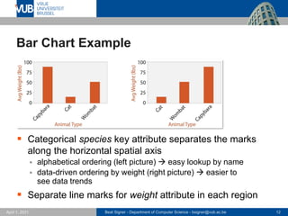
  • 12. Beat Signer - Department of Computer Science - [email protected] 12 April 1, 2021 Bar Chart Example ▪ Categorical species key attribute separates the marks along the horizontal spatial axis ▪ alphabetical ordering (left picture) → easy lookup by name ▪ data-driven ordering by weight (right picture) → easier to see data trends ▪ Separate line marks for weight attribute in each region
  • 13. Beat Signer - Department of Computer Science - [email protected] 13 April 1, 2021 Bar Charts Bar Charts What(Data) Table: one quantitative value attribute, one categorical key attribute. Why(Task) Lookup and compare values. How(Encode) Line marks, express value attribute with aligned vertical position, separate key attribute with horizontal position. Scale Key attribute: dozens to hundreds of levels.
  • 14. Beat Signer - Department of Computer Science - [email protected] 14 April 1, 2021 Stacked Bar Chart Example ▪ Bars distributed along the x-axis based on combina- tion of processor and pro- cedure ▪ More complex glyph for each bar ▪ multiple sub-bars stacked vertically - uses colour (type of cache miss) as well as length (number of misses) coding - common scale only for lowest bar component → order of stacking is relevant
  • 15. Beat Signer - Department of Computer Science - [email protected] 15 April 1, 2021 Stacked Bar Charts Stacked Bar Charts What(Data) Multidimensional table: one quantitative value attribute, two categorical key attributes. Why(Task) Part-to-whole relationship, lookup values, find trends. How(Encode) Bar glyph with length-coded subcomponents of value attribute for each category of secondary key attribute. Separate bars by category of primary key attribute. Scale Key attribute (main axis): dozens to hundreds of levels. Key attribute (stacked glyph axis): several to one dozen.
  • 16. Beat Signer - Department of Computer Science - [email protected] 16 April 1, 2021 Streamgraph Example ▪ Music listening history example ▪ one time series per artist counting the number of times their music was listened to each week ▪ Continuity of the horizontal layers ▪ emphasises legibility of individual streams ▪ deliberate organic silhouette (instead of x-axis as baseline
  • 17. Beat Signer - Department of Computer Science - [email protected] 17 April 1, 2021 Streamgraphs Streamgraphs What(Data) Multidimensional table: one quantitative value attribute (e.g. counts), one ordered key attribute (time), one categorical key attribute. What(Derived) One quantitative attribute (for computation of layer ordering). Why(Task) Find trends. How(Encode) Use derived geometry showing artist layers across time, layer height encodes counts. Scale Key attribute (time, main axis) hundreds of time points. Key attributes (artists, not always over entire time axis): dozens to hundreds.
  • 18. Beat Signer - Department of Computer Science - [email protected] 18 April 1, 2021 Dot Chart vs. Line Chart Example ▪ Dot chart (dot plot) and line chart for the same dataset showing a cat's weight over time ▪ trends are emphasised by line charts ▪ dot chart is like a bar chart where the quantitative attribute is encoded with point marks rather than line marks
  • 19. Beat Signer - Department of Computer Science - [email protected] 19 April 1, 2021 Dot Charts Dot Charts What(Data) Table: one quantitative value attribute, one ordered key attribute. Why(Task) Lookup and compare values. How(Encode) Express value attribute with aligned vertical position and point marks. Separate/order into horizontal regions by key attribute. Scale Key attribute: dozens to hundreds of levels.
  • 20. Beat Signer - Department of Computer Science - [email protected] 20 April 1, 2021 Line Charts ▪ Line charts should only be used for ordered key attri- butes but not for categorical key attributes! ▪ would imply trends that do not exist (violation of expressiveness principle) ▪ Aspect ratio (width/height) ▪ we are better in judging angles close to 45° ▪ banking to 45° idiom computes the best aspect ratio with as many lines as possible close to 45° Line Charts What(Data) Table: one quantitative value attribute, one ordered key attribute. Why(Task) Show trends. How(Encode) Dot chart with connection marks between dots. Scale Key attribute: hundreds of levels.
  • 21. Beat Signer - Department of Computer Science - [email protected] 21 April 1, 2021 Matrix Alignment ▪ Datasets with two keys often arranged in a two-dimensional matrix alignment ▪ one key distributed along the rows and one key along the columns ▪ rectangular cell in the matrix shows item values ▪ Examples of matrix alignments are heatmaps or the scatterplot matrix (SPLOM)
  • 22. Beat Signer - Department of Computer Science - [email protected] 22 April 1, 2021 Heatmap Example
  • 23. Beat Signer - Department of Computer Science - [email protected] 23 April 1, 2021 Heatmaps Heatmaps What(Data) Table: two categorical key attributes, one quantitative value attribute. Why(Task) Find clusters, outliers; summarise. How(Encode) 2D matrix alignment of area marks, diverging colourmap. Scale Items: one million. Categorical attribute levels: hundreds. Quantitative attribute levels: 3 to11.
  • 24. Beat Signer - Department of Computer Science - [email protected] 24 April 1, 2021 Scatterplot Matrix (SPLOM) Example
  • 25. Beat Signer - Department of Computer Science - [email protected] 25 April 1, 2021 Scatterplot Matrix (SPLOM) ▪ Usually only the lower or upper triangle of the matrix is shown (avoid redundancy) Scatterplot Matrix (SPLOM) What(Data) Table. What(Derived) Ordered key attribute: list of original attributes. Why(Task) Find correlation, trends, outliers. How(Encode) Scatterplots in 2D matrix alignment. Scale Attributes: one dozen. Items: dozens to hundreds.
  • 26. Beat Signer - Department of Computer Science - [email protected] 26 April 1, 2021 Volumetric Grids and Recursive Subdivison ▪ Volumetric grid aligns data in three dimensions based on three key attributes ▪ typically not recommended for non-spatial (abstract) data due to perceptual problems (e.g. occlusion or perspective distortion) ▪ Recursive Subdivision ▪ recursively subdivides a cell via a list or matrix and thereby supports multiple keys ▪ discussed later in the course
  • 27. Beat Signer - Department of Computer Science - [email protected] 27 April 1, 2021 Spatial Axis Orientation ▪ Rectilinear layouts ▪ regions or items are distributed along an orthogonal horizontal and vertical axis ▪ Parallel layouts ▪ parallel coordinates can be used to visualise many quantitative attributes at once ▪ provides overview over all attributes - also shows the range of values for individual attributes ▪ Radial layouts ▪ items distributed around a circle using the angle channel in addition to one or multiple linear spatial channels - more efficient in showing periodic patterns
  • 28. Beat Signer - Department of Computer Science - [email protected] 28 April 1, 2021 Parallel Coordinates Example
  • 29. Beat Signer - Department of Computer Science - [email protected] 29 April 1, 2021 Parallel Coordinates Parallel Coordinates What(Data) Table: many value attributes. Why(Task) Find trends, outliers, extremes, correlation. How(Encode) Parallel layout: horizontal spatial position used to separate axes, vertical spatial position used to express value along each aligned axis with connection line marks as segments between them. Scale Attributes: dozens along secondary axis. Items: hundreds.
  • 30. Beat Signer - Department of Computer Science - [email protected] 30 April 1, 2021 Radial Bar Chart Example Radial Bar Charts What(Data) Table: one quantitative attribute, one categorical attribute. Why(Task) Find periodic patterns. How(Encode) Length coding of line marks; radial layout.
  • 31. Beat Signer - Department of Computer Science - [email protected] 31 April 1, 2021 Pie Chart Examples Pie chart Bar chart Polar area chart Pie chart Normalised stacked bar chart Relative contributions of parts to a whole Pie chart versus bar chart accuracy Stacked bar chart
  • 32. Beat Signer - Department of Computer Science - [email protected] 32 April 1, 2021 Pie Charts and Polar Area Charts Pie Charts What(Data) Table: one quantitative attribute, one categorical attribute. Why(Task) Part-whole relationship. How(Encode) Area marks (wedges) with angle channel; radial layout. Scale One dozen categories. Polar Area Charts What(Data) Table: one quantitative attribute, one categorical attribute. Why(Task) Part-whole relationship. How(Encode) Area marks (wedges) with length channel; radial layout. Scale One dozen categories.
  • 33. Beat Signer - Department of Computer Science - [email protected] 33 April 1, 2021 Normalised Stacked Bar Charts Normalised Stacked Bar Charts What(Data) Multidimensional table: one quantitative value attribute, two categorical key attributes. What (Derived) One quantitative value attribute (normalised version of original attribute). Why(Task) Part-whole relationship. How(Encode) Line marks with length channel; rectilinear layout. Scale One dozen categories for stacked attribute. Several dozen categories for axis attribute.
  • 34. Beat Signer - Department of Computer Science - [email protected] 34 April 1, 2021 Spatial Layout Density ▪ Layout can be dense or sparse ▪ Dense layout uses small and densely packed marks to provide an overview of as many items as possible ▪ maximally dense layout uses a single pixel for each point mark - only planar position and colour channels can be used ▪ Space-filling layout fills all available space in the view ▪ typically uses area marks for items and containment marks for relationships (e.g. treemaps discussed later) ▪ maximises the available room for colour coding and might offer space for labels ▪ disadvantage: cannot make use of white space in the layout
  • 35. Beat Signer - Department of Computer Science - [email protected] 35 April 1, 2021 Dense Software Overview Example
  • 36. Beat Signer - Department of Computer Science - [email protected] 36 April 1, 2021 Dense Software Overviews Dense Software Overviews What(Data) Text with numbered lines (source code, test results log). What (Derived) Two quantitative attributes (test execution results). Why(Task) Locate faults, summarise results and coverage. How(Encode) Dense layout. Spatial position and line length from text ordering, Colour channels of hue and brightness. Scale Lines of text: ten thousand.
  • 37. Beat Signer - Department of Computer Science - [email protected] 37 April 1, 2021 Arrange Spatial Data
  • 38. Beat Signer - Department of Computer Science - [email protected] 38 April 1, 2021 Arrange Spatial Data … ▪ Two main spatial data types ▪ Geometry ▪ Spatial Fields - scalar fields with single value associated with each cell in the field - vector fields with multiple values associated with each cell (e.g. computational fluid dynamics) - tensor fields with matrix associated with each cell capturing more complex structure (e.g. for stress, conductivity etc.) ▪ Given spatial position is the attribute of primary importance ▪ use provided position as the substrate for the visual layout
  • 39. Beat Signer - Department of Computer Science - [email protected] 39 April 1, 2021 Geometry ▪ Geometric data does not necessarily have attributes associated with it ▪ can be derived from raw source data (e.g. geographic data about the earth) ▪ Geographic Data ▪ derive a geometry dataset based on abstractions (e.g. filtering, aggregation or level of detail) on the underlying raw data ▪ cartographic data (non-spatial information) can be used to size code the marks - e.g. size of point marks representing cities by their population ▪ Other derived geometry data ▪ e.g. based on computations on spatial fields
  • 40. Beat Signer - Department of Computer Science - [email protected] 40 April 1, 2021 Choropleth Map Example
  • 41. Beat Signer - Department of Computer Science - [email protected] 41 April 1, 2021 Choropleth Map Choropleth Map What(Data) Geographic geometry data. Table with one quantitative attribute per region. Why(Task) Find clusters. How(Encode) Space: use given geometry for area mark boundaries. Colour: sequential segmented colourmap.
  • 42. Beat Signer - Department of Computer Science - [email protected] 42 April 1, 2021 Scalar Fields ▪ Scalar spatial field has a single value associated with each spatially defined cell ▪ e.g. data from medical scans with radio-opacity (CT scan) or proton density (MRI scan) ▪ Isocontours use isolines to represent the contours of a particular level of the scalar value. ▪ isolines close together for regions with fast change
  • 43. Beat Signer - Department of Computer Science - [email protected] 43 April 1, 2021 Topographic Terrain Map Example
  • 44. Beat Signer - Department of Computer Science - [email protected] 44 April 1, 2021 Topographic Terrain Maps Topographic Terrain Maps What(Data) 2D spatial field; geographic data. What (Derived) Geometry: set of isolines computed from the field. Why(Task) Query shape. How(Encode) Use given geographic data geometry of points, lines, and region marks. Used derived geometry as line marks (blue in example). Scale Dozens of contour levels.
  • 45. Beat Signer - Department of Computer Science - [email protected] 45 April 1, 2021 Arrange Networks and Trees
  • 46. Beat Signer - Department of Computer Science - [email protected] 46 April 1, 2021 Arrange Networks and Trees … ▪ Connections (links) can be represented in different ways ▪ node-link diagrams with explicit connection marks - well-suited for tasks that involve the understanding of the network topology (e.g. shortest path between two nodes or finding all adjacent nodes) ▪ adjacency matrix ▪ enclosure with containment marks - only works for trees but not for networks
  • 47. Beat Signer - Department of Computer Science - [email protected] 47 April 1, 2021 Node-Link Diagram Examples (Trees) Triangular vertical node-link layout Spline radial layout
  • 48. Beat Signer - Department of Computer Science - [email protected] 48 April 1, 2021 Node-Link Diagram Examples (Trees) … Rectangular horizontal node-link layout Bubble tree node-link layout
  • 49. Beat Signer - Department of Computer Science - [email protected] 49 April 1, 2021 Force-Directed Placement Example Force-directed placement with size coding of edges Force-directed placement of larger network with size coding of nodes
  • 50. Beat Signer - Department of Computer Science - [email protected] 50 April 1, 2021 Force-directed Placement ▪ Increased scalability via multilevel network idioms ▪ e.g. multilevel scalable force-directed placement (SFDP) algorithm Force-directed Placement What(Data) Network. Why(Task) Explore topology, locate paths. How(Encode) Point marks for node, connection marks for links. Scale Nodes: dozens to hundreds. Links: hundreds. Node/link density: L<4N.
  • 51. Beat Signer - Department of Computer Science - [email protected] 51 April 1, 2021 SFDP Example
  • 52. Beat Signer - Department of Computer Science - [email protected] 52 April 1, 2021 Multilevel Force-Directed Placement (SFDP) Multilevel Force-directed Placement (SFDP) What(Data) Network. What (Derived) Cluster hierarchy on top of original network. Why(Task) Explore topology, locate paths and clusters. How(Encode) Point marks for nodes, connection marks for links. Scale Nodes: 1000-10'000. Links: 1000-10'000. Node/link density: L<4N.
  • 53. Beat Signer - Department of Computer Science - [email protected] 53 April 1, 2021 Adjacency Matrix View Example ▪ Network nodes laid out along the horizontal and vertical edges of a square region ▪ links between nodes indicated by colouring an area mark in the cell forming the intersection of the two nodes' row and column ▪ additional attribute can be visualised by colouring the matrix cells
  • 54. Beat Signer - Department of Computer Science - [email protected] 54 April 1, 2021 Adjacency Matrix View ▪ Better scalability than node-link diagrams ▪ Predictability and stability and support for reordering ▪ Drawback: impossible to investigate topological structure Adjacency Matrix View What(Data) Network. What (Derived) Table: network nodes as keys, link status between two nodes as values. Why(Task) "Explore" strongly connected networks. How(Encode) Area marks in 2D matrix alignment. Scale Nodes: 1000. Links: one million.
  • 55. Beat Signer - Department of Computer Science - [email protected] 55 April 1, 2021 Enclosure ▪ Containment marks are effective for showing complete information about hierarchical structure (instead of pairwise relationships only) ▪ Treemaps as an alternative to node-link diagrams ▪ hierarchical relationships shown via containment rather than connection marks
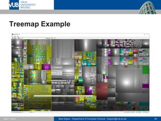
  • 56. Beat Signer - Department of Computer Science - [email protected] 56 April 1, 2021 Treemap Example
  • 57. Beat Signer - Department of Computer Science - [email protected] 57 April 1, 2021 Treemaps Treemaps What(Data) Tree. Why(Task) Query attributes at leaf nodes. How(Encode) Area marks and containment, with rectilinear layout. Scale Leaf nodes: one million. Links: one million.
  • 58. Beat Signer - Department of Computer Science - [email protected] 58 April 1, 2021 GrouseFlocks Example ▪ Visualisation for compound networks (tree on top of a network) ▪ network nodes form the leaves of the tree ▪ tree encoded via containment on top of the original graph (picture on the right)
  • 59. Beat Signer - Department of Computer Science - [email protected] 59 April 1, 2021 GrouseFlocks Grouse Flocks What(Data) Network. What (Derived) Cluster hierarchy on top of the original network. How(Encode) Connection marks for original network, containment marks for cluster hierarchy
  • 60. Beat Signer - Department of Computer Science - [email protected] 60 April 1, 2021 Exercise 7 ▪ Lab Session (online)
  • 61. Beat Signer - Department of Computer Science - [email protected] 61 April 1, 2021 Further Reading ▪ This lecture is mainly based on the book Visualization Analysis & Design ▪ chapter 7 - Arrange Tables ▪ chapter 8 - Arrange Spatial Data ▪ chapter 9 - Arrange Networks and Trees
  • 62. Beat Signer - Department of Computer Science - [email protected] 62 April 1, 2021 References ▪ Visualization Analysis & Design, Tamara Munzner, Taylor & Francis Inc, (Har/Psc edition), May, November 2014, ISBN-13: 978-1466508910
  • 63. 2 December 2005 Next Lecture View Manipulation and Reduction