SlideShare a Scribd company logo
FLEXBOX
Zoe Mickley Gillenwater @zomigiBlend Conference
September 2013
PUTTING
INTO
PRACTICE
and I wrote these books on CSS:
I’m a web designer/front-end dev
Stunning CSS3:
A Project-based Guide to
the Latest in CSS
www.stunningcss3.com
Flexible Web Design:
Creating Liquid and Elastic
Layouts with CSS
www.flexiblewebbook.com
My portfolio site from 2000
2003: Introduced to floats
Problems with float layout
 Difficulty with containment
 Wrapping/float drop
 Visual location somewhat tied to HTML order
 No built-in equal-height columns
 No float:center
The nickname for the CSS Flexible Box
Layout Module, a new layout mechanism
and box model.
What is flexbox?
Which is which?
2009 display:box
2011 display:flexbox
Now display:flex
See also http://css-tricks.com/old-flexbox-and-new-flexbox/
*with -webkit- prefix
† with -ms- prefix, 10 only
*
*
†
*
Turn it on
display: flex
flex item flex item
flex container
plain old box
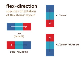
flex-direction
specifies orientation
of flex items’ layout
row
(default)
row-reverse
column
column-reverse
Demo site:
Visit
www.smoresday.us
using Chrome,
Opera, or IE 10 for
full effect
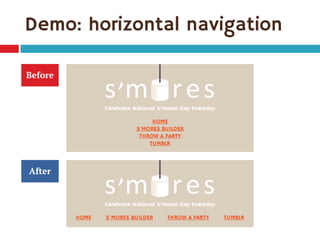
Demo: horizontal navigation
1. Turn <ul> into flex container:
.list-nav {
display: flex;
flex-direction: row; /* default */
}
2. Children <li> become flex items laid out on
single horizontal line
Demo: horizontal navigation
Before
After
I can do the same thing with display: inline.”
What’s the big deal?
Yes, you can.
We’re just laying the groundwork for the
cool stuff that’s coming.
Baby steps.
“
How the CSS might really look
.list-nav {
display: -webkit-box;
display: -ms-flexbox;
display: -webkit-flex;
display: flex;
-webkit-box-direction: normal;
-webkit-box-orient: horizontal;
-ms-flex-direction: row;
-webkit-flex-direction: row;
flex-direction: row;
}
2009
2011
current
Keeping track of variants
 Flexy Boxes code generator shows old and new
syntaxes: www.the-echoplex.net/flexyboxes/
 Let Sass or LESS do it for you, for instance:
 https://github.com/mastastealth/sass-flex-mixin
 https://gist.github.com/cimmanon/4461470
 The -prefix-free script can do some of it for
you: http://leaverou.github.io/prefixfree/
But for the sake of readability, I’m omitting
them from the code samples on these
slides. You can see them in the live demo.
Now back to flex-direction.
Use the variants you want.
Setting a point of reference
Main axis
Crossaxis
(for flex-direction: row)
flex-wrap
controls whether flex
items can lay out on
multiple lines and which
direction new lines are
stacked in
wrap
(for row)
wrap
(for column)
nowrap
(default; for row)
wrap-reverse
(for row)
Problems with flex-wrap
 Firefox doesn’t support it yet
 No browser supports 2009 equivalent box-
lines property
 Limited control of where breaks occur without
support for break-before/break-after
properties (only IE 10 and Opera support
them)
Summary: setting the stage
1. Create flex container using display:flex
2. Set its flex-direction to control
orientation (horizontal or vertical)
3. Set its flex-wrap to control whether and in
which direction to wrap
(Or, set flex-flow as shorthand for flex-
direction and flex-wrap)
.builder
.component
.gallery
.gallery-item
Mobile
block
layout
.action
Add flexbox for larger widths
No need to put within media query—it can “kick
in” whenever space allows (auto breakpoints!)
1. Create flex container:
.gallery {
display: flex;
flex-wrap: wrap;
margin-left: -20px;
}
Add flexbox for larger widths
2. Size flex items:
.gallery-item {
flex: 1 0 200px;
margin: 0 0 20px 20px;
padding: 20px;
}
This is where flexbox gets flexible.
And kinda confusing.
The flex property
Defining the flex property
 Makes flex items change their width or height
(whichever is dimension along main axis) to
fit available space
 Shorthand for 3 properties:
 flex-grow
 flex-shrink
 flex-basis
Defining the flex property
flex-grow
how much flex
item will grow
relative to
other items if
extra space is
available
(proportion
of extra space
that it gets)
flex-shrink
how much item
will shrink
relative to
others if there is
not enough
space
(proportion of
overflow that
gets shaved off)
flex-basis
the initial
starting size
before free
space is
distributed
(any standard
width/height
value, including
auto)
Breaking it down
.gallery-item {
flex: 1 0 200px;
flex-grow
give every
item 1 share
of extra width
flex-shrink
don’t let the
items shrink at
all (but they
wouldn’t
anyway due to
flex-wrap)
flex-basis
start them out
at 200 pixels
wide (basically,
min-width)
Let’s see it flex live
Single-digit flex values
 Common to see flex: 1 in demos
 flex: [number] is equivalent to
flex: [number] 1 0px
 Be sure you really want flex-basis to be 0
 When wrap on, essentially min-width
 0px therefore means items can shrink to 0px
 If everything can get down to 0px, nothing ever
has a reason to wrap
My first attempt
Zoe’s Brain Said:
“Since .action
starts out at 100%,
it won’t have space
to sit on the first
line with the
content preceding
it, and will wrap to
a second line.”
.component {
flex: 1;
}
.action {
flex: 1 1 100%;
}
The expected outcome:
Flexbox fail
My first attempt
Reality:
Since it’s fine for
each .component to
shrink to only 0px
wide, a 100% wide
element can and
will sit on the same
line as all the
components.
.component {
flex: 1 1 0px;
}
.action {
flex: 1 1 100%;
}
Forcing the wrap
Fixed:
.action will always
wrap to new line,
and .components
will wrap to
additional lines
when there’s less
than their
combined flex-
basis values (plus
margin, etc.).
.component {
flex: 1 1 200px;
}
.action {
flex: 1 1 100%;
}
Live demo time again
Why flex is great
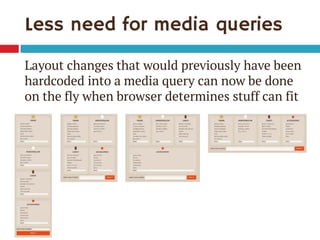
Less need for media queries
Layout changes that would previously have been
hardcoded into a media query can now be done
on the fly when browser determines stuff can fit
Flex adjusts for margin
.component {
width: 25%;
margin-left: 20px;
}
.component {
flex: 1 1 200px;
margin-left: 20px;
}
The boxes won’t all fit Works like a charm
box-sizing only takes care of padding and
border added on to width, not margin
Flex adjusts for quantity of items
 Great for sites with dynamic or frequently
changing content blocks, e.g.:
 News stories on home page vs inner page
 Product or feature tiles
 Pricing page with plans side by side
 Makes HTML/CSS more modular—an item can
move anywhere and adjust in size as needed
Flex can combine different units
Items measured in
different units can
sit side-by-side and
all fit perfectly
Pixels
Ems
Mystery percentage
Flex can combine different units
Set only the text field to flex:
.component li:last-child {
display: flex;
}
.component .other-name {
flex: 1;
}
Flex can be proportional
Setting flex-grow/flex-shrink to different
values can make flex items size themselves
relative to each other
flex: 1; flex: 1; flex: 2;
But be careful!
Having widths be in multiples of each other only
works if flex-basis is 0
If all start out 0px, then all the width on the line
is extra, so the flex:2 item gets twice as much
width as the others and is thus twice as wide as
the others
flex: 1 0 0px; flex: 1 0 0px; flex: 2 0 0px;
If flex-basis isn’t 0px…
…the widths may not end up as you expect
The third box gets twice as much of the extra,
but that doesn’t make it twice as wide overall
flex: 1 0 10px; flex: 1 0 10px; flex: 2 0 10px;
10px + 5px extra = 15px 10px + 5px extra = 15px 10px + 10px extra = 20px
if 50px available
While support improves, consider using
flexbox now on small page components as
progressive enhancement.
Here are a few ideas.
You can use it now
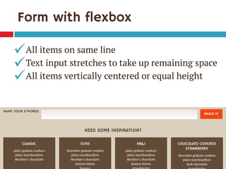
Single-line, full-width form
 All items on same line
 Text input(s) stretches to fill remaining space
 All items vertically centered or equal height
Form without flexbox
.action { text-align: center; }
.action * {
display: inline; /* default */
vertical-align: middle;
}
Form without flexbox
All items on same line
Text input stretches to take up remaining space
All items vertically centered or equal height


X
Form with flexbox
.action {
flex: 1 1 100%;
display: flex;
align-items: stretch; /* default */
}
.action input {
flex: 1;
}
.action input, .action label {
margin-right: 10px;
}
align-items
aligns flex items in
cross axis
flex-start flex-end
center baseline
stretch
(default)
foo foo foo
Form with flexbox
All items on same line
Text input stretches to take up remaining space
All items vertically centered or equal height



Override alignment on label
.action label {
align-self: center;
}
Combine the two
.action {
flex: 1 1 100%;
display: flex;
text-align: center; /* fallback */
}
.action input {
flex: 1;
}
.action label {
align-self: center;
}
.action input, .action label {
margin-right: 10px;
}
Another option: stack, center
.action {
flex: 1 1 100%;
display: flex;
flex-wrap: wrap;
align-items: center;
text-align: center; /* fallback */
}
.action input {
flex: 1;
display: block; /* fallback */
width: 100%; /* fallback */
box-sizing: border-box; /* fallback */
}
.action button {
flex: 1 1 100%;
margin-top: 10px;
}
Narrow version
Non-flexbox fallback version Flexbox version
Add Modernizr as needed
 Flexbox and fallback styles can often co-exist,
but sometimes need to isolate them
 Modernizr can add flexbox, no-flexbox,
and flexbox-legacy classes to do this
 Example: add margin between label and input
only if flexbox is on:
.flexbox .action label {
margin-right: 10px;
}
Full-width nav bar
 Requirements:
 All links on same line
 First link flush left, last link flush right
 Equal spaces between all links
 Using display:table-cell can do full-
width but not equal spaces
Nav with flexbox
.list-nav {
display: flex;
justify-content: space-between;
margin: 0;
padding: 0;
list-style: none;
}
.list-nav li {
/* no flex & no width = shrinkwrap */
text-align: center;
}
justify-content
aligns flex items along
main axis
space-around
flex-endcenter
flex-start
(default)
space-between
Combine with inline-block
.list-nav {
display: flex;
justify-content: space-between;
margin: 0;
padding: 0;
list-style: none;
text-align: center; /* fallback */
}
.list-nav li {
display: inline-block; /* fallback */
padding: 0 .5em; /* fallback */
text-align: center;
}
.list-nav li:first-child { padding-left: 0; }
.list-nav li:last-child { padding-right: 0; }
Non-flexbox
fallback version
Flexbox version
Combine with inline-block
Combine with table-cell
.list-nav {
width: 100%; /* fallback */
display: table; /* fallback */
display: flex; /* override display:table for flexbox browsers */
justify-content: space-between;
}
.list-nav li {
display: table-cell; /* fallback */
padding: 0 .5em;
text-align: center;
}
.list-nav li:first-child {
padding-left: 0;
text-align: left; /* fallback */
}
.list-nav li:last-child {
padding-right: 0;
text-align: right;
}
Variation: pagination
 Wide view: all links on same line, centered
 Set justify-content:center
 Medium view: all links on same line, full-
width, equal spacing
 Set justify-content:space-between
Variation: pagination
 Narrow view: two lines with “previous” and
“next” links on first row, full-width
 Set flex-wrap:wrap
 Set justify-content:space-between
 Use order property to move “next” link up
Visual reordering with flexbox
1. Make “previous” link come first visually,
“next” link second, and all the rest third
.pagination li {
order: 2;
display: inline-block; /* fallback */
}
.pagination li:first-child { /* “Previous” link */
order: 0;
text-align: left;
}
.pagination li:last-child { /* “Next” link */
order: 1;
text-align: right;
}
Visual reordering with flexbox
2. Force links to wrap after “next” link by
making it and “previous” link take up 100%
of the first line together
.flexbox .pagination li:first-child,
.flexbox .pagination li:last-child {
width: 50%;
}
.pagination {
display: flex;
flex-wrap: wrap;
justify-content: space-between;
text-align: center; /* fallback */
}
Accessibility implications
Pro
Keep content in
logical order in HTML
instead of structuring
HTML to achieve
visual layout
Con
Focus/tab order won’t
always match
expected order, may
jump around
seemingly randomly
Tab order = HTML order
1
2
10
“Next” won’t be second link tabbed to after
“Previous” since it doesn’t follow it in HTML
Limitations of order property
 Potential to create confusing tab order
 Can only rearrange sibling elements
 Flexbox rows/cols can’t overlap, so content
may not always slide into the spot left by the
re-ordered content
So: reserve flexbox order property for small
moves that don’t hurt accessibility, and use CSS3
Grid Layout, etc., for bigger re-ordering
Pinned item at bottom
 All boxes equal
in height
 Final item in
each box pinned
to the bottom so
that all final
items across grid
appear to align
Pinned item at bottom
 Without flexbox,“other” fields disconnected from
each other and thus can’t align
 With flexbox, they’re still disconnected, but their
parents aren’t and can be equal height, plus…
New “auto” margin behavior
 Margins set to auto get all the free space left
 So, to pin flex item to bottom of its flex
container:
 set flex-direction:column on flex container
so items can fill its height
 set margin-top:auto on item you want to pin
Pin the “other” fields
1. Make each .component match in height by
making parent .builder a flex container
(already done)
.builder {
display: flex;
align-items: stretch; /* default */
flex-wrap: wrap;
justify-content: space-between;
margin: 0 0 40px -20px;
}
Pin the “other” fields
2. Make each <ul> a flex item and stretch to
full height, then make it a flex container with
vertical direction so its <li> will stack
.component {
flex: 1 1 200px;
display: flex;
flex-direction: column;
}
.component ul {
flex: 1;
display: flex;
flex-direction: column;
margin: 0;
padding: 0;
list-style: none;
}
Pin the “other” fields
3. Give “other” <li> an auto top margin so all
free space left in <ul> is put above that
<li>, pushing it to bottom of <ul>
.component li:last-child {
margin-top: auto;
}
Pinning without flexbox
 Use display:table-cell for equal height
boxes
 Add bottom padding in ems to each box
 Use absolute positioning to pin “other” row in
space left by padding
Variation: two-piece main nav
.flexbox .list-nav {
justify-content: flex-start;
position: relative;
top: -70px;
}
.flexbox #link-home { margin-right:20px; }
.flexbox #link-tumblr { margin-left:20px; }
.flexbox #link-party {
margin-left: auto;
}
Why go to the trouble to use flexbox as
progressive enhancement now?”
I can use it, but why should I?
“
Develop it as a career skill
 Essential layout tool in the future, especially
with responsive web design
 Syntax is not going to change much, so what
you learn now will still work later
 Better to learn something before it’s needed in
a project rather than during
when I can do the same thing with <font> tags?”
Why should I do it with CSS
“ –Zoe, circa 2002
when I can do the same thing with floats?”
Why should I do it with flexbox
“
We all learn best by doing
 I learned a lot more about flexbox by building
demo site for this presentation—a lot
 Have to try it to learn it
 Using it for small cosmetic enhancements is
low-risk way to try it
It’s fun
 Great user experience is important, but great
developer experience is worthwhile too
 Enjoy your job to get better at your job
 Sometimes the little extra time is worth the
fun challenge and reward at the end
Learn more
Download slides and get links at
www.zomigi.com/blog/flexbox-presentation
Thanks!
Zoe Mickley Gillenwater
@zomigi
design@zomigi.com
zomigi.com | stunningcss3.com | flexiblewebbook.com
Ad

More Related Content

What's hot (6)

Layout with flexbox
Layout with flexboxLayout with flexbox
Layout with flexbox
The Level Consulting, Ltd.
 
Understanding flexbox
Understanding flexboxUnderstanding flexbox
Understanding flexbox
Davide Di Pumpo
 
CSS Flexbox (flexible box layout)
CSS Flexbox (flexible box layout)CSS Flexbox (flexible box layout)
CSS Flexbox (flexible box layout)
Woodridge Software
 
From Preprocessor to Postprocessor
From Preprocessor to PostprocessorFrom Preprocessor to Postprocessor
From Preprocessor to Postprocessor
Matteo Guidotto
 
Understanding flexbox
Understanding flexboxUnderstanding flexbox
Understanding flexbox
mustafa sarac
 
Untangling the web10
Untangling the web10Untangling the web10
Untangling the web10
Derek Jacoby
 

Viewers also liked (20)

Using Flexbox Today (Frontier Conf 2016)
Using Flexbox Today (Frontier Conf 2016)Using Flexbox Today (Frontier Conf 2016)
Using Flexbox Today (Frontier Conf 2016)
Zoe Gillenwater
 
Enhancing Responsiveness With Flexbox (Smashing Conference)
Enhancing Responsiveness With Flexbox (Smashing Conference)Enhancing Responsiveness With Flexbox (Smashing Conference)
Enhancing Responsiveness With Flexbox (Smashing Conference)
Zoe Gillenwater
 
Zero to 100,000 Evaluations in Four Weeks
Zero to 100,000 Evaluations in Four WeeksZero to 100,000 Evaluations in Four Weeks
Zero to 100,000 Evaluations in Four Weeks
freshlybakedpixels
 
Built to Last
Built to LastBuilt to Last
Built to Last
Dan Lynch
 
Talk at FullStack 2016: Automating documentation on JavaScript projects
Talk at FullStack 2016: Automating documentation on JavaScript projectsTalk at FullStack 2016: Automating documentation on JavaScript projects
Talk at FullStack 2016: Automating documentation on JavaScript projects
Marcos Iglesias
 
WebPagetest Power Users - Velocity 2014
WebPagetest Power Users - Velocity 2014WebPagetest Power Users - Velocity 2014
WebPagetest Power Users - Velocity 2014
Patrick Meenan
 
Isomorphic JavaScript: #DevBeat Master Class
Isomorphic JavaScript: #DevBeat Master ClassIsomorphic JavaScript: #DevBeat Master Class
Isomorphic JavaScript: #DevBeat Master Class
Spike Brehm
 
Enterprise JavaScript Error Handling (Ajax Experience 2008)
Enterprise JavaScript Error Handling (Ajax Experience 2008)Enterprise JavaScript Error Handling (Ajax Experience 2008)
Enterprise JavaScript Error Handling (Ajax Experience 2008)
Nicholas Zakas
 
Scalable JavaScript Application Architecture 2012
Scalable JavaScript Application Architecture 2012Scalable JavaScript Application Architecture 2012
Scalable JavaScript Application Architecture 2012
Nicholas Zakas
 
Vietnam Hr Day 2010
Vietnam Hr Day 2010Vietnam Hr Day 2010
Vietnam Hr Day 2010
Nguyen Hung Cuong
 
Teaming Workshops
Teaming WorkshopsTeaming Workshops
Teaming Workshops
MacInnis Marketing
 
Fpt's human resource strategies in 2009 (a look back)
Fpt's human resource strategies in 2009 (a look back)Fpt's human resource strategies in 2009 (a look back)
Fpt's human resource strategies in 2009 (a look back)
Vu Hung Nguyen
 
From a monolithic Ruby on Rails app to the JVM
From a monolithic  Ruby on Rails app  to the JVMFrom a monolithic  Ruby on Rails app  to the JVM
From a monolithic Ruby on Rails app to the JVM
Phil Calçado
 
Leadership Tools for Better Teams - Personal History Exercise - 20150615
Leadership Tools for Better Teams - Personal History Exercise - 20150615Leadership Tools for Better Teams - Personal History Exercise - 20150615
Leadership Tools for Better Teams - Personal History Exercise - 20150615
Joel Wenger
 
WordPress as Rapid Prototyping Tool
WordPress as Rapid Prototyping ToolWordPress as Rapid Prototyping Tool
WordPress as Rapid Prototyping Tool
Amit Kumar Singh
 
Box Model
Box ModelBox Model
Box Model
Amit Kumar Singh
 
Show vs. Tell in UX Design (Front in Amsterdam)
Show vs. Tell in UX Design (Front in Amsterdam)Show vs. Tell in UX Design (Front in Amsterdam)
Show vs. Tell in UX Design (Front in Amsterdam)
Zoe Gillenwater
 
Css part2
Css part2Css part2
Css part2
ISsoft
 
Верстка_Лекция1
Верстка_Лекция1Верстка_Лекция1
Верстка_Лекция1
itc73
 
Uwe usability evaluation
Uwe usability evaluationUwe usability evaluation
Uwe usability evaluation
Lon Barfield
 
Using Flexbox Today (Frontier Conf 2016)
Using Flexbox Today (Frontier Conf 2016)Using Flexbox Today (Frontier Conf 2016)
Using Flexbox Today (Frontier Conf 2016)
Zoe Gillenwater
 
Enhancing Responsiveness With Flexbox (Smashing Conference)
Enhancing Responsiveness With Flexbox (Smashing Conference)Enhancing Responsiveness With Flexbox (Smashing Conference)
Enhancing Responsiveness With Flexbox (Smashing Conference)
Zoe Gillenwater
 
Zero to 100,000 Evaluations in Four Weeks
Zero to 100,000 Evaluations in Four WeeksZero to 100,000 Evaluations in Four Weeks
Zero to 100,000 Evaluations in Four Weeks
freshlybakedpixels
 
Built to Last
Built to LastBuilt to Last
Built to Last
Dan Lynch
 
Talk at FullStack 2016: Automating documentation on JavaScript projects
Talk at FullStack 2016: Automating documentation on JavaScript projectsTalk at FullStack 2016: Automating documentation on JavaScript projects
Talk at FullStack 2016: Automating documentation on JavaScript projects
Marcos Iglesias
 
WebPagetest Power Users - Velocity 2014
WebPagetest Power Users - Velocity 2014WebPagetest Power Users - Velocity 2014
WebPagetest Power Users - Velocity 2014
Patrick Meenan
 
Isomorphic JavaScript: #DevBeat Master Class
Isomorphic JavaScript: #DevBeat Master ClassIsomorphic JavaScript: #DevBeat Master Class
Isomorphic JavaScript: #DevBeat Master Class
Spike Brehm
 
Enterprise JavaScript Error Handling (Ajax Experience 2008)
Enterprise JavaScript Error Handling (Ajax Experience 2008)Enterprise JavaScript Error Handling (Ajax Experience 2008)
Enterprise JavaScript Error Handling (Ajax Experience 2008)
Nicholas Zakas
 
Scalable JavaScript Application Architecture 2012
Scalable JavaScript Application Architecture 2012Scalable JavaScript Application Architecture 2012
Scalable JavaScript Application Architecture 2012
Nicholas Zakas
 
Fpt's human resource strategies in 2009 (a look back)
Fpt's human resource strategies in 2009 (a look back)Fpt's human resource strategies in 2009 (a look back)
Fpt's human resource strategies in 2009 (a look back)
Vu Hung Nguyen
 
From a monolithic Ruby on Rails app to the JVM
From a monolithic  Ruby on Rails app  to the JVMFrom a monolithic  Ruby on Rails app  to the JVM
From a monolithic Ruby on Rails app to the JVM
Phil Calçado
 
Leadership Tools for Better Teams - Personal History Exercise - 20150615
Leadership Tools for Better Teams - Personal History Exercise - 20150615Leadership Tools for Better Teams - Personal History Exercise - 20150615
Leadership Tools for Better Teams - Personal History Exercise - 20150615
Joel Wenger
 
WordPress as Rapid Prototyping Tool
WordPress as Rapid Prototyping ToolWordPress as Rapid Prototyping Tool
WordPress as Rapid Prototyping Tool
Amit Kumar Singh
 
Show vs. Tell in UX Design (Front in Amsterdam)
Show vs. Tell in UX Design (Front in Amsterdam)Show vs. Tell in UX Design (Front in Amsterdam)
Show vs. Tell in UX Design (Front in Amsterdam)
Zoe Gillenwater
 
Css part2
Css part2Css part2
Css part2
ISsoft
 
Верстка_Лекция1
Верстка_Лекция1Верстка_Лекция1
Верстка_Лекция1
itc73
 
Uwe usability evaluation
Uwe usability evaluationUwe usability evaluation
Uwe usability evaluation
Lon Barfield
 
Ad

Similar to Putting Flexbox into Practice (20)

Leveling Up With Flexbox (Smart Web Conference)
Leveling Up With Flexbox (Smart Web Conference)Leveling Up With Flexbox (Smart Web Conference)
Leveling Up With Flexbox (Smart Web Conference)
Zoe Gillenwater
 
Enhancing Responsiveness with Flexbox (RWD Summit)
Enhancing Responsiveness with Flexbox (RWD Summit)Enhancing Responsiveness with Flexbox (RWD Summit)
Enhancing Responsiveness with Flexbox (RWD Summit)
Zoe Gillenwater
 
Leveling Up with Flexbox (Smashing Conference)
Leveling Up with Flexbox (Smashing Conference)Leveling Up with Flexbox (Smashing Conference)
Leveling Up with Flexbox (Smashing Conference)
Zoe Gillenwater
 
Using Flexbox Today (CSS Summit 2016)
Using Flexbox Today (CSS Summit 2016)Using Flexbox Today (CSS Summit 2016)
Using Flexbox Today (CSS Summit 2016)
Zoe Gillenwater
 
Using Flexbox Today (Generate Sydney 2016)
Using Flexbox Today (Generate Sydney 2016)Using Flexbox Today (Generate Sydney 2016)
Using Flexbox Today (Generate Sydney 2016)
Zoe Gillenwater
 
Using Flexbox Today (Frontend United 2016)
Using Flexbox Today (Frontend United 2016)Using Flexbox Today (Frontend United 2016)
Using Flexbox Today (Frontend United 2016)
Zoe Gillenwater
 
Enhancing Responsiveness With Flexbox (CSS Day)
Enhancing Responsiveness With Flexbox (CSS Day)Enhancing Responsiveness With Flexbox (CSS Day)
Enhancing Responsiveness With Flexbox (CSS Day)
Zoe Gillenwater
 
Flexbox Will Shock You!
Flexbox Will Shock You!Flexbox Will Shock You!
Flexbox Will Shock You!
Scott Vandehey
 
Is Flexbox the Future of Layout?
Is Flexbox the Future of Layout?Is Flexbox the Future of Layout?
Is Flexbox the Future of Layout?
jameswillweb
 
A complete guide to flexbox
A complete guide to flexboxA complete guide to flexbox
A complete guide to flexbox
Bytes Technolab Inc.
 
Show & tell - Flex in flux
Show & tell - Flex in fluxShow & tell - Flex in flux
Show & tell - Flex in flux
Dan Dineen
 
Enhancing Responsiveness with Flexbox (CSS Conf EU 2015)
Enhancing Responsiveness with Flexbox (CSS Conf EU 2015)Enhancing Responsiveness with Flexbox (CSS Conf EU 2015)
Enhancing Responsiveness with Flexbox (CSS Conf EU 2015)
Zoe Gillenwater
 
CSS Lessons Learned The Hard Way – Zoe Gillenwater
CSS Lessons Learned The Hard Way – Zoe GillenwaterCSS Lessons Learned The Hard Way – Zoe Gillenwater
CSS Lessons Learned The Hard Way – Zoe Gillenwater
beyond tellerrand
 
CSS Lessons Learned the Hard Way (Beyond Tellerand)
CSS Lessons Learned the Hard Way (Beyond Tellerand)CSS Lessons Learned the Hard Way (Beyond Tellerand)
CSS Lessons Learned the Hard Way (Beyond Tellerand)
Zoe Gillenwater
 
The New CSS Layout - dotCSS
The New CSS Layout - dotCSSThe New CSS Layout - dotCSS
The New CSS Layout - dotCSS
Rachel Andrew
 
Understanding Flexbox Layout in React Native.pdf
Understanding Flexbox Layout in React Native.pdfUnderstanding Flexbox Layout in React Native.pdf
Understanding Flexbox Layout in React Native.pdf
Katy Slemon
 
Lecture-9.pptx
Lecture-9.pptxLecture-9.pptx
Lecture-9.pptx
vishal choudhary
 
flexbox report
flexbox reportflexbox report
flexbox report
LearningTech
 
World of Flexbox
World of Flexbox World of Flexbox
World of Flexbox
Elad Shechter
 
Flex box
Flex boxFlex box
Flex box
Harish Karthick
 
Leveling Up With Flexbox (Smart Web Conference)
Leveling Up With Flexbox (Smart Web Conference)Leveling Up With Flexbox (Smart Web Conference)
Leveling Up With Flexbox (Smart Web Conference)
Zoe Gillenwater
 
Enhancing Responsiveness with Flexbox (RWD Summit)
Enhancing Responsiveness with Flexbox (RWD Summit)Enhancing Responsiveness with Flexbox (RWD Summit)
Enhancing Responsiveness with Flexbox (RWD Summit)
Zoe Gillenwater
 
Leveling Up with Flexbox (Smashing Conference)
Leveling Up with Flexbox (Smashing Conference)Leveling Up with Flexbox (Smashing Conference)
Leveling Up with Flexbox (Smashing Conference)
Zoe Gillenwater
 
Using Flexbox Today (CSS Summit 2016)
Using Flexbox Today (CSS Summit 2016)Using Flexbox Today (CSS Summit 2016)
Using Flexbox Today (CSS Summit 2016)
Zoe Gillenwater
 
Using Flexbox Today (Generate Sydney 2016)
Using Flexbox Today (Generate Sydney 2016)Using Flexbox Today (Generate Sydney 2016)
Using Flexbox Today (Generate Sydney 2016)
Zoe Gillenwater
 
Using Flexbox Today (Frontend United 2016)
Using Flexbox Today (Frontend United 2016)Using Flexbox Today (Frontend United 2016)
Using Flexbox Today (Frontend United 2016)
Zoe Gillenwater
 
Enhancing Responsiveness With Flexbox (CSS Day)
Enhancing Responsiveness With Flexbox (CSS Day)Enhancing Responsiveness With Flexbox (CSS Day)
Enhancing Responsiveness With Flexbox (CSS Day)
Zoe Gillenwater
 
Flexbox Will Shock You!
Flexbox Will Shock You!Flexbox Will Shock You!
Flexbox Will Shock You!
Scott Vandehey
 
Is Flexbox the Future of Layout?
Is Flexbox the Future of Layout?Is Flexbox the Future of Layout?
Is Flexbox the Future of Layout?
jameswillweb
 
Show & tell - Flex in flux
Show & tell - Flex in fluxShow & tell - Flex in flux
Show & tell - Flex in flux
Dan Dineen
 
Enhancing Responsiveness with Flexbox (CSS Conf EU 2015)
Enhancing Responsiveness with Flexbox (CSS Conf EU 2015)Enhancing Responsiveness with Flexbox (CSS Conf EU 2015)
Enhancing Responsiveness with Flexbox (CSS Conf EU 2015)
Zoe Gillenwater
 
CSS Lessons Learned The Hard Way – Zoe Gillenwater
CSS Lessons Learned The Hard Way – Zoe GillenwaterCSS Lessons Learned The Hard Way – Zoe Gillenwater
CSS Lessons Learned The Hard Way – Zoe Gillenwater
beyond tellerrand
 
CSS Lessons Learned the Hard Way (Beyond Tellerand)
CSS Lessons Learned the Hard Way (Beyond Tellerand)CSS Lessons Learned the Hard Way (Beyond Tellerand)
CSS Lessons Learned the Hard Way (Beyond Tellerand)
Zoe Gillenwater
 
The New CSS Layout - dotCSS
The New CSS Layout - dotCSSThe New CSS Layout - dotCSS
The New CSS Layout - dotCSS
Rachel Andrew
 
Understanding Flexbox Layout in React Native.pdf
Understanding Flexbox Layout in React Native.pdfUnderstanding Flexbox Layout in React Native.pdf
Understanding Flexbox Layout in React Native.pdf
Katy Slemon
 
Ad

More from Zoe Gillenwater (16)

Responsive Flexbox Inspiration (Responsive Day Out)
Responsive Flexbox Inspiration (Responsive Day Out)Responsive Flexbox Inspiration (Responsive Day Out)
Responsive Flexbox Inspiration (Responsive Day Out)
Zoe Gillenwater
 
CSS Lessons Learned the Hard Way (ConvergeSE)
CSS Lessons Learned the Hard Way (ConvergeSE)CSS Lessons Learned the Hard Way (ConvergeSE)
CSS Lessons Learned the Hard Way (ConvergeSE)
Zoe Gillenwater
 
CSS Lessons Learned the Hard Way (Generate Conf)
CSS Lessons Learned the Hard Way (Generate Conf)CSS Lessons Learned the Hard Way (Generate Conf)
CSS Lessons Learned the Hard Way (Generate Conf)
Zoe Gillenwater
 
Just One (CSS Dev Conference keynote)
Just One (CSS Dev Conference keynote)Just One (CSS Dev Conference keynote)
Just One (CSS Dev Conference keynote)
Zoe Gillenwater
 
CSS3 Layout
CSS3 LayoutCSS3 Layout
CSS3 Layout
Zoe Gillenwater
 
Building Responsive Layouts
Building Responsive LayoutsBuilding Responsive Layouts
Building Responsive Layouts
Zoe Gillenwater
 
The Future of CSS Layout
The Future of CSS LayoutThe Future of CSS Layout
The Future of CSS Layout
Zoe Gillenwater
 
Building Responsive Layouts
Building Responsive LayoutsBuilding Responsive Layouts
Building Responsive Layouts
Zoe Gillenwater
 
CSS3, Media Queries, and Responsive Design
CSS3, Media Queries, and Responsive DesignCSS3, Media Queries, and Responsive Design
CSS3, Media Queries, and Responsive Design
Zoe Gillenwater
 
CSS3: Using media queries to improve the web site experience
CSS3: Using media queries to improve the web site experienceCSS3: Using media queries to improve the web site experience
CSS3: Using media queries to improve the web site experience
Zoe Gillenwater
 
Web Accessibility
Web AccessibilityWeb Accessibility
Web Accessibility
Zoe Gillenwater
 
Real-world CSS3
Real-world CSS3Real-world CSS3
Real-world CSS3
Zoe Gillenwater
 
Designing with CSS3 Effectively & Efficiently
Designing with CSS3 Effectively & EfficientlyDesigning with CSS3 Effectively & Efficiently
Designing with CSS3 Effectively & Efficiently
Zoe Gillenwater
 
Effective and Efficient Design with CSS3
Effective and Efficient Design with CSS3Effective and Efficient Design with CSS3
Effective and Efficient Design with CSS3
Zoe Gillenwater
 
Highly Maintainable, Efficient, and Optimized CSS
Highly Maintainable, Efficient, and Optimized CSSHighly Maintainable, Efficient, and Optimized CSS
Highly Maintainable, Efficient, and Optimized CSS
Zoe Gillenwater
 
Designing CSS Layouts for the Flexible Web
Designing CSS Layouts for the Flexible WebDesigning CSS Layouts for the Flexible Web
Designing CSS Layouts for the Flexible Web
Zoe Gillenwater
 
Responsive Flexbox Inspiration (Responsive Day Out)
Responsive Flexbox Inspiration (Responsive Day Out)Responsive Flexbox Inspiration (Responsive Day Out)
Responsive Flexbox Inspiration (Responsive Day Out)
Zoe Gillenwater
 
CSS Lessons Learned the Hard Way (ConvergeSE)
CSS Lessons Learned the Hard Way (ConvergeSE)CSS Lessons Learned the Hard Way (ConvergeSE)
CSS Lessons Learned the Hard Way (ConvergeSE)
Zoe Gillenwater
 
CSS Lessons Learned the Hard Way (Generate Conf)
CSS Lessons Learned the Hard Way (Generate Conf)CSS Lessons Learned the Hard Way (Generate Conf)
CSS Lessons Learned the Hard Way (Generate Conf)
Zoe Gillenwater
 
Just One (CSS Dev Conference keynote)
Just One (CSS Dev Conference keynote)Just One (CSS Dev Conference keynote)
Just One (CSS Dev Conference keynote)
Zoe Gillenwater
 
Building Responsive Layouts
Building Responsive LayoutsBuilding Responsive Layouts
Building Responsive Layouts
Zoe Gillenwater
 
The Future of CSS Layout
The Future of CSS LayoutThe Future of CSS Layout
The Future of CSS Layout
Zoe Gillenwater
 
Building Responsive Layouts
Building Responsive LayoutsBuilding Responsive Layouts
Building Responsive Layouts
Zoe Gillenwater
 
CSS3, Media Queries, and Responsive Design
CSS3, Media Queries, and Responsive DesignCSS3, Media Queries, and Responsive Design
CSS3, Media Queries, and Responsive Design
Zoe Gillenwater
 
CSS3: Using media queries to improve the web site experience
CSS3: Using media queries to improve the web site experienceCSS3: Using media queries to improve the web site experience
CSS3: Using media queries to improve the web site experience
Zoe Gillenwater
 
Designing with CSS3 Effectively & Efficiently
Designing with CSS3 Effectively & EfficientlyDesigning with CSS3 Effectively & Efficiently
Designing with CSS3 Effectively & Efficiently
Zoe Gillenwater
 
Effective and Efficient Design with CSS3
Effective and Efficient Design with CSS3Effective and Efficient Design with CSS3
Effective and Efficient Design with CSS3
Zoe Gillenwater
 
Highly Maintainable, Efficient, and Optimized CSS
Highly Maintainable, Efficient, and Optimized CSSHighly Maintainable, Efficient, and Optimized CSS
Highly Maintainable, Efficient, and Optimized CSS
Zoe Gillenwater
 
Designing CSS Layouts for the Flexible Web
Designing CSS Layouts for the Flexible WebDesigning CSS Layouts for the Flexible Web
Designing CSS Layouts for the Flexible Web
Zoe Gillenwater
 

Recently uploaded (20)

Presentation mockup using lots of animals
Presentation mockup using lots of animalsPresentation mockup using lots of animals
Presentation mockup using lots of animals
ChunChihChenPhD
 
PPT UNTUK ISU STRATEGIS (1).pptx PPT UNTUK ISU STRATEGIS (1).pptx
PPT UNTUK ISU STRATEGIS (1).pptx PPT UNTUK ISU STRATEGIS (1).pptxPPT UNTUK ISU STRATEGIS (1).pptx PPT UNTUK ISU STRATEGIS (1).pptx
PPT UNTUK ISU STRATEGIS (1).pptx PPT UNTUK ISU STRATEGIS (1).pptx
rachmatunnisa29
 
Internet Download Manager Crack Patch Latest IDM Free Download
Internet Download Manager Crack Patch Latest IDM Free DownloadInternet Download Manager Crack Patch Latest IDM Free Download
Internet Download Manager Crack Patch Latest IDM Free Download
Designer
 
Doodle Table of Contents Infographics by Slidesgo.pptx
Doodle Table of Contents Infographics by Slidesgo.pptxDoodle Table of Contents Infographics by Slidesgo.pptx
Doodle Table of Contents Infographics by Slidesgo.pptx
binhyennghlu
 
Modern Gradient Startup Pitch Deck PowerPoint Presentation and Google Slides ...
Modern Gradient Startup Pitch Deck PowerPoint Presentation and Google Slides ...Modern Gradient Startup Pitch Deck PowerPoint Presentation and Google Slides ...
Modern Gradient Startup Pitch Deck PowerPoint Presentation and Google Slides ...
SlidesBrain
 
4K Video Downloader Crack (2025) + License Key Free
4K Video Downloader Crack (2025) + License Key Free4K Video Downloader Crack (2025) + License Key Free
4K Video Downloader Crack (2025) + License Key Free
Designer
 
COTTER and KNUCKleeeeeeeeeeeeeeeeeee.pptx
COTTER and  KNUCKleeeeeeeeeeeeeeeeeee.pptxCOTTER and  KNUCKleeeeeeeeeeeeeeeeeee.pptx
COTTER and KNUCKleeeeeeeeeeeeeeeeeee.pptx
ayushjadon04
 
Minimalist Business Slides XL by Slidesgo.pptx
Minimalist Business Slides XL by Slidesgo.pptxMinimalist Business Slides XL by Slidesgo.pptx
Minimalist Business Slides XL by Slidesgo.pptx
karenalavamoran
 
Baby panda 400.pdf de ciencias naturales
Baby panda 400.pdf de ciencias naturalesBaby panda 400.pdf de ciencias naturales
Baby panda 400.pdf de ciencias naturales
debbie loaiza
 
An updated content measurement model - Elle Geraghty Content Strategy.pdf
An updated content measurement model - Elle Geraghty Content Strategy.pdfAn updated content measurement model - Elle Geraghty Content Strategy.pdf
An updated content measurement model - Elle Geraghty Content Strategy.pdf
Elle Geraghty
 
𝗗𝗲𝘀𝗶𝗴𝗻𝗶𝗻𝗴 𝗳𝗼𝗿 𝗮𝗹𝗹: 𝗜𝗻𝗰𝗹𝘂𝘀𝗶𝘃𝗲 𝗣𝗿𝗮𝗰𝘁𝗶𝗰𝗲 𝗳𝗼𝗿 𝗕𝗲𝘁𝘁𝗲𝗿 𝗘𝘅𝗽𝗲𝗿𝗶𝗲𝗻𝗰𝗲𝘀
𝗗𝗲𝘀𝗶𝗴𝗻𝗶𝗻𝗴 𝗳𝗼𝗿 𝗮𝗹𝗹: 𝗜𝗻𝗰𝗹𝘂𝘀𝗶𝘃𝗲 𝗣𝗿𝗮𝗰𝘁𝗶𝗰𝗲 𝗳𝗼𝗿 𝗕𝗲𝘁𝘁𝗲𝗿 𝗘𝘅𝗽𝗲𝗿𝗶𝗲𝗻𝗰𝗲𝘀𝗗𝗲𝘀𝗶𝗴𝗻𝗶𝗻𝗴 𝗳𝗼𝗿 𝗮𝗹𝗹: 𝗜𝗻𝗰𝗹𝘂𝘀𝗶𝘃𝗲 𝗣𝗿𝗮𝗰𝘁𝗶𝗰𝗲 𝗳𝗼𝗿 𝗕𝗲𝘁𝘁𝗲𝗿 𝗘𝘅𝗽𝗲𝗿𝗶𝗲𝗻𝗰𝗲𝘀
𝗗𝗲𝘀𝗶𝗴𝗻𝗶𝗻𝗴 𝗳𝗼𝗿 𝗮𝗹𝗹: 𝗜𝗻𝗰𝗹𝘂𝘀𝗶𝘃𝗲 𝗣𝗿𝗮𝗰𝘁𝗶𝗰𝗲 𝗳𝗼𝗿 𝗕𝗲𝘁𝘁𝗲𝗿 𝗘𝘅𝗽𝗲𝗿𝗶𝗲𝗻𝗰𝗲𝘀
Friends of Figm a, Sydney
 
Oversized Off White Pulka Dot Cotton Shirt
Oversized Off White Pulka Dot Cotton ShirtOversized Off White Pulka Dot Cotton Shirt
Oversized Off White Pulka Dot Cotton Shirt
ZNKL.in
 
STOCK ANALYSYS.pptx manajemen keuangan s
STOCK ANALYSYS.pptx manajemen keuangan sSTOCK ANALYSYS.pptx manajemen keuangan s
STOCK ANALYSYS.pptx manajemen keuangan s
kfdpontianak2012
 
PayPros-Journey-Overcoming-Challenges-Through-Governance.pptx
PayPros-Journey-Overcoming-Challenges-Through-Governance.pptxPayPros-Journey-Overcoming-Challenges-Through-Governance.pptx
PayPros-Journey-Overcoming-Challenges-Through-Governance.pptx
rayyansiddiqui034
 
interpolacrcrdcrdrcrdctctfct frfctfction.ppt
interpolacrcrdcrdrcrdctctfct frfctfction.pptinterpolacrcrdcrdrcrdctctfct frfctfction.ppt
interpolacrcrdcrdrcrdctctfct frfctfction.ppt
pawan070201
 
Presentation for Schoool Management System
Presentation for Schoool Management SystemPresentation for Schoool Management System
Presentation for Schoool Management System
kolay922013
 
EEE178-PPT-Theme iasodhajsdkjashdlaskdjbaksdkashdlkasdlkja;dj;kdada.pptx.pdf
EEE178-PPT-Theme iasodhajsdkjashdlaskdjbaksdkashdlkasdlkja;dj;kdada.pptx.pdfEEE178-PPT-Theme iasodhajsdkjashdlaskdjbaksdkashdlkasdlkja;dj;kdada.pptx.pdf
EEE178-PPT-Theme iasodhajsdkjashdlaskdjbaksdkashdlkasdlkja;dj;kdada.pptx.pdf
CastroAngeloReoD
 
Take this ppt refference and give content on mahindra commitment to sustainab...
Take this ppt refference and give content on mahindra commitment to sustainab...Take this ppt refference and give content on mahindra commitment to sustainab...
Take this ppt refference and give content on mahindra commitment to sustainab...
kochars428
 
Lori Vanzant Portfolio. Take a look! ty.
Lori Vanzant Portfolio. Take a look! ty.Lori Vanzant Portfolio. Take a look! ty.
Lori Vanzant Portfolio. Take a look! ty.
vanzan01
 
Steam-Education-PowerPoint-Templates.pptx
Steam-Education-PowerPoint-Templates.pptxSteam-Education-PowerPoint-Templates.pptx
Steam-Education-PowerPoint-Templates.pptx
andripapa1
 
Presentation mockup using lots of animals
Presentation mockup using lots of animalsPresentation mockup using lots of animals
Presentation mockup using lots of animals
ChunChihChenPhD
 
PPT UNTUK ISU STRATEGIS (1).pptx PPT UNTUK ISU STRATEGIS (1).pptx
PPT UNTUK ISU STRATEGIS (1).pptx PPT UNTUK ISU STRATEGIS (1).pptxPPT UNTUK ISU STRATEGIS (1).pptx PPT UNTUK ISU STRATEGIS (1).pptx
PPT UNTUK ISU STRATEGIS (1).pptx PPT UNTUK ISU STRATEGIS (1).pptx
rachmatunnisa29
 
Internet Download Manager Crack Patch Latest IDM Free Download
Internet Download Manager Crack Patch Latest IDM Free DownloadInternet Download Manager Crack Patch Latest IDM Free Download
Internet Download Manager Crack Patch Latest IDM Free Download
Designer
 
Doodle Table of Contents Infographics by Slidesgo.pptx
Doodle Table of Contents Infographics by Slidesgo.pptxDoodle Table of Contents Infographics by Slidesgo.pptx
Doodle Table of Contents Infographics by Slidesgo.pptx
binhyennghlu
 
Modern Gradient Startup Pitch Deck PowerPoint Presentation and Google Slides ...
Modern Gradient Startup Pitch Deck PowerPoint Presentation and Google Slides ...Modern Gradient Startup Pitch Deck PowerPoint Presentation and Google Slides ...
Modern Gradient Startup Pitch Deck PowerPoint Presentation and Google Slides ...
SlidesBrain
 
4K Video Downloader Crack (2025) + License Key Free
4K Video Downloader Crack (2025) + License Key Free4K Video Downloader Crack (2025) + License Key Free
4K Video Downloader Crack (2025) + License Key Free
Designer
 
COTTER and KNUCKleeeeeeeeeeeeeeeeeee.pptx
COTTER and  KNUCKleeeeeeeeeeeeeeeeeee.pptxCOTTER and  KNUCKleeeeeeeeeeeeeeeeeee.pptx
COTTER and KNUCKleeeeeeeeeeeeeeeeeee.pptx
ayushjadon04
 
Minimalist Business Slides XL by Slidesgo.pptx
Minimalist Business Slides XL by Slidesgo.pptxMinimalist Business Slides XL by Slidesgo.pptx
Minimalist Business Slides XL by Slidesgo.pptx
karenalavamoran
 
Baby panda 400.pdf de ciencias naturales
Baby panda 400.pdf de ciencias naturalesBaby panda 400.pdf de ciencias naturales
Baby panda 400.pdf de ciencias naturales
debbie loaiza
 
An updated content measurement model - Elle Geraghty Content Strategy.pdf
An updated content measurement model - Elle Geraghty Content Strategy.pdfAn updated content measurement model - Elle Geraghty Content Strategy.pdf
An updated content measurement model - Elle Geraghty Content Strategy.pdf
Elle Geraghty
 
𝗗𝗲𝘀𝗶𝗴𝗻𝗶𝗻𝗴 𝗳𝗼𝗿 𝗮𝗹𝗹: 𝗜𝗻𝗰𝗹𝘂𝘀𝗶𝘃𝗲 𝗣𝗿𝗮𝗰𝘁𝗶𝗰𝗲 𝗳𝗼𝗿 𝗕𝗲𝘁𝘁𝗲𝗿 𝗘𝘅𝗽𝗲𝗿𝗶𝗲𝗻𝗰𝗲𝘀
𝗗𝗲𝘀𝗶𝗴𝗻𝗶𝗻𝗴 𝗳𝗼𝗿 𝗮𝗹𝗹: 𝗜𝗻𝗰𝗹𝘂𝘀𝗶𝘃𝗲 𝗣𝗿𝗮𝗰𝘁𝗶𝗰𝗲 𝗳𝗼𝗿 𝗕𝗲𝘁𝘁𝗲𝗿 𝗘𝘅𝗽𝗲𝗿𝗶𝗲𝗻𝗰𝗲𝘀𝗗𝗲𝘀𝗶𝗴𝗻𝗶𝗻𝗴 𝗳𝗼𝗿 𝗮𝗹𝗹: 𝗜𝗻𝗰𝗹𝘂𝘀𝗶𝘃𝗲 𝗣𝗿𝗮𝗰𝘁𝗶𝗰𝗲 𝗳𝗼𝗿 𝗕𝗲𝘁𝘁𝗲𝗿 𝗘𝘅𝗽𝗲𝗿𝗶𝗲𝗻𝗰𝗲𝘀
𝗗𝗲𝘀𝗶𝗴𝗻𝗶𝗻𝗴 𝗳𝗼𝗿 𝗮𝗹𝗹: 𝗜𝗻𝗰𝗹𝘂𝘀𝗶𝘃𝗲 𝗣𝗿𝗮𝗰𝘁𝗶𝗰𝗲 𝗳𝗼𝗿 𝗕𝗲𝘁𝘁𝗲𝗿 𝗘𝘅𝗽𝗲𝗿𝗶𝗲𝗻𝗰𝗲𝘀
Friends of Figm a, Sydney
 
Oversized Off White Pulka Dot Cotton Shirt
Oversized Off White Pulka Dot Cotton ShirtOversized Off White Pulka Dot Cotton Shirt
Oversized Off White Pulka Dot Cotton Shirt
ZNKL.in
 
STOCK ANALYSYS.pptx manajemen keuangan s
STOCK ANALYSYS.pptx manajemen keuangan sSTOCK ANALYSYS.pptx manajemen keuangan s
STOCK ANALYSYS.pptx manajemen keuangan s
kfdpontianak2012
 
PayPros-Journey-Overcoming-Challenges-Through-Governance.pptx
PayPros-Journey-Overcoming-Challenges-Through-Governance.pptxPayPros-Journey-Overcoming-Challenges-Through-Governance.pptx
PayPros-Journey-Overcoming-Challenges-Through-Governance.pptx
rayyansiddiqui034
 
interpolacrcrdcrdrcrdctctfct frfctfction.ppt
interpolacrcrdcrdrcrdctctfct frfctfction.pptinterpolacrcrdcrdrcrdctctfct frfctfction.ppt
interpolacrcrdcrdrcrdctctfct frfctfction.ppt
pawan070201
 
Presentation for Schoool Management System
Presentation for Schoool Management SystemPresentation for Schoool Management System
Presentation for Schoool Management System
kolay922013
 
EEE178-PPT-Theme iasodhajsdkjashdlaskdjbaksdkashdlkasdlkja;dj;kdada.pptx.pdf
EEE178-PPT-Theme iasodhajsdkjashdlaskdjbaksdkashdlkasdlkja;dj;kdada.pptx.pdfEEE178-PPT-Theme iasodhajsdkjashdlaskdjbaksdkashdlkasdlkja;dj;kdada.pptx.pdf
EEE178-PPT-Theme iasodhajsdkjashdlaskdjbaksdkashdlkasdlkja;dj;kdada.pptx.pdf
CastroAngeloReoD
 
Take this ppt refference and give content on mahindra commitment to sustainab...
Take this ppt refference and give content on mahindra commitment to sustainab...Take this ppt refference and give content on mahindra commitment to sustainab...
Take this ppt refference and give content on mahindra commitment to sustainab...
kochars428
 
Lori Vanzant Portfolio. Take a look! ty.
Lori Vanzant Portfolio. Take a look! ty.Lori Vanzant Portfolio. Take a look! ty.
Lori Vanzant Portfolio. Take a look! ty.
vanzan01
 
Steam-Education-PowerPoint-Templates.pptx
Steam-Education-PowerPoint-Templates.pptxSteam-Education-PowerPoint-Templates.pptx
Steam-Education-PowerPoint-Templates.pptx
andripapa1
 

Putting Flexbox into Practice

  • 1. FLEXBOX Zoe Mickley Gillenwater @zomigiBlend Conference September 2013 PUTTING INTO PRACTICE
  • 2. and I wrote these books on CSS: I’m a web designer/front-end dev Stunning CSS3: A Project-based Guide to the Latest in CSS www.stunningcss3.com Flexible Web Design: Creating Liquid and Elastic Layouts with CSS www.flexiblewebbook.com
  • 3. My portfolio site from 2000
  • 4. My portfolio site from 2000
  • 6. Problems with float layout  Difficulty with containment  Wrapping/float drop  Visual location somewhat tied to HTML order  No built-in equal-height columns  No float:center
  • 7. The nickname for the CSS Flexible Box Layout Module, a new layout mechanism and box model. What is flexbox?
  • 8. Which is which? 2009 display:box 2011 display:flexbox Now display:flex See also http://css-tricks.com/old-flexbox-and-new-flexbox/ *with -webkit- prefix † with -ms- prefix, 10 only * * † *
  • 9. Turn it on display: flex flex item flex item flex container plain old box
  • 10. flex-direction specifies orientation of flex items’ layout row (default) row-reverse column column-reverse
  • 12. Demo: horizontal navigation 1. Turn <ul> into flex container: .list-nav { display: flex; flex-direction: row; /* default */ } 2. Children <li> become flex items laid out on single horizontal line
  • 14. I can do the same thing with display: inline.” What’s the big deal? Yes, you can. We’re just laying the groundwork for the cool stuff that’s coming. Baby steps. “
  • 15. How the CSS might really look .list-nav { display: -webkit-box; display: -ms-flexbox; display: -webkit-flex; display: flex; -webkit-box-direction: normal; -webkit-box-orient: horizontal; -ms-flex-direction: row; -webkit-flex-direction: row; flex-direction: row; } 2009 2011 current
  • 16. Keeping track of variants  Flexy Boxes code generator shows old and new syntaxes: www.the-echoplex.net/flexyboxes/  Let Sass or LESS do it for you, for instance:  https://github.com/mastastealth/sass-flex-mixin  https://gist.github.com/cimmanon/4461470  The -prefix-free script can do some of it for you: http://leaverou.github.io/prefixfree/
  • 17. But for the sake of readability, I’m omitting them from the code samples on these slides. You can see them in the live demo. Now back to flex-direction. Use the variants you want.
  • 18. Setting a point of reference Main axis Crossaxis (for flex-direction: row)
  • 19. flex-wrap controls whether flex items can lay out on multiple lines and which direction new lines are stacked in wrap (for row) wrap (for column) nowrap (default; for row) wrap-reverse (for row)
  • 20. Problems with flex-wrap  Firefox doesn’t support it yet  No browser supports 2009 equivalent box- lines property  Limited control of where breaks occur without support for break-before/break-after properties (only IE 10 and Opera support them)
  • 21. Summary: setting the stage 1. Create flex container using display:flex 2. Set its flex-direction to control orientation (horizontal or vertical) 3. Set its flex-wrap to control whether and in which direction to wrap (Or, set flex-flow as shorthand for flex- direction and flex-wrap)
  • 23. Add flexbox for larger widths No need to put within media query—it can “kick in” whenever space allows (auto breakpoints!) 1. Create flex container: .gallery { display: flex; flex-wrap: wrap; margin-left: -20px; }
  • 24. Add flexbox for larger widths 2. Size flex items: .gallery-item { flex: 1 0 200px; margin: 0 0 20px 20px; padding: 20px; }
  • 25. This is where flexbox gets flexible. And kinda confusing. The flex property
  • 26. Defining the flex property  Makes flex items change their width or height (whichever is dimension along main axis) to fit available space  Shorthand for 3 properties:  flex-grow  flex-shrink  flex-basis
  • 27. Defining the flex property flex-grow how much flex item will grow relative to other items if extra space is available (proportion of extra space that it gets) flex-shrink how much item will shrink relative to others if there is not enough space (proportion of overflow that gets shaved off) flex-basis the initial starting size before free space is distributed (any standard width/height value, including auto)
  • 28. Breaking it down .gallery-item { flex: 1 0 200px; flex-grow give every item 1 share of extra width flex-shrink don’t let the items shrink at all (but they wouldn’t anyway due to flex-wrap) flex-basis start them out at 200 pixels wide (basically, min-width)
  • 29. Let’s see it flex live
  • 30. Single-digit flex values  Common to see flex: 1 in demos  flex: [number] is equivalent to flex: [number] 1 0px  Be sure you really want flex-basis to be 0  When wrap on, essentially min-width  0px therefore means items can shrink to 0px  If everything can get down to 0px, nothing ever has a reason to wrap
  • 31. My first attempt Zoe’s Brain Said: “Since .action starts out at 100%, it won’t have space to sit on the first line with the content preceding it, and will wrap to a second line.” .component { flex: 1; } .action { flex: 1 1 100%; } The expected outcome:
  • 33. My first attempt Reality: Since it’s fine for each .component to shrink to only 0px wide, a 100% wide element can and will sit on the same line as all the components. .component { flex: 1 1 0px; } .action { flex: 1 1 100%; }
  • 34. Forcing the wrap Fixed: .action will always wrap to new line, and .components will wrap to additional lines when there’s less than their combined flex- basis values (plus margin, etc.). .component { flex: 1 1 200px; } .action { flex: 1 1 100%; }
  • 35. Live demo time again
  • 36. Why flex is great
  • 37. Less need for media queries Layout changes that would previously have been hardcoded into a media query can now be done on the fly when browser determines stuff can fit
  • 38. Flex adjusts for margin .component { width: 25%; margin-left: 20px; } .component { flex: 1 1 200px; margin-left: 20px; } The boxes won’t all fit Works like a charm box-sizing only takes care of padding and border added on to width, not margin
  • 39. Flex adjusts for quantity of items  Great for sites with dynamic or frequently changing content blocks, e.g.:  News stories on home page vs inner page  Product or feature tiles  Pricing page with plans side by side  Makes HTML/CSS more modular—an item can move anywhere and adjust in size as needed
  • 40. Flex can combine different units Items measured in different units can sit side-by-side and all fit perfectly Pixels Ems Mystery percentage
  • 41. Flex can combine different units Set only the text field to flex: .component li:last-child { display: flex; } .component .other-name { flex: 1; }
  • 42. Flex can be proportional Setting flex-grow/flex-shrink to different values can make flex items size themselves relative to each other flex: 1; flex: 1; flex: 2;
  • 43. But be careful! Having widths be in multiples of each other only works if flex-basis is 0 If all start out 0px, then all the width on the line is extra, so the flex:2 item gets twice as much width as the others and is thus twice as wide as the others flex: 1 0 0px; flex: 1 0 0px; flex: 2 0 0px;
  • 44. If flex-basis isn’t 0px… …the widths may not end up as you expect The third box gets twice as much of the extra, but that doesn’t make it twice as wide overall flex: 1 0 10px; flex: 1 0 10px; flex: 2 0 10px; 10px + 5px extra = 15px 10px + 5px extra = 15px 10px + 10px extra = 20px if 50px available
  • 45. While support improves, consider using flexbox now on small page components as progressive enhancement. Here are a few ideas. You can use it now
  • 46. Single-line, full-width form  All items on same line  Text input(s) stretches to fill remaining space  All items vertically centered or equal height
  • 47. Form without flexbox .action { text-align: center; } .action * { display: inline; /* default */ vertical-align: middle; }
  • 48. Form without flexbox All items on same line Text input stretches to take up remaining space All items vertically centered or equal height   X
  • 49. Form with flexbox .action { flex: 1 1 100%; display: flex; align-items: stretch; /* default */ } .action input { flex: 1; } .action input, .action label { margin-right: 10px; }
  • 50. align-items aligns flex items in cross axis flex-start flex-end center baseline stretch (default) foo foo foo
  • 51. Form with flexbox All items on same line Text input stretches to take up remaining space All items vertically centered or equal height   
  • 52. Override alignment on label .action label { align-self: center; }
  • 53. Combine the two .action { flex: 1 1 100%; display: flex; text-align: center; /* fallback */ } .action input { flex: 1; } .action label { align-self: center; } .action input, .action label { margin-right: 10px; }
  • 54. Another option: stack, center .action { flex: 1 1 100%; display: flex; flex-wrap: wrap; align-items: center; text-align: center; /* fallback */ } .action input { flex: 1; display: block; /* fallback */ width: 100%; /* fallback */ box-sizing: border-box; /* fallback */ } .action button { flex: 1 1 100%; margin-top: 10px; }
  • 55. Narrow version Non-flexbox fallback version Flexbox version
  • 56. Add Modernizr as needed  Flexbox and fallback styles can often co-exist, but sometimes need to isolate them  Modernizr can add flexbox, no-flexbox, and flexbox-legacy classes to do this  Example: add margin between label and input only if flexbox is on: .flexbox .action label { margin-right: 10px; }
  • 57. Full-width nav bar  Requirements:  All links on same line  First link flush left, last link flush right  Equal spaces between all links  Using display:table-cell can do full- width but not equal spaces
  • 58. Nav with flexbox .list-nav { display: flex; justify-content: space-between; margin: 0; padding: 0; list-style: none; } .list-nav li { /* no flex & no width = shrinkwrap */ text-align: center; }
  • 59. justify-content aligns flex items along main axis space-around flex-endcenter flex-start (default) space-between
  • 60. Combine with inline-block .list-nav { display: flex; justify-content: space-between; margin: 0; padding: 0; list-style: none; text-align: center; /* fallback */ } .list-nav li { display: inline-block; /* fallback */ padding: 0 .5em; /* fallback */ text-align: center; } .list-nav li:first-child { padding-left: 0; } .list-nav li:last-child { padding-right: 0; }
  • 62. Combine with table-cell .list-nav { width: 100%; /* fallback */ display: table; /* fallback */ display: flex; /* override display:table for flexbox browsers */ justify-content: space-between; } .list-nav li { display: table-cell; /* fallback */ padding: 0 .5em; text-align: center; } .list-nav li:first-child { padding-left: 0; text-align: left; /* fallback */ } .list-nav li:last-child { padding-right: 0; text-align: right; }
  • 63. Variation: pagination  Wide view: all links on same line, centered  Set justify-content:center  Medium view: all links on same line, full- width, equal spacing  Set justify-content:space-between
  • 64. Variation: pagination  Narrow view: two lines with “previous” and “next” links on first row, full-width  Set flex-wrap:wrap  Set justify-content:space-between  Use order property to move “next” link up
  • 65. Visual reordering with flexbox 1. Make “previous” link come first visually, “next” link second, and all the rest third .pagination li { order: 2; display: inline-block; /* fallback */ } .pagination li:first-child { /* “Previous” link */ order: 0; text-align: left; } .pagination li:last-child { /* “Next” link */ order: 1; text-align: right; }
  • 66. Visual reordering with flexbox 2. Force links to wrap after “next” link by making it and “previous” link take up 100% of the first line together .flexbox .pagination li:first-child, .flexbox .pagination li:last-child { width: 50%; } .pagination { display: flex; flex-wrap: wrap; justify-content: space-between; text-align: center; /* fallback */ }
  • 67. Accessibility implications Pro Keep content in logical order in HTML instead of structuring HTML to achieve visual layout Con Focus/tab order won’t always match expected order, may jump around seemingly randomly
  • 68. Tab order = HTML order 1 2 10 “Next” won’t be second link tabbed to after “Previous” since it doesn’t follow it in HTML
  • 69. Limitations of order property  Potential to create confusing tab order  Can only rearrange sibling elements  Flexbox rows/cols can’t overlap, so content may not always slide into the spot left by the re-ordered content So: reserve flexbox order property for small moves that don’t hurt accessibility, and use CSS3 Grid Layout, etc., for bigger re-ordering
  • 70. Pinned item at bottom  All boxes equal in height  Final item in each box pinned to the bottom so that all final items across grid appear to align
  • 71. Pinned item at bottom  Without flexbox,“other” fields disconnected from each other and thus can’t align  With flexbox, they’re still disconnected, but their parents aren’t and can be equal height, plus…
  • 72. New “auto” margin behavior  Margins set to auto get all the free space left  So, to pin flex item to bottom of its flex container:  set flex-direction:column on flex container so items can fill its height  set margin-top:auto on item you want to pin
  • 73. Pin the “other” fields 1. Make each .component match in height by making parent .builder a flex container (already done) .builder { display: flex; align-items: stretch; /* default */ flex-wrap: wrap; justify-content: space-between; margin: 0 0 40px -20px; }
  • 74. Pin the “other” fields 2. Make each <ul> a flex item and stretch to full height, then make it a flex container with vertical direction so its <li> will stack .component { flex: 1 1 200px; display: flex; flex-direction: column; } .component ul { flex: 1; display: flex; flex-direction: column; margin: 0; padding: 0; list-style: none; }
  • 75. Pin the “other” fields 3. Give “other” <li> an auto top margin so all free space left in <ul> is put above that <li>, pushing it to bottom of <ul> .component li:last-child { margin-top: auto; }
  • 76. Pinning without flexbox  Use display:table-cell for equal height boxes  Add bottom padding in ems to each box  Use absolute positioning to pin “other” row in space left by padding
  • 77. Variation: two-piece main nav .flexbox .list-nav { justify-content: flex-start; position: relative; top: -70px; } .flexbox #link-home { margin-right:20px; } .flexbox #link-tumblr { margin-left:20px; } .flexbox #link-party { margin-left: auto; }
  • 78. Why go to the trouble to use flexbox as progressive enhancement now?” I can use it, but why should I? “
  • 79. Develop it as a career skill  Essential layout tool in the future, especially with responsive web design  Syntax is not going to change much, so what you learn now will still work later  Better to learn something before it’s needed in a project rather than during
  • 80. when I can do the same thing with <font> tags?” Why should I do it with CSS “ –Zoe, circa 2002
  • 81. when I can do the same thing with floats?” Why should I do it with flexbox “
  • 82. We all learn best by doing  I learned a lot more about flexbox by building demo site for this presentation—a lot  Have to try it to learn it  Using it for small cosmetic enhancements is low-risk way to try it
  • 83. It’s fun  Great user experience is important, but great developer experience is worthwhile too  Enjoy your job to get better at your job  Sometimes the little extra time is worth the fun challenge and reward at the end
  • 84. Learn more Download slides and get links at www.zomigi.com/blog/flexbox-presentation Thanks! Zoe Mickley Gillenwater @zomigi [email protected] zomigi.com | stunningcss3.com | flexiblewebbook.com