
 Data Structure
 Networking
 RDBMS
RDBMS Operating System
 Java
Java MS Excel
 iOS
iOS HTML
HTML CSS
CSS Android
 Python
 C Programming
 C++
C++ C#
C# MongoDB
 MySQL
MySQL Javascript
 PHP
PHP
- Selected Reading
- UPSC IAS Exams Notes
- Developer's Best Practices
- Questions and Answers
- Effective Resume Writing
- HR Interview Questions
- Computer Glossary
- Who is Who
Change Color of Points for ggplot2 Scatterplot Using ColorBrewer in R
To change the color of points for ggplot2 scatterplot using color brewer in R, we can follow the below steps −
- First of all, create a data frame.
- Then, create the point chart with default colors.
- After that, use scale_colour_brewer function to create the point chart.
Create the data frame
Let's create a data frame as shown below −
x<-sample(1:50,25)
y<-sample(1:50,25)
Group=sample(1:4,25,replace=TRUE)
df<-data.frame(x,y,Group)
df
On executing, the above script generates the below output(this output will vary on your system due to randomization) −
   x  y  Group
1  23  8  2
2  49  11 2
3  19  30 3
4  35  50 4
5  41  15 2
6  11  9  1
7  3   43 3
8  34  6  1
9  33  5  1
10 32  3  3
11 37  2  1
12 4   41 2
13 6   48 4
14 26  44 4
15 15  40 2
16 47  19 3
17 28  16 4
18 43  35 3
19 39  42 1
20 38  32 3
21 8   25 3
22 22  14 4
23 46  46 1
24 25  21 2
25 45  20 3
Create the point chart with default colors
Loading ggplot2 package and creating the point chart between x and y based on values in Group column −
x<-sample(1:50,25)
y<-sample(1:50,25)
Group=sample(1:4,25,replace=TRUE)
df<-data.frame(x,y,Group)
library(ggplot2)
ggplot(df,aes(x,y,col=Group))+geom_point()
Output
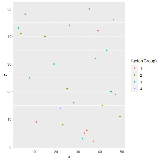
Create the point chart with color brewer
Use scale_colour_brewer function of the ggplot2 package to create the point chart between x and y based on values in Group column −
x<-sample(1:50,25)
y<-sample(1:50,25)
Group=sample(1:4,25,replace=TRUE)
df<-data.frame(x,y,Group)
library(ggplot2)
ggplot(df,aes(x,y,col=factor(Group)))+geom_point()+scale_colour_brewer(palette="Spec
tral")
Output


Updated on: 2021-08-14T08:52:31+05:30
2K+ Views

Advertisements